
The pattern is made up of the letters T and S.
The pattern is made up of the letters T and S.
An archetype is defined as ‘a very typical example of a certain person or thing’, or ‘an original which has been imitated; a prototype’. However, in Jungian theory, prototypes are defined as ‘a primitive mental image inherited from the earliest human ancestors, and supposed to be present in the collective unconscious’.
Therefore, in literature, art, or mythology, archetypes are ‘a recurrent symbol or motif’.
Swiss psychiatrist Carl Jung believed that archetypes were ‘models of people, behaviours, or personalities’, and that they were ‘inborn tendencies that play a role in influencing human behaviour’. To break it down further, according to Jung, the human psyche comprises of the ego, personal unconscious, and the collective unconscious, and it is within the collective unconscious that has psychological inheritance; ‘it [contains] all of the knowledge and experiences we share as a species’. ‘Jung believed that we inherit these archetypes much the way we inherit intransitive patterns of behaviour’.
The 12 fundamental archetypes we can consider for this project are: the caregiver, citizen/everyman, hero, innocent (ego), the creator, explorer, lover, rebel (soul), jester, magician, sage, and sovereign (self).
Those who identify with this archetype are full of empathy and compassion.
Goal: To help others
Fear: Being considered selfish
Weakness: Being exploited and feeling put upon
Talent: Compassion and generosity
Represents those who are dependable, down-to-earth realists. Always searching for belonging in the world, and may join many groups and communities to find a place where they fit in.
Goal: To belong
Fear: To be left out or to stand out from the crowd
Weakness: Can be a little too cynical
Talent: Honest and open, pragmatic and realistic
Sometimes criticised for being naive dreamers. However, their positive outlook and happy-go-lucky personalities can uplift others. Always tries to see the good in the world and looks for the silver lining in every situation.
Goal: To be happy
Fear: Being punished for doing something wrong
Weakness: Being too trusting of others
Talent: Faith and open-mindedness
Born to bring something into being that does not exist yet. They hate to be passive consumers of anything, much preferring to make their own entertainment. Creators are often artists or musicians though they can be found in almost any area of work.
Goal: To create things of enduring value
Fear: Failing to create anything great
Weakness: Perfectionism and creative blocks caused by fear of not being exceptional
Talent: Creativity and imagination
Seeks harmony in everything they do. They find it hard to deal with conflict and may find it difficult to stand up for their own ideas and beliefs in the face of more assertive types.
Goal: Being in a relationship with people, work, and environment they love
Fear: Feeling unwanted or unloved
Weakness: Desire to please others at risk of losing own identity
Talent: Passion, appreciation, and diplomacy
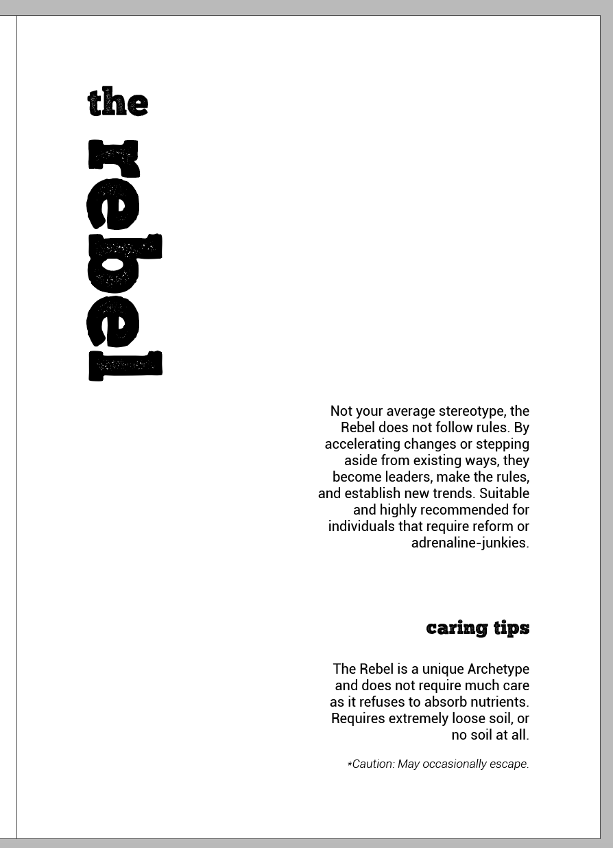
When the rebel sees something in the world that isn’t working, they look to change it. Sometimes, rebels can abandon perfectly good traditions just because they have a desire for reform. They can be charismatic and easily encourage others to follow them in their pursuit of rebellion.
Goal: To overturn what isn’t working
Fear: To be powerless
Weakness: Taking their rebellion too far and becoming obsessed by it
Talent: Having big, outrageous ideas and inspiring others to join them
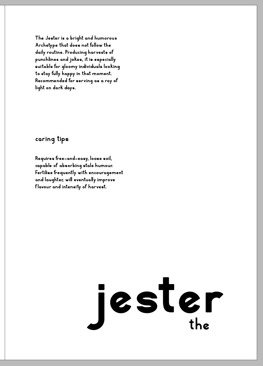
The jester loves to liven up a party with humour and tricks, however, they have deep souls. They want to make others happy and can often use humour to change people’s perceptions.
Goal: To lighten up the world and make others laugh
Fear: Being perceived as boring by others
Weakness: Frivolity, wasting time and hiding emotions beneath a humorous disguise
Talent: Seeing the funny side of everything and using humour for positive change
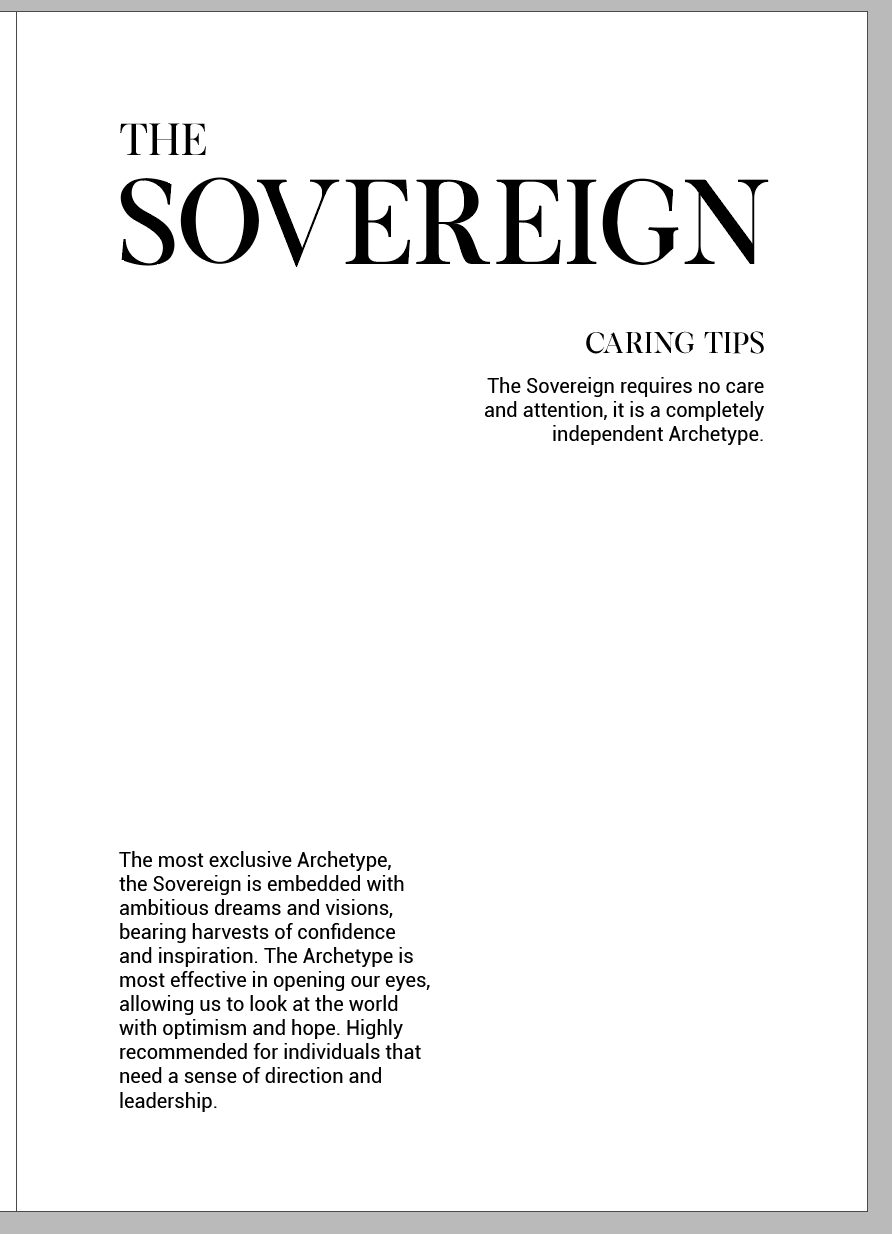
Loves to be in control. They often have a clear vision of what will work in a given situation. They believe they know what is best for a group or community and can get frustrated if others don’t share their vision.
Goal: Create a prosperous, successful family or community
Fear: Chaos, being undermined or overthrown
Weakness: Being authoritarian, unable to delegate
Talent: Responsibility, leadership
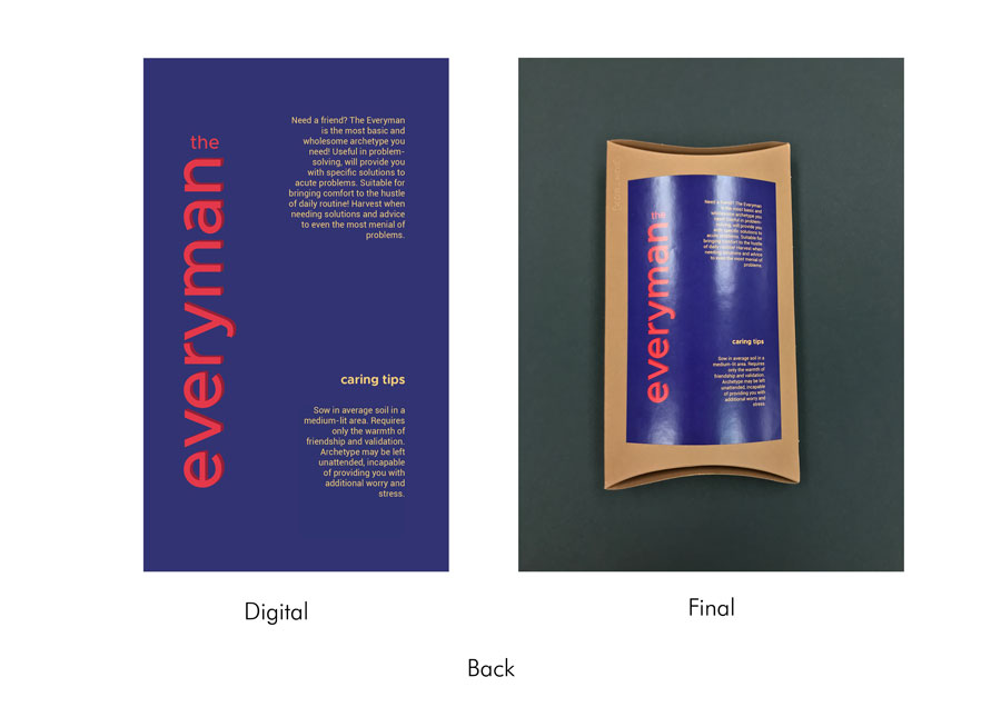
Such brands are aimed at taking care of their customers and help them to care about others. Consumers branding associates caregivers with comfort, coziness, emotional warmth, and flexibility. This is the most obvious brand archetype for medicine, charity organisations, insurance companies, and other brands that are targeted at both responsibility and safety.
e.g. Logo for Hope for Healing
Offering them specific solutions to acute problems, promising to bring comfort to the hustle of their daily routine. Often regarded as ‘fair, simple’ brands’ for everybody.
e.g. EcoWash Systems
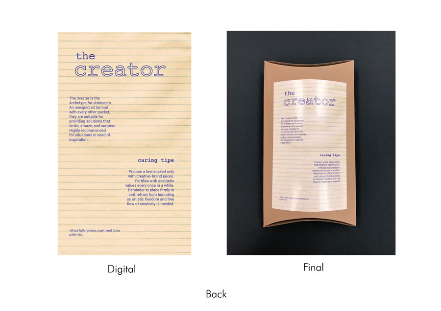
Visioneers, artists, such brands are soaked with aesthetic values and encourage customers creativity and artistic freedom. They stand for the diversity in design, coming up with unexpected solutions that strike, amaze, and surprise. They inspire their customers with bold decisions.
e.g. FireWood presenting their products in the shapes of logs, bringing the name and notion closer together
Brands that are sweet, cozy, and feel like home. This archetype plays with nostalgia, referring to your ‘inner kid’, friendship, and family relations.
e.g. Sunday (a real estate business), and Coca-Cola
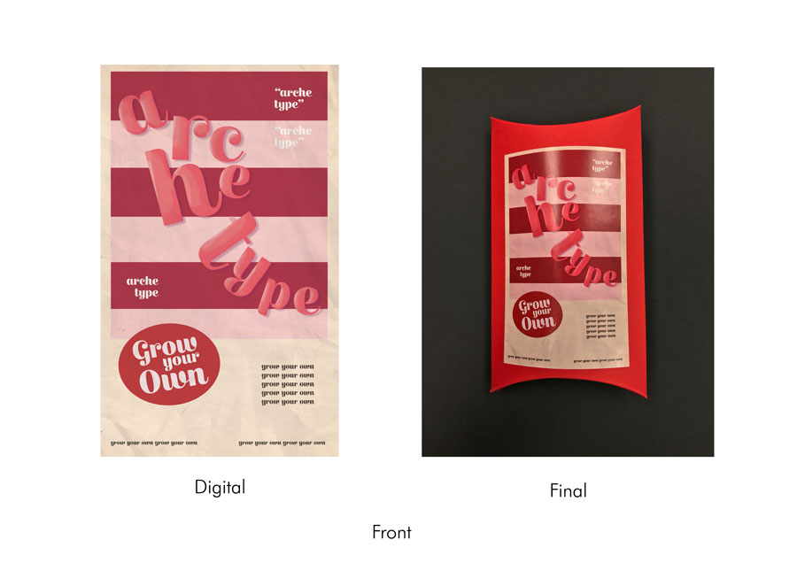
Makes customers feel very special. They lure with romance and promise adventures, surround their clients with beauty and luxury, and make everything possible for the client to feel exclusive.
e.g. L’Oreal and Mercedes
These brands break stereotypes and don’t want to follow the rules. They make the rules and establish the newest trends. By accelerating changes or stepping aside from existing visual patterns, they become leaders in their marketing niche to inspire others.
e.g. Apple
These brands don’t want to be boring and follow the daily routine. Advertising campaigns become viral if they use irony or even sarcasm
e.g. Snacks, fizzy drinks and other junk food marketing schemes
Only true market leaders and brands with rich histories can appeal to this archetype. They conquer and reign. Noble, stable, of the highest quality, they can use posh taglines and reflect luxury.
e.g. Givenchy
What Are the 12 Archetypes and Which One Dominates Your Personality
https://www.verywellmind.com/what-are-jungs-4-major-archetypes-2795439
For our final Typography project, we were given the liberty to experiment with typographical layouts through grids on any medium, digital or traditional. Experimentations through grids was conducted within the context of personality archetypes.
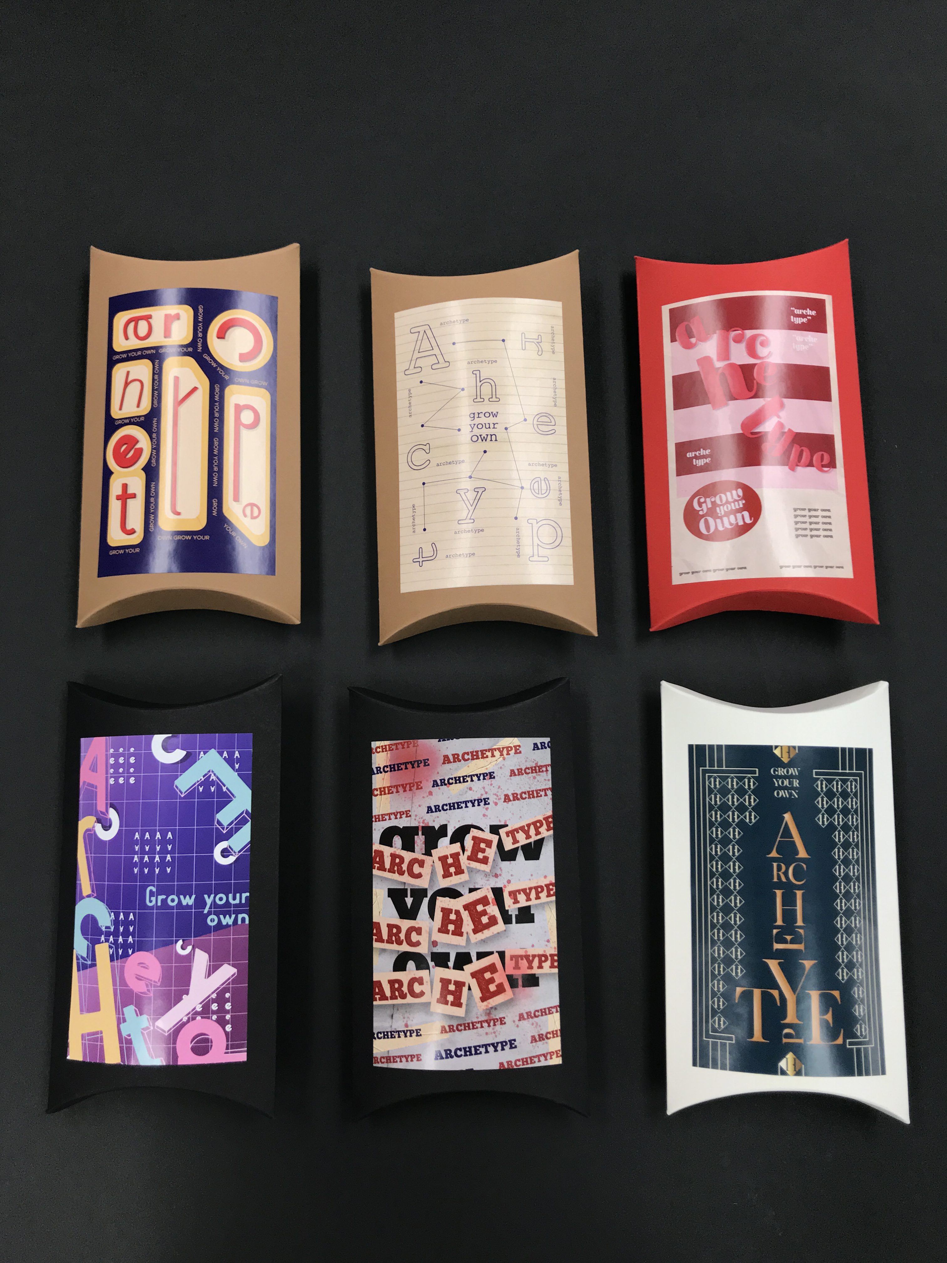
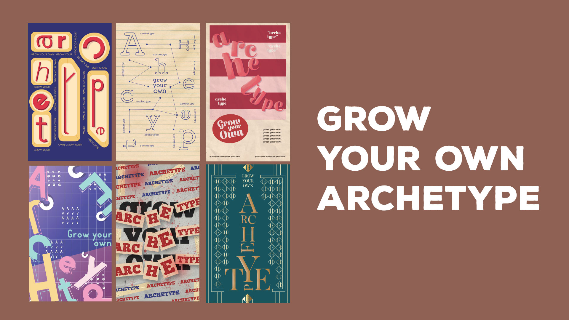
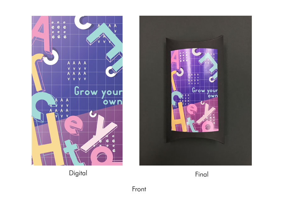
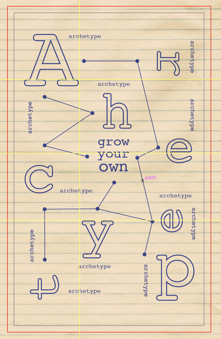
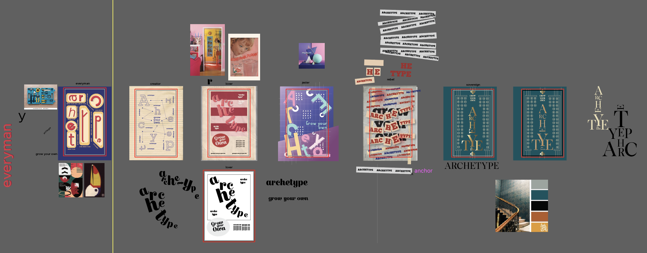
For my final product, I thought it would be interesting to play with the idea of representing archetypes as products. Therefore, with the help of Prof. Lisa, I used seed packets (or boxes in this case) to represent the characteristics of each archetype. Each packet comprises of a front cover, which features the words ‘Grow Your Own Archetype’ in different styles and techniques, as well as a back cover, which shows the name of that particular archetype, a short description, and caring tips (elaborating on the description of the archetype but in a more light-hearted approach). The designs were then printed and stuck onto kraft boxes of different colours.
Without the use of imagery, the different front covers of the packets comprise of a particular font (the font changes with each archetype to better portray characteristics of that particular archetype). The letters of ‘Grow Your Own Archetype’ then undergo changes through distortion, scaling, and other adjustments to emphasise the aspects of the archetype. As a means to convey the represented archetype in a more obvious manner, as well as having a more straightforward direction for the addition of colours, each seed packet/archetype represents a well-known art style that would be most appropriate to embody the assigned archetype – the colours, basic shapes, and textures therefore reflect the distinctive characteristics that derive from each style.
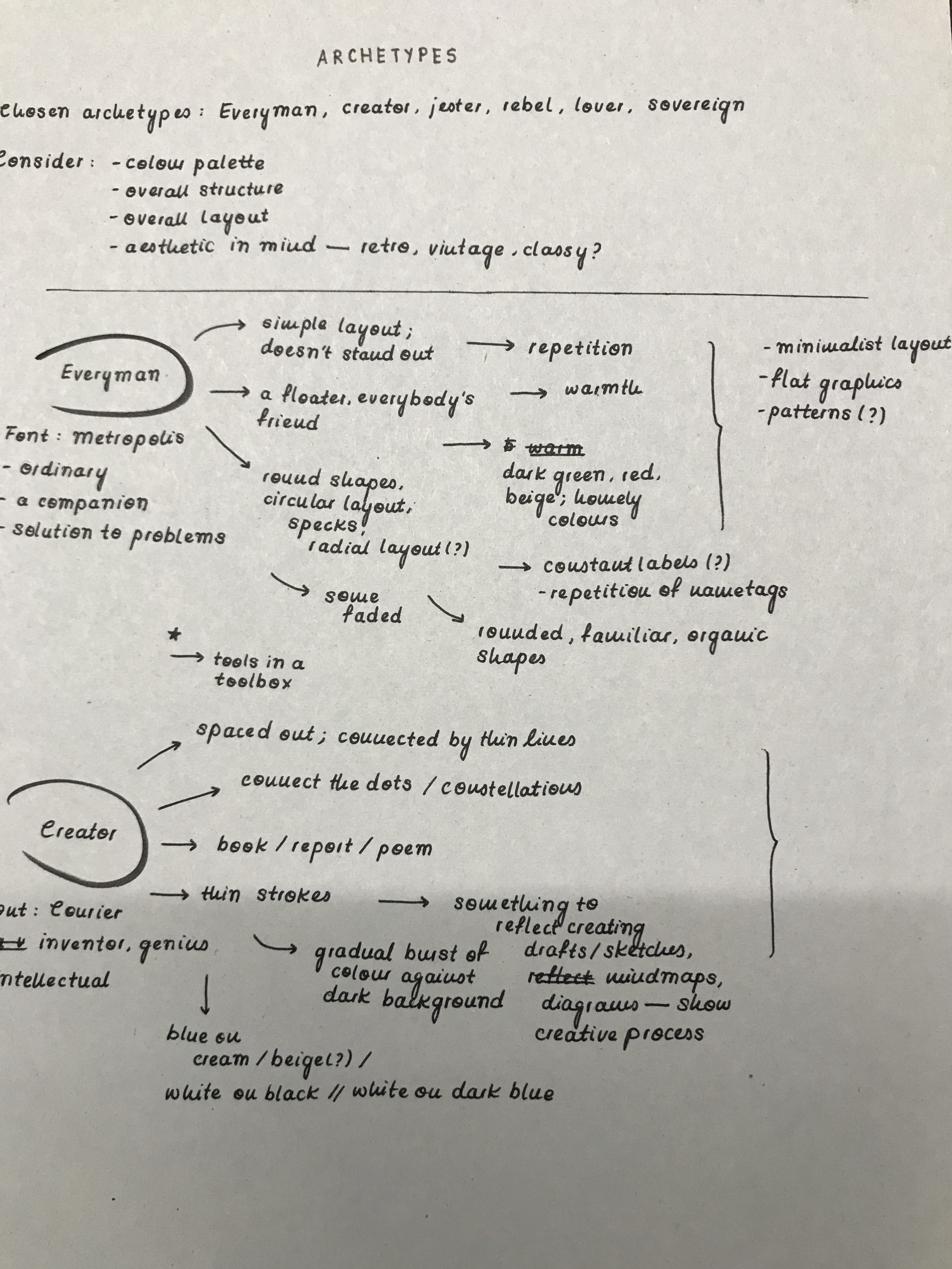
Font chosen: Metropolis
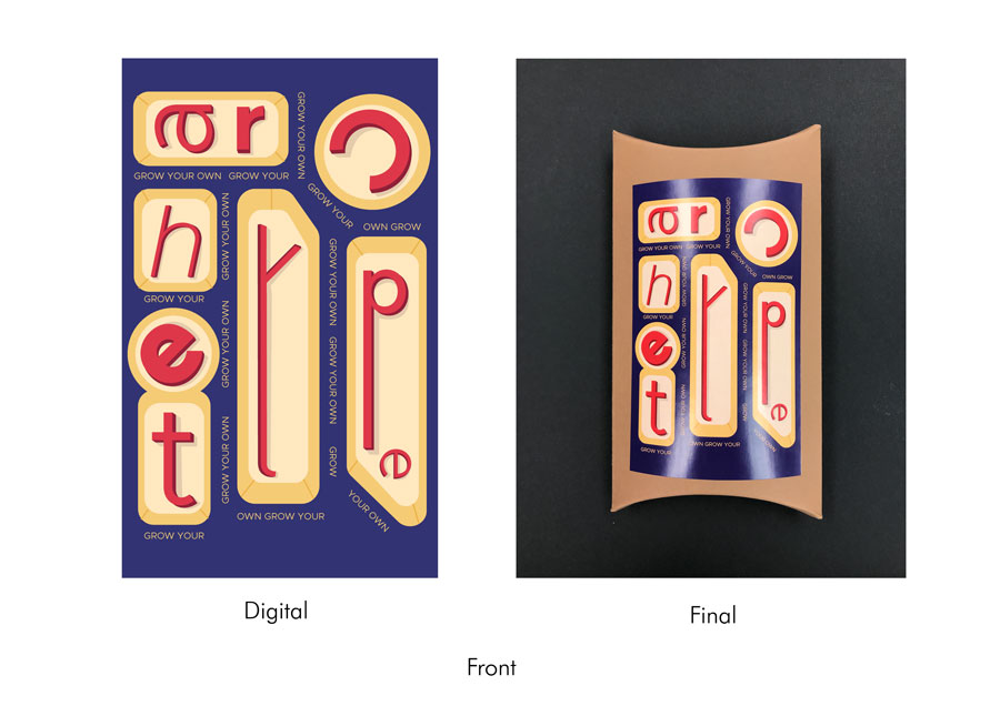
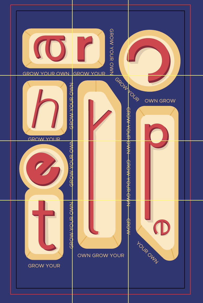
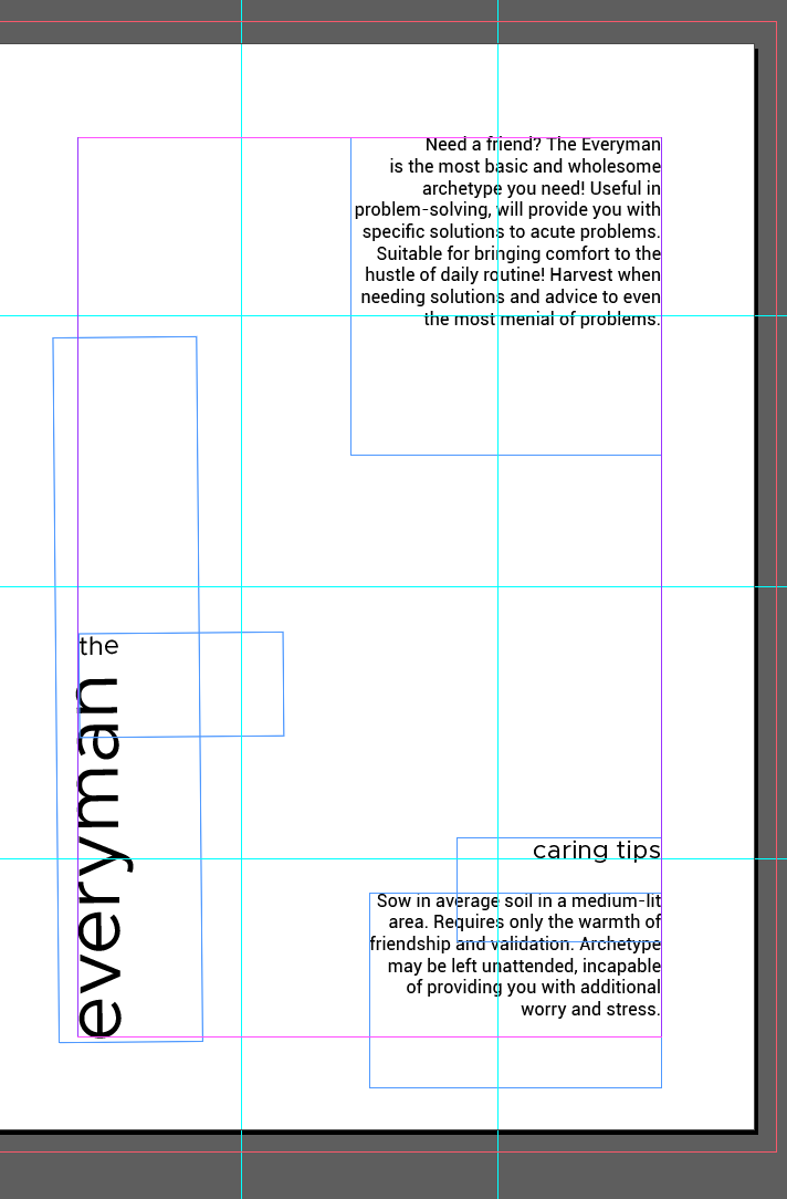
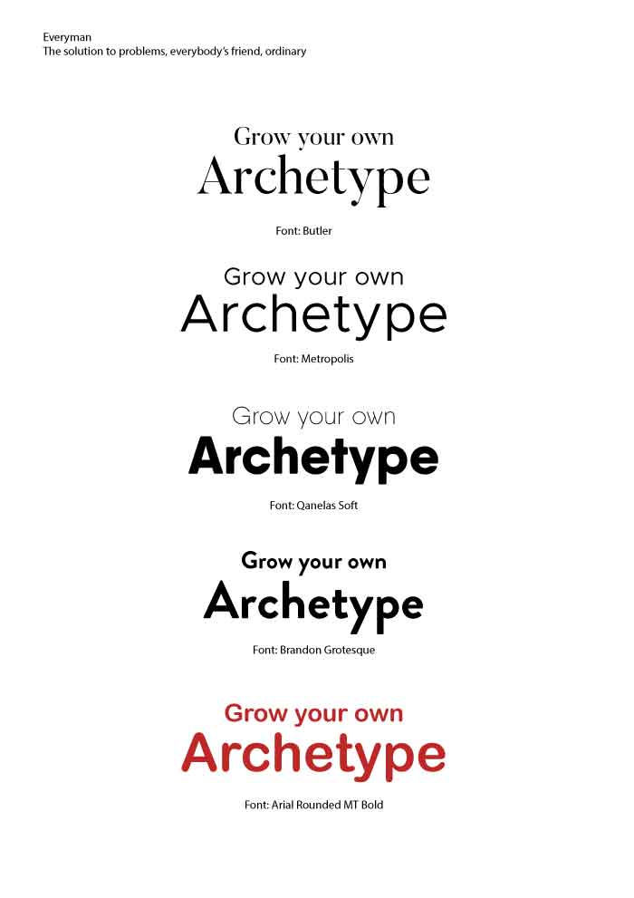
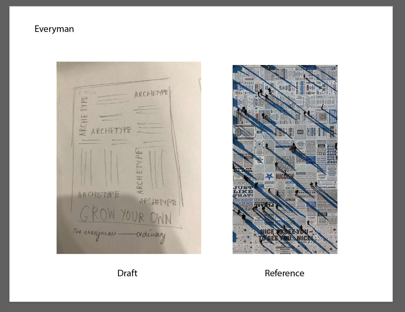
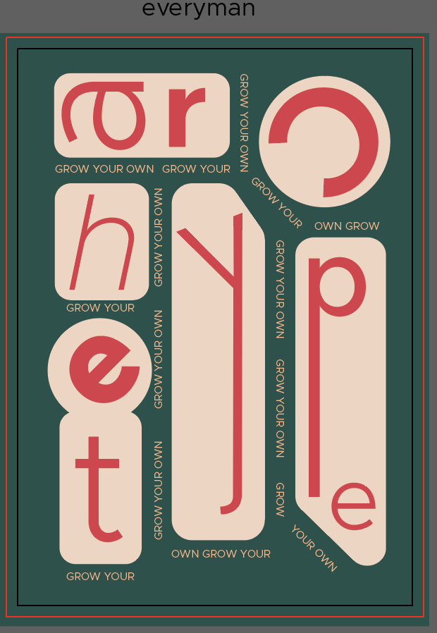
The first seed packet represents the Everyman. Drawing on the archetype’s distinctive characteristic as ordinary and a friend to everyone, as well as a go-to solution to all problems, the front cover uses the letters from ‘Archetype’ to emulate tools in a toolbox (emphasising the idea of tools as solutions to problems and something ordinary and often looked-over). The style on the other hand, tries to adopt elements from the Bauhaus movement. Seeing the Bauhaus movement as rather ordinary, simple, and functional, I thought it seemed appropriate to use it as a reference; the design uses Bauhaus colours of yellow, red, and blue (with variations in tones to create shadows) with letters arranged geometrically. The words ‘Grow Your Own’, on the other hand, use a thinner variation of the font and are kept in all capital letters to line the outline of the shapes, reflecting the dents in a toolbox.
As for the font chosen, based on Prof. Lisa’s advice, I went with the font Metropolis as it was a sans serif font that had a simple and basic structure. It also has different variations in weight and structure (regular, italicised, bold).
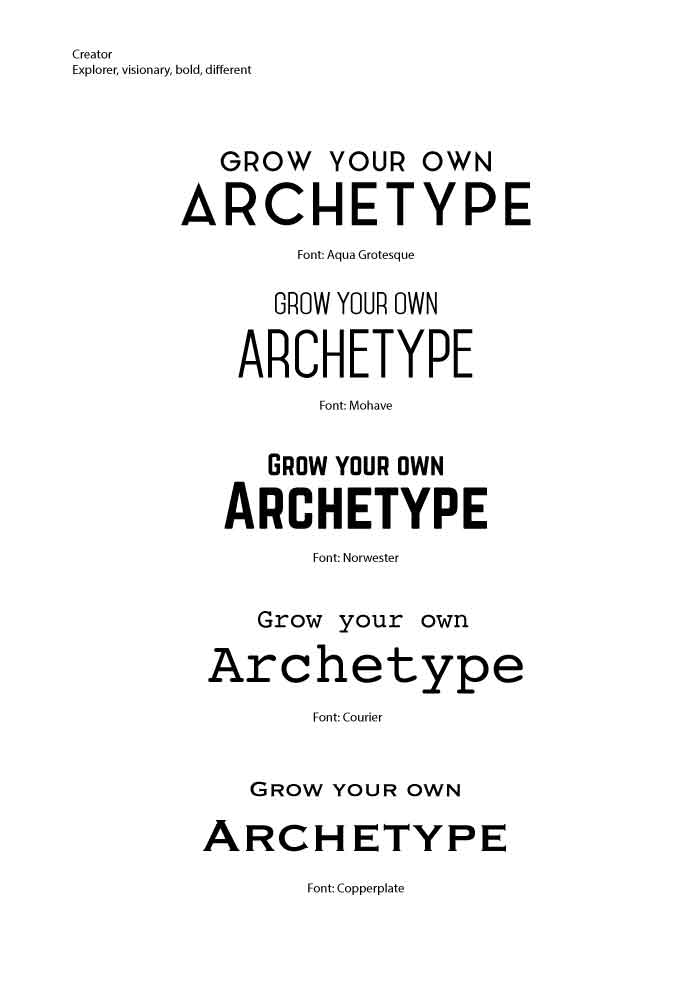
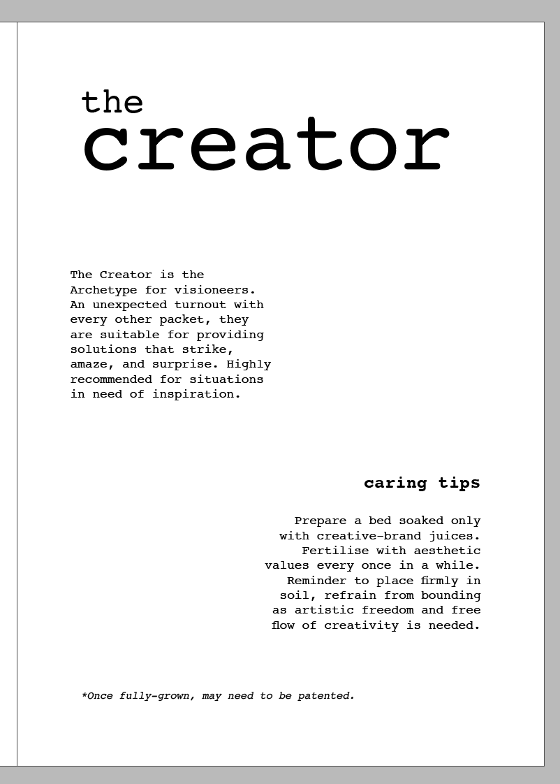
Font chosen: Courier
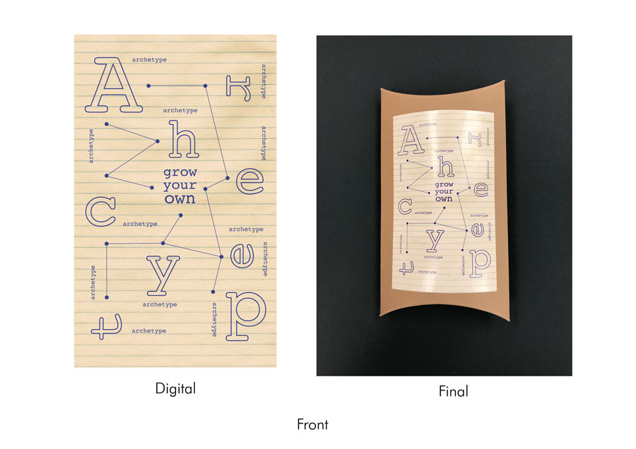
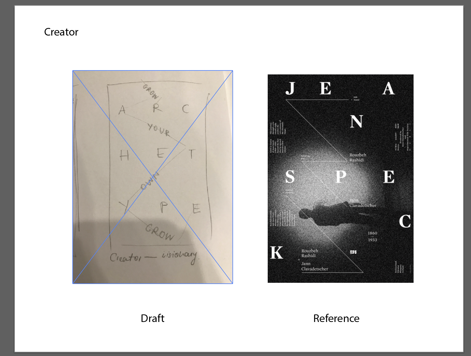
The second seed packet represents the Creator. The design is meant to embody the visionary, creative, and intellectual aspect of the archetype; the letters from ‘archetype’ are spaced out in a scattered format, with a thin line connecting them forming a constellation-like pattern. Smaller forms of the word ‘archetype’ also serve as an addition to the constellation. Laid out against a lined paper background (notebook paper), the design was meant to convey the idea of sketches, equations, or some notes – some sort of indication of creating something new. The design style was meant to reflect minimalist aesthetics typically found in modern designs – using a single colour scheme, coupled with straight thin lines (both in the line graphics and outlined versions of the letters).
The font Courier reflected the idea of Creator as the serif structure made it seem like a typewriter font. Its sleek and simple physicality also added to the overall minimalist aesthetic the design was initially trying to achieve.
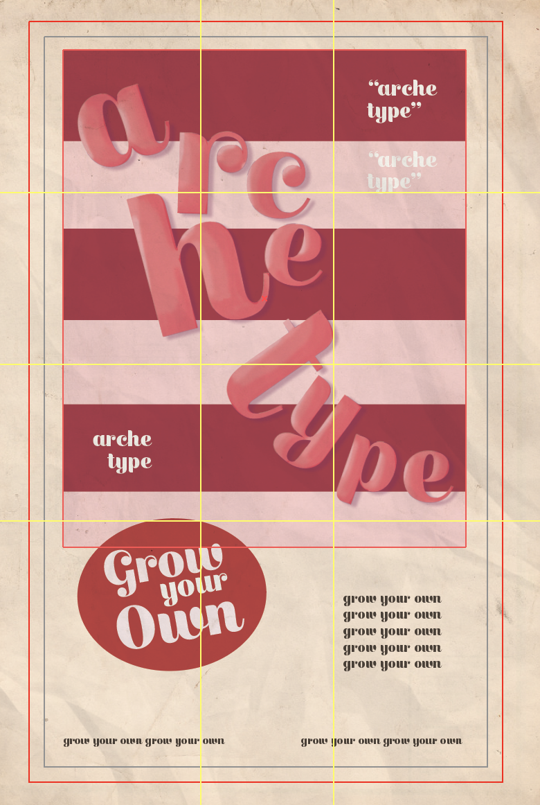
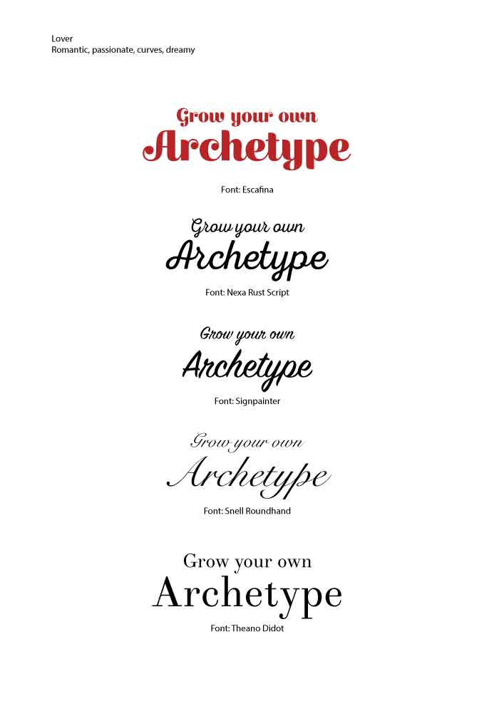
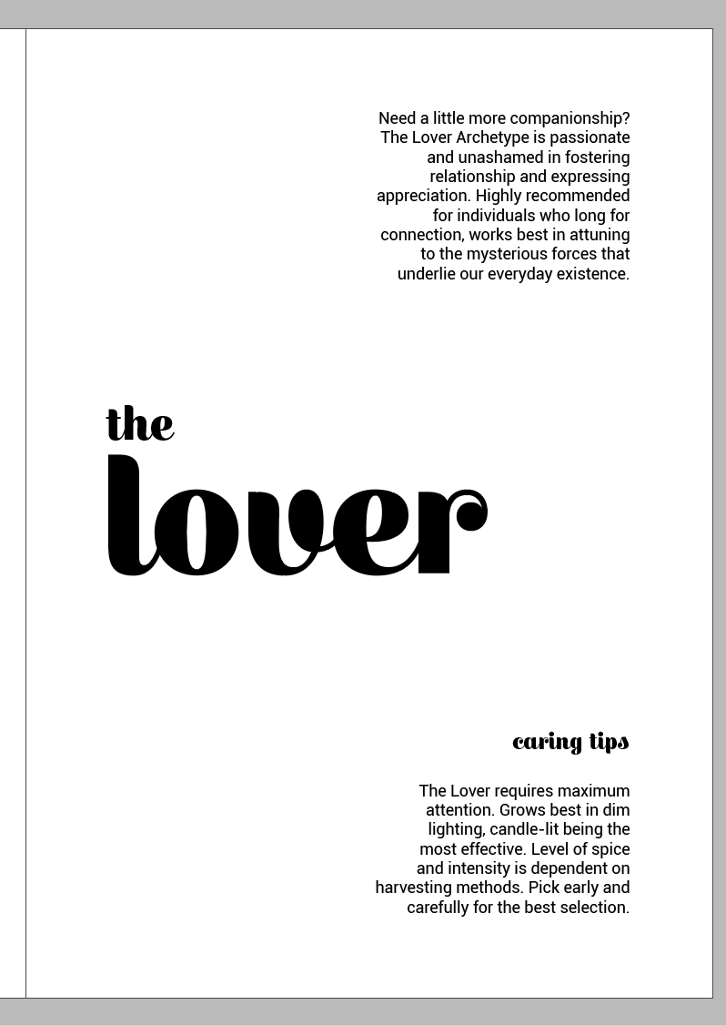
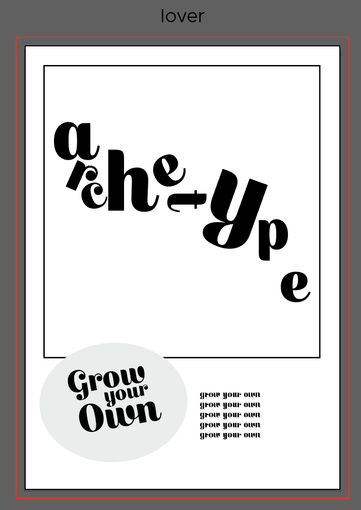
Font chosen: Escafina
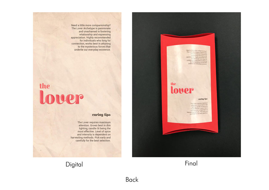
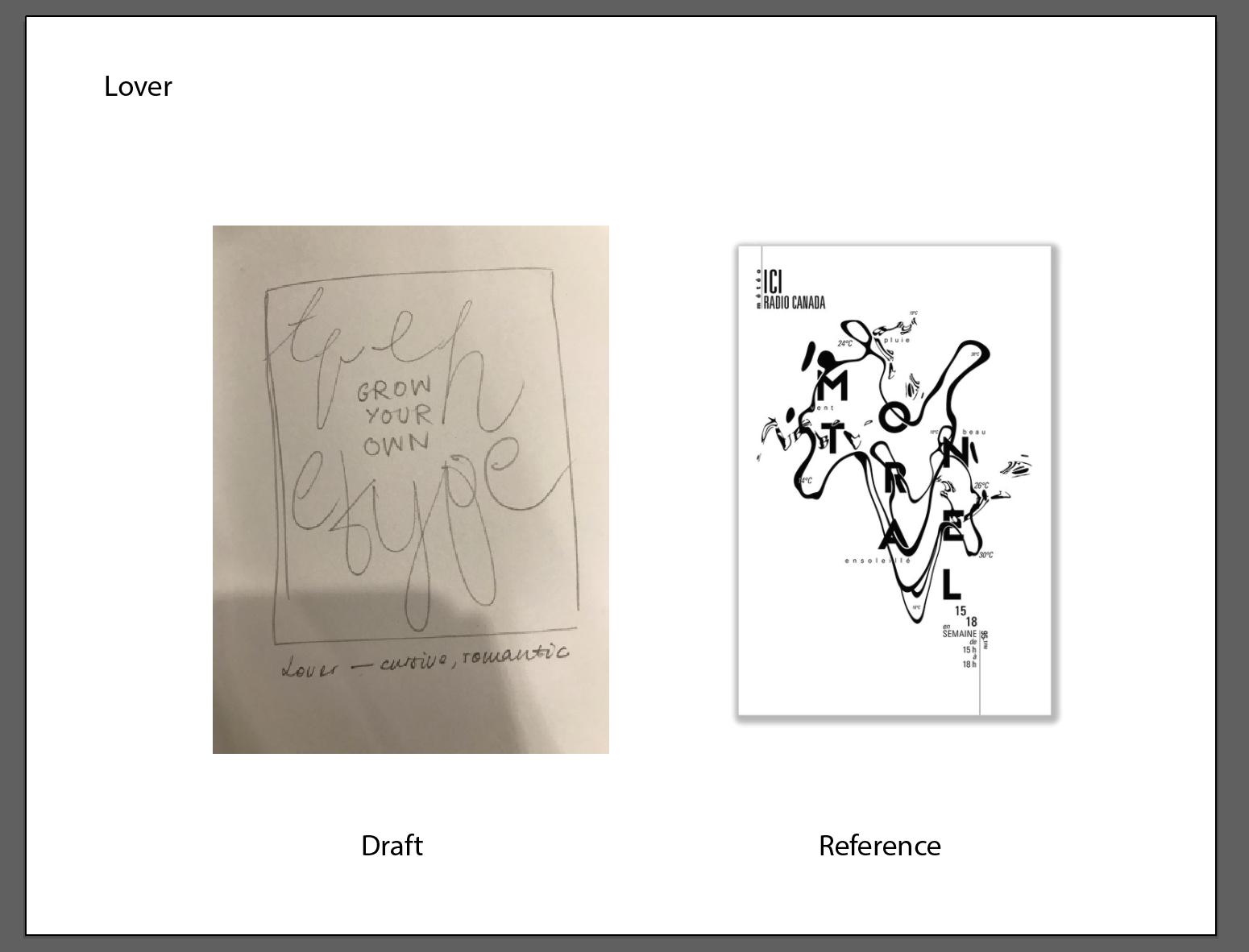
The third seed packet represents the Lover. The design in this case was meant to embody the romantic, sweet, and passionate aspects of the archetype. Keeping in mind the cursive nature of the font, the letters that form the word ‘archetype’ were constructed in a way that formed a faint human silhouette. As the font is reminiscent of 1950s American Kitsch, the layout was done in the style of a retro advertisement – with a graphic bounded by a box at the top, quotes, and a realistic but stylised look of graphics. This would all be on top of a beige-coloured background. In addition to the vintage texture in the background, the word ‘archetype’ is airbrushed to create the same stylised look in retro advertisement graphics. The words ‘Grow Your Own’ are featured on a red sticker to entice the viewer to buy the product, and blurbs (also typically found in retro advertisements) are also part of the layout. The colours were also meant to reflect the sweetness of the archetype, as well as colours typically associated with love (pink and red).
As the Lover archetype is often associated with passion and love, something I perceive to be more organic as opposed to rigid or geometric. Therefore, using Escafina as the font allowed me to convey the archetype effectively because of its extremely cursive nature and accentuated curves and strokes. It also gave an overall more feminine look (which is typically portrayed in brands that adopt the Lover archetype). The font also helped me in experimenting with different art styles that use less geometric fonts.
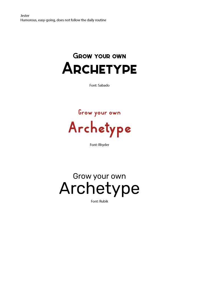
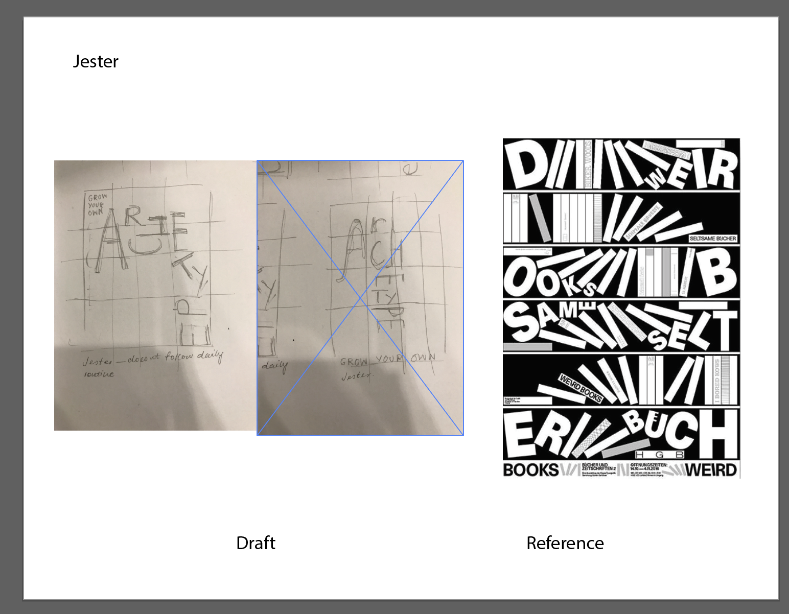
Font chosen: Rhyder
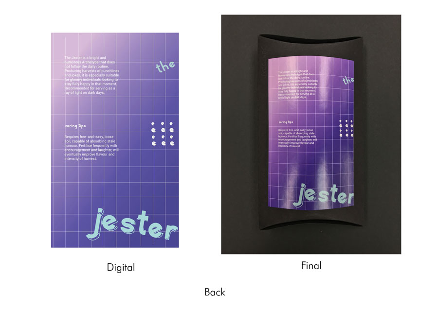
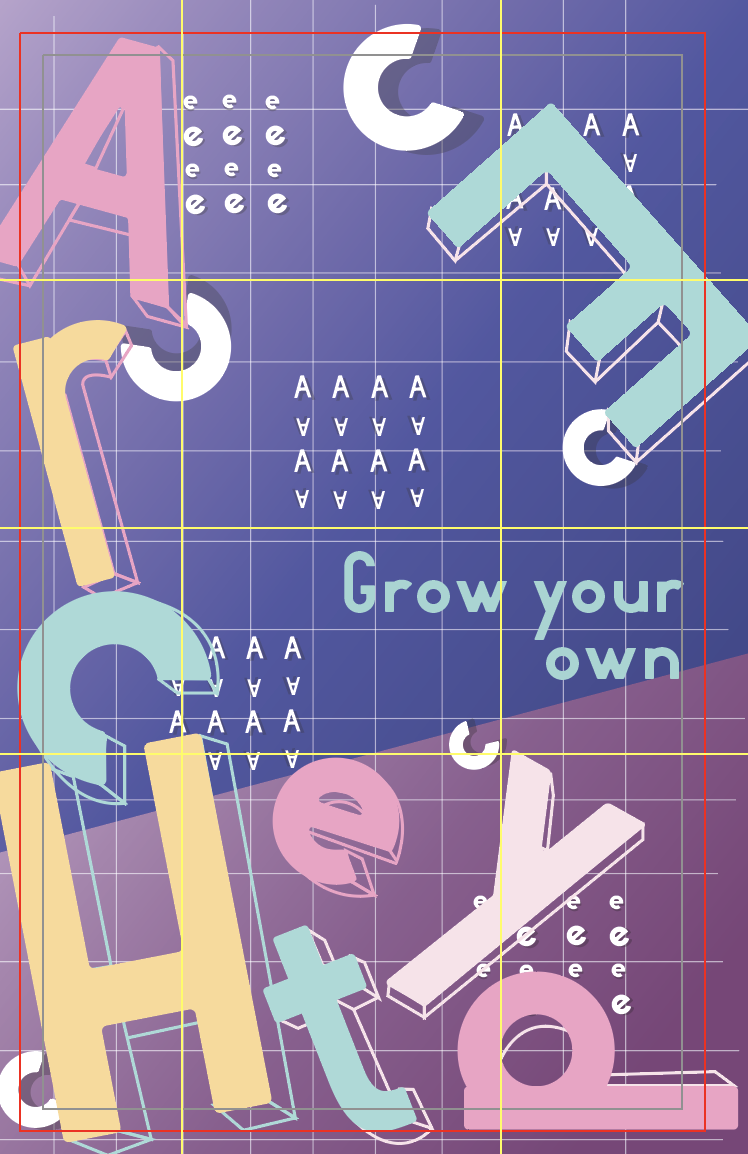
The fourth seed packet represents the Jester. The design here builds on the archetype’s distinctive qualities as humorous, fun, and often not following the daily routine; it features letters of the word ‘archetype’ laid out in an inconsistent manner, with some letters rotated or elongated, or even lying on its sides. The letter ‘E’ reinforces the idea of not following the daily routine by situating it at the top right-hand corner, away from the rest of the letters. The style that the design was meant to convey is Memphis – since Memphis draws on random patterns and integrates humour and fun patterns, it seemed appropriate to have the Jester embody that movement. To do so, the design uses a grid (sometimes seen in Memphis designs), against a bright purple, with the letters themselves painted with pale, bright colours. The ‘random patterns and shapes’, on the other hand, are formed using different letters laid out in a grid and integrated into the grid structure in the background.
The font used is Rhyder and embodies the idea of the Jester quite effectively. Its playful yet simple structure as seen in the big differences in height and the forms of some of the characters themselves, allow for the idea of the Jester being humorous but at the same time, remains simple enough to adjust aspects of the letter.
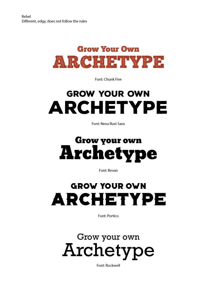
Font chosen: Chunk Five
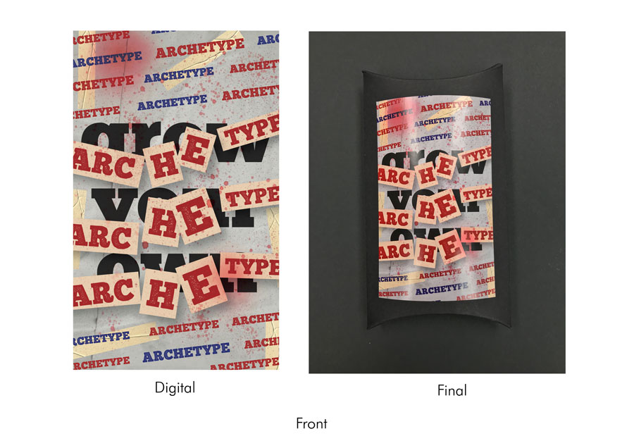
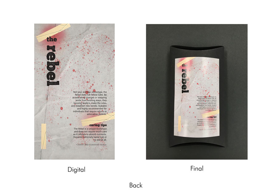
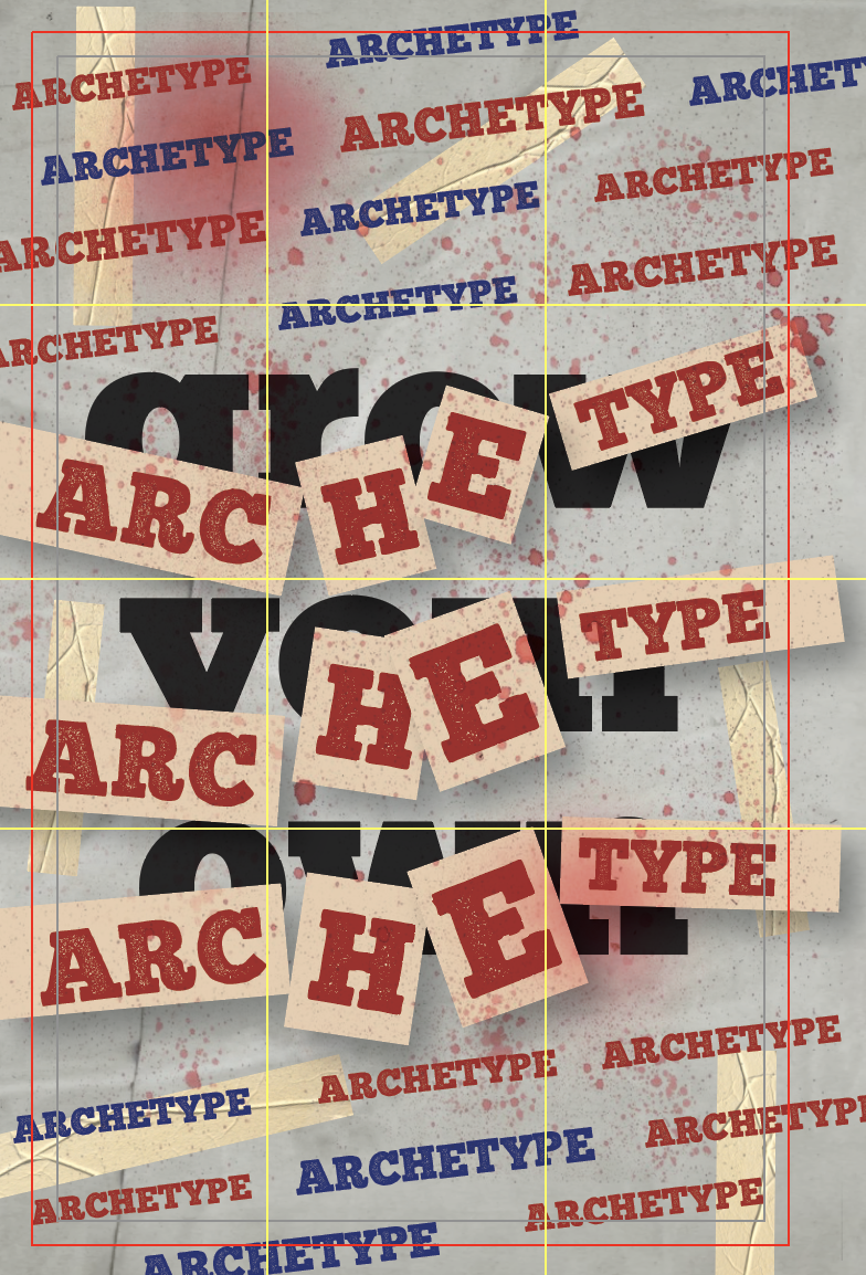
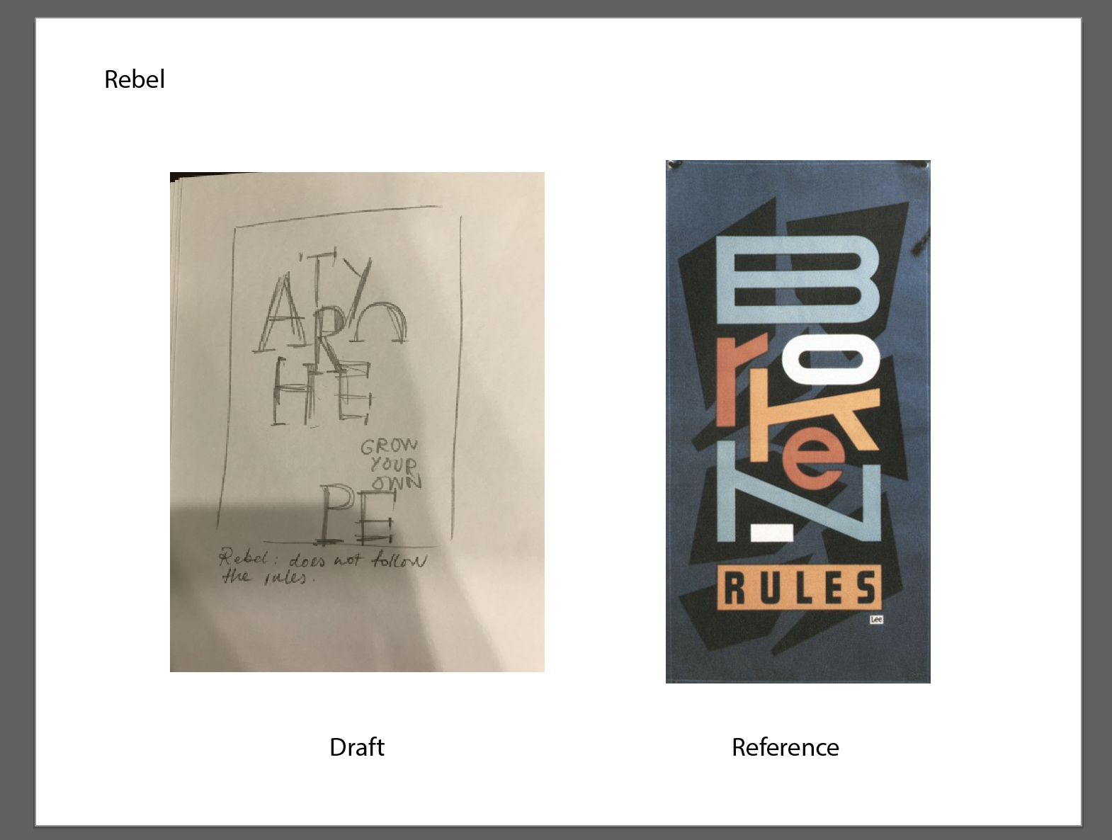
The fifth seed packet represents the Rebel. The design draws inspiration from the archetype’s need to go against authority, refusal to follow the rules and establish changes. Therefore, to convey the idea of rebelling and need to break the rules, I wanted the overall layout to show traces of vandalism. Using two variations of the font (one with a solid colour and the other with a rust-like texture), the words ‘Grow Your Own’ are laid out in the background, and the words ‘Archetype’ are plastered all over in a two formats – in a diagonal line above and below, and on pieces of paper taped over ‘Grow Your Own’. To reinforce this idea of rebellion further, the design takes after the 70s-80s grunge aesthetic; using torn paper textures, spray paint splatters, and the collage technique through plastering letters all over. The colours used (namely red and blue) were used to represent the idea of rebellion.
The font chosen is Chunk Five and a variation of it, Chunk Five Print. I felt that the boldness of the form, in its weight and structure, as well as the geometric edges, brought forth the idea of rigidity and strength, making it seem edgy and daring.
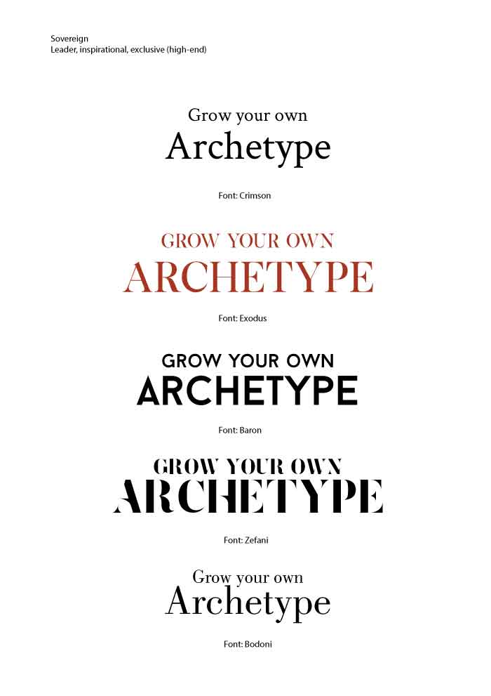
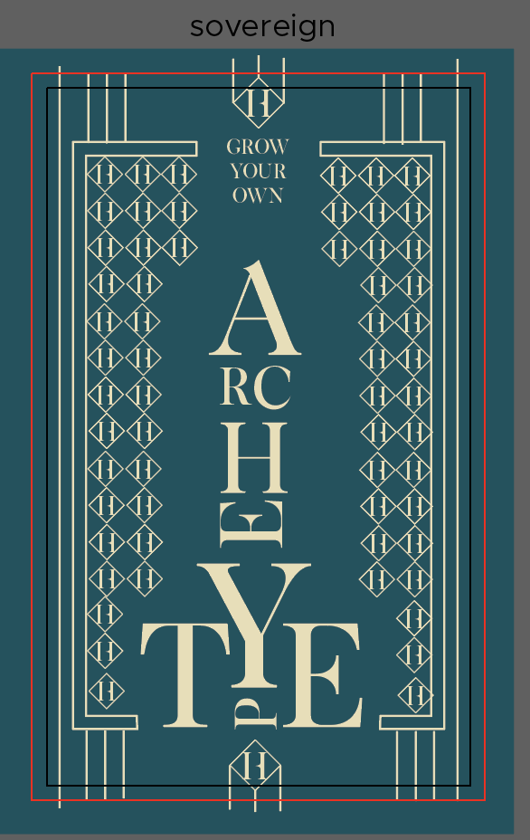
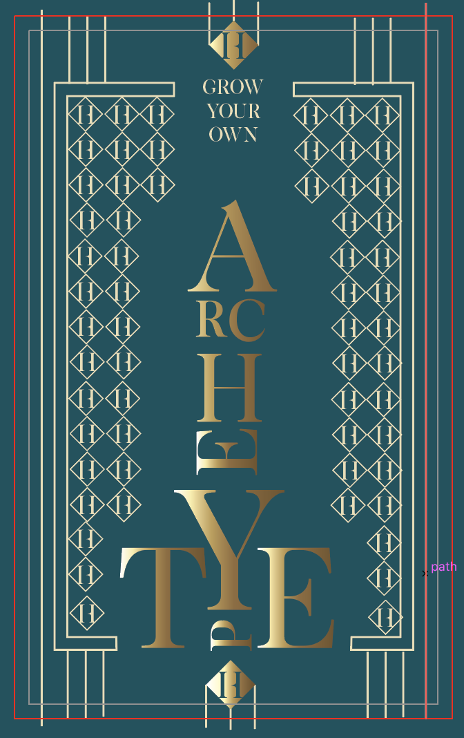
Font chosen: Exodus
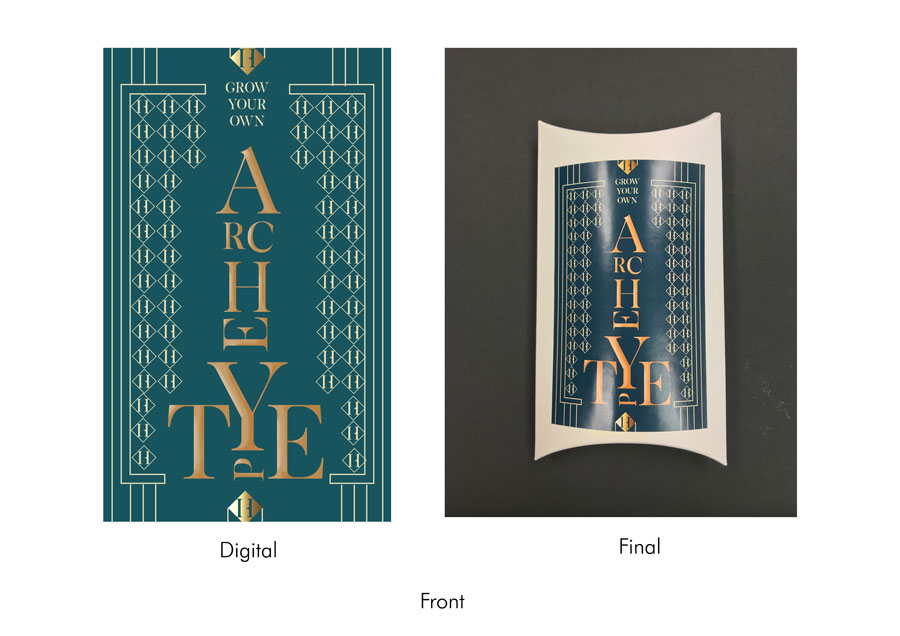
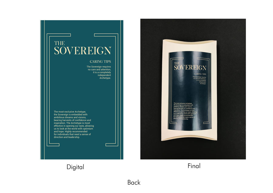
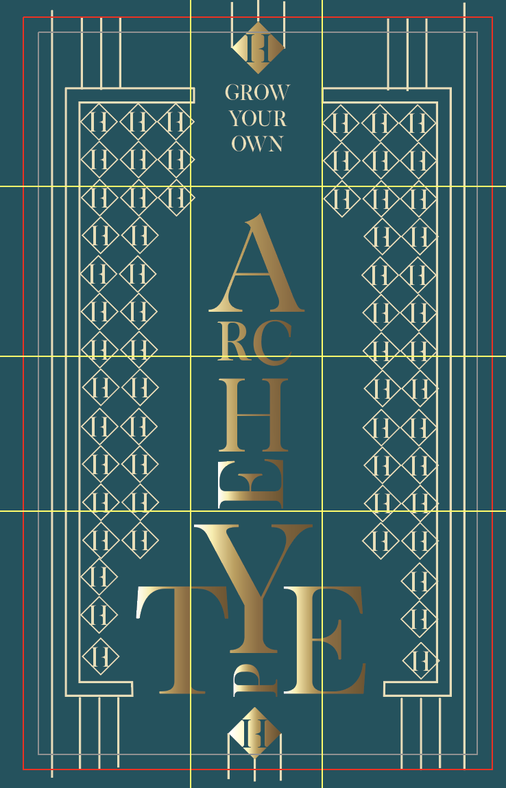
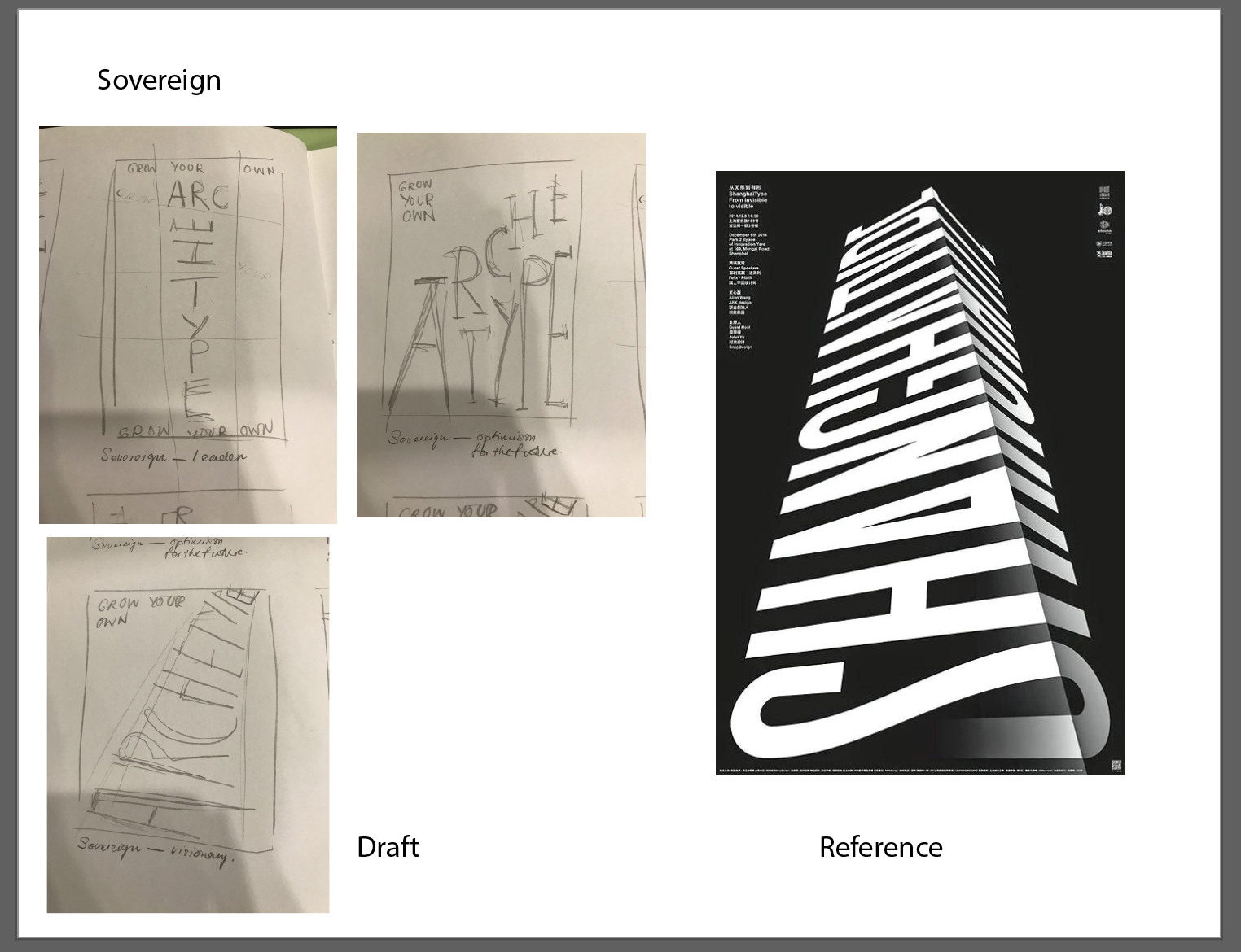
The last seed packet represents the Sovereign. Keeping in mind the Sovereign’s distinctive qualities as being a leader and forward-looking, as well as brands that are often perceived as exclusive and prestigious, I thought it would be fitting to have the letters from ‘Archetype’ form some sort of tower. So playing with the scale of the letters, I constructed a tower, with the uppercase ‘A’ at the top to reinforce it further as a tower. Design-wise, the idea of exclusivity and prestigiousness seemed to take after the characteristics of the Art Deco movement. The letters are coloured in gold and airbrushed to have the glow reminiscent of Art Deco patterns, and thin lines were added to the background to mimic the geometric patterns. The patterns also comprise of the letter H with a diamond shape around it; repeating the motif and placing them in a similar layout as the word ‘Archetype’ seemed to represent the Art Deco idea quite effectively.
The font chosen is Exodus. The idea of exclusivity and prestigiousness can be seen in the font because of its serif, the thinner body against a longer serif, and its sleek geometric structure. The font, to me, is reminiscent of high-end fashion brands and magazine publications that use the same type of font (e.g. Vogue, Harper’s Bazaar and Calvin Klein).
The front covers of the seed packets were based on a modular grid (6 X 6) while the back covers were based on a 2 and 3-column grid. However, based on the layout of certain covers, the grid was broken at times.
I wanted to establish a visually-appealing front and back design through experimenting with methods of contrast. Contrast also helped in establishing visual hierarchy. Contrast is first seen in the use of scaling, where certain letters and words were bigger or smaller than the rest – it helped me in forming interesting structures (e.g. the tower in Sovereign), and added a layer of depth (e.g. the letters in Jester). Contrast can also be seen in the difference in colours, as well as in the layout of a more scattered and unpredictable format against the simple back covers which hold longer chunks of text.
As we were required to restrict our use of graphics with the sole use of letters, I felt that the addition of textures, colours, and basic shapes would help immensely in effectively conveying the concept. Therefore, the design of each archetype is accompanied by colours, textures, and shapes (basic shapes or shapes formed by the letters themselves) to reflect the art movement or style it was intended to mimic – the use of red, blue and yellow in Everyman, thin lines and strokes with notebook paper in Creator, airbrush effect in Lover, patterns and grids in Jester, the paint splatter and torn paper effect in Rebel, and golden glow in Sovereign.
Before starting on our designs, we had to conduct some research on archetypes. After looking more into the various designs, I decided to go with those that would be most appropriate for seed packets.
For a more detailed write-up on archetypes, please refer to: https://oss.adm.ntu.edu.sg/vwong005/research-archetypes/
As mentioned previously, the design of each archetype was modelled after a specific art movement or style. Using information we learned from the History of Design module, I tried to couple each art movement with each archetype, keeping in mind certain characteristics that would allow me to reinforce the idea of each archetype. I paired each archetype and art style accordingly:
As we were given the freedom to choose any medium to showcase our final product on, conceptualising first began with coming up with creative and interesting ways to have the final layout on. As I was not as confident in digital platforms, I decided to stick with print media.
Seeing the archetypes as personalities, I thought it would be fun to project these personalities onto objects instead. With Prof. Lisa’s help, I decided to go with having seed packets representing each archetype, with every packet coming with its own description and caring tips.
After settling the medium and researching more into archetypes, it was time to select fonts. Keeping a list of characteristics I thought the chosen font should feature in its corresponding archetype, I went online to look for and narrowed down a list of fonts to use for each type. The list was narrowed down further with the help of Prof. Lisa and opinions from friends. Ultimately, the end goal was to have the font effectively convey the archetype just by its structure.

Next was to come up with content for the back cover. As the archetypes were going to be reflected in the form of seed packets, it was only right to have their descriptions written in the style of caring tips. The text was as a result, a mash of the archetype descriptions and some gardening tips.
Then it was time to formulate layouts for the front and back covers. As I struggle a lot with the manipulation of type or arranging them in appealing formats, I thought it would be best to first see how I can rearrange the letters into patterns or objects that would reflect the corresponding archetype.
This was then taken a step further, after experimenting with different layouts, I brainstormed further and saw how I could integrate the font choice into the layout, and saw how else I could use other graphics to play around with the layout.
With advice from Prof. Lisa and friends, I then adjusted the layouts digitally and from there, continued to move things around or edit them until I was content.
Next, I brainstormed further and saw how else I could add another layer of familiarity to the design of each archetype. The elements I considered adding when pairing each archetype with an art movement or style involved scale, the weight of strokes, colours, textures, and shapes.
The final step was to put everything together. After compiling the designs to print on sticker paper, I got foldable boxes of various colours. The different colours were also meant to further emphasise each archetype (e.g. black for rebel, red for lover, and white for sovereign). The designs (both front and back labels) were then trimmed and stuck onto the boxes. For the presentation, I added a little biscuit inside so that it would make a sound when shaken, similar to an actual seed packet.

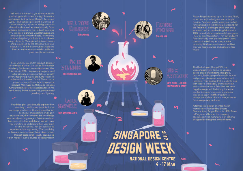
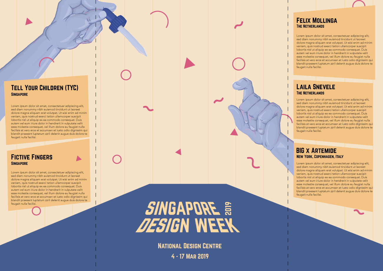
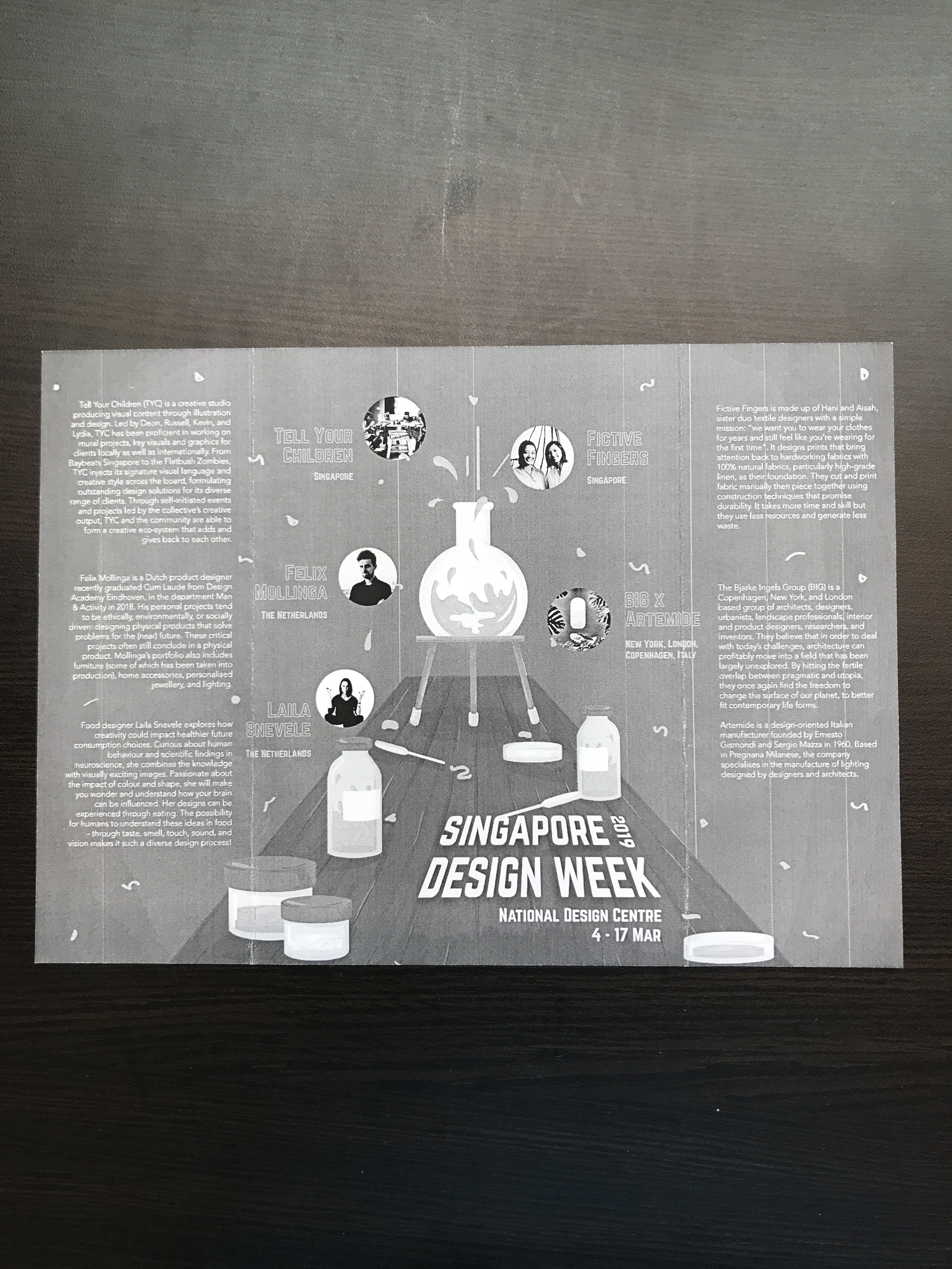
Tell Your Children (TYC) is a local creative studio that specialises in producing visual content through illustration and design. They have been proficient in working on mural projects, key visuals, and graphics for both local and international clients.
Ultimately, they seek to elevate and lead the creative community of Singapore and beyond. Through self-initiated events and projects led by the collective’s creative output, TYC and the community are able to form a creative eco-system that adds and gives back to one another.

Fictive Fingers is a sister textile design duo that works primarily with natural fabrics (particularly linen). Drawing everything with pencil and paper, cutting and printing fabric manually, then piecing them together using traditional construction techniques, nothing works harder than their hands.

Focusing on quality, they create products while maintaining minimum waste and energy consumption – the restrained detail of their work puts emphasis back on making choices with the environment in mind.
Studio Dam is a local multidisciplinary design studio whose creative works span from visual branding projects, to bespoke furnitures and spatial identities. Their distinct approach to product design projects is to work intuitively with their hands and directly with materials during the conceptualising phase.
Felix Mollinga is a budding Dutch product designer who recently graduated Cum Laude from Design Academy Eindhoven, department Man & Activity in 2018. His personal design projects tend to be ethically, environmentally, or socially driven: designing physical products that solve problems for the (near) future.
His portfolio includes furniture, home accessories, personalised jewellery, and lighting.
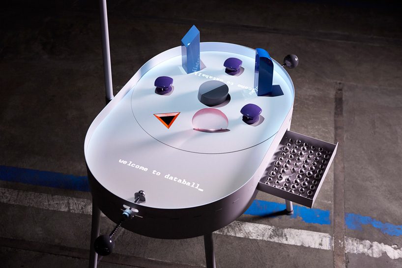
One of his projects include inventing a playful pinball machine that visualises the flow of personal data. Databall_ is a pinball machine that visualises the flow of personal data, covering all aspects of daily digital life, from a chat history, to photos, to online purchases.
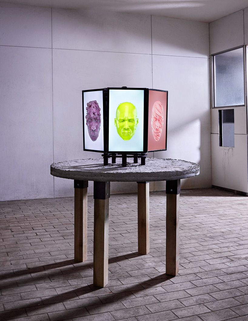
Laila Snevele is a food designer who explores how creativity could impact healthier future consumption choices. Curious about human behaviour and scientific images in neuroscience, she combines the knowledge with visually-exciting images. Passionate about the impact of colours and shapes, she makes people wonder and understand how our brains can be influences. Possibility for humans to understand these ideas in food – through taste, smell, touch, sound, and vision makes it such a diverse design process!
The Bjarke Ingels Group (BIG) is a Copenhagen and New-York based firm that operates within the fields of architecture, urbanism, research and development. Its practice emerges out of a careful analysis of how contemporary life constantly evolves and changes.
Artemdie is an Italian lighting company founded in 1960 that specialises in the manufacture of pieces created by designers and architects.
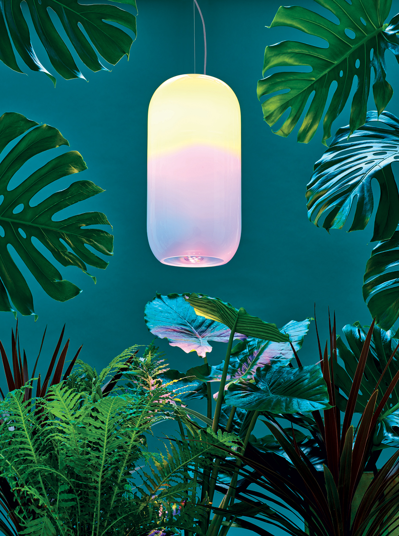
Following their previous partnership at the 2016 Milan Design Week, both firms created a new lighting design at the 2018 London Design Festival. Named Gople, the transparent pill-shaped lamp nourishes nature, enhancing plant life and human perception, as well as intertwining modern technologies with artisanal traditions.
bjarke ingels’ BIG and artemide gople lamp nourishes the growth of houseplants
https://www.designboom.com/tag/bjarke-ingels-group-big/
https://www.fictivefingers.com/about
https://felixmollinga.com/category/blog/
playful pinball machine by felix mollinga visualizes the flow of personal data
https://www.tycstudios.com/about
3D visualizations of taste give you the flavor of sweet, salty and sour just by looking at them
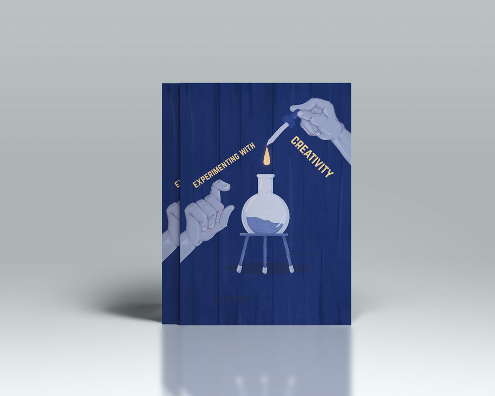
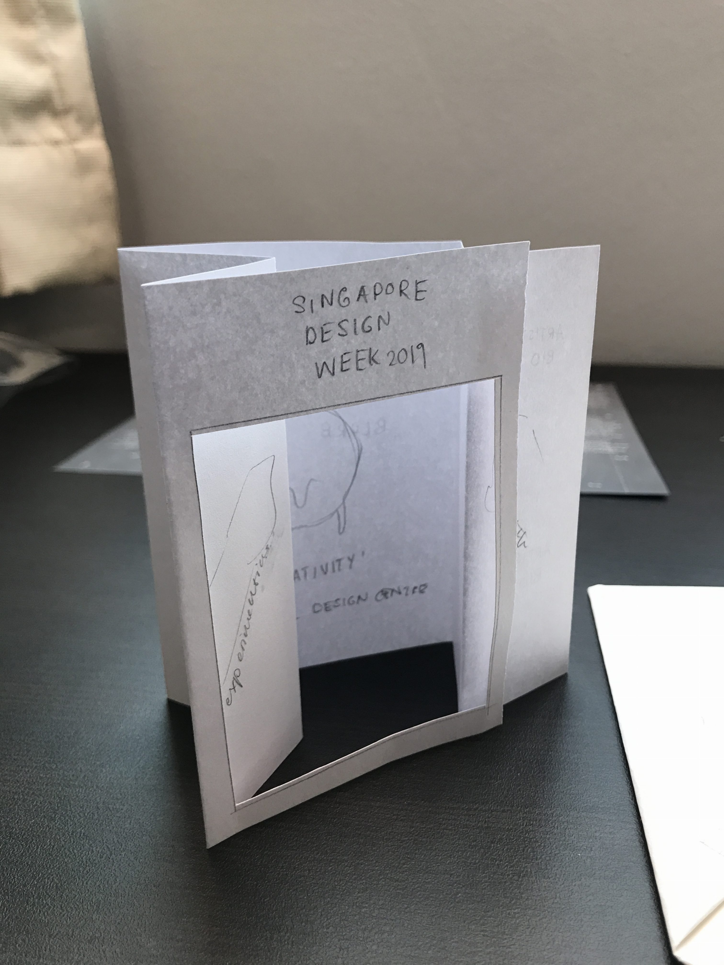
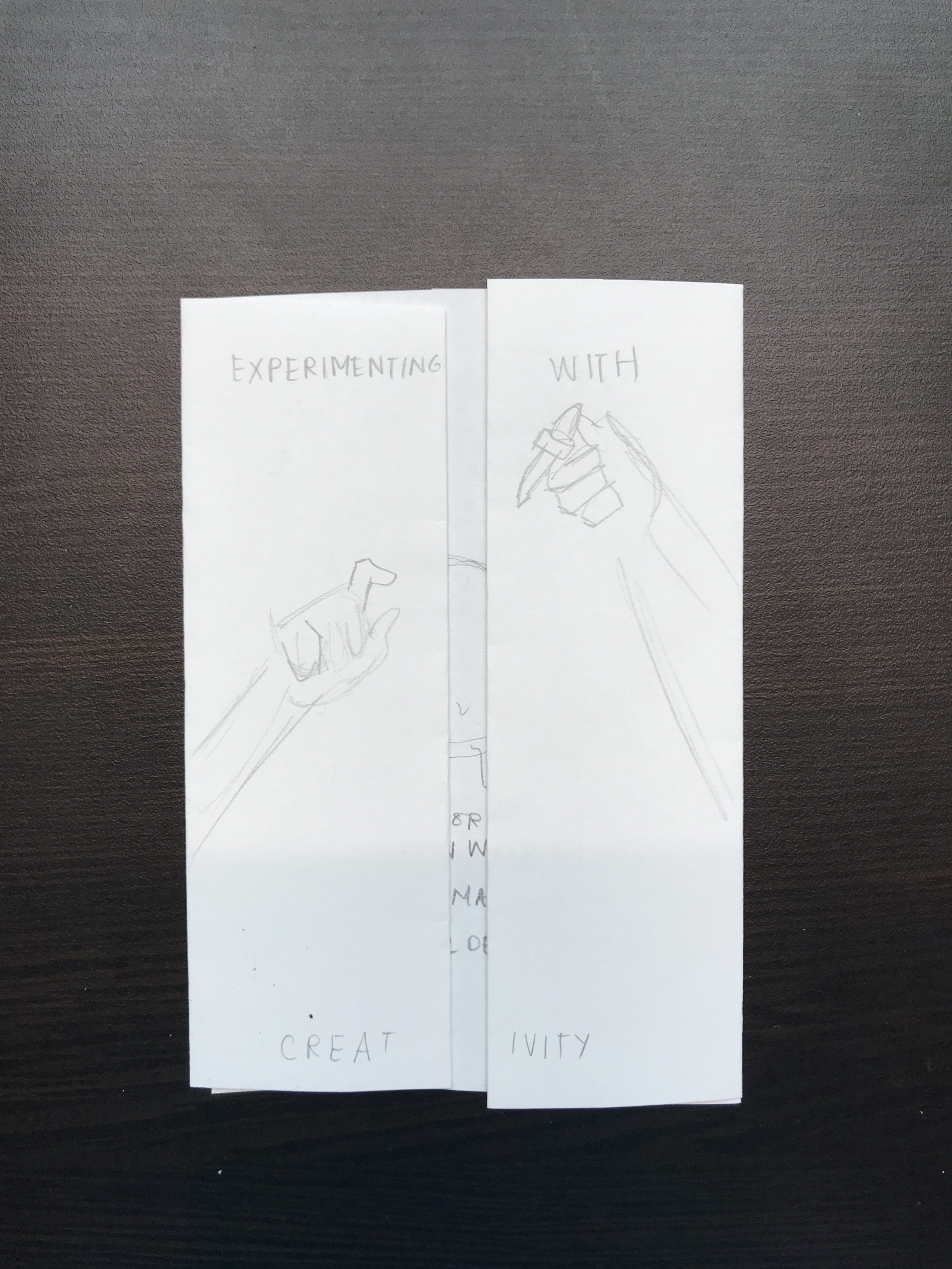
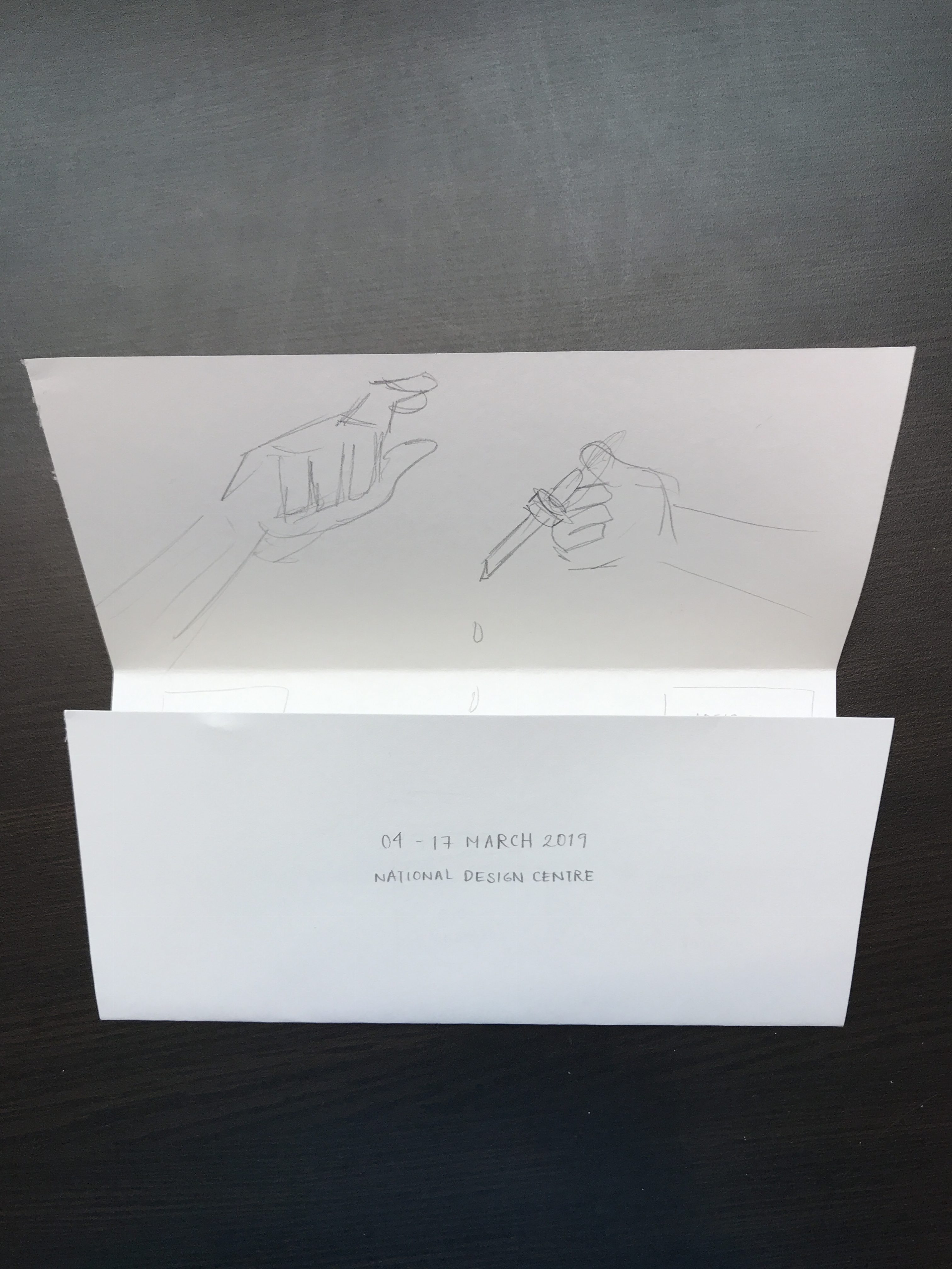
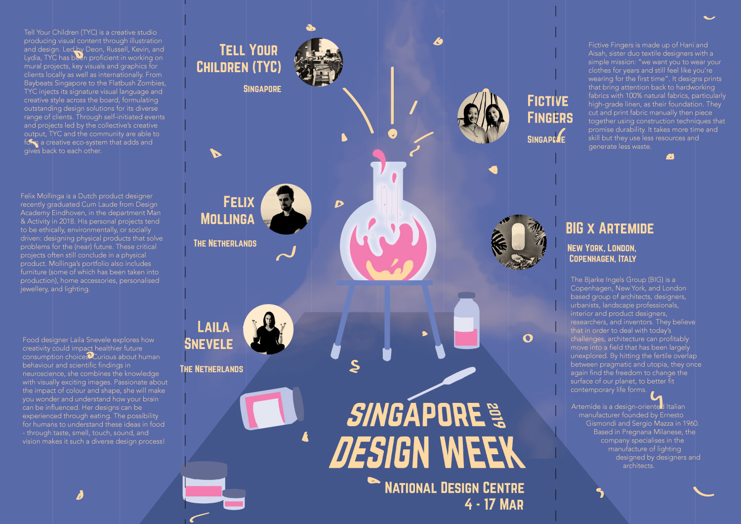
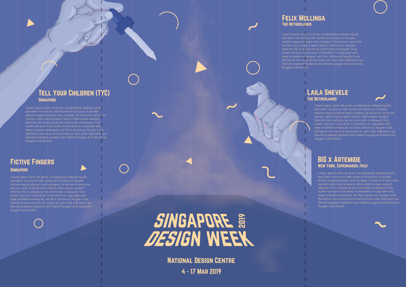
As a follow-up to the previous project, for our final submission, we were required to conceptualise and create a brochure for 2019’s Singapore Design Week.
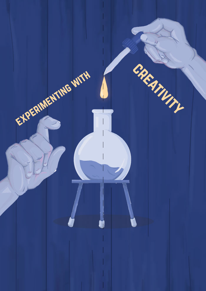
Keeping to ‘Experimenting with Creativity’, the theme reflected in the previous poster project, the brochure I created for this project adopts the imagery and concept from the poster but categorises and displays information in a way that is suitable for a brochure and integrates new information about the exhibition.
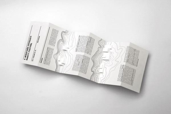
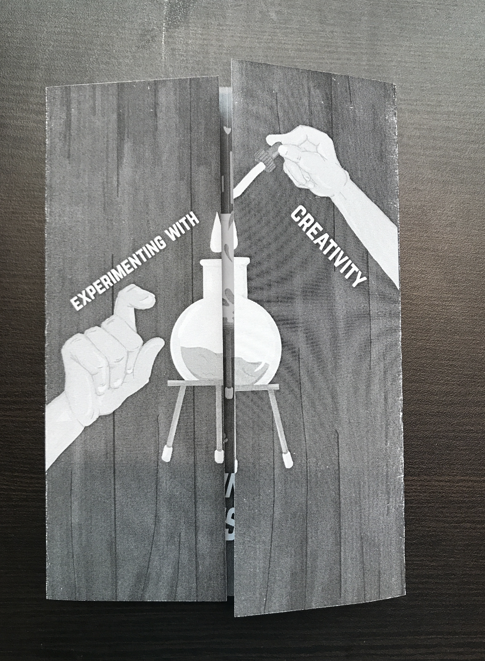
The final product is an A5 size brochure that uses a gate fold, and becomes A4 in size when open. The content comprises of event details of Singapore Design Week and biographies of five exhibiting artists. The brochure also integrates graphics (some of which are adapted from the poster) that convey the idea of ‘Experimenting with Creativity’, where after experimenting with creativity, resulted in an explosion that formed Singapore Design Week and the exhibiting artists, reflecting the notion of Singapore Design Week championing creativity in the local and overseas design industry.
Reinforcing the idea of experimenting, the graphics consist of science apparatus (test tubes, droppers, specimen jars) and an explosion of patterns. The use of a curtain as the background also carries forth the attempt to bring about a mysterious and magical mood that was also conveyed in the poster. The fold of the brochure, on the other hand, is a conventional gate fold. The fold helps to reinforce the idea of the exploding beaker where the front cover is still and adding the droplet into the beaker results in an explosion as seen on in the inside of the brochure, where it is much more colourful and shows movement through patterns and strokes.
The use of graphics in this case really helped in bringing forth the narrative of the entire brochure. Coupled with the unveiling nature of the gate fold, the brochure was able to effectively convey the experimental and explosive parts of the intended narrative. To represent the idea of experimenting, I used images of science apparatus, and the changes in shapes of the patterns helped in conveying the idea of an explosion.
The brochure also uses contrast to emphasise important details and at the same time, create an overall balanced and harmonious layout. Contrast is seen firstly, in the variation of size; more crucial information such as the slogan, title, and event details are displayed in a bold font with a vibrant yellow. Less vital information such as the short blurb and artist biographies are displayed using a font with less weight and is smaller in size, but remains readable. Contrast is displayed through different colour palettes; the text and focal points of the graphics uses a bright yellow and pink that has an outer glow. This is contrasted against less important graphics that use a pale blue colour palette.
Hierarchy is also used to create a smooth visual flow. Having a more quiet graphic in the front followed by a more vibrant and explosive layout on the inside that is unveiled by the gatefold helps to establish the flow of information. Furthermore, having the text and graphics vary in size and colour in terms of brightness and vibrancy helps in guiding the eyes from more important information to less important ones.
Similar to that of the poster, movement is established through the use of patterns that are more compressed in the centre, closer to the beaker, followed by it being more spaced out towards the edges. The explosive pattern was further enhanced by lines that depict motion and little bits of splatters found on the table and apparatus.
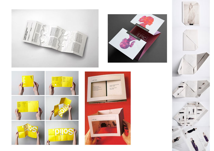
Research into brochure production began with us looking more into the types of folds that brochures could use. I was personally intrigued by gate folds and variations of it, because I felt it was an interesting and versatile way of unveiling information, and is especially appropriate for my brochure.
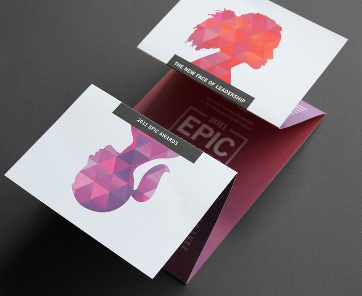
I was inspired by these two folds especially because of their simple layout that allowed for a straightforward user experience, but also comprised of an interesting layout. The folds here allowed for a linear reveal of information, thereby creating visual interest. Especially with the gatefold, having minimal text and maximum graphic to entice the viewer to open allowed for an interesting method of revealing information.
This is a more experimental fold I hope to try out as well. Going back to the idea of the slow reveal of information, I thought this was a very creative method of unveiling information and definitely creates visual interest. The inclusion of the die-cut and folds at the side which meet in the centre when flattened also seemed suitable for the curtain graphic I used in my poster. However, this may turn out rather flimsy and could deteriorate the ease in user experience.
For a more in-depth look into chosen exhibiting artists, please refer to: https://oss.adm.ntu.edu.sg/vwong005/chosen-designers/
After looking into brochures, layouts, and folds, we tried some of our own. Keeping in mind the content we had to display, user experience (where it had to be easy for users to open and fold back), and display methods (where they could be stood up on display stands), I tried to use simple but creative folds that helped to create an interesting flow of information, and die-cuts to give a sneak peek into the inside of the brochure.
Ultimately, with Prof. Michael’s advice, I decided to do away with the die-cut and adopt a simple gate fold. This way, I could have better control of the layout of information and therefore, more control over the flow of information. By focusing more on the layout of the content itself as opposed to using a complicated fold, it allowed me to establish the same intended mood, but with a simpler and more straightforward user experience.
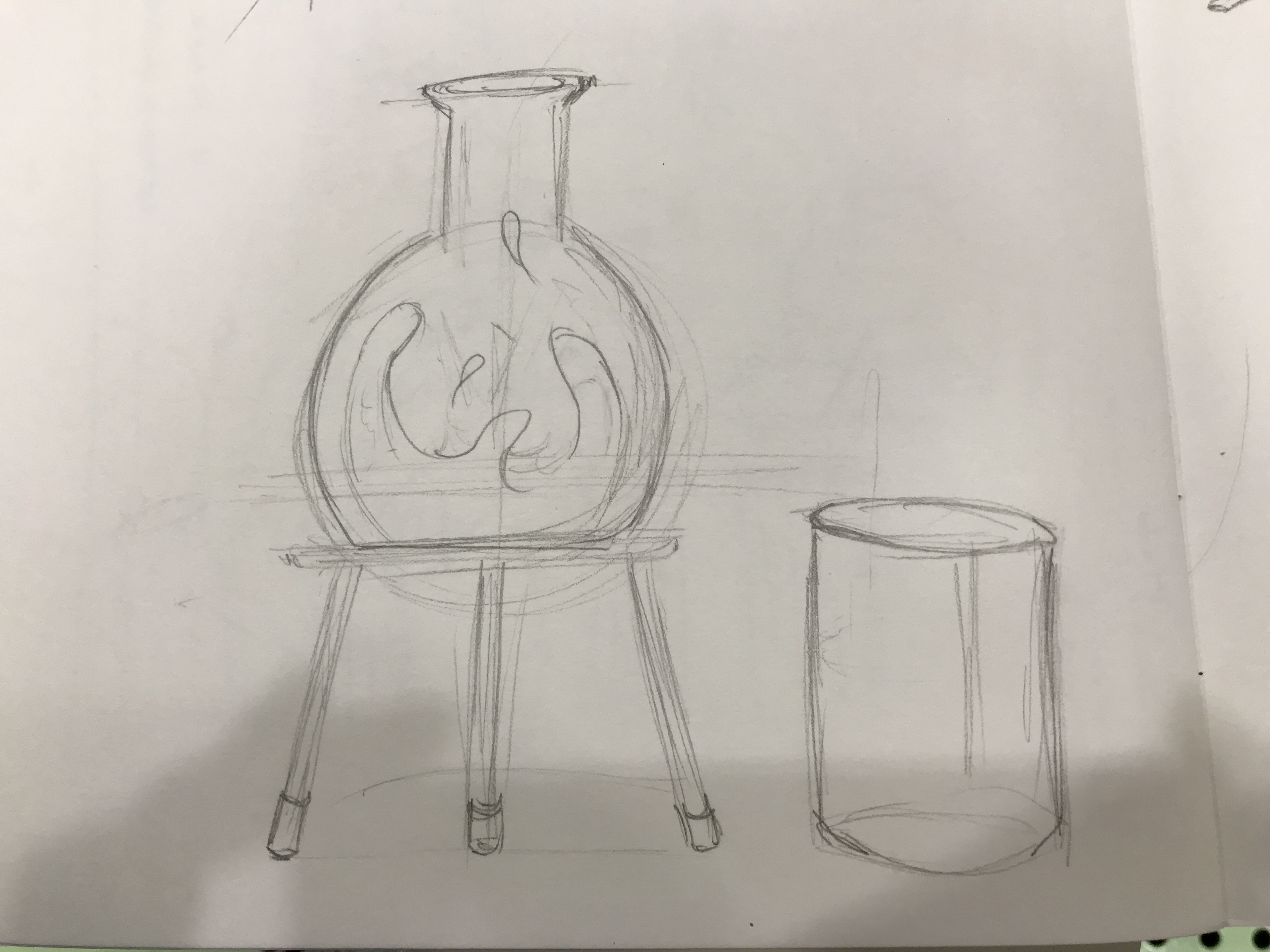
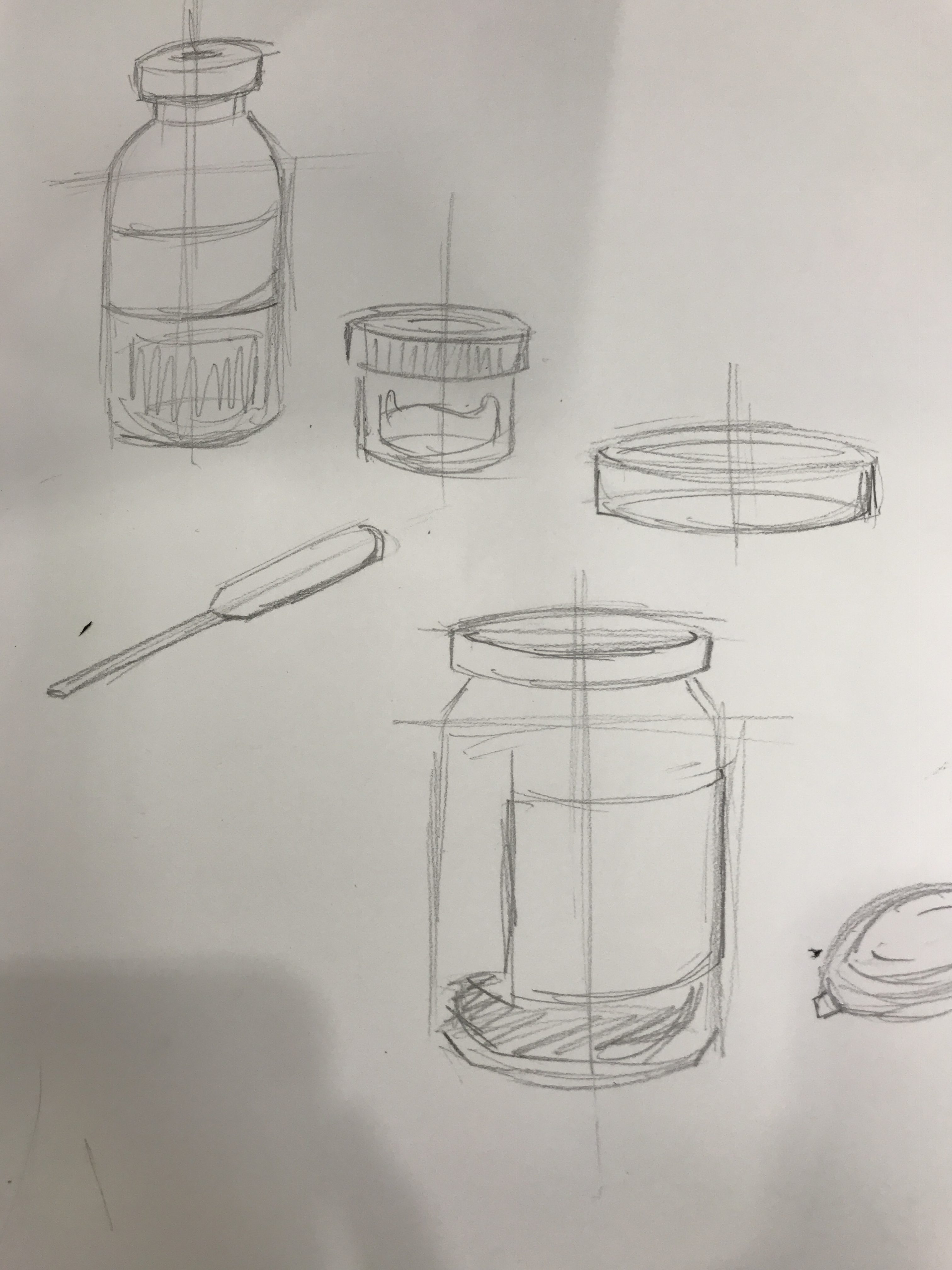
As we had to adopt the same concept and overall similar graphics from the previous poster project, I used the same colour palette but decided to replace most of the graphics. Instead of a glowing ball of yellow mass to represent creativity, I tried illustrating new images and patterns to better convey the idea of ‘experimenting’, ‘creativity’, and to portray an explosion. Therefore, I decided to have science apparatus to convey the literal meaning of experimenting. Also, having more than just a beaker gave the page more life and excitement, allowing for more platforms for movement, colour, and placement for information.
I felt that having the science apparatus, and the transition of a flask with still liquid into a flask with bubbling and glowing liquid to represent the formation of creativity was a more straightforward and easy-to-understand graphic that managed to embody the overall theme of the exhibition.
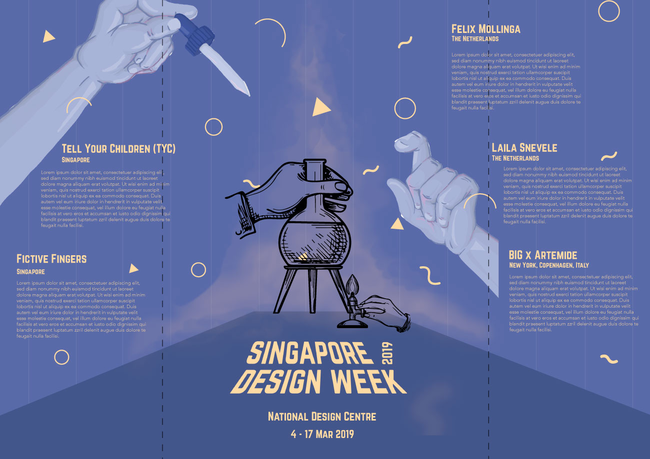
After settling the content to be placed in the brochure, what was left was putting them together to establish a flow of information. Already having the idea to keep the front and back simple and more mysterious, I tried to have a more dynamic layout on the inside to contrast against the front and better convey the ‘explosive’ graphics. However, it was not simple to work with long chunks of text, and their unequal placements, with the aim to keep the information easy to read and locate. It was also challenging in avoiding the fold lines to allow for easy readability. After playing around with the layout, from a more static composition, I moved the text blocks around and instead of having them all align with one another, I decided to place them in a manner similar to that of the patterns: compressed in the centre and more spaced out towards the edges, all in a radial layout instead of in vertical columns. This was a better method in helping to further enhance the concept and also gives a more dynamic, exciting, and contrasting composition to that in the front.
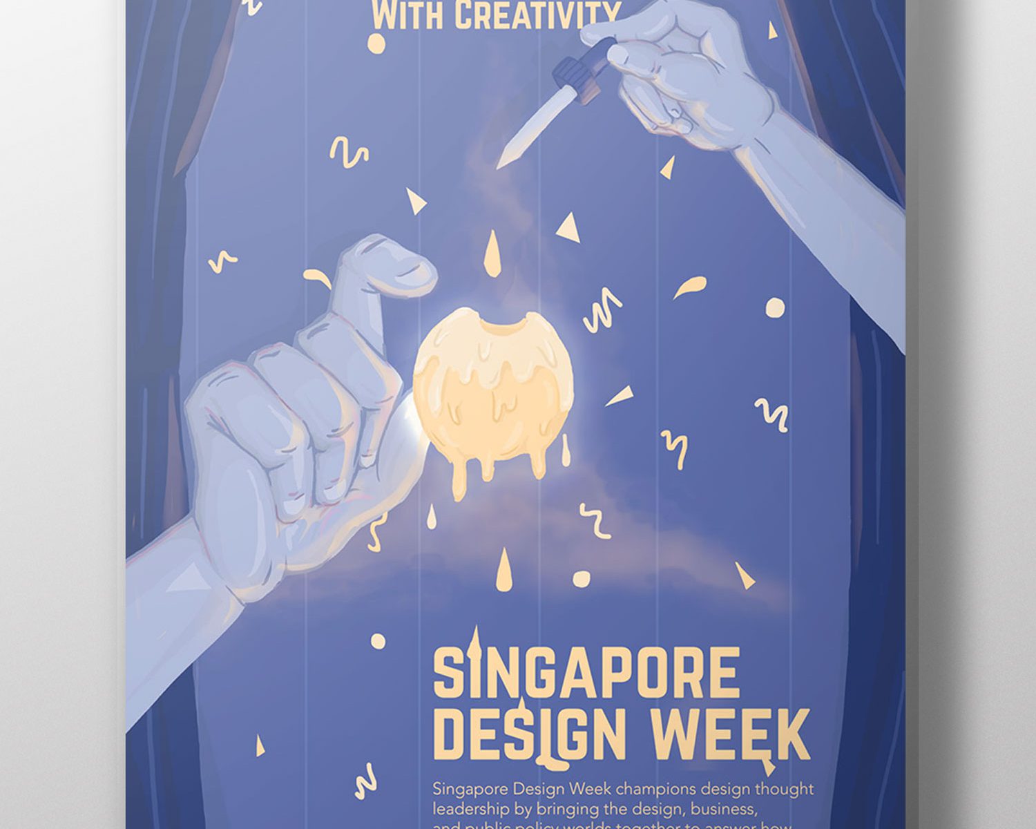
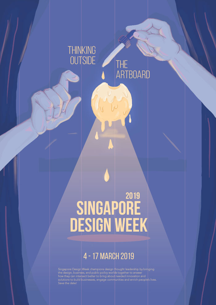
For this project, we were tasked to conceptualise and create an A2 poster for 2019’s Singapore Design Week, centred on a slogan.
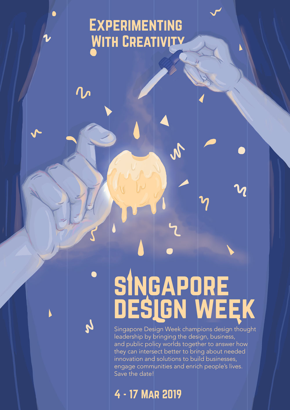
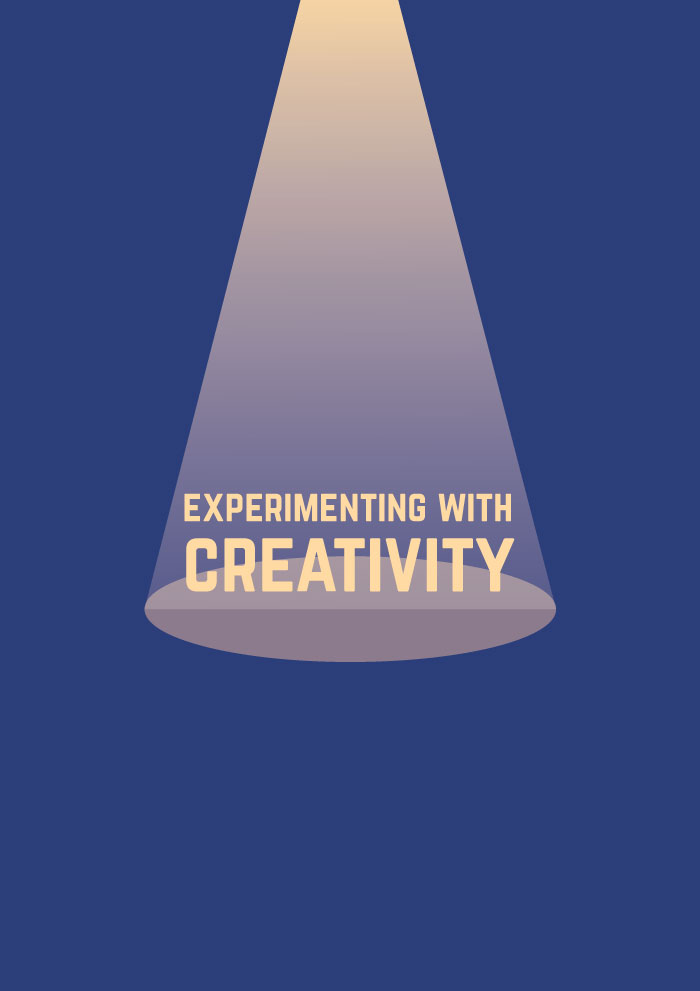
After visiting the National Design Centre which exhibited the evolution of design in Singapore over the past 50 years, I wanted to create a poster that conveyed and celebrated the creativity of the local design industry, focusing more on the products or designs that derived from experimentations or unconventional ideas. Following the slogan ‘Experimenting with Creativity’, the poster was meant to give off a mysterious and magical feeling; the pair of hands, with one holding a dropper, is adding a yellow droplet (conveying the idea of experimenting) into a mass of glowing yellow liquid (meant to represent creativity). The graphic conveys the idea of experimenting by indicating that the forming of the yellow mass, and the droplets being added to it, resulted in an explosion that created Singapore Design Week.
The layout of the poster is mostly centralised with the event details aligned slightly to the right. In an attempt to contrast against the centralised layout of the graphics and focal point, as well as considering the nature of the text (i.e. the block of text and important details), I tried to place the text in the bottom right hand corner, instead of right down the centre. Having the text in a central alignment also made the poster seem more like a movie poster instead of one advertising for an exhibition.
Considering the purpose of the poster (i.e. conveying details about Singapore Design Week), and the different levels of importance with each text, the text displayed in the poster vary by font, size, and placement to establish visual hierarchy. The important details such as the slogan and title, dates, and venue, have a different font from the short blurb – Norwester vs. Avenir Light. By using Norwester, a bolder choice in both structure and weight, and bigger in size, it emphasises the important details such as the slogan and event details. A lighter and smaller font such as Avenir Light complements the blurb, and displays it as non-crucial information.
The illustrations, on the other hand, vary in size and colour; having creativity represented by a ball of bright yellow mass fixated in the centre with an outer glow helps in capturing the attention of passers-by. The pale blue colour palettes of the other illustrations (the hands, curtains, and background) on the other hand, allows for a better contrast against the bright yellow mass and text. The difference in colour palette, size, and weight for more important and less important details therefore helps to establish visual hierarchy.
The poster’s visual hierarchy also intends for an easy flow of information, where the viewer would first view the yellow mass in the centre, followed by the slogan and event details, and then the rest of the poster (i.e. the other illustrations).
In an effort to convey the idea of an explosion from the yellow mass, I used simple shapes such as circles, triangles, and squiggles, being ejected from the centre. The shapes are more compressed in the centre and gradually spaces out as it reaches the edges – this helps in conveying the idea of motion, thereby establishing motion. The use of smoke also helps to reinforce movement upwards and sideways.
The project first began with conducting research on design in Singapore. By taking a field trip to the Fifty Years of Design exhibition at National Design Centre, we had to give our own interpretations on the evolution of design in Singapore.
For a more in-depth post about personal interpretations of design in Singapore, please visit: https://oss.adm.ntu.edu.sg/vwong005/page-and-communication-field-trip-to-ndc/?preview_id=1168&preview_nonce=b4ed77e164&_thumbnail_id=1232&preview=true
We also had to familiarise ourselves with poster-making by researching more about the elements to consider when making a poster, methods of establishing visual hierarchy in layouts, and aspects that make a good poster in layout, creativity, and legibility.
For a more in-depth post about poster analyses, please visit: https://oss.adm.ntu.edu.sg/vwong005/page-and-communication-visual-research/
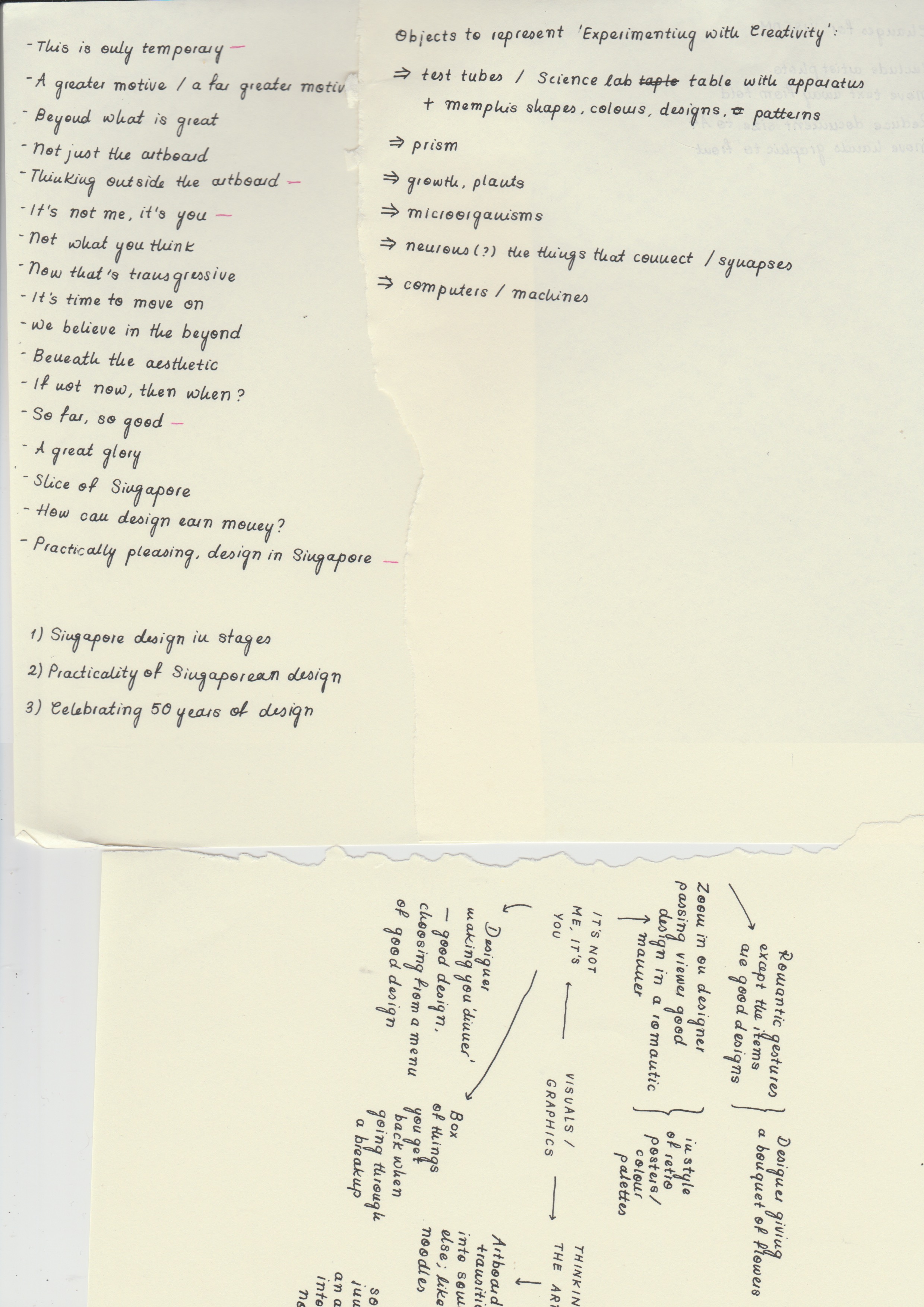
Conceptualising started with brainstorming for slogans, then sculpting our ideas around the chosen slogan. After visiting the exhibition, I came up with three main ideas that represented the design scene in a whole – the first one reinforcing the evolution of Singaporean design in specific stages, the second being designing with the intention of others in mind (e.g. caring for others, environmentally-friend products), and the last one celebrating experimentation and overall creativity.
For a more in-depth look into the approaches and the slogans, please visit: LINK
After coming up with slogans that supported these three main ideas, I brainstormed further and came up with interesting images and styles of illustration that could convey the idea better. Having difficulty in choosing a slogan, I decided to come up with rough sketches and layouts with different graphics and styles to see which would be most appropriate for Singapore Design Week and its target demographic.
Ultimately, after considerations and many changes, I decided to look into conveying the diversity and creativity in Singaporean design, with the slogan ‘Experimenting with Creativity’.
When formulating the drafts for the poster, I tried to keep these aspects in mind:
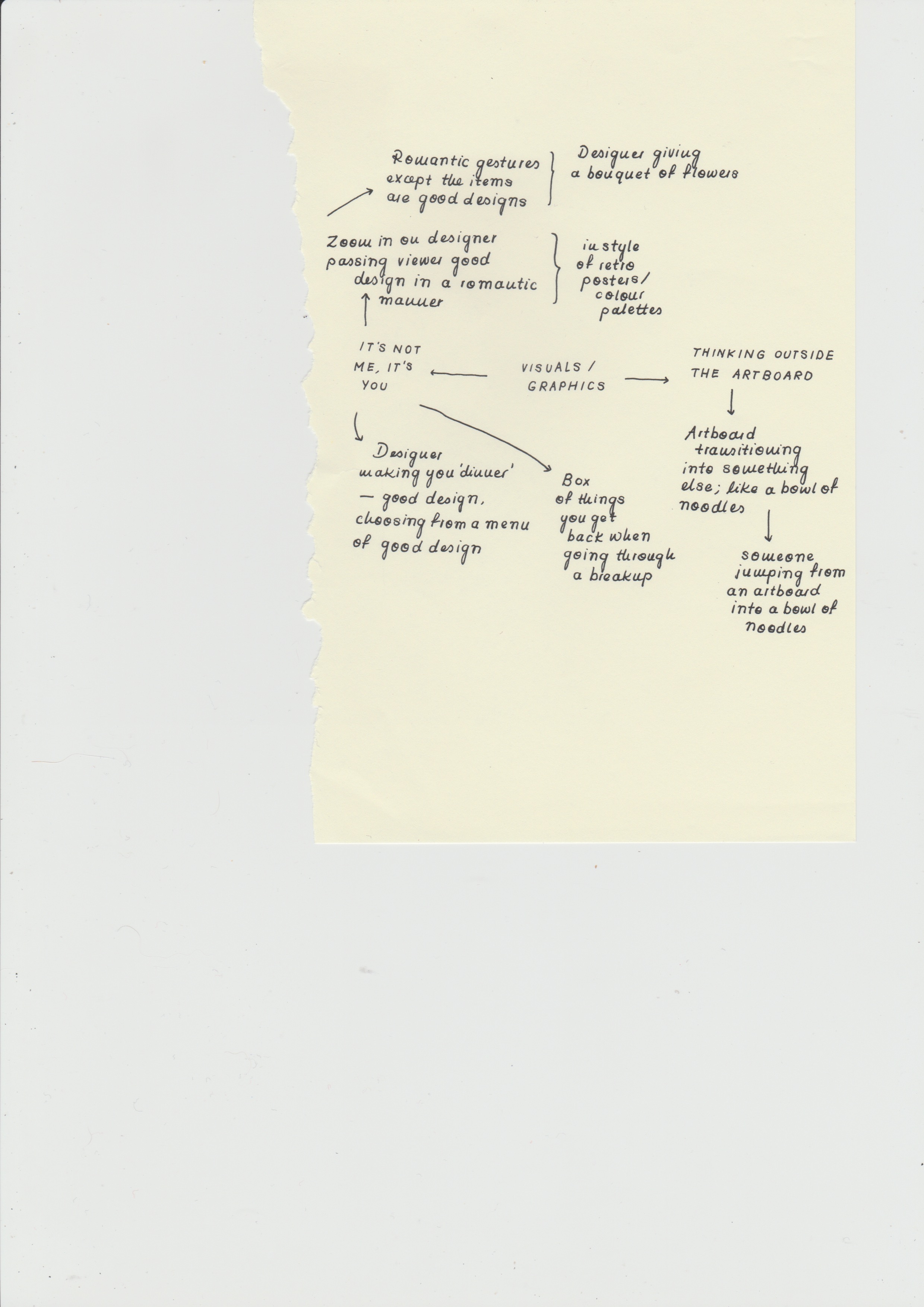
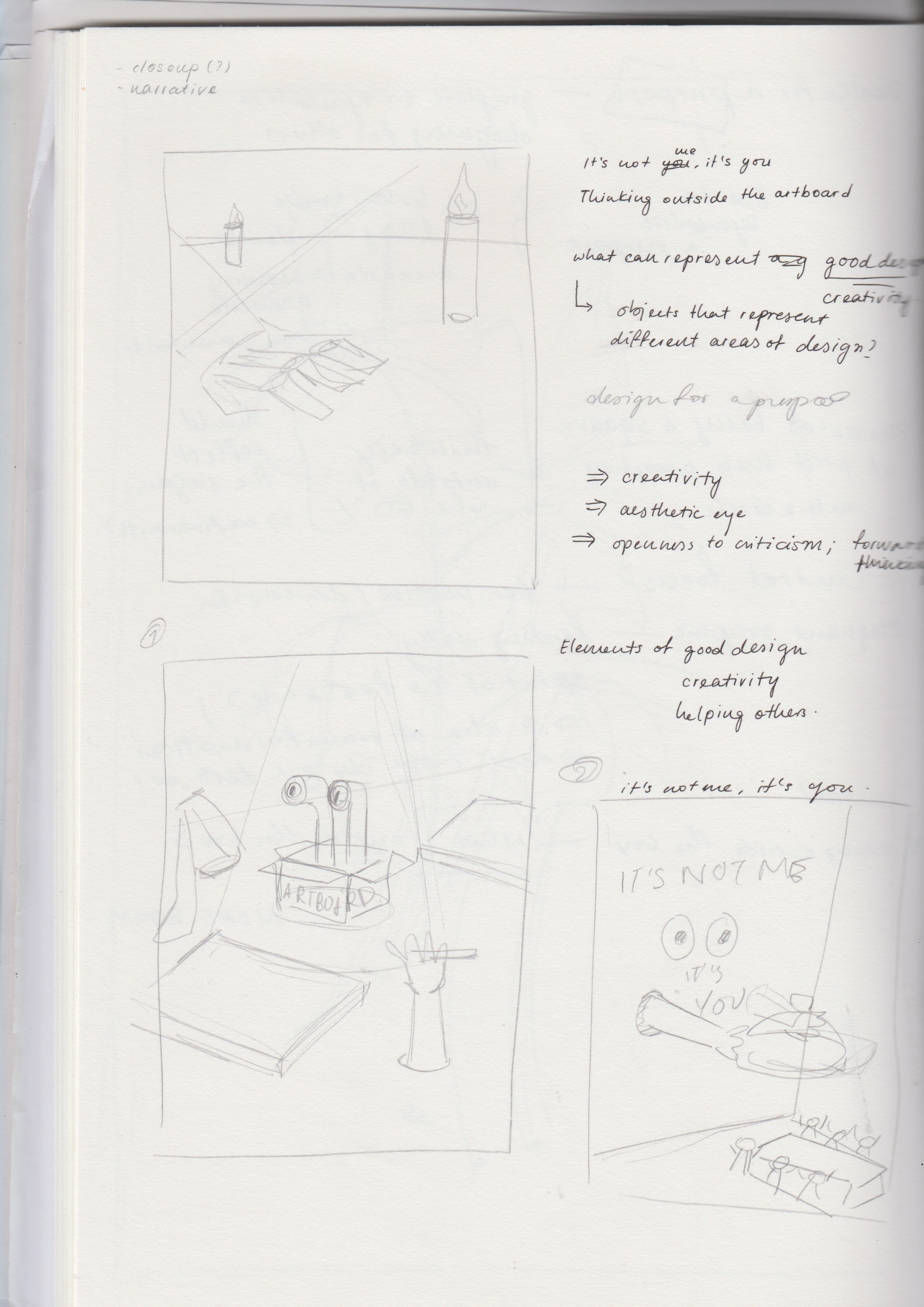
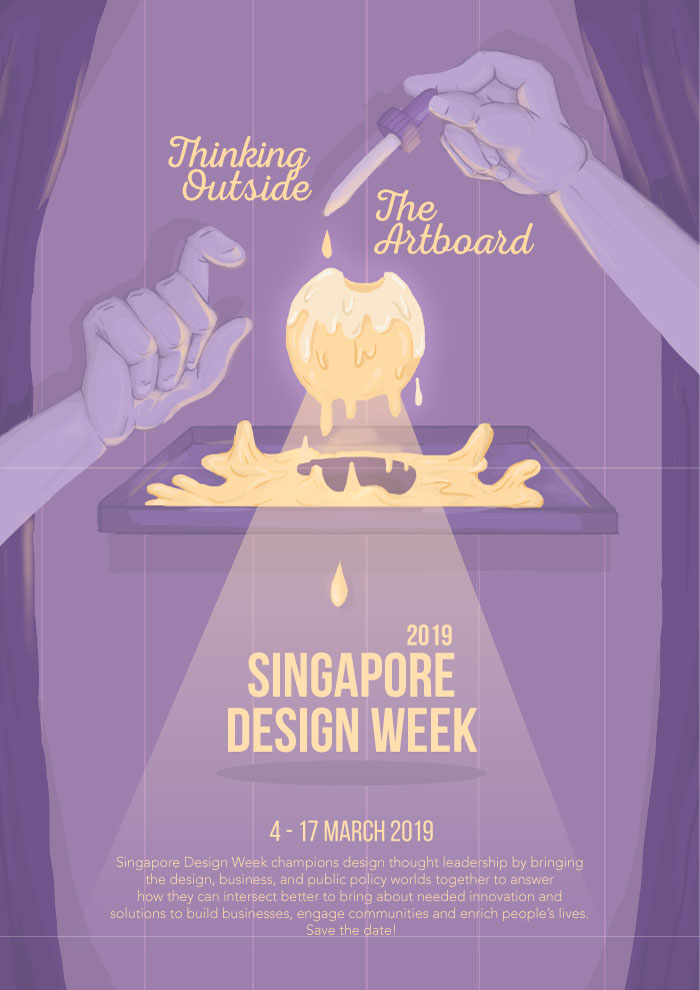
a. Thinking Outside the Artboard
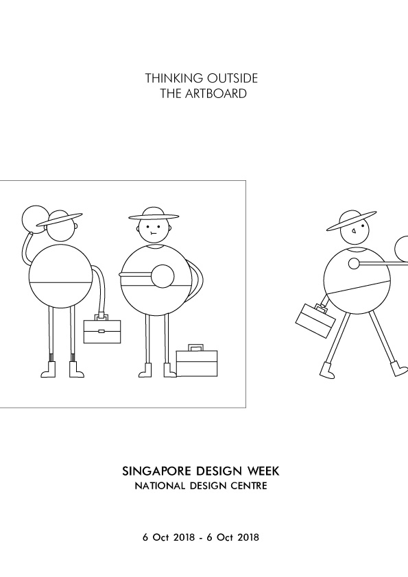
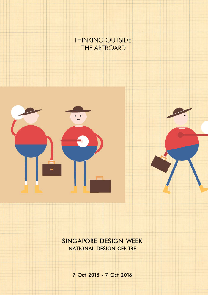
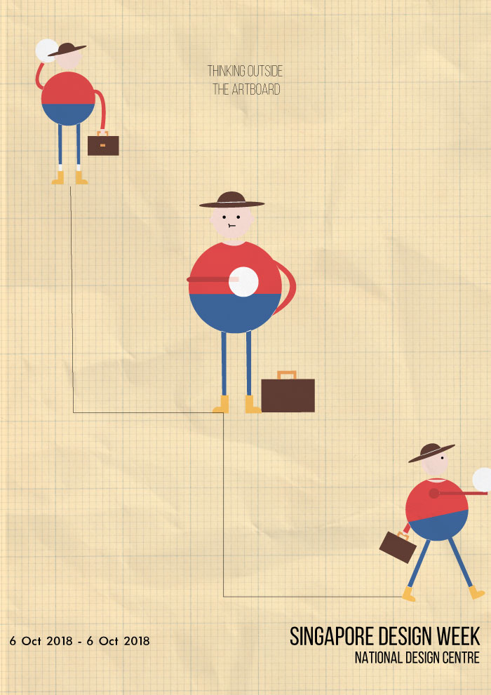
Elaborating further on the idea of celebrating the vastness of creativity in Singapore’s design industry, I came up with the slogan ‘Thinking Outside the Artboard’, meant to be a play on ‘thinking outside the box’, replacing the word ‘box’ with ‘artboard’, the canvas used in Adobe Illustrator. To convey this idea, I had a character taking a design from an artboard and taking it to the exhibition.
However, the design was not interesting or eye-catching enough, it was too flat. The graphic also did not effectively convey the idea, and the character seemed inappropriate for the Singapore Design Week demographic.
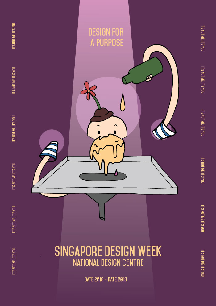
b. It’s Not Me, It’s You / Design For A Purpose
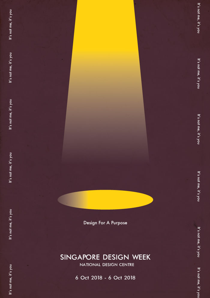
With the idea of designing for a purpose in mind, I came up with the slogan ‘Design For A Purpose’ or ‘It’s Not Me, It’s You’, and wanted to have the poster show some sort of romantic gesture, to be humorous but at the same time show how designing has a part to play in reaching out to different communities. For the first draft, I had a spotlight reflecting onto an object, with the slogans by the side. However, although it makes for an interesting layout and overall approach, I had difficulty in coming up with an image that embodied good design.
c. Further Explorations

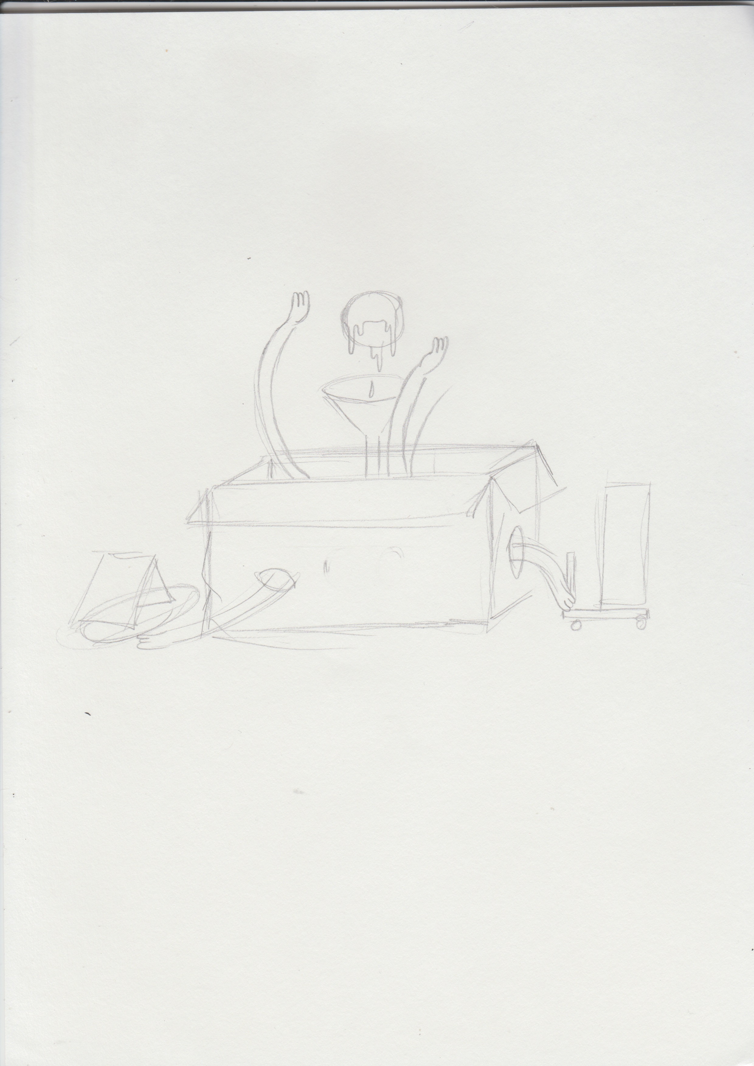

Expanding further on ‘Designing For A Purpose’, I tried to have the graphics convey a better idea of designing with a clear purpose – the posters consist of a designer character adding a droplet into a ball (meaning to represent creativity), the ball would then slowly leak into the funnel and onto a city, giving it life and adding some vibrancy to it.
The design however, did not really sit well with the whole idea of Singapore Design Week. The graphic would not be able to appeal to a wide demographic and the layout seemed like it would not allow for a better placement of text.
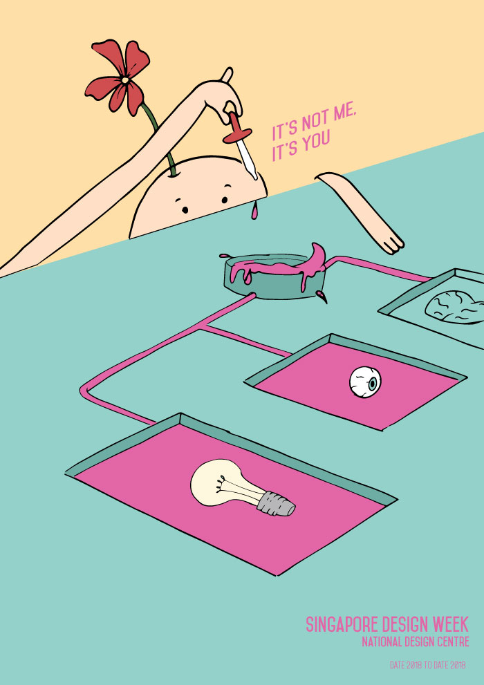
Similar to the previous design, the poster was supposed to convey the idea of designing for a purpose, with the creativity flowing through to different objects giving them colour. Although the colour choice was interesting, the graphic did not seem to complement the slogan and therefore, was ineffective in bringing forth the message.
Returning to how I could better convey the idea, I decided to change the slogan to ‘Experimenting with Creativity’, and adopt a style that could appeal to a wider demographic. Hoping to establish a mysterious and magical sort of feeling as a means to capture the attention of viewers, and emphasise the idea of creation and creativity, I played with contrast through colours and adding effects such as glows, smoke, and spotlights. The design comprises of hands dropping a yellow liquid onto a ball of glowing yellow mass. The liquid then flows onto a canvas and into the funnel, forming the words ‘Singapore Design Week’.
The design, however, gave a fairytale kind of mood and seemed more appropriate for theatrical productions. The shape of the canvas also disrupted the visual flow and raised even more questions about the graphic.
Keeping to the same direction, I adjusted the colour palette and text, as well as removed the canvas to establish a smoother visual flow. However, the graphics still did not manage to effectively convey the idea of creativity, and still felt quite static – it wasn’t able to stir excitement.
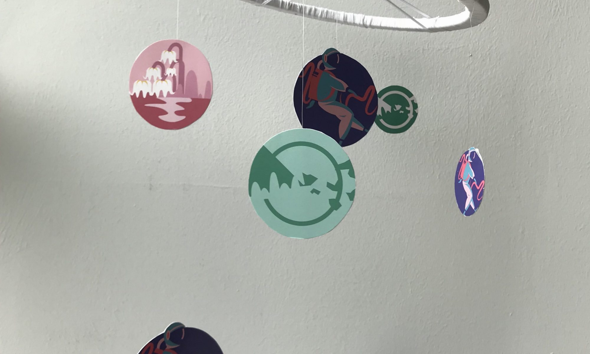
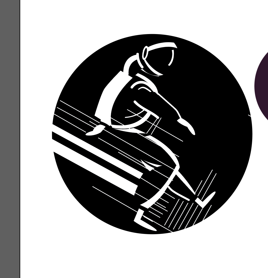
For our very first project in Visual Communications, we were tasked to create a mobile for a hospital that revolved around the theme of hope. The focus of the project involved designing graphic forms that used concepts pertaining to figure/ground relationships.
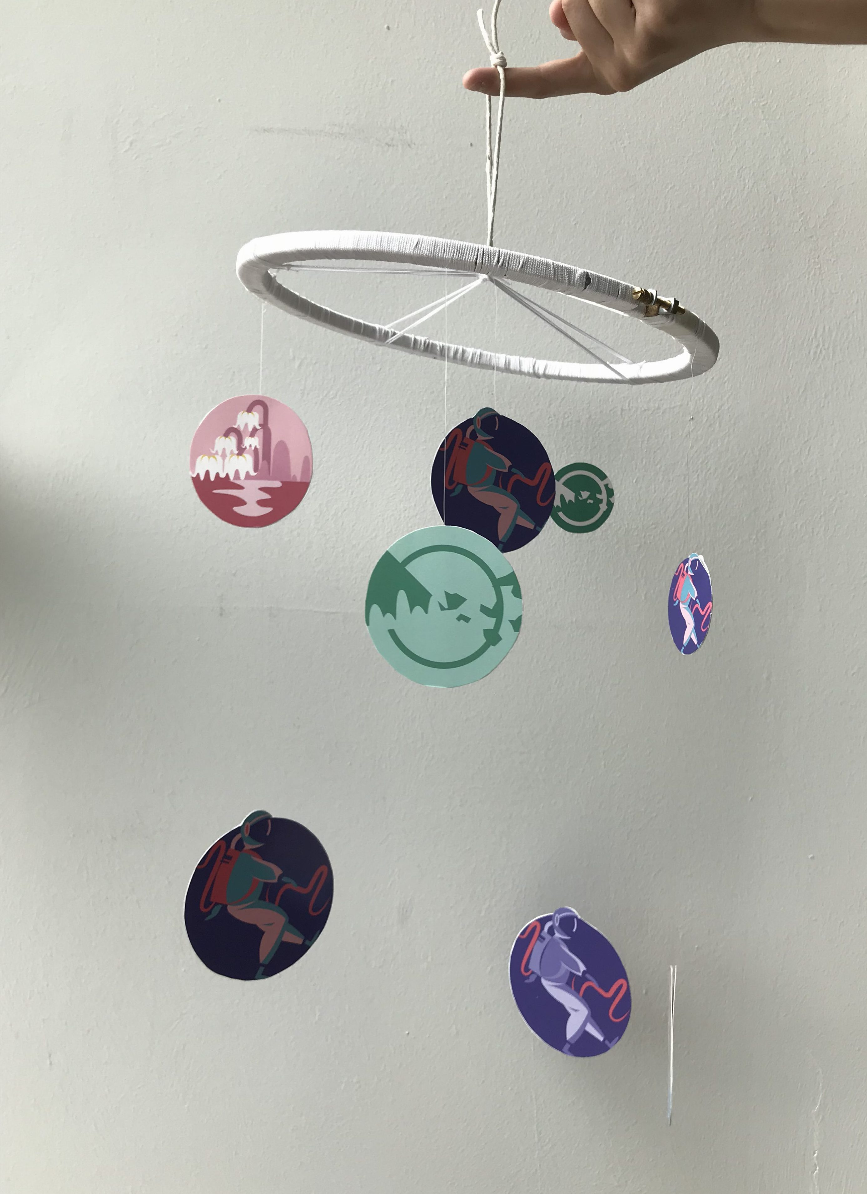
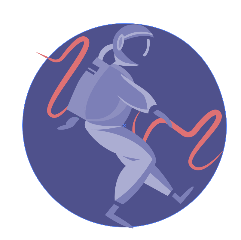
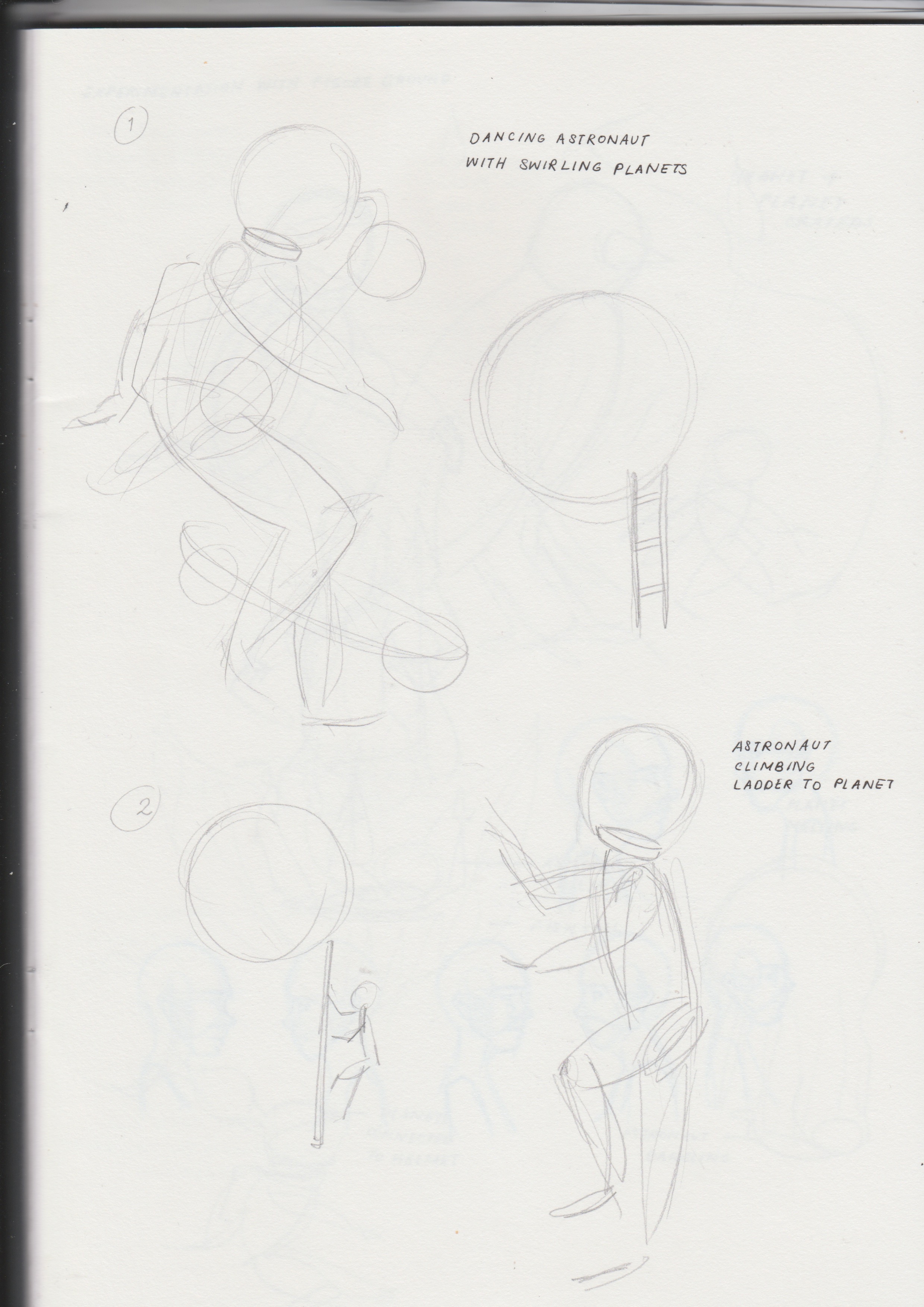
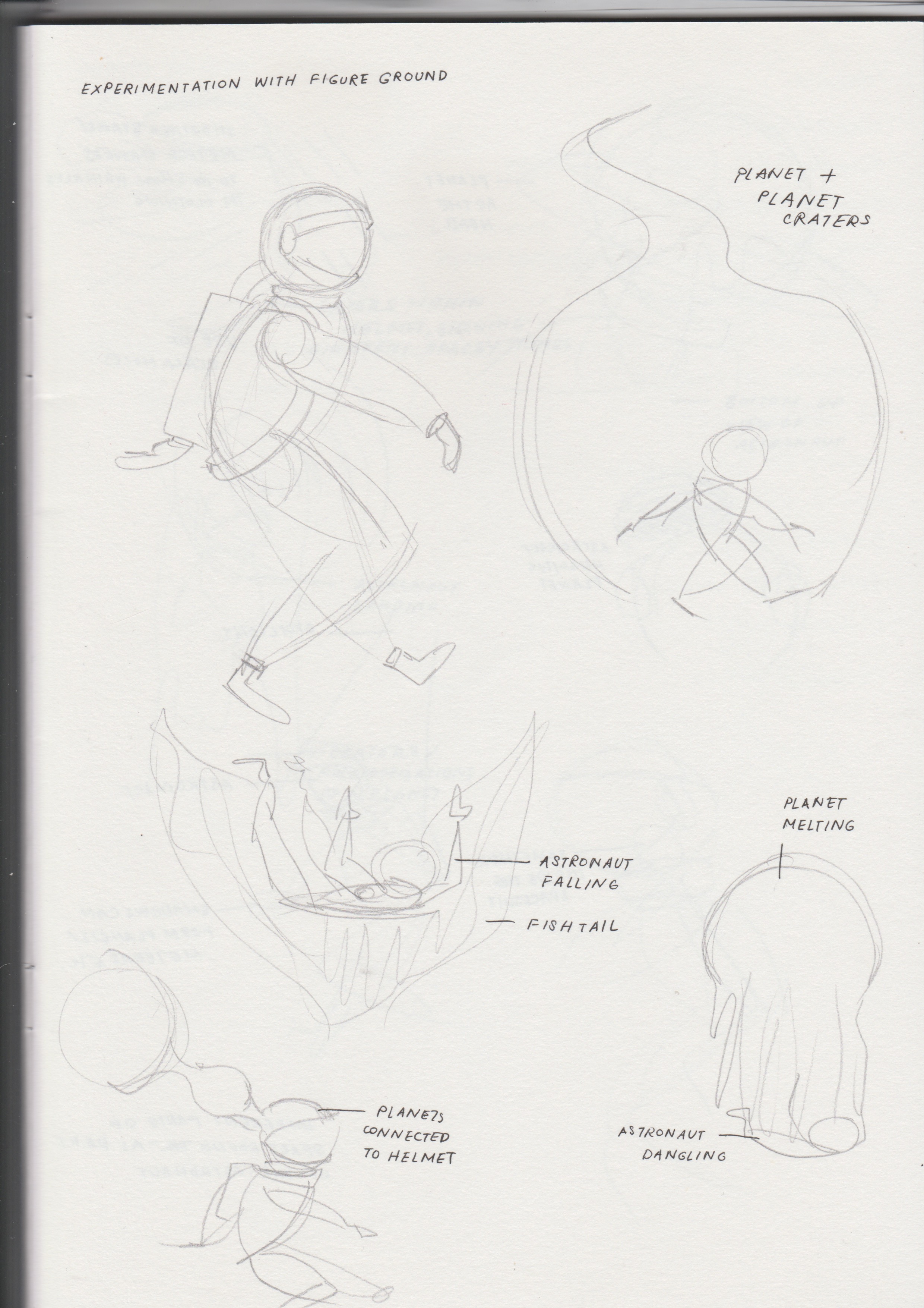
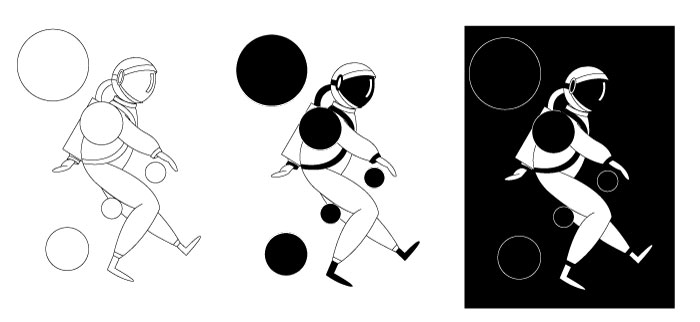
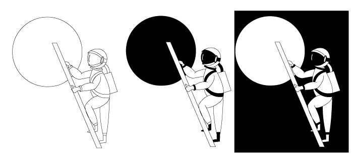
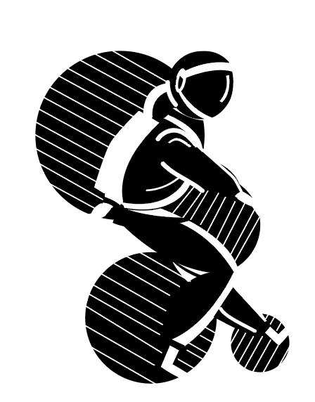
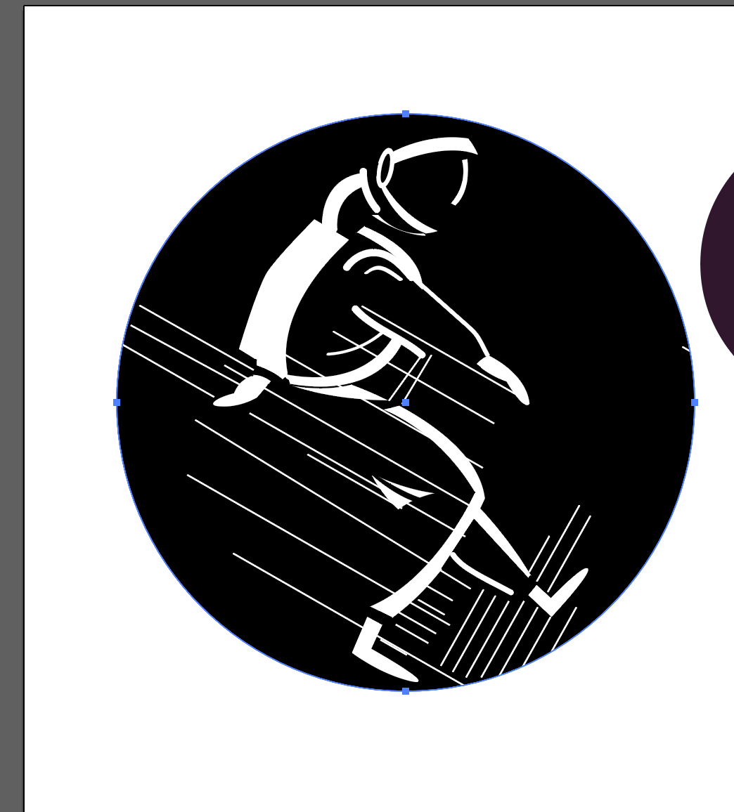
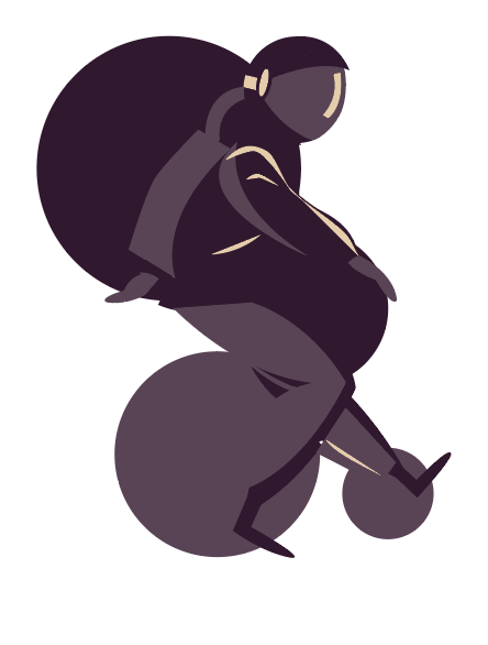
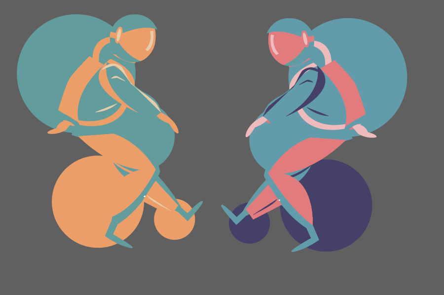
Keeping in mind the idea of hope, my final product (both the graphics and hanging structure) are based on the theme of outer space. Wanting to go in a more whimsical direction, I used astronauts and ‘planets of hope’ as content for the main graphics as I felt that it could appeal better to a wider demographic of both young and older patients.
Choice of Graphics
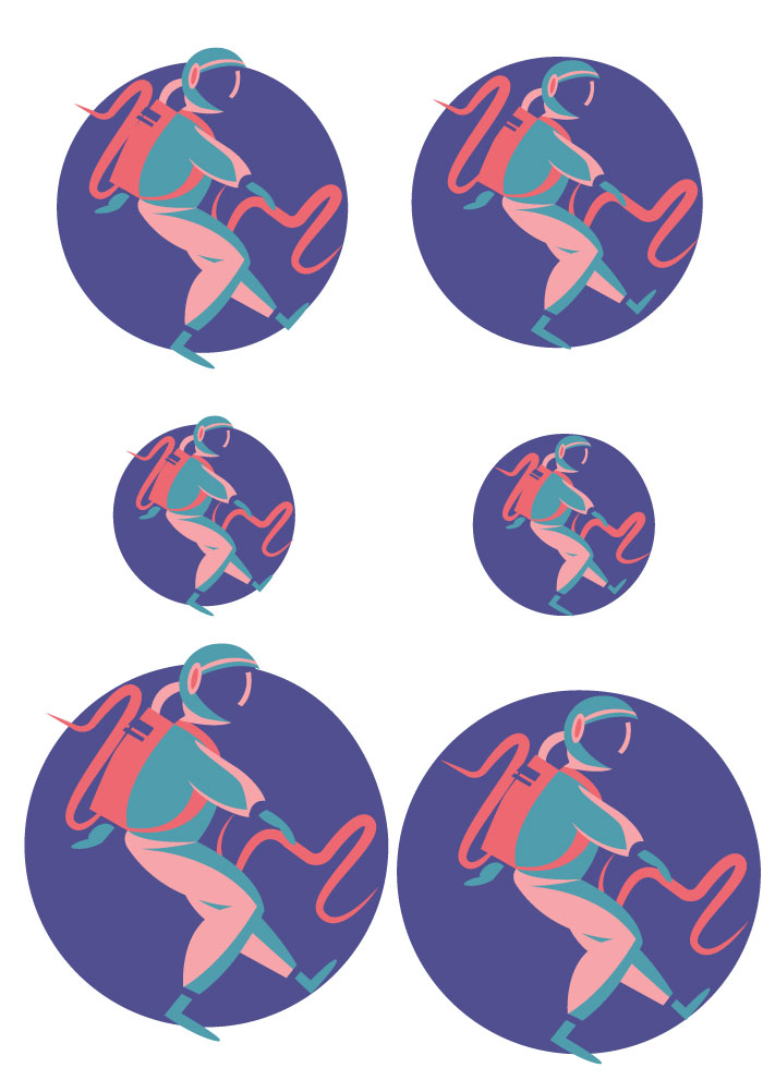
With regards to the concept, I chose to go with the theme of outer space with astronauts and ‘planets of hope’ helping to convey this idea as in my opinion, astronauts serve as a sign of hope – they are always on the search for new signs of life. With Michael’s help, the involvement of the ‘planets of hope’ expanded this concept, where it reinforced the idea of the astronaut being on the search of new life.
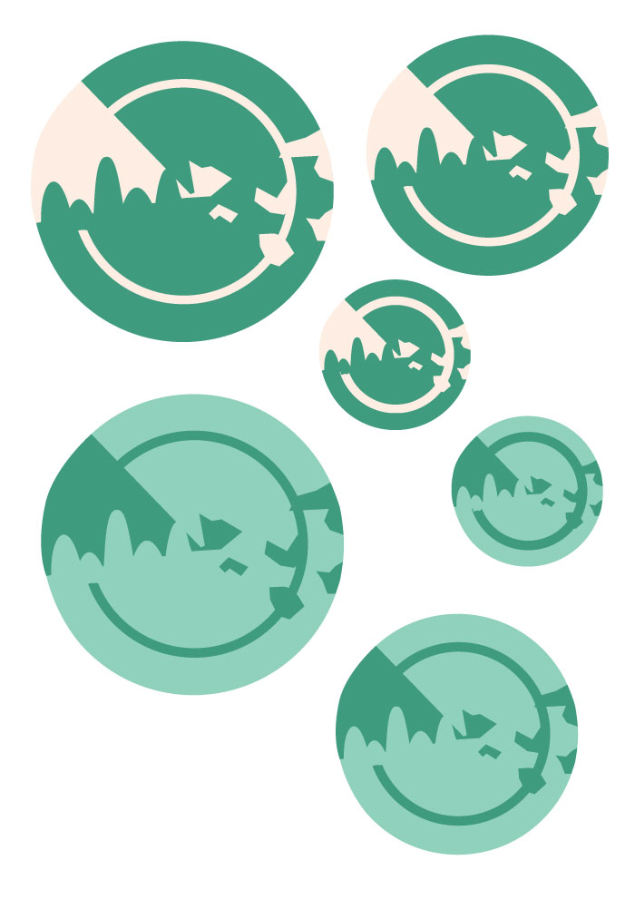
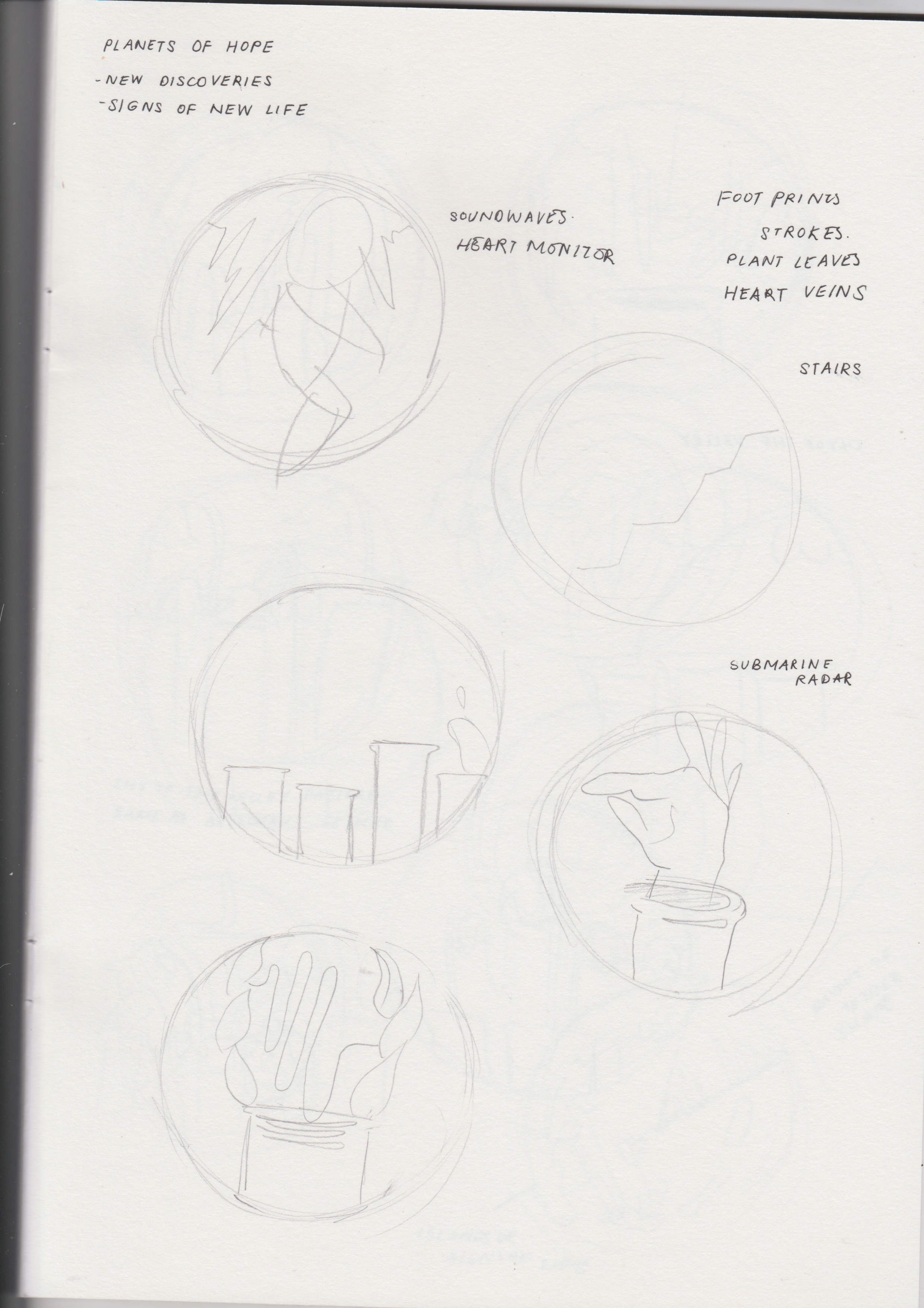
Wanting to convey the idea of hope in a more straightforward manner, the planets themselves have symbols of hope integrated into their forms.
For the first planet, the graphic features a valley with flowers – the flowers are meant to be Lilies of the Valley, a common type of spring flowers, and spring itself often being associated with hope, bringing about instances of new life. The second planet was also meant to convey hope as signs of new life. Inspired by the visuals and purpose of a submarine radar (where objects would appear as lit-up spots it), I thought it would be interesting to have a planet that showed the idea of objects appearing on a submarine radar. There was also the inclusion of curves and geometric shapes to represent rock formations.
To further reinforce the idea of new life, as well as finding a link to tie the three different graphics together, they all feature a wave in the background. It was meant to represent the bleeps in a heart rate monitor. The rises and dips in waves in the monitor indicates the presence of a heart beat, and therefore to me, is a symbol of life.
Placement of Graphics

The placement, on the other hand, was focusing on contrast between sizes, having a range of small, medium, and bigger graphics, with one in the centre.
Hanging Structure
Keeping in mind the theme of outer space, I wanted the physical structure to be circular as well (in-line with the circular shapes of the graphics). White yarn was used to cover the wooden structure to give it a softer and calmer feeling, and also prevent the colours from clashing with that of the graphics. Fishing line was used to hang the graphics.
Figure/Ground
One of the design principles applied was the use of figure/ground relationships. The graphics of the mobile were to be results of experimentation with figure-ground relationships and Gestalt theories (proximity, similarity, closure, good continuation, and common fate).
Figure and ground refers to a theory of the mind’s organising tendencies, in particular the way the human brain perceives physical form, distinguishing an object or form from its context or surroundings—a figure from its background.
If you see graphic design as a process of arranging shapes on a canvas, then you’re only seeing half of what you work with. The negative space of the canvas is just as important as the positive elements that we place on the canvas.
Trying to experiment with methods of closure, where the figures seemed complete although their forms were not, the figures were an integration of positive and negative space. Mostly used in the astronaut and submarine radar graphics, I tried to use the background to help fill in gaps left by the positive form (e.g. the helmet in the astronaut and the rock formations in the submarine radar).
As for the flowers, I wanted to try methods of good continuation, where an intersection between two or more objects makes it seem as though it is a single uninterrupted object. Seeing the possibility of creating a continuous flow between the shapes of hills and petals of the Lilies of the Valley, I used the layout of waves in a heart rate monitor to create a flow between the two, attempting to form a smooth continuation, thereby seemingly forming a single shape.
Contrast
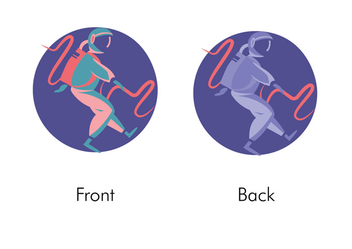
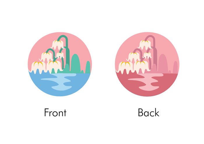
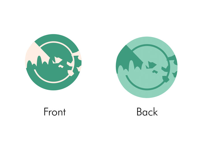
I also wanted the graphics to play with the idea of contrast. I felt that a contrasting colour palette will help to bring out the shapes better amongst one another, and allows for a brighter and more vibrant composition. Contrast in colour was used within different shapes of the graphic, as well as in the front and the back; a wider range of colours were used in the front while monochromatic colours were used in the back.
The process first began with conceptualising, where we were to come up with our own interpretations of what hope is.
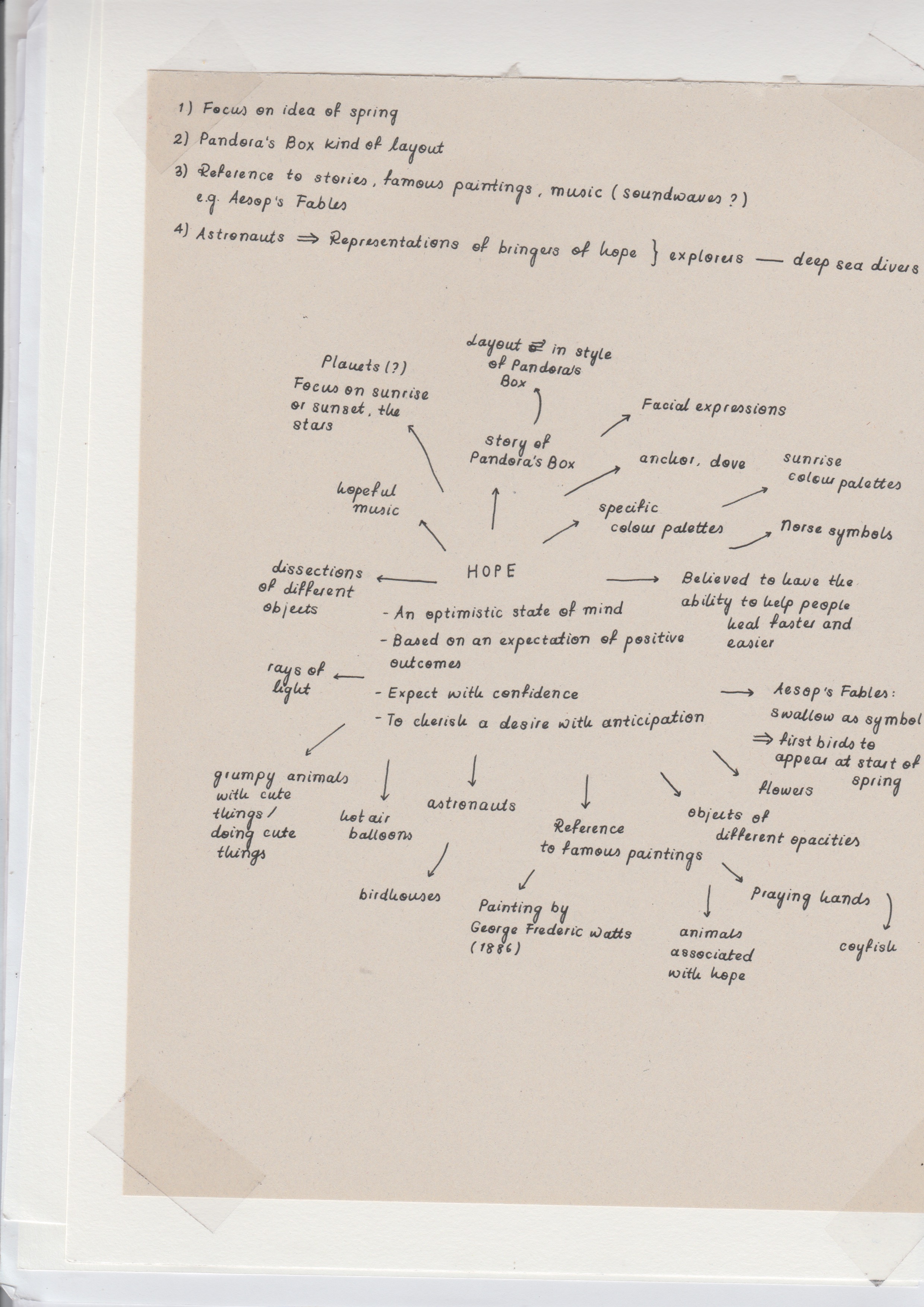
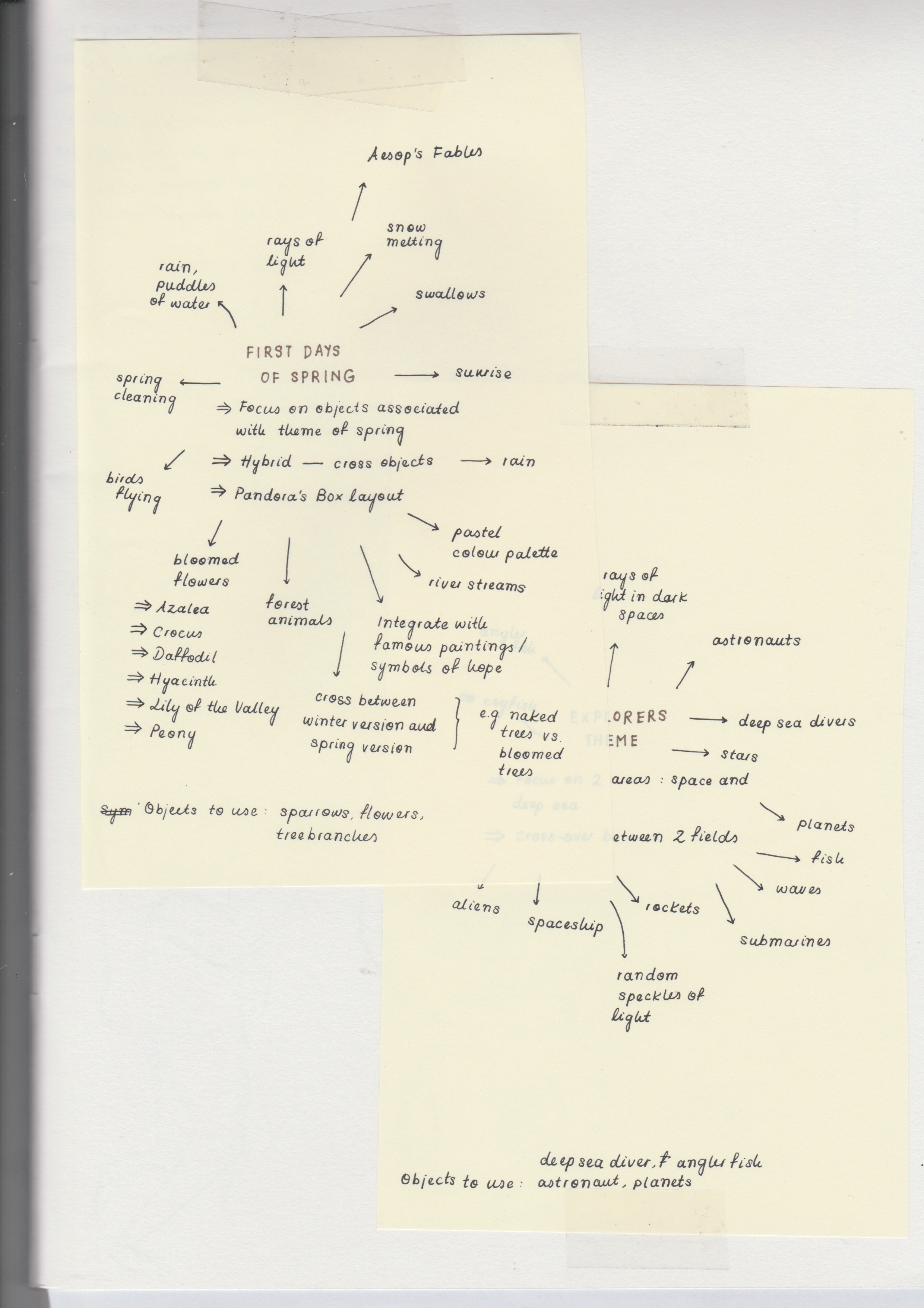
After brainstorming all the symbols and objects typically associated with the idea of hope, I categorised these objects into sub-themes: spring, fairytales (i.e. Pandora’s Box), and outer space.
In addition to finding objects typically associated with hope and further developing the three finalised concepts, I wanted to research more into methods of experimenting with figure-ground. Coming across Gestalt principles such as proximity, similarity, closure, good continuation, and common fate, I thought I could use them as bases in forming the graphics.
Looking at more reference images also helped in seeing how else I could play with the positive and negative spaces, and the shapes I could use to convey the elements I wanted to use.
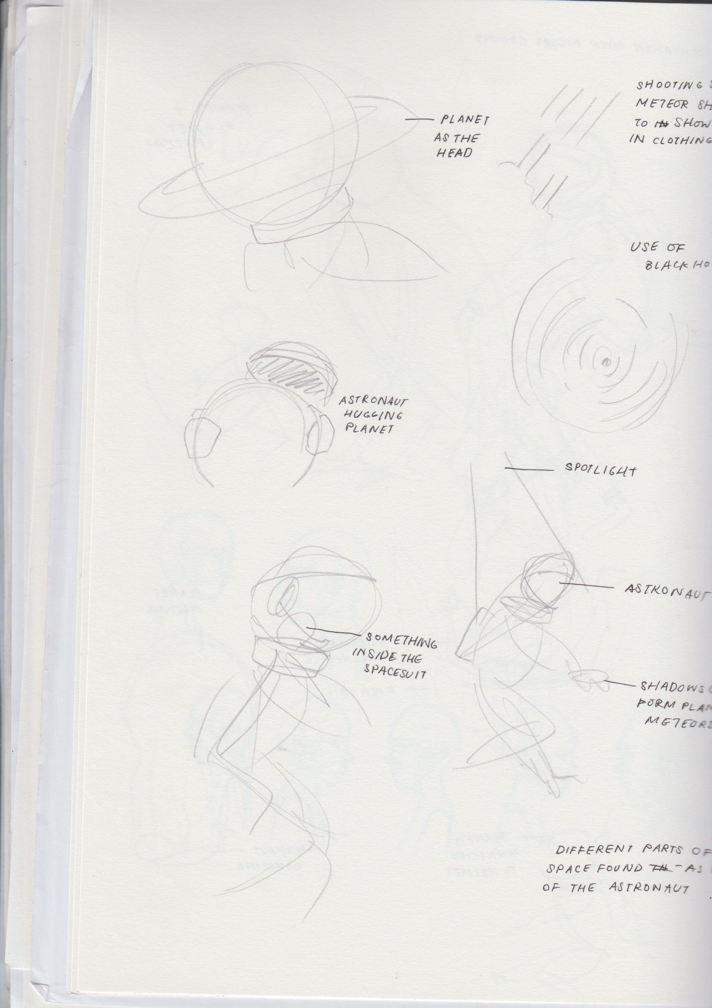

After brainstorming on the theme of hope and figuring out the elements we wanted to include in the graphics, we practised taking the illustrative elements out of them and drew contour shapes, and how they would look like in both positive and negative forms.
After receiving feedback on how I could improve the graphics – using more shapes instead of lines – we had another round of group feedback where we finalised the graphics we were going to use and further developments into figure-ground relationships.
The addition of colour was then looked into. Inspired by some bright pastel colour palettes in the reference image below, I thought using such colours was effective in conveying the idea of hope as something vibrant but at the same time, remained calm and peaceful.
After receiving feedback on the darkness and dullness of the chosen colour palette, I decided to go with something a little brighter and draws more contrast. Ultimately, I decided on this final colour palette.
After printing and cutting the graphics out, it was time to fix the hanging structure. At first, I used thinner wires that were covered with thread; after coiling them with one another in an effort to make them thicker and sturdier, the entire structure did not look appealing and was still not able to hold up on its own with the hanging graphics.
The second attempt therefore, consisted of using a wooden embroidery ring and coiling white yarn around it over and over again until the wooden parts were completely covered. The yarn made it have a softer exterior and seemed to give the entire structure a look better-suited for a hospital. However, with the metal bolts screwed onto the side of the structure, hanging it on its own made it topple to one side and therefore, the placement of graphics had to lean more onto the opposite side to make it balance.
One of the main challenges I faced in this project was the use of figure-ground concepts. More familiar with seeing graphics in their complete and literal forms, I had difficulty in experimenting with positive and negative spaces and in the end, my graphics ended up looking more illustrative then the supposed abstract shapes and forms. Furthermore, I felt that I could have been a little more imaginative with the background instead of using just a circle.
https://www.smashingmagazine.com/2014/05/design-principles-space-figure-ground-relationship/
https://www.artsy.net/article/editorial-decoding-artspeak-figure-and-ground
https://en.wikipedia.org/wiki/Principles_of_grouping
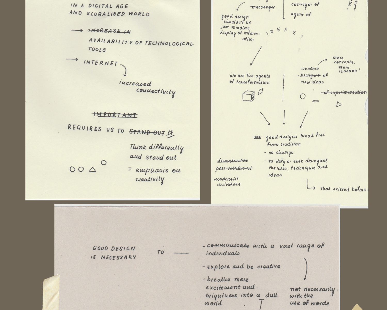
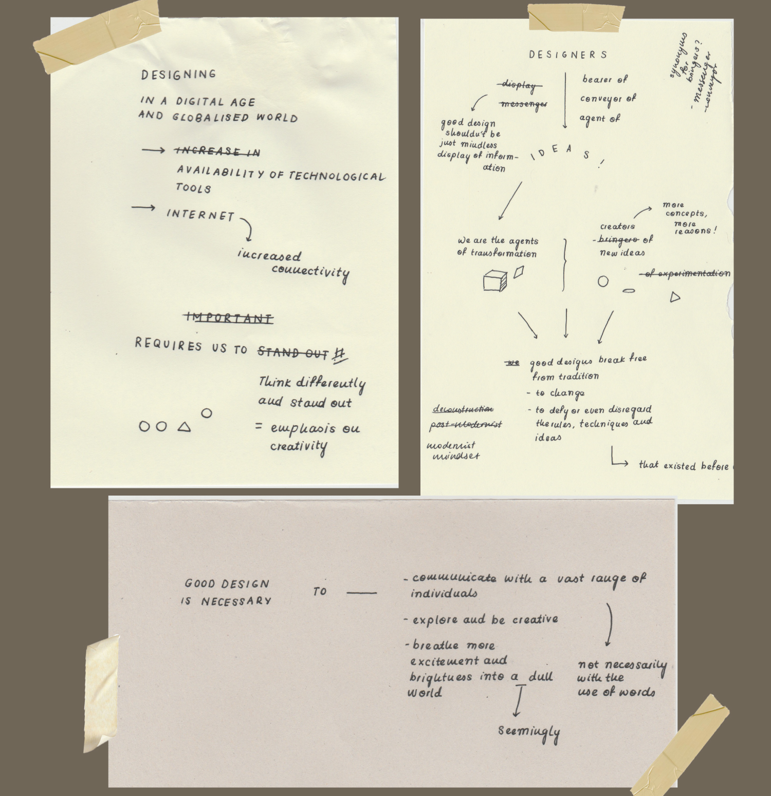
The Manifesto reads:
“Designing in the digital age and a globalised world, with the availability of technological tools and the Internet (increasing connectivity), requires us to think differently and stand out, putting an emphasis on creativity.”
“Designers are therefore, bearers / conveyors / agents of ideas (good design shouldn’t be just mindless displays of information. We are the agents of transformation, the creators of new ideas (more concepts, more reasons). Therefore, good designs break free from tradition – to change, to defy or even disregard the rules, techniques, and ideas that existed before us.”
“Good design is necessary to communicate with a vast range of individuals (not necessarily with the use of words), explore and be creative, and breathe more excitement and brightness into a seemingly dull world.”
The manifesto drew inspiration from the Modernism movement, where artists around the world began to use new imagery, materials and techniques to create artworks that they felt better reflected the realities and hopes of modern societies. I thought the notion of experimenting and exploring with new techniques and tools, which eventually brought about new movements, was inspiring and should be practised more in design.
The manifesto was hand-written on torn pieces of paper from different notebooks, with scribbles and cancellations, to better reflect the emphasis on the brainstorming and experimentation stages of designing.