Project 2 | Page and Communication

Page and Communication

For this project, we were tasked to conceptualise and create an A2 poster for 2019’s Singapore Design Week, centred on a slogan.
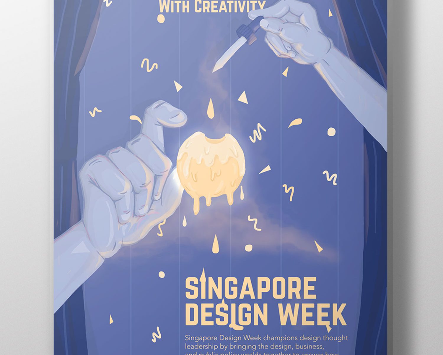
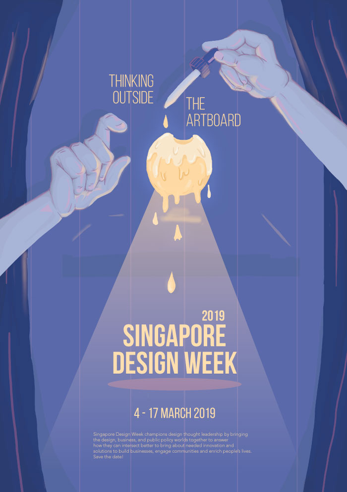
Final Product

Image of final poster
Concept

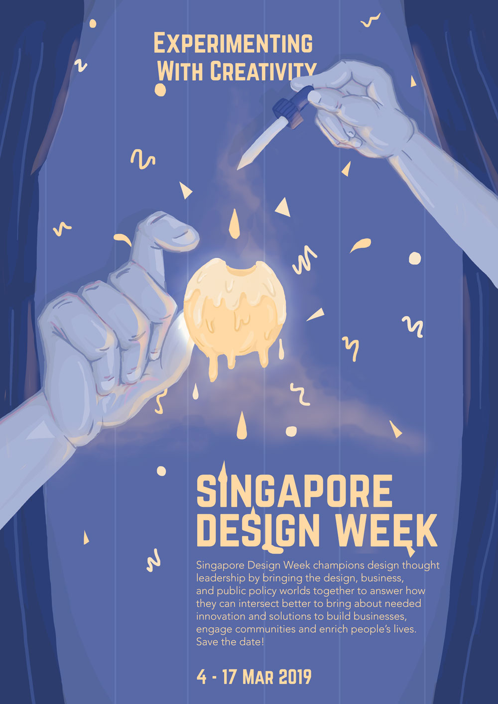
After visiting the National Design Centre which exhibited the evolution of design in Singapore over the past 50 years, I wanted to create a poster that conveyed and celebrated the creativity of the local design industry, focusing more on the products or designs that derived from experimentations or unconventional ideas. Following the slogan ‘Experimenting with Creativity’, the poster was meant to give off a mysterious and magical feeling; the pair of hands, with one holding a dropper, is adding a yellow droplet (conveying the idea of experimenting) into a mass of glowing yellow liquid (meant to represent creativity). The graphic conveys the idea of experimenting by indicating that the forming of the yellow mass, and the droplets being added to it, resulted in an explosion that created Singapore Design Week. 

Techniques applied
I. Alignment

The layout of the poster is mostly centralised with the event details aligned slightly to the right. In an attempt to contrast against the centralised layout of the graphics and focal point, as well as considering the nature of the text (i.e. the block of text and important details), I tried to place the text in the bottom right hand corner, instead of right down the centre. Having the text in a central alignment also made the poster seem more like a movie poster instead of one advertising for an exhibition. 

II. Hierarchy & Contrast

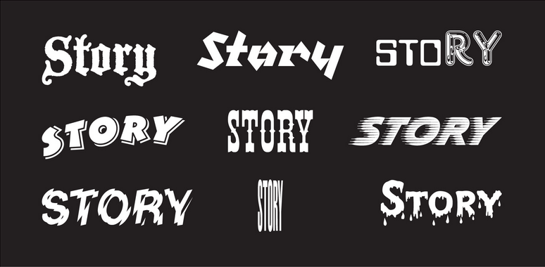
Considering the purpose of the poster (i.e. conveying details about Singapore Design Week), and the different levels of importance with each text, the text displayed in the poster vary by font, size, and placement to establish visual hierarchy. The important details such as the slogan and title, dates, and venue, have a different font from the short blurb – Norwester vs. Avenir Light. By using Norwester, a bolder choice in both structure and weight, and bigger in size, it emphasises the important details such as the slogan and event details. A lighter and smaller font such as Avenir Light complements the blurb, and displays it as non-crucial information.

The illustrations, on the other hand, vary in size and colour; having creativity represented by a ball of bright yellow mass fixated in the centre with an outer glow helps in capturing the attention of passers-by. The pale blue colour palettes of the other illustrations (the hands, curtains, and background) on the other hand, allows for a better contrast against the bright yellow mass and text. The difference in colour palette, size, and weight for more important and less important details therefore helps to establish visual hierarchy.

The poster’s visual hierarchy also intends for an easy flow of information, where the viewer would first view the yellow mass in the centre, followed by the slogan and event details, and then the rest of the poster (i.e. the other illustrations). 

III. Movement

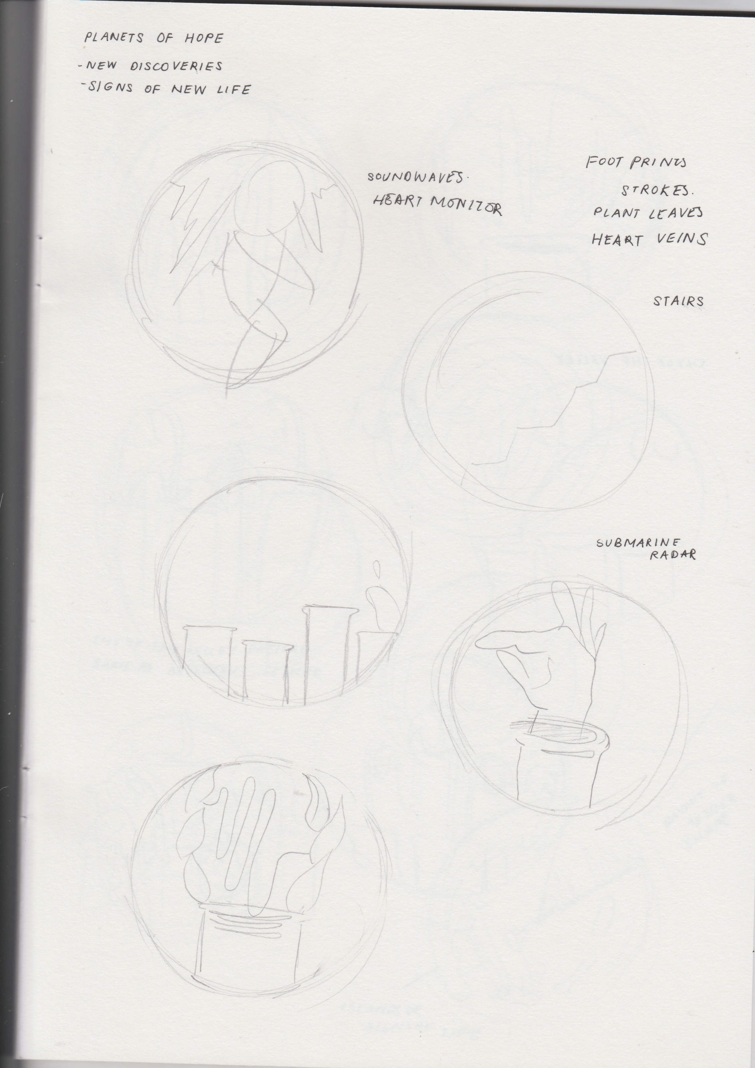
In an effort to convey the idea of an explosion from the yellow mass, I used simple shapes such as circles, triangles, and squiggles, being ejected from the centre. The shapes are more compressed in the centre and gradually spaces out as it reaches the edges – this helps in conveying the idea of motion, thereby establishing motion. The use of smoke also helps to reinforce movement upwards and sideways.

Research & Process

Research

The project first began with conducting research on design in Singapore. By taking a field trip to the Fifty Years of Design exhibition at National Design Centre, we had to give our own interpretations on the evolution of design in Singapore.  

For a more in-depth post about personal interpretations of design in Singapore, please visit: https://oss.adm.ntu.edu.sg/vwong005/page-and-communication-field-trip-to-ndc/?preview_id=1168&preview_nonce=b4ed77e164&_thumbnail_id=1232&preview=true

We also had to familiarise ourselves with poster-making by researching more about the elements to consider when making a poster, methods of establishing visual hierarchy in layouts, and aspects that make a good poster in layout, creativity, and legibility. 

For a more in-depth post about poster analyses, please visit: https://oss.adm.ntu.edu.sg/vwong005/page-and-communication-visual-research/

process
I. Conceptualisation

Conceptualising started with brainstorming for slogans, then sculpting our ideas around the chosen slogan. After visiting the exhibition, I came up with three main ideas that represented the design scene in a whole – the first one reinforcing the evolution of Singaporean design in specific stages, the second being designing with the intention of others in mind (e.g. caring for others, environmentally-friend products), and the last one celebrating experimentation and overall creativity. 

For a more in-depth look into the approaches and the slogans, please visit: LINK

Brainstorming for graphics

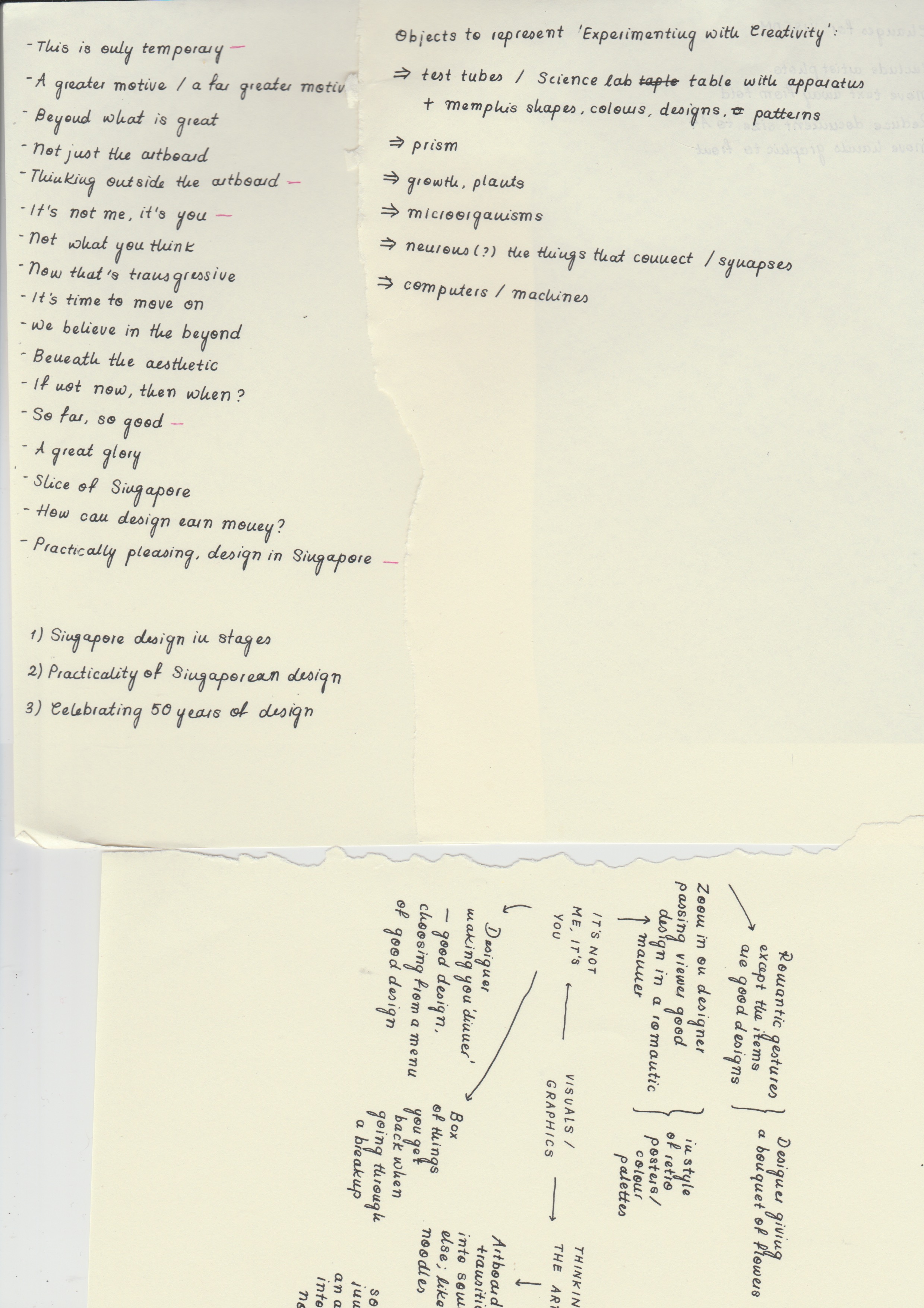
After coming up with slogans that supported these three main ideas, I brainstormed further and came up with interesting images and styles of illustration that could convey the idea better. Having difficulty in choosing a slogan, I decided to come up with rough sketches and layouts with different graphics and styles to see which would be most appropriate for Singapore Design Week and its target demographic. 

Ultimately, after considerations and many changes, I decided to look into conveying the diversity and creativity in Singaporean design, with the slogan ‘Experimenting with Creativity’. 

II. Building on Slogans
Sketches for possible graphics

When formulating the drafts for the poster, I tried to keep these aspects in mind:

  • The imagery used should reflect the slogan effectively
  • Legibility is important – the text should be easy to locate and read
  • The graphics should be eye-catching, appropriate for the target demographic, and able to easily capture the attention of passers-by and at the same time, reflect good craftsmanship and technique 
  • Reflecting a harmonious and balanced colour palette and overall layout of both text and graphics
  • The ability in establishing an overall emotion or mood

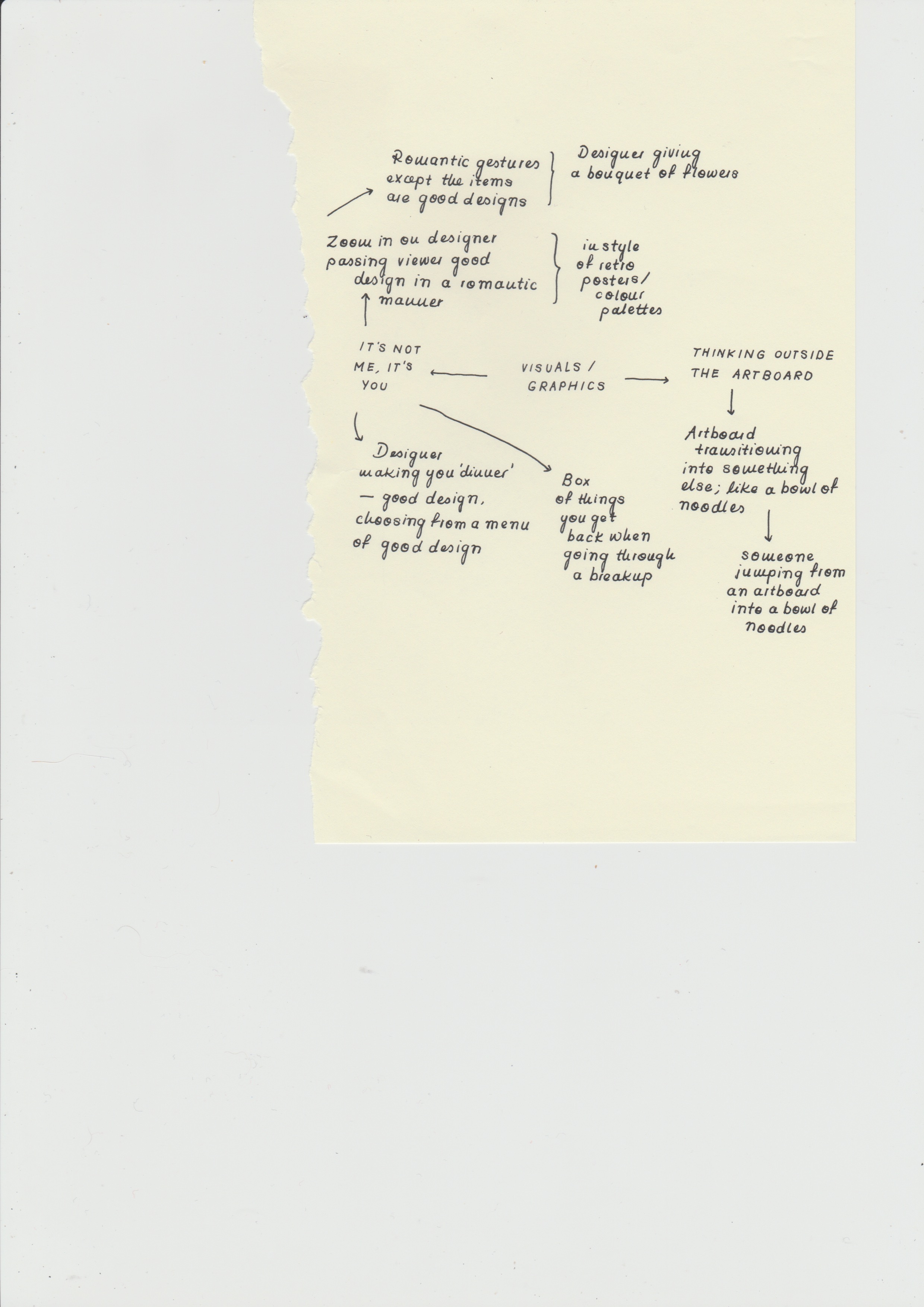
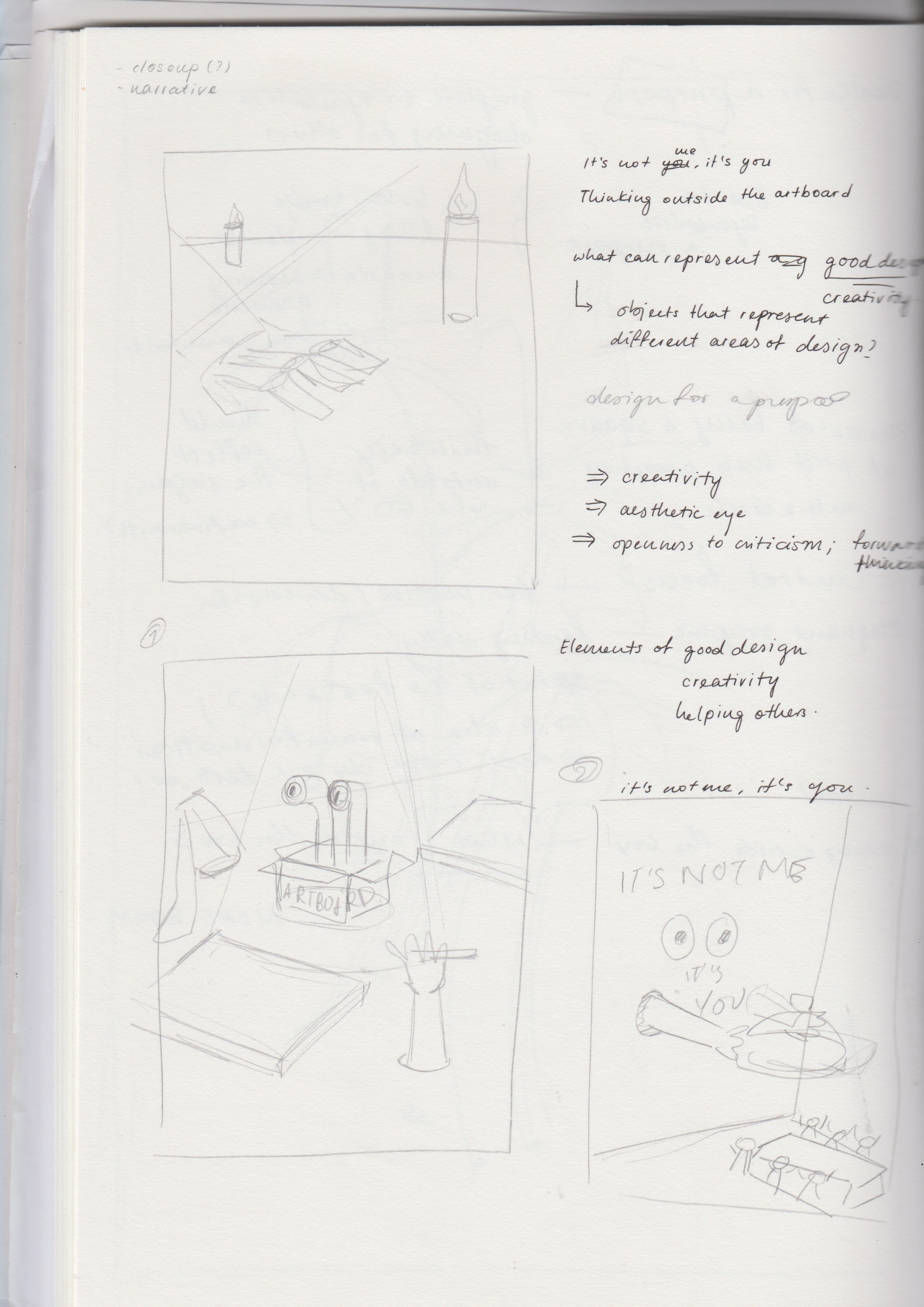
a. Thinking Outside the Artboard

Image of draft: Thinking Outside the Artboard

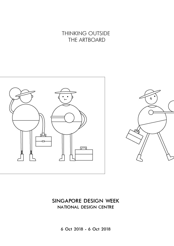
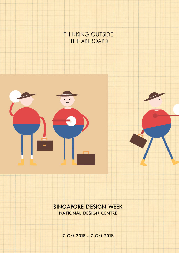
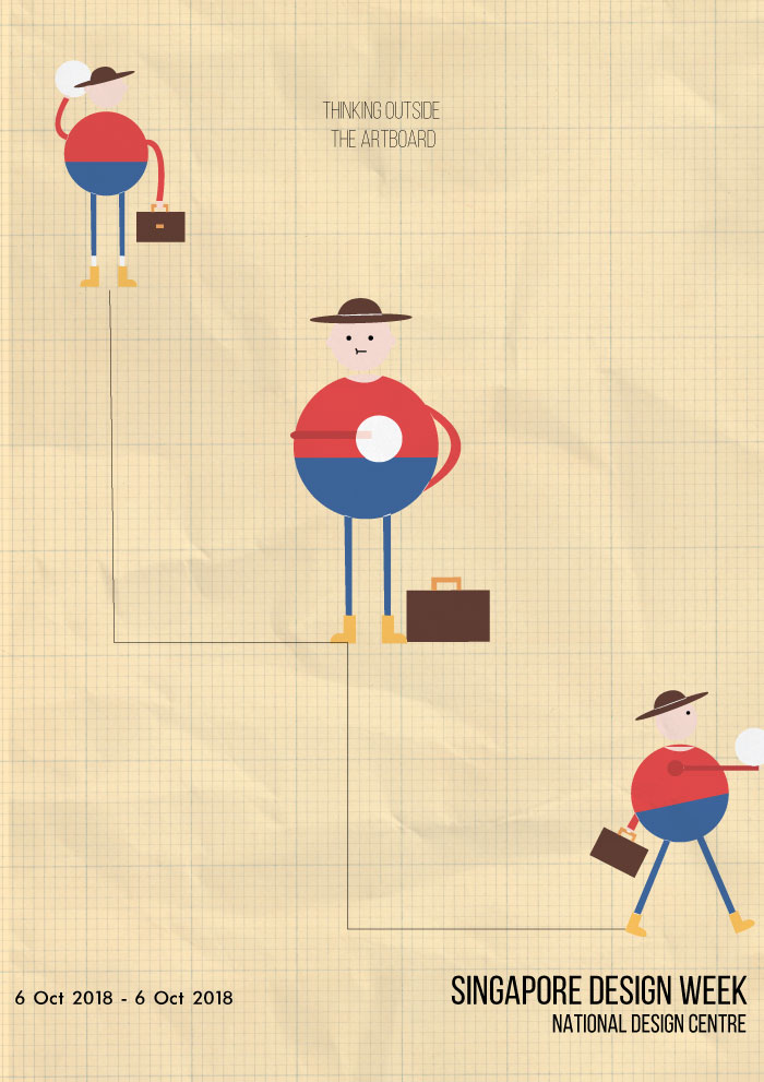
Elaborating further on the idea of celebrating the vastness of creativity in Singapore’s design industry, I came up with the slogan ‘Thinking Outside the Artboard’, meant to be a play on ‘thinking outside the box’, replacing the word ‘box’ with ‘artboard’, the canvas used in Adobe Illustrator. To convey this idea, I had a character taking a design from an artboard and taking it to the exhibition. 

However, the design was not interesting or eye-catching enough, it was too flat. The graphic also did not effectively convey the idea, and the character seemed inappropriate for the Singapore Design Week demographic. 

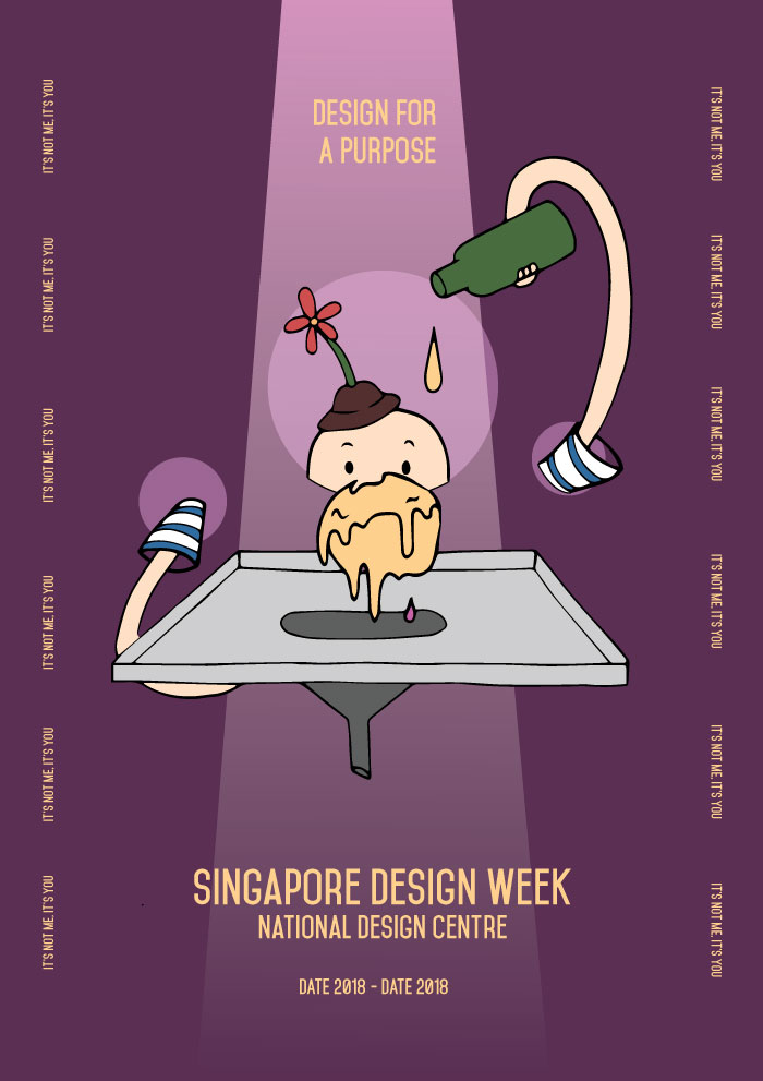
b. It’s Not Me, It’s You / Design For A Purpose

Image of draft: Design for A Purpose 

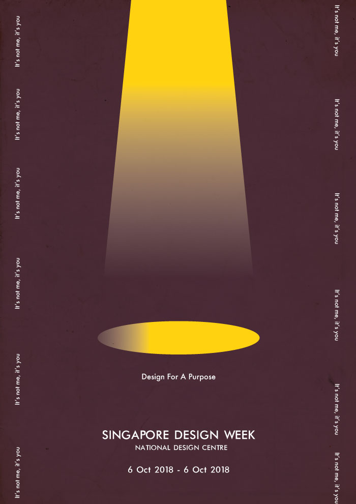
With the idea of designing for a purpose in mind, I came up with the slogan ‘Design For A Purpose’ or ‘It’s Not Me, It’s You’, and wanted to have the poster show some sort of romantic gesture, to be humorous but at the same time show how designing has a part to play in reaching out to different communities. For the first draft, I had a spotlight reflecting onto an object, with the slogans by the side. However, although it makes for an interesting layout and overall approach, I had difficulty in coming up with an image that embodied good design. 

c. Further Explorations

Sketches for possible designs
Draft 2: Design For A Purpose

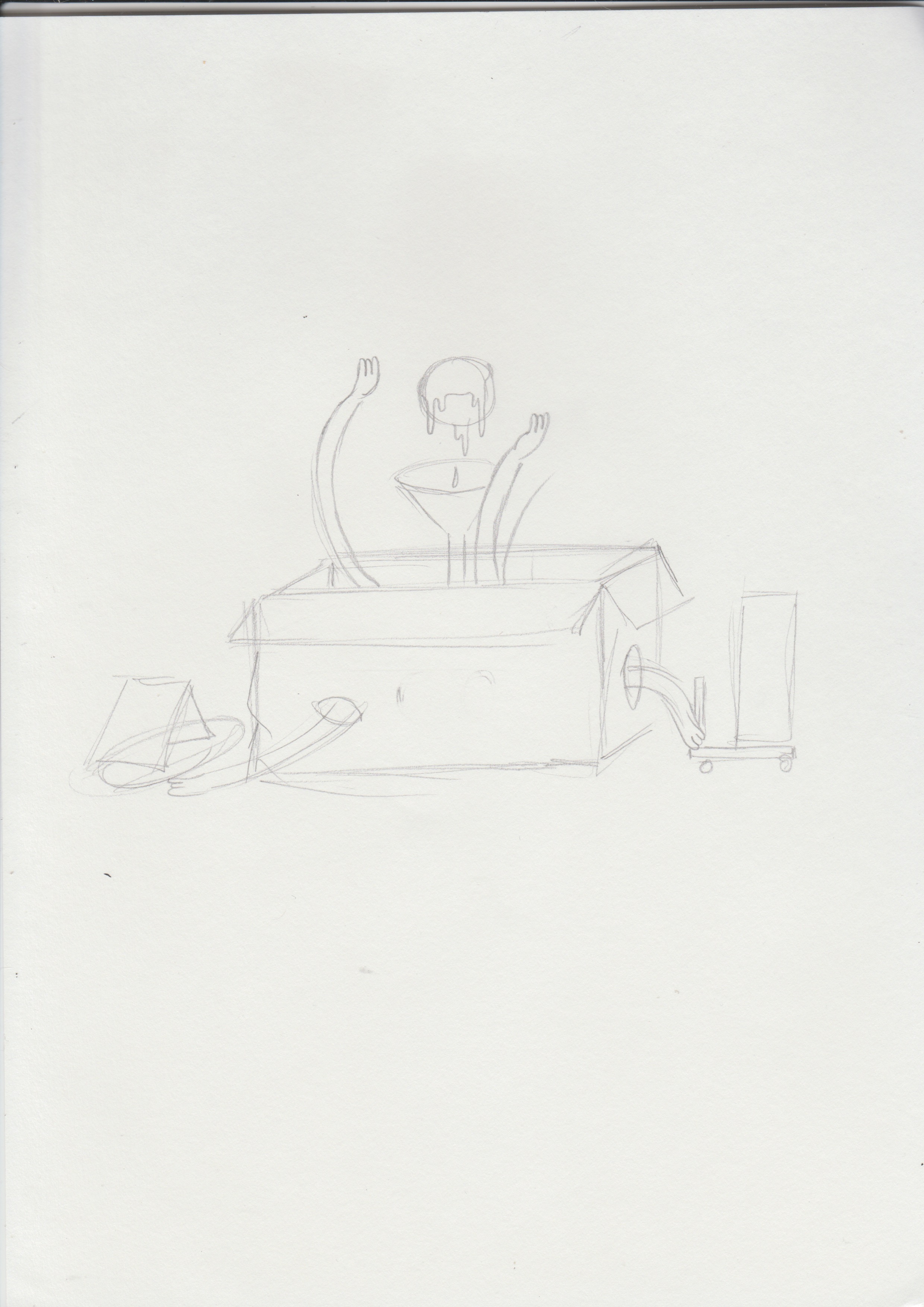
Expanding further on ‘Designing For A Purpose’, I tried to have the graphics convey a better idea of designing with a clear purpose – the posters consist of a designer character adding a droplet into a ball (meaning to represent creativity), the ball would then slowly leak into the funnel and onto a city, giving it life and adding some vibrancy to it.

The design however, did not really sit well with the whole idea of Singapore Design Week. The graphic would not be able to appeal to a wide demographic and the layout seemed like it would not allow for a better placement of text.

Draft 2: It’s Not Me, It’s You

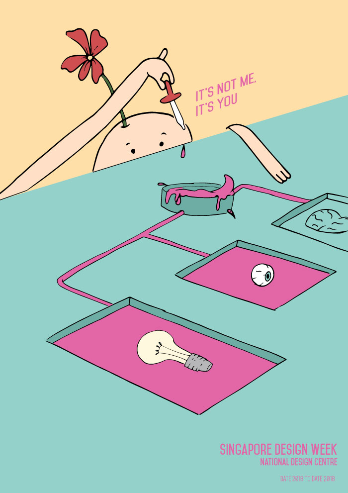
Similar to the previous design, the poster was supposed to convey the idea of designing for a purpose, with the creativity flowing through to different objects giving them colour. Although the colour choice was interesting, the graphic did not seem to complement the slogan and therefore, was ineffective in bringing forth the message. 

III. Experimenting with Layout
Image of draft: Thinking Outside the Artboard

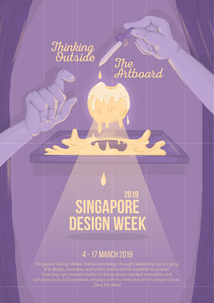
Returning to how I could better convey the idea, I decided to change the slogan to ‘Experimenting with Creativity’, and adopt a style that could appeal to a wider demographic. Hoping to establish a mysterious and magical sort of feeling as a means to capture the attention of viewers, and emphasise the idea of creation and creativity, I played with contrast through colours and adding effects such as glows, smoke, and spotlights. The design comprises of hands dropping a yellow liquid onto a ball of glowing yellow mass. The liquid then flows onto a canvas and into the funnel, forming the words ‘Singapore Design Week’.

The design, however, gave a fairytale kind of mood and seemed more appropriate for theatrical productions. The shape of the canvas also disrupted the visual flow and raised even more questions about the graphic. 

Image of draft: Thinking Outside the Artboard

Keeping to the same direction, I adjusted the colour palette and text, as well as removed the canvas to establish a smoother visual flow. However, the graphics still did not manage to effectively convey the idea of creativity, and still felt quite static – it wasn’t able to stir excitement. 

Feedback & Challenges

  • An issue I had at the beginning of conceptualising the poster was the slogan and the accompanying images. Wanting to have an interesting and more humorous slogan that gave an overall view of the design scene in Singapore was quite challenging where it became difficult for me to conjure images and a style that supported the idea of the slogan. Therefore, with constant changes to the slogan and supporting images, layout, and style, it gave me less time to refine the final piece. 
  • Another challenge that hindered the overall poster was the illustrations themselves – they were not able to effectively convey the idea of the slogan. The yellow ball of mass, with the intention of representing creativity, was not literal enough and the colour and form made it seem more like ice-cream, with the dripping graphics adding more to that idea. The nature of the graphics (with the hands meeting in the centre and the yellow mass in the centre)  also demanded for a centralised layout for the text.
  • The nearly centralised layout was also not very interesting; it didn’t allow for easy experimentation with the text, and ended up looking like an editorial page rather than a poster. It was not as able in supporting the idea of ‘experimenting’ and may not be as eye-catching as posters with better variation in text and graphic placements. 

Project 1 | Therapeutic Graphics of Hope

Introduction

For our very first project in Visual Communications, we were tasked to create a mobile for a hospital that revolved around the theme of hope. The focus of the project involved designing graphic forms that used concepts pertaining to figure/ground relationships.

Final Product

Image of final product: Mobile

Keeping in mind the idea of hope, my final product (both the graphics and hanging structure) are based on the theme of outer space. Wanting to go in a more whimsical direction, I used astronauts and ‘planets of hope’ as content for the main graphics as I felt that it could appeal better to a wider demographic of both young and older patients.

I. Concept

Choice of Graphics

Image of astronaut

With regards to the concept, I chose to go with the theme of outer space with astronauts and ‘planets of hope’ helping to convey this idea as in my opinion, astronauts serve as a sign of hope – they are always on the search for new signs of life. With Michael’s help, the involvement of the ‘planets of hope’ expanded this concept, where it reinforced the idea of the astronaut being on the search of new life.

Image of submarine radar

Wanting to convey the idea of hope in a more straightforward manner, the planets themselves have symbols of hope integrated into their forms.

For the first planet, the graphic features a valley with flowers – the flowers are meant to be Lilies of the Valley, a common type of spring flowers, and spring itself often being associated with hope, bringing about instances of new life. The second planet was also meant to convey hope as signs of new life. Inspired by the visuals and purpose of a submarine radar (where objects would appear as lit-up spots it), I thought it would be interesting to have a planet that showed the idea of objects appearing on a submarine radar. There was also the inclusion of curves and geometric shapes to represent rock formations.

Close up of sonogram in background

To further reinforce the idea of new life, as well as finding a link to tie the three different graphics together, they all feature a wave in the background. It was meant to represent the bleeps in a heart rate monitor. The rises and dips in waves in the monitor indicates the presence of a heart beat, and therefore to me, is a symbol of life. 

Placement of Graphics

Final product

The placement, on the other hand, was focusing on contrast between sizes, having a range of small, medium, and bigger graphics, with one in the centre.

Hanging Structure

Keeping in mind the theme of outer space, I wanted the physical structure to be circular as well (in-line with the circular shapes of the graphics). White yarn was used to cover the wooden structure to give it a softer and calmer feeling, and also prevent the colours from clashing with that of the graphics. Fishing line was used to hang the graphics.

II. Principles applied

Figure/Ground 

One of the design principles applied was the use of figure/ground relationships. The graphics of the mobile were to be results of experimentation with figure-ground relationships and Gestalt theories (proximity, similarity, closure, good continuation, and common fate). 

Figure and ground refers to a theory of the mind’s organising tendencies, in particular the way the human brain perceives physical form, distinguishing an object or form from its context or surroundings—a figure from its background.
If you see graphic design as a process of arranging shapes on a canvas, then you’re only seeing half of what you work with. The negative space of the canvas is just as important as the positive elements that we place on the canvas.

Trying to experiment with methods of closure, where the figures seemed complete although their forms were not, the figures were an integration of positive and negative space. Mostly used in the astronaut and submarine radar graphics, I tried to use the background to help fill in gaps left by the positive form (e.g. the helmet in the astronaut and the rock formations in the submarine radar).

As for the flowers, I wanted to try methods of good continuation, where an intersection between two or more objects makes it seem as though it is a single uninterrupted object. Seeing the possibility of creating a continuous flow between the shapes of hills and petals of the Lilies of the Valley, I used the layout of waves in a heart rate monitor to create a flow between the two, attempting to form a smooth continuation, thereby seemingly forming a single shape.

Contrast

Astronaut: Front and back
Lily of the Valley: Front and back
Submarine radar: Front and back

I also wanted the graphics to play with the idea of contrast. I felt that a contrasting colour palette will help to bring out the shapes better amongst one another, and allows for a brighter and more vibrant composition. Contrast in colour was used within different shapes of the graphic, as well as in the front and the back; a wider range of colours were used in the front while monochromatic colours were used in the back.

Research & Process

I. Conceptualising

The process first began with conceptualising, where we were to come up with our own interpretations of what hope is.

Image of Mindmap
Image of Mindmap

After brainstorming all the symbols and objects typically associated with the idea of hope, I categorised these objects into sub-themes: spring, fairytales (i.e. Pandora’s Box), and outer space.

  • Spring: Sparrow (the first birds to appear during Spring), winter branches, and flower petals
  • Pandora’s Box: Hope being the one left at the bottom of the box after all the bad things escaped
  • Outer space: Astronauts on the lookout for new life
II. Research & References

In addition to finding objects typically associated with hope and further developing the three finalised concepts, I wanted to research more into methods of experimenting with figure-ground. Coming across Gestalt principles such as proximity, similarity, closure, good continuation, and common fate, I thought I could use them as bases in forming the graphics.

Looking at more reference images also helped in seeing how else I could play with the positive and negative spaces, and the shapes I could use to convey the elements I wanted to use.

III. Drafts & Process
Preliminary sketches

After brainstorming on the theme of hope and figuring out the elements we wanted to include in the graphics, we practised taking the illustrative elements out of them and drew contour shapes, and how they would look like in both positive and negative forms.

Explorations of other themes
Draft: Astronaut
Draft: Astronaut
Draft: Astronaut

After receiving feedback on how I could improve the graphics – using more shapes instead of lines – we had another round of group feedback where we finalised the graphics we were going to use and further developments into figure-ground relationships.

Draft: Astronaut
Draft: Astronaut

The addition of colour was then looked into. Inspired by some bright pastel colour palettes in the reference image below, I thought using such colours was effective in conveying the idea of hope as something vibrant but at the same time, remained calm and peaceful.

Draft: Colour palette

After receiving feedback on the darkness and dullness of the chosen colour palette, I decided to go with something a little brighter and draws more contrast. Ultimately, I decided on this final colour palette.

After printing and cutting the graphics out, it was time to fix the hanging structure. At first, I used thinner wires that were covered with thread; after coiling them with one another in an effort to make them thicker and sturdier, the entire structure did not look appealing and was still not able to hold up on its own with the hanging graphics.

The second attempt therefore, consisted of using a wooden embroidery ring and coiling white yarn around it over and over again until the wooden parts were completely covered. The yarn made it have a softer exterior and seemed to give the entire structure a look better-suited for a hospital. However, with the metal bolts screwed onto the side of the structure, hanging it on its own made it topple to one side and therefore, the placement of graphics had to lean more onto the opposite side to make it balance.

Feedback & Challenges

One of the main challenges I faced in this project was the use of figure-ground concepts. More familiar with seeing graphics in their complete and literal forms, I had difficulty in experimenting with positive and negative spaces and in the end, my graphics ended up looking more illustrative then the supposed abstract shapes and forms. Furthermore, I felt that I could have been a little more imaginative with the background instead of using just a circle.

References

https://www.smashingmagazine.com/2014/05/design-principles-space-figure-ground-relationship/

https://www.artsy.net/article/editorial-decoding-artspeak-figure-and-ground

https://en.wikipedia.org/wiki/Principles_of_grouping

Manifesto

Manifesto

Image of Manifesto

The Manifesto reads:

“Designing in the digital age and a globalised world, with the availability of technological tools and the Internet (increasing connectivity), requires us to think differently and stand out, putting an emphasis on creativity.”

“Designers are therefore, bearers / conveyors / agents of ideas (good design shouldn’t be just mindless displays of information. We are the agents of transformation, the creators of new ideas (more concepts, more reasons). Therefore, good designs break free from tradition – to change, to defy or even disregard the rules, techniques, and ideas that existed before us.”

“Good design is necessary to communicate with a vast range of individuals (not necessarily with the use of words), explore and be creative, and breathe more excitement and brightness into a seemingly dull world.”

The manifesto drew inspiration from the Modernism movement, where artists around the world began to use new imagery, materials and techniques to create artworks that they felt better reflected the realities and hopes of modern societies. I thought the notion of experimenting and exploring with new techniques and tools, which eventually brought about new movements, was inspiring and should be practised more in design.

The manifesto was hand-written on torn pieces of paper from different notebooks, with scribbles and cancellations, to better reflect the emphasis on the brainstorming and experimentation stages of designing.

In-Class Activity | Menu

Menu

We were recently tasked, using InDesign as a platform, to explore grid systems. I thought it would be interesting to have a vintage-style menu to compliment the food items.

Food menu using grids

Typographer of the Week | Herb Lubalin

About the Typographer

Image result for herb lubalin
Image of Herb Lubalin

Herb Lubalin was an American graphic designer. Sometimes referred to as the ‘king of typography’, he was most known for his collaborations with Ralph Ginzburg on three of Ginzburg’s magazines: Eros, Fact, and Avant Garde, as well as the typeface Avant Garde. He also founded the International Typeface Corporation (ITC).

Considered one of the most ‘successful art directors of the 20th century’, Lubalin was on a constant search for ‘something new’, with ‘a passion for inventiveness’. ‘Constantly working and achieving much success throughout his career, at the age of 59, he proclaimed ‘I have just completed my internship”.

His Works

Ginzburg magazines
Image result for herb lubalin ginzburg magazine
Image of Fact magazine

First launching Eros, which was dedicated to ‘beauty and emerging sense of sexuality in the burgeoning counterculture’, followed by Fact (it being spiced up issues instead of sugar-coated pieces like in Reader’s Digest), Lubalin’s editorial design for the magazine is considered ‘one of the brilliant of its kind’. Eros featured ‘a large format’ with ‘no advertisement’, while Fact had an ‘elegant design’ with ‘minimalist palette, based on dynamic serifed typography and exquisite illustrations’.

The magazines were also said to have showcased his artistic skills as he ‘brought out the creative visual beauty of these publications’.

avant-garde typeface
Image result for herb lubalin
Image of Avant Garde magazine

Following the release of the Avant Garde magazine, Lubalin created the ITC Avant Garde typeface to meet the demand for a complete typesetting of the logo. However, it was widely misunderstood and misused in poorly thought-out solutions, eventually becoming a stereotypical ‘1970s’ font, said to have a ‘flawed Futura-esque face’. Despite this, Lubalin’s original magazine logo was and remains highly influential in typographic design.

Learning Points

Image result for herb lubalin
Image of Lubalin’s typographic work
  • Looking more into Herb Lubalin’s typographic designs, I was inspired by how he managed to tweak the physical characteristics of each typeface to form a graphic or complement another image.
  • Herb Lubalin’s typographic designs also demonstrated experimentation with kerning and the overall layout of the typeface. He showed that using the type alone could  make a layout seem more exciting but at the same time, remain structured and harmonious.

References

http://www.designishistory.com/1960/herb-lubalin/

http://www.famousgraphicdesigners.org/herb-lubalin

http://www.historygraphicdesign.com/the-age-of-information/the-new-york-school/681-herb-lubalin


Reflections | Uping Your Type Game

Uping Your Type Game, Jessica Hische

Points discussed
  • Don’t have a favourite font, have a favourite type designer
  • Choosing the right type:
  • Does it come in a variety of weights? (Flexibility, more colour choices, reversing type)
  • Does it have a nice x-height?
  • Does it have a true italic?
  • Is it a typeface I’d want to hang out with? (Typefaces have personalities, finding the right personality balance)
  • Is it spaced well? (Tightly spaced)
  • Does it have even colour?(Making little micro adjustments to the letters to make sure that they don’t feel optically heavier at the joins)
  • What width or widths do I need? (Difference in letter width between different “regular” width typefaces) – If you’re designing a website with narrow text columns, you might want to pick a typeface whose regular width is a little on the narrow side so you can get more words on each line without having to scale text down – Choose typefaces that lend a hand in getting the right amount of words on a line
  • If it’s a sans, is there enough letter variety?
  • Where do I find good type?: Hosted web fonts, self-hosted web fonts, common web fonts services (typekit, webtype, font deck, fonts.com, webINK, MyFonts, Google Web Fonts)
  • Thinking Conceptually:
  • Defining the mood, read the content, write down key points and visual cues, but also all the weird random stuff that pops into your head
  • Establishing Historical Context
  • Pairing Typefaces: Unexpected combinations that lead to beautiful and harmonious results
  • Choose a Super-Family
  • Choose typefaces from the same type designer
  • Choose typefaces with similar characteristics
  • Don’t be afraid to experiment

In Jessica Hische’s article, Uping Your Type Game, she gives an in-depth discussion on type designers, and provides steps and pointers in creating better design pieces with suitable typefaces. She also suggests having a broader perspective on typeface design by looking more into fonts by type designers (e.g. not having a favourite font, but rather a favourite type designer), working with fonts of super-families, and experimenting.

Reading the article did give me better insight into the elements to consider when choosing the appropriate typeface or when pairing fonts together. Taking into consideration characteristics such as the weights, x-heights, and the type in its true italic form, helps to determine the typeface’s ability to bring the final design further. In addition to discussing the elements to consider when choosing appropriate typefaces, Hische also provides suggestions on websites to visit when looking into different fonts.

In general, I feel that the article provided a good perspective on what determines good and suitable typefaces we should integrate into our designs. However, with regards to the points she raised on using fonts that belong to super-families and fonts with larger x-heights, it may be a bit rigid in just sticking to using more established fonts. The article seems like it is geared towards using more minimal fonts as opposed to fanciful or decorative fonts. Therefore, it may not be the best to stick to these rules when experimenting as it disregards more fanciful fonts or even less well-known fonts that do not belong to any super-families. When experimenting, or even considering the final outcome of the design piece, I feel that it is more important in utilising a range of fonts, including more decorative ones, then just sticking to the more established few.

Reflections | Why Fonts Matter

Why Fonts Matter by Sarah Hyndman

The TEDTalk, Why Fonts Matter, conducted by Sarah Hyndman discusses the importance of typography in areas such as design and advertising. As a professional graphic designer herself, she shares her opinions on why typography has the ability to alter aspects of everyday life.

Image result for maltesers
Fonts used for Maltesers, a brand of chocolate (my favourite brand of chocolate if you want to be specific)

One of the points that she brought up that I agreed with was typography’s ability to influence opinions and establish moods and emotions. An example she used to reinforce this point was the labels of candy bars, where fonts with rounded edges and brighter colours seem to make the candy more appetising, or have an overall sweeter taste. I agree with her stance on this, where certain elements of a typeface can alter the overall emotion and mood of the design piece. In my opinion, because of these “elements” that we identify with, we would typically associate them with certain moods (examples being jagged, straight lines with something angry and serious, or curved lines being more gentle or sorrowful). Therefore, fonts matter in this case as designers are able to use typography as a medium to convey a certain mood to the intended viewers.

Image result for coca cola
Iconic Coca-Cola font

Another point that she brought up was typography’s purpose in telling a story. She further reiterates this point by bringing in examples of well-known brands, and fonts used in movie posters. Similar to the earlier points she mentioned about fonts’ abilities to convey certain moods and emotions, the type of fonts used in design such as logos or title fonts have the ability to encompass a very brief overview. For example, she talked about Coca Cola and how it’s ribbon-like font conveys the overall aesthetic of America in the 50s, with its hot summers and Grease-like lifestyle.

Image result for ex machina
Font for Ex Machina, a scifi movie
Image result for nightmare on elm street poster
Fonts used for A Nightmare on Elm Street, a horror movie
Image result for bad times at the el royale
Fonts used for the upcoming Bad Times at the El Royale, a neo-noir movie

In my opinion, the ability that typography has in conveying a story is important; it shapes a brand and conveys a certain mood or aesthetic without the use of images. Typography, therefore, is important as it is capable of pushing a brand forward, maybe even allowing it to be widely-recognised just by its font alone.

Reflections | The Grand Design

The Grand Design

The points brought up in this segment of the reading allowed me to have a better sense of the elements that determine the basics of good typography. Some of the points brought up in the reading that I intend to follow in future practices of type design include:

  • Legibility 
  • “Applying scents, paints and iron stays to empty prose” 
  • A link 
  • Transformation of text
  • Replication of script
  • To these blind and often invisible visions, the typographer must respond in visible terms
  • To successfully fulfil an intended purpose
  • Interpret and communicate the text 
  • Separate and group bodies of text (analyse and map the text)
  • Identity and form 
  • “Writing merges with typography, and the text becomes its own illustration”
  • Tie other visual elements together 
  • Selecting appropriate typefaces 
  • Consider the block of texts, columns and margins, shaping the page
  • Consider minute details 
  • Invite the reader into the text
  • Reveal the tenor and meaning of the text 
  • Clarify the structure and the order of the text 
  • Link the text with other existing elements 
  • Induce a stage of energetic repose, which is the ideal condition for reading 

Checklist for Good Typography

Keeping in mind the points discussed in the reading, I hope to consider the following aspects when designing a piece of collateral in future:

Image of personal checklist for good Typography

Typographer of the Week | Erik Spiekermann

About the Typographer

Related image
Image of Erik Spiekermann

Erik Spiekermann is a renowned typographer, type designer, and author. He is most known for co-founding MetaDesign in 1979, FontShop in 1989, as well as Edenspiekermann in 2002. In addition to having offices all around the world (there’s one in Singapore too!), he has designed an array of different typefaces including FF Meta, ITC Officina, FF Unit, and even customised fonts for The Economist, Deutsche Bahn, Cisco, Bosch, Mozilla, and Autodesk.

His Works

I. TyPographical Works
Image result for the economist magazine
Fonts for The Economist

Spiekermann had a hand in designing many commercial typefaces and those as part of corporate design programmes. In addition to heading corporate design programmes for big names such as Audi, Skoda, Volkswagen, Lexus, Heidelberg, and way finding projects like Berlin Transit and Dusseldorf Airport, he has also designed typefaces for companies such as The Economist magazine and the font family for Nokia.

Image result for dusseldorf airport sign
Font used in way finding signs in Dusseldorf Airport

With regards to designing typefaces, Spiekermann sees himself as “more of a problem solver than an artist”. He approaches design by identifying a problem then finding typefaces that almost work but could be improved, he says “study them, note the approaches and failings, sleep on it, then start sketching without looking at anything else”.

Learning Points

Image result for erik spiekermann font
Image of Meta, a font by Erik Spiekermann
  • I agree with Erik Spiekermann’s approach to designing typefaces. I feel that typeface design has a purpose in pushing a piece of collateral further in conveying its intended message or helping enhance its overall visual aesthetic. Therefore, designing or picking an appropriate typeface is much like solving a problem.
  • Looking at his typefaces, I really like the modern element of each font. The slickness and simplicity of each font makes for easy readability and versatility. Furthermore, the success of his works in famous corporations around the world also emphasises how simple and modern fonts have the ability to be iconic.

References

https://www.fontshop.com/designers/erik-spiekermann

https://typekit.com/designers/erik-spiekermann

https://www.fonts.com/browse/designers/erik-spiekermann