
Crystal City
Group Members (Group E)
Clara
En Cui
Vanessa


Group Members (Group E)
Clara
En Cui
Vanessa

Leading up to the submission of our final model, we were tasked to create individual moodboxes that gave a visual representation of the sounds we produced as a group. The moodbox was meant to capture the ‘mood’ of the sound sample as a physical expression, displaying specific sections of interest, and showing how the positive volumes affect the negative voids, correlating to the spatial and textural qualities of the sounds and silences.

Based on one of the sound compositions my groupmates and I created, the final moodbox is a depiction of both the structure of the composition’s soundwaves, as well as a representation of the adjectives used to describe the sounds used in the composition.
The moodbox is based off a sound composition my groupmates and I created. The instruments used were:
Since the three of us did not have extensive backgrounds in music, we decided to take another approach in creating a composition; instead of playing the instruments as how they are intended to be played, we used their physical structures to create sounds. The ‘ticking’ noise was a result of hitting the side (made out of plastic) of the glockenspiel with a stick, the ‘scraping’ noise from dragging a rhythm stick (made out of wood) across the rough surface of the studio table, and the ‘ding’ from hitting the triangle.

We also experimented with volumes by varying the levels of the ‘ticking’ and ‘scraping’ to establish clearer Dominant and Subdominant factors. Following a beat of 4 counts with the ‘scraping’ and ‘ding’ coming in at varying intervals, the composition resulted in the soundwave depicted above.
Inspired by the look of the soundwaves, I wanted to recreate the progression of the composition being soft in the beginning, louder in the centre, and soft again at the end, thereby establishing a ‘rippling’ effect. The moodbox is therefore circular to better establish the ‘rippling’ effect. This is further emphasised by the folds created by the felt and the radial display of the moodbox’s different elements.

Zooming further into the soundwaves, it is much more congested in the centre as opposed to the beginning and the end. To represent this, the elements of the moodbox is crammed in the centre and dispersed towards the ends, attempting to show variation in voids – minimised voids (minimal negative voids) in the centre and maximum voids toward the ends (maximum negative voids). This is further emphasised by layering netting in the centre. The frequencies in the soundwaves are also of varying heights. The highs and lows of the soundwaves were recreated in the moodbox by varying the heights of its different elements (as displayed by the cotton buds, safety pins, and needles).

The moodbox is also a representation of the adjectives used to describe the composition.
After listening to the composition, I interpreted it as sounding quite sharp, heavy and rigid in nature, having an irregular pattern of both focused and dispersed sounds, with a touch of softness and fleetingness. The descriptions are represented by the following elements:
| Adjective | Sound Element | Moodbox Structure |
| Sharp and sudden | ‘Ding’ from triangle | Use of needles in the centre |
| Heavy and rigid | ‘Ticking’ | Height of elements remaining at a low level |
| Irregular pattern | ‘Scraping’ and ‘ding’ coming in at varying intervals | Variation in materials |
| Focused and dispersed | ‘Ticking’ and ‘scraping’ sound focused, ‘ding’ sounds dispersed | Radial layout of elements |
| Soft and fleeting | ‘Ding’ adds a touch of softness to the composition and sounds fleeting as it lingers | Use of cotton buds |
The moodbox is made with the following materials:
The materials were put together mainly by pasting and piercing – namely, piercing the needles and safety pins through the foam and laundry netting.
The moodbox could have made a better impression if it was bigger in scale. Furthermore, a better choice of materials could have been used to represent the different elements of the composition.

This segment of this project explores two areas; planar and plastic models. Constructing planar models is an outlet for us to experiment with planes while the plastic models are a lead-up to our final product involving the pleasant and unpleasant memories associated with certain scents.


The planar model pictured above is a result of experimenting with the idea of contrast. Strips of different lengths and widths were used, focusing on altering their physical structures to create swirls and rigidness, and varying heights from its horizontal base.
The plastic model pictured above is a sculptural representation of both a pleasant and unpleasant scent that evokes an accompanying memory.
Structuring the sculpture based on height – where the main elements are found on the top and bottom – is representative of the idea of achievement VS failure.
The top half of the sculpture represents the pleasant memory (i.e. Daler Rowney acrylic paint), whose accompanying memory gives me a sense of achievement and familiarity. In addition to elevating it to represent a ‘high point’ in my life, I also used swirls of plastic to surround a ball in the centre to represent the sense of familiarity and comfort the scent evokes. The transparency of the plastic also reinforces it as a ‘refreshing’ scent, something paint is typically associated with.
The bottom half of the sculpture, on the other hand, represents the unpleasant memory (i.e. coffee beans). It is based on the notion where despite it being my favourite blend of coffee, it still evokes unpleasant memories; this was done through creating a flower-like structure encompassing a smaller structure punctured with holes. The smoky, lingering smell of the beans is shown through the upwards-flow of the flower-like elements, translucency of the plastic, and strips of plastic bags stuffed into the centre, masking the punctured plastic within.

| Planar Model | Principal axis, broken planes, use of voids
Hierarchy Contrast Rule of thirds Dynamic compositions (wedging) |
| Plastic Model | Contrast
Melting and soldering |
The planar model has a vertical principal axis, with the use of broken planes as demonstrated by swirls from the SD plane, where it does not fit in a box when elevated. The structure of the planes also managed to create symmetrical circular voids.
The planar model also uses hierarchy, evident in the use of Dominant (D), Subdominant (SD), and Subordinate (SO) planes. The D plane is reinforced through its thick width, the SD plane shown by its thinner width, and the SO plane portrayed by its short length and width.
Contrast is demonstrated in the planar model in its physical structure; the planes vary in rigidness (displayed in the SO plane) and swirls (displayed in the D and SD planes).
Similarly, the plastic model uses contrast in its varying segments; straight and upright elements (the connecting straw and circular plate), and swirls created by the flower-like structure and the bottom and the wrapping strips of plastic at the top. Contrast is also emphasised through varying opacities where transparent plastics were used at the top, along with translucent plastics at the bottom (strips of plastic bags and sanded plastics).
The planar model also makes use of the Rule of Thirds. This is evident in grouping the majority of the model (D, some of the SD, and SO planes) at 1/3 of the base, with the remaining 2/3 of the SD plane extending outwards. The Rule of Thirds is also shown in the SO plane where 1/3 of its length is wedged.
The planar model is structured using wedging as opposed to pasting. In addition to creating more visually-appealing models, it also helps in creating dynamic compositions where the planes use various angles of dependent balance to hold one another up.
The plastic model’s structure is created using methods such as heating and soldering. Heating melted and moulded the plastic (shown in the flower-like structure), while soldering formed patterns (shown in the punctured structure).
The scent I chose that reminds me of a pleasant memory is a particular brand of acrylic paint, namely Daler Rowney paint. Coming from the exact same tube of paint, the scent takes me back to my first wall mural art project that I took part in with some friends a year ago, which gives me a sense of familiarity and achievement as well as the fun memories that went along with it (e.g. climbing an extremely tall, rickety ladder when we were all terrified). The scent that evokes an unpleasant memory, on the other hand, is a particular brand of coffee beans that my workplace serves. Even though it remains as my favourite coffee, the smell emitted reminds me of busy days, rude customers, messed up orders, and the trouble I’d get into for not doing a good job with making coffee.

Based in Czech Republic, Veronica Richterova is a designer/artist most notable for her works involving recycled PET bottles.


Considered a guru in ‘up cycling plastic bottles to create nature-inspired and cartoonish sculptures’, the artist has gained recognition for ‘cutting, heating, twisting, melting’ and ‘transforming plastic materials’ in a number of ways. Her fascination with plastic bottle extends further when she writes extensively about the usage of plastic bottles and its history of mass-production.


| Positive | Improvements | |
| Model 1 | Interesting composition | Refrain from pasting
Extend length of SD Move composition to 1/3 of the base Reduce length of SO |
Link to Fashion Accessory final product and process:
https://oss.adm.ntu.edu.sg/vwong005/fashion-accessor…mnemosynes-scent/
http://www.designindaba.com/articles/creative-work/plastic-bottle-artworks-veronika-richterová

The final segment of Project 3 involved taking inspiration from the high fashion world, as well as elements from our plastic prototypes and planar models to create a fashion accessory that embodies the pleasant and/or unpleasant scents we discussed earlier in a composition that demonstrates planar techniques.


Inspired by the interesting compositions seen in avant-garde fashion, we wanted to create a fashion accessory that echoed the works of Alexander McQueen. Finding versatility in body jewellery, we decided to make an arm band using a combination of planar structures, incorporating elements that represented the memories evoked by our pleasant scents. Our product was also structured in such a way that it has the ability to stand out in a dimly-lit environment.

| Hierarchy |
| Contrast |
| Wedging |
| Dynamic compositions |
Hierarchy is represented through the use of Dominant (D), Subdominant (SD), and Subordinate (SO) elements. The D element is reinforced by its length and bright white colour, the SD element is reinforced by its combination of transparent body and black colour, as well as its smaller size in comparison, while the SO element is reinforced by its contrasting gold-rose colour and scale being the smallest of all the elements.
The product was also meant to create contrast through its varying colours and textures. The variety in colours is demonstrated by the black SD, the white D, the metallic colours in the second SD, and the incorporation of light. Texture, on the other hand, is varied through the use of different materials; acrylic for the SD’s body, textured paper for the D, and metal wires for the second SD.
Contrast is also used in the model’s layout, where the structures are aligned in such a way that they contrast against one another. This is seen in the second SD (i.e. the metal wires) going in the opposite direction of the D (i.e. white structure) plane, and the SD (i.e. black base) standing upright, contrasting against the angled positions of the previous two elements.
Wedging was used in joining the D plane to the SD structure.
Wedging the structures together helped to create dynamic compositions, where the D plane uses Dependant Balance against the SD metal wires to hold itself up.

Alexander McQueen was once the head designer of the Louis Vuitton-owned Givenchy fashion line, and launched his own menswear line in 2004. Earning the title of British Fashion Council’s British Designer of the Year four times, as well as being named Commander of the Order of the British Empire, McQueen was most notable for his signature dramatic style of clothing, ‘pushing the limits of what people expected from fashion’.
The accessory involved fusing together two of our planar models, since they were quite similar in structure and composition.


Link to planar and plastic models:
https://oss.adm.ntu.edu.sg/vwong005/planar-plastic-p…mnemosynes-scent/
https://www.biography.com/people/alexander-mcqueen-541384

After a couple of weeks of conceptualising, going grocery shopping for ingredients, and scouting for branches and leaves around the campus, it was finally time to present our models.
Experimenting with dynamic compositions through the mediums of food and Ikebana, my final model was meant to portray the season of Summer.


I wanted the model to show a dish being formed in a more abstract manner. This was attempted through dissecting the food items; the ice-cream cone was turned on its head with the bottom (or apex) facing upwards and yoghurt placed outside instead of within. The sphere (macadamia nut) was also placed alongside the ice-cream cone with a drizzle of yoghurt to represent it flowing downwards into the granola mixture and joining the rest of the ingredients.
When I came across the word “Summer”, pictures of Summer-based recreational activities immediately flash through my mind. These activities are usually held outdoors under the hot sun; they include, but are not limited to, state fairs or fun fairs, beaches, and picnics.
After conducting some research and assembling mood boards and reference images, I felt quite drawn portraying a typical Summer picnic. I wanted to experiment with the idea of packaged and compact high-end ingredients (usually easy to transport), and platters that are usually brought to picnics. The addition of props and greenery to the foods could also help in establishing a varied and interesting colour palette of both earthy tones with splashes of vibrant colours, conveying a mood of calmness in a time of celebration and being carefree.

Some of the design principles applied in the model include:
| Design Principle | Evident In |
| Dynamic Composition | Angles at which volumes are balanced against |
| Rule of Thirds | Sizes of volumes |
| Hierarchy | Sizes, colours, and materials of volumes and props |
| Harmony | Composition of model and visuals of volumes |
| Contrast | Materials, textures, and colours of volumes and props |
The volumes (cone, sphere, and cylinder) used in the model are structured to reflect different kinds of balances. The cylinder, in relation to the base, uses Independent Balance, where the angle of balance is less than 45°. It is independently related to the vertical and horizontal axis in such a way that it is able to balance itself regardless of whether it is physically supported by other structures.
The cone, in relation to the cylinder, uses Dependent Balance, where its axis is propped up against the axis of the cylinder, depending on it for physical visual structure and balance.
The sphere, on the other hand, uses Precarious Balance, where its angle of balance is more than 45°, seeming as though it is holding its own balance and can fall apart once its support is removed.
Rule of thirds is applied in the sizes of the volumes where the height of the cylinder is approximately 1/3 of the cone, the diameter of the sphere approximately 1/3 of the diameter of the cylinder, and the sphere placed 1/3 alongside the axis of the cone.
Hierarchy is applied in the volumes and props used in the model.
| Dominant | Cone, Branches | Cone: Emphasised through size and colour (brown as a base colour due to its subtleness)
Branches: Emphasised through their sizes and physical structure |
| Subdominant | Cylinder | Emphasised through its size and transparency; transparency to take its attention away from the Dominant cone in case both volumes are too similar in size |
| Subordinate | Sphere, Flowers, Yoghurt | Sphere: Emphasised through its size
Flowers: Emphasised through its vibrant splash of colour against a palette of earthy tones Yoghurt: Emphasised through its physical structure and colour as a “finishing touch” |
Harmony is displayed through the model’s composition where the volumes and props are placed within close proximity; the branches and flowers are grouped together while the food items form another group. Harmony is also shown in repetition of certain elements; the same yoghurt used in the cylinder is drizzled on the cone, and the granola used in the cylinder is also scattered around the base. The idea of unity is also reinforced through the colour palette where earthly, more muted tones are used (displayed in the base, the shades of green and brown in the branches, and the colours of the cone and sphere), complemented with a splash of colour (in the cylinder and flowers).
Contrast is reinforced through the use of a variety of shapes, materials, textures, and colours displayed in the volumes and props.
| Cone | Made up of grainy, geometric patterns with brown colour (earthy tone), which contrasts against the cylinder. |
| Cylinder | Layering within the cylinder helps create an earthy colour palette (granola and yoghurt) with splashes of bright colours (mango, honey, blueberries), and contrasts against the cone. |
| Sphere | The deep brown colour of the sphere contrasts against the brown tone of the cone and is also contrasted against the white yoghurt drizzle. |
| Branches | The physical structure of the branch, as well as its size, contrasts against the rigid nature of the shapes. |
| Accents | The accents (flowers, scattering of granola, fruits, yoghurt) are vibrantly-coloured, serving as a contrast against the muted colours of the other elements, and is also meant to capture the vibrancy of Summer in a more subtle context. |
The contrasts between different elements help to clearly identify the Dominant, Subdominant, and Subordinate elements as well.
The research on food and taste came in handy when sculpting my model; deconstructing flavour profiles, and techniques in layering and plating. Some of the methods I applied includes:
| Flavour profiles | Expanding more on the idea of low, mid, and high notes in flavour profiles, I wanted to enhance the Dominant, Subdominant, and Subordinate aspects of the volumes.
The cone (Dominant) being a plain ice-cream cone establishes the base flavour. The cylinder (Subdominant) comprising of granola giving it a subtle flavour. The sphere (Subordinate) along with the fruits being a representation of bursts of flavour. |
| Liquids | Use of honey as a liquid to create difference in texture. |
| Dairy | The yoghurt helped to add a layer of white space within the cylinder. |
| Choosing plate colours | Choosing a transparent cylinder to help bring out the vibrancy of the ingredients within. |
| Variety | Difference in textures and colours of the ingredients used helped to establish a sense of contrast. The blues and yellows used within the granola complemented one another as well as contrasted against the earthy tones of other elements on display. |
| Garnishes | Garnishes through the scattering of oats were used sparingly. |

My model was meant to embody some of the aspects of the Moribana style of Ikebana. Inspired by the Water-Reflecting Style, I placed a layer of honey at the top of the layered granola, with the cylinder serving as a container, and bent the branches towards the cylinder, in the hopes of it being reflected on the reflective surface of the honey.
I also wanted to experiment with the technique of Landscape Moribana, where it represents the beauty of natural scenery. In addition to using real plants and branches, I tried to mimic the ‘Near View’ used in Landscape Moribana, where scenes are portrayed as if it is happening before one’s eyes; zooming into the leaves and flowers used.
The principles of Ikebana are also represented; asymmetry in the branches being on one side of the model, materiality in the use of branches, leaves, and clusters of flowers, and harmony through the colour palette used (deep tones of brown and green accompanied with a splash of bright pink).

I would change the Subordinate (macadamia nut) to a blueberry instead. Using a blueberry would give a better consistency to the concept of ingredients rolling down the cone forming the granola dish, as well as establish better harmony in repeated elements. It would also serve as a better contrast to the colour of the cone, making it have a better sense of a “finishing touch”.

I would also cut back on the amount of materials used in the Ikebana aspect. Keeping in mind the minimalistic nature of Ikebana, I would remove the flowers and some of the leaves, keeping behind the physical structure of the branch with a few leaves.


| Positive Aspects | Changes to Make | |
| Model 1 | Dynamic composition used
Volumes can be seen at different angles |
Change cone to Dominant
Change location of sphere Change sizes of volumes to clearly establish Dominant, Subdominant, Subordinate |
| Model 2 | Dynamic composition used
Volumes can be seen at different angles |
Change cone to Subdominant
Change cylinder to Dominant |


| Positive Aspects | Changes to Make | |
| Model 1 | Dynamic composition used
More obvious display of Dominant, Subdominant, Subordinate |
Apply rule of thirds to size and placement of volumes |
| Model 2 | Dynamic composition used
More obvious display of Dominant, Subdominant, Subordinate |
Link to research:

In this project, we explored dynamic compositions through the medium of food and the Japanese art of floral arrangement, Ikebana, in accordance to a season we were assigned to. For my case, I had to portray the season of summer.
Since my model had to embody the season of summer, I took some time to brainstorm objects (namely food), moods, and colours that are usually associated with Summer.


After doing so, I took objects I could work with and categorised them further into three groups: State Fairs, The Beach, and Picnics. I then proceeded to gather more images to create mood boards to help me establish the mood, colour palettes, and decorations I could use for my model.

State fairs are a common occurrence in America, especially during Summer. Objects and moods typically associated with these fairs include bright lights, stripes of vibrant colours, deep-fried junk food, and finger food (whatever is portable).

In a more tropical setting, beaches are commonly visited during Summer. Objects and moods commonly associated with beaches include fruity cocktails, popsicles, tropical fruits (most notably watermelons and pineapples), and colour palettes that consist of pink and green.

Picnics are also another common Summer activity. Objects and moods commonly associated with picnics include more high-end and nutritionally-packed dishes (e.g. sandwiches, granola, salads, and mueslis), platters of cold cuts and cheeses, picnic mats, grassy areas, and more earthy tones (in contrast to the vibrant colour palettes in beaches and state fairs).

After brainstorming and researching more about associations with Summer, I decided to have my model portray a picnic. I intend to have the volumes (cone, cylinder, and sphere) to represent a common dish at picnics with a colour palette that reflects the earthy tones of a picnic.
Since we had to experiment with food as a medium, I decided to first learn more about culinary approaches in combining different foods.

Taste in food traditionally comprises of sweet, savoury, bitter, sour, and umami. However, these tastes can be further broken down into “flavour profiles”, some of the main components including:
| Description | Examples | |
| Low notes | Deep lingering flavours in foods that form the base, or backdrop, for other flavours. | Mushrooms, seared meat, beans |
| Mid notes | Flavours that are much more subtle. They are not as immediately identifiable in the sense that they do not hang around as long as the low and high notes. | Raw chicken and vegetables (food that often tastes bland without the presence of other flavours) |
| High notes | Flavours that are “show stoppers”. | Splash of citrus, handful of fresh herbs, minced hot peppers |
Combining these notes helps to achieve a sense of “roundness” or “fullness”, as their main function is to bring other flavours out; we do not normally taste them individually.
In addition to combining different flavour profiles, chefs also adopt layering as a technique to “marry a variety of flavours”, thereby “creat[ing] dimensionality, structure, and redefined variation on the plate”. When creating layers in a dish, it is important to keep in mind the functions of different types of ingredients.
| Aromatics | Often used as a starting point for most dishes, aromatics lay the foundation of flavour. An example being the use of ginger, garlic, and scallions in Chinese cuisine. |
| Fats | The type of fats used in a dish categorises the dish into a type of cuisine. An example being ghee mainly used in Indian cuisine. |
| Liquids | Liquids can be used as both a cooking medium and seasoning. They also have the capacity to impact a dish’s flavour, especially with alcohol-laced flavouring like wine, vodka, and beer. |
| Dairy items | Dairy items add flavour and can be used as thickening agents. |
| Acidic flavours | Acidic flavour attributes can aid in creating colour, flavours, and different levels of acidity. They can also help in creating more balanced dishes by being contrasted against sweeteners. |
Combining food profiles is then further enhanced through representation, or plating. Applying different design principles and techniques, all whilst keeping to a set of guidelines, can help in bringing out the flavours and visuals of the dish. Some of these guidelines include:
1. Choose the perfect plate
Choosing a plate is key to attractive food presentation. This can be done by thinking of the plate as a canvas and the food as a medium. When choosing, it is important to consider the plate’s size, keeping it big enough to allow the food to stand out and small enough so that the portion does not look too small. The plate colour is also an important aspect; white plates generally create high contrast and provides a neutral background for colourful creations. The plate then can be used as a frame to apply the rule of thirds – white space can be utilised in pinpointing the focal point of your dish.
2. Placing Ingredients
When plating a dish, picture a clock in mind; proteins should be placed between 3 and 9, starch or carbohydrates between 9 and 12, and vegetables from 12 and 3. Moist ingredients are typically used as a base and are anchored by placing other foods on top of them. Odd amounts are also served, usually regarded as creating more visual appeal. Also, prevent overcrowding in a dish – keep it simple by keeping the focus on one ingredient. Finding a focal point also helps to ensure that accompanying ingredients will play a complementary and supporting role instead.
3. Pay attention to the details
In addition to experimenting with texture, try to create colour and contrast; beautiful backgrounds can be created by adding green vegetables with accent points brought about by brightly-coloured fruits. Pairing ingredients with complementary colours typically enhances visual appeal. Furthermore, create height by balancing out taller ingredients by leaning long, flat items against them.
4. Design and create with sauces
Reiterating the aforementioned purpose of liquids having the capacity of impacting a dish’s flavour, accent dots can be created on one side of the plate (while considering the rule of thirds), or by lightly drizzling sauce over the main ingredients.
5. Use garnishes purposefully
When using garnishes, make sure to use edible garnishes that relate to the dish, as well as possessing the ability to enhance and complement the flavours as opposed to distracting from them. Also, never heap garnishes in one corner – disperse them thoughtfully in order to add colour and texture.

Dinara Kasko is a Ukrainian pastry chef who is most notable for applying architectural concepts in her desserts. A graduate from Kharkov University Architecture School, Karsko worked both as a designer-visualiser and part-time photographer. She decided to then take pursue her dreams of being a pastry chef, inspired by her architectural past.
Her approaches include treating cakes and treats as if they were scale-models of buildings; her cakes resembling “diagrammatic models of contemporary architecture but rather than building with steel, concrete, or glass, the material palette for her buildings consist of meringue, gelatin, and chocolate”.
Through her works, Kasko aims to “connect ‘patisserie and architecture’ through geometric forms and careful compositions”.

Ikebana is the Japanese art of flower arrangement. It is a disciplined art form where “the arrangement is a living thing where nature and humanity are brought together”, and is “steeped in the philosophy of developing a closeness with nature”.
Derived from the Japanese love of nature, where there is “a strong bond of intimacy” with natural surroundings – “even in contemporary concrete-and-asphalt urban complexes” – Ikebana is an art form that is centred on “suggesting the whole of nature”, “creating a link between the indoors and outdoors”. It is also perceived as an outlet to help one “live in the moment” and to “appreciate things in nature that previously had seemed insignificant”.
Similar to the characteristics associated with traditional Japanese paintings, gardens, architecture, and design, Ikebana follows certain guidelines and rules of construction. When practising Ikebana, it is also important to keep in mind that nature is always changing, where the objects displayed would change to reflect the season.
Some of the more prominent Ikebana styles include:
| Style | Overview | Design |
| Kuge | Buddhist floral offerings placed on temple altars | Consisted of three main stems gathered closely at the base and rose from the water as one |
| Rikka | Began to be displayed in the homes of the aristocracy; its purpose changed to that of a decoration of the home, therefore design became an important factor
Each stem has a symbolic meaning drawn from both religion and landscape art Arrangement became a kind of microcosm representing the entire universe |
“Standing arrangement”
Tall, formal arrangements Grand and imposing Arranged ways of nature |
| Chabana | Prominent during popularity of tea drinking and ceremonies
A more informal style |
Often uses a single seasonal flower or branch to capture the essence of the material
Rustic simplicity and minimalism |
| Nageire | Popular with merchant class and general public
Means literally “to throw in” No set rules for the arrangement, could be used to decorate any space |
Freestyle form usually done in a tall vase
Emphasis on the natural form of the flowers |
| Shoka | Popular with the rising merchant class
A style that was easier to learn as compared to Rikka Easy to carry out |
Derived from three principal stems of Rikka; branches represented heaven (ten), earth (chi), man (jin)
The branches formed an asymmetrical triangular shape Used fewer materials (showing influence of Nageire) |
| Moribana | One of the most popular styles
“Piling up of flowers” Broad expanse of natural-looking shapes and a mound of beautiful flowers Type of Moribana is dependent on angle of primary, secondary, ornamental stems |
Much freer approach, but still emphasised uneven numbers and asymmetry in arrangements
Upright, slanting, water-reflecting Uses a shallow container and kenzan |
| Jiyuka | Encourages contemporary artistic expression
Non-plant elements may play a role in abstract Jiyuka compositions |
Creative design, not confined to flowers
Naturalistic and abstract styles differ in the flowers and plants used and represented in compositions Naturalistic: Underlines natural beauty of the floral materials Abstract: Highlights design qualities of flowers and leaves |

A defining feature of the Moribana style includes arranging the materials “as if they are piled up in low flat containers with a wide surface area of water”. Other characteristics that distinguish Moribana include its use of three principal stems – the Subject, the Secondary, and the Object (as well as intermediaries as Filler stems), and its three main styles – the Upright Style, Slanting Style, and Water-Reflecting Style.
| Upright Style | Defined by a standard floral style with principal stems positioned in a manner to evoke a sense of movement, bringing forth a composition of formal and graceful beauty |
| Slanting Style | A floral form that expresses the beauty of branches and grasses that grow slanting down, evoking a greater sense of movement (as compared to the Upright Style) |
| Water-Reflecting Style | The Subject is placed to slant over the container, allowing its reflection to be casted on the surface of the water
The Subject, the Secondary, and the Object are arranged in such a way that the wide surface of the water is visible The floral style is rich in subjective and expressive possibilities |
Moribana can be further divided into two sub-styles: Colour Scheme Moribana and Landscape Moribana, with two main methods: the Realistic Method and the Traditional Method.
Colour Scheme Moribana: Expresses beauty of colour
The Colour Scheme Moribana aims to achieve the beauty of harmony along with a contrast of materials. This particular style values the importance of colour harmony and contrast where the Object is to use specific techniques to give full play to growth patterns and the individual characteristics of the materials.
This is mainly carried out through the Colour Method or the Traditional Method.
| Colour Method | A technique with free choice of materials by which to express the beauty of colour through the colours, shapes, and textures of various plants |
| Traditional Method | The beauty of colour is brought out based on set rules for the materials and method of arrangement. This particular style values the importance of colour harmony and contrast where the Object is to use specific techniques to give full play to growth patterns and the individual characteristics of the materials
Its chief aim is not the expression of scenic beauty, but the correct expression of floral styles |
Landscape Moribana: Beauty of natural scenery is represented
Landscape Moribana encompasses natural landscapes represented within the limited confines of flower containers. It can be divided into three views:
| Far View | Takes tall trees as main subject |
| Middle View | Focus moves closer to scenes of dense growth with smaller trees becoming the major theme and low shrubs used as chief materials |
| Near View | Point of view moves in even closer to flowers and grasses blooming at the base of trees and other scenes portrayed as if they actually exist before one’s eyes |
| Traditional Method | A technique to express beauty of scenery using limited materials, with arranging methods prescribed for these materials while observing their natural growth |
| Realistic Method | A technique to express scenic beauty by understanding natural growth, environment and seasonal aspect of the material, and is done by mixing in the subjectivity and impressions of the arranger |

The Jiyuka Style, on the other hand, mainly comprises of free style where there is no set pattern or form. This gives way to the “expressiveness of arrangement”, which “emphasises the creativity of personal expression inspired by the main features of plants and flowers”.
Practitioners of Ikebana usually form arrangements that establish beauty in the form of “colour combinations, natural shapes, and graceful lines”. With considerable technical skill, arrangers also combine materials to “create a kind of beauty that cannot be found in nature”.
Some of the primary aspects that Ikebana features include:
| Materiality | Living branches, leaves, grasses, withered leaves, fruits, moss, seed pods, buds and blossoms are used
Arrangers tend to use several different types of plants in a single arrangement; even when a single type of flower is used, attempts are made to bring out its full implications as a symbol of nature |
| Asymmetry | Uses empty space as essential feature of composition
Space is utilised in such a way that it is not meant to be filled but created and preserved through the arrangements |
| Harmony | Harmony is achieved through the materials, container, and setting used
Elements such as minimalism, shape and line, form, humanity, and aesthetics should also complement one another |
Link to final:
https://oss.adm.ntu.edu.sg/vwong005/final-project-2-gaias-ikebana/
http://www.thekitchn.com/cooking-without-recipes-unders-52508
http://www.restaurantbusinessonline.com/understanding-flavor-principles
http://www.starchefs.com/cook/features/flavor-profiles-layering-flavor
https://www.webstaurantstore.com/article/200/basic-guide-to-food-presentation.html
http://www.archdaily.com/795134/dinara-kaskos-design-background-inspires-architectural-deserts-and-delicacies
http://theartofplating.com/news/5-chefs-who-master-the-art-of-plating-in-san-francisco/
http://www.ikebanahq.org/whatis.php
http://www.stephencoler.com/ikebana_history_en.htm
https://www.bonsaiempire.com/origin/related-arts/ikebana
http://www.ikebana-ikenobo-bretagne.com/jiyuka_en.html
http://web-japan.org/kidsweb/virtual/ikebana/ikebana03.html
http://www.ohararyu.or.jp/english/form_moribana.html
https://sites.google.com/site/artfloralikebana/cours-d-art-floral-japonais-ikebana/free-style—jiyuka
A common term usually associated with symmetry is ‘equilibrium’, where it refers to elements being equally arranged on both sides of an axis, creating a sense of balance, and thereby establishing beauty of form. Additionally, the idea of elements coexisting in such a way where balance and beauty are achieved, can be reinforced through the use of varying materials and spaces.
Drawing inspiration from these ideas that were evident in projects such as Hufton+Crow’s Disparate Bus Stops and Sou Fujimoto’s House H, I hope to, in my final product, apply these concepts using different techniques and design principles, with the use of materials enhancing it further.
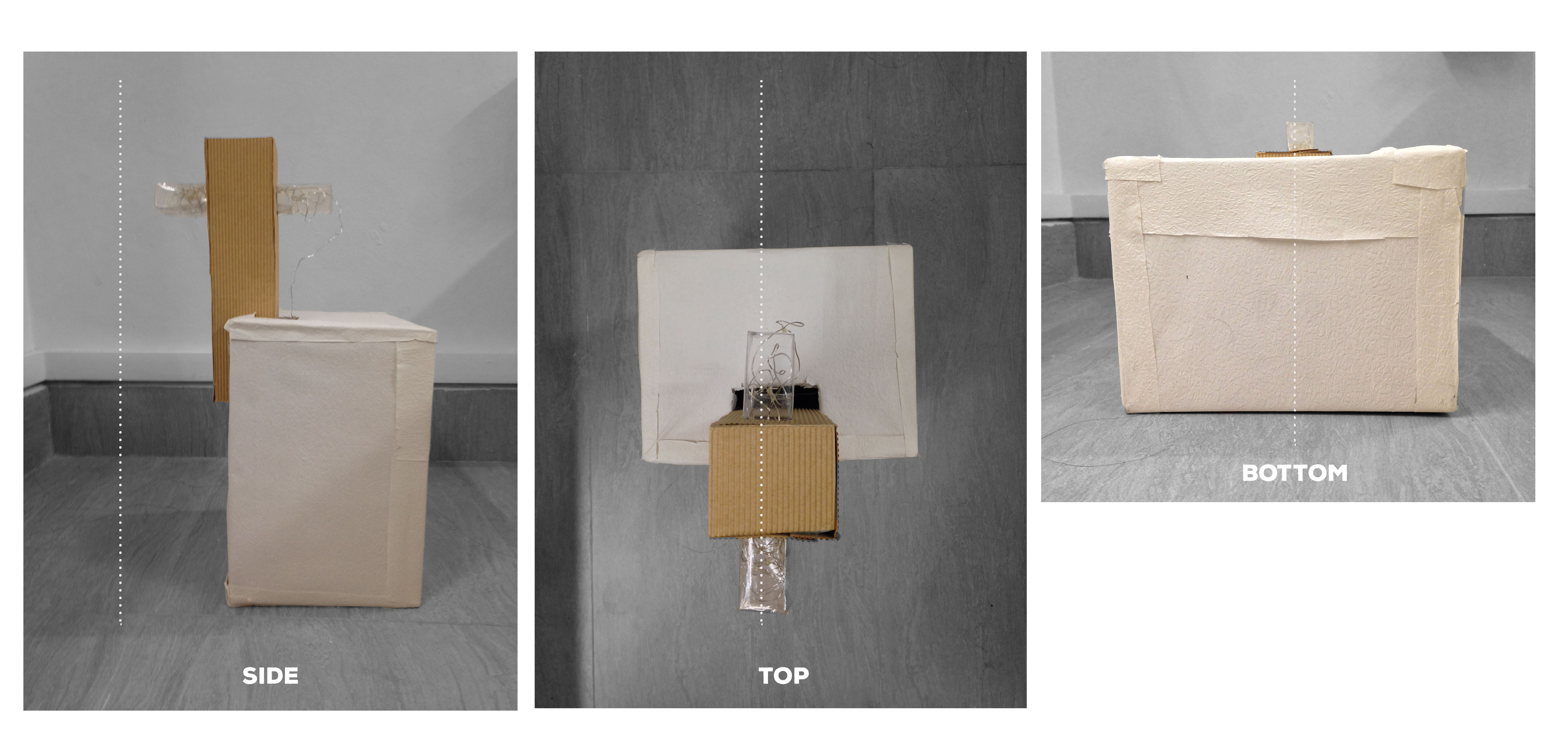
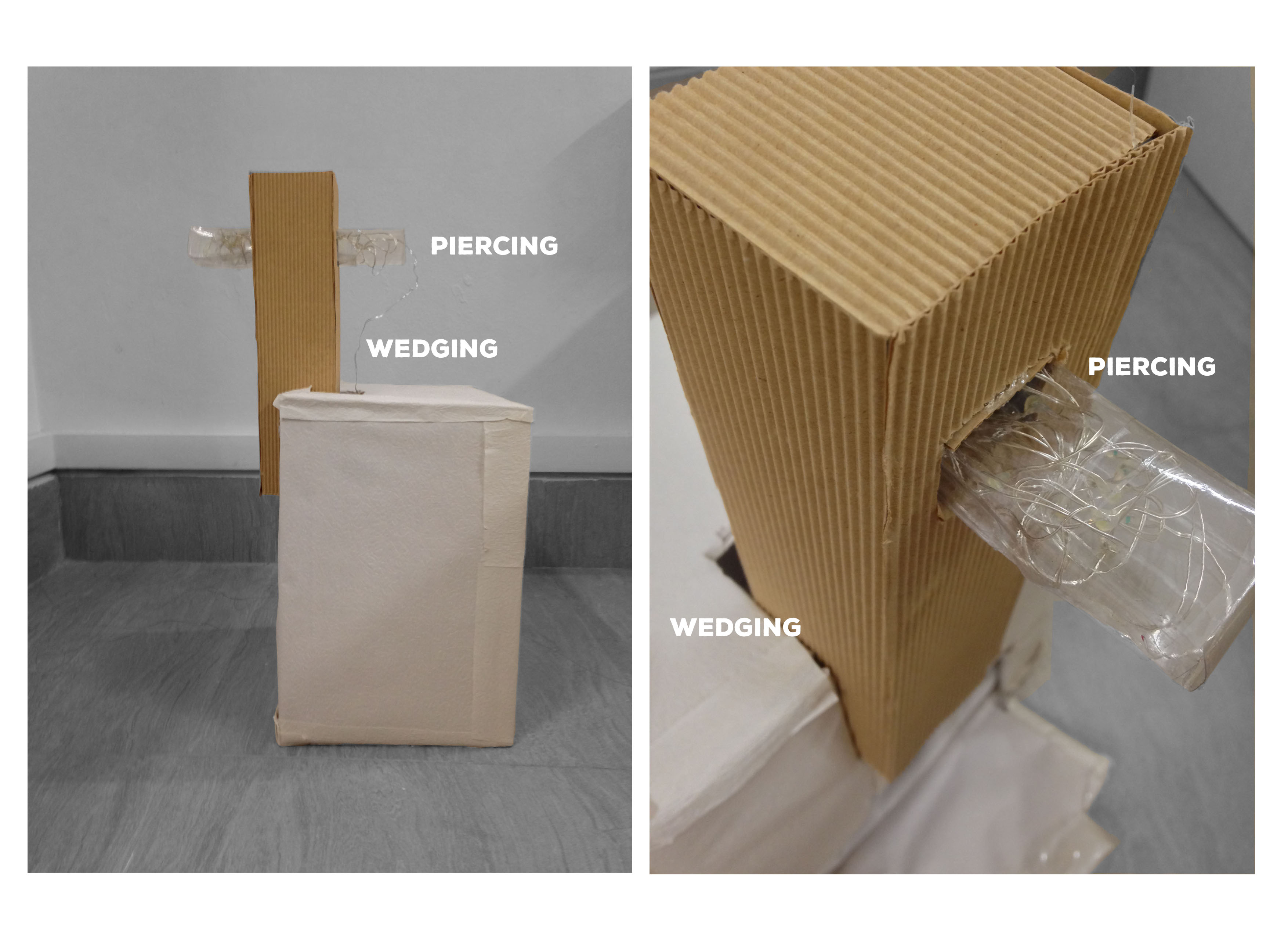
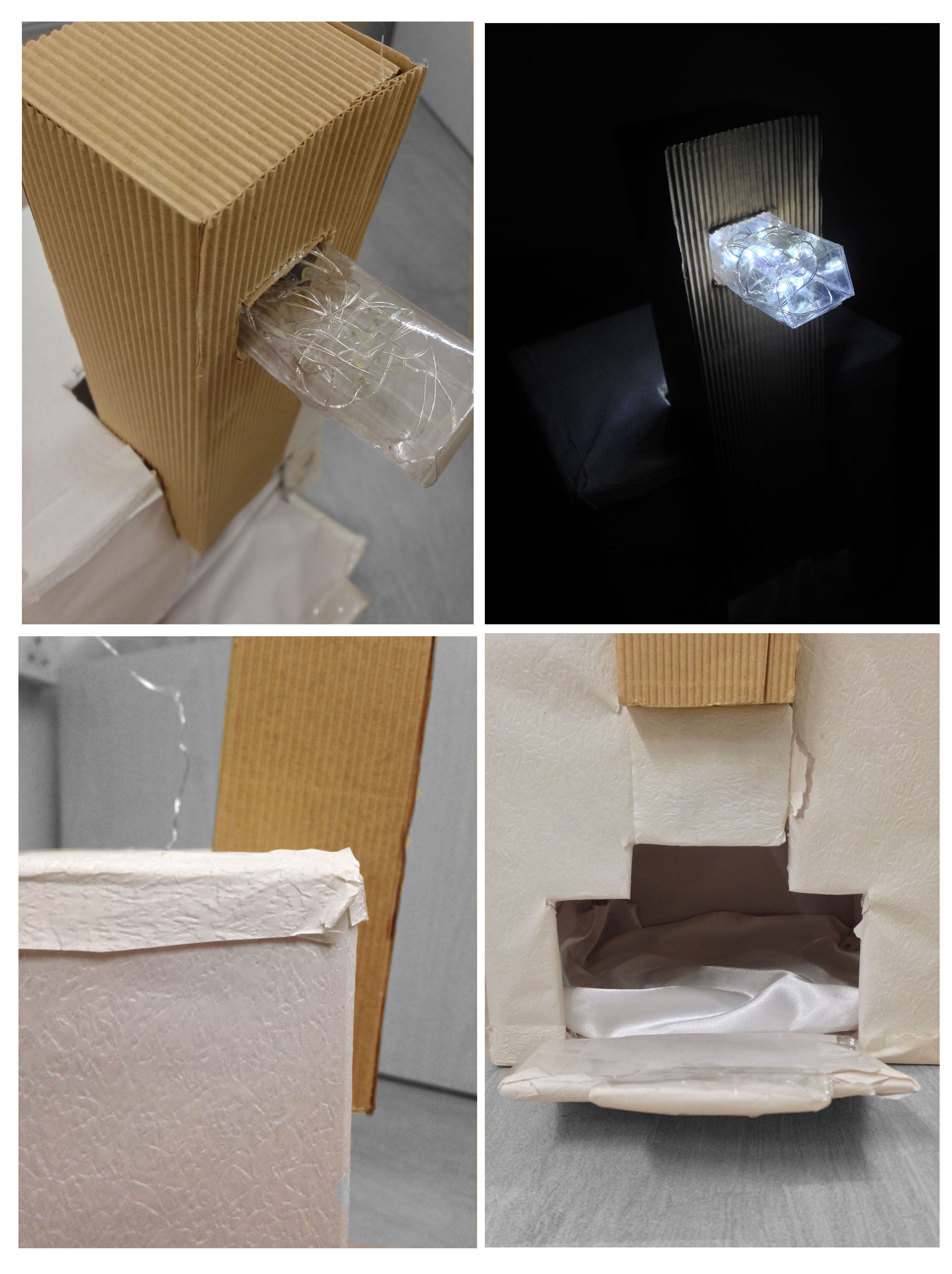
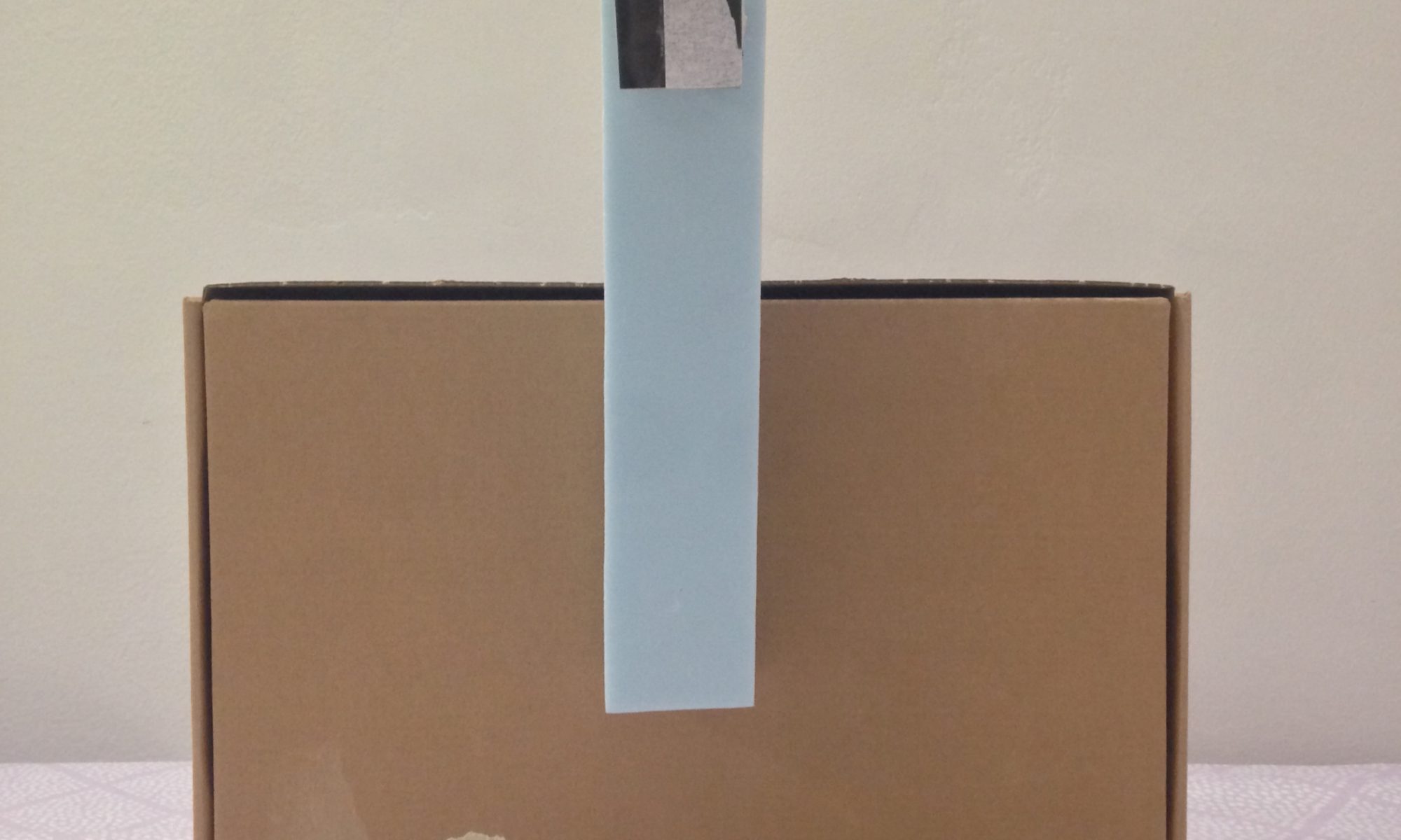
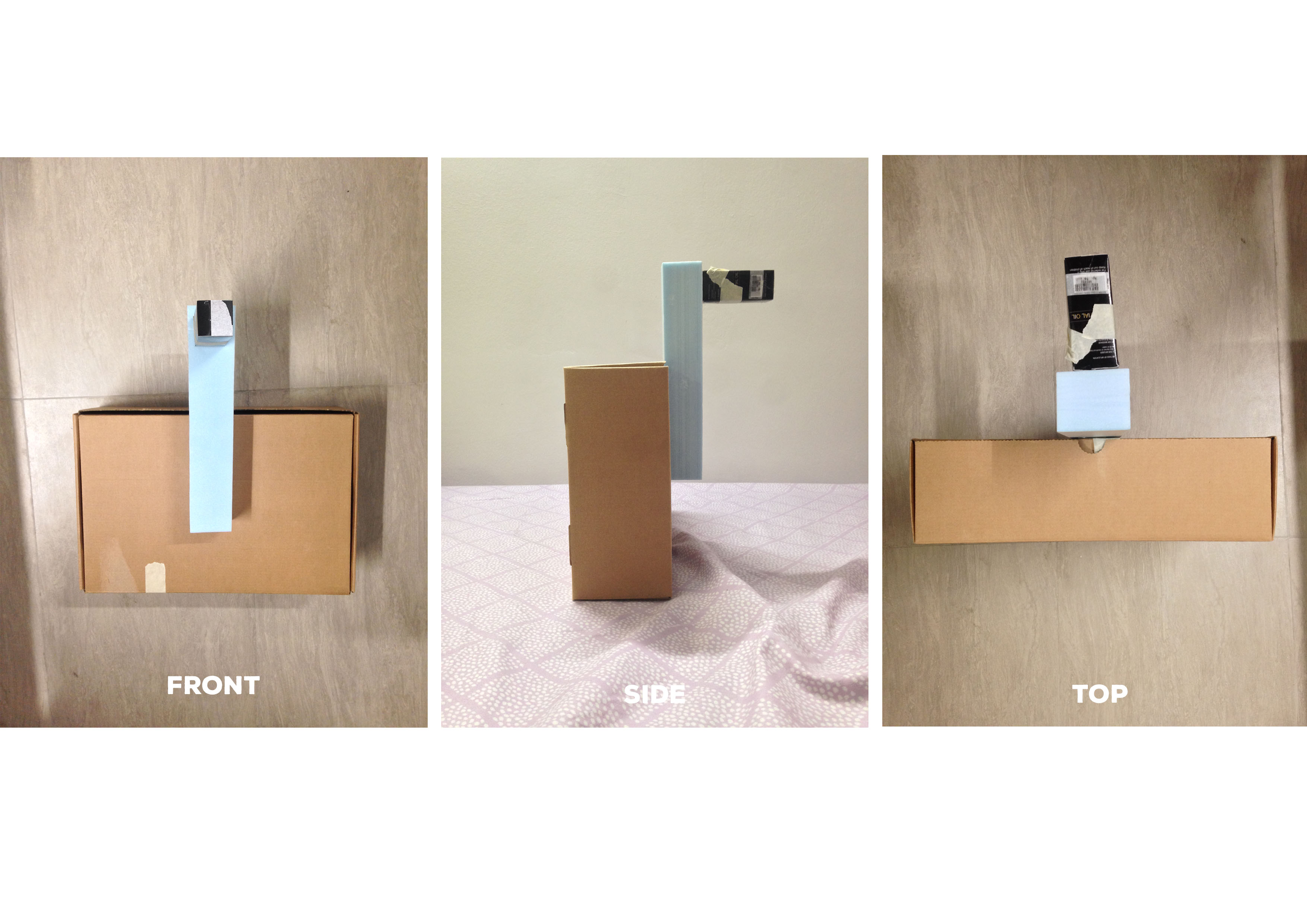
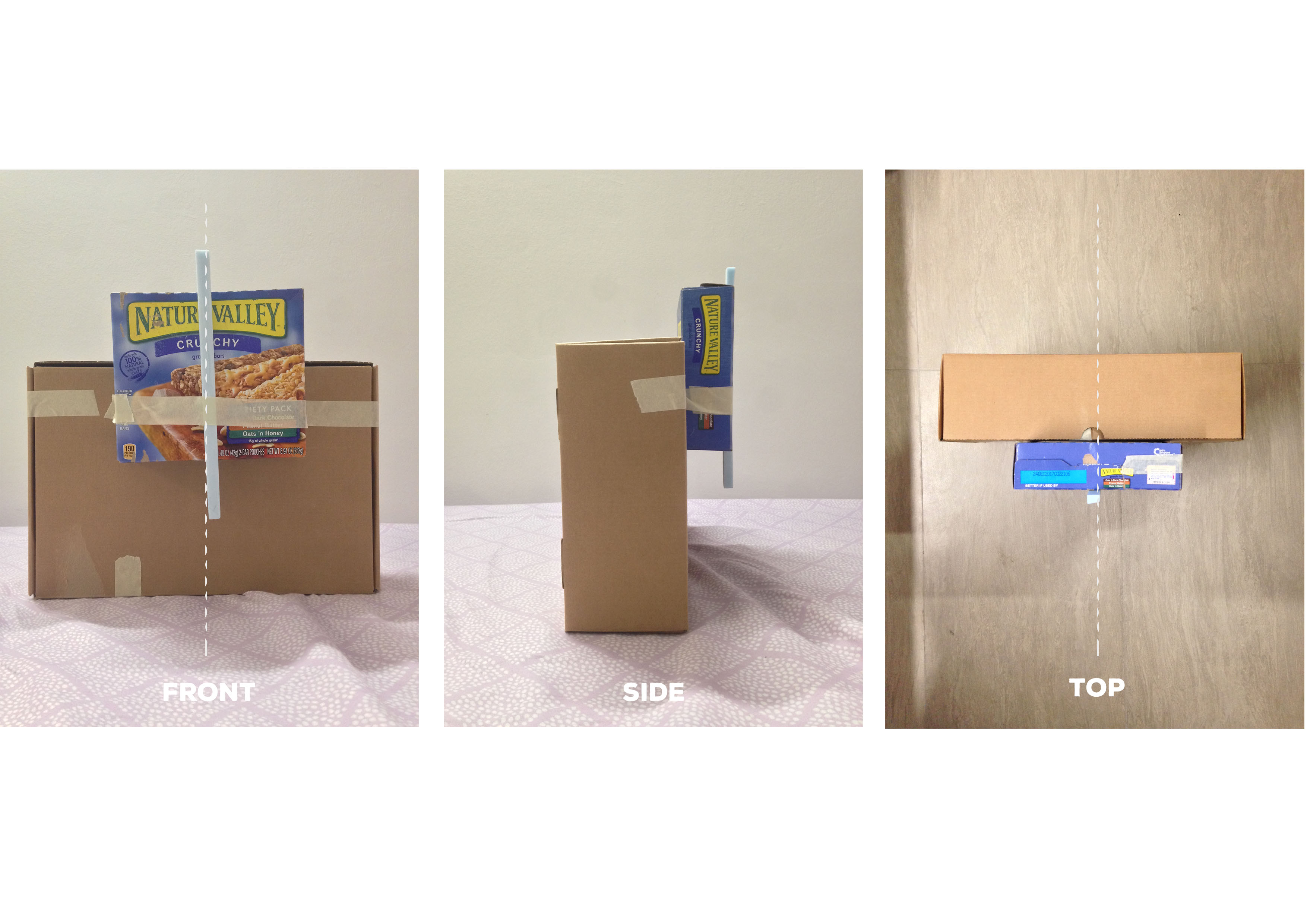
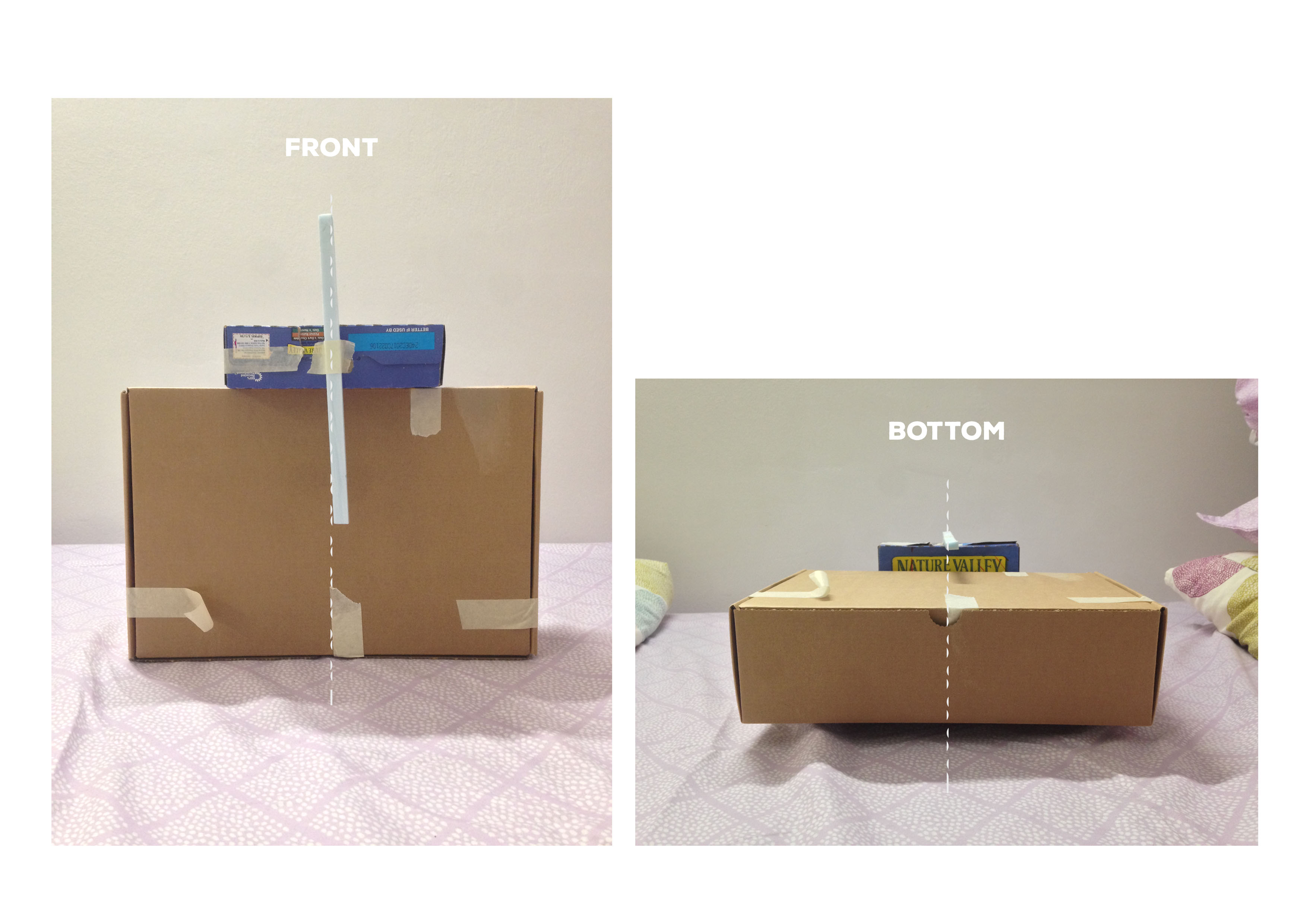
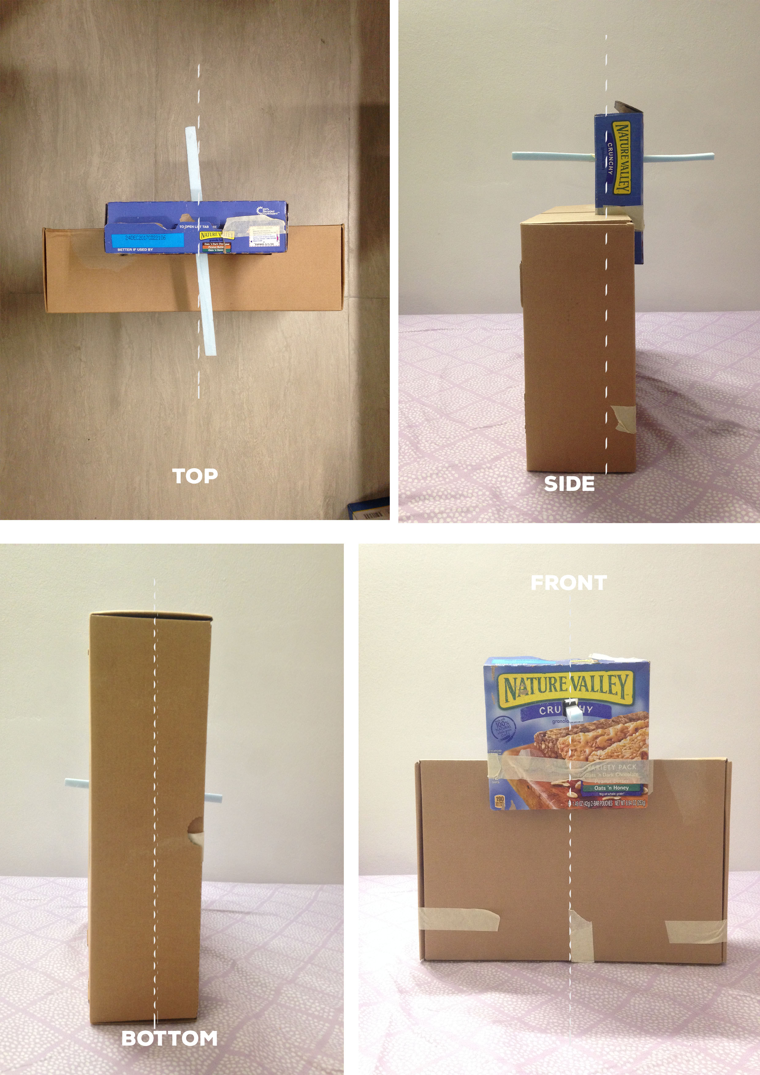
Piercing and wedging the boxes helped in creating symmetrical views at different angles.
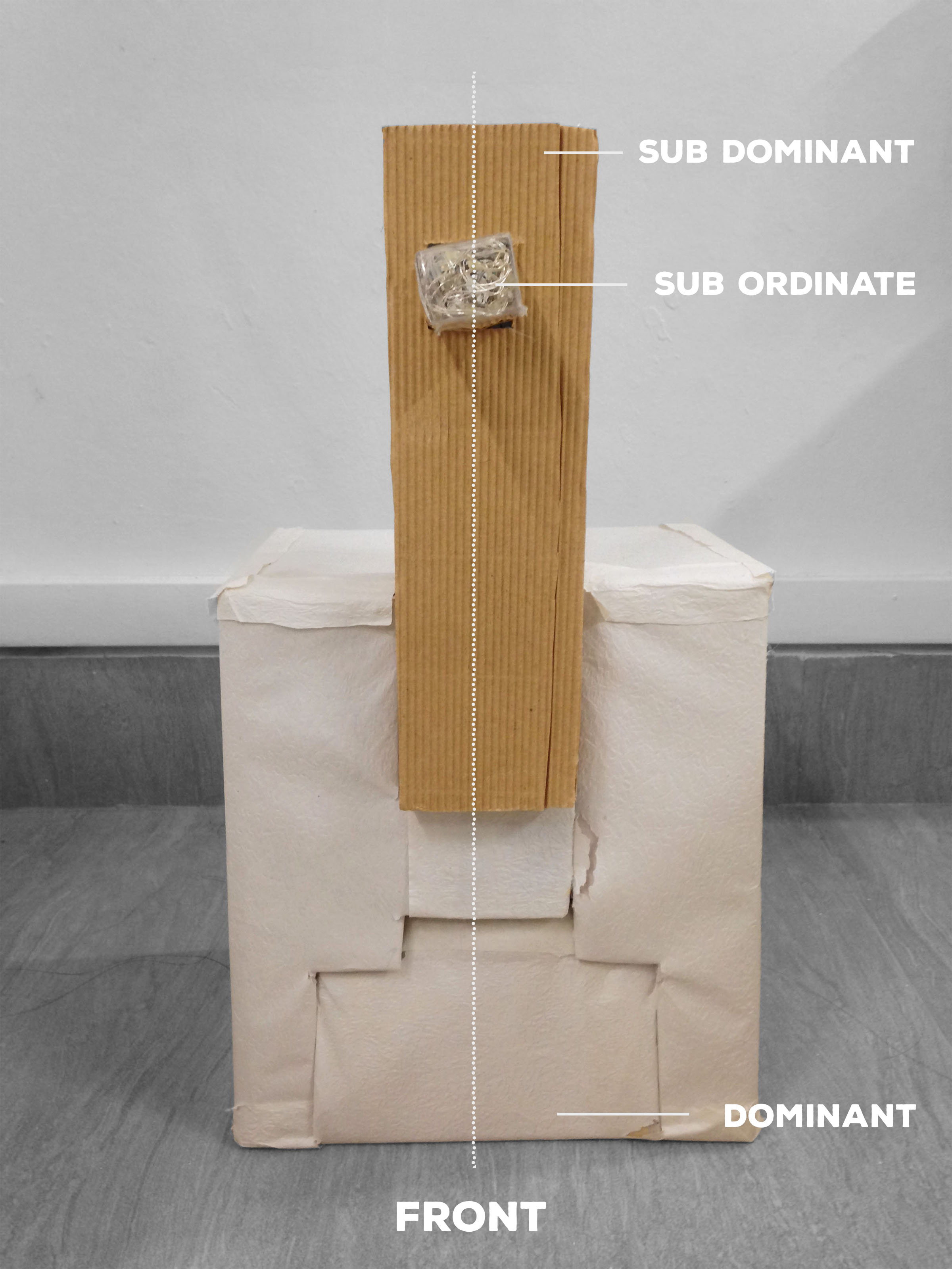


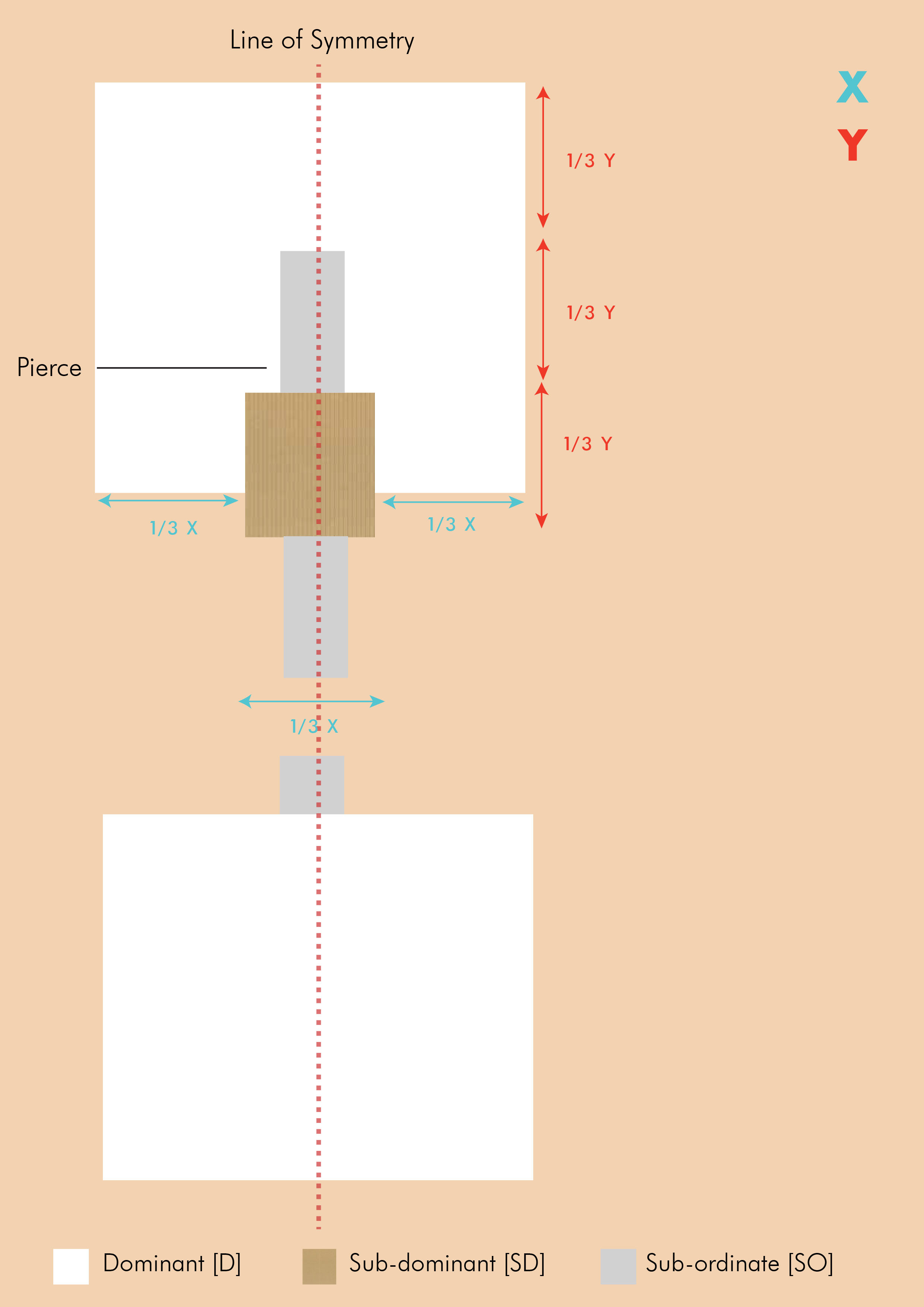
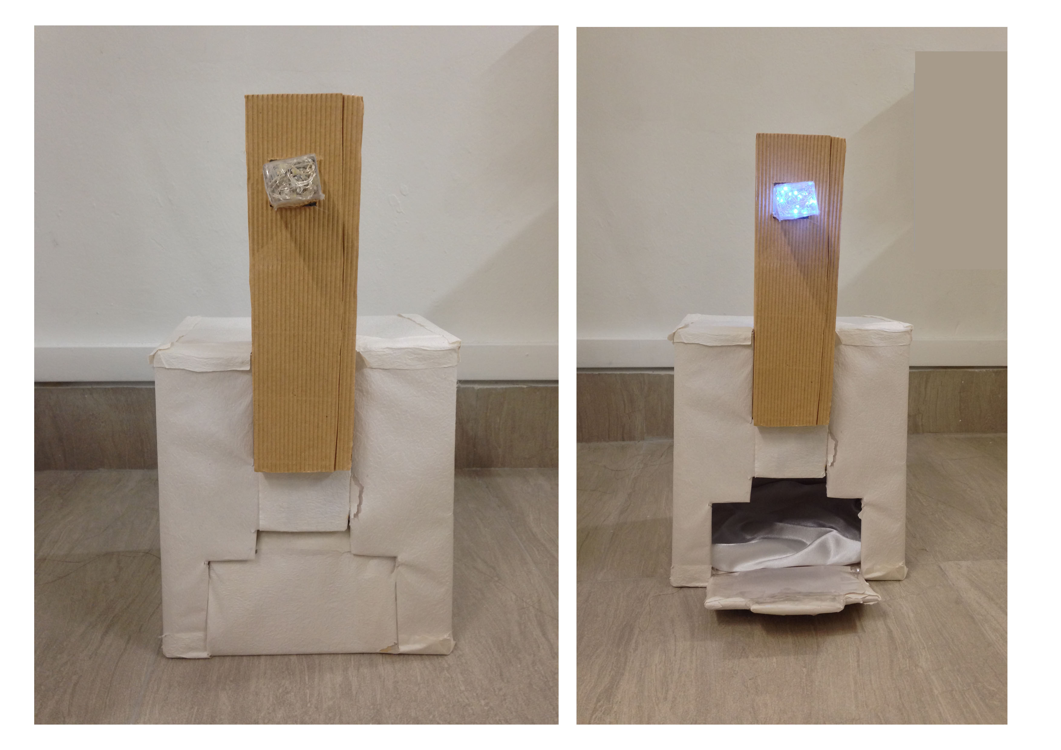
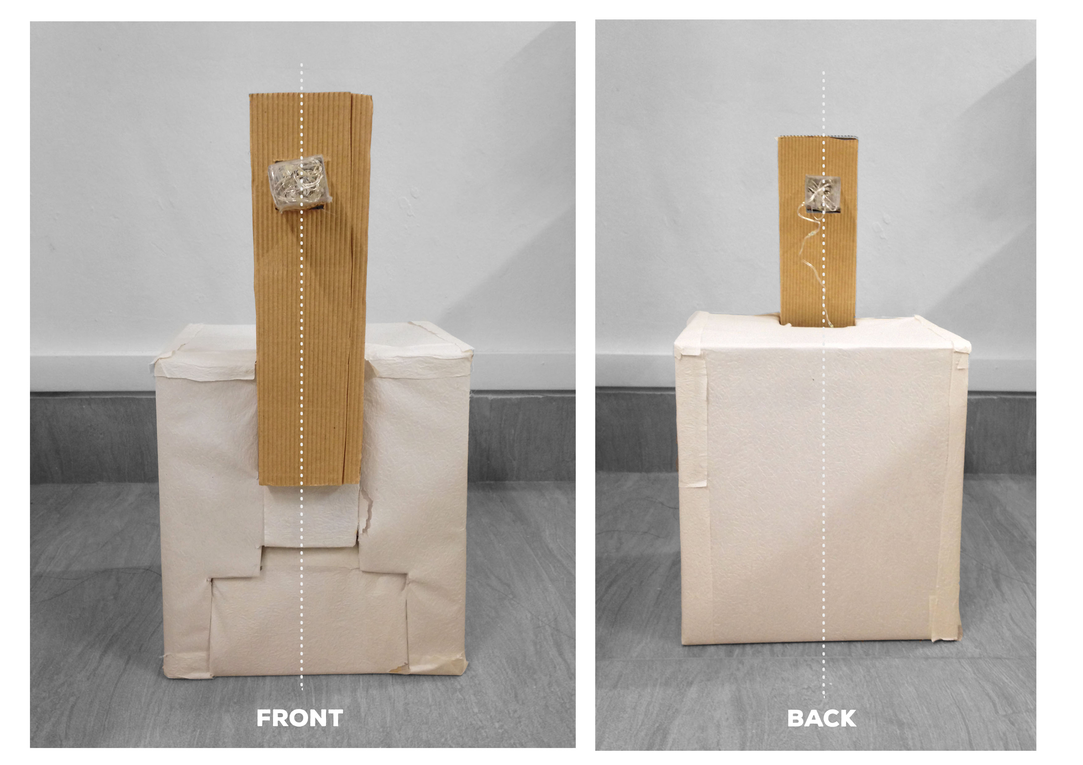
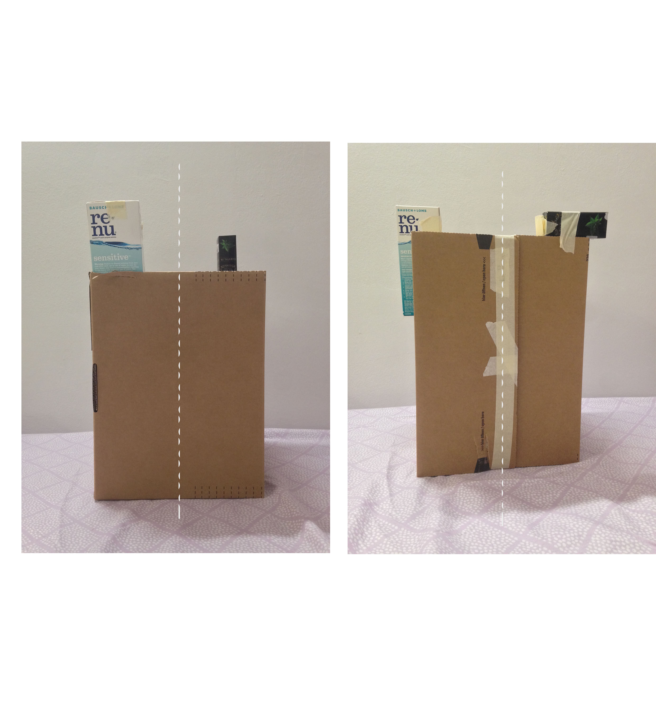
| Symmetry | Symmetry is established by having elements on both sides of the principal axis equal. Focusing on the idea of Reflection Symmetry, I wanted to ensure that the proportions of the boxes on both sides of the principal axis (or line of symmetry) were equal – when a line is drawn through the boxes, they would be equal on both sides. |
| Rule of Thirds | Rule of Thirds is applied through the lengths in which the boxes are placed. This can be seen in the aforementioned sketch analyses where the lengths are indicated by X and Y. |
| Hierarchy | Hierarchy is displayed through the use of boxes of different sizes, displaying the Dominant [D], Sub-dominant [SD], and Sub-ordinate [SO] elements. |
| Balance | The equal proportions on both sides also help in creating a sense of balance. |
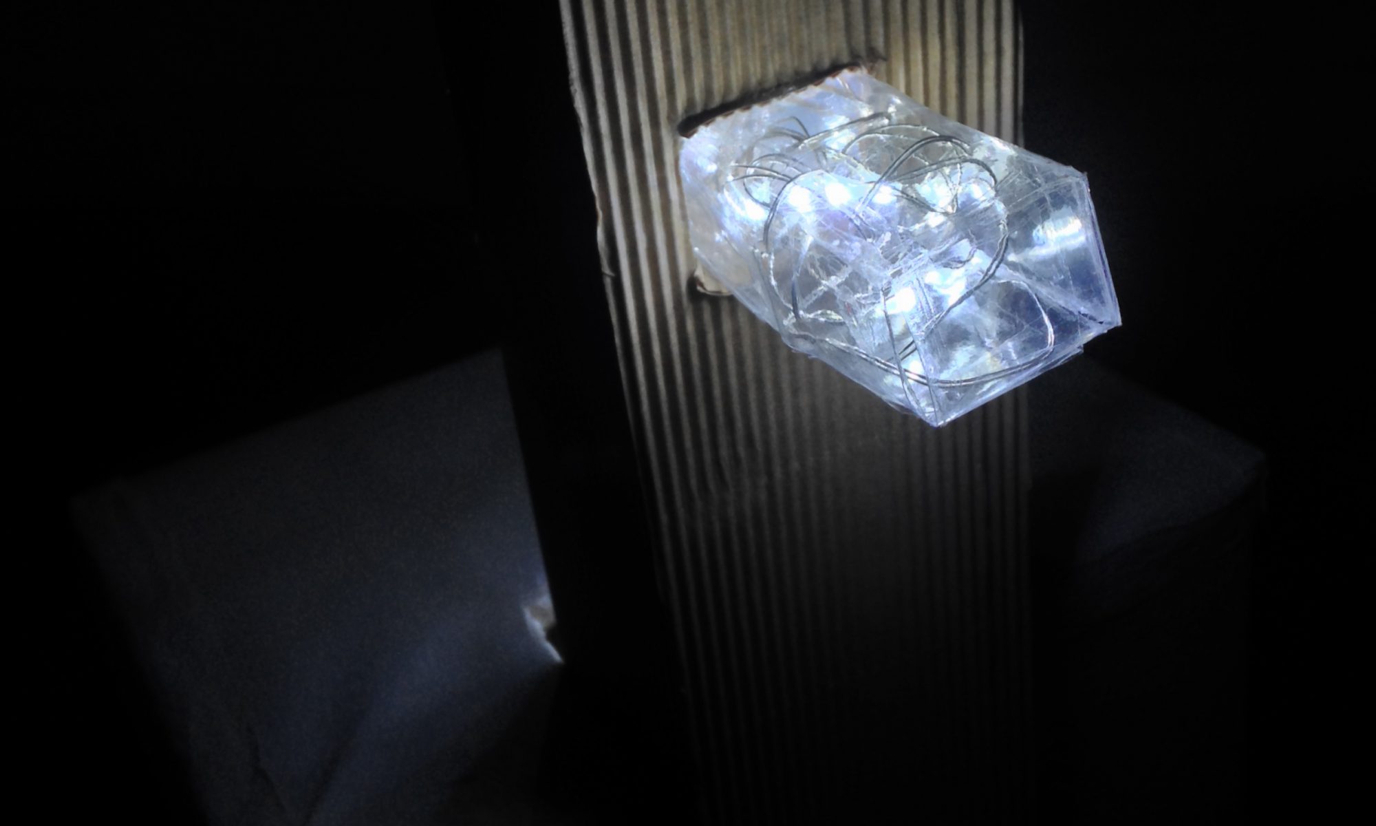
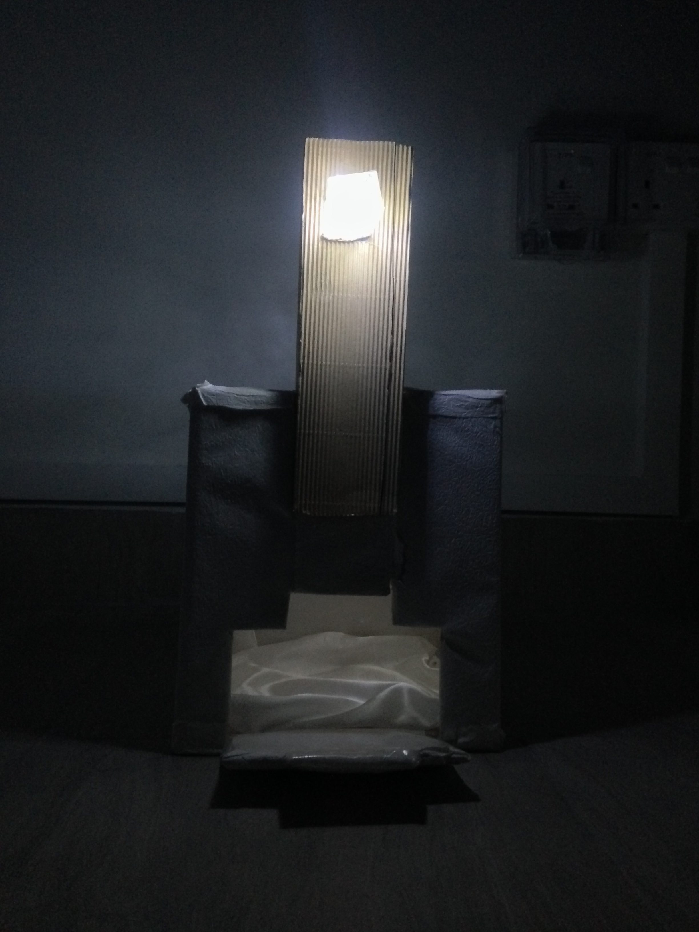
| Void | The product is also a hollow structure whereby there is an incision in the front, creating negative space within. This also allows for the light above to enter the structure, making it more visually-appealing. |
|
Contrast |
I wanted to expand on the idea of contrast by having different colours and textures – this is carried out through the portrayal of wood (using Kraft paper), marble (using textured white paper), and soft/shiny surfaces (using fabric).
Inspired by the aforementioned Disparate Bus Stops, I also wanted to include an element of light to further enhance my product, and at the same time, enhancing the SO by making it more of a ‘finishing touch’ kind of element. |
| Opacity | I wanted my product to display the use of opacity as well. This was carried out by using a range of materials with varying opacities – the wood being opaque, textured paper being translucent, and the clear plastic (SO) being transparent. |
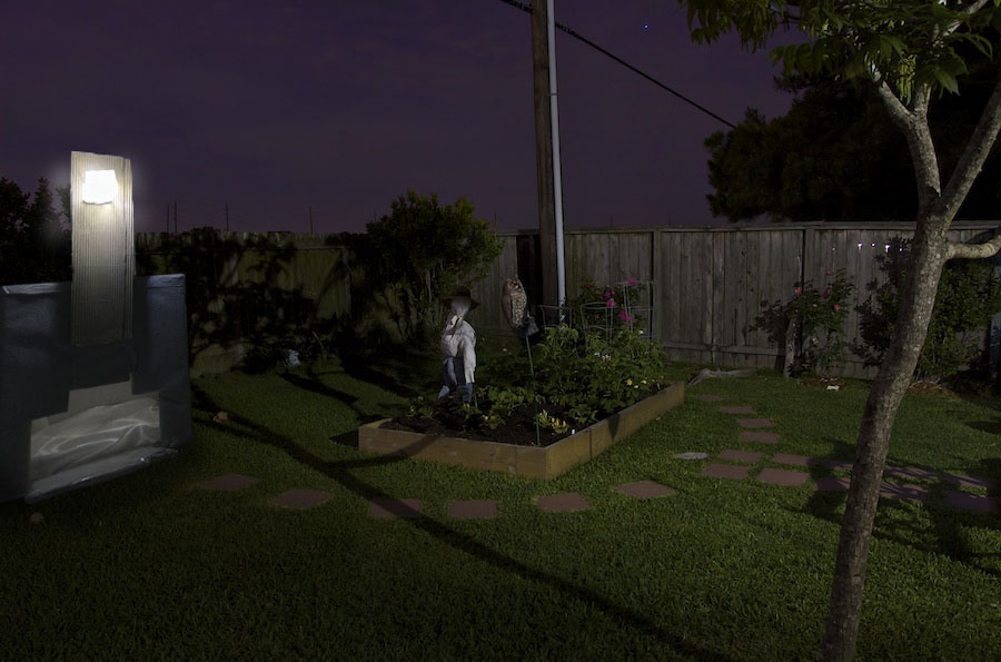
With regards to application, the final product can be used as an outdoor doghouse. The Dominant aspect, with negative space within, acting as the main body, the Subdominant aspect acting as support for the structure and also for aesthetic purposes (being made up of a contrasting material to the Dominant aspect), and the Subordinate aspect acting as a light.
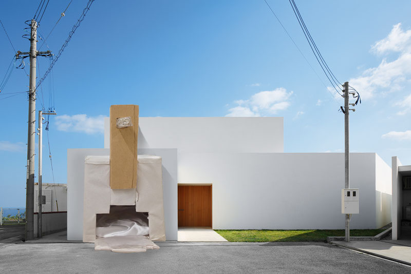
Another application the product can be used for is a garage. Similar to that of the doghouse, the Dominant aspect, with the negative space within, can be used as the main structure for housing the car, the Subdominant acting as a support structure, and the Subordinate aspect functioning as a light for the driveway.
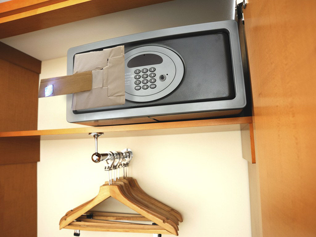
The product can also be used as an additional high-tech safety feature for a safe. The Subdominant can be used as a handle while the Subordinate can be used as an indicator that turns green when the correct code is punched in and red when the wrong one is used.
A challenge I faced was symmetry being a straightforward concept and therefore, I struggled in coming up with creative ways in representing it. However, after researching more on architects, artists, and how common people perceive the idea of symmetry, I was able to formulate ideas.
I also hope to improve on the final display of my product by making it much neater and the cuts cleaner.
– Link to research and process: https://oss.adm.ntu.edu.sg/vwong005/research-process…t-1-pandoras-box/
– Link to 2D sketch analysis (of interesting 3D object): https://oss.adm.ntu.edu.sg/vwong005/2d-sketch-analysis/
As an introduction to rectilinear volumes, our first project required us to create sculptures that embodied different principles of design, all within the context of the story of Pandora’s Box. The project kicked off with everyone picking a random word from a small, wooden box, from which I got ‘symmetry’.
Initially thinking of symmetry as a rather straightforward concept, I came to realise that depicting it in a physical, abstract form is quite challenging. After wracking my brains for a good few days, I decided to turn to research and reference artists and the ideas flowed from there.
‘Symmetry’ refers to ‘balanced proportions’ or the ‘beauty of form arising from balanced proportions’, when ‘elements are arranged in the same way on both sides of an axis’, creating ‘correct or pleasing proportion[s]’ of a subject. Common terms associated include ‘equilibrium’, ‘agreement’, and ‘harmony’.
The concept of symmetry encompasses three main techniques – reflection, rotation, and translation symmetry.
| Reflection Symmetry | The mirroring of an equivalent element around a central axis |
| Rotation Symmetry | Rotation of equivalent elements around a common centre |
| Translation Symmetry | Location of equivalent elements in different areas of space |
Combinations of these techniques can therefore, create ‘harmonious, interesting, [and] memorable designs’.
Sou Fujimoto is one of Japan’s most recognised architects, whose body of work centres on ‘ambiguous interpretation[s] of spaces and forms’ in which he is inspired by ‘organic and natural structures (such as forests and caves)’. He has mentioned that with regards to the complexity of the natural environment, ‘we inject our human sense of order (and vice versa), carrying forward a new definition of space which responds to the changing times’, and with that, his works fit into the idea of this place ‘between the natural and human artificial’.
House H (2008)
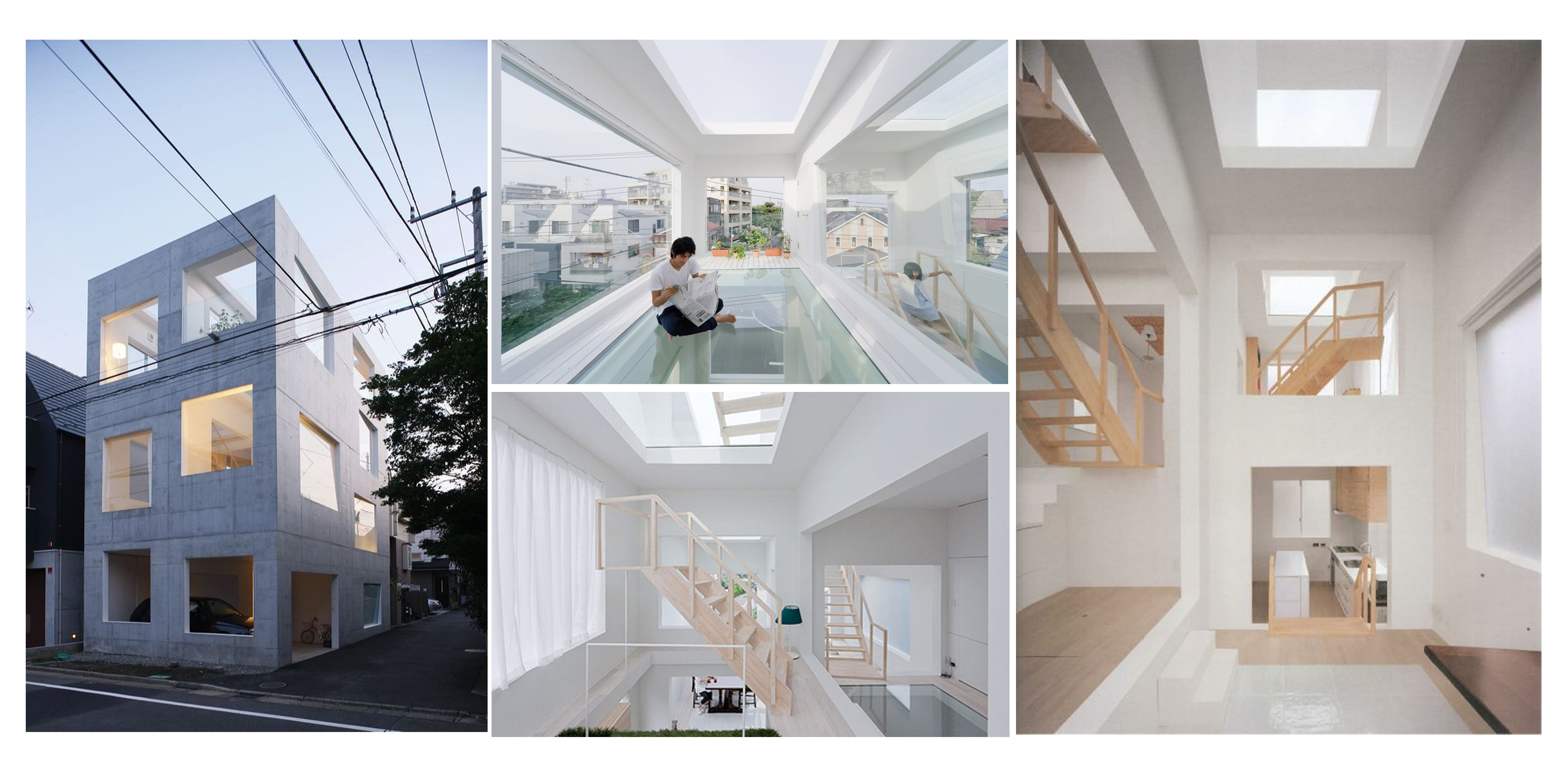
House H was conceptualised as a dwelling for a family of three located in a residential district in Tokyo. It is said that living in a multi-storey complex in a ‘dense metropolis’ like Tokyo is ‘somehow similar to living in a large tree’, from which ‘exists a few large branches’, ‘endow[ing] numerous qualities’ such as ‘pleasant places to sit, sleep’, and ‘discourse’.
The residence is covered by holes – the walls, ceilings, and floors are ‘blatantly punctured and are interlocked three-dimensionally’, through which ‘one is able to see and feel through to the spaces adjacent, above and below oneself’. ‘The rich spatiality conceived here’ also consists of the three-dimensional factors of an ‘Escher image’.
Desparate Bus Stops is a project by British architectural photographers Hufton+Crow, where they documented seven disparate bus shelters scattered along roadways in the village of Krumbach, Austria. The structures of these bus shelters were reimagined by an international group of designers.
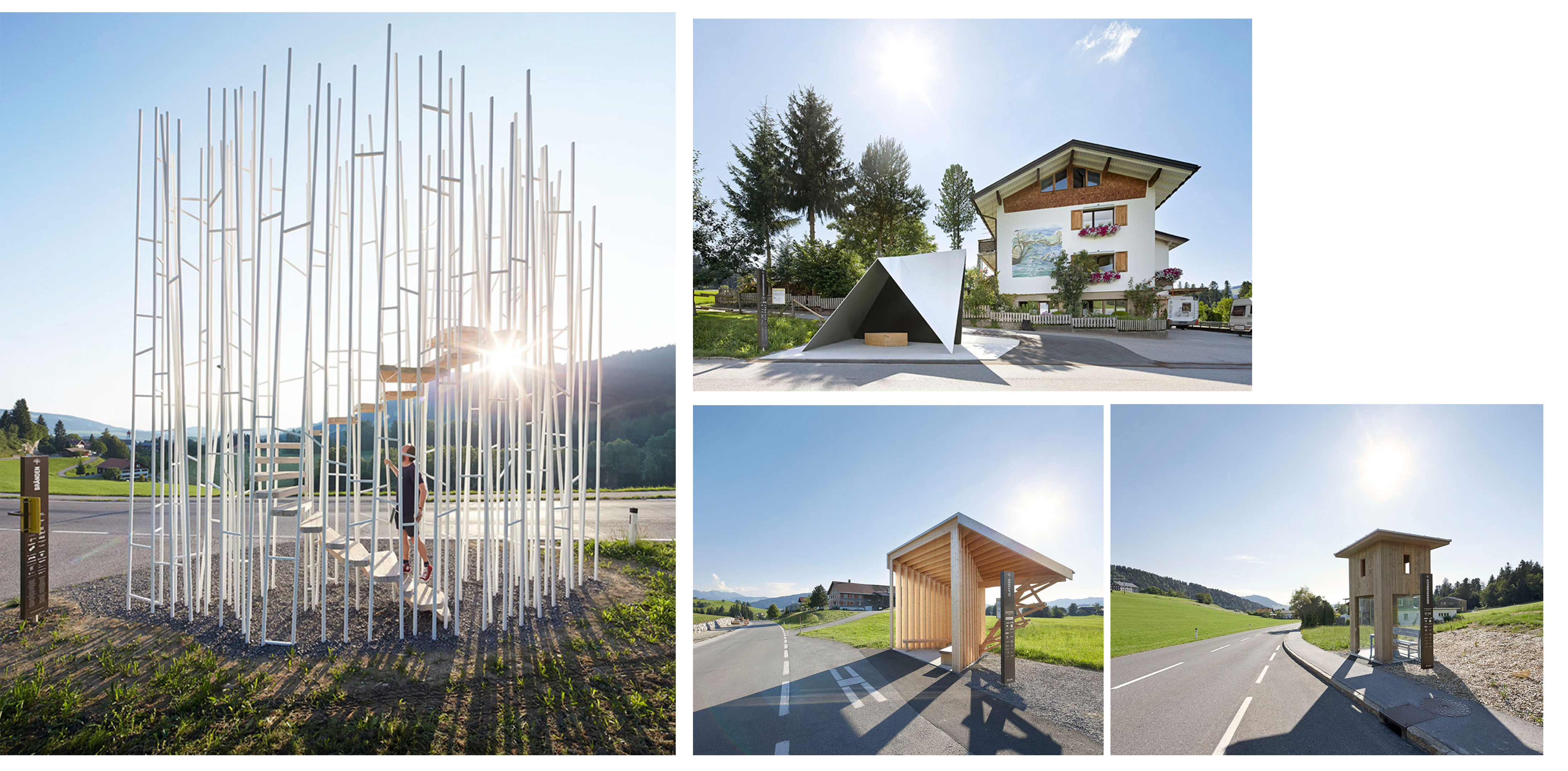
The bus stops focused on relating to the landscape in diverse ways, all while providing varying degrees of shelter from weather forces and indicating, with a strong presence, where passers-by may catch the regional transit.
After researching more on the concept of symmetry, I came across many instances where symmetry is associated with being rather geometric, minimalist, slick, and clean-cut. On my part, I find minimalist structures visually-pleasing to look at (emphasises harmony) and hence, I intend to base my final product on this basis. Additionally, keeping in mind the criteria for this project – using rectilinear shapes with no tilting of volumes – I intend to expand more on Reflection Symmetry.
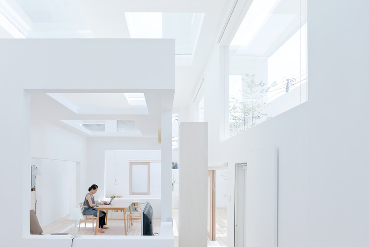
I hope to emulate some factors of Sou Fujimoto’s House H, especially in adopting methods to turn the rigid nature of rectilinear volumes to establish separate but balanced forms. This is evident in House H‘s inclusion of void and natural lighting, which is seen through using transparent materials, as well as ‘using artificial and geometric order’ to create a ‘succession of void’.
Coming across Disparate Bus Stops, I was inspired to approach the use of materials in both a visual and functional form. Using a variety of materials that range in opacity and texture, the designers in the project were able to take traditional bus stops and give them a modern twist that is, at the same time, visually-pleasing and functional in relation to its environment.
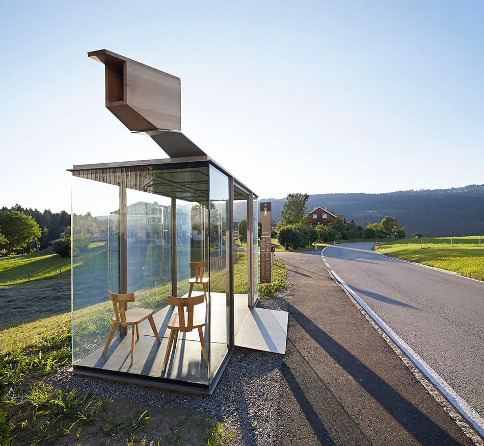
My personal favourite is the one by Smiljan Radic, where I found his choice of material particularly interesting – in addition to the visually-appealing pairing of materials with different opacities and textures (glass and wood), the bus stop is also functional in the sense that users experience it in the same way they would at a regular bus stop, such as sitting while waiting for the bus. The attention to environmental factors – being surrounded by glass in a natural landscape – also makes it all the more visually-appealing and attention-grabbing.
Model 1 focuses more on the concept of Translation Symmetry.
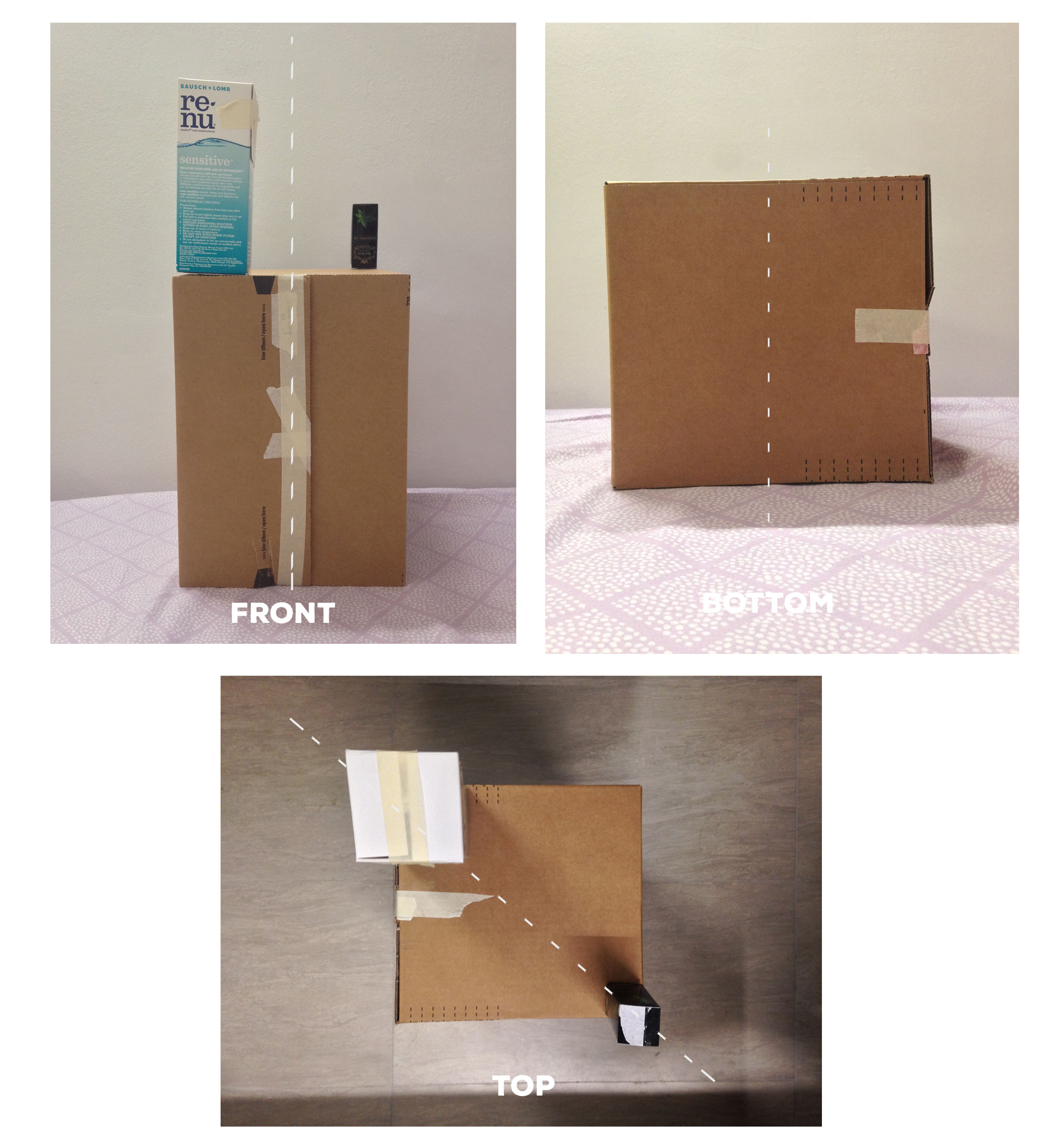
| Positive | Changes To Make | |
| Draft 1 | Diagonal line of symmetry
Rule of Thirds (sizes of boxes used) Established hierarchy |
Line of symmetry to be present in all views |
| Draft 2 | Diagonal line of symmetry
Rule of Thirds (sizes of boxes used) Established hierarchy Line of symmetry present in frontal view, through wedging |
Boxes to be seen from different views
Try out different methods of display for SO |
| Draft 3 | Lines of symmetry
Rule of Thirds (sizes of boxes used) Established hierarchy More interesting views from different angles |
Model 2 focuses more on the concept of Reflection Symmetry.
| Positive | Changes To Make | |
| Draft 1 | Line of symmetry
|
Unclear hierarchy: Change sizes of boxes
Lack of line of symmetry in other views: Look into wedging and piercing |
| Draft 2 | Line of symmetry | Unclear hierarchy: Change shape of SD
Lack of line of symmetry in other views: Look into wedging and piercing |
| Draft 3 | Line of symmetry
Symmetry more established in different views |
Unclear hierarchy: Change shape of SD, change length of SO
Application of Rule of Thirds Lack of line of symmetry in other views: Look into wedging and piercing |
| Draft 4 | Line of symmetry
Symmetry more established in different views |
Hierarchy: Change shape of SD, change size of SO
Apply materials |
Model 3 focuses more on Rotation Symmetry.
| Positive | Changes To Make | |
| Draft 1 | Line of symmetry
Established hierarchy |
Discard: No tilting of volumes |
For my final product, I decided to go with Model 2 because of its clearer hierarchy of volumes and composition that allows for more expansion on the concept of symmetry. Its arrangement is also easier to apply for use in daily life as opposed to Model 1.
– Link to final product and write-up: https://oss.adm.ntu.edu.sg/vwong005/final-project-1-pandoras-box/
– Link to 2D sketch analysis (of interesting 3D object): https://oss.adm.ntu.edu.sg/vwong005/2d-sketch-analysis/
https://www.merriam-webster.com/dictionary/symmetry
http://learndesignprinciples.com/symmetry.html
http://www.floornature.com/sou-fujimoto-120/
http://www.archdaily.com/188814/house-h-sou-fujimoto
https://www.designboom.com/architecture/huftoncrow-krumbach-bus-stops-austria-07-29-2014/

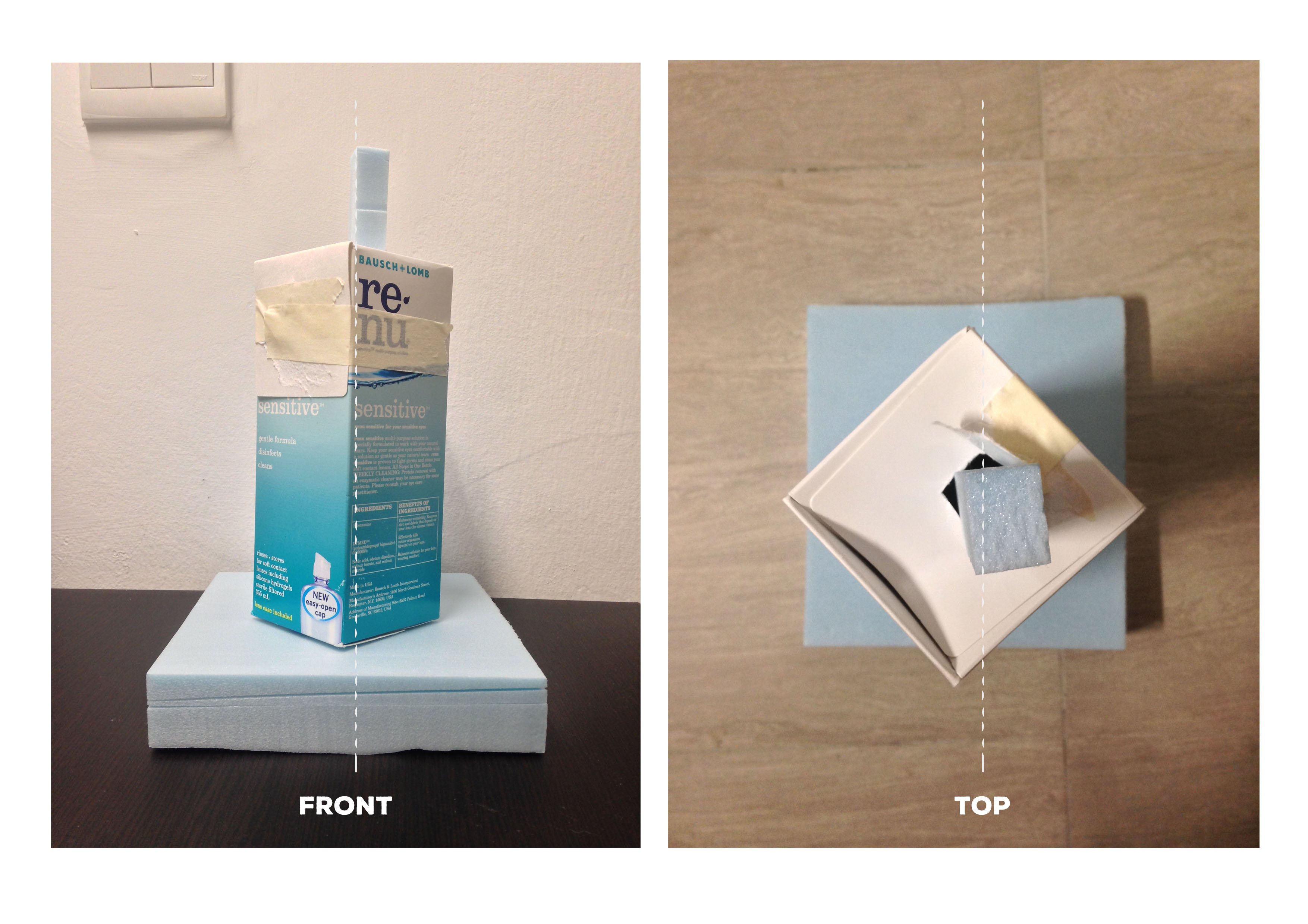
As a form of warm-up to the module, we were tasked to bring an object we found three-dimensionally interesting to class. Something I found interestingly-shaped was my eyedrops bottle.
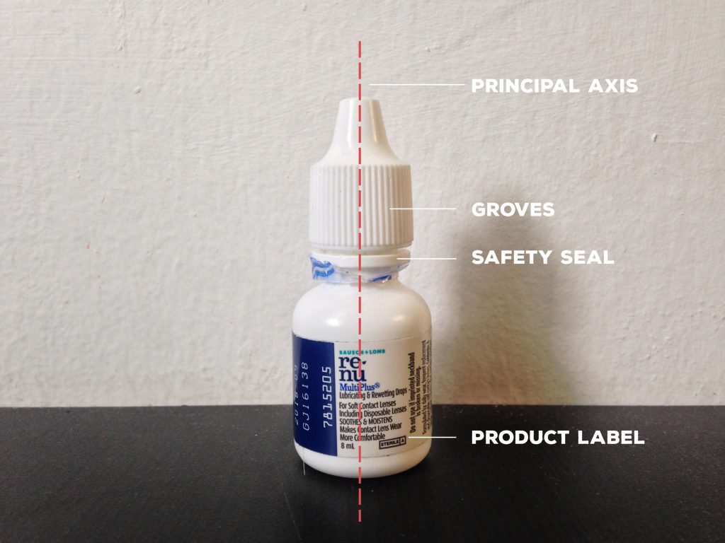
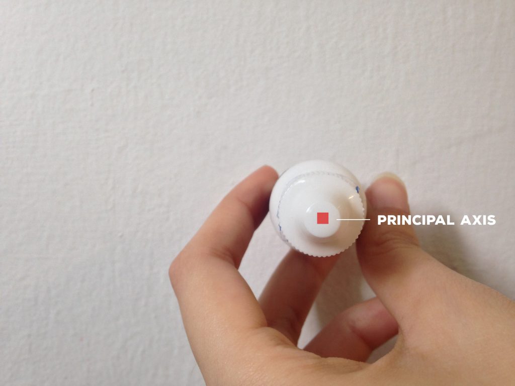
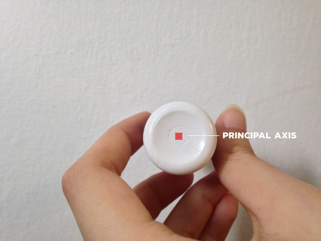
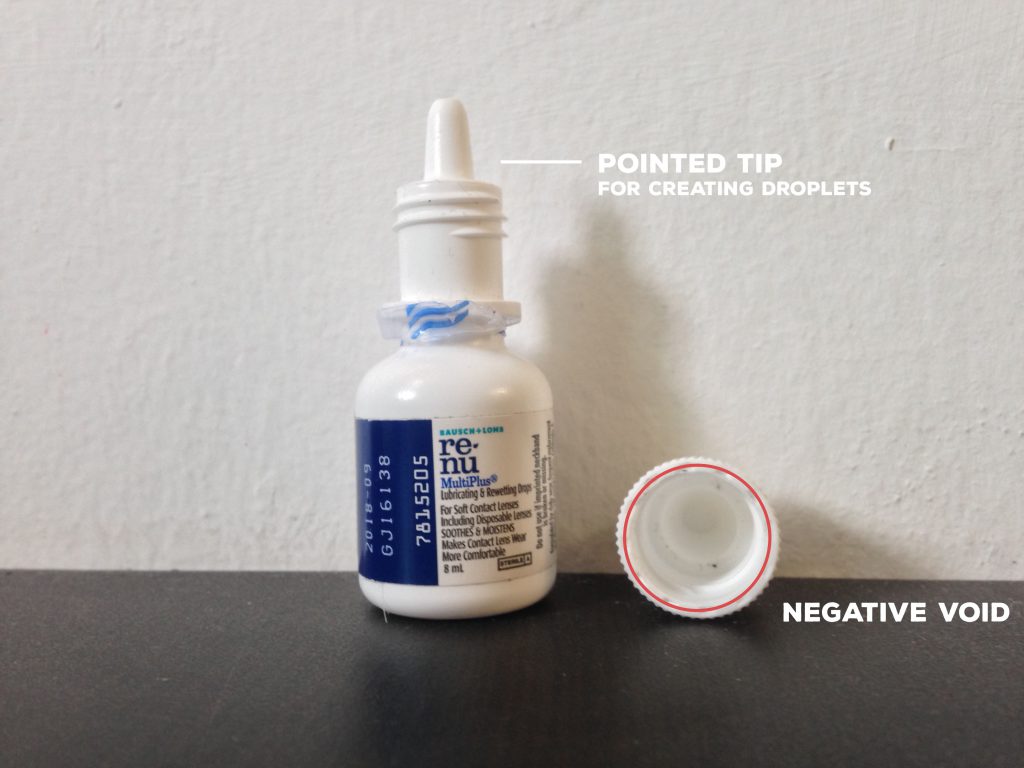
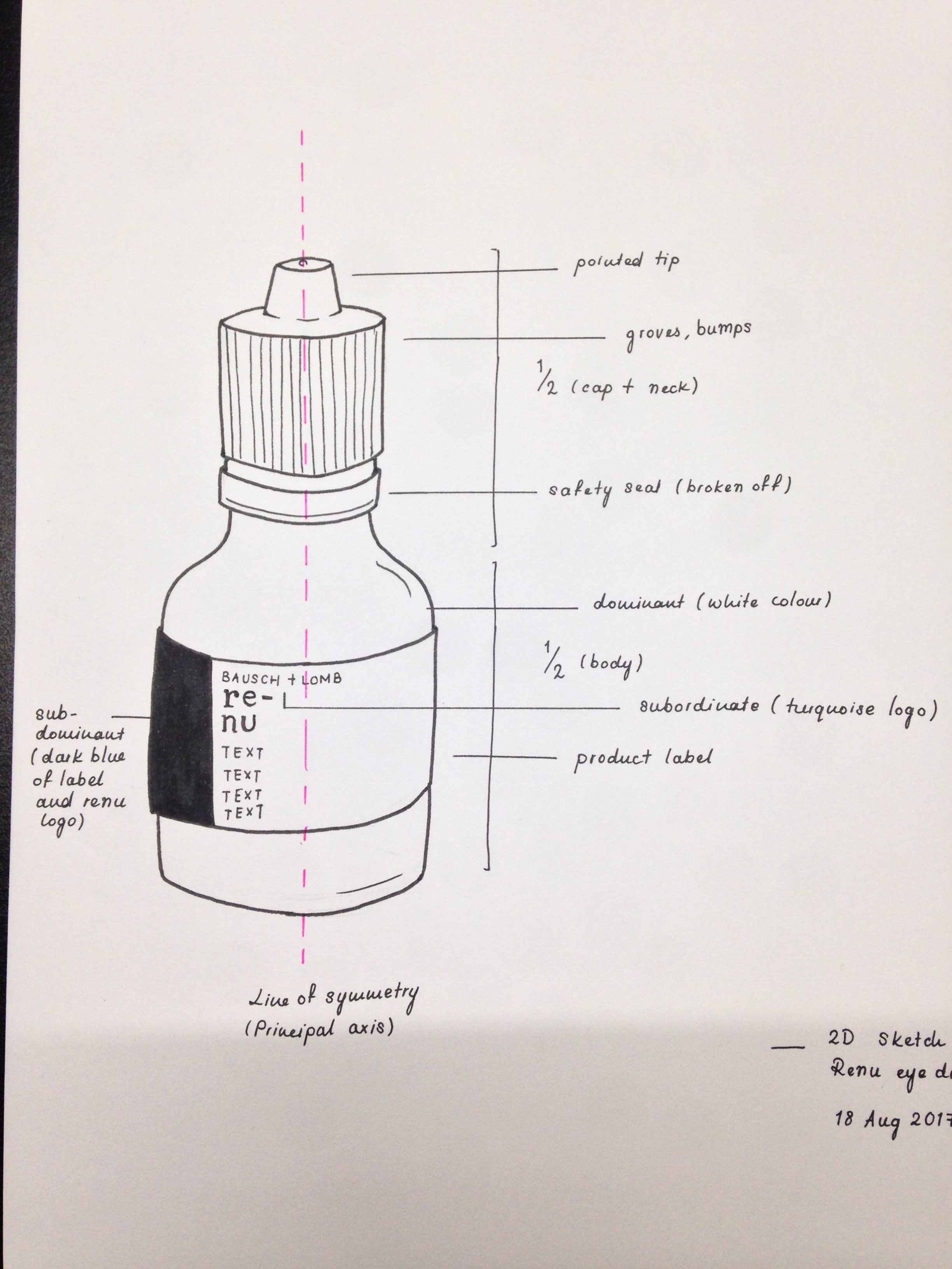
‘Principal Axis’ was one of the first terms we discussed in class. Principal axes are usually found along the longest lengths of the object in question. In the case of this eyedropper, the axis is through the centre.
After doing a quick Google search, I also found out that the main role of axes in design is to align elements. Generally, when these elements are arranged around an axis, the design feels ordered, thus creating a sense of stability, comfort, and being approachable (which is what people prefer).
Identifying the Principal Axis helps to determine if the object is symmetrical. Symmetry is defined as ‘a property of visual equivalence among elements in a form’, and is usually determined after finding the object’s line of symmetry. The eyedropper in this case, is symmetrical, given that opposing sides on the line of symmetry are identical.
‘Hierarchy’ was another important term we learned; it is defined as when ‘an element appears more important in comparison to other elements in design’. On the other hand, ‘hierarchal organisation is the simplest structure for visualising and understanding complexity’. Hierarchy is also described using three main terms – dominant (the element most present and eye-catching), subdominant (the element that contrasts with the dominant component), and subordinate (the element that adds the finishing touch).
Using the eyedropper as a case study, the dominant element is the white colour used in both the bottle and label, while the subdominant element is the dark blue colour used in the label, and the subordinate element being the turquoise ‘Bausch + Lomb’ sub-header in the label.
‘Mass’ in design refers to a space that is filled. Void, on the other hand, refers to an empty space created by surrounding elements of the object. The eyedropper mainly consists of positive mass but has an area of negative void when opened.
‘Opacity’ is defined as ‘the quality or state of a body that makes it impervious to the rays of light’. The design of the eyedropper is entirely opaque, this may be be a safety precaution to protect the contents within.
The eyedropper also possesses other qualities that make it all the more interesting. Some elements that contributed to its ergonomic design include having groves on the cap to allow users to have a better grip when opening the bottle, a safety seal that prevents leakage and exposure of the contents when being transported during the manufacturing process, and a cone-shaped tip to help in creating droplets when used.
http://learndesignprinciples.com/hierarchy.html
http://learndesignprinciples.com/axis.html
https://www.merriam-webster.com/dictionary/opacity