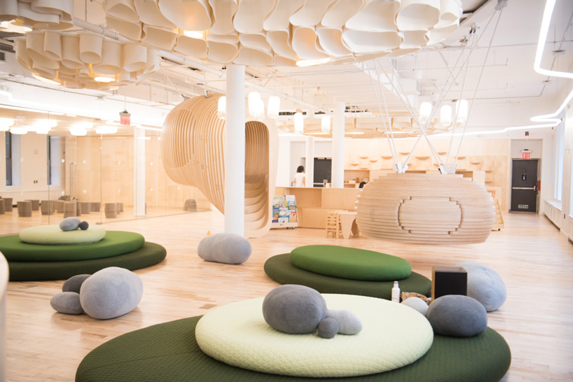
Tell Your Children (TYC) is a local creative studio that specialises in producing visual content through illustration and design. They have been proficient in working on mural projects, key visuals, and graphics for both local and international clients.
Ultimately, they seek to elevate and lead the creative community of Singapore and beyond. Through self-initiated events and projects led by the collective’s creative output, TYC and the community are able to form a creative eco-system that adds and gives back to one another.
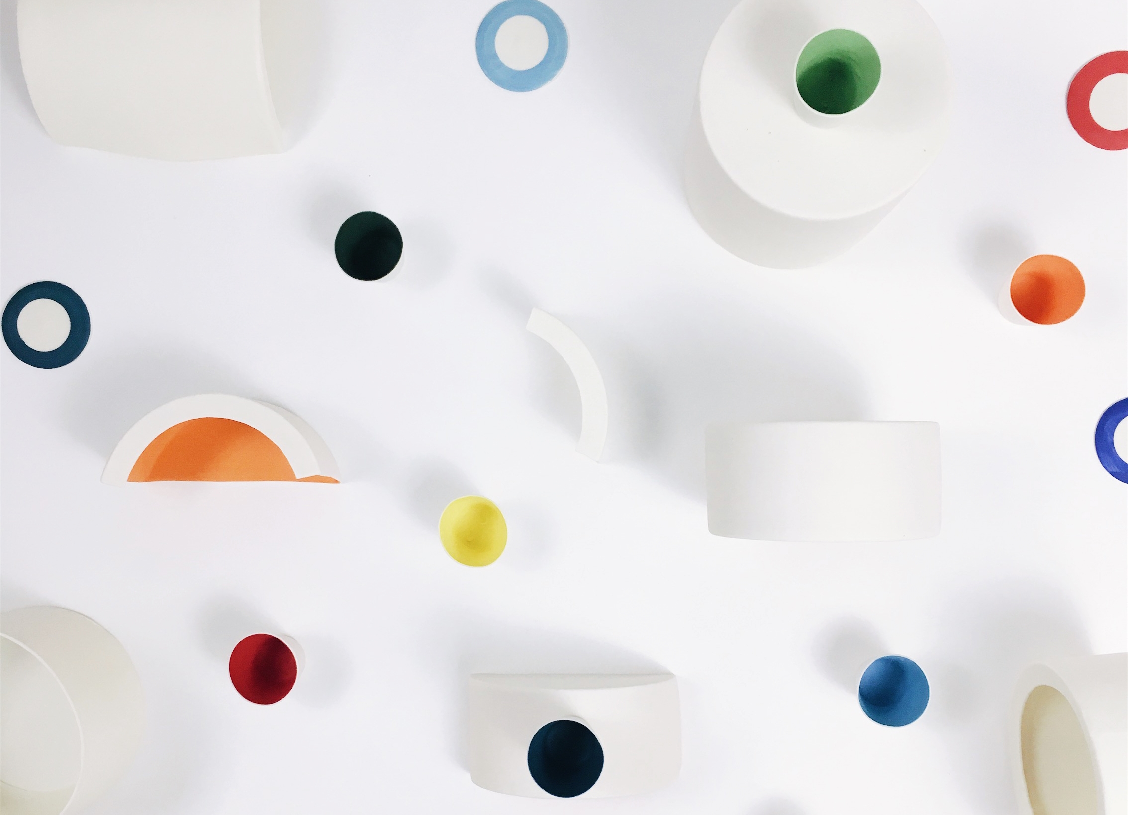
Fictive Fingers, singapore
Image of screenprinting by Fictive Fingers
Fictive Fingers is a sister textile design duo that works primarily with natural fabrics (particularly linen). Drawing everything with pencil and paper, cutting and printing fabric manually, then piecing them together using traditional construction techniques, nothing works harder than their hands.
Image of products
Focusing on quality, they create products while maintaining minimum waste and energy consumption – the restrained detail of their work puts emphasis back on making choices with the environment in mind.
Studio Dam, singapore
Chroma Light Series by Studio Dam
Studio Dam is a local multidisciplinary design studio whose creative works span from visual branding projects, to bespoke furnitures and spatial identities. Their distinct approach to product design projects is to work intuitively with their hands and directly with materials during the conceptualising phase.
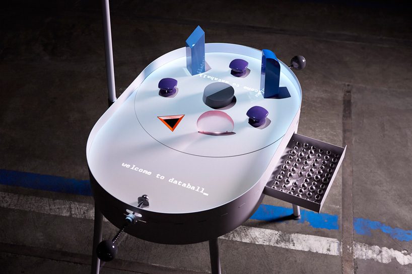
Felix Mollinga
Work for Strandbeest Theo Jansen, Singapore (2018)
Felix Mollinga is a budding Dutch product designer who recently graduated Cum Laude from Design Academy Eindhoven, department Man & Activity in 2018. His personal design projects tend to be ethically, environmentally, or socially driven: designing physical products that solve problems for the (near) future.
His portfolio includes furniture, home accessories, personalised jewellery, and lighting.
Image of Databall_ (2018)
One of his projects include inventing a playful pinball machine that visualises the flow of personal data. Databall_ is a pinball machine that visualises the flow of personal data, covering all aspects of daily digital life, from a chat history, to photos, to online purchases.
Laila Snevele
Digital Seasoning
Laila Snevele is a food designer who explores how creativity could impact healthier future consumption choices. Curious about human behaviour and scientific images in neuroscience, she combines the knowledge with visually-exciting images. Passionate about the impact of colours and shapes, she makes people wonder and understand how our brains can be influences. Possibility for humans to understand these ideas in food – through taste, smell, touch, sound, and vision makes it such a diverse design process!
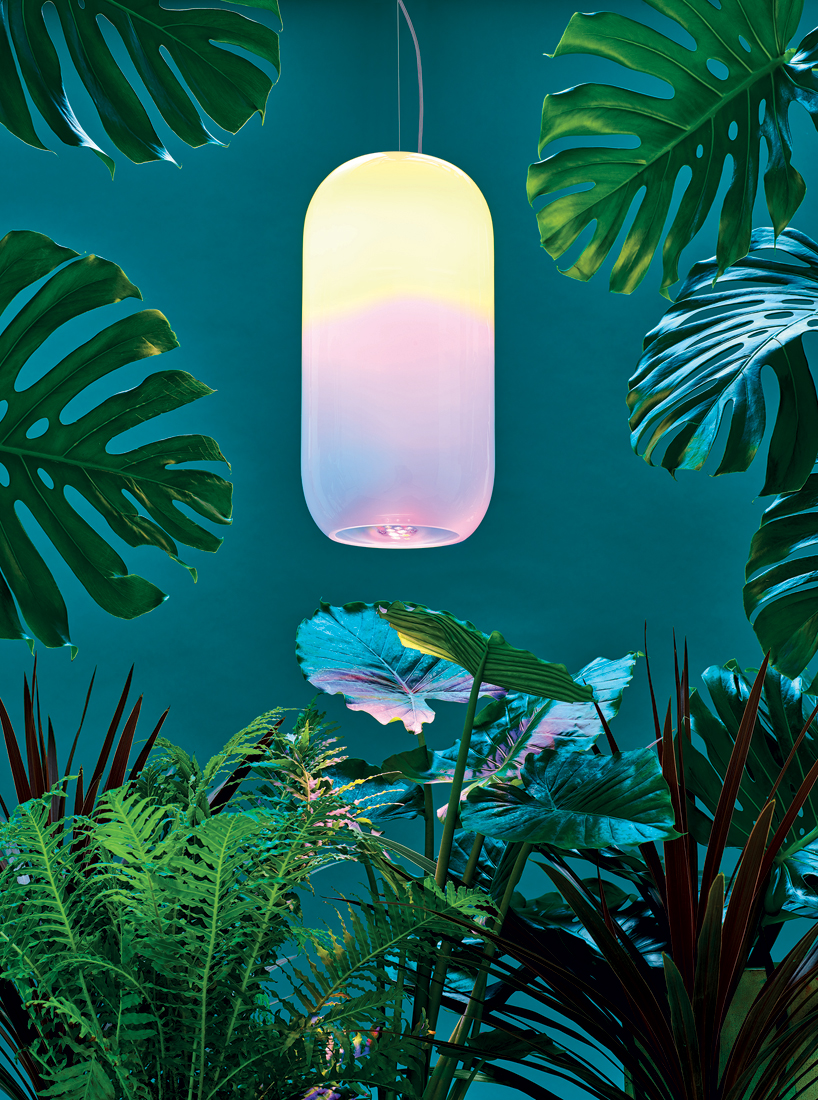
BIG X Artemide
Image of ‘conscious and entrepreneurial’ school in New York designed by BIG (2017)
The Bjarke Ingels Group (BIG) is a Copenhagen and New-York based firm that operates within the fields of architecture, urbanism, research and development. Its practice emerges out of a careful analysis of how contemporary life constantly evolves and changes.
Image of alphabet lamps by BIG and Artemide for the 2016 Milan Design Week
Artemdie is an Italian lighting company founded in 1960 that specialises in the manufacture of pieces created by designers and architects.
Image of Gople (2018)
Following their previous partnership at the 2016 Milan Design Week, both firms created a new lighting design at the 2018 London Design Festival. Named Gople, the transparent pill-shaped lamp nourishes nature, enhancing plant life and human perception, as well as intertwining modern technologies with artisanal traditions.
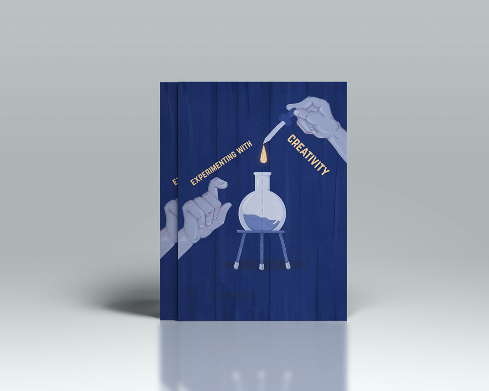
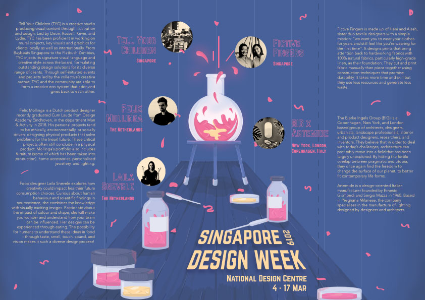
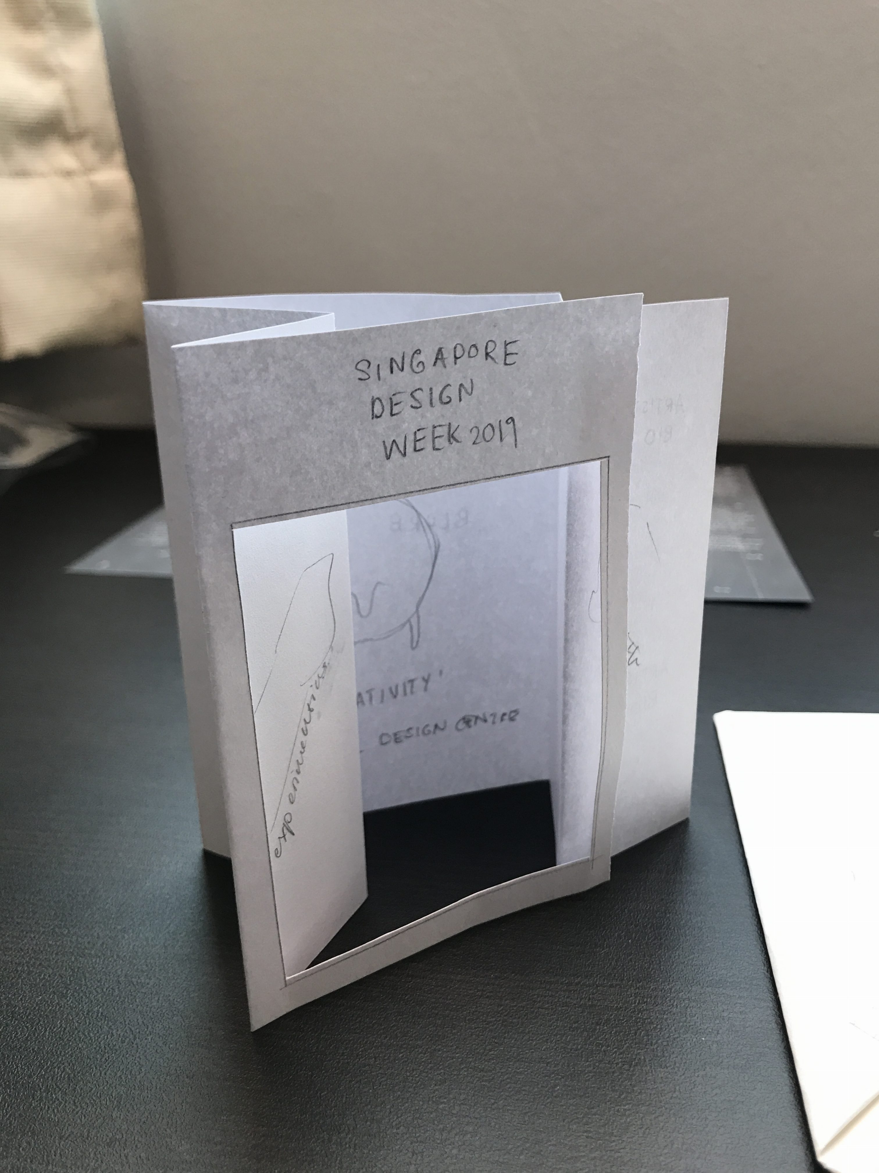
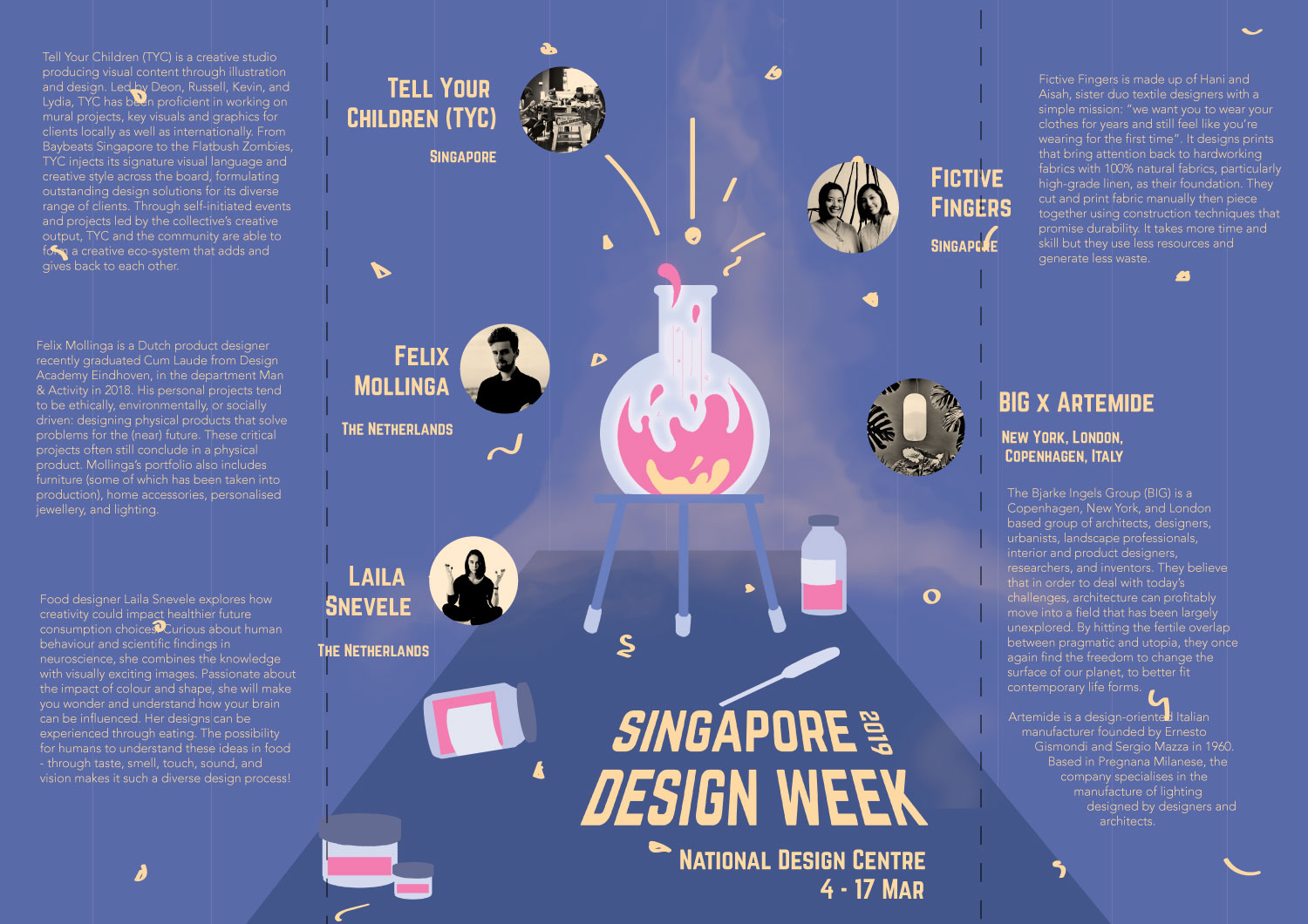
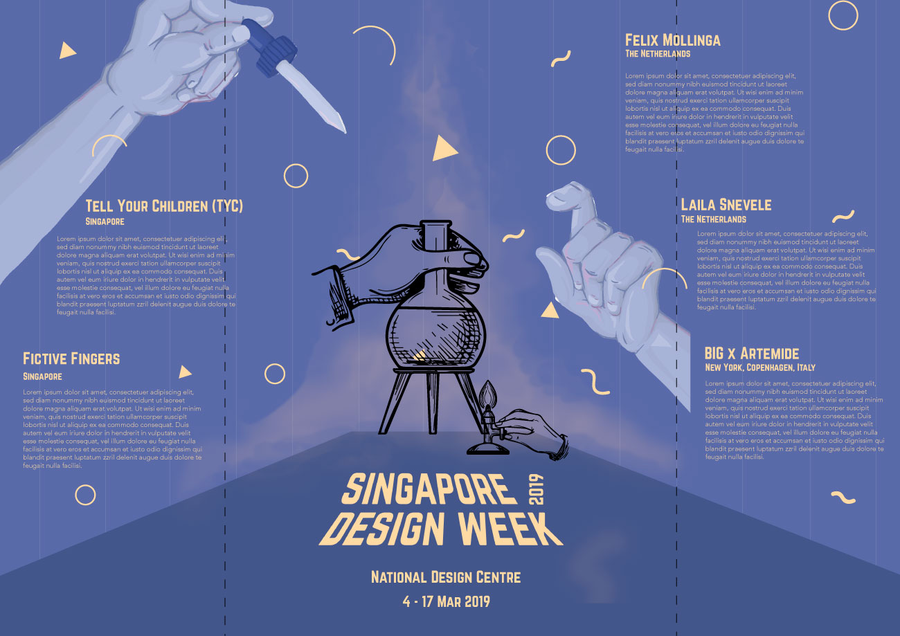
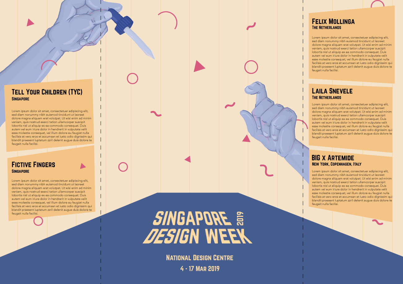
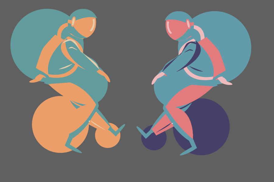
As a follow-up to the previous project, for our final submission, we were required to conceptualise and create a brochure for 2019’s Singapore Design Week.
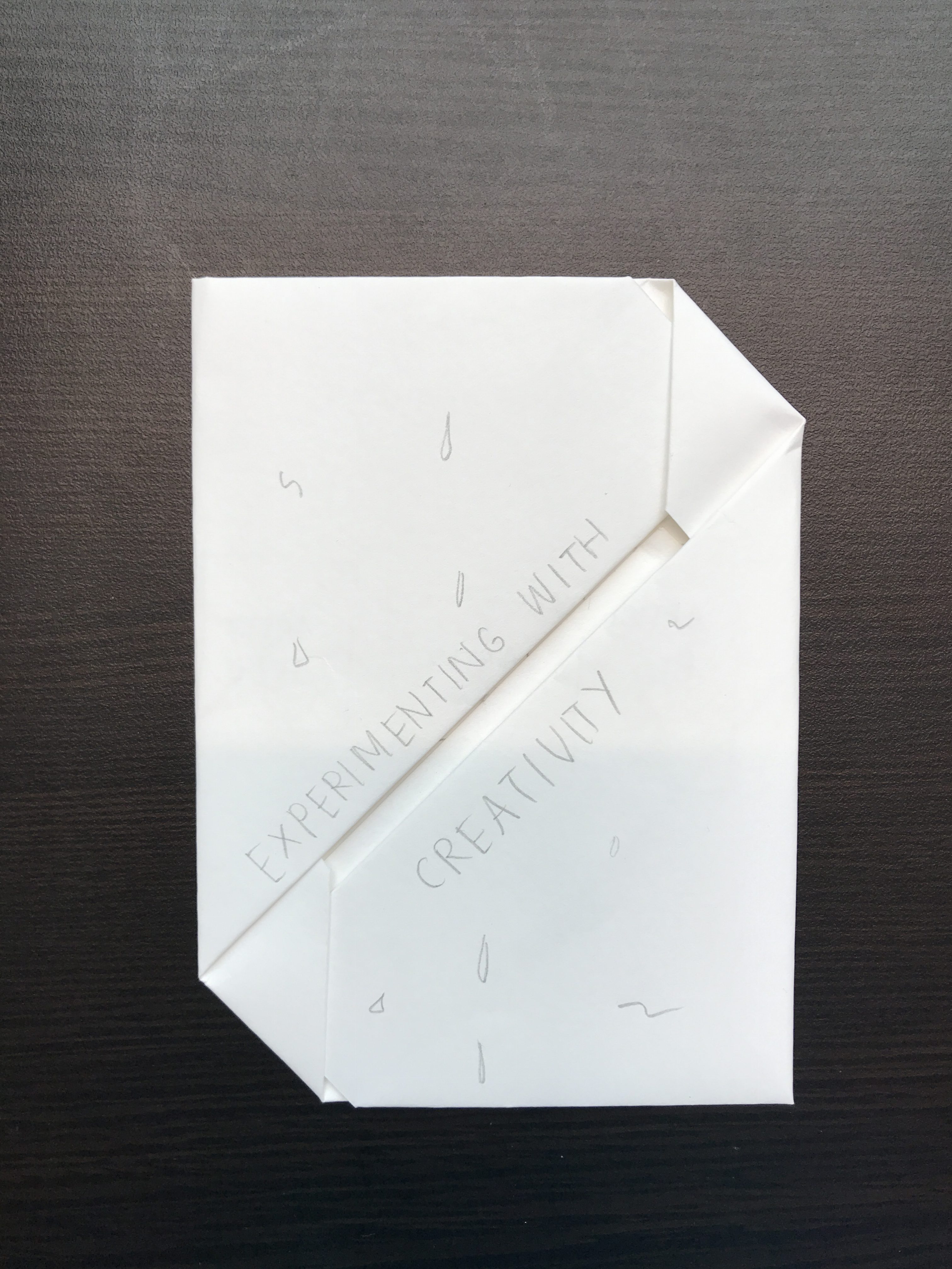
Image of final productImage of final product: Front coverImage of final product: Back coverImage of final product: Inside pages
Concept
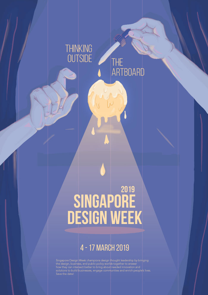
Keeping to ‘Experimenting with Creativity’, the theme reflected in the previous poster project, the brochure I created for this project adopts the imagery and concept from the poster but categorises and displays information in a way that is suitable for a brochure and integrates new information about the exhibition.
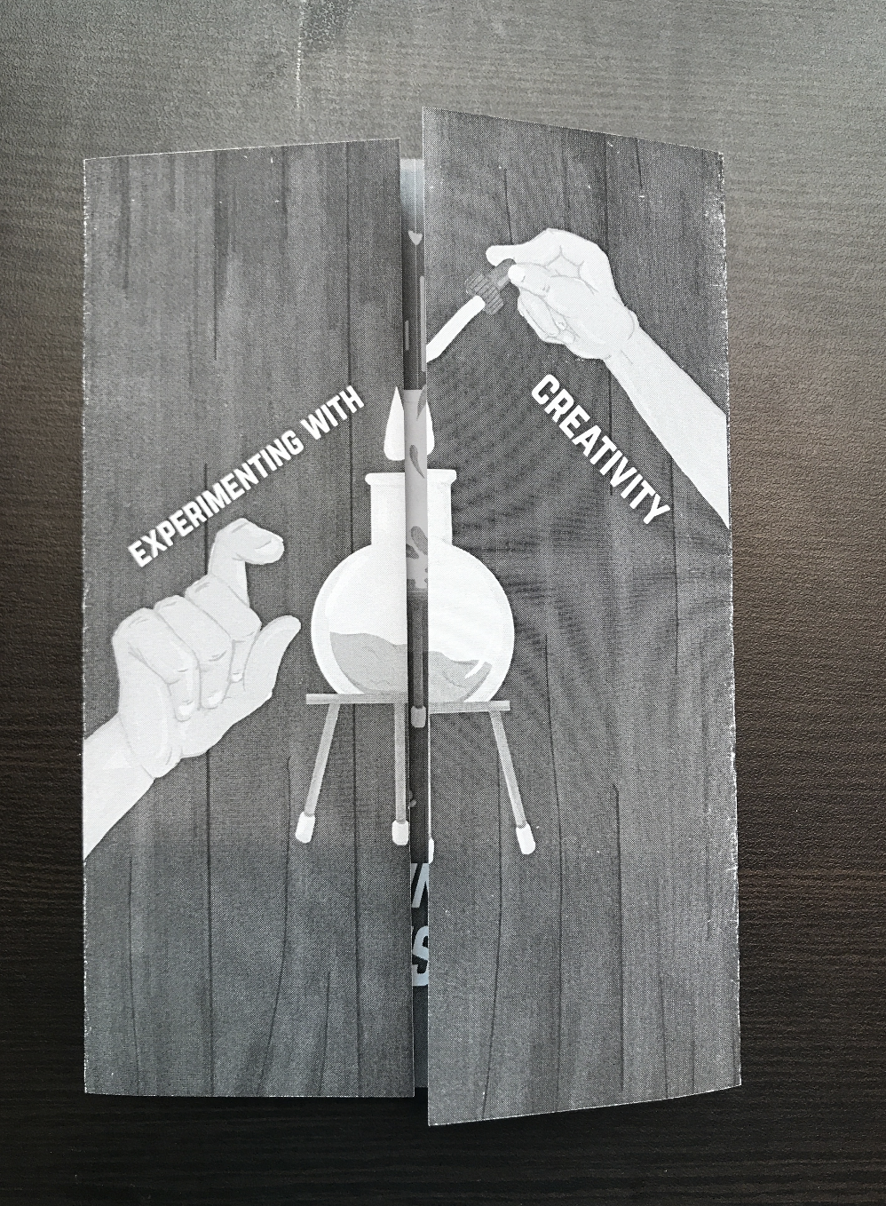
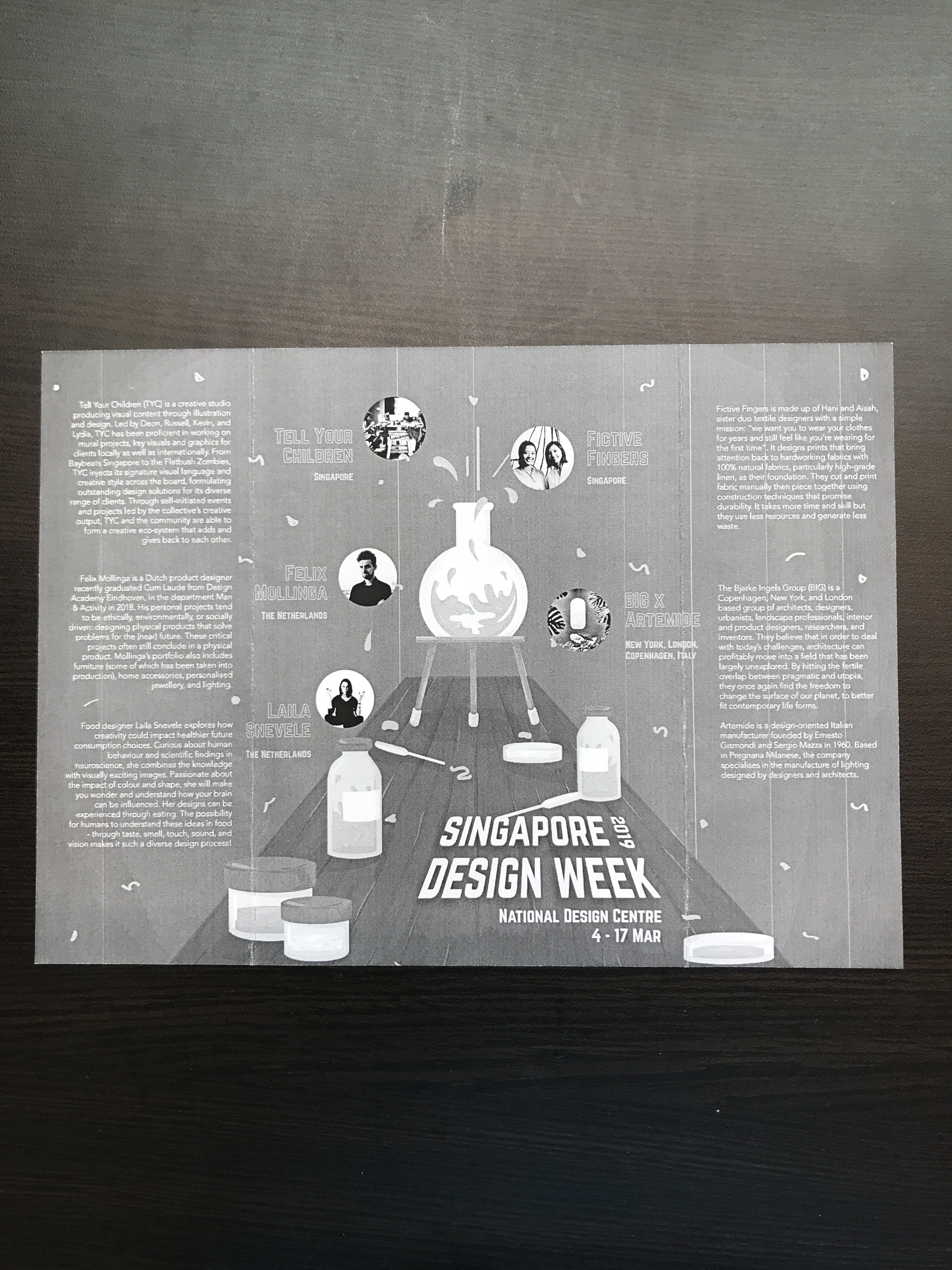
The final product is an A5 size brochure that uses a gate fold, and becomes A4 in size when open. The content comprises of event details of Singapore Design Week and biographies of five exhibiting artists. The brochure also integrates graphics (some of which are adapted from the poster) that convey the idea of ‘Experimenting with Creativity’, where after experimenting with creativity, resulted in an explosion that formed Singapore Design Week and the exhibiting artists, reflecting the notion of Singapore Design Week championing creativity in the local and overseas design industry.
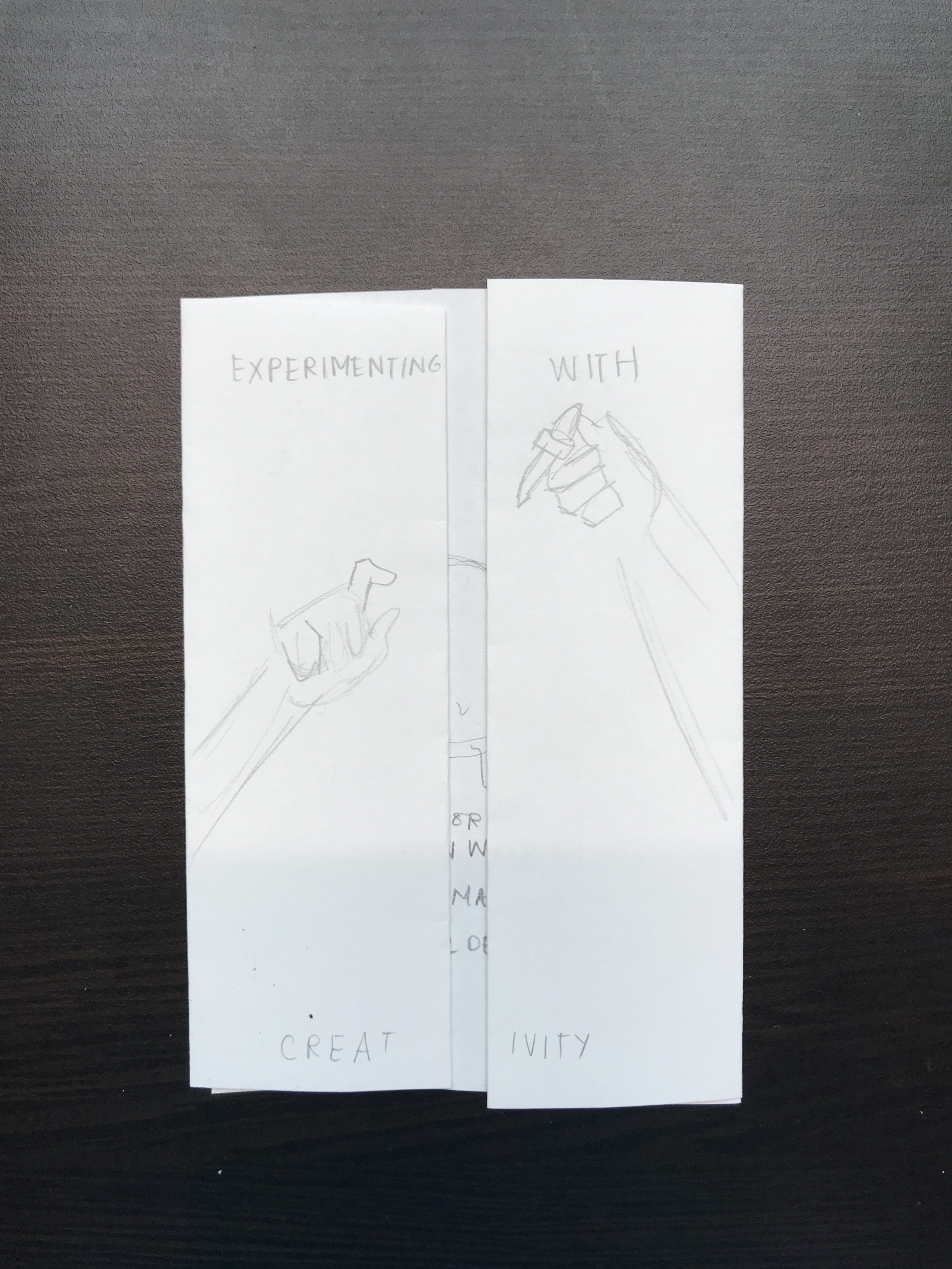
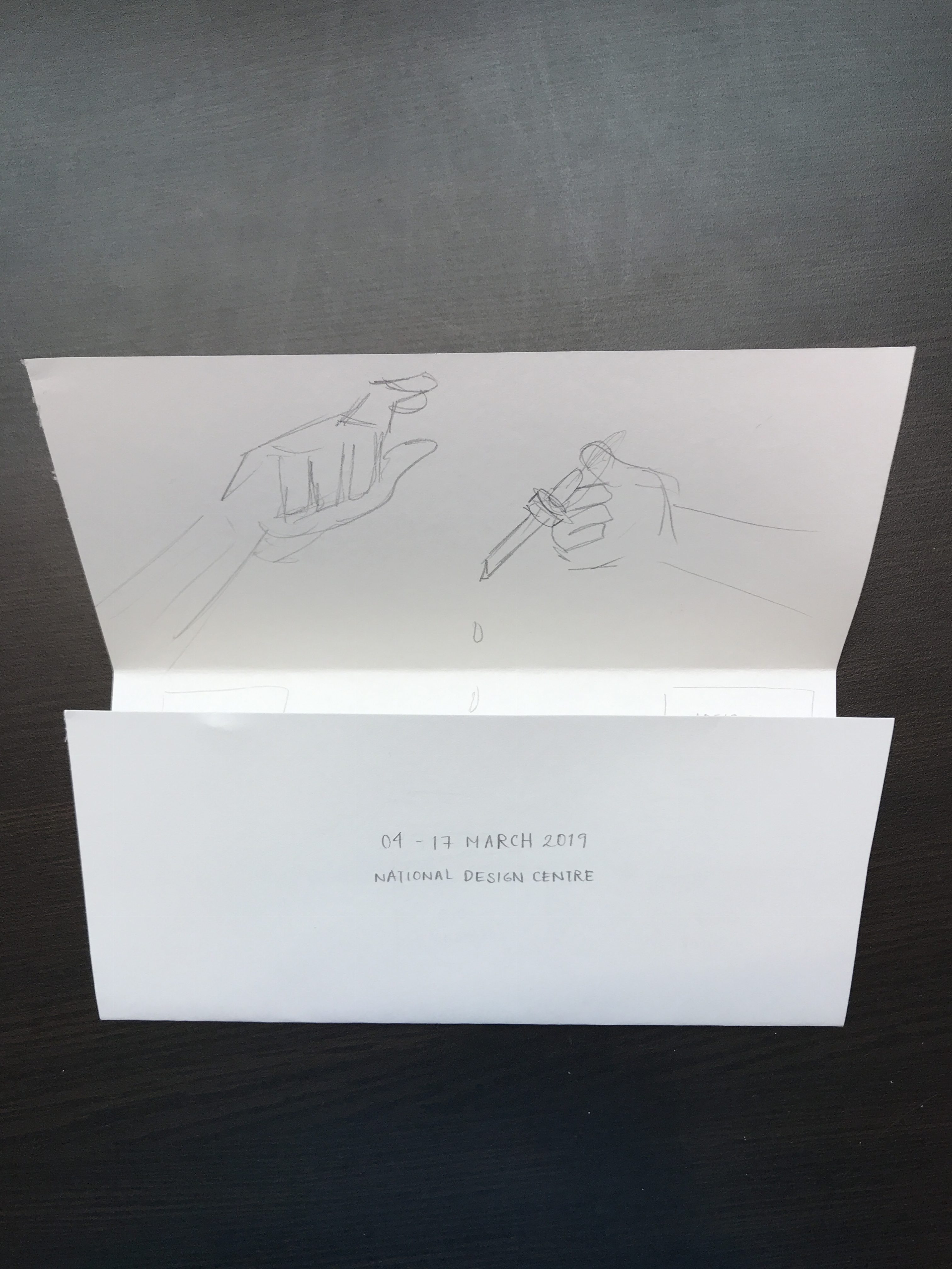
Reinforcing the idea of experimenting, the graphics consist of science apparatus (test tubes, droppers, specimen jars) and an explosion of patterns. The use of a curtain as the background also carries forth the attempt to bring about a mysterious and magical mood that was also conveyed in the poster. The fold of the brochure, on the other hand, is a conventional gate fold. The fold helps to reinforce the idea of the exploding beaker where the front cover is still and adding the droplet into the beaker results in an explosion as seen on in the inside of the brochure, where it is much more colourful and shows movement through patterns and strokes.
Techniques Applied
I. Imagery
The use of graphics in this case really helped in bringing forth the narrative of the entire brochure. Coupled with the unveiling nature of the gate fold, the brochure was able to effectively convey the experimental and explosive parts of the intended narrative. To represent the idea of experimenting, I used images of science apparatus, and the changes in shapes of the patterns helped in conveying the idea of an explosion.
II. Contrast
The brochure also uses contrast to emphasise important details and at the same time, create an overall balanced and harmonious layout. Contrast is seen firstly, in the variation of size; more crucial information such as the slogan, title, and event details are displayed in a bold font with a vibrant yellow. Less vital information such as the short blurb and artist biographies are displayed using a font with less weight and is smaller in size, but remains readable. Contrast is displayed through different colour palettes; the text and focal points of the graphics uses a bright yellow and pink that has an outer glow. This is contrasted against less important graphics that use a pale blue colour palette.
III. Hierarchy
Hierarchy is also used to create a smooth visual flow. Having a more quiet graphic in the front followed by a more vibrant and explosive layout on the inside that is unveiled by the gatefold helps to establish the flow of information. Furthermore, having the text and graphics vary in size and colour in terms of brightness and vibrancy helps in guiding the eyes from more important information to less important ones.
IV. Movement
Similar to that of the poster, movement is established through the use of patterns that are more compressed in the centre, closer to the beaker, followed by it being more spaced out towards the edges. The explosive pattern was further enhanced by lines that depict motion and little bits of splatters found on the table and apparatus.
Research & Process
Research
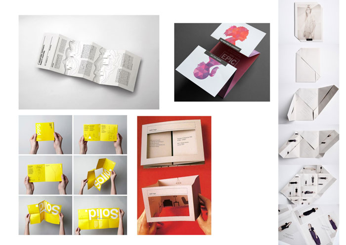
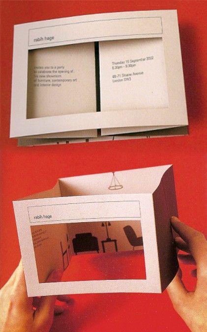
Image of folding references to try out
Research into brochure production began with us looking more into the types of folds that brochures could use. I was personally intrigued by gate folds and variations of it, because I felt it was an interesting and versatile way of unveiling information, and is especially appropriate for my brochure.
Reference for brochure foldReference for brochure fold
I was inspired by these two folds especially because of their simple layout that allowed for a straightforward user experience, but also comprised of an interesting layout. The folds here allowed for a linear reveal of information, thereby creating visual interest. Especially with the gatefold, having minimal text and maximum graphic to entice the viewer to open allowed for an interesting method of revealing information.
Reference for brochure fold
This is a more experimental fold I hope to try out as well. Going back to the idea of the slow reveal of information, I thought this was a very creative method of unveiling information and definitely creates visual interest. The inclusion of the die-cut and folds at the side which meet in the centre when flattened also seemed suitable for the curtain graphic I used in my poster. However, this may turn out rather flimsy and could deteriorate the ease in user experience.
For a more in-depth look into chosen exhibiting artists, please refer to: https://oss.adm.ntu.edu.sg/vwong005/chosen-designers/
Process
I. Experimenting with Folds
Experimenting with folds: Experimental foldExperimenting with folds: Experimental fold with die-cutExperimenting with folds: GatefoldExperimenting with folds: Trifold brochure
After looking into brochures, layouts, and folds, we tried some of our own. Keeping in mind the content we had to display, user experience (where it had to be easy for users to open and fold back), and display methods (where they could be stood up on display stands), I tried to use simple but creative folds that helped to create an interesting flow of information, and die-cuts to give a sneak peek into the inside of the brochure.
Ultimately, with Prof. Michael’s advice, I decided to do away with the die-cut and adopt a simple gate fold. This way, I could have better control of the layout of information and therefore, more control over the flow of information. By focusing more on the layout of the content itself as opposed to using a complicated fold, it allowed me to establish the same intended mood, but with a simpler and more straightforward user experience.
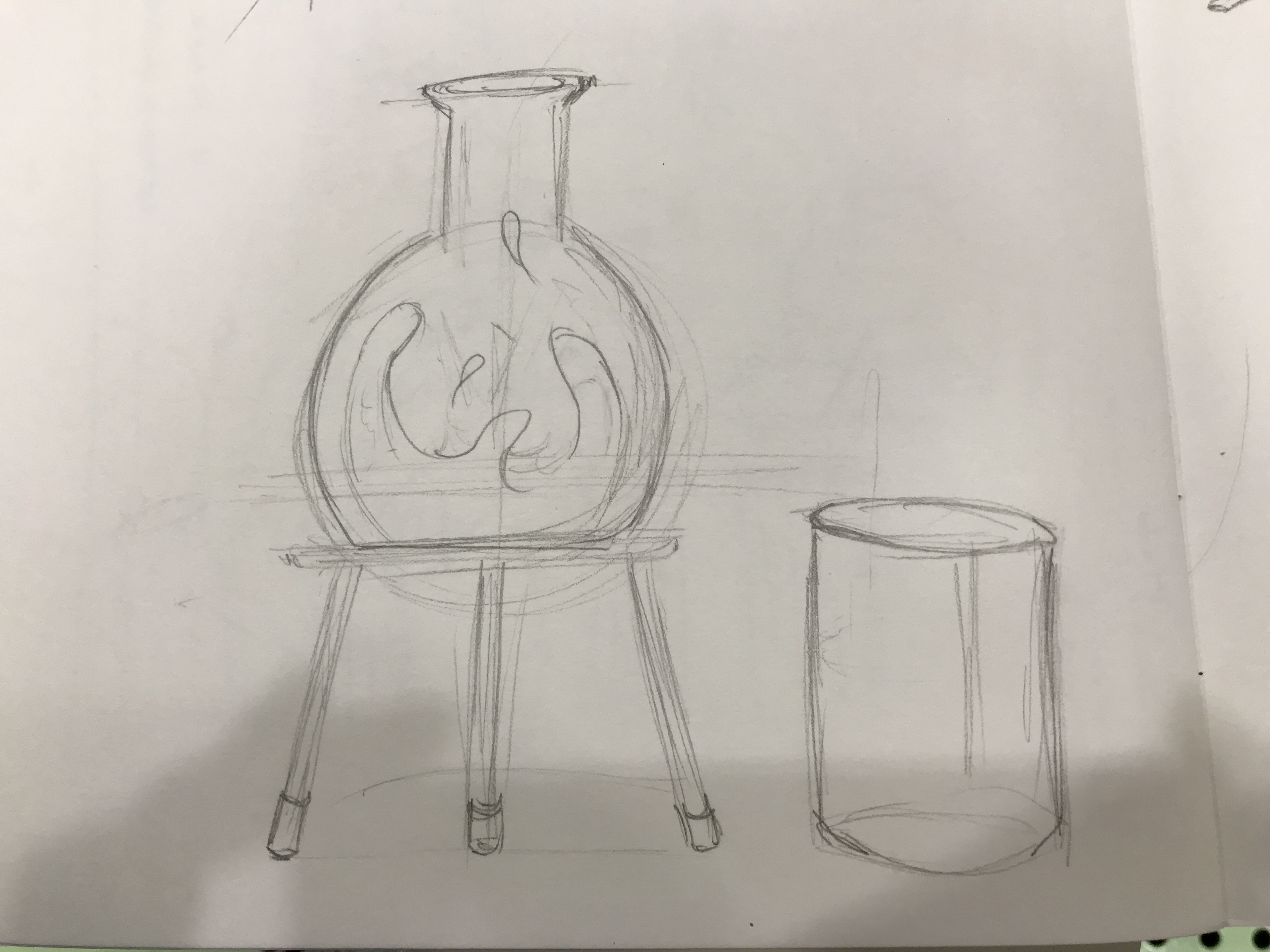
II. Creating Graphics
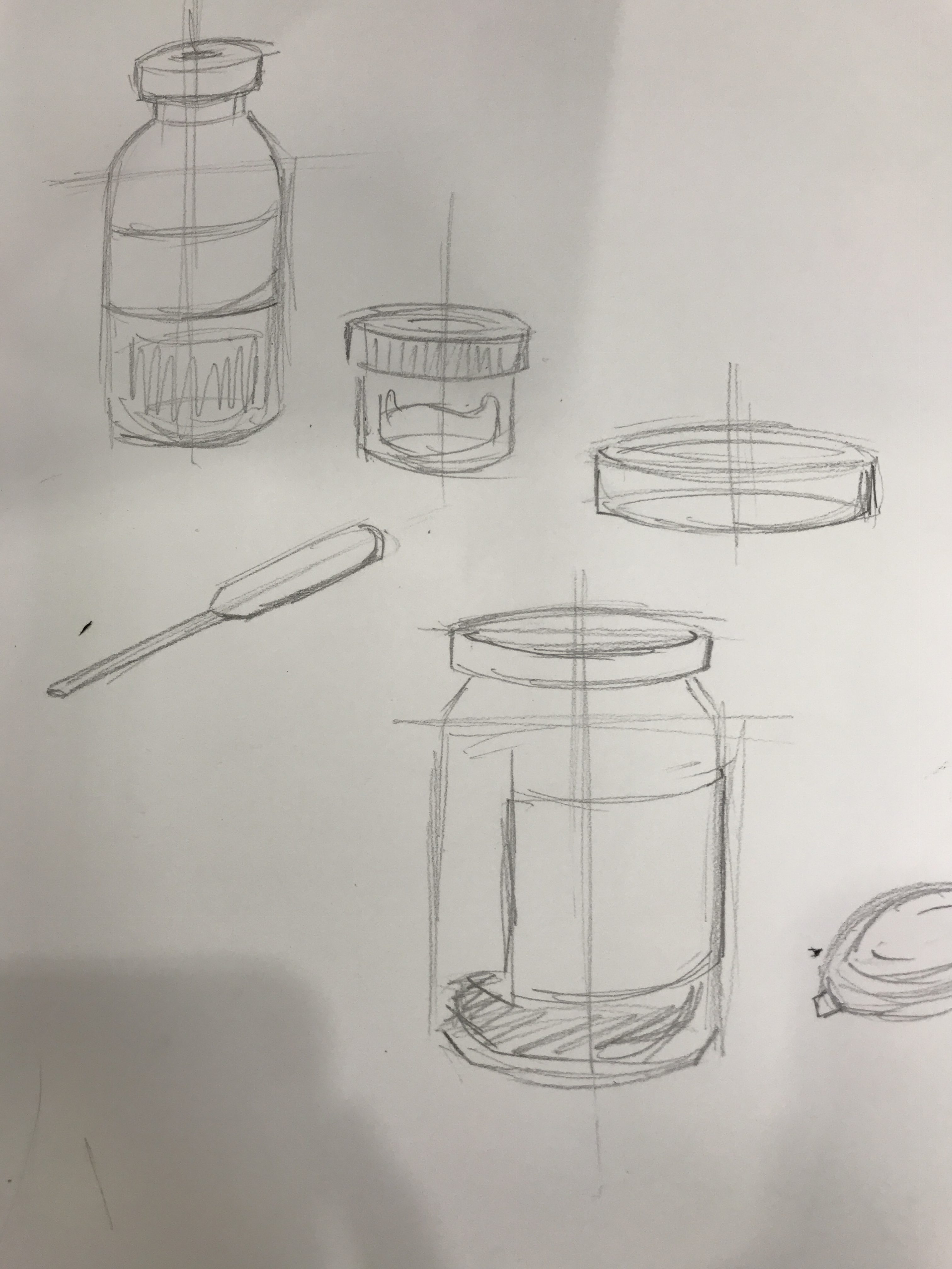
Image of graphic sketchesImage of graphic sketches
As we had to adopt the same concept and overall similar graphics from the previous poster project, I used the same colour palette but decided to replace most of the graphics. Instead of a glowing ball of yellow mass to represent creativity, I tried illustrating new images and patterns to better convey the idea of ‘experimenting’, ‘creativity’, and to portray an explosion. Therefore, I decided to have science apparatus to convey the literal meaning of experimenting. Also, having more than just a beaker gave the page more life and excitement, allowing for more platforms for movement, colour, and placement for information.
I felt that having the science apparatus, and the transition of a flask with still liquid into a flask with bubbling and glowing liquid to represent the formation of creativity was a more straightforward and easy-to-understand graphic that managed to embody the overall theme of the exhibition.
III. Organising Content
Image of draft: Front coverImage of draft 4Image of draft 3Image of draft 2Image of draft 1Image of test print: Front pageImage of test print: inside pages
After settling the content to be placed in the brochure, what was left was putting them together to establish a flow of information. Already having the idea to keep the front and back simple and more mysterious, I tried to have a more dynamic layout on the inside to contrast against the front and better convey the ‘explosive’ graphics. However, it was not simple to work with long chunks of text, and their unequal placements, with the aim to keep the information easy to read and locate. It was also challenging in avoiding the fold lines to allow for easy readability. After playing around with the layout, from a more static composition, I moved the text blocks around and instead of having them all align with one another, I decided to place them in a manner similar to that of the patterns: compressed in the centre and more spaced out towards the edges, all in a radial layout instead of in vertical columns. This was a better method in helping to further enhance the concept and also gives a more dynamic, exciting, and contrasting composition to that in the front.
Challenges & Feedback
One of the main challenges I faced in the project was finding a recognisable object to represent creativity, and experimenting with it. The use of science apparatus helped a little, especially when it comes to the idea of ‘experimenting’, but it could still pass Singapore Design Week off as something science-related or educational as opposed to celebrating creativity in the design industry.
Another challenge I faced was the placement of the artist biographies. Working with blocks of text was not easy when it comes to experimenting with different and more dynamic placements that could reflect the explosive pattern. Furthermore, working with centralised graphics within the boundaries of a gate fold was also not easy. Therefore, the overall layout on the inside of the brochure, though legible, was not as effective in creating excitement through dynamic movement.
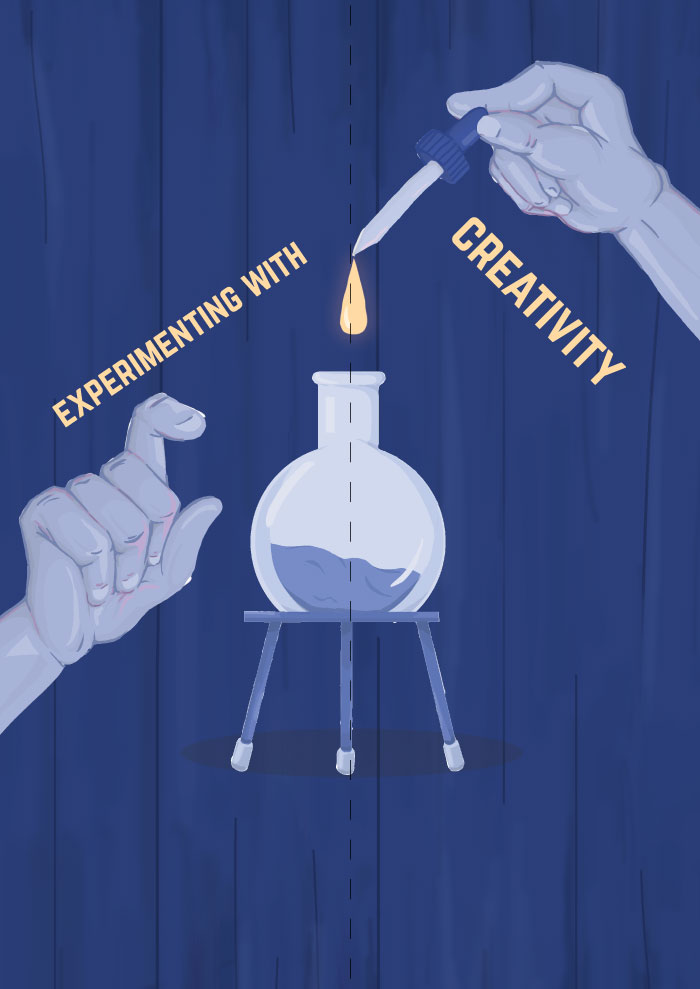
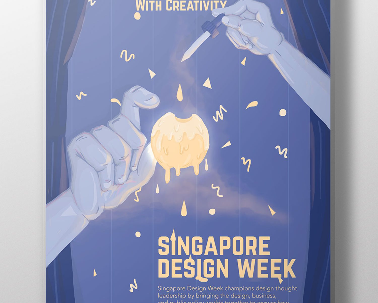
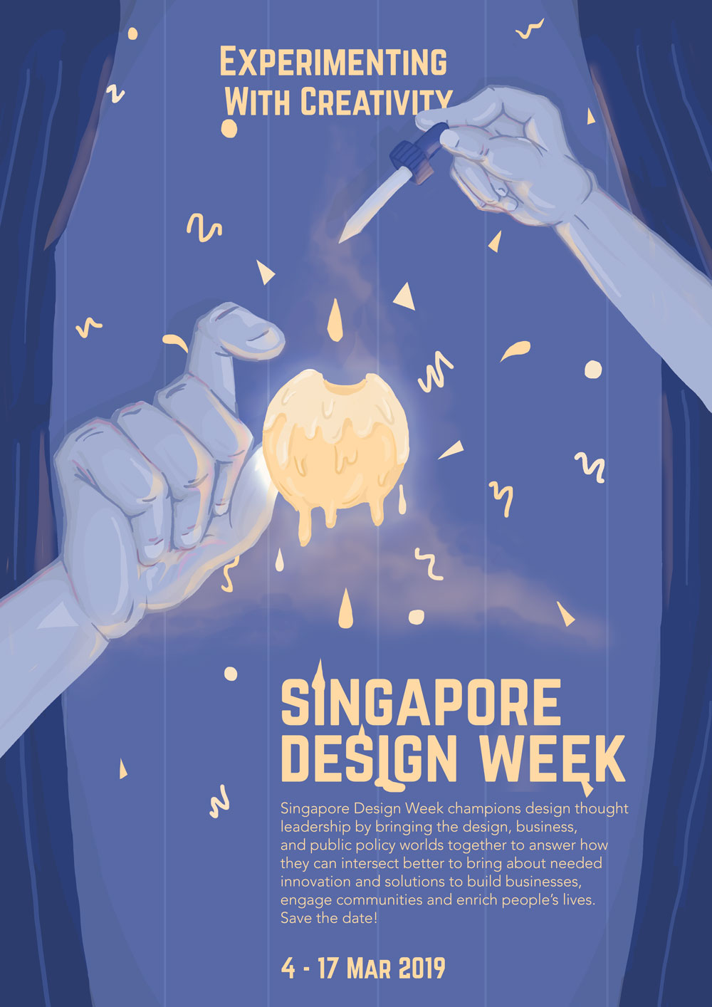
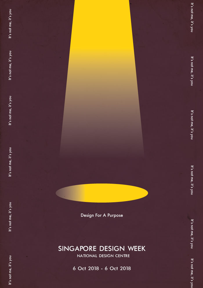
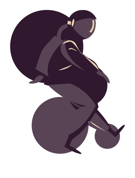
For this project, we were tasked to conceptualise and create an A2 poster for 2019’s Singapore Design Week, centred on a slogan.
Final Product
Image of final poster
Concept
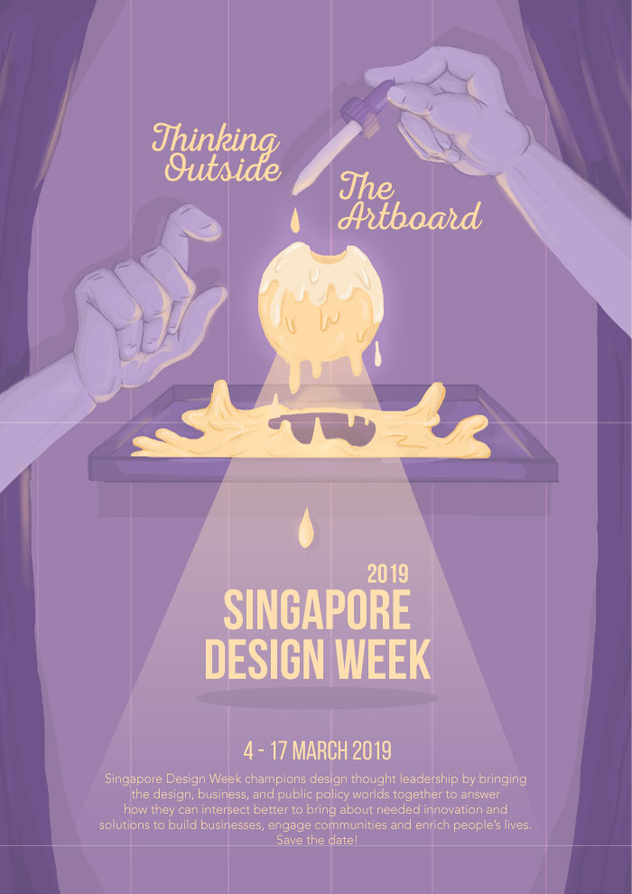
After visiting the National Design Centre which exhibited the evolution of design in Singapore over the past 50 years, I wanted to create a poster that conveyed and celebrated the creativity of the local design industry, focusing more on the products or designs that derived from experimentations or unconventional ideas. Following the slogan ‘Experimenting with Creativity’, the poster was meant to give off a mysterious and magical feeling; the pair of hands, with one holding a dropper, is adding a yellow droplet (conveying the idea of experimenting) into a mass of glowing yellow liquid (meant to represent creativity). The graphic conveys the idea of experimenting by indicating that the forming of the yellow mass, and the droplets being added to it, resulted in an explosion that created Singapore Design Week.
Techniques applied
I. Alignment
The layout of the poster is mostly centralised with the event details aligned slightly to the right. In an attempt to contrast against the centralised layout of the graphics and focal point, as well as considering the nature of the text (i.e. the block of text and important details), I tried to place the text in the bottom right hand corner, instead of right down the centre. Having the text in a central alignment also made the poster seem more like a movie poster instead of one advertising for an exhibition.
II. Hierarchy & Contrast
Considering the purpose of the poster (i.e. conveying details about Singapore Design Week), and the different levels of importance with each text, the text displayed in the poster vary by font, size, and placement to establish visual hierarchy. The important details such as the slogan and title, dates, and venue, have a different font from the short blurb – Norwester vs. Avenir Light. By using Norwester, a bolder choice in both structure and weight, and bigger in size, it emphasises the important details such as the slogan and event details. A lighter and smaller font such as Avenir Light complements the blurb, and displays it as non-crucial information.
The illustrations, on the other hand, vary in size and colour; having creativity represented by a ball of bright yellow mass fixated in the centre with an outer glow helps in capturing the attention of passers-by. The pale blue colour palettes of the other illustrations (the hands, curtains, and background) on the other hand, allows for a better contrast against the bright yellow mass and text. The difference in colour palette, size, and weight for more important and less important details therefore helps to establish visual hierarchy.
The poster’s visual hierarchy also intends for an easy flow of information, where the viewer would first view the yellow mass in the centre, followed by the slogan and event details, and then the rest of the poster (i.e. the other illustrations).
III. Movement
In an effort to convey the idea of an explosion from the yellow mass, I used simple shapes such as circles, triangles, and squiggles, being ejected from the centre. The shapes are more compressed in the centre and gradually spaces out as it reaches the edges – this helps in conveying the idea of motion, thereby establishing motion. The use of smoke also helps to reinforce movement upwards and sideways.
Research & Process
Research
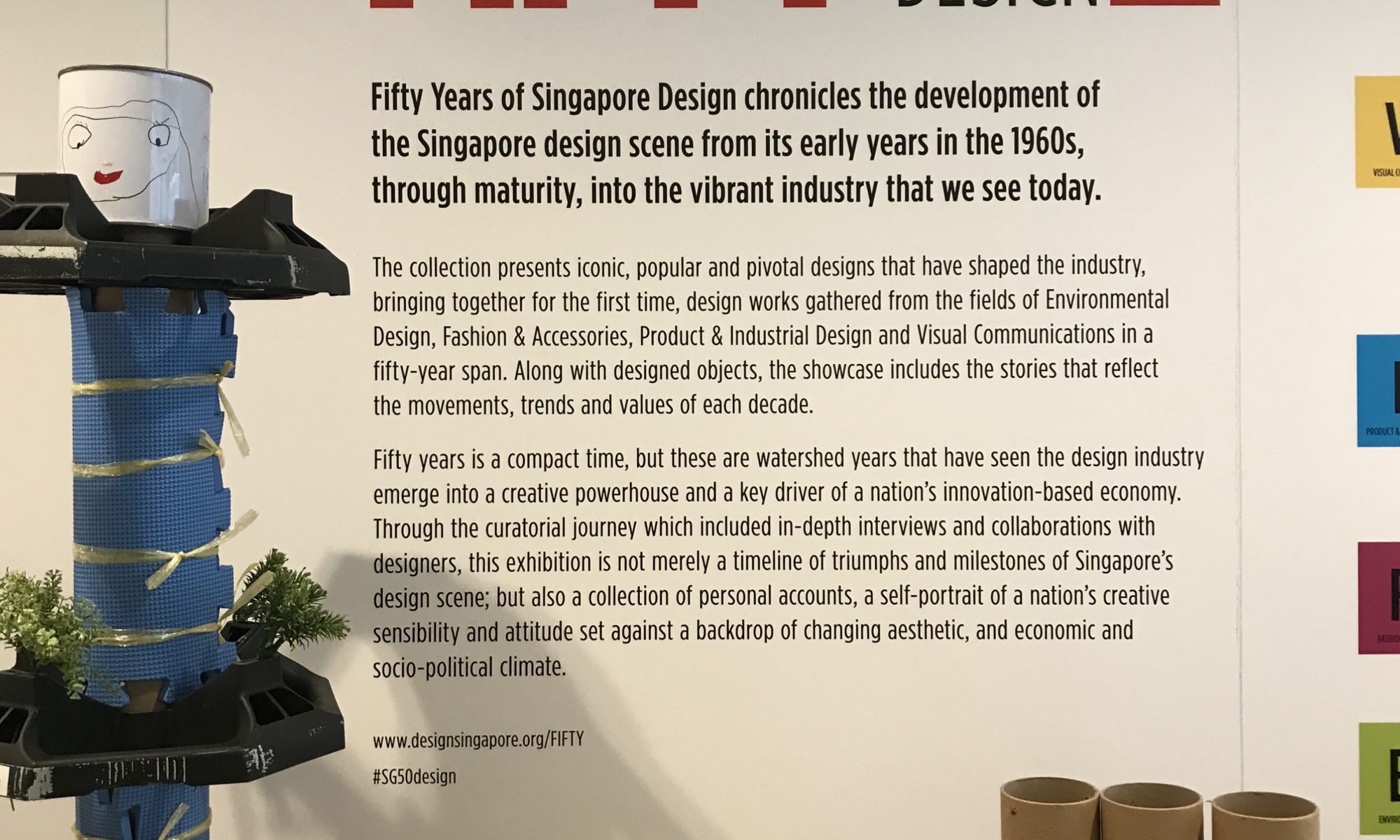
The project first began with conducting research on design in Singapore. By taking a field trip to the Fifty Years of Design exhibition at National Design Centre, we had to give our own interpretations on the evolution of design in Singapore.
For a more in-depth post about personal interpretations of design in Singapore, please visit: https://oss.adm.ntu.edu.sg/vwong005/page-and-communication-field-trip-to-ndc/?preview_id=1168&preview_nonce=b4ed77e164&_thumbnail_id=1232&preview=true
We also had to familiarise ourselves with poster-making by researching more about the elements to consider when making a poster, methods of establishing visual hierarchy in layouts, and aspects that make a good poster in layout, creativity, and legibility.
For a more in-depth post about poster analyses, please visit: https://oss.adm.ntu.edu.sg/vwong005/page-and-communication-visual-research/
process
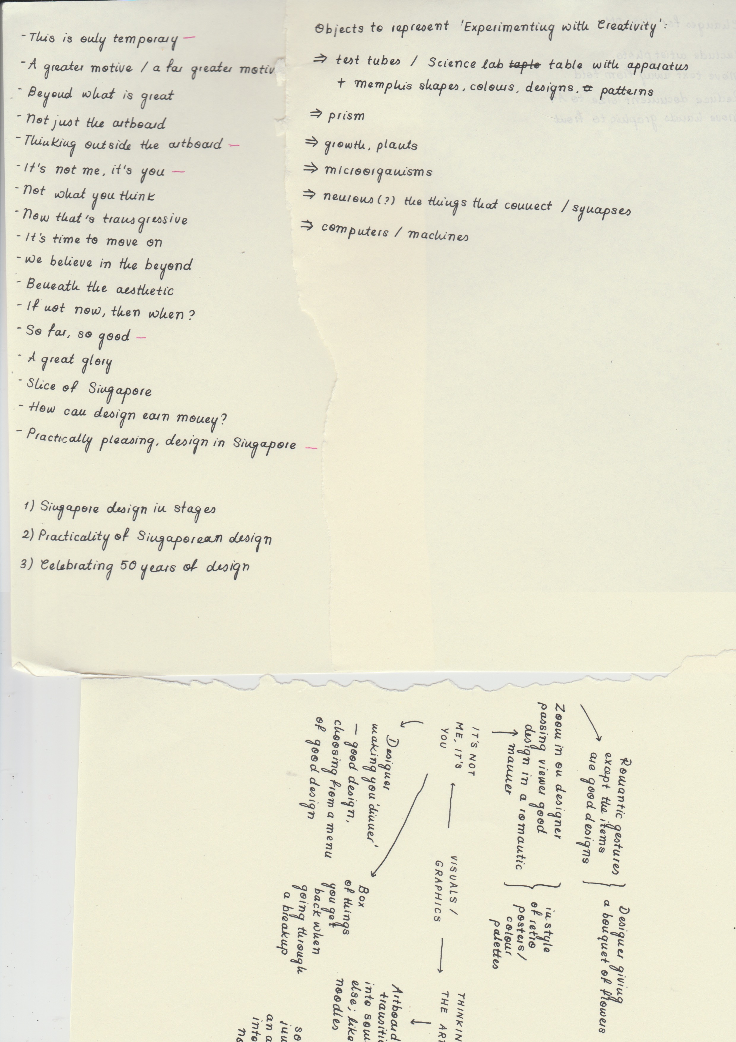
I. Conceptualisation
Conceptualising started with brainstorming for slogans, then sculpting our ideas around the chosen slogan. After visiting the exhibition, I came up with three main ideas that represented the design scene in a whole – the first one reinforcing the evolution of Singaporean design in specific stages, the second being designing with the intention of others in mind (e.g. caring for others, environmentally-friend products), and the last one celebrating experimentation and overall creativity.
For a more in-depth look into the approaches and the slogans, please visit: LINK
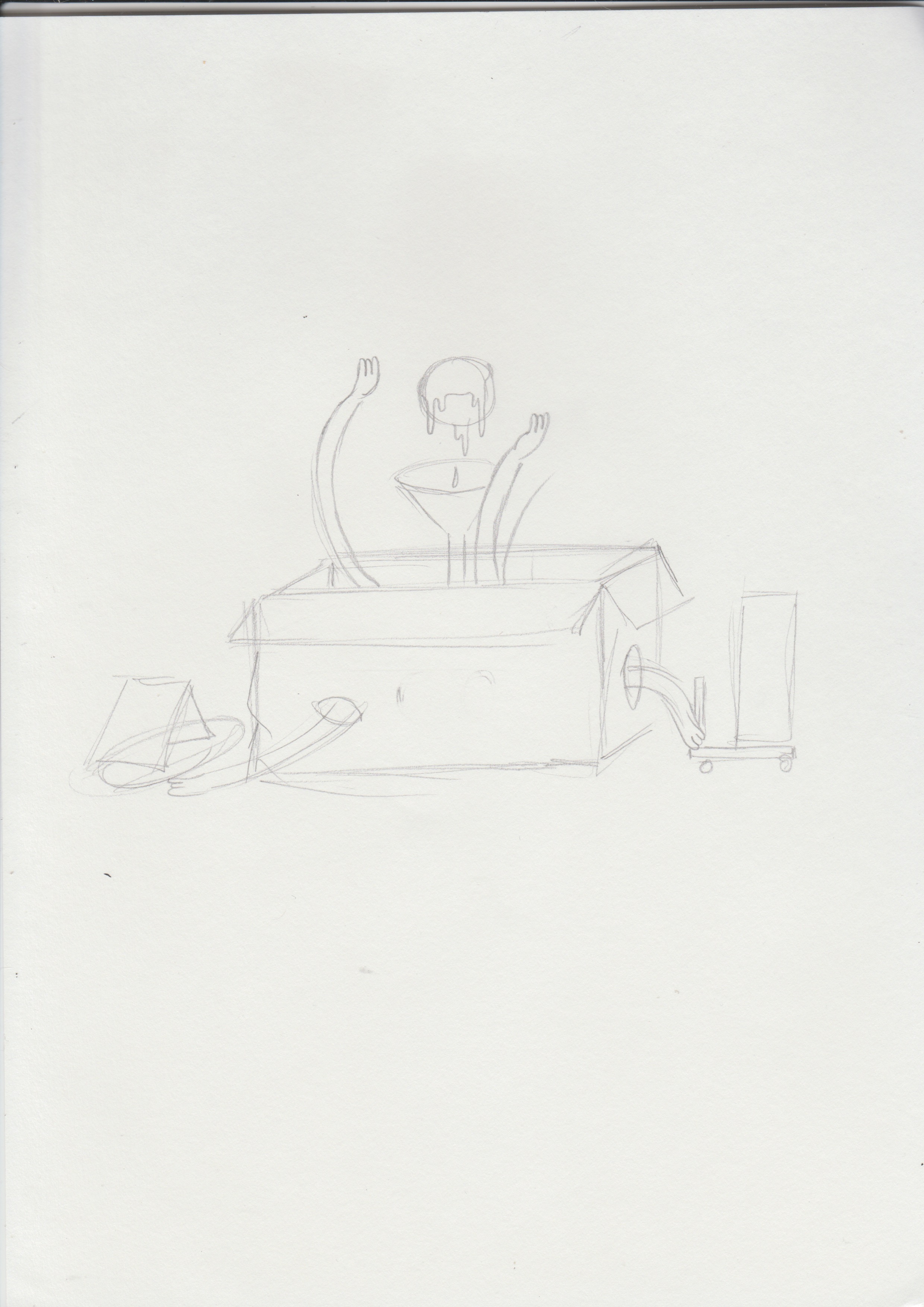
Brainstorming for graphicsBrainstorming for graphics
After coming up with slogans that supported these three main ideas, I brainstormed further and came up with interesting images and styles of illustration that could convey the idea better. Having difficulty in choosing a slogan, I decided to come up with rough sketches and layouts with different graphics and styles to see which would be most appropriate for Singapore Design Week and its target demographic.
Ultimately, after considerations and many changes, I decided to look into conveying the diversity and creativity in Singaporean design, with the slogan ‘Experimenting with Creativity’.
II. Building on Slogans
Sketches for possible graphics
When formulating the drafts for the poster, I tried to keep these aspects in mind:
The imagery used should reflect the slogan effectively
Legibility is important – the text should be easy to locate and read
The graphics should be eye-catching, appropriate for the target demographic, and able to easily capture the attention of passers-by and at the same time, reflect good craftsmanship and technique
Reflecting a harmonious and balanced colour palette and overall layout of both text and graphics
The ability in establishing an overall emotion or mood
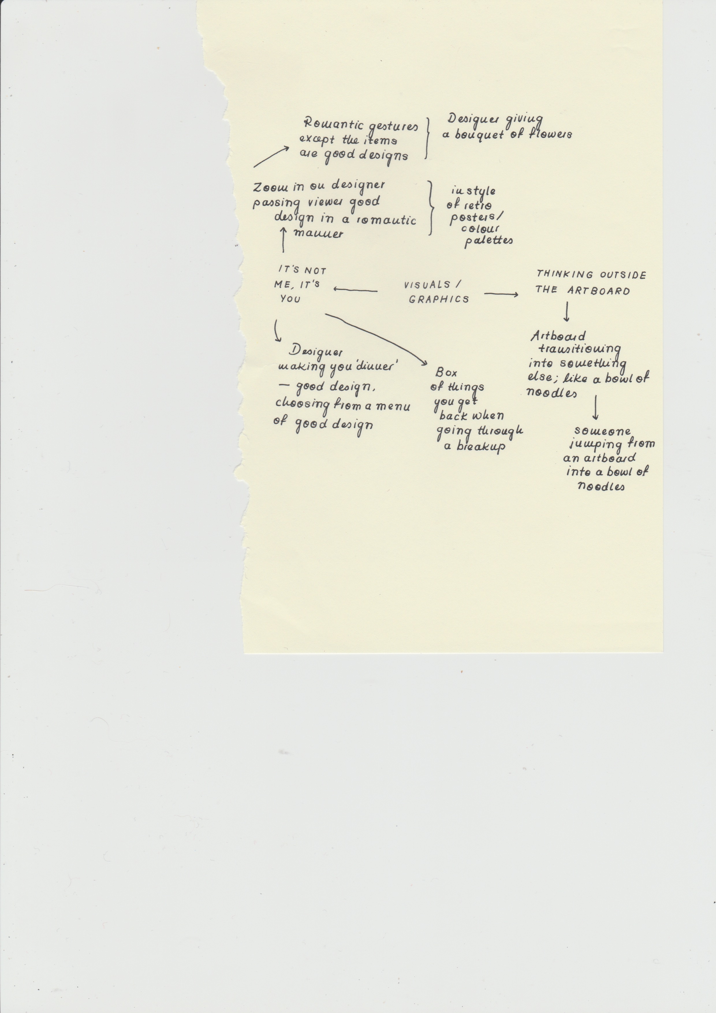
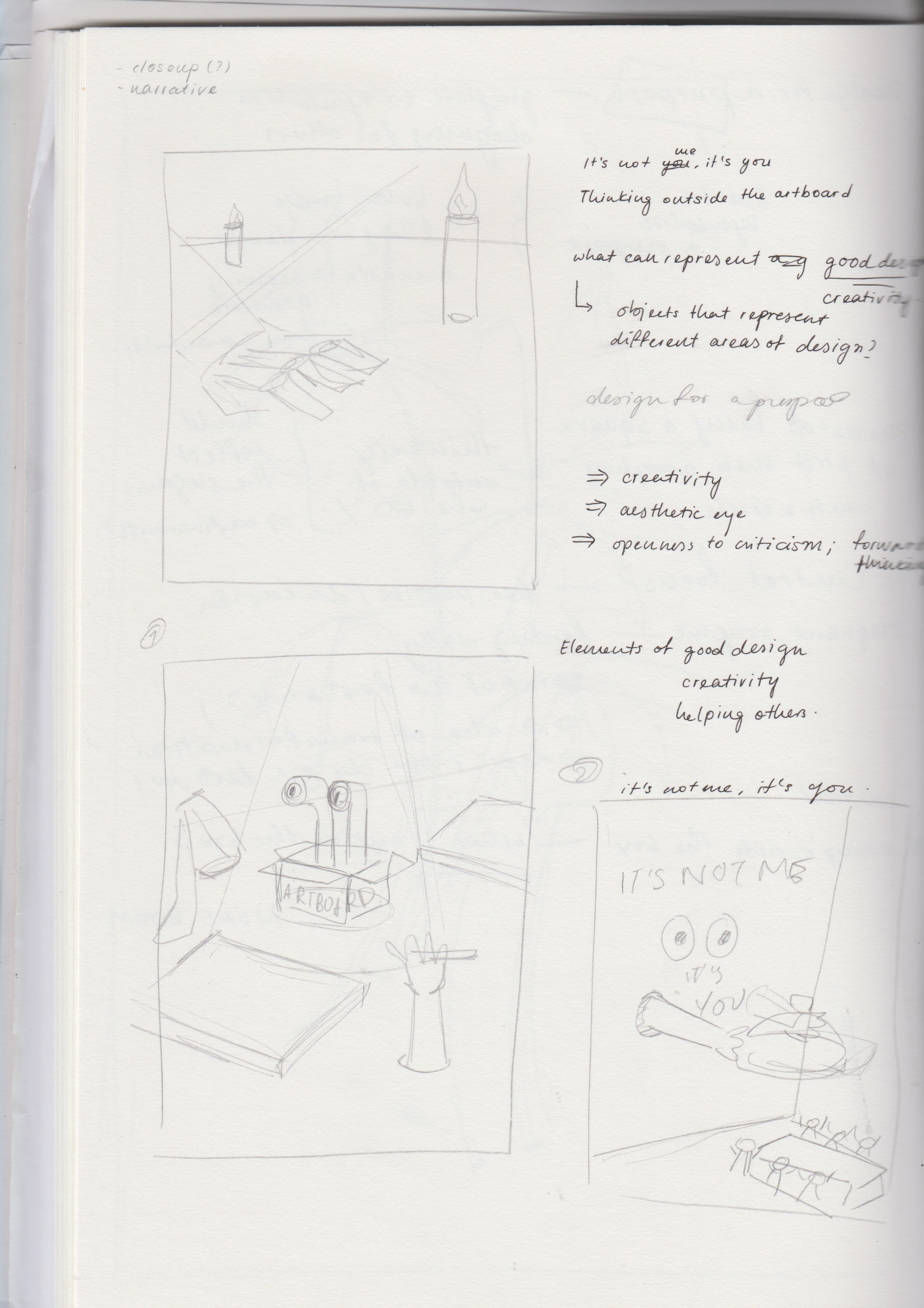
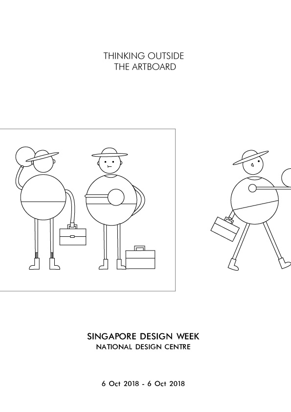
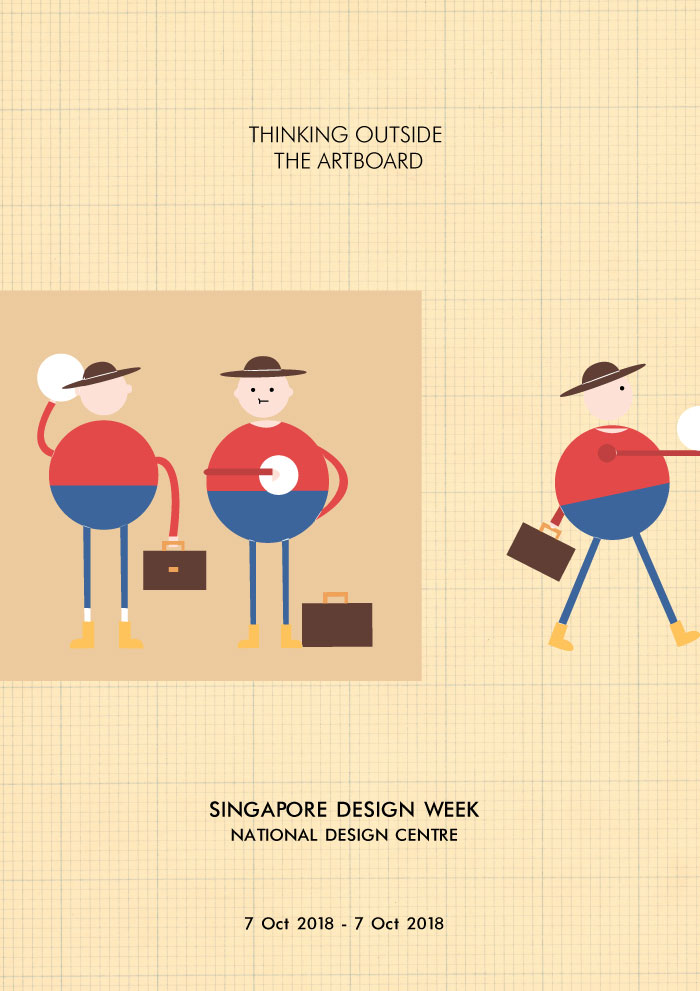
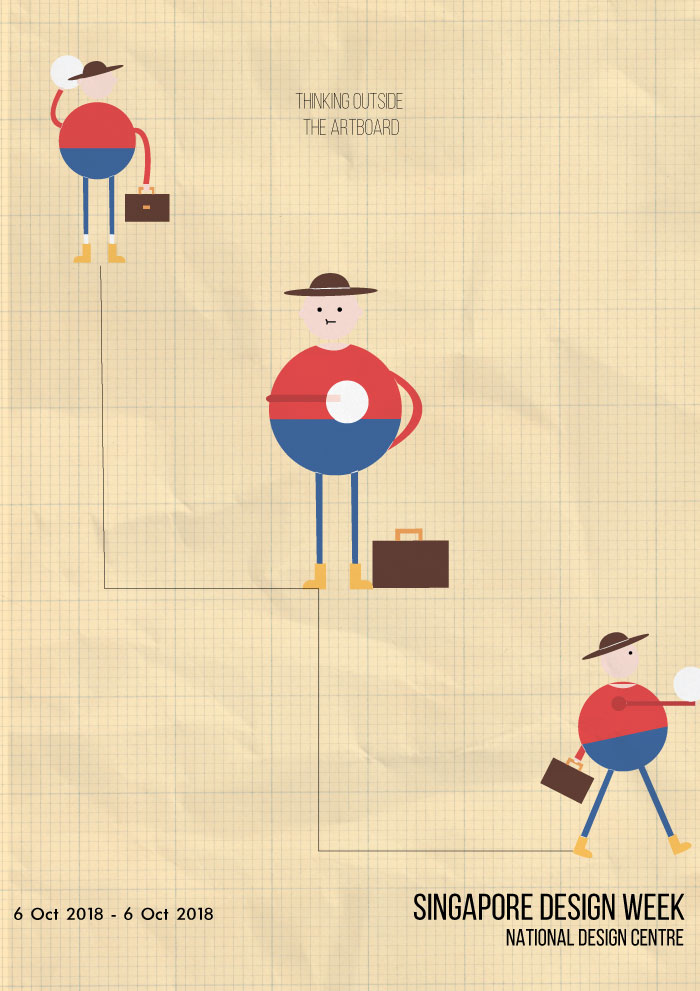
a. Thinking Outside the Artboard
Image of draft: Thinking Outside the ArtboardImage of draft: Thinking Outside the ArtboardImage of draft: Thinking Outside the Artboard
Elaborating further on the idea of celebrating the vastness of creativity in Singapore’s design industry, I came up with the slogan ‘Thinking Outside the Artboard’, meant to be a play on ‘thinking outside the box’, replacing the word ‘box’ with ‘artboard’, the canvas used in Adobe Illustrator. To convey this idea, I had a character taking a design from an artboard and taking it to the exhibition.
However, the design was not interesting or eye-catching enough, it was too flat. The graphic also did not effectively convey the idea, and the character seemed inappropriate for the Singapore Design Week demographic.
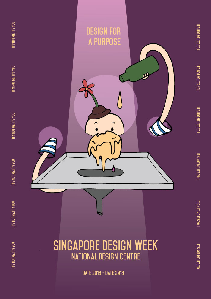
b. It’s Not Me, It’s You / Design For A Purpose
Image of draft: Design for A Purpose
With the idea of designing for a purpose in mind, I came up with the slogan ‘Design For A Purpose’ or ‘It’s Not Me, It’s You’, and wanted to have the poster show some sort of romantic gesture, to be humorous but at the same time show how designing has a part to play in reaching out to different communities. For the first draft, I had a spotlight reflecting onto an object, with the slogans by the side. However, although it makes for an interesting layout and overall approach, I had difficulty in coming up with an image that embodied good design.
c. Further Explorations
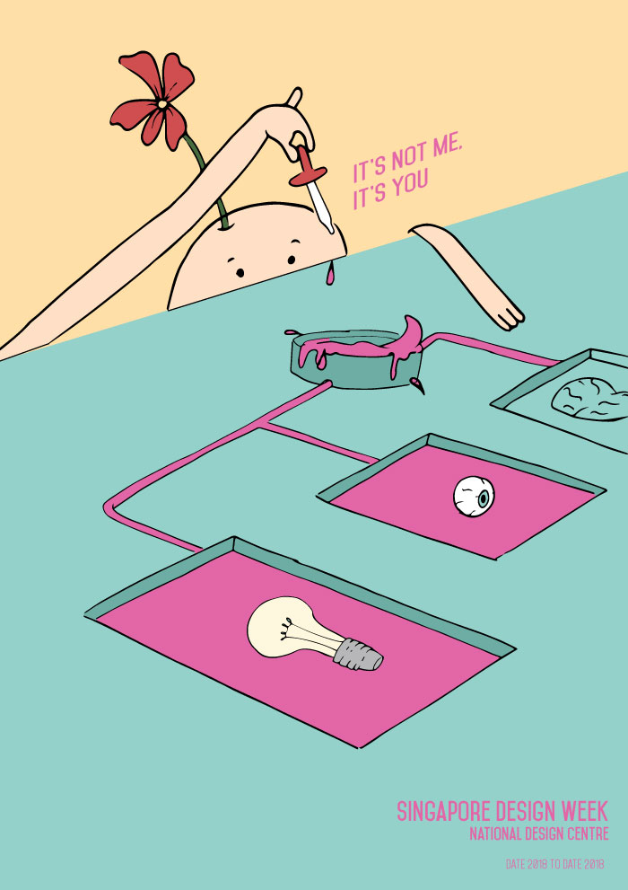
Sketches for possible designsSketches for possible designsDraft 2: Design For A PurposeDraft 2: Design For A Purpose
Expanding further on ‘Designing For A Purpose’, I tried to have the graphics convey a better idea of designing with a clear purpose – the posters consist of a designer character adding a droplet into a ball (meaning to represent creativity), the ball would then slowly leak into the funnel and onto a city, giving it life and adding some vibrancy to it.
The design however, did not really sit well with the whole idea of Singapore Design Week. The graphic would not be able to appeal to a wide demographic and the layout seemed like it would not allow for a better placement of text.
Draft 2: It’s Not Me, It’s You
Similar to the previous design, the poster was supposed to convey the idea of designing for a purpose, with the creativity flowing through to different objects giving them colour. Although the colour choice was interesting, the graphic did not seem to complement the slogan and therefore, was ineffective in bringing forth the message.
III. Experimenting with Layout
Image of draft: Thinking Outside the Artboard
Returning to how I could better convey the idea, I decided to change the slogan to ‘Experimenting with Creativity’, and adopt a style that could appeal to a wider demographic. Hoping to establish a mysterious and magical sort of feeling as a means to capture the attention of viewers, and emphasise the idea of creation and creativity, I played with contrast through colours and adding effects such as glows, smoke, and spotlights. The design comprises of hands dropping a yellow liquid onto a ball of glowing yellow mass. The liquid then flows onto a canvas and into the funnel, forming the words ‘Singapore Design Week’.
The design, however, gave a fairytale kind of mood and seemed more appropriate for theatrical productions. The shape of the canvas also disrupted the visual flow and raised even more questions about the graphic.
Image of draft: Thinking Outside the Artboard
Keeping to the same direction, I adjusted the colour palette and text, as well as removed the canvas to establish a smoother visual flow. However, the graphics still did not manage to effectively convey the idea of creativity, and still felt quite static – it wasn’t able to stir excitement.
Feedback & Challenges
An issue I had at the beginning of conceptualising the poster was the slogan and the accompanying images. Wanting to have an interesting and more humorous slogan that gave an overall view of the design scene in Singapore was quite challenging where it became difficult for me to conjure images and a style that supported the idea of the slogan. Therefore, with constant changes to the slogan and supporting images, layout, and style, it gave me less time to refine the final piece.
Another challenge that hindered the overall poster was the illustrations themselves – they were not able to effectively convey the idea of the slogan. The yellow ball of mass, with the intention of representing creativity, was not literal enough and the colour and form made it seem more like ice-cream, with the dripping graphics adding more to that idea. The nature of the graphics (with the hands meeting in the centre and the yellow mass in the centre) also demanded for a centralised layout for the text.
The nearly centralised layout was also not very interesting; it didn’t allow for easy experimentation with the text, and ended up looking like an editorial page rather than a poster. It was not as able in supporting the idea of ‘experimenting’ and may not be as eye-catching as posters with better variation in text and graphic placements.
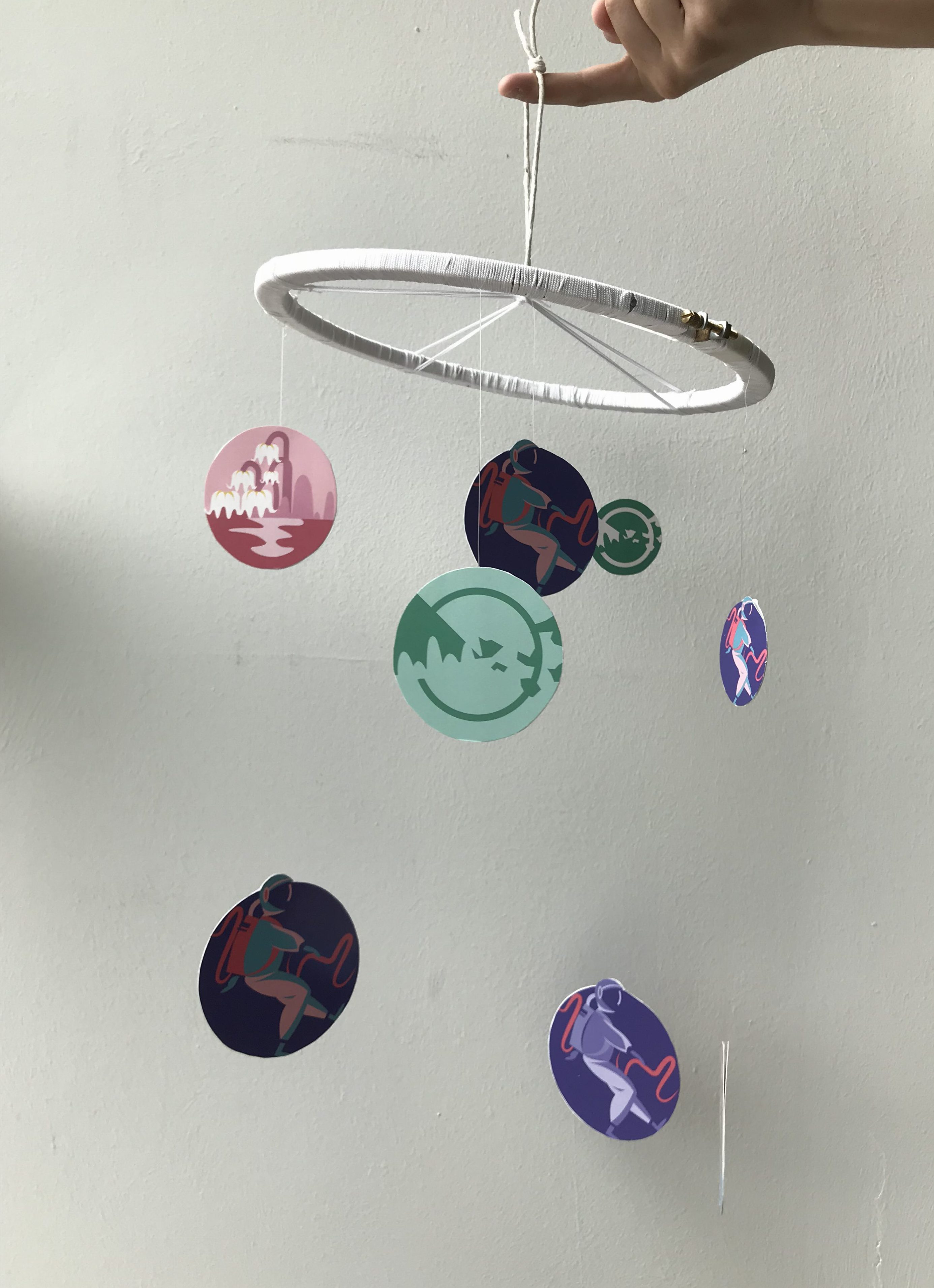
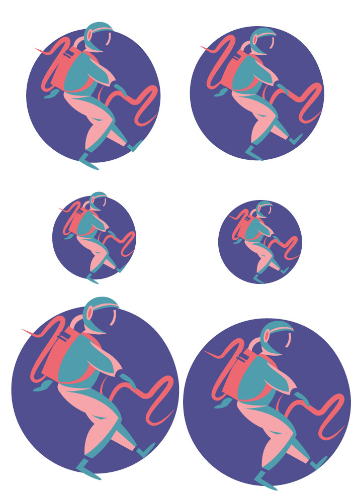
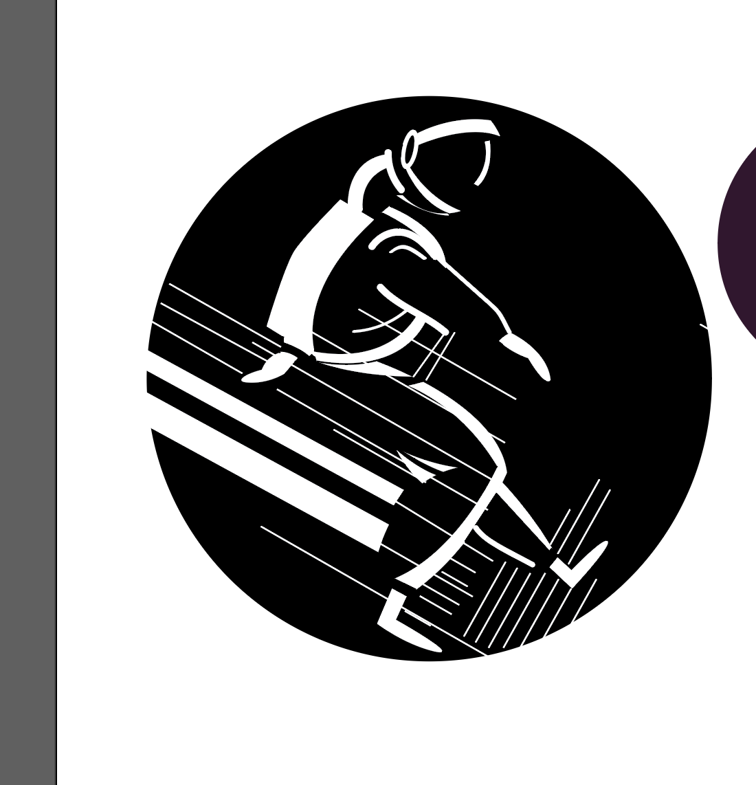
For our very first project in Visual Communications, we were tasked to create a mobile for a hospital that revolved around the theme of hope. The focus of the project involved designing graphic forms that used concepts pertaining to figure/ground relationships.
Final Product
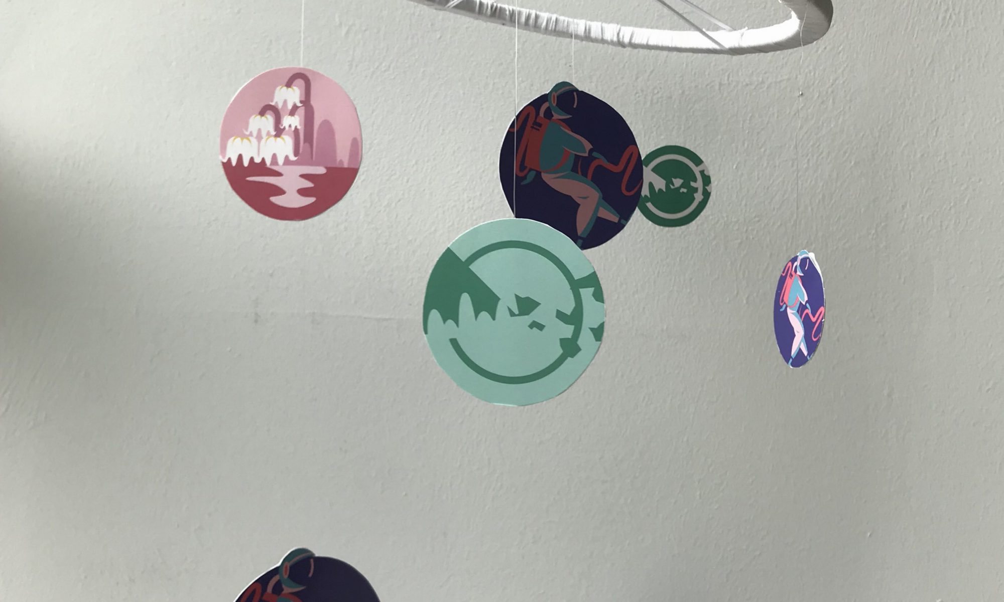
Image of final product: Mobile
Keeping in mind the idea of hope, my final product (both the graphics and hanging structure) are based on the theme of outer space. Wanting to go in a more whimsical direction, I used astronauts and ‘planets of hope’ as content for the main graphics as I felt that it could appeal better to a wider demographic of both young and older patients.
I. Concept
Choice of Graphics
Image of astronaut
With regards to the concept, I chose to go with the theme of outer space with astronauts and ‘planets of hope’ helping to convey this idea as in my opinion, astronauts serve as a sign of hope – they are always on the search for new signs of life. With Michael’s help, the involvement of the ‘planets of hope’ expanded this concept, where it reinforced the idea of the astronaut being on the search of new life.
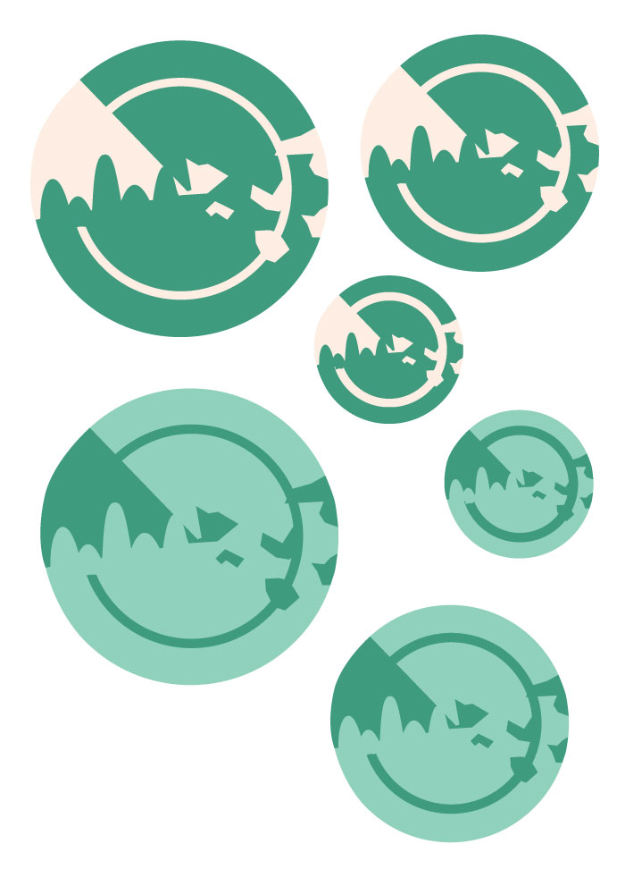
Image of submarine radar
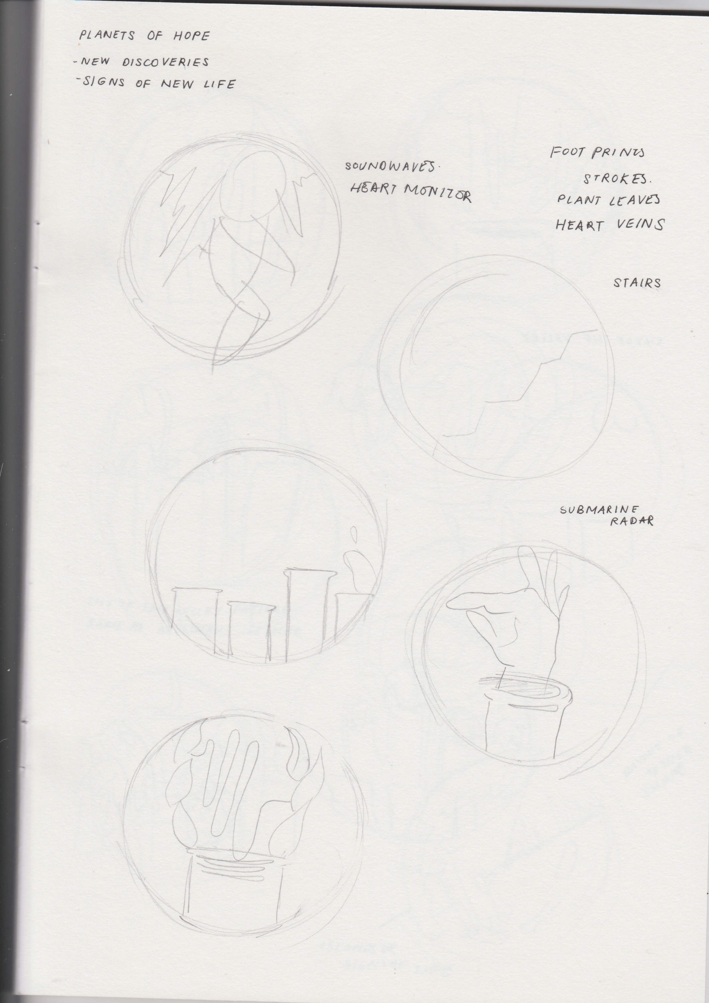
Wanting to convey the idea of hope in a more straightforward manner, the planets themselves have symbols of hope integrated into their forms.
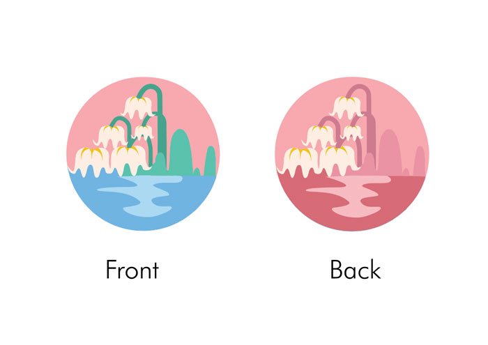
For the first planet, the graphic features a valley with flowers – the flowers are meant to be Lilies of the Valley, a common type of spring flowers, and spring itself often being associated with hope, bringing about instances of new life. The second planet was also meant to convey hope as signs of new life. Inspired by the visuals and purpose of a submarine radar (where objects would appear as lit-up spots it), I thought it would be interesting to have a planet that showed the idea of objects appearing on a submarine radar. There was also the inclusion of curves and geometric shapes to represent rock formations.
Close up of sonogram in background
To further reinforce the idea of new life, as well as finding a link to tie the three different graphics together, they all feature a wave in the background. It was meant to represent the bleeps in a heart rate monitor. The rises and dips in waves in the monitor indicates the presence of a heart beat, and therefore to me, is a symbol of life.
Placement of Graphics
Final product
The placement, on the other hand, was focusing on contrast between sizes, having a range of small, medium, and bigger graphics, with one in the centre.
Hanging Structure
Keeping in mind the theme of outer space, I wanted the physical structure to be circular as well (in-line with the circular shapes of the graphics). White yarn was used to cover the wooden structure to give it a softer and calmer feeling, and also prevent the colours from clashing with that of the graphics. Fishing line was used to hang the graphics.
II. Principles applied
Figure/Ground
One of the design principles applied was the use of figure/ground relationships. The graphics of the mobile were to be results of experimentation with figure-ground relationships and Gestalt theories (proximity, similarity, closure, good continuation, and common fate).
Figure and ground refers to a theory of the mind’s organising tendencies, in particular the way the human brain perceives physical form, distinguishing an object or form from its context or surroundings—a figure from its background.
If you see graphic design as a process of arranging shapes on a canvas, then you’re only seeing half of what you work with. The negative space of the canvas is just as important as the positive elements that we place on the canvas.
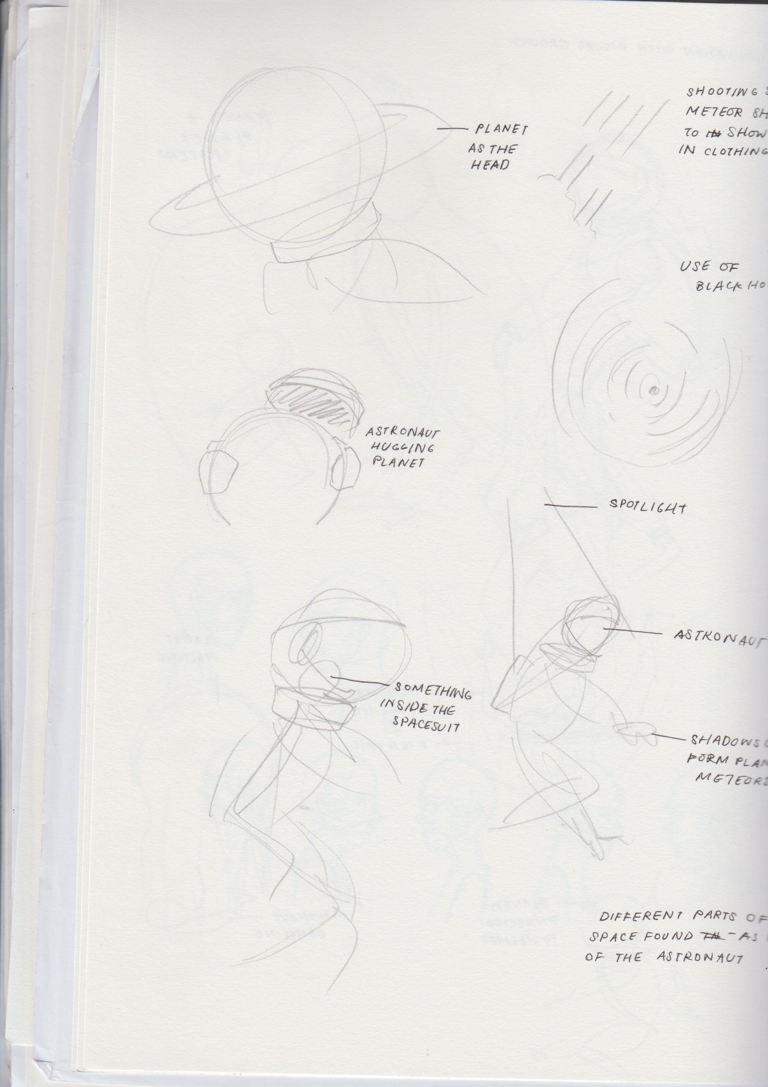
Trying to experiment with methods of closure, where the figures seemed complete although their forms were not, the figures were an integration of positive and negative space. Mostly used in the astronaut and submarine radar graphics, I tried to use the background to help fill in gaps left by the positive form (e.g. the helmet in the astronaut and the rock formations in the submarine radar).
As for the flowers, I wanted to try methods of good continuation, where an intersection between two or more objects makes it seem as though it is a single uninterrupted object. Seeing the possibility of creating a continuous flow between the shapes of hills and petals of the Lilies of the Valley, I used the layout of waves in a heart rate monitor to create a flow between the two, attempting to form a smooth continuation, thereby seemingly forming a single shape.
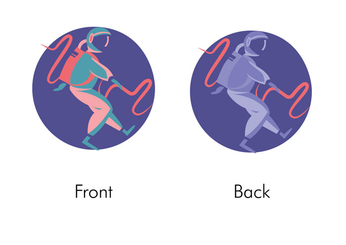
Contrast
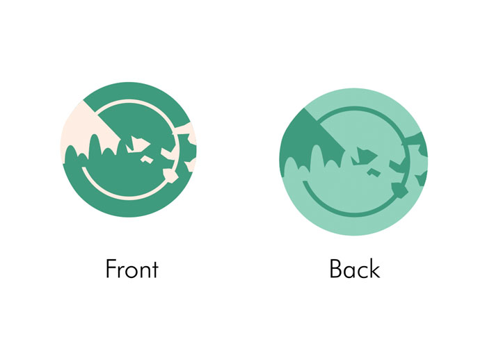
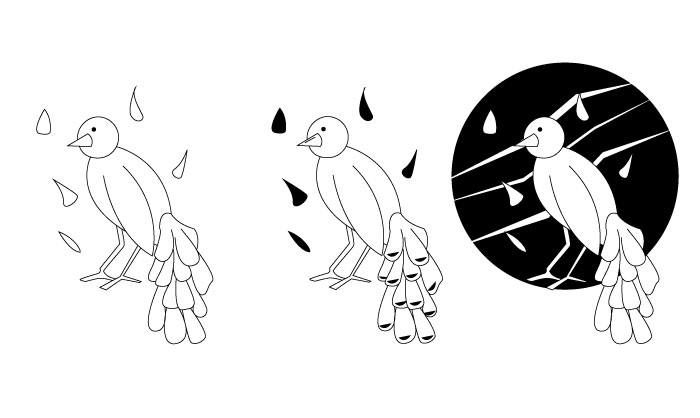
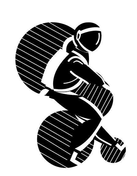
Astronaut: Front and backLily of the Valley: Front and backSubmarine radar: Front and back
I also wanted the graphics to play with the idea of contrast. I felt that a contrasting colour palette will help to bring out the shapes better amongst one another, and allows for a brighter and more vibrant composition. Contrast in colour was used within different shapes of the graphic, as well as in the front and the back; a wider range of colours were used in the front while monochromatic colours were used in the back.
Research & Process
I. Conceptualising
The process first began with conceptualising, where we were to come up with our own interpretations of what hope is.
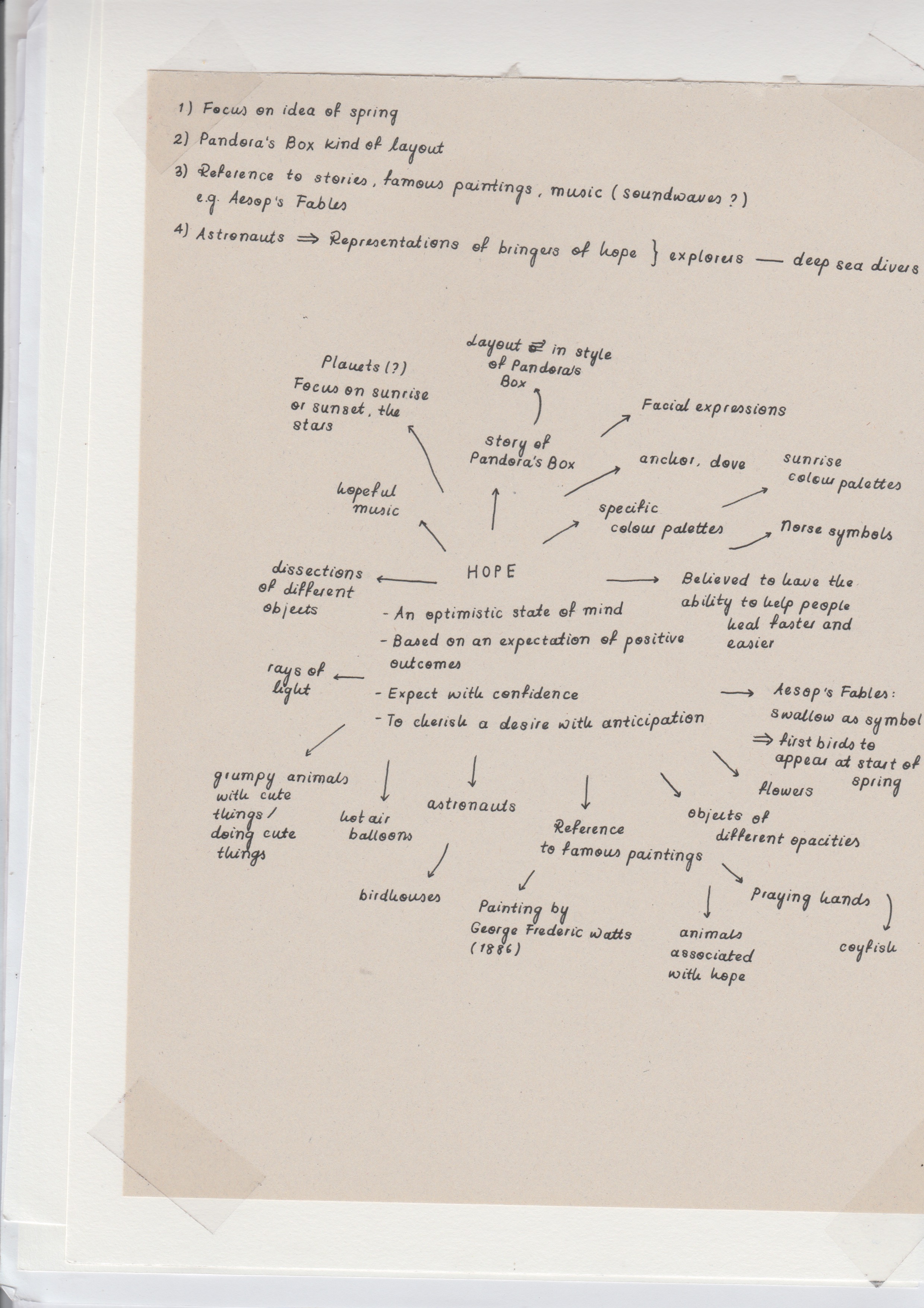
Image of MindmapImage of Mindmap
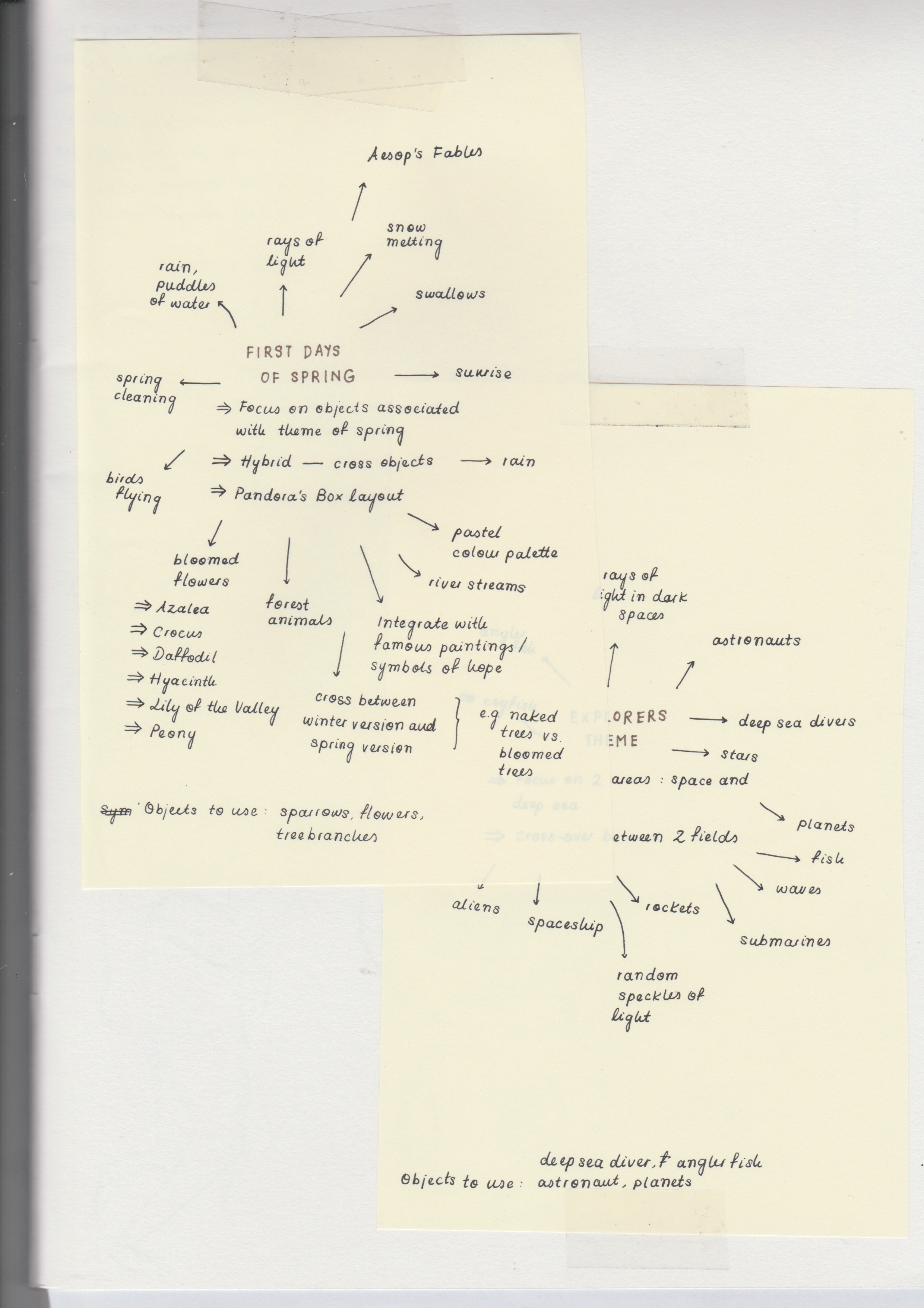
After brainstorming all the symbols and objects typically associated with the idea of hope, I categorised these objects into sub-themes: spring, fairytales (i.e. Pandora’s Box), and outer space.
Spring: Sparrow (the first birds to appear during Spring), winter branches, and flower petals
Pandora’s Box: Hope being the one left at the bottom of the box after all the bad things escaped
Outer space: Astronauts on the lookout for new life
II. Research & References
In addition to finding objects typically associated with hope and further developing the three finalised concepts, I wanted to research more into methods of experimenting with figure-ground. Coming across Gestalt principles such as proximity, similarity, closure, good continuation, and common fate, I thought I could use them as bases in forming the graphics.
Looking at more reference images also helped in seeing how else I could play with the positive and negative spaces, and the shapes I could use to convey the elements I wanted to use.
After brainstorming on the theme of hope and figuring out the elements we wanted to include in the graphics, we practised taking the illustrative elements out of them and drew contour shapes, and how they would look like in both positive and negative forms.
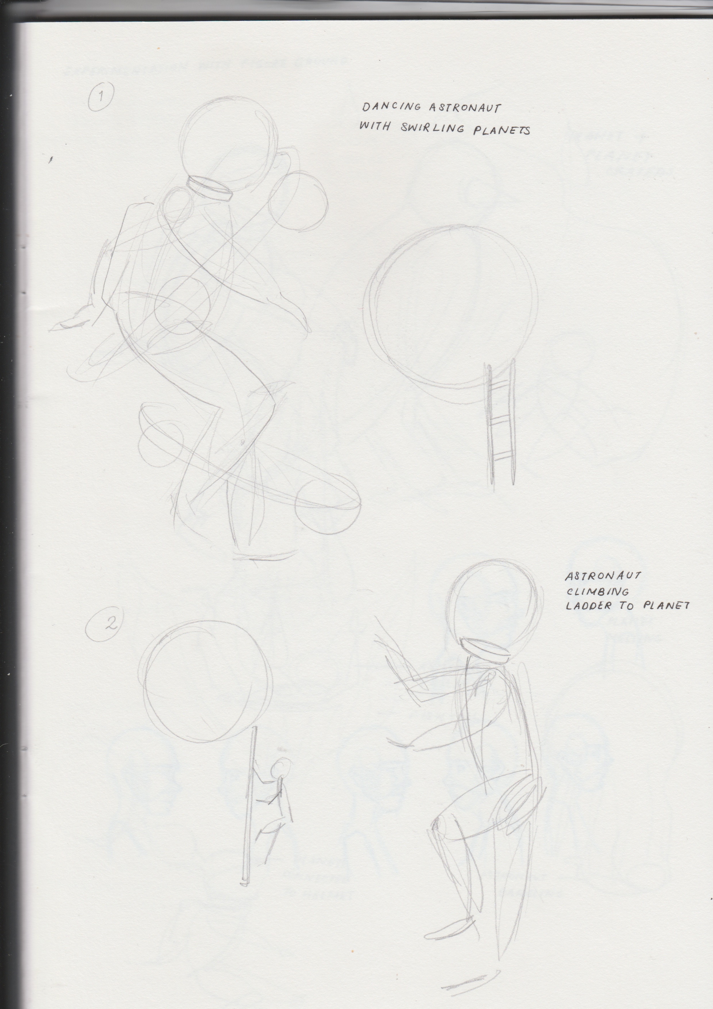
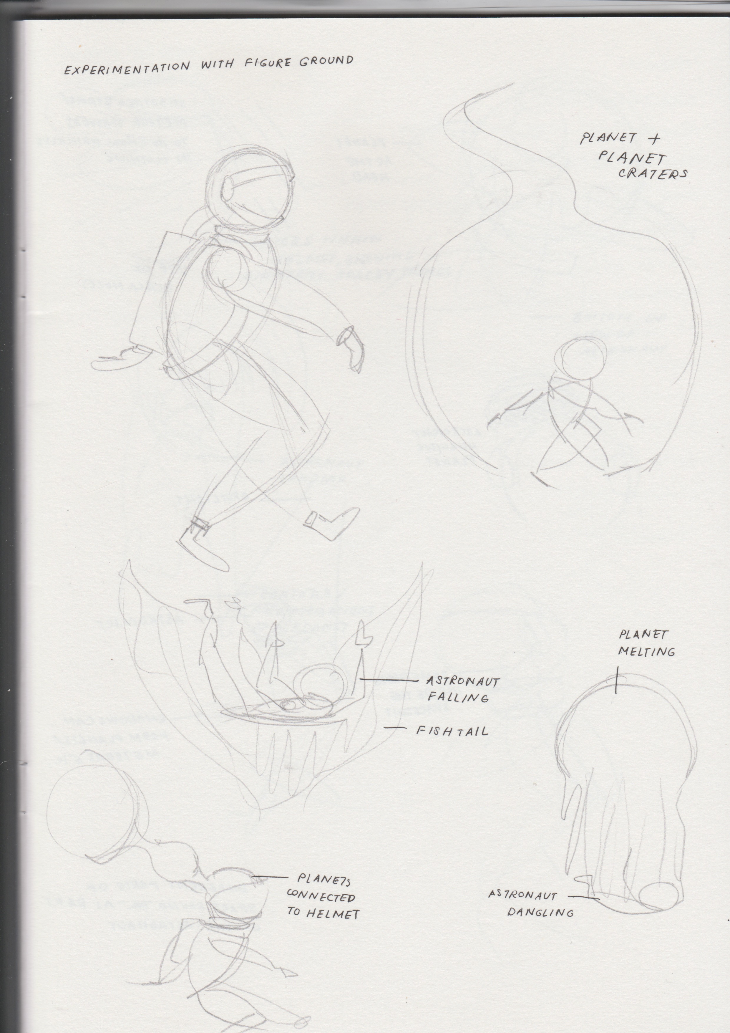
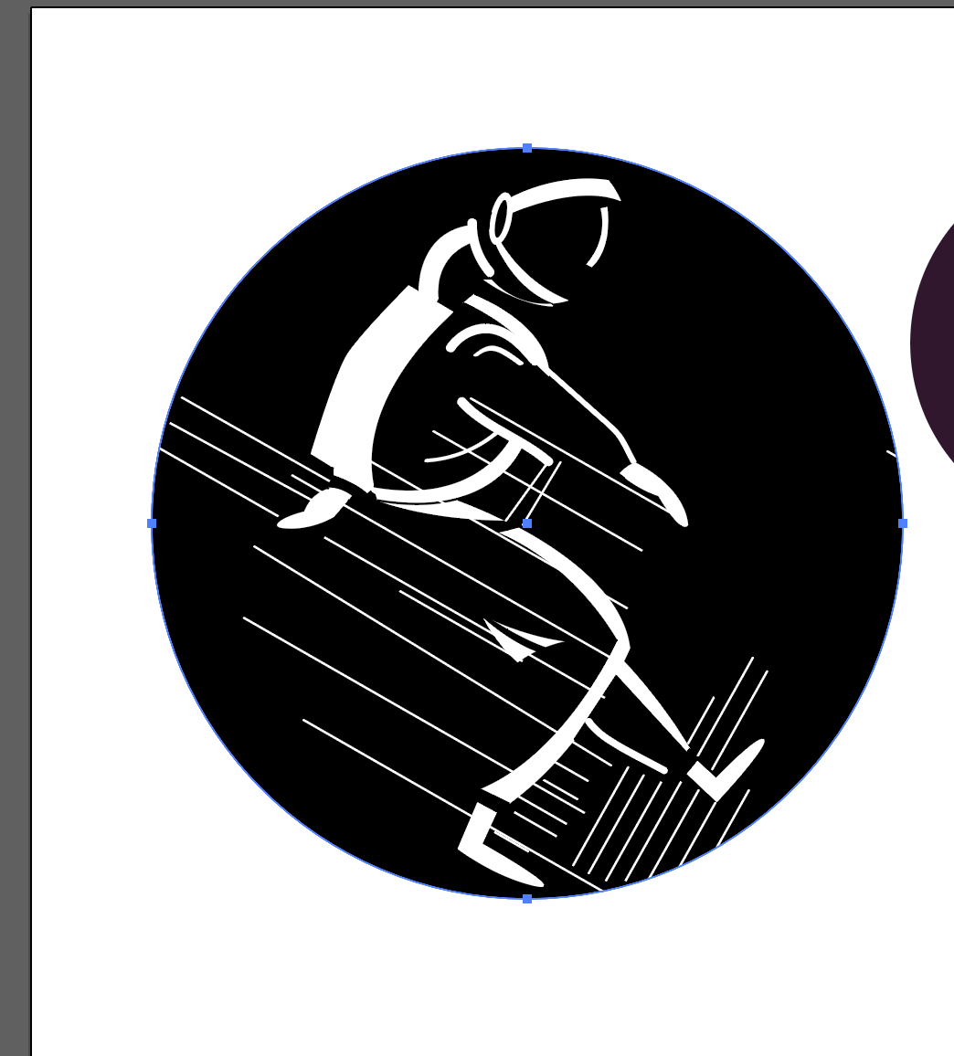
Explorations of other themesDraft: AstronautDraft: AstronautDraft: Astronaut
After receiving feedback on how I could improve the graphics – using more shapes instead of lines – we had another round of group feedback where we finalised the graphics we were going to use and further developments into figure-ground relationships.
Draft: AstronautDraft: Astronaut
The addition of colour was then looked into. Inspired by some bright pastel colour palettes in the reference image below, I thought using such colours was effective in conveying the idea of hope as something vibrant but at the same time, remained calm and peaceful.
Draft: Colour paletteDraft: Colour palette
After receiving feedback on the darkness and dullness of the chosen colour palette, I decided to go with something a little brighter and draws more contrast. Ultimately, I decided on this final colour palette.
After printing and cutting the graphics out, it was time to fix the hanging structure. At first, I used thinner wires that were covered with thread; after coiling them with one another in an effort to make them thicker and sturdier, the entire structure did not look appealing and was still not able to hold up on its own with the hanging graphics.
The second attempt therefore, consisted of using a wooden embroidery ring and coiling white yarn around it over and over again until the wooden parts were completely covered. The yarn made it have a softer exterior and seemed to give the entire structure a look better-suited for a hospital. However, with the metal bolts screwed onto the side of the structure, hanging it on its own made it topple to one side and therefore, the placement of graphics had to lean more onto the opposite side to make it balance.
Feedback & Challenges
One of the main challenges I faced in this project was the use of figure-ground concepts. More familiar with seeing graphics in their complete and literal forms, I had difficulty in experimenting with positive and negative spaces and in the end, my graphics ended up looking more illustrative then the supposed abstract shapes and forms. Furthermore, I felt that I could have been a little more imaginative with the background instead of using just a circle.
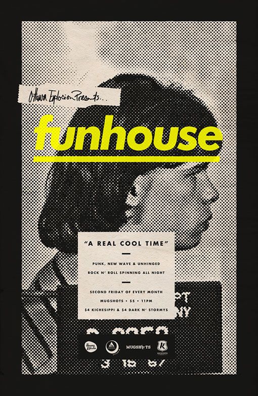
The poster above is promoting an event; it seems to be a promotional poster for a venue advertising deals for the second Friday of every month.
What emotion does the design elicit?
Looking at the choice of colour and graphics, the poster has a very grunge and underground kind of aesthetic, giving an overall mysterious vibe. It makes me curious to find out more about the event.
What makes the poster captivating? Discuss the use and effect of imagery, text, texture, colour.
One of the visual elements that makes the poster captivating is the choice of colour. The pop of vibrant yellow draws a strong contrast against the background and image’s muted colour palette, drawing attention to the title without making the poster look too gaudy.
Another captivating element of the poster is the image and use of half-tone. The image complements the overall aesthetic of the poster and the use of one subject allows it to have a simple composition that is easy on the eyes. The use of half-tone adds to the overall mood as well, and adds a layer of texture to the image, making more attention-grabbing.
How did the poster generate visual interest and facilitate readability?
The combination of visuals in the poster is harmonious; the graphics such as the image, halftone, colour palette, and fonts work very well together, giving a unanimous aesthetic and mood. Additionally, despite the boldness of each graphic, the muted colour palette prevents it from being too jarring, allowing for easy readability.
The use of sans serif fonts also allow for easy readability. Important details such as the prices and event timing is displayed in a font that is legible.
How do you feel about the approach and execution?
Overall, I think the poster is effective in generating visual interest because of its choice of graphics, colour palette, textures, and fonts, it is eye-catching but at the same time, its graphics work together harmoniously. Additionally, I feel that the poster complements the type of event as well.
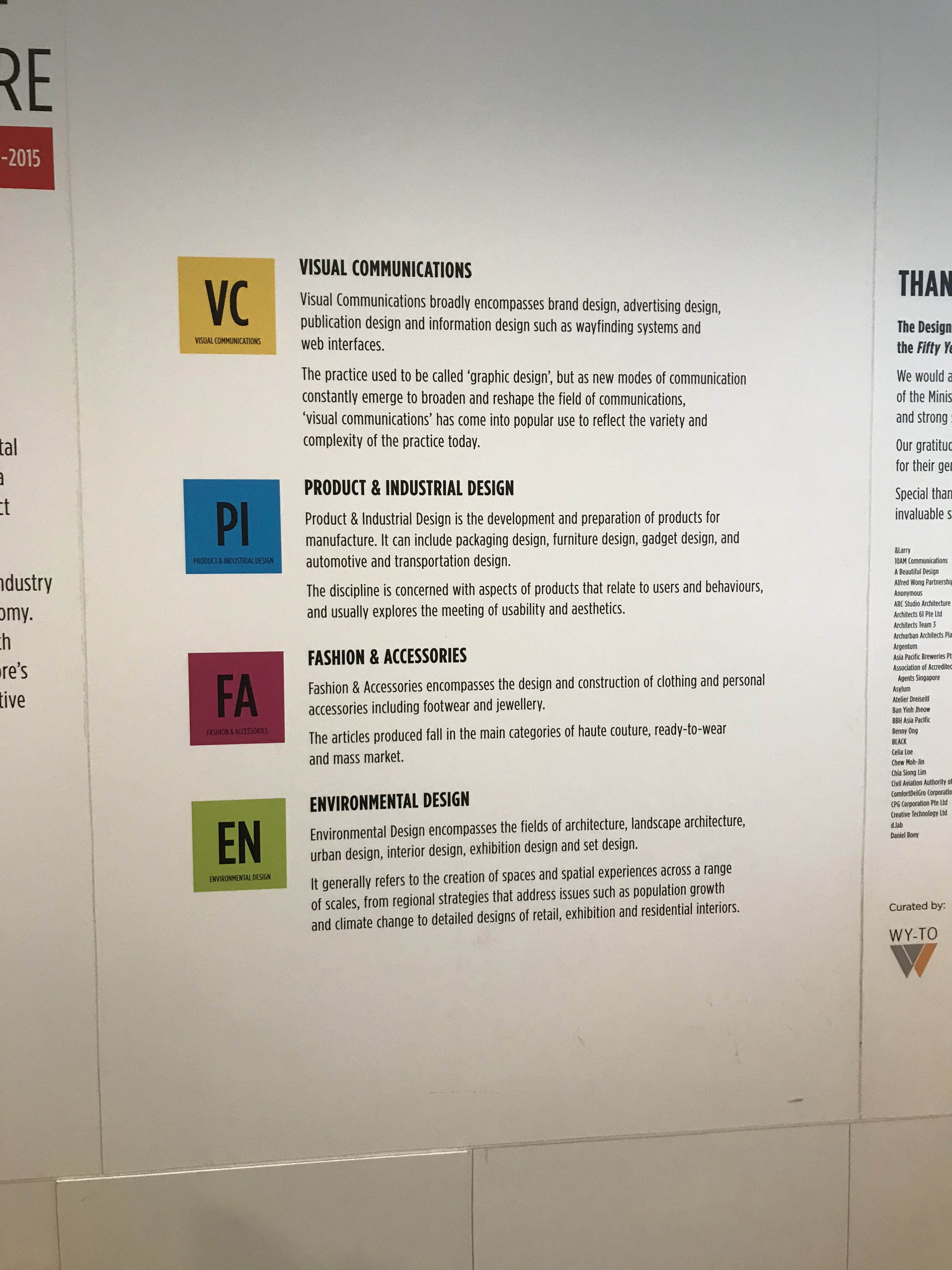
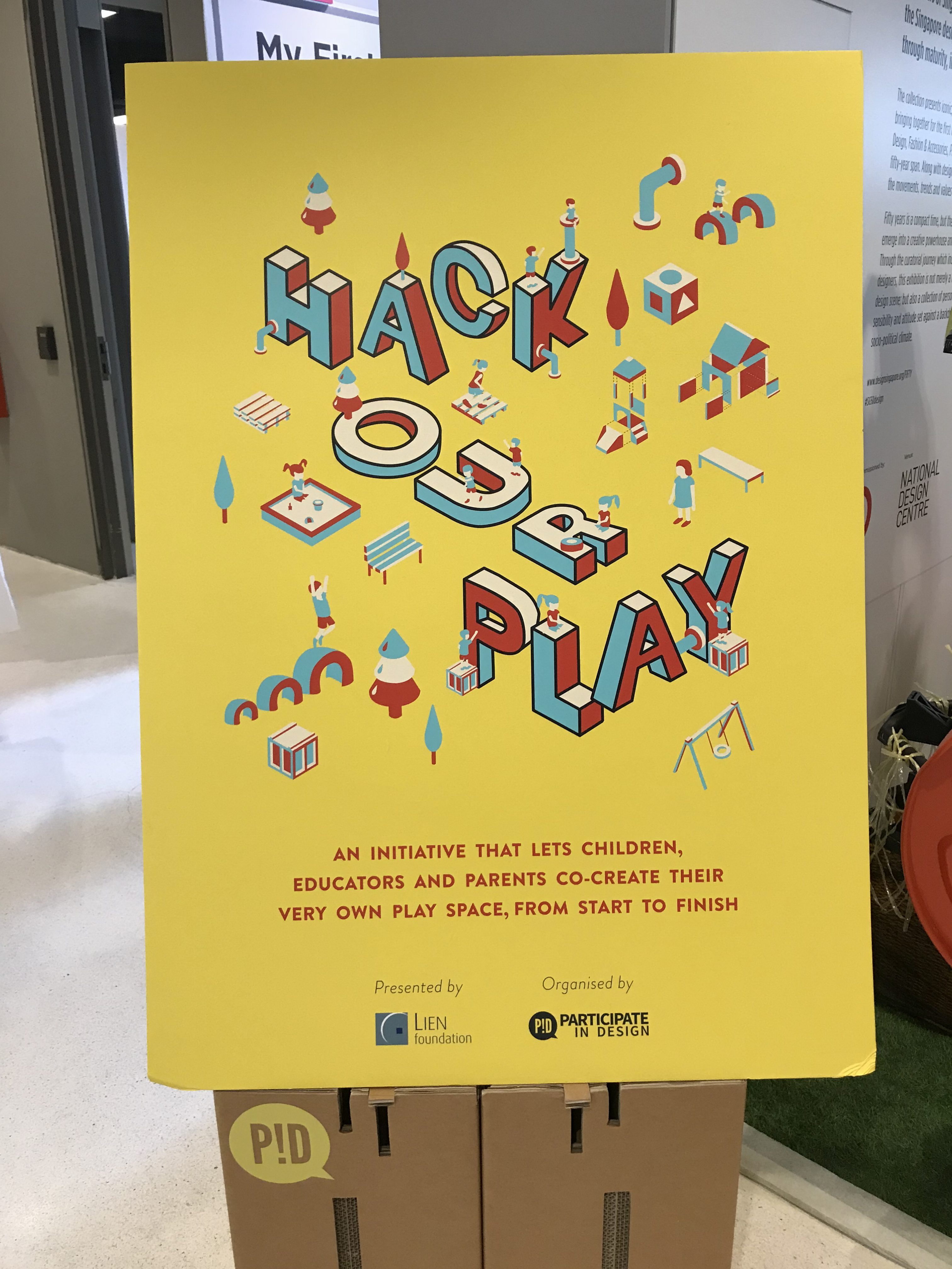
Take pictures and list the various types of design practices you encounter during your visit.
The areas of design practice in Singapore
Personally, visiting the exhibition was quite intriguing; quite clueless about the evolution of design in Singapore, I was surprised to see that the design scene was actually quite diverse – in addition to graphic and packaging design, Singapore had a hand in fashion, product and architectural design, amongst others. Furthermore, you could see how each design field evolved over time and grew more prominent with each era.
What are some of your observations of the design scene/practice in Singapore over the years?
External forces influenced the design scene greatly;
Design style is clear with every era;
Practicality was a major factor in design;
Bringing forth a unique Singaporean culture was celebrated;
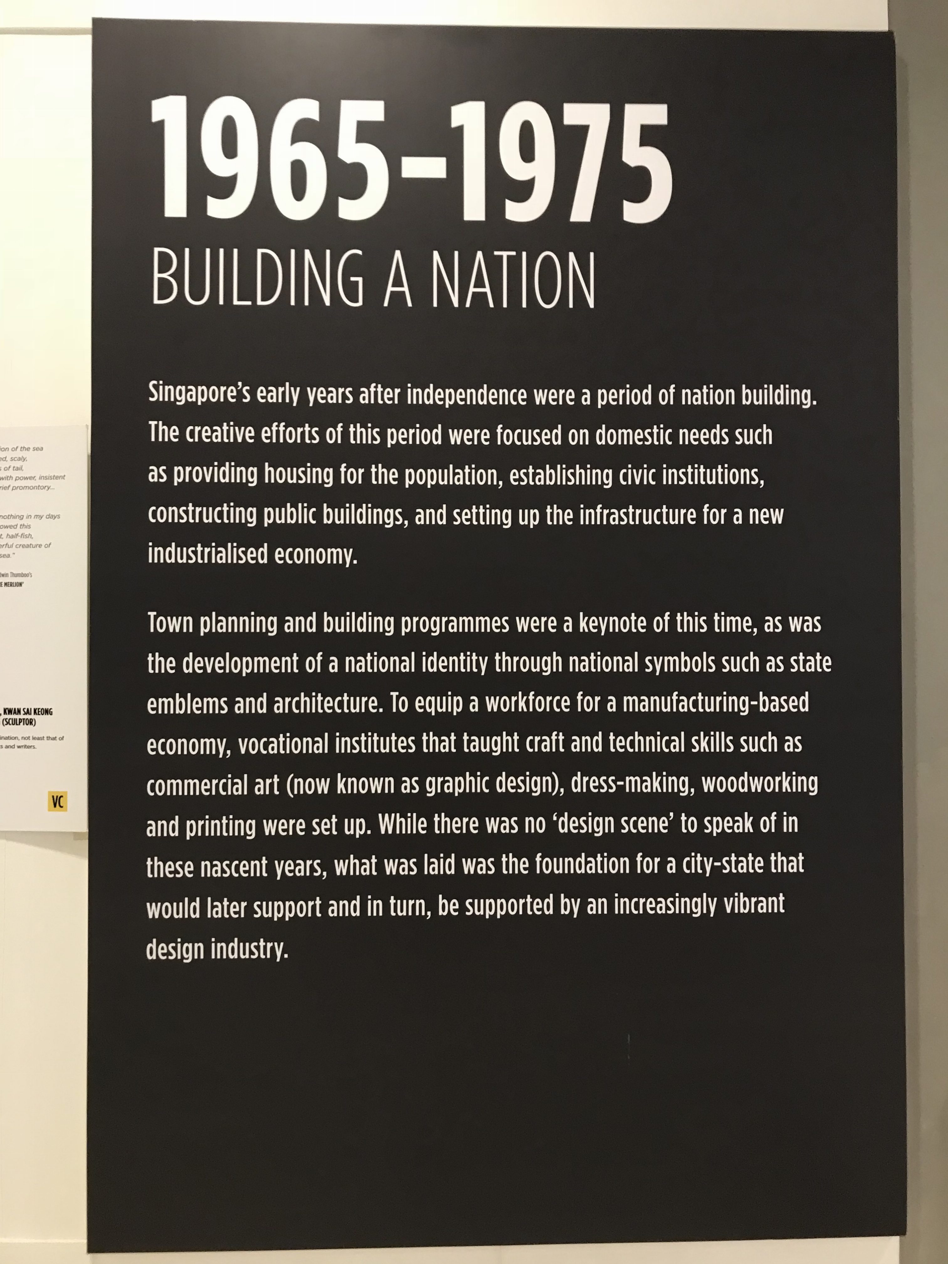
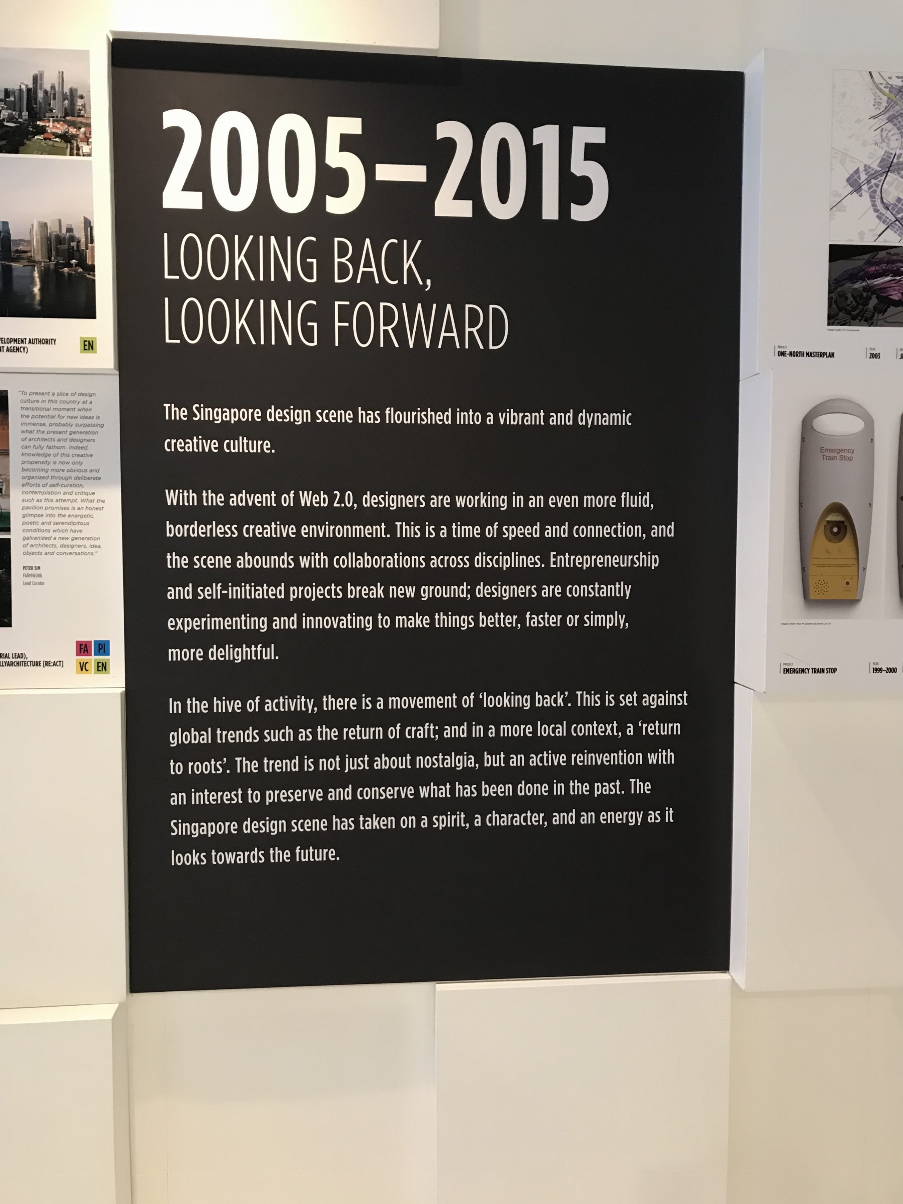
Goal of ‘Building A Nation’Goal of ‘Looking Back, Looking Forward’
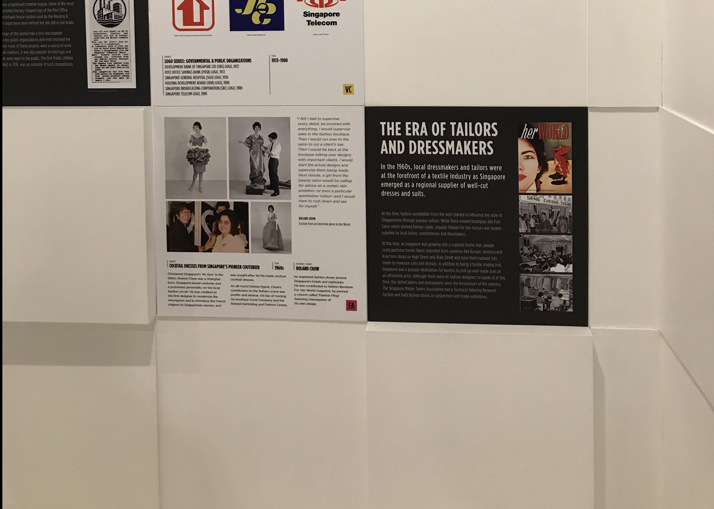
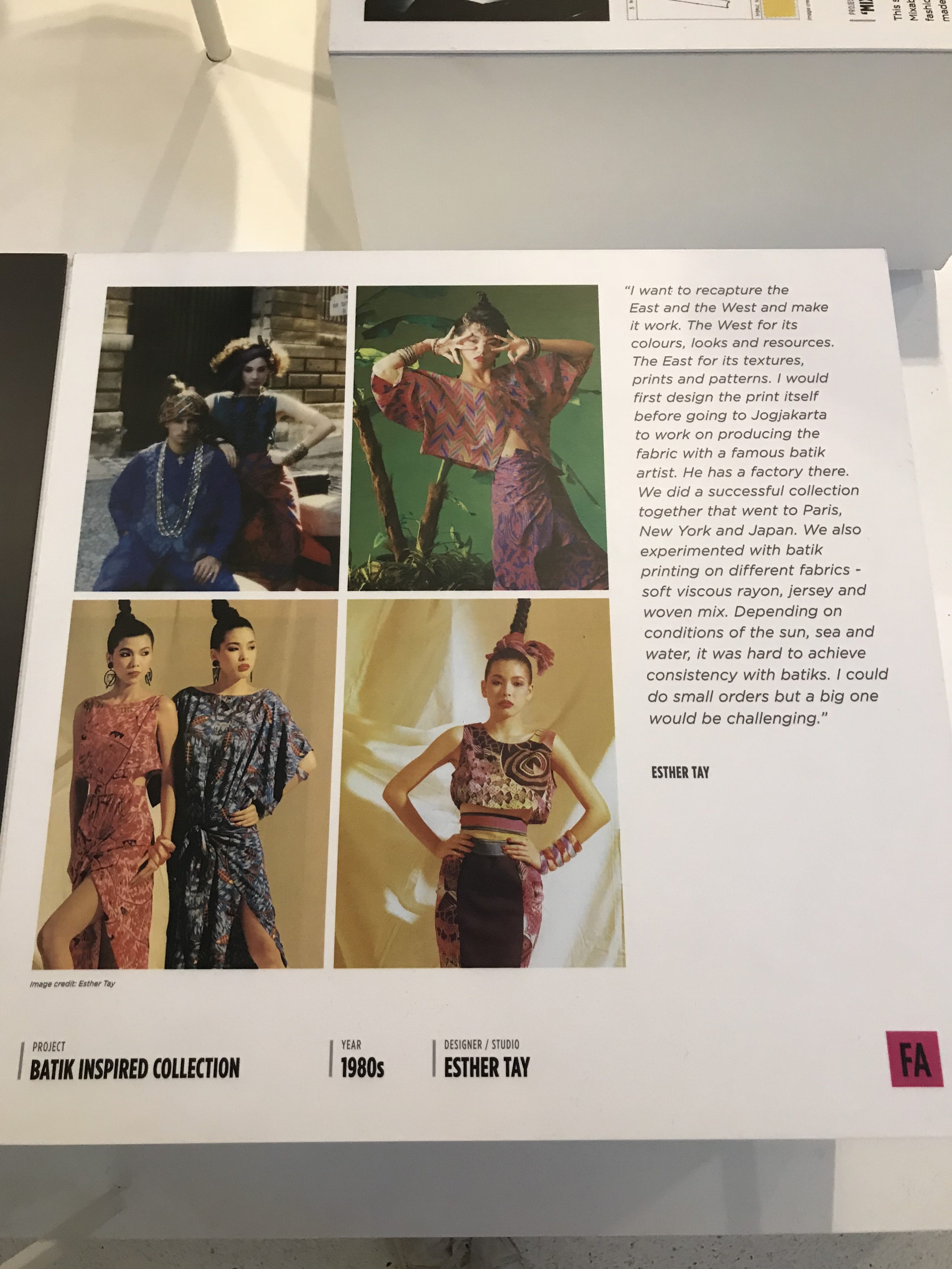
The design scene/practice in Singapore had clear evolutions throughout the decades – the influence of external factors on Singapore could have played a part in changing the design scenes with each era. The factors involved integrating new technologies, changes in the economy, branding a new nation on a global platform, and celebrating culture through nostalgia. With each decade that brought about a goal that includes external factors, designs from that particular time period could be seen changing accordingly.
Fashion design from the 1960sFashion design from the 1980s
Expanding further on the influence of external factors, the design styles and trends could clearly be seen with each decade. Personally, the styles seen in the items on display probably would have followed trends relevant in that time period. A prominent example would be the pieces from the 1980s where vibrant colours and patterns were used a fair amount.
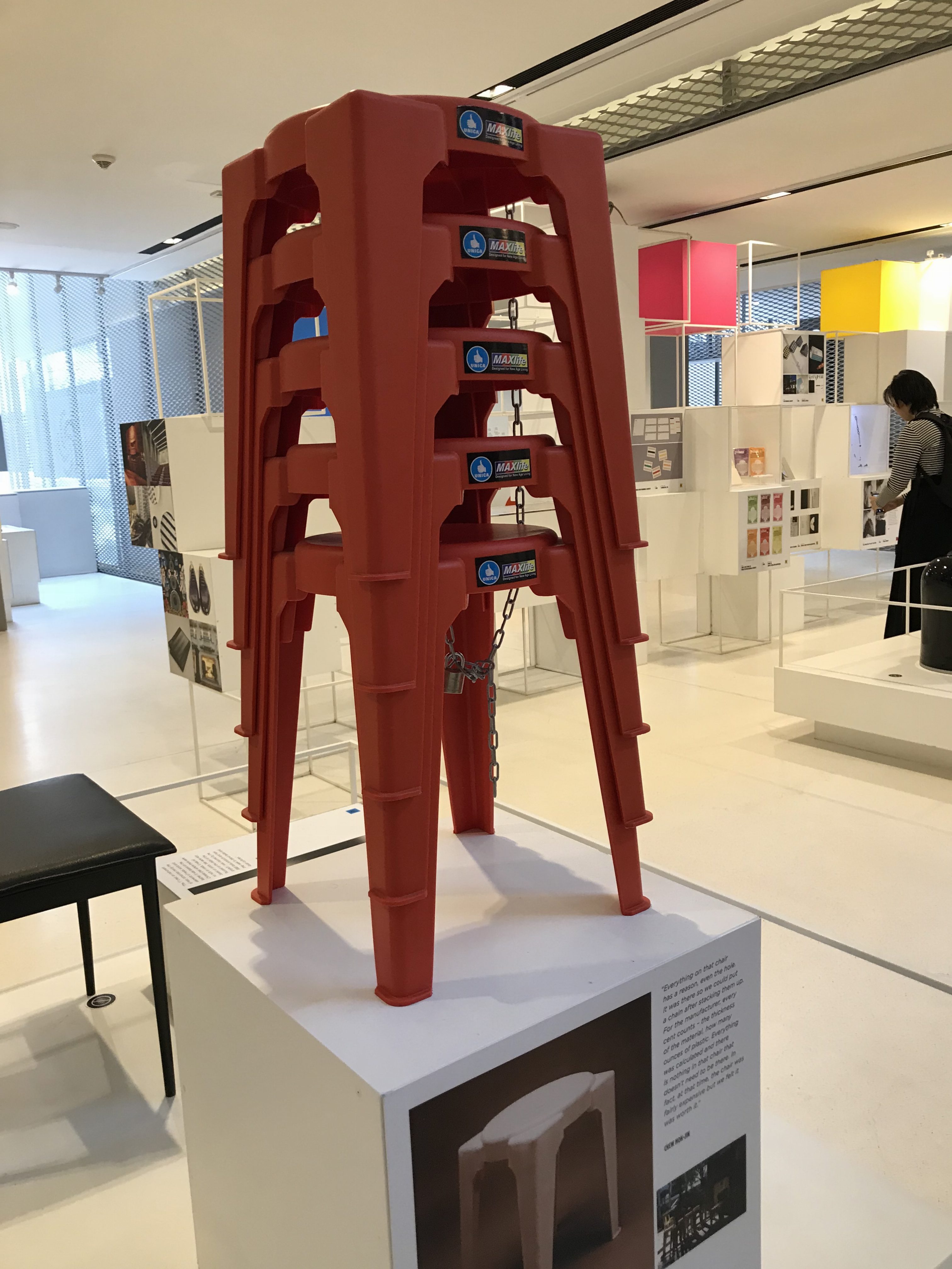
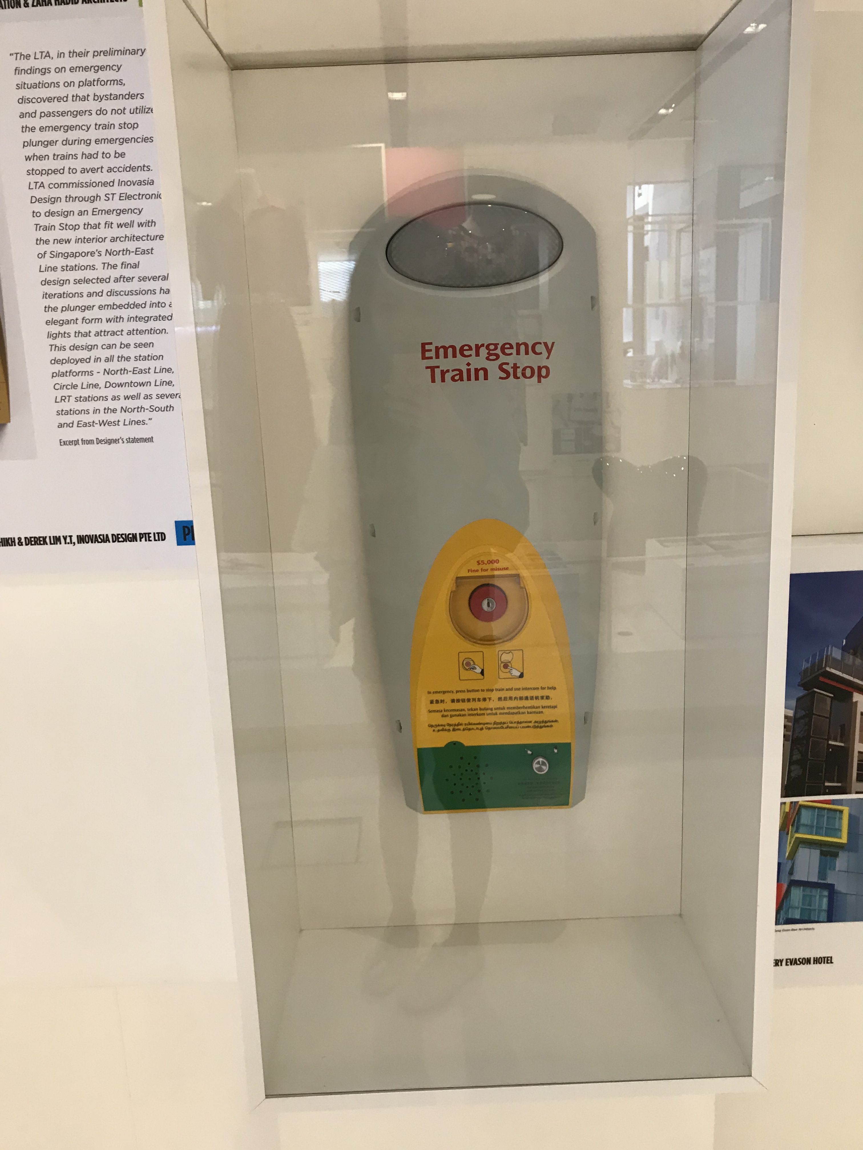
Image of the Unica plastic stools still used todayImage of Emergency button for LTA
Singapore’s design scene also has a focus on practicality, the design pieces on display had other goals in addition to serving as a form of visual aid, with said goals changing with different time periods. For example, some pieces were created with the intention of integrating Singaporean culture, building a local brand, while others had the goal of creating better visitor experiences (e.g. clearer and simpler way finding signs).
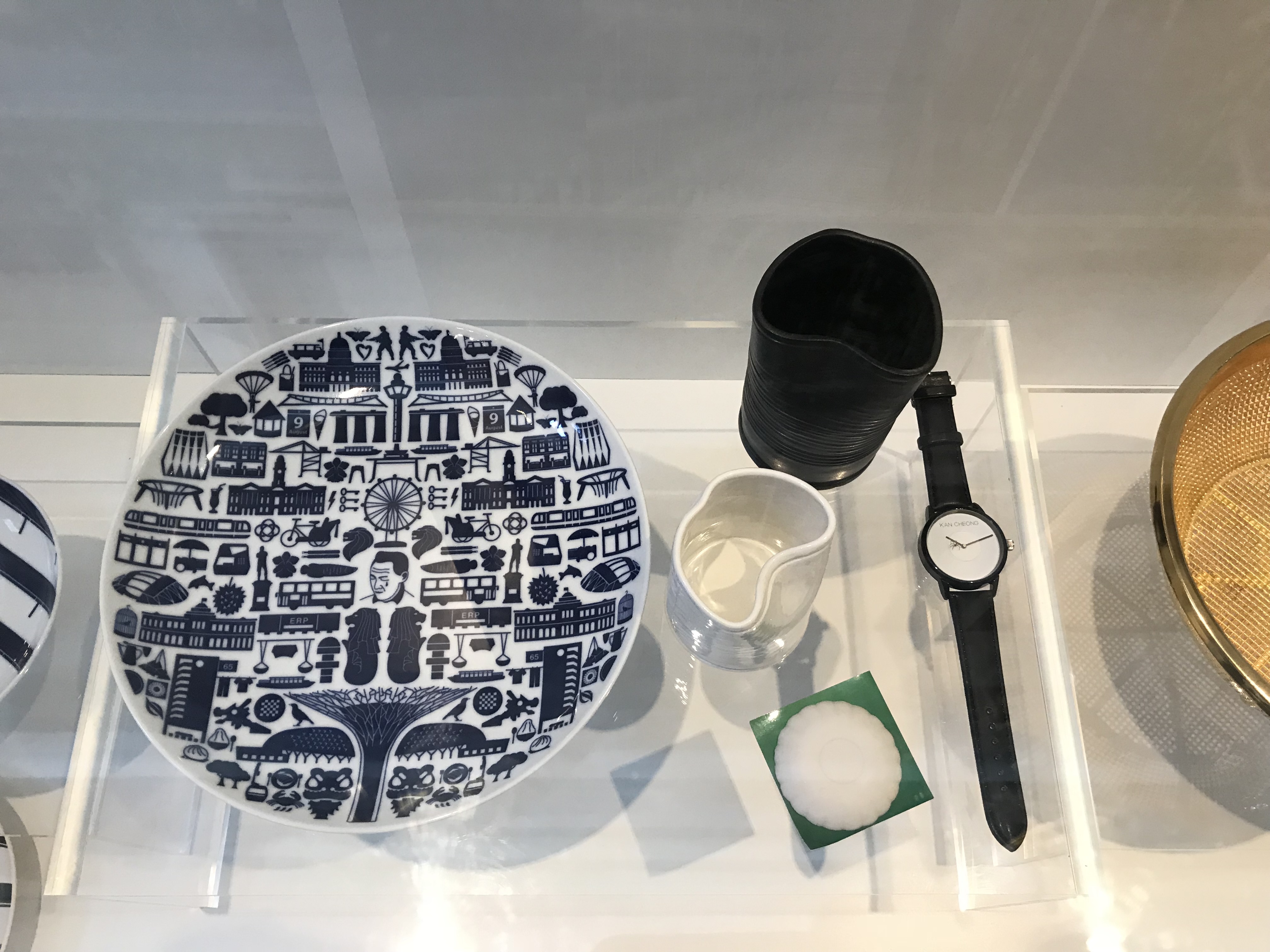
Image of everyday products that integrate aspects of local culture
Some areas of the Singaporean design scene also had a strong focus on integrating local culture. The pieces on display used different aspects of Singaporean culture (i.e. local slang, food items) to form products. This was probably in-line with the goal of branding a nation and/or celebrating nostalgia.
What are some of the future goals/key thrust for design in Singapore?
Designing with a purpose
Minimalist and cleaner looks
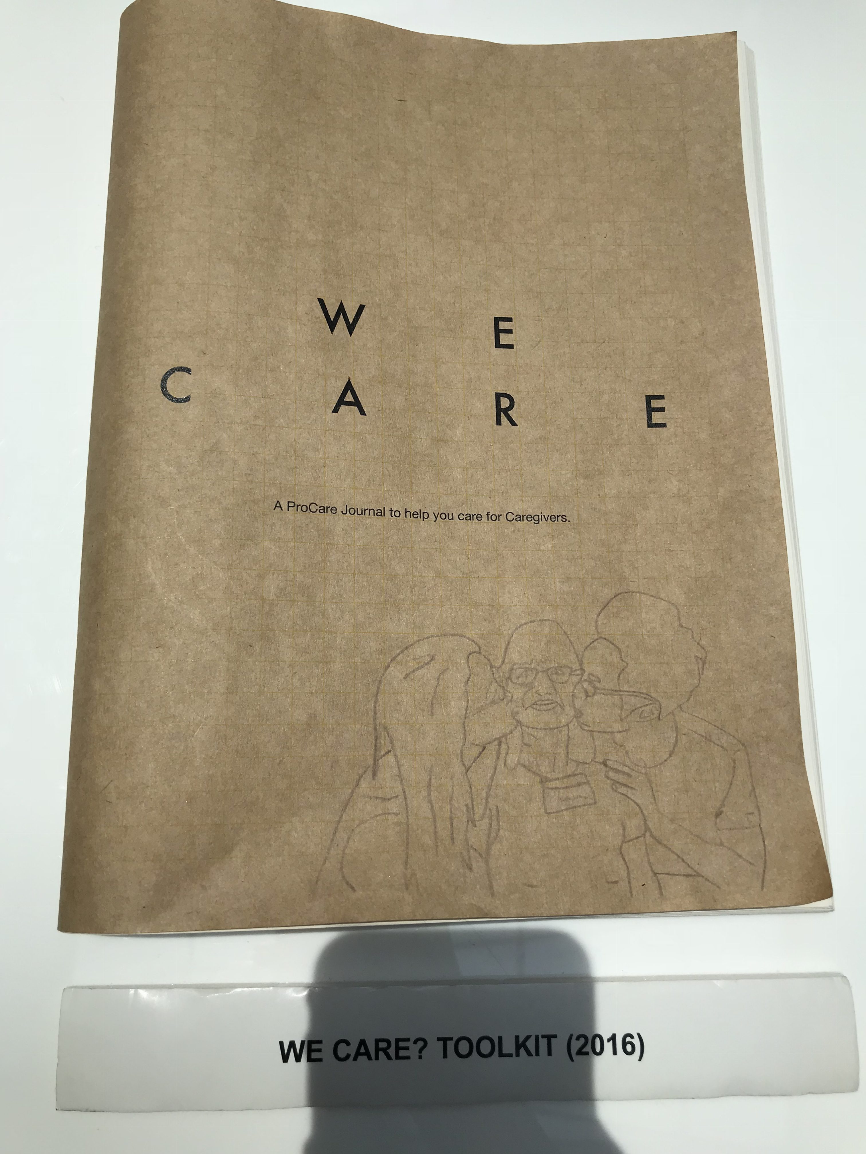
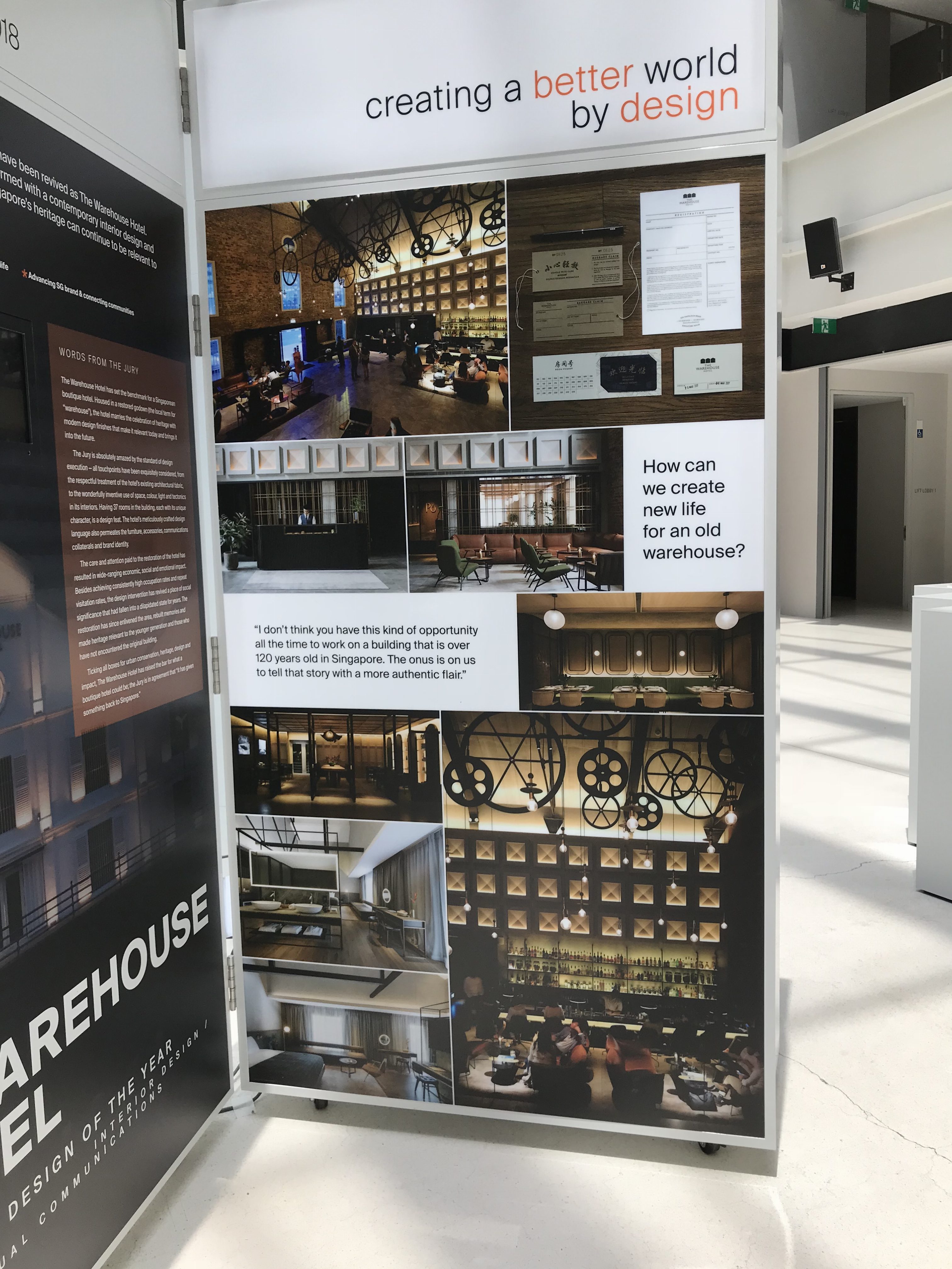
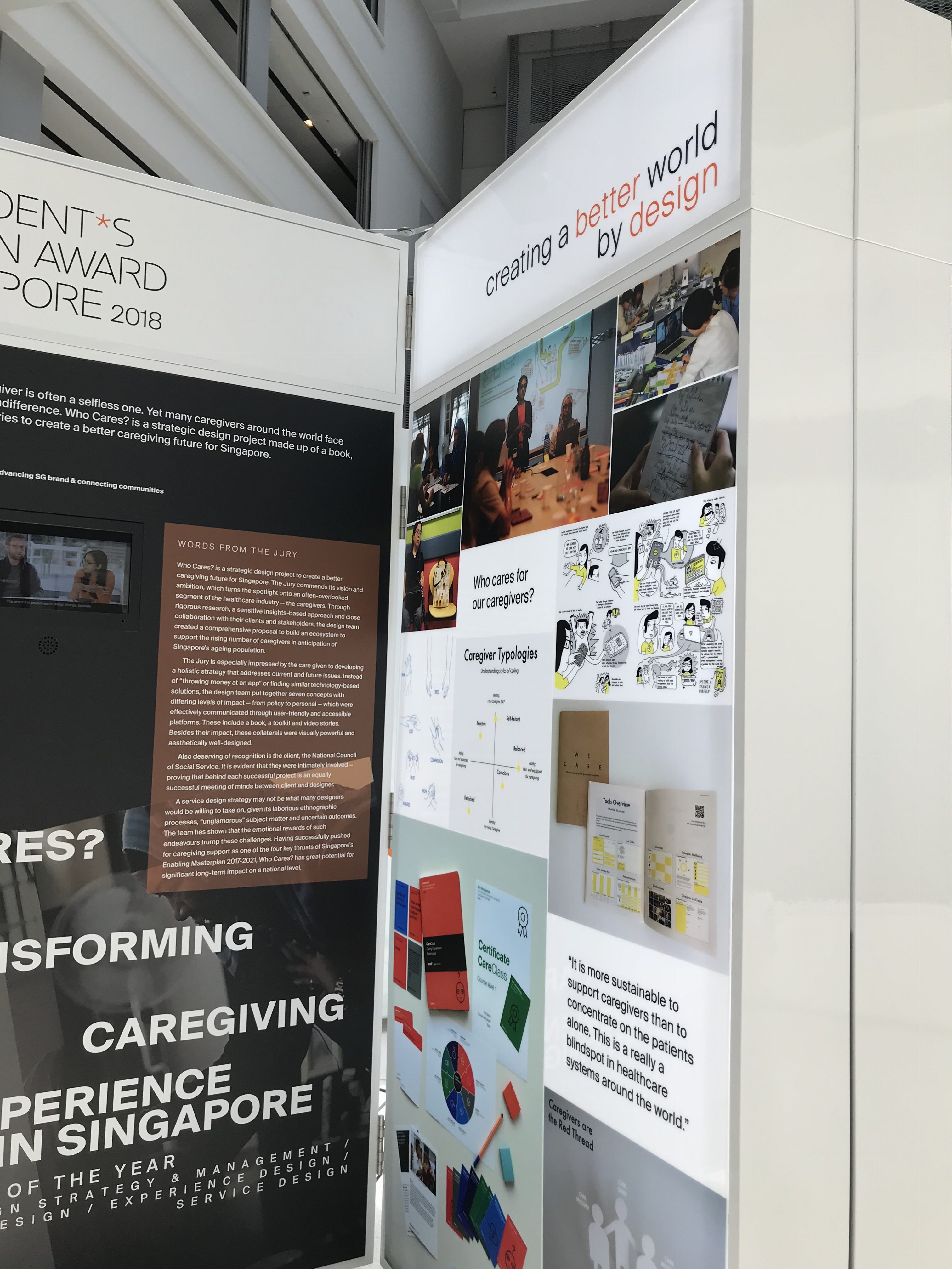
Image of guidebook for caregiversDesigning with the intention of changing mindsetsImage of The Warehouse Hotel exhibit
Delving further into the exhibition, it could be interpreted that the design scene in Singapore is heading towards more of designing with an additional purpose. More of the recent exhibited projects – be it architecture, product design, or graphic design – seemed to have been carried out with the intention of repurposing old objects (thereby, helping the environment), or to cater to a certain demographic (thereby, helping others).
Examples of recent graphic design projectsExamples of recent graphic design projects
With regards to visual aesthetics, personally, I feel that the design scene in Singapore is going towards more of a minimalist and slicker aesthetic to compliment modern times. In graphic design, blocks of colour and sans serif fonts are typically used with minimal graphics, whereas in architecture and product design, structures are more geometric and clean.
What implications might those goals have on current perception and practice of design?
Designers now have an additional goal of functionality rather than just creating visually-pleasing and enticing visuals
Personally, after viewing the exhibition, I feel that the design practice in Singapore now has an additional goal of aiding social and economical goals. In addition to creating enticing and visually-pleasing design pieces, designers now have to consider the methods in which the piece can reach out to certain demographics and/or fulfil certain goals. With regards to the goals set in place for Singapore by 2020, practitioners are expected to cater to changing social, economic, and environmental changes. As a result, design is seen to integrate aspects such as “practical functions”, “cultural symbolism”, “limited resources”, “human relations”, “effective communications”, and “timeless beauty”.
"Design can be the key catalyst to fuse the arts, cultural heritage, media, info-communications technologies to bring about new economic opportunities in this intersection, spur innovation, and enable new forms of creative expressions."
"In the emerging creative economy, design will move up the value chain to embody intellectual property and creative capital."