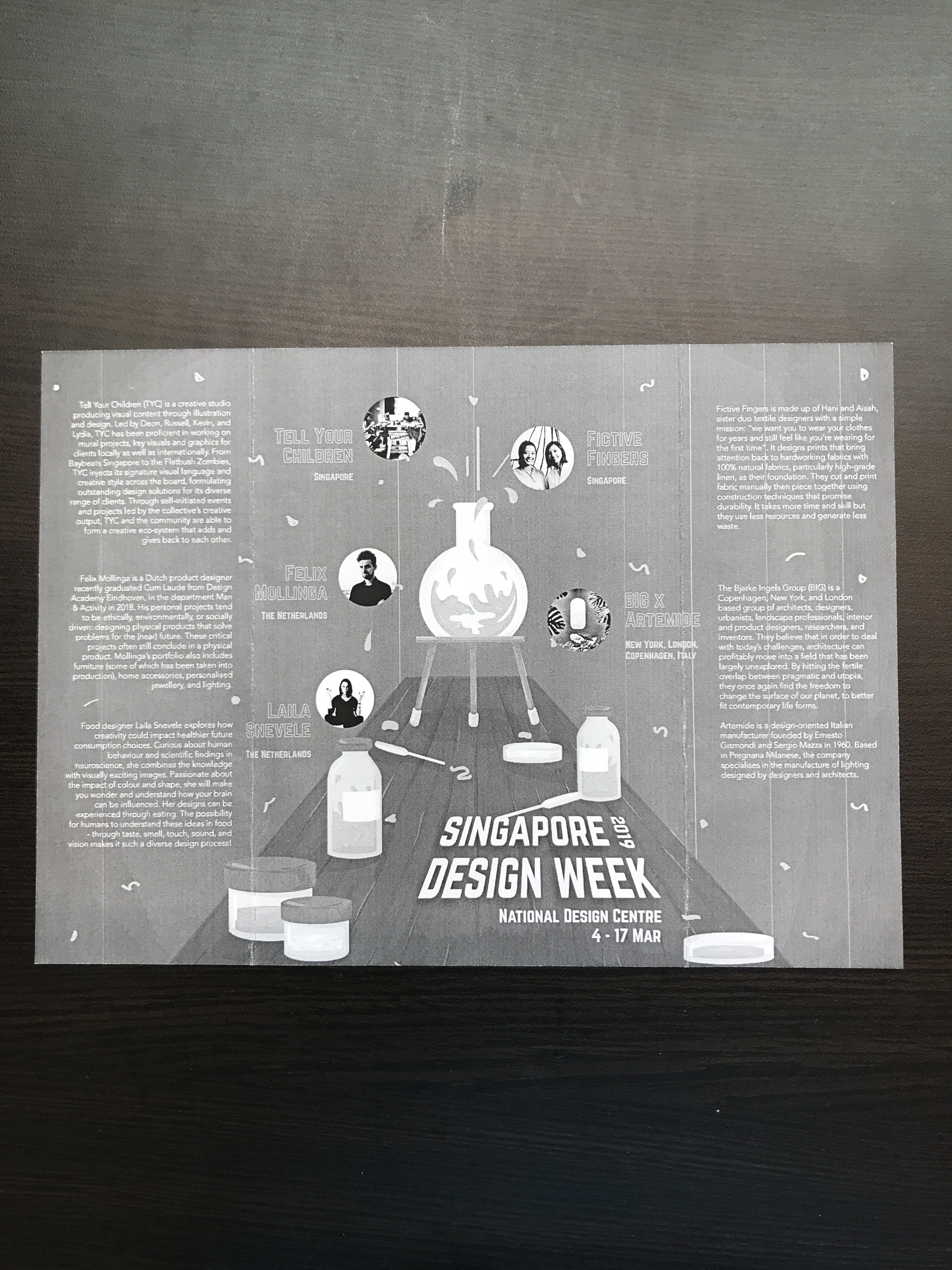
Tell Your Children (TYC) is a local creative studio that specialises in producing visual content through illustration and design. They have been proficient in working on mural projects, key visuals, and graphics for both local and international clients.
Ultimately, they seek to elevate and lead the creative community of Singapore and beyond. Through self-initiated events and projects led by the collective’s creative output, TYC and the community are able to form a creative eco-system that adds and gives back to one another.
Fictive Fingers, singapore
Image of screenprinting by Fictive Fingers
Fictive Fingers is a sister textile design duo that works primarily with natural fabrics (particularly linen). Drawing everything with pencil and paper, cutting and printing fabric manually, then piecing them together using traditional construction techniques, nothing works harder than their hands.
Image of products
Focusing on quality, they create products while maintaining minimum waste and energy consumption – the restrained detail of their work puts emphasis back on making choices with the environment in mind.
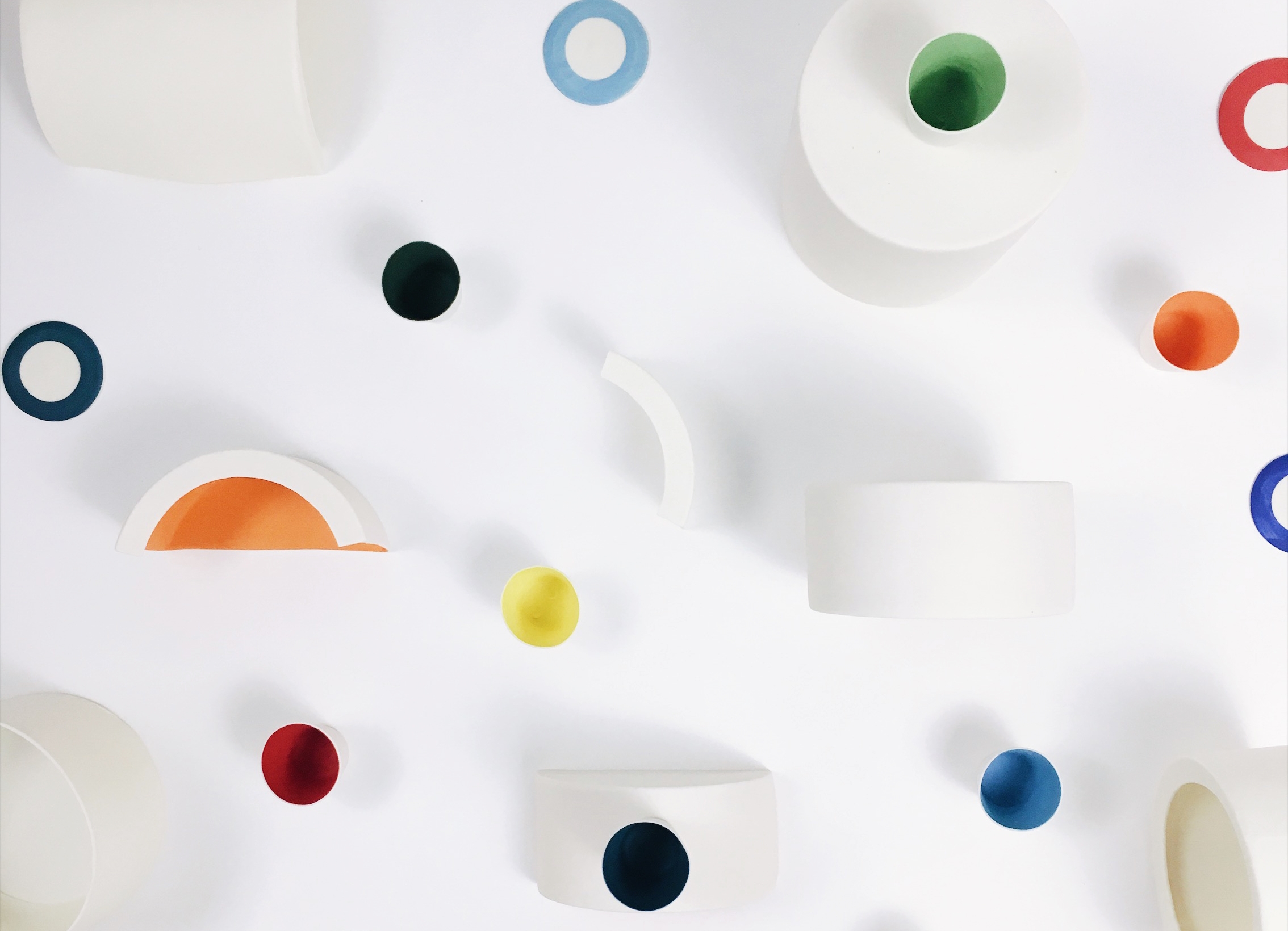
Studio Dam, singapore
Chroma Light Series by Studio Dam
Studio Dam is a local multidisciplinary design studio whose creative works span from visual branding projects, to bespoke furnitures and spatial identities. Their distinct approach to product design projects is to work intuitively with their hands and directly with materials during the conceptualising phase.
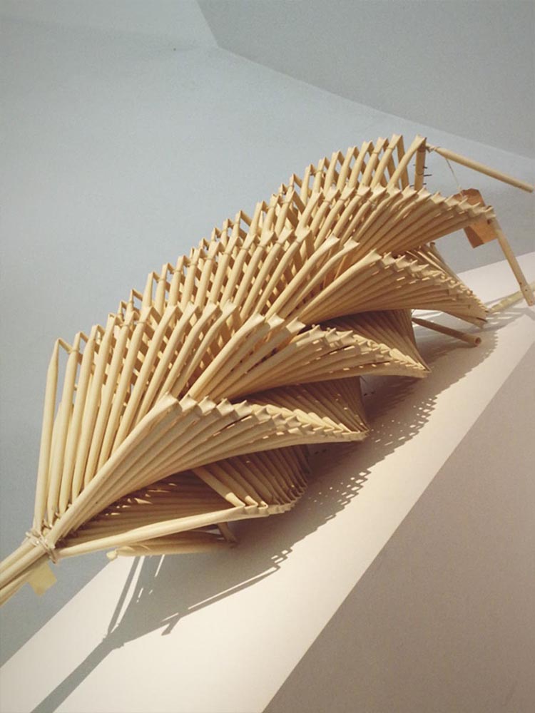
Felix Mollinga
Work for Strandbeest Theo Jansen, Singapore (2018)
Felix Mollinga is a budding Dutch product designer who recently graduated Cum Laude from Design Academy Eindhoven, department Man & Activity in 2018. His personal design projects tend to be ethically, environmentally, or socially driven: designing physical products that solve problems for the (near) future.
His portfolio includes furniture, home accessories, personalised jewellery, and lighting.
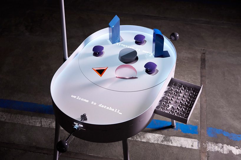
Image of Databall_ (2018)
One of his projects include inventing a playful pinball machine that visualises the flow of personal data. Databall_ is a pinball machine that visualises the flow of personal data, covering all aspects of daily digital life, from a chat history, to photos, to online purchases.
Laila Snevele
Digital Seasoning
Laila Snevele is a food designer who explores how creativity could impact healthier future consumption choices. Curious about human behaviour and scientific images in neuroscience, she combines the knowledge with visually-exciting images. Passionate about the impact of colours and shapes, she makes people wonder and understand how our brains can be influences. Possibility for humans to understand these ideas in food – through taste, smell, touch, sound, and vision makes it such a diverse design process!
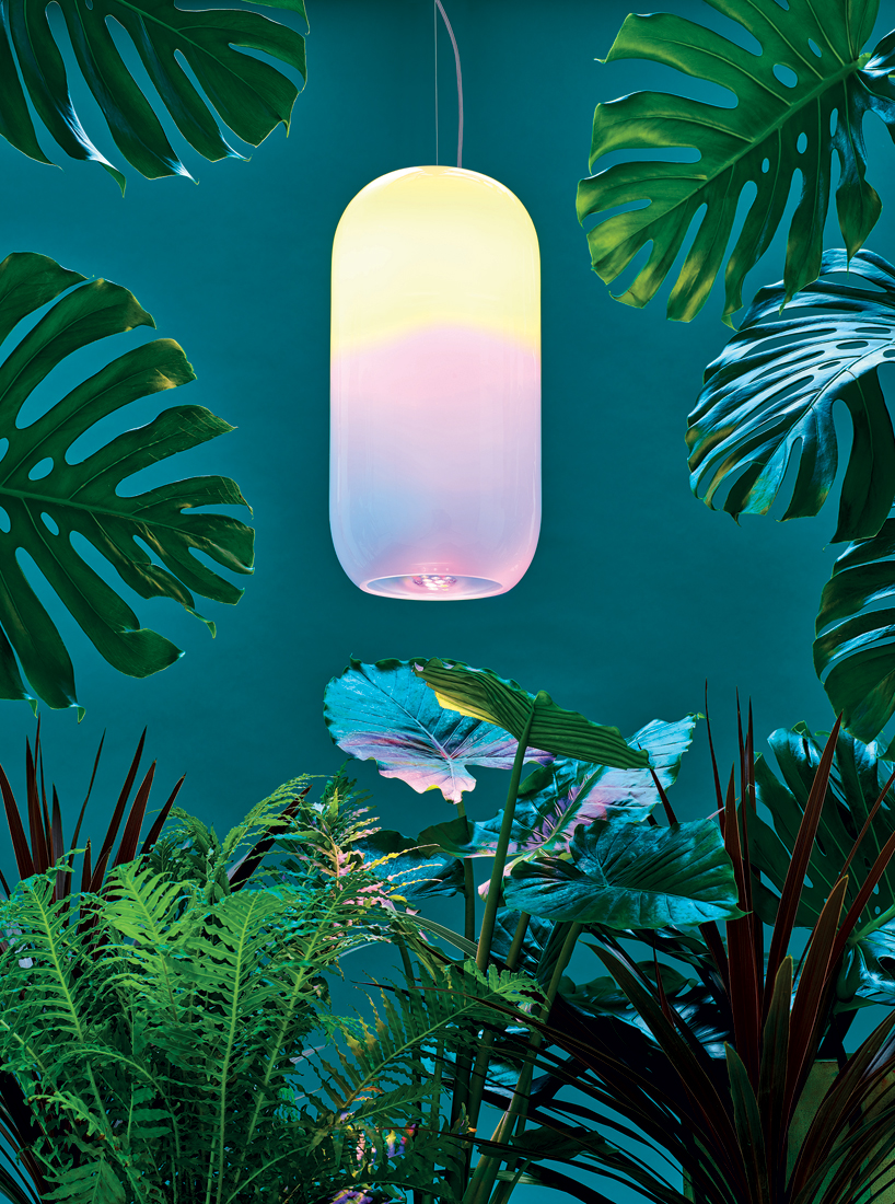
BIG X Artemide
Image of ‘conscious and entrepreneurial’ school in New York designed by BIG (2017)
The Bjarke Ingels Group (BIG) is a Copenhagen and New-York based firm that operates within the fields of architecture, urbanism, research and development. Its practice emerges out of a careful analysis of how contemporary life constantly evolves and changes.
Image of alphabet lamps by BIG and Artemide for the 2016 Milan Design Week
Artemdie is an Italian lighting company founded in 1960 that specialises in the manufacture of pieces created by designers and architects.
Image of Gople (2018)
Following their previous partnership at the 2016 Milan Design Week, both firms created a new lighting design at the 2018 London Design Festival. Named Gople, the transparent pill-shaped lamp nourishes nature, enhancing plant life and human perception, as well as intertwining modern technologies with artisanal traditions.
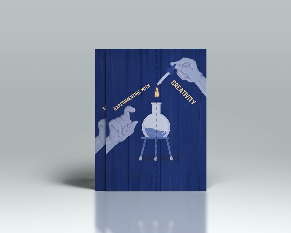
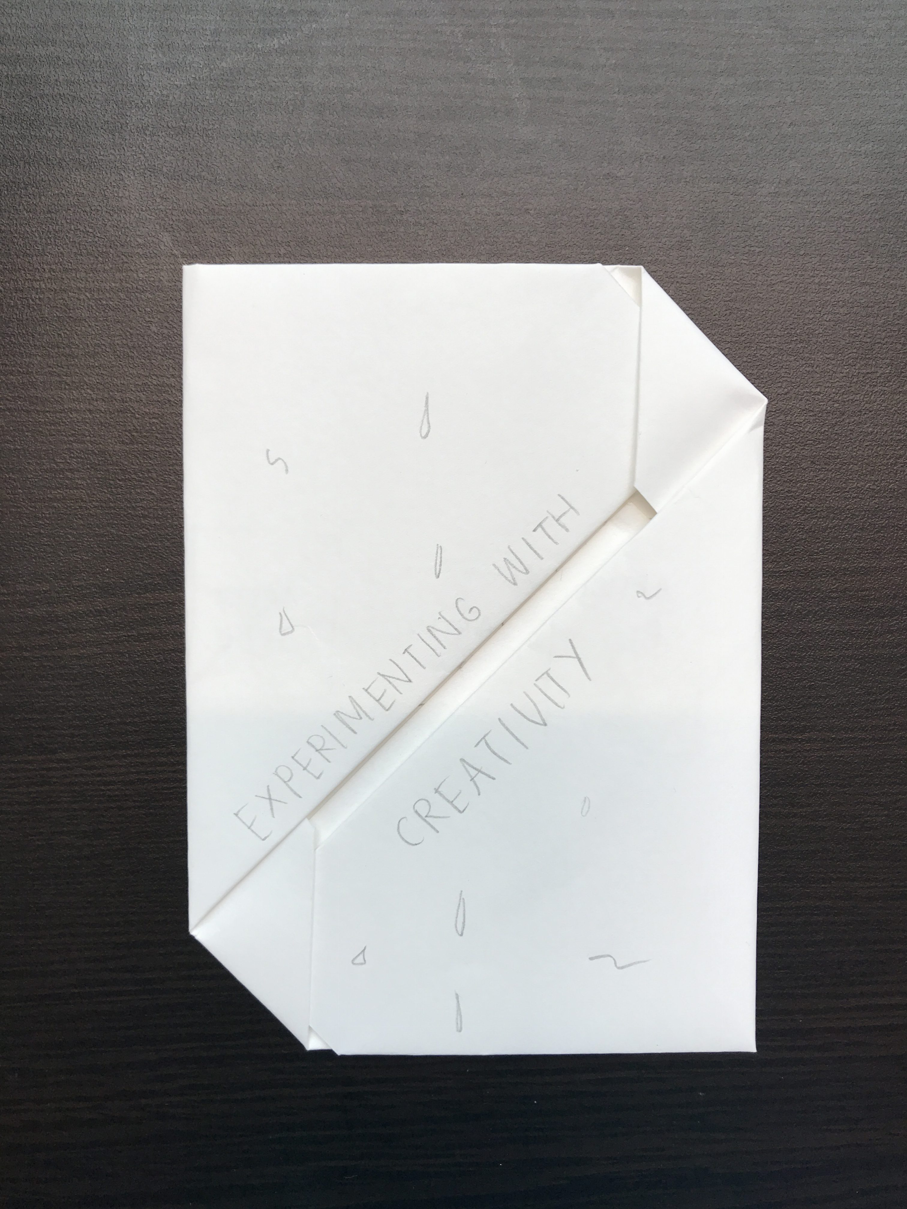
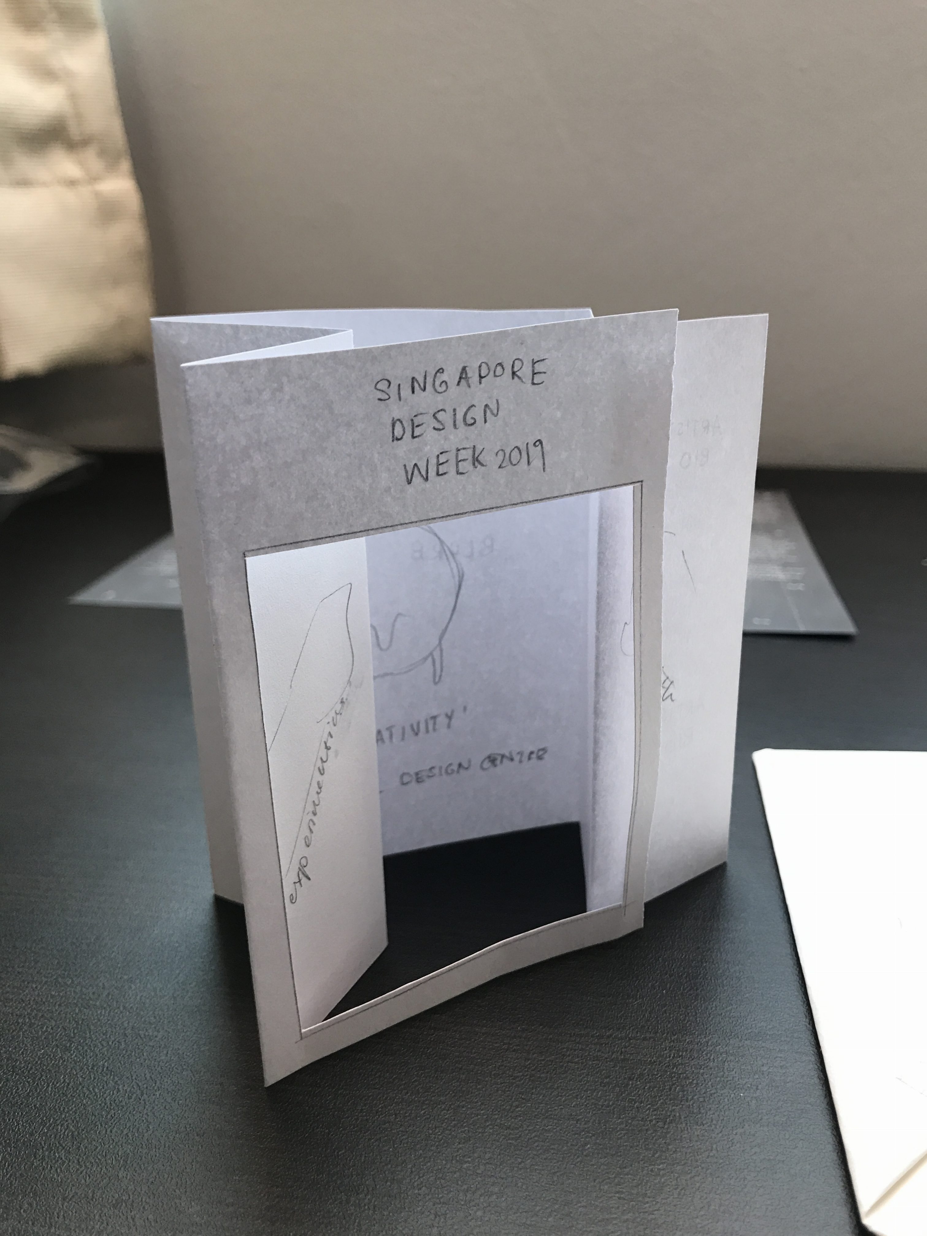
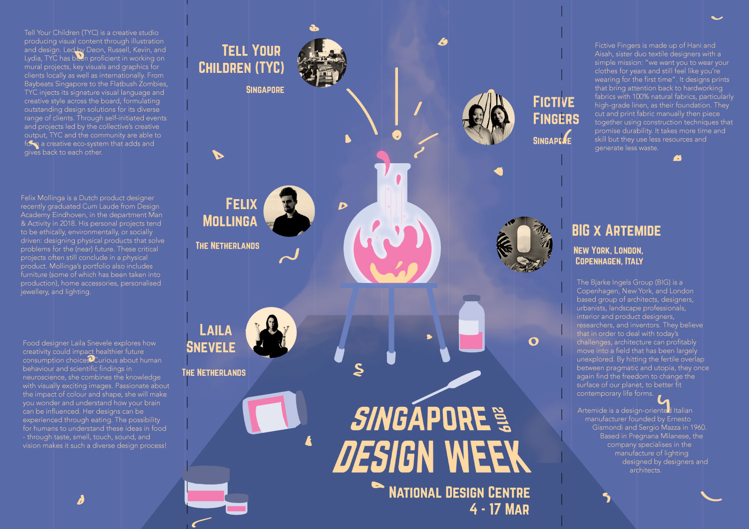
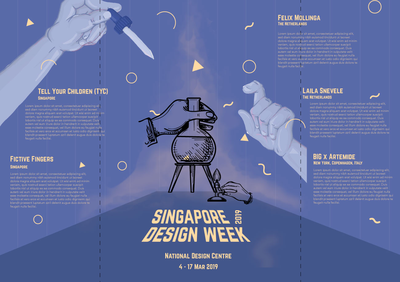
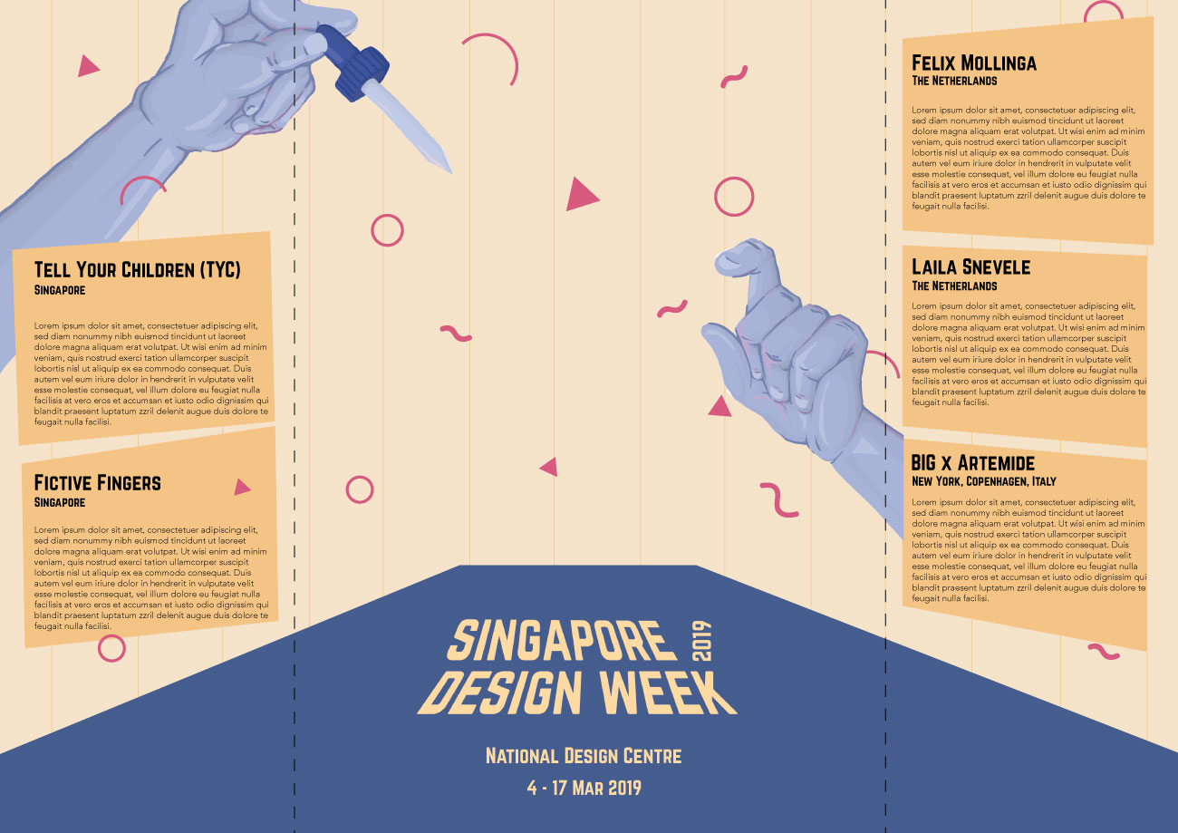
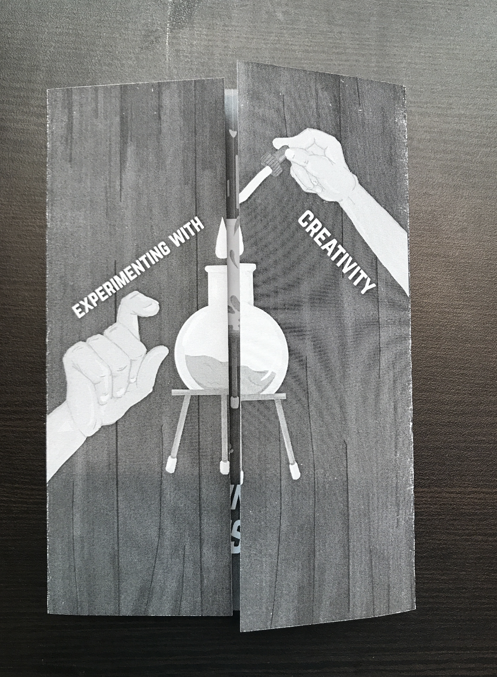
As a follow-up to the previous project, for our final submission, we were required to conceptualise and create a brochure for 2019’s Singapore Design Week.
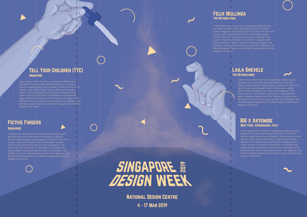
Image of final productImage of final product: Front coverImage of final product: Back coverImage of final product: Inside pages
Concept
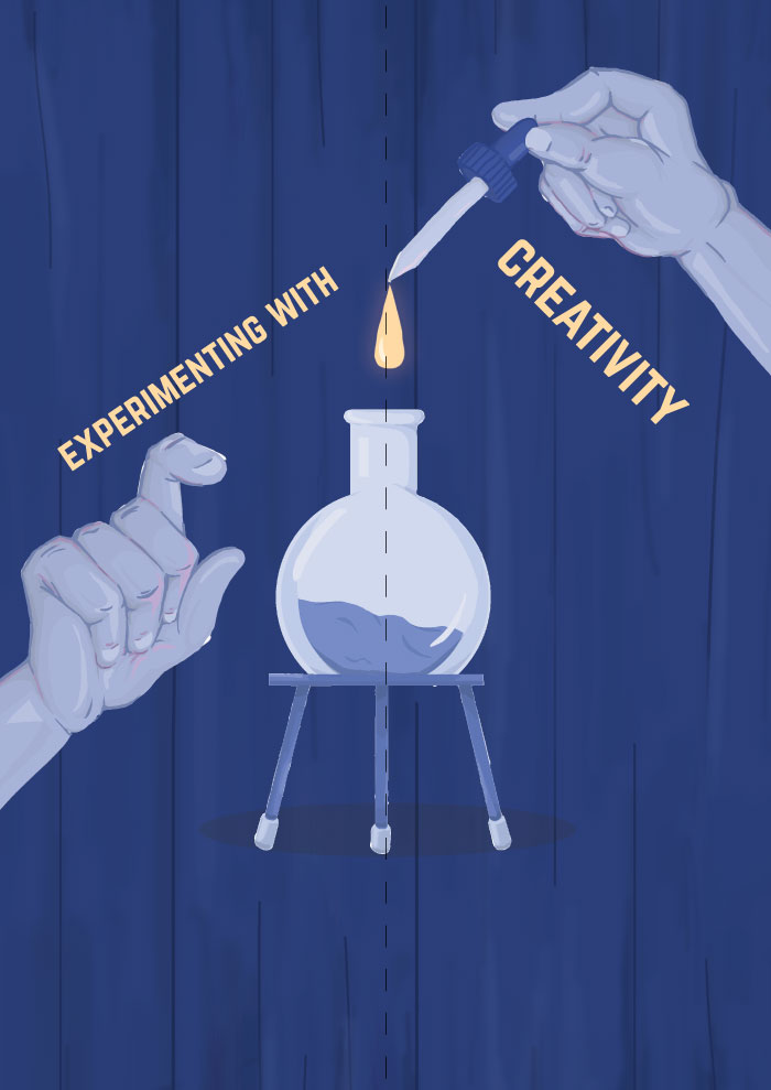
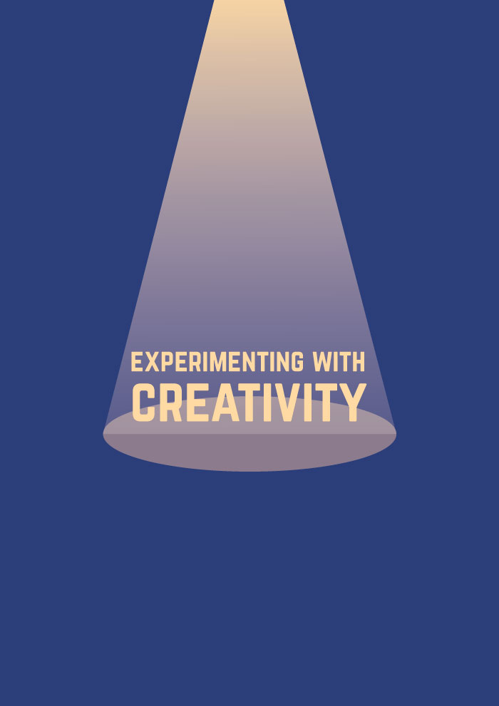
Keeping to ‘Experimenting with Creativity’, the theme reflected in the previous poster project, the brochure I created for this project adopts the imagery and concept from the poster but categorises and displays information in a way that is suitable for a brochure and integrates new information about the exhibition.
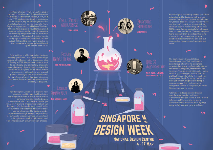
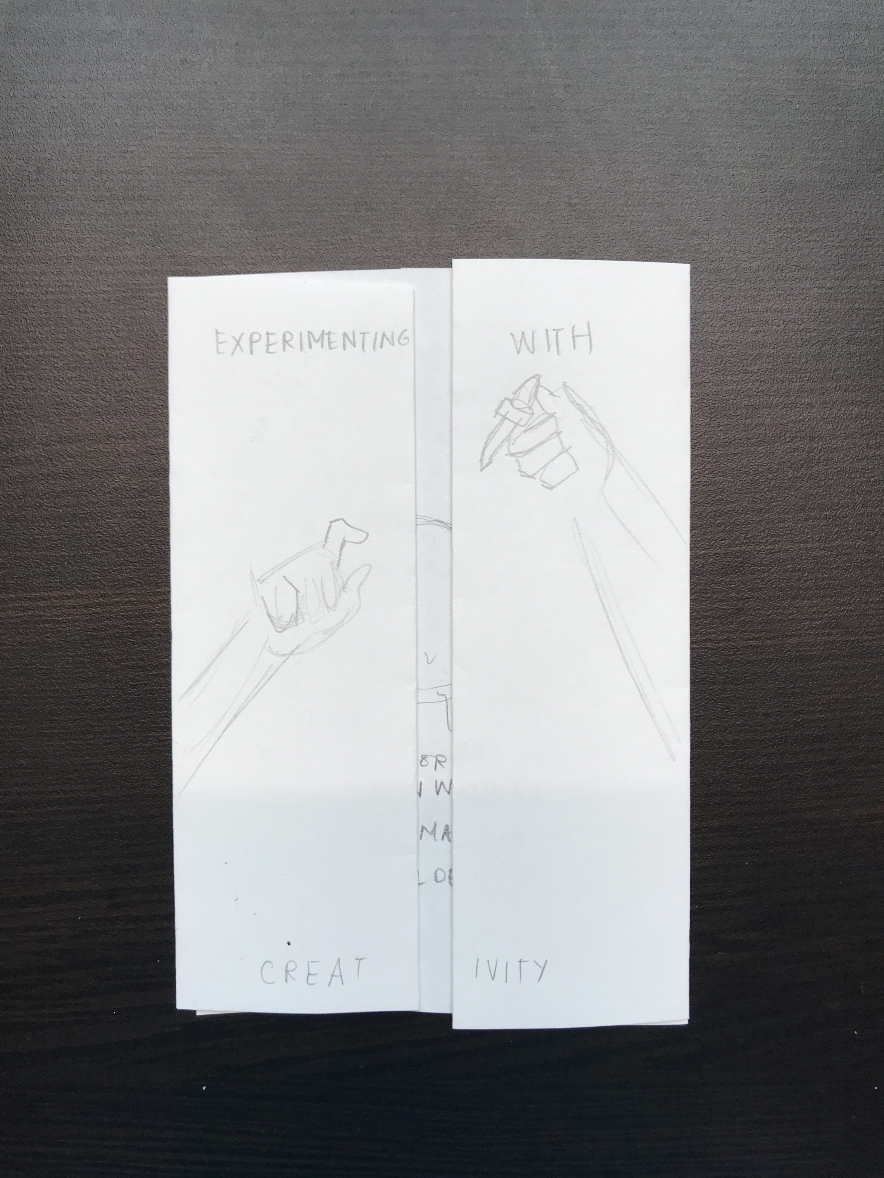
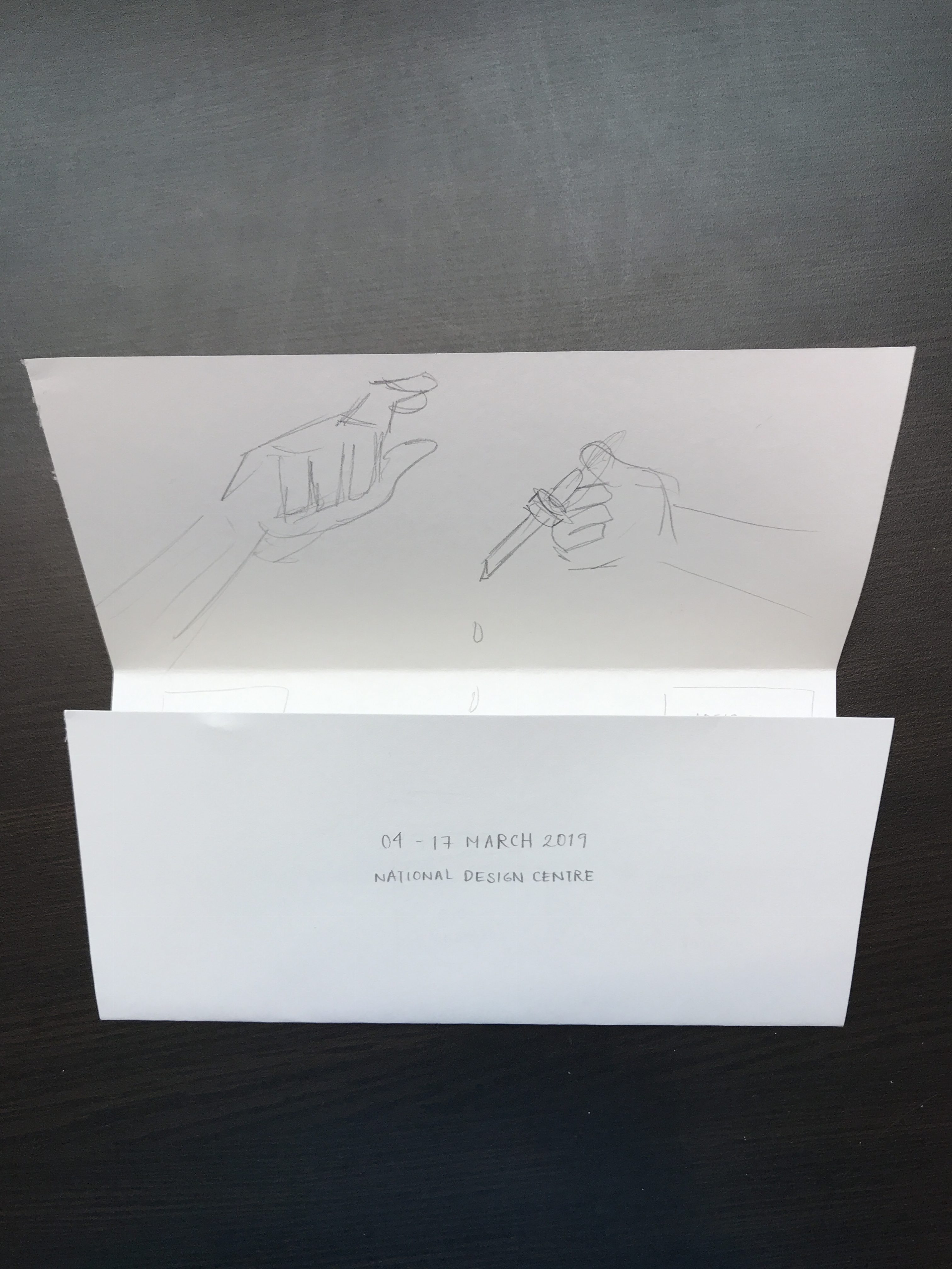
The final product is an A5 size brochure that uses a gate fold, and becomes A4 in size when open. The content comprises of event details of Singapore Design Week and biographies of five exhibiting artists. The brochure also integrates graphics (some of which are adapted from the poster) that convey the idea of ‘Experimenting with Creativity’, where after experimenting with creativity, resulted in an explosion that formed Singapore Design Week and the exhibiting artists, reflecting the notion of Singapore Design Week championing creativity in the local and overseas design industry.
Reinforcing the idea of experimenting, the graphics consist of science apparatus (test tubes, droppers, specimen jars) and an explosion of patterns. The use of a curtain as the background also carries forth the attempt to bring about a mysterious and magical mood that was also conveyed in the poster. The fold of the brochure, on the other hand, is a conventional gate fold. The fold helps to reinforce the idea of the exploding beaker where the front cover is still and adding the droplet into the beaker results in an explosion as seen on in the inside of the brochure, where it is much more colourful and shows movement through patterns and strokes.
Techniques Applied
I. Imagery
The use of graphics in this case really helped in bringing forth the narrative of the entire brochure. Coupled with the unveiling nature of the gate fold, the brochure was able to effectively convey the experimental and explosive parts of the intended narrative. To represent the idea of experimenting, I used images of science apparatus, and the changes in shapes of the patterns helped in conveying the idea of an explosion.
II. Contrast
The brochure also uses contrast to emphasise important details and at the same time, create an overall balanced and harmonious layout. Contrast is seen firstly, in the variation of size; more crucial information such as the slogan, title, and event details are displayed in a bold font with a vibrant yellow. Less vital information such as the short blurb and artist biographies are displayed using a font with less weight and is smaller in size, but remains readable. Contrast is displayed through different colour palettes; the text and focal points of the graphics uses a bright yellow and pink that has an outer glow. This is contrasted against less important graphics that use a pale blue colour palette.
III. Hierarchy
Hierarchy is also used to create a smooth visual flow. Having a more quiet graphic in the front followed by a more vibrant and explosive layout on the inside that is unveiled by the gatefold helps to establish the flow of information. Furthermore, having the text and graphics vary in size and colour in terms of brightness and vibrancy helps in guiding the eyes from more important information to less important ones.
IV. Movement
Similar to that of the poster, movement is established through the use of patterns that are more compressed in the centre, closer to the beaker, followed by it being more spaced out towards the edges. The explosive pattern was further enhanced by lines that depict motion and little bits of splatters found on the table and apparatus.
Research & Process
Research
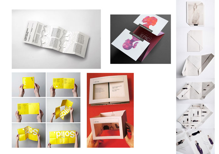
Image of folding references to try out
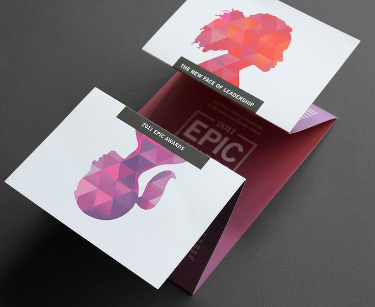
Research into brochure production began with us looking more into the types of folds that brochures could use. I was personally intrigued by gate folds and variations of it, because I felt it was an interesting and versatile way of unveiling information, and is especially appropriate for my brochure.
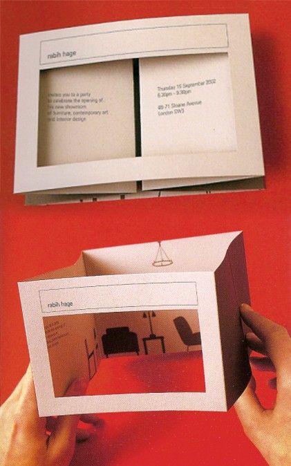
Reference for brochure foldReference for brochure fold
I was inspired by these two folds especially because of their simple layout that allowed for a straightforward user experience, but also comprised of an interesting layout. The folds here allowed for a linear reveal of information, thereby creating visual interest. Especially with the gatefold, having minimal text and maximum graphic to entice the viewer to open allowed for an interesting method of revealing information.
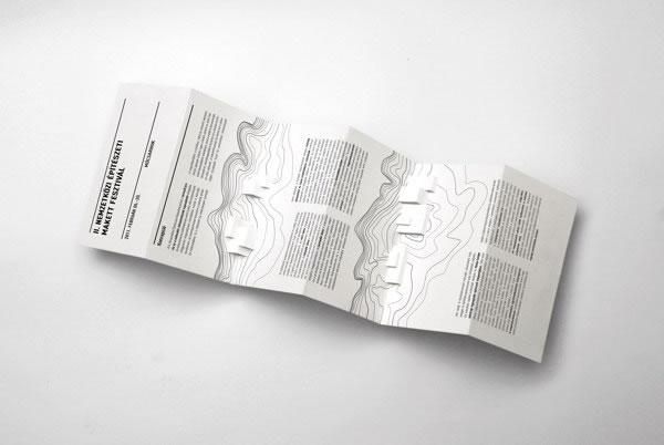
Reference for brochure fold
This is a more experimental fold I hope to try out as well. Going back to the idea of the slow reveal of information, I thought this was a very creative method of unveiling information and definitely creates visual interest. The inclusion of the die-cut and folds at the side which meet in the centre when flattened also seemed suitable for the curtain graphic I used in my poster. However, this may turn out rather flimsy and could deteriorate the ease in user experience.
For a more in-depth look into chosen exhibiting artists, please refer to: https://oss.adm.ntu.edu.sg/vwong005/chosen-designers/
Process
I. Experimenting with Folds
Experimenting with folds: Experimental foldExperimenting with folds: Experimental fold with die-cutExperimenting with folds: GatefoldExperimenting with folds: Trifold brochure
After looking into brochures, layouts, and folds, we tried some of our own. Keeping in mind the content we had to display, user experience (where it had to be easy for users to open and fold back), and display methods (where they could be stood up on display stands), I tried to use simple but creative folds that helped to create an interesting flow of information, and die-cuts to give a sneak peek into the inside of the brochure.
Ultimately, with Prof. Michael’s advice, I decided to do away with the die-cut and adopt a simple gate fold. This way, I could have better control of the layout of information and therefore, more control over the flow of information. By focusing more on the layout of the content itself as opposed to using a complicated fold, it allowed me to establish the same intended mood, but with a simpler and more straightforward user experience.
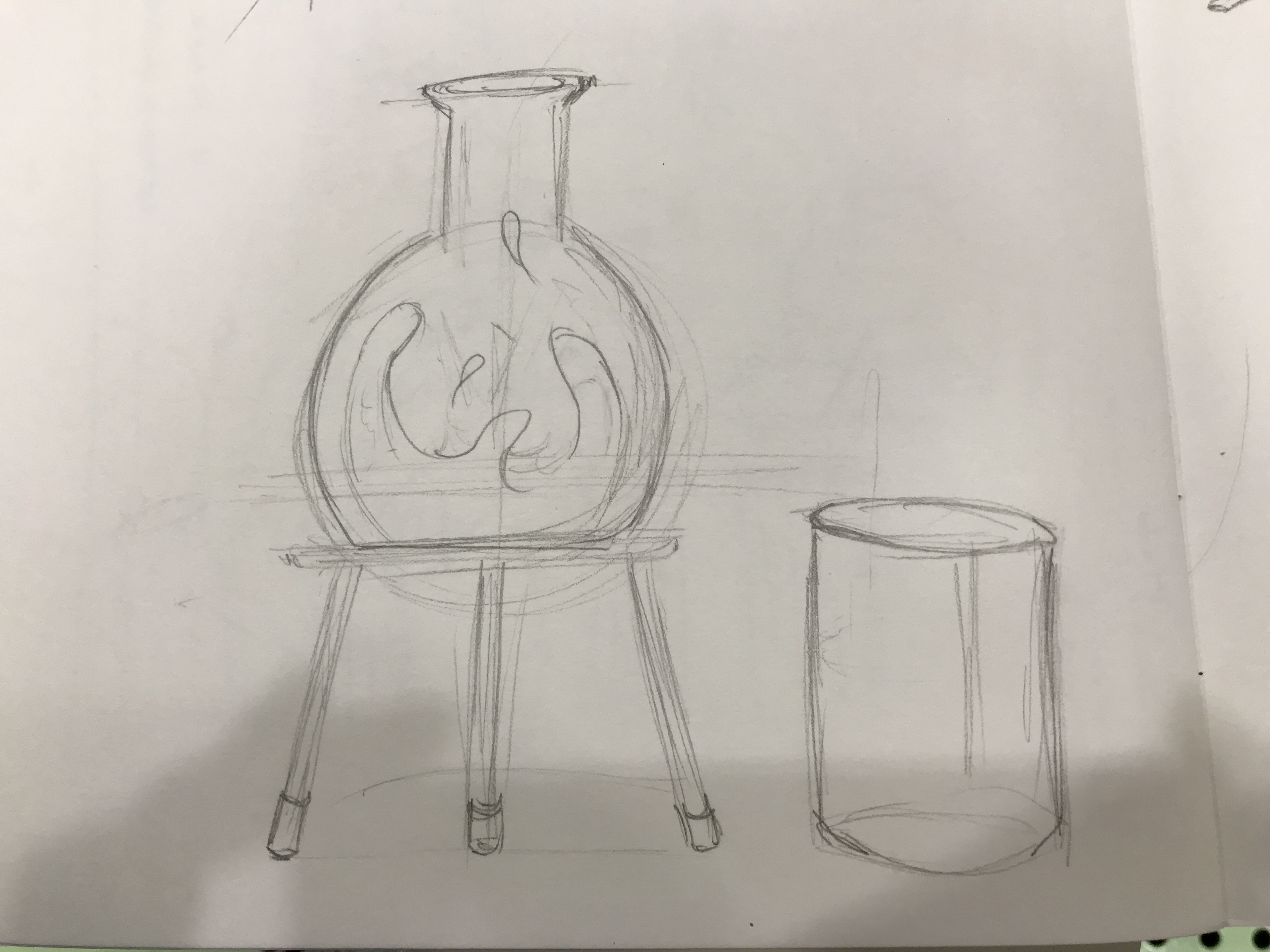
II. Creating Graphics
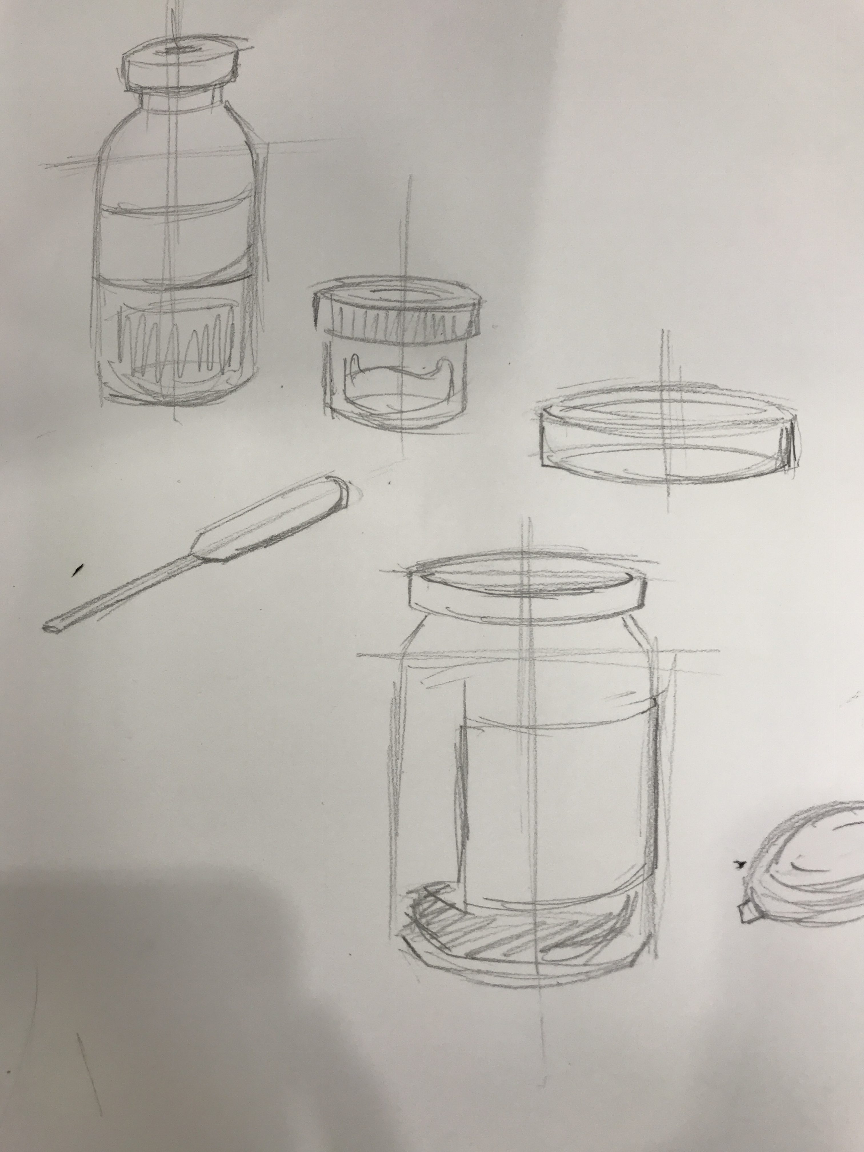
Image of graphic sketchesImage of graphic sketches
As we had to adopt the same concept and overall similar graphics from the previous poster project, I used the same colour palette but decided to replace most of the graphics. Instead of a glowing ball of yellow mass to represent creativity, I tried illustrating new images and patterns to better convey the idea of ‘experimenting’, ‘creativity’, and to portray an explosion. Therefore, I decided to have science apparatus to convey the literal meaning of experimenting. Also, having more than just a beaker gave the page more life and excitement, allowing for more platforms for movement, colour, and placement for information.
I felt that having the science apparatus, and the transition of a flask with still liquid into a flask with bubbling and glowing liquid to represent the formation of creativity was a more straightforward and easy-to-understand graphic that managed to embody the overall theme of the exhibition.
III. Organising Content
Image of draft: Front coverImage of draft 4Image of draft 3Image of draft 2Image of draft 1Image of test print: Front pageImage of test print: inside pages
After settling the content to be placed in the brochure, what was left was putting them together to establish a flow of information. Already having the idea to keep the front and back simple and more mysterious, I tried to have a more dynamic layout on the inside to contrast against the front and better convey the ‘explosive’ graphics. However, it was not simple to work with long chunks of text, and their unequal placements, with the aim to keep the information easy to read and locate. It was also challenging in avoiding the fold lines to allow for easy readability. After playing around with the layout, from a more static composition, I moved the text blocks around and instead of having them all align with one another, I decided to place them in a manner similar to that of the patterns: compressed in the centre and more spaced out towards the edges, all in a radial layout instead of in vertical columns. This was a better method in helping to further enhance the concept and also gives a more dynamic, exciting, and contrasting composition to that in the front.
Challenges & Feedback
One of the main challenges I faced in the project was finding a recognisable object to represent creativity, and experimenting with it. The use of science apparatus helped a little, especially when it comes to the idea of ‘experimenting’, but it could still pass Singapore Design Week off as something science-related or educational as opposed to celebrating creativity in the design industry.
Another challenge I faced was the placement of the artist biographies. Working with blocks of text was not easy when it comes to experimenting with different and more dynamic placements that could reflect the explosive pattern. Furthermore, working with centralised graphics within the boundaries of a gate fold was also not easy. Therefore, the overall layout on the inside of the brochure, though legible, was not as effective in creating excitement through dynamic movement.