After conducting research on recognised artists in the mark-making field, I found the works of Andy Warhol and the impact it made especially enlightening, particularly his 1960 works that portray everyday objects. Upon learning more about the impact he made on the art world through utilising an array of out-of-the-ordinary mediums and techniques (most prevalent in his Oxidation series), as well as giving life and character to regular, everyday objects (through the abstract enhancement of their qualities), I hope to integrate some of the qualities he displayed through his works in my experimental techniques, as well as conceptualising.
Furthermore, in Warhol’s Shadows series, I found the methods in which he used to create different hues and spots of light innovative. In my experimentation process, I hope to emulate this by adopting different techniques and tools to create hues, textures, and lighting.
Please refer to the following link for a more in-depth analysis of Andy Warhol’s works: https://oss.adm.ntu.edu.sg/vwong005/mark-making-building-blocks-in-art/
Concept
Initially wanting to have a concept that surrounds emotions I face at my workplace (a place in which I spent most of my time before enrolling into ADM), I found using object association as a conceptual basis a more effective approach as it is a more general concept providing much more room to experimenting and using different tools and techniques. Therefore, in my final concept, I aim to represent emotions on an abstract and non-representative level with a theme of composing them in such a way that it uses a variety of visual elements to symbolise an object or sensation that is commonly associated with the emotion in question.
Experimental Process
Mark-Making Techniques
To aid in creating our lines, we were introduced to a couple of mark-making methods – constructing our own mark-making tool and mono printing.
Process: Making monoprintsProcess: Artist research
Creating our own tools involved coming up with innovative methods to apply ink onto a canvas; for example, we could come up with a new tool that when used to apply marks onto a canvas, forms certain patterns or strokes that traditional tools (e.g. paintbrushes or pencils) are not able to achieve, or methods of application that involve splattering paint or pouring paint over a canvas. Mono printing, on the other hand, can be carried out by using a machine to flatten materials over a canvas, forming a shape or pattern using ink. In addition to these two methods, I also explored using a range of mediums to form different textures and layers of depth in the hopes of conveying the emotions more effectively.
Breaking Down Emotions
I. Love
Moodboard: Love
Emotion Subset
Objects Associated
Visual Elements Associated
Tenderness
Fondness
Affection
Sentimentality
‘Butterflies in stomach’ feeling
Flowers
Hearts (literal and metaphorical)
Journeys, long periods of time
Blushing, palpitations
Wavy strokes
Soft textures
Hazy backgrounds
Faded, watery strokes
Paint splatters, spots
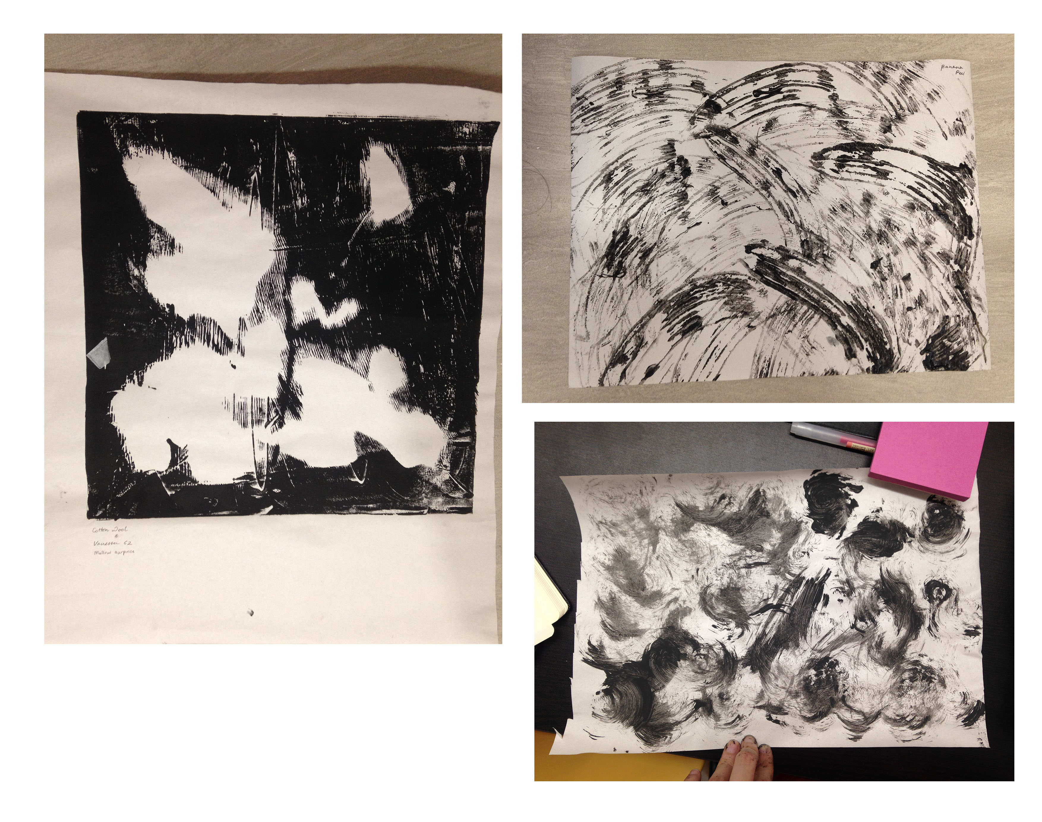
Top: Water filter dipped in black paint Bottom: Water filter, hot glue gun, cotton bud dipped in white paint Right: Leaves
II. Joy
Moodboard: JoyMoodboard: Joy
Emotion Subset
Objects Associated
Visual Elements Associated
Ecstasy
Euphoria
Drugs
Heavy patterns
Sense of flying; freedom
Waves
Blurred visions
Radial movements
Circular strokes
Thrill
Exhilaration
Explosions of energy
Masses of energy
Fast movements
Fast, spontaneous gestures
Sharp strokes
Splatters in upward directions
Top (Left): Rim of cup Top (Right): Tube of spray bottle Bottom (Left): Toothbrush Bottom (Right): Oil and paint
III. Surprise
Moodboard: Surprise
Emotion Subset
Objects Associated
Visual Elements Associated
Surprise
Widened eyes and mouth
Hidden elements
Explosive mannerisms
Unexpectedness
Build up of suspense
Circular motions
Gradients
Isolated strokes
Left: Cotton wool Right (Top): Banana peel Right (Bottom): Wire brush
IV. Anger
Moodboard: Anger
Emotion Subset
Objects Associated
Visual Elements Associated
Irritation
Aggravation
Pet peeves
Scratching,
Lack of uniformity
Irregular strokes
Mixture of organic and geometric shapes
Spontaneous gestures
Focus on harsh and textured strokes
Rage
Fury
Ferocity
Rapid movement
Shouting
Veins popping out
Violence – stabbing, tearing
Cracks
Irregular strokes
Spontaneous gestures
Sharp, geometric shapes and strokes
Harsh textures
‘Windshield-wiper’ movements
No sense of direction
Top (Left): Sleeve of coffee cup Top (Right): Crushed paper with white thread Middle (Right): Finger prints, meant to replicate motions of pet peeves (e.g. tapping sounds, sharp scratching noises) Bottom (Left and Right): End of paintbrush
Anger: Chinese herbs to make patterns
V. Sadness
Moodboard: Sadness
Emotion Subset
Objects Associated
Visual Elements Associated
Depression
Grief
Melancholy
Pills, medication
Unmade beds, untidiness
Tears
Feeling of stillness, calm
Bodies of water
Single rays of light
Spilled milk
Hidden feelings; bottling up
Sighing
Soft textures
Paint splatters
Irregular movement
Waves, organic shapes
Gradients
Haziness
Left: Green tea leaves Right (Top): Tissue paper dipped in black paint Right (Bottom): Torn up leafLeft: White paint on black paper (meant to represent idea of bottling feelings up) Right: Party popper streamersLeft: Spilled milk, enhanced with white paint Right: White paint on black paper (meant to convey idea of a still lake, refer to reference picture in mood board)
VI. Fear
Moodboard: Fear
Emotion Subset
Objects Associated
Visual Elements Associated
Horror
Mystery, hidden elements
Veils
Tree branches
Demons, supernatural entities
Gradients
Sharp, heavy strokes
Geometric shapes
Darker strokes
Haziness
Nervousness
Tenseness
Tension; tightened grips
Breakage
Palpitations
Nerve signals
Scratches, fidgeting
Gradients
Sharp, irregular strokes
Messiness; mixture of strokes and shapes
Top (Left): Cotton buds Top (Right): Powedr on black paint Bottom (Left): Handprints Bottom (Right): Black droplets created by shaking paperTop (Left): Crushed paper with black yarn Top (Middle): Black and white paint Top (Right): Static floor wipes Bottom (Left): Spray bottle Bottom (Middle): Black paint on newspaper article about Hurricane Harvey Bottom (Right): Shoe printsPaintbrush and walnut print (meant to represent nerve endings)Walnut used
Takeaways
Throughout this process, I was able to adopt different methods of mark-making to create visual elements that I can use in my final product. Experimenting allowed me to venture out of my comfort zone and through the use of various mediums, create prints that focus on conveying emotions as opposed to literally depicting them.
For the final product, please refer to: https://oss.adm.ntu.edu.sg/vwong005/project-1-my-line-is-emo
For research on mark-making artists, please refer to: https://oss.adm.ntu.edu.sg/vwong005/mark-making-building-blocks-in-art/
After weeks of conceptualising, experimenting, and wrapping our heads around the idea of emotions, our critique for Foundation 2D’s Project 1: My Line is Emo is finally up!
Final Artwork
Final artwork
Final artwork Top to bottom: Horror, Ferocity, EuphoriaFinal artwork From top to bottom: Affection, Depression, Surprise
Project 1 centred around the use of abstract, non-representational line works and visual elements (ranging from point, line, shape, space, scale, texture, and value/tone) to evoke a series of emotions. We were then required to experiment with various methods of mark-making, letting our creative juices flow onto different mediums and eventually, displaying our products for critique.
Concept
After going through various changes in concepts, I decided to base my final works for Project 1 on a theme of common association where the lines are structured in such a way that symbolises/represents a common object or sensation associated with the emotion in question. The idea of this concept was mainly derived from Andy Warhol and his depiction of everyday objects, where I found an interest in how he managed to transform the look of regular objects into works of art embedded with abstract details and emotions.
Please refer to the following link for a more in-depth description of artist influences in this project: https://oss.adm.ntu.edu.sg/vwong005/mark-making-building-blocks-in-art/
Process
However, becoming too invested in the abstract qualities of the work with regards to creating texture and depth, I did go off-track and created more three-dimensionally based works as opposed to two-dimensional ones. Therefore in the following notes, I will be addressing the works in its three-dimensional format followed by how I could have carried out the same intentions within a two-dimensional context.
The process in creating the final works comprised of three stages – brainstorming, scouting for materials and methods, and experimenting and application.
Please refer to the following link for a more in-depth description of the process of breaking down the emotions: https://oss.adm.ntu.edu.sg/vwong005/project-1-experi…tion-and-process/
I. Love
In the case of Love, I wanted to expand more on the tertiary emotion of Affection, and therefore came up with these associated objects and feelings along with visual elements usually depicted with this emotion.
Emotion
Objects Associated
Visual Elements Associated
Affection
Sensation of butterflies in stomach
Positivity and negativity in times
Paint splatters
Swirls
Wave-like strokes
Soft, watery strokes
Mixture of dark and light
Whilst researching, I was inspired by the following images that centred around Affection:
Reference: Affection
To portray Affection, I therefore wanted to give an abstract visual quality (with the associated visual elements already in mind) to the sensation of having ‘butterflies in your stomach’ (which is a common feeling possessed when being around someone you are affectionate with), coupled with portraying love in times of positivity and negativity.
Creating the line involved firstly using a two-toned space which consisted of off-white newsprint and crumpled black paper pasted side-by-side to reflect the linear nature of time. Water filters, both white and black, were then pasted to represent ‘butterflies’, and black and white paint was applied in a splatter and wave-like fashion to give the line a two-dimensional layer. With this, I hope to convey the idea of affection towards another being prevalent in both good and bad times.
To make the line more visually-appealing, I wanted to make use of mirroring where the elements are arranged in such a way that the black components reflect the white components. I also hoped to create a layer of depth by using different textures and a combination of two-dimensional (paint and medium) and three-dimensional (water filter) elements.
II. Joy
As for Joy, I focused on the tertiary emotion of Euphoria. Euphoria, defined as an ‘intense state of excitement and happiness’, and thus the following objects and sensations are associated with it.
Emotion
Objects Associated
Visual Elements Associated
Euphoria
Drugs
Different textures
Explosive direction
Mixture of shapes
Messiness
Whilst researching, I was especially taken aback by the following image that centred around Euphoria:
Reference: Euphoria
With the aforementioned visual elements in mind, I wanted to use abstract qualities and materials to depict the idea of drugs as a tool to create a euphoric sensation.
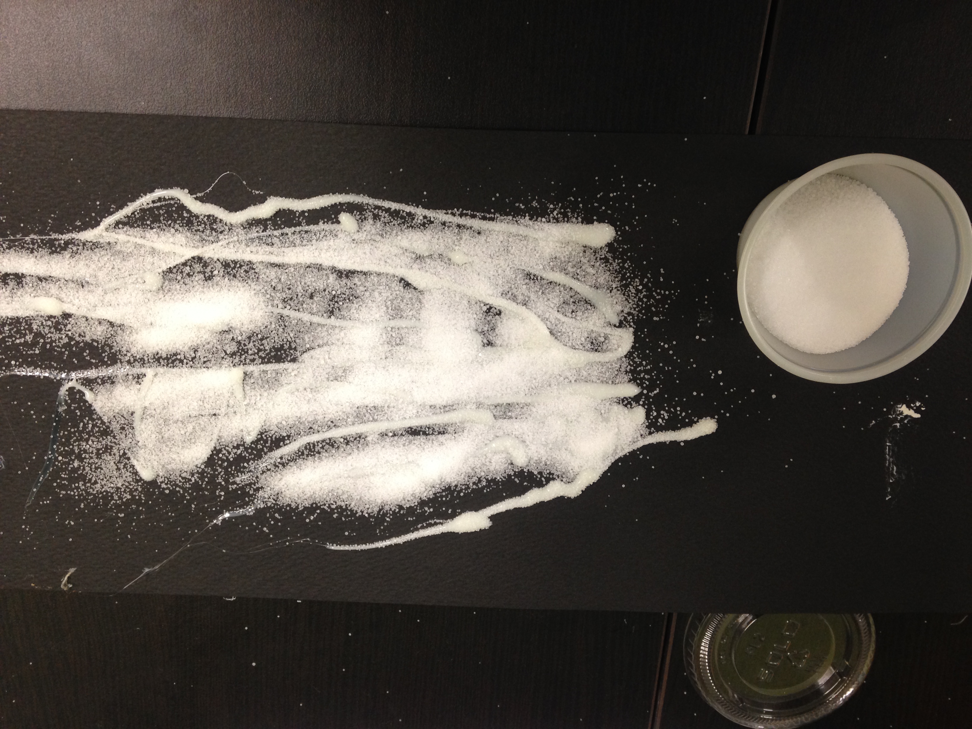
Euphoria: Sprinkling salt
In doing so, I used black paper to establish the space, giving a more effective contrast to the white visual elements. Three-dimensional objects were then used as the main subject matter – coffee beans painted white as pills, and hot glue stuck with sprinkles of salt as cocaine, along with two-dimensional white paint to represent cigarettes.
In addition to using shapes and textures to represent literal objects (as well as creating layers), I also wanted to expand on the idea of direction to reinforce the sensation of Euphoria. Therefore, I structured the elements in such a way that they all flow towards the right end of the paper, ending it with explosive-like and spontaneous shapes. The messiness and irregular placement of visual elements was also to emphasise the uncontrollable sensation of ingesting drugs.
III. Surprise
For surprise, I decided to go with the more general approach and finalised these objects, sensations and visual elements.
Emotion
Objects Associated
Visual Elements Associated
Surprise
Bursting-forth motion
Build up of energy
Gradients
Explosive direction
I was especially intrigued by this image:
Reference: Surprise
I therefore, wanted to use abstract visual elements to replicate the notion of energy being built up over a period of time and eventually bursting forth, using different materials to create the idea of tension.
To do so, I balled up recycled paper to create a textured ball and taped it behind off-white newsprint. The newsprint was then scrunched up around the shape of the ball to form texture and relay the idea of something trying to burst through the paper. On the right end of the paper, I cut strips and taped it back down onto the newsprint and placed balled up black paper atop it; the strips of newsprint meant to emphasise the ball bursting forth. The two-dimensional aspects were splatters of black and white paint around the right end of the paper to reinforce the energy of the ball bursting forth.
Experimenting more in the areas of texture, depth, mediums, and contrast, I wanted to focus more on three-dimensional aspects to convey this idea as I felt it was a more effective method in replicating the same energy as the one in the reference picture.
IV. Anger
In the case of Anger, I decided to narrow down my approach to expanding on Ferocity. These are the commonly-associated objects and visual elements:
Emotion
Objects Associated
Visual Elements Associated
Ferocity
Veins popping out
Messiness; no sense of direction
Sharp and harsh strokes
Mixture of textures
Dark strokes
The images that influenced my approach were the following:
Reference: Ferocity
The most commonly-associated sensations with Ferocity is Rage and the images that surround this feeling usually go back to shouting and screaming with strained facial expressions. These expressions are also accompanied with veins popping up in a state of high pressure. I therefore, wanted my line to give an abstract representation to this symbol of Ferocity.
Creating the line consisted of (two-dimensional) using black paint to paint straight, sharp strokes onto off-white newsprint, followed by (three-dimensional) twisting strips of black paper in twig-like structures, and pasting them onto the print, along with strings of black yarn. This was meant to reinforce varying intensities of the veins.
In this line, I wanted to emulate the intensity of the appearance of veins when in a state of rage, and therefore turned to the idea of depth and using a mixture of two-dimensional and three-dimensional elements to create layers to enforce this idea.
V. Sadness
For Sadness, I decided to expand more on the tertiary emotion of Depression, using the following objects and visual elements as a basis of influence.
Emotion
Objects Associated
Visual Elements Associated
Depression
Unmade bed
Tears
Softness
Paint splatters
No sense of direction; irregularity
Faded strokes
The image that influenced this idea is:
Reference: Depression
When thinking of Depression, I immediately thought of prominent objects present in a state of Depression, most notably an unmade bed. To emphasise the emotion and making the concept more obvious, I added tear drops to the line as well.
This was carried out via cutting up a piece of white satin cloth and splattering droplets of black paint in an uncontrolled manner. The satin cloth was meant to represent bed sheets; additionally the sheen of the cloth also added a layer of depth to the emotion it was meant to convey, by reiterating the softness of bedsheets and it being able to reflect light made it seem closer to its literal counterpart. Furthermore, I wanted to splatter black paint in an irregular method to emphasise the messy nature of Depression.
Using different materials, in this case, helped me with conveying the emotion more effectively.
VI. Fear
Lastly, for fear, I decided to dwell more on Horror.
Emotion
Objects Associated
Visual Elements Associated
Horror
Supernatural entities shrouded by veils
Darker strokes
Gradients
Mixture of haziness and sharp strokes
The image that intrigued me the most was:
Reference: Horror
I felt that this was one of the most common occurrences in horror movies, and the fact that we are not able to see the entity as it is shrouded by something makes it all the more terrifying. Therefore, I wanted to replicate that feeling by creating a line that represented the object that blurs our visions in seeing the entity in its true form – the veil.
To do so, I cut up the netting of a laundry bag and glued it to a black strip of paper. The centre of the laundry bag was then painted black with fast strokes.
In addition to using visual elements commonly associated with the idea of horror, I also wanted to, similar to Depression, use different materials as a basis to more effectively convey the intended emotion.
Critique
Some of the main points regarding my works brought up during critique were based on research and application. According to Prof. Joy and classmates, my research was evident in the lines displayed and the concepts they were based on are clear-cut, and after explaining the concepts, viewers were able to see the intended message and emotion.
On the other hand, as mentioned previously, due to my eagerness in using textures and depth, my lines utilised more three-dimensional elements as opposed to two-dimensional ones, which gave me an unfair advantage in representing the emotions as I had the ability to display the emotions close to something in their literal form. My lines also could be better able to convey the emotion if there was a designated direction for the visual elements. Furthermore, I felt that I could have done a better job in displaying my lines during the presentation with neater alignment and better cropping.
In response to this, what I could have done in this project was instead of focusing too much on the three-dimensional aspects of the visuals, I could use two-dimensional methods to replicate the visual. For example, with regards to depth and creating layers, I could have used fainter and blurry strokes to represent something in the background (this can be carried out through using water-based inks as well), and heavier, harsher strokes to represent elements in the foreground (this can be further reinforced by using textured paint such as acrylic paints). Additionally, I could have turned my focus to how the elements complement one another in general – by clearly establishing the direction in which the elements could flow, it would have been a clearer representation of the energy or movement associated with the emotion it was meant to portray.
Takeaways
Challenges
One of the main challenges I faced in this project was time imbalance where I devoted more time to coming up with a proper concept before creating prints. Due to the huge amount of time coming up with various concepts and discarding most of them, I was not able to find time in experimenting and coming up with innovative and creative mark-making methods to create the lines. Should I have properly planned my time, I would have been able to explore more two-dimensional methods of portraying the emotions.
Response
After receiving critique along with reflecting on the challenges faced, I hope to, in future, better plan my time in projects leaving room for more experimentation and trying out different concepts. I also aim to pay more attention to the ways I display my final works; making them neater and more aligned, giving them a much more professional look.
For the process, please refer to: https://oss.adm.ntu.edu.sg/vwong005/project-1-experi…tion-and-process/
For research on mark-making artists, please refer to: https://oss.adm.ntu.edu.sg/vwong005/mark-making-building-blocks-in-art/
In our first project, we return to the very basics of creating art in the form of mark making.
What is Mark Making?
Often referred to as a fundamental element in creating art, mark making is defined as ‘the different lines, dots, marks, patterns, and textures we create in art work’. With this, we are able to express emotion, movement and other concepts we wish to display in an artwork.
How is Mark Making Done?
Mark making is carried out whenever a brush, pencil, or any other tool, hits a canvas, creating a line and thus, making a mark. This can be carried out across different surfaces of various materials – examples include ‘paint on canvas, ink or pencil on paper, scratched marks on plaster, digital paint tools on screens, or tattooed marks on skin’. Creating such marks can be done loosely and gestural, or controlled and neat as well.
Artists therefore, rely on gestures to express feelings and emotions in response to something seen or something felt. These gestural qualities can also be used to form abstract compositions.
Case Studies
I. Andy Warhol
Andy Warhol
Andy Warhol was a successful magazine and ad illustrator who went on to become a leading artist in the 1960s Pop Art movement, and eventually, an iconic figure in the history of art. He had a hand in a wide variety of different art forms, some of which included performance art, filmmaking, video installations, and writing. All of which challenged the conventional definitions and subjects of art, blurring the lines between fine art and mainstream aesthetics.
Debuting the concept of ‘Pop Art’ – ‘paintings that focused on mass-produced commercial goods’ – Warhol’s acclaimed paintings depicted Coca Cola bottles, vacuum cleaners, and hamburgers, as well as celebrities that range from Marilyn Monroe to Mao Zedong. Gaining fame and notoriety, he received hundreds of commissions for portraits from socialites and celebrities, allowing him to create ‘Eight Elvises’ which resold for $100 million in 2008, making it one of the most valuable paintings in world history.
Shadows (1978-1979)
Warhol’s Shadows (1978-1979) at Yuz Museum, Shanghai
Amidst iconic Pop Art paintings featuring celebrities and everyday objects, Warhol also produced Shadows, a series consisting of ‘102 silkscreened and hand-painted canvases featuring distorted photographs of shadows generated in the artist’s studio’. The paintings, always installed edge-to-edge, extend uninterrupted for almost 450 linear feet around the museum’s curved galleries, ‘[emphasising] the cinematic quality of the work’.
A display of his signature palette of bright hues, the backgrounds featured in Shadows were created using a sponge mop, with ‘the streaks and trails’ left behind ‘adding gesture to the picture plane’. Seven or eight different screens were used, as evident in the slight shifts in scales of dark areas as well as the arbitrary presence of spots of lights. They also alternate between positive and negative imprints as the series progresses. Warhol is said to have portrayed the idea of perception in Shadows as he chose to focus on the shadow to devise light (or sparks of colour).
Oxidation (1978)
Warhol’s Oxidation (1978)
Another of Warhol’s more notable works includes Oxidation, or colloquially known as his ‘Piss Paintings’ made in the late 1970s. In an ironic twist and towards the end of his career, this series was a deviation from his glory as the ‘king of Pop Art’, where he turned to something he has been avoiding – abstract art.
Oxidation was a product of Warhol and his acquaintances urinating on canvases he had prepared with metallic and acrylic paints. This resulted in urine reacting with the copper in the painted grounds, forming deposits of mineral salts that evolved at different rates, sometimes turning green or blue, and black at other times. His treacherous process included experimenting with different metallic paints and the amounts of used fluids. Food ingested by participants influenced the effect urine created on the canvases (one of Warhol’s favourites, Ronny Cutrone, created ‘pretty colours’ due to his increased intake of vitamin B).
Despite its controversy, Warhol still managed to blur the lines between genres and art forms, with their mode of execution breaching established art practices. ‘Aesthetic form achieved through the use of bodily fluids, and not any fluid but the one considered a waste, complicates their interpretation, and positions oxidation painting between the discourses dealing with social divisions, experimentation with body, abstract art, and eroticism’.
II. Emma Kunz
Emma Kunz in Waldstatt (1958)
Emma Kunz was a Swiss telepathic healer and researcher in the 1940s. With this, she became a notable arts figure, where she channelled drawings for patients using coloured pencils, crayons, graph paper, and a pendulum. Serving as a telepathic healer, Kunz’s drawings operated as both documentation of research into and as conduits for patterns of vibrational energy that can be used to realign psychic imbalances underlying her patients’ medical conditions and thus, cure them. Kunz is now recognised as an exceptional artist whose incomparable artworks have been exhibited in over 50 museums around the world, and leaving behind a comprehensive legacy of works consisting of approximately 400 drawings.
Work by Kunz
Describing her artistic energy as ‘design and shape as dimension, rhythm, symbol, and transformation[s] of numbers and concepts’, Kunz recorded her knowledge in large-format drawings on graph paper. They were visual testimonies of her research, represented by geometric drawings with pencil, coloured pencils, and oil pastels, ‘providing answers to questions about life and its spiritual implications’. To her, every colour and every shape had a precise meaning in her understanding of the world.
Her pictures were regarded as ‘holograms’, ‘spaces you could walk into, as well as ‘images to be unfolded or collapsed back down again, usually multilayered in their construction’. They served as ‘cryptic answers to numerous questions’ that fascinated her (both in spiritual or philosophical in nature), where they might contain causes and treatments of illnesses, and explanations for political situations and resulting consequences. On another level, Kunz’s pictures were used to aid her patients’ physical or mental problems.
III. Rorschach Test
Rorschach Inkblot
Created by Hermann Rorschach, the Rorschach Test is defined as ‘a method of psychological evaluation’ that psychologists use ‘in an attempt to examine the personality characteristics and emotional functioning of their patients’. Often employed in diagnosing ‘underlying thought disorders’ as well as ‘differentiating psychotic from non-psychotic thinking’ in scenarios where a patient is reluctant to openly admit to psychotic thinking, particularly in symptoms related to depression, schizophrenia, and anxiety disorders. It is administered using 10 cards, each with a complicated inkblot pattern, where subjects are instructed to look at the shape, shading, and colour.
When viewing the inkblots, subjects are often said to be able to see many images – this is due to ‘the number of images elicited by these inkblots [being] determined by the irregular shapes at the edges of each’. Researchers focused on fractals (or repeating patterns that can be seen at all scales), and have deduced that when fractals are more complex, people see fewer images than when patterns are simpler. These fractals are said to ‘fool the visual system’, where the brain is adapted to process patterns.
Conclusion
After getting to know more about mark making, I came to realise the importance of utilising and expanding on concepts, as well as experimentation and adopting new approaches (especially outside the arts field) in creating art. In the case of Andy Warhol and Emma Kunz, both artists – renowned for their imaginative approaches to art) – have inspired me to look pass traditional art mediums such as paper and graphite to convey emotions and ideas, and instead expand into using objects that are usually not associated with creating art. With regards to the Rorschach Test and its development process, I hope to also, look into using abstract shapes to represent objects and convey emotions as opposed to constantly relying on creating works that portray objects in their literal form.
For the process, please refer to: https://oss.adm.ntu.edu.sg/vwong005/project-1-experi…tion-and-process/
For the final product, please refer to: https://oss.adm.ntu.edu.sg/vwong005/project-1-my-line-is-emo/