
Overview

For our next project, we had to adopt the mindsets of surrealist artists and philosophers and give new meaning to an average, everyday object through the medium of photographs. Experimenting with the idea of semiotics, we were tasked to capture an object in its literal form followed by completely subverting its literal form and purpose.
The object (or model) I will be working with is a safety pin.
Research & Reference
To kickstart this project, I looked to surrealist artists and photographers for inspiration.
Rene Magritte

An iconic figure in the surrealist art movement, Rene Magritte is an artist most notable for his “witty and thought provoking images”, which feature “simple graphics and everyday imagery”. Magritte was once a practitioner of Impressionism, but chancing upon the imagery featured in Giorgio de Chiro’s The Song of Love impacted him so greatly that it became a significant factor in changing his style, for which he became famous for.

Magritte’s works conveyed “themes of mystery and madness to challenge assumptions of human perception, often “forcing viewers to look outside of the norm and focus on the distinctive features which were not originally present”. He believed that “what is concealed is more important than what is open to view”, which translated to his works that often have an aura of mystery.
"Everything we see hides another thing, we always want to see what is hidden by what we see." - Rene Magritte
It is relatively simple for one to distinguish Magritte’s works; this is mainly due to his distinctive style which encompasses the portrayal of objects – usually familiar and mundane objects – as symbols and placing them in “unusual contexts and juxtapositions”. These objects are placed in “dreamlike surroundings”, which are usually similar to one another and juxtaposes against the objects. With his playful and provocative sense of humour, Magritte conveys his fascination with a “paradoxical world” by presenting objects in bizarre flights of fancy blended with horror, peril, comedy and mystery.
I hope to adopt Magritte’s approach of using juxtaposition as a tool to create a sense of mystery. This can be done through pairing contrasting objects or placing mundane objects in unusual settings.
Tommy Ingberg

Tommy Ingberg is a modern surrealist photographer who “creates minimalistic and self-reflecting surreal photo montages”. He plays with the idea of “human nature”, using his own “inner life, thoughts and feelings” as the main basis in his pictures. His works comprise of “simple, scaled back compositions with few elements, where every part adds to the story”, but with “gaps for the viewer to fill”.
"For me, surrealism is about trying to explain something
abstract like a feeling or a thought, expressing the
subconscious with a picture." - Tommy Ingberg
Inspired by the subject matter portrayed in his photographs, namely the idea of combining the physical attributes of humans and objects together, I intend to experiment more with the idea of pairing the physical aspects and functions of the object with human personalities, emotions, or physicality.
Kyle Thompson

Kyle Thompson is a modern surrealist photographer whose images mainly comprise of self portraits taken against landscapes that feature empty forests and abandoned homes.
Thompson describes his works as an outlet of “encapsulat[ing] the ephemeral narrative, a non-existent storyline that exists only for a split moment”, which “lives on in a constant unchanging state”. He aims to show the “collapse of narrative” as there is “no defined storyline with a beginning and end”, creating a “loop”. The human figures in his images often have covered limbs or are hidden behind calm and melancholic demeanours (evident in their facial expressions or gestures); “by diverting the view of the face, the images become more ambiguous”, making the viewer “no longer able to tie a defined storyline to the image”. Thompson’s works therefore “evade narrative and easy answers”.
"I do a lot of images about self-destruction, often translating it a bit literally and imagining my body as something delicate and breakable like glass that is shattering." - Kyle Thompson

Thompson’s images are usually centred on the idea of loneliness – the backdrop and subject matter featured help to convey this emotion. Location-wise, his images are usually set in “lonely dreamscapes”, places that are commonly empty (forests and abandoned homes). Reinforcing the idea of loneliness, his images have a minimalistic look which is achieved through simplifying everything in each shot, “remov[ing] certain details so that the images are easy to relate to, but difficult to define”.
I was inspired by Thompson’s technique of using subject matter to convey loneliness and emotion. Limiting the set-up, in my opinion, not only draws focus to the subject featured, but also helps in giving the object an emotional aura. I therefore intend to adopt his idea of limiting subject matter, and at the same time, focusing on “elegant compositions, rich colours, and powerful juxtapositions” (acclaimed factor of his images), to convey the intended message and creating emotion.
Task 1: Denotation
For the first task, we were required to portray the object in its literal form, both in physicality and functionality.

Concept
This task required us to capture two main aspects of the assigned object – its physical attributes and functionality. Since this series is to convey a straightforward message to viewers, I wanted to make use of different principles along with the pin’s environment to emphasise its physical attributes and functionality.
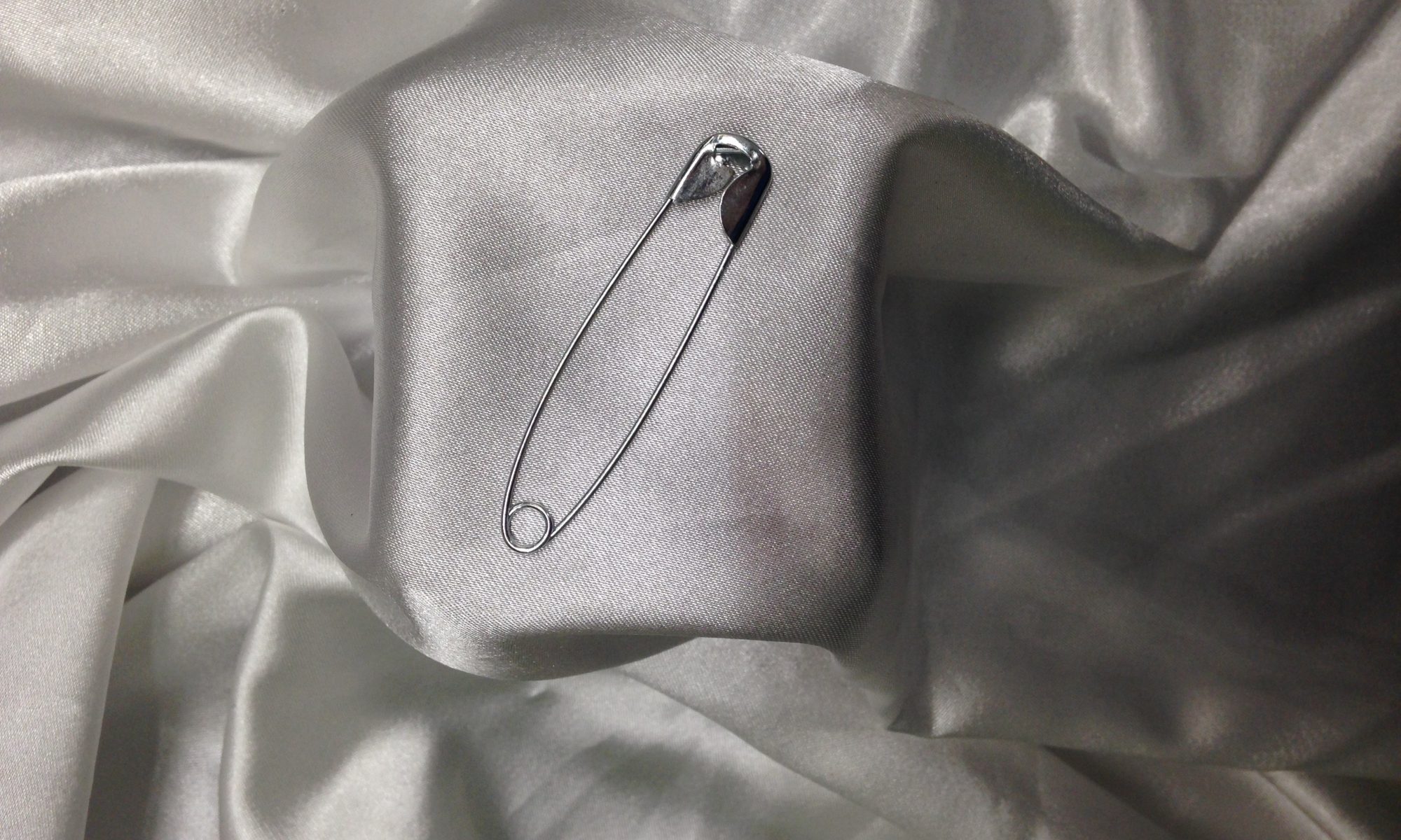
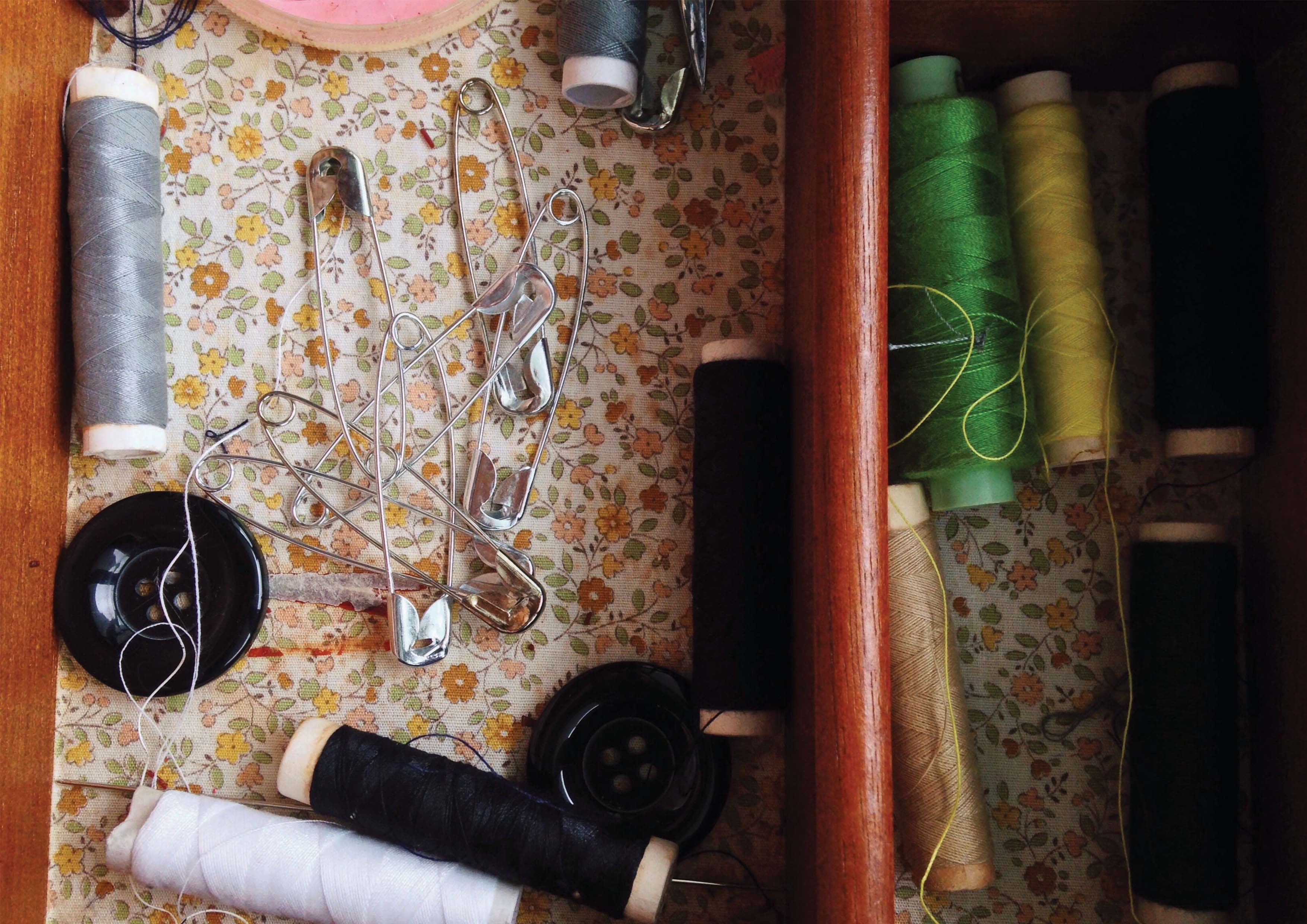
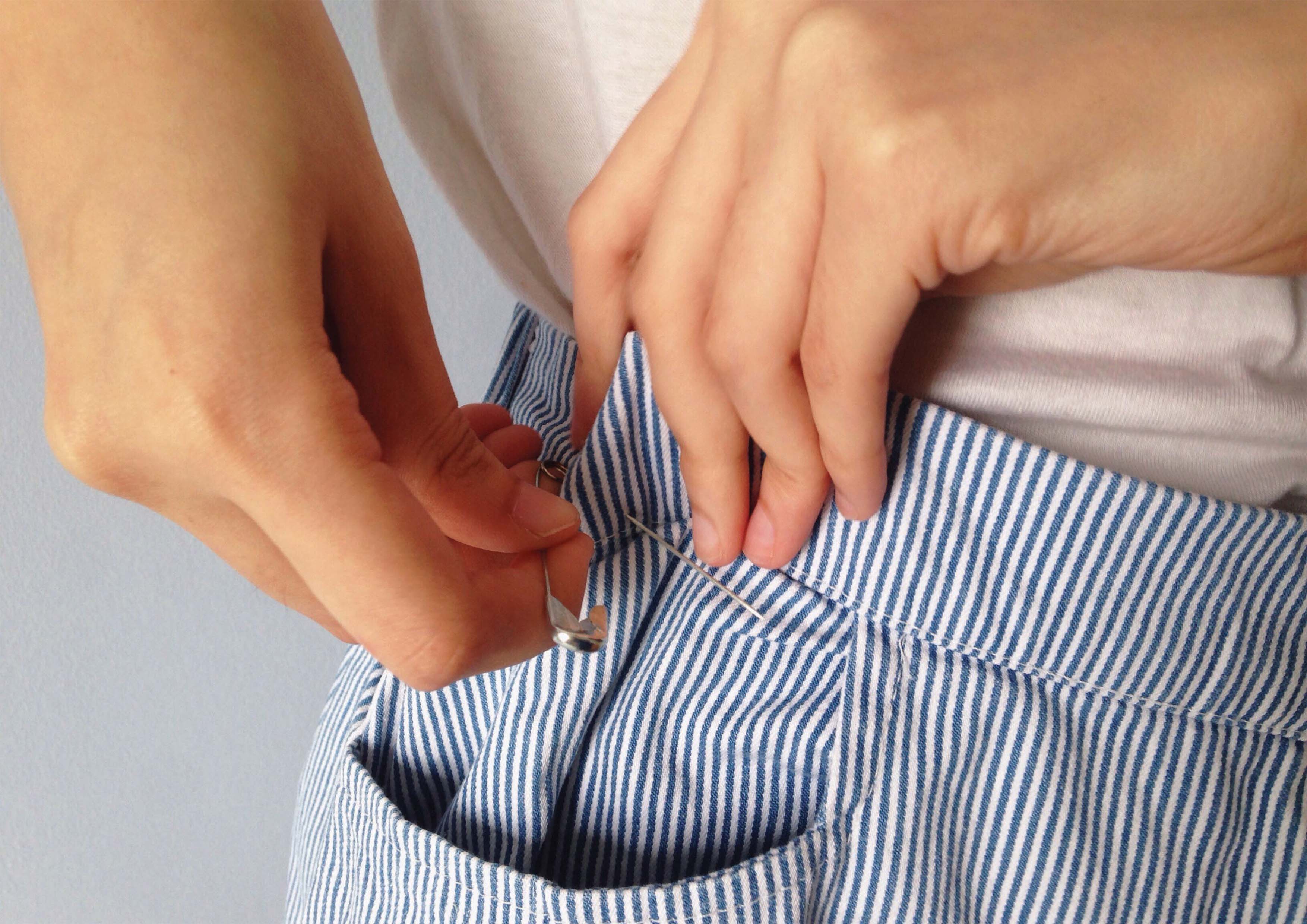
The first image shows where one can typically find a safety pin; in a sewing box. It also shows the safety pin as something that exists in abundance – one would usually purchase a handful of safety pins as oppose to just one pin. The second image focuses on the main function of the safety pin; to fasten clothing. The last image focuses on the physical attributes of the pin, the most prominent being its sharp point.
Principles Applied
I. Varied Angles
| Image 1 | Top-down angle |
| Image 2 | Eye-level |
| Image 3 | Eye-level |
I wanted to photograph the pin using different angles to highlight certain elements. In the first image, I used a top-down angle to show the pin in its usual environment; doing so helped me to clearly establish the physicality of the entire pin as well as the environment. In the second image, I used an eye-level angle to show its main function. Having the pin situated at an eye-level also helps to clearly establish the subjects in the shot and how they relate to one another. In the third image, I used an eye-level shot to show the pin’s sharp point. Doing so again, helps to clearly highlight one of the more prominent physical attributes of the pin.
II. Varied Shot Scales
| Image 1 | Wide-shot |
| Image 2 | Wide-shot |
| Image 3 | Extreme close-up |
I also experimented with different shot scales. In the first image, I used a wide-shot – in my opinion, I consider this a wide shot due to the smaller sizes of the objects portrayed – to establish the pin’s usual environment. Using a wide-shot helps in clearly portraying the environment, as well as forming a more interesting establishing shot. For the second image, I also chose to use a wide-shot to show its main function – similar to the idea behind the first image, it helped to clearly portray the subjects in the shot and their relations to one another. As for the last image, I used an extreme close-up to draw focus to the pin’s sharp point.
III. Cropping
Cropping was another principle applied. In the first image, I cropped out the rest of the sewing box as a means to draw focus to the pile of safety pins but at the same time, keeping certain elements in the background to convey the setting to viewers. Similarly, in the second and third image, I chose to zoom into the safety pin as opposed to having the subjects in their entirety; this was meant to highlight certain aspects of the pin and draw focus to its literal functionality, clearly conveying the message to viewers.
IV. Symmetry
The shots were also captured with the intent of keeping everything symmetrical. This was to emphasise on the safety pin’s rigid nature, as well as reduce clutter from the other elements in the shot, keeping the focus to the safety pin.
V. Colours & Textures
Since the shots in this task were meant to clearly convey the pin’s physical form and functionality, I used colours and textures to emphasise its structure and at the same time, make the shots more visually appealing. In the first image, I tried to capture the patterned background of the sewing box along with the colourful spools of thread; they were also able to serve as a contrast to the pin’s metallic colour. The wooden frame of the sewing box also served as a contrast to the pin’s metallic material. As for the second image, using a blue and white striped fabric complementing the pale blue background and skin colour helped to make the shot more visually-appealing. For the third image, I chose to have the pin situated against a plain, subtle background to emphasise the pin’s sharp point.
Research & Process

To prepare for this task, I dissected the safety pin’s physical structure and functionality and chose certain attributes to highlight. These attributes included its sharp point and clasp, its rigid nature and metallic body, its typical existence in abundance, and its function of fastening fabrics. With that, I proceeded to think of structuring shots in such a way where I can highlight these features.
To highlight the pin’s metallic and rigid structure, I tried to contrast it against softer textures; this was done by placing it against materials such as cloth and felt. I also experimented with different textures of fabrics when fastening the safety pin to them – this was done to see which gave better visual appeal and at the same time, keeping the focus drawn to the pin.
Task 2: Connotation
The second task then required us to subvert the object’s meaning, capturing its cultural relevance and meaning, as well as celebrating, changing, or critiquing its meaning.


Concept
The safety pin, as small as its structure is and direct as its functions are, has a long history. Hence, I wanted to take the attributes and functions displayed in the previous task and completely subvert their meanings. The images are related as follows:
- Task 1 Image 1 = Task 2 Image 1
- Task 1 Image 2 = Task 2 Image 2
- Task 1 Image 3 = Task 2 Image 3
The first image of this task was meant to convey an alternative scenario where a safety pin was regarded as a rare object of high-end culture and something only the wealthy can afford. Contrasting against its relating image in Task 1 (which displays the safety pin as a basic tool in sewing and the tendency for one to easily find and purchase them), I wanted the image to show the safety pin as something associated with royalty. With a make-shift display, I tried to recreate an auction display or art exhibition with satin cloth and fairy lights to give the safety pin a “high-society” aura.
The second image, on the other hand, was meant to represent two things – a contrast against its main function, and a homage to its role as a fashion accessory in the punk rock movement and haute couture. Relating back to its literal function displayed in Task 1 Image 2, it contrasts against this by showing the utilitarian nature of safety pins can be subverted and they can be shown as something useless, being used merely as an accessory; instead of having a useful feature in fastening fabric together, the safety pin can also be used to further enhance one’s appearance.
As for the third image, it shows the pin as a “utilitarian superhero”. This is meant to pay homage to its role in European culture, where a safety pin is worn as it seen as something that wards off evil, as well as relating to Task 1 Image 3, where it highlights the pin’s sharp point. The image is meant to convey the safety pin as a superhero through mimicking the well-known moment where superheroes sense trouble and immediately go into a costume-change moment.
Principles Applied
I. Varied Angles
| Image 1 | Eye-level |
| Image 2 | Eye-level |
| Image 3 | Low angle |
Similar to earlier shots, I wanted to experiment with different angles. For Images 1 and 2, I used an eye-level shot. Using an eye-level shot in Image 1 reinforces its intended concept and setting; since the image was meant to convey the idea of a safety pin, an object of royalty, housed in an exhibit, having it at eye-level helps viewers to experience the scenario better. Using an eye-level for Image 2, on the other hand, helps to position the subjects better, showing a clearer shot.
As for Image 3, I used a low angle. Since the main subject in the image was supposed to represent a superhero, I thought it would be fitting to use a low angle so as to paint the subject in a more “heroic” manner, and something that people tend to look up to and highly regard.
II. Varied Shot Scales
| Image 1 | Mid-shot |
| Image 2 | Mid-shot |
| Image 3 | Wide-shot |
I also used varied shot scales to better relay the intended messages. Since the images were meant to portray the objects as something of importance – an object of royalty and a superhero – I used mid-shots and wide-shots to show the entirety of the object. Using a mid-shot also helped in conveying the subverted function of the pin more clearly (in Image 2).
III. Cropping
Cropping was also used in the photographs, especially evident in Image 2, to draw focus to the safety pin but at the same time, keeping aspects of other elements in the shot to clearly establish the setting, thereby better relaying the image’s intended message to viewers.
IV. Rule of Thirds
Rule of thirds was considered when placing subjects within the shot; this is mostly displayed in Images 2 and 3 where the subject of focus (i.e. the safety pin) is placed 2/3 in the frame.
V. Colour & Texture
Colour and textures of different elements were also taken into consideration when composing the shots. In Image 1, I used a white satin cloth to form the backdrop; this was meant to highlight the safety pin as an object associated with wealth. The addition of white fairy lights in the background also helped in creating a layer of depth and added more visual appeal. As for Image 2, I chose to have a muted-coloured background to create a neutral background for the bright skin colour and scattering of safety pins. In Image 3, I chose to have complementary colours (yellow and blue) for the clothing as well as a mixture of cotton and denim to provide a layer of depth through different textures. This helped in making the shot more visually appealing.
V. Signs, Symbols & Icons
I wanted to experiment with safety pins as symbols and therefore, portrayed them in situations that convey their cultural contexts. However, viewers are required to have prior knowledge on the safety pin’s history before understanding the images’ concepts.
Research & Process
To prepare for this task, I conducted some research on safety pins and turns out they have quite a prominent history. I then created a mind map to note down the safety pins’ literal functions and their subverted versions.


In a cultural context, they were a symbol for the punk rock movement where they were conceived as a fashion accessory amongst followers. They then became a fashion symbol in haute couture amongst high-end brands that range from Versace to Marc Jacobs.

Safety pins also hold a significant role in European culture where they are seen as a symbol of good luck, typically worn on clothes as a means to ward off evil spirits.

After conducting some research, I decided to pick out a few contexts I could carry forward with. I chose to experiment with the ideas of safety pins as icons of the punk rock movement, a defender against evil spirits, and subverting its physicality as an affordable and insignificant tool.

I experimented with different ways to convey the cultural contexts of the safety pin. I tried object association where I paired the safety pins with objects related to its cultural background – to portray the punk rock movement, I used items commonly associated with the movement (this included splatters of black paint, graffiti art, music instruments, and black clothing and fish nets. Additionally, showing it as a defender against evil spirits, I tried using different representations of evil spirits (having a print of a monster and painting my hand black). However, I felt these shots, although quite straightforward, were not as visual appealing or captivating.
Task 3: Text and Image

For the final task, I wanted to expand on the idea of a safety pin being a superhero. In its physical structure, the safety pin consists of a clasp in which it holds its sharp end, protecting users from pricking themselves; this is symbolic of superheroes, where their main role is to confine evil and protect others. Their heroic nature is further reinforced through their main function, fastening clothing. It is once again, reinforced through its cultural meaning where they are perceived as symbols of good luck and objects capable of warding off evil spirits. Therefore, to show it as a superhero, I mimicked a pop culture reference of Superman in his call to justice.
I used the tagline “The Insignificant Superhero” to reiterate the idea of the safety pin, an object so insignificant due to its cheap production value, small size, and tendency to be forgotten until needed, having a capacity to carry out tasks beyond its appearance. The tagline used is a relay where viewers have to have prior knowledge to understand the context behind the poster. However, in a literal context, the text can serve as anchorage, where viewers who know the main function of a safety pin (fastening fabrics), will be able to realise the usefulness of the pin.
Feedback & Improvements
Some of the feedback I received was that there were other portrayals I could have used to better convey the subverted versions of the safety pin. For example, with regards to it being a superhero, I could have portrayed a scenario where the safety pin is responding to person in need of desperate help but the situation in this case is the person accidentally tearing his/her clothes before an important job interview.
In future projects, I hope to work more on my conceptualising stages and deliver images that are able to clearly convey the intended message.
References
I. Rene Magritte
https://www.biography.com/people/rené-magritte-9395363
https://www.britannica.com/biography/Rene-Magritte
https://www.renemagritte.org
II. Tommy Ingberg
http://ingberg.com/default.aspx?Page=about&PID=56
https://thenextweb.com/events/2017/09/21/heres-making-tnw-new-york-invite/#.tnw_tSvoVF12
III. Kyle Thompson
What Is Punk? 25 Definitions From People Who Should Know
A completely unnecessary history of the safety pin
https://www.theguardian.com/world/shortcuts/2016/jun/29/the-safety-pins-puncturing-post-brexit-racism