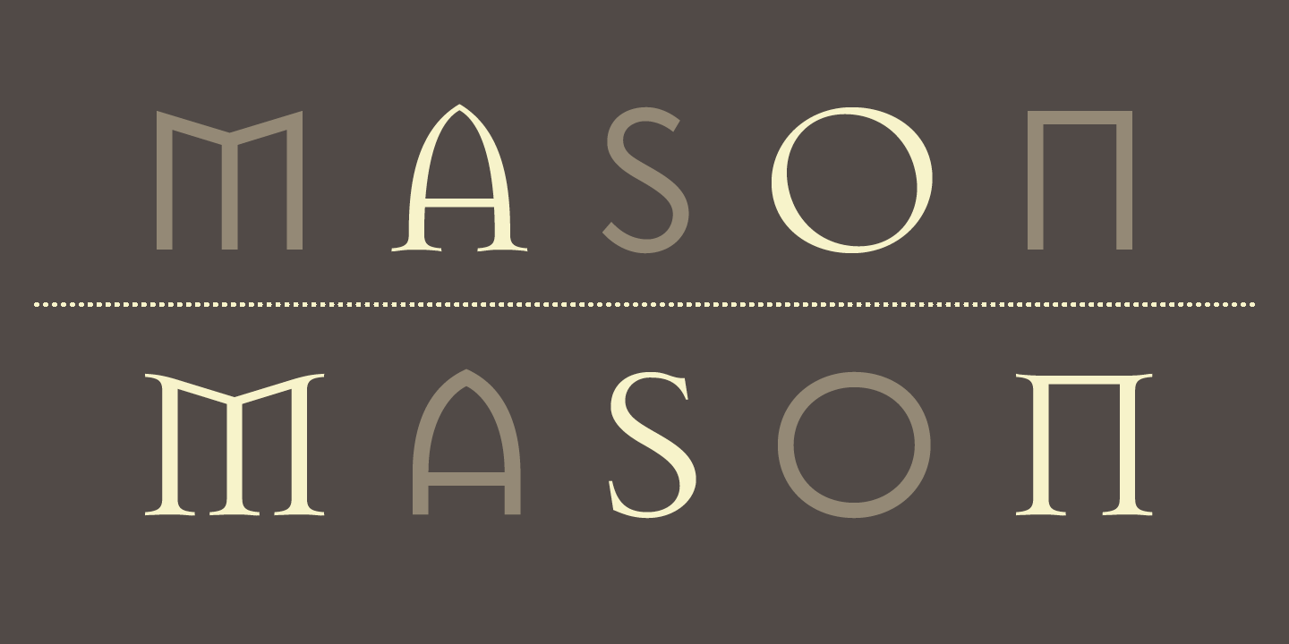
Jonathan Barnbrook is a recognised contemporary graphic designer, typographer, and filmmaker. Deemed as one of the UK’s most active designers, Barnbrook is most known for his work in typography, where he created the famous “Mason”, and the “Priori” typeface which was used in the iconic 2002 David Bowie album, Heathen, which he designed as well.
His works are said to combine “originality, wit, political savvy and bitter irony in equal measures”. He is also considered a pioneer of “graphic design with a social conscience”, where he “makes strong statements” about issues such as “corporate culture, consumerism, war and international politics”.
His Works
I. Album Works
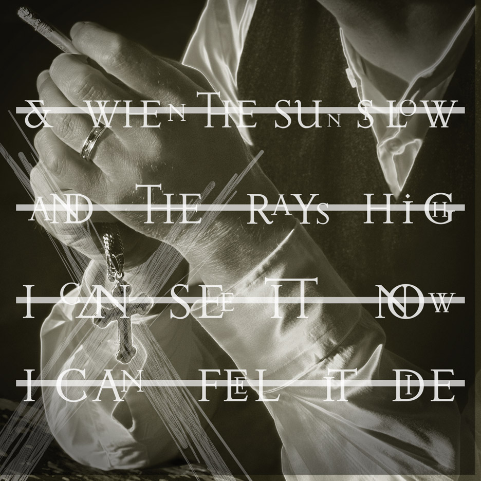
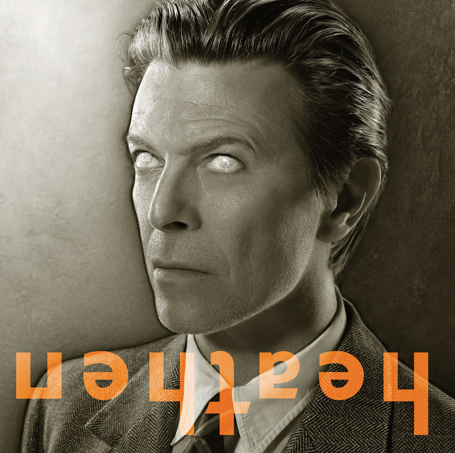
Image of David Bowie’s Heathen (2002)
In 2002, Barnbrook produced the album cover for Heathen by David Bowie. In this particular cover, he incorporated his “Priori” typeface, during which was his first time using the font for commercial purposes. Bowie then requested Barnbrook to design cover art for other albums including Reality and The Next Day (both of which hold “rather controversial reputation”).
II. Typography
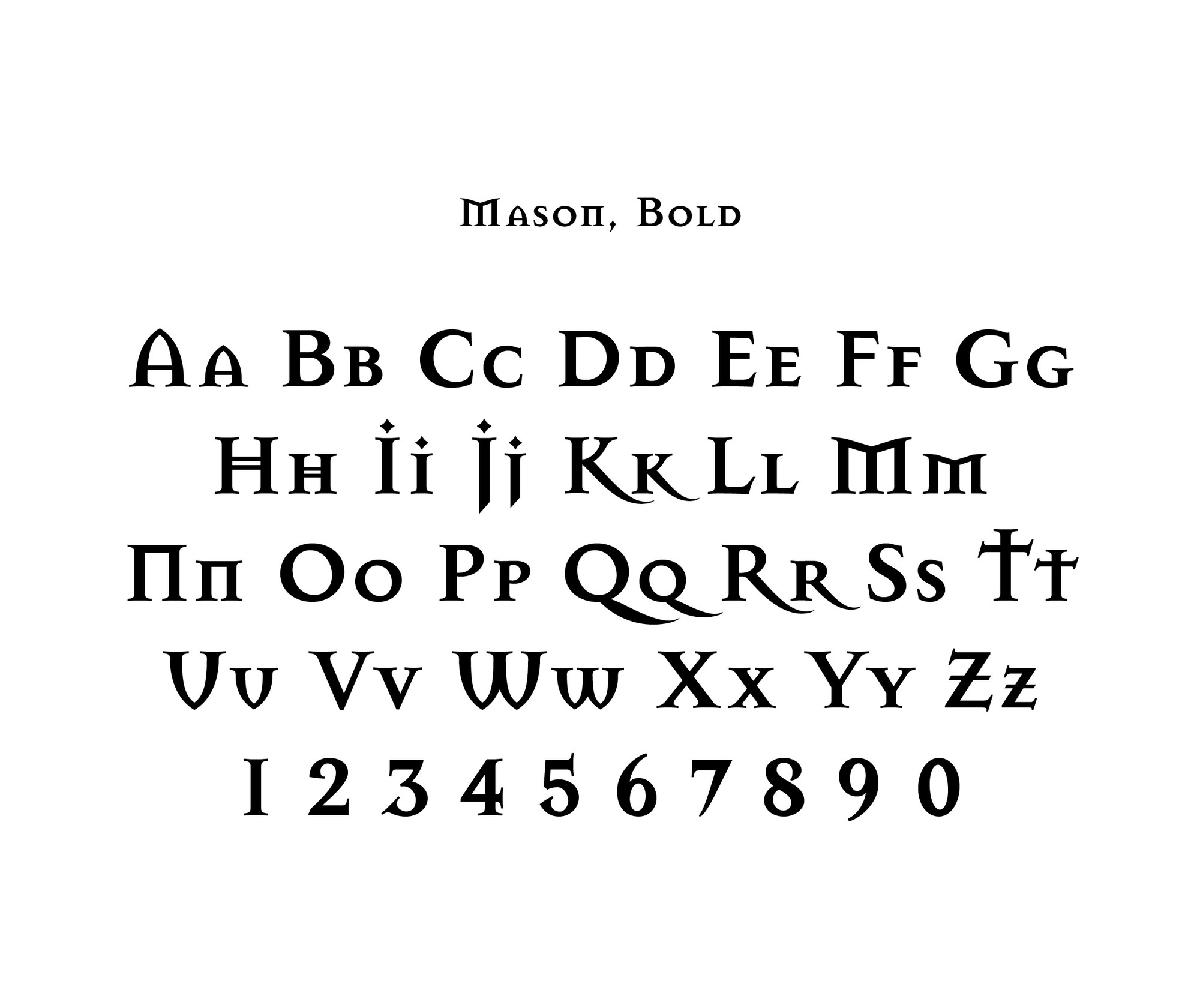
I Want To Spend the Rest of My Life Everywhere, with Everyone, One to One, Always, Forever, Now by Damien HirstMason by Jonathan Barnbrook
Barnbrook was also known for his range of fonts including False Idol, Exocet, Newspeak, Awe, Infidel, Sarcastic, Shock, and Moron. These fonts have “emotive and controversial titles”. Furthermore, he has collaborated with artist Damien Hirst on the book “I want to spend the rest of my life everywhere with everyone, one to one always, forever now”, in addition to “Typography Now Two” and various advertising campaigns.
Learning Points
Emigre by Jonathan Barnbrook
Looking at the fonts that Jonathan Barnbrook created, I really liked how he managed to create unique typefaces that embody personalities and moods, but at the same time, refrain from looking too tacky. This makes for easy readability that is both unique (and different from today’s modern-looking fonts) but remains visually-pleasing to the eye.
I also found it interesting how he weaves external influences, political issues for example, into his typefaces. The inclusion of little extra details such as adding extra strokes and making rounded letters more geometric by straightening curves allows for the typeface to look more unique, and conveys a concept. Doing so may also help a piece of design work better convey its intended message or mood.
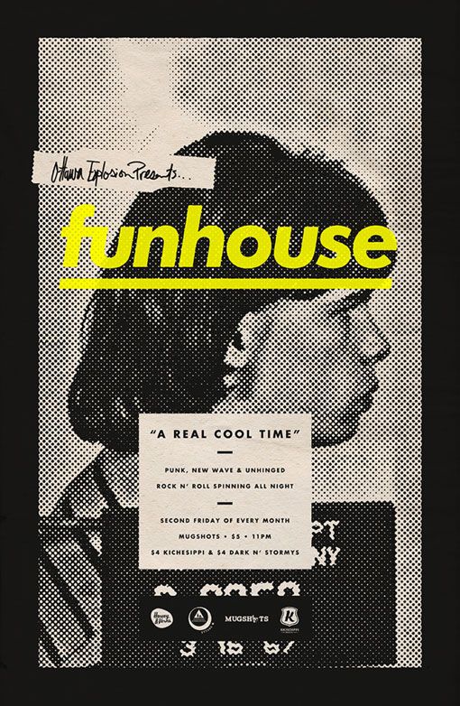
The poster above is promoting an event; it seems to be a promotional poster for a venue advertising deals for the second Friday of every month.
What emotion does the design elicit?
Looking at the choice of colour and graphics, the poster has a very grunge and underground kind of aesthetic, giving an overall mysterious vibe. It makes me curious to find out more about the event.
What makes the poster captivating? Discuss the use and effect of imagery, text, texture, colour.
One of the visual elements that makes the poster captivating is the choice of colour. The pop of vibrant yellow draws a strong contrast against the background and image’s muted colour palette, drawing attention to the title without making the poster look too gaudy.
Another captivating element of the poster is the image and use of half-tone. The image complements the overall aesthetic of the poster and the use of one subject allows it to have a simple composition that is easy on the eyes. The use of half-tone adds to the overall mood as well, and adds a layer of texture to the image, making more attention-grabbing.
How did the poster generate visual interest and facilitate readability?
The combination of visuals in the poster is harmonious; the graphics such as the image, halftone, colour palette, and fonts work very well together, giving a unanimous aesthetic and mood. Additionally, despite the boldness of each graphic, the muted colour palette prevents it from being too jarring, allowing for easy readability.
The use of sans serif fonts also allow for easy readability. Important details such as the prices and event timing is displayed in a font that is legible.
How do you feel about the approach and execution?
Overall, I think the poster is effective in generating visual interest because of its choice of graphics, colour palette, textures, and fonts, it is eye-catching but at the same time, its graphics work together harmoniously. Additionally, I feel that the poster complements the type of event as well.
Take pictures and list the various types of design practices you encounter during your visit.
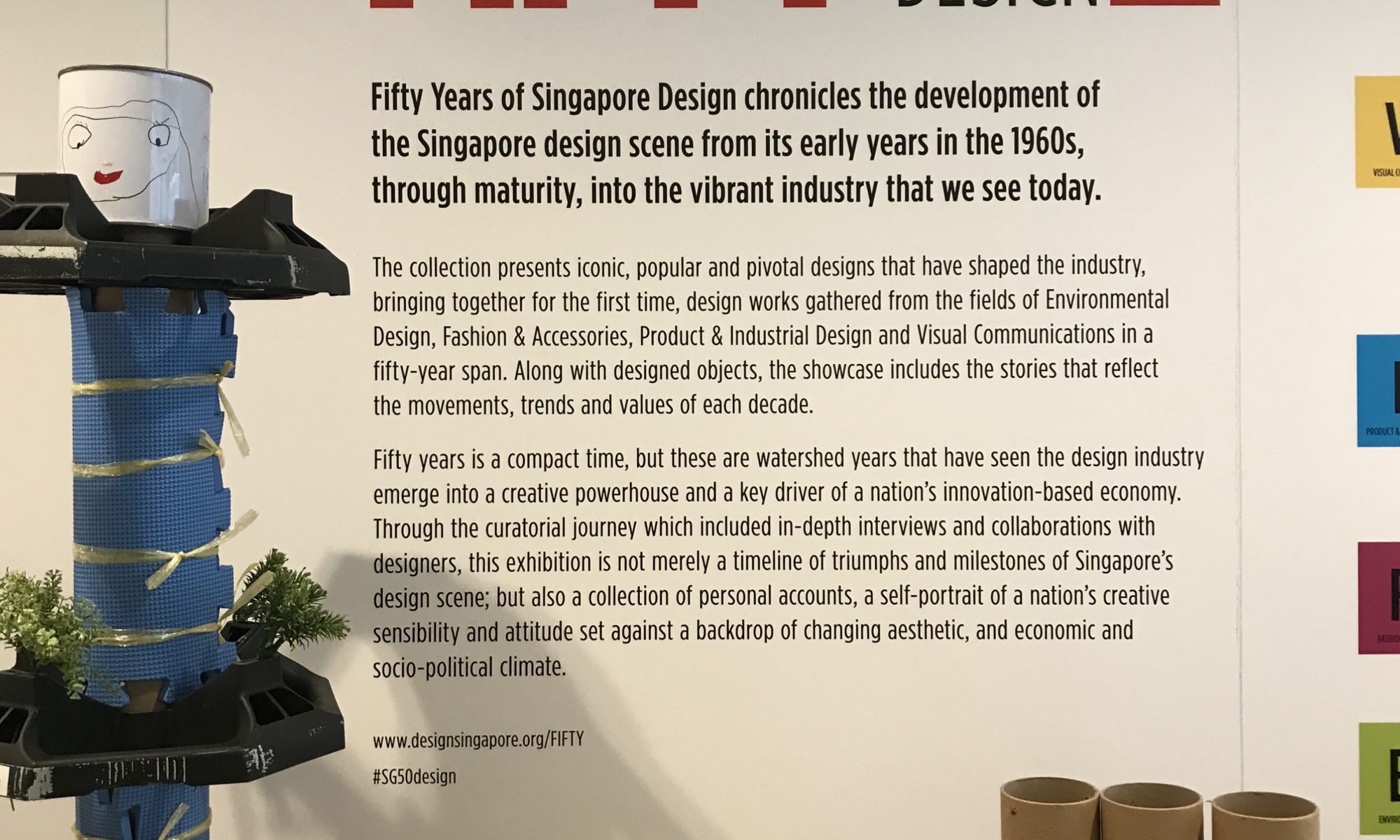
The areas of design practice in Singapore
Personally, visiting the exhibition was quite intriguing; quite clueless about the evolution of design in Singapore, I was surprised to see that the design scene was actually quite diverse – in addition to graphic and packaging design, Singapore had a hand in fashion, product and architectural design, amongst others. Furthermore, you could see how each design field evolved over time and grew more prominent with each era.
What are some of your observations of the design scene/practice in Singapore over the years?
External forces influenced the design scene greatly;
Design style is clear with every era;
Practicality was a major factor in design;
Bringing forth a unique Singaporean culture was celebrated;
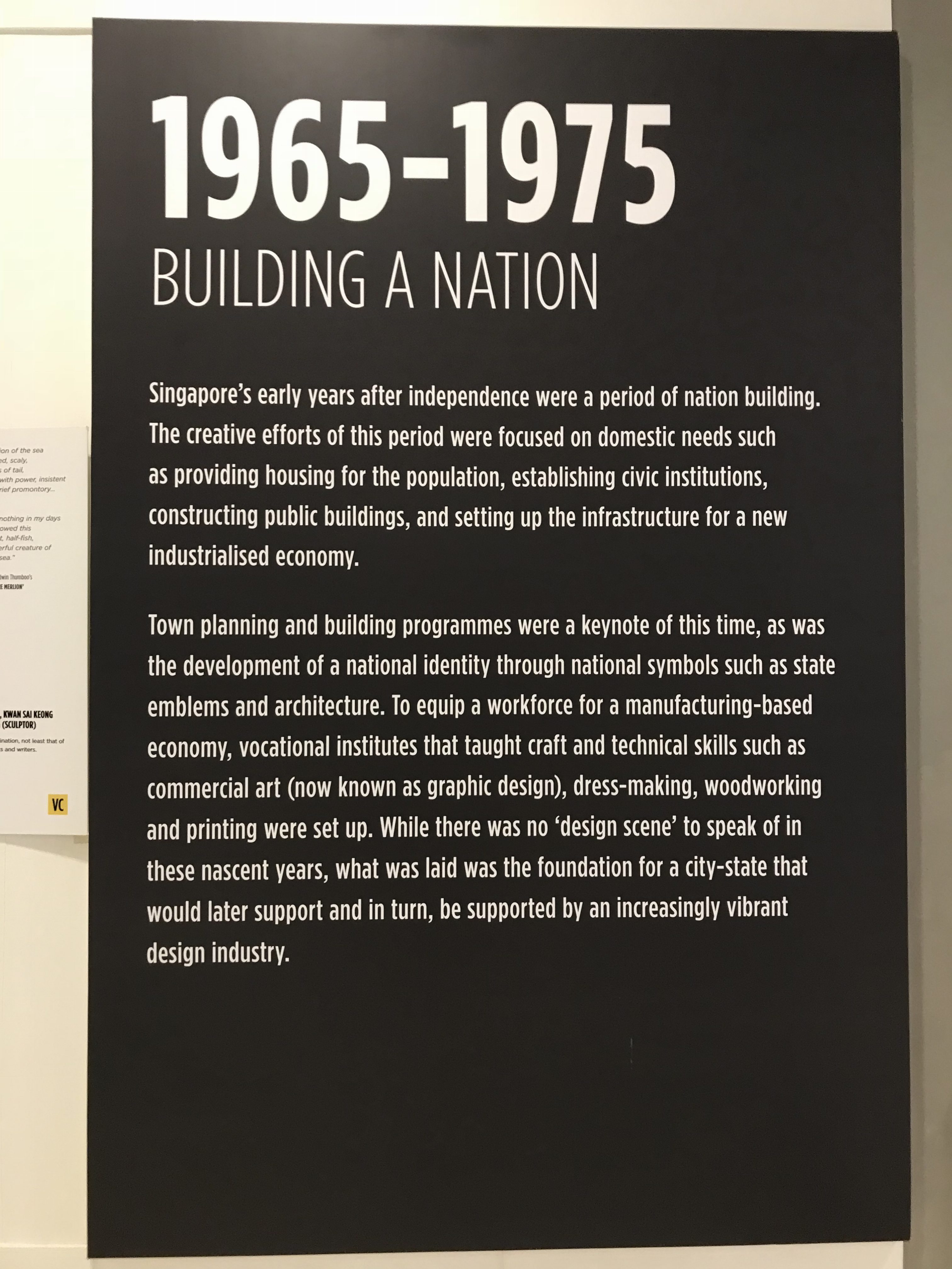
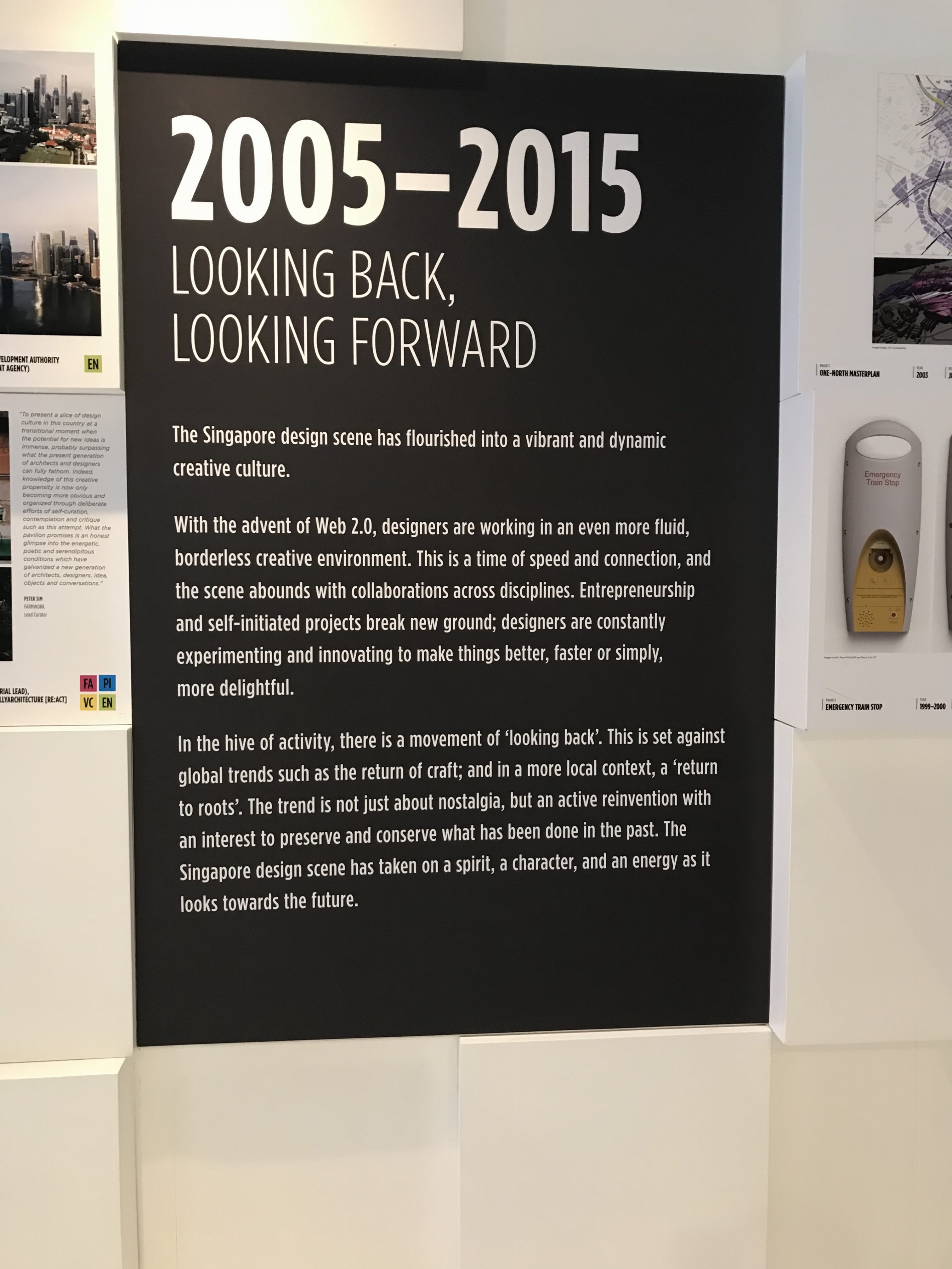
Goal of ‘Building A Nation’Goal of ‘Looking Back, Looking Forward’
The design scene/practice in Singapore had clear evolutions throughout the decades – the influence of external factors on Singapore could have played a part in changing the design scenes with each era. The factors involved integrating new technologies, changes in the economy, branding a new nation on a global platform, and celebrating culture through nostalgia. With each decade that brought about a goal that includes external factors, designs from that particular time period could be seen changing accordingly.
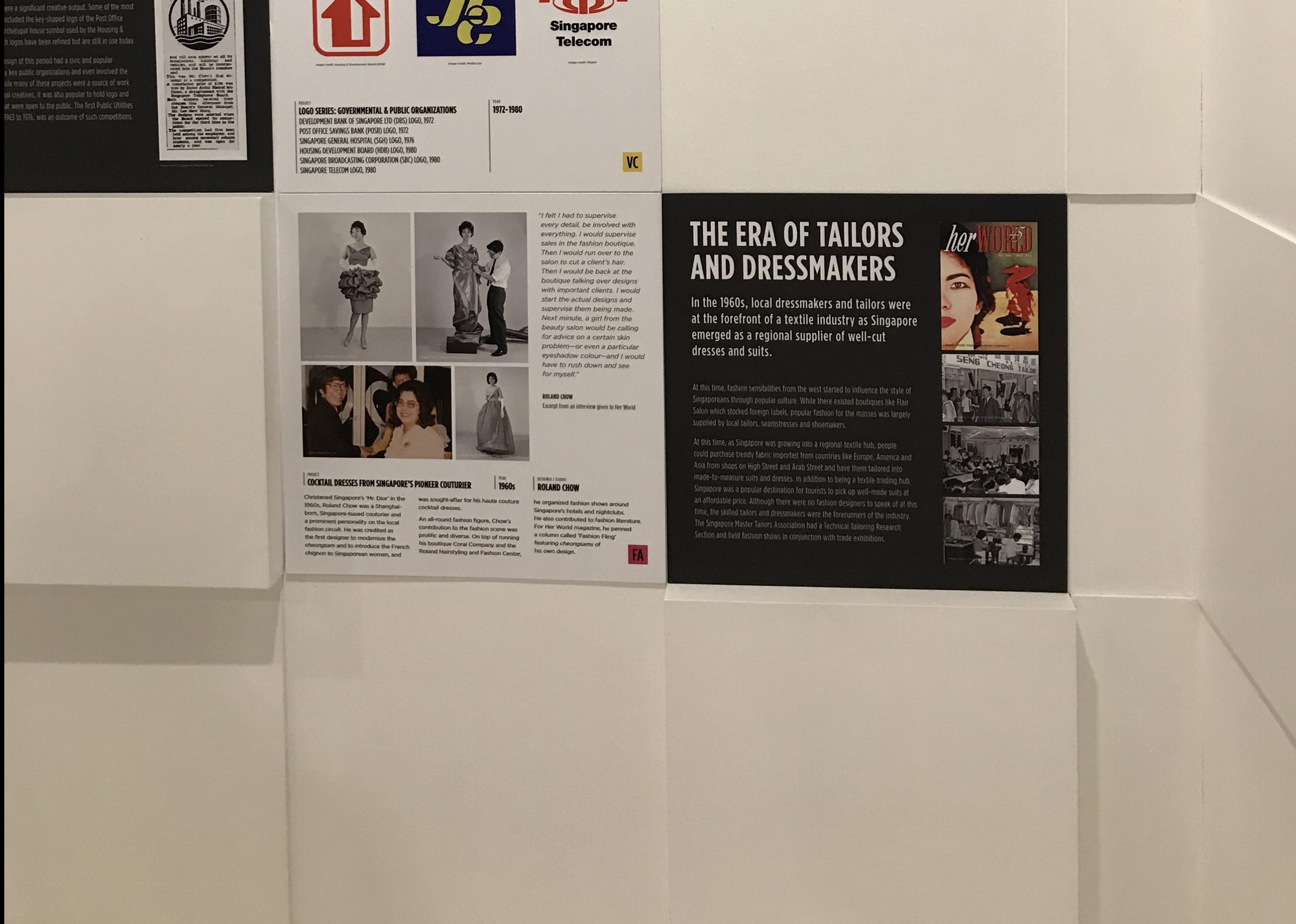
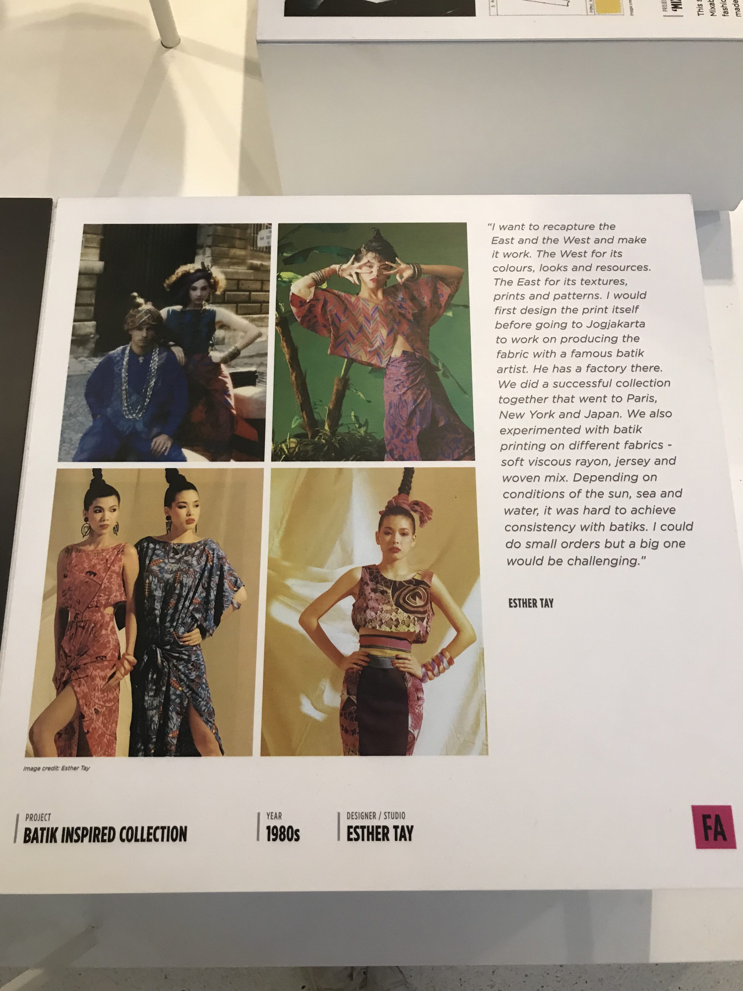
Fashion design from the 1960sFashion design from the 1980s
Expanding further on the influence of external factors, the design styles and trends could clearly be seen with each decade. Personally, the styles seen in the items on display probably would have followed trends relevant in that time period. A prominent example would be the pieces from the 1980s where vibrant colours and patterns were used a fair amount.
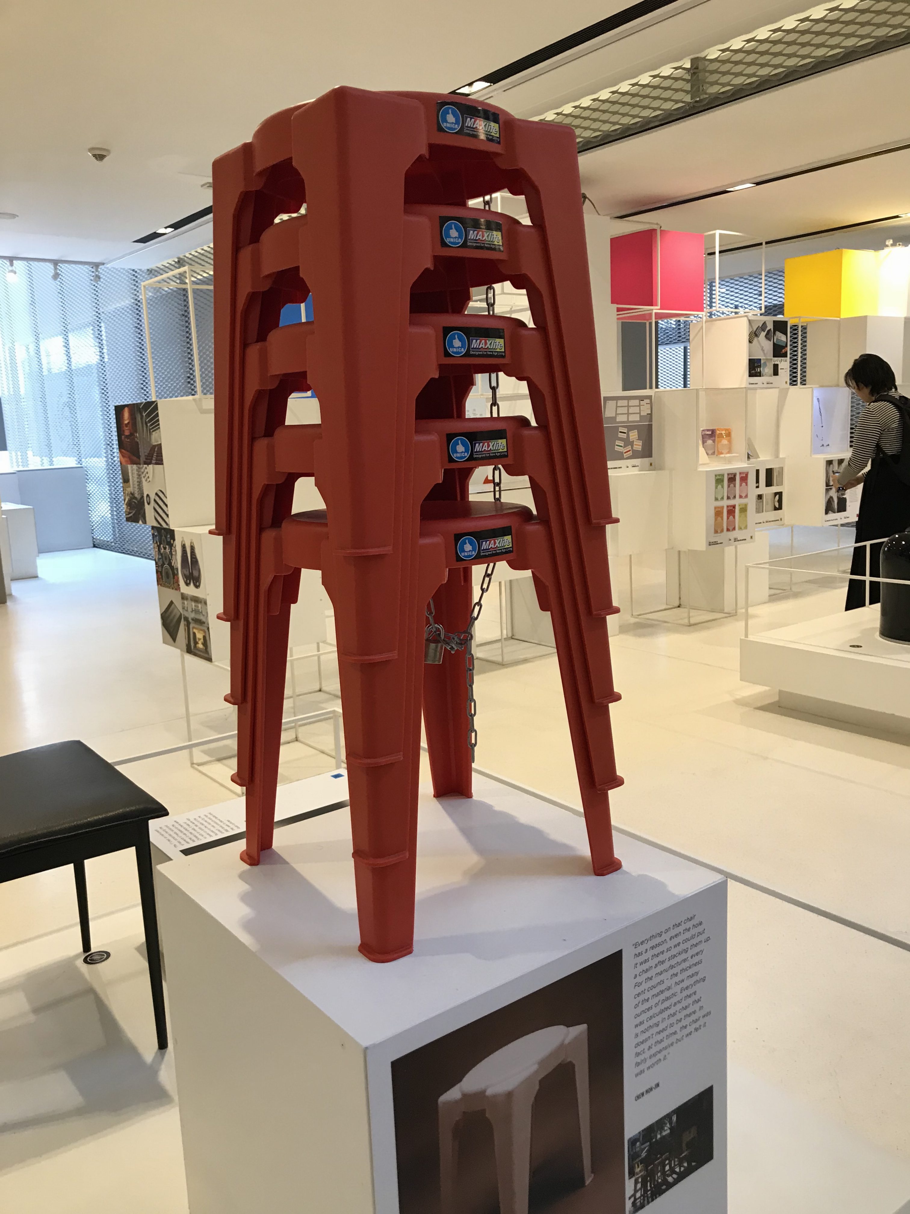
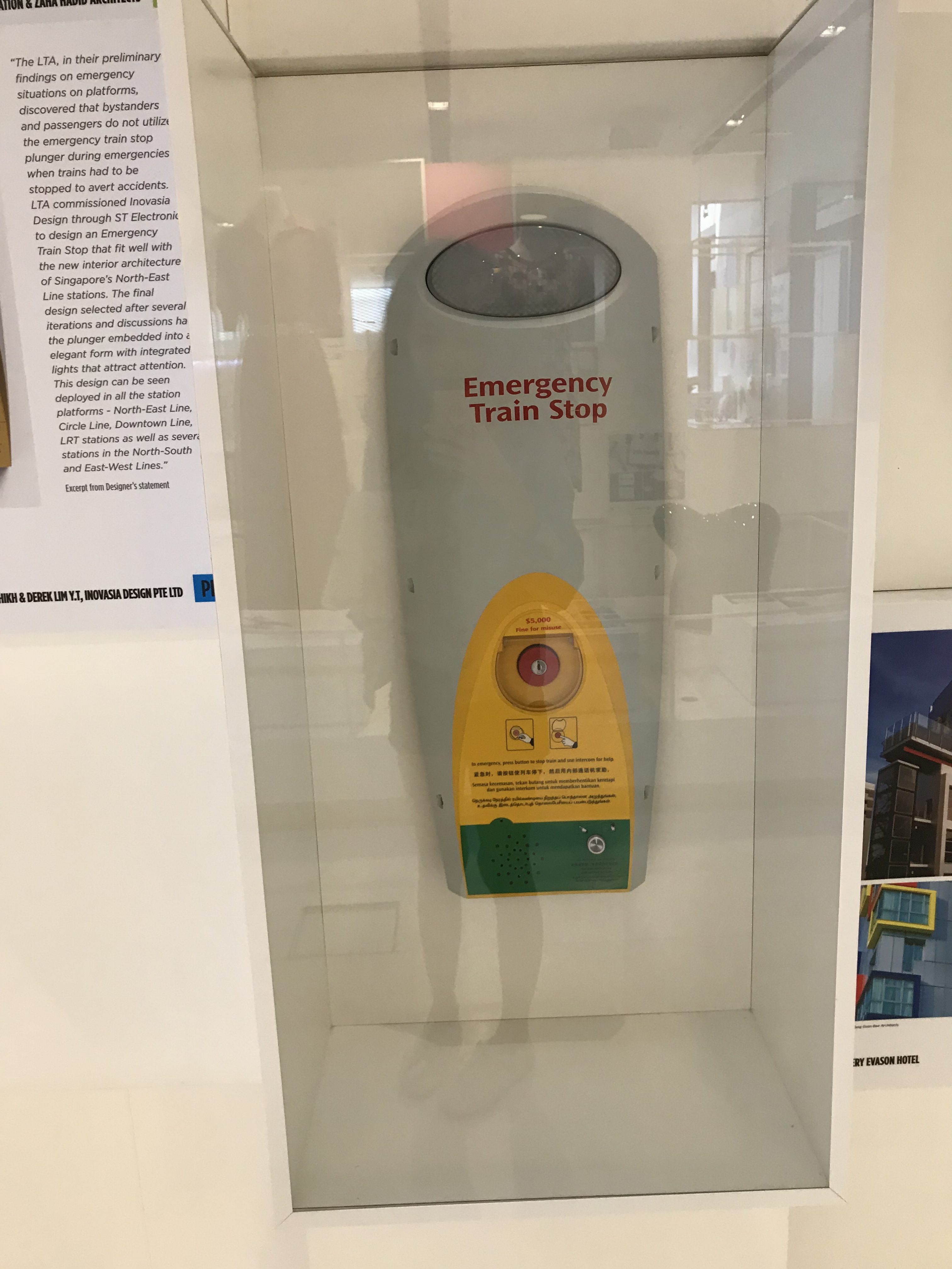
Image of the Unica plastic stools still used todayImage of Emergency button for LTA
Singapore’s design scene also has a focus on practicality, the design pieces on display had other goals in addition to serving as a form of visual aid, with said goals changing with different time periods. For example, some pieces were created with the intention of integrating Singaporean culture, building a local brand, while others had the goal of creating better visitor experiences (e.g. clearer and simpler way finding signs).
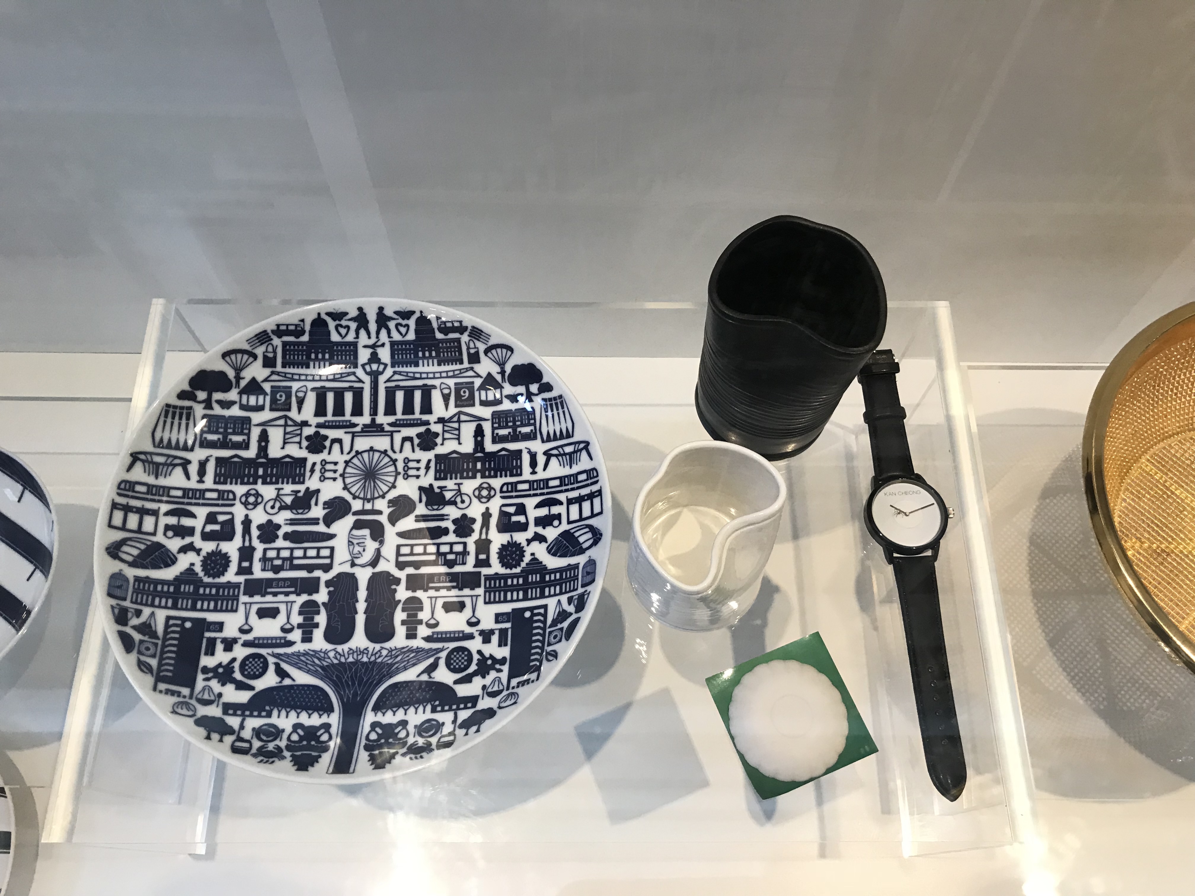
Image of everyday products that integrate aspects of local culture
Some areas of the Singaporean design scene also had a strong focus on integrating local culture. The pieces on display used different aspects of Singaporean culture (i.e. local slang, food items) to form products. This was probably in-line with the goal of branding a nation and/or celebrating nostalgia.
What are some of the future goals/key thrust for design in Singapore?
Designing with a purpose
Minimalist and cleaner looks
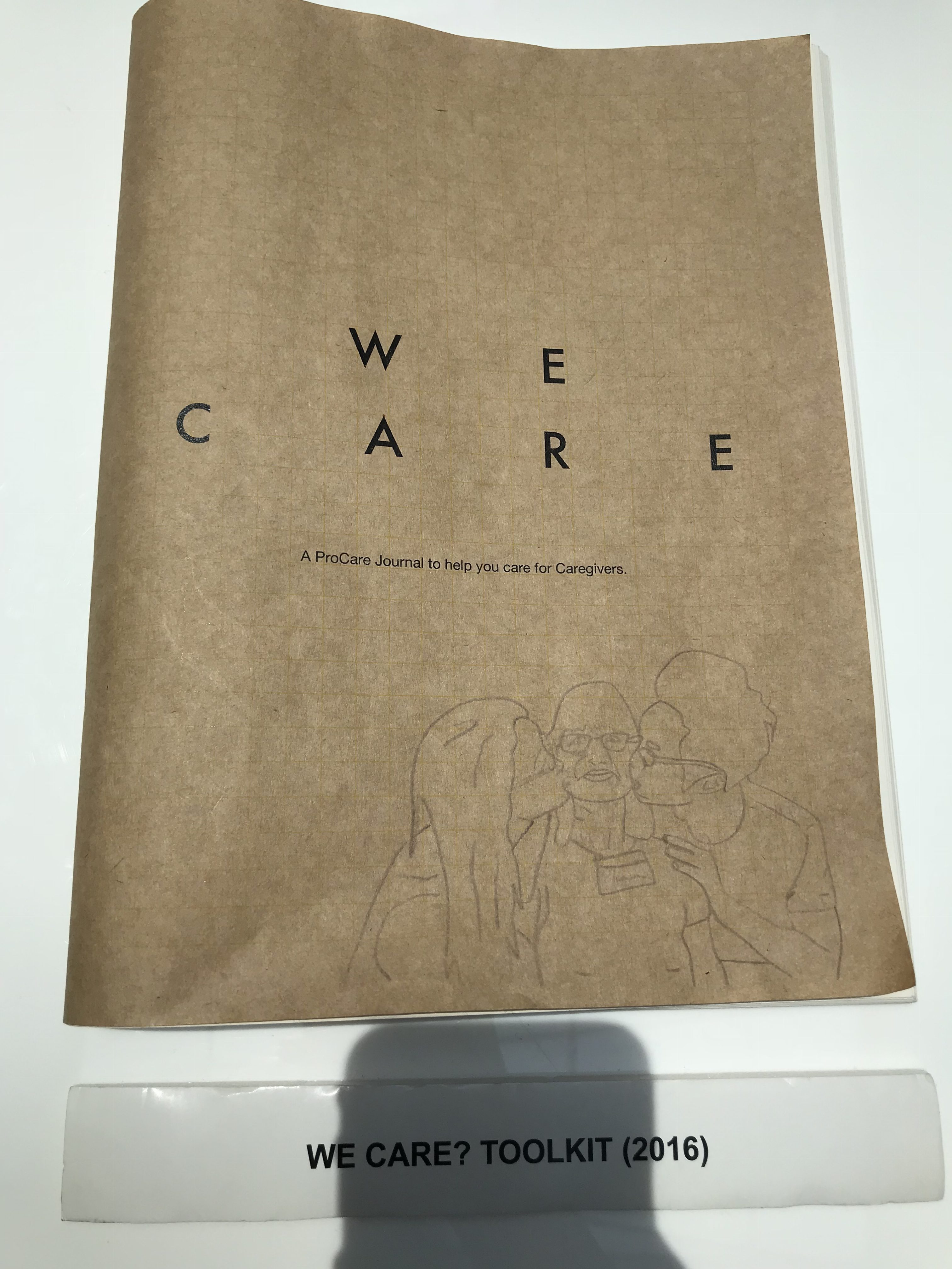
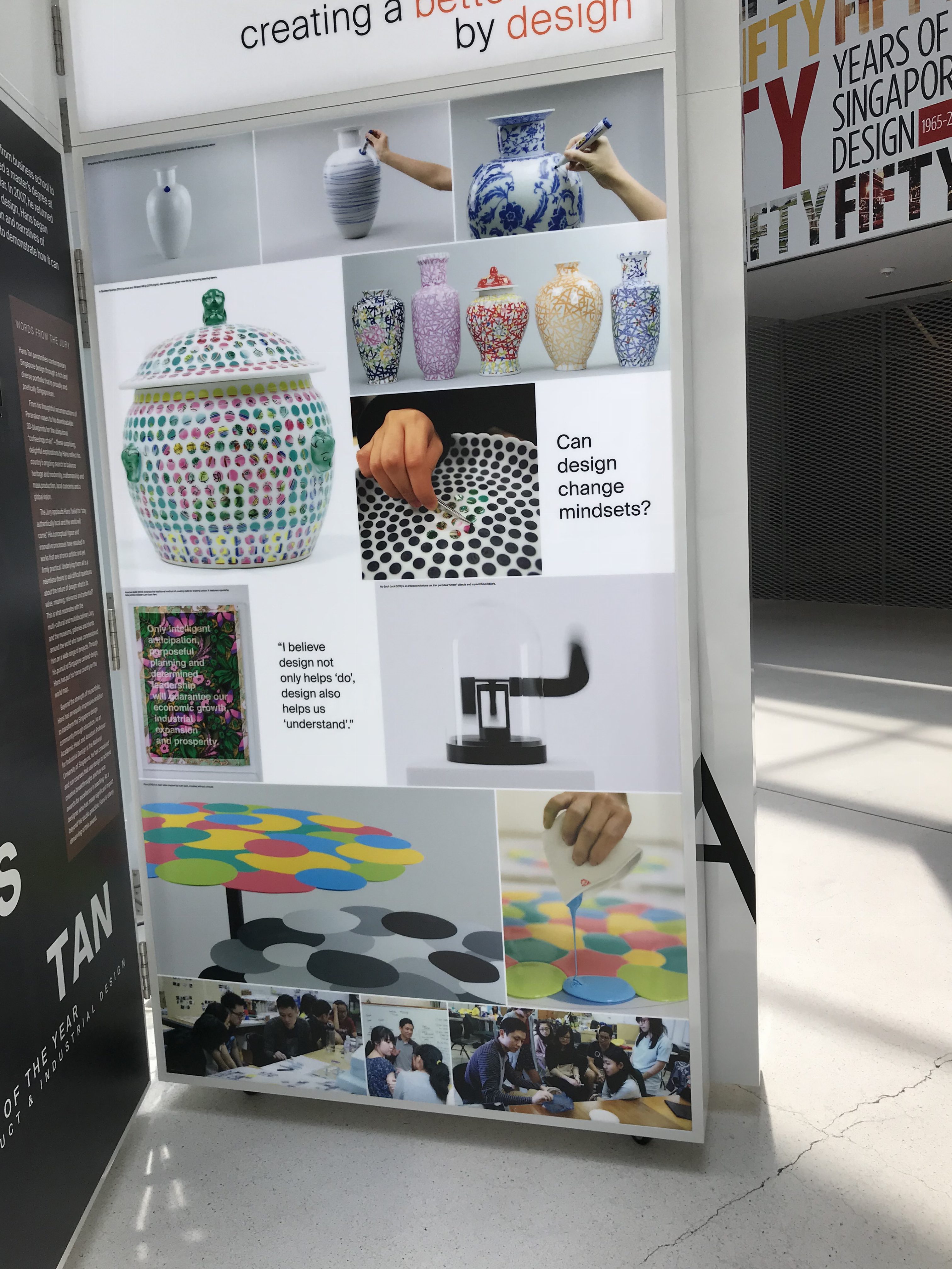
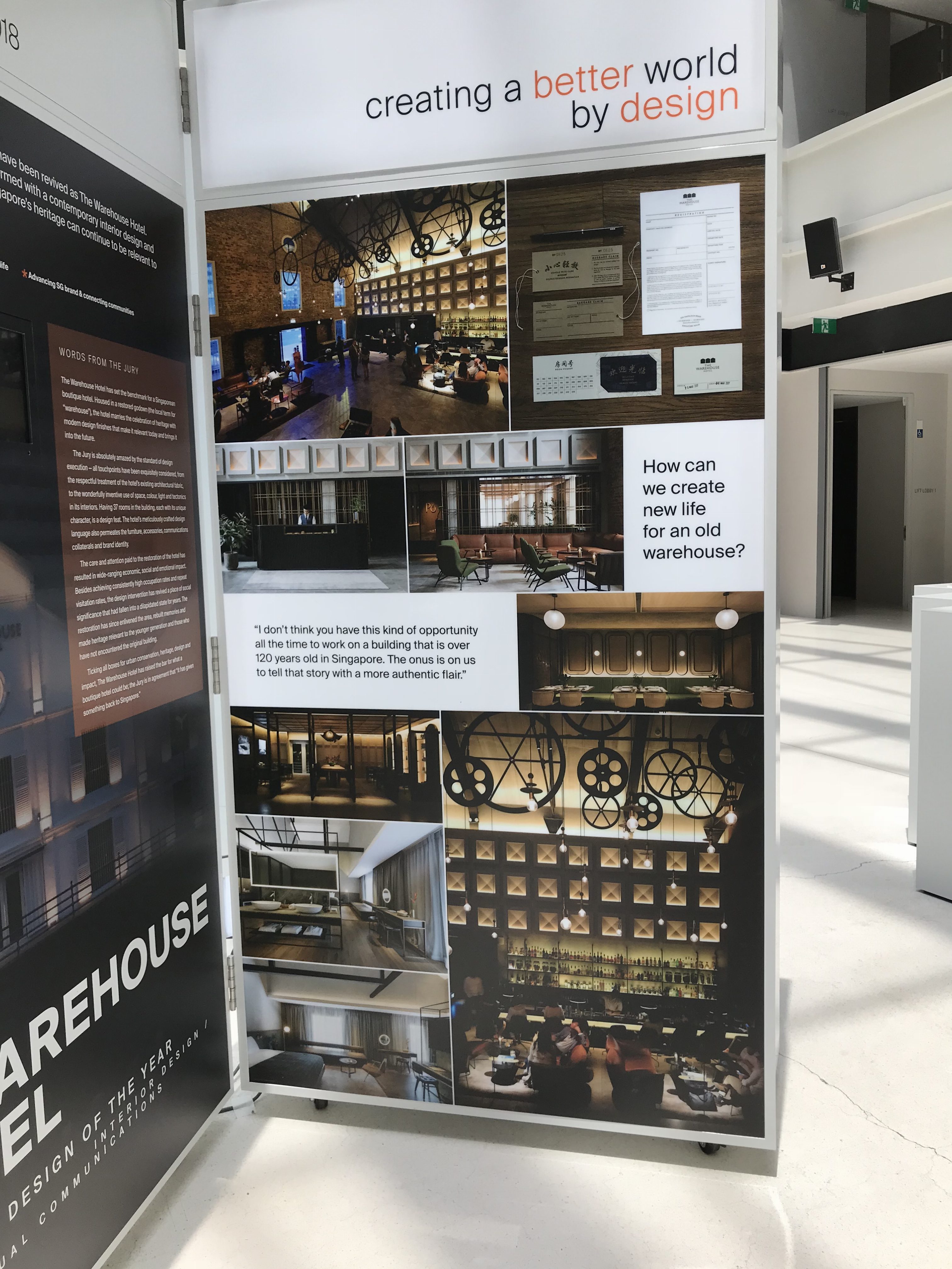
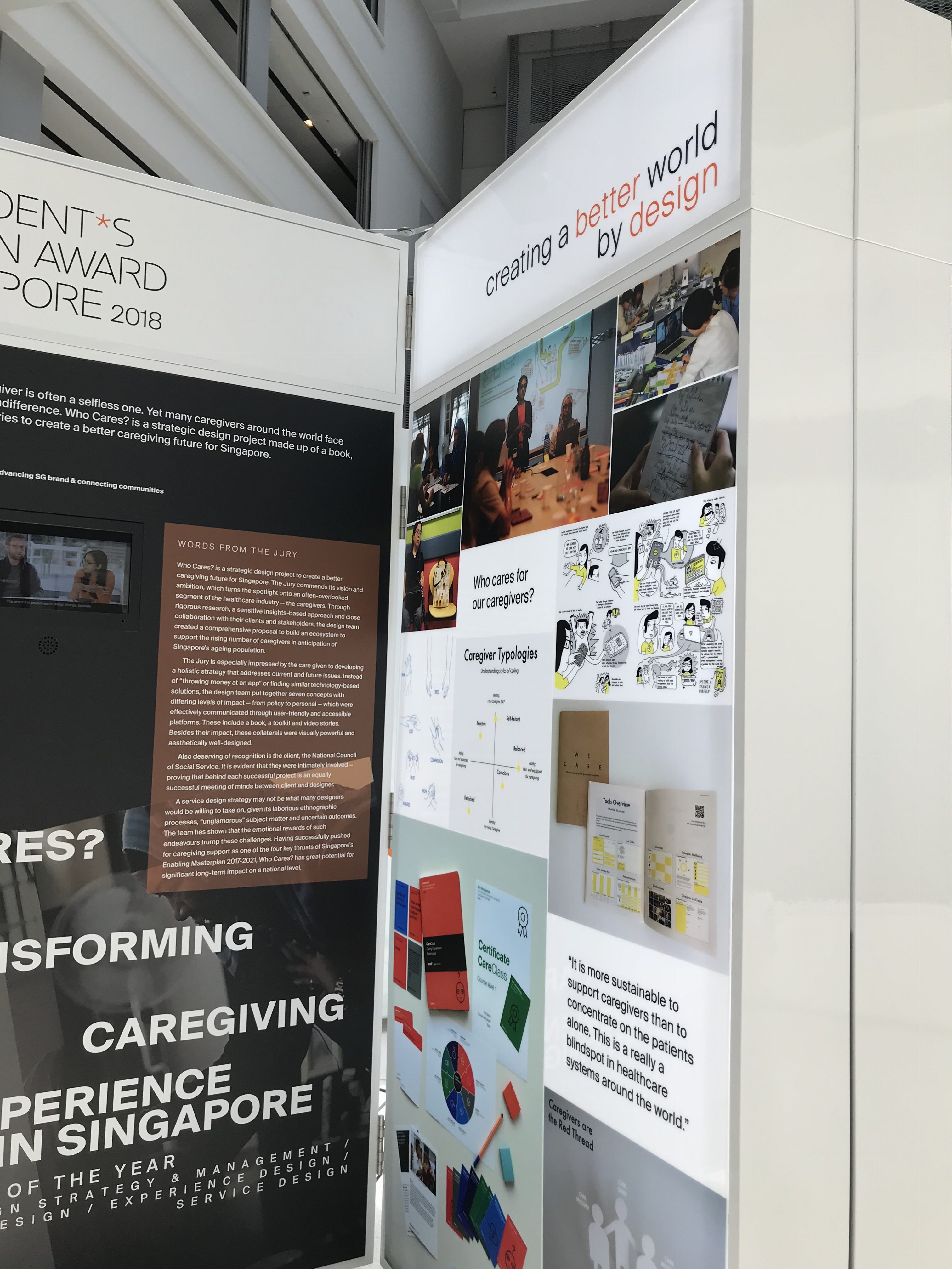
Image of guidebook for caregiversDesigning with the intention of changing mindsetsImage of The Warehouse Hotel exhibit
Delving further into the exhibition, it could be interpreted that the design scene in Singapore is heading towards more of designing with an additional purpose. More of the recent exhibited projects – be it architecture, product design, or graphic design – seemed to have been carried out with the intention of repurposing old objects (thereby, helping the environment), or to cater to a certain demographic (thereby, helping others).
Examples of recent graphic design projectsExamples of recent graphic design projects
With regards to visual aesthetics, personally, I feel that the design scene in Singapore is going towards more of a minimalist and slicker aesthetic to compliment modern times. In graphic design, blocks of colour and sans serif fonts are typically used with minimal graphics, whereas in architecture and product design, structures are more geometric and clean.
What implications might those goals have on current perception and practice of design?
Designers now have an additional goal of functionality rather than just creating visually-pleasing and enticing visuals
Personally, after viewing the exhibition, I feel that the design practice in Singapore now has an additional goal of aiding social and economical goals. In addition to creating enticing and visually-pleasing design pieces, designers now have to consider the methods in which the piece can reach out to certain demographics and/or fulfil certain goals. With regards to the goals set in place for Singapore by 2020, practitioners are expected to cater to changing social, economic, and environmental changes. As a result, design is seen to integrate aspects such as “practical functions”, “cultural symbolism”, “limited resources”, “human relations”, “effective communications”, and “timeless beauty”.
"Design can be the key catalyst to fuse the arts, cultural heritage, media, info-communications technologies to bring about new economic opportunities in this intersection, spur innovation, and enable new forms of creative expressions."
"In the emerging creative economy, design will move up the value chain to embody intellectual property and creative capital."
As a clueless individual in the field of Typography, it is always an eye-opening and inspiring experience to learn more about the hard work and painstaking efforts put in by type designers in creating groups of typefaces both for traditional and digital use. Matthew Carter is an extraordinary figure! Not only did he design some of the most recognised typefaces – namely, Snell Roundhand, Elephant, and Bell Centennial – but, he also had a hand in creating typefaces for practical uses (Olympian for newspaper text and Bell Centennial for US telephone directories).
Image of the Bell Centennial font designed by Matthew Carter, used in a 1995 US telephone book
Watching the TEDTalk allowed me to have a wider perspective in the processes that go into creating typefaces. Matthew Carter’s efforts in Bitstream Inc. and his collaborative efforts with Microsoft opened my eyes to screen-based fonts and the different considerations that go into the transition from hand drawn to digital typefaces. Reflecting on the points Matthew Carter brought up on the relevance of maximising legibility of screen-based fonts – in my opinion, although it may not be as relevant today, it did raise the bar for the standard of screen-based fonts and how people perceive them (and working hand-in-hand in creating better screen displays), as well as carrying the whole practice of typography into the digital age.
So I really thank Matthew Carter for his hard work and efforts!
We were tasked to come up with a typographical poster for a haiku. Feeling rather imaginative and inspired that day about the quiz for Astronomy (a Science module most of the ADM students are taking this semester), that was happening on the same day, I decided to write a haiku about it:
Hello, please send help
I keep digging my own grave
Zenith? More like no
Looking at examples of typography posters, I quite liked how the layout of the letterforms and the inclusion of visual elements were able to convey the narrative of the haiku. Inspired by this idea, I intended for my poster to show how the test and the subject was slowly killing me (metaphorically, of course). To better convey this idea, I had the words form a shovel stuck into a mound of dirt with a body at the bottom (the dead body being what will be left of me after this module ends). Adding the circles from an OMR sheet as an added texture also helped in making the layout a little more interesting to look at.
I tried using methods of layout and visual hierarchy to help with structuring the linear narrative of the haiku as well as to emphasise certain words, especially those that form the visuals (e.g. the vertical placement of the word Zenith, an astronomical term, was to emphasise it being “the point in the sky or celestial sphere directly above an observer”). I thought using sans serif fonts allowed for better placement and wouldn’t look too gaudy in unconventional layouts.
However, I feel like adding layers of shadows or experimenting with the thickness of certain words could have made the poster a little more interesting to look at. I also had some difficulty in finding a place to put the first sentence, and just went with putting it in a corner.
In a recent class, we were tasked to create a small artwork revolving around the idea of opposing words; given a list of different pairings of words, we had to use typography as a medium to convey the meanings behind them as well as the contrast. For this exercise, I decided to go with ‘clean’ and ‘dirty’ as I thought it sounded the most interesting!
I. Concept
Wanting to convey the literal meanings of both words as straightforward as I could, I tried to use a narrative to see how I could arrange and display the letterforms. Deciding to go with the more literal approach, the words were meant to represent something being hosed off, showing its clean form (the bright lettering) after removing the grime (the slimy, black lettering).
To further emphasise this idea, I used block letters and brighter colours to convey the concept of ‘clean’; I thought the straight lines of block letters and bright colours helped to convey slick and how things generally look like after being cleaned (slick and shiny). ‘Dirty’, on the other hand, uses wavy lines and black to convey grime and dirt. The difference between the structures of the two letterforms (straight/rigid VS. wavy/unstructured) really helped in showing the contrast between the two ideas. Furthermore, having parts of the ‘dirty’ cling onto the bottom of ‘clean’, in my opinion, helped in conveying the concept of hosing the dirt off something, and made the composition a little more interesting to look at.
II. Feedback & Learning POints
Straighter lines
Based on the feedback received in class from both friends and Lisa, the composition would have worked better with straighter and more uniform letters (the heights of the letters matching and the lines themselves being straighter). I agree too! The idea would have worked better if it was typed instead of hand drawn.
Minimal colour palette
Instead of using a bright colour palette with pink and yellow, the idea of hosing off something would have worked better with the ‘clean’ was white with a black outline. I think the contrast between outlined words and colour-filled works would help in making the composition more visually-appealing as well.
The essay, summarised, discusses the opinions of Beatrice Warde regarding the processes of print and typography. Using a detailed analogy of wine vessels, Warde clarifies between the two areas by bringing to light her perspectives on what makes good typography and on the elements of the printed word.
Looking more into the essay, Warde brought up some interesting points on her view on good typography; in the beginning she stated that “there are a thousand mannerisms in typography that are as impudent and arbitrary as putting port in tumblers of red or green glass”. Returning to the analogy of wine vessels, she uses the idea of the base of a goblet where, if it looks “too small for security”, “it does not matter how cleverly it is weighted; you feel nervous lest it should tip over” – to a certain extent, I agree with what she is trying to imply. Readability in typography, in my opinion, is the number one thing we should consider in creating typographical artworks. Not only do we need to be wary of conveying the right information, but the ways in which the reader perceives it, or in Warde’s words, “ways of setting lines of type which may work well enough… reading three words as one, and so forth”.
Towards the end of the essay, Warde also talks about legibility and layout; she quotes, “if the reader had not been practically forced to read – if he had not seen those words suddenly imbued with glamour and significance – then the layout would have been a failure”, but at the same time, she feels that the “mental eye focuses through type and not upon it”, where the “arbitrary warping of design or excess of ‘colour'” can “get in the way of the mental picture to be conveyed”, making it a “bad type”. Again, to a certain extent, I do agree with the points she is trying to make, that if the artwork ends up looking too fanciful or gaudy, with too many designs and colours, readers would just ultimately miss the main point of the artwork (i.e. to convey information through text). However, I feel like this may not be the case in some scenarios; going back to the group presentations on typefaces, I remember the group presenting on Comic Sans brought up an interesting fact about the font, that it is so unstructured and difficult to read that it is more effective in retaining information (so it is more commonly found in children’s textbooks and worksheets). Therefore, I do agree that jarring kinds of visuals can interfere with conveying information to the reader, affecting its readability, but maybe it can help it making that piece of artwork memorable?
In conclusion, the essay helped me in understanding the little nuances that distinguishes between good and bad typography, as well as the factors to consider when reviewing a piece of typographical artwork. On a side note, I thought the analogy of comparing wine vessels to typography was quite interesting as well, and helps in illustrating her points better.
Hailed as one of the most prominent key figures in the design industry, Paula Scher is known for her versatility in creating polished logos and “loudly expressive” posters. This “all-embracing sensibility” of Scher has made her a “reigning titan in a heavily male-dominated industry”. She has had a hand in identity and branding systems, promotional materials, environmental graphics, packaging and publication designs, receiving hundreds of industry honours and awards.
Scher is also referred to as the “master conjurer of the instantly familiar”, “[straddling] the line between pop culture and fine art in her work”.
Her Works
I. Branding and identity systems
Mentioned previously, Paula Scher was notable for her contributions to some of the world’s most recognisable brands and organisations. One of which would be her works for CBS Records, where the records she designed were associated with four Grammy nominations. She is also credited with reviving historical typefaces and design styles.
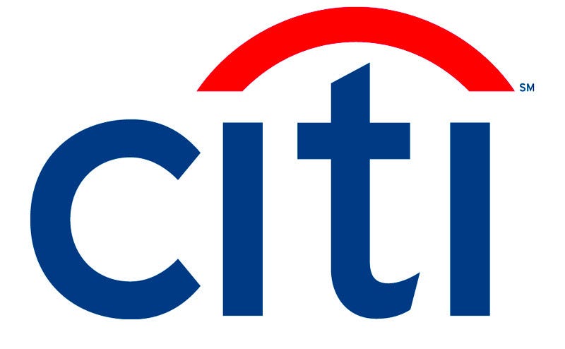
Image of CitiBank logoScher was also known for designing the CitiBank logo.
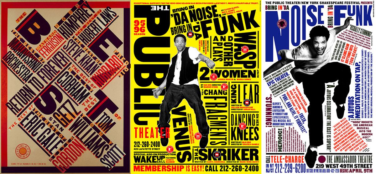
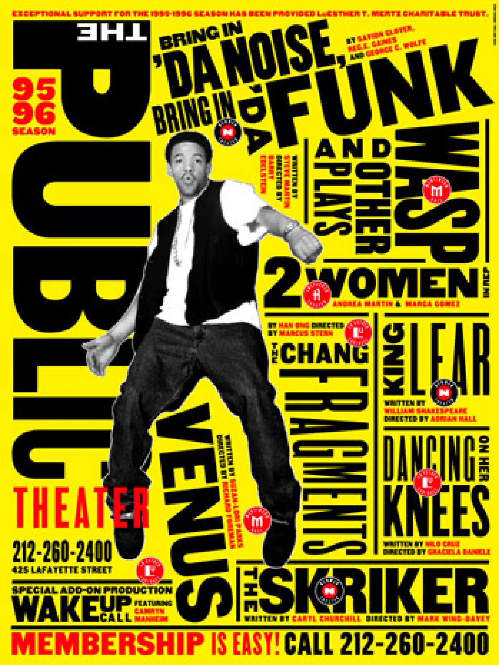
Image of promotional graphics system for The Public Theatre
She was also known for her works for The Public Theatre in 1994. Tasked with the challenge of raising public awareness and attendance, along with trying to appeal to a more diverse crowd, Scher managed to create a programme that was said to have become the “turning point of identity in designs that influence much of the graphic design created for theatrical promotion and for cultural institutions in general”. She did so by creating a graphic language that “reflected street typography” and “graffiti-like juxtaposition”.
Learning Points
A takeaway I got from briefly looking at Paula Scher’s works was her use of contrast. I found the idea of how she took aesthetics commonly associated with the subject and completely going the opposite direction with the final product especially bold and interesting (especially what she did with her collateral for The Public Theatre). What resulted was something that was considered both groundbreaking and a reincarnation of old design principles.
I also found her use of bold colours and unconventional layout of text very eye-catching and intriguing (especially in her works for Atlantic Records). The placement of the text helps create movement, and just adds an overall energetic and vibrant feel to the artwork.
I think Paula Scher’s versatility as a designer is also very inspiring; it’s interesting to see how she’s able to cater to a vast range of different clients from prim and proper big names to more underground and “street” brands – she is able to create slick and clean-cut designs, as well as grungy and energetic-looking typeface layouts.
After having an in-depth look into the anatomy of type, I have a better idea of what to look out for when analysing a certain font, and the criteria to set when selecting fonts for a piece of design. Additionally, the reading helped to clear some of the doubts I had about typography terms. For some reason, I kept thinking typefaces and fonts were the same thing, but now I have a clearer idea of the two and I most likely would be able to tell them apart in future! Most likely.
Typeface: The design of the letterforms / (Digital) The visual design
Font: Delivery mechanism / (Digital) The software that allows you to install, access, and output the design
Overall, as a beginner in typography, and it being one of my weaker elements of design, the reading allowed me to have a clearer view on how to integrate typefaces into the design pieces (and at the same time, making them visually appealing and complementary to the other visual elements). It also helped me in familiarising important terms, as well as what to refrain from doing in future!