

My Life in Typefaces
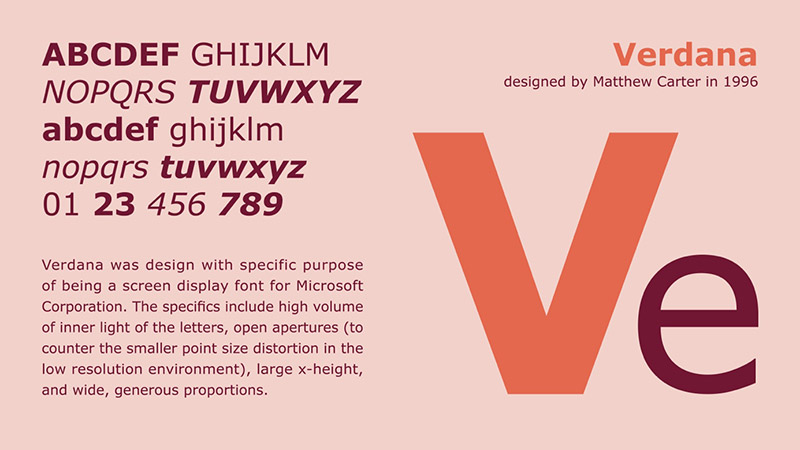
As a clueless individual in the field of Typography, it is always an eye-opening and inspiring experience to learn more about the hard work and painstaking efforts put in by type designers in creating groups of typefaces both for traditional and digital use. Matthew Carter is an extraordinary figure! Not only did he design some of the most recognised typefaces – namely, Snell Roundhand, Elephant, and Bell Centennial – but, he also had a hand in creating typefaces for practical uses (Olympian for newspaper text and Bell Centennial for US telephone directories).

Watching the TEDTalk allowed me to have a wider perspective in the processes that go into creating typefaces. Matthew Carter’s efforts in Bitstream Inc. and his collaborative efforts with Microsoft opened my eyes to screen-based fonts and the different considerations that go into the transition from hand drawn to digital typefaces. Reflecting on the points Matthew Carter brought up on the relevance of maximising legibility of screen-based fonts – in my opinion, although it may not be as relevant today, it did raise the bar for the standard of screen-based fonts and how people perceive them (and working hand-in-hand in creating better screen displays), as well as carrying the whole practice of typography into the digital age.
So I really thank Matthew Carter for his hard work and efforts!