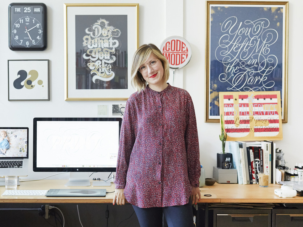
Uping Your Type Game, Jessica Hische
Points discussed
- Don’t have a favourite font, have a favourite type designer
- Choosing the right type:
- Does it come in a variety of weights? (Flexibility, more colour choices, reversing type)
- Does it have a nice x-height?
- Does it have a true italic?
- Is it a typeface I’d want to hang out with? (Typefaces have personalities, finding the right personality balance)
- Is it spaced well? (Tightly spaced)
- Does it have even colour?(Making little micro adjustments to the letters to make sure that they don’t feel optically heavier at the joins)
- What width or widths do I need? (Difference in letter width between different “regular” width typefaces) – If you’re designing a website with narrow text columns, you might want to pick a typeface whose regular width is a little on the narrow side so you can get more words on each line without having to scale text down – Choose typefaces that lend a hand in getting the right amount of words on a line
- If it’s a sans, is there enough letter variety?
- Where do I find good type?: Hosted web fonts, self-hosted web fonts, common web fonts services (typekit, webtype, font deck, fonts.com, webINK, MyFonts, Google Web Fonts)
- Thinking Conceptually:
- Defining the mood, read the content, write down key points and visual cues, but also all the weird random stuff that pops into your head
- Establishing Historical Context
- Pairing Typefaces: Unexpected combinations that lead to beautiful and harmonious results
- Choose a Super-Family
- Choose typefaces from the same type designer
- Choose typefaces with similar characteristics
- Don’t be afraid to experiment
In Jessica Hische’s article, Uping Your Type Game, she gives an in-depth discussion on type designers, and provides steps and pointers in creating better design pieces with suitable typefaces. She also suggests having a broader perspective on typeface design by looking more into fonts by type designers (e.g. not having a favourite font, but rather a favourite type designer), working with fonts of super-families, and experimenting.
Reading the article did give me better insight into the elements to consider when choosing the appropriate typeface or when pairing fonts together. Taking into consideration characteristics such as the weights, x-heights, and the type in its true italic form, helps to determine the typeface’s ability to bring the final design further. In addition to discussing the elements to consider when choosing appropriate typefaces, Hische also provides suggestions on websites to visit when looking into different fonts.
In general, I feel that the article provided a good perspective on what determines good and suitable typefaces we should integrate into our designs. However, with regards to the points she raised on using fonts that belong to super-families and fonts with larger x-heights, it may be a bit rigid in just sticking to using more established fonts. The article seems like it is geared towards using more minimal fonts as opposed to fanciful or decorative fonts. Therefore, it may not be the best to stick to these rules when experimenting as it disregards more fanciful fonts or even less well-known fonts that do not belong to any super-families. When experimenting, or even considering the final outcome of the design piece, I feel that it is more important in utilising a range of fonts, including more decorative ones, then just sticking to the more established few.


