
Type in the Wild
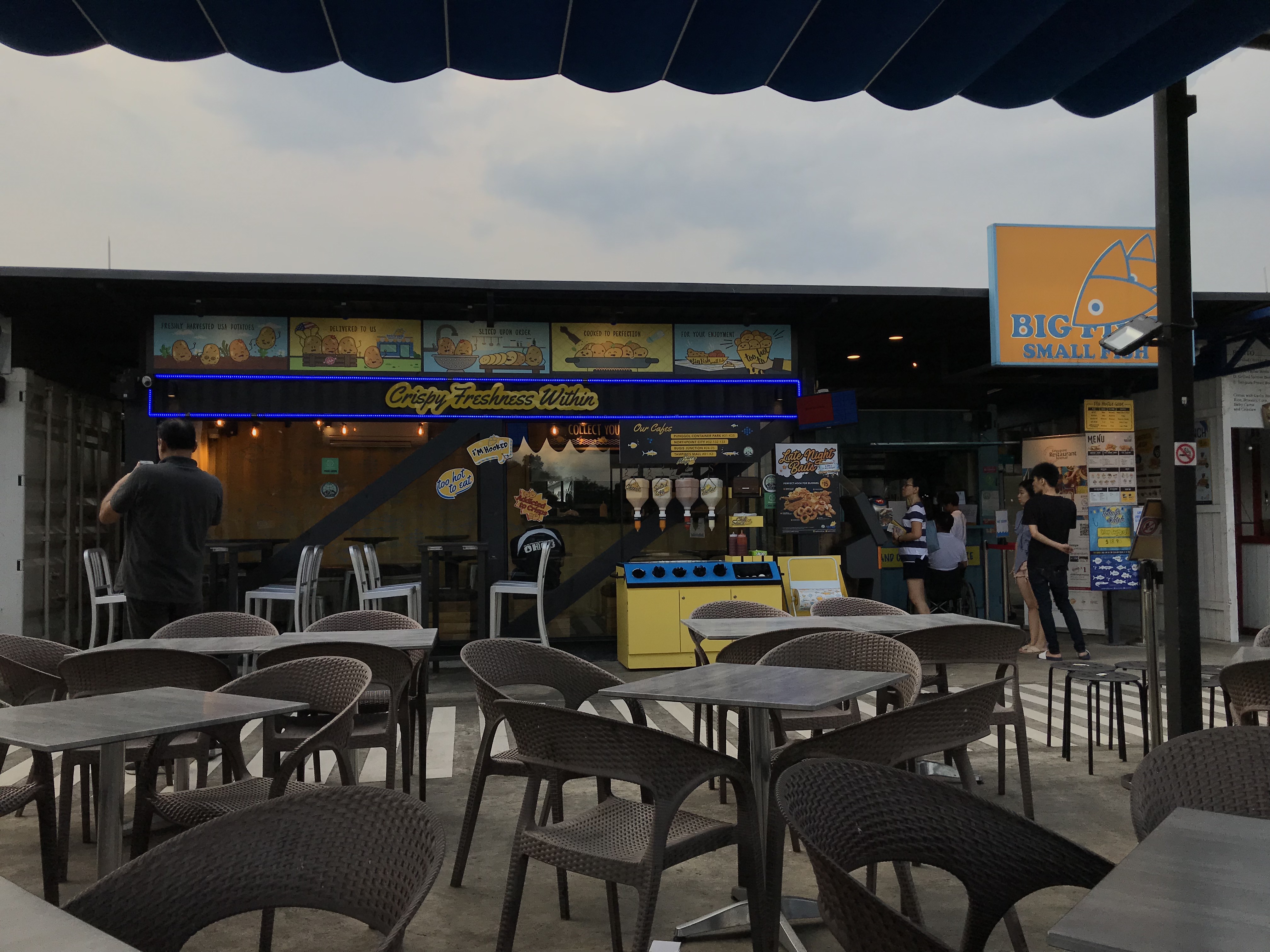
A place I recently visited for the first time was the container park at Punggol, near the Punggol Waterway Park. It is a small area with brightly-coloured shipping container-like shops that house a variety of dining and bar options. Since it just rained, the weather was windy and cool so I didn’t mind having my lunch at 5pm.
Type At Big Fish Small Fish
One of the eateries that caught my eye was Big Fish Small Fish, mainly because of its bright blue and yellow colour scheme, but also their use of many different fonts. As it seemed like a trendy restaurant catered to a younger demographic (since they primarily sell fried food items), it made sense to use bright colours and blends of fanciful and handwritten-like fonts.
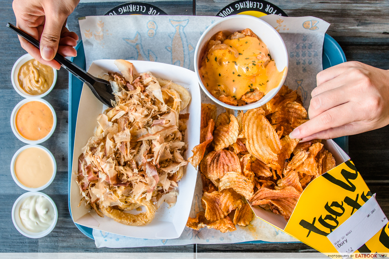
Examples of type can be found throughout the establishment – on menus, promotional posters, signboards, wrappers, and labels. Interestingly, every other piece of collateral had different combinations of typefaces.
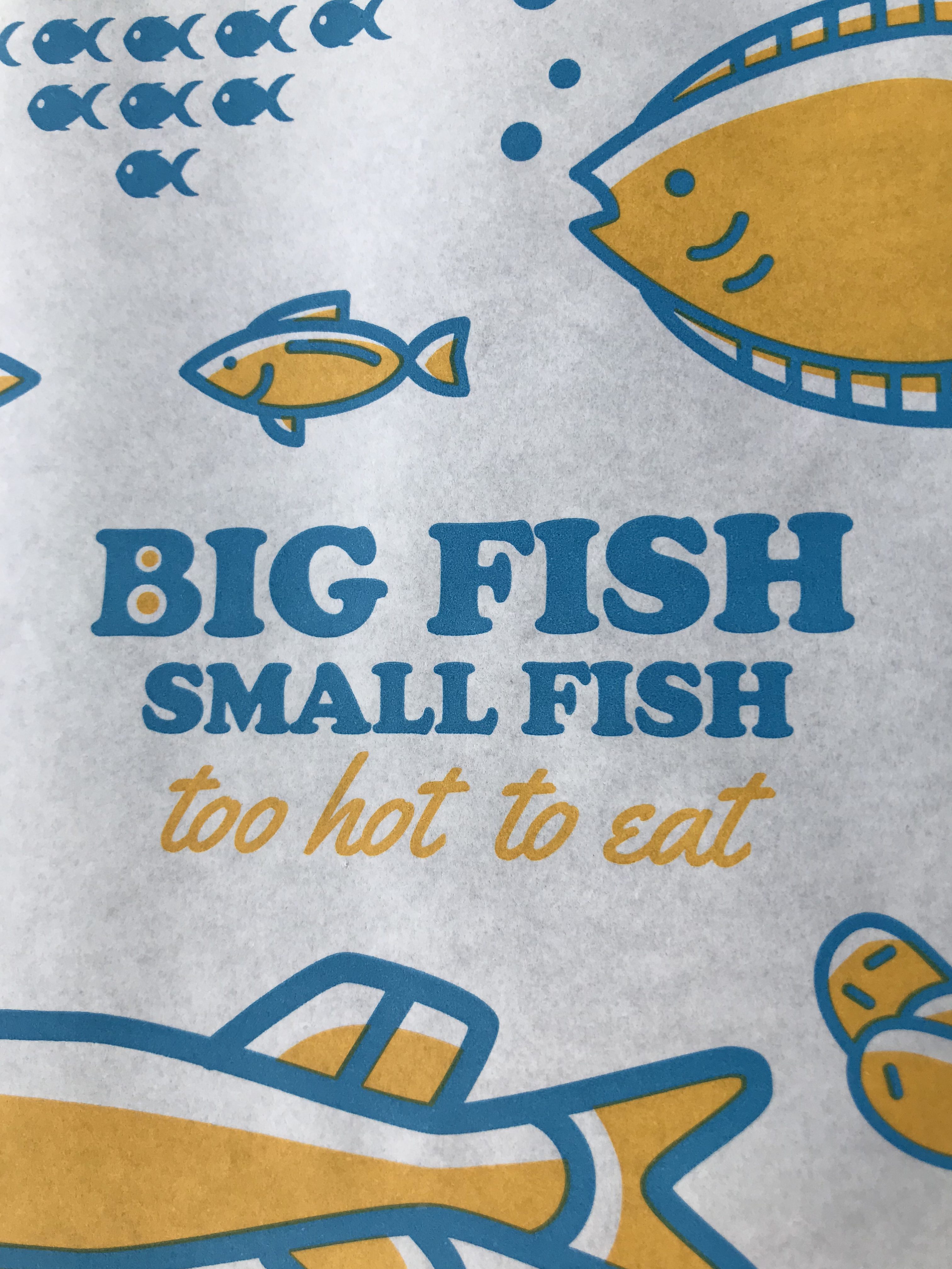
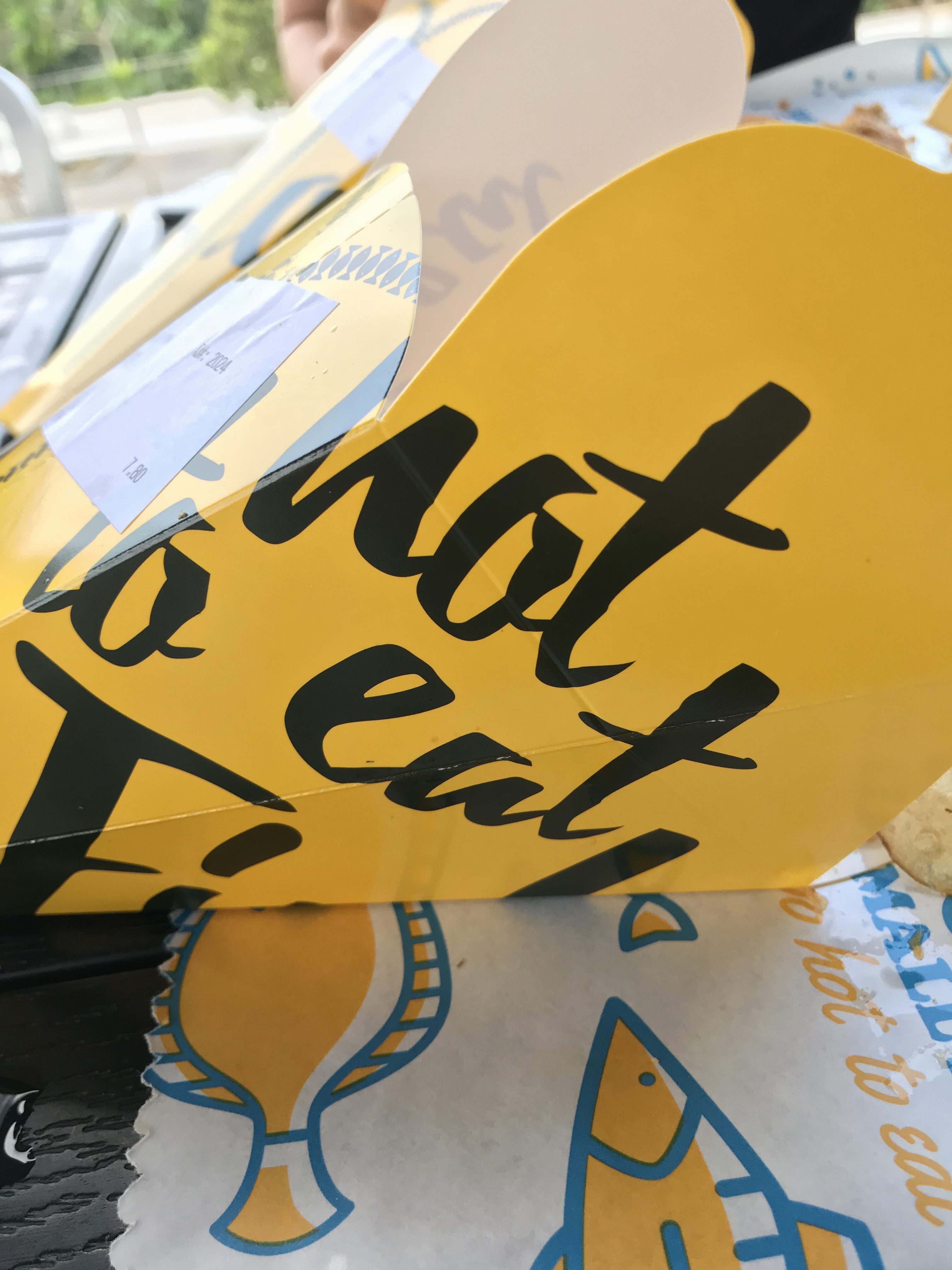
Each packaging item has a different typeface, and they vary quite a bit – the name of the place is displayed using serif fonts (slab serif) while slogans are typically italicised or cursive. The placement of the words also varies with each packaging – the most notable being the placemats, where the two typefaces are centralised and accompanied by illustrations, compared to the holder, where the typeface encompasses most of the surface space.
Positive
- The use of slab serif fonts is eye-catching and seems to suit the trendy and hip atmosphere of the place. It also seems more youthful and light-hearted, which suits their target demographic.
- The use of cursive fonts adds an overall casual and laid-back feel to the slogan and seems appropriate for what the slogan is saying.
Negative
- The use of different typefaces all at once is a little jarring, especially when coupled with a bright colour scheme.
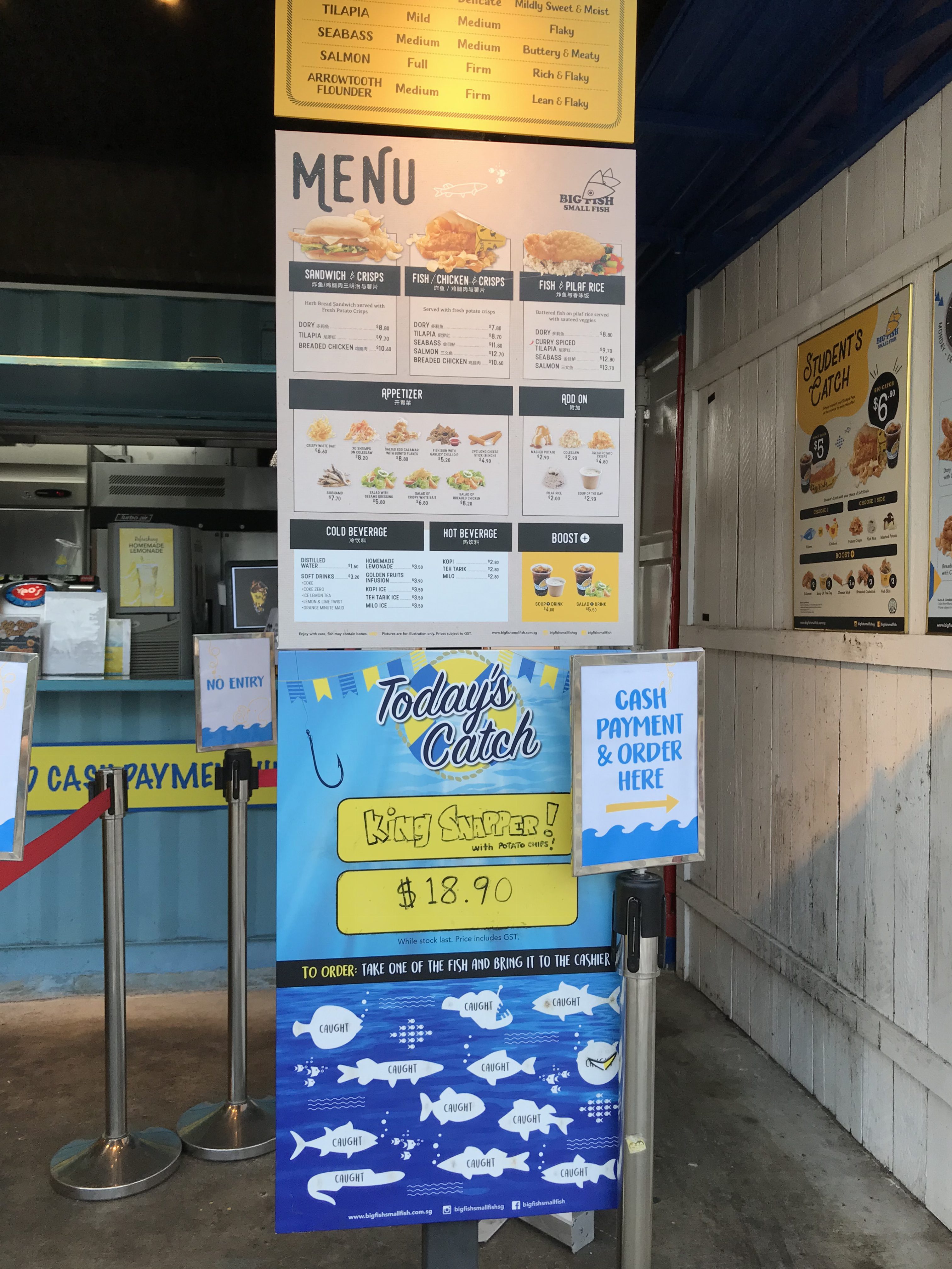
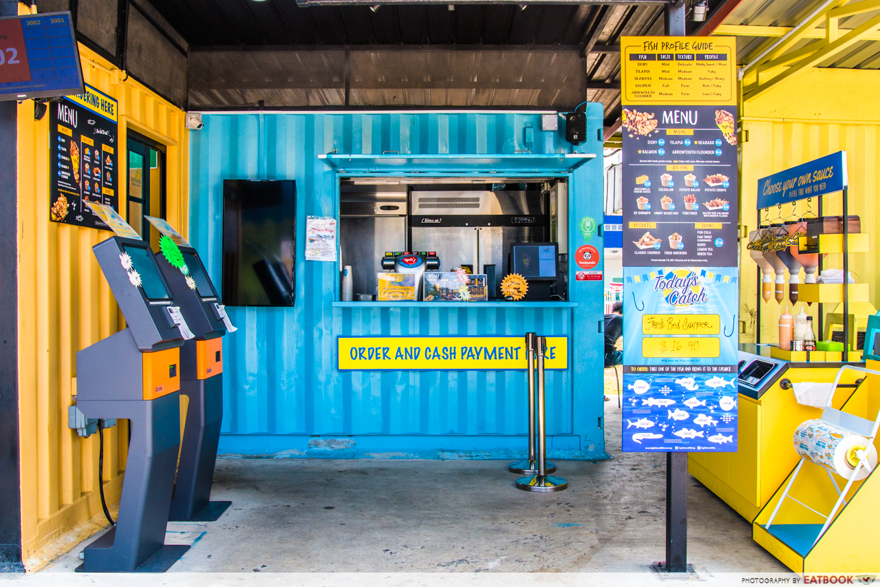
Similar to the food packaging, the eatery’s signboards and posters also use combinations of different typefaces. Instead of decorative slogans, the content displayed here is informative and more extensive – for this, sans serif fonts were primarily used (accompanied by cursive title fonts and one or two lines of serif fonts). Additionally, the sans serif fonts still hold hints of humanist structures.
Positive
- The use of sans serif fonts is suitable for menus as it allows for easy readability, as well as being visually appealing, especially in its case where blocks of information have to be conveyed to viewers.
- The use of cursive fonts as titles accompanied with sans serif fonts is eye-catching and at the same time, not too gaudy.
Negative
- The extensive use of a narrow, handwritten font (as labels for different fishes in the Today’s Catch poster) is not very visually appealing. It seems to work better for short sentences as opposed to labels in a smaller space.
References
Big Fish Small Fish Review: Fish And Chips With A Variety Of Sauces At $6.90 Nett At Punggol