
About the Typographer

Herb Lubalin was an American graphic designer. Sometimes referred to as the ‘king of typography’, he was most known for his collaborations with Ralph Ginzburg on three of Ginzburg’s magazines: Eros, Fact, and Avant Garde, as well as the typeface Avant Garde. He also founded the International Typeface Corporation (ITC).
Considered one of the most ‘successful art directors of the 20th century’, Lubalin was on a constant search for ‘something new’, with ‘a passion for inventiveness’. ‘Constantly working and achieving much success throughout his career, at the age of 59, he proclaimed ‘I have just completed my internship”.
His Works
Ginzburg magazines
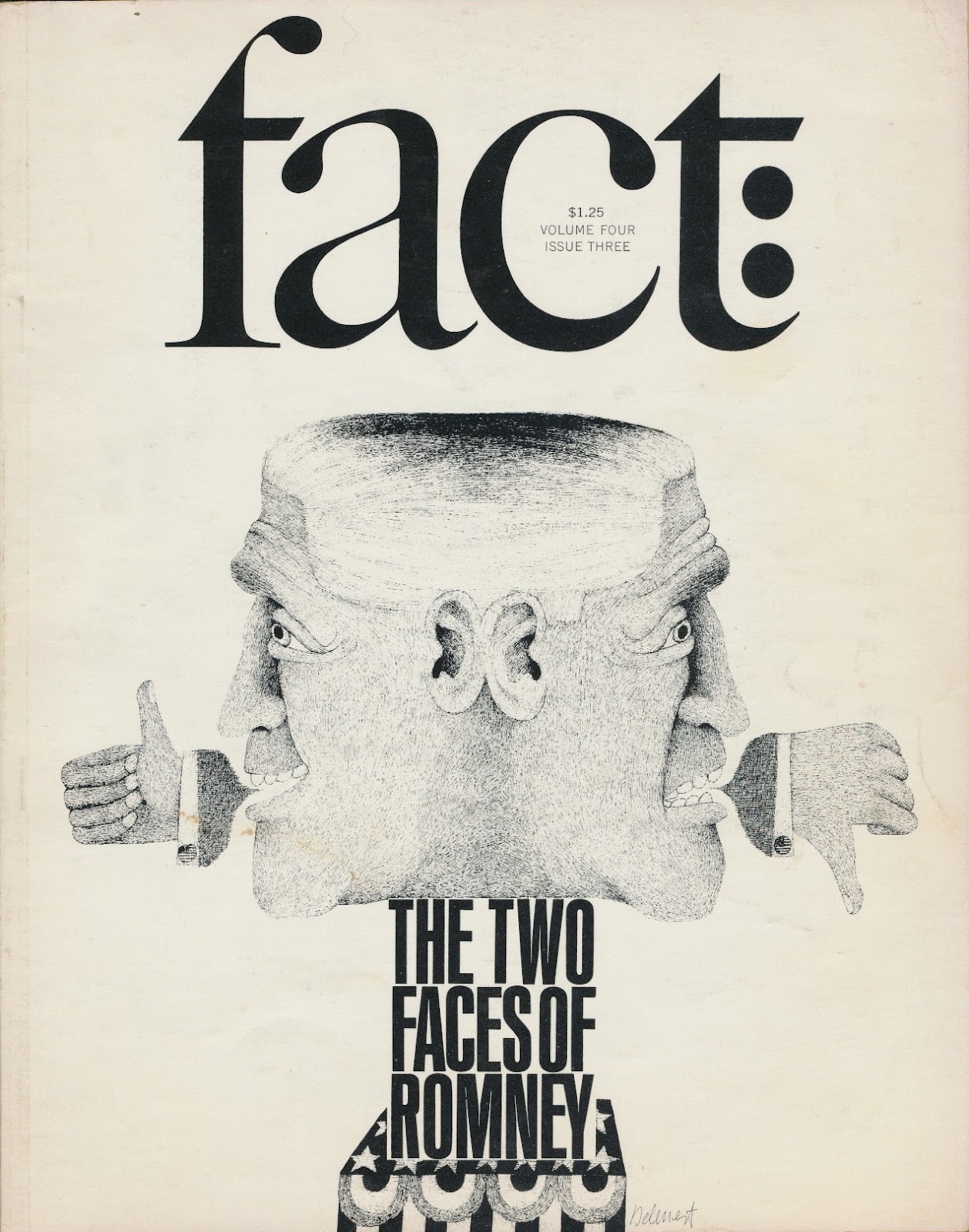
First launching Eros, which was dedicated to ‘beauty and emerging sense of sexuality in the burgeoning counterculture’, followed by Fact (it being spiced up issues instead of sugar-coated pieces like in Reader’s Digest), Lubalin’s editorial design for the magazine is considered ‘one of the brilliant of its kind’. Eros featured ‘a large format’ with ‘no advertisement’, while Fact had an ‘elegant design’ with ‘minimalist palette, based on dynamic serifed typography and exquisite illustrations’.
The magazines were also said to have showcased his artistic skills as he ‘brought out the creative visual beauty of these publications’.
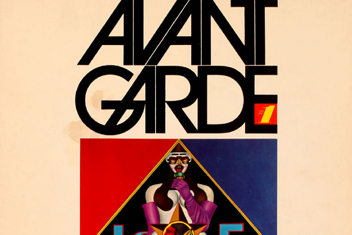
avant-garde typeface

Following the release of the Avant Garde magazine, Lubalin created the ITC Avant Garde typeface to meet the demand for a complete typesetting of the logo. However, it was widely misunderstood and misused in poorly thought-out solutions, eventually becoming a stereotypical ‘1970s’ font, said to have a ‘flawed Futura-esque face’. Despite this, Lubalin’s original magazine logo was and remains highly influential in typographic design.
Learning Points

- Looking more into Herb Lubalin’s typographic designs, I was inspired by how he managed to tweak the physical characteristics of each typeface to form a graphic or complement another image.
- Herb Lubalin’s typographic designs also demonstrated experimentation with kerning and the overall layout of the typeface. He showed that using the type alone could make a layout seem more exciting but at the same time, remain structured and harmonious.
References
http://www.designishistory.com/1960/herb-lubalin/
http://www.famousgraphicdesigners.org/herb-lubalin
http://www.historygraphicdesign.com/the-age-of-information/the-new-york-school/681-herb-lubalin