
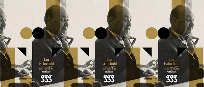
Jan Tschichold
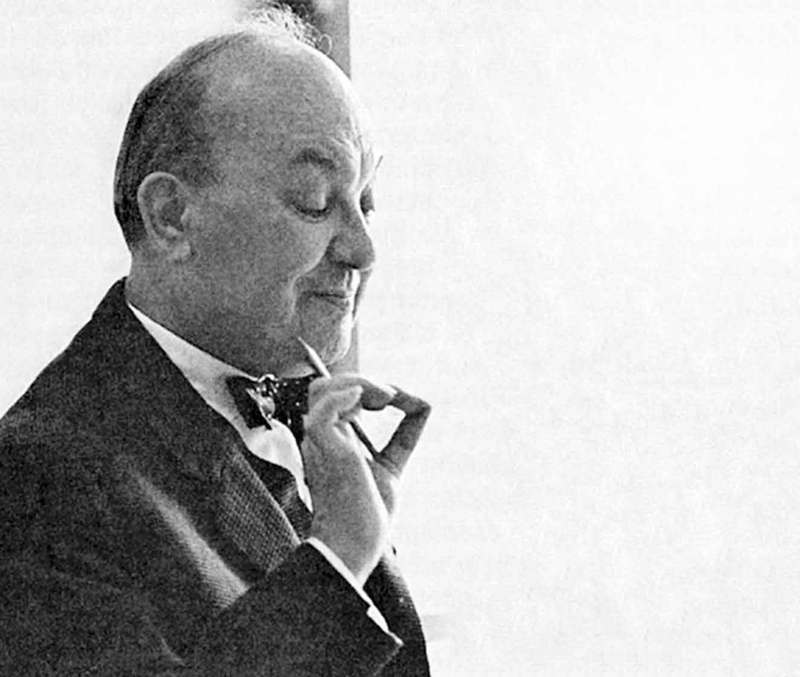
Image of Jan Tschichold
About The Artist
Jan Tschihold is a highly-influential typographer, playing an important role in the development of graphic design in the 20th century; he was most known for ‘strongly advocating the beauty of sans serif fonts’, cleaning and organising design ahead of its time by ‘developing and promoting principles of typographic modernism’, and designing Penguin books, turning them into ‘something special’.
Works
I. Sabon
Inspired by Jakob Sabon’s and Conrad Berner’s Garamond, Tschichold created Sabon, a variation of the aforementioned Garamond typeface.

Designed to be used in available printing techniques of that time, Sabon was a result of Tschichold’s efforts of taking Garamond and standardising its construction by removing historic typefaces anomalies, making it more ‘economical’ and ‘narrower’. As a result, Sabon eventually became one of the ‘handsomest contemporary interpretations’ of Garamond.
II. Page Canons
Tschichold also developed a system of page harmony that is still relevant today. Establishing the 2:3 ratio rule, where he expresses that ‘the key to this positioning of the type area is the division into nine pans of both the width and height of the page’.
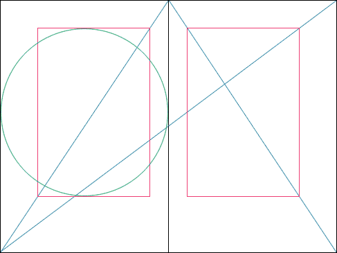
This ratio can be applied to a variety of layouts including magazine spreads, annual reports, and illustrated title pages.
Learning Points & opinions
As I’m not very well-versed in Typography, it often slips my mind that fonts are typically products of designers’ painstaking efforts, rather than something easily generated by computers. Therefore, after reading more about Jan Tschichold, I was quite blown away by his works and the influences he created in the design world that still hold up till this day.
Some of my learning points include:
- The Sabon font and how it came to be
- Technical formulae in creating visually-pleasing page layouts
- A brief insight into the development of graphic design in the 20th century, especially its more important milestones (i.e. the development of typographic modernism)
When familiarising with his works, I was quite intrigued by the structure of the Sabon typeface. In addition to it being regarded as one of the more ‘beautiful’ and ‘handsome’ variations of the Garamond font, I feel that, with its clean structure with serif strokes shows a blend of vintage and modern, making it versatile in many areas of design (but maybe towards a more high-end brand), and timeless. The page canons, on the other hand, are an interesting insight into page layout; I never knew that the placement of text and images required math and ratios. The ratios seem to be very ahead of their time and although they seem rather rigid at first, they are versatile in their ability to be applied to a variety of layouts including magazine spreads and reports, even to this day.


In conclusion, it’s really inspiring to learn more about how prominent figures, like Jan Tschichold, continue to influence graphic design by establishing principles and elements that hold a highly-regarded position after many, many decades!