
About the Typographer
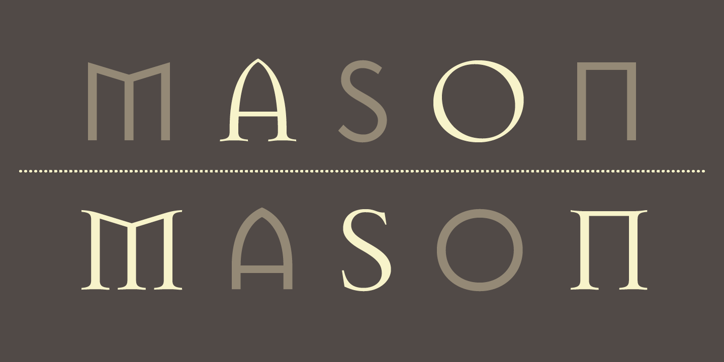
Jonathan Barnbrook is a recognised contemporary graphic designer, typographer, and filmmaker. Deemed as one of the UK’s most active designers, Barnbrook is most known for his work in typography, where he created the famous “Mason”, and the “Priori” typeface which was used in the iconic 2002 David Bowie album, Heathen, which he designed as well.
His works are said to combine “originality, wit, political savvy and bitter irony in equal measures”. He is also considered a pioneer of “graphic design with a social conscience”, where he “makes strong statements” about issues such as “corporate culture, consumerism, war and international politics”.
His Works
I. Album Works

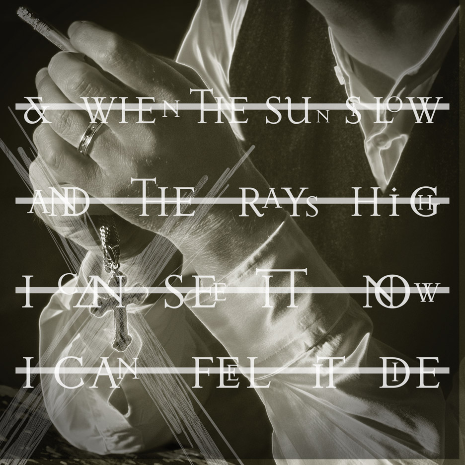
In 2002, Barnbrook produced the album cover for Heathen by David Bowie. In this particular cover, he incorporated his “Priori” typeface, during which was his first time using the font for commercial purposes. Bowie then requested Barnbrook to design cover art for other albums including Reality and The Next Day (both of which hold “rather controversial reputation”).
II. Typography

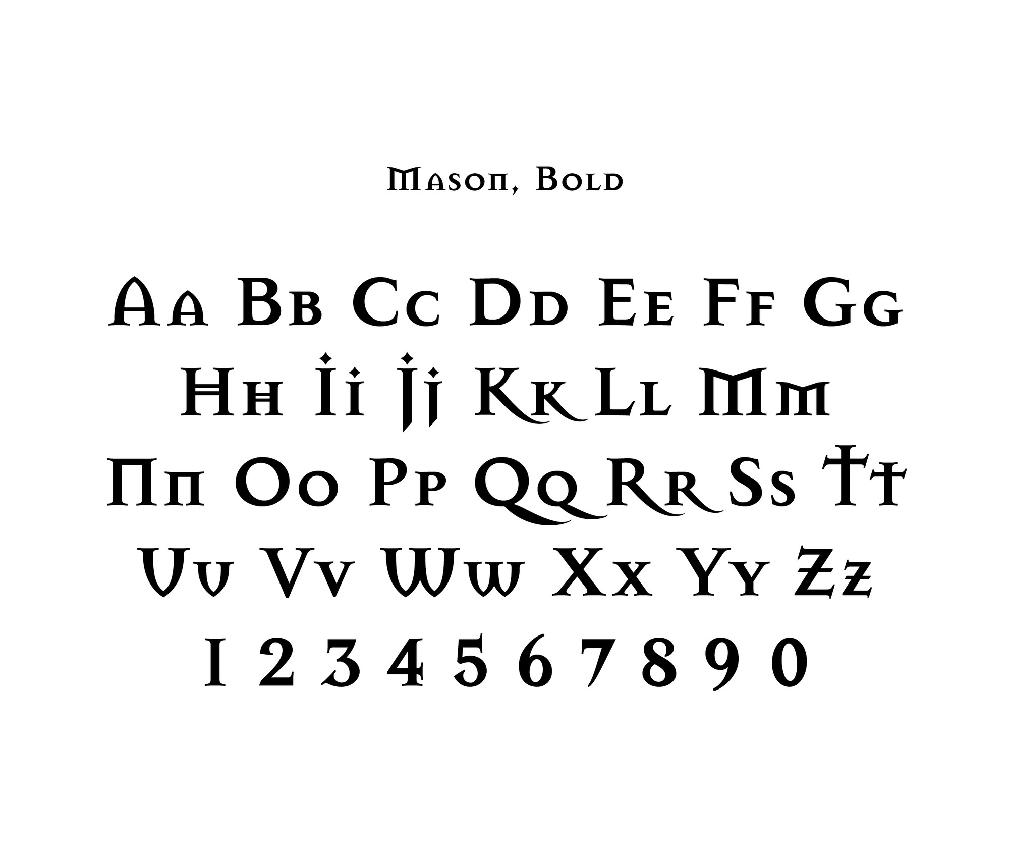
Barnbrook was also known for his range of fonts including False Idol, Exocet, Newspeak, Awe, Infidel, Sarcastic, Shock, and Moron. These fonts have “emotive and controversial titles”. Furthermore, he has collaborated with artist Damien Hirst on the book “I want to spend the rest of my life everywhere with everyone, one to one always, forever now”, in addition to “Typography Now Two” and various advertising campaigns.
Learning Points
- Looking at the fonts that Jonathan Barnbrook created, I really liked how he managed to create unique typefaces that embody personalities and moods, but at the same time, refrain from looking too tacky. This makes for easy readability that is both unique (and different from today’s modern-looking fonts) but remains visually-pleasing to the eye.
- I also found it interesting how he weaves external influences, political issues for example, into his typefaces. The inclusion of little extra details such as adding extra strokes and making rounded letters more geometric by straightening curves allows for the typeface to look more unique, and conveys a concept. Doing so may also help a piece of design work better convey its intended message or mood.
References
https://designmuseum.org/designers/jonathan-barnbrook
https://www.fontshop.com/designers/jonathan-barnbrook
http://www.famousgraphicdesigners.org/jonathan-barnbrook