

About the Typographer
An influential figure in the field of typography, Massimo Vignelli has been practising design in New York for nearly 50 years. Steadfastly maintaining a ‘Modernist’ approach to design problems, he has made a significant impact on all forms of design, from graphic design to furniture and clothing. In addition to heading Unimark International, one of the world’s largest design studios, Vignelli also designed identities for major corporations such as American Airlines, Bloomingdales, and Knoll. Today, his work can be seen all over the world, with collections in museums such as the Museum of Modern Art, the Metropolitan Museum of Art, and the Cooper-Hewitt Museum.
His Works
New York city subway map
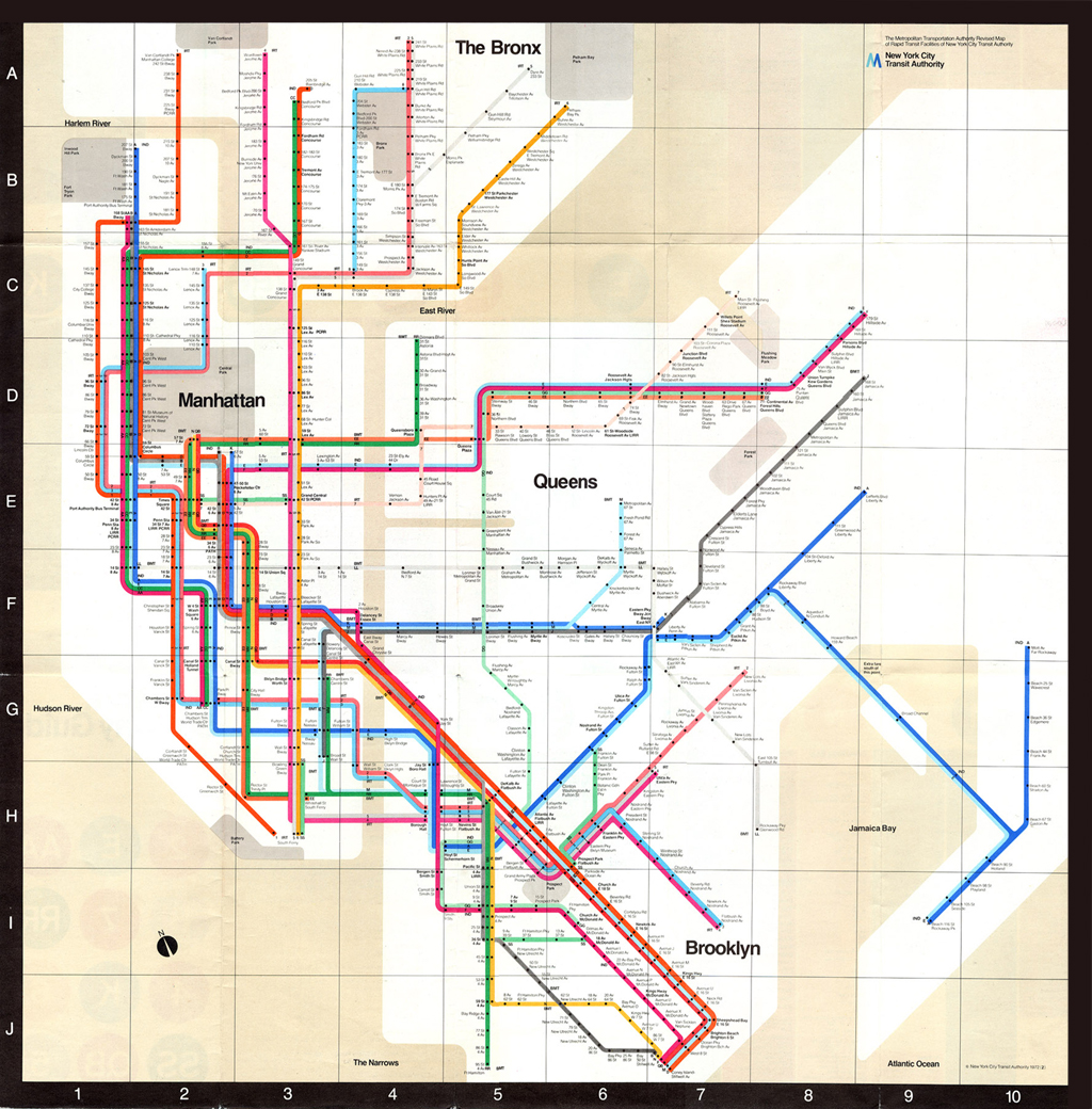
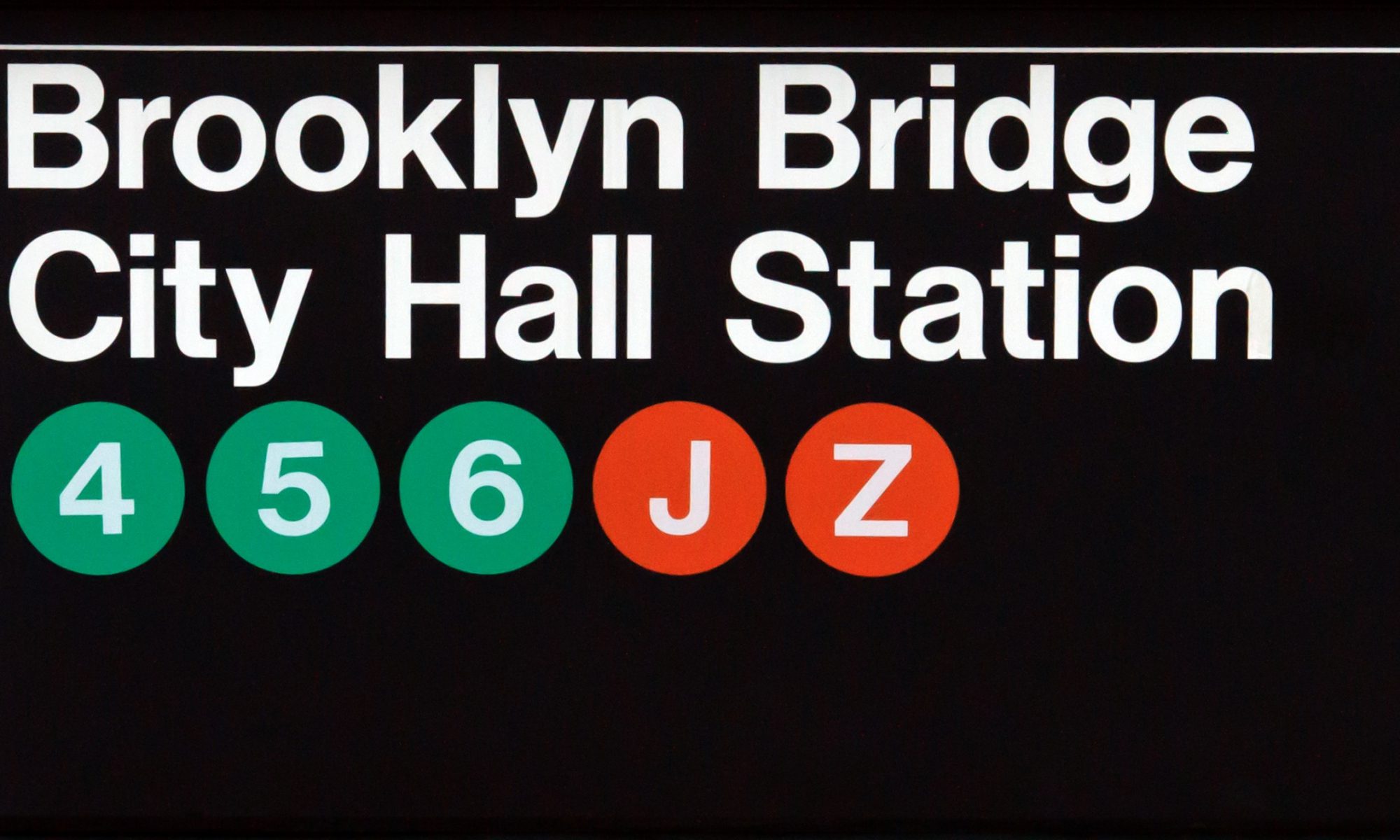
One of Vignelli’s most iconic and proudest works involves the design of the New York City Subway map, and on the walls of subway stations; it is said to be a ‘landmark in Modernist information design’.

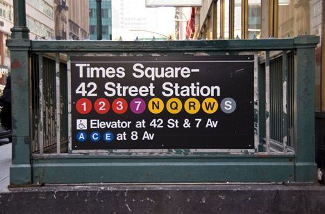
Before Vignelli stepped in, the subway station had a ‘conglomeration of assorted visual styles’, resulting in a ‘flawed user experience’. And with the rising popularity of graphic design standards, corporate identity, and a growing public awareness of good design, it was time the subway needed a new visual identity and effective navigational system.

Assigned to Unimark, Vignelli and his team conducted in-depth research into the user experience from The New York City Transit Authority Graphics Standards Manual (1970), with the intention of implementing a system that was ‘seamless, intelligent, and reproducible while withstanding human error’.
What followed was an iconic piece of work in the history of graphic design with a mixed reception: ‘adoration from the design community, and kickback from native New Yorkers, who were expecting a geographically correct map rather than a modernist schematic layout’.
Learning Points
After learning more about Massimo Vignelli’s works, I gained more insight into the graphic design field on a global stage. I was really inspired about his iconic contributions and how his legacy continues to live on after his passing. When researching more about his reinvention of the New York City Subway visual identity, I realised that his approach to user experience and awareness was important and applicable, especially when creating graphics for clients.
Vignelli also had a ‘Modernist’ approach to his designs, and personally, I found them visually appealing. Having a ‘Modernist’ identity in works, in my opinion, allows for easy readability and understanding. Minimalist graphics are also versatile, and can easily be applied to different cases. However, with modern style graphics becoming increasingly popular and widely used, they can come across quite boring and simple! I think it will be interesting to see a bridge between modern style graphics and decorative fonts in future.