PROJECT: SIMPANG // FINAL

Presenting my final work! MY OWN PERSONAL ZINE:

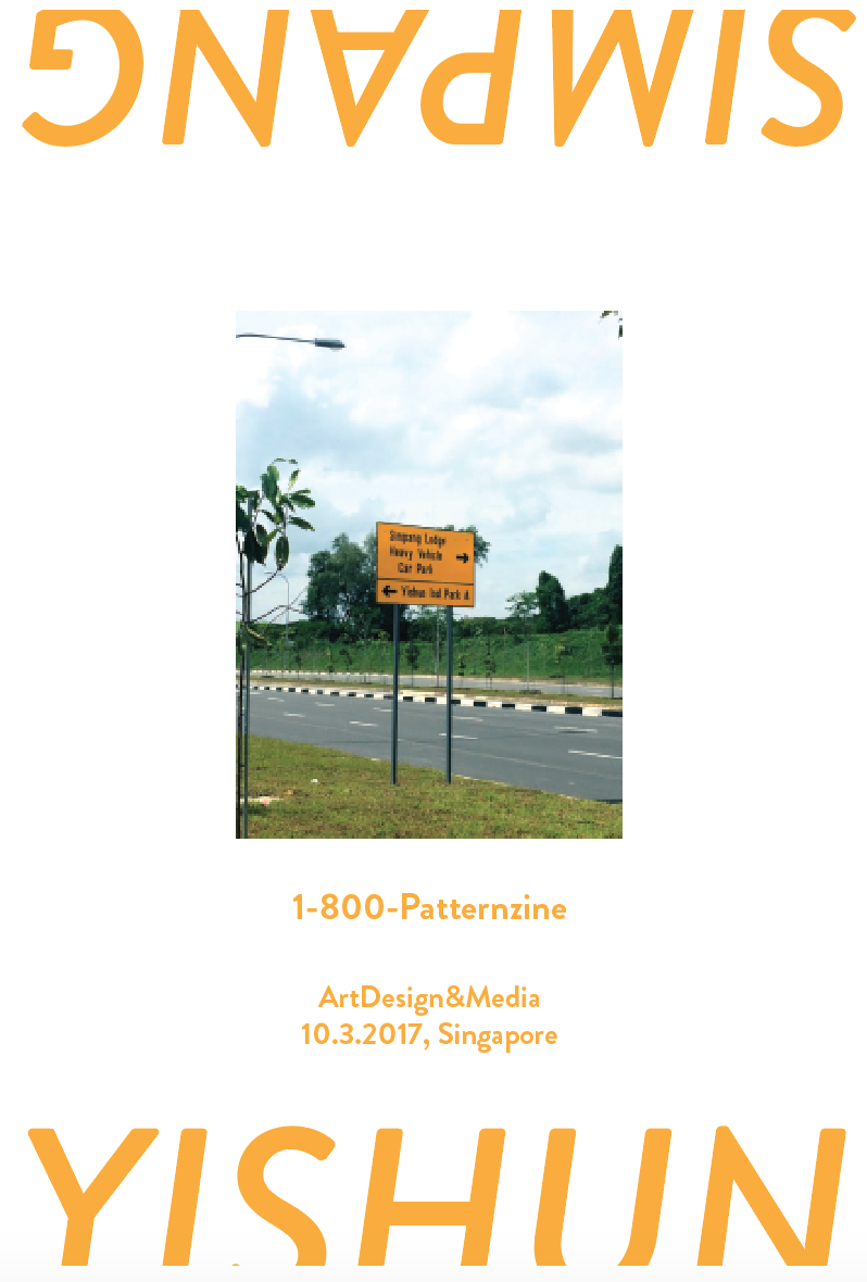
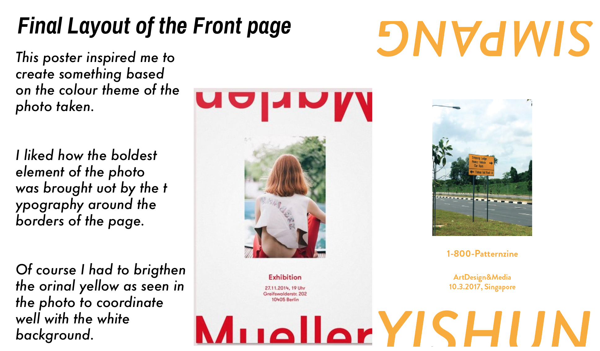
This is my front page: and I elaborated it in the Process.


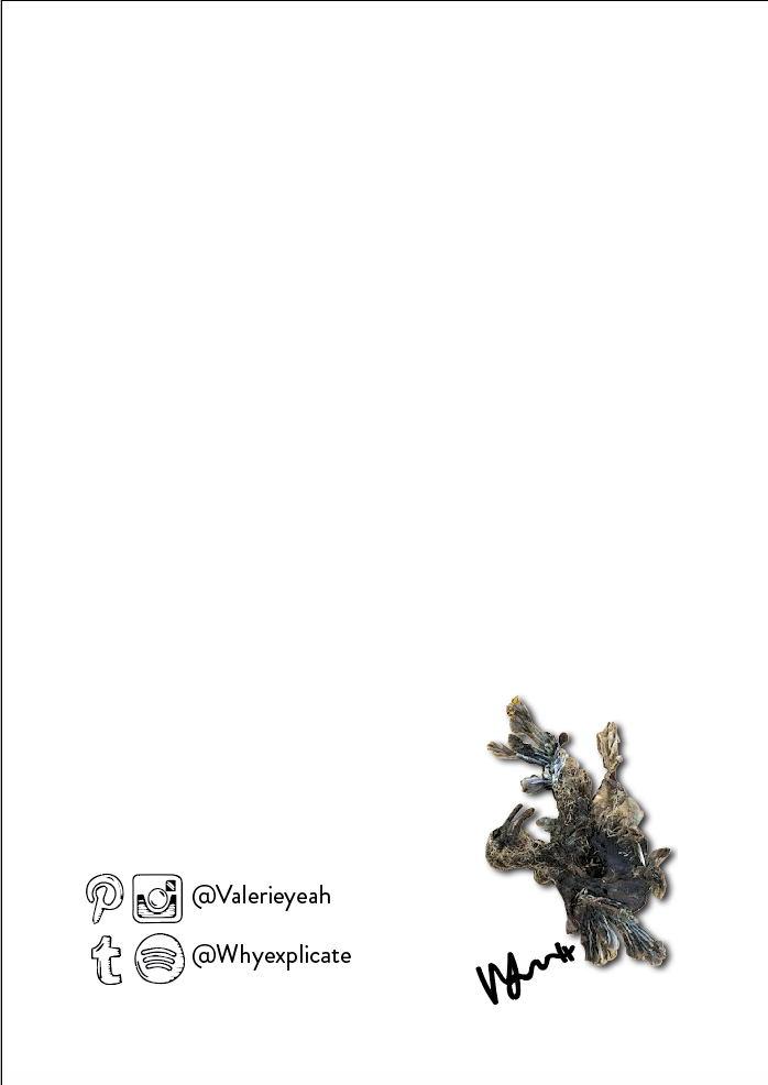
As advised by Shirley, the last page’s bird is there as it was one of the closest thing to life other than the plants and my limbs that day.

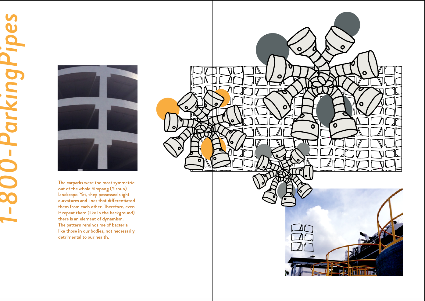
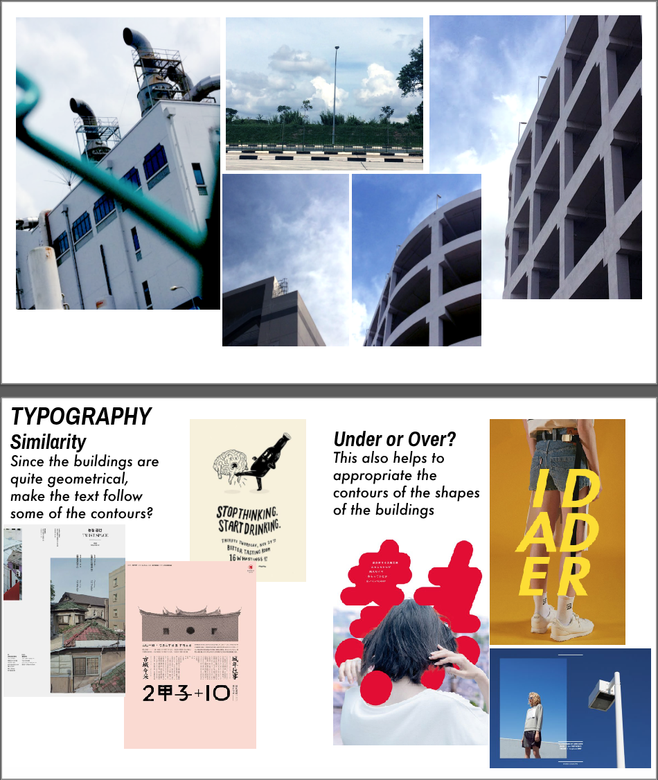
This runs through to why I chose to caption my pages/spreads as
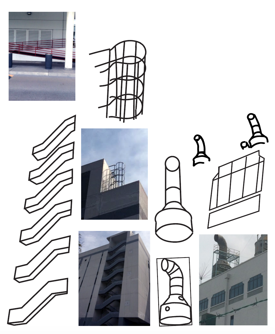
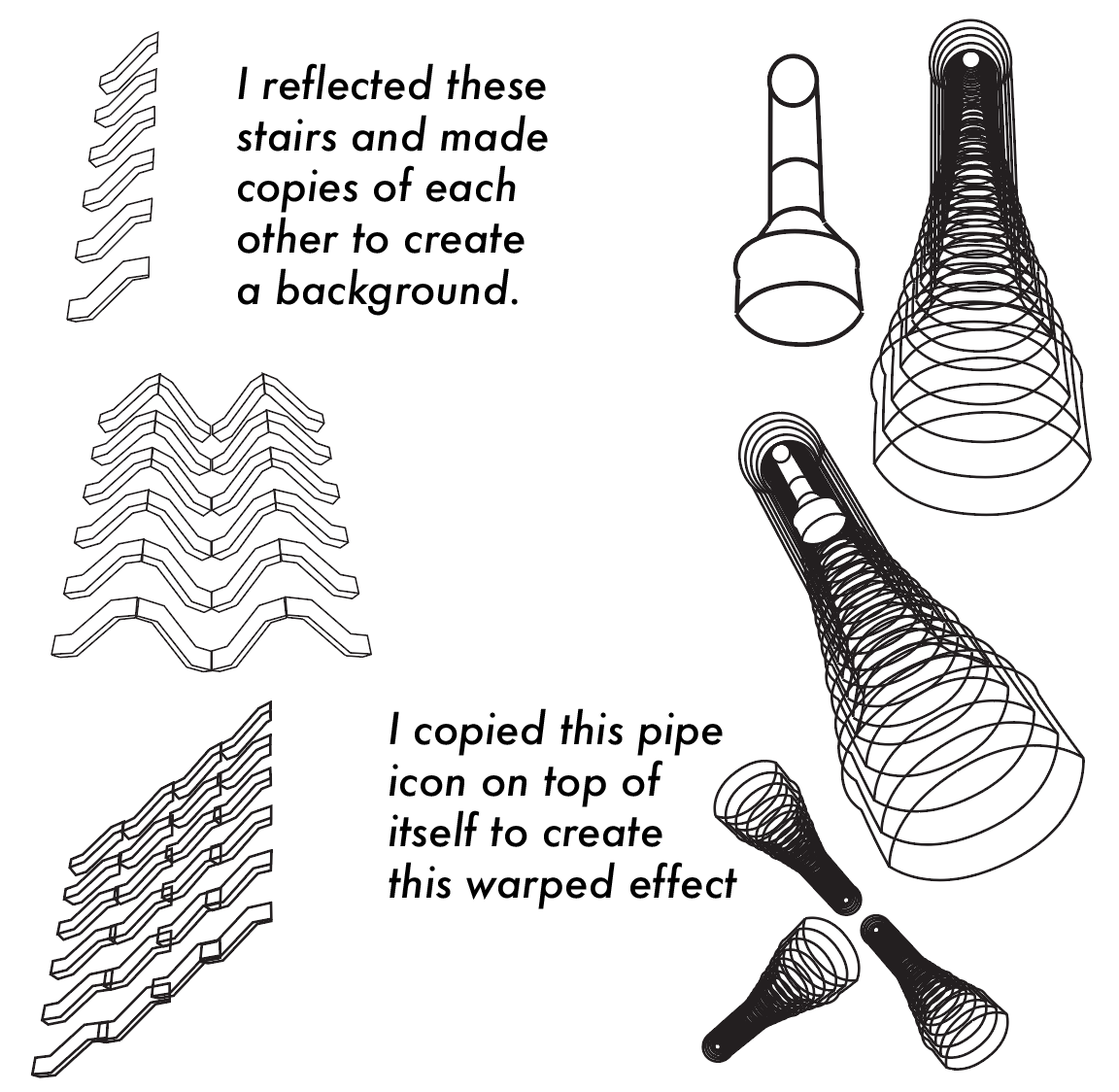
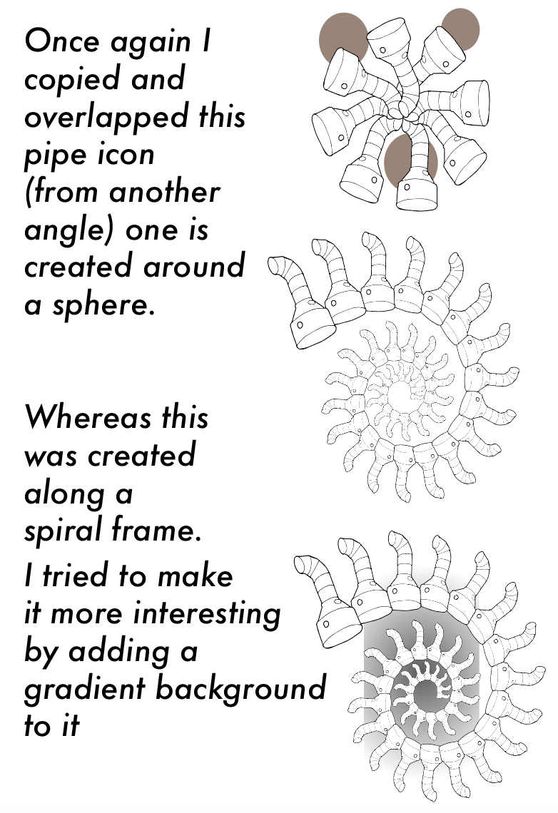
  1. 1-800-ParkingPipes
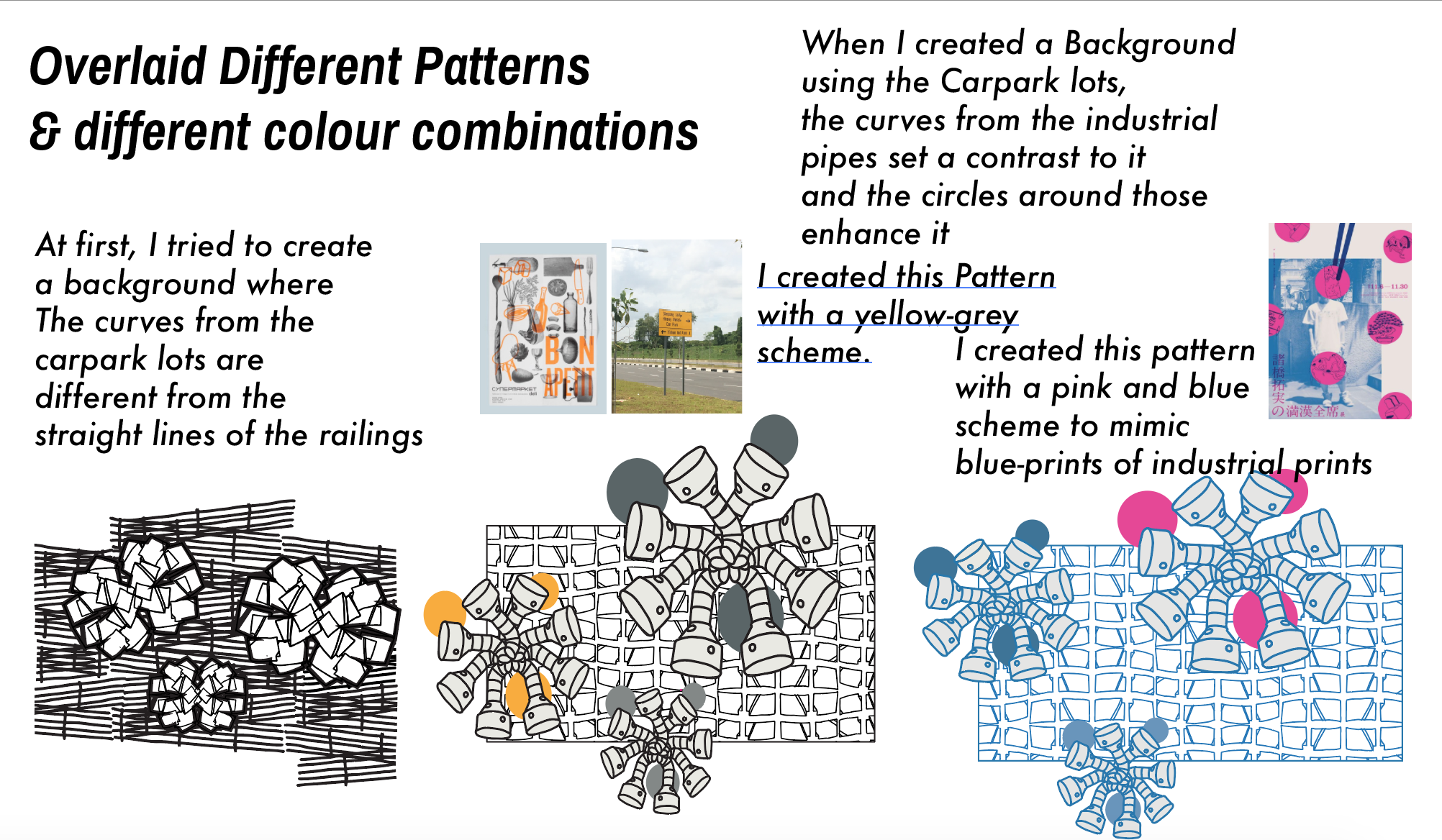
  2. 1-800-RailingWindows
  3. 1-800-Piper’sStairs

and finally the title 1-800-PatternZine.

HAHA I find out that I keep wanting to make puns out of everything.

Why 1-800- you may ask? This is to follow the industrial theme of the zine. It is also because my phone was the only thing responding to me at that point in time. It would be fitting to put the titles as hotlines and have the titles suggest the subject matter of the particular spread.

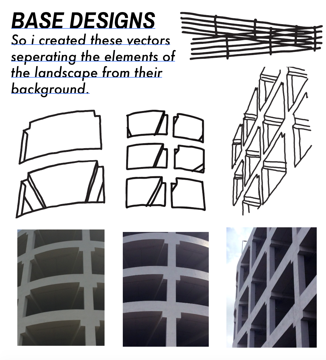
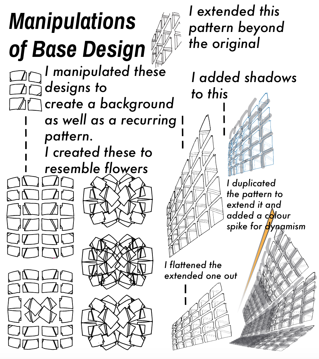
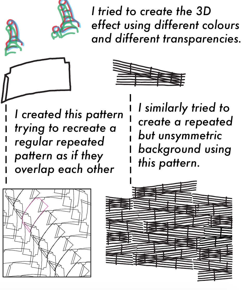
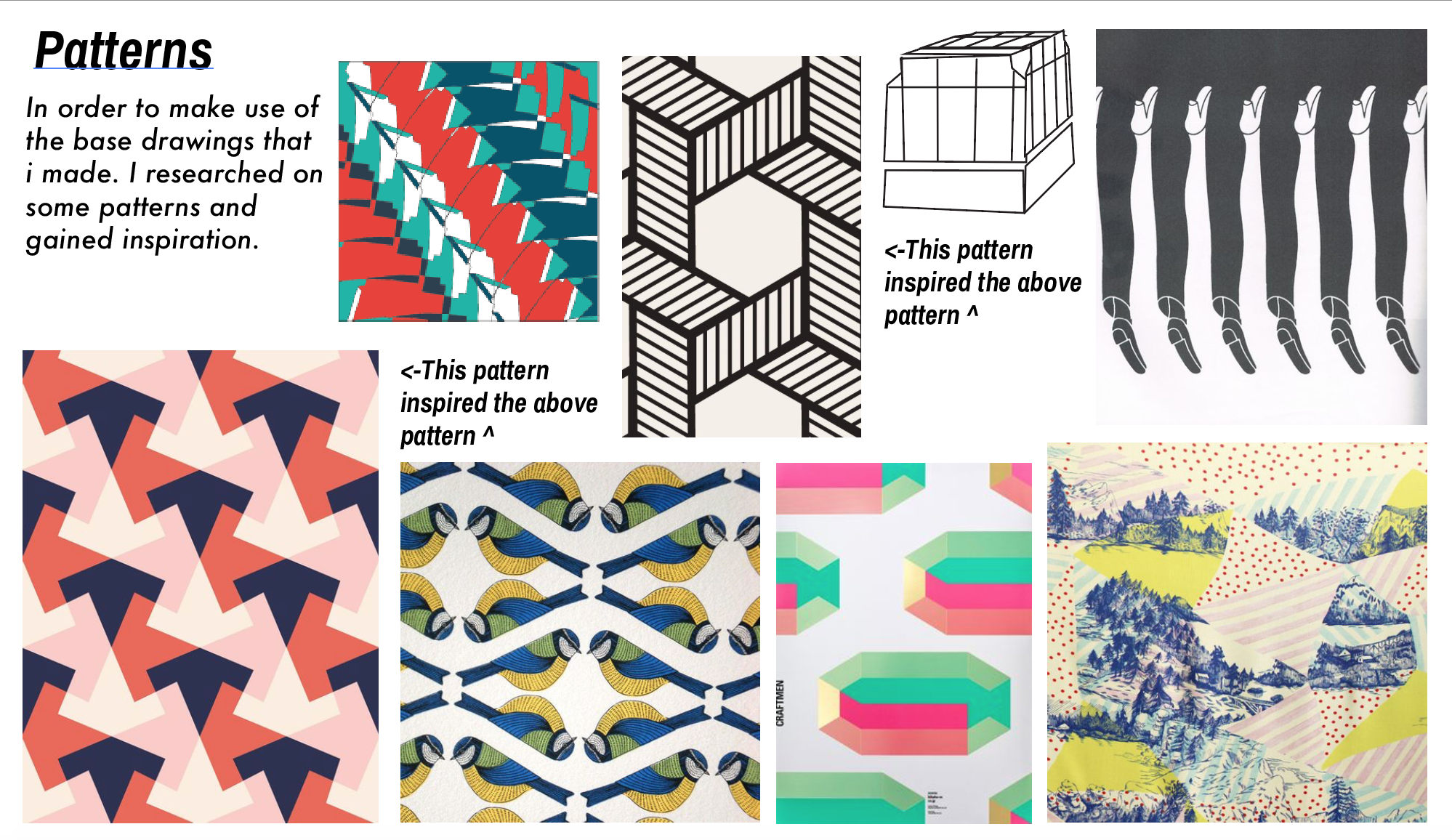
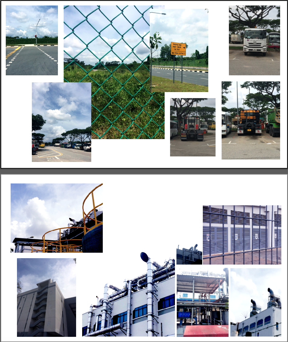
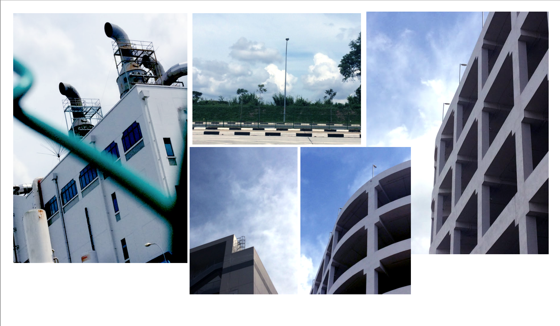
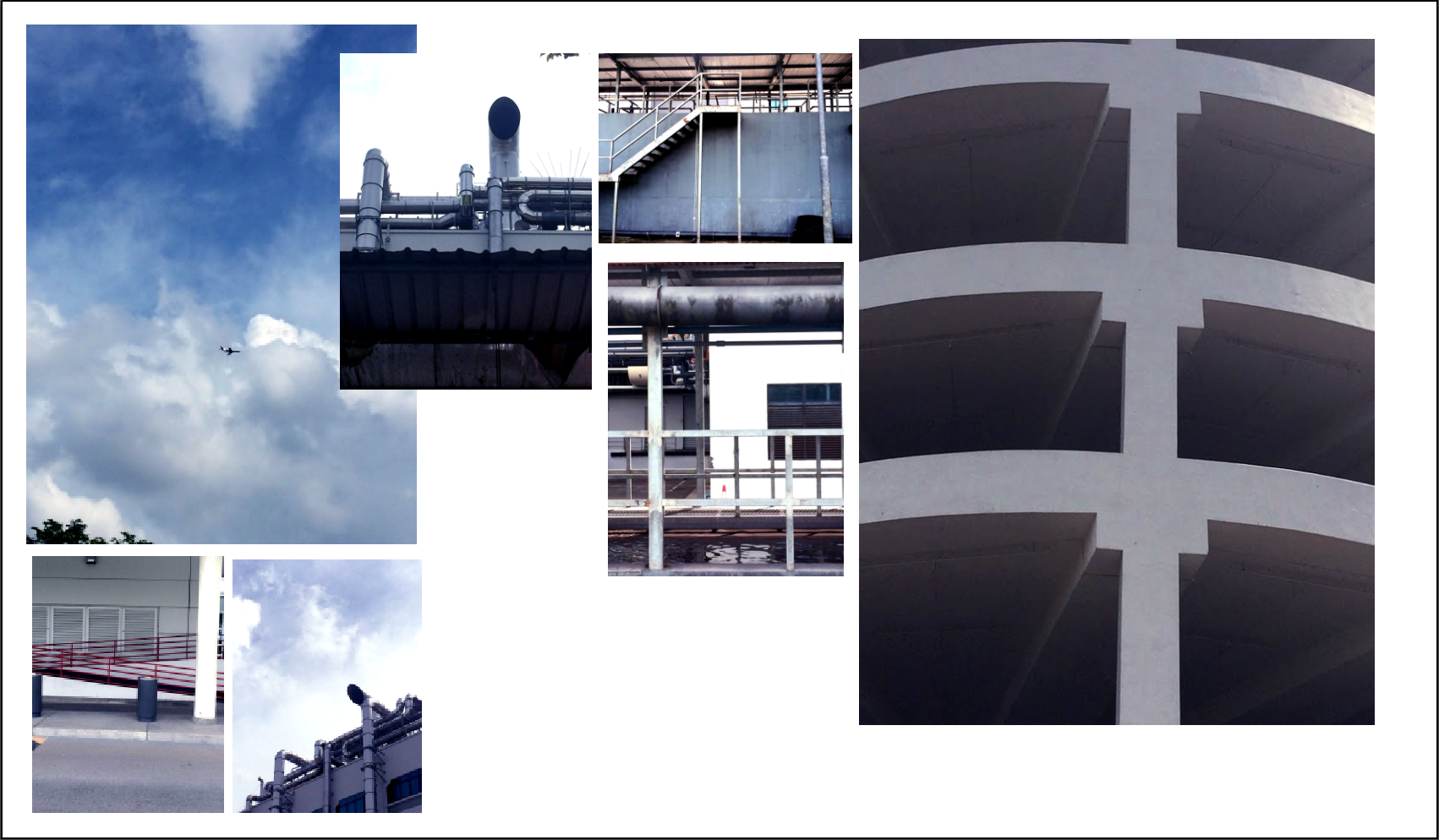
This whole zine was taxing as it required us to think about a lot of aspects of the zine. From the typography to the pictures to the patterns TO THE LAYOUTS! Each component required a lot of attention.

This let me understand that spreads are important from start to finish and to even create a wider spread with a lot more content such as fashion magazines etc. they would require a whole team and a whole long period’s worth to create an amazing spread. However taxing it was, the experience was one I hope to relive in the future! I want to create many more zines and experiment with many more different layouts to find one that I really am comfortable in!

THANK YOU, SHIRLEY FOR SUCH A GREAT YEAR. IT HAS BEEN A PLEASURE LEARNING FROM YOU. BOTH THE MODULE AND LIFE ADVICE. Thou has truly inspired me to go beyond my boundaries and challenge myself (against my will) and I truly appreciate the effort that you have given all the classes throughout this year! MUCH LOVE MUCH MISSES :”’)

QUE SERA: FINAL POST

MY FINAL WORKS:

I AM
A NATIONAL RUGBY PLAYER.


I AM

A BOTANIST.


I AM

A SEA EXPLORER.


I AM

A NEON SIGN MAKER.


REFLECTIONS: From the start to end, it was a ride worth taking. This is the first 2d project which I am not very proud of. I blame this on the fact that I had a creative block for the longest time for this project, resulting in ideas that seem rather dry. Not going to lie, this was one of my most disappointing projects yet.

NONETHELESS, I will use this opportunity to really work on both my strengths and weaknesses. I would need to figure out how to work around the mental breakdowns I too often have. I would also have to practice and put more time into learning illustrator on my own.

More technically speaking, this project allowed me to really see how important balance and boundless typography can be. It is not just a set of letters made up of vectors. It can be a setting, a play on images or a space even. This project allowed me to see the alphabets we see everyday in a different light as they can be manipulated into every way possible like other pieces of art.

Till the next Que Sera.

2d QUE SERA // PROCESS

For my first and most daunting project out of the four typographic layouts, I first got inspired by the Print as shown below. Especially the letter V. This became the base of my first print as well as my first illustrator experiment.


With regards to the layout and style of the letter V as shown, I researched more into other flat lay art works. Then I encountered one of the many artworks by Malika Favre. It is the first time I attempt to do an Artwork without any borderlines.
"June" Illustration for the Gifted 2012 calendar | Illustrator: Malika Favre | Get it here - <a href="http://www.gftd.co" rel="nofollow" target="_blank">www.gftd.co</a>Malika Favre - On The Draw - Handsome Frank Illustration Agency:
I wanted to work with my nickname as opposed to my initials: VAL

I then came up with this three items to represent my name:

  1. V – Hull of the Ship.
  2. A – Top down view of a Mountain.
  3. L – L-shaped Boat deck.

For the letter V, I tried to recreate the shape of the hull in the first example. Even adding additional shapes to hint at shadows. This proved to be quite frustrating as I did not know how to group the shapes well enough as I could not manipulate them separately as and when I wanted them.

For the Mountain to represent A, I found it difficult to envision the folds and crevasses of the mountains from a top-down perspective, what more in a flat 2 dimensional plane.
 :  <- This example I found on Pinterest proved to be too realistic, therefore I used the following example instead.
ringo55: efg’s brain. (via kippi0404):

This encouraged me to create the mountain with patches on one side and having three shades of different colors to make it SEEM like a mountain!

As for the letter L, I was heavily influenced by the first Malika Favre example as shown above (the red deck). With that, I added a little beach chair to accompany the hat and towel on the boat!


Secondly, I FINALLY DID MY OWN BOTANIC RESEARCH PAINTING.

For this, I wanted to stay true to the nature of the botanic paintings so I painted my plants by hand.


Artichoke with section - great color combination to use for a room! http://www.newmexico.org/listing/?lid=22737:
After trying out both mushrooms and leaves and flowers, I realized Foliage (ferns, branches etc.) are more natural looking when I manipulate the typography into my name VAL. Therefore, I incorporated different types of foliage and small notes to bring in a more documentation feel.


THIRDLY, I created my own NEON SIGN!

At first, I wanted to use glow sticks however I figured that they would not last, and they are unbendable.

THEN I ENCOUNTERED A WIRE CALLED EL WIRE. I then looked up on how do i go about pinning it to a white board.

My fave thing is that it looks as cool during the day, as it does lit up at night! Step and supplies after the break, and stay tuned for the more advanced Neon Light Bulb with a concrete base (complete with a DIY Kit)!   Source>:

I personally tried to wire the el wire onto ANOTHER wire, however, it was too bouncy and I could not attach it to a board therefore i tried this alternative method!

One of the coolest DIY tutorial's around: create a neon sign with EL Wire:

PRESENTING MY RENDITION OF THE FINAL PIECE!


LASTLY, I ENVISIONED MYSELF IN MY TOP FUTURE JOB. A national rugby player!
Image result for vintage college typo
For this typo set, I superimposed the rugby ball ^ onto my name, VAL in the Vintage Typo College font you normally use for rugby sports gear etc.
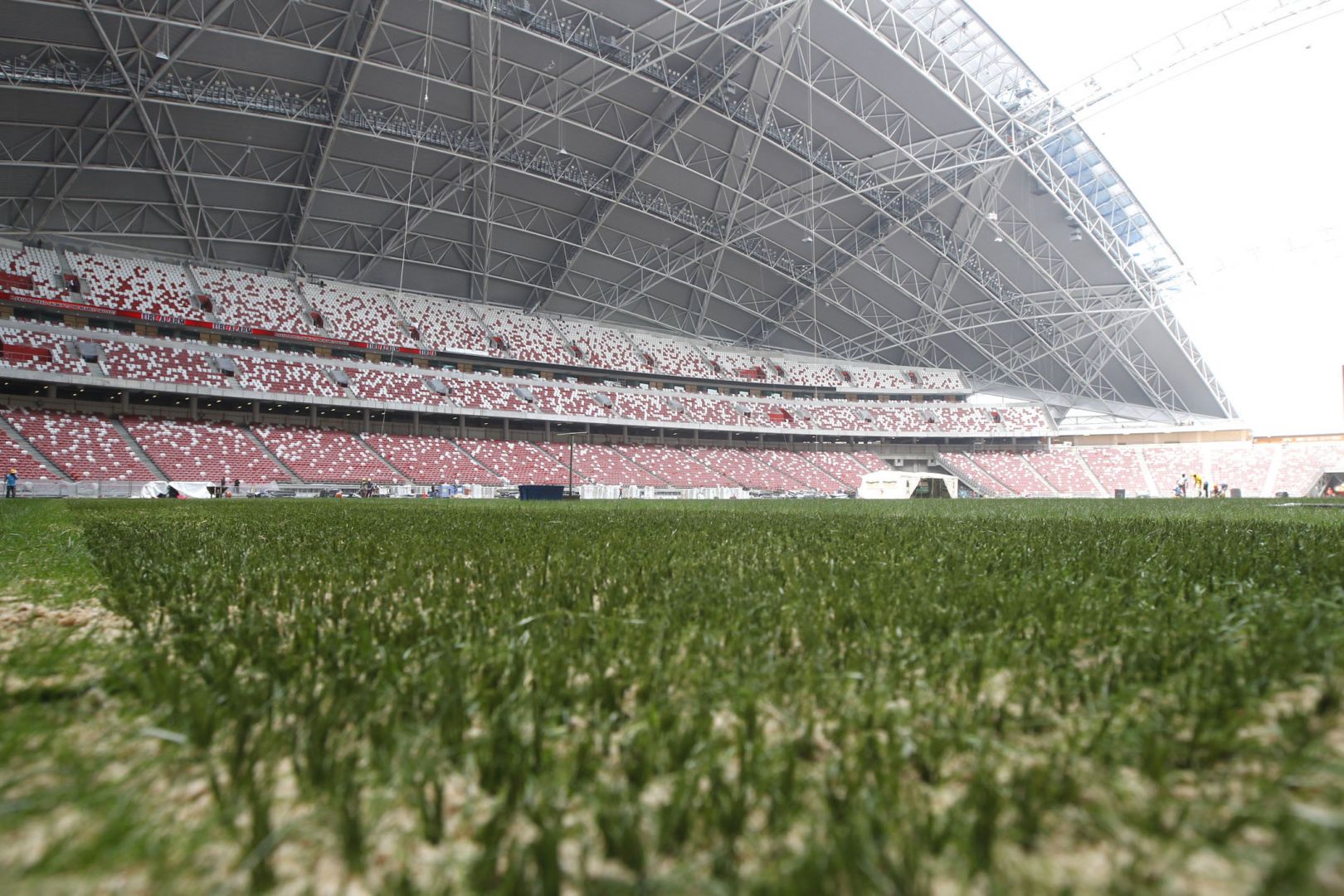
I then went ahead to take a photo of the SINGAPORE NATIONAL STADIUM WHERE I LONG TO PLAY MY GAME and edited it to be a richer colour as compared to this overexposed picture as seen in the final picture.

2D2 Project: Que Sera

Research:

Important things to take note of:

  • Get the essence right
  • have a simple yet informed background

What job do I want in the future (choose 4):

  1. Hitman for dishonored – Gun, Target, Suit, gloves
  2. National Team Player – Rugby ball, field lines, boots, jersey (my first love)Football Players, The Century Illustrated Monthly Magazine Cover, Nov. 1909, by J. C. Leyendecker:                     
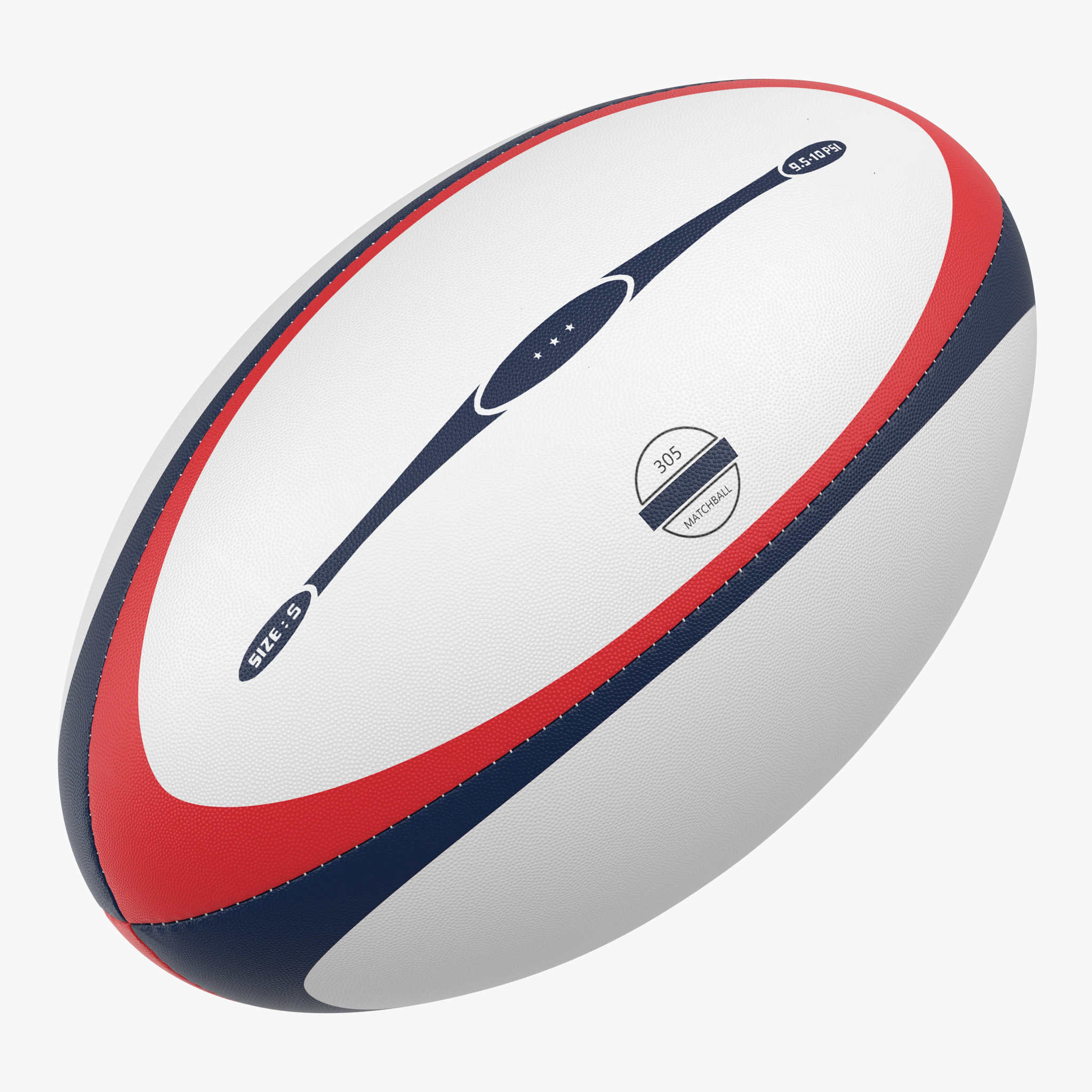
For rugby, I have only started playing the sport for less than a year but I love it so much I aspire to be a national team player for the Singapore team. Therefore, I would like to translate this passion into typography.
  3. Bath enthusiast – bathroom tiles, candles, bubbles, soaps
  4. Humble carpenter – wood, apron, shavings, tool belt
  5. Global explorer (by sea) – hull of boat, float, knots, sail :

    Since I was young I have always loved the deep blue waters be it in the sink or the Singapore seas. As I grew older I have always wondered beyond Singapore and aspired to be a well-weathered traveler. Therefore, I dream to be one of the many sea-explorers.
    As I research more of what style to emulate as I go about showing this dream of mine, I came across a collection of typographic images ->
    As you can see for the V, it takes on a shape of a hull of a boat/ship. This graphic style is apparently flat lay and it is very new yet familiar to me. I have always seen it on Pinterest pages however never got about to do it. As I researched further I came across these artworks by Malika Favre – On The Draw.
    Malika Favre recently landed something of a dream brief from the Canary Islands Tourist Board. Along with six other illustrators, she was chosen to travel to the islands and to create artwork inspired by the trip. The project, On the Draw, was curated by the Tenerife based design studio 28ymedio to help promote tourism to …
    "June" Illustration for the Gifted 2012 calendar | Illustrator: Malika Favre | Get it here - <a href="http://www.gftd.co" rel="nofollow" target="_blank">www.gftd.co</a>Malika Favre - On The Draw - Handsome Frank Illustration Agency:
    These Artworks thus pushed me to take on my very first illustrator project which I will cover in the process post.

  6. Botanist – studies of flowers/plants in general, ‘fig 2.1’, cross sections
    This passion of mine only started sprouting as I cultivated my watercolor skills. I have always liked the layout and aesthetics of Botanical studies – the layout of the document to the cross-sections of some flowers.Vintage Botanical Print Food Plant Chart Art: Attention to detail: botanical illustrations by Carl Linnaeus: Image result for botanical illustrations black and whitevintage mushroom botanical printbotanical drawings pinus pinea - Buscar con Google: Image result for botanical illustrations herbs
    After researching on various botanical layouts as seen above, I went on to further research on plants in typography as I find out which style I would want to use for my final piece.
    BOTANICAL ALPHABET // Sasha Prood // DesignLoveFest: Bronx Botanical Garden, New York on BehanceWoodland theme birthday invitation
    After looking at different ways I could reimagine the plants to be used to spell my initials, I realized that using the natural forms of foliage as seen in the typography compilation is the most natural way to manipulate the plants.
  7. Neon sign maker – wavy neon glass lettering Neon Signs | See more unique neon light ideas here http://www.delightfull.eu/en/graphic-lamps/index.php #unique #lamps: DIY inspiration-Neon MessagesNew York's hottest club is CLUB HORCRUX. #ihadto #imnotsorryeither | #neon: Neon signs are pretty rad! Specially when incorporated with cool interior design. Here are our top picks including our own. Neon by Penny Farthing Design House. This here is own own neon sign placed over a wall of greenery in our showroom. Some people were a little skeptical about making such a statement in a wedding accessories studio but to me it just felt right and I love the results. Just because it's bridal doesn't has to be all traditional and classic. More and more brides are enjoying...
    At first, I wanted to start a project on how I wanted to be a glass blower as I have always been in awe of their workmanship. However, I found it difficult to capture glass in any typography given my amateur level on illustrator. But what struck me was that neon signs were also a part of glass art.