
For my first and most daunting project out of the four typographic layouts, I first got inspired by the Print as shown below. Especially the letter V. This became the base of my first print as well as my first illustrator experiment.

With regards to the layout and style of the letter V as shown, I researched more into other flat lay art works. Then I encountered one of the many artworks by Malika Favre. It is the first time I attempt to do an Artwork without any borderlines.


I wanted to work with my nickname as opposed to my initials: VAL
I then came up with this three items to represent my name:
- V – Hull of the Ship.
- A – Top down view of a Mountain.
- L – L-shaped Boat deck.
For the letter V, I tried to recreate the shape of the hull in the first example. Even adding additional shapes to hint at shadows. This proved to be quite frustrating as I did not know how to group the shapes well enough as I could not manipulate them separately as and when I wanted them.
For the Mountain to represent A, I found it difficult to envision the folds and crevasses of the mountains from a top-down perspective, what more in a flat 2 dimensional plane.
 <- This example I found on Pinterest proved to be too realistic, therefore I used the following example instead.

This encouraged me to create the mountain with patches on one side and having three shades of different colors to make it SEEM like a mountain!
As for the letter L, I was heavily influenced by the first Malika Favre example as shown above (the red deck). With that, I added a little beach chair to accompany the hat and towel on the boat!
Secondly, I FINALLY DID MY OWN BOTANIC RESEARCH PAINTING.
For this, I wanted to stay true to the nature of the botanic paintings so I painted my plants by hand.

After trying out both mushrooms and leaves and flowers, I realized Foliage (ferns, branches etc.) are more natural looking when I manipulate the typography into my name VAL. Therefore, I incorporated different types of foliage and small notes to bring in a more documentation feel.

THIRDLY, I created my own NEON SIGN!
At first, I wanted to use glow sticks however I figured that they would not last, and they are unbendable.
THEN I ENCOUNTERED A WIRE CALLED EL WIRE. I then looked up on how do i go about pinning it to a white board.

I personally tried to wire the el wire onto ANOTHER wire, however, it was too bouncy and I could not attach it to a board therefore i tried this alternative method!

PRESENTING MY RENDITION OF THE FINAL PIECE!


For this typo set, I superimposed the rugby ball ^ onto my name, VAL in the Vintage Typo College font you normally use for rugby sports gear etc.
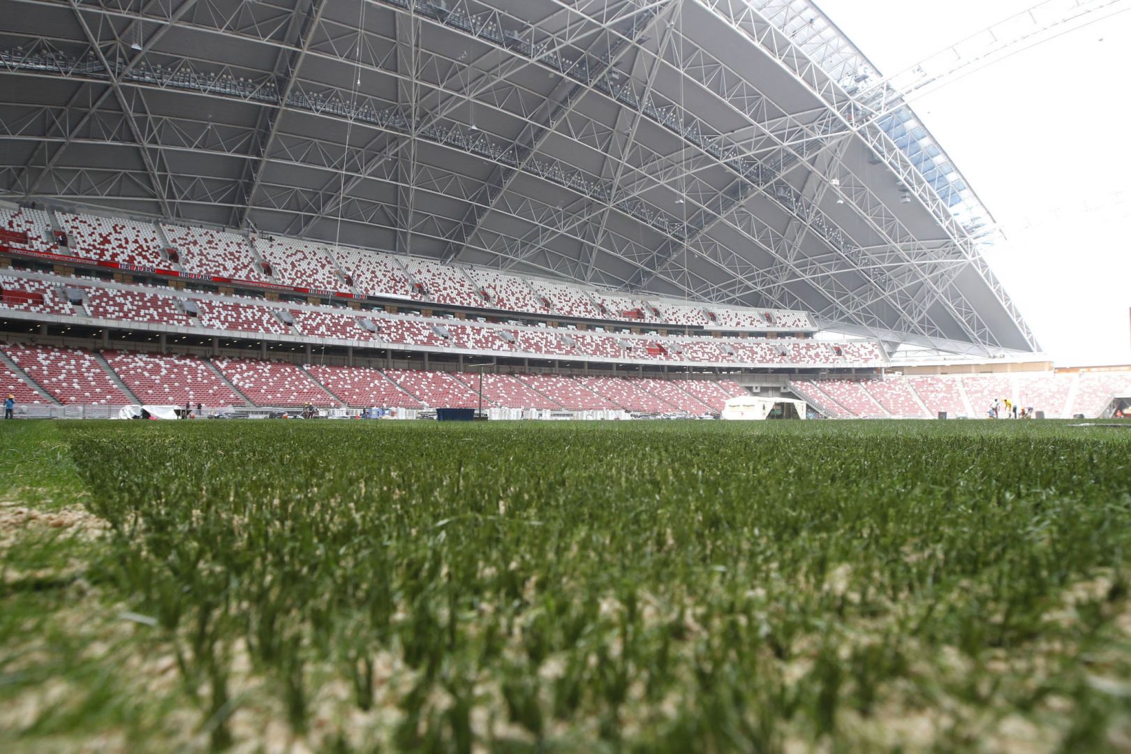
 I then went ahead to take a photo of the SINGAPORE NATIONAL STADIUM WHERE I LONG TO PLAY MY GAME and edited it to be a richer colour as compared to this overexposed picture as seen in the final picture.