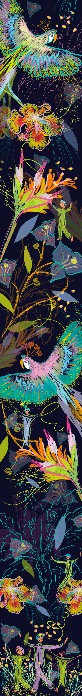
Final Pattern Collection- Darkness before Dawn

Layout Experimentation

Colour Background Experimentation


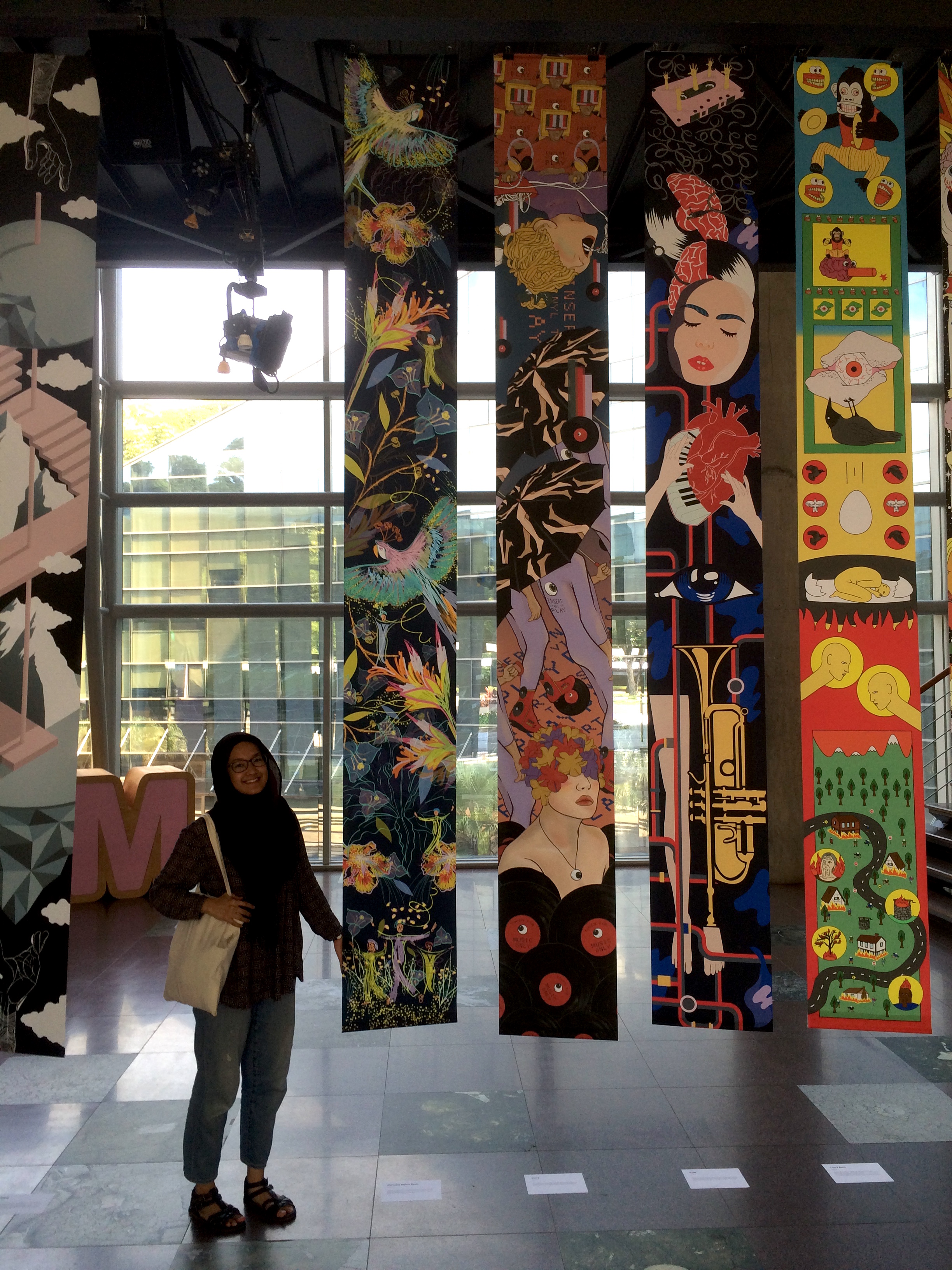
Final Banner
Final Installation in ADM
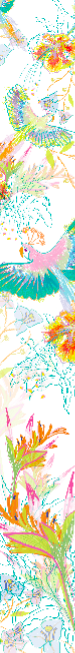
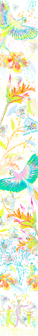
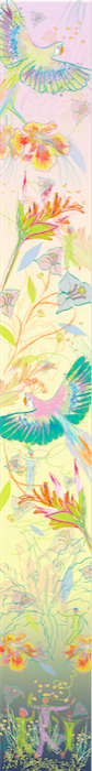
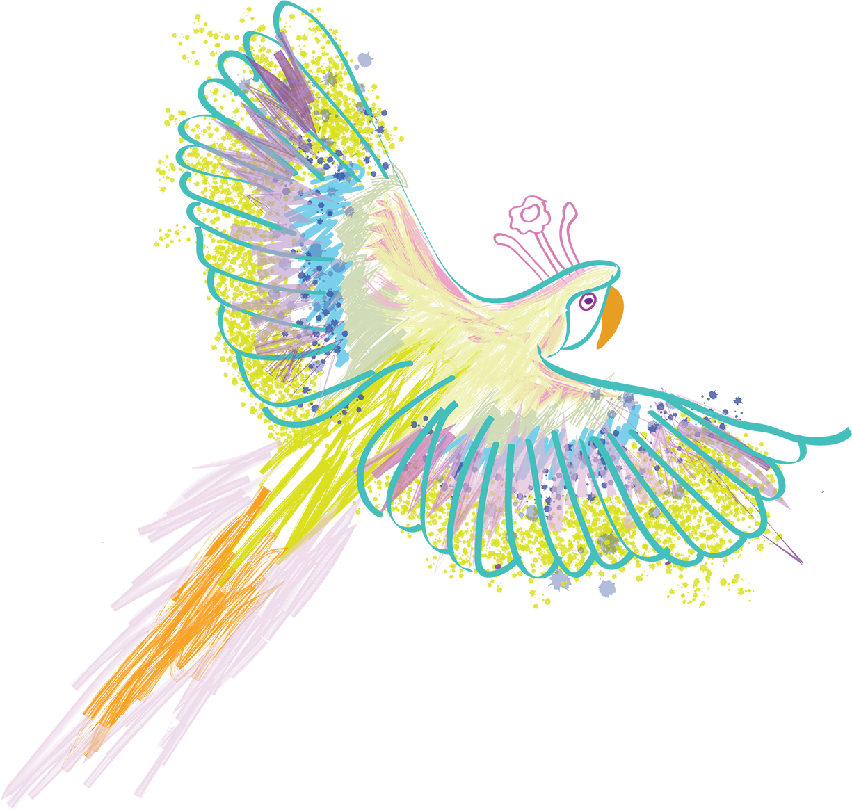
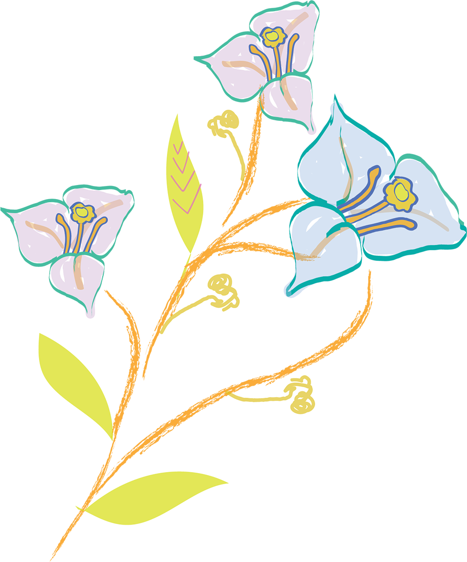
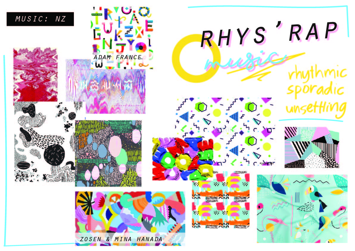
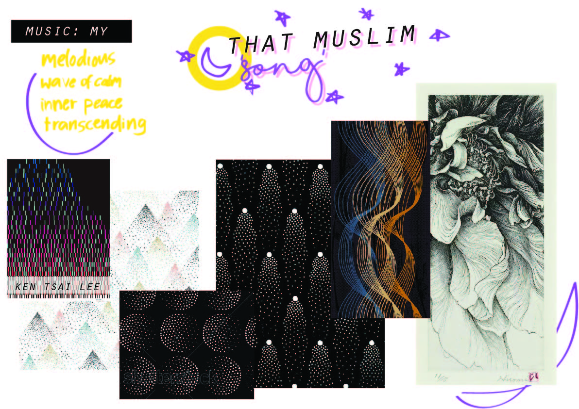
Inspired by the Tai Chi music playing at dawn outside at the courtyard, I wanted to create a fresh, bright ‘tropical paradise’ scene- all based in Singapore.
I sketched out some first, but digitally drew all these using Adobe Illustrator. Here are the motifs I drew:
Birds

Local Flora & Fauna


Small figures doing Tai Chi


Link to pdf of my moodboard in HD:
https://drive.google.com/open?id=11eOmBolgv4EOnW2mvJKtWPtE50tfuty2
Concept 1
Concept 2

Concept 3
I found myself extremely intrigued that the ideal balance of aesthetics in designing a product is simply represented through this triangle.

1. Predominant ‘accent’: Human Factors
‘The Ostrich Pillow’
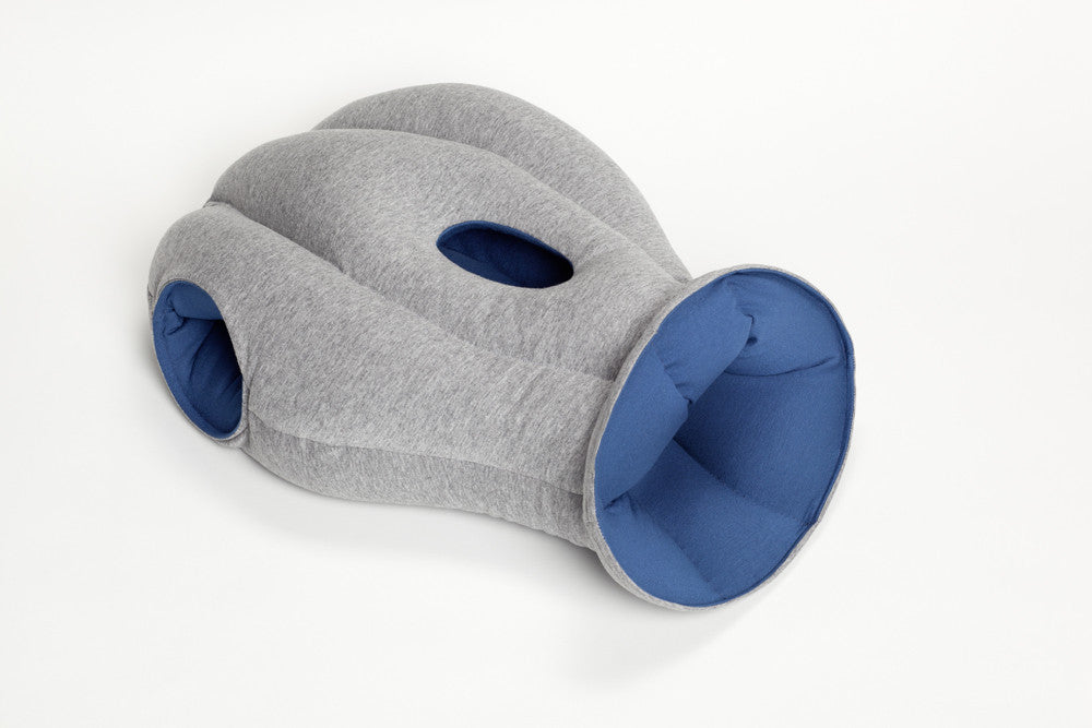
Launched on Kickstarter, this pillow promises users a comfortable power nap anywhere. The 3 holes (two at the sides and one in front) are meant to to provide its users a ‘private little space’. These holes also point to the fact that it has evidently been designed to take the napping positions of people in public spaces seriously into consideration.

Observing these human factors have resulted in a predominantly ergonomic pillow that functions to provide privacy and comfort.
Unfortunately, the aesthetics of this have been compromised, and people who use the odd looking pillow end up looking like a strange creature and attract more attention. Personally it looks like an extremely comfortable pillow and is the perfect pillow to use on a desk but the bizarre design overwhelms any desire of buying it due to embarrassment of using it as it is not exactly an attractive nor stylish, fashionable product.
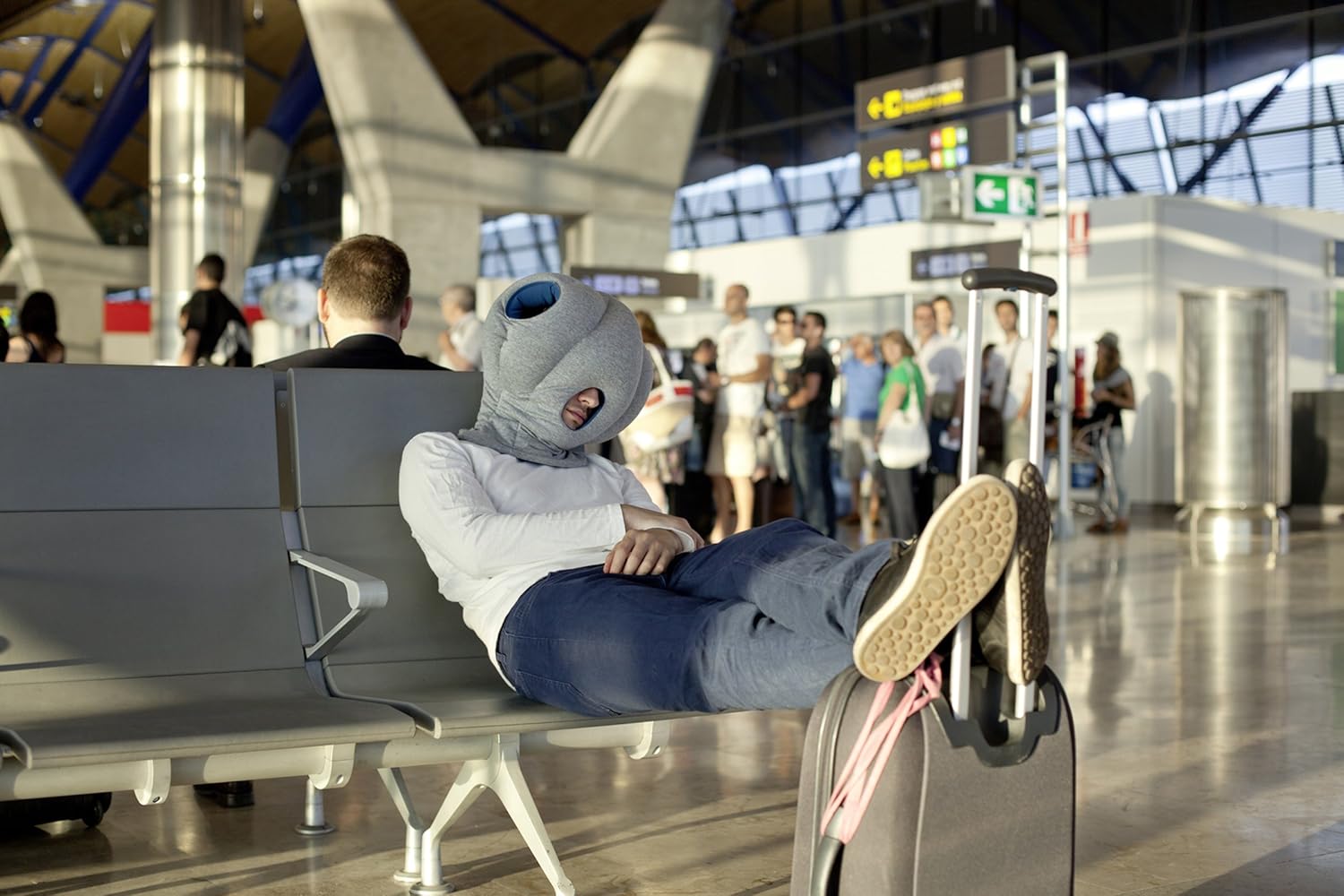
However, on Kickstarter 1,846 backers have pledged $195,094 of a $70k goal, so this demand for this perhaps indicates that there are still many who prefer comfort over style.
2. Predominant Accent: Function
‘Lost in Sofa’
Daisuke Motogi

Designed by Japanese architect Daisuke Motogi, ‘Lost in Sofa’ plays on the idea of sofas being a black hole where small things are lost. It allows users to insert or even hide various objects into it.
I would say that what makes this sofa so appealing is its novel functionality. It serves it’s main function as a seat, but the added unique feature of holding items makes it much more interactive and playful.
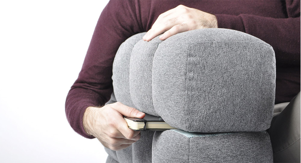
If this feature were taken out, it may not hold out so well aesthetically solely based on its form. The use of negative and positive space is rather awkward and visually looks bulky and odd.In terms of human factors, to an extent the padded cubes look comfortable to sit on, but is not ergonomic with its extremely rigid structure.
3. Predominant ‘accent’: Emotion
Orbit oil & Vinegar Set

The predominant ‘accent’ of this modern cruet set appeals to people’s emotions. The aesthetics of the design itself- having one blown glass bubble in another- is especially intriguing. It is unique, clean, simple, visually appealing and looks extremely sophisticated. One would expect to find this in a modern, sleek kitchen in an upscale home.
For this to happen, usability had to compromised as it is evidently difficult to clean the inside. Also, a smooth rounded glass ball may not be the best surface to grip onto. However, this inconvenience might be just a small thing that can be overlooked to those who are enamoured by the unconventional sleek design. It serves its function well, to hold oil and vinegar in a single container as they are often used together.

In the words of Don Norman: “When we feel good, we overlook design faults. Use a pleasing design, one that looks good and feels, well, sexy, and the behaviour seems to go along more smoothly, more easily, and better. Attractive things work better.”

I simply find myself drawn to the work of Ross Lovegrove, which are mainly inspired by nature and organic in form. I’ve realised that when I design I tend to place greater concern in aesthetics rather than function, and that is something I need to greatly improve on. However, Lovegrove brings together these two aspects beautifully in his creations, and I admire his works not only for it’s functionality but more for its “organic essentialism“, using nothing more or less than is needed.
Often I find that products that serve a wonderfully clear and clever function are inspired by nature itself. I am always in awe at how product designers have managed to observe their natural surroundings to extract form and function and create ingenious products. One of my absolute favourite work of his is this staircase, which not only serves it’s function but is a stunning piece of art/sculpture in itself.


DNA Staircase
I also loved and really appreciated how his designs addressed sustainability and environmental issues.

Solar Tree Street Lamp


I want to be able to create sustainable, eco-friendly products but I’m not being very specific mainly because I’m not sure what or how I would do it.
Lovegrove’s works serve as a inspiration for what I may want to design in the future.
I decided to go with saddle stitch to allow the zine to be opened flat. I followed Sea Lemon’s Youtube tutorial on how to saddle stitch. She had very clear instructions!
https://www.youtube.com/watch?v=BysUiyjB0jY

2. I then measured to find the middle of the paper.
3. I marked with a pencil, using a staple as a guide as to where to create the holes.

4. I used a normal pin to pierce holes

*I forgot to take photos for the rest of the steps,hehe*
5. After that, I inserted the staple into the holes. This was the very tricky part, as you really had to adjust and make sure it laid flat on the surface.
Also, note to self, don’t cut your nails before doing this or else you will have a hard time….hahah.
But overall, I’m satisfied with how it turned out!
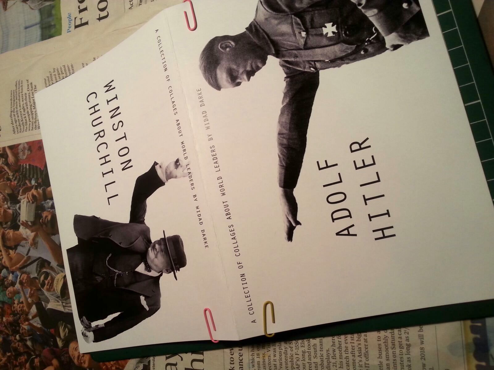
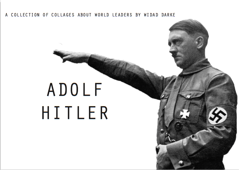
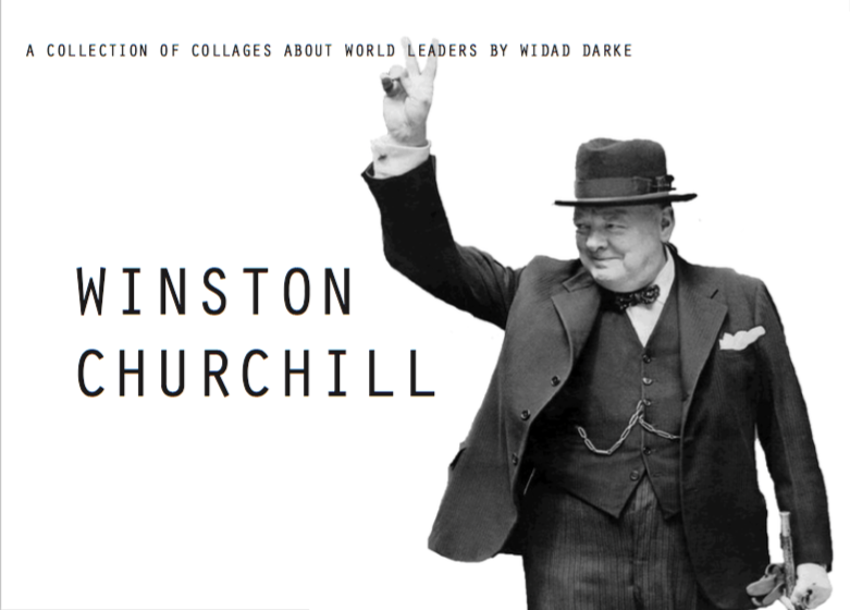
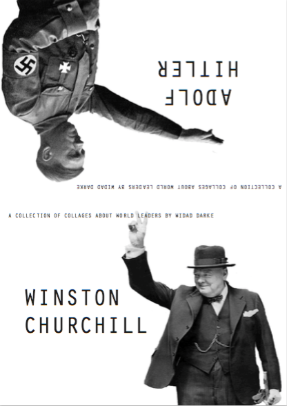
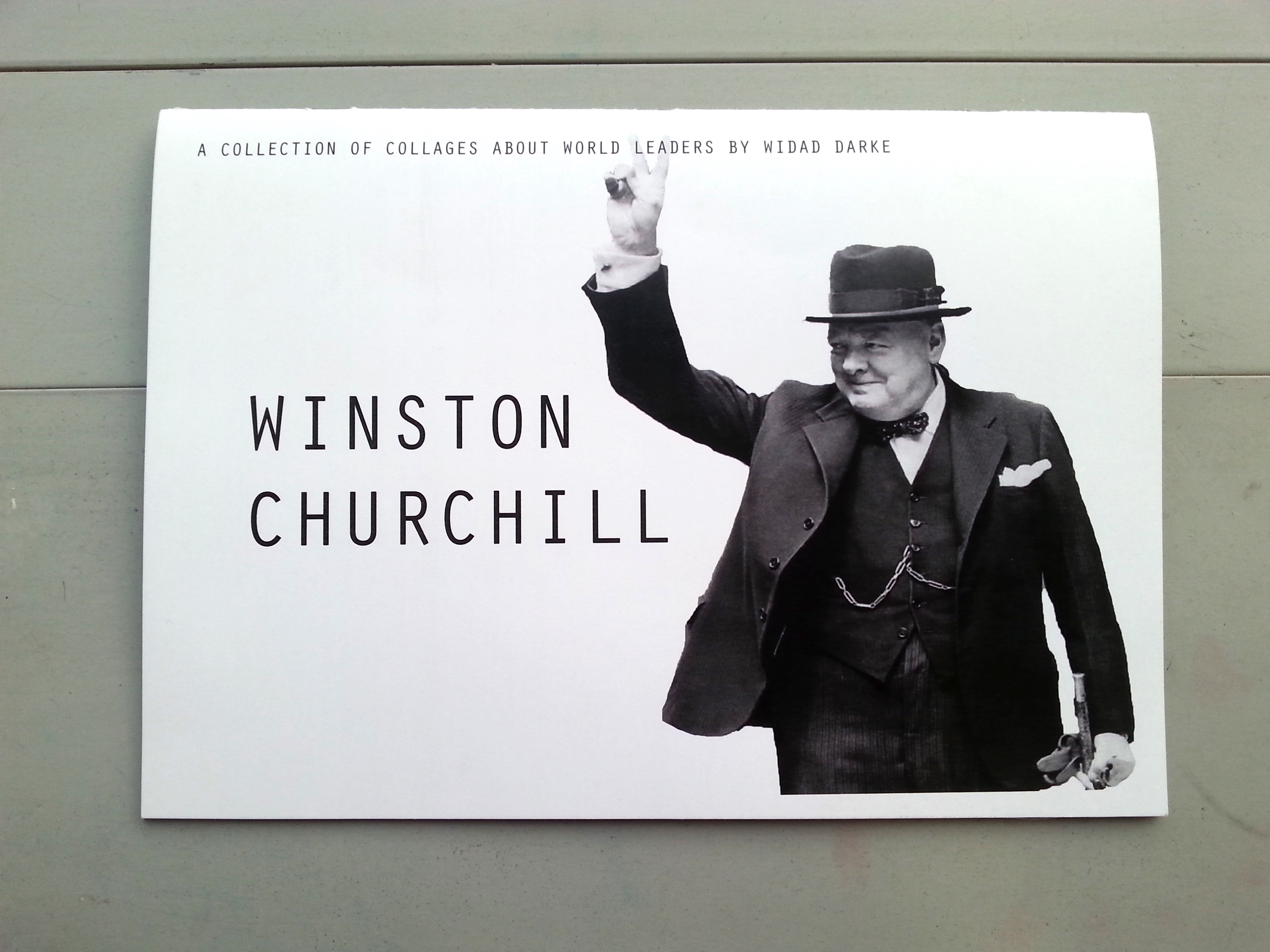
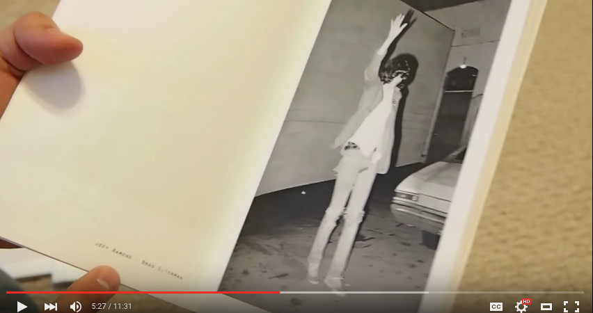
I wanted my zine to be a continuation of my POV project on Hitler and beauty, specifically exploring the aspect of artists (who happen to be world leaders) interacting with their art.
I took away the concept of ‘Beauty from the POV of Hitler” and opened it up to introduce another Winston Churchill, who just happens to be:
a) A world leader
b) Hitler’s enemy
c) A painter
I feel like it was a beautiful coincidence and there couldn’t have been anyone more perfect to accompany Hitler in this zine. In the zine, I have created/curated/compiled collages that serve as montages/ commentaries of their political and personal life.
Hence, I have titled my zine: “A COLLECTION OF COLLAGES ABOUT WORLD LEADERS.”
When I was still in the early stages of doing research for my content, I had these pre-conceived notions that Hitler= bad and Churchill= good. However, I came to realised that theres no clear black and white, and there’s only grey matter. Churchill, like any other human, had a dark side- he was an imperialist, racist and made a lot of nasty comments along with his inspirational ones.
I realised Churchill and Hitler weren’t all that different.
Both world leaders are incredibly complex, contradictory and larger-than-life human being and wrestle with these contradictions during their lifetime.
Hence, in my collages, I wanted to prompt my audience to question, is Churchill really a hero? Is Hitler really a villain? Most of the collages are left to be ambiguous at surface level as they allow the audience to create their own conclusions/assumption based on what I have created.
My target audience is specifically people history lovers/ history students. Because of this, the way my collages are designed are similar to that of a political cartoon- very minimal text, heavily dependent on visuals and of course, an underlying message/commentary. Just like a political cartoon, only those who understand the issue will understand what the message of the cartoon is.
As I decided that my zine was not going to be educational, rather, it would be for viewing purposes and to encourage people to question current beliefs, I didn’t add in additional historical information in the zine. However, I did explain certain historical events to the class.
My whole format is strongly connected to my overall intention behind the zine. I didn’t want the two men to ‘interact’ or ‘meet’ with each other, therefore I wanted to have them on opposite ends of the page. I’m adopting a calendar style format, where you read the pages in landscape form, and only read from the bottom until you reach the end.
( I’m just realising now that when Eugene suggested that I do a calendar format, he was talking about the whole thing- including the binding! I don’t know why I didn’t consider the ring binding. I think it’s because I had this pre-conceived notion that binding either has to be stitching or staples…. How did I miss that…)
As for the paper, I went for a clean white card stock with a matte finish. I felt that this was the optimum choice as any other colour would not provide the clean look I was going for, especially since the collages were extremely colourful.
For the paper weight, I chose 250 gsm as it was a nice balance- not too thin and not too thick. Any thicker, I felt it would be too stiff to turn the pages.
For each collage, I have created accompanying captions that serve a a title to just slightly hint at the context.
As I have already elaborated quite a lot on these existing compositions (https://oss.adm.ntu.edu.sg/wafa001/2016/03/23/2d-point-of-view-final-post/), I’ll just briefly explain again.
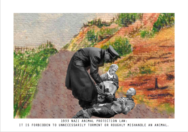
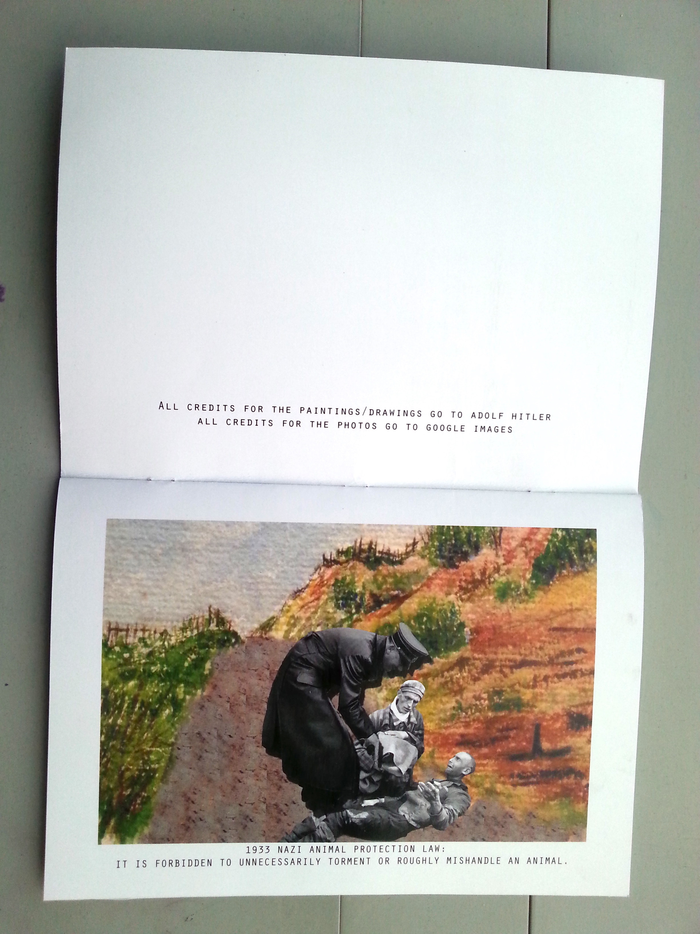
This collage refers to the irony that exists in these laws- that Hitler’s Nazis have created laws showing so much mercy to animals, yet have contrasting laws that oppress Jews. This collage presents a hypothetical question: What if Hitler treated Jews the same as animals?
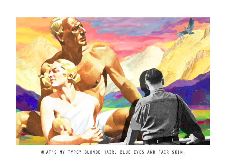
In this composition, Hitler is looking out to his ideal scene of Lebensraum (living space), which of course has his ideal Aryan family just basking in the sun.
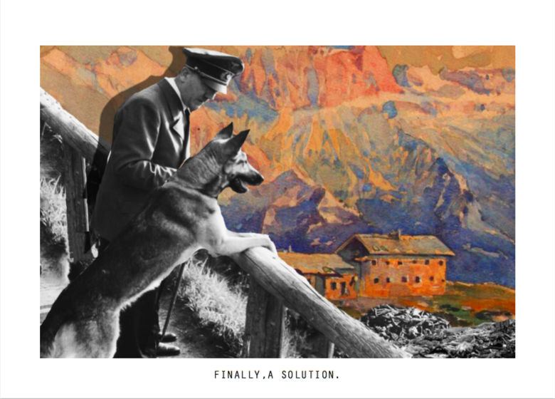
This caption is a tasteless play on words of the ‘Final Solution’ which was created to the ‘Jewish problem’. In the background you can see a pile of dead bodies.
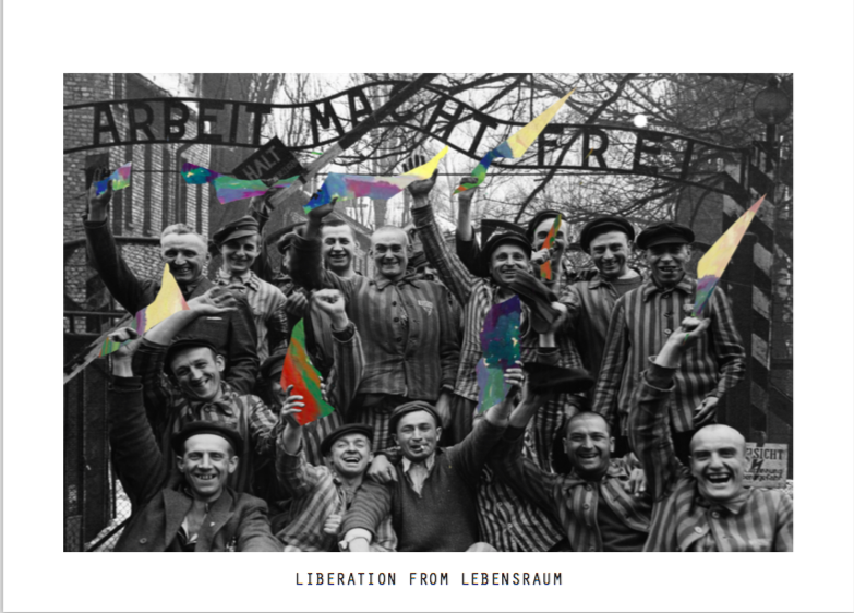
Here, survivors of concentration camps hold pieces of Hitler’s painting (specifically the one which depicts his Lebensraum) as a symbol of victory- as his death signifies the death of his ideals, visions and of their oppression.
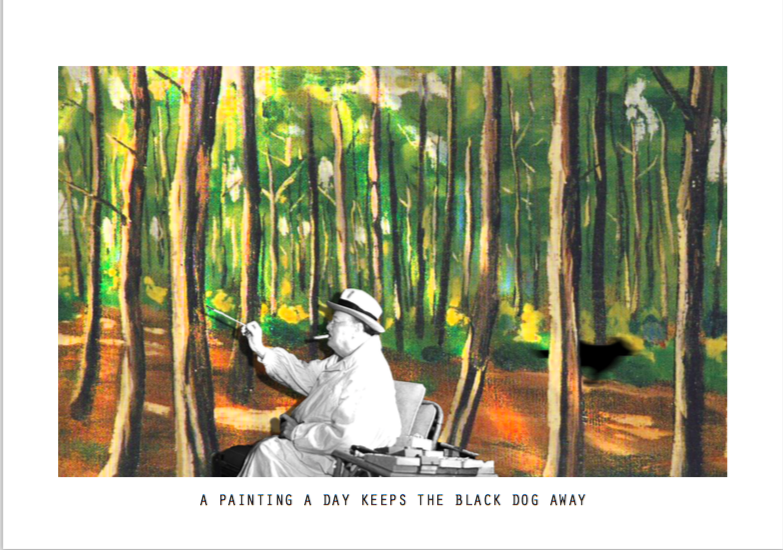
“Always subject to depression, Churchill told the poet and diplomat Wilfrid Scawen Blunt: ‘There is more blood than paint upon these hands’. Indeed Blunt believed that had it not been for painting, Churchill might have gone mad.”
Churchill referred to his depression as ‘Black dog’, so in this collage you can see that as Churchill paints there is light streaming through the trees, and to his right, there is black blur of motion that suggests a dog’s silhouette, running away from the scene.
–http://www.historytoday.com/nigel-jones/churchill-and-hitler-arms-easels
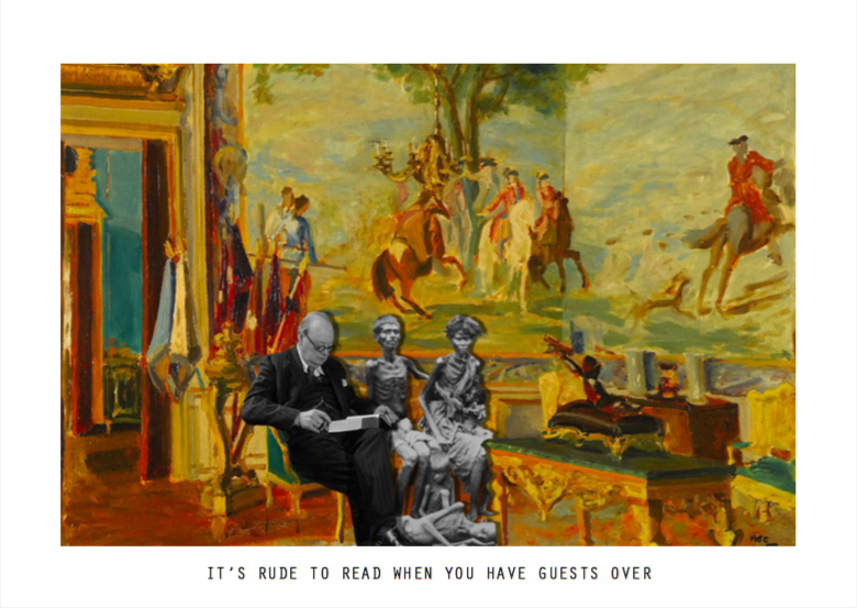
This composition refers to the Bengal Famine of 1943 which had a shocking 3 million people dying. Churchill was the Prime Minister of Britain at that toime.
“This famine was attributed to because by the imperial policies of the British. In reply to the Secretary of State for India’s telegram requesting food stock to relieve the famine, Churchill wittily replied:
“If food is scarce, why isn’t Gandhi dead yet?”
Up to 3 million people starved to death. Asked in 1944 to explain his refusal to send food aid, Churchill jeered:
“Relief would do no good. Indians breed like rabbits and will outstrip any available food supply.””
–http://www.counterpunch.org/2015/01/28/winston-churchill-the-imperial-monster/
This collage makes reference to the blatant disregard Churchill displayed for the Indians.
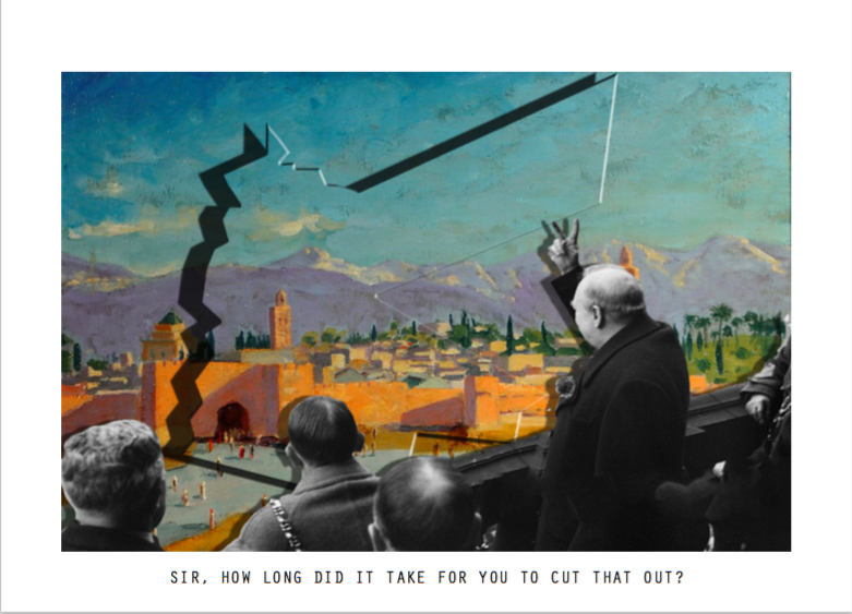
I created the ‘cut-out’ in the painting in reference to the obvious triangular division named “Churchill’s Sneeze” or “Churchill’s Hiccup”.
“Winston’s Hiccup or Churchill’s Sneeze is the huge zigzag in Jordan’s eastern border with Saudi Arabia, supposedly because Winston Churchill drew the boundary of Transjordan after a generous and lengthy lunch.”
https://en.wikipedia.org/wiki/Winston%27s_Hiccup
This collage hints at Churchill’s imperialist tendencies and actions, and pokes fun at his trademark ‘V for Victory’ hand sign.
“Churchill himself was never shy about interfering in the troubled politics of the Middle East. He cheerfully carved up the region, awarding new nations like prizes to various Arab dynasties after the collapse of the Ottoman Empire, with scant regard for local loyalties and tribal traditions. He also enthusiastically supported the early settlements of Zionists in Palestine.”
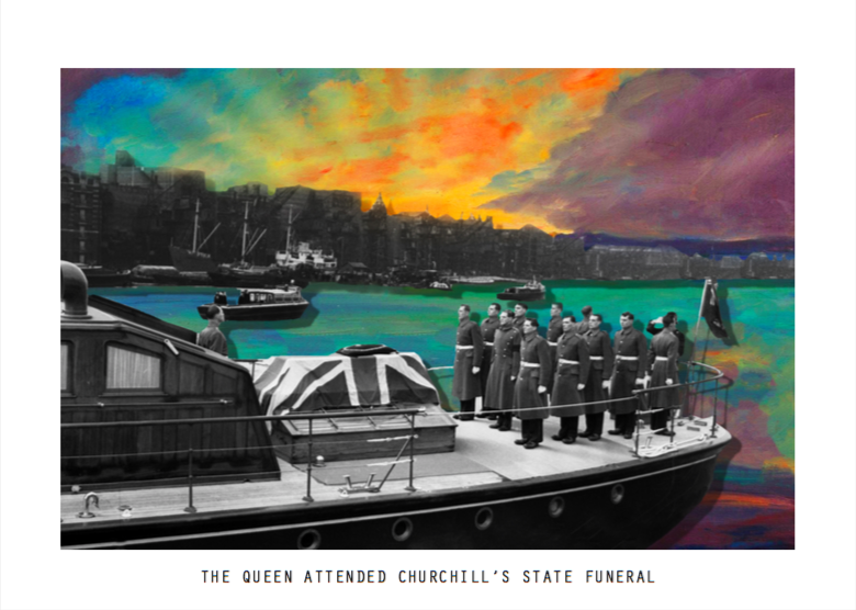
This collage concludes his life montage- where Churchill is give a state funeral- quite the contrast to Hitler’s death of suicide and being burnt. Did Churchill really deserve the state funeral and honour he received? Or was his victories far larger than his failures?

Feedback from classmates

During the exercise where we viewed our classmates’ zines for a minute each, I felt a sense of impending doom (okay I’m being dramatic) as I noticed that many of them were holding my zine in different directions, and flipping back and forth.
I feel really bad for causing this confusion, and it was a major oversight on my part. After getting feedback from everyone, if I were to reprint this zine again, I’d definitely do it in the same format but just a different binding! A ring binding- like the way a calendar is designed. It’s quite crazy how binding can change so much.
Some of my classmates commented that they would have preferred the accordion binding.
However, I honestly don’t feel that the accordion binding is best suited for what I intended for this project.
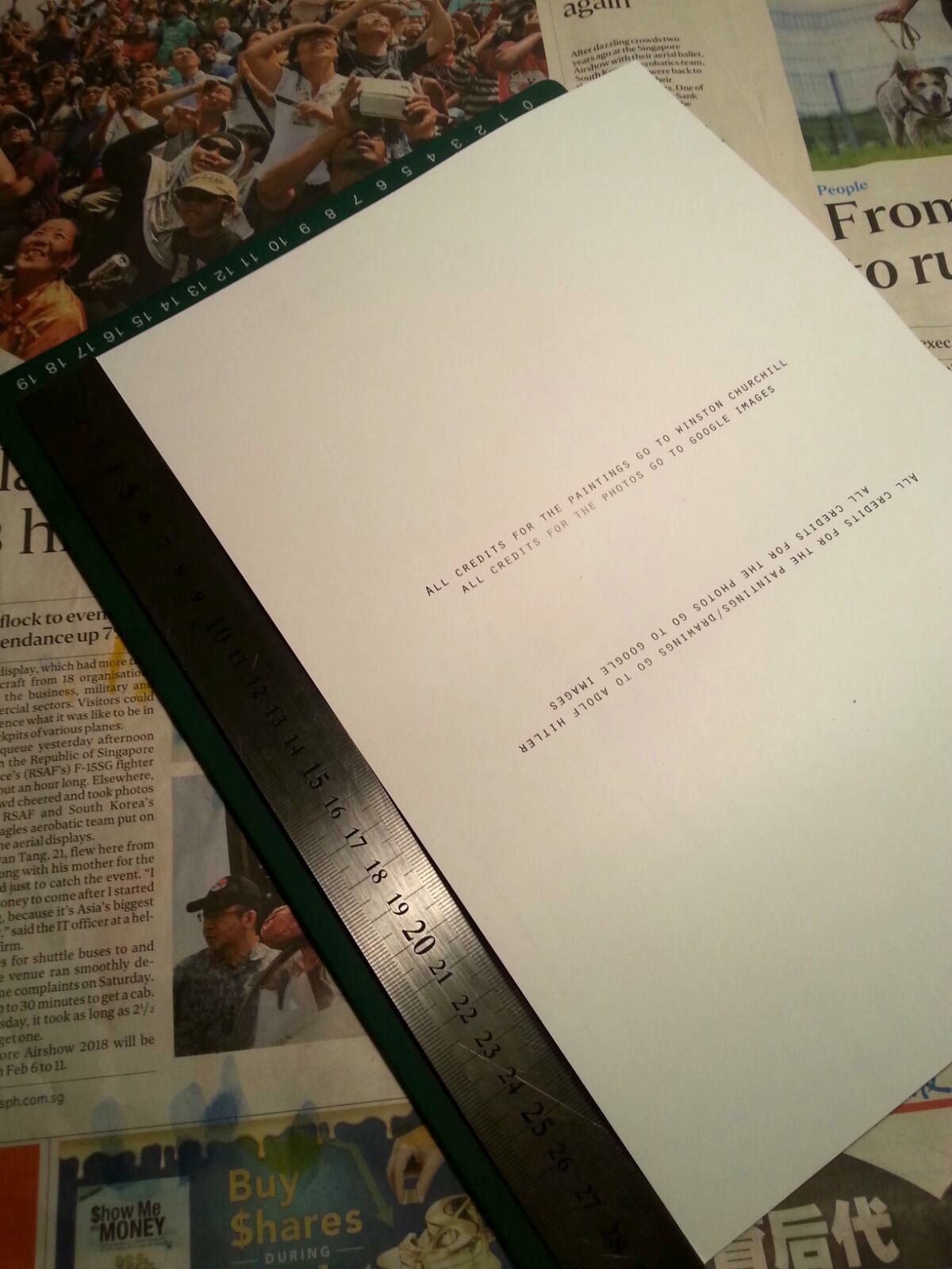
I accidentally place the text for the credits the wrong way. It should have been flipped the other way round to serve as a subtle guide on how to read the book. This caused a lot of confusion:(
Feedback from Joy
Joy raised some technical issues which I wasn’t aware of and didn’t realise they actually posed a problem :/
The border in the front and back page were not aligned/consistent with the rest. The printing shop I went to wouldn’t allow me to have it full, as they had some trouble with their settings. And because of time constraints I had to make do with it 🙁
Intended printing size
A comparison of both borders
Actual printed copy- notice the awkward cropping of the borders 🙁
2. Placement of text
Joy suggested that the cover might look better if the title ” A collection of collages about ….” had been placed below.
3.Text typeface
She suggested not using all capital letters, to differentiate body text and the front cover text.
4. Punctuation
She also mentioned the lack of punctuation in some captions. I realise now that though it was deliberate on my part, the audience might see it as poor grammar?
Noted with thanks Joy! I think I might re-do this zine during the holidays (:

I’m rather disappointed with myself that I wasn’t aware of all these technical issues.
In hindsight, I feel like all these technical issues was due to:
Im not going to lie, I feel rather disappointed with what I have produced. But I’ll end off my post with a more positive note with what I’m glad about:
I was stubbornly stuck in a mindset that indesign was too complicated, and that there’s no way I could understand it, even after the in class tutorial. But I managed to do it, with the help of asking many questions to very patient friends, youtube tutorial and the notes I took down in class. This experience just proves to me that I have to stop thinking so negatively and embrace learning with open arms.
2. The beauty of zine
After looking through my classmates’ zines, I’m truly in awe of the different zines they have produced- from a guide on wave boarding, to a zine about a duck who is a detective! I hope to make more in the future, in my own personal time because it’s really super fun!
What now?
2D has now ended. But I’m always going to want to improve myself:
To Joy: Thank you for being such a wonderful teacher, endlessly encouraging and supporting us to do better, think better and be better versions of ourselves.
I have decided that I still want to explore the topic of Hitler further, but I realised what was really interesting was the aspect of having an artist interact with his painting.
Possible titles for my zine:
World leaders in their paintings (a more catchier name perhaps?)
Beauty from the POV of Churchill (alcohol, Hitler dead, painting??, victory) and Hitler (animals, Aryans, clean country)
Man + Country + Paintbrush= This project
I brought this concept with me to class along with one composition I finished for Churchill’s funeral.
Group consultation notes
I first started off asking the group for their suggestions on how I could design my format, as all my compositions are landscape oriented.
Conversely, Eugene suggested that I should both world leaders should not be ‘meeting’, and they should be on opposite sides- in a ‘calendar’ type of format, where Hitler would be in the front, and Churchill would be at the back. I thought it was an interesting suggestion, and I’m also considering doing that.
In the middle of all this, Jacob asked me who my target audience was, and I was taken off guard. I stared at him for a while then mumbled something along the lines of ” I want to show it in an art gallery- to be displayed..”, which doesn’t really make sense to me now.
I feel that the the nature of the zine allows you display your creativity out of the formal context, and an art gallery is rather formal- and works should be frames. I don’t know why I forgot to consider my target audience- which is an essential part of creating this zine- it affects the way you print and format your zine, your content- basically, everything.
So, I’ve been thinking a lot about that and I decided that my the content of my zine itself is quite unusual- world leaders interacting with their paintings (I’m not even sure how to classify that topic)
However, I don’t really have a specific audience, but I think my target audience would generally be people who have an appreciation for art or history. Like for instance, those who love art but don’t really know much about history/ these world leaders OR people who appreciate history and don’t really interact with art.
Either way, I want my zine to be thought provoking and somewhat amusing in the sense that these world leaders, who many don’t know are also artists- are interacting with their painting. And it will also be an added bonus if my audience finds it informative as well. Like Joy mentioned to me, does my zine have an education purpose or a viewing purpose/ making the audience question what is happening?
On the aspect of typography, i haven’t really thought it out yet, but with my collages being rather busy, I might want to keep it simple.
One of my friends also shared a website on font pairing, and it’s pretty cool and useful!
We are now at the final project for the foundation year!
For Project 3, this was the aim of the project:
“To formalise your semester’s works in free and uninhibited ways. To introduce inspiration and serendipity into creative development.”
Here is an overview of all the projects I have done this semester so far:
Semester 1

Semester 2


So far, here are some of the possible projects I’m interested in expanding on?
Possible mediums/ styles?
“To explore experimental formats and understand alternative layouts and grid formats”
As I was making the different types of bindings, these were the questions that I asked myself:
Types of stitches I am interested in, mainly for its aesthetics.:
I watched this simple video, where Youtuber George Moore, goes through a stack of photo- zines sent to him by a photographer. It was interesting to watch as he made some commentary on little details such as:
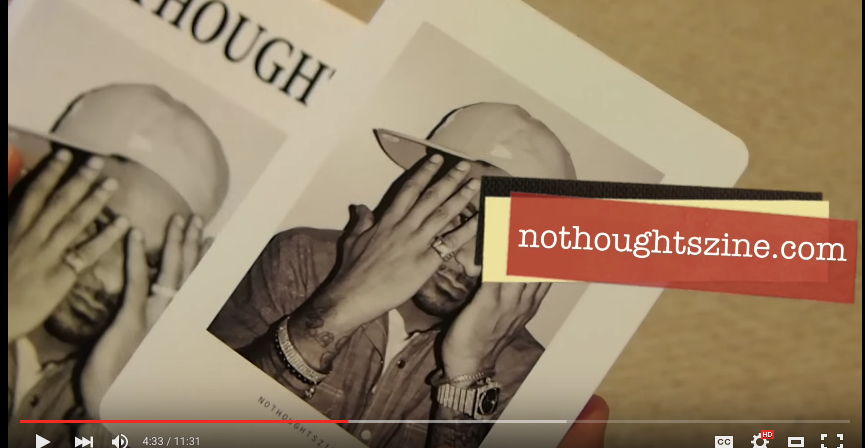
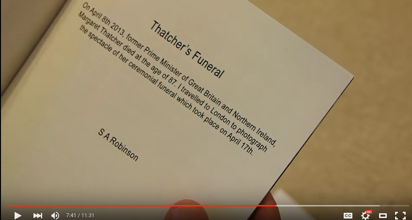
It was also interesting that each zine could be on anything at all- one zine was solely dedicated to the funeral of Margaret Thatcher?
You can watch the video here below.
Some ideas:
I also watched this video- it’s really interesting!
Consultation with Joy
I showed Joy the different binding techniques I experimented with using staplers and the sewing machine.
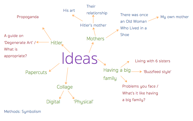
I also showed her my ‘brainstorm’ as an idea of where I want to head towards- which is mainly the concept of family or relationships.
I told her I wanted to try to stay away from cliches. So she suggested something!
….
After I told Joy I was astounded/amazed/ bewildered at some of her suggestions, she did make a good point that if I wanted to move away from the cliches, sometimes marrying my concepts could bring in a new fresh concept.
Also, when I showed her my experimentation with the different binding and expressed to her my interest in the Japanese/Chinese binding, she advised me to be mindful of what each binding can do for me. It could dictate how people read etc.
We also discussed about the time constraint of this project- and how to make it work.
It was a very insightful consultation which really got me thinking.
Moving Forward