Hello! I’m extremely excited to be starting a new project!
Let’s get started!

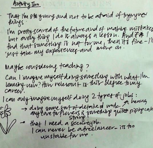
We started off with a simple class activity which honestly required some deep contemplation of myself and my future.
Class activity 1
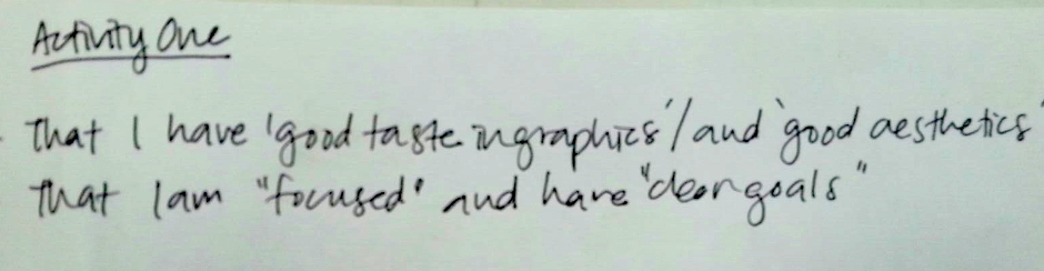
We were told to write adjectives that described our personalities/traits/ attributes. This was a form of primary research- doing fieldwork right there in the classroom! Then we passed our paper around in our circle of ten, each of us adding in traits we thought our friends had.
Some things I wrote about myself: friendly, funny (some people may beg to differ) organised, meticulous, detail oriented.
My classmates added in: creative, hardworking, artistic,intellectual, good taste in graphics and good aesthetics! Thanks guys! (:
Class activity 2
This was the activity that stumped me a bit. We were told to write what we imagined ourselves to be/ or be doing in 2020 (in 5 years time). That was a bit tough for me, since I am very uncertain of what specific career I want to pursue.

But there is one thing I know for sure- that I definitely want to ‘invest’ in myself by taking classes and gaining new skills like calligraphy, henna, making sugar flowers, watercolour. I’m not very sure where Im headed, but I know that the path I want to take is one fill with lots of flowers!
Class Activity 3
The last activity wrapped up everything together. We were told to create mathematical equations to get us where we imagine ourselves to be in 2020.

Attributes I’d like to:
Add
Multiply
Subtract
Overall reflection?
I need to take a deep look at myself again. I used to be able to easily write down my attributes so surely but this time around I was more hesitant and had trouble finding words to describe myself. Maybe I’ve changed? I will be elaborating on this further in my second post and my visual journal.
I feel like this project is going to involve a lot of self-discovery and deep thinking haha.
Anyways, we were told to do research on 5 colour theories:

This is actually the first time in 2D where we will be using colour, so I’ve done some research to see which theory/theories would be most useful to me in this project.
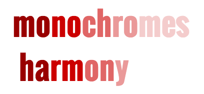
-It is basically a palette where there the different shades (colours) share a single hue, but they are different in terms of brightness and saturation
-Having this monochromatic palette makes the composition cohesive visually
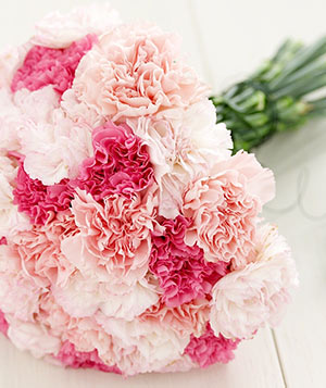
http://www.bouquetweddingflower.com/wp-content/uploads/2011/07/pink-carnations-bouquet.jpg?357dfe
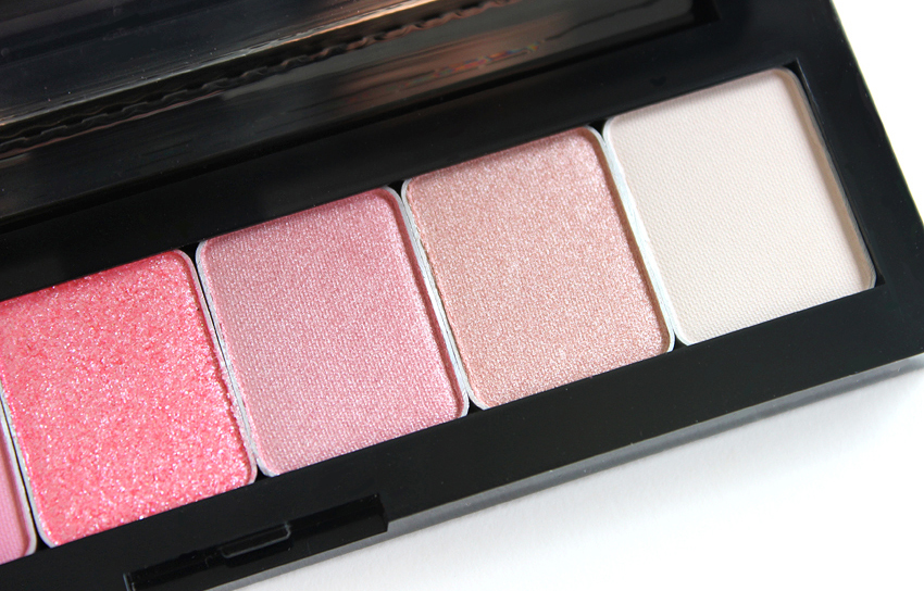
http://thenotice.net/wp-content/uploads/2014/09/shu-uemura-pret-a-palette-review-pink-hues.jpg
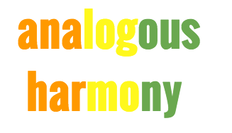
-This palette consists of 3 colours that are situated next to each other on the colour wheel, creating sort of a gradient which is harmonious and pleasing to the eye.
-You usually choose one dominating colour, one supporting colour and an accent colour.

https://d1pnro5z6v3t0.cloudfront.net/wordpress/wp-content/uploads/2013/03/ST_Bouquet_Blueprint_green_0001.jpg

-This is an extension of the second colour theory, except that this takes into consideration the warm and cool colours on the colour wheel.
-Each temperature conveys a certain mood/vibe.
-Warm: Energetic, bright

https://edanafashion.files.wordpress.com/2015/10/ff40.jpg
-Cool: calm, soothing, peaceful

https://s-media-cache-ak0.pinimg.com/236x/f3/f7/46/f3f7464e18260601446a5eb118ec6531.jpg
 -This colour scheme makes use of opposite colours on the colour wheel paired together, which makes a statement with the high contrast.
-The juxtaposition works well to draw attention to something. It can often create a very bold effect if done well, but can also clash if the wrong tones of the colours are used.

http://djerelo.com/wp-content/uploads/2013/07/Navy-Blue-Wall-Decor-Teens-Bedroom-Design-With-Orange-Accents-bedroom-furniture.jpg

http://www.bestofinteriors.com/wp-content/uploads/2013/08/blue-ottomans.jpg

-This is a spin off of complementary hues, two colours adjacent to the base complement colour are used, mainly to ease the stark contrast.

https://s-media-cache-ak0.pinimg.com/736x/be/22/a7/be22a723cf9172d7c81b3a565ca132af.jpg
I’m quite amazed at the science behind colours. I honestly thought that this would be rather boring, but it is quite the opposite- this knowledge opens up your eyes to a whole new world of colours.
Now that I’ve explored all the 5 different theories, how will I be applying it to my project?
I personally feel that each colour theory is a reflection of a personality. Someone who chooses the Complementary Hues is rather bold, daring and unconventional, likes to take risks, whereas someone who chooses the Monochromatic Harmony is someone who likes to play on the safe side, and likes things to be organised. So I think I might not be sticking to just one colour theory. I think it will depend on what traits I want to use, and I still have to finalise my concept.
Also, so far I think I am the sort of person who usually has the monochromatic harmony, mainly because I’m not sure how to pair colours together and what makes them work. To think about it, it is reflected in what I wear, the colours of the flower I pick etc. I usually stick with the safe choices: black scarf or dark blue scarf everyday hahaha, pink flowers with green leaves. Now that I’ve had an understood how all of this works, I’m extremely excited to apply this to real life! You might even see me wearing a colourful outfit (one day…)!
PS. Joy was so sweet and gave us all a colour wheel each !(Thank you so much Joy!)


I have so many amazing artists to share but I’ll try to restrain myself by sharing only 2 for now. I’ll share more in my visual journal.
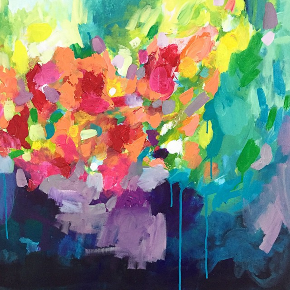
The first artist is Amira Rahim.
Her artwork is simply beautiful. Much of it is abstract, which is rather surprising- I think I’ve developed an appreciation and love for abstract art. Each art piece is like an explosion of colours that is simply breathtaking. I could stare at one picture for hours, studying how she cleverly applies paint and pairs certain hues. I can’t really describe her work and do it justice, so you’ll have to see it yourself.
She definitely understands colours so I’m hoping to be able to study her paintings and apply her techniques to my compositions.

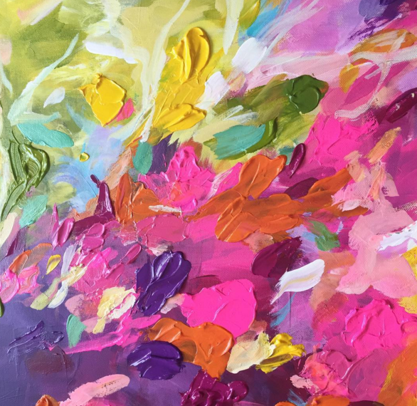
I know that we are supposed to be following one of the colour theories, and each of her works probably has the whole colour wheel in it, but when I study it closely, she does make use of certain ‘rules’ in certain areas and layering which makes it all together a successive piece.
I also feel like her style is extremely expressive and she lets the colours speak for itself without having to draw anything literal, and I’d like to use this as an inspiration in my works, because I definitely would like to include abstract compositions!
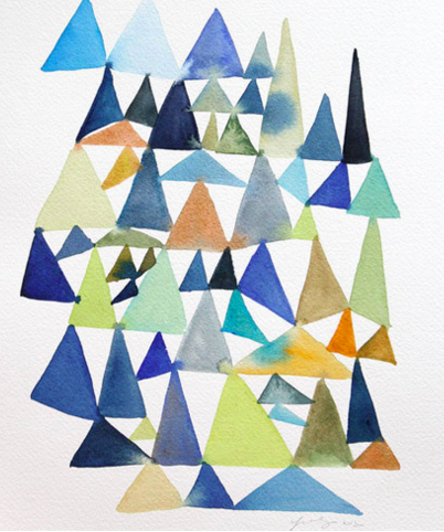
The second artist is Yao Cheng.
Yao Cheng mainly dabbles in watercolour, like how Amira specialises in acrylic /oil painting. Her work encompasses quite a range of my favourites-abstract and literal, flowers and fruits (and even vegetables) to geometric shapes!
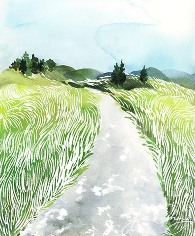

You can see here that there is a more obvious choice of colour palette, and in the picture above, she is in her own way being a florist- painting her own flowers and arranging them in a certain way, according to the colour scheme.
As you can see, the my reference artists all have extremely colourful and bright artworks, which I feel is a reflection of what I like- floral, bright colours. It is also, in a way, a reflection of who I am- a mix of everything.
The artists I chose will definitely inspire me not only in their colours of the works, but their style as well.
I’m trying my very best not to pour everything out onto OSS so that I have something to start off my visual journal for this project! It’s going to be different this time! More colours!

- To re-evaluate myself. I think I will do more fieldwork and ask my family and friends what attributes they see in me.
- To start off my visual journal with many colourful reference photos to keep me inspired and create a ‘mood board’. I know its quality over quantity, but I’ve been neglecting my journal, so I aim to do at least 6 pages! Let’s see how that goes hehe.
- To experiment with the colour wheel and get more familiar with it and using the proper terms.
- Come up with a concept AND the mathematical equations ready for consultation with Joy on Thursday.
All images are taken from each artist’s websites.
www.amirarahim.com
www.yaochengdesign.com