
I found myself extremely intrigued that the ideal balance of aesthetics in designing a product is simply represented through this triangle.

1. Predominant ‘accent’: Human Factors
‘The Ostrich Pillow’
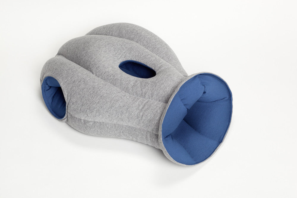
Launched on Kickstarter, this pillow promises users a comfortable power nap anywhere. The 3 holes (two at the sides and one in front) are meant to to provide its users a ‘private little space’. These holes also point to the fact that it has evidently been designed to take the napping positions of people in public spaces seriously into consideration.

Observing these human factors have resulted in a predominantly ergonomic pillow that functions to provide privacy and comfort.
Unfortunately, the aesthetics of this have been compromised, and people who use the odd looking pillow end up looking like a strange creature and attract more attention. Personally it looks like an extremely comfortable pillow and is the perfect pillow to use on a desk but the bizarre design overwhelms any desire of buying it due to embarrassment of using it as it is not exactly an attractive nor stylish, fashionable product.
However, on Kickstarter 1,846 backers have pledged $195,094 of a $70k goal, so this demand for this perhaps indicates that there are still many who prefer comfort over style.
2. Predominant Accent: Function
‘Lost in Sofa’
Daisuke Motogi

Designed by Japanese architect Daisuke Motogi, ‘Lost in Sofa’ plays on the idea of sofas being a black hole where small things are lost. It allows users to insert or even hide various objects into it.
I would say that what makes this sofa so appealing is its novel functionality. It serves it’s main function as a seat, but the added unique feature of holding items makes it much more interactive and playful.
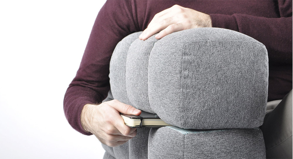
If this feature were taken out, it may not hold out so well aesthetically solely based on its form. The use of negative and positive space is rather awkward and visually looks bulky and odd.In terms of human factors, to an extent the padded cubes look comfortable to sit on, but is not ergonomic with its extremely rigid structure.
3. Predominant ‘accent’: Emotion
Orbit oil & Vinegar Set

The predominant ‘accent’ of this modern cruet set appeals to people’s emotions. The aesthetics of the design itself- having one blown glass bubble in another- is especially intriguing. It is unique, clean, simple, visually appealing and looks extremely sophisticated. One would expect to find this in a modern, sleek kitchen in an upscale home.
For this to happen, usability had to compromised as it is evidently difficult to clean the inside. Also, a smooth rounded glass ball may not be the best surface to grip onto. However, this inconvenience might be just a small thing that can be overlooked to those who are enamoured by the unconventional sleek design. It serves its function well, to hold oil and vinegar in a single container as they are often used together.

In the words of Don Norman: “When we feel good, we overlook design faults. Use a pleasing design, one that looks good and feels, well, sexy, and the behaviour seems to go along more smoothly, more easily, and better. Attractive things work better.”
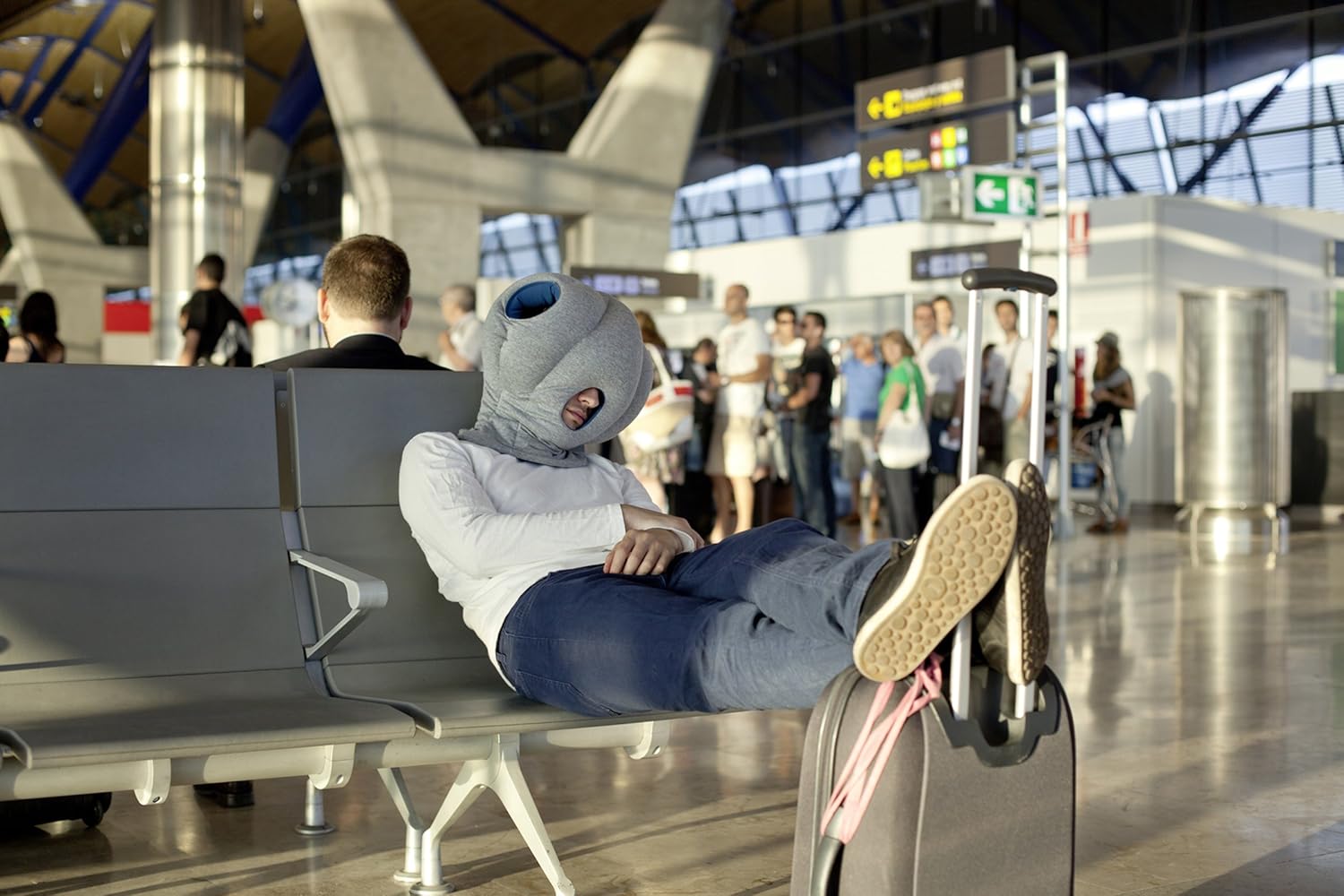
Love the ostrich pillow!
Would you buy it? 😀
Actually, I secretly want one for myself especially during the crazier weeks in school haha.
I think one would look like a completer dodo wearing it in an airport… aesthetics is lost…