Project 2 (Progress)- Part 4

Standard

Hello everyone!

After consultation with Joy last week, I got the thumbs up for my concept and she gave me some things to think about:

  1. How I want my format/layout of my 4 compositions to be

2. How I can unify my 4 compositions- funnily enough, we had the same idea! To use the concept of Gulliver’s Travels in one of the composition. She also suggested using the miniature children throughout the 4 compositions to tie them all in together.


Screen Shot 2015-10-01 at 6.53.33 PM

Remember my ”What’s next?’ section at the end of the Part 3 post? I will be answering and giving updates on each of the section.


  1. Playing around with more dingbats

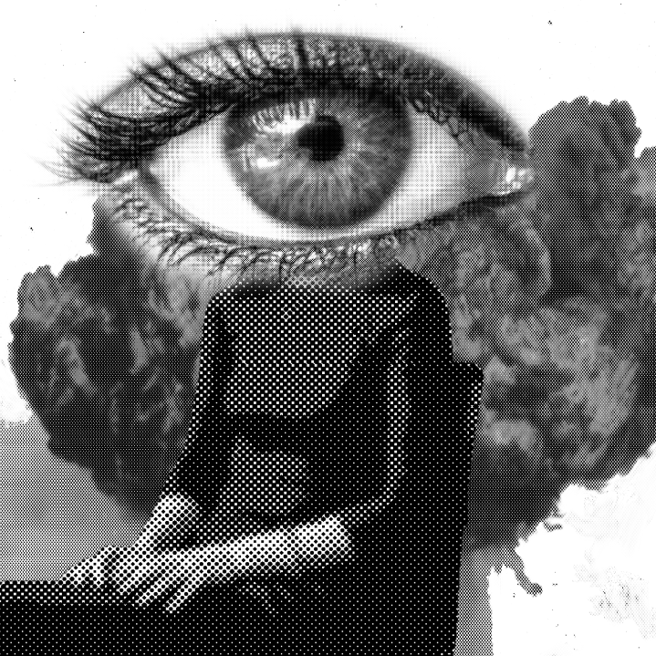
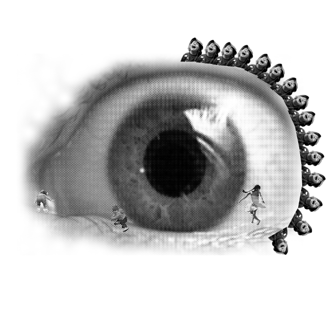
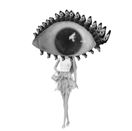
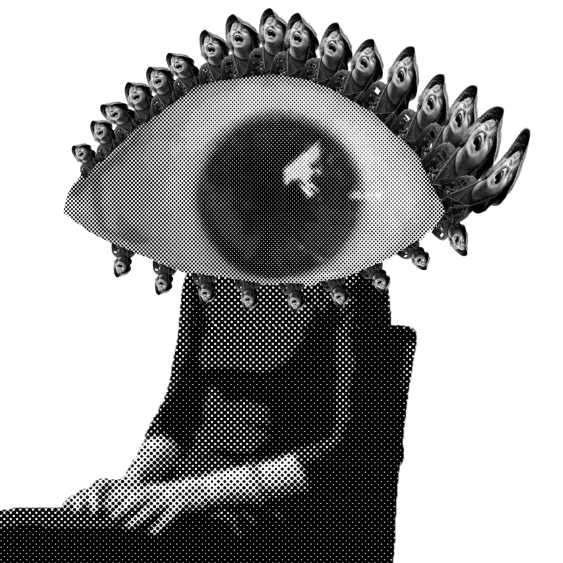
Looking back on the compositions I’ve created, I’m not that satisfied with the visual outcome. I feel like it could look better and more interesting and I could push the design in terms of abstraction since I feel I already have a strong concept.

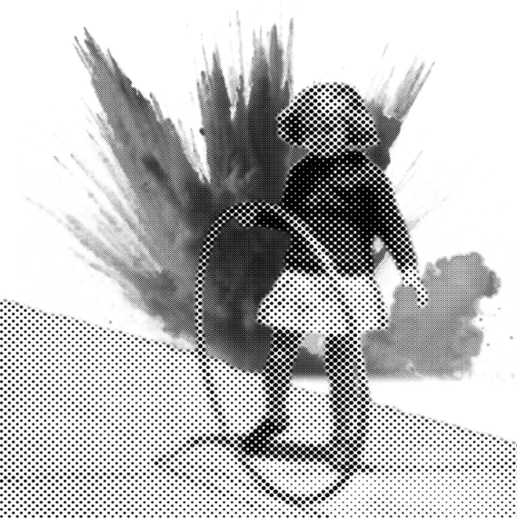
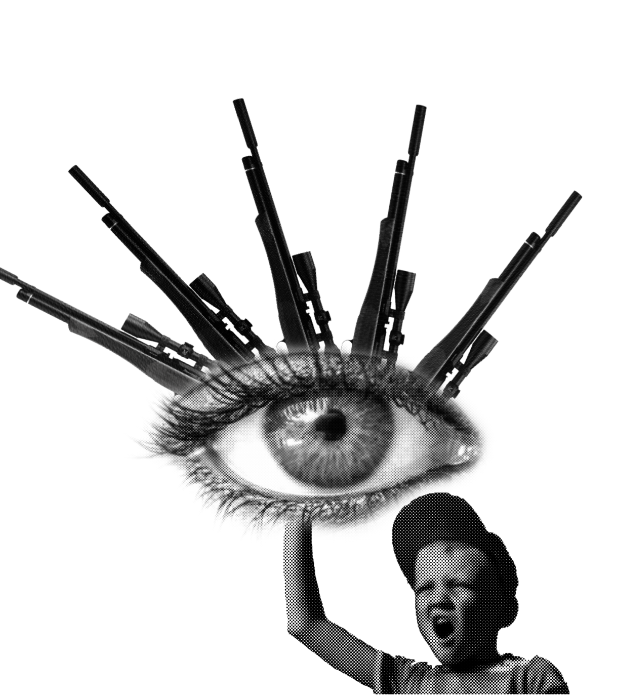
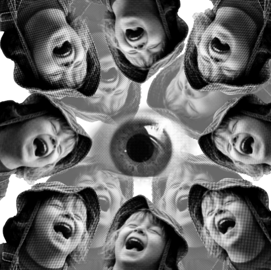
So I spent quite a while experimenting and improving my existing compositions. I noticed that I kind of used compositions from my previous concept about war. Now I realise there are links and similarities that I can draw between the two concepts. I hope that as I explore I will be able to make more connections.

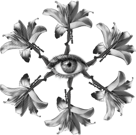
The original composition:

Screen Shot 2015-10-12 at 11.09.21 PM


Screen Shot 2015-10-12 at 10.50.05 AM

Screen Shot 2015-10-12 at 10.52.37 PM Screen Shot 2015-10-12 at 10.50.43 PM

So far I’m making good progress and will be churning out more!


2. Just to reiterate, I have decided to use all 4 lines of the nursery rhyme.


3. For my first original poem about war, I wanted to focus on my compositions having a Constructivism feel and style as it was most appropriate for my concept. Since changing it now, I feel like Dadaism would be more appropriate for my current concept, and Hannah Hoch’s style is really inspiring for my nursery rhyme.

Dadaism challenged “conventional aesthetic and cultural values by producing works marked by nonsense, travesty, and incongruity”.

I have created my own personal checklist to keep in line with the Dada feel.

a)Nonsensical!

b)Travesty: An exaggerated or grotesque imitation, such as a parody of a literary work. Mockery, distortion, corruption.

c) Incongruity: lacking in harmony, incompatible. Not in agreement, as with principles; inconsistent:


I feel like my concept does the same. Nursery rhymes are supposed to be about mothers who love and care for the children properly, whereas my concept deconstructs the rhyme, exploring different types of mothers, each dysfunctional in their own sense. Also, in my compositions, when I represent what the children do and are surrounded by is a reflection of the type of mother they have. So I might not necessarily picture the mother there, but the environment is enough to tell the convey the story.

To think about it, Dadaism is quite an extreme form of abstraction as it will be pushing me out of my comfort zone as I am the type of person who needs things to make sense and look the part. So there will always be a tension between my inner design style and the Dada style and I have to find a balance between both. I have a feeling things will be a bit twisted. But I’m looking forward to it!


Screen Shot 2015-10-01 at 6.56.15 PM

  1. To finalise my compositions for tomorrow’s printing (AAAAHHHHH) and put it in the format required
  2. To gather my thoughts and prepare my presentation for Thursday’s critque!

2D Project 2 (Progress)- Part 1

Standard

I now realise that we are supposed to change to a nursery rhyme for our final artwork, but I’ll upload my progress for this poem anyway since I’ve done quite a lot of exploration and I thought it would be interesting to share.

My concept

I had a lightbulb moment in the shower: I was thinking about the title- It Is Dangerous To Read Newspapers. Why is it dangerous? Margaret Atwood tells that her “passive eyes transmute everything [she] look[s] at”. Being surrounded by news of war since she was young, it has affected the way she sees the world. But for me, personally, I have been affected in a different way.

For me there are two ends of the spectrum:

  • Everything you see is affected- the way you see the world is changed. You are so deeply troubled and disturbed.
  • You are desensitised. You are not able to feel anything when you hear news- its just statistics and numbers to you.

Work-in-progress (using classmates’ dingbats as well!)

I created 5 compositions, and I’m not going to lie, I had quite a lot of fun doing these compositions! Even though I won’t be using these compositions at all, they were good practise anyway!

The images are based on the stanza:

“Even my/ passive eyes transmute/ everything I look at to the pocked/ black and white of a war photo/ how/ can I stop myself / It is dangerous to read newspapers”

(The slash represents the break in the lines)

So everything she sees becomes a war-like situation, even from nature. Nature is distorted. What she sees is affected by horrors of war. I used Nicholas Yoon’s lily, Eugene’s bees and Vimal’s buildings for these dingbats.

Screen Shot 2015-09-29 at 11.15.45 AM


Screen Shot 2015-09-29 at 8.00.19 AM

Screen Shot 2015-09-28 at 10.39.37 PM


Screen Shot 2015-09-28 at 10.35.55 PM Screen Shot 2015-09-28 at 10.36.43 PMScreen Shot 2015-09-28 at 10.36.18 PM


Struggles

I am a complete beginner to Photoshop, so it was quite embarrassing to say that I struggled with even the most basic things. I had to constantly refer back to video tutorials on Youtube- But I’ve learnt a lot by trial and error.

The problems I faced and how I overcame it

One of the problems I faced was when I pixelated some images, they were TOO pixelated that you could barely see any details. I kept watching tutorials and I was following everything that they said to do, but I still go the same result. (Turns out the images I was using weren’t large/ high res enough)….. -.-


In Part 2 of my progress I will be talking about my choice of English nursery rhyme, my concept and I will also be showing several compositions I played around with. Hopefully I’ll be able to tie in the new concept to this one!


Stay tuned!


2D Project 2: Rhymes (Research)

Standard

My poem of choice is Margaret Atwood’s “It is Dangerous to Read Newspapers”.


Screen Shot 2015-09-20 at 6.08.18 PM

In the first pdf below, I have compiled my research mostly on Constructivism and El Lissitzky. The research I did on Dadaism and Hannah Hoch is much more brief and is basically a compilation of images as the art serves more as a visual inspiration to me:

‘Rhymes’ (Research)- Reference Artists


In the second pdf below, I briefly talk about my concept and how my reference artists helped with the the conceptualisation of my poems in terms of concept/ composition and style:

2D Project 2 Week 1