2D Project 3 (Ego) : Part 1

Standard

Hello!

My concept for this project will be “Change of Self“.

Moving from Malaysia to Singapore, I realised that I didn’t just change where I lived but who I was as well.

There were constant and variable elements in this change, some of which I attribute to family, friends and the environment.


After my consult with Joy, she helped me figure out my layout.


Screen Shot 2015-11-01 at 9.04.25 AM


You can view my Weekly Consult form in the pdf below:

Ego Week 11


The layout above was supposed to be posted last week, I had it saved already ready to publish but I completely forgot, so Im just going to combine both posts for the past 2 weeks into one.


I’ve made quite a lot of progress in my visual journal in terms of finalising my equations and realllly thinking everything through- from colour theories to my whole concept of change and how my actual compositions would look like.

For my second consult with Joy, I showed her rough sketches (thumbnail form) of my compositions, what worked and what didn’t work. Honestly in terms of executing my work I’m kind of stuck still and I’m not sure why. I’m hoping I’ll get over this by this week and have concrete compositions to show Joy for this weeks consult.


My finalised equations:

Screen Shot 2015-11-08 at 10.38.31 PM


Screen Shot 2015-11-08 at 11.20.26 PM


Here is my progress in my visual journal! There are more words than there are photos or drawings, but that is because Im still figuring out a lot of things and trying to organise my thoughts. Maybe I think in words? Some people are more visual than text based- I guess Im better at translating my thoughts into words than visual images…


Screen Shot 2015-11-08 at 11.21.16 PM


I found out about this “Big 5 Personality Traits” and decided to do it to help me contain myself into these categories:

Screen Shot 2015-11-08 at 11.21.09 PM


I added in more reference images from my reference artists to convey how my style has changed, reflecting my the change in who I am as well.

Screen Shot 2015-11-08 at 11.20.56 PM Screen Shot 2015-11-08 at 11.20.47 PM


I also delved into my choices for color theories but stopped halfway because I realised that I was limiting myself by thinking in this manner


Screen Shot 2015-11-08 at 11.20.40 PM


The colours I would choose for each colour theory:Screen Shot 2015-11-08 at 11.17.19 PM

I experimented with some patterns using the colour theories- it was quite fun actually!

Screen Shot 2015-11-08 at 11.18.15 PM


Consultation with Joy in Week 12

  1.  I told Joy that I wanted to use patterns in all of my compositions.
  2. I updated her on the fact that I will make all my compositions handmade, and use digital media to combine my handmade compositions into the end of the equations. She suggested making use of scanning as an art? This was pretty interesting- I think I will look further into that.

2. She also told me to think about how far can you push using digital means to your advantage?

3. I told her about my idea of using kaleidoscopes, which I’m not sure whether I will be using. I have to see if it can tie in to my concept well.

Screen Shot 2015-11-08 at 11.19.06 PM


My failed attempt at a kaleidoscope 🙁

Screen Shot 2015-11-08 at 11.31.18 PM

So what’s next?

START EXECUTING MY COMPOSITIONS!

2D Project 2 Final Wrap Up!

Standard

Hello!

This is the final post for Project 2!

Screen Shot 2015-10-20 at 12.08.06 AM

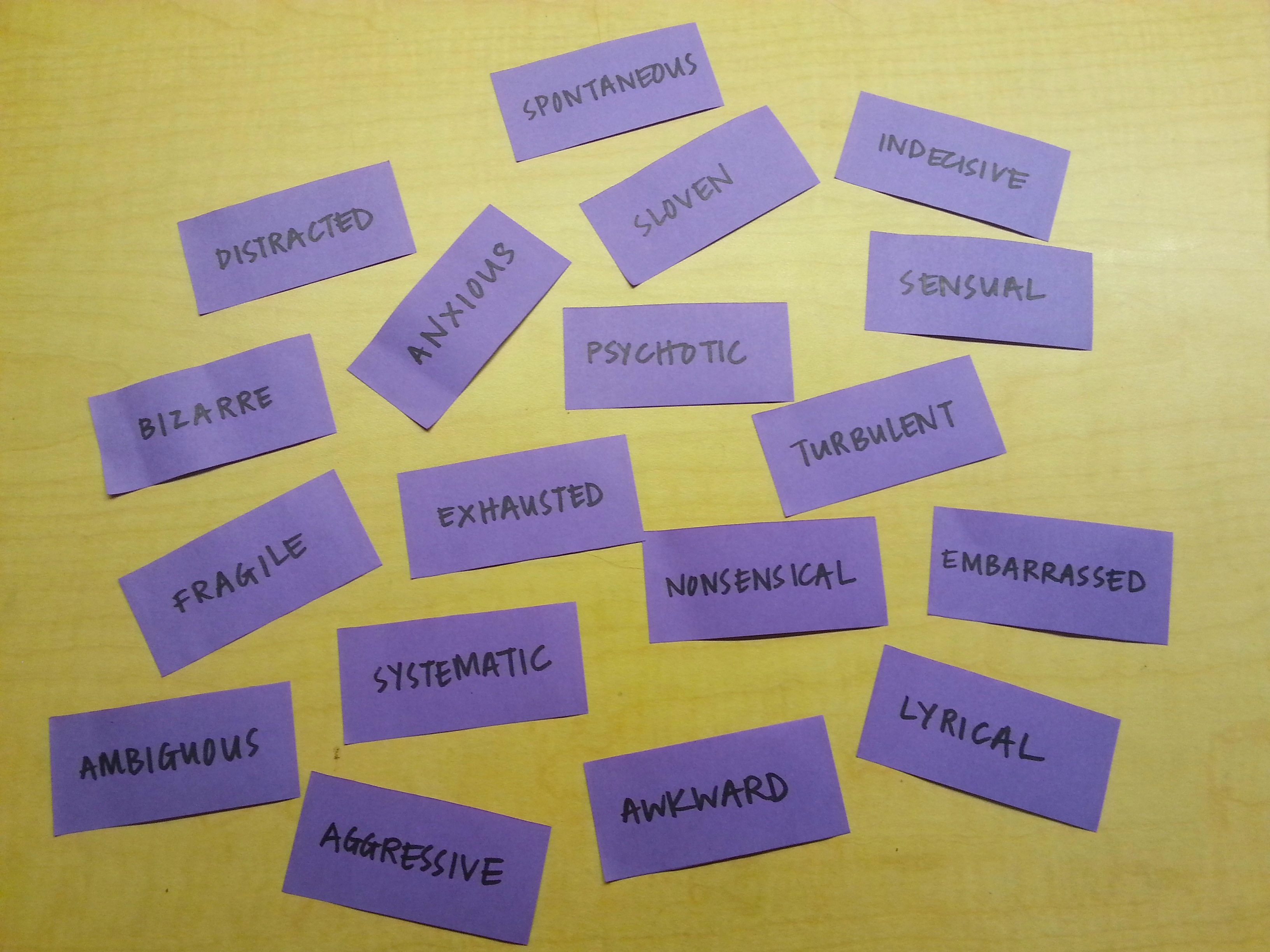
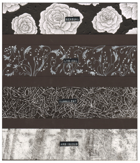
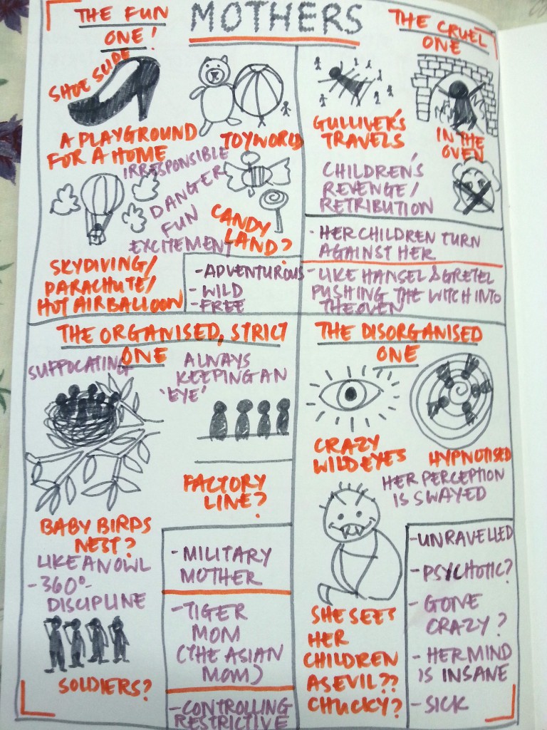
My concept is based on each of the 4 lines of the nursery rhyme “There Was An Old Woman Who Lived In A Shoe”. It explores the 4 different types of mothers, each dysfunctional in their own ways.

Throughout the 4 compositions you will see little minion children, and in each composition they behave differently, reflecting the type of mother they have.


Screen Shot 2015-10-19 at 11.58.01 PM

I actually forgot to mention this during my presentation, but I decided to arrange the compositions in a square because I felt that the ‘eye compositions’ should be diagonal opposites, as well as both ‘chaotic compositions’ being the other diagonal (like a criss -cross). This would create an overall sense of balance for the viewer, showing that even though I deconstructed the nursery rhyme and interpreted each line rather differently, when you see the whole picture, ultimately they all make and belong to the same one nursery rhyme.

I was wondering whether I should have arranged it that both ‘eye compositions’ were on the top- but then I realised it wouldn’t really make sense visually and conceptually.


Screen Shot 2015-10-19 at 11.46.41 PM


Screen Shot 2015-10-19 at 11.58.38 PM

As you go through each of these compositions, before you read the explanations, the question you should be asking is this: What kind of a mom do these children have?

Why? Because it’s much more interesting to let you draw the conclusions yourself. Instead of showing you the mom’s facial expression yourself by using obvious visual compositions (eg. using a dingbat that shows a distressed woman to show that she can’t control her children), you can judge for yourself what the personality of the mom is by the way her children behave. 

Let’s begin!


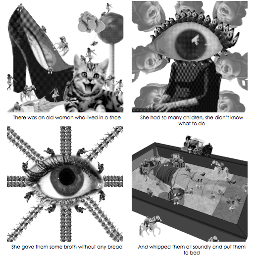
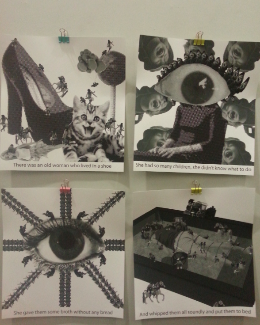
Composition 1: “There was once an old woman who lived in a shoe”
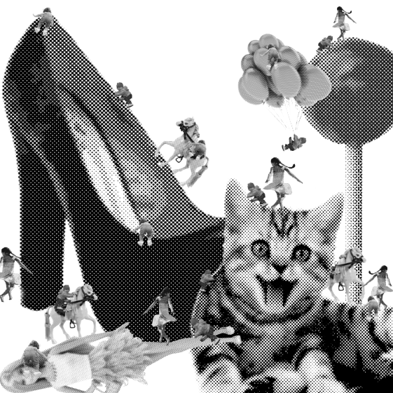
Screen Shot 2015-10-19 at 11.25.41 PM

Dingbats used:

-Shoe (mine)

-Balloons (mine)

– 2 different dingbats of children (all mine)

-Mary skipping (Hsin Wei’s)

-Pony (Andrew’s )

-Barbie doll (Andrew’s )

-Kitten (Justin’s )

-Lollipop (Pei Yi’s)


Explanation:

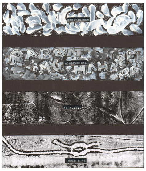
-What kind of a mother lives in a shoe with her children? A fun mother! She lets chaos reign, therefore you see children everywhere and there is no central focus. I chose to design the composition this way as to invite the viewer to look close and see the different fun activities the little minion children are doing.

Speaking of which, if you look closer, you will be able to see that in reality, the activities the children are doing rather unsafe and risky- and they are doing the most ridiculous things! You can see a baby hanging off the balloon or climbing up the shoe on a pony!

-The dingbats I chose are to create a whimsical atmosphere and add elements of excitement by exaggerating them to amplify or skew the function of the dingbat. For instance, the lollipop is enlarged into a colossal lollipop– every child’s dream.

-Kittens are generally harmless, but when it is ten times bigger than the children, there is a sense of danger here that the mother has put the children in. It is almost like she lets her children play with a baby tiger!

-Also, when you see the illustrations of the nursery rhyme you see the mother living in a beat up man’s shoe, tattered and chunky. But when you see the high heel– you think, this must be one stylish, fashion conscious mom! In another sense it is also rather impractical as the high heel is extremely unstable as a house. The choice of the shoe reflects the mother’s personality as well- impractical, fun, easy going mother.


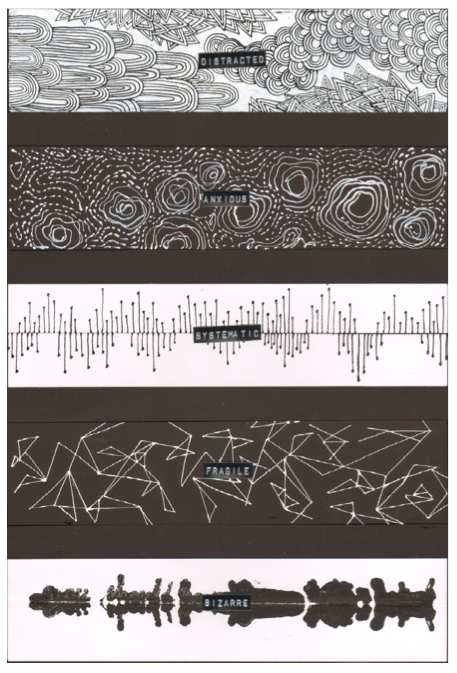
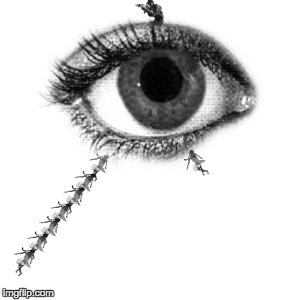
Composition 2: “She had so many children she didn’t know what to do”
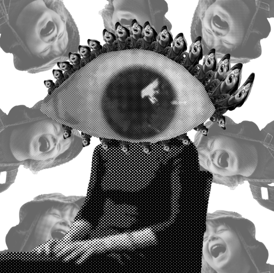
Screen Shot 2015-10-19 at 11.25.29 PM

Dingbats used:

-Scared eye (mine)

– Boy laughing (mine)

-Woman sitting in the chair (mine)


Explanation:

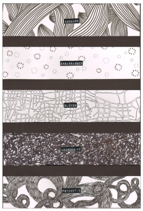
Nursery rhymes usually talk about a mothers love to their children. But here I wanted to change the perception completely. I wanted to show a mother who has is in a state of helplessness due to her mental illness. She has lost her mind and lost control over her child/children. But one thing remains ambiguous- perhaps she has many children or maybe she just has one and she sees the same one being ‘multiplied’- we can’t really tell since her perception is distorted. Her child/children have become alien to her. There is no love, but fear and disturbance because of what her state of mind is.

This whole composition is to reflect her psychotic mind and to give an eerie, vibe as the mother feels her child/children are mocking her. Also, this was largely inspired by Hannah Hoch’s dada style- the use of exaggeration and collage style like compositions.

-The scared eye is enlarged to hide her face. We don’t need to see her face to know what is going on with her. The startling eye almost jumps out at you to suggest bewilderment, contrasting the cool composure she is taking on, sitting on the chair.

-To further enhance the eeriness and psychotic feel, I created ‘eyelashes’ out of the same dingbat of the laughing child. The repetition of the dingbat in the eyelashes and the background is to show how her world is ‘closing in’ on her and her child/ children seems to be the source of her discomfort, unease and anxiety.

The dingbat is actually meant to be really happy and bright but using it in this composition now distorts my feeling towards it- it seems more dark and twisted and slightly creepy.


svhu8

^A gif I made on Joy’s suggestion. (Thanks Joy! They’re pretty cool!) The different pictures show my experiments for this composition.

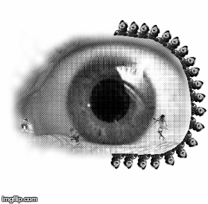
Here’s another one that I made but didn’t make the cut. It also didn’t make sense that the children were on her eyeball haha.

svvto


Composition 3: “She gave them some broth without any bread”
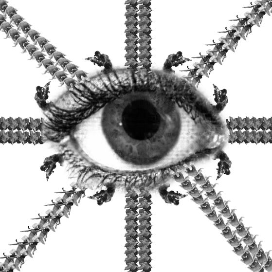
Screen Shot 2015-10-19 at 11.26.06 PM


Dingbats used:

-Eye (mine)

– 2 different dingbats of children (all mine)

-Mary skipping (Hsin Wei’s)

-Sniper (Jordan’s)


Explanation:

– I used the eye here again, but this time to convey an opposite, contrasting personality: the rigidness of the strict tiger mom who wants to enforce discipline. She has everything under control. Because of her personality, I wanted to convey her as a military officer, therefore using straight lines and ‘war’ imagery. The fact that the eye is central to the composition is to suggest that she has a 360 degree control and that she watches her children carefully, ‘keeping an eye’ on them.

-You can see the little minion children here making an appearance again. However, this time they are arranged in straight, strict lines to mimic the military rows soldiers make. They are ‘kept in line’ and are under control- very orderly.

-The use of Jordan’s sniper is to reinforce how she she keeps her guard up at all times. The sniper is placed all around the eye, rotated at different positions to convey movement like how someone with a gun is alert and will ‘pan left and right’ as he moved around the room to detect any suspicious activity.

svhoj

^ A gif of my work-in-progress in creating this composition


Composition 4: “And whipped them all soundly and put them to bed”
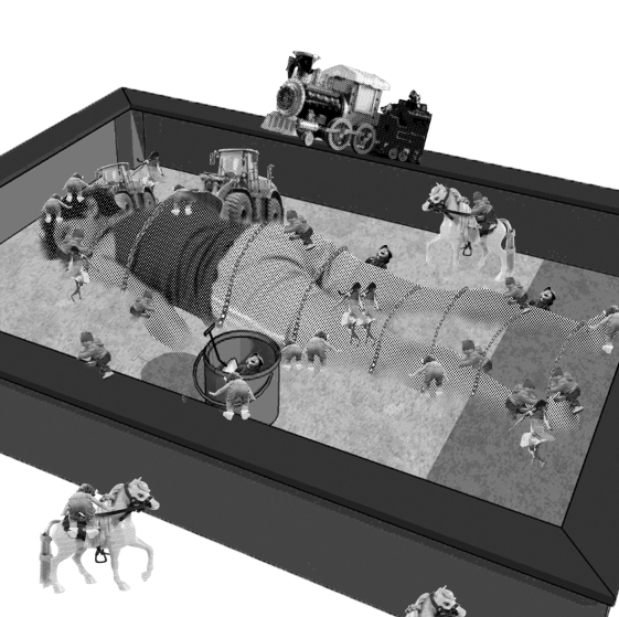
 

Screen Shot 2015-10-19 at 11.25.53 PM


Dingbats used:

-Woman lying down (mine)

– 2 different dingbats of children (all mine)

-Bulldozer (mine)

-Train (Brenda’s)

-Mary skipping (Hsin Wei’s)

Barbie doll (Andrew’s)

The first question you should ask when you see this is: Why are these children doing this to their mother?

Explanation:

– This mother is the abusive step-mother. Here, we see that the children get their revenge- they send HER to bed. One idea I had was to use the concept of Hansel & Gretel pushing the witch in the oven, but I liked the Gulliver’s Travels concept wayy better!

-I purposely made composition 4 similar to composition 1 in terms of layout. Many of the same dingbats are used. The children are riding the ponies in composition 1, but it is to have fun and adventure. Here, it they use the ponies almost like soldiers ‘waging war’ haha. You have children everywhere to convey chaos. In this composition, the children have a revolution and chain their step-mother.

-I decided to add in the bulldozer and the train to suggest the creativity of the children in using their toys to make their way to the sandbox and to dig the sand. I find it quite humorous actually!


Screen Shot 2015-10-19 at 11.58.58 PMDespite having no knowledge of Photoshop whatsoever, I am extremely happy that I am able to learn a lot just by doing this project. All those hours spent with trial and error and playing around with tones, cropping etc was totally worth it! Again, just like other previous project, this definitely pushed me out of my comfort zone but I am definitely pleased with the outcome and that I went through this whole process!

But most importantly, one main thing I should takeaway from this project is that you should be flexible and open. Take those curveballs thrown at you to push your creativity and potential and you will definitely be pleasantly surprised by the results!


Screen Shot 2015-10-20 at 12.05.14 AM


For this project, I find that it was much more easier to document my progress on OSS, however I still have some sketches and research done in my visual journal albeit considerably less than the previous project!


20151021_181642

20151021_181657


Screen Shot 2015-10-20 at 12.06.13 AM

Screen Shot 2015-10-21 at 6.22.10 PM


IMG-20151021-WA0038 (1)


Screen Shot 2015-10-21 at 6.22.31 PM


Screen Shot 2015-10-21 at 6.23.34 PM


Screen Shot 2015-10-20 at 12.00.42 AM

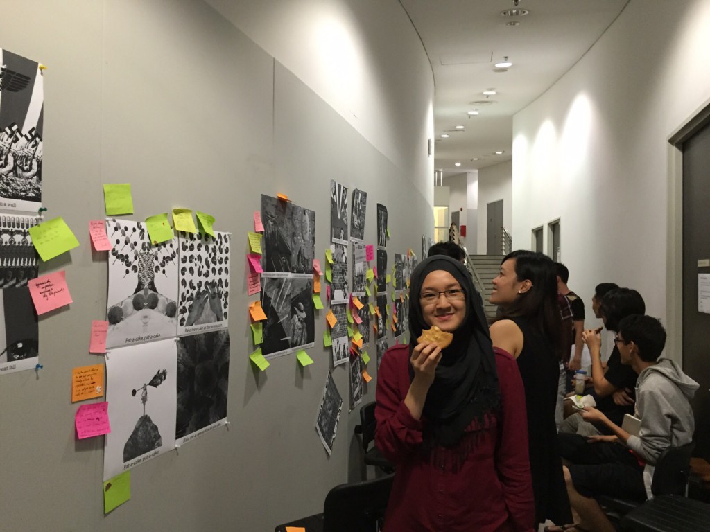
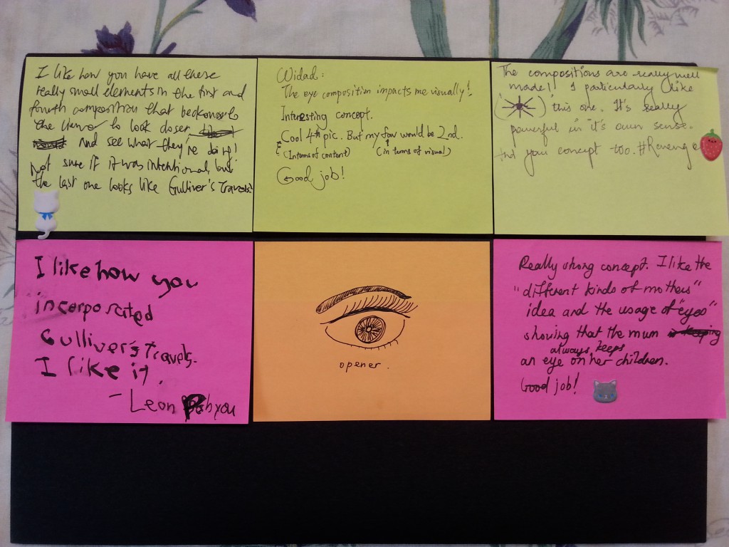
Instructors feedback:

  • Joy liked the manipulation of the ‘child laughing’ dingbat to create eyelashes- she felt that it was creative.
  • She liked that it wasn’t too literal
  • Most importantly, she especially likes the fact that there was no need to depict the mother to show what kind of mother it is.

Classmates’ feedback:

20151021_174225

2D Project 1 + Visual Journal

Standard

I hereby present my 2D Project 1 on lines! This post will be a culmination of the whole project- from the beginning of the process to the end. I will be breaking it down through the following categories:

My process (including photos of my Visual Journal)

a)Research on reference artists

b)Experimentation of techniques (Visual Journal)

c)Development of concept (Identifying my direction)


 My final outcome

a) Format / methodology- choice of media

b) Final artwork

c) Overall thoughts on the project and challenges faced

Let’s begin!


Screen Shot 2015-10-03 at 7.11.27 AM

a) Research on reference artists

Screen Shot 2015-10-03 at 7.08.01 AM

Here are some snippets of the research I did on Sol LeWitt and Red:

Sol LeWitt:

Screen Shot 2015-10-03 at 7.28.46 AM


Screen Shot 2015-10-03 at 7.27.33 AM

Screen Shot 2015-10-03 at 7.24.36 AM


Red:

Screen Shot 2015-10-03 at 7.29.58 AM


Screen Shot 2015-10-03 at 7.26.10 AM


Screen Shot 2015-10-03 at 7.24.49 AM

Towards the end of this very long post I will be commenting on how my research has helped my work and influenced my designs. I will be referring to some of my designs as I talk about this, that’s why I chose to put this towards the end of the post.

Here is the pdf if you would like to see the whole thing

2D Reference Artists Updated


b)Experimentation of techniques (Visual Journal)

Screen Shot 2015-10-03 at 7.17.31 AM

I had a ‘virtual visual journal’ as well for my initial stages- where I defined and pinned up photos that could provide me with visual inspiration. Joy actually suggested that it was better to print out the photos and stick it into my visual journal, but I felt that it was more optimal for me to have it as a soft copy as I could add and delete photos based on my concept.


DSC_4963

Here are some images of it:

Screen Shot 2015-10-04 at 10.36.05 PM

muhahaScreen Shot 2015-10-04 at 10.28.33 PMScreen Shot 2015-10-04 at 10.32.28 PM


I experimented with many many different techniques and designs. Unfortunately I stupidly threw away some of my experiments without documenting them so I shall display what I have salvaged.


DSC_4944


DSC_4956


Screen Shot 2015-10-04 at 10.48.36 PM


Monoprinting

20150830_233750


Screen Shot 2015-10-04 at 11.07.06 PM

DSC_4969 DSC_4970DSC_4948


Monoprinting was definitely an eye opener for me. It introduced me to the world of abstract art and automatism- there was beauty in the fact that each piece was unique and I always found myself always holding my breath before peeling of the paper from the rubber mat to see what is printed.

There is a certain unrefined, raw quality and grittiness to monoprinting that greatly appealed to me, and that’s why I chose to use this technique for the last 4 emotions (turbulent, indecisive, ambiguous and exhausted). Previously, the positive new emotions the dots shared were expressed through the marrying of the two mediums. I wanted to create contrast to this shared positive joy with monoprinting to bring out the negative, dark cloud of emotions that surrounded both dots.


c)Development of concept (Identifying my direction)Screen Shot 2015-10-01 at 11.24.25 AM

20150830_182759

I wanted to do a play on Paul Klee’s line, so I titled my project ‘Two dots went for a walk’. I wanted to explore the relationship and interaction between two dots- from the beginning before they meet, their experiences and the emotions they share when their lines/paths intersect, and the possibility of their lines diverging after they meet.

The dots symbolise the relationship between a male and a female and their emotions they share together.

20150830_184223

Without really meaning to, my concept became more of a narrative, telling the story of two ‘dots’, and expressing each emotion through the personality of each dot.

Let me take you through this narrative.

So in the beginning, before the dots meet, the female experiences ‘anxious’ and ‘distracted’ while the male is ‘awkward’ and embarrassed’.

Then after they meet (intersect) and begin to share experiences, they share new emotions together (spontaneous, lyrical, sensual and nonsensical).

After the honeymoon stage, they begin to find out things about each other- mostly negative ones . The female is ‘bizarre’, ‘fragile’ and ‘systematic’. The male has opposite emotions: ‘psychotic’, ‘aggressive’ and ‘sloven’

Because they start to show each other their true colours, their relationship becomes rocky and they share the same negative emotions: ‘turbulent’,’exhausted’ and their relationship status is ‘ambiguous’ and ‘indecisive’- they don’t know where it is going and how it will end.


Screen Shot 2015-10-03 at 7.12.56 AM


a) Format & methodology-choice of media

Screen Shot 2015-10-01 at 11.01.29 AM

I chose the 4 X A2 format on Joy’s suggestion (thanks Joy!)- and I felt it suited my concept the best. The top part (first two rows) represents the dots before they meet, and the ones below represents after they begin sharing and revealing emotions.


Screen Shot 2015-10-01 at 11.26.31 AM

I wanted to use mediums to represent each dot. So for one dot (the male) I chose to exclusively use pen/marker, whereas for the other dot (the female) I chose to use only acrylic paint. I wanted the male to be represented by bold, thick, and relatively crazy line whereas the female would have more intricate, detailed lines- therefore I felt that the mediums I chose was suitable for each.

As I did each design, I now realised that I somehow embodied the persona of each dot- which was helped by my choice of medium. For instance, when I was doing the design for the female dot, I had extreme focus and had to be very detailed and precise. The acrylic paint I used wasn’t conventionally applied using a paintbrush- I squeezed it out of a plastic cellophane tube instead, giving me more control over it. For the male, I had more freedom in my hand movement and my concentration didn’t have to be as intense as the the designs for the female.

So before they meet, the emotions the dots experience individually have more singular lines of the same medium. I played with telling their story in the sense that I gave the female emotions such as ‘anxious’ and ‘distracted’ and for the male-‘awkward’ and ‘embarrassed’.Their coming together would have the two mediums being mixed as they share these new emotions (sensual, lyrical, spontaneous, nonsensical). These emotions had more motion and energy to represent the newfound connection. After they pass the initial stage, they discover each others dark side, which leads them to experience more negative emotions together. For these emotions, I chose to use monoprinting as I felt that this technique was better suited in conveying these ‘darker’ and more complex emotions.

Doing each design, I had to embrace the persona of each dot. For example, when I was designing ‘Awkward’, halfway through, I was rather unsatisfied with how it didn’t look as perfect and equal as I wanted to. But then I realised that this was the persona of the dot I was designing for. This ‘male dot’ didn’t care for the finest of details- being detail oriented was the personality of the female dot. So designing the emotions of the ‘male dot’ I was relatively more relaxed and expressive and free, not worrying too much about details.


b) Final artwork

Screen Shot 2015-10-03 at 7.20.10 AM

I apologise for how small the photos are, so the best thing I can do is give you closeups of each emotion:

Screen Shot 2015-10-01 at 11.30.00 AM

Screen Shot 2015-10-01 at 11.31.50 AM

Screen Shot 2015-10-01 at 11.32.38 AM

Screen Shot 2015-10-01 at 11.33.16 AM

If I were to take you though all 18 emotions, we would be here for a very long time. So I shall take you through a few of my favourites.

Sensual: If you look carefully, the edges of the petals between two roses have the silhouette of two people facing each other in an intimate way. I wanted to incorporate this subtle feature because it represents the intimacy of this emotion and how the emotion ‘Sensual’ is not for the public- only the people in the relationship share it.

Spontaneous: I ditched the acrylic paint in a henna cone with the fine point and squeezed it out directly from the the acrylic paint tube. I used my fingers to form the designs using short swift stroked to create textured. I feel like the process and idea of this itself was spontaneous and really embodies the meaning.

Bizarre: This is one of the most abstract designs of all of them, and I feel this is what best represents automatism, inspired heavily by ‘The Ghosts of My Friends’. Actually, for this I used acrylic paint in a henna cone and wrote out (in cursive) a ‘strange secret’ the female dot would have. Then I folded the paper so it became smudged and the words became strange-bizarre patterns.

Indecisive: This is actually a mono print of a granny knot. This type of knot is insecure, and can slip when subjected to increasing tension, and therefore must be avoided. I chose this to be the last emotion. It represents the conflicted point of the relationship where the two dots are right now.Will they stay where they are or will they eventually diverge? It also plays on the phrase ‘tying the knot’ aka getting married- will they secure their relationship or will their indecisiveness cause them to fall out?

c)  Challenges faced & Overall thoughts on the project

Screen Shot 2015-10-01 at 11.27.36 AM

I struggled a lot with conveying and responding to the emotions in an abstract manner and without being too literal. Initially, I also struggled with coming up my concept, but I overcame this by writing out all the emotions onto post it notes and tried to make sense of it. I somehow instinctively arranged all the emotions into a narrative and it all came naturally.

Also, one of the biggest challenges I faced was using acrylic paint using a plastic henna cone. I had to practise doing it many times to get the steady lines and the right pressure. It was very difficult but I managed to do somewhat of a decent job.


Screen Shot 2015-10-03 at 5.18.24 PMNow that I have finished the whole project, on reflection, I didn’t take direct visual inspiration from both artists. Rather, I was inspired by their ideas and methods and I translated it into my own.

For Sol LeWitt, I mentioned how I wanted to create simple, geometric art to branch out from my usual flowery designs. Although I couldn’t use some of his ideas (especially the concept of an idea being art itself like of an architect having construction workers carry out his ‘art’) because I had to do everything by myself, I was inspired by his aesthetics and tried to incorporate the minimalist style in ‘Systematic’ and ‘Fragile’- with the use of a lot of straight lines.


As for Red, she inspired me through her methodology-how she embraced expressing messages through her medium and pushing away conventional tools. Although mine wasn’t as cool and out there as hers was, I did try to go out of the box. This was by the use of acrylic paint almost exclusively in a henna plastic cone. The acrylic paint represented one dot (the ‘female’ dot), and the henna cone that contains it represents how uptight and controlled her personality is. As a result, the acrylic paint that came out gave thin, long lines that created meticulous details. In the emotion ‘Distracted’ you can clearly see that. You would think that a distracted mind would have many different pictures/images/ideas flowing around- yet I chose this design to reflect that even her mind, when distracted, is absentminded in a ‘neat’ and ‘controlled’ manner- something like a version of a neat doodle.


Screen Shot 2015-10-03 at 5.40.02 PM


Weekly Progress

Week 1:

2D Reference Artists Updated

Week 2:

Week 2 Visual Journal

Week2 Project1 Progress

Week 3:

Week3 Visual Journal

Week3 Project 1 Progress

Week 3 Review Form

Week 4:

Screen Shot 2015-10-03 at 8.53.13 AM

Week 5

DN1002 Project 1 Critique Sheet