I’d like to make sure this post has everything I needed to say about this project, so I apologise if I am repeating myself in some parts.
Due to my time constraint, I had to slightly change my concept. I realise that I was creating problems for myself by fixating on unnecessary issues. I turned what was supposed to be a simple concept on my flawed attributes to something entirely complicated, almost missing out the main star itself- typography.
My initial concept was to show how I reconcile having the same attribute at two different stages of life- between adult and child, and how it can have different connotations at different ages. I feel that it had merit and potential but I had made it too complicated so I scratched that and went back to the basics.
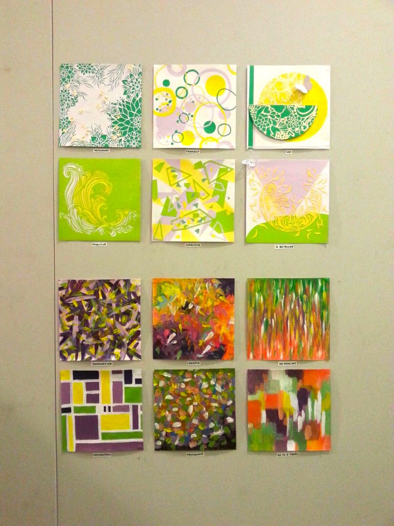
Therefore, my first project focuses on my flaws. Last semester we did a project on ‘Self’, where we mainly focused on our positive attributes. So, this time I thought it would be interesting to explore my flaws because they too, are part of my identity.
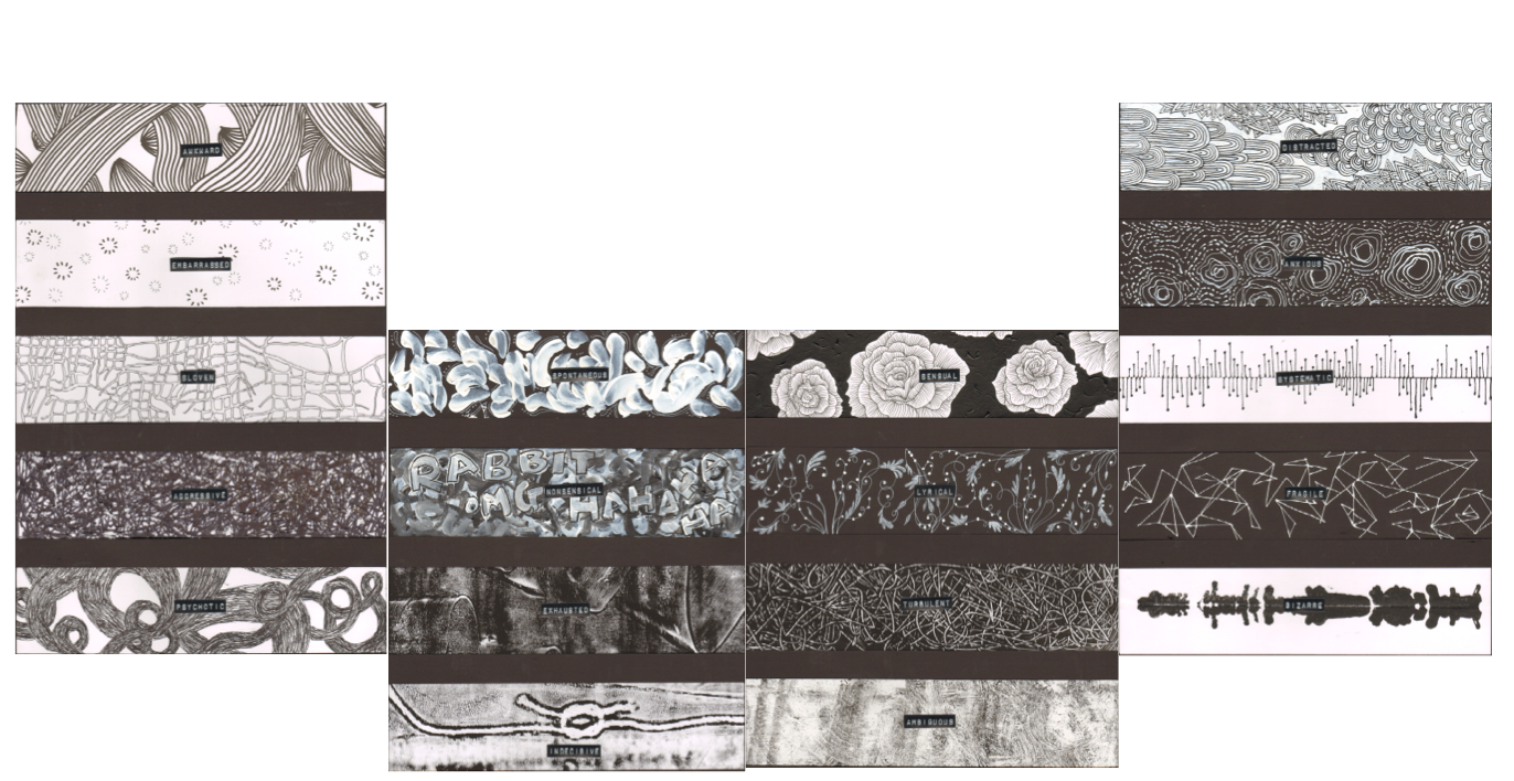
When I listed these 4 attributes (conformist, curious, demanding and open), I noticed some of them had a relationship with one another. On analysing them closely, I realised some of them contradicted one another and this was because they have a cause and effect relationship.
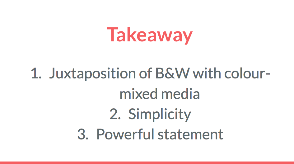
This was how I arranged the compositions:

Format
The first set: ‘Conformist’ and ‘Demanding’ have a somewhat contradicting relationship, at least to me.
Here is my take on these attributes:
- Conformist= following rules, being conventional.
- Demanding= exerting your authority on others and making sure other people follow your rules.
I figured out that I was demanding because I’m such a conformist that I expect others to follow the rules that I follow as well.
The second set, ‘Open’ and ‘Curious’ doesn’t really have a contradiction, but rather, a clearer relationship.
I figured out that I was ‘curious’ because I’m so open with my thoughts and feelings that I somehow think that others are as open as I am- and it turns out that they aren’t, so in reality, I’m actually nosy.
Each attribute has either an element of ‘taking in’ and ‘giving out’, as seen clearly annotated above. I thought it was important to highlight these two ‘categories’ because I feel like I’m sort of a machine- when I take input, I inevitably have output.
Typography
Going along with the same 2 categories, for ‘Taking in’ I used computer fonts sourced from the internet to reflect different sources. For ‘Giving out’, the typography are all entirely handmade and using my handwriting to reflect the information I ‘give out’.
Choice of colour
- ‘Taking in’ and ‘Giving out’
I wanted to allude to the two categories I talked about above with the use of colour.
‘Taking in’ means receiving information from different sources = more than 2 colours used
‘Giving out’ has only one source, which is me= only 2 colours used (I initially wanted to use one colour, but I needed to have contrast, so I decided on two instead)
- Color palette- why bright colors?
To be honest, when I was editing these I was having a bad headache from looking at all the bright saturated colours ( I had to increase the saturation on the computer or else it would be too muted).
Initially I chose all these bold, bright colours to mimic the childish attribute but when I changed my concept I decide to keep it as I felt that it would perfectly reflect my distaste for my flaws. The colours I paired together for each composition are no way pleasing to look at- they are jarring and have high contrast. Overall, I didn’t want to make this project aesthetically pleasing because I wanted to show how uncomfortable I was with my flaws through the colour scheme. If I were to use the same colours, but with pastel hues or muted tones, the project would be entirely different and wouldn’t have the same impact.
Hello my name is Widad and I am a
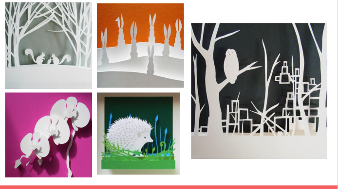
I was inspired by this work I found on Pinterest. I can’t seem to find out who the artist it though 🙁 The element of the letters being camouflaged intrigued me.
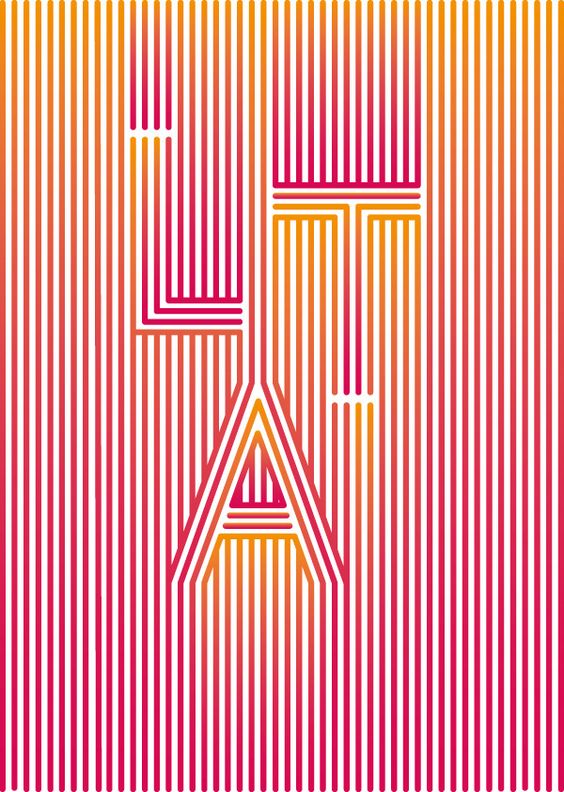
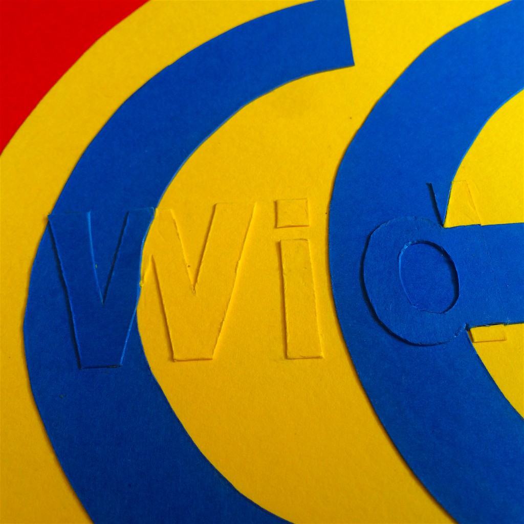
When you first see this piece from afar, all you see is CE. I chose to use CE because the CE marking is a mandatory conformity marking for products sold in the European Union. I thought this would be a perfect symbol for showing conformity. All the products that comply to the certain set of rules and regulations can display the symbol on their products.
I feel that conformists are the same to a certain extent. We’d like to think we are all individuals and unique, but we unconsciously or consciously follow society’s rules and in that sense lose our identities. I’m a conformist because I stick to the status quo and don’t question rules- I don’t like to stand out for the wrong reasons, I don’t rebel. That is why I hid/camouflaged my name because being a conformist, I lose a part of my identity.
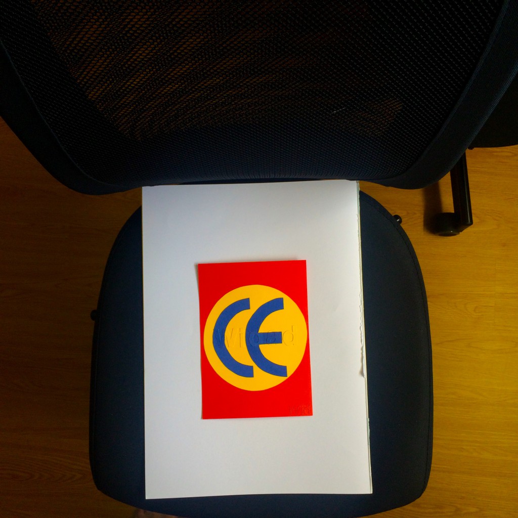
Upon close inspection, you can actually see my name popping out. As I was doing this, I was thinking to myself that this would be so much easier if I were to do it digitally. But I feel that it feels so much more special when it is handmade.
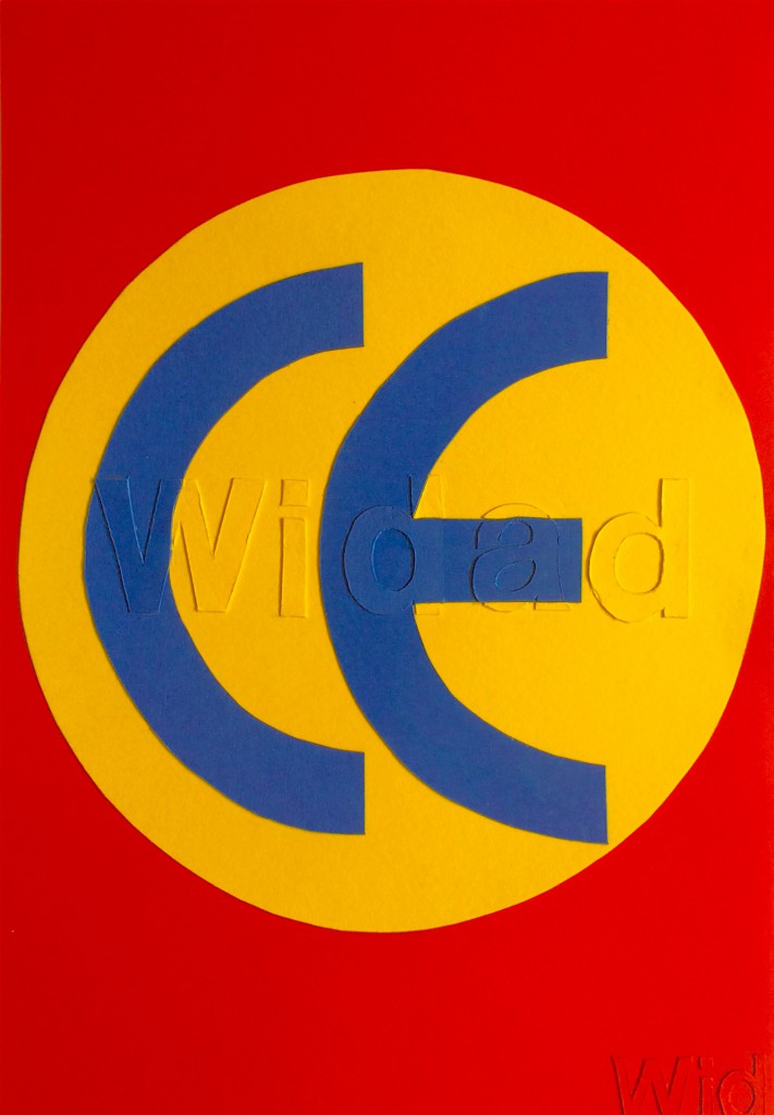
Conformists usually go for the mainstream choice, so I googled what a font that was overused and popular with designers. I found out that Helvetica was a popular choice and decided to go with that font. As for the positioning of the letters, I went with equally spaced kernings, equal cap height to give an overall harmonious looking word to show how complying with the rules gives order and balance.
I chose to use red, yellow and blue to show that even if the mainstream were to do the most ridiculous things (as ridiculous as this colour scheme) and it was normalised, you’d probably find me doing the same thing.
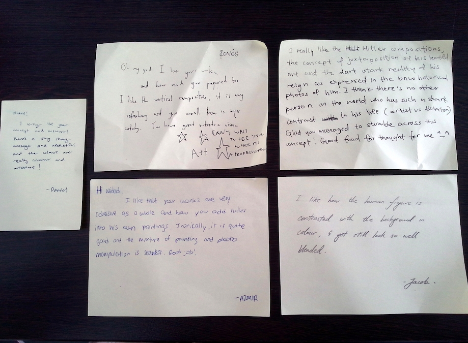
Jacob made an observation that if my intention was to hide my name, the use of red works because it detracts attention from the middle- and I thought that was very interesting and true even though I chose red as an intuitive thing.
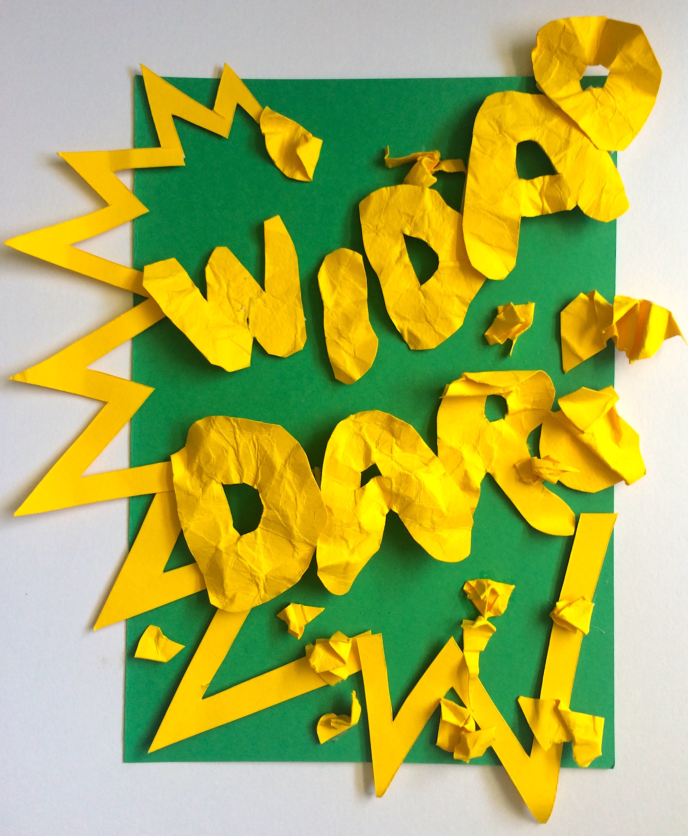
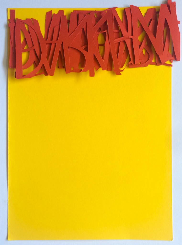
Hello my name is Widad and I am
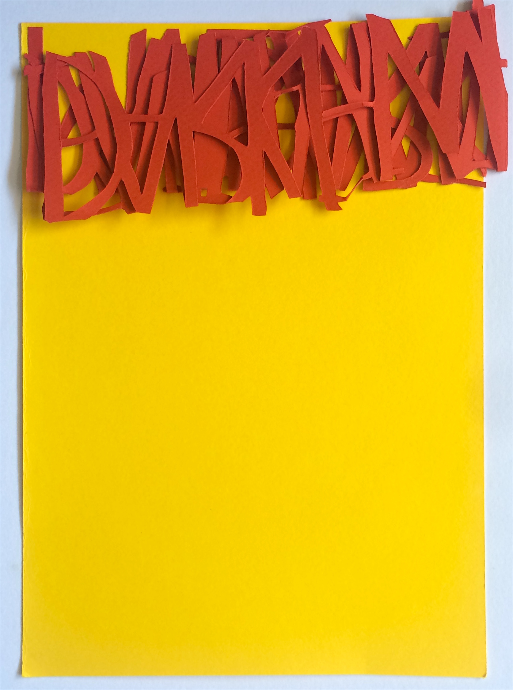
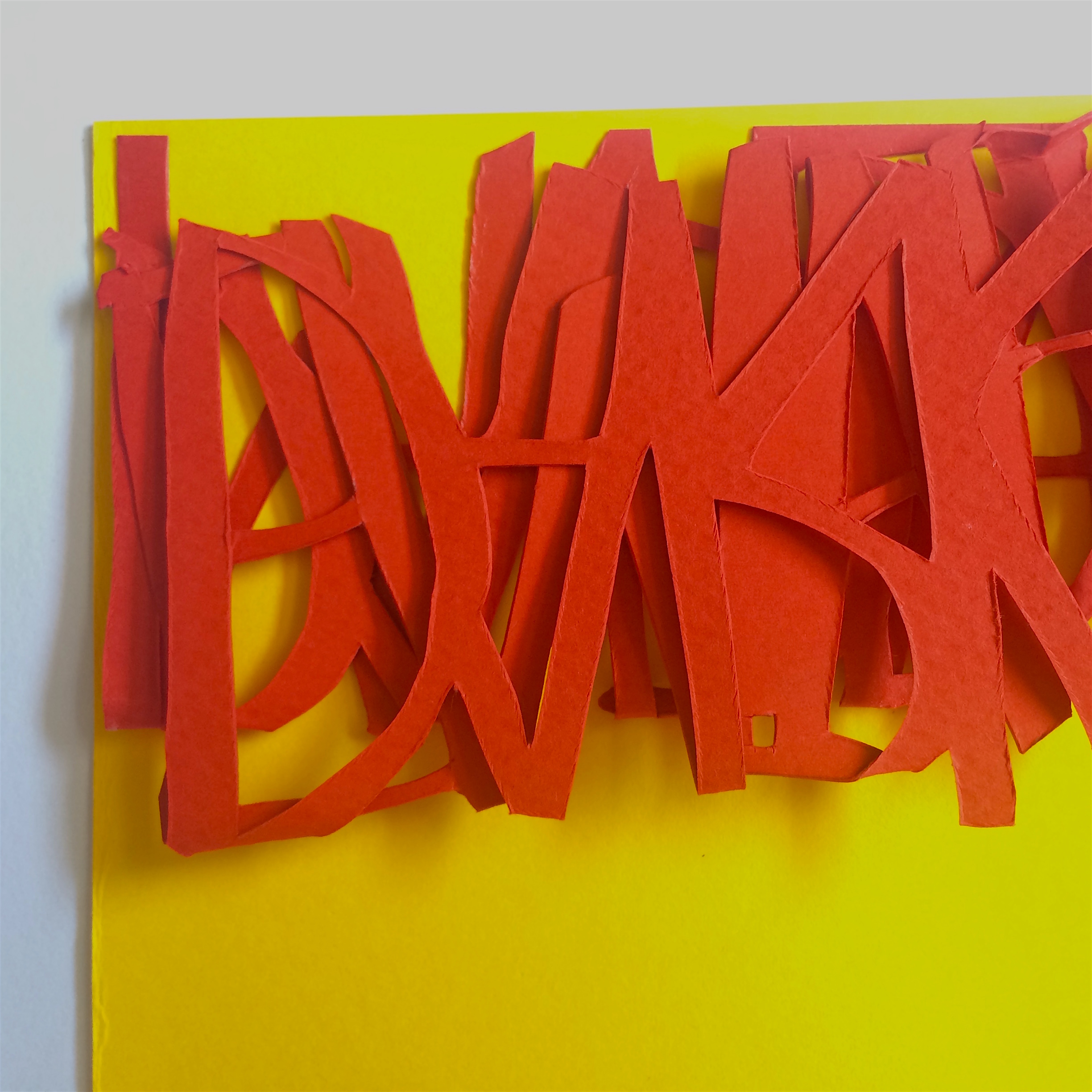
I was struggling with how to represent this attribute using typography. In the end, I wanted to show someone pressuring others, and the affects of being demanding on other people. I cut each word free-hand with scissors and a blade, and then crumpled each of them to show create a wear and tear look (the implications of being demanded to do things).

I wanted to create the impression of someone exerting force, so I used the letter ‘W’ repeatedly at the sides to create something that resembles a ‘speech bubble’ to suggest shrillness and something loud.
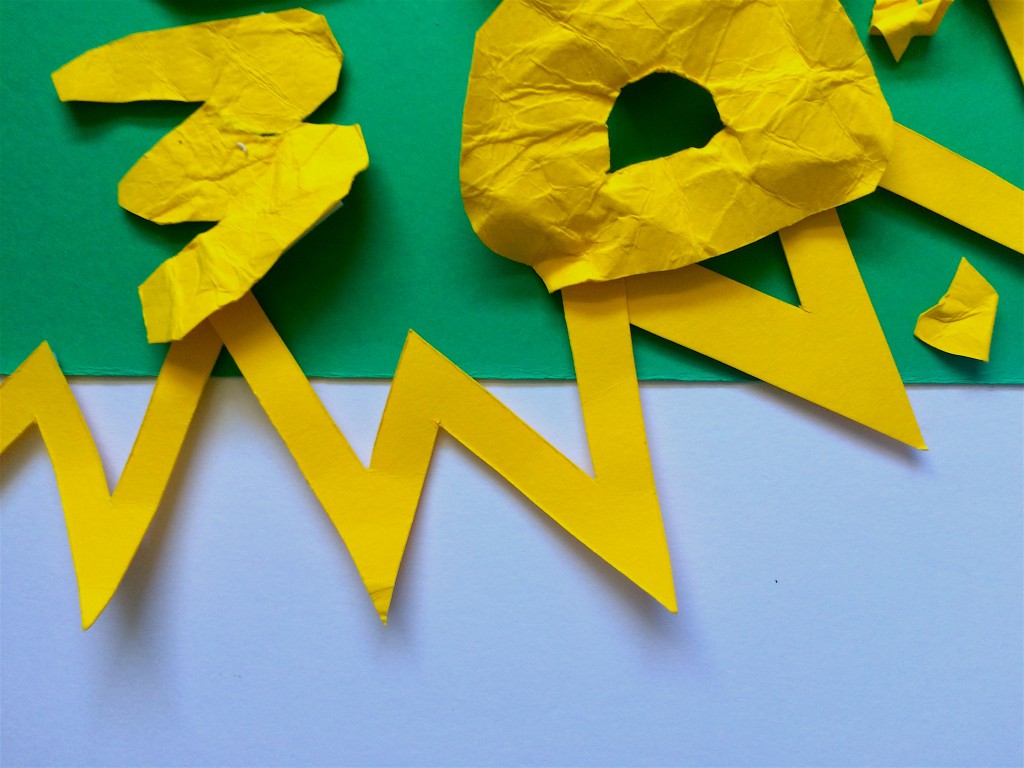
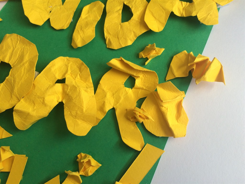
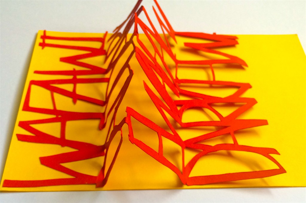
To stick the letters, I used double sided foam tape and if you look closely you can see that in ‘Widad’ each letter pops up more as you go from left to right, and D’ almost flies off the page- as if the intonation changes and the intensity of a demanding shrill voice increases.
Then in ‘Darke’, the letters eventually becomes flatter until the ‘K’ becomes indistinguishable as it is crunched into a ball and the ‘E’ explodes all over the paper. Here, I wanted to show how high force pressure will eventually tear something down.
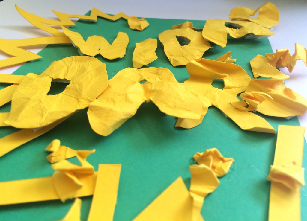
Someone suggested that I cramped in more letters to create the impression of being overbearing. I thought this was a very good suggestion because now that I look at it, the negative spaces in the speech bubble look a bit too empty.
To show contrast in the first set,
‘Conformist’: ‘Widad’ is camouflaged, very 2D and inconspicuous.
‘Demanding’: ‘Widad Darke’ is in big, bold 3D words and high contrast.
Hello my name is Widad and I am
I was inspired by this photo I found on Pinterest. Again, I have no idea who the artist is because the tiny words are in a different language.
For this attribute, I consider it as a flaw because I reveal more than I should. This was presented like this first to the class:
I wanted to show how when people see me all they see is this contained person. Then, when I start talking, everything ‘springs’ and spills out so easily. Hence, the ‘pop out’ effect.
I wanted to use ‘Loud Typography’ to infer to the ‘volume’ that I have- that I’m very expressive, letting people know my inner thoughts even if they don’t ask for it.
It’s done in an ‘accordion style’ so that it somehow ‘unravels’ to allude to how when I start talking I can’t filter out the information.
Compressed:

When it is fully stretched out, it reveals this:

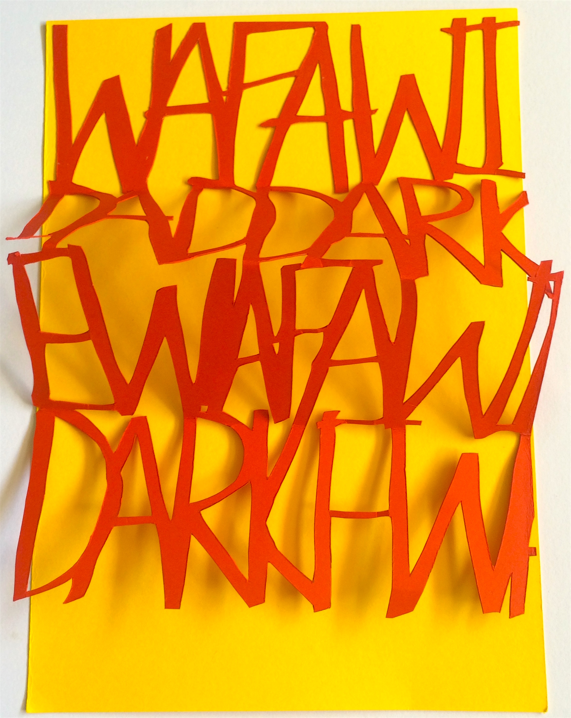
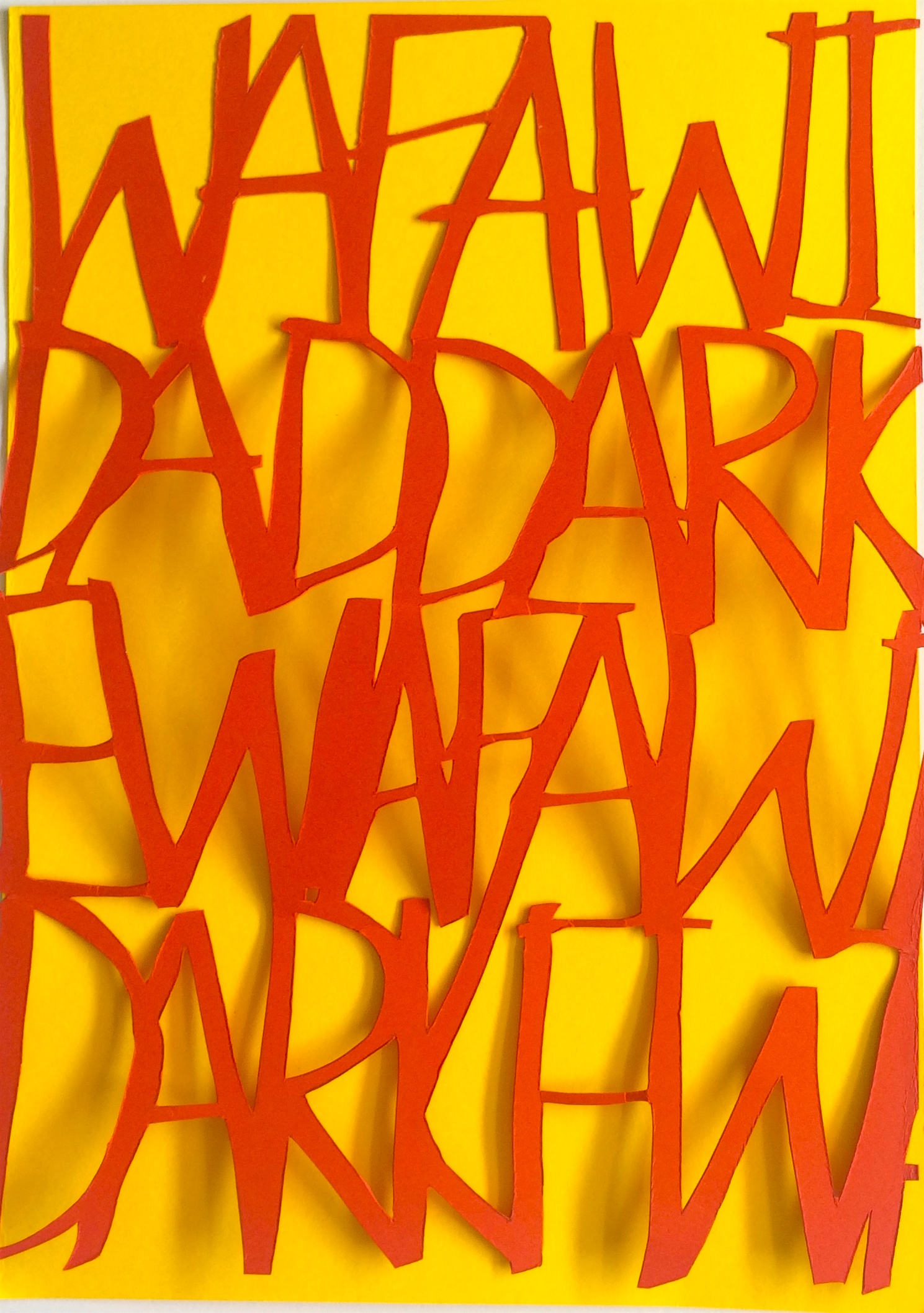
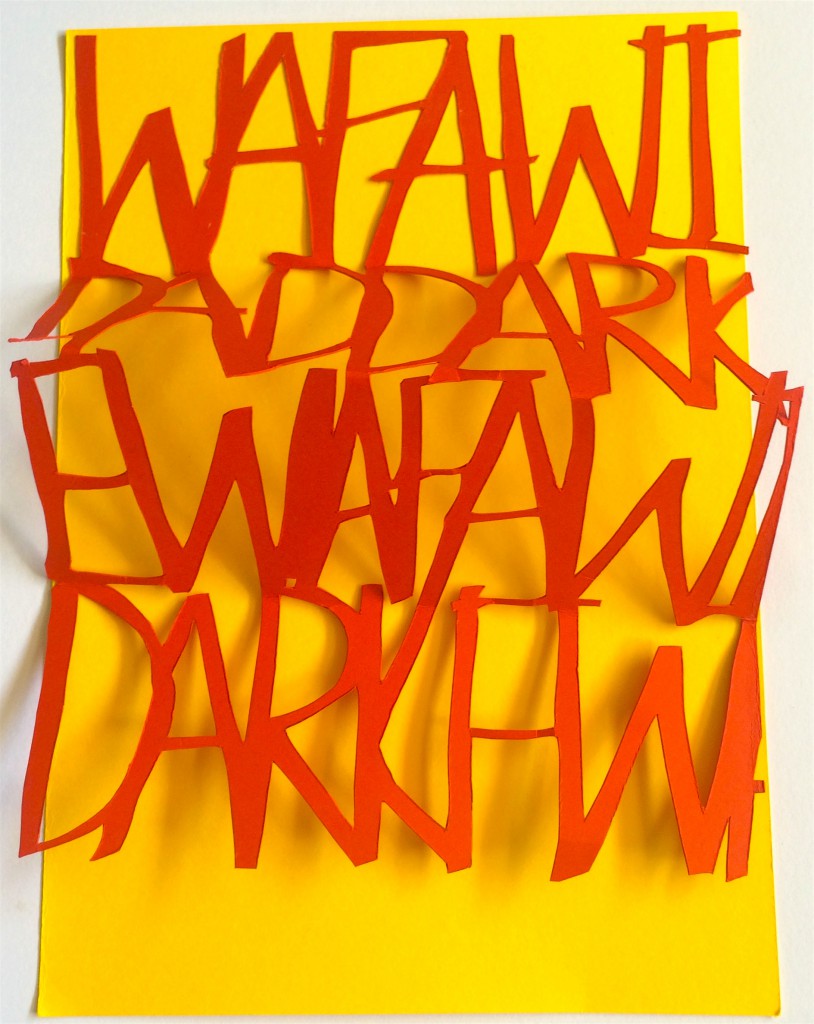
For this paper cutting, it was a pretty tedious process. First, I wrote out my full name on a stencil using highlighter to achieve a thicker line than using a pen. Then I cut out the words, place it on the red colour paper, traced it, then cut it out again.
I used my full name to represent how when I talk, I let people know too much about me. Using my full name is like ‘exposing’ my whole self through speech. I also chose to cram the words together and have some of them be disjointed (WAFA/WIDDARK/E) until it somewhat becomes unreadable to mimic how I speak- mumbling, rambling and sometimes confusing to others.
I wanted to apply ‘Loud Typography to this composition’ as it is often used to sensationalised articles in newspapers magazines, to show how my life was basically an open magazine, but I don’t think I achieved that effect.
Hello my name is Widad and I am
This is how it’s presented. I wanted to spark people’s curiosity.
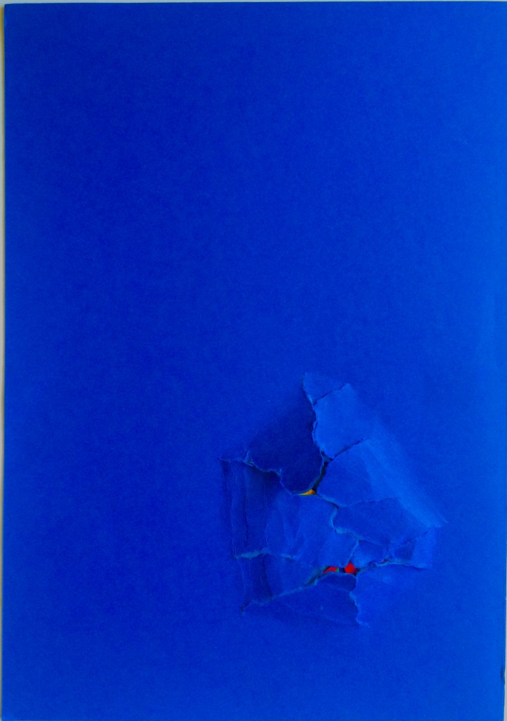
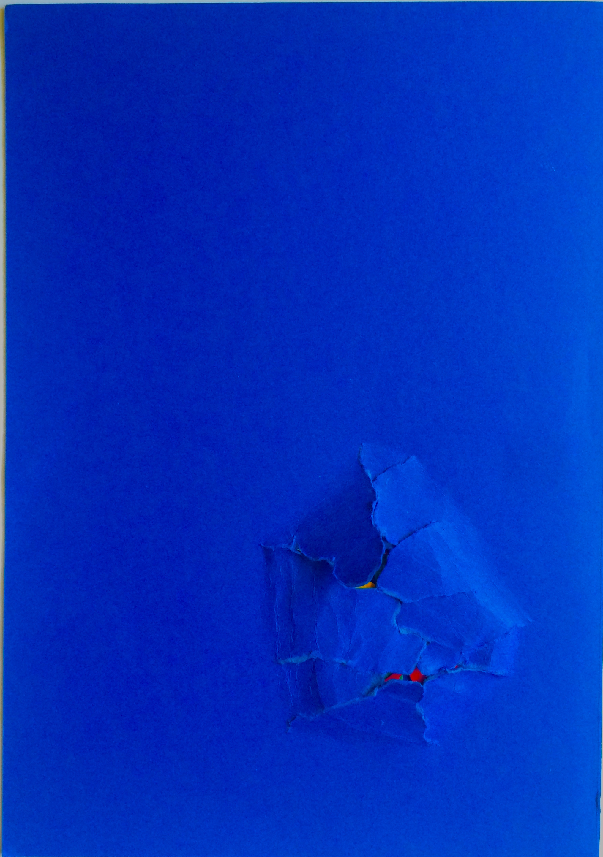
For this composition, I created a hole being torn out in the middle of the paper to suggest how being nosy and prying into other people’s private matters can be intrusive and by doing so it’s a bit savage.
I really wanted to highlight the seriousness and the effect of being intrusive- it can have detrimental effects, hence I tore the paper rather than cut a clean hole in the middle.
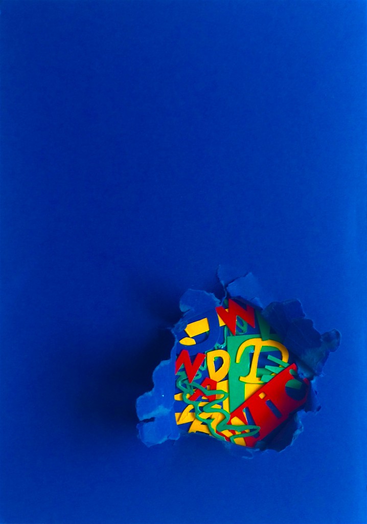
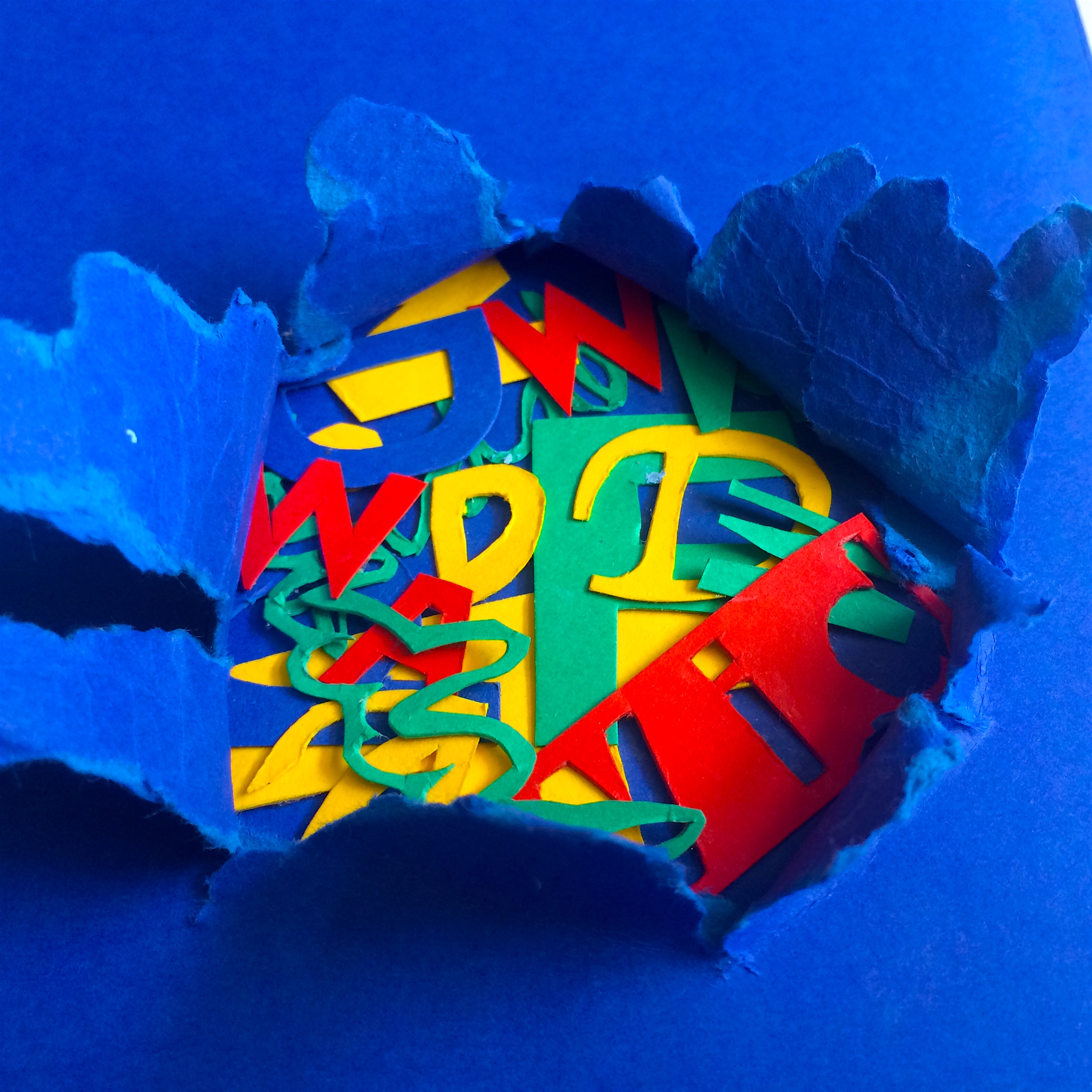
Once exposed, it reveals a collection of the different fonts and sizes of the letters in my name- to show the secrets of different people that I keep. For the most part, my name is barely obvious all you see is letters. It shows how these letters which are part of my name can also be fragments of other people’s names, like how I know only bits of their lives.

Again when you compare the second set,
‘Open’- big letters covering the whole composition as I blab too much
‘Curious’- a small section because the secrets I ‘gain’ are only a few.
For this projects, all of my compositions were strongly conceptually driven, which I feel were largely inspired by Stefan Sagmeister and Logan Mc Lain.
Visually, colour wise, I was inspired by Adam France and his bold use of colours.
I’ve done a post on Logan Mc Lain and Adam France, but I wanted to show the works of Stefan Sagmeister that inspired me to create conceptually driven work. I’m really drawn to works of art that are not to blatantly direct yet not too overt but makes you think.
He makes his intern cut into his body to show that design is painful.
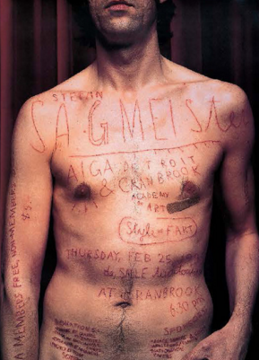
This has to be my favourite.
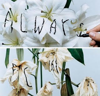
Although my medium does not carry the message, I hope that my form does.
and
There are many many areas I feel I can improve on. Here are a few of my thoughts:
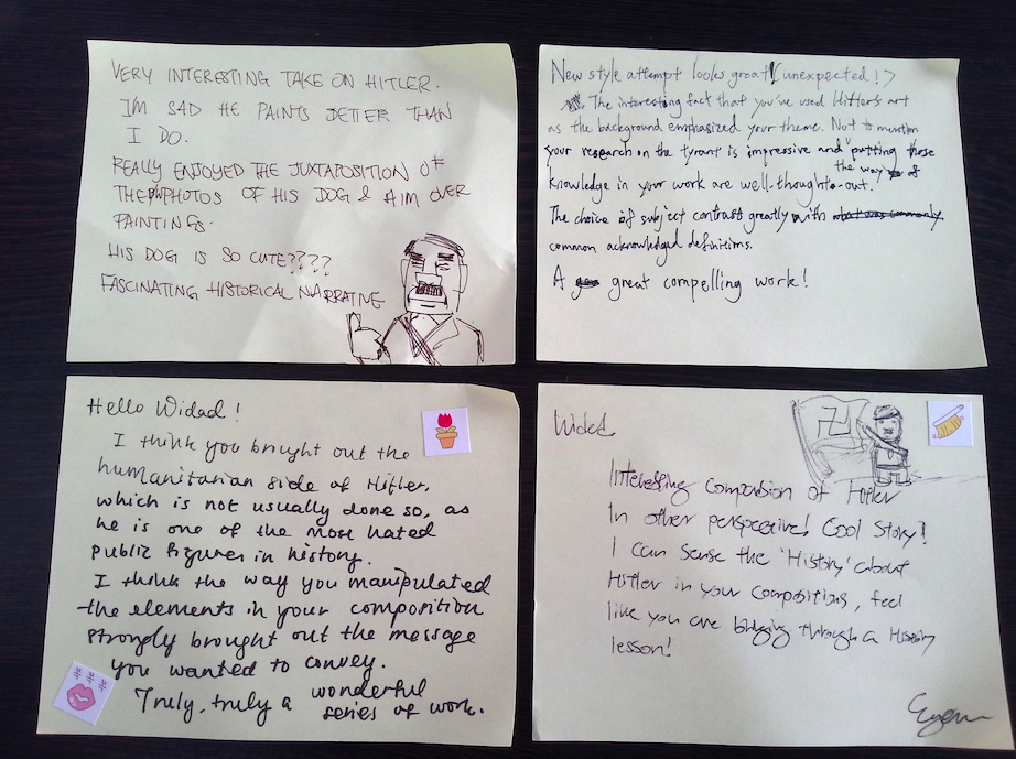
-Open: Joy suggested that I put Widad at the bottom of the piece so that when I compress the pop up there is a sense if balance: “Hello my name is Widad and I’m open”, then everything spills out.
-Demanding: Adding more words into the speech bubble to make it more overbearing
-Presentation: Someone mentioned that it was a pity that my presentation didn’t seem finished and I agree that it could have been done a lot better..
Overall, I really feel like I did push my comfort zone to create compositions which are definitely definitely not my style or aesthetic. I have never done such conceptually driven works before, and though it was stressful, I thoroughly enjoyed it,