2D: “TYPOGRAPHIC PORTRAIT” REFERENCE ARTISTS

Standard

Screen Shot 2016-02-12 at 8.26.49 PM

I know this is waaaay overdue, but its like this because of two reasons.

a) I actually did research on Dadaism, Hannah Hoch and David Carson, but halfway decided that I wasn’t really feeling it and scrapped it, looking for other inspiration. I scrolled through hundreds of photos and felt like none of them resonated with me, so therefore thought b)it would be better for me to have my concept in place first then finding inspiration.

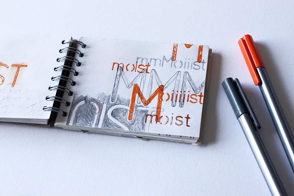
I thought I’d just post an extract that I felt was somewhat significant from the research that I abandoned…

Screen Shot 2016-02-15 at 6.25.29 PM


I’m not so sure now whether deciding to consolidate my reference artists after my concept was a good call, because I’m still having what is equivalent to writer’s block in terms of my concept.

I think I made a huge mistake… 🙁

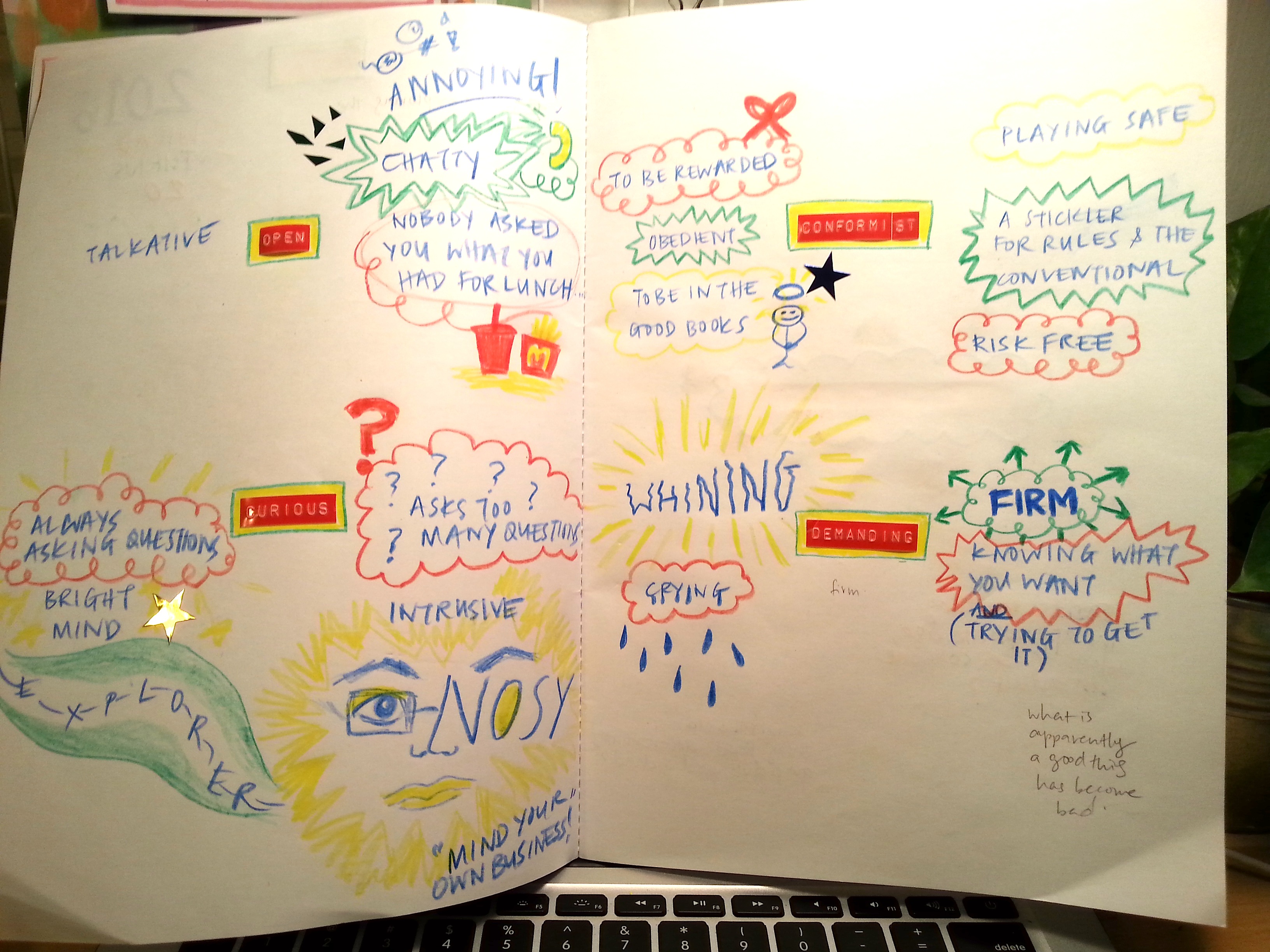
I appreciate now that having reference artists is actually helping me with my concept.Honestly, I thought that looking at others works would actually somehow hinder my process conceptualising because I was afraid I might end up being too similar and losing my own originality. If I’m not wrong, I guess in art, sometimes you can be inspired by other artists and appreciate their work. It is okay to take inspiration from them (and crediting them!) to put into your art.

So I thought it’s about time I do proper research on my reference artists and do some reading and just do something and hopefully get inspired instead of worrying too much and not doing anything besides thinking my brains out.


Artist #1

Screen Shot 2016-02-15 at 6.38.46 PM


Logan Mc Lain goes by the name ‘Slogan’ and describes himself as “An Irish textile artist working with digital embroidery and type.”

Screen Shot 2016-02-15 at 6.35.33 PM

I first stumbled on one of his projects – “The Worst Word”. Intrigued to know what the worst word was, I discovered that he has conducted something of a ‘survey’, asking people what the worst word was. It was humorous, witty and I loved the typography he designed for each word- giving each person their own ‘art’ for what they feel is the worst word.


logan-mclain-faith
logan-mclain-most2 logan-mclain-ass2


He then proceeds to tell an amusing story about how he discovers the worst word.


Screen Shot 2016-02-16 at 10.23.58 AM


You should go and read more of the post and see more of the artwork he created for this project. It’s quite amazing!

‘like’= an overused word= having a disposable nature= mounting ‘like’ on a take-away coffee cup lid

The way he alludes to the disposable nature of the word through something that very often becomes trash is extremely impressive.

http://loganmclain.com/the-worst-word/

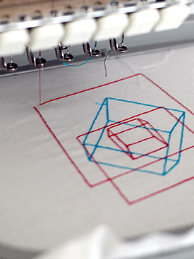
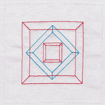
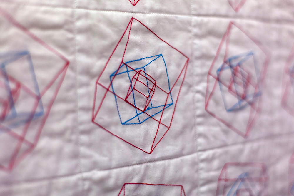
Another one of his projects, ‘Memory Encoded Patterns’ explores the theme of human and computer memory by recording aspects of his Grandmother’s decline into Alzheimer’s through memory encoded patterns.


logan-mclain-memory-10

logan-mclain-memory-11

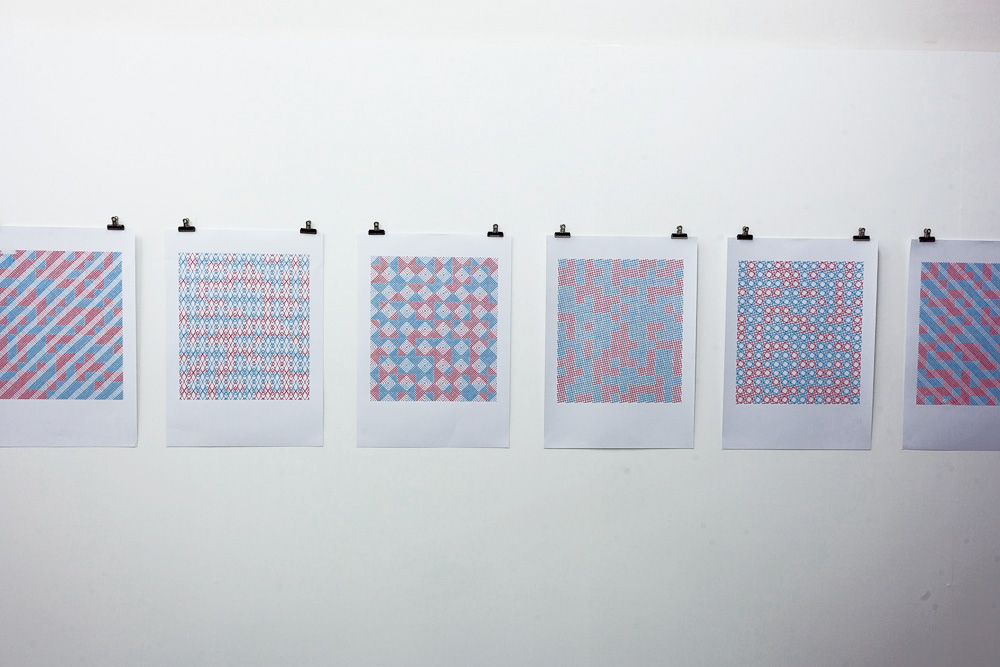
To a passing bystander who has no context, we might just see red and blue patterns. But the amazing thing is that the colours hold great significance. He explains:

“These stitched paper-based works exploit binary code through their colour coding. Red is one, blue is zero. Each one is treated with a different pattern but all are based on the exact same grid. When converted from binary code into ASCII they reveal six simple phrases that capture aspects of the last few years of my nan’s life in the nursing home. Each phrase is encoded in exactly 224 bits.

“Room No. 4, TLC Nursing Home”
A reference to the room that my grandmother occupied in the nursing home in Citywest, Dublin.

“Liz and Trisha are here now”
Something the staff would say to my nanny. My mother and aunt befriended some of the staff at the home.”

If I were to look at the patterns and not know the meaning behind it, I’d just probably think someone just cross stitched blue and red patterns. But knowing what it means- the coding behind it- makes me emphatic of what the experiences he had having a grandma with Alzheimer. It’s almost like I’m being given a glimpse into his life knowing this ‘secret’ message.


Screen Shot 2016-02-15 at 6.33.59 PM

His art has to be one of the most unique type of work that I’ve seen. I didn’t know this type of art existed.

I’ve seen some amazing, beautiful artwork purely having aesthetic value. However, his work really blows me away because of how cleverly his form carries the meaning in such a unique manner. His work reminds me of Stefan Sagmeister’s, however, each of these artists have their niche, and I feel that I can relate better to Slogan because Sagmeister’s photography is rather daunting for me.

His style is unique (have I mentioned that already?), humorous, witty and I really admire how the meaning in injected in his art. I would really like to bring this sort of style to my own compositions in the project. How can I relay my message in a more meaningful way? I personally feel that alluding and using symbolism gives an artwork more depth and really encouraged viewers to appreciate and think deeper than the surface.

What can I takeaway from his work?I love how, in a way, he creates his own ‘languages’ through his artwork and the unconventional way he does all of it. I’d hope to bring that same kind of style he has in some way in my project. I have also elaborated on how one of his works really inspired me for my concept.


All pictures taken from: http://loganmclain.com/


Screen Shot 2016-02-15 at 8.06.30 PM

Adam_France_Picture

Screen Shot 2016-02-15 at 6.35.33 PM

Adam_France_Keith_Haring_2


Adam_France_Playdoh

Adam_France_Fontgal_Copypaste nine1

A project of his that I was especially drawn to is his ‘Paper Protest’.


Adam_France_Paper_Protest_8 Adam_France_Paper_Protest_77


He describes the concept of ‘Paper Protest’ below:

“The works all use the fragile, thin and colourful qualities of the paper to express something more powerful, aggressive and outspoken. ”


Adam_France_Paper_Protest_3Adam_France_Paper_Protest_6


As you can see, he cleverly makes use of juxtaposition to produce these amazing colourful art. I think this really goes to show that in art, you don’t need to really go all deep and philosophical and all that. Sometimes it’s just simple things- like contrasting two qualities can produce something extraordinary.


Screen Shot 2016-02-15 at 6.33.59 PM

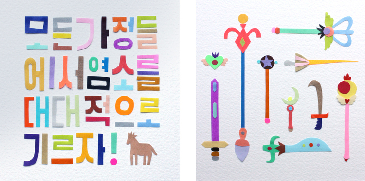
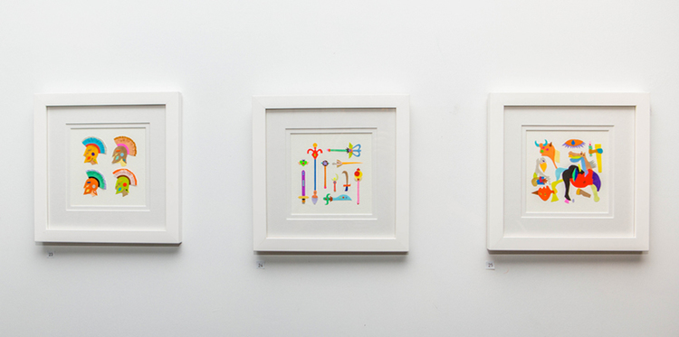
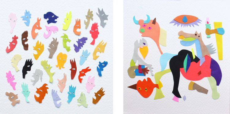
What can I take away from his work? The reason why I’m really drawn to his work is simply because of the use of colours. I also feel that my love for all things colourful is part of my identity so I wanted to include this element. Also, we often associate bright colours with children so I might juxtapose it with more modern, clean looking typography associated with a ‘more adult’ style- but we’ll talk about that later. I really enjoyed his ‘Paper Protest’- it opens me up to the idea of not always having to juxtapose mediums. You can juxtapose a medium and a message, and it can work wonderfully.

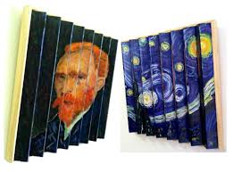
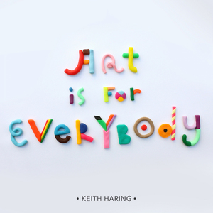
Adam France serves as a great inspiration for my work visually. His art is playful, quirky, colourful and cheerful, reminiscent of a happy childhood I had.It’s also such a coincidence that Adam France uses a lot of gifs in his website, so I can really learn a lot from his work.

His use of colours have really inspired my visual journal- so you see a lot of red,blue, green and yellow written in colour pencil!

http://www.adamfrance.com.au/


2D: “TYPOGRAPHIC PORTRAIT” Process Part 4

Standard

Just yesterday, late afternoon, I had my lightbulb moment that I had been waiting and waiting for. I knew what I wanted my concept to be, but I just didn’t know how to execute it. This also helps me really consolidate and give an overarching concept that I wanted and needed.

As I mentioned in my previous posts, I was struggling with how to depict the transition or duality each of my attribute seemed to have in relation to my child and adult self. Doing my research on Logan Mc Lain, I stumbled upon one of his projects, ‘Animated Embroidery’. Now, usually I have zero interest in things being animated and the word ’embroidery’ didn’t excite me so much. At first glance, the cover picture itself wasn’t all that intriguing to me.


logan-mclain-animated-embroidery

But obviously I just clicked on it and I didn’t expect after reading the post that the whole process would turn out to be something really fascinating.


It’s crazy how all of each stitched cube can come together to create an animated cube. It’s a bit like stop-motion, really.

Art-of-Attrition1

So I figured using gifs would be a really interesting way to show the transition between being a child to an adult. I know that my skills are very limited so I can’t actually make my work animated, but I was inspired by how he printed out each cube to show the process that created the gif. He didn’t show the gif in the exhibition, but the fact that it can be animated in digital form is simply amazing!


0202


02062

So I thought that instead or having separate images, I could overlay all of them into one composition.


You can read more about his process here: http://loganmclain.com/animated-embroidery/


I know that my project can’t possibly reach the level of Slogan, but I will attempt at trying to maybe a 2 second gif or even less, given my time constraint.

Now the challenge I face now is how I actually do it.

I figured there are two ways I can go about executing my concept in this gif format and real life format.


Option A: 

To draw each ‘pattern’/image/snapshot on separate pieces of paper, scan them in and overlay them in photoshop

Pros: Saves time. Brings in a digital as well as handmade element.

Cons: Photoshopping them might take a lot of time since I’m still rather unfamiliar with it. Scanned resolutions might also not look too nice


Option B

To just overlay/overlap each image in real life and create separate pieces for the gif.

Pros: More handmade feel. You can touch the textures and see it in ‘real’ life.

Cons: Time consuming


I think I need an Option C…..


2D: “TYPOGRAPHIC PORTRAIT” PROCESS PART 3

Standard


Hello! I haven’t updated for sometime now. Let’s get straight into it!

I’ve had a few setbacks these past weeks- falling sick twice threw me off course for my progress so I’m starting to really hustle for the upcoming week.

Screen Shot 2016-02-12 at 8.24.54 PM

and

Screen Shot 2016-02-12 at 8.25.24 PM

I have decided to focus on my flaws:

  1. Nosy (Curious)
  2. Conformist (Obedient)
  3. Open (Big mouth)
  4. Demanding (I need to get what I want/ stubborn)

Since I will be turning 20 this year, it sort of marks a ‘milestone’ for me. My age can no longer be under the teenager category- my age is officially an ‘adult age’. I thought it would be interesting to explore the two polarities of immature and mature, and to portray my struggle as I transition into an adult, trying to reconcile two extremes.

I came up with this concept when I was researching my reference artists and realised that the art I was drawn to was sort of childish, colourful, playful and bright. I know everyone says that there’s an inner child in every adult but I feel like this topic looks at it in a different angle.


Screen Shot 2016-02-12 at 8.23.52 PM

In my first consultation with Joy, as I told her about a few of my ideas that I had, for one concept she pointed out that the attributes that I chose seemed to be categorised into collecting stuff vs projecting (directing) control. There was the theme of additive and subtractive.

For my second concept she also pointed out that I was exposing and recognising polarities (opposites) and she suggested that I explore the reconciliation between both. I completely agree with her in that finding the balance AND showing it visually would be more challenging and stronger of a concept rather than just exposing polarities.

Another thing she prompted me to think about was the use of light. I don’t remember in what context she was talking about but she commented something about one of my attributes which was very intriguing. That attribute was me being too revealing abut my personal life- almost like I’m an author of my biography. Joy suggested two opposites: the author of the diary (dark) VS the author of achievements (light). This really got me thinking- how do I project myself? How do others view me VS how I view myself?


Screen Shot 2016-02-12 at 8.24.35 PM

Generally, I definitely want to be hands-on as I feel like this method is most true to my self.

I’ve made some sketches and experimented just a bit with a few mediums as seen in the pictures below. Im still trying to figure out some conceptual stuff to make it solid.


20160214_193043

20160214_193205

20160214_193146

20160215_164731


*I realised I forgot to put up these photos and had to add them back today….


Screen Shot 2016-02-12 at 8.24.09 PM

In our group consultations, I voiced my concerns on how I would reconcile the two polarities between adult and child. Shanelle suggested that I use ‘Lenticular painting’ which enables you to see the two sides.


url

I thought it was a really good idea, but this itself poses a lot of challenges as I haven’t decided whether I want to create actual typography. I’m still considering this!

Another interesting thing that was brought up was when Ying Li noticed that I spelled out ‘W’ as doubleyou. Joy then added on and brought me to light on the existence of ‘ambigrams’. They are words that you can read in more than one direction. It’s sort of like an optical illusion, but in a word format haha. I thought that was pretty cool and could really help bring in more depth to my concept/compositions.

I also gathered other ideas as others were discussing their work:

  • The concept of background and foreground. How can you push that to bring meaning?
  • How culturally relevant are the attributes? In a certain culture, this attribute may be viewed positively whereas in another, it may be considered as a flaw.
  • Using symbolism to relay your message- I really loved Shanelle’s intricate drawings. It had a lot of meaning to it and was really well executed.

Overall, the group consultations were extremely interesting, and I gained valuable insight on how other approached their projects and saw how people worked differently.

Therefore I am inspired to jump on the bandwagon and pump out the most of what I can offer before the presentation:

Screen Shot 2016-02-12 at 8.26.13 PM

The time I have left is pretty short, but I feel like this added pressure will only help me become more productive.

I feel like I spent a lot of time on this project worrying and worrying about how I would execute it, and I concentrated on the wrong things.

🙁

I’ve calculated that I have only 5 days left (which is less than a week!!)

I’ve written out my action plan:

Saturday

  1. Experiment more with the different handmade typography
  2. Record in visual journal.

Sunday

  1. Still experimenting
  2. Record in visual journal
  3. Post progress on OSS!
  4. Decide the visual layout of each composition (sketches, which part if my name to use)
  5. Confirm on the format
  6. Begin the first composition

Monday

  1. Finish the first composition. Begin on the other three.

Tuesday

  1. Finish all 4 compositions!!!!!!

Wednesday

  1. Buy frames from Ikea-
  2. Prepare presentation notes
  3. Practise presentation
  4. Final touchups
  5. Maybe post on OSS?

My first project for the second semester didn’t really go off on a good start, but I’m determined to persevere and do my best!


2D: “Typographic Portrait” Process Part 2

Standard

Whilst researching on reference artists, I came across David Carson’s TED talk on “Design and Discovery” that he gave in 2009. (https://www.youtube.com/watch?v=tFpANOqSdi8)

The whole talk was around 25 minutes, but I thoroughly enjoyed every bit of it. He was extremely funny and insightful.

One thing I wanted to share from his talk was when he talked about the power of emotion in design. I feel like he explained this in a really simple and concise way when he showed two pictures of ‘warnings’ spray painted onto two doors.

Here’s an extract of his transcript:

“I’m a big believer in the emotion of design, and the message that’s sent before somebody begins to read, before they get the rest of the information; what is the emotional response they get to the product, to the story, to the painting — whatever it is. That area of design interests me the most, and I think this for me is a real clear, very simplified version of what I’m talking about.These are a couple of garage doors painted identical, situated next to each other. So, here’s the first door.

Screen Shot 2016-01-26 at 9.53.29 PMYou know, you get the message. You know, it’s pretty clear. Take a look at the second door and see if there’s any different message.

Screen Shot 2016-01-26 at 9.54.49 PM O.K., which one would you park in front of? (Laughter) Same color, same message, same words. The only thing that’s different is the expression that the individual door-owner here put into the piece — and, again, which is the psycho-killer here? (Laughter) Yet it doesn’t say that; it doesn’t need to say that. I would probably park in front of the other one.”


After watching just this part, I was taken aback by how the same message simply written in a different way could have such a discrepancy in affecting the viewer. I realised that there emotion is truly powerful in design- I just need to know how to express it. I’m am hoping (and will be consciously trying my best) to evoke this kind of emotion in all my work so that I can effectively relay my message and more importantly, make an impact on the viewer. But it will be a challenge to channel my emotions into my designs and choosing the best way to express myself.


2D: “Hello”

Standard

Hello! I am now in a new semester with new exciting projects lined up!

In our first 2D class we were assigned this fun mini ‘project’- to decorate our name cards in 3 ways- abstract, conceptual, or using typography. We were supposed to present out name cards to the class in Week 2 but I couldn’t make it for class so here are my presentation notes that I had prepared beforehand!

I decided to focus on three aspects on myself based on the nature of each requirement.


63ea9192-82c2-4c90-a8f8-e018accd5c48

Name card 1: Typography (Obsessive compulsive/ ‘perfectionist’/ Conformist?)

In the brief it said to pay attention to the type of font, the spacing, the overlap, the positive and negative space, use of capital alphabets etc.I went with a simple drawing which said ‘W i d a d’.

I did everything ‘right’ in the sense that I followed the proper ‘rules’ and the norm for writing your name. This was to show how I was very much an obedient rule follower in life as well as in design. I also wanted to show the so called ‘perfectionist’/ obsessive compulsive side of me, so the spacing had to be exactly equal between each alphabet, and each letter is drawn out as perfectly as I could. I’m the type of person who always colours within the lines.

The main medium I used throughout all the name cards was pencil. This was mainly to reflect the lack of confidence and the self-doubt that I carry with me. Using pencil symbolises how I always need a safety net- to be able to erase my mistakes to achieve ‘perfection’, or to be able to erase what I do in case I change my mind. This is different than having the confidence to use pen straight away.


Name card 2: Abstract (Scatterbrain/ Absentmindedness ) 

Of all the 3 cards, I think this is pretty straightforward.

  1. I really love henna designs
  2. The crazy mix of designs show how ‘scattered’ my thoughts are (I always have too many tabs open on one window, I am frequently scolded for jumping from one topic to another, I forget where I left my phone/bottle at least 3 times a day/ )

(Abstract Henna designs flowing and going crazy-to represent scattered thoughts


Name card 3: Conceptual (Lack of independence and self-reliance) 

It probably sounds as if I view myself really negatively (which may be true just sometimes!), but really, I find that it’s so much more interesting to explore your own flaws and maybe sometime discover why you have them and what you need to do to fix them. The last name card, I wanted to convey my lack of independence. As I grew older, I realised I wasn’t as independent and self-reliant as I should be.

Following the rules and having someone to show me the way often leads me to ‘success’- because I’m good at following orders, but it doesn’t lead me to somewhere new neither causes change.

You may be wondering why all 3 name cards have more or less the same font and same style. I did this to show what happens when you get too comfortable in your own bubble, play safe and rely and expect others to guide you and show you the way. I can achieve ‘success’ but the outcome is nothing outstanding or special each time. I confine myself by creating a template by following others but the result is really nothing new or exciting each time. I need to be independent and take risks to be able to create new experiences and achieve my own success- to create my ‘own font’.


I think that was somewhat deep for name cards.


2D: “Typographic Portrait” Process Part 1

Standard

Hello all!

I’m extremely excited to be working on the first 2D project for Semester 2! It is somewhat similar to the last project we did last semester (on ‘Self’), but I feel like this makes it slightly more difficult because now this project really pushes you even more explore aspects of yourself.

To recap, the 3 attributed I covered in the ‘Hello’ project were: Being a ‘perfectionist’, scatterbrained and lacking independence.

Because I’m indecisive and still cannot decide which 6 to choose:

Some characteristics I’d like to portray about myself

  1. Meticulous/ Obsessive Compulsive
  2. Conformist/ Following the rules/ Colouring in the lines
  3. Lack of independence
  4. Revealing too much (being too open?)
  5. Indecisive
  6. Clumsy
  7. Absentminded/ Scatter brained
  8. Procrastinator/ Unfocused

How can your 6 attributes be best represented typographically?

I’m not very sure,I’m still in the process of deciding which concept I want to choose.

I have a few concepts I have in mind:

  1.  I’ve read several pages of Barbara Emanuel thesis on “Rhetoric in Graphic Design”, and it is extremely enlightening. Screen Shot 2016-01-24 at 10.13.09 PM

I never thought as my artwork that I’m making in ADM as a means of persuasion. But in reality, we are unintentionally making choices as we design in order to portray a certain image of ourselves/ our beliefs to the audience.

  1. My first concept idea would be emphasising rhetoric in my composition. I thought of playing with the idea of opposites/antonyms of attributes (Flaws VS Strengths). As humans we always want to hide our flaws and show people only our good side. So I thought that I could create pieces where my flaws would be disguised as strengths.

2. My second concept idea is ‘Dreams VS Fears’. Rather than focusing on what we are, I thought it would be interesting to represent our attributes in an indirect way by looking merging the extreme ends of the spectrum (what we aspire to be and what we fear / what is stopping us).

For instance,

Dream: “My name is Widad and I’m healthy and fit.

Worst Fear: “My name is Widad and I eat brownies for breakfast, lunch and dinner.

My reasoning for this is that I feel like I am always in the middle of these two extremes and I always aspire to become this dream while fearing the worst. So it would be very intriguing to explore this balance.

3. My third idea for my concept was looking at my relationships with others. This concept would be process driven, involving the other person in each relationship.


An idea I had for the medium was to focus on environmental typography- to bring in the relevance of my major- product design. As I want to learn to design sustainable products, the typography/ fonts/ types I make could be limited to natural/ recycled materials.

That’s all I have for now!