2D ‘POINT OF VIEW’ : PROCESS (PART 2)

Standard

I forgot to post this post on my process- it was saved in my drafts unfinished, so I’m posting it now!

Dated: 10 March 2016

Screen Shot 2016-03-15 at 7.04.54 PM

Group consultation notes:

-I wasn’t able to show my Photoshop composition to my classmates because my Photoshop broke down…

-However, I did run by them my concepts- they didn’t have much to say, well because I didn’t show them anything. I tried to describe the room in the womb composition to them, but I think nobody understood what I was talking about so they didn’t answer me when i asked them what they thought about it.

-Joy did give me some food for thought- she suggested I do the whole project about Hitler and beauty??!!  (She says its so that I have its better for my art direction- so i would know what style to use and all that )It sounds like an interesting idea.. but I’m not sure.


Screen Shot 2016-03-15 at 7.12.10 PM

As of right now, I’m deciding between two concepts:

  1. Ironic/twisted situations
  • POV of rabbit VS POV of child
  • POV of son VS POV of mother (murderer)
  • POV of Hitler VS POV of mother

2. Hitler??

Screen Shot 2016-03-15 at 7.05.17 PM

Screen Shot 2016-03-15 at 7.06.44 PM

  1. Beauty from the POV of Hitler is blue eyes, fair skin, blond hair:
    • I started on the composition for the POV from Hitler again, although I’m still not really sure what I’m doing- I’m just playing around in Photoshop.
    • My idea behind this is that I want to make use of the adjectives (blue eyes, blond hair and fair skin), and incorporate it into the view Hitler looks out of. So, to him it’s like the ideal landscape, playing on the term ‘Lebensraum’ (living space for Hitler and his Aryans).
    • I wanted to make it seem that he was looking out into the open and even then all he sees is the beautiful- which is fair skin, blond hair and blue eyes.
    • I tried using a nose (to depict fair skin) and blond hair to ‘blend’ into his painting, but there is not much contrast because everything is already relatively beige/brown and it doesn’t look interesting visually.
    • Conversely, I was thinking of putting a blue eye as the sun, but I felt that it would look too jarring and out of place since the long hair and fair skin almost camouflages into the painting.

Screen Shot 2016-03-16 at 12.42.15 PM

Screen Shot 2016-03-16 at 1.21.13 PM

Screen Shot 2016-03-16 at 1.52.38 PM

Screen Shot 2016-03-16 at 2.15.40 PM

Screen Shot 2016-03-16 at 2.28.07 PM


2. Beauty from the POV of a mother is the baby in her:2. I was also thinking, for the accompanying POV from Hitler’s mother, it might be interesting to have this painting he did of a house, tinted red in Photoshop for 2 reasons:

a) To mimic the inside of a uterus (I had this idea from the article about Canary Island spa shown below.

b) To foreshadow the bloodshed he will cause when he grows up to become a murderer.

Screen Shot 2016-03-15 at 7.07.16 PM

Screen Shot 2016-03-15 at 7.07.25 PM

7152cb56e559fccb26f44dbacc60f32c


Screen Shot 2016-03-16 at 12.20.41 PM


2D: “TYPOGRAPHIC PORTRAIT” Process Part 4

Standard

Just yesterday, late afternoon, I had my lightbulb moment that I had been waiting and waiting for. I knew what I wanted my concept to be, but I just didn’t know how to execute it. This also helps me really consolidate and give an overarching concept that I wanted and needed.

As I mentioned in my previous posts, I was struggling with how to depict the transition or duality each of my attribute seemed to have in relation to my child and adult self. Doing my research on Logan Mc Lain, I stumbled upon one of his projects, ‘Animated Embroidery’. Now, usually I have zero interest in things being animated and the word ’embroidery’ didn’t excite me so much. At first glance, the cover picture itself wasn’t all that intriguing to me.


logan-mclain-animated-embroidery

But obviously I just clicked on it and I didn’t expect after reading the post that the whole process would turn out to be something really fascinating.


It’s crazy how all of each stitched cube can come together to create an animated cube. It’s a bit like stop-motion, really.

Art-of-Attrition1

So I figured using gifs would be a really interesting way to show the transition between being a child to an adult. I know that my skills are very limited so I can’t actually make my work animated, but I was inspired by how he printed out each cube to show the process that created the gif. He didn’t show the gif in the exhibition, but the fact that it can be animated in digital form is simply amazing!


0202


02062

So I thought that instead or having separate images, I could overlay all of them into one composition.


You can read more about his process here: http://loganmclain.com/animated-embroidery/


I know that my project can’t possibly reach the level of Slogan, but I will attempt at trying to maybe a 2 second gif or even less, given my time constraint.

Now the challenge I face now is how I actually do it.

I figured there are two ways I can go about executing my concept in this gif format and real life format.


Option A: 

To draw each ‘pattern’/image/snapshot on separate pieces of paper, scan them in and overlay them in photoshop

Pros: Saves time. Brings in a digital as well as handmade element.

Cons: Photoshopping them might take a lot of time since I’m still rather unfamiliar with it. Scanned resolutions might also not look too nice


Option B

To just overlay/overlap each image in real life and create separate pieces for the gif.

Pros: More handmade feel. You can touch the textures and see it in ‘real’ life.

Cons: Time consuming


I think I need an Option C…..


2D: “TYPOGRAPHIC PORTRAIT” PROCESS PART 3

Standard


Hello! I haven’t updated for sometime now. Let’s get straight into it!

I’ve had a few setbacks these past weeks- falling sick twice threw me off course for my progress so I’m starting to really hustle for the upcoming week.

Screen Shot 2016-02-12 at 8.24.54 PM

and

Screen Shot 2016-02-12 at 8.25.24 PM

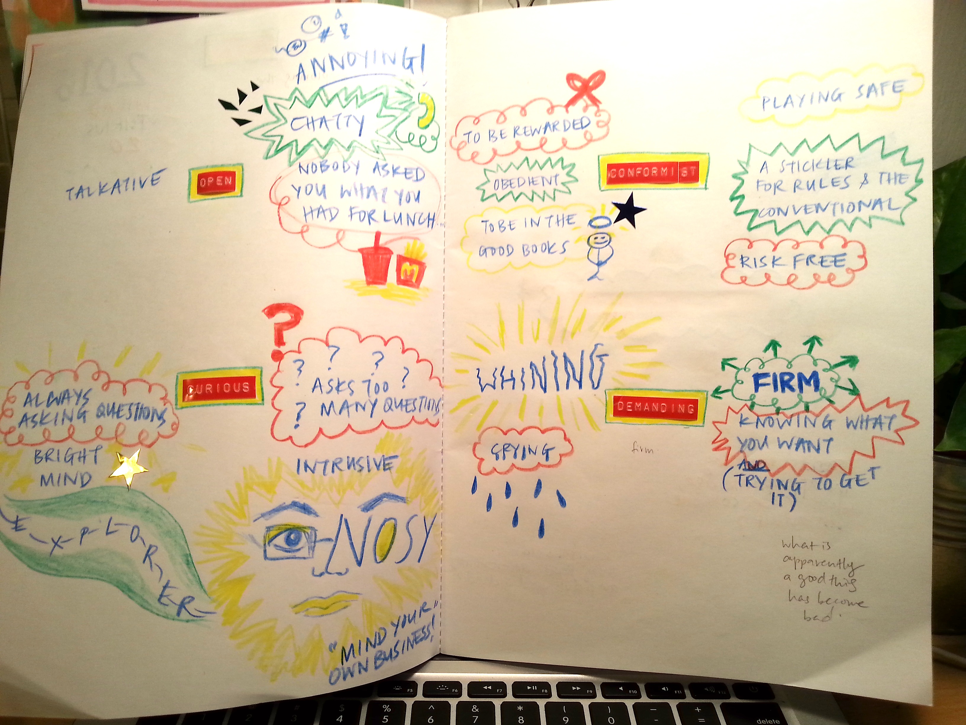
I have decided to focus on my flaws:
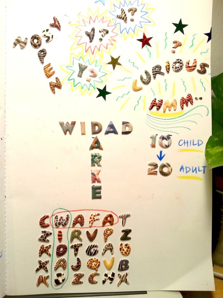
  1. Nosy (Curious)
  2. Conformist (Obedient)
  3. Open (Big mouth)
  4. Demanding (I need to get what I want/ stubborn)

Since I will be turning 20 this year, it sort of marks a ‘milestone’ for me. My age can no longer be under the teenager category- my age is officially an ‘adult age’. I thought it would be interesting to explore the two polarities of immature and mature, and to portray my struggle as I transition into an adult, trying to reconcile two extremes.

I came up with this concept when I was researching my reference artists and realised that the art I was drawn to was sort of childish, colourful, playful and bright. I know everyone says that there’s an inner child in every adult but I feel like this topic looks at it in a different angle.


Screen Shot 2016-02-12 at 8.23.52 PM

In my first consultation with Joy, as I told her about a few of my ideas that I had, for one concept she pointed out that the attributes that I chose seemed to be categorised into collecting stuff vs projecting (directing) control. There was the theme of additive and subtractive.

For my second concept she also pointed out that I was exposing and recognising polarities (opposites) and she suggested that I explore the reconciliation between both. I completely agree with her in that finding the balance AND showing it visually would be more challenging and stronger of a concept rather than just exposing polarities.

Another thing she prompted me to think about was the use of light. I don’t remember in what context she was talking about but she commented something about one of my attributes which was very intriguing. That attribute was me being too revealing abut my personal life- almost like I’m an author of my biography. Joy suggested two opposites: the author of the diary (dark) VS the author of achievements (light). This really got me thinking- how do I project myself? How do others view me VS how I view myself?


Screen Shot 2016-02-12 at 8.24.35 PM

Generally, I definitely want to be hands-on as I feel like this method is most true to my self.

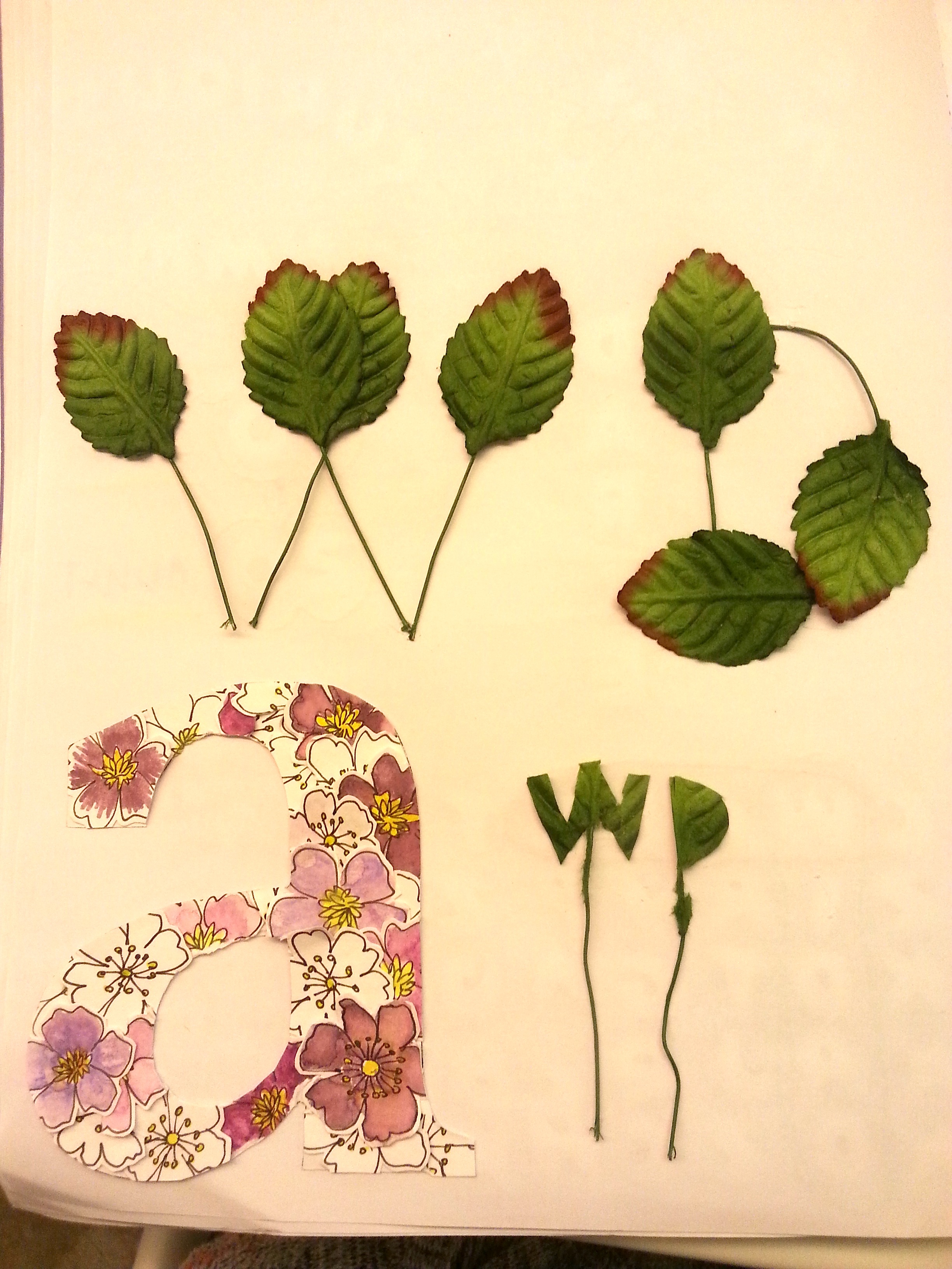
I’ve made some sketches and experimented just a bit with a few mediums as seen in the pictures below. Im still trying to figure out some conceptual stuff to make it solid.


20160214_193043

20160214_193205

20160214_193146

20160215_164731


*I realised I forgot to put up these photos and had to add them back today….


Screen Shot 2016-02-12 at 8.24.09 PM

In our group consultations, I voiced my concerns on how I would reconcile the two polarities between adult and child. Shanelle suggested that I use ‘Lenticular painting’ which enables you to see the two sides.


url

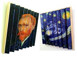
I thought it was a really good idea, but this itself poses a lot of challenges as I haven’t decided whether I want to create actual typography. I’m still considering this!

Another interesting thing that was brought up was when Ying Li noticed that I spelled out ‘W’ as doubleyou. Joy then added on and brought me to light on the existence of ‘ambigrams’. They are words that you can read in more than one direction. It’s sort of like an optical illusion, but in a word format haha. I thought that was pretty cool and could really help bring in more depth to my concept/compositions.

I also gathered other ideas as others were discussing their work:

  • The concept of background and foreground. How can you push that to bring meaning?
  • How culturally relevant are the attributes? In a certain culture, this attribute may be viewed positively whereas in another, it may be considered as a flaw.
  • Using symbolism to relay your message- I really loved Shanelle’s intricate drawings. It had a lot of meaning to it and was really well executed.

Overall, the group consultations were extremely interesting, and I gained valuable insight on how other approached their projects and saw how people worked differently.

Therefore I am inspired to jump on the bandwagon and pump out the most of what I can offer before the presentation:

Screen Shot 2016-02-12 at 8.26.13 PM

The time I have left is pretty short, but I feel like this added pressure will only help me become more productive.

I feel like I spent a lot of time on this project worrying and worrying about how I would execute it, and I concentrated on the wrong things.

🙁

I’ve calculated that I have only 5 days left (which is less than a week!!)

I’ve written out my action plan:

Saturday

  1. Experiment more with the different handmade typography
  2. Record in visual journal.

Sunday

  1. Still experimenting
  2. Record in visual journal
  3. Post progress on OSS!
  4. Decide the visual layout of each composition (sketches, which part if my name to use)
  5. Confirm on the format
  6. Begin the first composition

Monday

  1. Finish the first composition. Begin on the other three.

Tuesday

  1. Finish all 4 compositions!!!!!!

Wednesday

  1. Buy frames from Ikea-
  2. Prepare presentation notes
  3. Practise presentation
  4. Final touchups
  5. Maybe post on OSS?

My first project for the second semester didn’t really go off on a good start, but I’m determined to persevere and do my best!


2D: “Typographic Portrait” Process Part 2

Standard

Whilst researching on reference artists, I came across David Carson’s TED talk on “Design and Discovery” that he gave in 2009. (https://www.youtube.com/watch?v=tFpANOqSdi8)

The whole talk was around 25 minutes, but I thoroughly enjoyed every bit of it. He was extremely funny and insightful.

One thing I wanted to share from his talk was when he talked about the power of emotion in design. I feel like he explained this in a really simple and concise way when he showed two pictures of ‘warnings’ spray painted onto two doors.

Here’s an extract of his transcript:

“I’m a big believer in the emotion of design, and the message that’s sent before somebody begins to read, before they get the rest of the information; what is the emotional response they get to the product, to the story, to the painting — whatever it is. That area of design interests me the most, and I think this for me is a real clear, very simplified version of what I’m talking about.These are a couple of garage doors painted identical, situated next to each other. So, here’s the first door.

Screen Shot 2016-01-26 at 9.53.29 PMYou know, you get the message. You know, it’s pretty clear. Take a look at the second door and see if there’s any different message.

Screen Shot 2016-01-26 at 9.54.49 PM O.K., which one would you park in front of? (Laughter) Same color, same message, same words. The only thing that’s different is the expression that the individual door-owner here put into the piece — and, again, which is the psycho-killer here? (Laughter) Yet it doesn’t say that; it doesn’t need to say that. I would probably park in front of the other one.”


After watching just this part, I was taken aback by how the same message simply written in a different way could have such a discrepancy in affecting the viewer. I realised that there emotion is truly powerful in design- I just need to know how to express it. I’m am hoping (and will be consciously trying my best) to evoke this kind of emotion in all my work so that I can effectively relay my message and more importantly, make an impact on the viewer. But it will be a challenge to channel my emotions into my designs and choosing the best way to express myself.


2D: “Typographic Portrait” Process Part 1

Standard

Hello all!

I’m extremely excited to be working on the first 2D project for Semester 2! It is somewhat similar to the last project we did last semester (on ‘Self’), but I feel like this makes it slightly more difficult because now this project really pushes you even more explore aspects of yourself.

To recap, the 3 attributed I covered in the ‘Hello’ project were: Being a ‘perfectionist’, scatterbrained and lacking independence.

Because I’m indecisive and still cannot decide which 6 to choose:

Some characteristics I’d like to portray about myself

  1. Meticulous/ Obsessive Compulsive
  2. Conformist/ Following the rules/ Colouring in the lines
  3. Lack of independence
  4. Revealing too much (being too open?)
  5. Indecisive
  6. Clumsy
  7. Absentminded/ Scatter brained
  8. Procrastinator/ Unfocused

How can your 6 attributes be best represented typographically?

I’m not very sure,I’m still in the process of deciding which concept I want to choose.

I have a few concepts I have in mind:

  1.  I’ve read several pages of Barbara Emanuel thesis on “Rhetoric in Graphic Design”, and it is extremely enlightening. Screen Shot 2016-01-24 at 10.13.09 PM

I never thought as my artwork that I’m making in ADM as a means of persuasion. But in reality, we are unintentionally making choices as we design in order to portray a certain image of ourselves/ our beliefs to the audience.

  1. My first concept idea would be emphasising rhetoric in my composition. I thought of playing with the idea of opposites/antonyms of attributes (Flaws VS Strengths). As humans we always want to hide our flaws and show people only our good side. So I thought that I could create pieces where my flaws would be disguised as strengths.

2. My second concept idea is ‘Dreams VS Fears’. Rather than focusing on what we are, I thought it would be interesting to represent our attributes in an indirect way by looking merging the extreme ends of the spectrum (what we aspire to be and what we fear / what is stopping us).

For instance,

Dream: “My name is Widad and I’m healthy and fit.

Worst Fear: “My name is Widad and I eat brownies for breakfast, lunch and dinner.

My reasoning for this is that I feel like I am always in the middle of these two extremes and I always aspire to become this dream while fearing the worst. So it would be very intriguing to explore this balance.

3. My third idea for my concept was looking at my relationships with others. This concept would be process driven, involving the other person in each relationship.


An idea I had for the medium was to focus on environmental typography- to bring in the relevance of my major- product design. As I want to learn to design sustainable products, the typography/ fonts/ types I make could be limited to natural/ recycled materials.

That’s all I have for now!