I know this is waaaay overdue, but its like this because of two reasons.
a) I actually did research on Dadaism, Hannah Hoch and David Carson, but halfway decided that I wasn’t really feeling it and scrapped it, looking for other inspiration. I scrolled through hundreds of photos and felt like none of them resonated with me, so therefore thought b)it would be better for me to have my concept in place first then finding inspiration.
I thought I’d just post an extract that I felt was somewhat significant from the research that I abandoned…
I’m not so sure now whether deciding to consolidate my reference artists after my concept was a good call, because I’m still having what is equivalent to writer’s block in terms of my concept.
I think I made a huge mistake… 🙁
I appreciate now that having reference artists is actually helping me with my concept.Honestly, I thought that looking at others works would actually somehow hinder my process conceptualising because I was afraid I might end up being too similar and losing my own originality. If I’m not wrong, I guess in art, sometimes you can be inspired by other artists and appreciate their work. It is okay to take inspiration from them (and crediting them!) to put into your art.
So I thought it’s about time I do proper research on my reference artists and do some reading and just do something and hopefully get inspired instead of worrying too much and not doing anything besides thinking my brains out.
Artist #1
Logan Mc Lain goes by the name ‘Slogan’ and describes himself as “An Irish textile artist working with digital embroidery and type.”
I first stumbled on one of his projects – “The Worst Word”. Intrigued to know what the worst word was, I discovered that he has conducted something of a ‘survey’, asking people what the worst word was. It was humorous, witty and I loved the typography he designed for each word- giving each person their own ‘art’ for what they feel is the worst word.
He then proceeds to tell an amusing story about how he discovers the worst word.
You should go and read more of the post and see more of the artwork he created for this project. It’s quite amazing!
‘like’= an overused word= having a disposable nature= mounting ‘like’ on a take-away coffee cup lid
The way he alludes to the disposable nature of the word through something that very often becomes trash is extremely impressive.
http://loganmclain.com/the-worst-word/
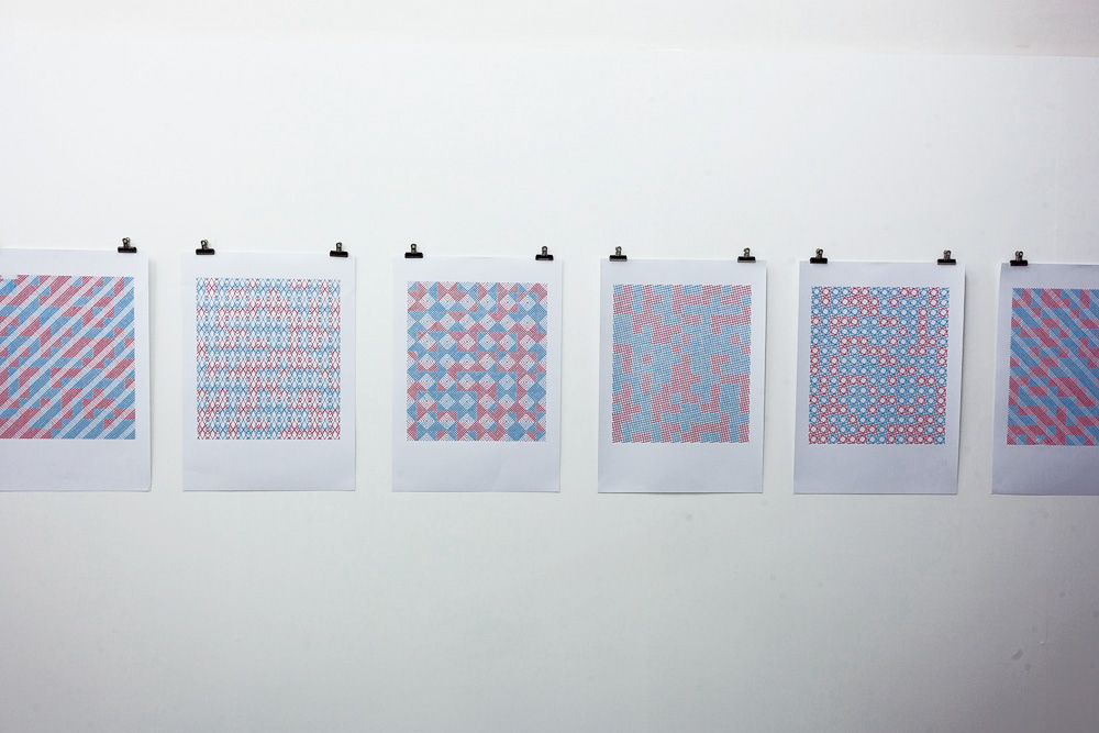
Another one of his projects, ‘Memory Encoded Patterns’ explores the theme of human and computer memory by recording aspects of his Grandmother’s decline into Alzheimer’s through memory encoded patterns.
To a passing bystander who has no context, we might just see red and blue patterns. But the amazing thing is that the colours hold great significance. He explains:
“These stitched paper-based works exploit binary code through their colour coding. Red is one, blue is zero. Each one is treated with a different pattern but all are based on the exact same grid. When converted from binary code into ASCII they reveal six simple phrases that capture aspects of the last few years of my nan’s life in the nursing home. Each phrase is encoded in exactly 224 bits.
“Room No. 4, TLC Nursing Home”
A reference to the room that my grandmother occupied in the nursing home in Citywest, Dublin.
“Liz and Trisha are here now”
Something the staff would say to my nanny. My mother and aunt befriended some of the staff at the home.”
If I were to look at the patterns and not know the meaning behind it, I’d just probably think someone just cross stitched blue and red patterns. But knowing what it means- the coding behind it- makes me emphatic of what the experiences he had having a grandma with Alzheimer. It’s almost like I’m being given a glimpse into his life knowing this ‘secret’ message.
His art has to be one of the most unique type of work that I’ve seen. I didn’t know this type of art existed.
I’ve seen some amazing, beautiful artwork purely having aesthetic value. However, his work really blows me away because of how cleverly his form carries the meaning in such a unique manner. His work reminds me of Stefan Sagmeister’s, however, each of these artists have their niche, and I feel that I can relate better to Slogan because Sagmeister’s photography is rather daunting for me.
His style is unique (have I mentioned that already?), humorous, witty and I really admire how the meaning in injected in his art. I would really like to bring this sort of style to my own compositions in the project. How can I relay my message in a more meaningful way? I personally feel that alluding and using symbolism gives an artwork more depth and really encouraged viewers to appreciate and think deeper than the surface.
What can I takeaway from his work?I love how, in a way, he creates his own ‘languages’ through his artwork and the unconventional way he does all of it. I’d hope to bring that same kind of style he has in some way in my project. I have also elaborated on how one of his works really inspired me for my concept.
All pictures taken from: http://loganmclain.com/
A project of his that I was especially drawn to is his ‘Paper Protest’.
He describes the concept of ‘Paper Protest’ below:
“The works all use the fragile, thin and colourful qualities of the paper to express something more powerful, aggressive and outspoken. ”
As you can see, he cleverly makes use of juxtaposition to produce these amazing colourful art. I think this really goes to show that in art, you don’t need to really go all deep and philosophical and all that. Sometimes it’s just simple things- like contrasting two qualities can produce something extraordinary.
What can I take away from his work? The reason why I’m really drawn to his work is simply because of the use of colours. I also feel that my love for all things colourful is part of my identity so I wanted to include this element. Also, we often associate bright colours with children so I might juxtapose it with more modern, clean looking typography associated with a ‘more adult’ style- but we’ll talk about that later. I really enjoyed his ‘Paper Protest’- it opens me up to the idea of not always having to juxtapose mediums. You can juxtapose a medium and a message, and it can work wonderfully.
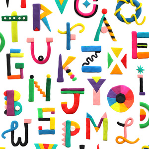
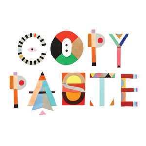
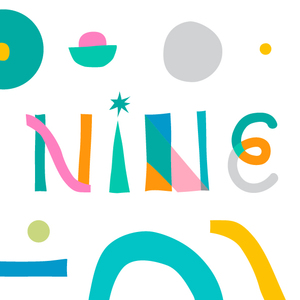
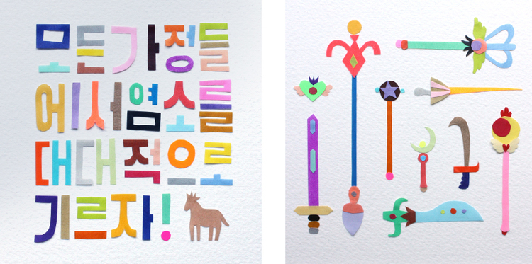
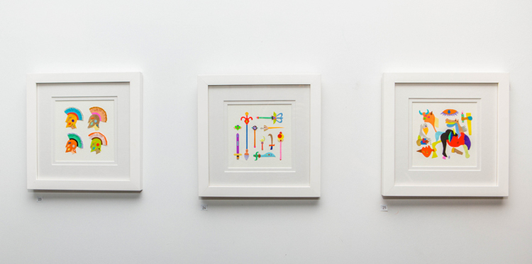
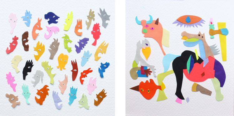
Adam France serves as a great inspiration for my work visually. His art is playful, quirky, colourful and cheerful, reminiscent of a happy childhood I had.It’s also such a coincidence that Adam France uses a lot of gifs in his website, so I can really learn a lot from his work.
His use of colours have really inspired my visual journal- so you see a lot of red,blue, green and yellow written in colour pencil!


