2D ‘ZINE’ : BINDING PROCESS (PART 3)

Standard


Screen Shot 2016-04-18 at 1.22.08 PM

I decided to go with saddle stitch to allow the zine to be opened flat. I followed Sea Lemon’s Youtube tutorial on how to saddle stitch. She had very clear instructions!

https://www.youtube.com/watch?v=BysUiyjB0jY

92f2559c-9a8e-4eed-9224-f4c20bfa5cbc

  1. I first had to secure all the pages together using paperclips

0f9cc591-08ac-4b1a-8bca-42dffe8d46b8


2. I then measured to find the middle of the paper.

0ed658f1-00dc-4436-ae9d-ff0f7300cf4c


3. I marked with a pencil, using a staple as a guide as to where to create the holes.

d5ba44c6-04f5-4a2e-b458-14e13e577483


4. I used a normal pin to pierce holes

45709001-1e50-445b-9f37-d335af7ccebd

*I forgot to take photos for the rest of the steps,hehe*

5. After that, I inserted the staple into the holes. This was the very tricky part, as you really had to adjust and make sure it laid flat on the surface.

Also, note to self, don’t cut your nails before doing this or else you will have a hard time….hahah.

But overall, I’m satisfied with how it turned out!

2D ‘ZINE’ : PROCESS (PART 2)

Standard

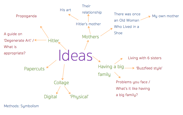
I have decided that I still want to explore the topic of Hitler further, but I realised what was really interesting was the aspect of having an artist interact with his painting.

Possible titles for my zine:

World leaders in their paintings (a more catchier name perhaps?)

Beauty from the POV of Churchill (alcohol, Hitler dead, painting??, victory) and Hitler (animals, Aryans, clean country)

Man + Country + Paintbrush= This project


I brought this concept with me to class along with one composition I finished for Churchill’s funeral.

Group consultation notes

I first started off asking the group for their suggestions on how I could design my format, as all my compositions are landscape oriented.

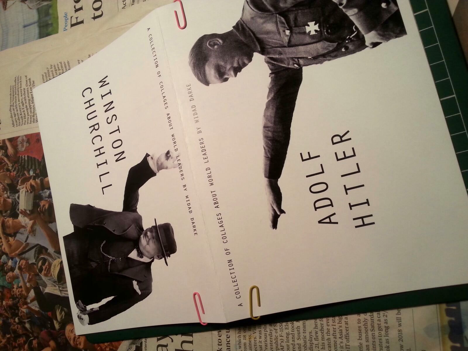
  • Standard book format: I told them I wanted to 4 compositions for each world leader to highlight and juxtapose their qualities.


  • Accordion book format: I also told them about my other idea to have it in an accordion format such that Hitler’s compositions would start from the left and Churchill’s would start from the right, and they would eventually ‘meet’ in the middle.  Joy said she liked the ideas of them 

Conversely, Eugene suggested that I should both world leaders should not be ‘meeting’, and they should be on opposite sides- in a ‘calendar’ type of format, where Hitler would be in the front, and Churchill would be at the back. I thought it was an interesting suggestion, and I’m also considering doing that.


In the middle of all this, Jacob asked me who my target audience was, and I was taken off guard. I stared at him for a while then mumbled something along the lines of ” I want to show it in an art gallery- to be displayed..”, which doesn’t really make sense to me now.

I feel that the the nature of the zine allows you display your creativity out of the formal context, and an art gallery is rather formal- and works should be frames. I don’t know why I forgot to consider my target audience- which is an essential part of creating this zine- it affects the way you print and format your zine, your content- basically, everything.

So, I’ve been thinking a lot about that and I decided that my the content of my zine itself is quite unusual- world leaders interacting with their paintings (I’m not even sure how to classify that topic)

However, I don’t really have a specific  audience, but I think my target audience would generally be people who have an appreciation for art or history. Like for instance, those who love art but don’t really know much about history/ these world leaders  OR people who appreciate history and don’t really interact with art.

Either way, I want my zine to be thought provoking and somewhat amusing in the sense that these world leaders, who many don’t know are also artists- are interacting with their painting. And it will also be an added bonus if my audience finds it informative as well. Like Joy mentioned to me, does my zine have an education purpose or a viewing purpose/ making the audience question what is happening?


On the aspect of typography, i haven’t really thought it out yet, but with my collages being rather busy, I might want to keep it simple.


One of my friends also shared a website on font pairing, and it’s pretty cool and useful!

Canva’s Ultimate Guide to Font Pairing

2D ‘ZINE’ : PROCESS (PART 1)

Standard

We are now at the final project for the foundation year!

For Project 3, this was the aim of the project:

Screen Shot 2016-03-28 at 6.05.23 PM


“To formalise your semester’s works in free and uninhibited ways. To introduce inspiration and serendipity into creative development.”

Here is an overview of all the projects I have done this semester so far:

Semester 1

  • Project 1: Lines (A narrative-Two Dots Went For A Walk)

Screen Shot 2015-10-01 at 10.41.17 AM

  • Project 2: Nursery Rhymes (There was an Old Woman Who Lived In a Shoe- The 4 Different Types of Mothers)


Screen Shot 2015-10-19 at 11.46.41 PM

  • Project 3: Ego (Breaking out of my bubble)


774a1dce-30bf-4961-a4a4-bcd7a4a703ce-767x1023


Semester 2

  • Project 1: Typographic Portraits (Flaws)

Screen Shot 2016-02-21 at 12.44.54 PM

  • Project 2: Point Of View (Beauty and Hitler)

Screen Shot 2016-03-23 at 10.42.33 AM

  • Project 3: Zine (????)


So far, here are some of the possible projects I’m interested in expanding on?

  1. Semester 1, Project 2: Nursery Rhymes (4 Different Types of Mothers)
  2. Semester 2, Project 2: Point Of View (Beauty and Hitler)


Possible mediums/ styles?

  1. Collage/ dingbats
  2. Paper cuts


“To explore experimental formats and understand alternative layouts and grid formats”

As I was making the different types of bindings, these were the questions that I asked myself:

  1. If I staple, how many staples would I need on the spine? Too few staples- big gap? Too many, excessive?
  2. If I do the saddle stitch, how do I make sure that my staples line up all on a straight row? Again, how many do I use to make sure it’s secure?


Types of stitches I am interested in, mainly for its aesthetics.:

  • Saddle stitch with thread
  • Coptic binding
  • Japanese Bookbinding


I watched this simple video, where Youtuber George Moore, goes through a stack of photo- zines sent to him by a photographer. It was interesting to watch as he made some commentary on little details such as:

  • Type of card stock, thickness of the paper
  • Borders of the photos and negative space (some have a regular border on each page, some photos take the whole page, there was also an important photo which was the only one with one blank page dedicated to the title)

Screen Shot 2016-03-29 at 9.56.03 PM


Screen Shot 2016-03-29 at 9.54.17 PM

  • The print of the photos- glossiness or matte?
  • Some had ‘detachable’ elements

Screen Shot 2016-03-29 at 9.55.26 PM

It was also interesting that each zine could be on anything at all- one zine was solely dedicated to the funeral of Margaret Thatcher?


Screen Shot 2016-03-29 at 9.57.16 PM


You can watch the video here below.


Some ideas:

  • Photocopied style? (Xerox) Making use of the xerox machine
  • Collage? Layering on a page, putting pockets?
  • Using a sewing machine


I also watched this video- it’s really interesting!


Consultation with Joy

I showed Joy the different binding techniques I experimented with using staplers and the sewing machine.

I also showed her my ‘brainstorm’ as an idea of where I want to head towards- which is mainly the concept of family or relationships.

Screen Shot 2016-04-03 at 8.49.08 PM

I told her I wanted to try to stay away from cliches. So she suggested something!

….


  1. The Darke family during the Nazi time. The idea of inserting yourself into a hypothetical situation. I thought this was pretty interesting.
  2. Then she suggested.. Hitler as a member of the Darke family? This had me laughing nervously. What happens when something foreign enters your family? She suggested maybe he could be the scapegoat of the family, and brought up the idea of the scapegoat effect. Apparently in every functional/dysfunctional family, someone has to take the blame! Interesting! But the thought of Hitler even hypothetically being part of my family made me uncomfortable hahaha. But who knows?
  3. Questioning icons- everyone is a by-product of their family.What if they were brought up somewhere else?

After I told Joy I was astounded/amazed/ bewildered at some of her suggestions, she did make a good point that if I wanted to move away from the cliches, sometimes marrying my concepts could bring in a new fresh concept.

Also, when I showed her my experimentation with the different binding and expressed to her my interest in the Japanese/Chinese binding, she advised me to be mindful of what each binding can do for me. It could dictate how people read etc.

We also discussed about the time constraint of this project- and how to make it work.

It was a very insightful consultation which really got me thinking.


Moving Forward

  1. Nail down the concept
  2. Have at least 3 pages ready to show the new concept.
  3. Print and make a mock up for group consultation.