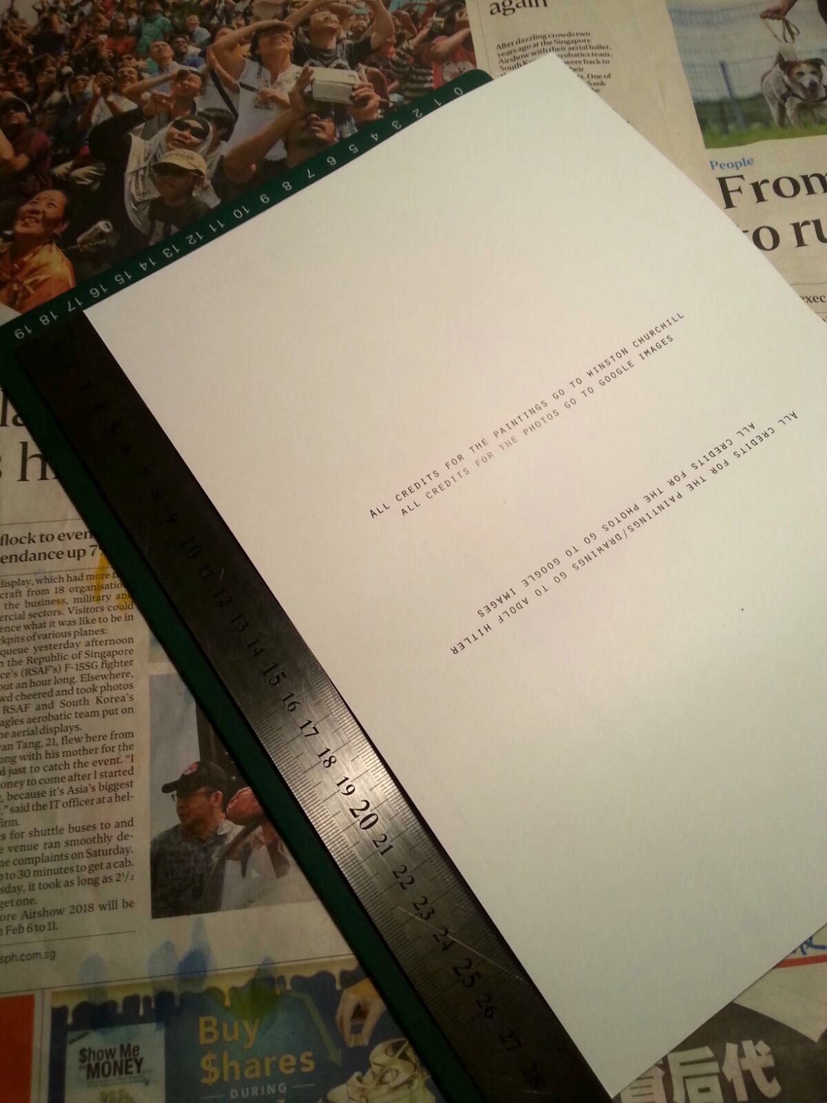
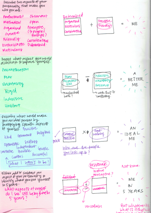
This is the second post I didn’t manage to post/finish that was dated: 14 March, Monday.
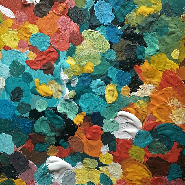
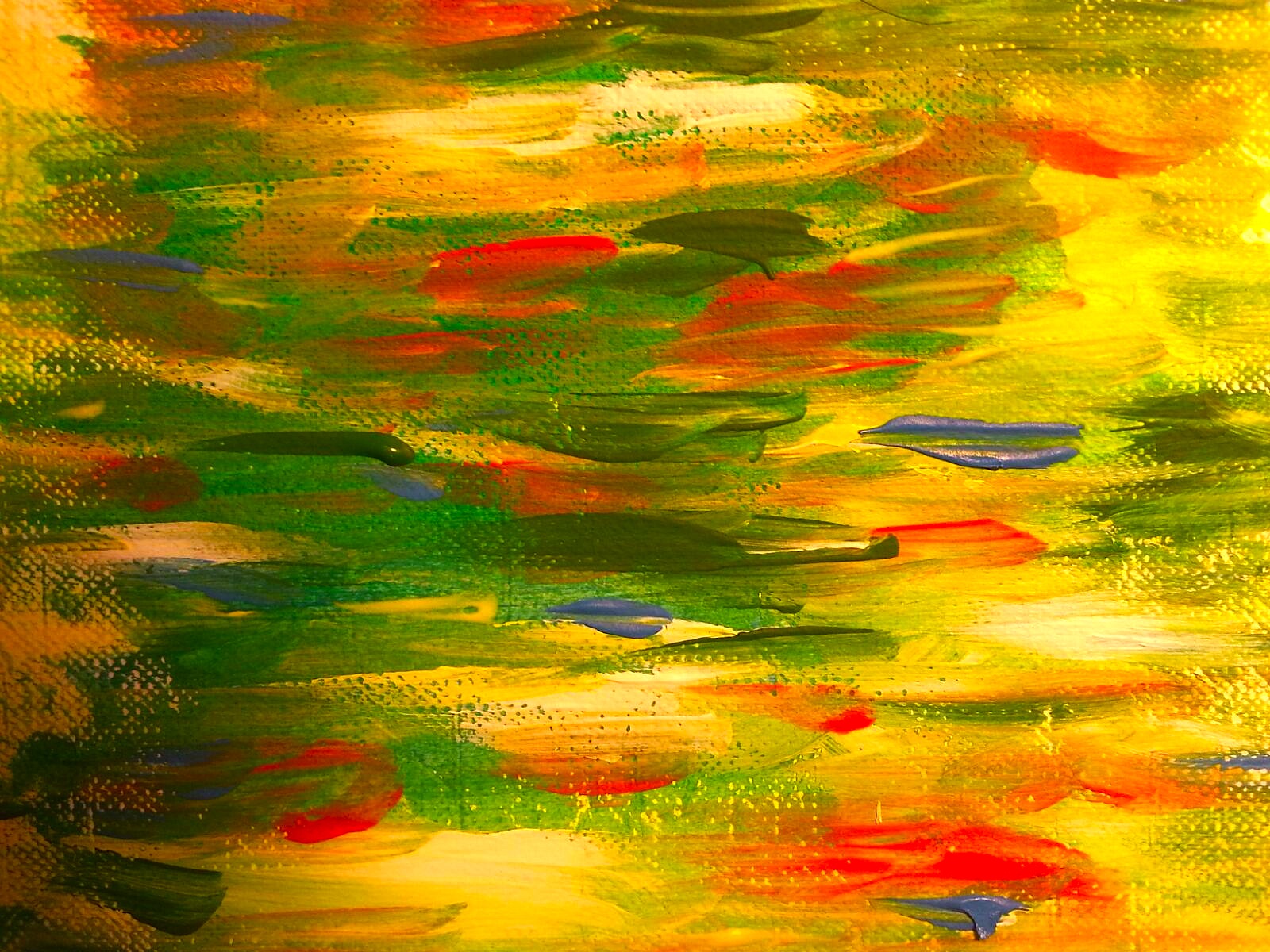
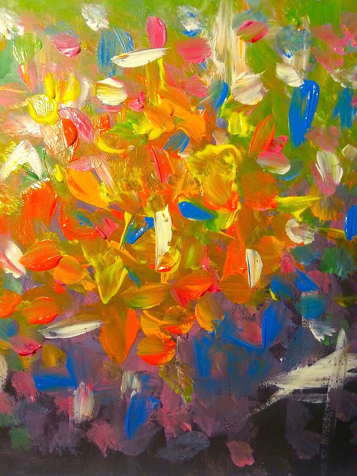
I had screenshot my progress along the way, but I didn’t have time to post it up.
I have already decided on my 6 POVs!
POV 1- Beauty from the POV of a mother is a child’s innocence.
POV 2-Beauty from the POV of Hitler is animals
POV 3-Beauty from the POV of Dadaists is ‘Degenerate Art’
POV 4-Beauty from the POV of Hitler is a clean country
POV5-Beauty from the POV of Hitler is Aryans
POV 6- Beauty from the POV of survivors is freedom
Here are some of my in-work-progress shots I took, and I explain some of my thoughts behind it.
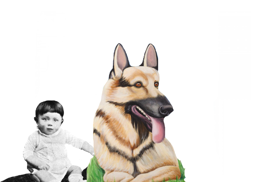
POV 1- Beauty from the POV of a mother is a child’s innocence.
I initially wanted to place baby Hitler riding his dog to convey a child’s imagination, so I used the clone stamp tool to extend the rest of the dog’s head to create a body. 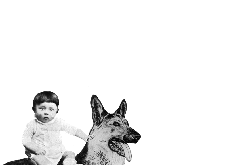
While it looked pretty believable, I decided to scrap it because I found another picture of a dog that he drew and I felt that drawing would be a better match for the painting and convey the more colourful vibe.
Testing out with both dogs.
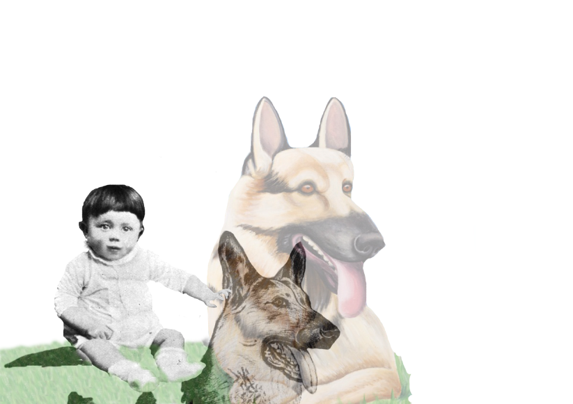
After deciding on this dog, I used the pattern stamp tool to have the same type of grass as in the drawing. I wanted to have that artificial look to reflect the ideal this point of view has and it helped to make the composition more brighter and colourful, compared to the more natural looking grass which was relatively dull.
I also wanted to incorporate this barbed wire into the compositions a subtle way to foreshadow the concentration camps Hitler would later command to build. However, I decided against it because I wanted the composition to be void of any hidden symbolism and have it straightforward-much like a child’s innocence. Also, I was reminded that this is his mother’s POV, therefore, she would have only a purely loving perspective of her child.
I was also thinking of putting in his mom and have her interact with baby Hitler in the collage. However, I felt that it was there was no real purpose to put her inside other than the fact that he was her mother. She didn’t need to be present in other to depict her POV.
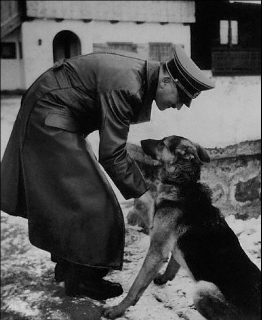
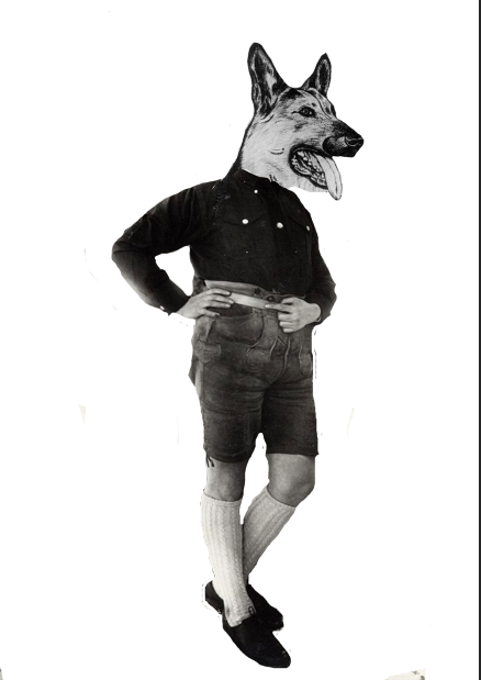
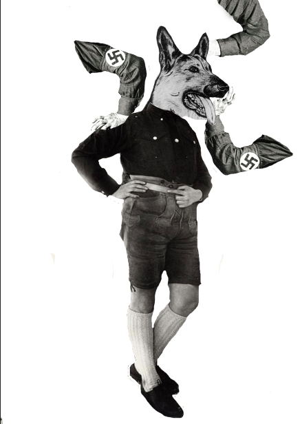
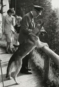
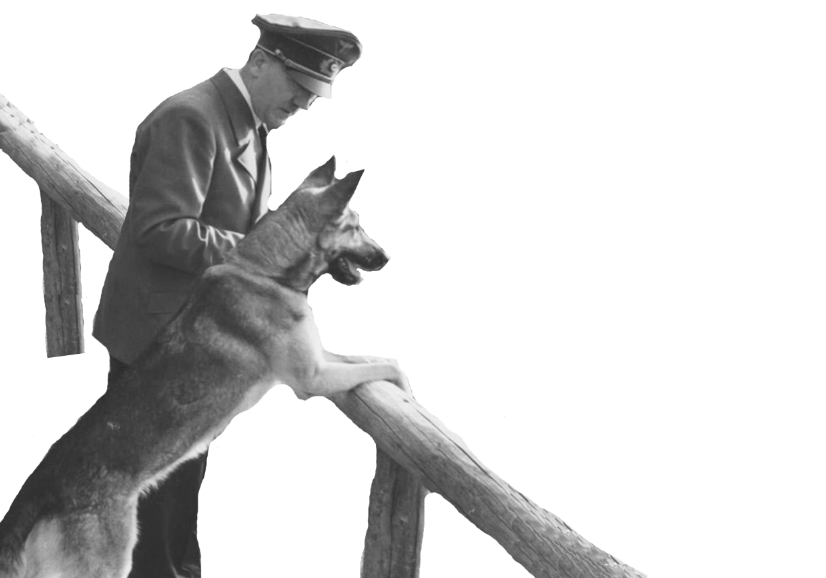
POV 2-Beauty from the POV of Hitler is animals
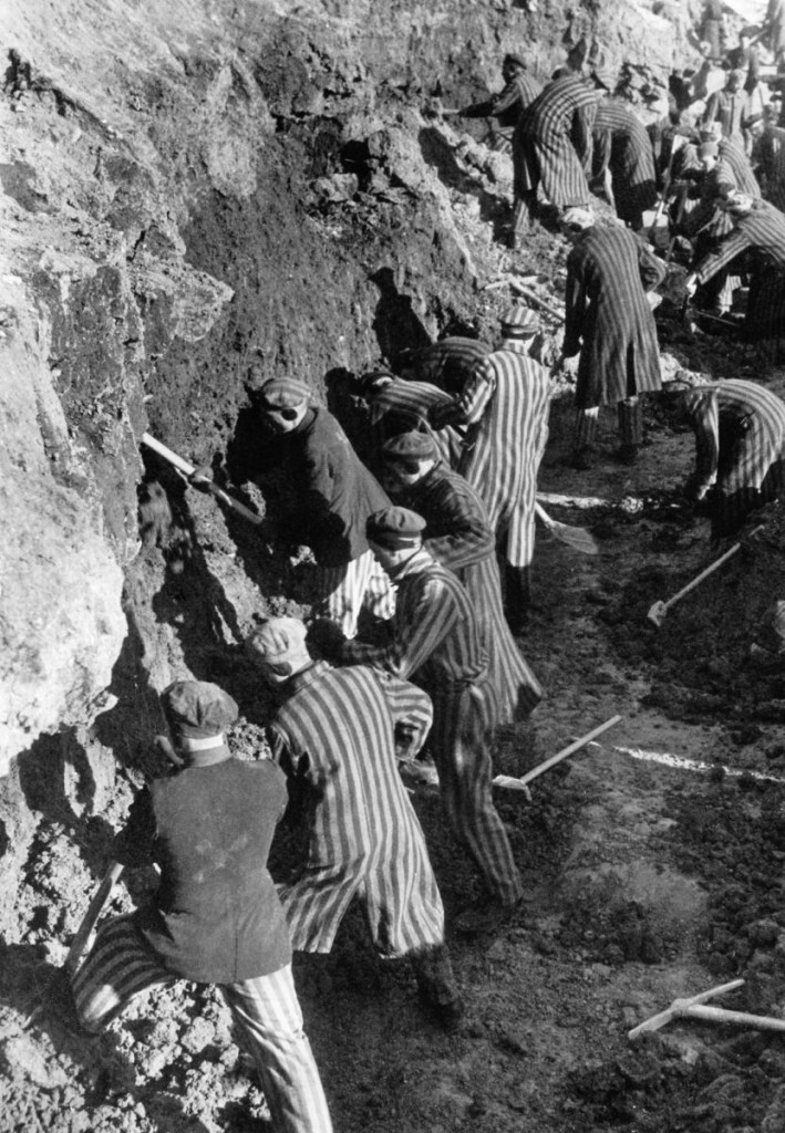
One of my initial ideas was to use this photo of the non-Aryan people being forced to clean the streets in this manner 🙁 , to have them look like ‘deers feeding on the grass’.
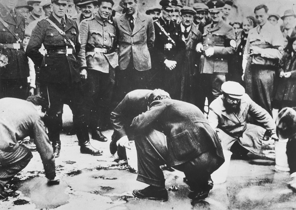
However, after some consideration, I realised that there would be no eye contact between Hitler and the people kneeling on the floor, so I went for another photo.
All these photos really break my heart. But doing this project, I had to somewhat switch off this part of myself and just focus on relaying the message. It’s kind of twisted that I have to turn a blind eye doing this project on Hitler and beauty.
Option 1-with squirrel
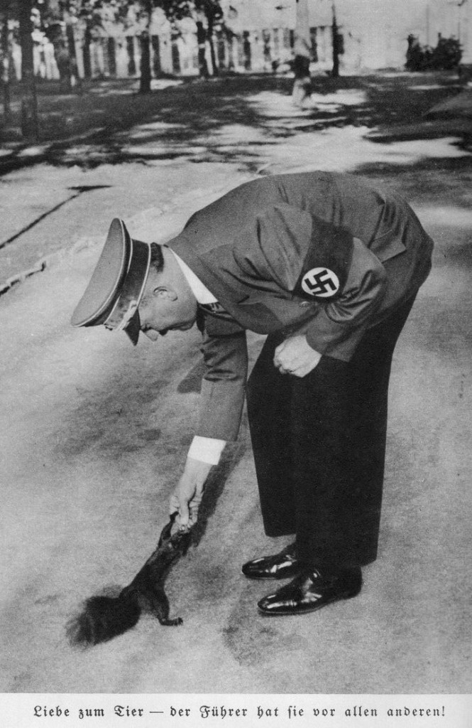
Option 2- with dog
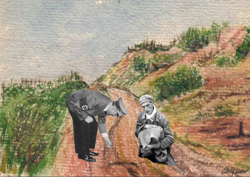
Decided to add in one more person
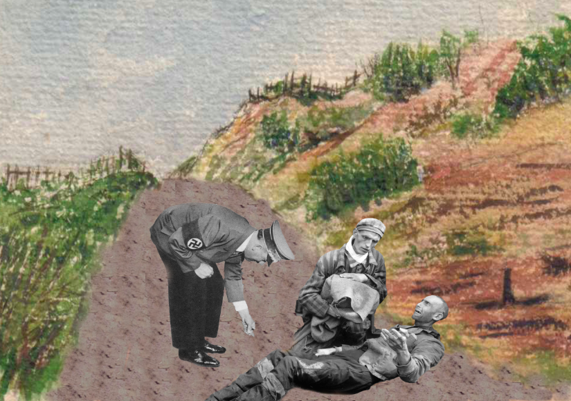
I did the same as POV 1- Used the pattern stamp tool to cover the soil from the original image of the people.
I went for Option 2 because his facial expression is more distinct- shows that he’s smiling, and the previous image of Hitler had no correct line of gaze (?) with the people lying/sitting on the floor.
I also wanted to add in the officials standing by Hitler’s side, smiling- but I thought it would detract the focus between the interaction of him and the people lying on the ground.

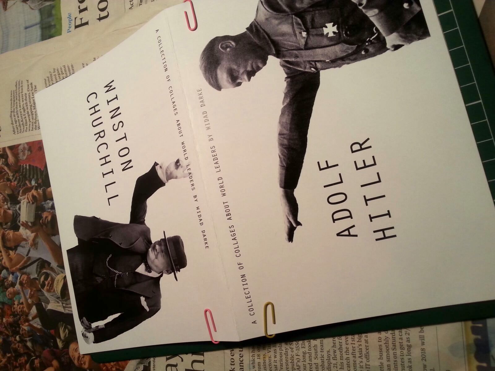
POV 3-Beauty from the POV of Dadaists is ‘Degenerate Art’
The process of doing this wasn’t so serious and was more fun to do. I stepped into the shoes of a Dada artists and tried to imagine what art I would have wanted to create to ‘rebel’ against Hitler’s control of art. So, I thought it would be funny to use Hitler’s painting and and photos against him to create a piece of art he would hate.
Hitler in a ridiculous pose (he hated this photo)


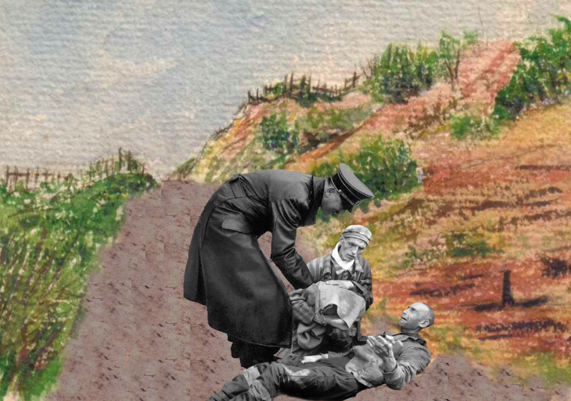
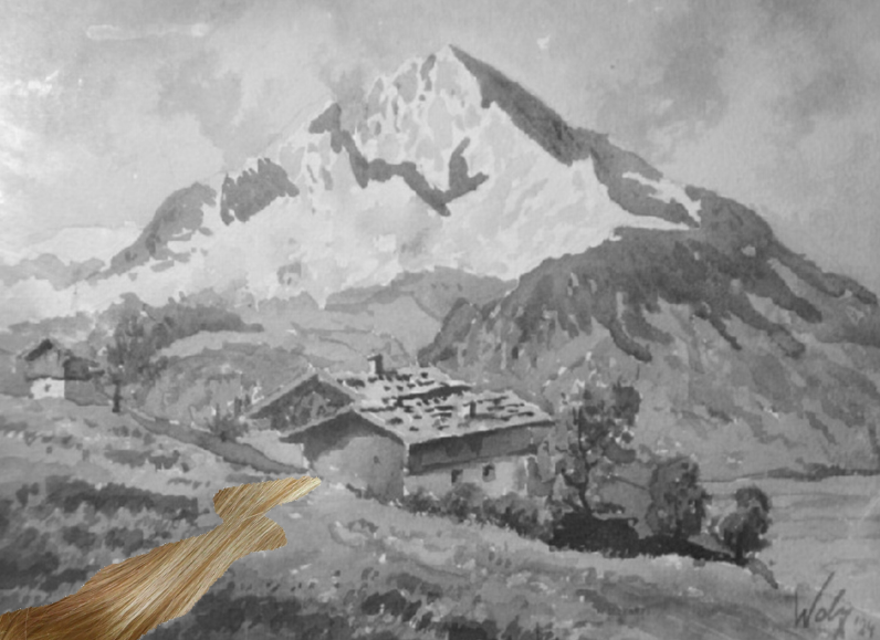
POV 4-Beauty from the POV of Hitler is a clean country
One initial idea I had was to make use of these two photos:
So, Hitler and his dog would be looking down from the mountain, but at the bottom of the mountain, would be all these people digging. However, I felt that the message wouldn’t be that clear and using a shocking image of a pile of corpses hidden as it is resized to a smaller image would be better. 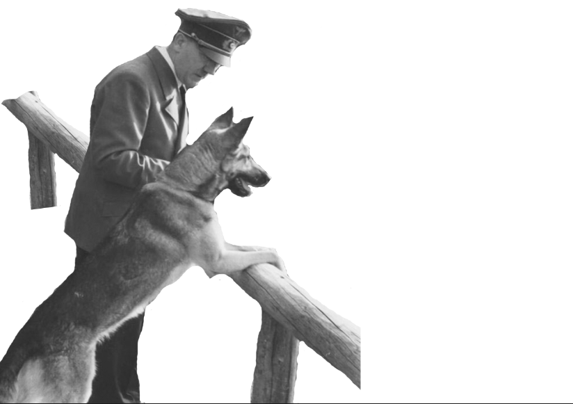
I spent a long time trying to extend the railing and make it look as seamless as possible, again using the clone stamp tool and the pattern stamp tool.
Another thing I struggled with was finding high resolution images of Hitler- so that’s one big thing I wish I could have done better- but it’s quite impossible to have really high res images of historical figures. But on the other hand, the graininess lends a gritty quality to the compositions.
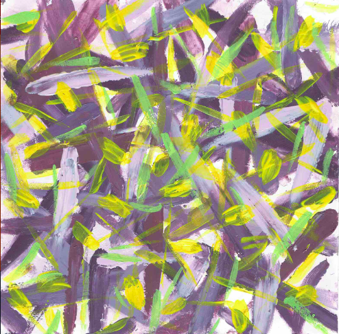
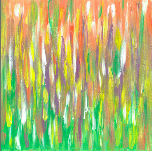
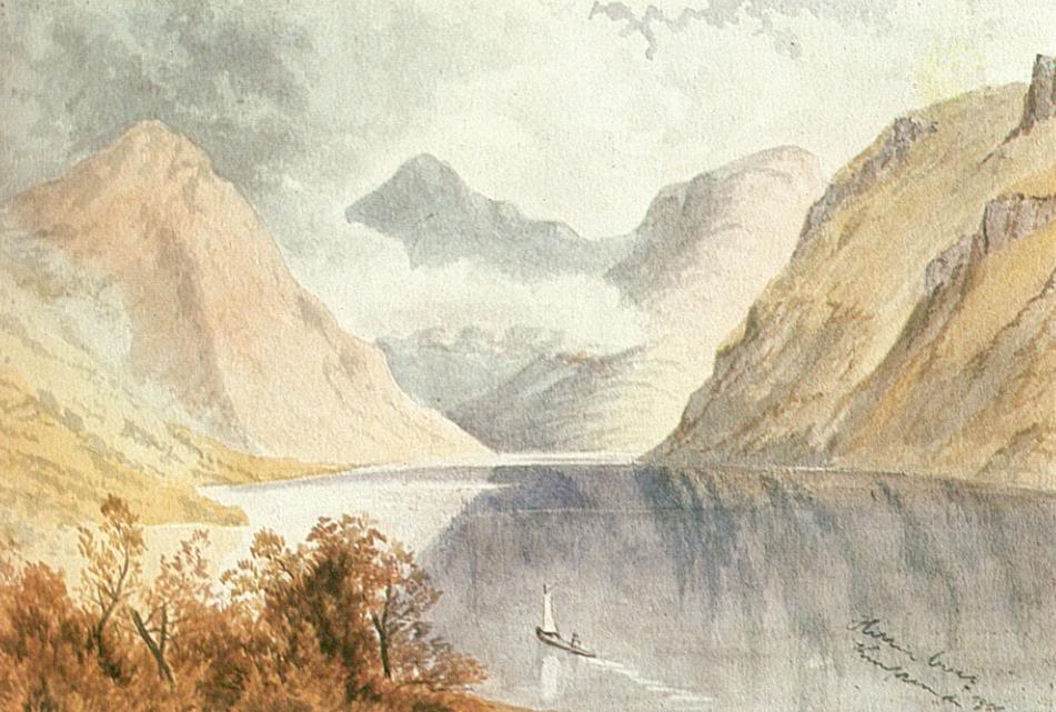
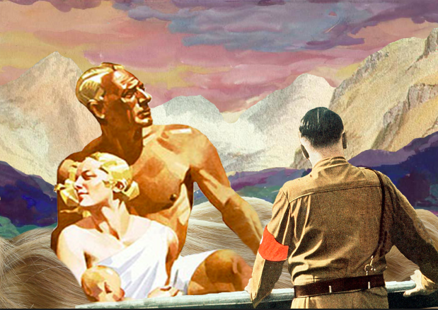
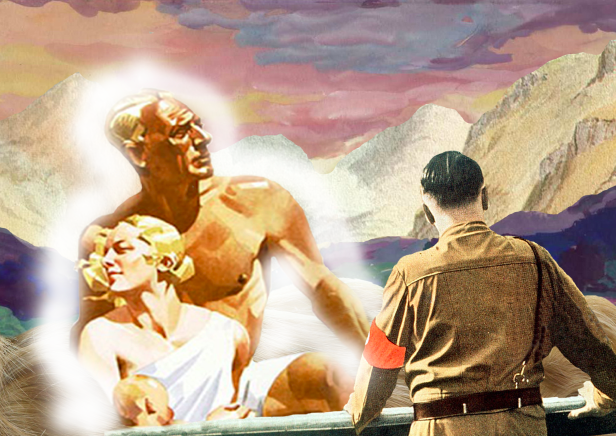
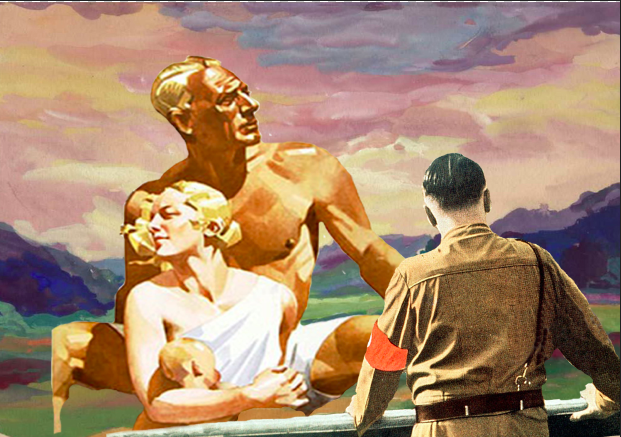
POV5-Beauty from the POV of Hitler is Aryans
This was one of the very first compositions I tried which was a huge fail.
So I layered two paintings over each other.

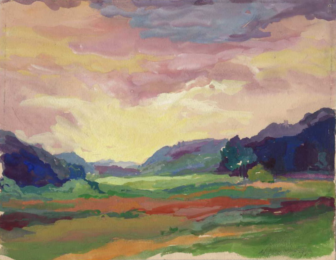
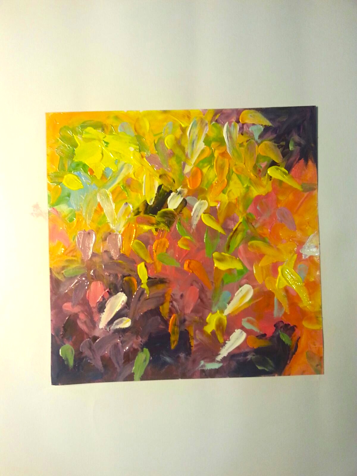
I tried to depict the Aryan family in a river of blond hair. I actually kind of liked it. Actually, I’m not sure why I scrapped it. Maybe it was because I wanted higher contrast and the green grass to show.
I tried to give them a ‘glow’ but also largely failed.
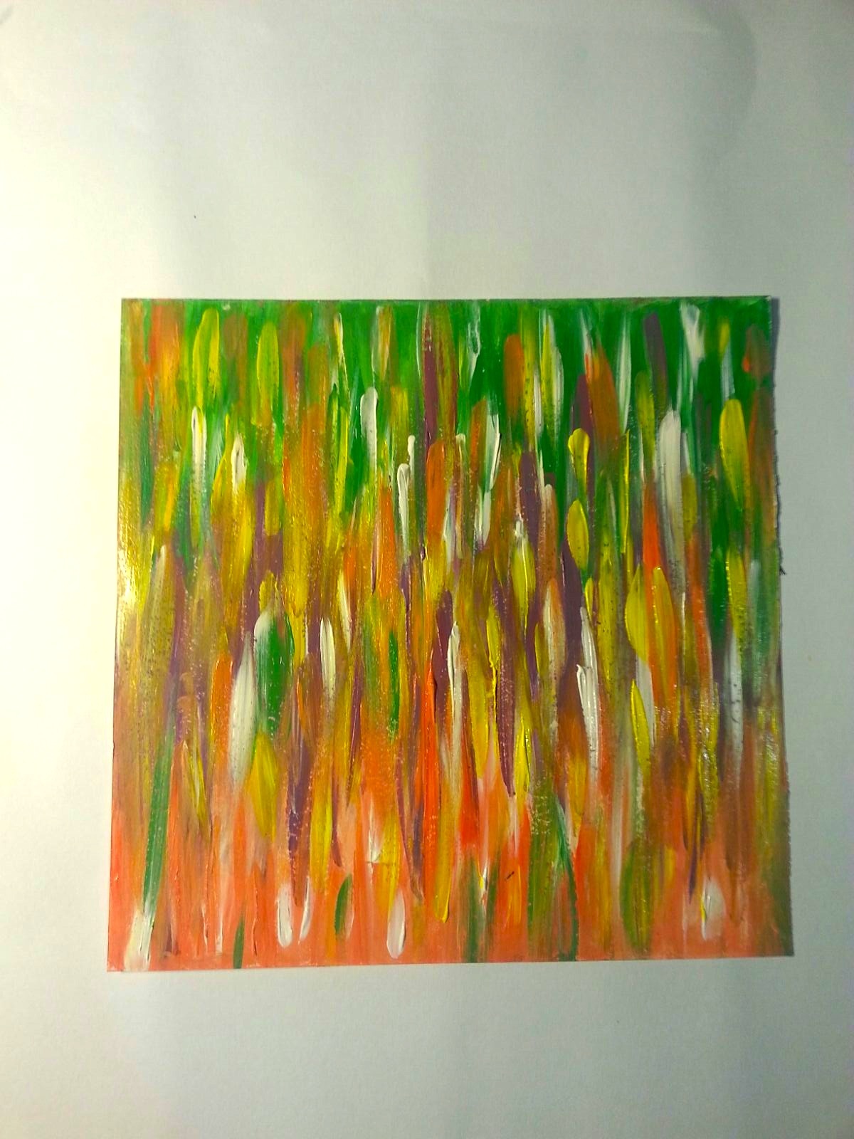
I tried it with only one painting- notice there are no high mountains. It was too plain. I also had to extend his legs using my favourite tool haha.
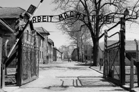
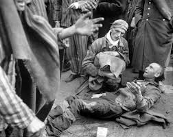
POV 6- Beauty from the POV of survivors is freedom
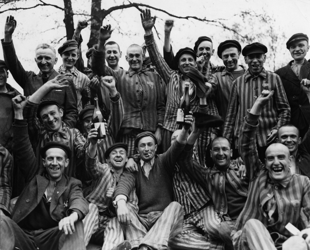
I loved this happy photo of the concentration camp survivors and wanted to take advantage of their hands raised in victory.
I thought it would be a good idea to have a colourful blue sky to show the start of a new life.
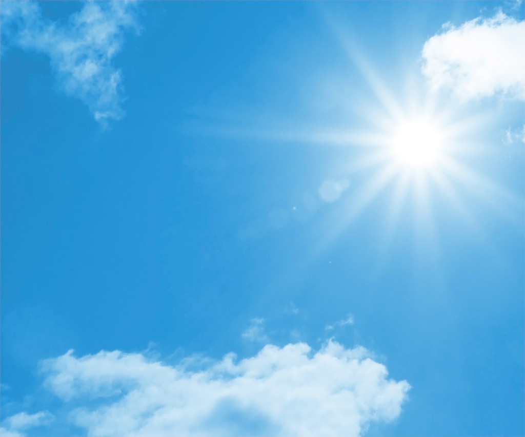
It wasn’t really a good idea..

It looked too artificial- as if they were posing in front of a green screen.
So I thought it would be more meaningful and symbolic if I had the open gates of the concentration camp behind them, as if saying they had escaped Hitler’s oppressive rule on them.