I hereby present my 2D Project 1 on lines! This post will be a culmination of the whole project- from the beginning of the process to the end. I will be breaking it down through the following categories:
My process (including photos of my Visual Journal)
a)Research on reference artists
b)Experimentation of techniques (Visual Journal)
c)Development of concept (Identifying my direction)
My final outcome
a) Format / methodology- choice of media
b) Final artwork
c) Overall thoughts on the project and challenges faced
Let’s begin!
a) Research on reference artists

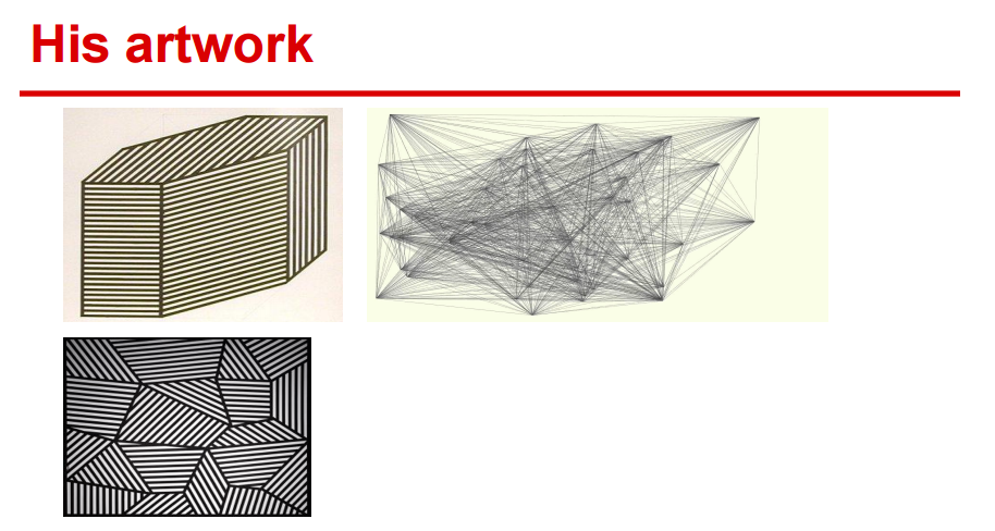
Here are some snippets of the research I did on Sol LeWitt and Red:
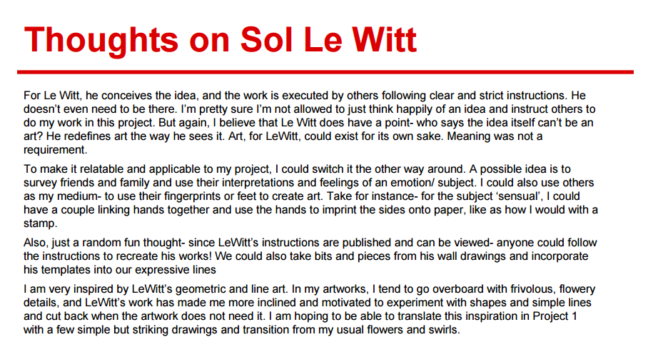
Sol LeWitt:

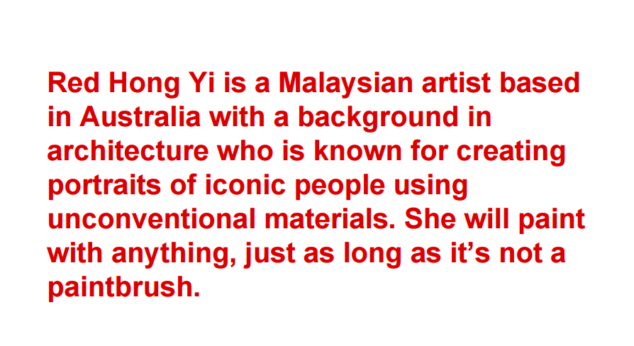
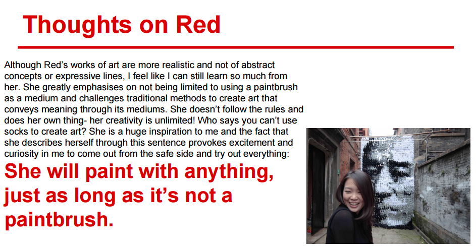
Red:

Towards the end of this very long post I will be commenting on how my research has helped my work and influenced my designs. I will be referring to some of my designs as I talk about this, that’s why I chose to put this towards the end of the post.
Here is the pdf if you would like to see the whole thing
b)Experimentation of techniques (Visual Journal)

I had a ‘virtual visual journal’ as well for my initial stages- where I defined and pinned up photos that could provide me with visual inspiration. Joy actually suggested that it was better to print out the photos and stick it into my visual journal, but I felt that it was more optimal for me to have it as a soft copy as I could add and delete photos based on my concept.
Here are some images of it:

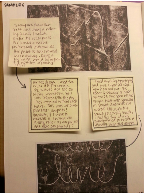
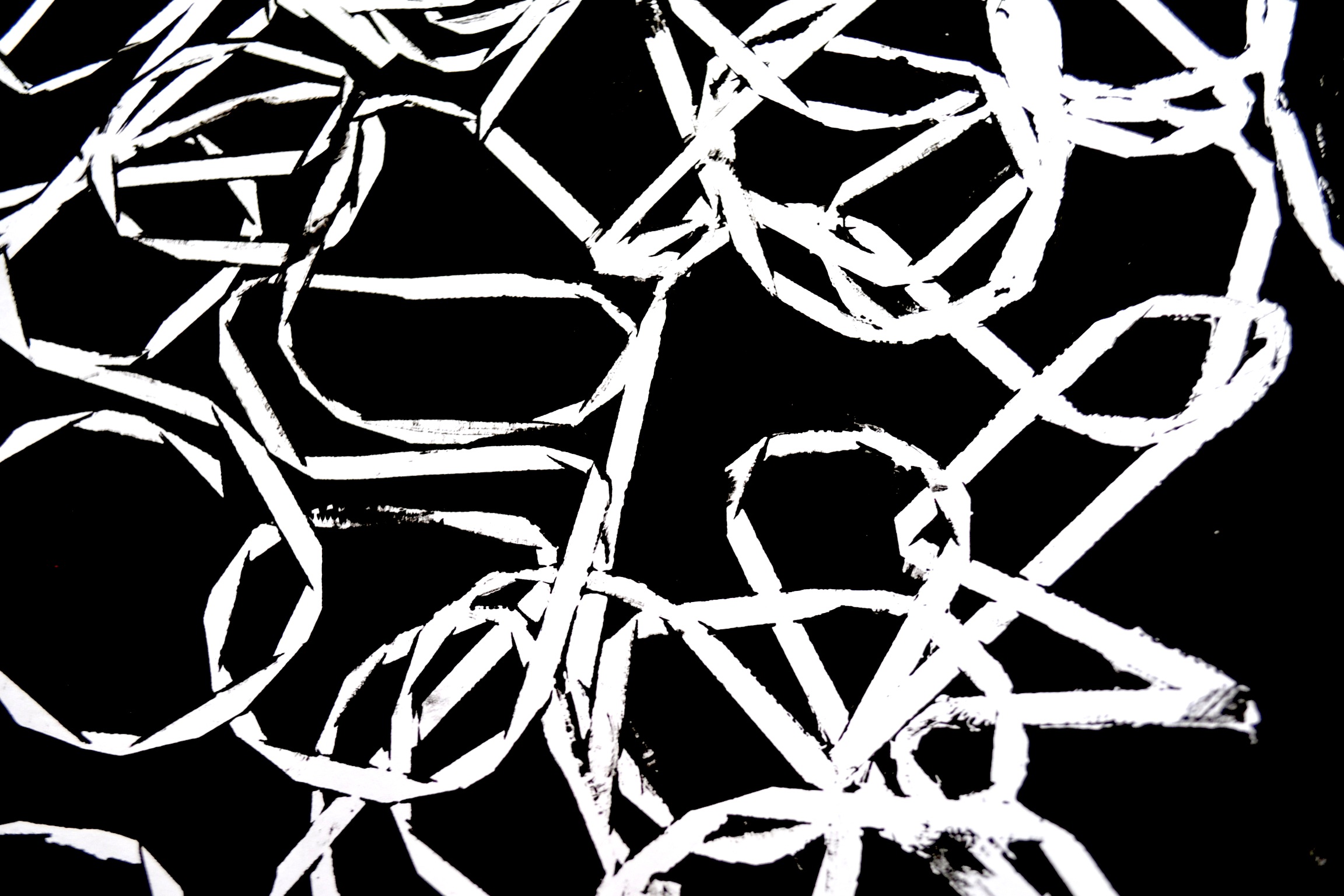
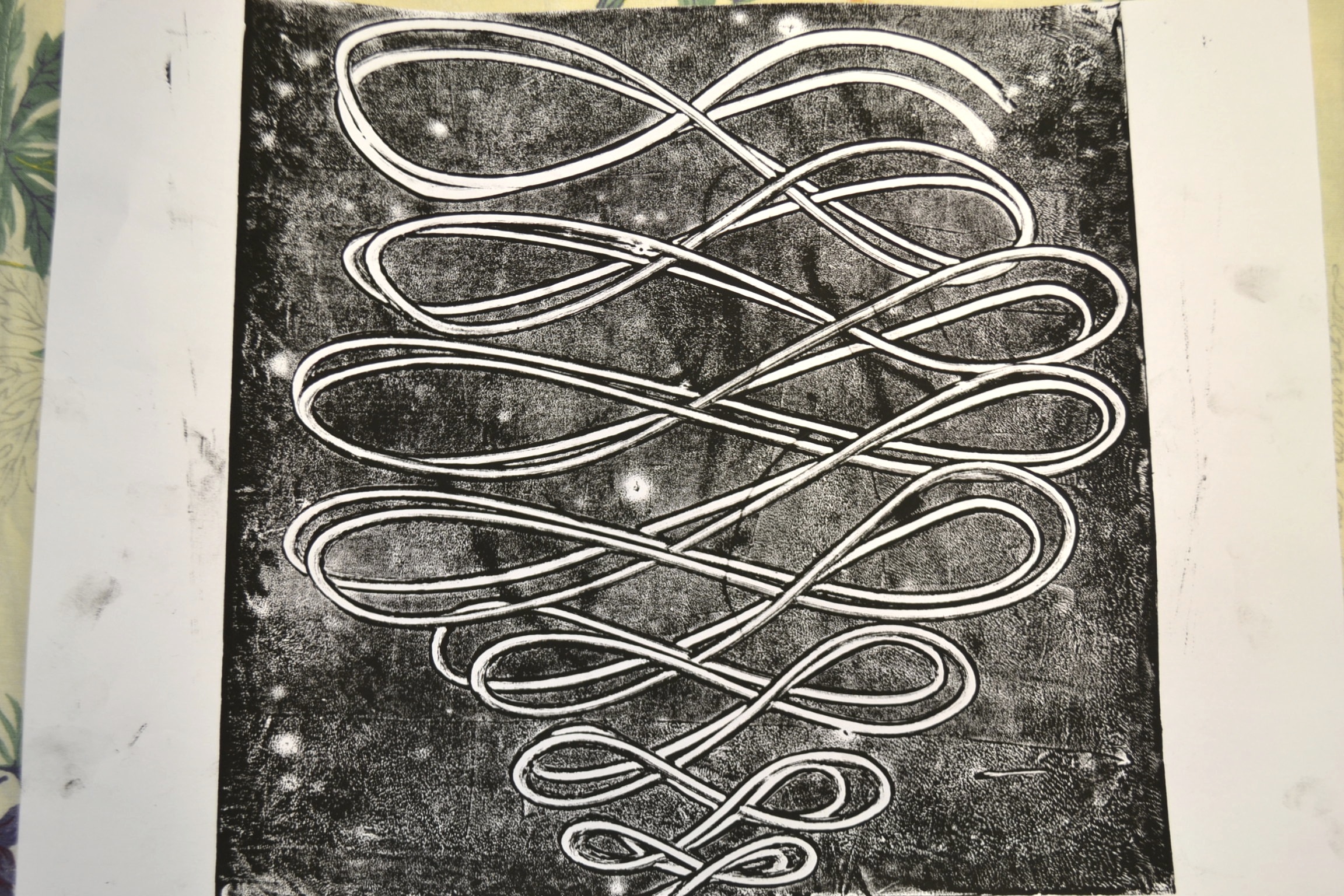
I experimented with many many different techniques and designs. Unfortunately I stupidly threw away some of my experiments without documenting them so I shall display what I have salvaged.

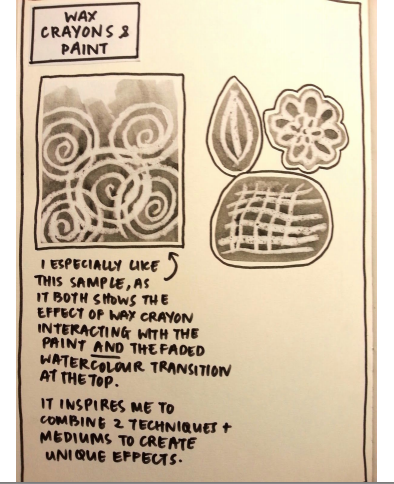
Monoprinting


Monoprinting was definitely an eye opener for me. It introduced me to the world of abstract art and automatism- there was beauty in the fact that each piece was unique and I always found myself always holding my breath before peeling of the paper from the rubber mat to see what is printed.
There is a certain unrefined, raw quality and grittiness to monoprinting that greatly appealed to me, and that’s why I chose to use this technique for the last 4 emotions (turbulent, indecisive, ambiguous and exhausted). Previously, the positive new emotions the dots shared were expressed through the marrying of the two mediums. I wanted to create contrast to this shared positive joy with monoprinting to bring out the negative, dark cloud of emotions that surrounded both dots.
c)Development of concept (Identifying my direction)
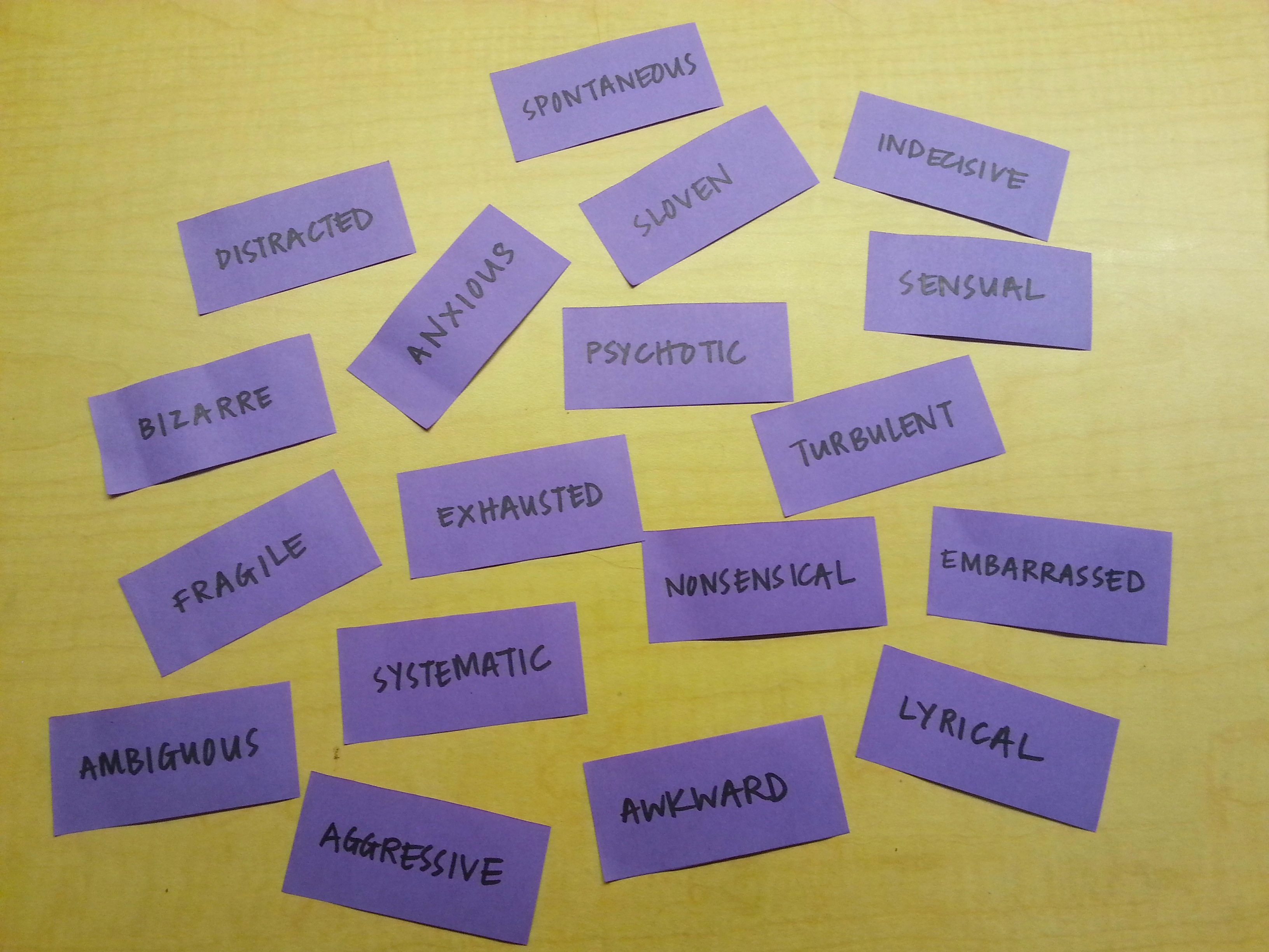
I wanted to do a play on Paul Klee’s line, so I titled my project ‘Two dots went for a walk’. I wanted to explore the relationship and interaction between two dots- from the beginning before they meet, their experiences and the emotions they share when their lines/paths intersect, and the possibility of their lines diverging after they meet.
The dots symbolise the relationship between a male and a female and their emotions they share together.

Without really meaning to, my concept became more of a narrative, telling the story of two ‘dots’, and expressing each emotion through the personality of each dot.
Let me take you through this narrative.
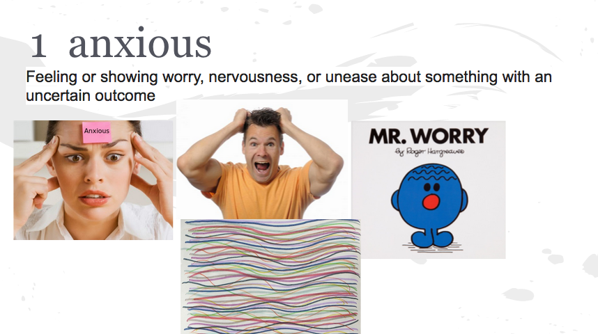
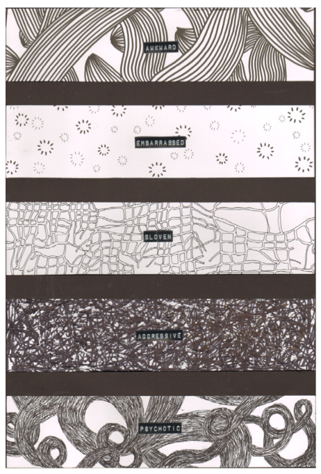
So in the beginning, before the dots meet, the female experiences ‘anxious’ and ‘distracted’ while the male is ‘awkward’ and embarrassed’.
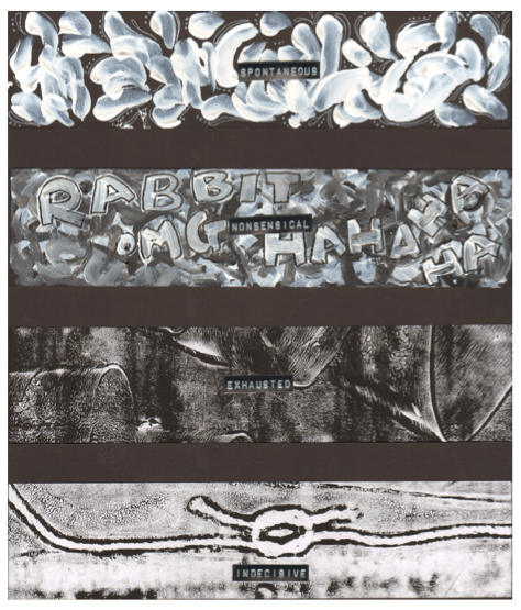
Then after they meet (intersect) and begin to share experiences, they share new emotions together (spontaneous, lyrical, sensual and nonsensical).
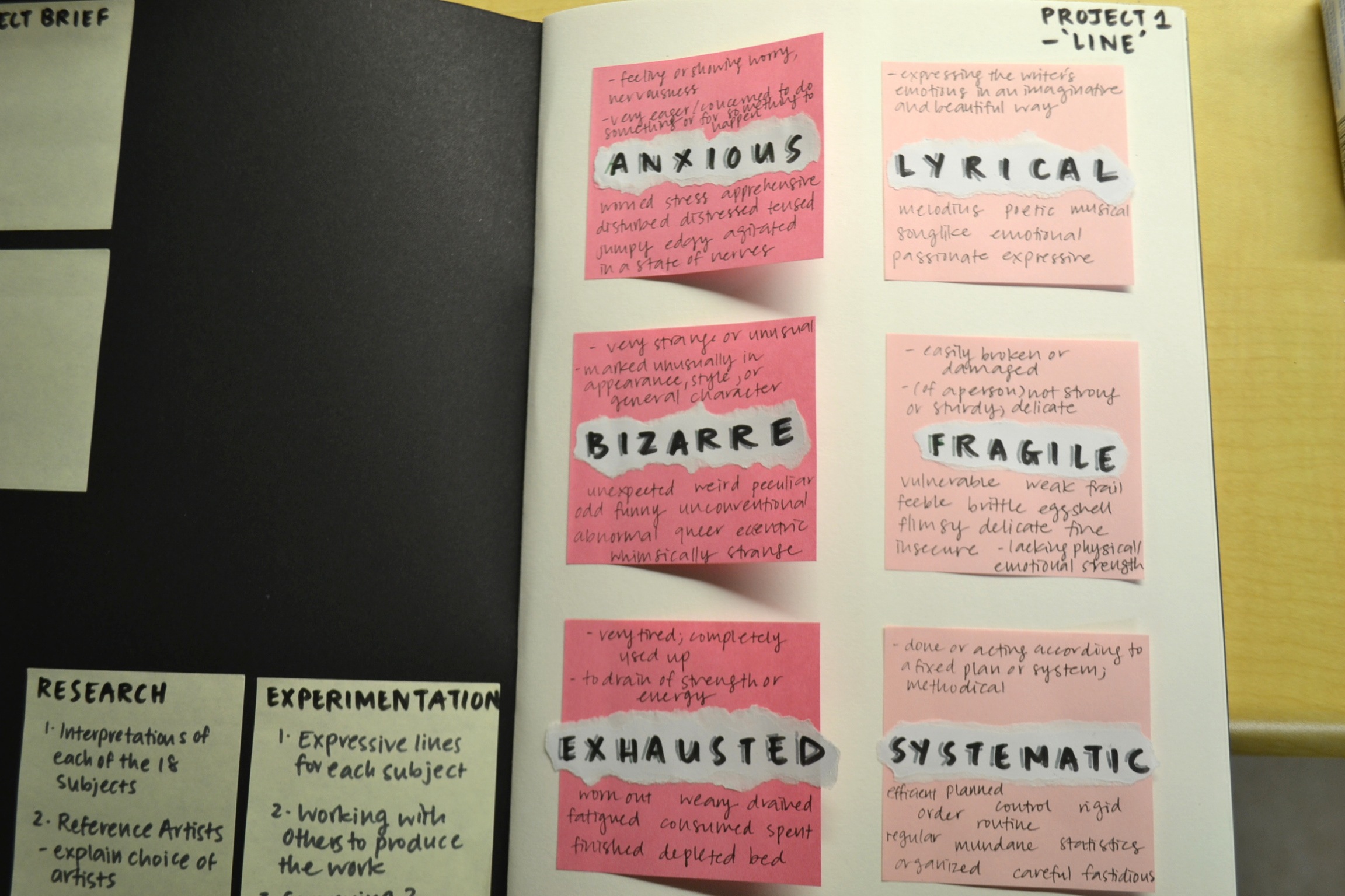
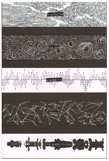
After the honeymoon stage, they begin to find out things about each other- mostly negative ones . The female is ‘bizarre’, ‘fragile’ and ‘systematic’. The male has opposite emotions: ‘psychotic’, ‘aggressive’ and ‘sloven’
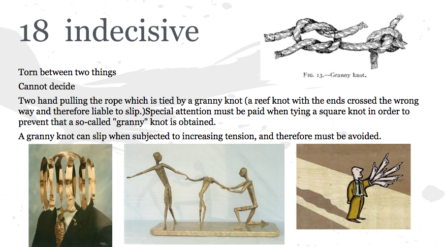
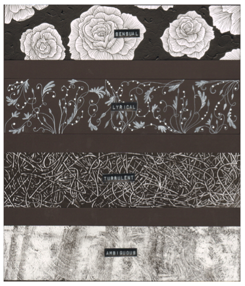
Because they start to show each other their true colours, their relationship becomes rocky and they share the same negative emotions: ‘turbulent’,’exhausted’ and their relationship status is ‘ambiguous’ and ‘indecisive’- they don’t know where it is going and how it will end.
a) Format & methodology-choice of media
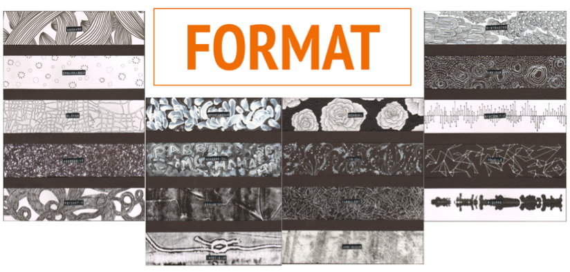
I chose the 4 X A2 format on Joy’s suggestion (thanks Joy!)- and I felt it suited my concept the best. The top part (first two rows) represents the dots before they meet, and the ones below represents after they begin sharing and revealing emotions.
I wanted to use mediums to represent each dot. So for one dot (the male) I chose to exclusively use pen/marker, whereas for the other dot (the female) I chose to use only acrylic paint. I wanted the male to be represented by bold, thick, and relatively crazy line whereas the female would have more intricate, detailed lines- therefore I felt that the mediums I chose was suitable for each.
As I did each design, I now realised that I somehow embodied the persona of each dot- which was helped by my choice of medium. For instance, when I was doing the design for the female dot, I had extreme focus and had to be very detailed and precise. The acrylic paint I used wasn’t conventionally applied using a paintbrush- I squeezed it out of a plastic cellophane tube instead, giving me more control over it. For the male, I had more freedom in my hand movement and my concentration didn’t have to be as intense as the the designs for the female.
So before they meet, the emotions the dots experience individually have more singular lines of the same medium. I played with telling their story in the sense that I gave the female emotions such as ‘anxious’ and ‘distracted’ and for the male-‘awkward’ and ‘embarrassed’.Their coming together would have the two mediums being mixed as they share these new emotions (sensual, lyrical, spontaneous, nonsensical). These emotions had more motion and energy to represent the newfound connection. After they pass the initial stage, they discover each others dark side, which leads them to experience more negative emotions together. For these emotions, I chose to use monoprinting as I felt that this technique was better suited in conveying these ‘darker’ and more complex emotions.
Doing each design, I had to embrace the persona of each dot. For example, when I was designing ‘Awkward’, halfway through, I was rather unsatisfied with how it didn’t look as perfect and equal as I wanted to. But then I realised that this was the persona of the dot I was designing for. This ‘male dot’ didn’t care for the finest of details- being detail oriented was the personality of the female dot. So designing the emotions of the ‘male dot’ I was relatively more relaxed and expressive and free, not worrying too much about details.
b) Final artwork

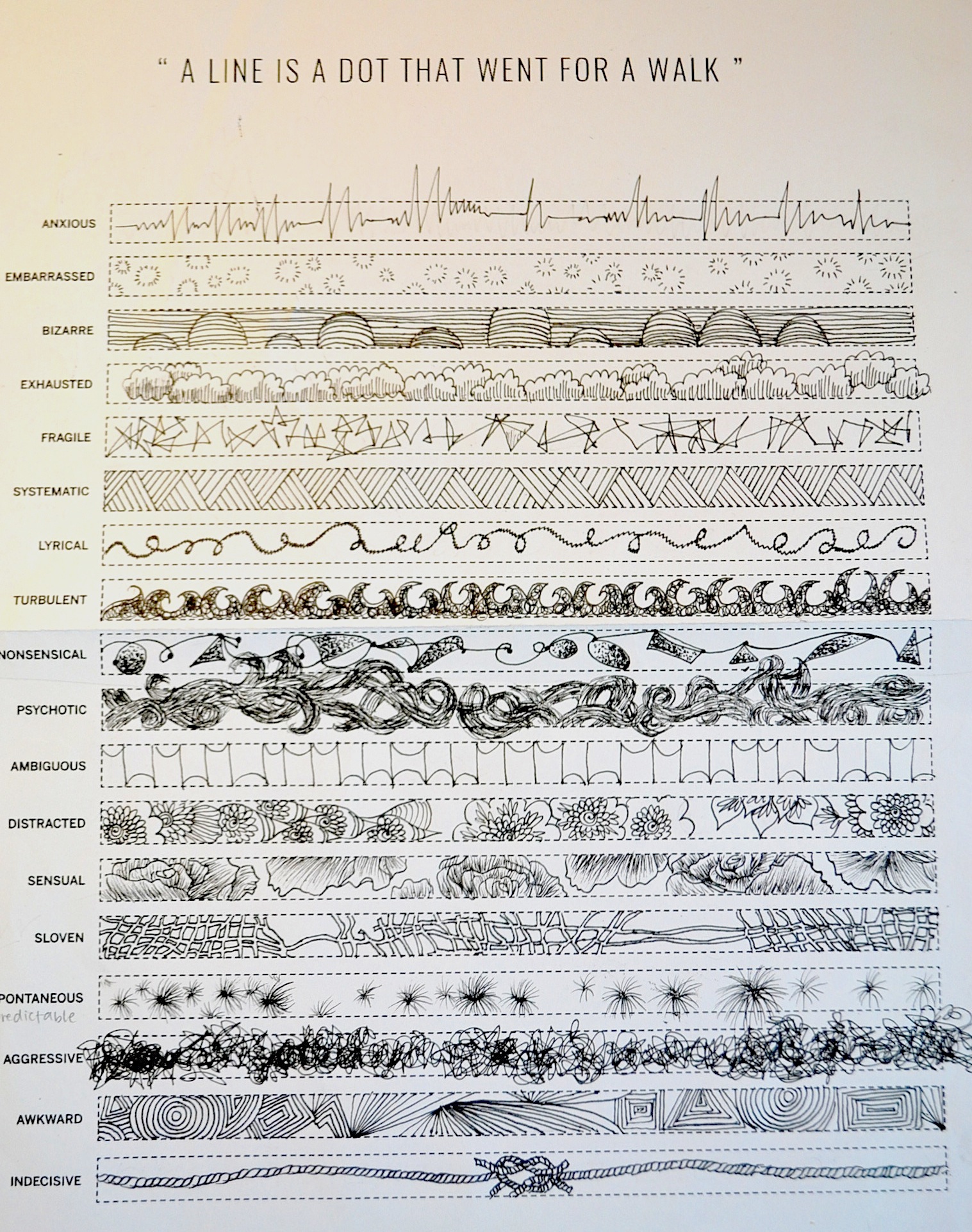
I apologise for how small the photos are, so the best thing I can do is give you closeups of each emotion:
If I were to take you though all 18 emotions, we would be here for a very long time. So I shall take you through a few of my favourites.
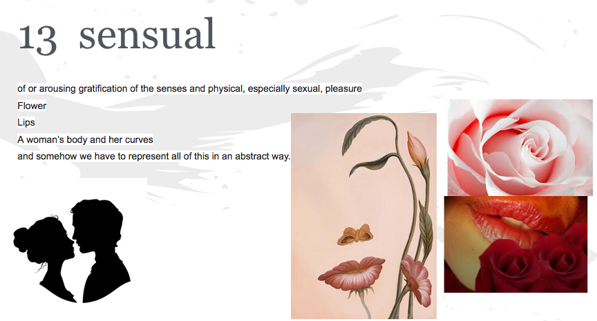
Sensual: If you look carefully, the edges of the petals between two roses have the silhouette of two people facing each other in an intimate way. I wanted to incorporate this subtle feature because it represents the intimacy of this emotion and how the emotion ‘Sensual’ is not for the public- only the people in the relationship share it.
Spontaneous: I ditched the acrylic paint in a henna cone with the fine point and squeezed it out directly from the the acrylic paint tube. I used my fingers to form the designs using short swift stroked to create textured. I feel like the process and idea of this itself was spontaneous and really embodies the meaning.
Bizarre: This is one of the most abstract designs of all of them, and I feel this is what best represents automatism, inspired heavily by ‘The Ghosts of My Friends’. Actually, for this I used acrylic paint in a henna cone and wrote out (in cursive) a ‘strange secret’ the female dot would have. Then I folded the paper so it became smudged and the words became strange-bizarre patterns.
Indecisive: This is actually a mono print of a granny knot. This type of knot is insecure, and can slip when subjected to increasing tension, and therefore must be avoided. I chose this to be the last emotion. It represents the conflicted point of the relationship where the two dots are right now.Will they stay where they are or will they eventually diverge? It also plays on the phrase ‘tying the knot’ aka getting married- will they secure their relationship or will their indecisiveness cause them to fall out?
c) Challenges faced & Overall thoughts on the project
I struggled a lot with conveying and responding to the emotions in an abstract manner and without being too literal. Initially, I also struggled with coming up my concept, but I overcame this by writing out all the emotions onto post it notes and tried to make sense of it. I somehow instinctively arranged all the emotions into a narrative and it all came naturally.
Also, one of the biggest challenges I faced was using acrylic paint using a plastic henna cone. I had to practise doing it many times to get the steady lines and the right pressure. It was very difficult but I managed to do somewhat of a decent job.
 Now that I have finished the whole project, on reflection, I didn’t take direct visual inspiration from both artists. Rather, I was inspired by their ideas and methods and I translated it into my own.
For Sol LeWitt, I mentioned how I wanted to create simple, geometric art to branch out from my usual flowery designs. Although I couldn’t use some of his ideas (especially the concept of an idea being art itself like of an architect having construction workers carry out his ‘art’) because I had to do everything by myself, I was inspired by his aesthetics and tried to incorporate the minimalist style in ‘Systematic’ and ‘Fragile’- with the use of a lot of straight lines.
As for Red, she inspired me through her methodology-how she embraced expressing messages through her medium and pushing away conventional tools. Although mine wasn’t as cool and out there as hers was, I did try to go out of the box. This was by the use of acrylic paint almost exclusively in a henna plastic cone. The acrylic paint represented one dot (the ‘female’ dot), and the henna cone that contains it represents how uptight and controlled her personality is. As a result, the acrylic paint that came out gave thin, long lines that created meticulous details. In the emotion ‘Distracted’ you can clearly see that. You would think that a distracted mind would have many different pictures/images/ideas flowing around- yet I chose this design to reflect that even her mind, when distracted, is absentminded in a ‘neat’ and ‘controlled’ manner- something like a version of a neat doodle.
Weekly Progress
Week 1:
Week 2:
Week 3:
Week 4:

Week 5