+65

no staple 8 page mini zine

we had to choose what kind of zine we wanted to produce. a saddlestitch zine consisted of just 8 pages. a no staple 8 page mini zine allowed us to add another page at the back and only required folding

front

IMG_5525

back

IMG_5520


inner front cover

IMG_5530

1st&2nd page

IMG_5531

1st&2nd page

IMG_5532

2nd&3rd page

IMG_5533

2nd&3rd page

IMG_5534

4th&5th page

IMG_5536

4th&5th page

IMG_5537


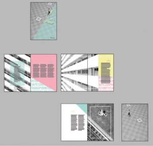
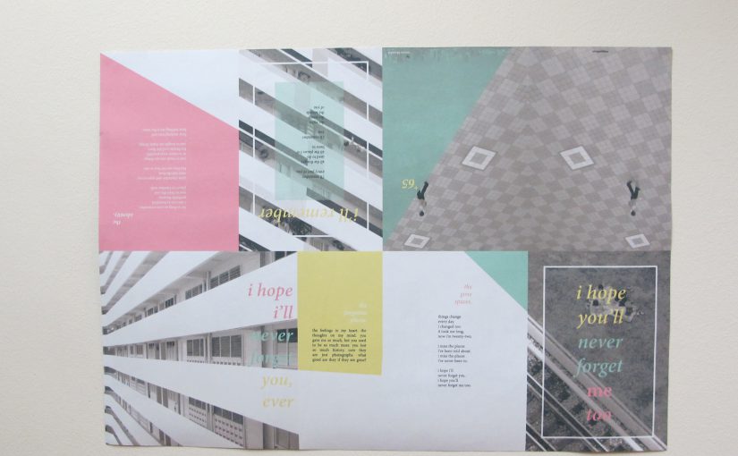
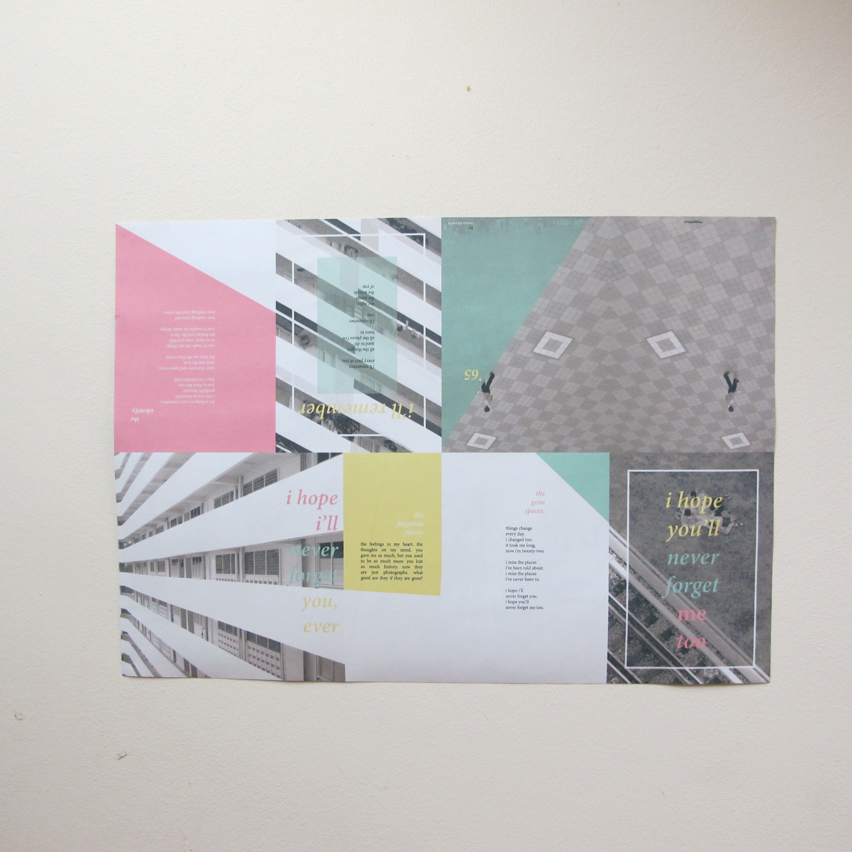
back content (A2 size)
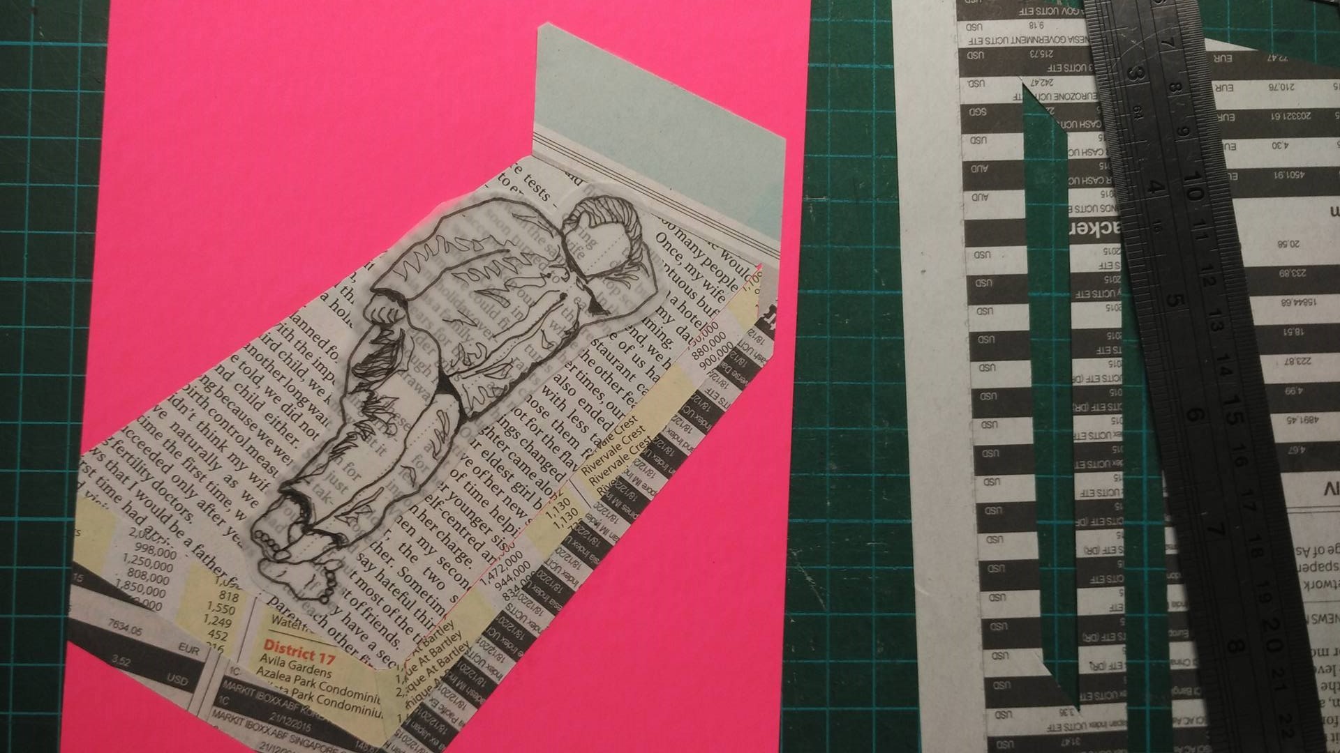
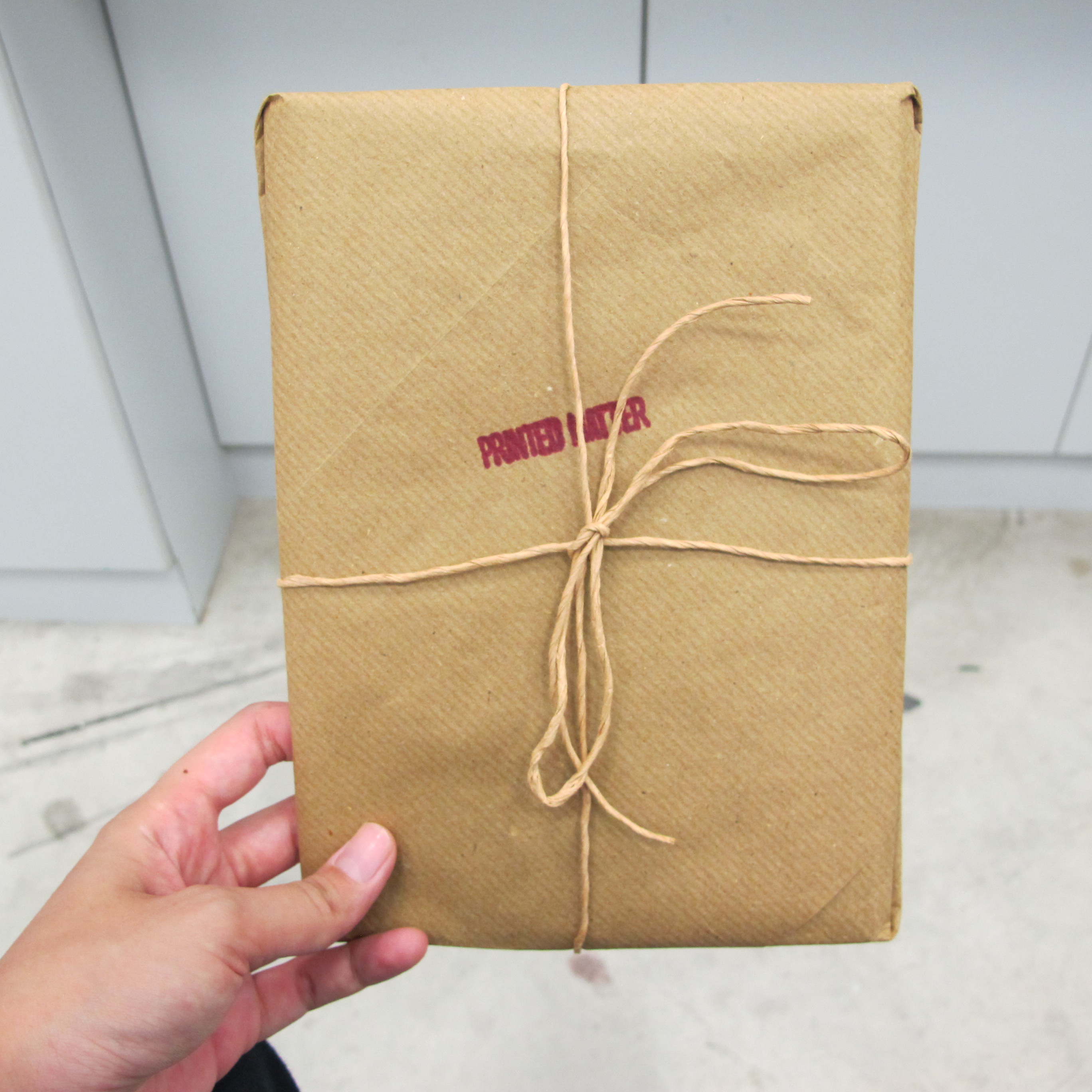
IMG_5523

IMG_5524

package

IMG_5544

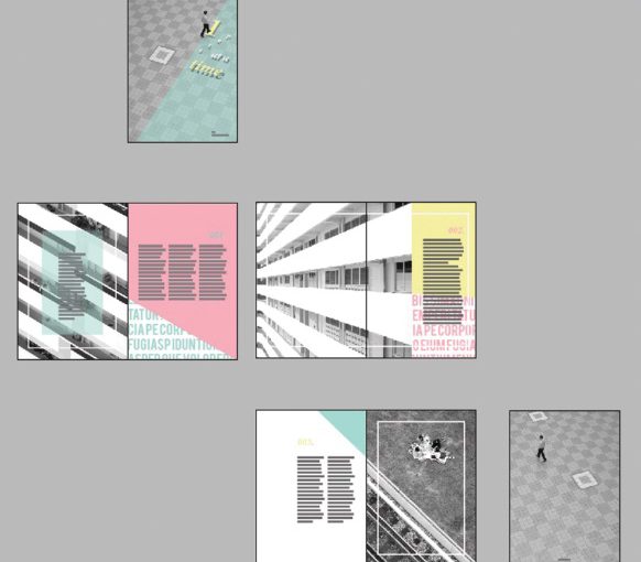
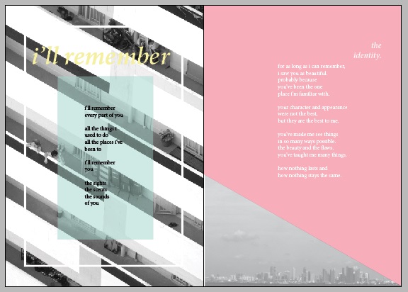
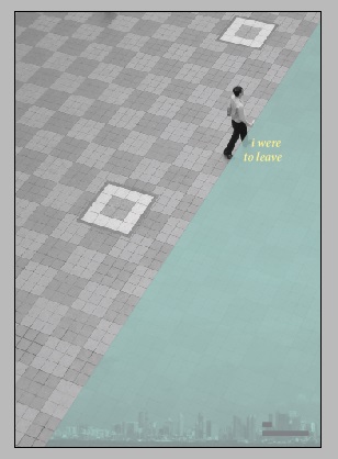
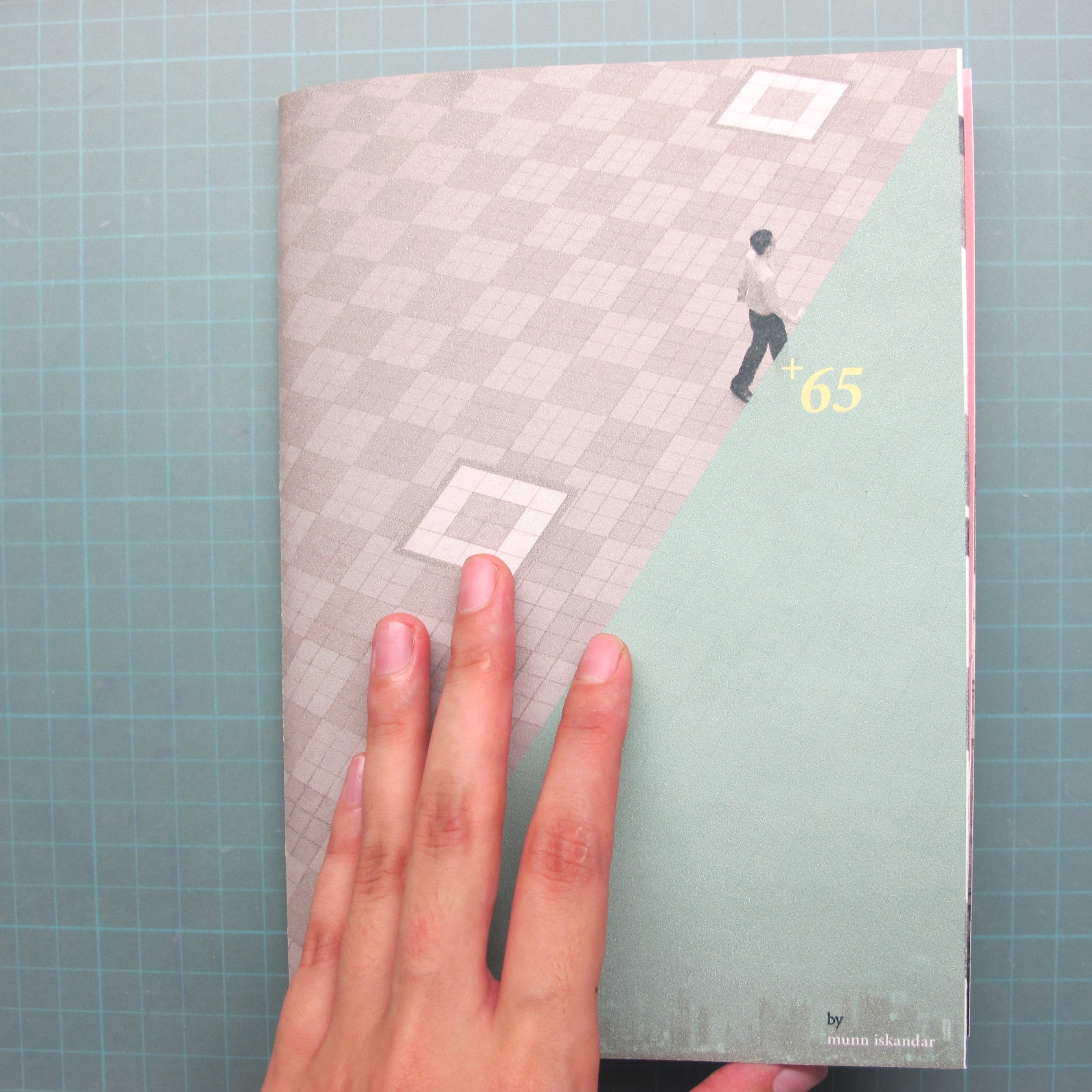
theme: the changes in singapore

title: +65 (singapore’s country code)

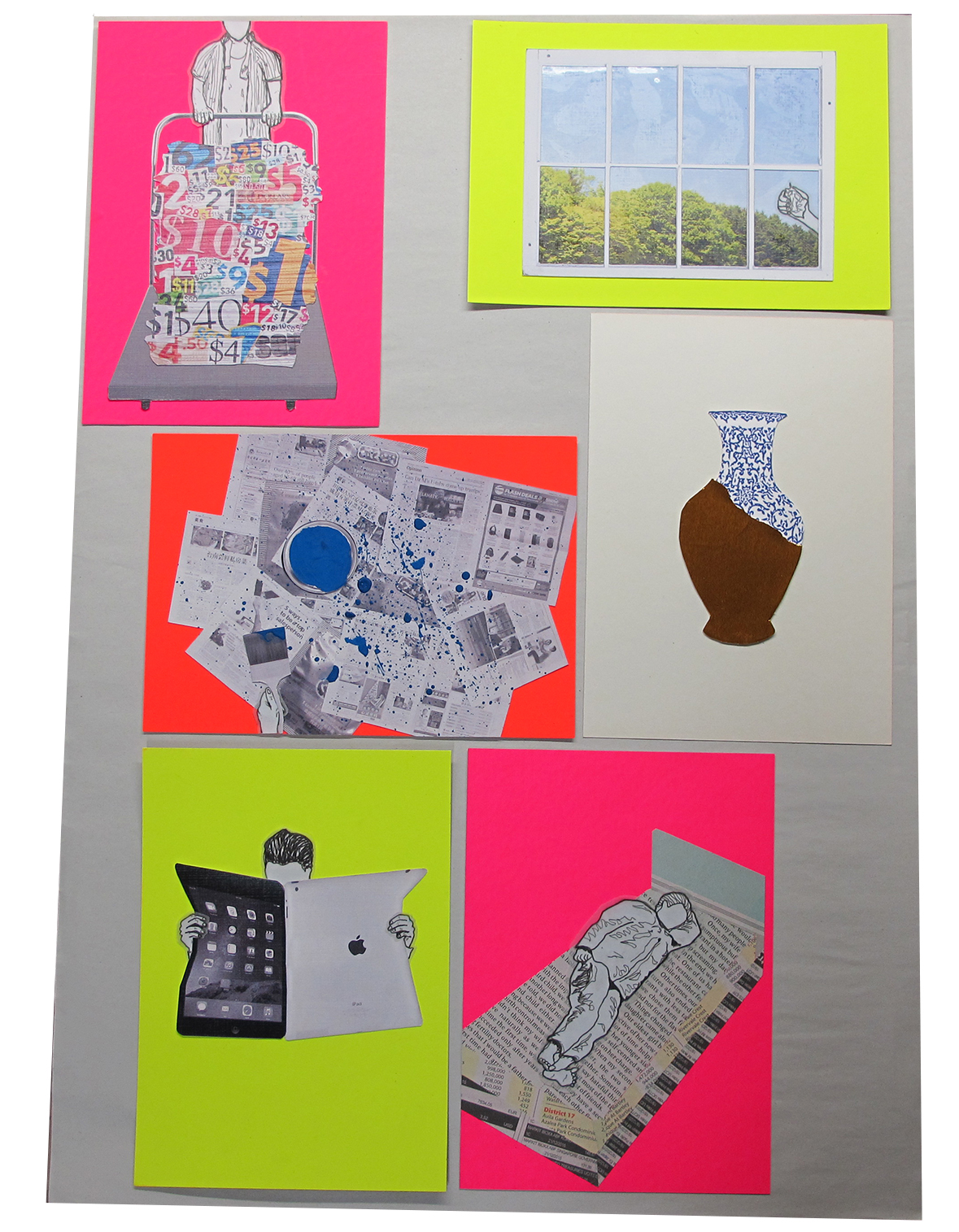
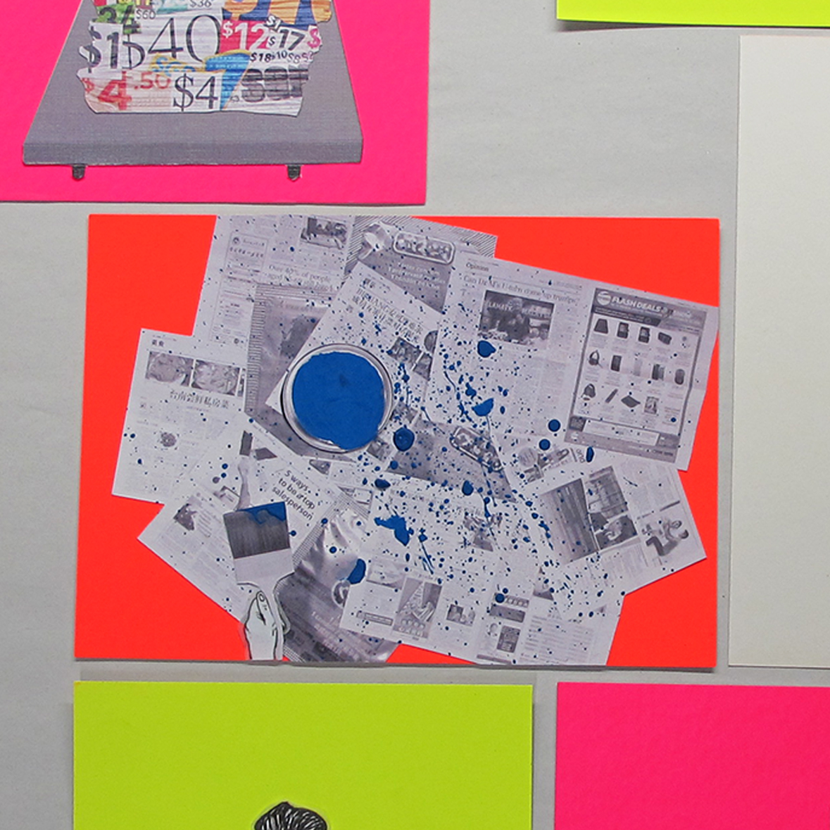
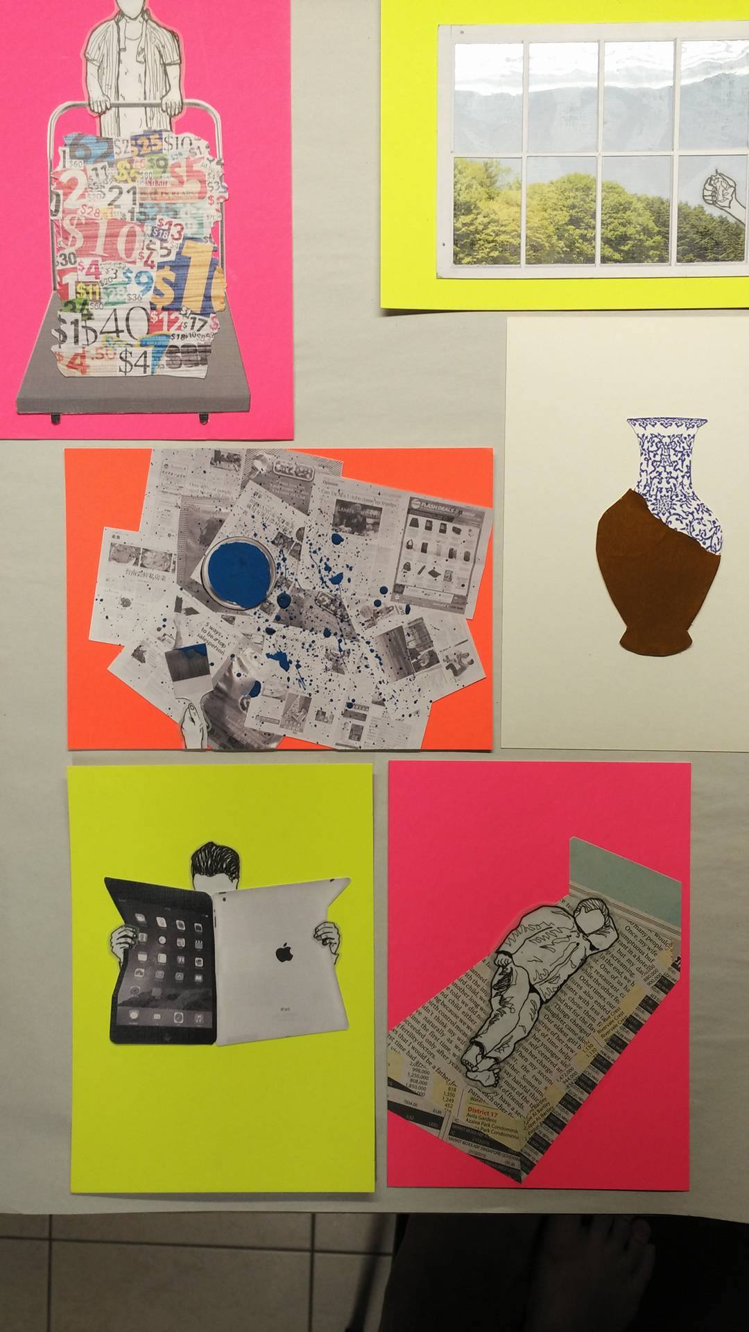
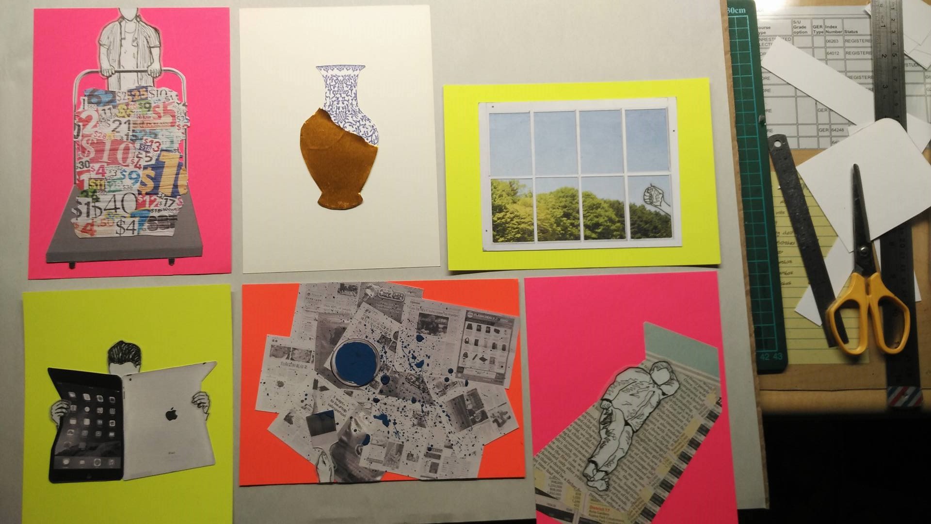
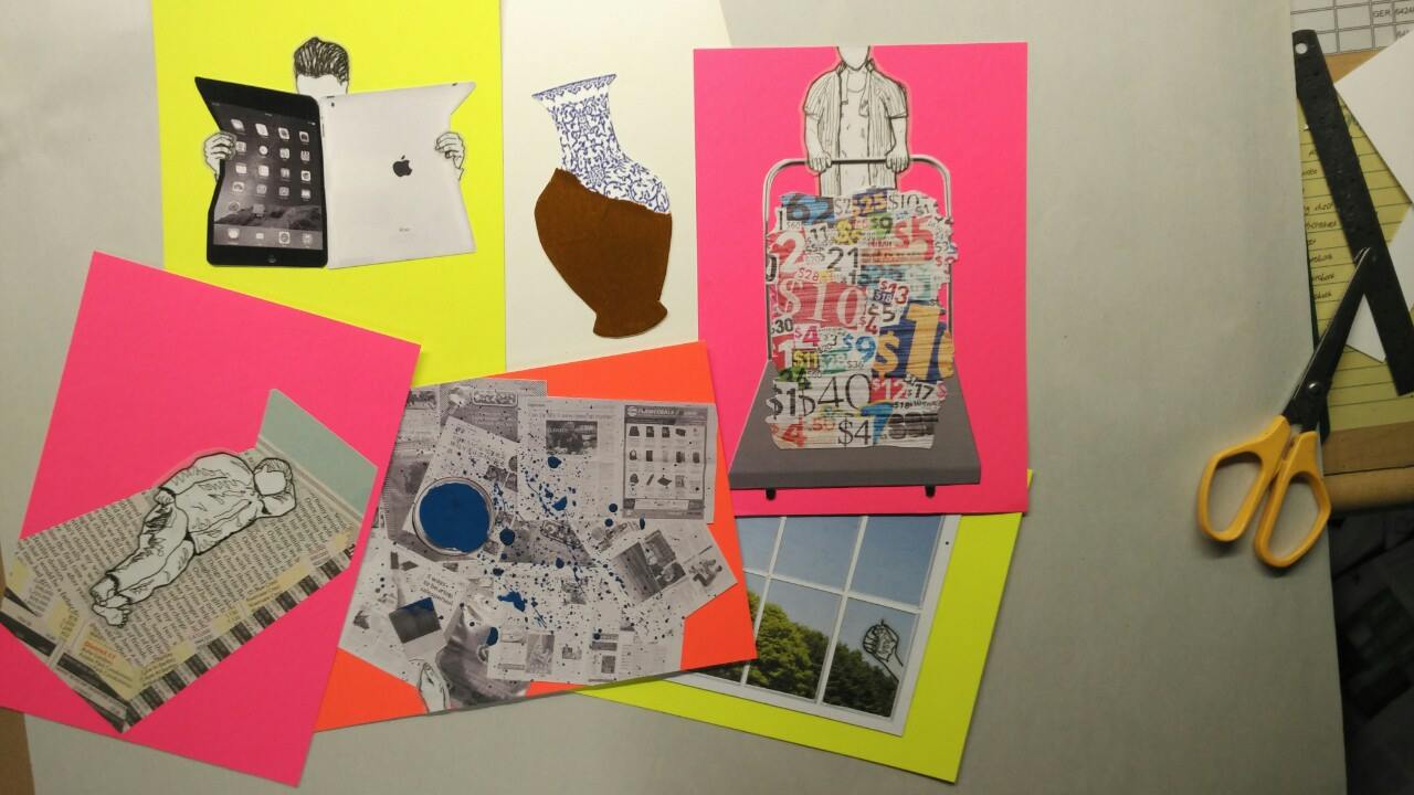
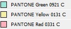
colours used: monochromatic colours and 3 pantone colours (below)

colours used

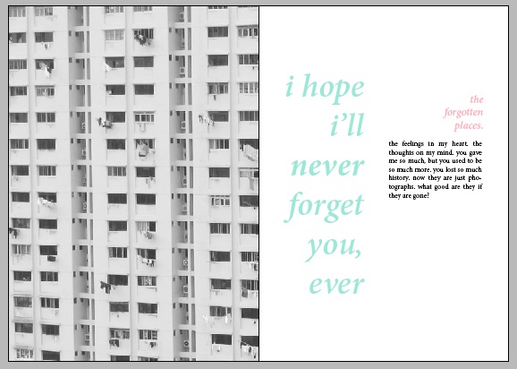
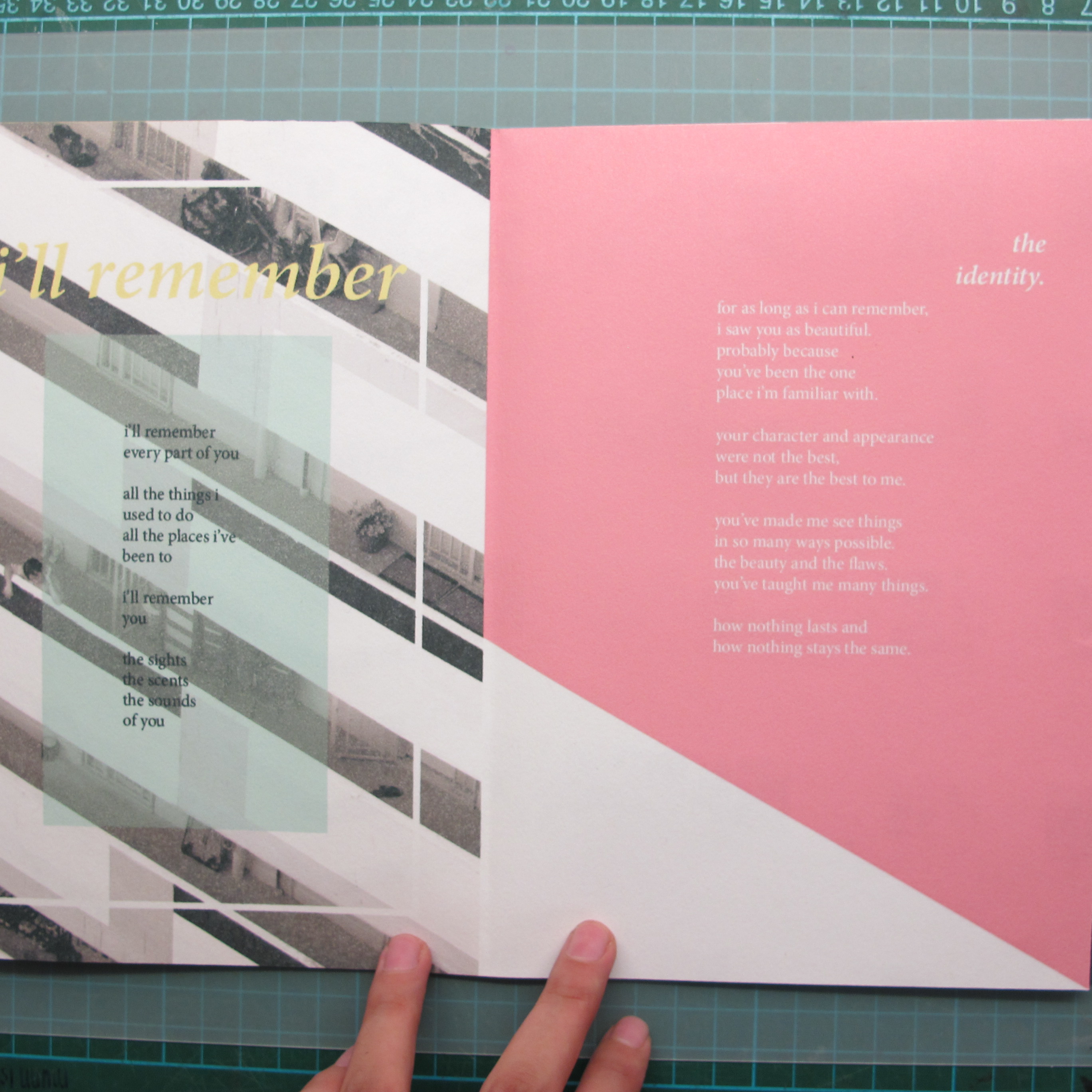
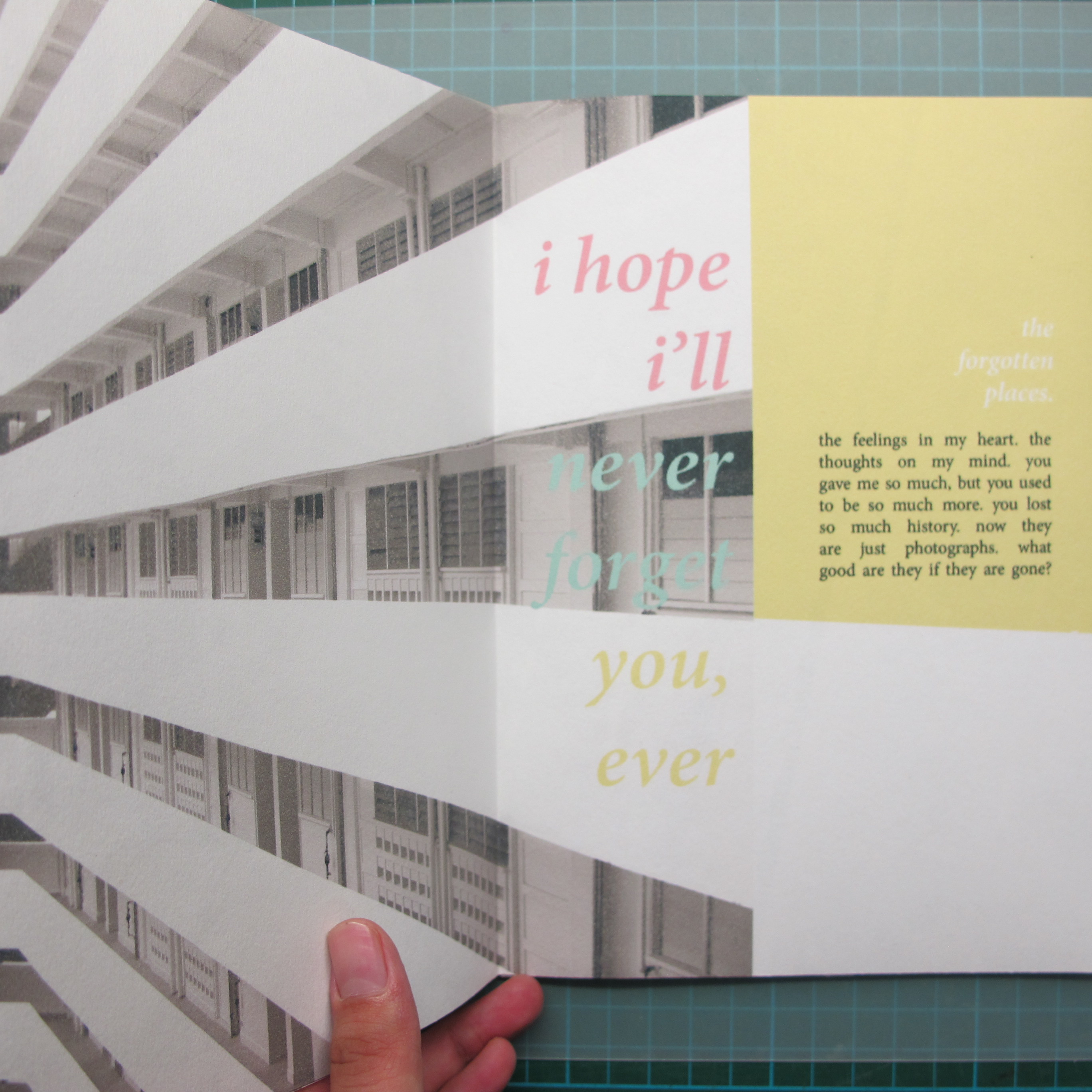
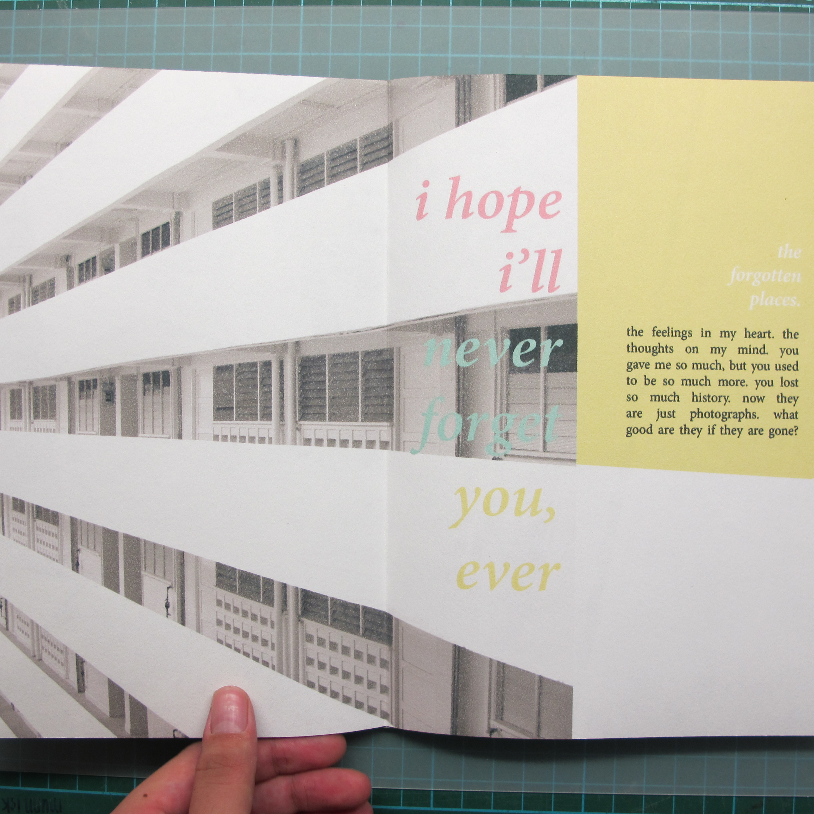
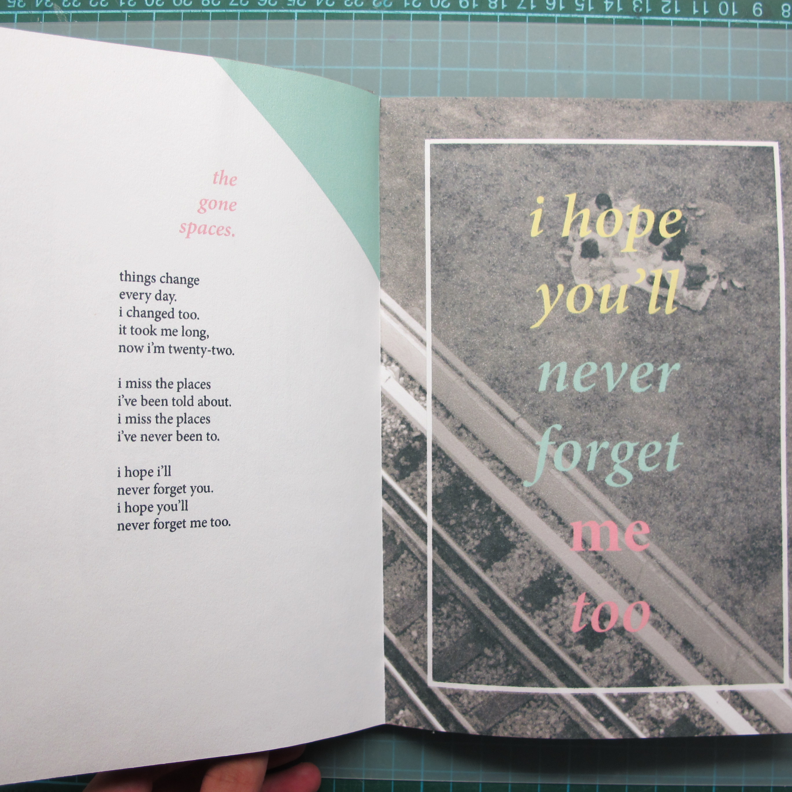
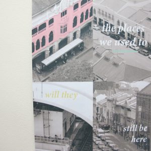
by taking away the attention from the previously coloured images, the focus now goes to the three vibrant colours in the zine. these colours are lively and easy on the eyes

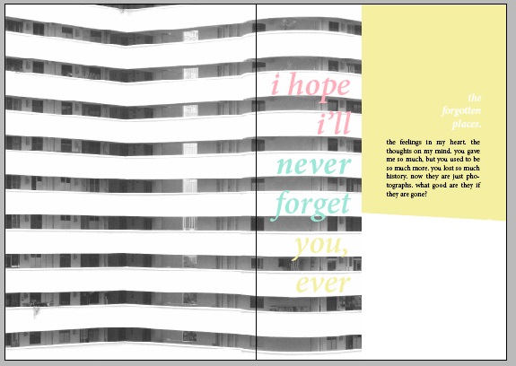
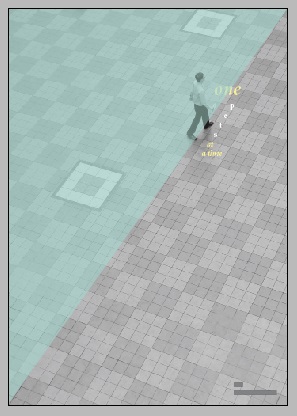
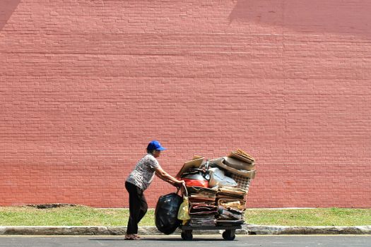
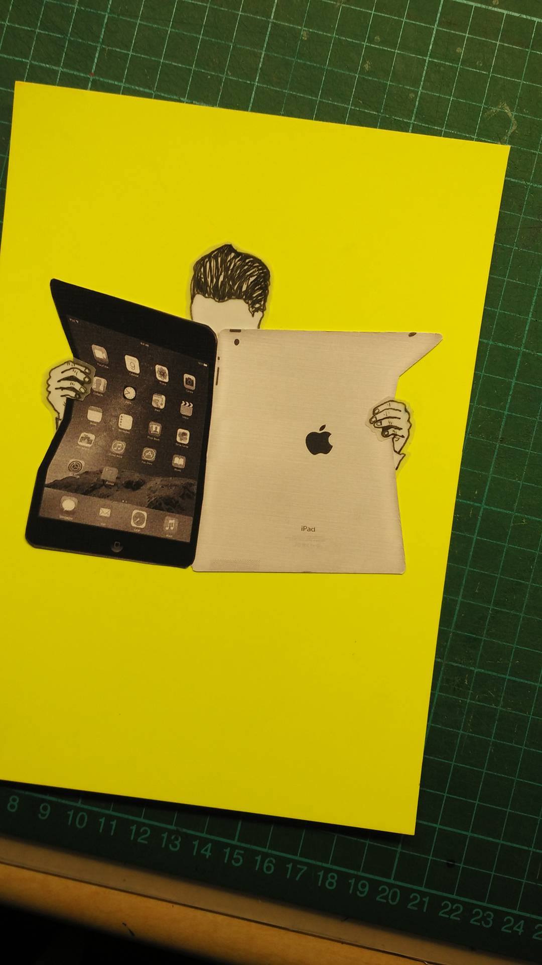
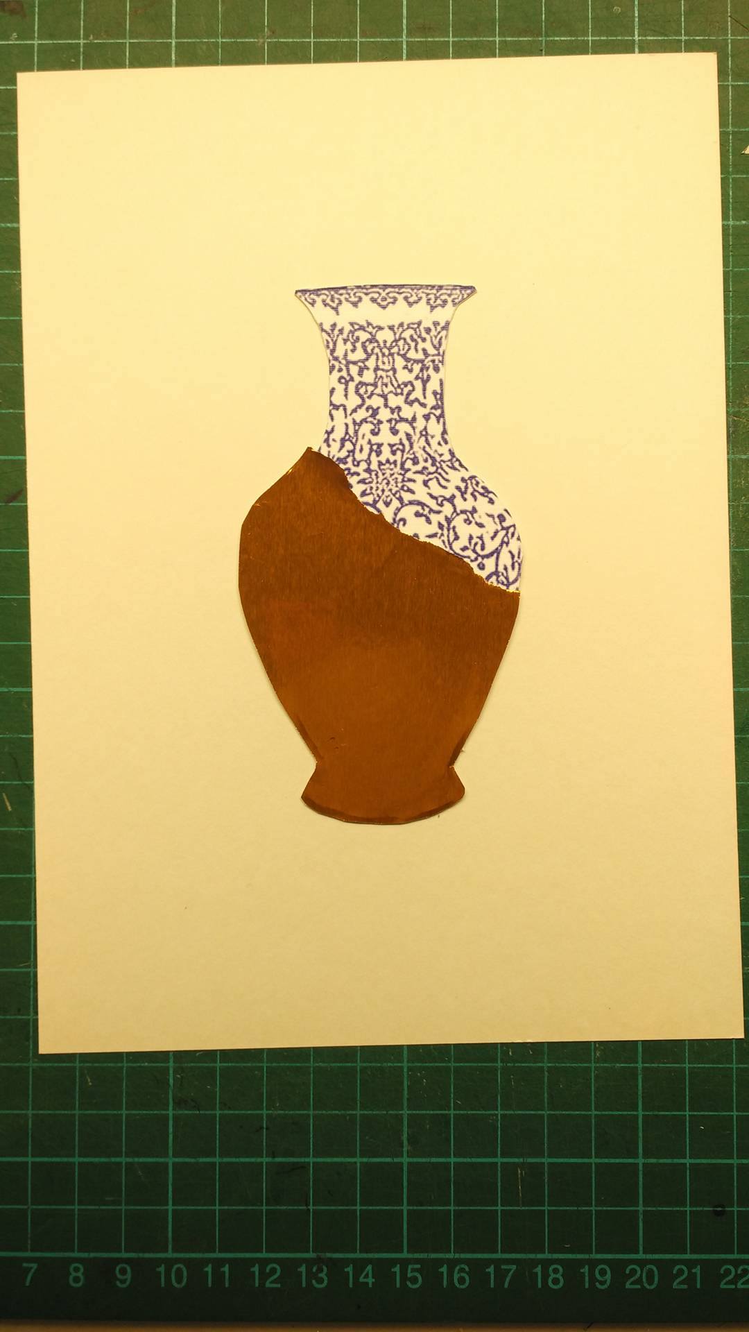
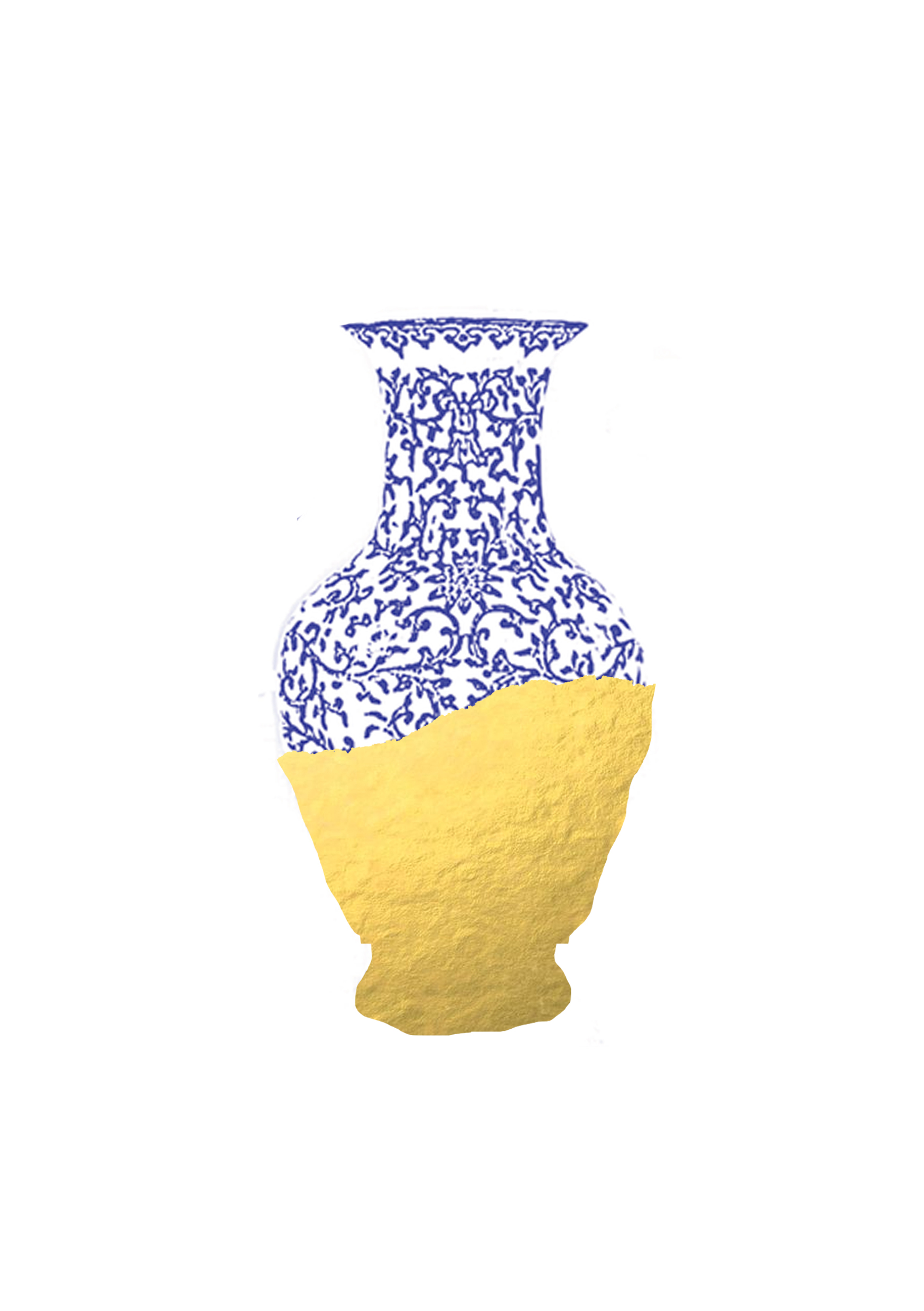
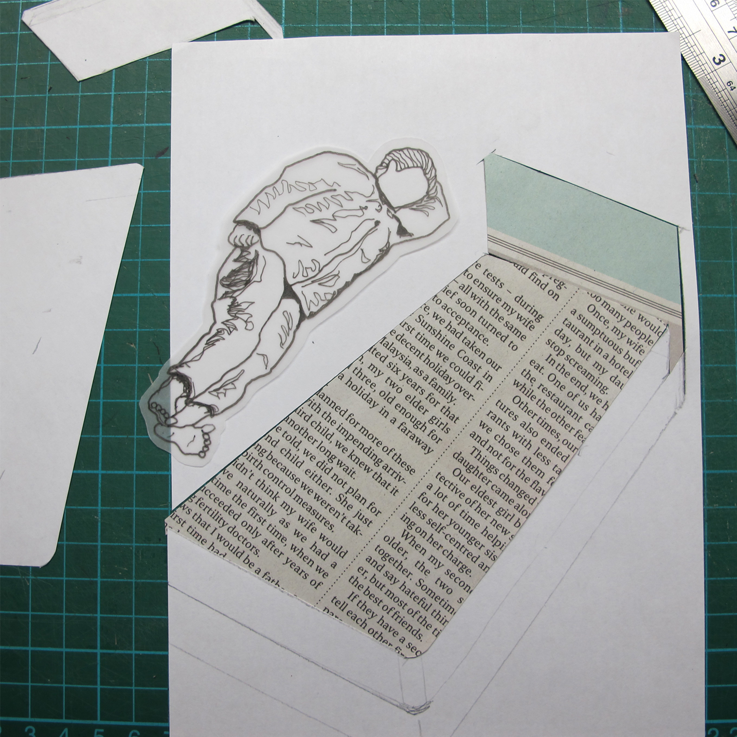
concept: to showcase slant/diagonal images, for consistency, accompanied with poems/reflections/thoughts/feelings regarding this issue. of how everything is changing and whether we will even notice when they are gone

there is a reason to why the images, the texts and the colours were placed in their current position. the bold colours, together with the image is an extension of the diagonal line of the main subject, such as the train track

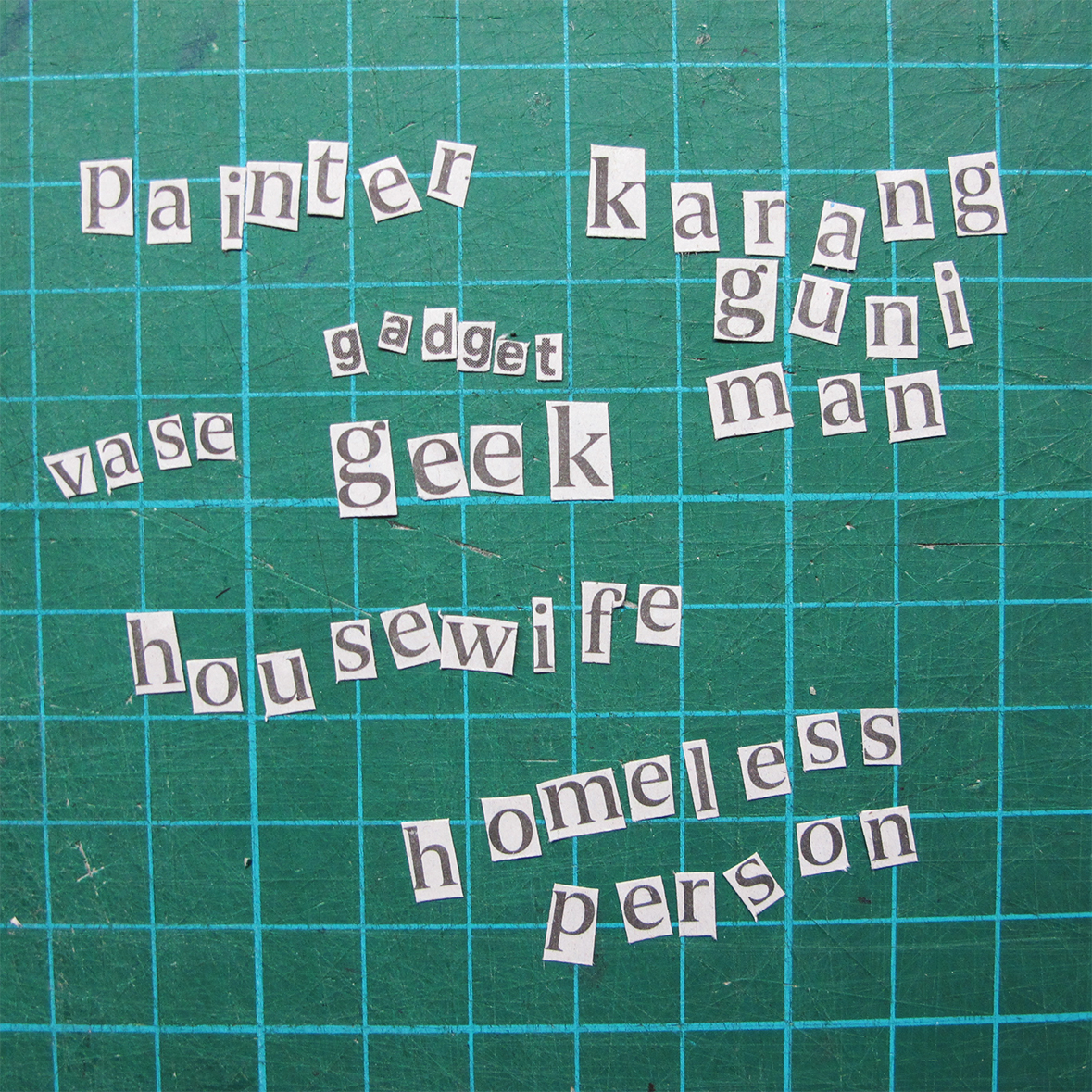
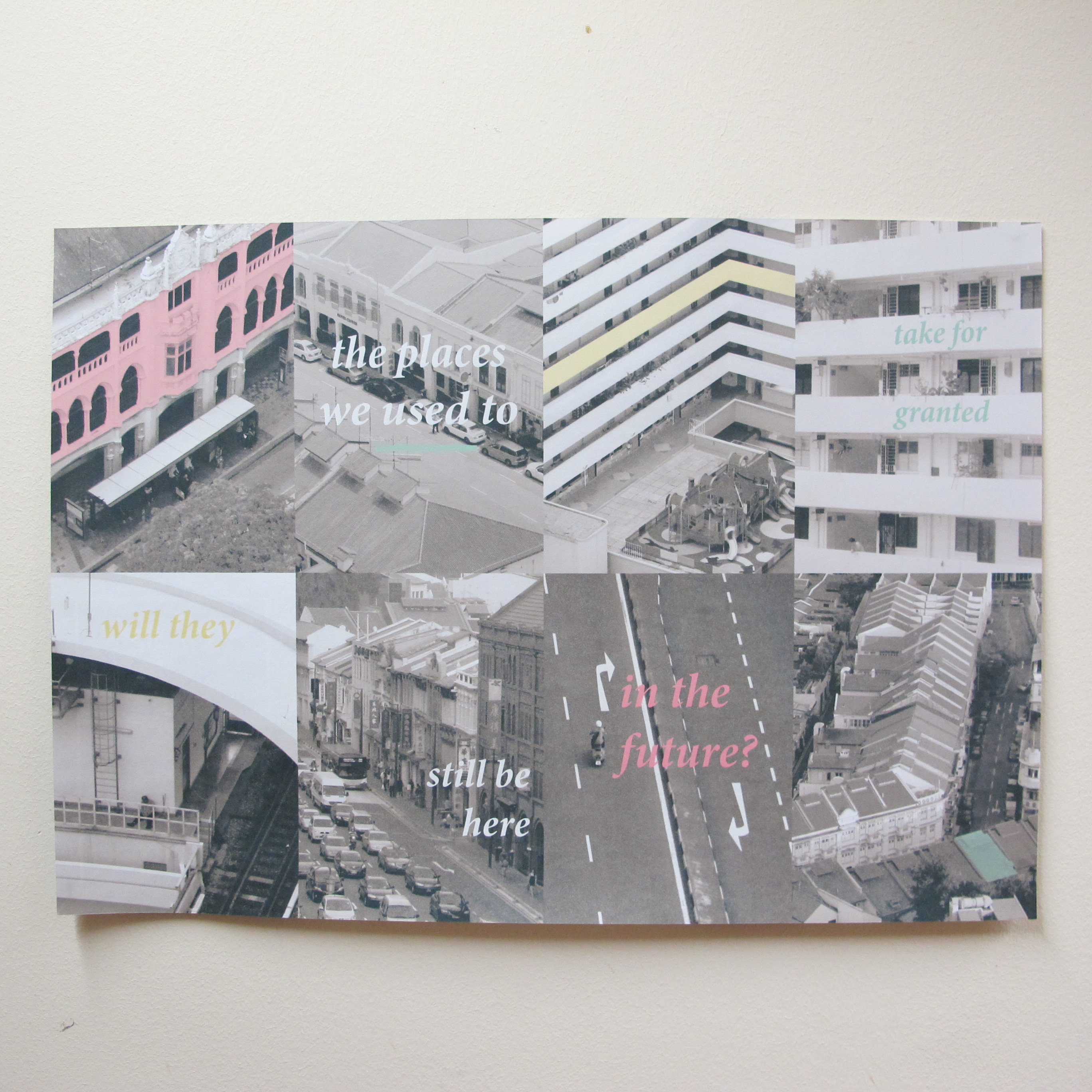
the 8 images at the back page further adds on to the meaning of the first page, and are arranged in such a way that they connect to the next image

getting there

there were so many ideas and directions this zine could go to?!

the possibilities were endless. however, what’s important was the concept, the images used, the layout, the colour(s) used, font, font size, placement, texts and everything else related. it was so easy to get lost in our own thoughts.

here are some layout possibilities.

1213141516

this first idea (above) revolved around 1 main concept, also known as the how-to. it was about ‘how to keep yourself sane’ (while in university) and the spread was supposed to be tips on the topic.

5 6 7 8

these were mainly on the layout process where the images were filled up either half of the spread or part of it.

topictopic1topic2Untitled-2

other title considerations.

9 10 11

however, i was quite grounded on what colours i foresee my zine to be. i wanted to make use of monochromatic coloured images and a few other colours.

17

the title itself took quite some time to finalise!

title title2 title3Y

point of view

subject matter: newspaper

from the pov of a

letters

1. painter

2. karang guni man

3. gadget geek

4. vase

5. housewife

6. homeless person

overall

  1. painter

painter process

painter process 02

painter process 03

a newspaper, from the pov of a painter is to protect the floor

protection = condom (play of words)

to mix condom wrappers amongst the newspaper and to have a plain floor

to add paint splatter (textures) on the end product, with paint bucket and paintbrush.

colour theme: orang neon bg (bright and outstanding), blue paint, monotonous subject, black pen on tracing paper (hang)

composition style: more than 2/3 filled

painter

2. karang guni man

a pov of a newspaper from a karang guni man is a source of income

individual newspaper cutouts of ($amount) were collected and shaped to form stacked newspapers

a drawing of a karang guni man (clothing) was added, together with the trolley

colour theme: neon bg (bright and outstanding), coloured newspaper print, black pen on tracing paper

composition style: triangular, more to central

karang guni IMG_20160311_1324201

IMG_483401 IMG_483601

source of income2source of incomesource of income4source of income3  trolley12980689_10154007398807492_334148033_o54

3. gadget geek

a newspaper from the pov of a gadget geek is a device

an ipad was manipulated to form a newspaper, being read by a man

a drawing of a man was added

colour theme: neon bg (bright and outstanding), monotonous subjects, black pen on tracing paper

composition style: central


newspaper ipad 01gadget geek process2gadget geek process4

newspaper ipad12952791_10154007399067492_1562087852_o1110912970162_10154007399137492_1429670680_o

4. vase

a pov of a newspaper from a vase is a wrapper

gold was used on a white and blue ceramic vase

12952909_10154007398827492_1830337696_o 12962413_10154007399232492_1007567308_o14

pottery seller

colour theme: plain bg, blue detailings, gold wrapper

composition style: central

5. housewife

a newspaper from the pov of a housewife is a glass cleaner

a background image, a window template, a plastic sheet, a drawing of a hand drawn on tracing paper and glue stains (to show dirt on plastic) were used

cleaning-glass

12940986_10154007399182492_627201839_o1215

colour theme: yellow neon bg, colored background

composition style: central

6. homeless man

a pov of a newspaper from a homeless man is a bed

homeless02

12962649_10154007398417492_1097749207_o

12946961_10154007399112492_2064974919_oIMG_484601321

colour theme: pink neon bg, newspaper strips, drawing on tracing paper

composition style: diagonally central


in conclusion,

the style of using a bright background and flat images was my idea initially.

however, as time progresses, some colours were use. the composition style was also being varied.

12959522_10154007399297492_656057719_o 12962396_10154007398347492_646819449_o 12970590_10154007398767492_1497300482_o