hands down the most enjoyable assignment and presentation.
to go so deep into evaluating and analyzing who we are as a character and a human being was a refreshing and a questionable decision. am i as patient as i think i am? what do people think about me? is my traits based on people’s judgement or based on my beliefs of who i am as a person?
to come up with 12 missing spots for the equation for Ego was challenging yet intriguing.
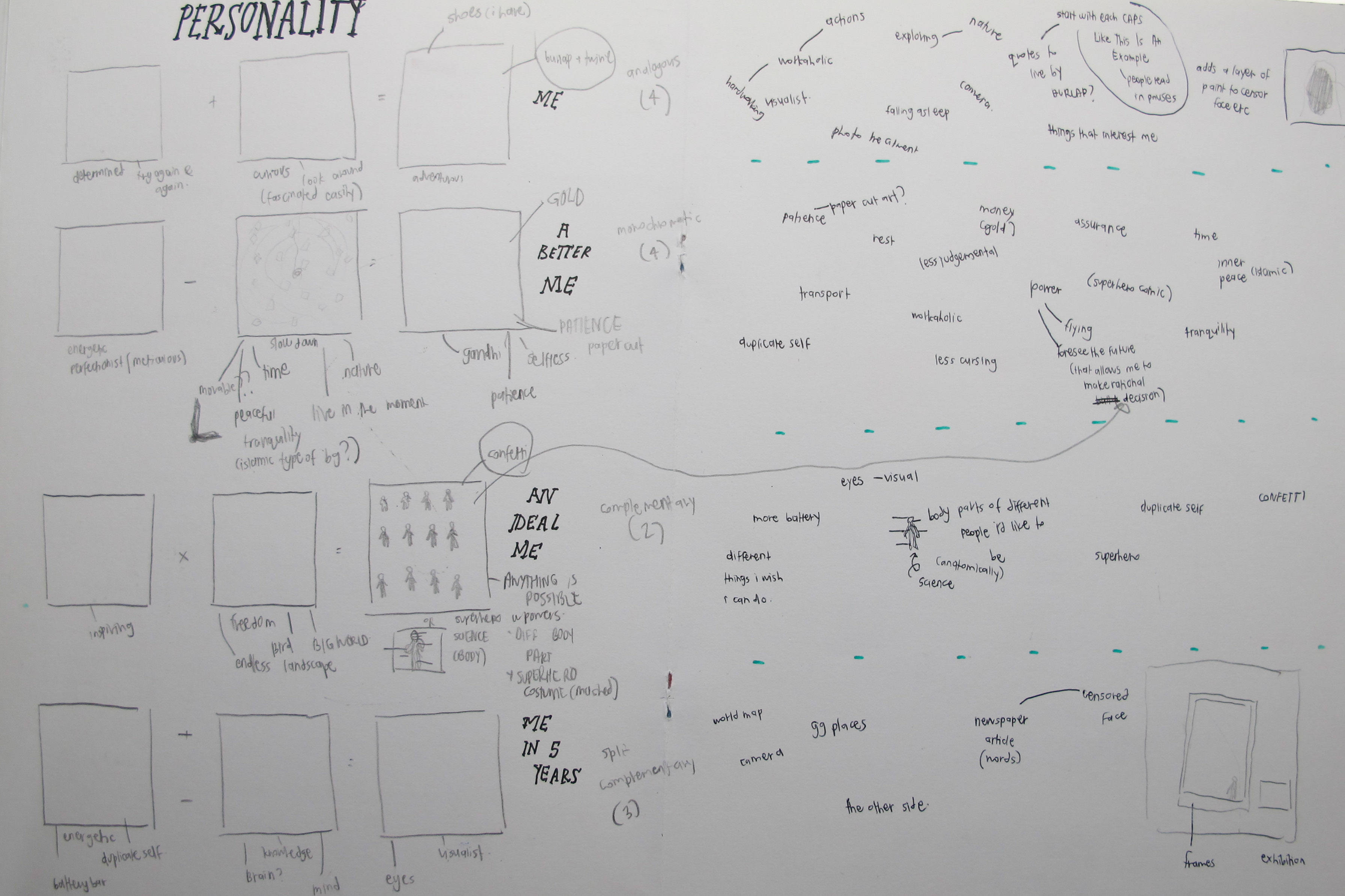
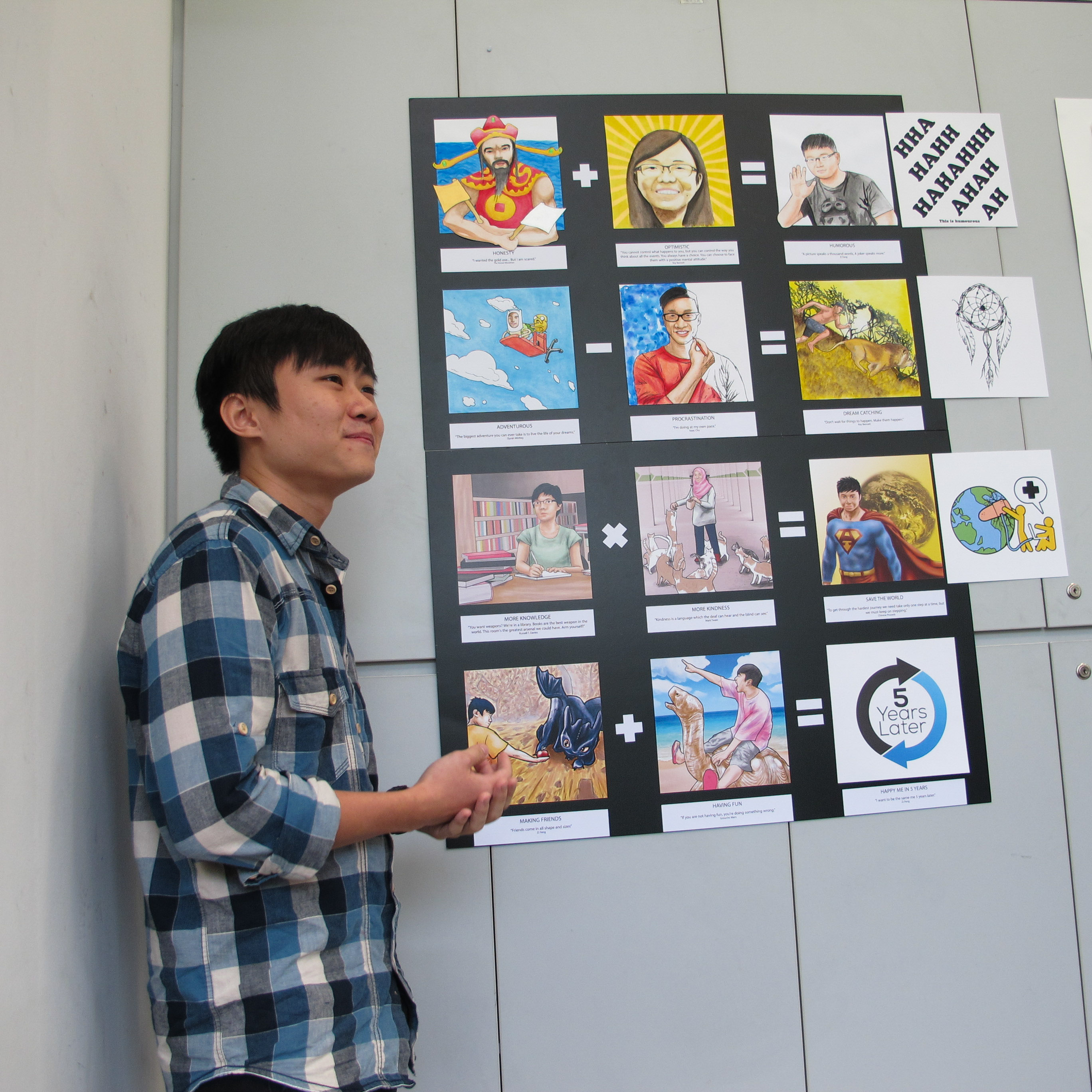
here’s what i believe are my traits.
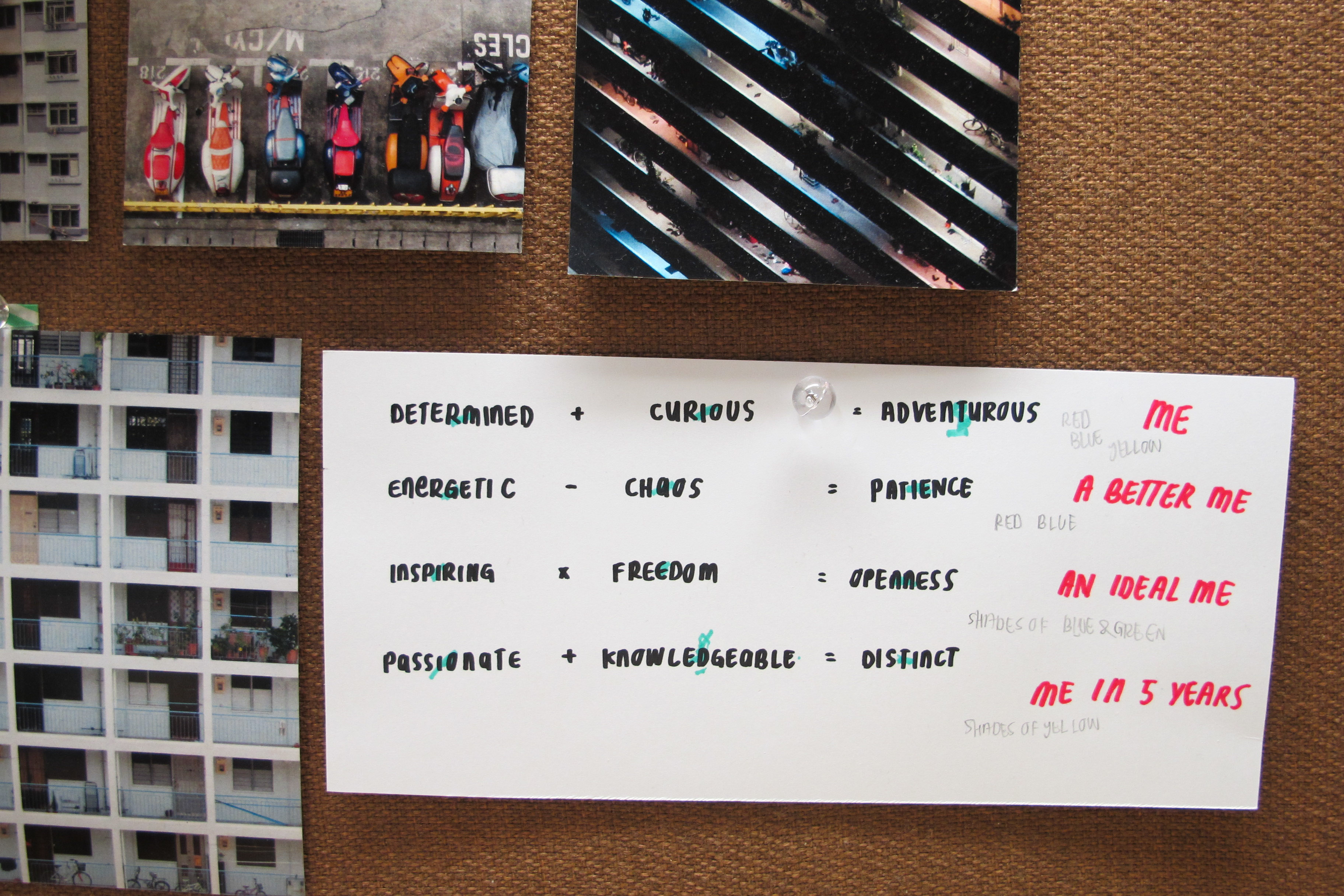
me
determined + curious = adventurous
a better me
energetic – chaos = patience
an ideal me
inspiring x freedom = openness
me in 5 years
passionate + knowledgeable = distinct
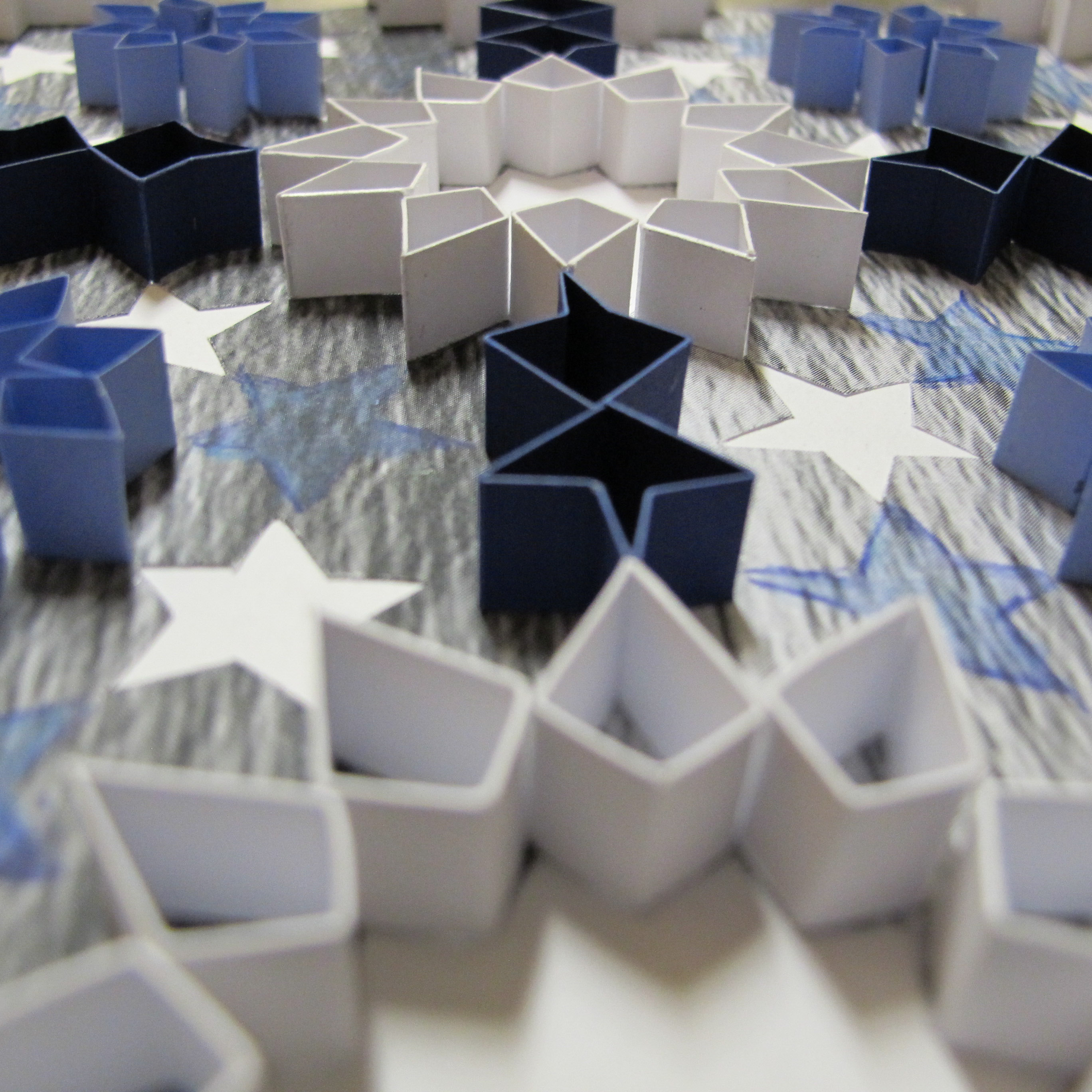
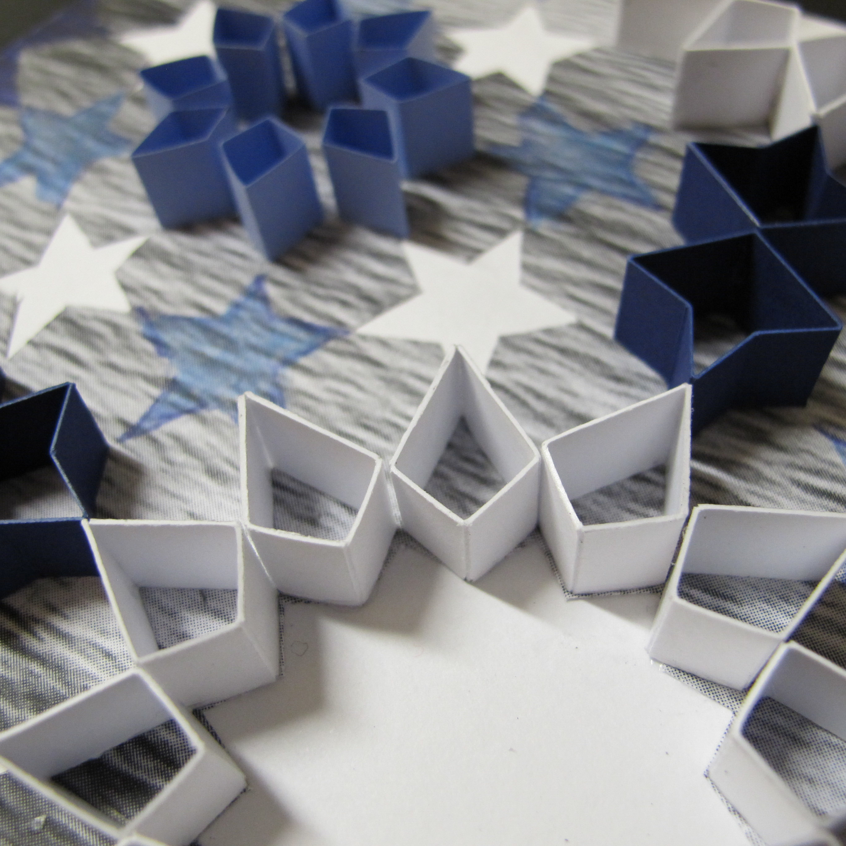
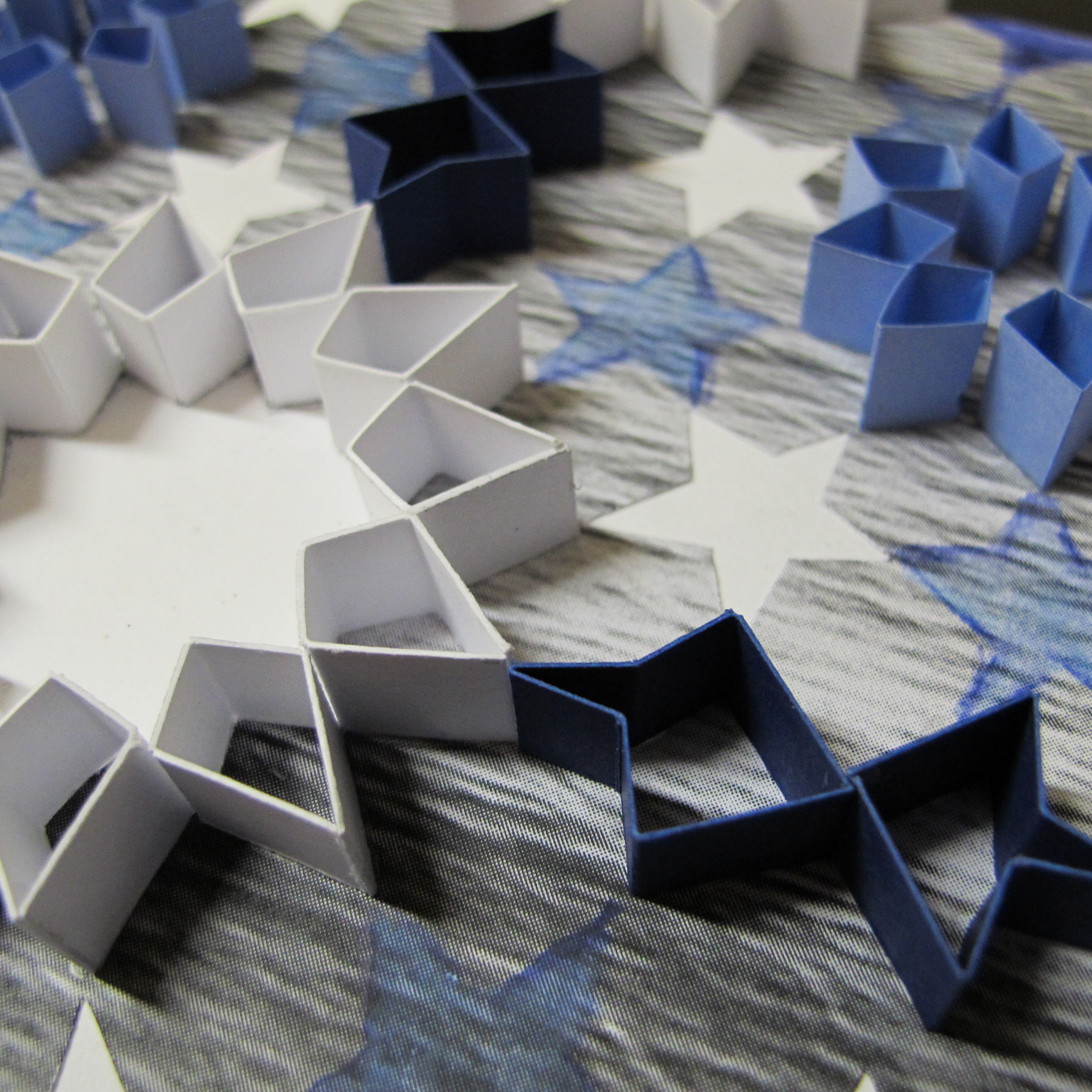
previously, the colours that were narrowed down according to analogous, complementary, split complementary and monochromatic were

from all these points,
the colours were narrowed down to the ones below due to the meaning it brings across when paired with the traits.

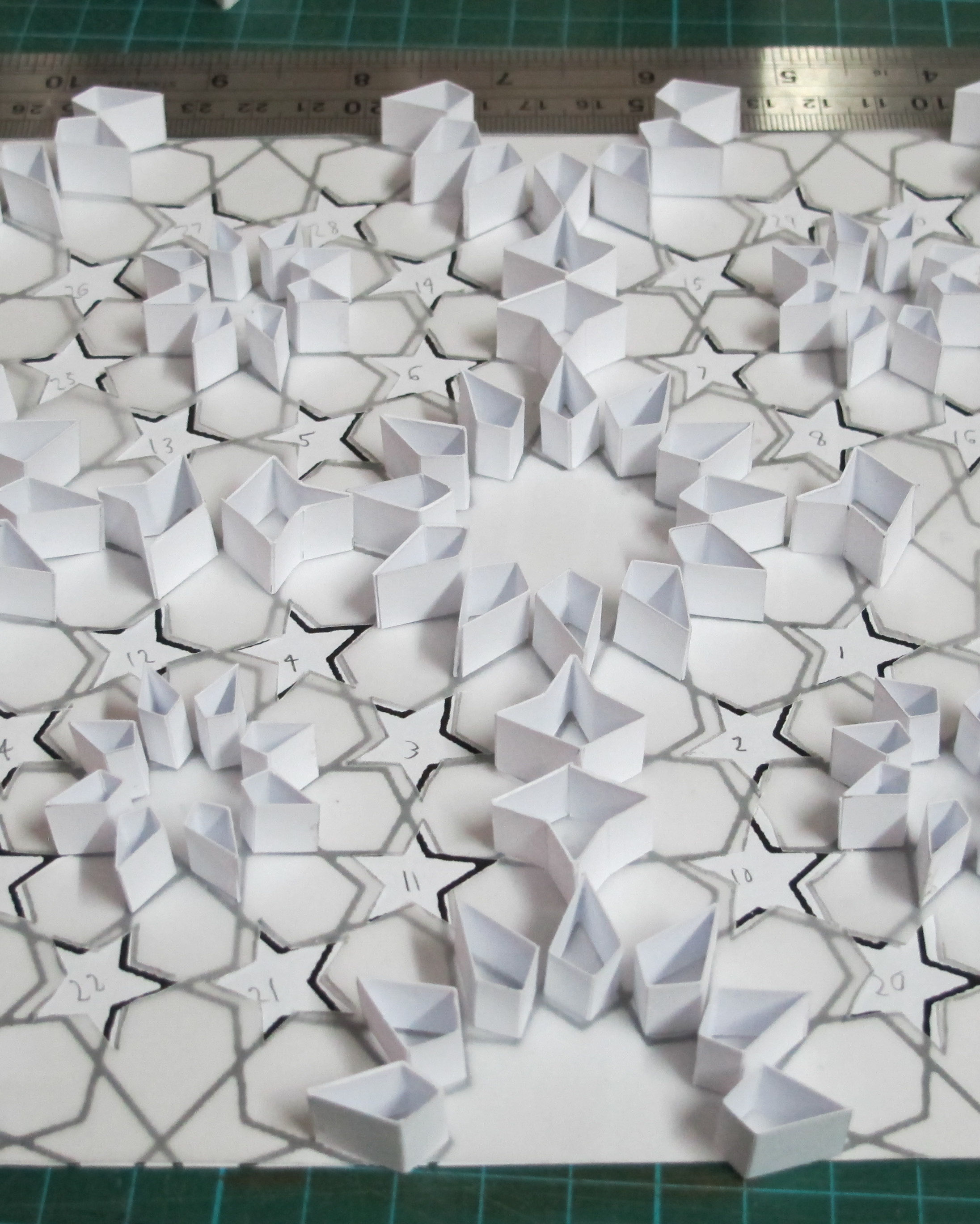
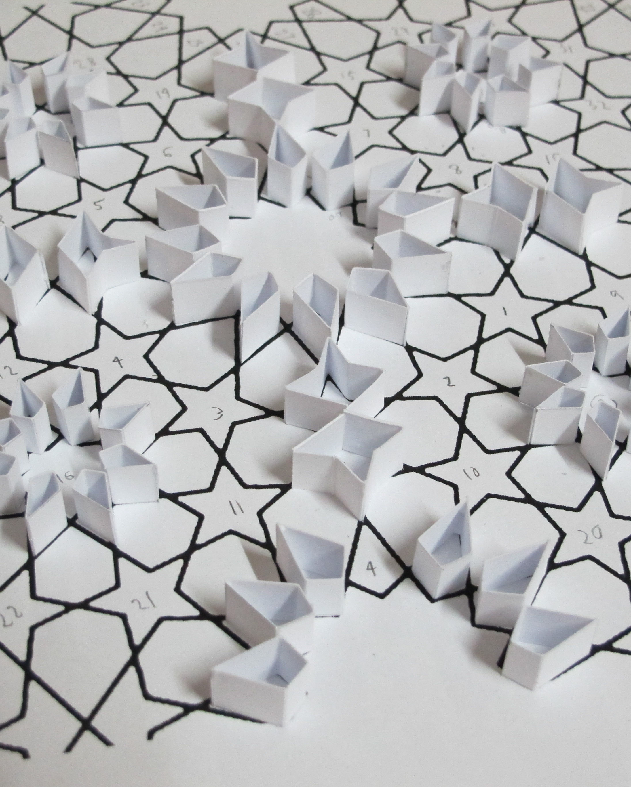
here’s some behind the scenes of brainstorming at an earlier time too

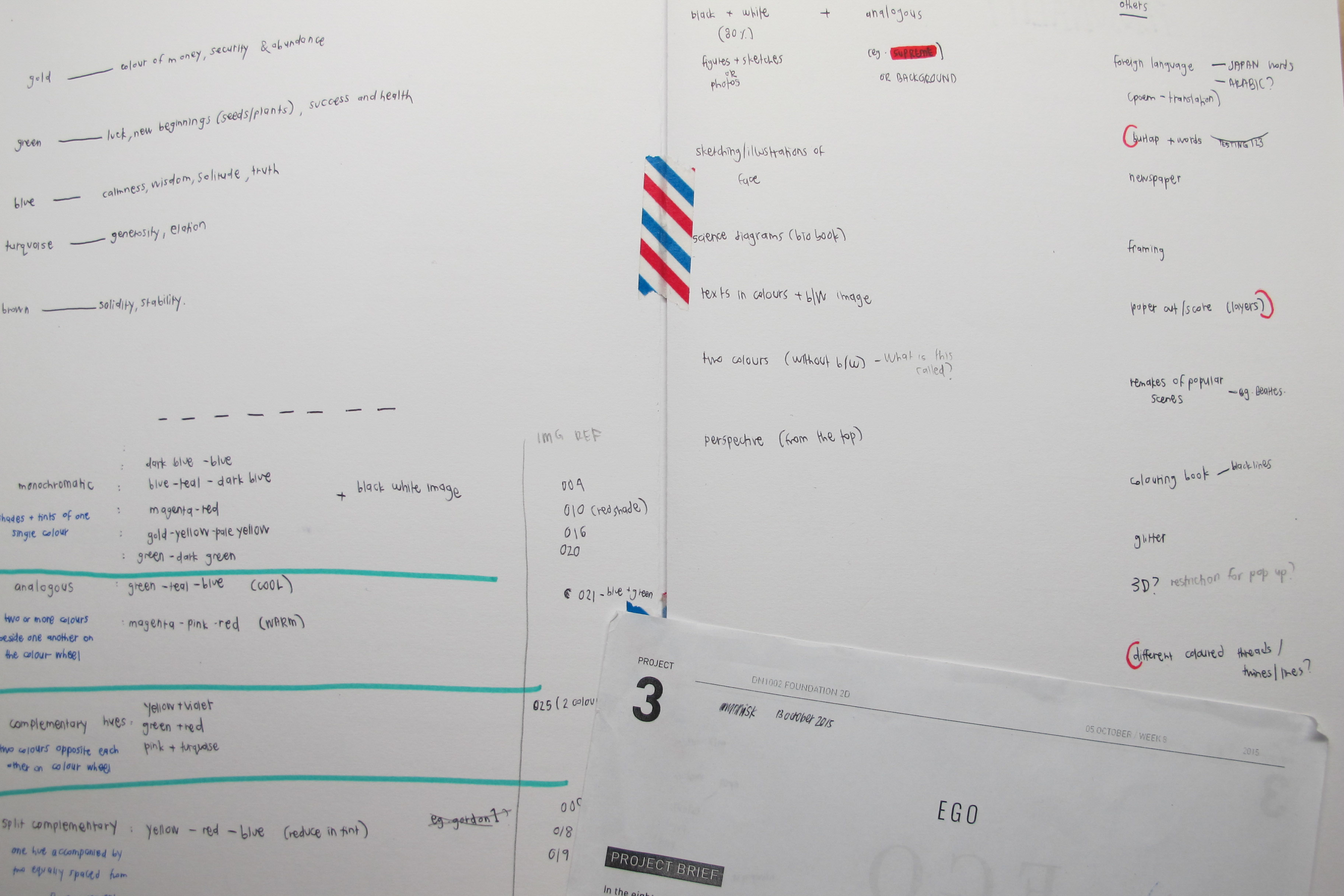
before the main consultation, i was going in all sorts of direction due to excitement in trying out different styles. however, after deciding with the concrete traits and how to symbolise/represent them, it was definitely easier to match the different line of equation with the colours.
—
let’s go through in this order:
001 me
002 a better me
003 an ideal me
004 me in 5 years
—-
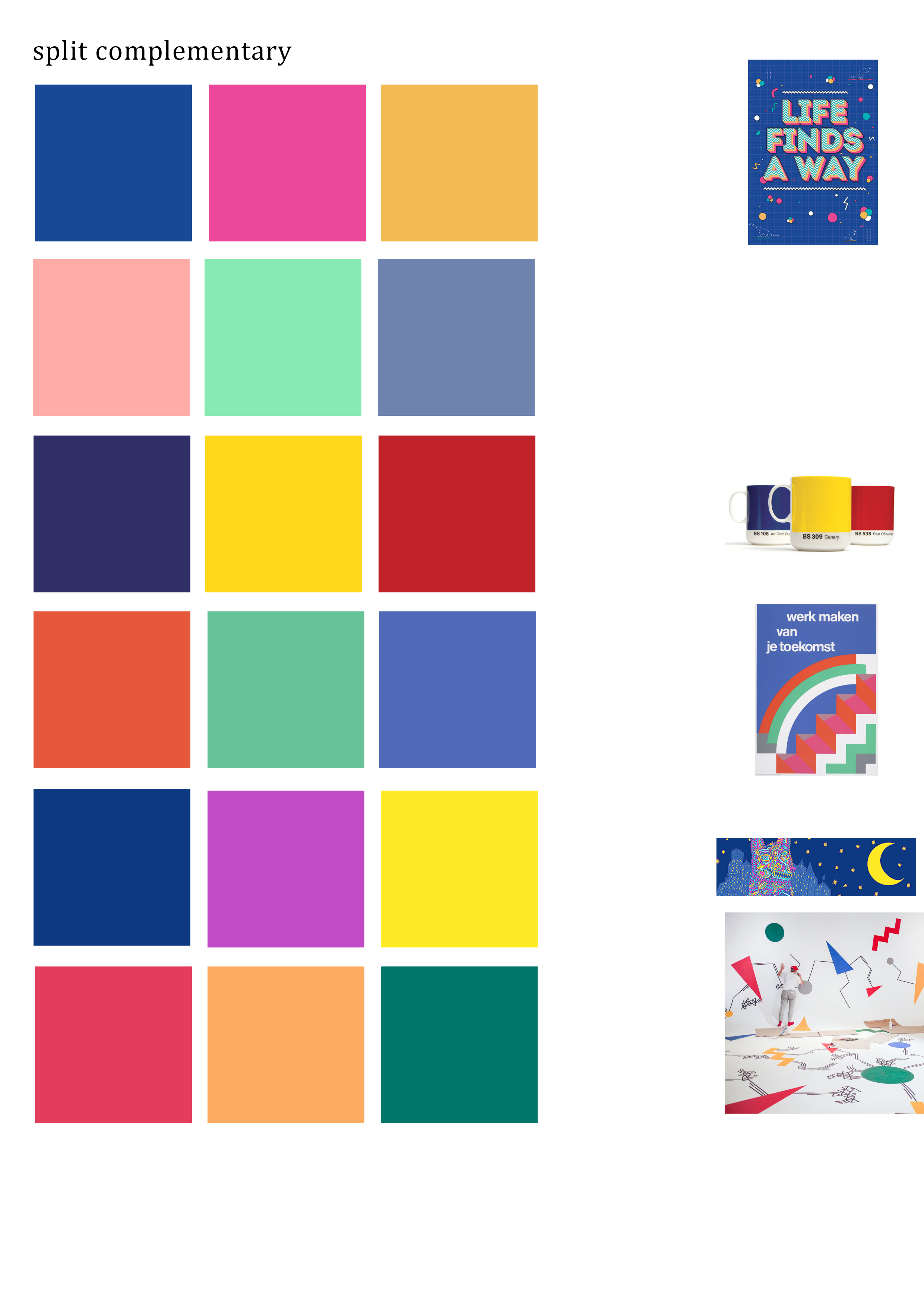
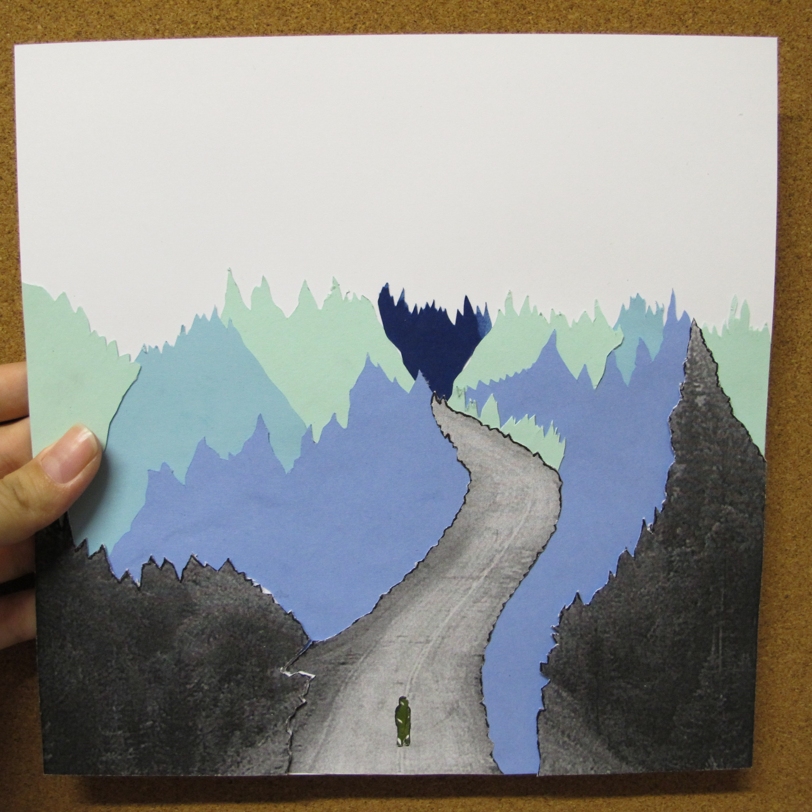
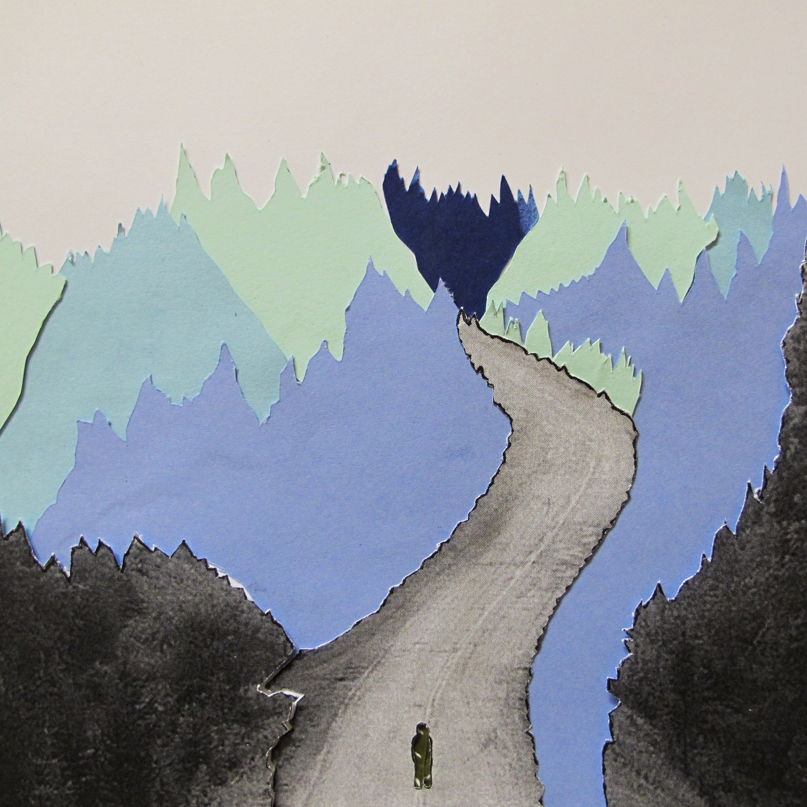
001 me
using the split complementary colours of red, yellow and blue with the equation
determined + curious = adventurous
(theme: layers, places and signs)
i believe that i am determined and curious, i want to find out things positively and this enables me to be an adventurer
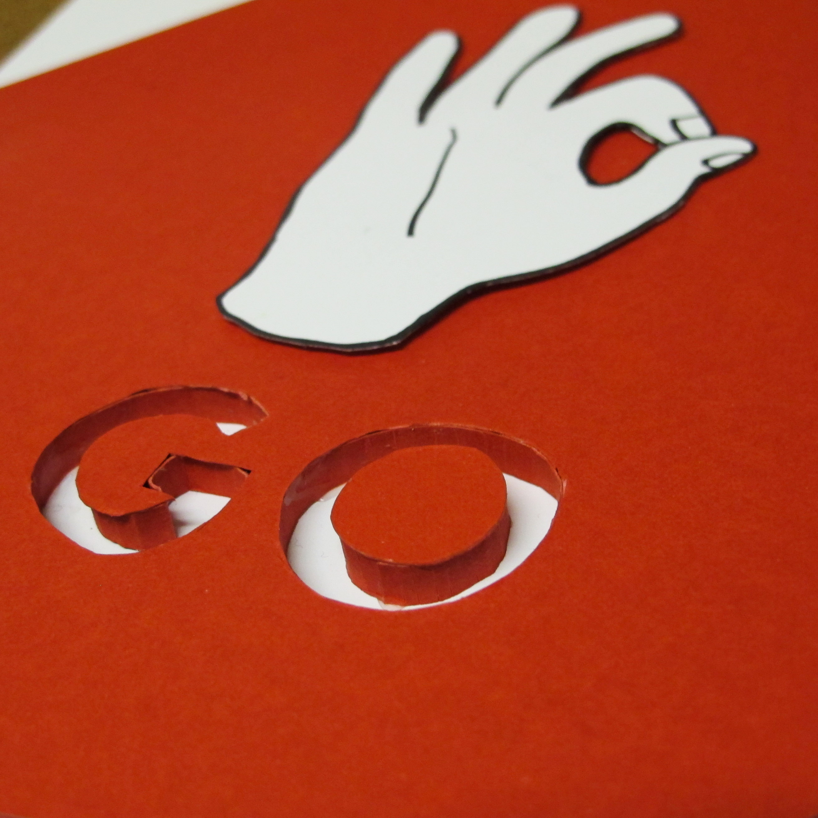
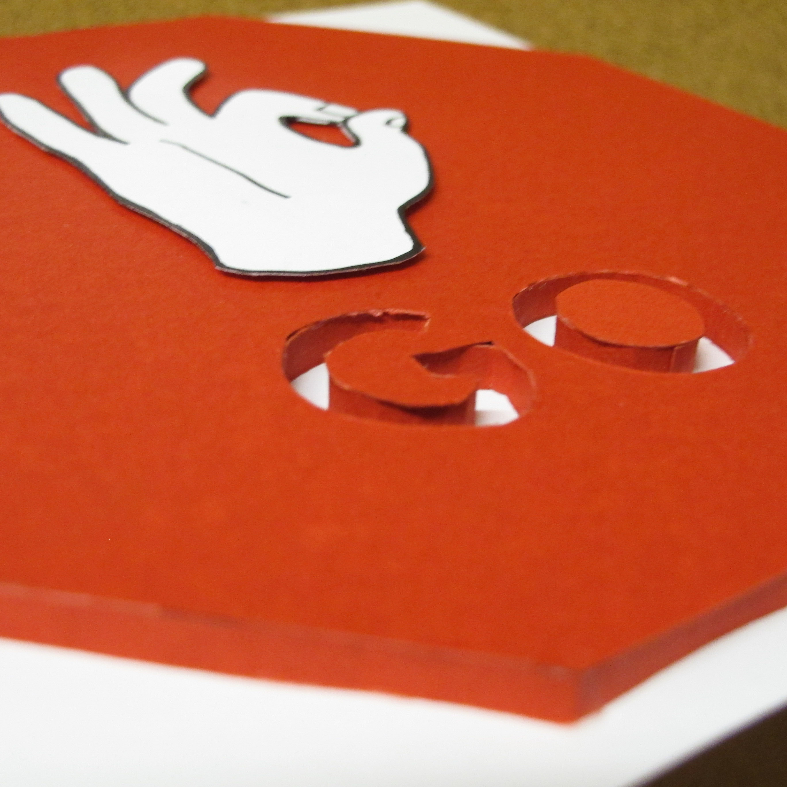
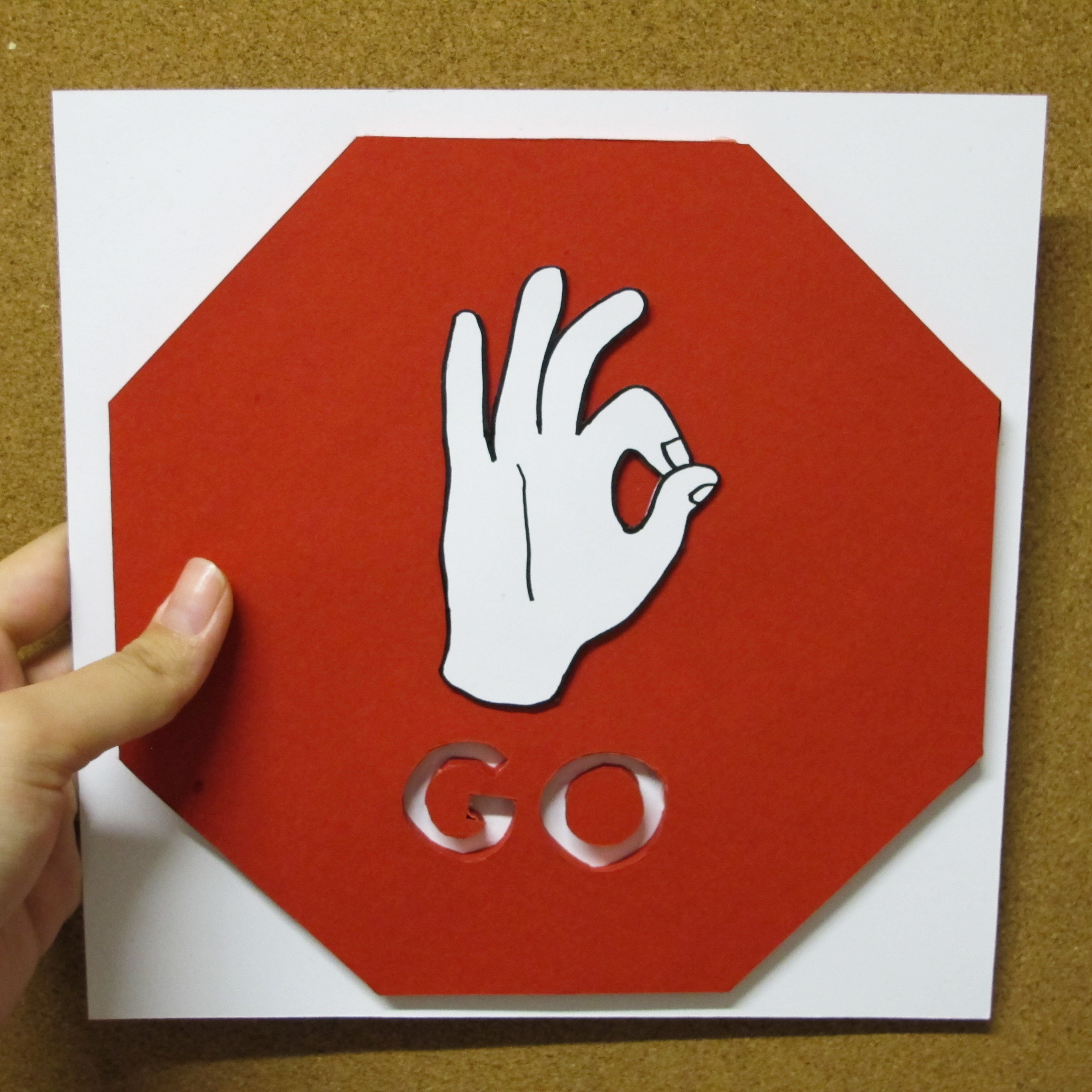
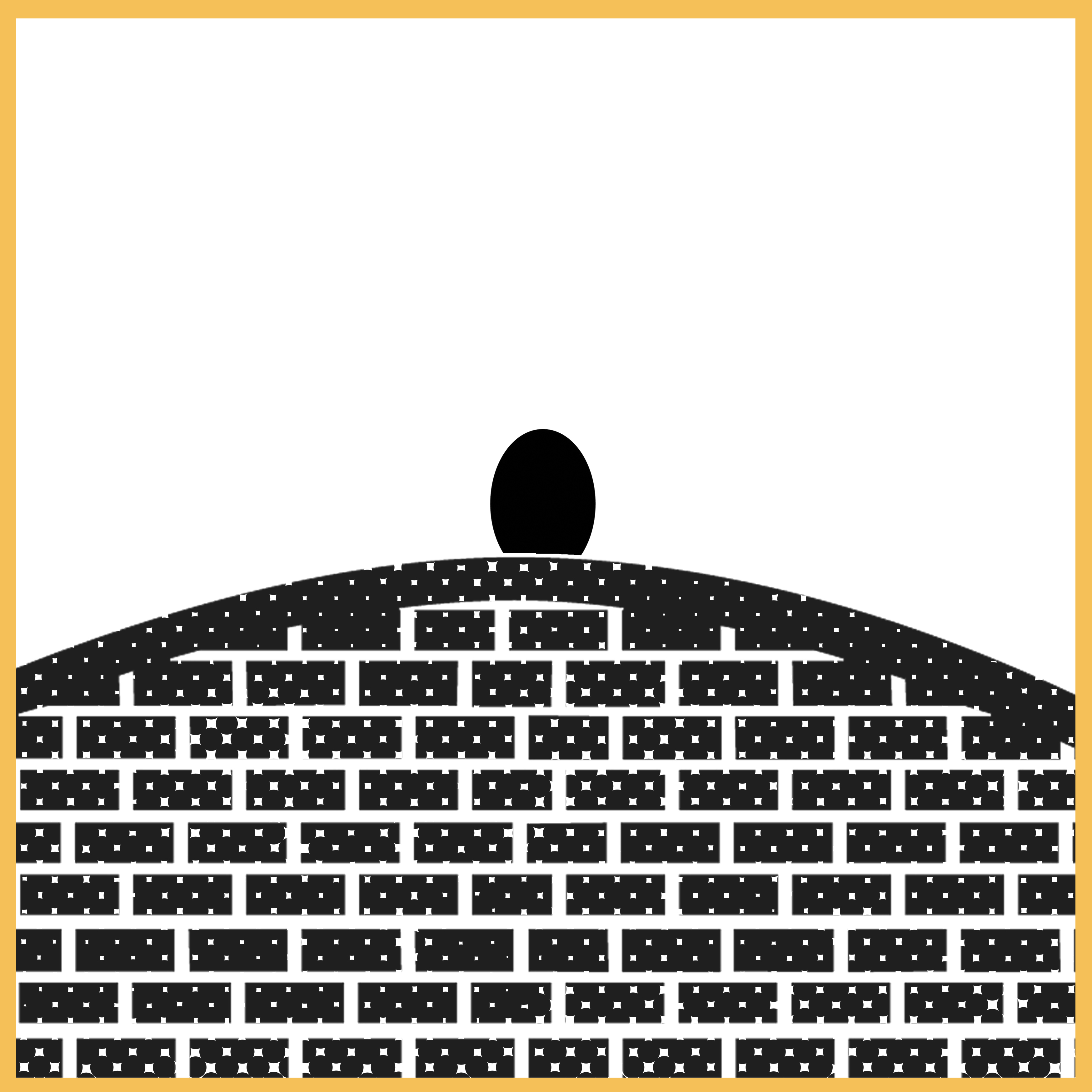
determined is about manipulating the existing STOP sign and changing it to a GO sign with the palm replaced with an ‘ok’ sign. this shows determination because i strongly believe that knowing that there will be things stopping your way in life, it is possible to overcome challenges.
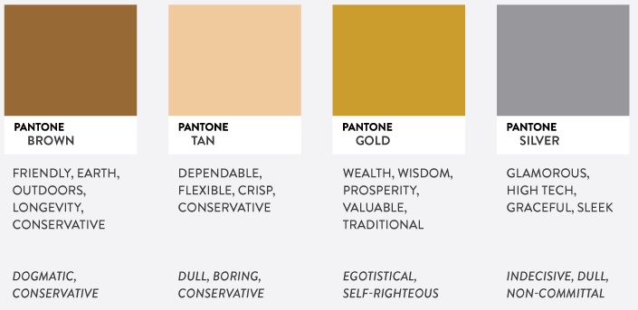
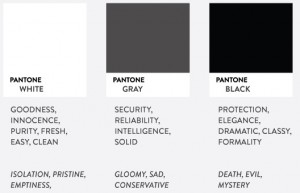
red represent determination, passion and energy and of making quick decisions.
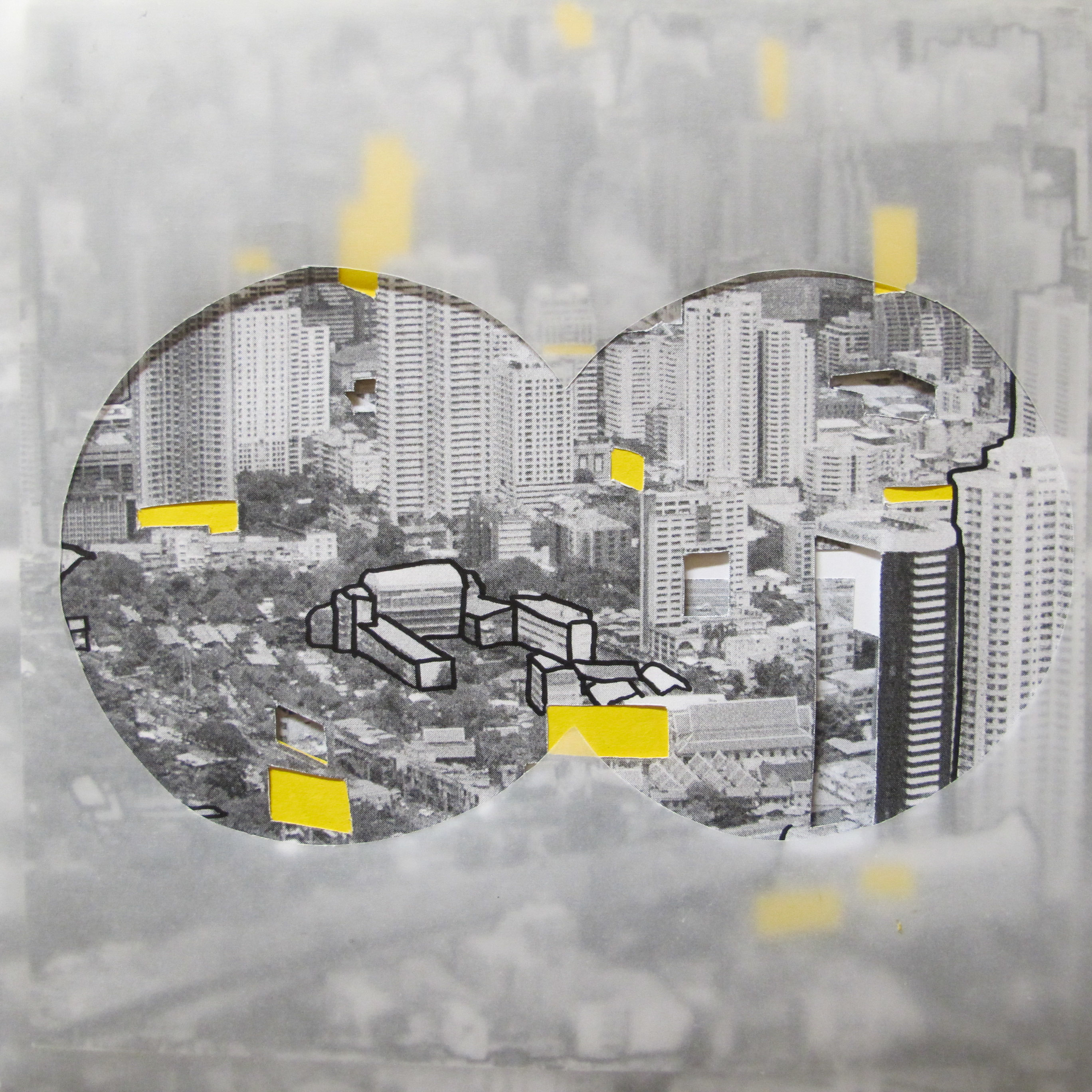
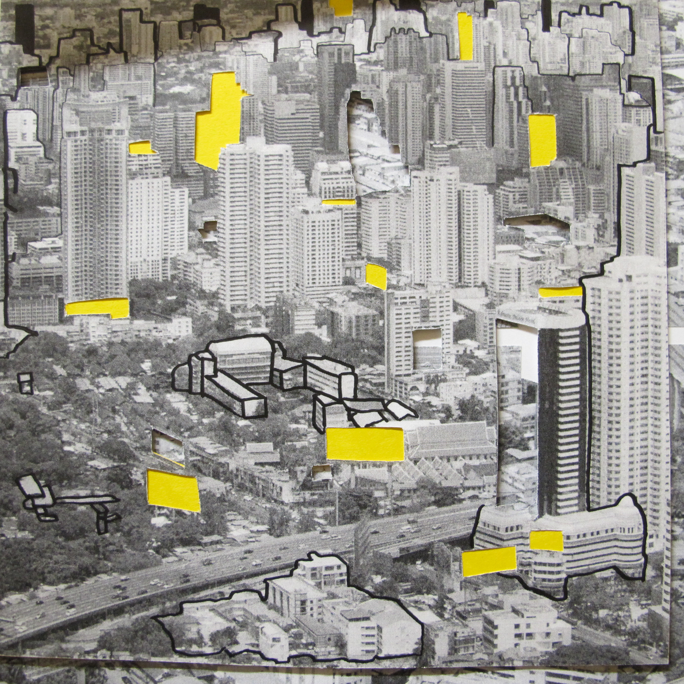

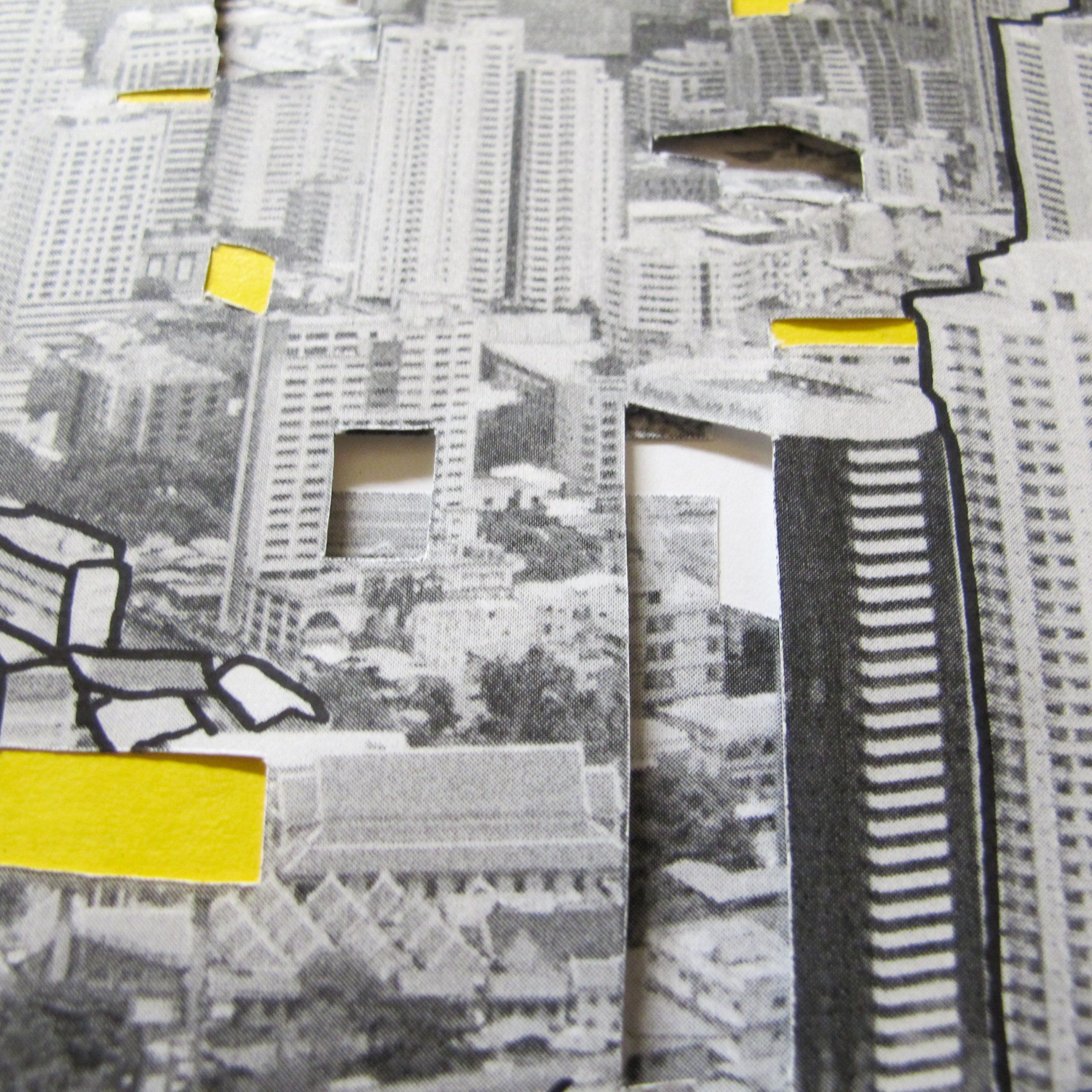
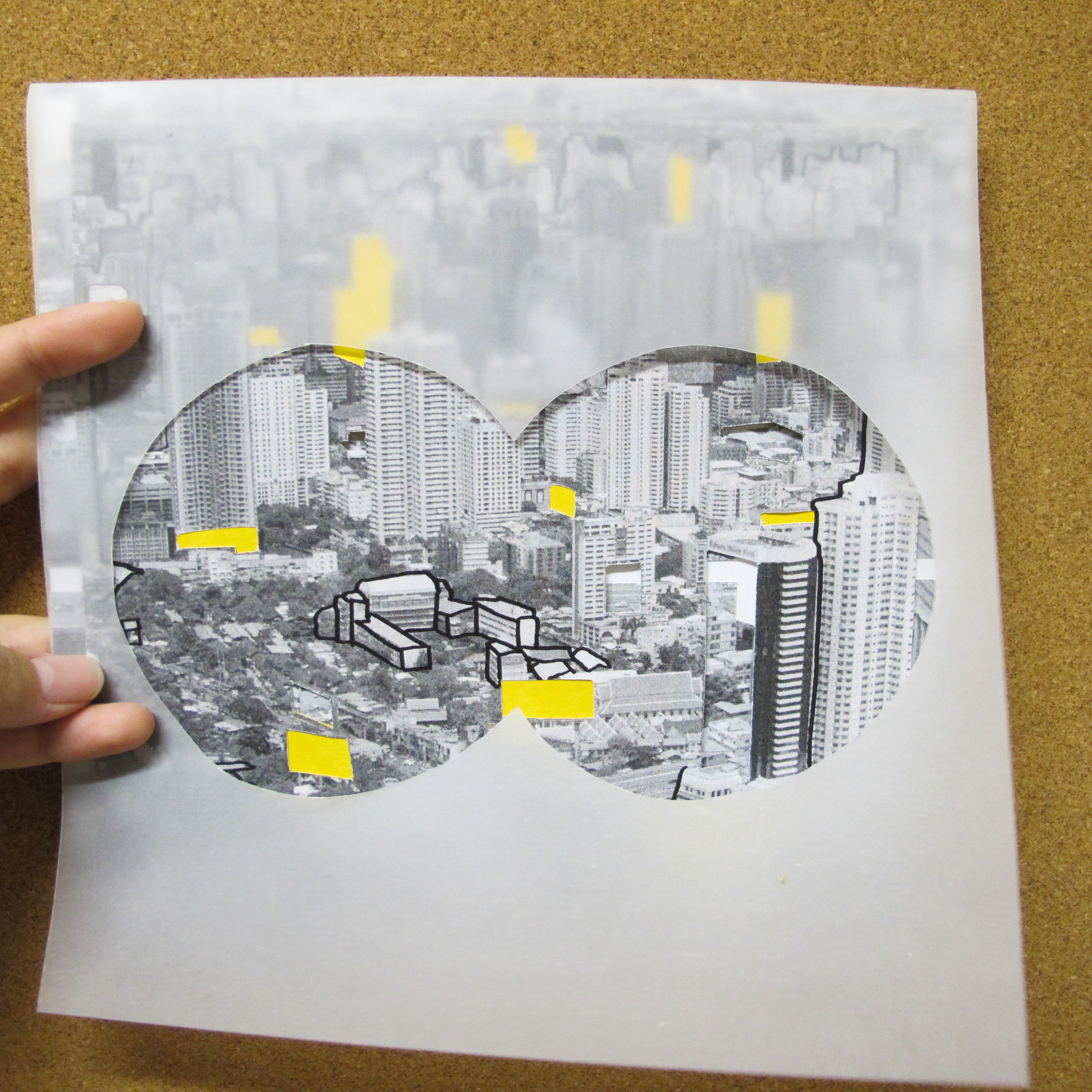

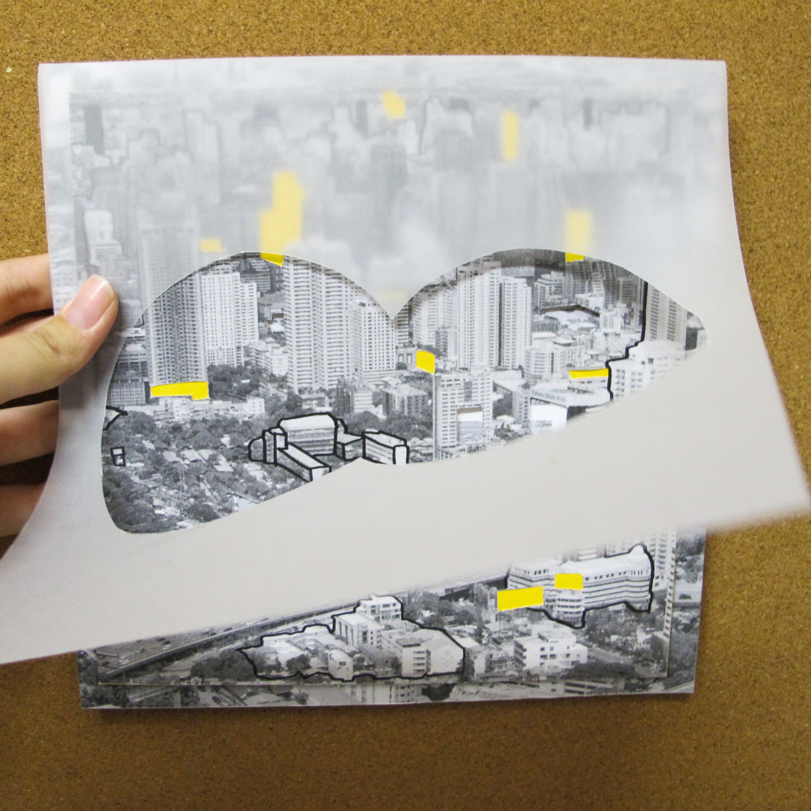
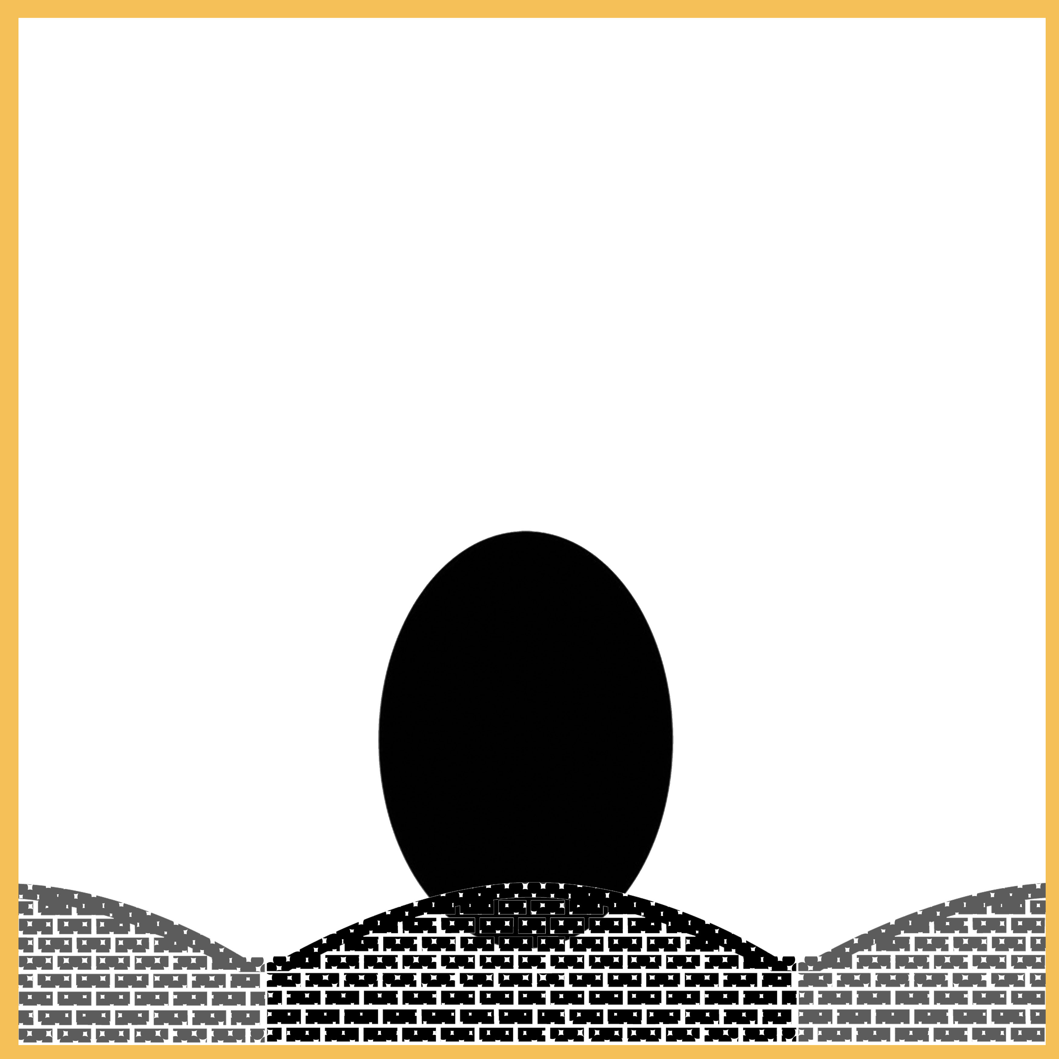
curious is depicted in a way that you find yourself looking through a binoculars lens (tracing paper) and overlooking the city of Bangkok (photo taken early this year). constantly analyzing and always asking what’s what.
the yellow cut-out are of buildings that makes me wonder what goes on there and also the foreign (Thai) words on the banner of the roads.
yellow is known to stimulate mental activity, is an attention getter. it also evokes a cheerful and pleasant feeling.
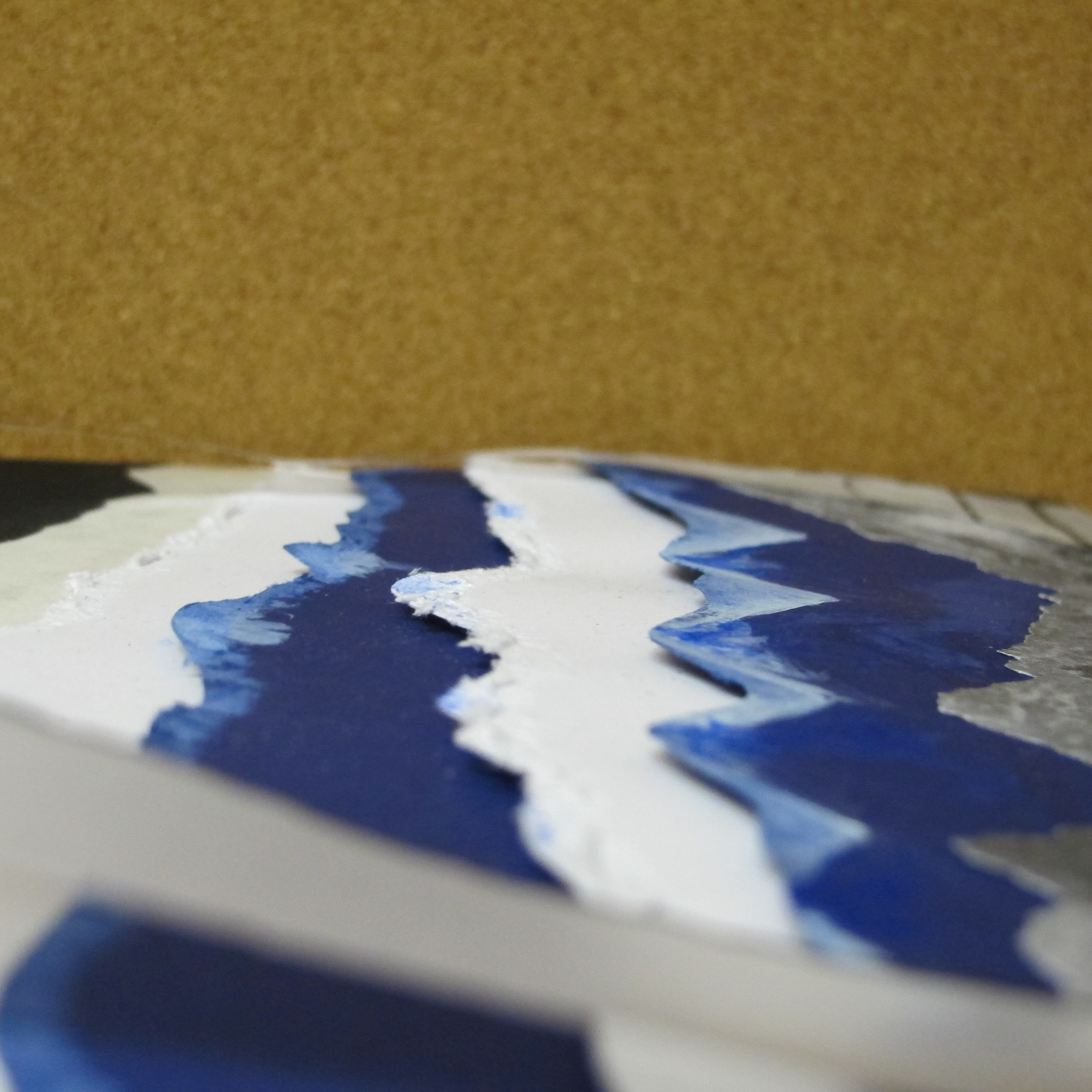
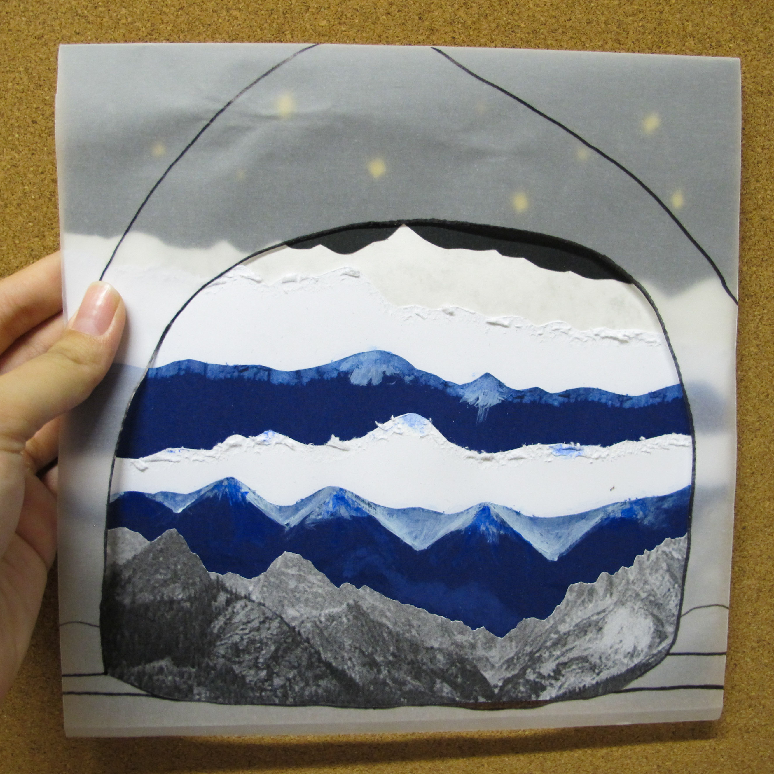
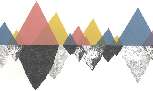
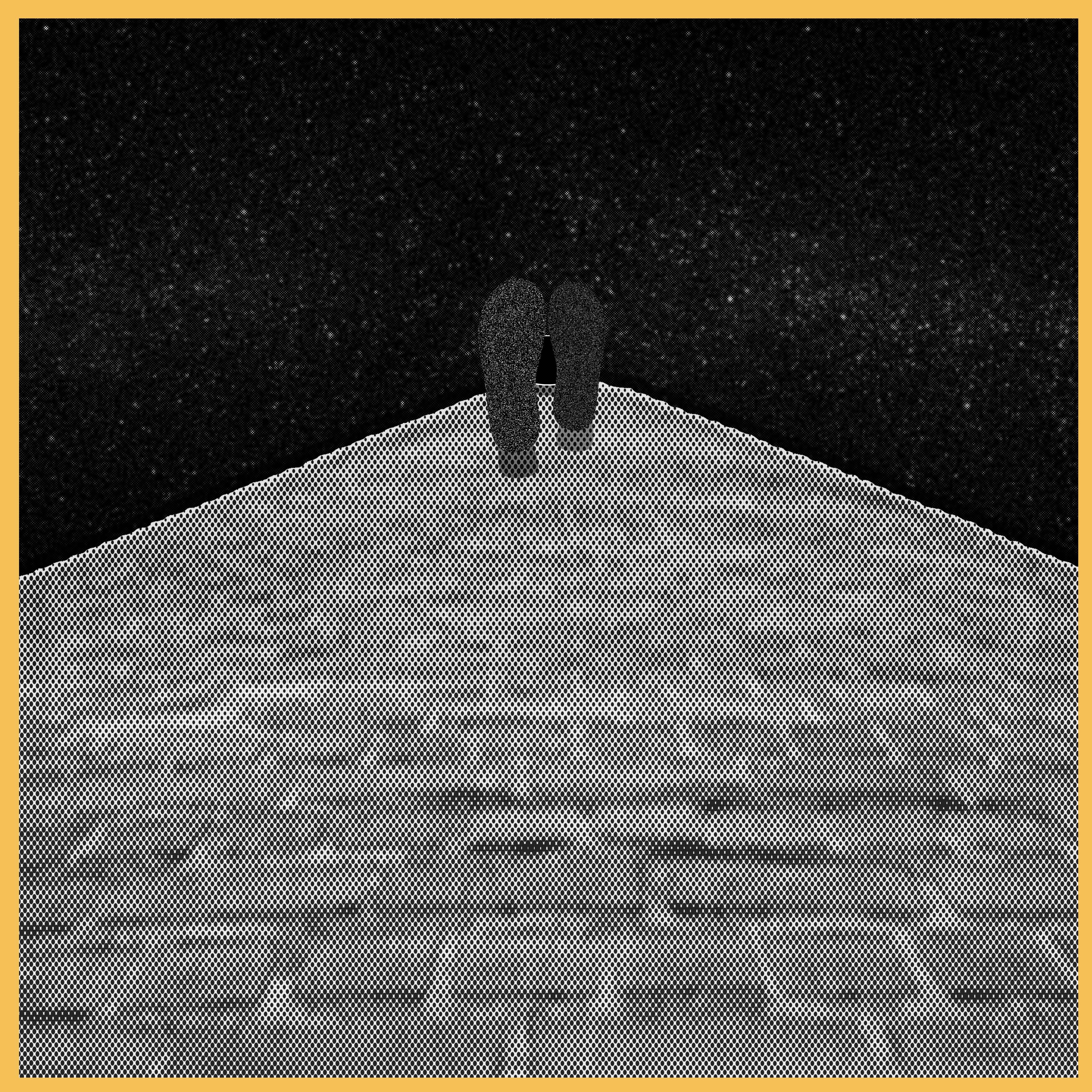
adventurous, to me, is always in the nature, thus the mountains. the layers of mountains together with the grain for cutting. the black starry sky represents night time, which adds on to the adventure. the tracing paper shows a tent, meaning that the viewer is inside the tent.
blue represents colour of the sky and sea, stability and tranquility. it also has a calming effect.
—–
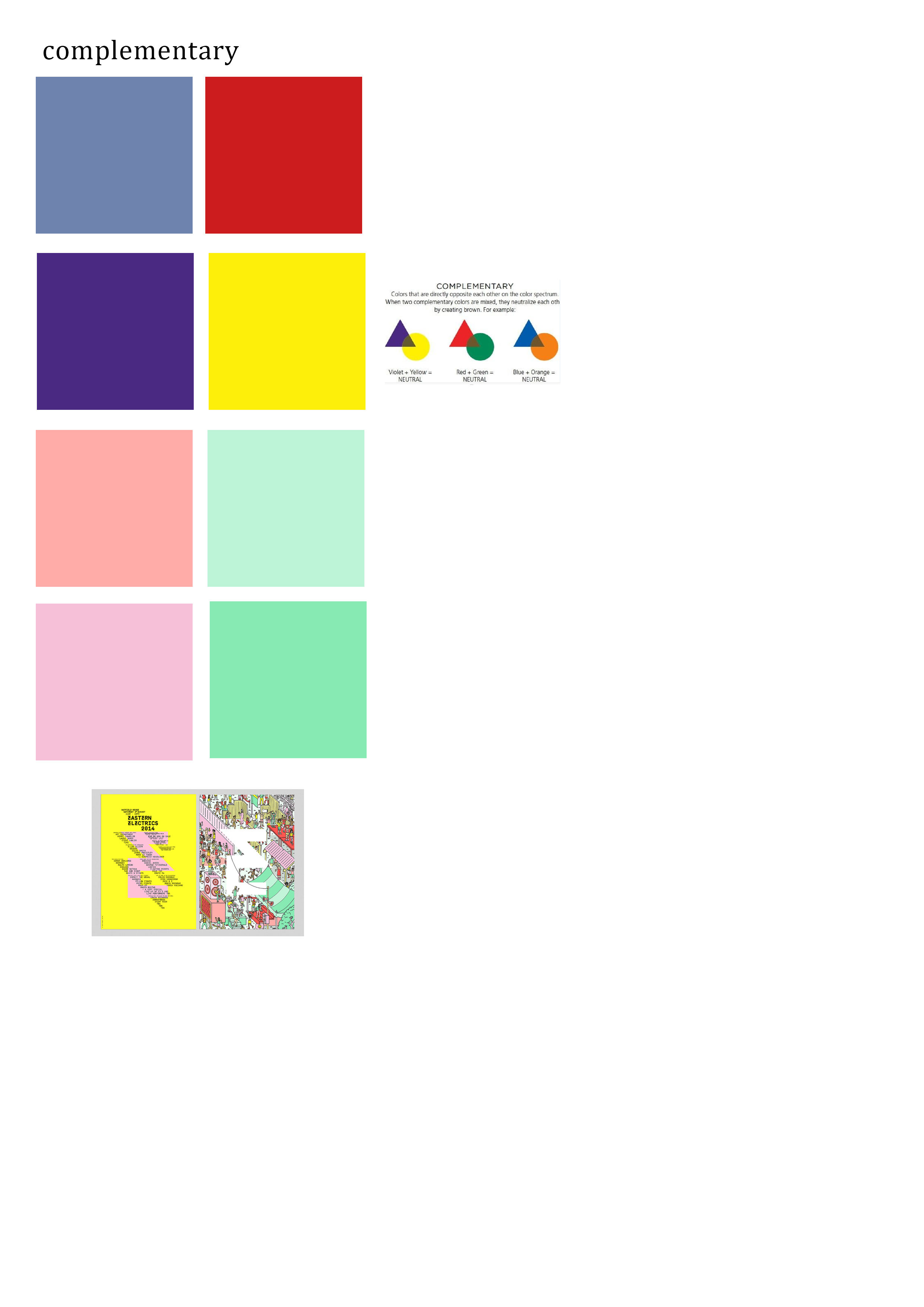
002 a better me
using the complementary colours of red and blue with the equation
energetic – chaos = patience
(theme: waves)
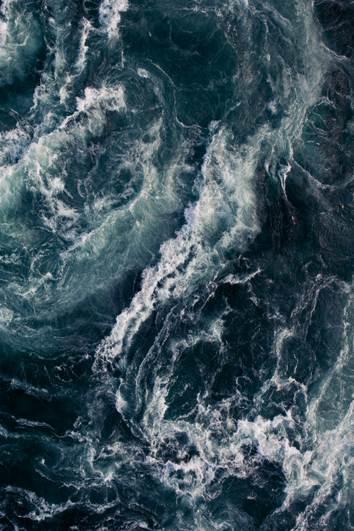
when you have so much energy, you need to slow down, you need to take time to breathe and calm down and you will need patience. to remove the fast pased and chaos will be ideal
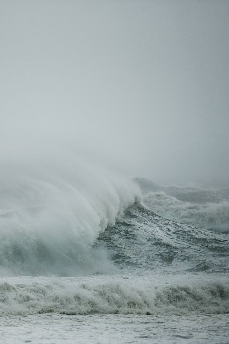
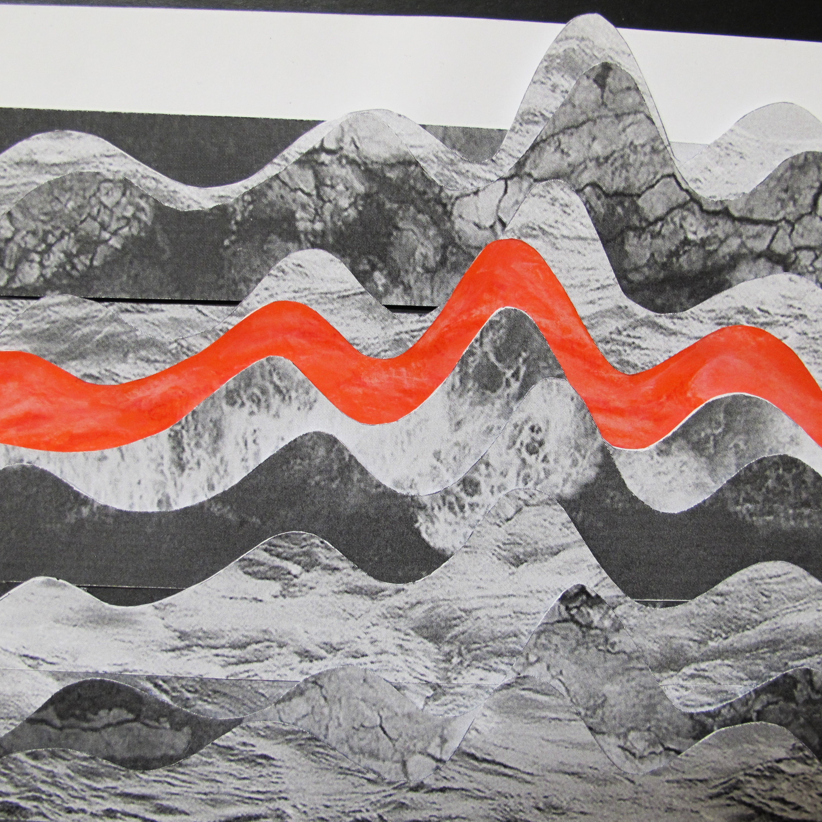
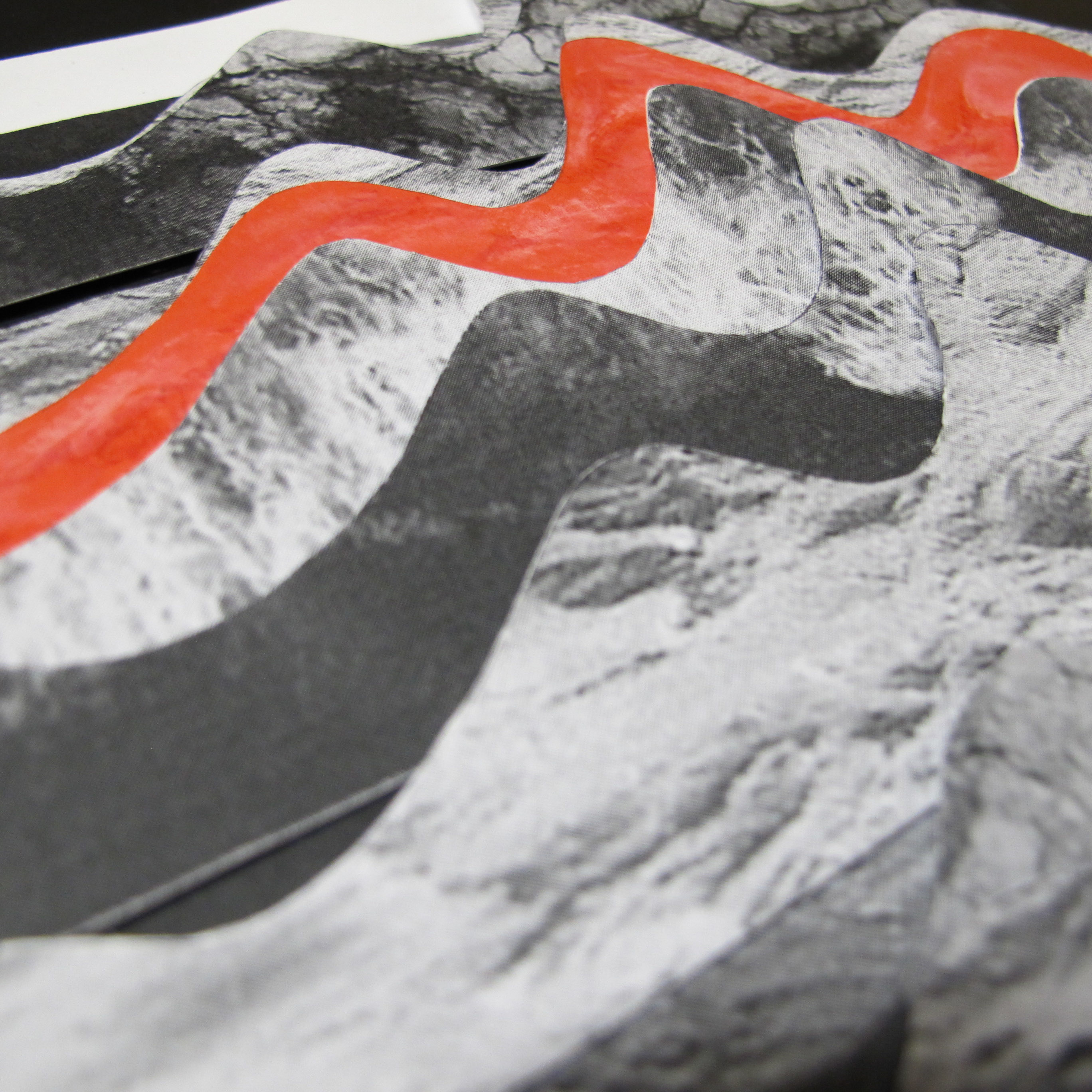
energetic is represented in energy waves formation and it was done in different layers and how the 3/4 part of the wave starts getting higher and higher
red was used due to its representation of energy and determination

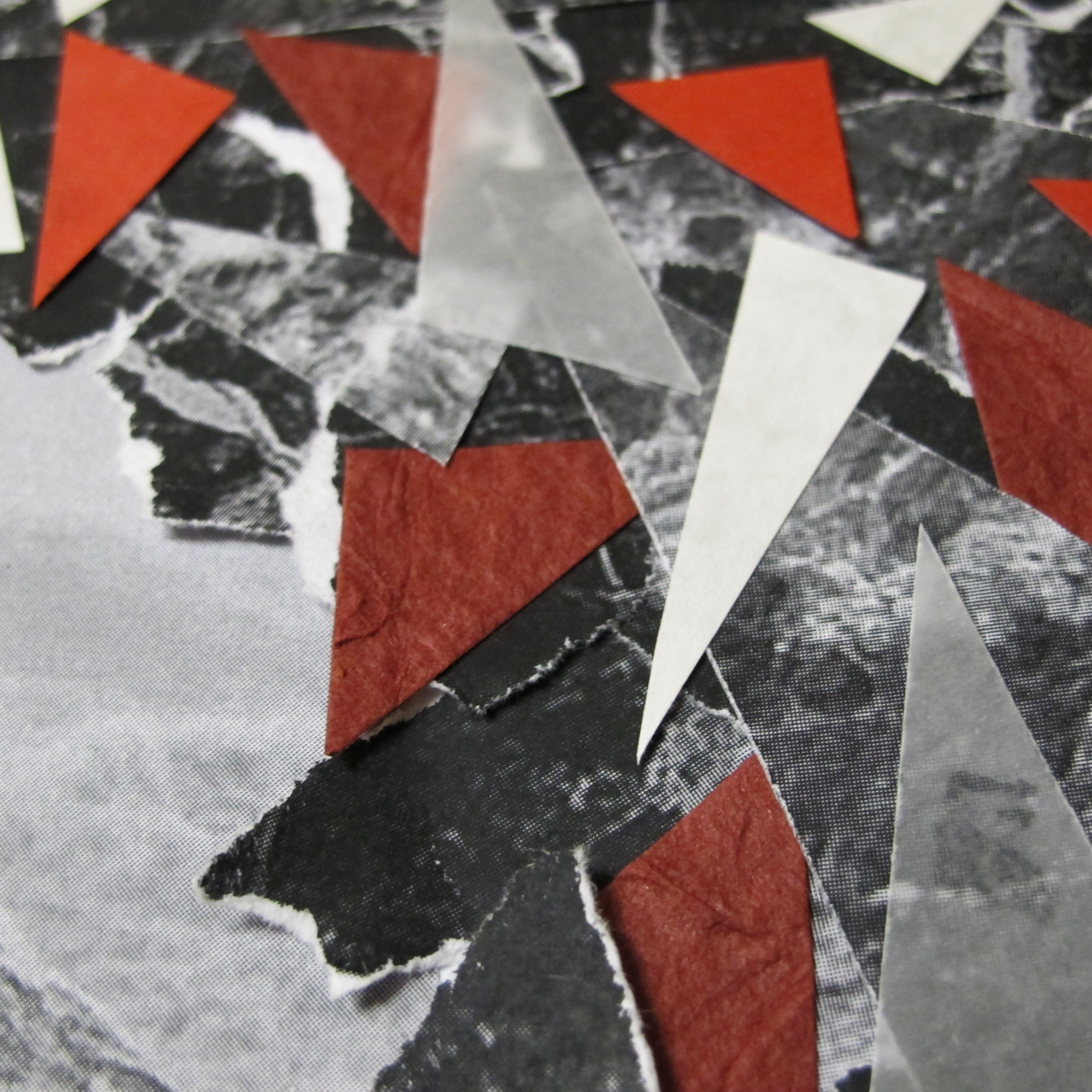
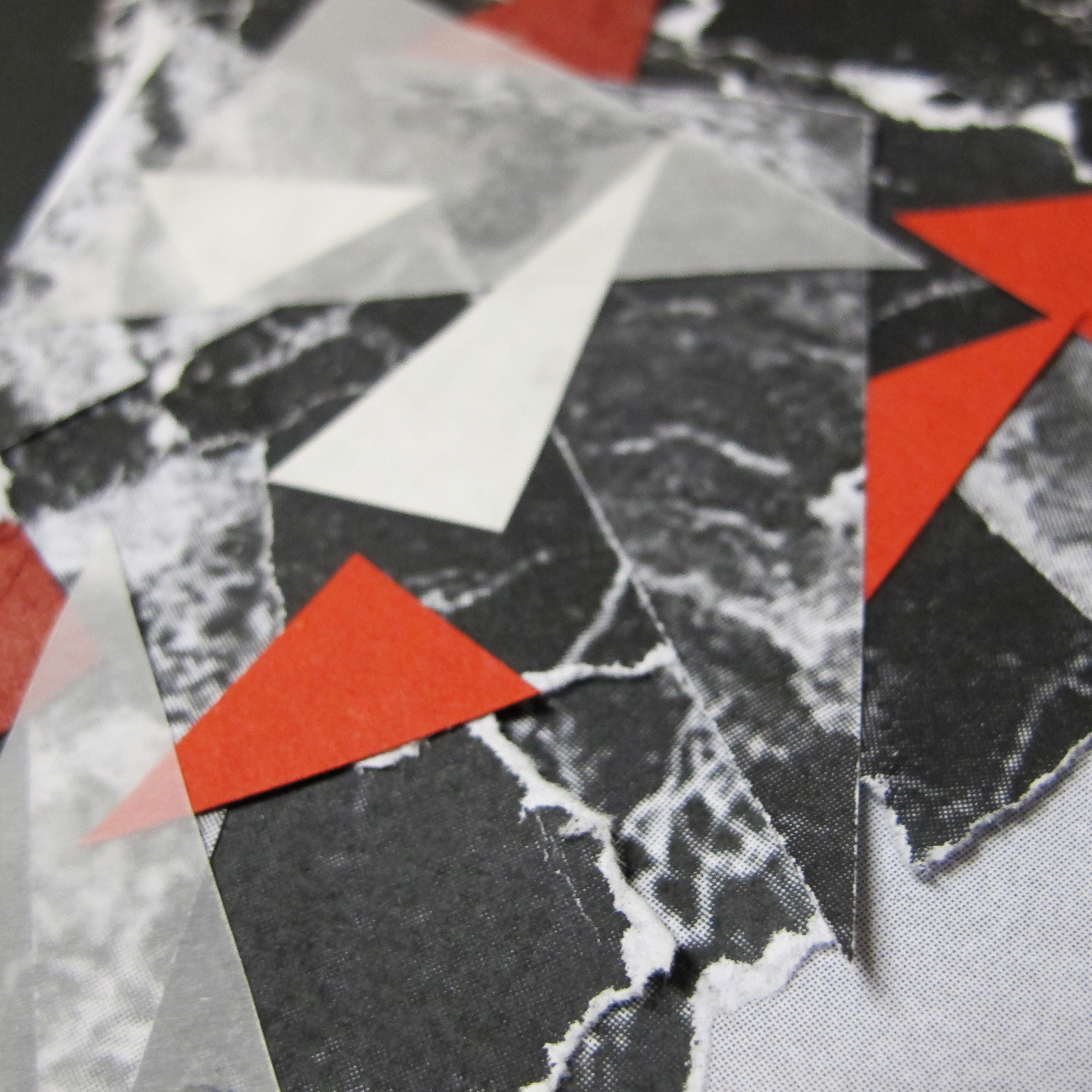
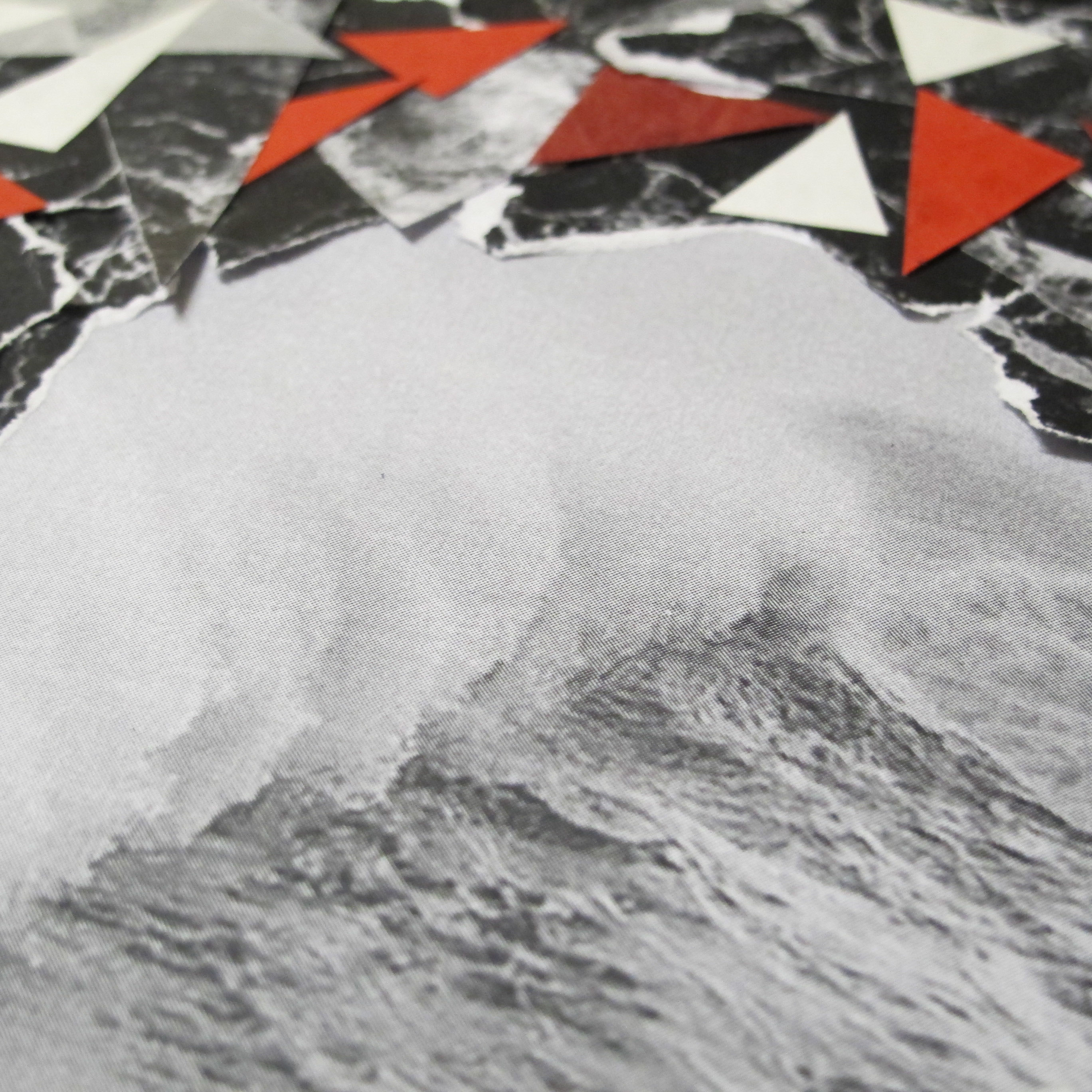
chaos shows crashing waves, together with marble texture and using many layers (tear by hand and cutting it in sharp triangles). there is a central in chaos, showing a huge wave is about to come and when it does all the pieces will be jumbled. this shows fast passing of time, movement and energy.
shades of red is used similar to the above reason.
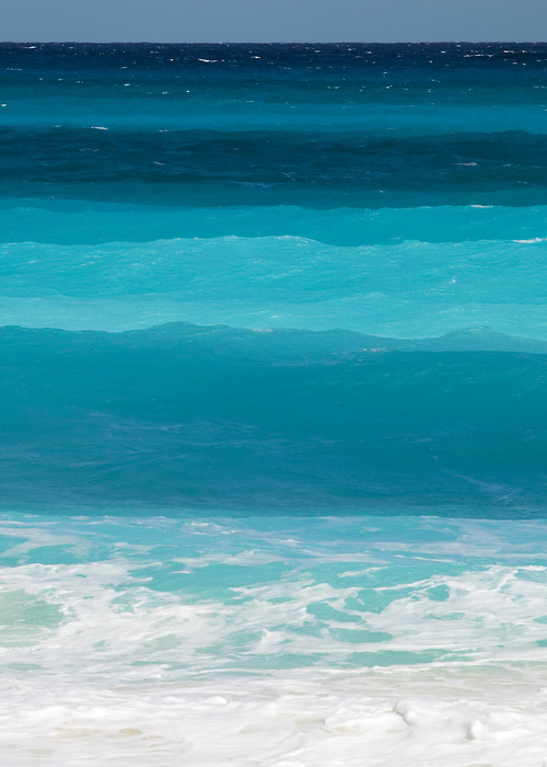
patience has calm water as a backdrop with cut out of paper strips that form an islamic pattern. this meaning of adding religion in this is to symbolise inner peace and tranquility.
blue is the color of calmness, strong, balance and stability and peace.
some behind the scenes..


(this is patience 2.0 as the first piece was not up to standard and it encourages me to be patient and redo it)


—–
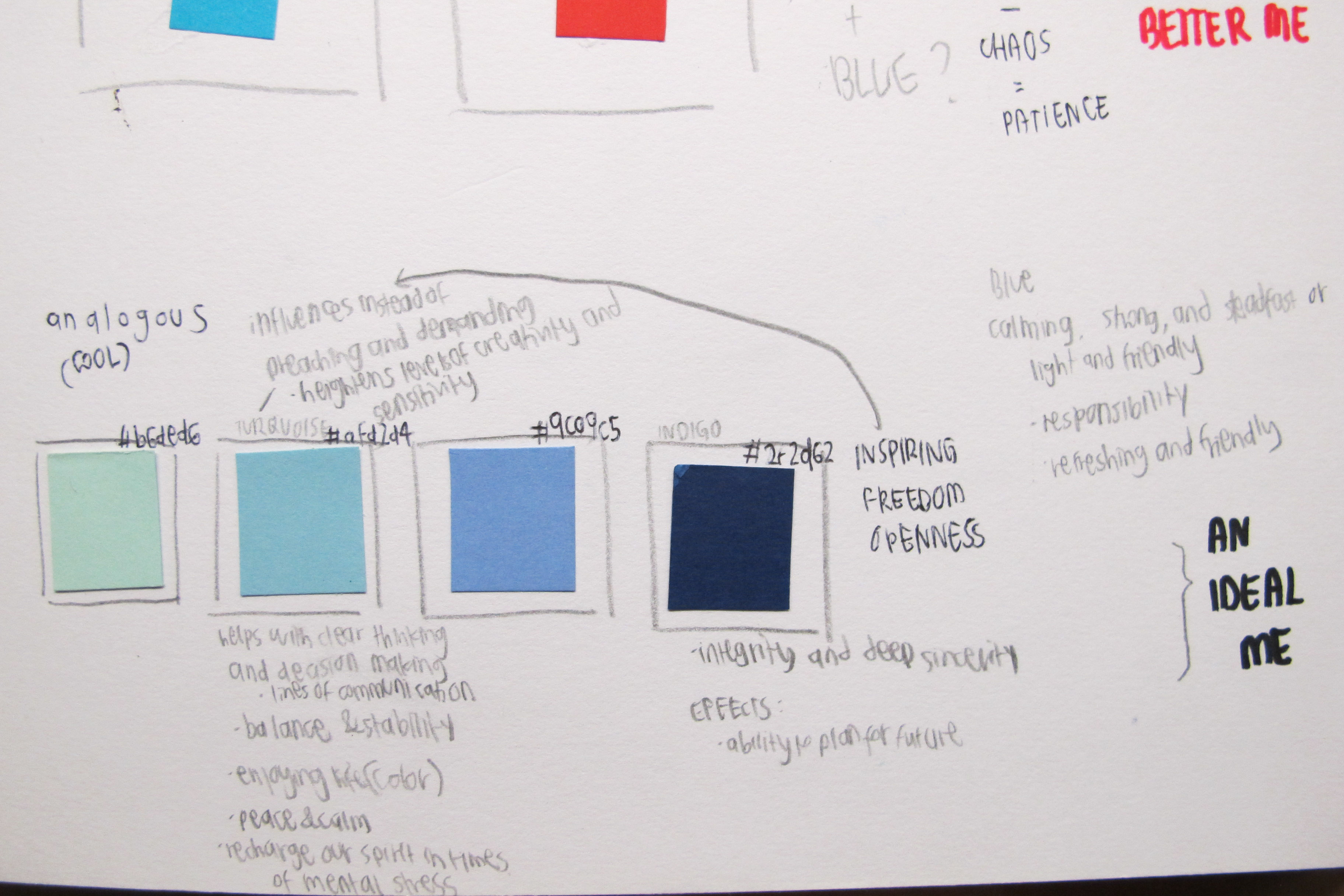
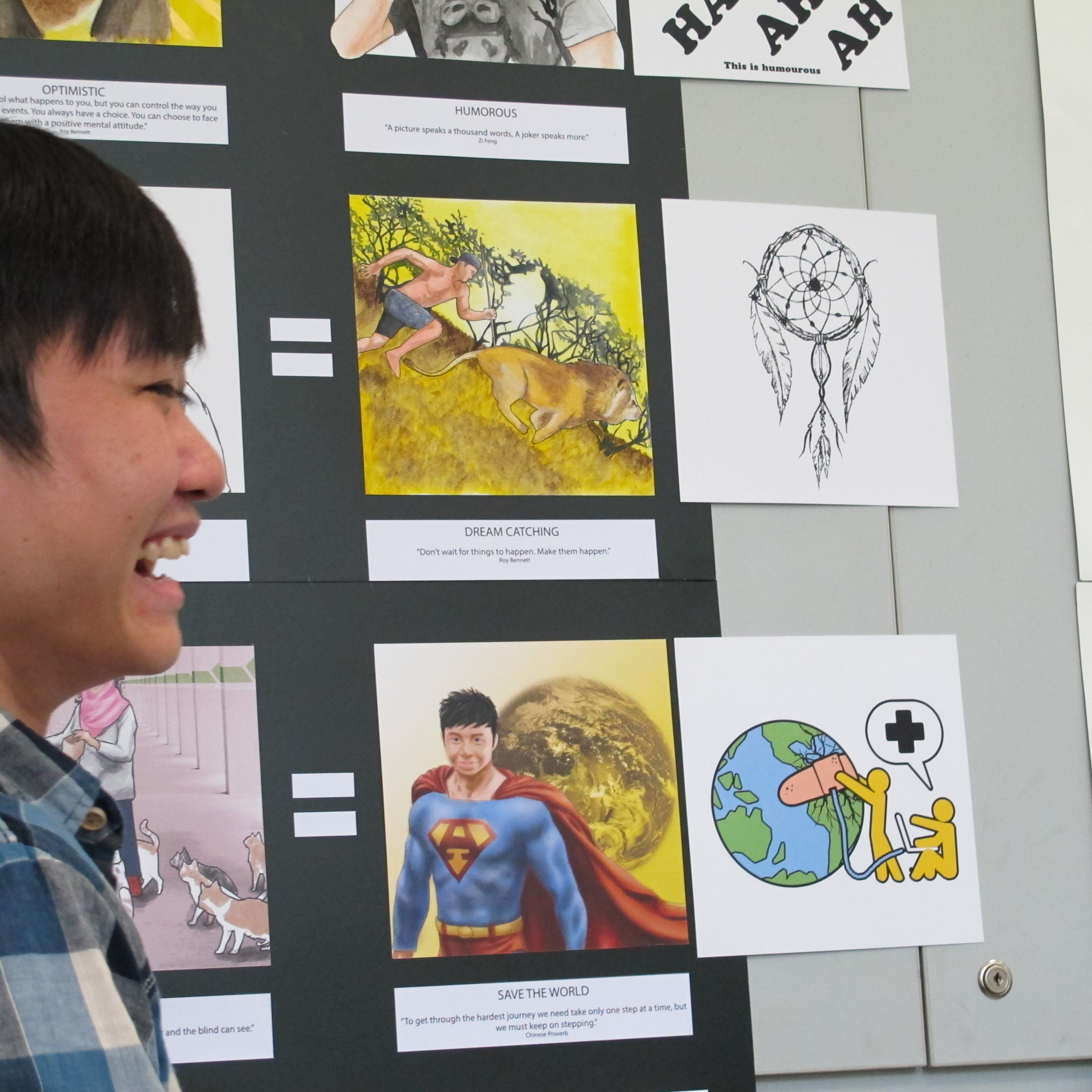
003 an ideal me
using the analogous colours of blue, light green and indigo with the equation
inspiring x freedom = openness
(theme: mountains and wilderness)
when you are inspired easily, you tend to inspire unknowingly and with the freedom to do whatever you want, to have no restrictions, will lead to a broad-mindedness and to believe that anything is possible and reachable
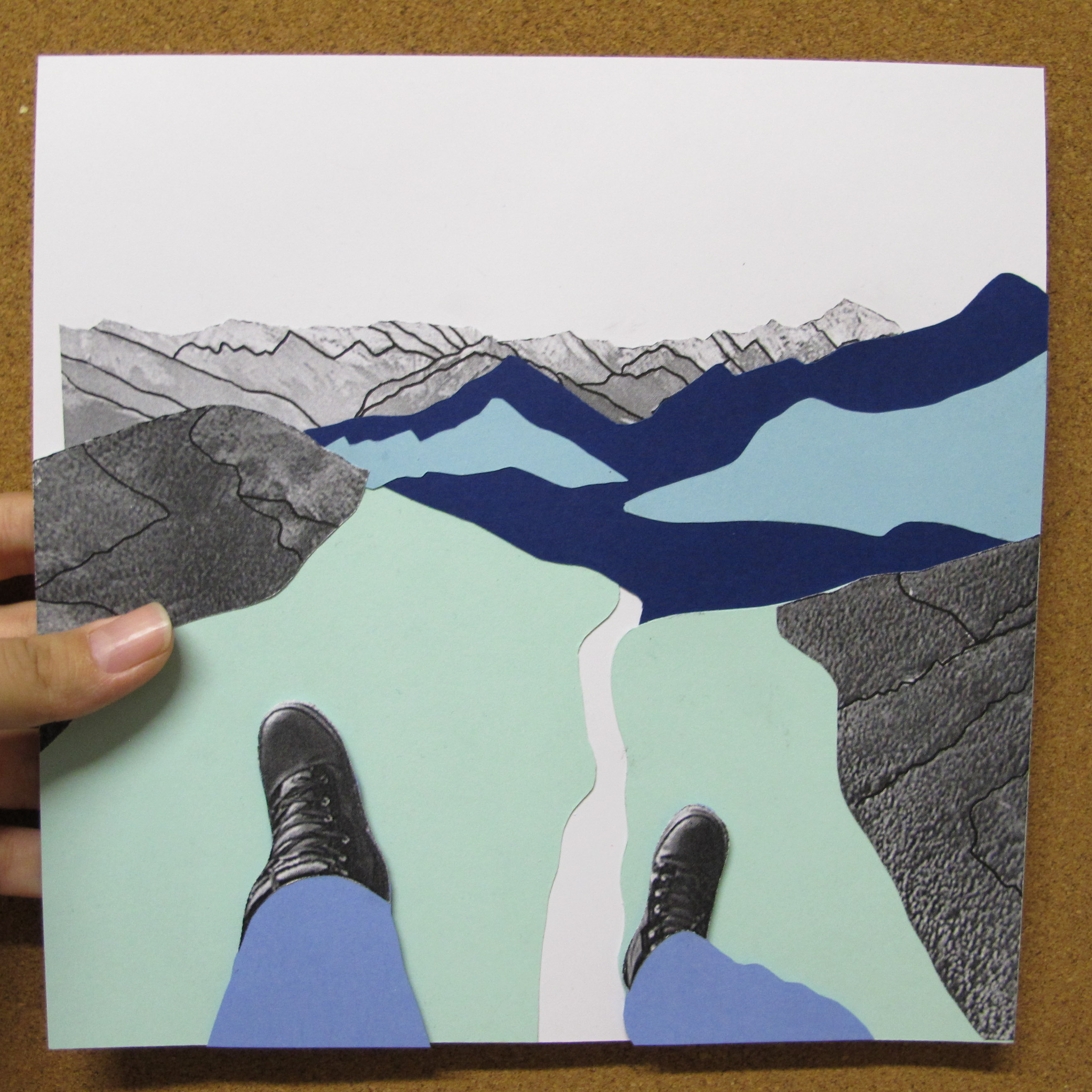
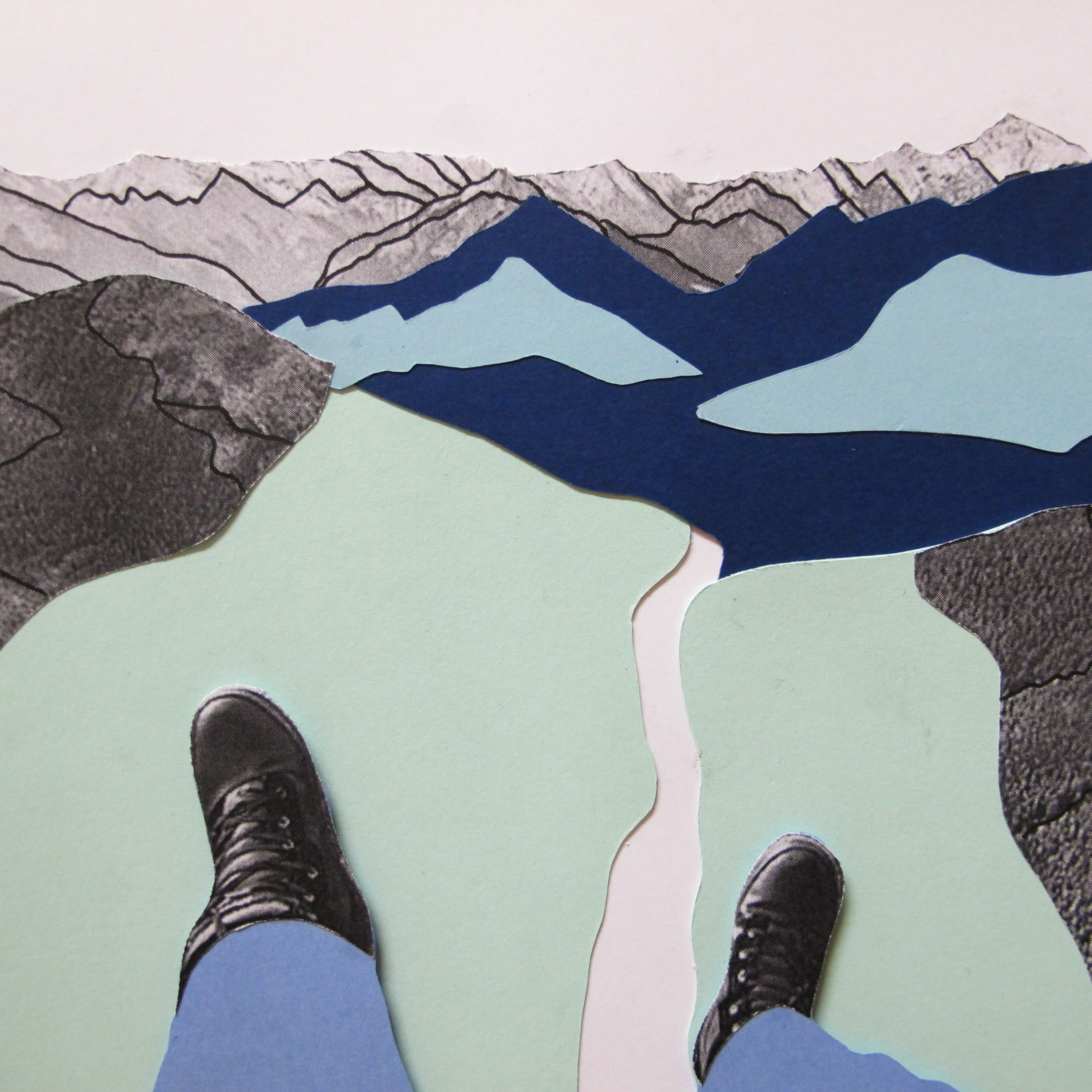
inspiring is linked to nature, of a hiker or an explorer on top of a cliff with a view as beautiful as this. the bold colours shows a simplified version of the photo and is to inspire audience to live life as free as this, to be able to do something daring and inspiring.
these colours influences instead of preach and demands. it is also refreshing and friendly
freedom shows a large space with a tiny human scale. this shows that the world has endless of possibilities.
these colours, in this context, is about enjoying life and how blue and greens have this effects on us, to have the ability to plan for the future, and to recharge our spirit in times.
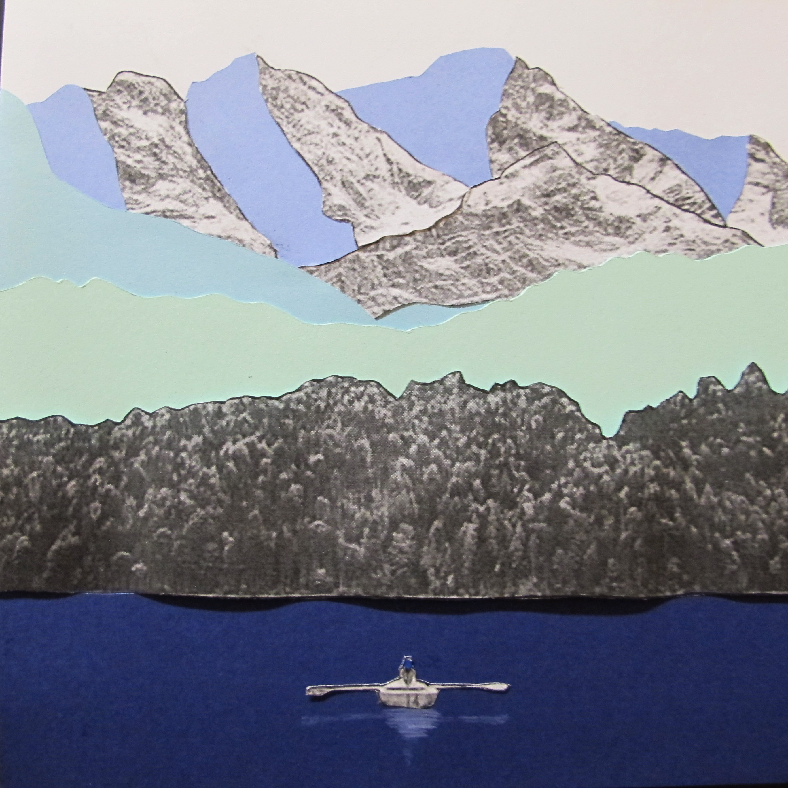
openness or broad-mindedness shows a person canoeing in front of a vast landscape and mountains. showing huge space and being free in a calming place. to know that there’s more to life than just concrete cities and work. to be able to life in the moment.
the colours are used due to the similar reasons as mentioned in the previous two points.
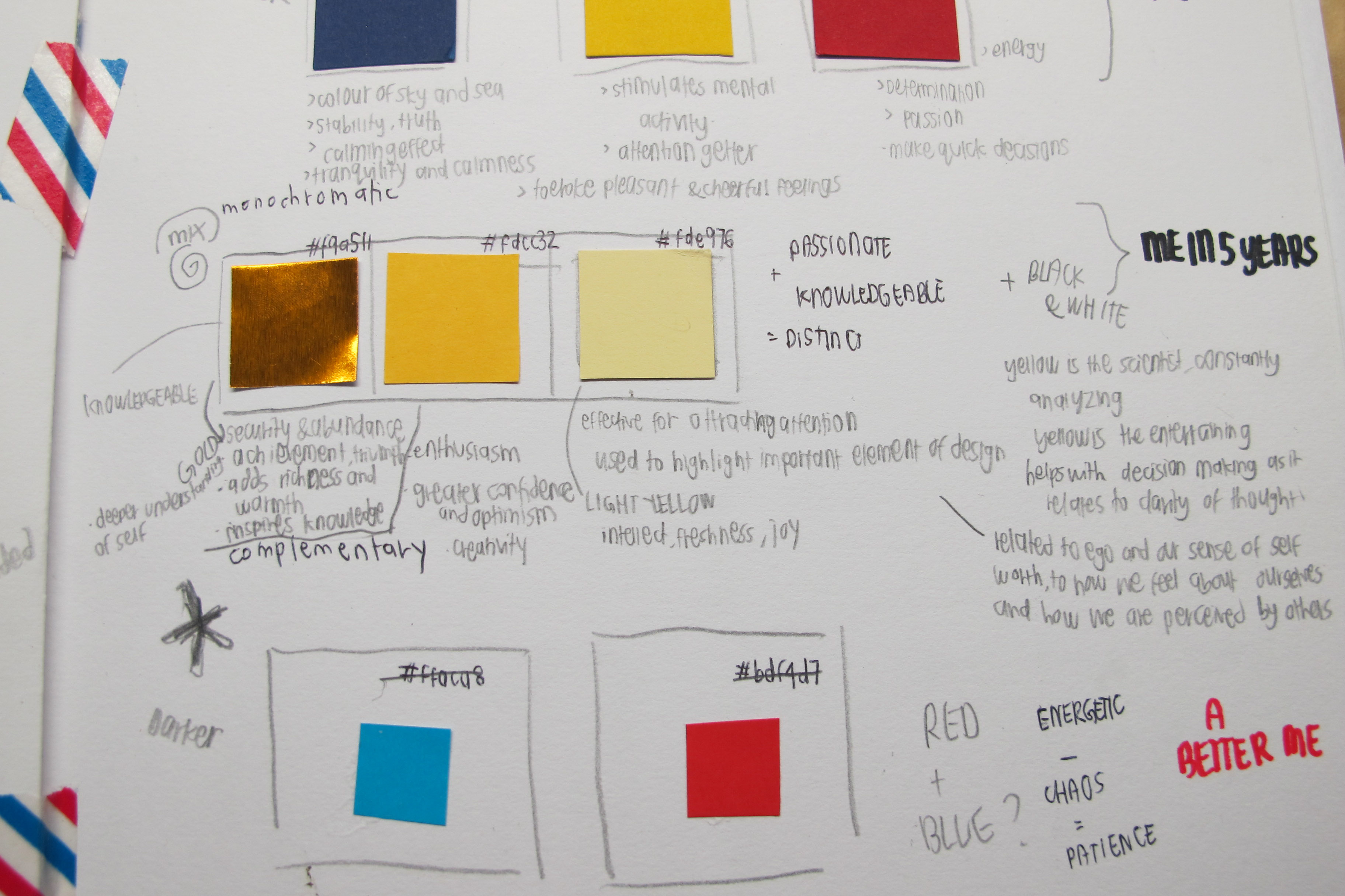
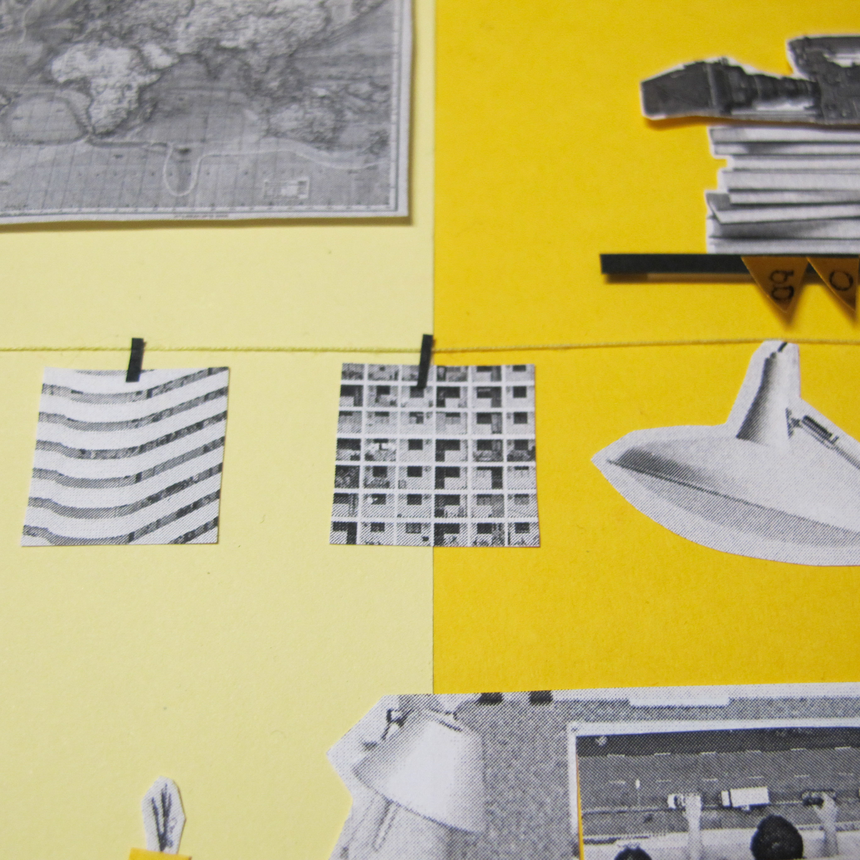
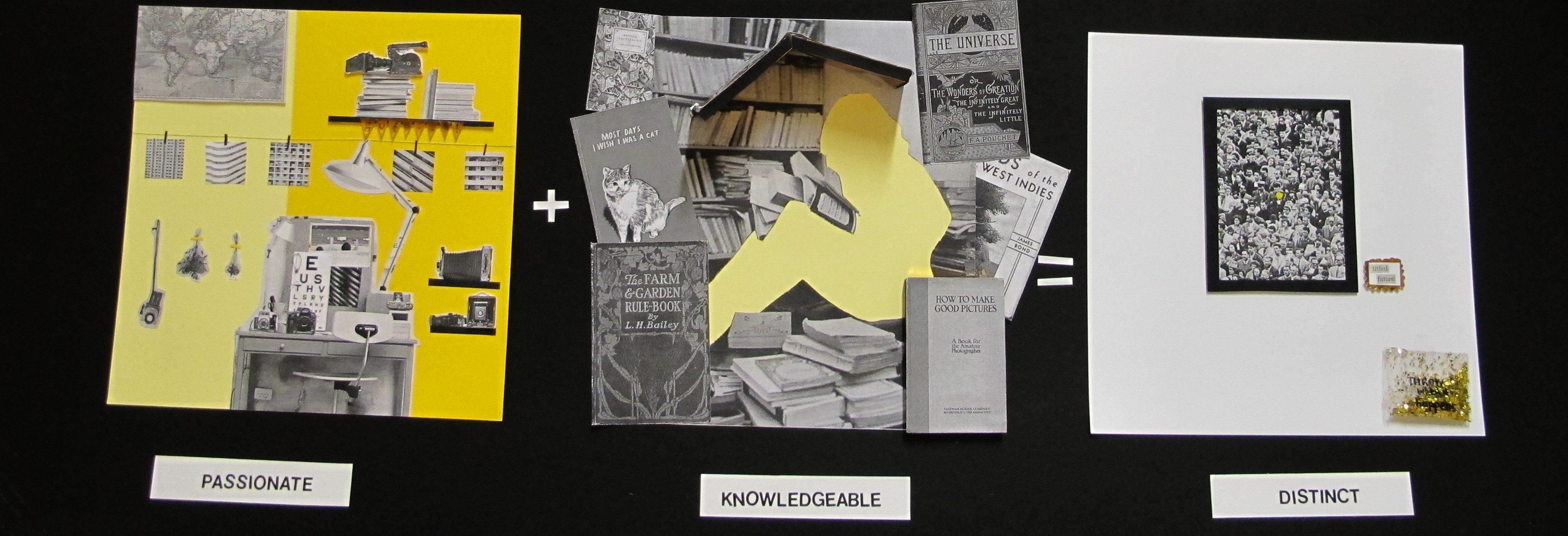
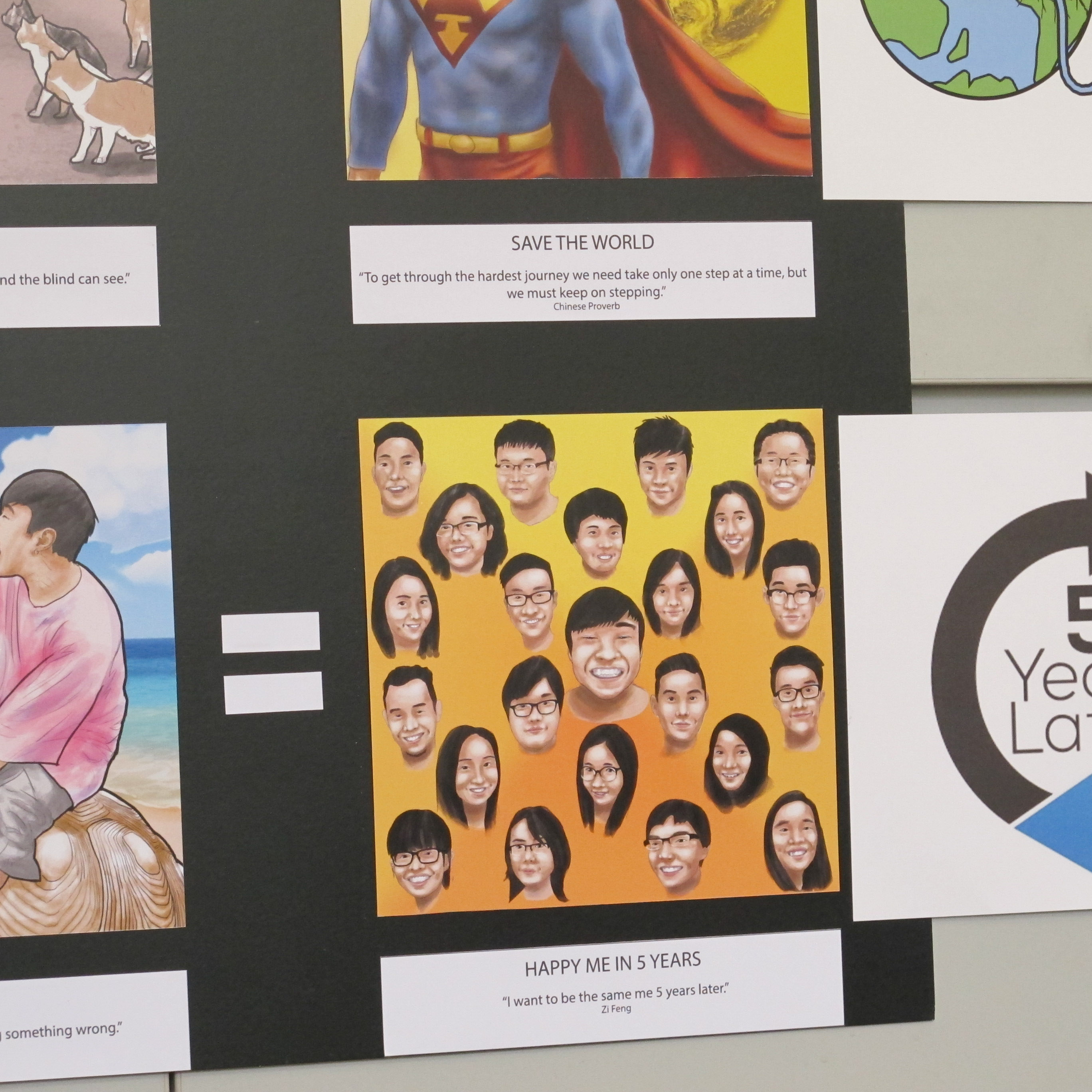
004 me in 5 years
using the monochromatic colour of yellow, together with black, grey and white with the equation
passionate + knowledgeable = distinct
(theme: frontal of a location)
to be passionate for something is to love and enjoy what you do, and to have the knowledge in what you want to know will result in you being able to create a style to call your own
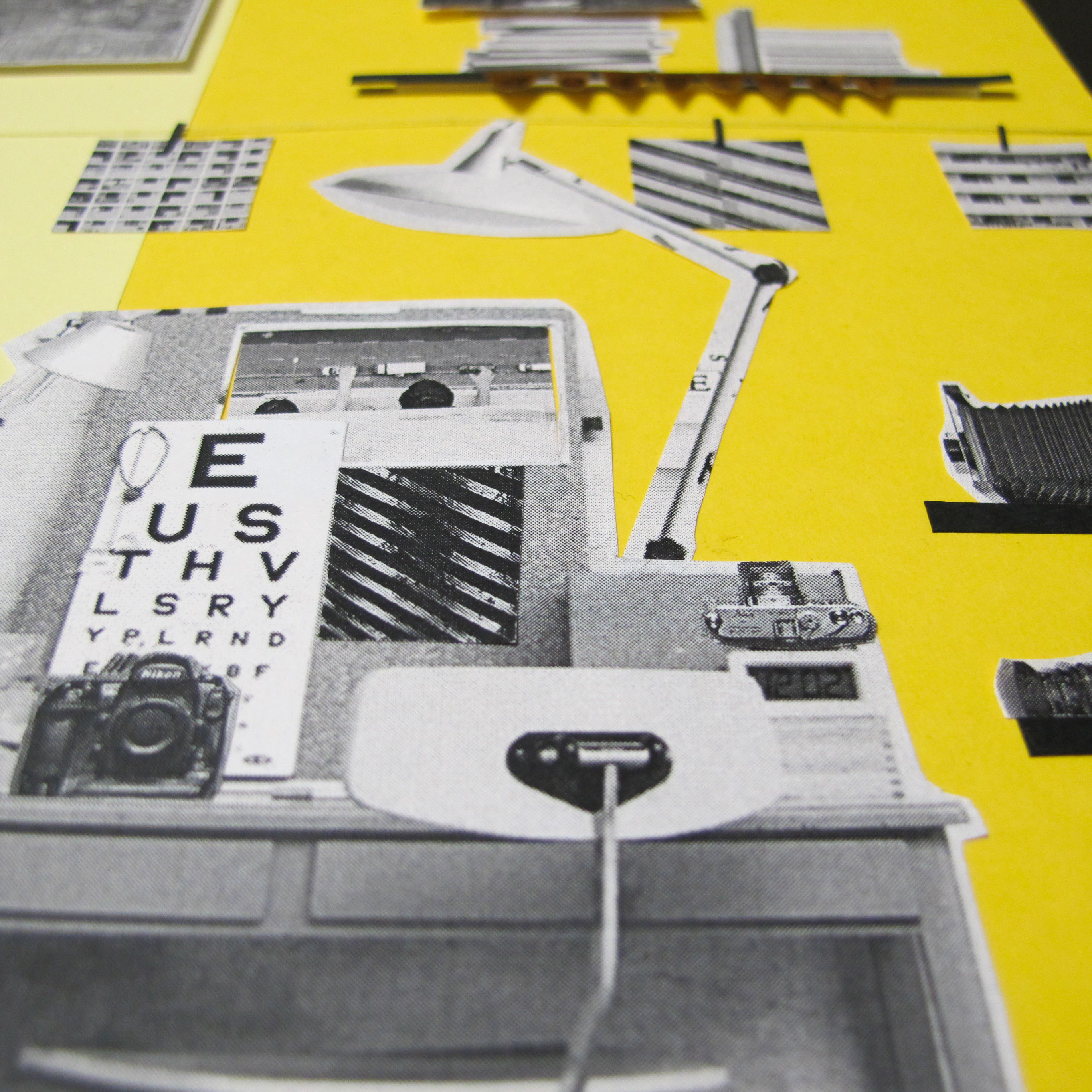
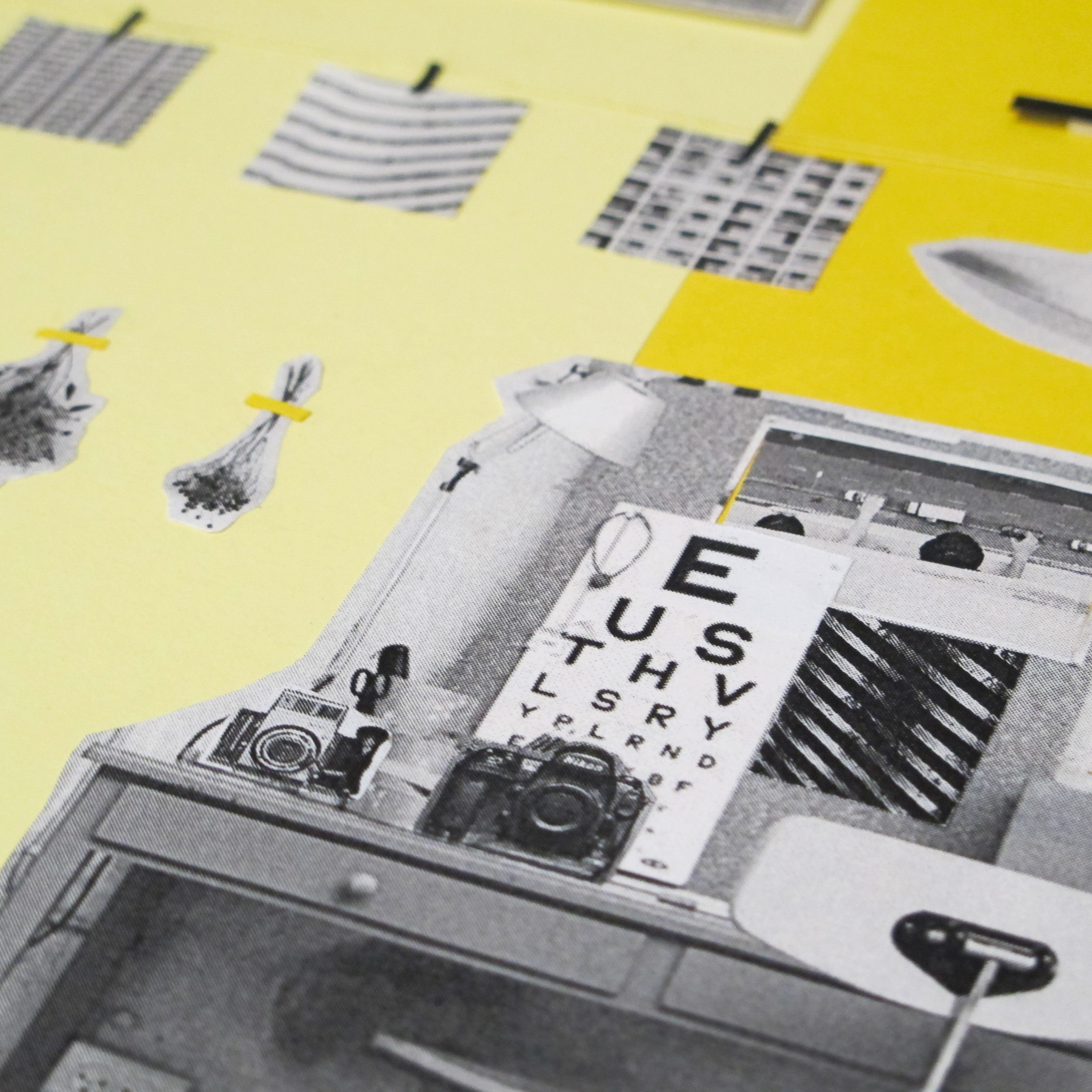
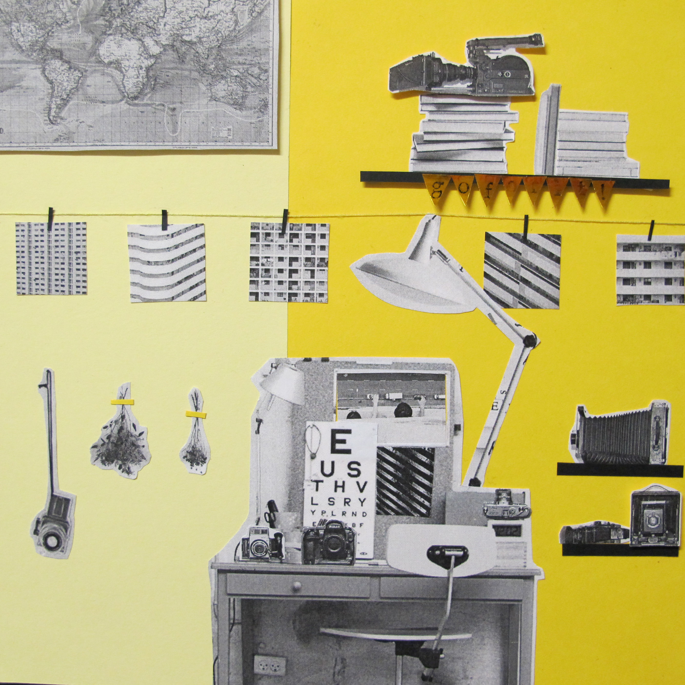
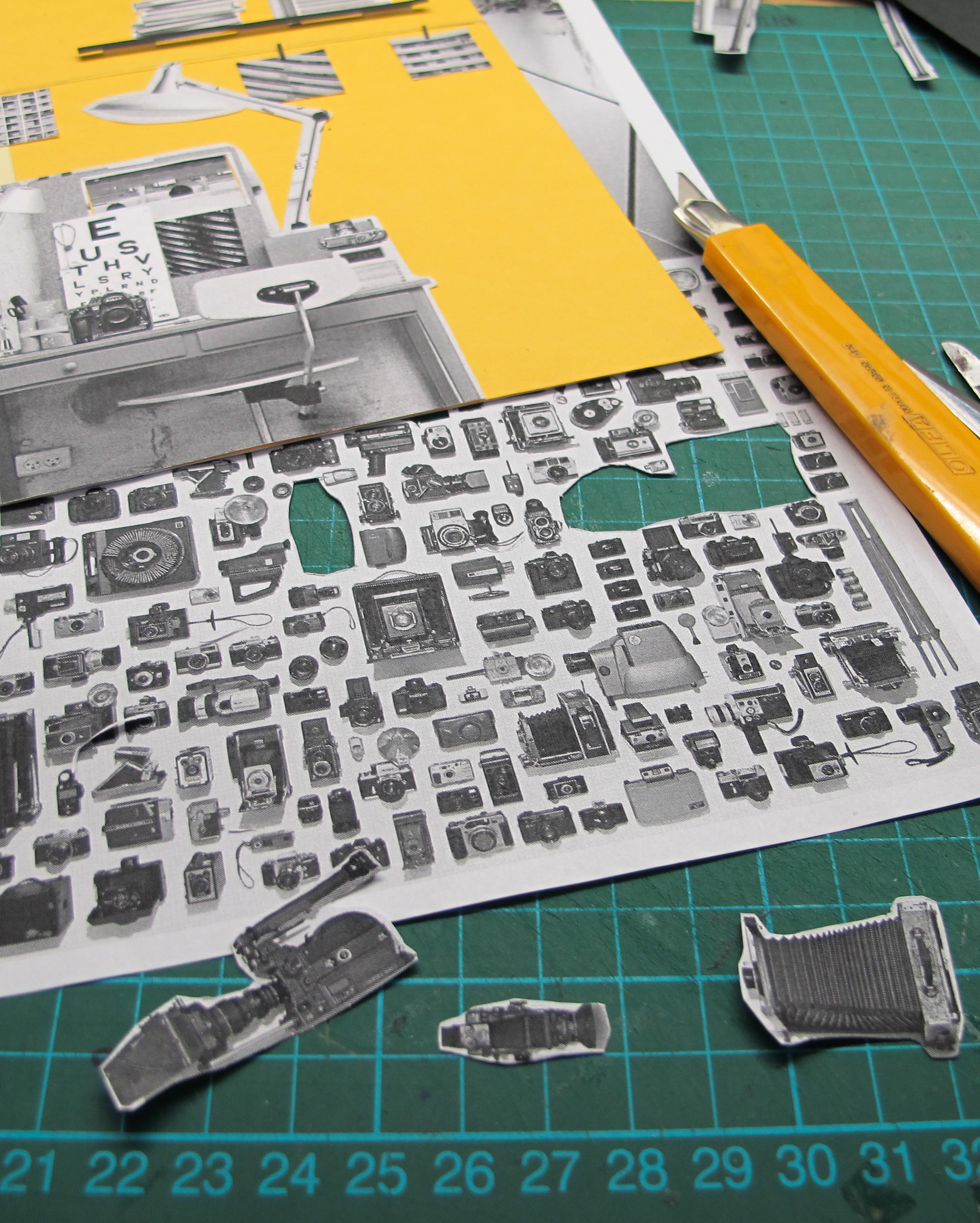
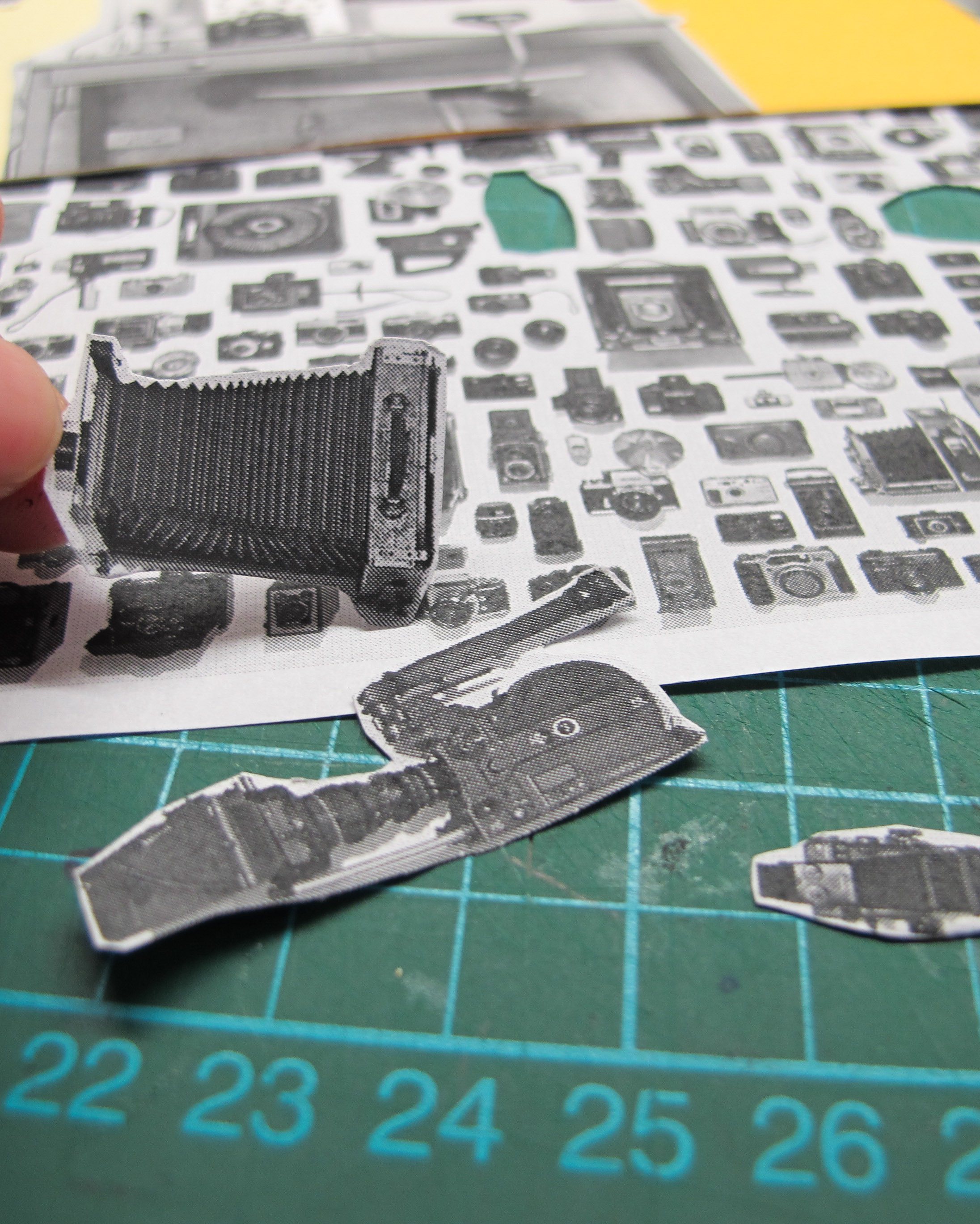

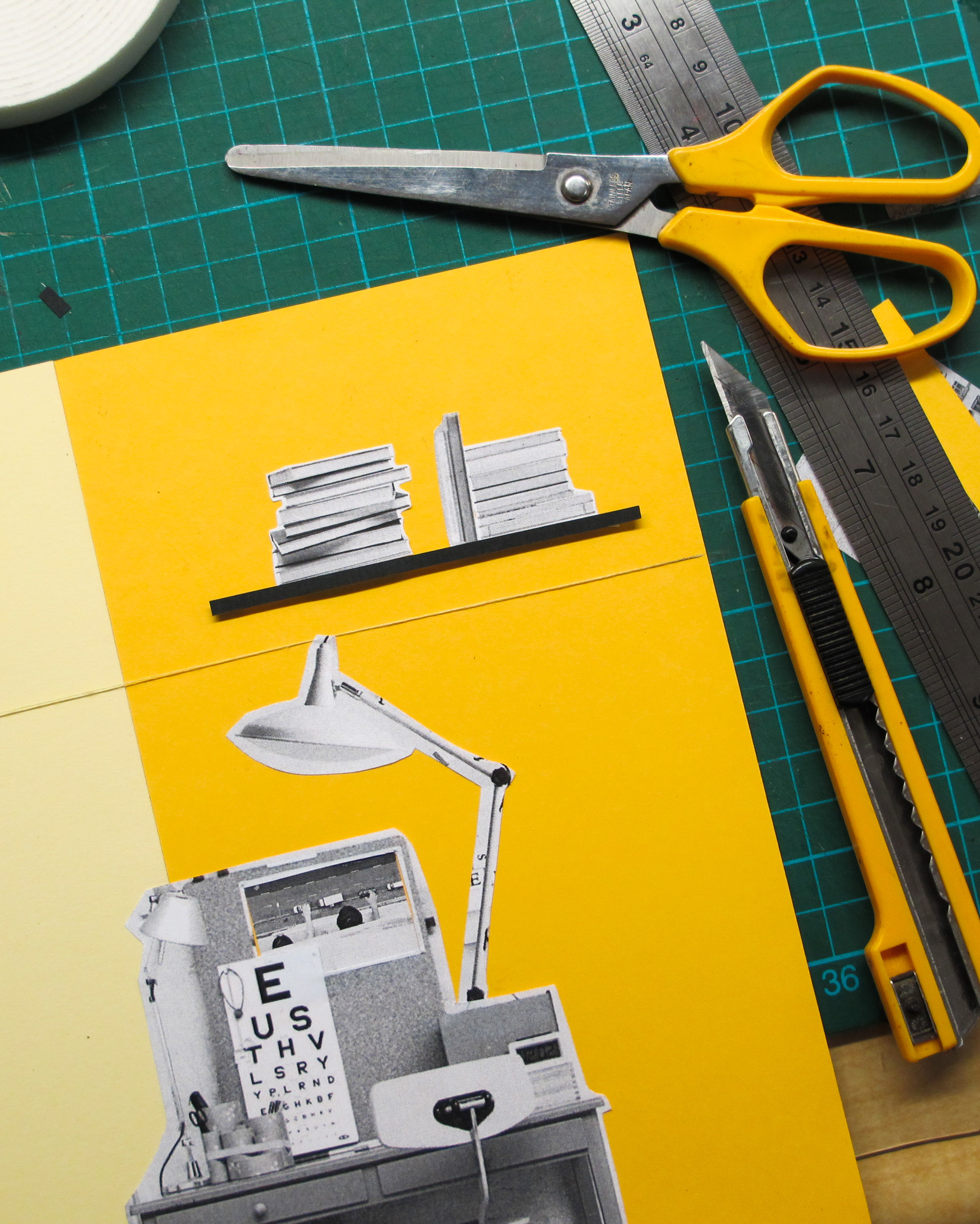
being passionate means individuality. like what i’ve mentioned during the presentation, passion cannot be faked or forged. if you like or have an interest in something, or you do things that you enjoy, that is your passion. a workspace is a perfect location to show your passion. what you have on your walls, whether it’s your own works or what you enjoy to read or the cameras you have, that describes the type of person you are. that’s where your ideas are born. for my case, there are books, cameras and the photos i’ve taken. there is also a burlap that writes “go for it!”, where your words of encouragements and decorative items such as flowers are.
yellow shows enthusiasm and light yellow represents intellect. whereas gold shows achievement and a deeper understanding of self.
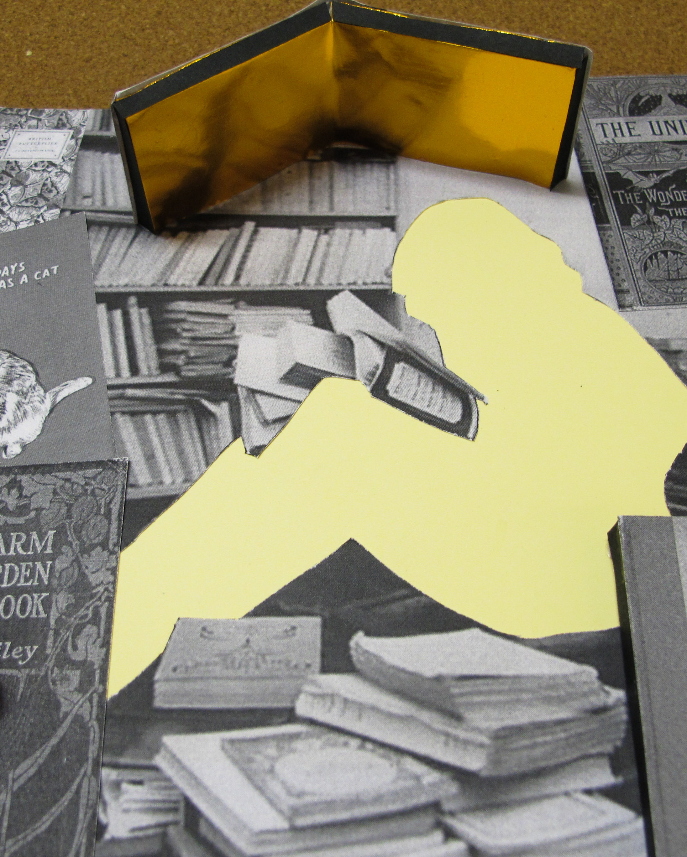


being knowledgeable is important for the future. how does one increase his/her knowledge. by books. books are important source of information that are specifically packed for everyone. it contains precious information and thus, i’ve placed gold papers in some books to show that the content are golden/precious. the book that shades the lady is giving her a ‘roof’/a protection.
light yellow shows intellect and creativity, and it adds richness and warmth too. gold means abundance and inspires knowledge.
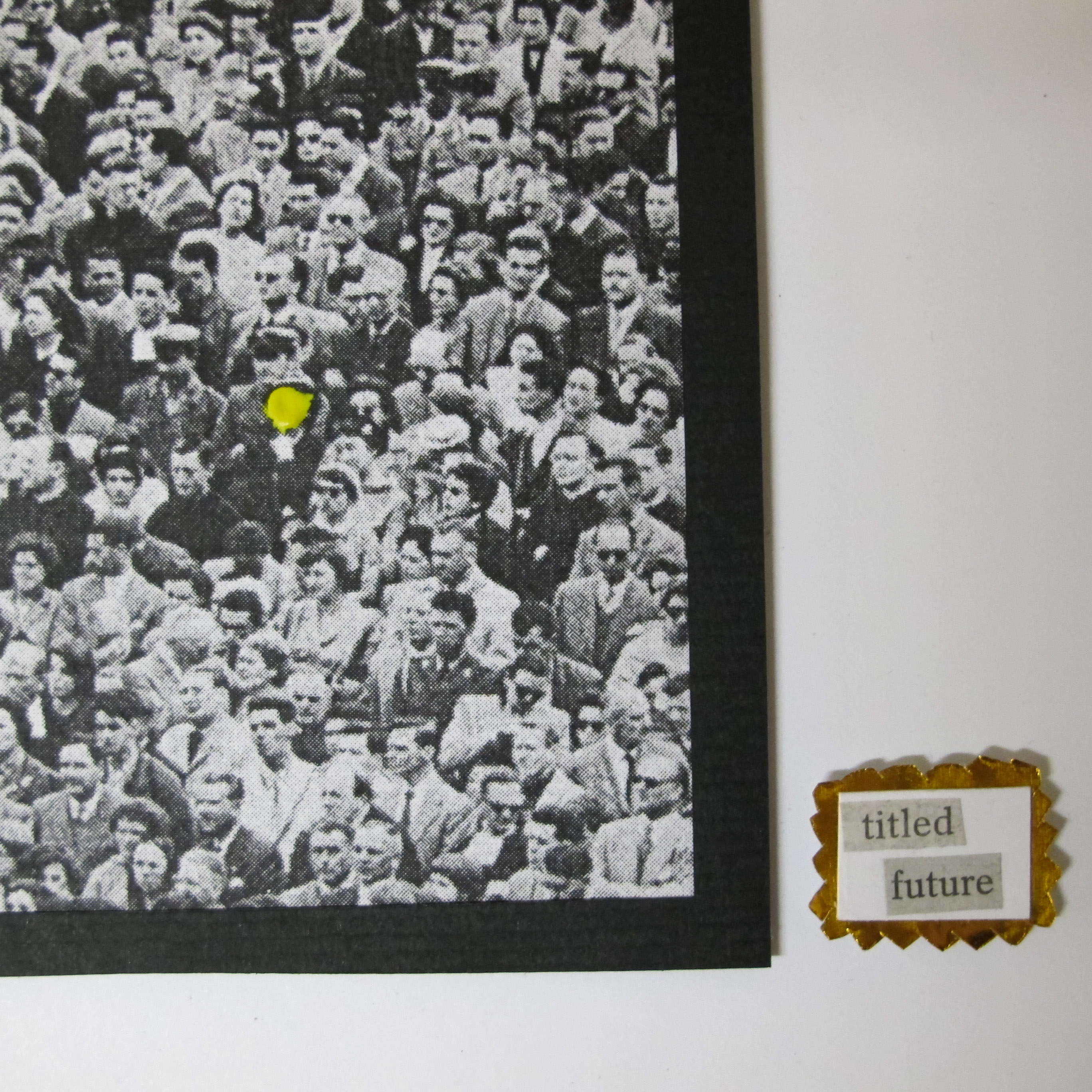
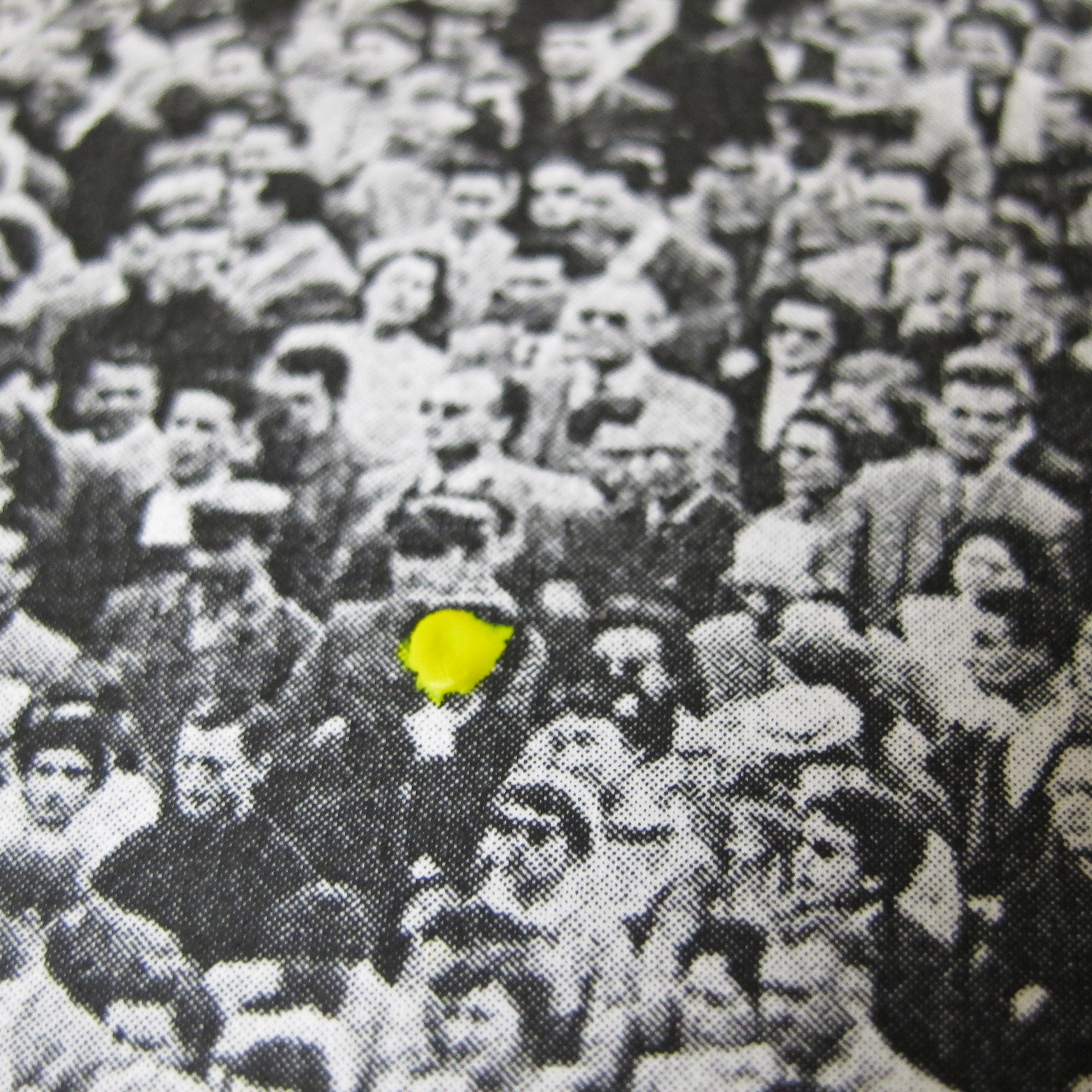
to be known for my distinct style is what i hope to achieve in 5 years time. this is of an artwork at a gallery that people are looking at. in the artwork there are so many people crammed in a photo, yet one stands out. the one who is different. the one who is coloured in bright yellow paint, yet faceless. to be known for the works i do and not just popularity is what i aim for. at the side, the small exhibit description writes titled: future, with gold embellishments. and at the bottom of the paper, i’ve attached gold confetti in a plastic that has writing on it that says “throw when it happens” as a form of celebration.
gold is related to ego and our sense of self worth, to how we feel about ourselves and how we are perceived by others.
—-
in summary, the whole process of planning every single detail, to focus on the texture and end product, to use foam tape just to allow the paper to have a pop up effect and to have a synchronised theme of everything being black and white photo and to show a clear divider of the different colour harmonies allowed me to see who i was as a person and i really enjoyed that.

—–
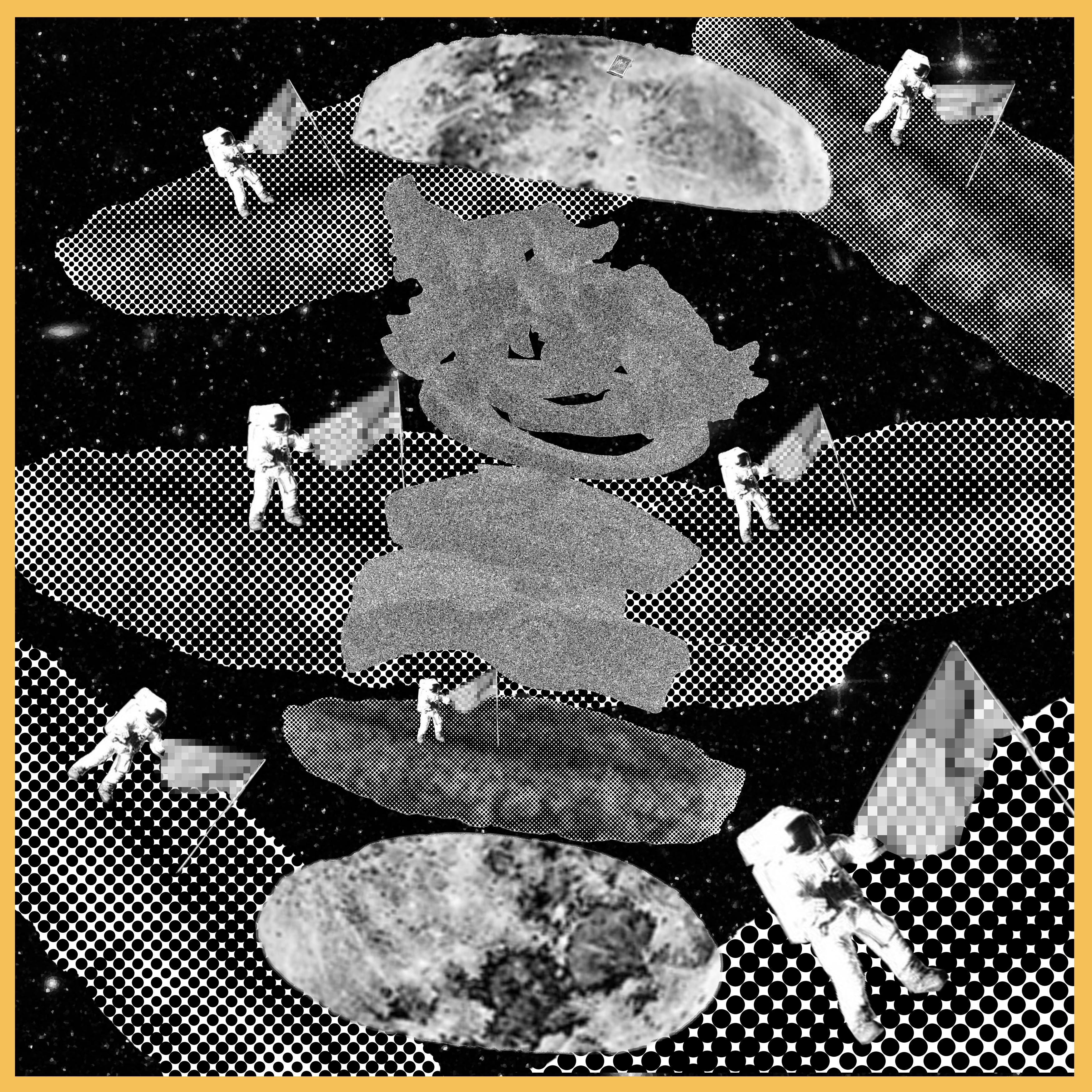
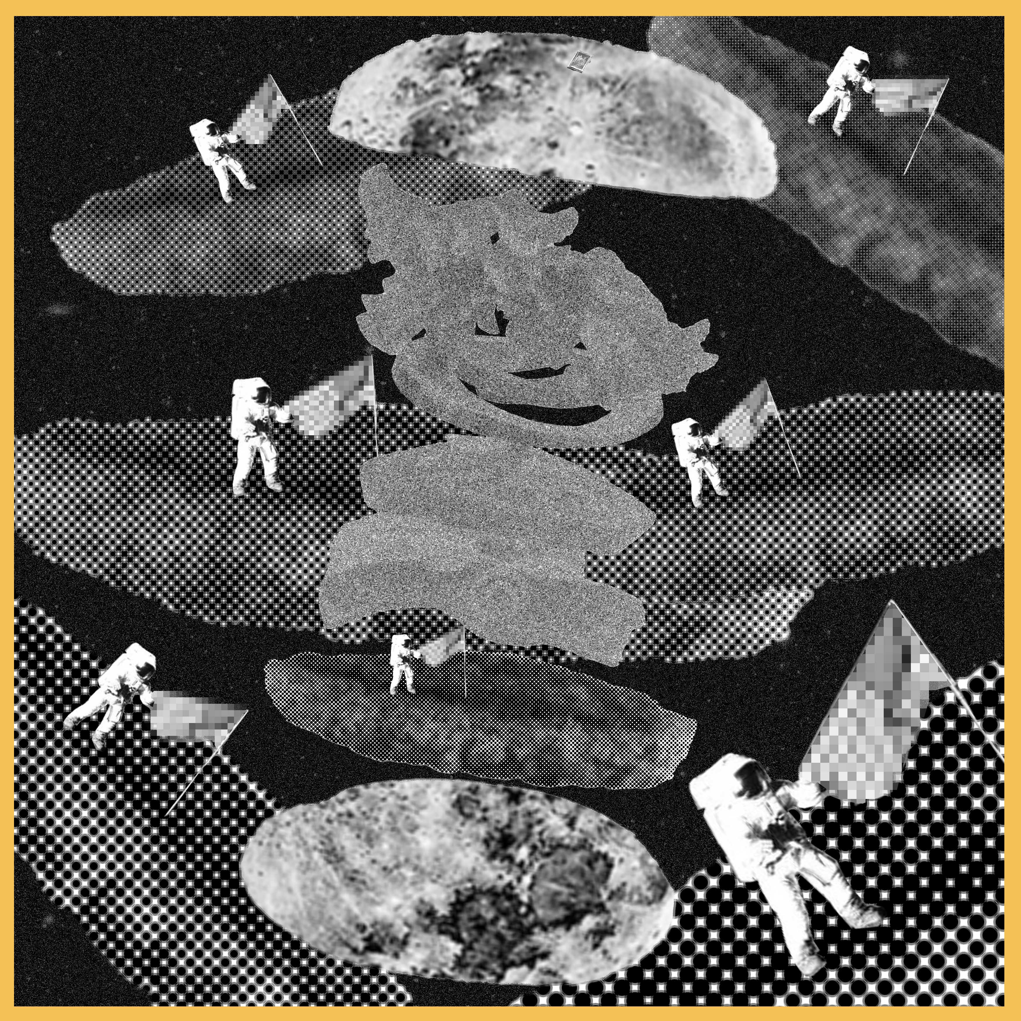
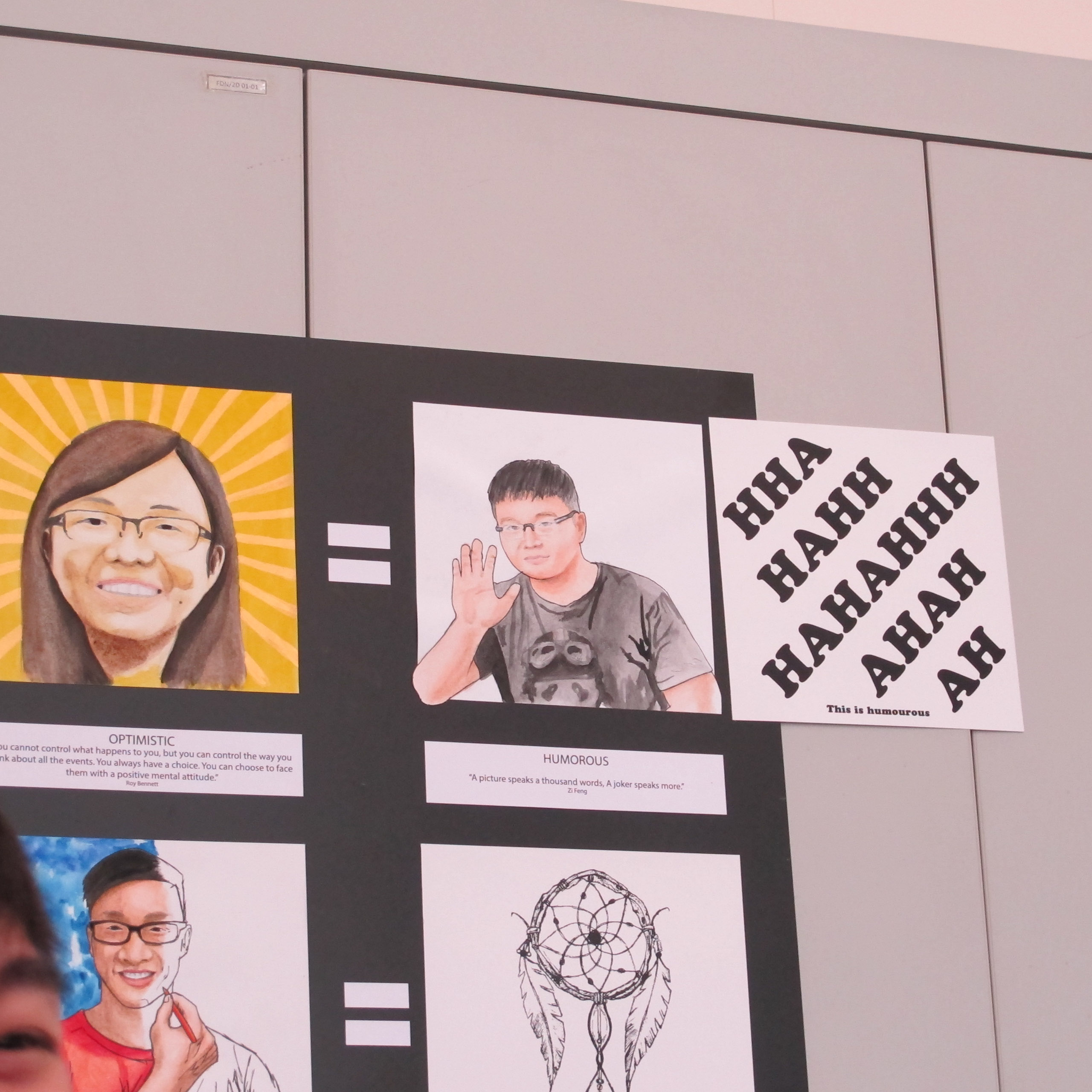
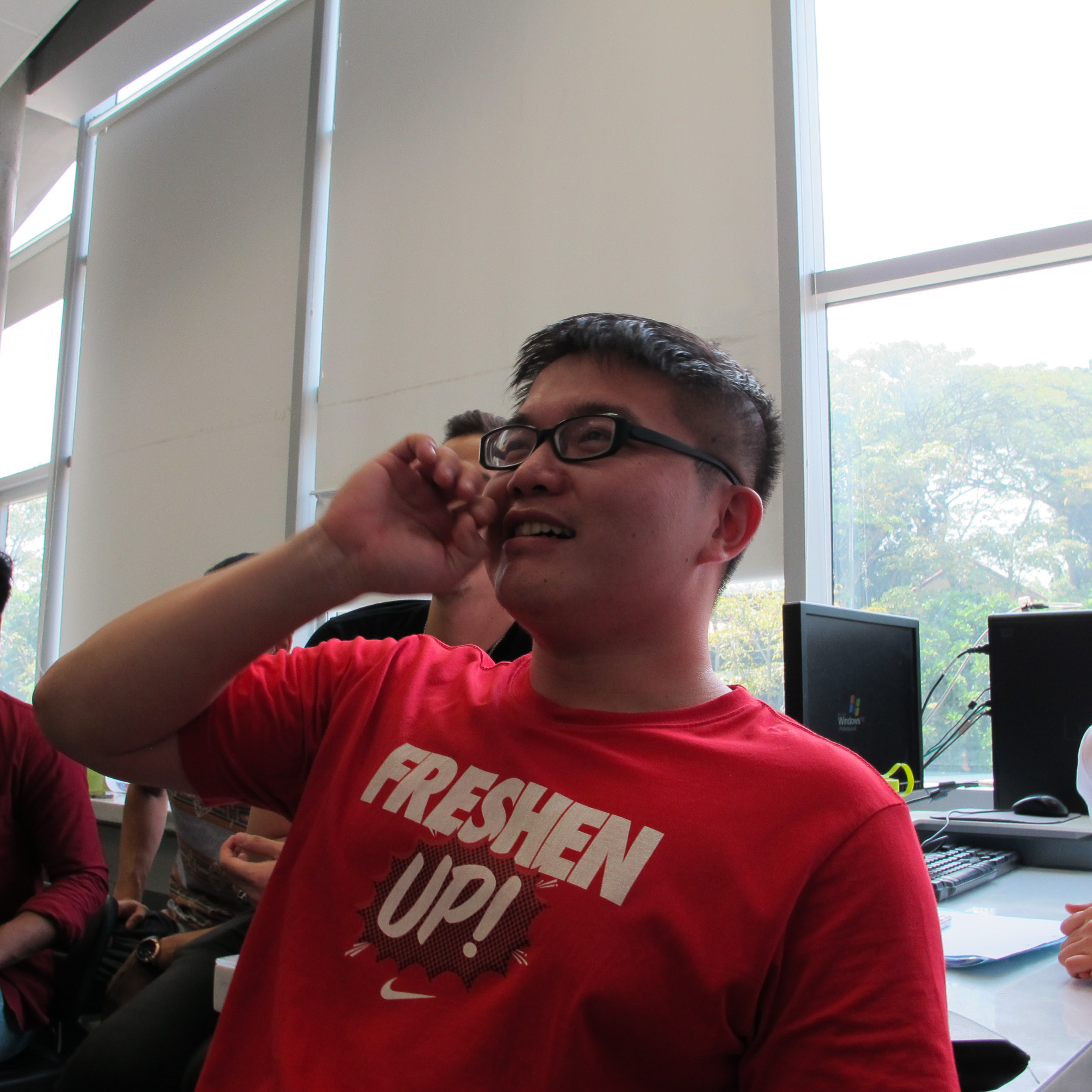
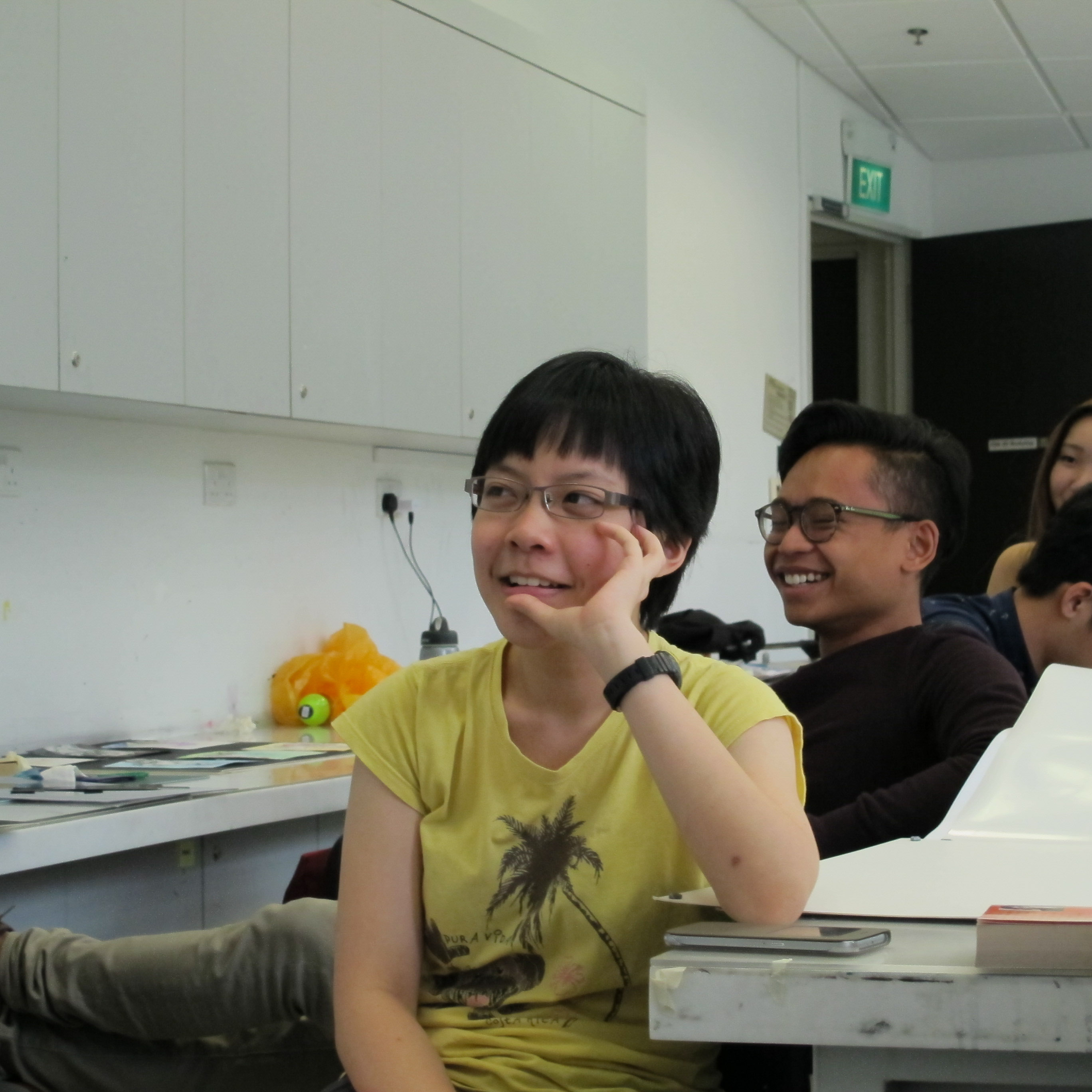
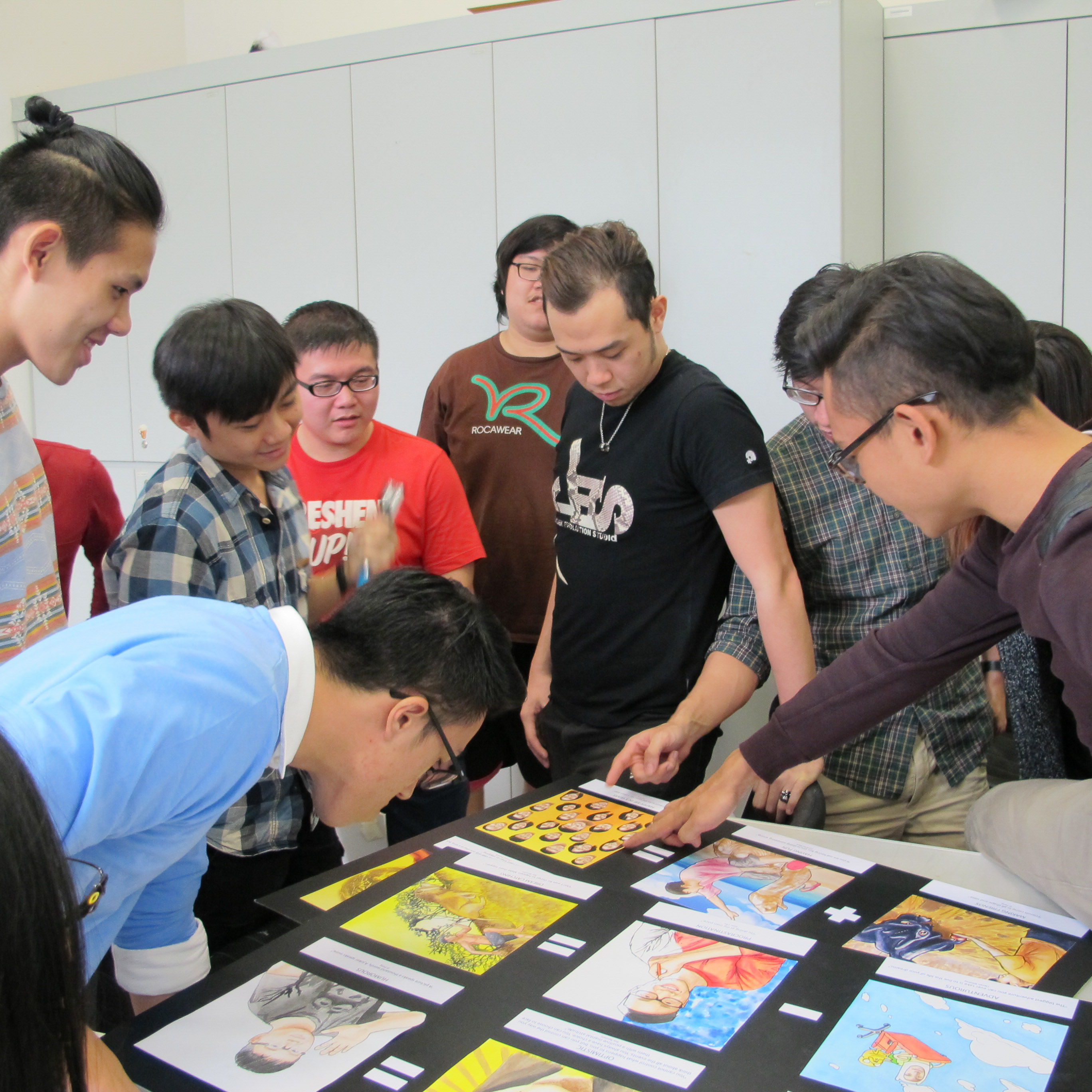
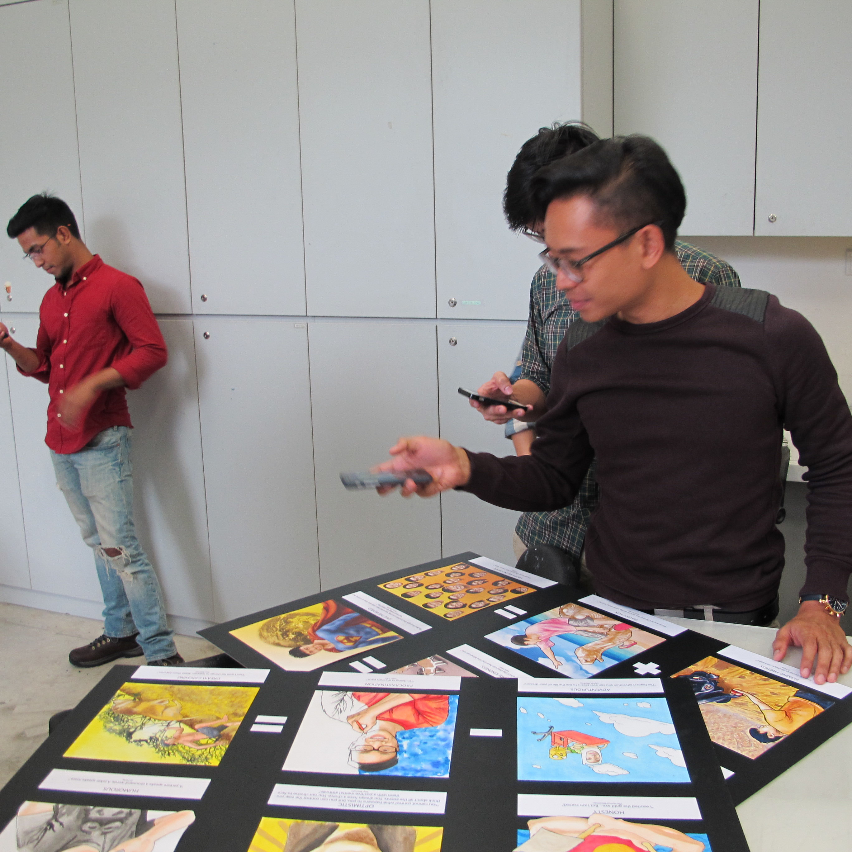
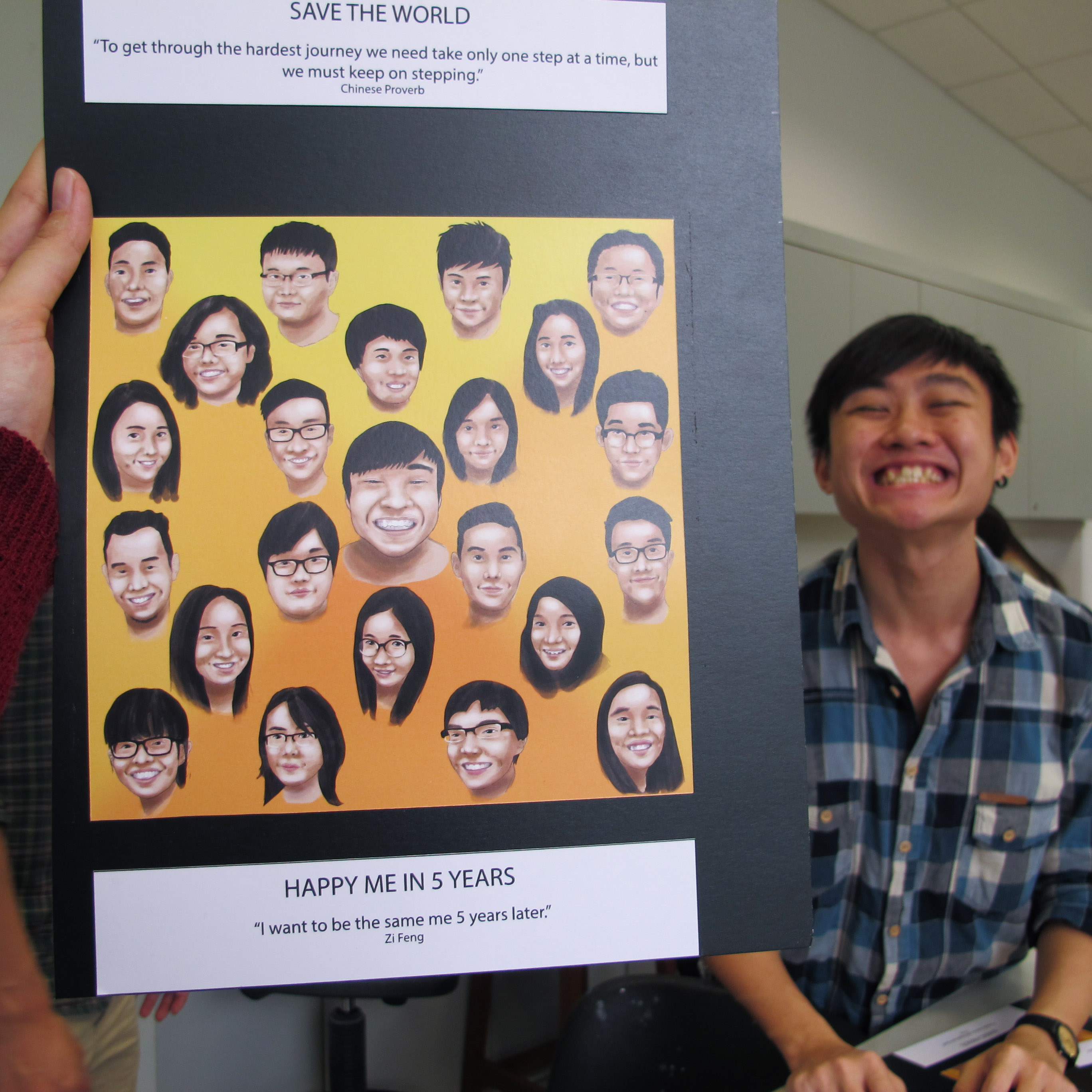
here’s some extras of the creative wind presenting his artwork and the reaction of our classmates. 🙂

with love and thanks,
munnisk


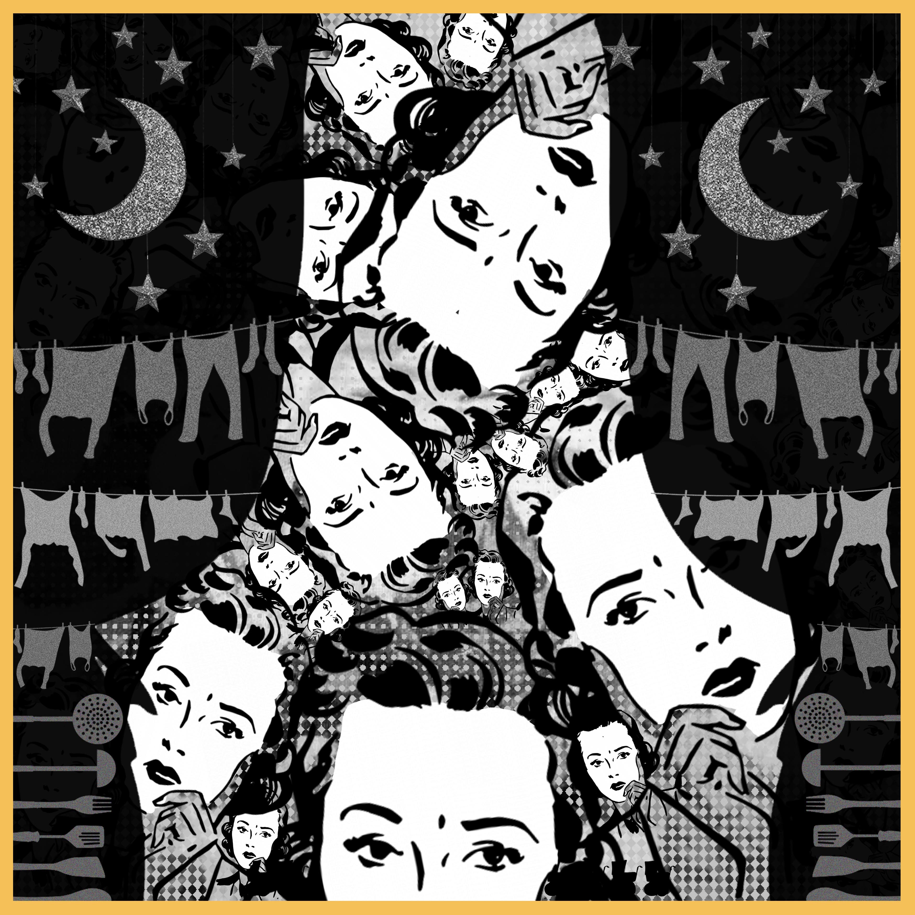
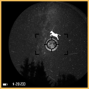 design principles: contrast in the whites of cow and the black of the camera frame
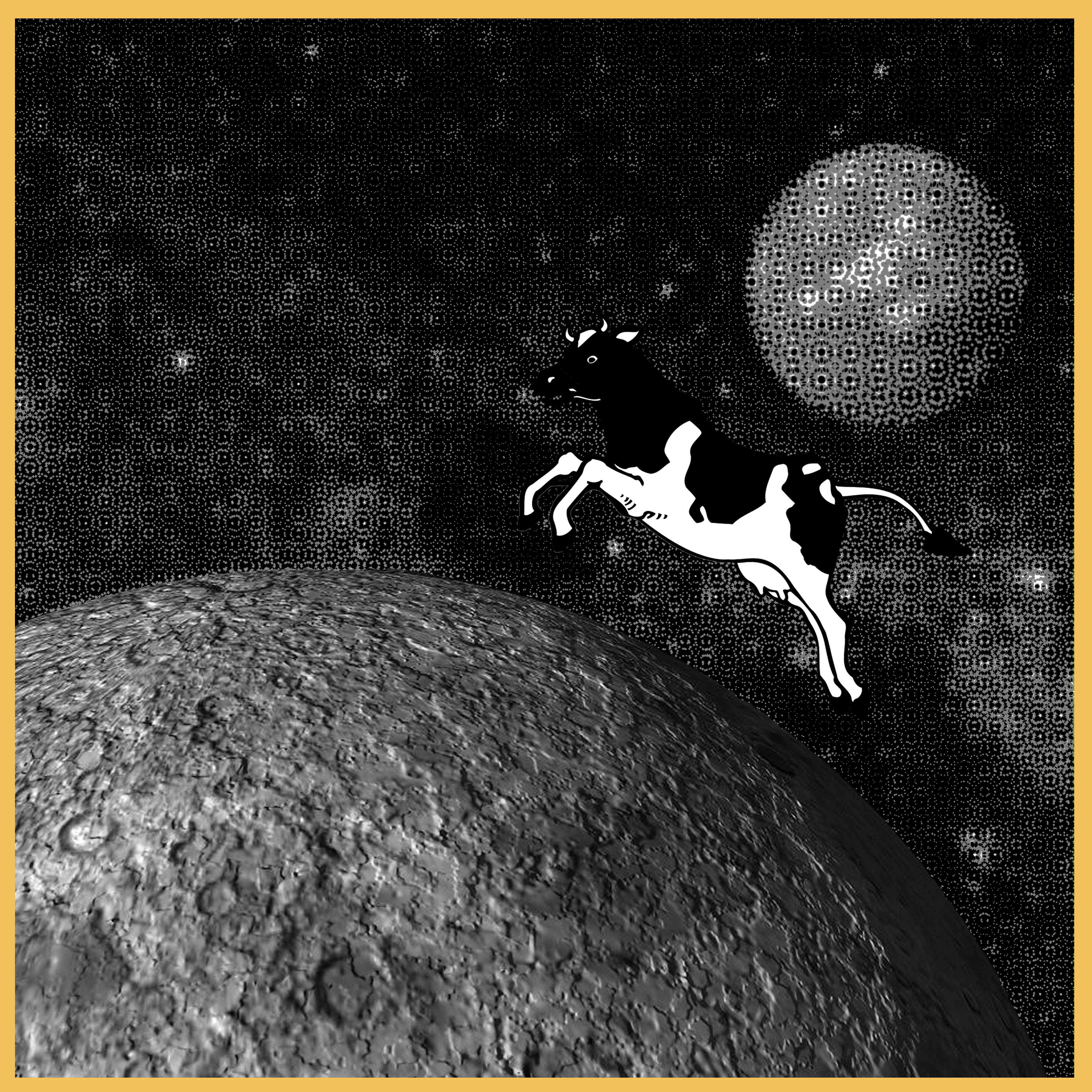
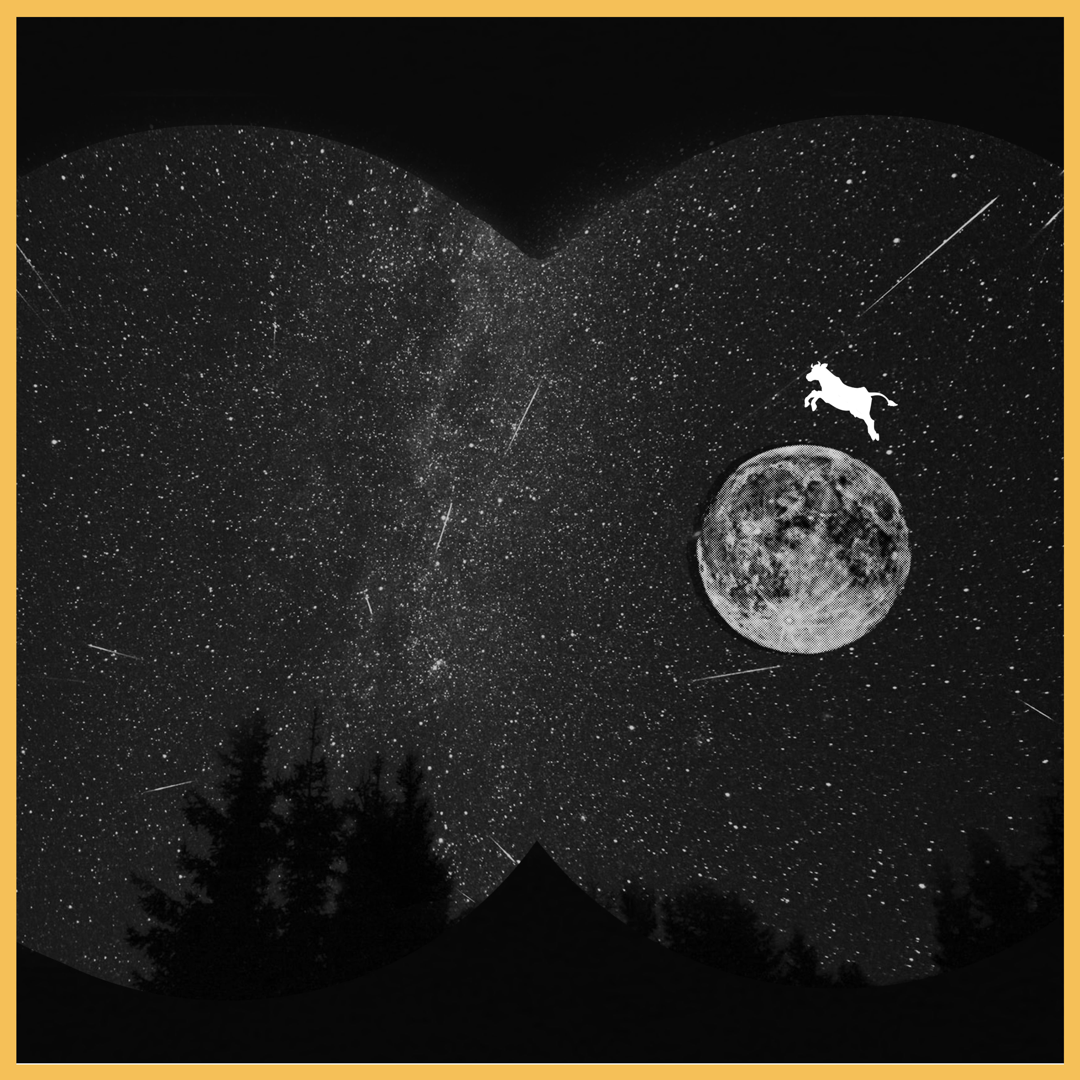
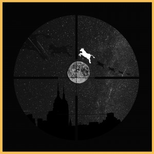 design principles: harmony, rhythm in cow, highlight of the cow, contrast in the whites of the cow compared to everything else
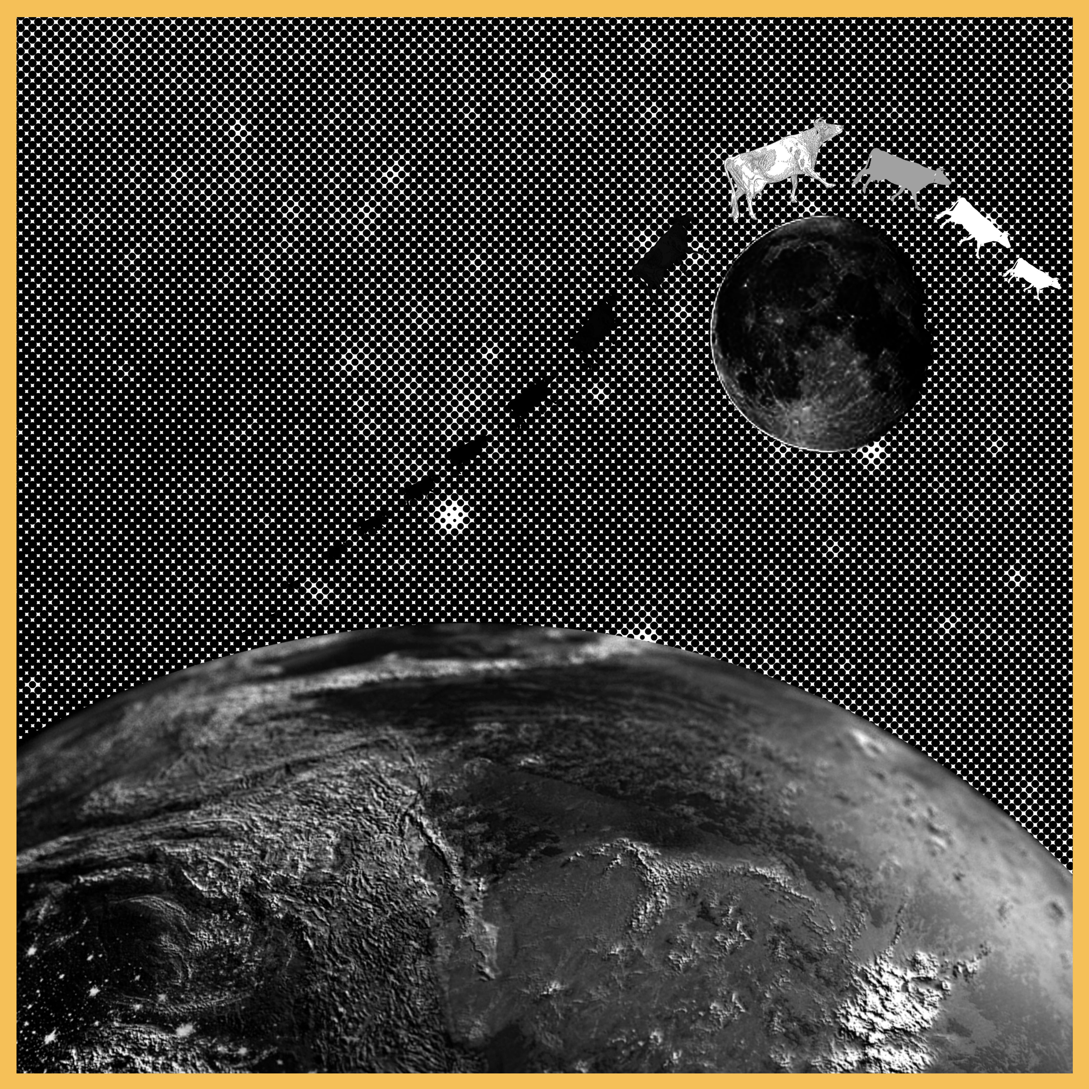
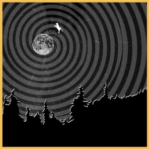 design principles: size of the cow and the moon against the swirly background, contrast of the white, grey and black
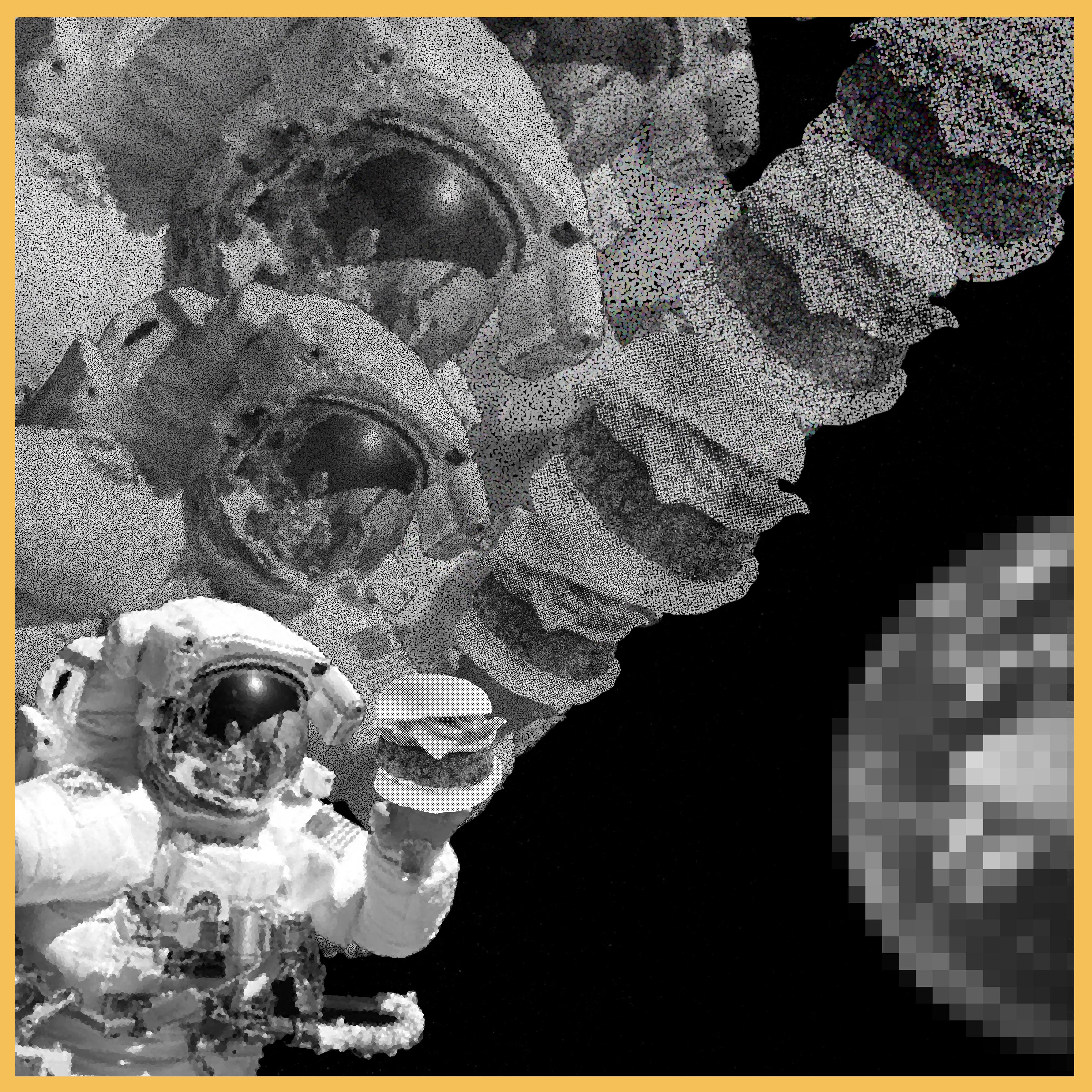
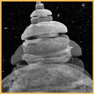 design principles: harmony, rhythm, repetition, contrast in the beef burgers
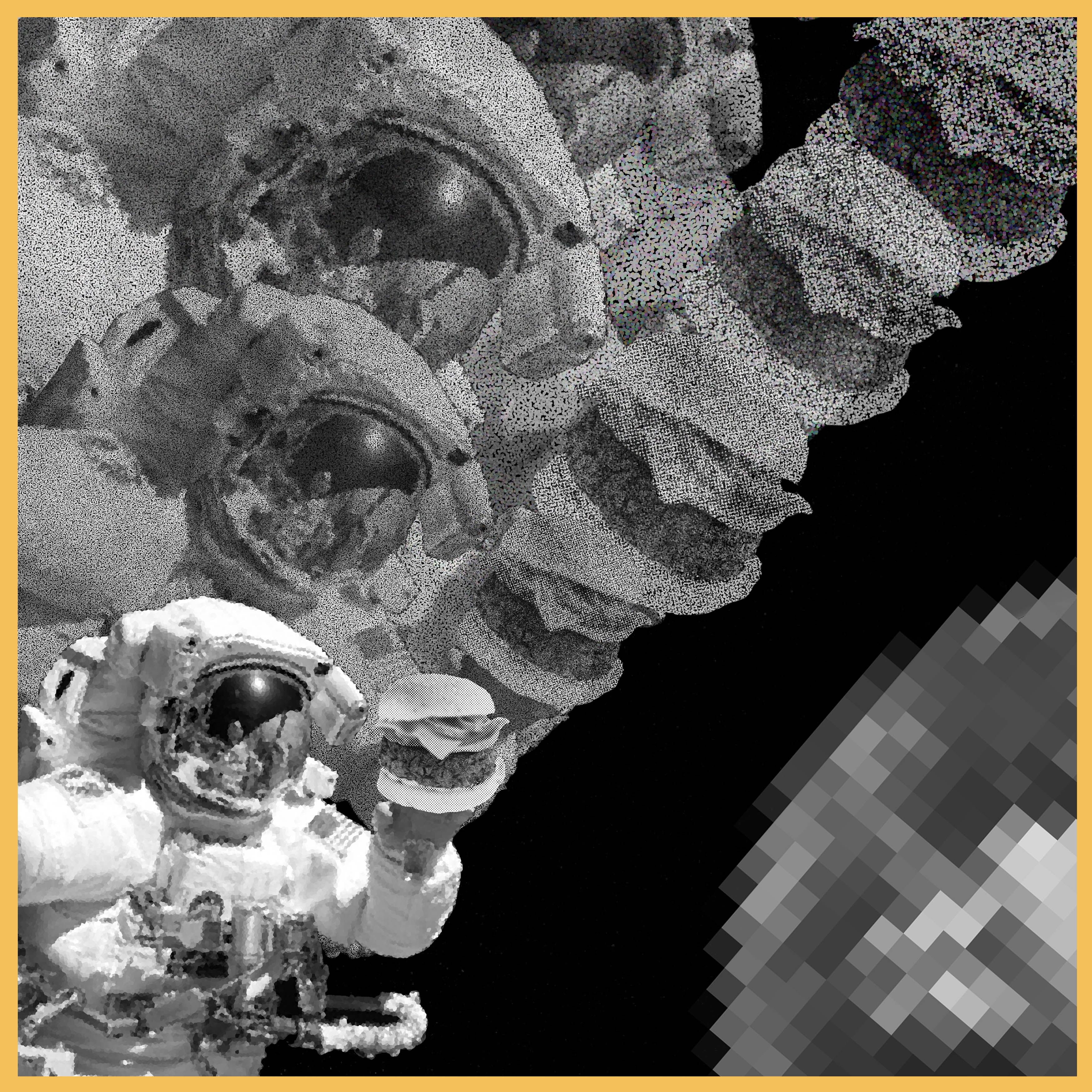
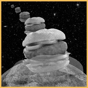 design principles: harmony, rhythm, repetition, contrast and proximity in the beef burgers