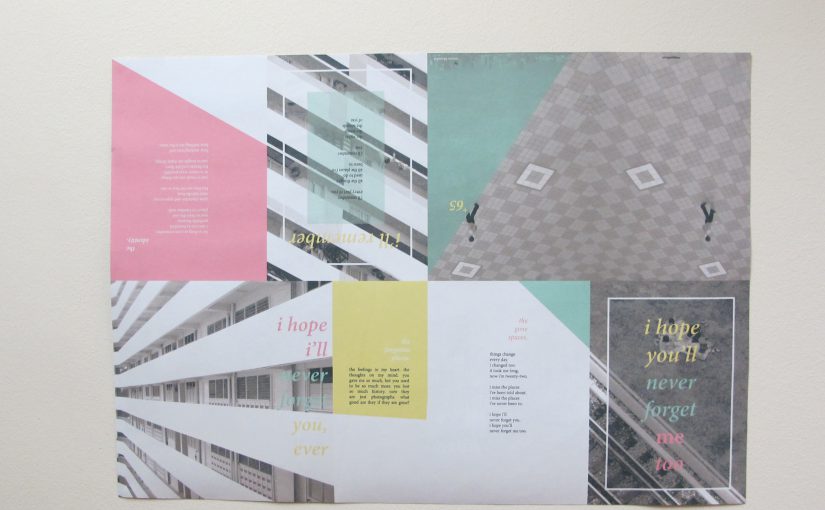
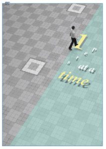
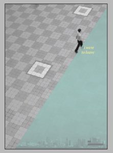
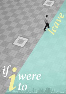
no staple 8 page mini zine
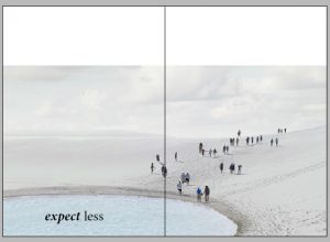
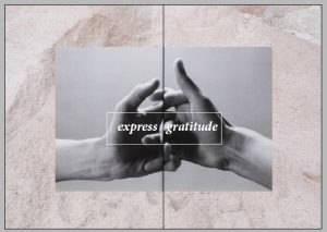
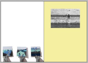
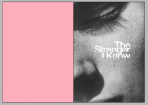
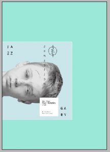
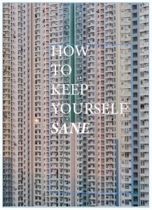
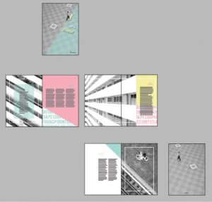
we had to choose what kind of zine we wanted to produce. a saddlestitch zine consisted of just 8 pages. a no staple 8 page mini zine allowed us to add another page at the back and only required folding
—
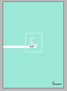
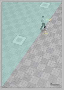
front
back
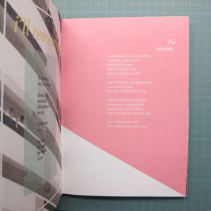
inner front cover
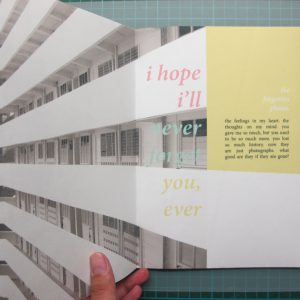
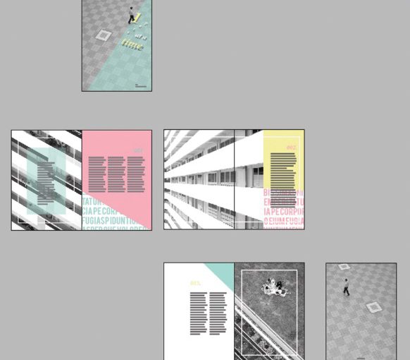
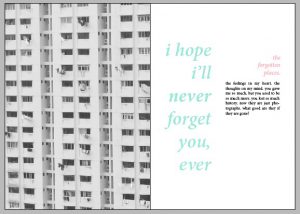
1st&2nd page
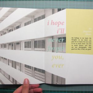
1st&2nd page
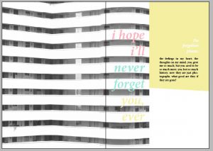
2nd&3rd page
2nd&3rd page
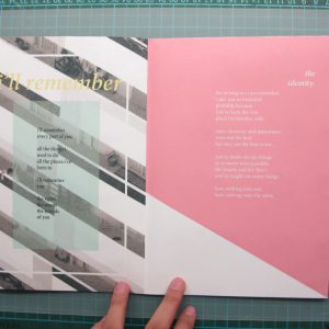
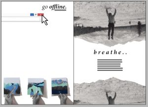
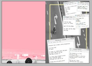
4th&5th page
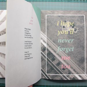
4th&5th page
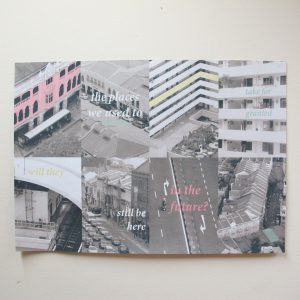
back content (A2 size)
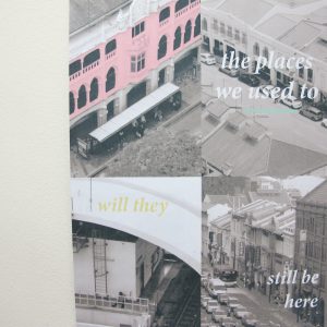

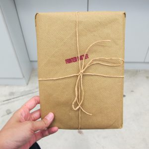
package
theme: the changes in singapore
title: +65 (singapore’s country code)
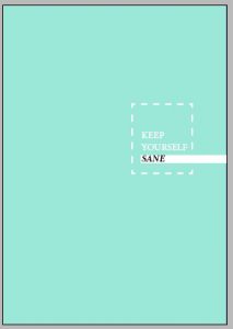
colours used: monochromatic colours and 3 pantone colours (below)
by taking away the attention from the previously coloured images, the focus now goes to the three vibrant colours in the zine. these colours are lively and easy on the eyes
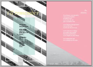
concept: to showcase slant/diagonal images, for consistency, accompanied with poems/reflections/thoughts/feelings regarding this issue. of how everything is changing and whether we will even notice when they are gone
there is a reason to why the images, the texts and the colours were placed in their current position. the bold colours, together with the image is an extension of the diagonal line of the main subject, such as the train track
the 8 images at the back page further adds on to the meaning of the first page, and are arranged in such a way that they connect to the next image
