Traces – Artist Statement and Reflection

Individual Artist Statement

The artists use videos and physical space to highlight the concerns on the Fukushima nuclear disaster. Employing the appropriation of footages and news reports on the nuclear meltdown, the artists manipulate the materials by clustering similar news reports in chronological order to recap on what happened in 2011. Drawing reference from “Don’t Follow The Wind (2015), the installation portrays a deserted Japanese home left the same as it was before the evacuation, bringing attention to the ongoing situation that the Japanese are facing. In addition, the space was decorated with overgrown plants, contrasting the relationship between mankind and nature over time.

Individual Reflections

Through this project, I enjoyed myself very much, pushing the limits of what I thought I couldn’t achieve. Initially, upon receiving the project brief, I was kind of lost as to what I was supposed to do and what I should do. As usual, Yi Wen, Debbie and I decided to work together, more brains and resources should be able to come up with something better. We all came up with various different ideas, ranging from various different mediums and topics. I wanted to create an immersive space as I felt that it is most representative of 4D, to sort of capture time and space. I felt that immersive space would appeal more to audiences also by providing a richer experience that could appeal to different senses. On the other hand, the issue was how to carry it out.

Through our brainstorming process, we then came across this issue of Fukushima, and that struck us to come up with our installation where we slowly added in the details that we wanted. We took pretty long to settle on one idea, which was quite worrying at the start. However, once we settled down on this, all three of us were quite focused on the topic and progress was pretty good.

Nonetheless, execution was definitely not a smooth journey. We basically had hiccups wherever there could possibly be a hiccup. For location booking, we went between Candy and Bharat several times, as both kept telling us to check with the other, until we finally confirmed that there are no lessons and we could book the critique room at B1-13. Then, ADM told us that we could not loan any projectors as they have loaned out everything. We tried calling other schools in NTU, but they did not allow loaning to students not taking their courses. We even went to the extreme of wanting to rent for the installation, before we finally contacted a senior who was fortunately able to help us loan from the non-foundation year side of the equipments department. This was a heart attack as without the projector, our project was so much less as the video would play a very important role. We also spent a lot of time on the set decoration, making our own partition so huge it required all three of us to move it at the same time, making a bed frame from scratch and the list goes on.

Nonetheless, the completion was so satisfying it felt sad for us to take it down after the critique. Not just me, but in fact all three of us. Our efforts could be seen through the small little details in the installation, and we had so much feels for it we felt so reluctant to take it all down after we ended. Personally, I felt that this was a really enriching experience. I never thought that we, or maybe just me, could achieve something like that. I never thought we could really come up with a well-done installation like how we see them when professional artists do it. Although far from being perfect, I was really amazed at what the three of us had achieved. This was definitely the fruit of our effort and this team effort truly cannot be expressed through words. I am so glad to be able to work so well with this two other girls, to come up with something that we couldn’t have achieved without the effort of every single one of us.

This project had really pushed the limits of myself, allowing me to come up with the installation that I felt was impossible from the start of the semester when we were first told about installations. Though there were some mishaps along the way, overall i enjoyed this project a lot. I have definitely benefited from this than I thought I would. If I, or we, had more time and resources, I am sure our teamwork and effort can make this installation even more perfect, working on the flaws stated during the critique session.

Zine

In this project, we design a printed document, a zine, that we can showcase almost anything we want to, from past works to photography. For me, I chose to display some of my preferred works, ranging from digital works done in 2D modules, to painting done for Foundation Drawing, and even works done before ADM life started.

Initially, my idea was to come up with something like a catalog for a gallery, something clean and classy and minimalist. I also considered to make the entire zine in monochrome, showcasing only my works done in black and white, to further enhance the idea of minimalist and classy. I went to check out several designs, in particular from Apple and Samsung, two big technological giants well known to have been producing classy and sleek gadgets like the Apple iPhone, iPad, or the Samsung Galaxy series.

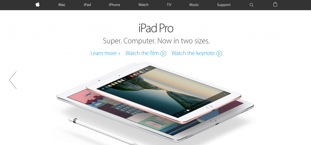
The Apple website
The Apple website
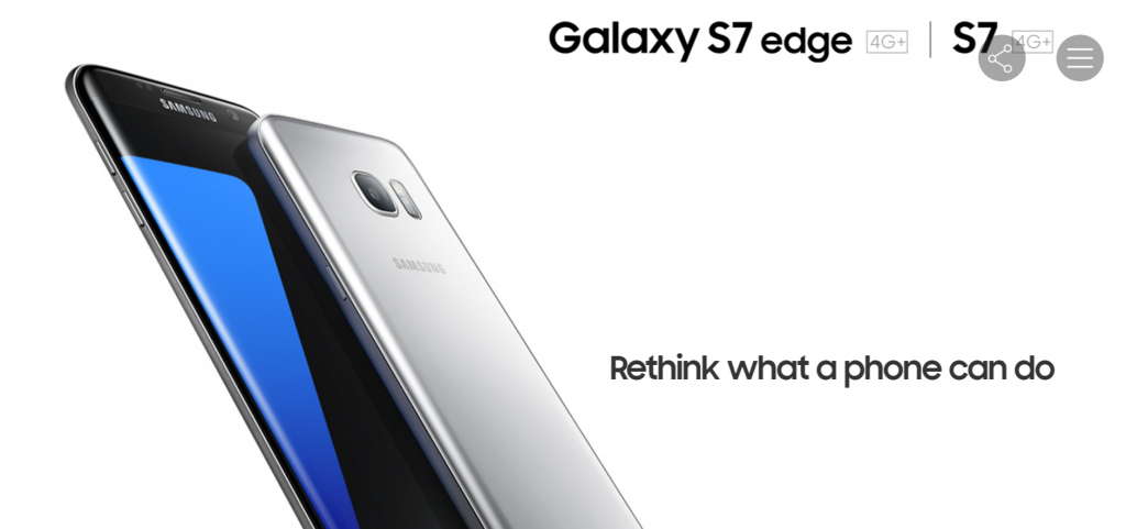
The Samsung website
The Samsung website

I found out that both Apple and Samsung made their website very classy in similar ways. First, it was the plain white background with very simplistic font, that makes the entire composition very clean and sharp. Next, the subjects – the gadgets and phones, were very precisely trimmed and placed in place with sufficient empty space, to make the subject stand out and have enough empty space to accentuate their elegance and class. However, this point might not be applicable to my design as my subjects were not 3D objects, and tend to have a background, making such cropping inapplicable. Nonetheless, this was a good start in understanding how to compose my “clean” and “classy” zine.

I also researched on the websites of the National Design Centre, and National Museum of Singapore, since I wanted my zine to look like a catalog for a gallery or exhibition, thus this two might be a good platform that is more relevant to my design.

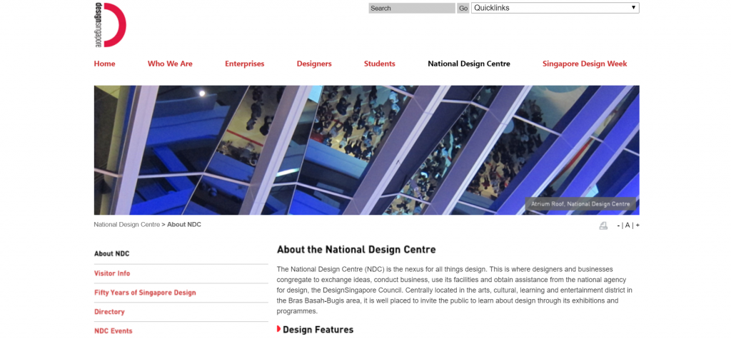
The National Design Centre website
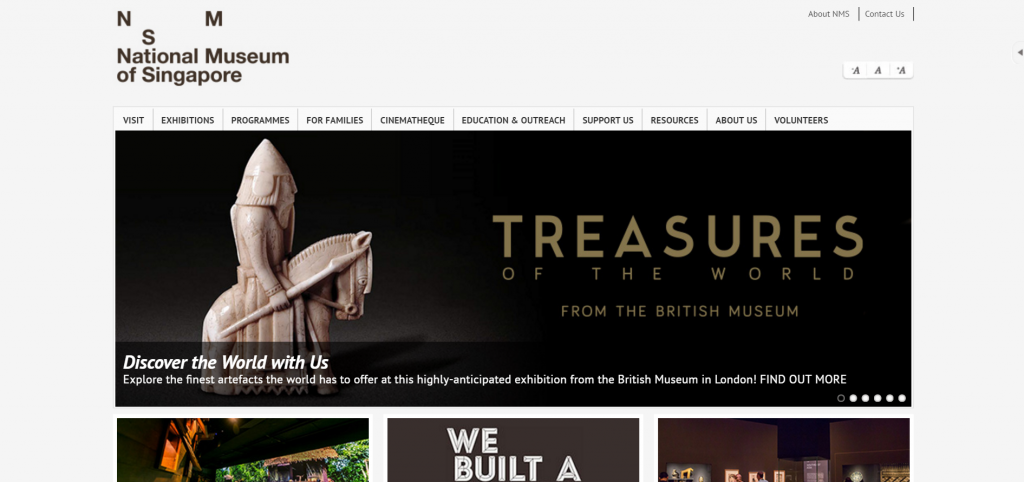
The National Museum of Singapore website

SImilar to Apple and Samsung, they had very plain and light coloured background, which looks clean and classy. Both website also uses very plain fonts, with very neat and orderly arrangement of their elements. I noticed that the logos of this two websites were slightly more unique, with the logo of the National Design Centre incorporating words into part of the logo, and the asymmetrical arrangement of NMS for the National Museum. I thought through how I could incorporate English into Chinese strokes for my cover page, but ultimately giving up the idea to keep things very minimalist. I also decided to use asymmetrical arrangement in some of my layout, similar to the National Museum logo and also in line with a design principle, which talks about repetition and something out of the norm to draw attention.

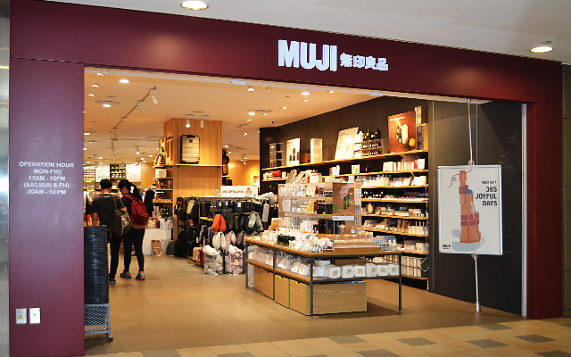
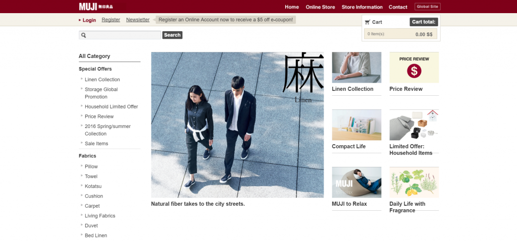
While shopping, I chanced upon another idea for my zine, after seeing how MUJI, a japanese shop actually has a very calm and “zen” feeling to it. This was another direction I could go for! With shopping physically there and going online to their website, I found out I like their design quite a lot.

The MUJI shop
The MUJI shop
The MUJI website
The MUJI website

MUJI typically uses 2 colours in their entire theme – a dark red, and a light brown. These colours worked well together to give a warm, cosy and comfortable feeling, yet not compromising on its elegance and class. I also like how they use a single Chinese / Japanese word to classify and label their products. I felt that this could be a possible way to classify my works. Slowly, I decided to move my design towards a “MUJI” feel, a slightly more Japanese, cosy and comfortable design, tied in with the classy and spacious feeling of Apple and Samsung.

With these in mind, I started looking through my past works and sieved out some of the better ones that I would like to showcase in my zine. These included 2D projects since semester one like Lines, Rhymes, Ego, Point of View, and also drawings and paintings in both wet and dry mediums, from my portfolio and Foundation Drawing module.

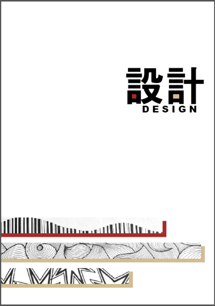
Here is how my zine looks like, as a finalised printout, in page order (borders are only here to define the area printed due to white background):
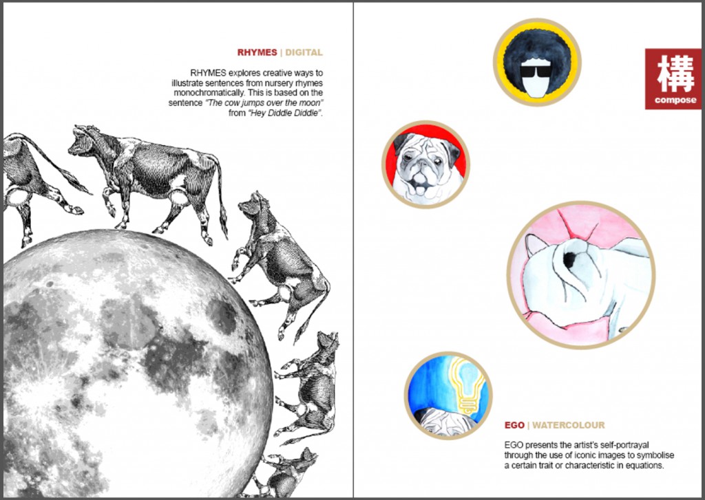
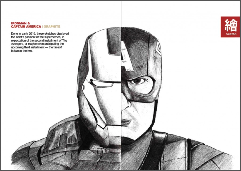
Page 1Page 2-3Page 4-5Page 6-7Page 8I made use of the dark red and light brown colour combination as a main theme for my zine, giving a warm and comfortable tone due to their warm nature. I then used the “one chinese word” element from MUJI, which in my case, i chose to find them in Japanese. I translated the words I wanted into Japanese on google translate, and tried to use those that could be in Chinese characters, particularly, traditional Chinese characters. The existence of these words in both Japanese and traditional Chinese seemed like a good match to me, as it ties in well with the Japanese style I wanted, and also understandable in Chinese to most locals. As such, I categorised my pages according to a defining type they belong to, namely “composition”, “sketch” and “colour”, which translates to 结() or ()造, ()画, and 色(). I then named the entire zine as 设计, or Sekkei in Japanese, meaning design.

On the cover page, the title was along one-third of the layout, while the “Lines” strips were started at the two-third in response to the rule of thirds. The word “design” and the strips were also slightly misplaced left / right to eliminate symmetry. I also added my two main colours into the Chinese words which had similar strokes on one side. The shadows of the strips were also in the same colour, and given that order to not have symmetry as well.

On the second page onwards, the dark red was used as the titles to the works, as it was more eye-catching, while the light brown subtly tells of what medium the work was done in. On the right hand side of every spread, there would be a dark red tab to tell of the category of the works, similar to the one-character design of MUJI. The second page shows the “Rhymes” composition being cropped out and taking a large portion of the page, similar to the design idea of Apple and Samsung.

On the third page, the “Ego” composition was arranged in a asymmetrical way similar to the logo of the National Museum, and the shapes were all round. This gives repetition and something out of the norm based on arrangement and size. The arrangement and size different also brings in something of interest to catch the audience’s attention, and provides more movement in the layout.

On page four and five, the two sketches merges to form “one” person, which I felt was an interesting way to display these two different but similarly styled sketches, especially when these two superheroes are going to face-off in an upcoming movie, Captain America – Civil War. There was also an emphasis on white spaces around them, with entirely nothing else apart from the caption, to bring full attention to the work done.

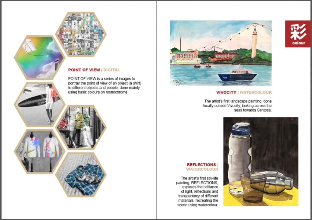
On page six, the hexagons work together with little gaps in between to show a coherent composition like a bee hive. then, one piece is removed from the composition to have an interesting point, and I felt that the area was just nice to insert the captions, giving the whole page a clean and neat arrangement without being too boring.

On page seven, the two paintings are misaligned such that the top painting seems to hang over the bottom one, having a cantilevered position gives it movement to make the composition interesting.

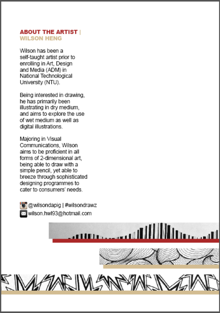
The back cover shows the extension of the strips from the front cover, as well as details about myself, to give more information and context of what the works are about and who the artist is. Social contacts are also provided so that interested audience could view more works and even contact the artist for queries or request for works.

With this, the zine is completed! I personally found it quite interesting to carry out this project, to look through all the works I have done, bringing back all the good (and bad) memories as well as reflecting back to see progress and improvements, and changes in style over time. It was also interesting to try to understand how to make the layout interesting and make everything aesthetically pleasing, to both the audience and myself.