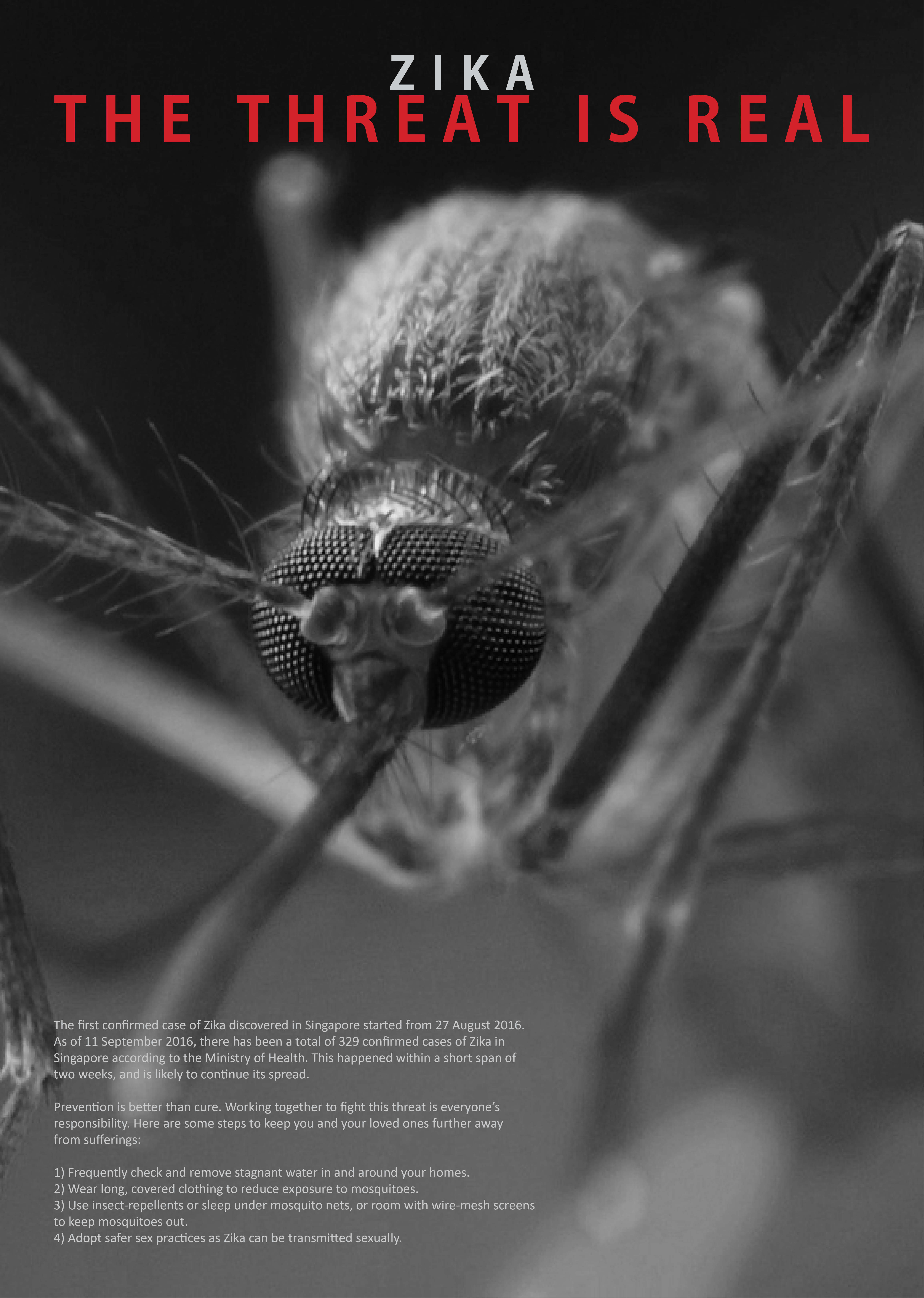
Moving onto the final artwork of this project, I have chosen to stick to the design with a mosquito looking forward at the viewer.
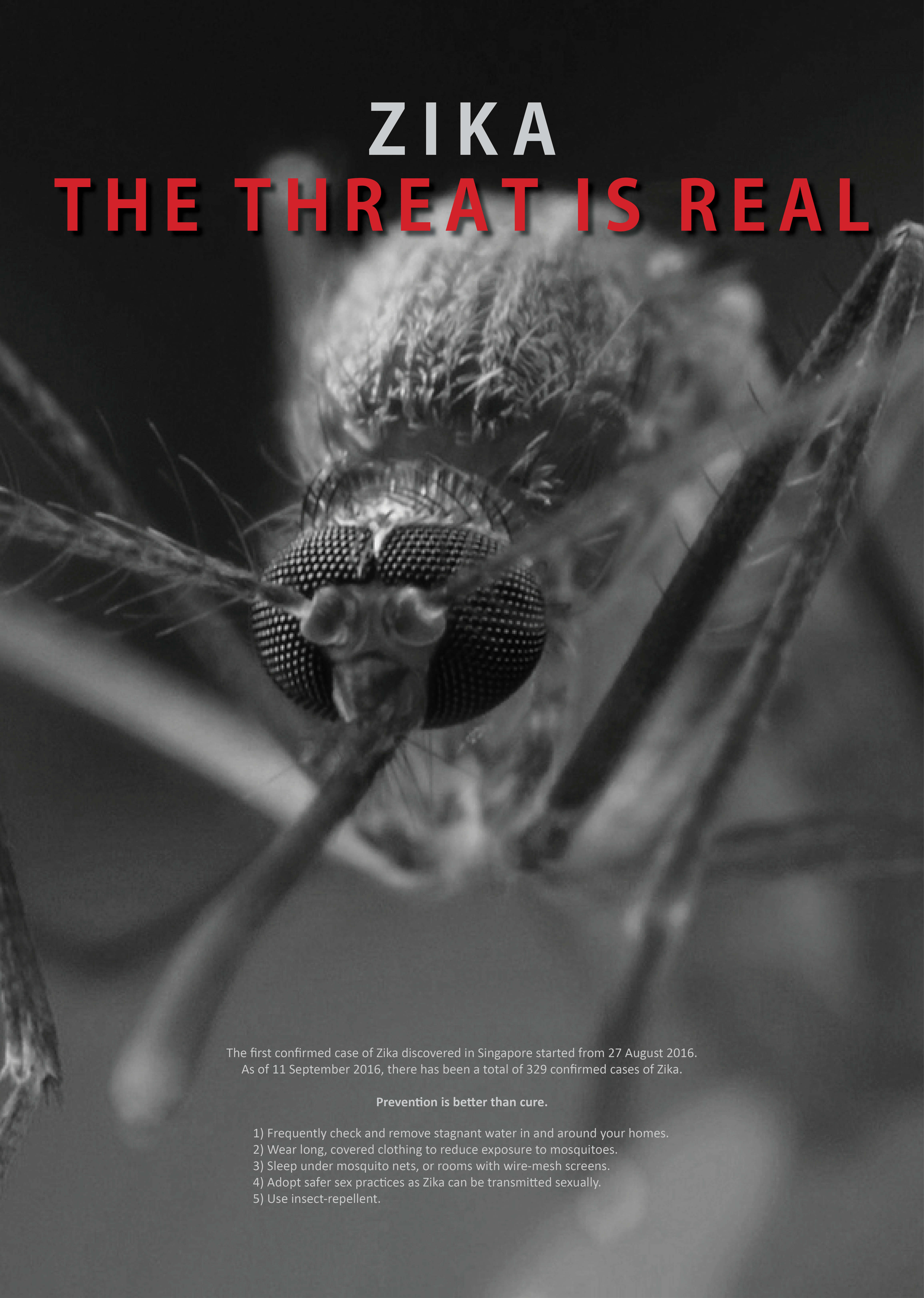
There are some minor tweaks introduced to reduce the amount of words in the body text as it seems kind of chunky which viewers might not want to read it, adjusting the position of the body text, changing the size and position of the title text at the top of the poster as well. Adding a drop shadow to the words in red at the top also helped to push the punchline forward, making it clearer and more impactful. This was because when we did a black and white mockup I realised that the red and the grey behind it were similar in tonal value, despite the difference in colors.
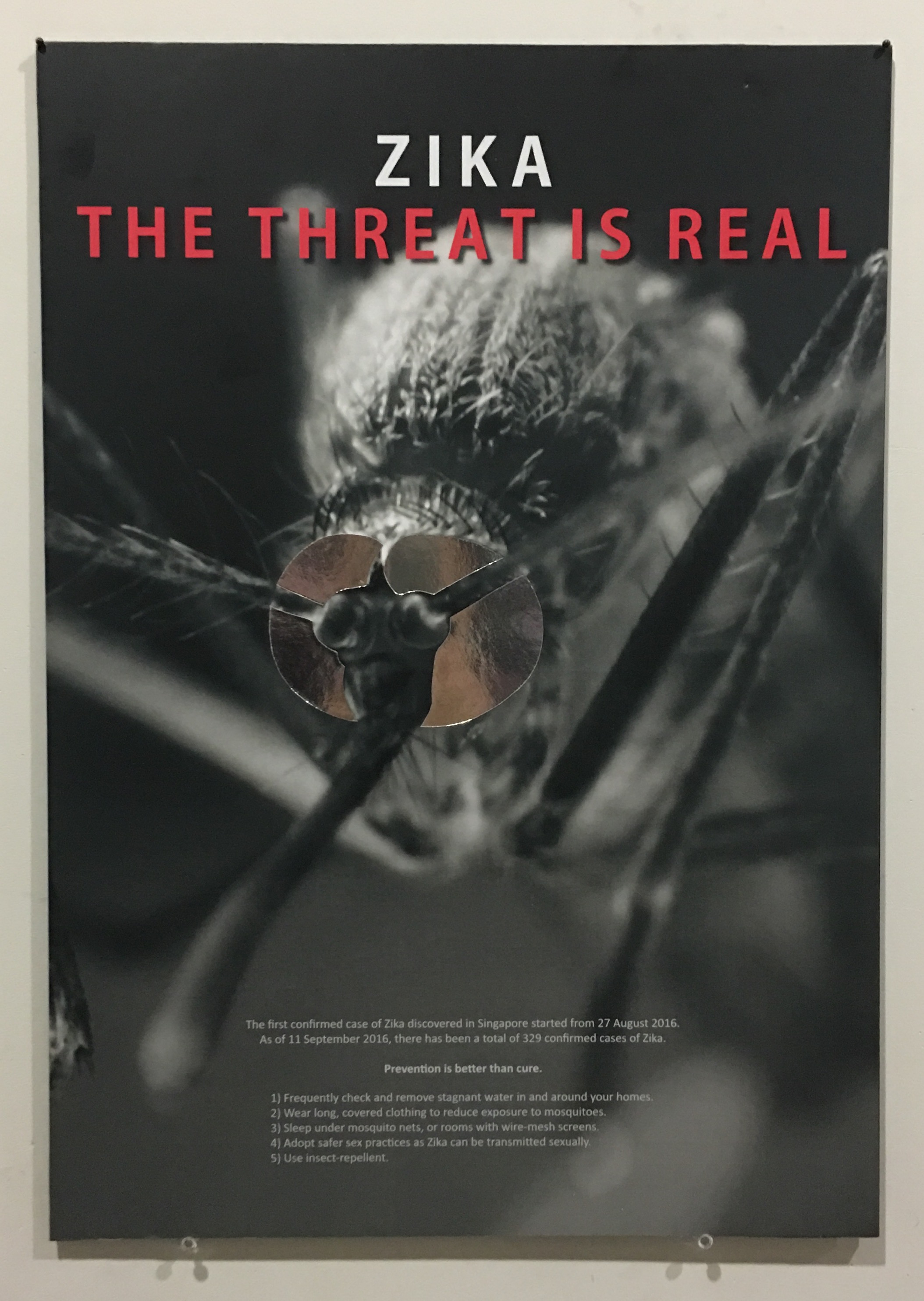
After printing, I traced and cut out silver reflective paper to stick over the eyes of the mosquito as suggested previously. This helps to enhance the context of the mosquito targeting the viewers and makes the poster more interesting as majority of it was in monochrome. Silver also gave it a touch of mystery and seductiveness, on top of the mirror effect intended.
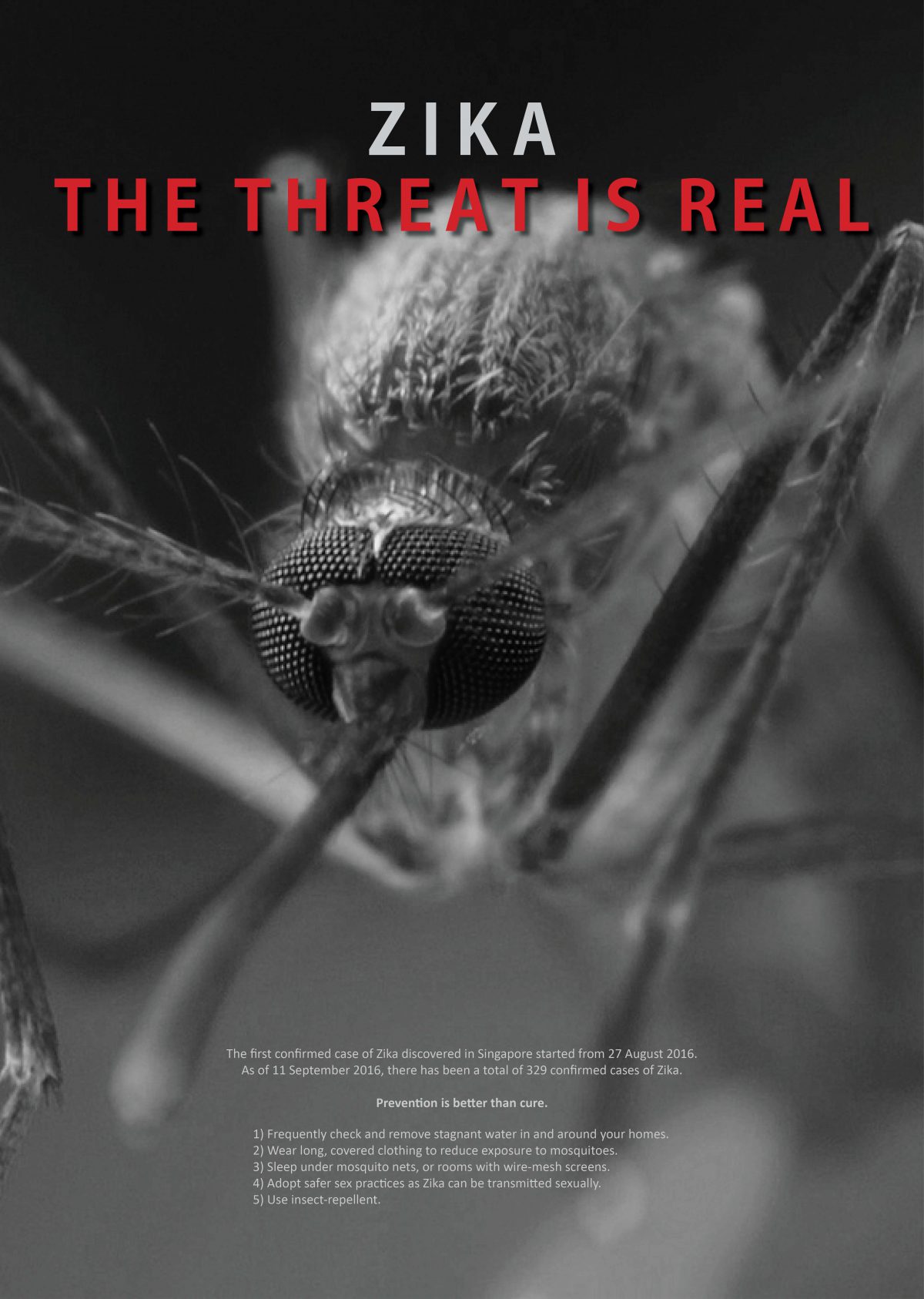
I also decided to mount it on a black foamboard that I bought and mounted manually instead of mounting it on a white one done by the printing shop as my entire design is in black. Although looking from the front, it would not be obvious, it ultimately affects the overall harmony of the poster physically, thus I feel that a black foam board would be a lot more suitable for this poster. Below shows a recap of the previous design, followed by my final design and the physical poster itself!