Moving forward based on the feedback given for the previous designs, I have did some minor tweaks to the exterior to try to enhance the link and flow from the exterior to the interior.


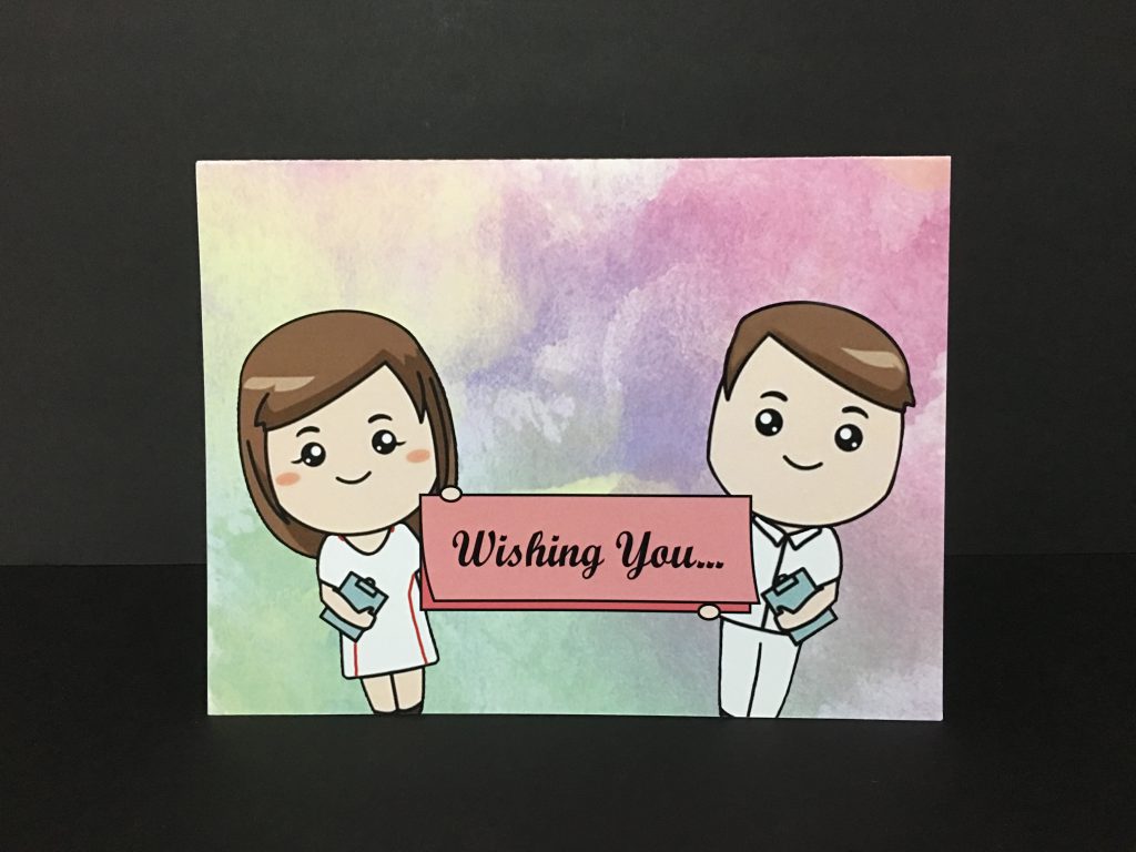
On the front cover, the two nurses have been tilted to give abit more dynamism and movement, making it seem more lively and also enlarged to cover more space. The words “speedy recovery” was removed as it might not have been a good idea to repeat “speedy recovery” and “get well soon”, being too repetitive. In place of it, I used “wishing you…” such that it provides an entry to continue reading on inside the card. The words are also anchored down on a card held by the nurses, in a similar format as the physical card to make links with the physical form itself. The background was then chosen to be the same as the interior to have the visual link and consistency.
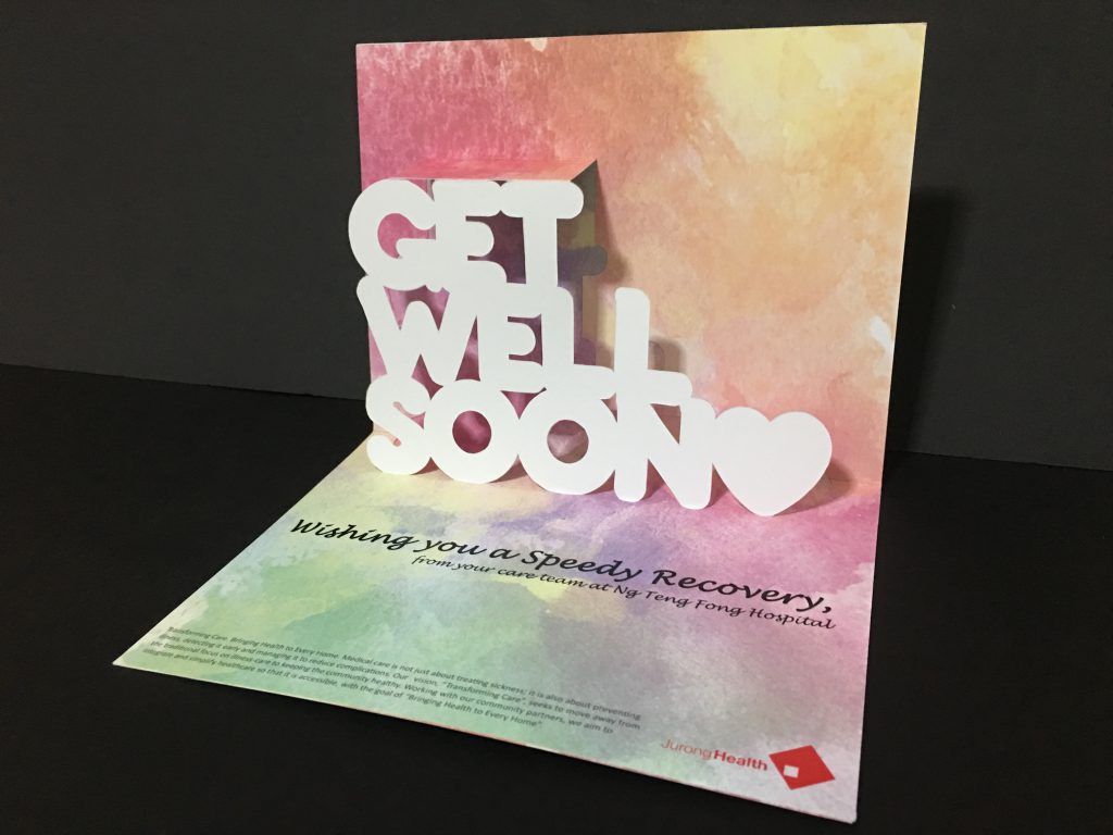
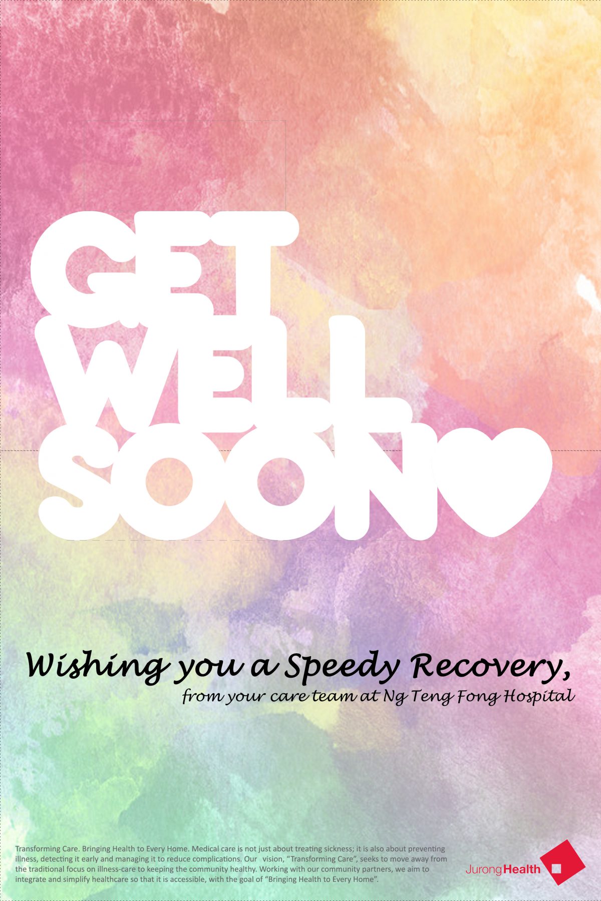
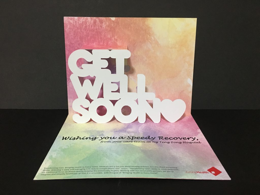
Nonetheless, there were some other flaws noticed during the critique session and would be great to be resolved if given more time. On the exterior, everything seems to flushed downwards and there is an awkward empty space on top – would be good to trim down the card to reduce this empty space and make it more balanced; and I personally feel that trimming this card down would make it a slimmer rectangle, which is less bulky and might look more sleek and classy as well, also the pop-up will have to shrink accordingly. Alternatively, since it seems like a “celebration” thrown by the nurses, there could be some banners or decorations in the place of the empty space on top. To further strengthen the visual link from the exterior to interior, there could be repetition of the nurses or simply just one inside, probably beside the pop-up, to make use of the empty space and also provide more “liveliness”. Some other suggestions included the use of colors, such as making the “heart” on the pop-up red so that it catches the attention of viewers and make it less flat and plain, and also to consider changing the “purplish” patch near the bottom right as it seems grey to some.
Overall, this assignment was probably the one that I enjoyed the most as i really do enjoy making things with my hands, watching and feeling how they change and come to life, and not just fully digital. The various explorations within this module has also allowed me to learn new things, both technically and also about myself along the way. With this, we conclude the end of the module and… HOLIDAYS, HERE I COME!!

