
For the final output, I decided to shrink the book down to a notebook size of A5 rather than a foolscap pad. This will ensure it still goes in line with the office setting to depict a paper source used for meeting notes, yet reduce the problem of having to much empty spaces and also make the overall look more polished and finished.
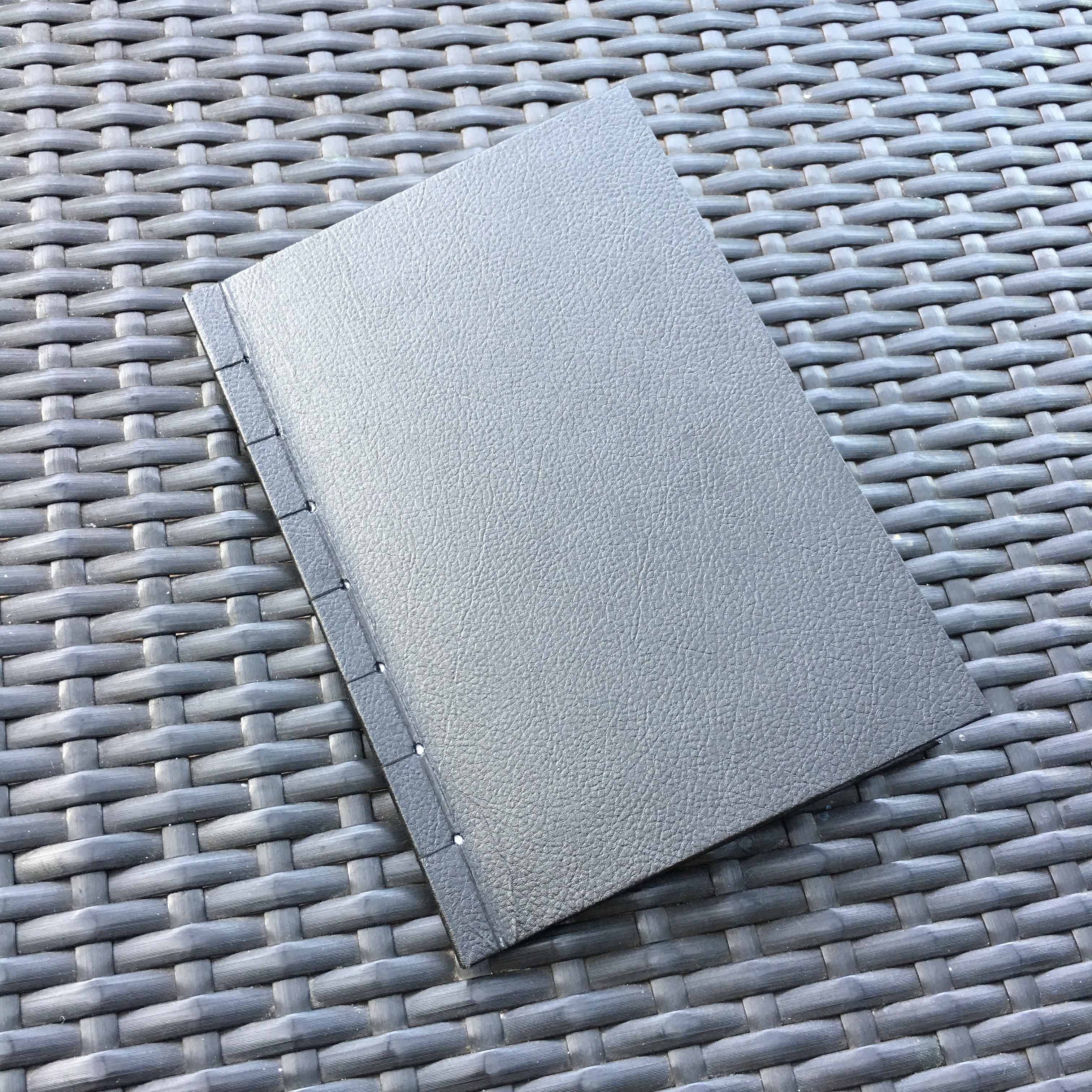
I chose a black leather grained paper for the exterior to keep a simple and classy look suitable and appropriate for working class, similar to how many notebooks such as Moleskine has a plain black appearance. Initially, I wanted to do a perfect binding which is usually how these notebooks are bound, but for fear for stability and strength of the book, I was afraid the pages might come off or the hard cover might not be able to hold properly, I decided to do a simple Japanese stitch binding along the side. I used a small margin of 1cm, as well as black string to keep it as minimal and simple as i can so as not to distract or bring away the attention as this was not a main detail.

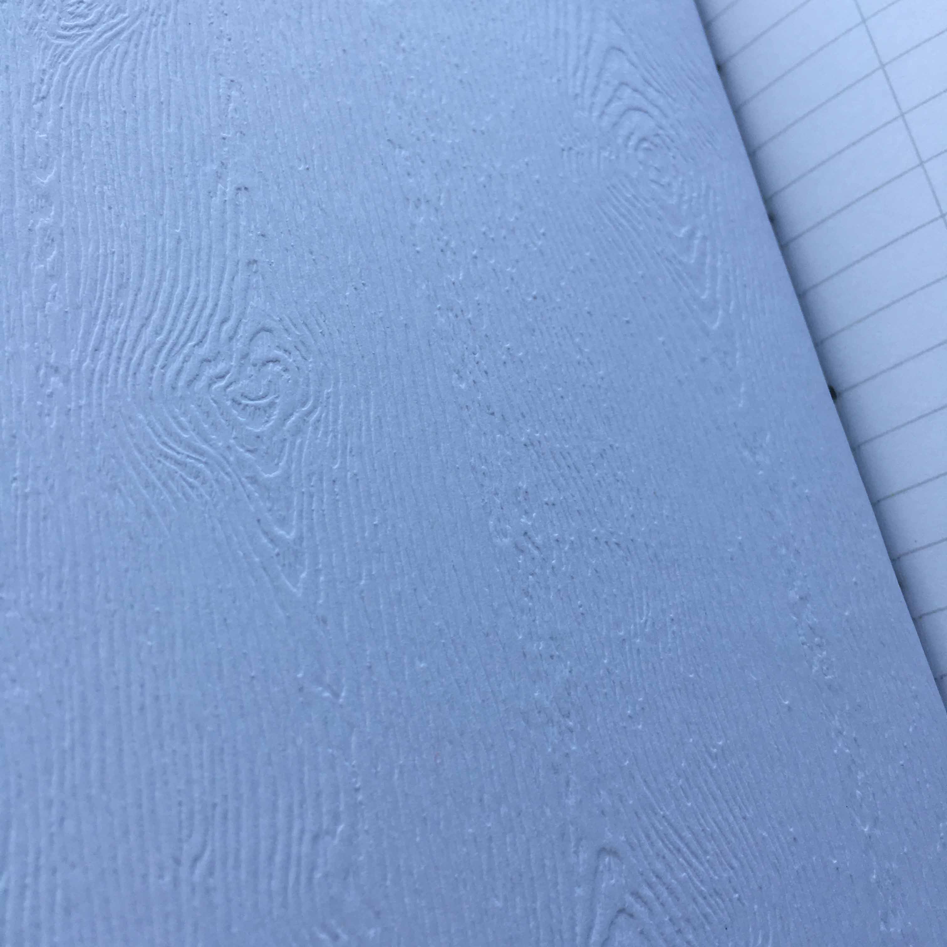
I made a hardcover by wrapping a thicker board within the black leather grained paper, and the interior is covered with a wood textured paper. This was to go in line with a classy look, with the exterior coming from nature (leather from animal) and the interior to follow (wood from forests).
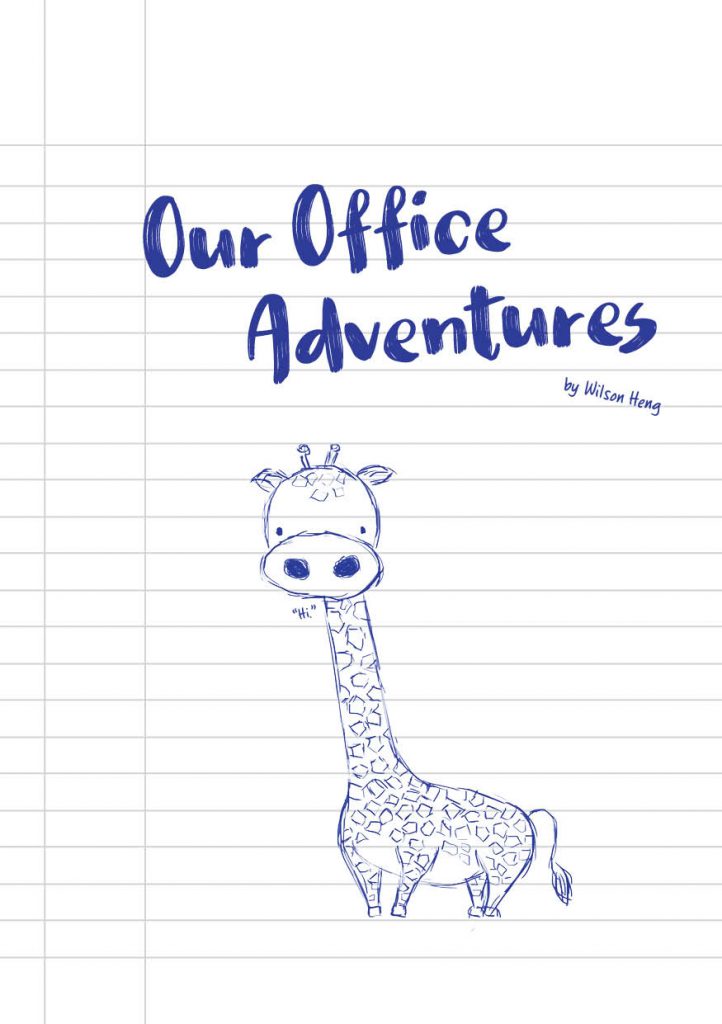
The interior looks like this!
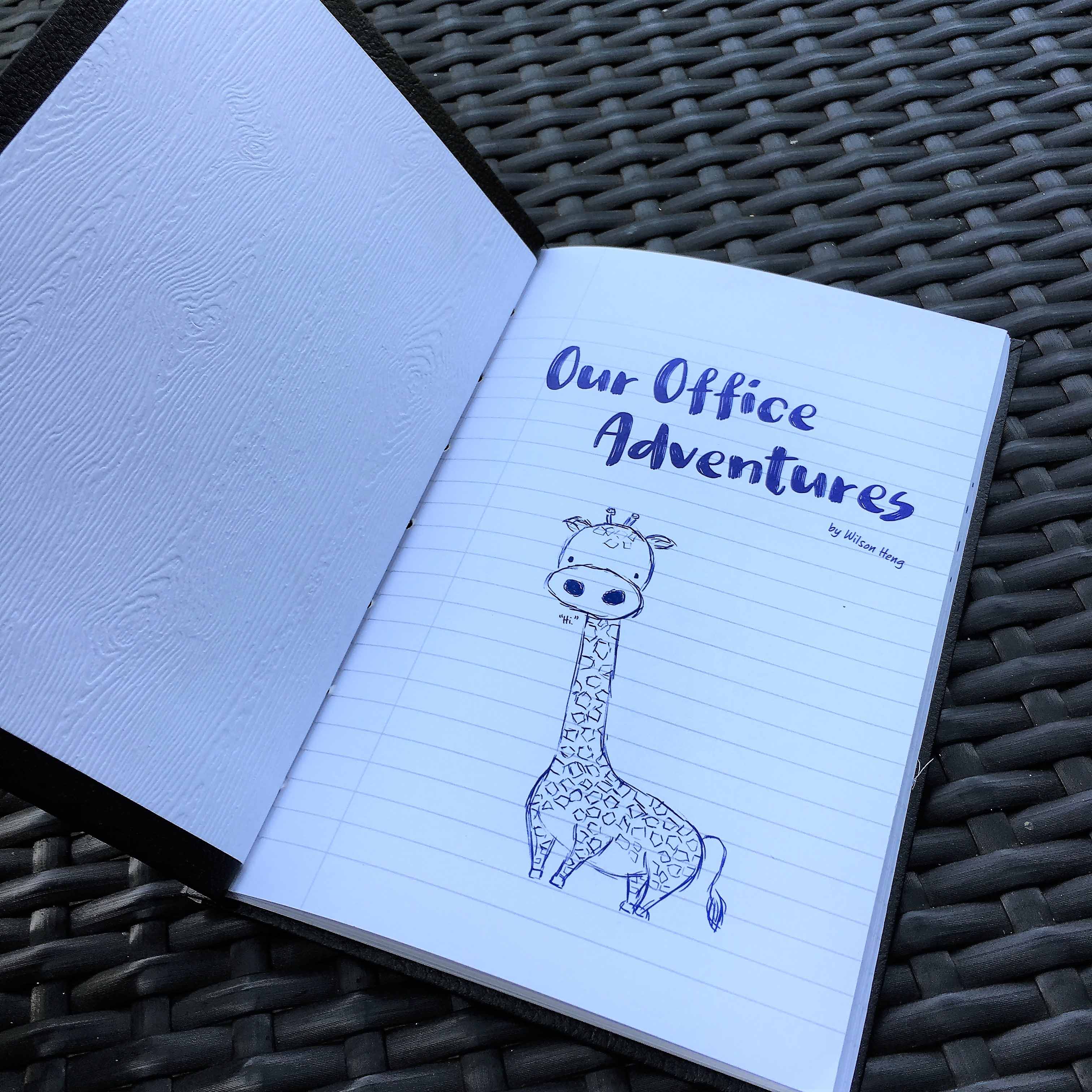

The change to a A5 book reduced the space by a lot, and was a lot more appropriate and suitable to have a reduced font size similar to handwriting. The typeface chosen for the title text was thick but consists of multiple thin strokes, like how drawing and shading with a pen would look like. The content was also written in a handwriting typeface, all these help to tie in the idea of doodling during a meeting with just a pen and a notebook.
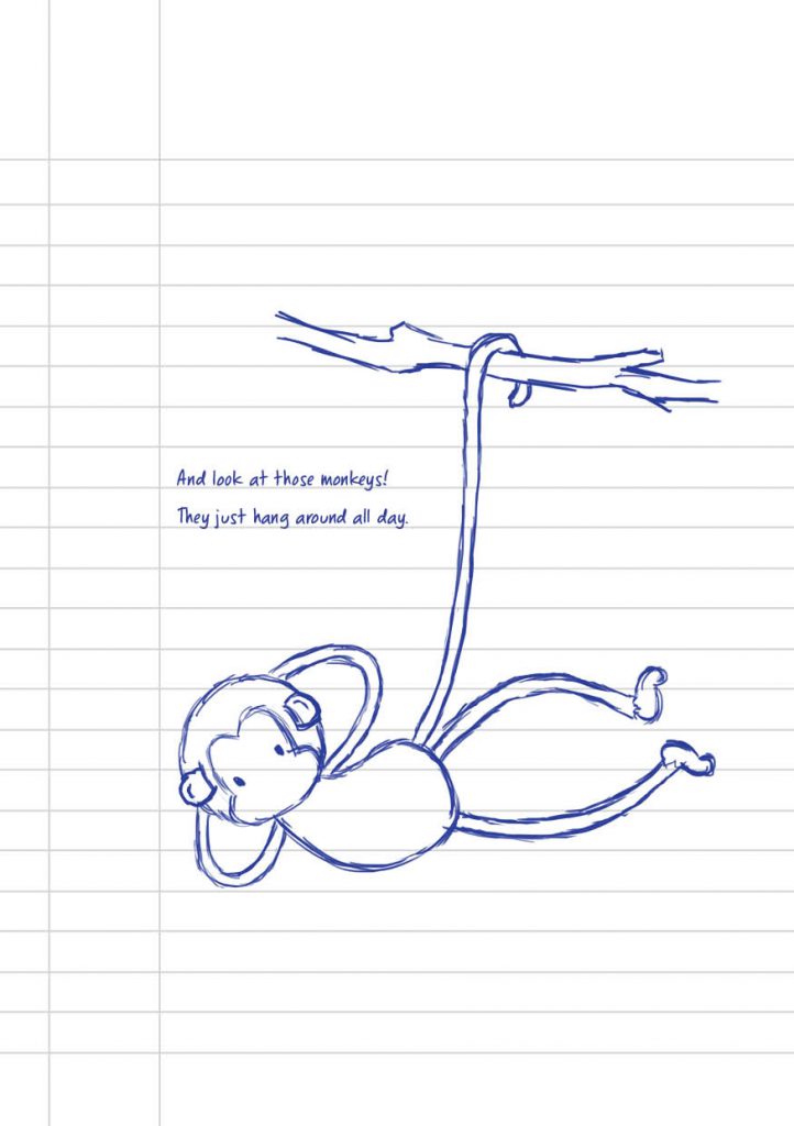
The storyline goes as follows,
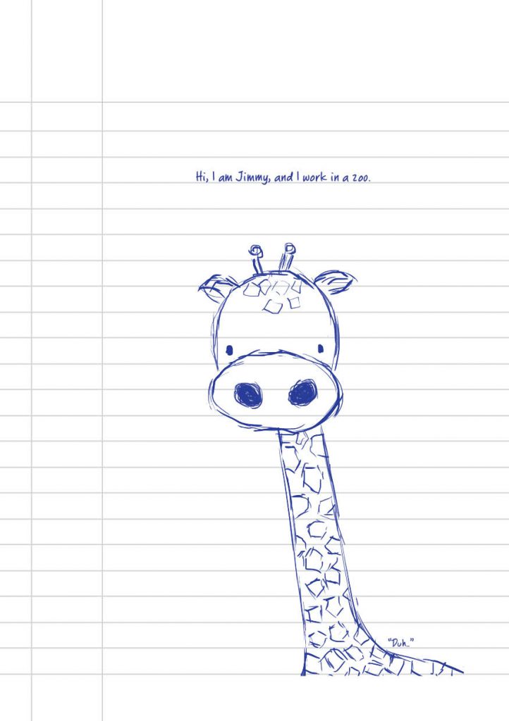
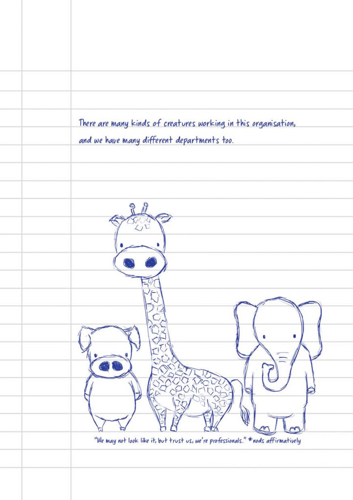
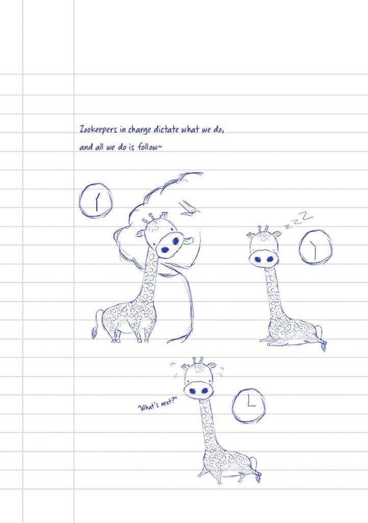
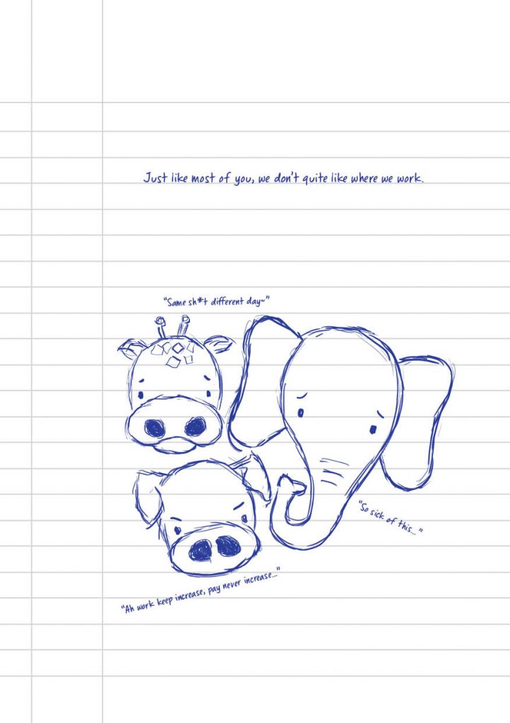

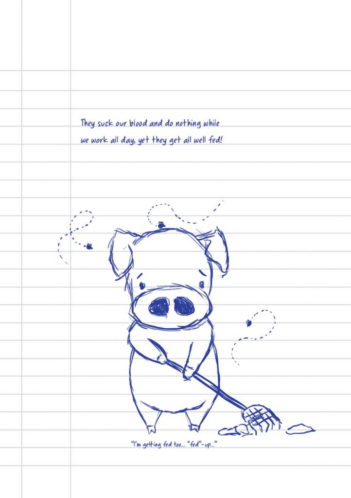
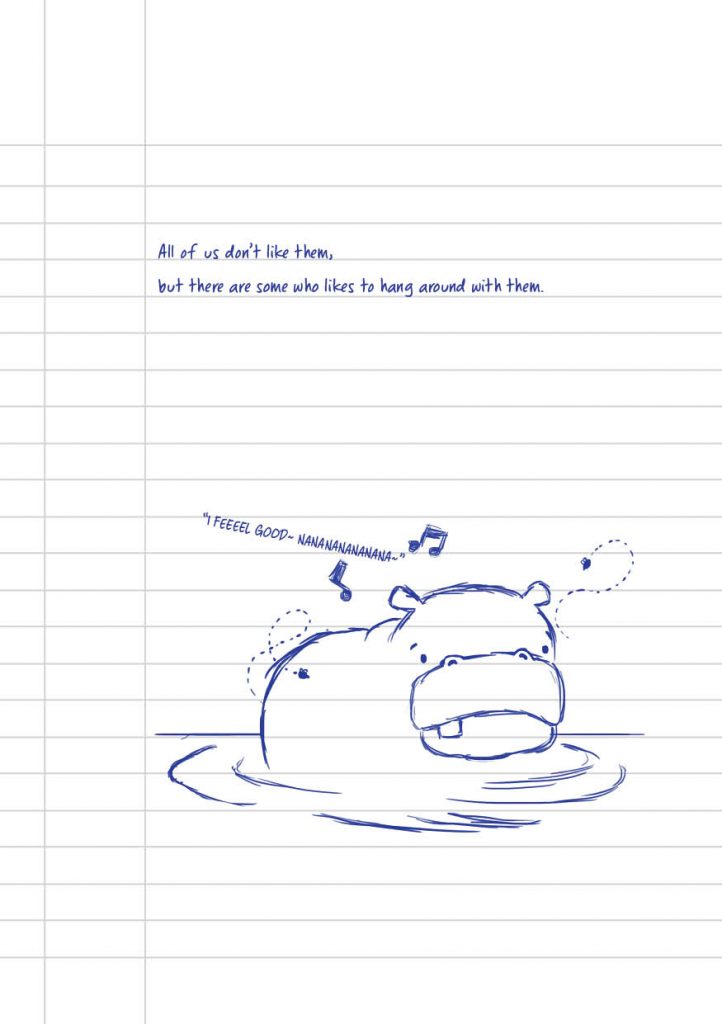
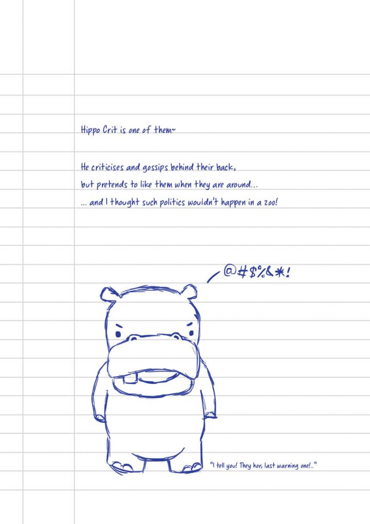
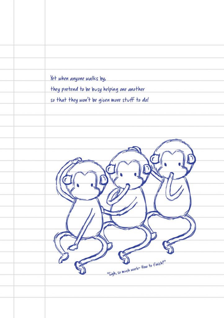
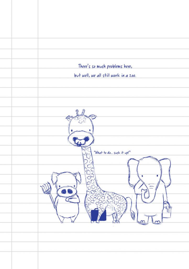
The ending page serves to give the context and reveals what the book is actually talking about, just in case the metaphors was not clear enough to any audience. The language used is also light-hearted and casual as the book is meant to be slightly satirical and funny, consisting of puns such as Hippo Crit as the hypocrite and monkeys literally hanging around. There were also small captions added to the illustrations to depict what the state of mind of the writer (office worker) is, which is being bored in the meeting and trying to find ways to entertain himself. I feel that this has helped bring out a lot more fun and crazy in a way, to also make it more relatable and light hearted while criticising something that working adults are going through.