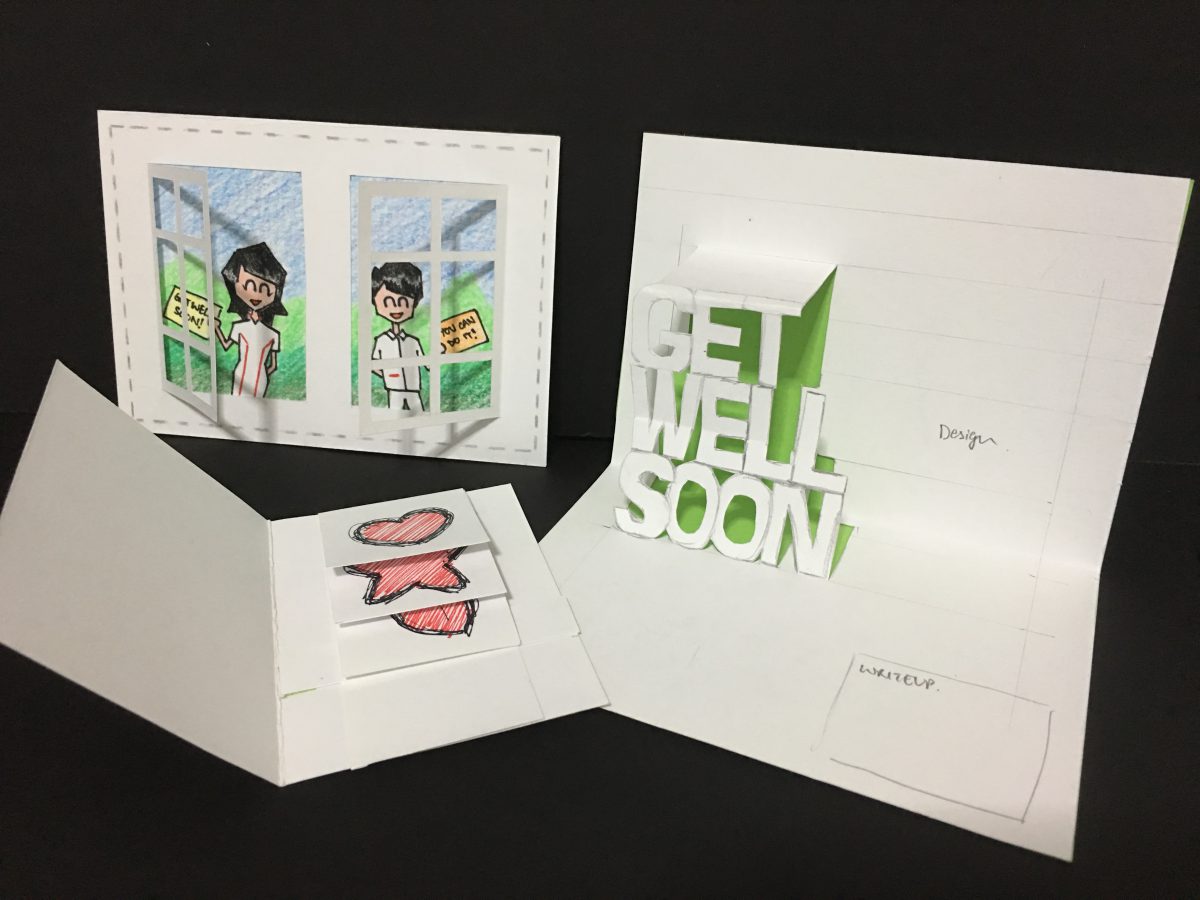
Moving forward based on the feedback given for the previous designs, I have did some minor tweaks to the exterior to try to enhance the link and flow from the exterior to the interior.
Front cover
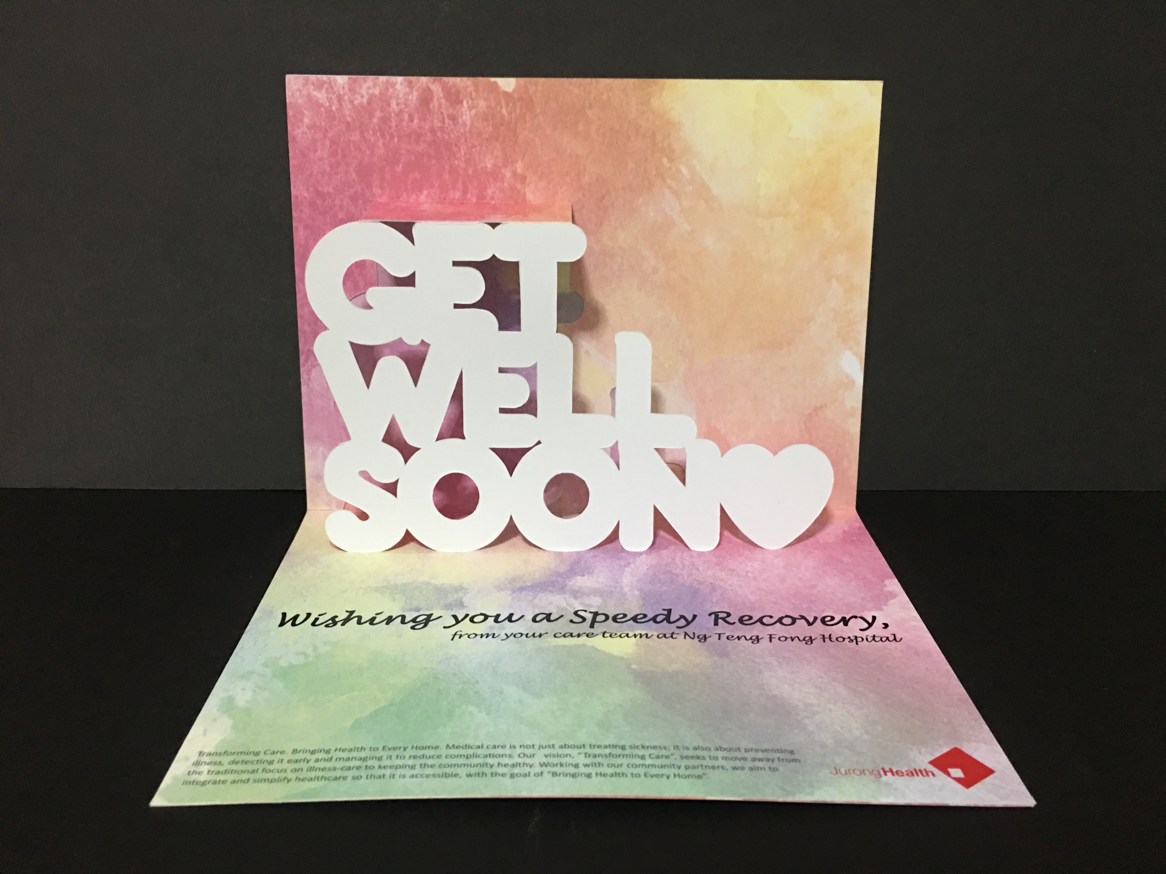
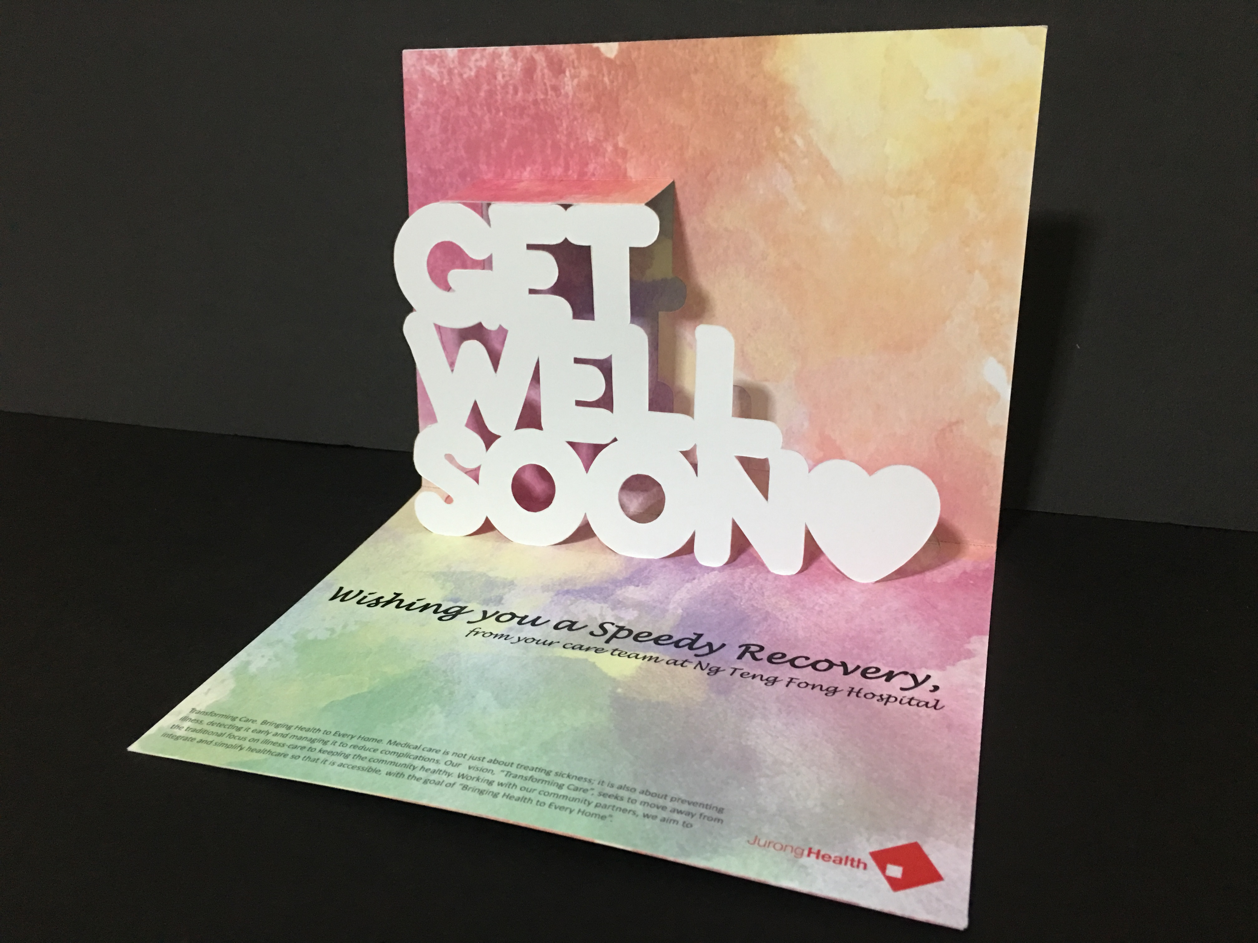
Opening up the card
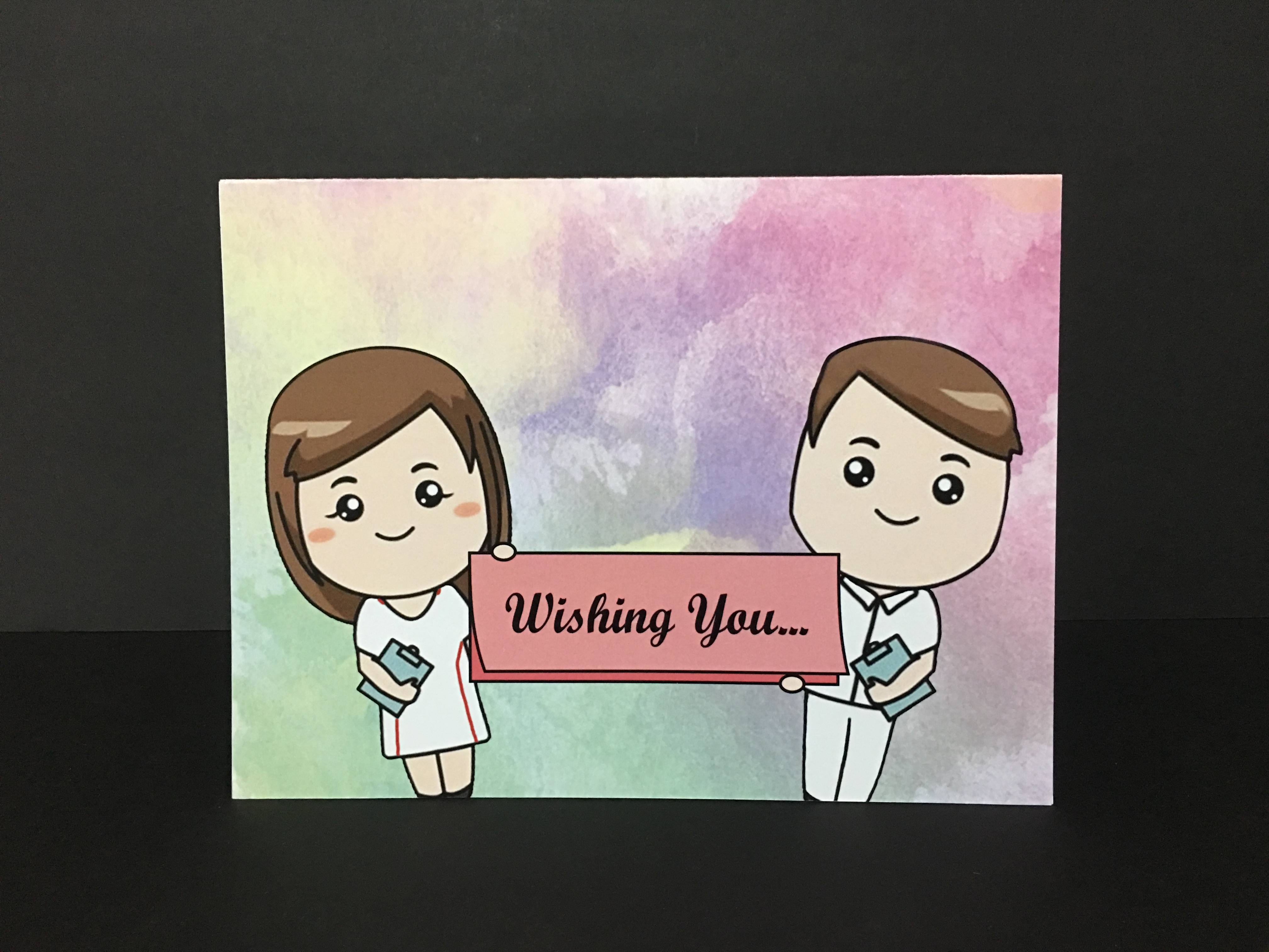
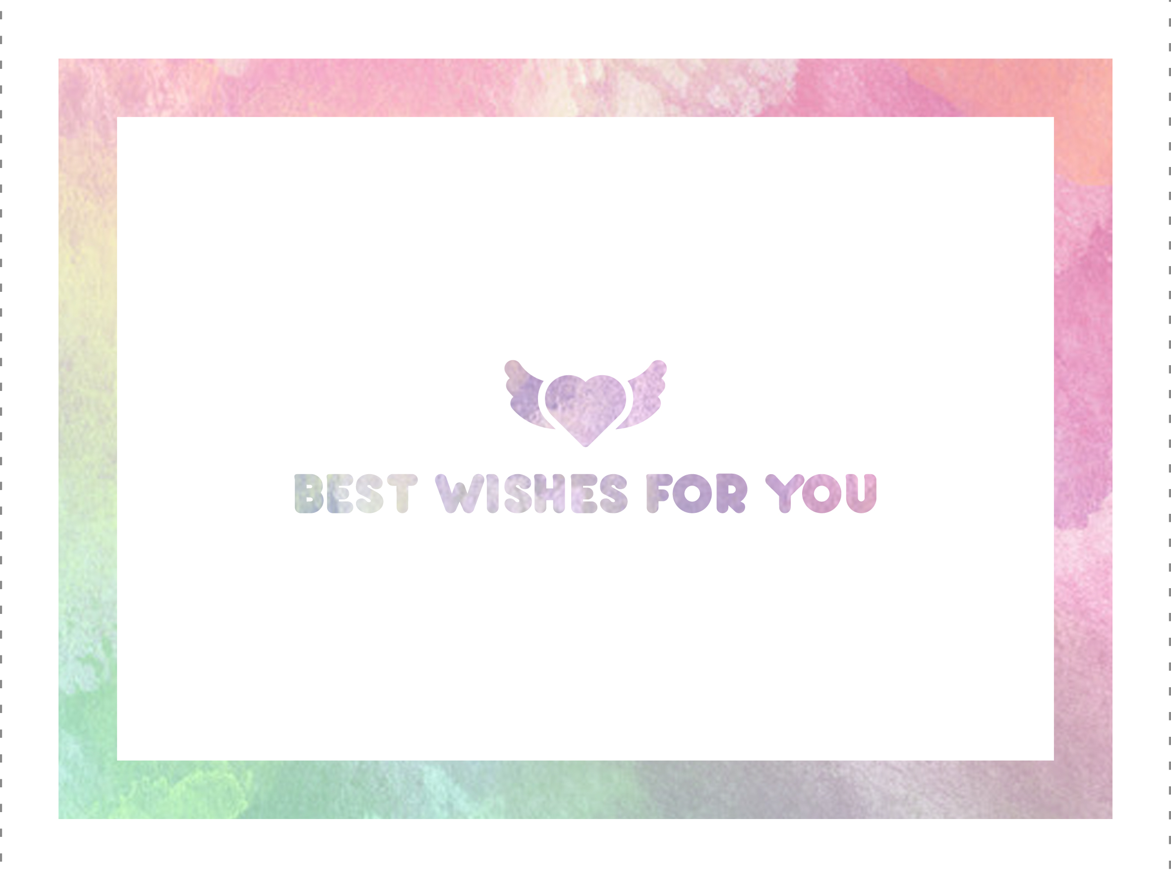
On the front cover, the two nurses have been tilted to give abit more dynamism and movement, making it seem more lively and also enlarged to cover more space. The words “speedy recovery” was removed as it might not have been a good idea to repeat “speedy recovery” and “get well soon”, being too repetitive. In place of it, I used “wishing you…” such that it provides an entry to continue reading on inside the card. The words are also anchored down on a card held by the nurses, in a similar format as the physical card to make links with the physical form itself. The background was then chosen to be the same as the interior to have the visual link and consistency.
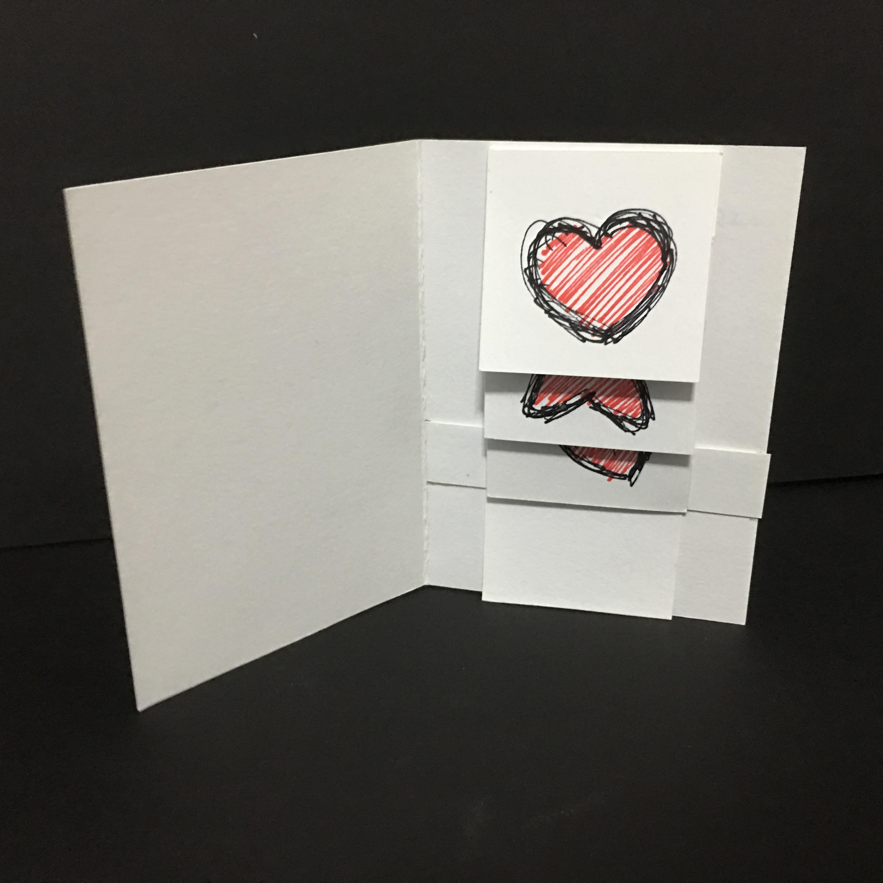
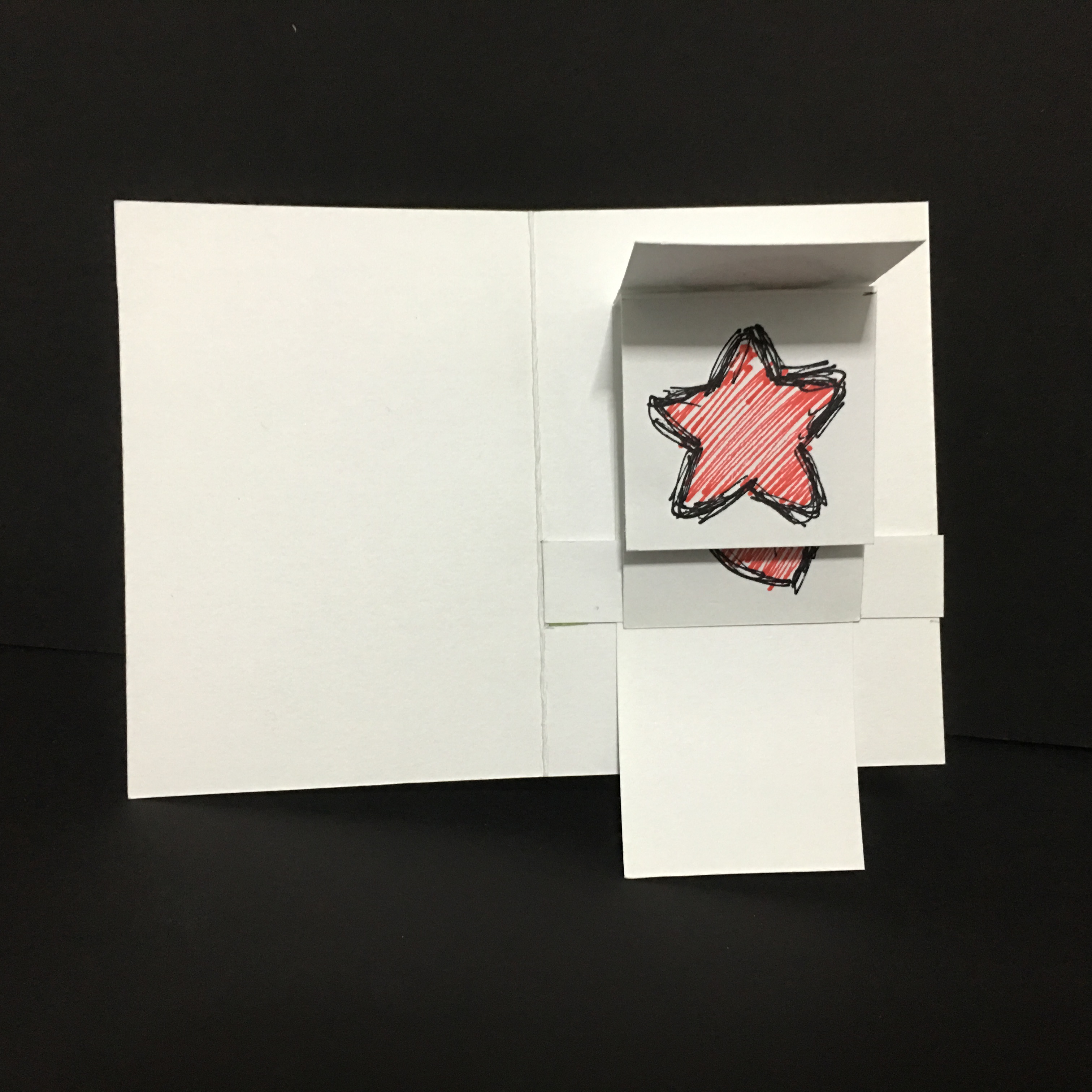
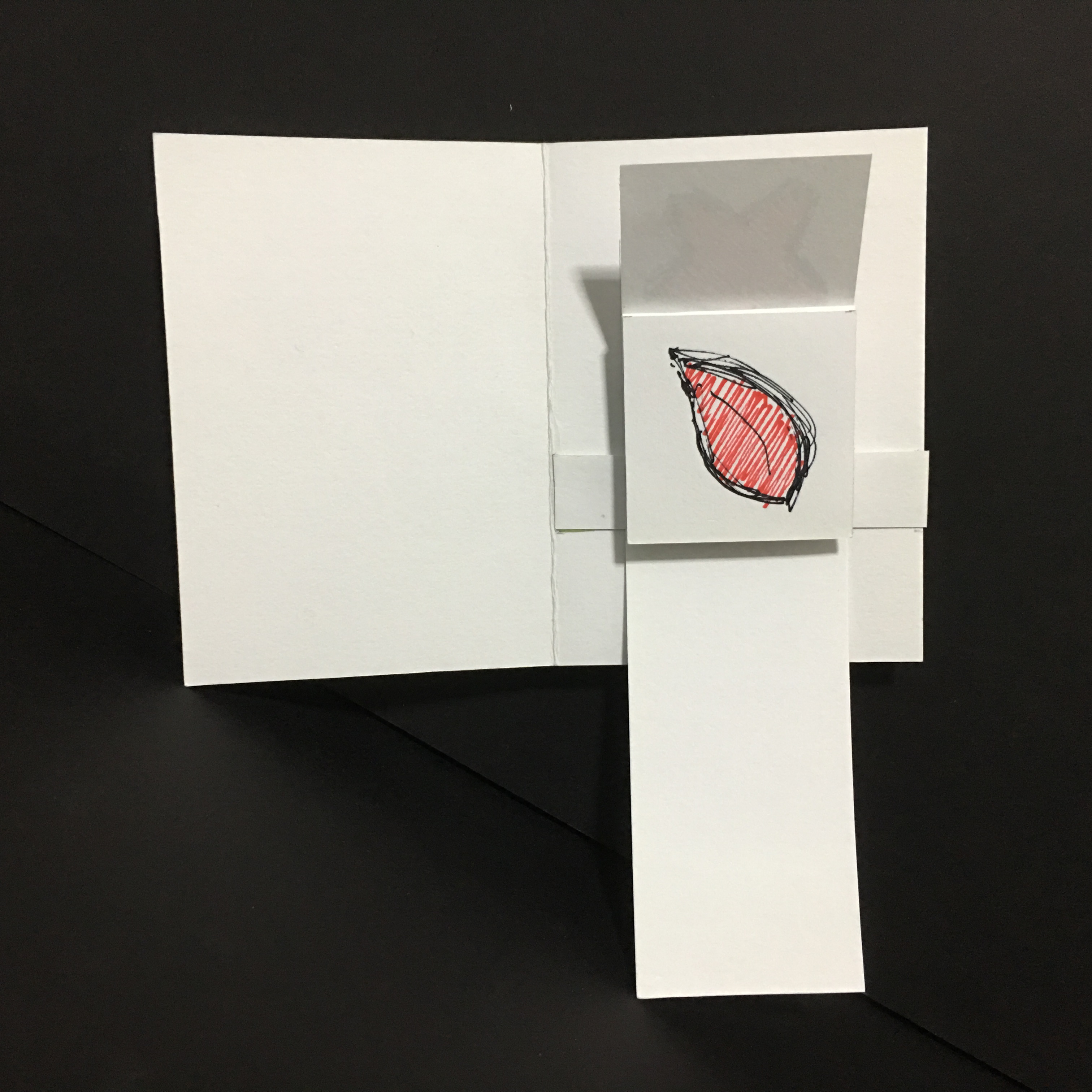
Nonetheless, there were some other flaws noticed during the critique session and would be great to be resolved if given more time. On the exterior, everything seems to flushed downwards and there is an awkward empty space on top – would be good to trim down the card to reduce this empty space and make it more balanced; and I personally feel that trimming this card down would make it a slimmer rectangle, which is less bulky and might look more sleek and classy as well, also the pop-up will have to shrink accordingly. Alternatively, since it seems like a “celebration” thrown by the nurses, there could be some banners or decorations in the place of the empty space on top. To further strengthen the visual link from the exterior to interior, there could be repetition of the nurses or simply just one inside, probably beside the pop-up, to make use of the empty space and also provide more “liveliness”. Some other suggestions included the use of colors, such as making the “heart” on the pop-up red so that it catches the attention of viewers and make it less flat and plain, and also to consider changing the “purplish” patch near the bottom right as it seems grey to some.
Overall, this assignment was probably the one that I enjoyed the most as i really do enjoy making things with my hands, watching and feeling how they change and come to life, and not just fully digital. The various explorations within this module has also allowed me to learn new things, both technically and also about myself along the way. With this, we conclude the end of the module and… HOLIDAYS, HERE I COME!!
In this project, we are tasked to create a well-wishing card, assuming the role of “Ng Teng Fong Hospital” and giving this card to their patients. This project guides us to explore the use of folds and cuts to give life to paper, to experiment out how different folds and cuts could give rise to different spaces and experience while navigating through the card itself.
The first step I took was more hands-on, coming up with physical designs of cards without even thinking of the content first as I am more of a hands-on person. It was easier for me to generate something physical before thinking of what content goes where in that space, then editing the physical form if needed from there.
Some physical designs at initial stage
One design featured a typical pop-up card but with words flushed to one side, one design focused more on interacting with the cover itself making “windows” where nurses are cheering on the patients, and one design was a “waterfall” card which could feature several panels (pics drawn to differentiate panels only) when a tab was pulled. When the tab is pull down, the panels flip upwards and reveal the following panels one by one, as shown below.
The original state of the “waterfall” cardSecond panel revealed when tab is pulled downwardsThe final panel revealed after tab is fully extended
After much consideration and discussion, I decided to focus more on the most typical of all – the pop-up card. This was not because of choosing the easy way out or going with the flow of the typical design, but because of several factors. The pop-up card is simple to understand and requires minimal actions to see the entire design, unlike some which might even require instructions to operate the card. The pop-up card is also relatively easy to make on minimal pieces of paper, and looks minimalist to fit the production costs and image of the hospital, and not to show something extravagant in which patients might feel it is a waste of money or worse, the hospital trying to earn more money. The card was also decided to take on the size of 20cm x 15cm, to be big and clear enough and have enough negative spaces to give a more relaxing feeling. The subsequent explorations of this design are as follows:
Front coverInterior of the card
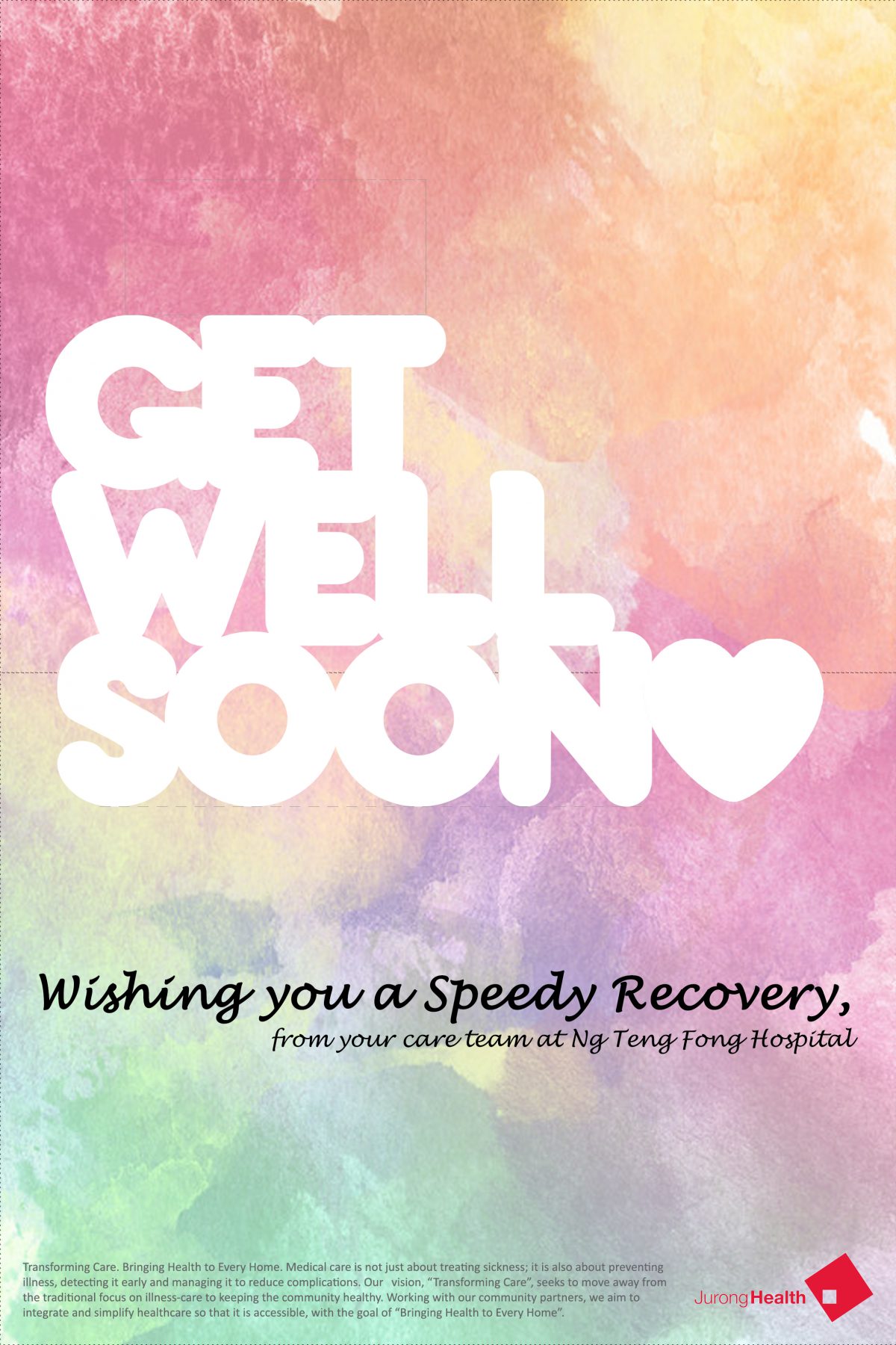
I chose a theme of pastel watercolor style as I feel that it is a very calming and soothing color scheme, and the style alone is very neutral, seemingly suitable for patients of all ages and both genders. The absence of characters and objects makes it more neutral and classy in simplicity. I also wanted the front cover to look very very clean and polished, just plain white with a bit of the color scheme to link with the overall treatment of the card. With the white cover, opening the card up to a splash of colors could also be a pleasant surprise and more liveliness, together with the pushing out of the pop-up design. Typefaces chosen were either rather plump and rounded or are of handwriting styles to look more friendly and add a human touch to it, as well as considering the strength of the pop-up design to hold itself and not be too fragile as well. The corporate text is also minimized at the bottom and of a lighter tone to take less weight and seem more sincere in wishing well rather than promoting the hospital. Nonetheless, feedback included that the cover seemed too empty and plain, and lack the kind of visual interests that could arouse the patients to want to open the card.
A subsequent tweak to the front cover included the addition of cartoon “Ng Teng Fong Hospital” nurses who have been caring for the patients and also to provide context that the card is from the hospital. This is coupled with “Speedy Recovery” to give the card an identity and label. The background is then the same as the interior to make sure that exterior and interior are integrated. Nonetheless, the visual link between the two still seem weak and it does not seem to flow well between the two, making them seem like separate entities. The words also seemed as though they are just floating.
Exterior V2.
It is then time to work on these flaws to come up with the final design!
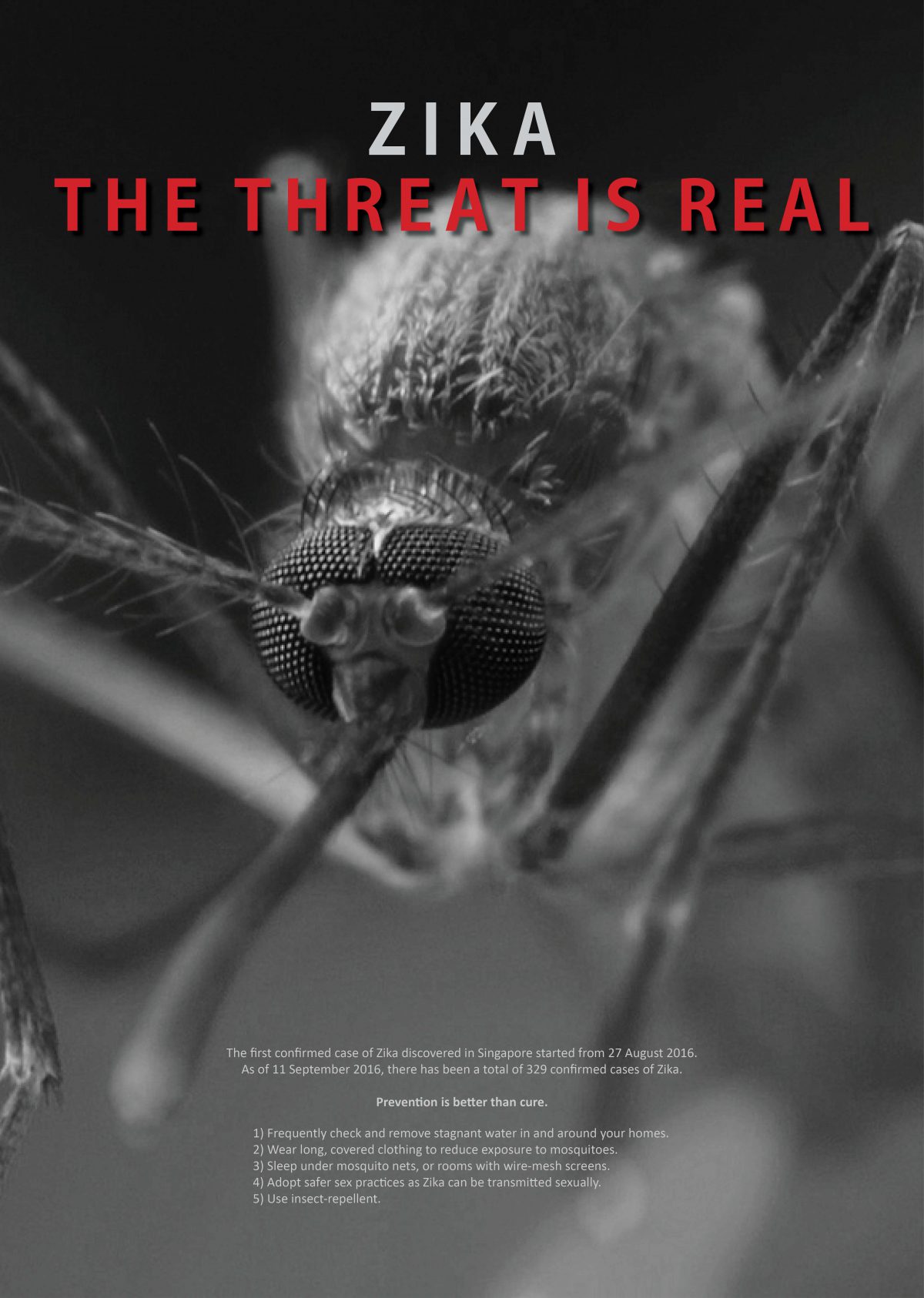
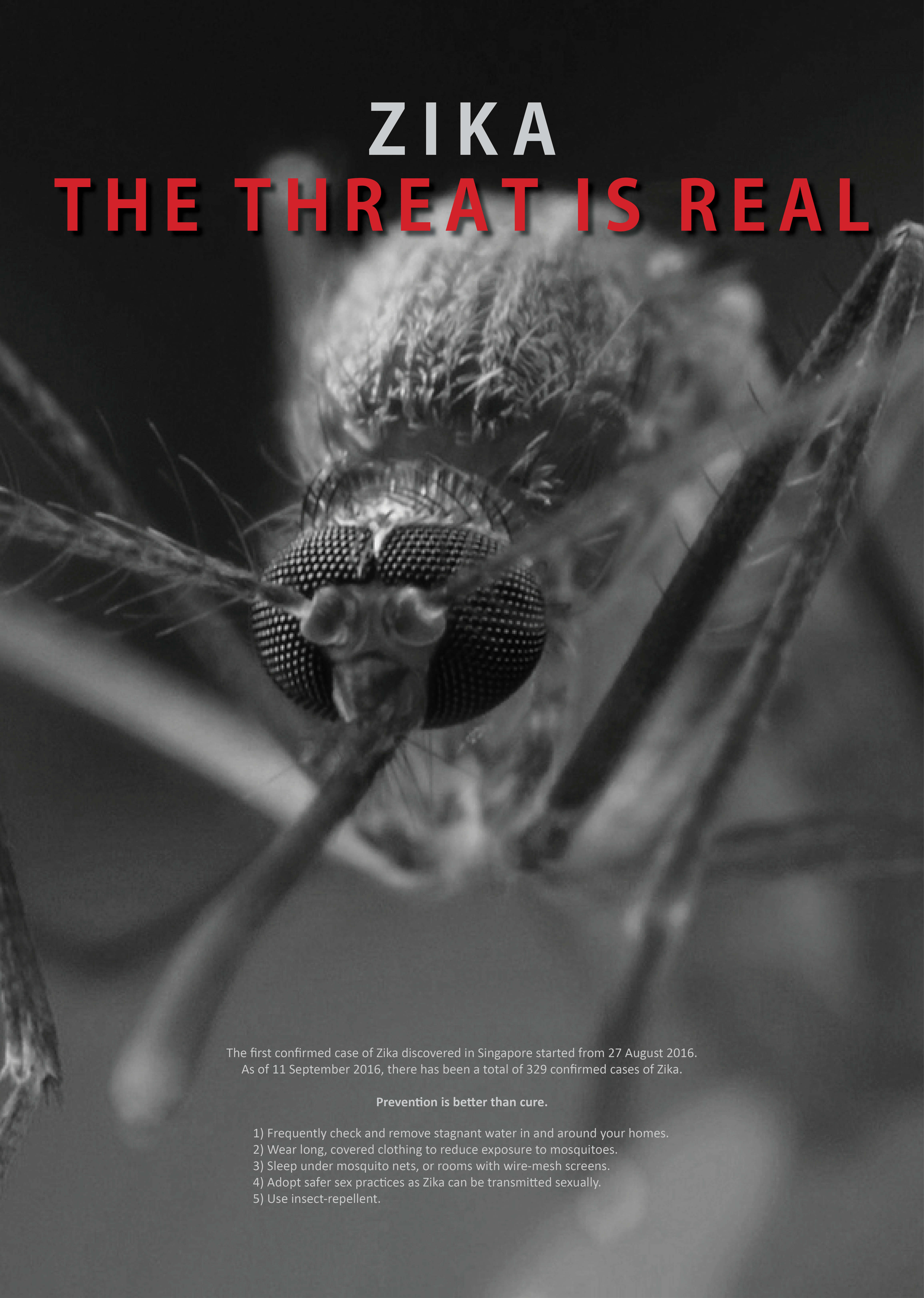
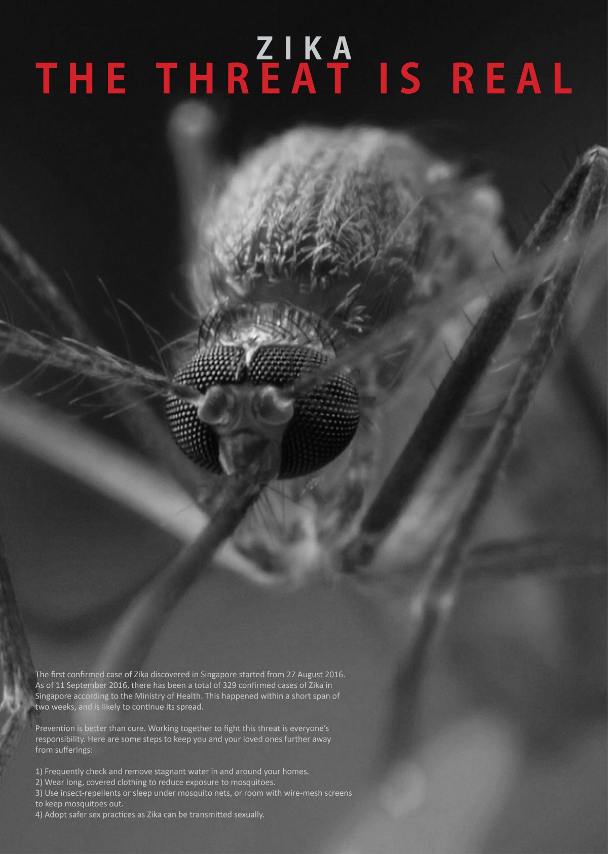
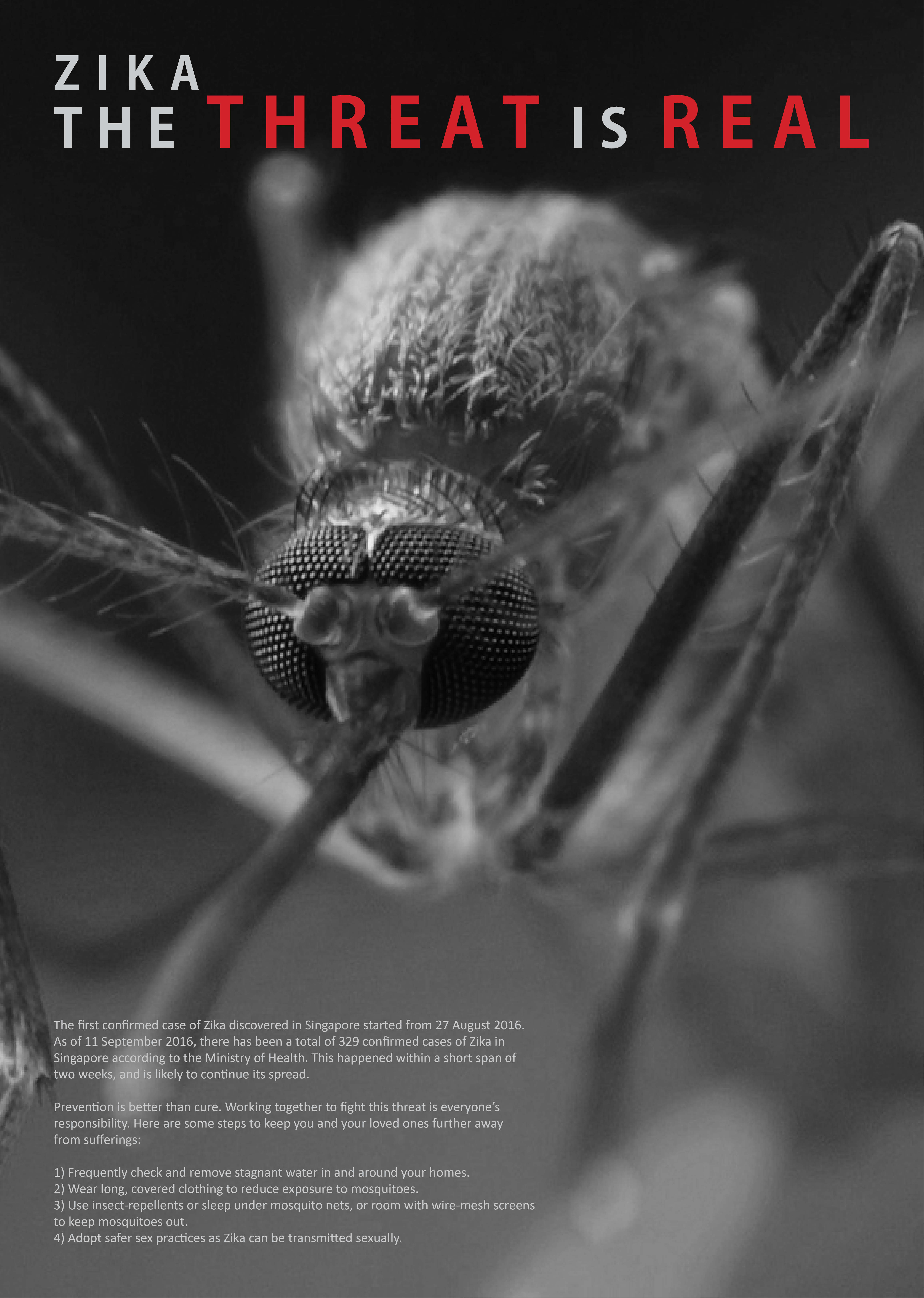
Moving onto the final artwork of this project, I have chosen to stick to the design with a mosquito looking forward at the viewer.
There are some minor tweaks introduced to reduce the amount of words in the body text as it seems kind of chunky which viewers might not want to read it, adjusting the position of the body text, changing the size and position of the title text at the top of the poster as well. Adding a drop shadow to the words in red at the top also helped to push the punchline forward, making it clearer and more impactful. This was because when we did a black and white mockup I realised that the red and the grey behind it were similar in tonal value, despite the difference in colors.
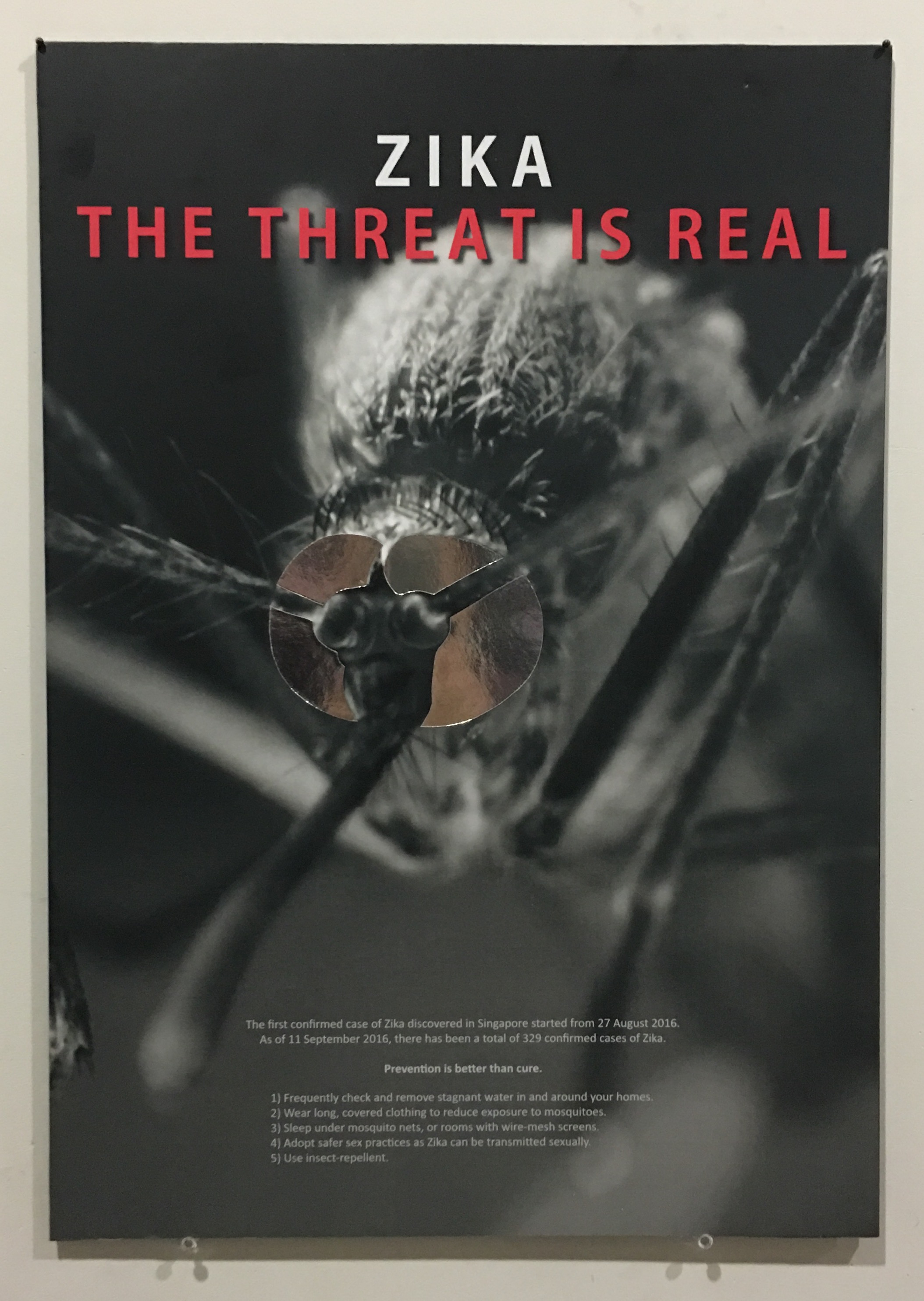
After printing, I traced and cut out silver reflective paper to stick over the eyes of the mosquito as suggested previously. This helps to enhance the context of the mosquito targeting the viewers and makes the poster more interesting as majority of it was in monochrome. Silver also gave it a touch of mystery and seductiveness, on top of the mirror effect intended.
I also decided to mount it on a black foamboard that I bought and mounted manually instead of mounting it on a white one done by the printing shop as my entire design is in black. Although looking from the front, it would not be obvious, it ultimately affects the overall harmony of the poster physically, thus I feel that a black foam board would be a lot more suitable for this poster. Below shows a recap of the previous design, followed by my final design and the physical poster itself!
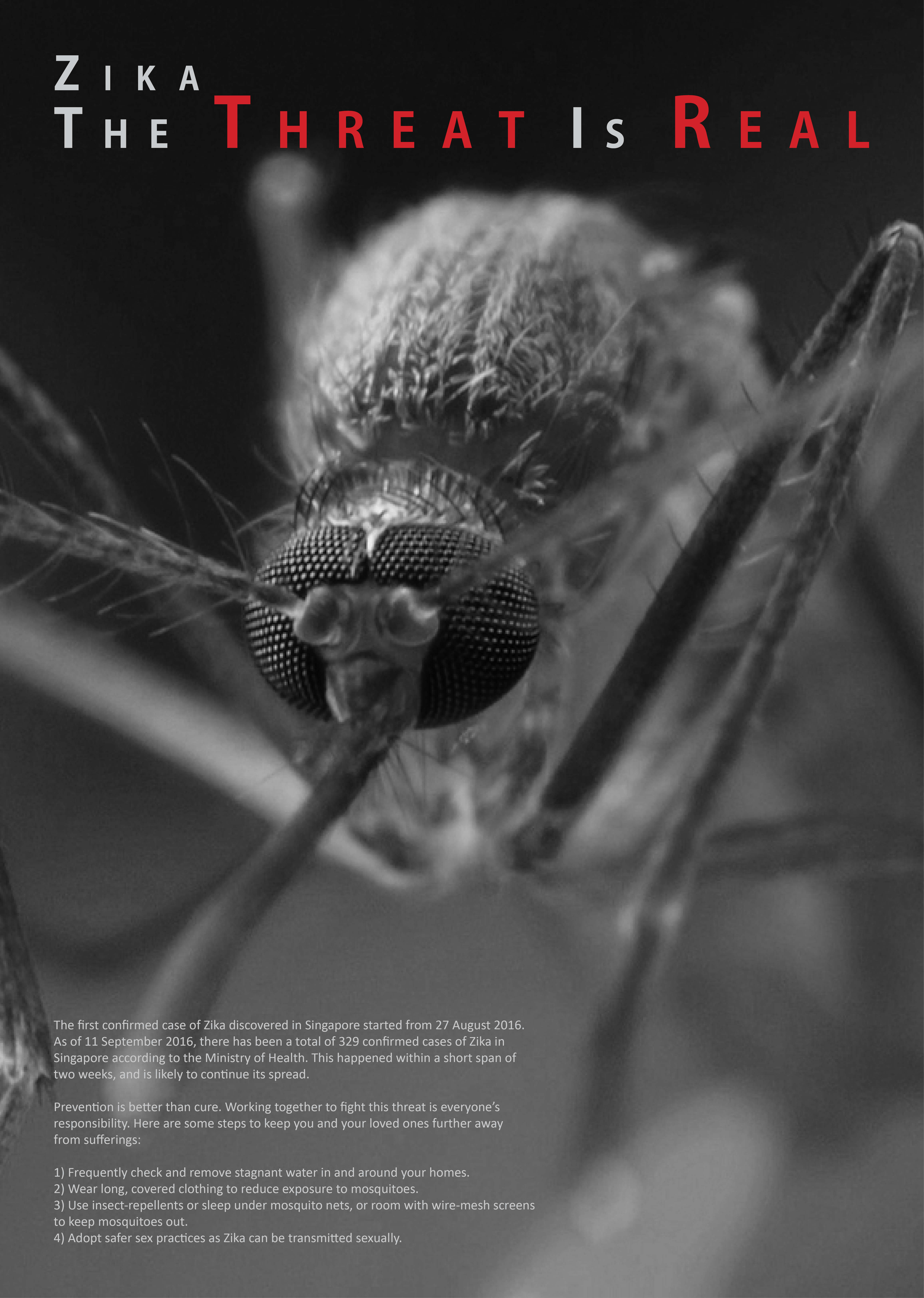
Recap on previous designFinal ArtworkPhysical poster
After researching for health communication poster examples and coming up with some slogans, it’s time to start experimenting with some compositions and layouts of the poster, as well as deciding what content to put in. Some key points to note from the assignment brief include:
Graphic-driven
Slogan with the word “Zika”
Preventive measures
I decided to go for a clean and simple look for the poster, as I feel that it will look more professional that way, and is easy to understand, not complicated and also clear and concise. Here are some of the compositions that I played with.
Concept 1-1Concept 1-2Concept 1-3Concept 1-4
Among these for concept 1, my favourite will still be 1-1 with everything centralised. This has a symmetrical overall composition and goes well with what I want – very clean and simple. The mosquito is the biggest, catching the attention of viewers, followed by the word “ZIKA” in red and big which gives the context of the poster, followed by the rest of the caption “THE THREAT IS REAL”, then a small paragraph talking about the worsening situation of Zika as well as the preventive measures as required on the assignment brief.
Concept 2-1Concept 2-2Concept 2-3
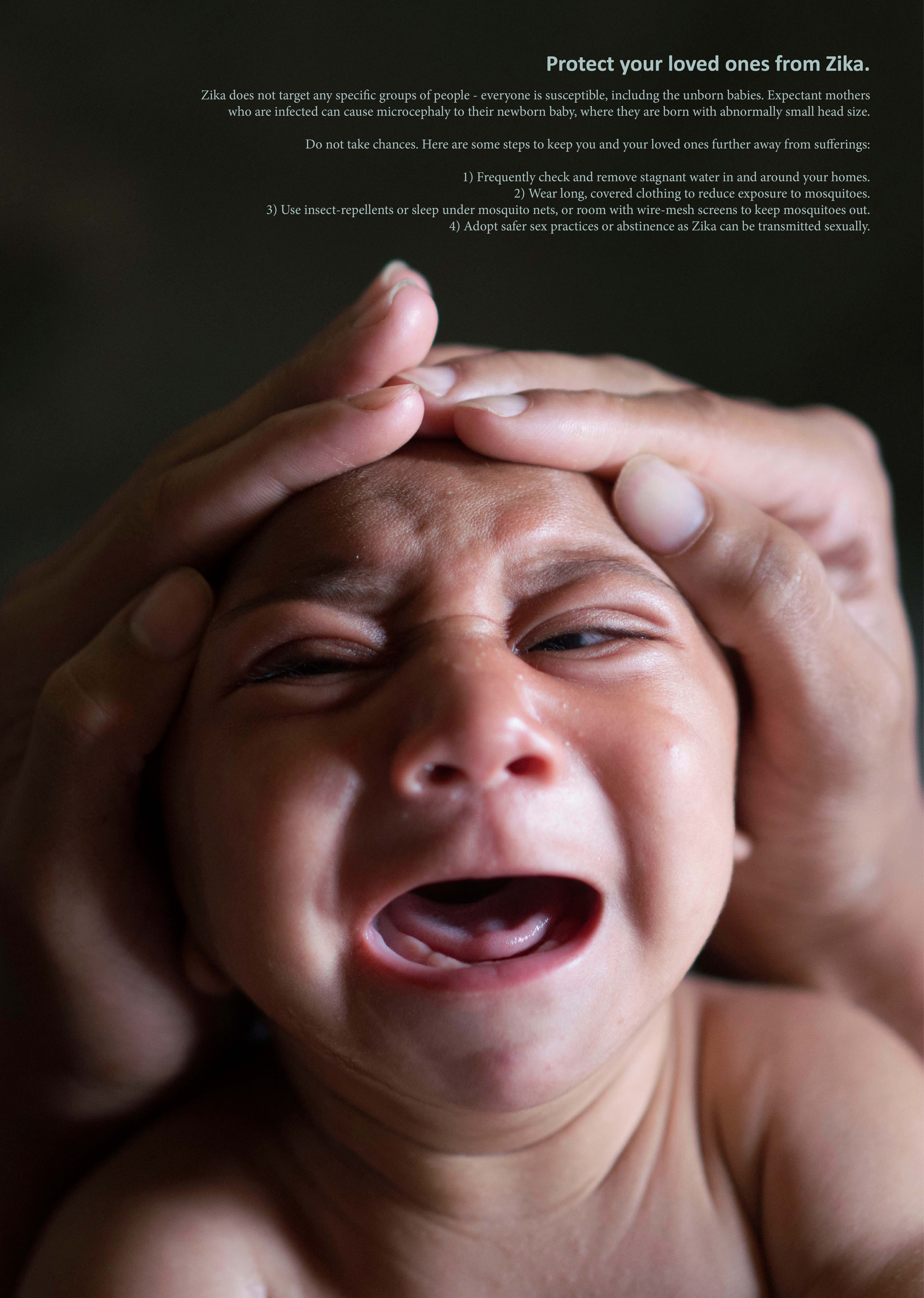
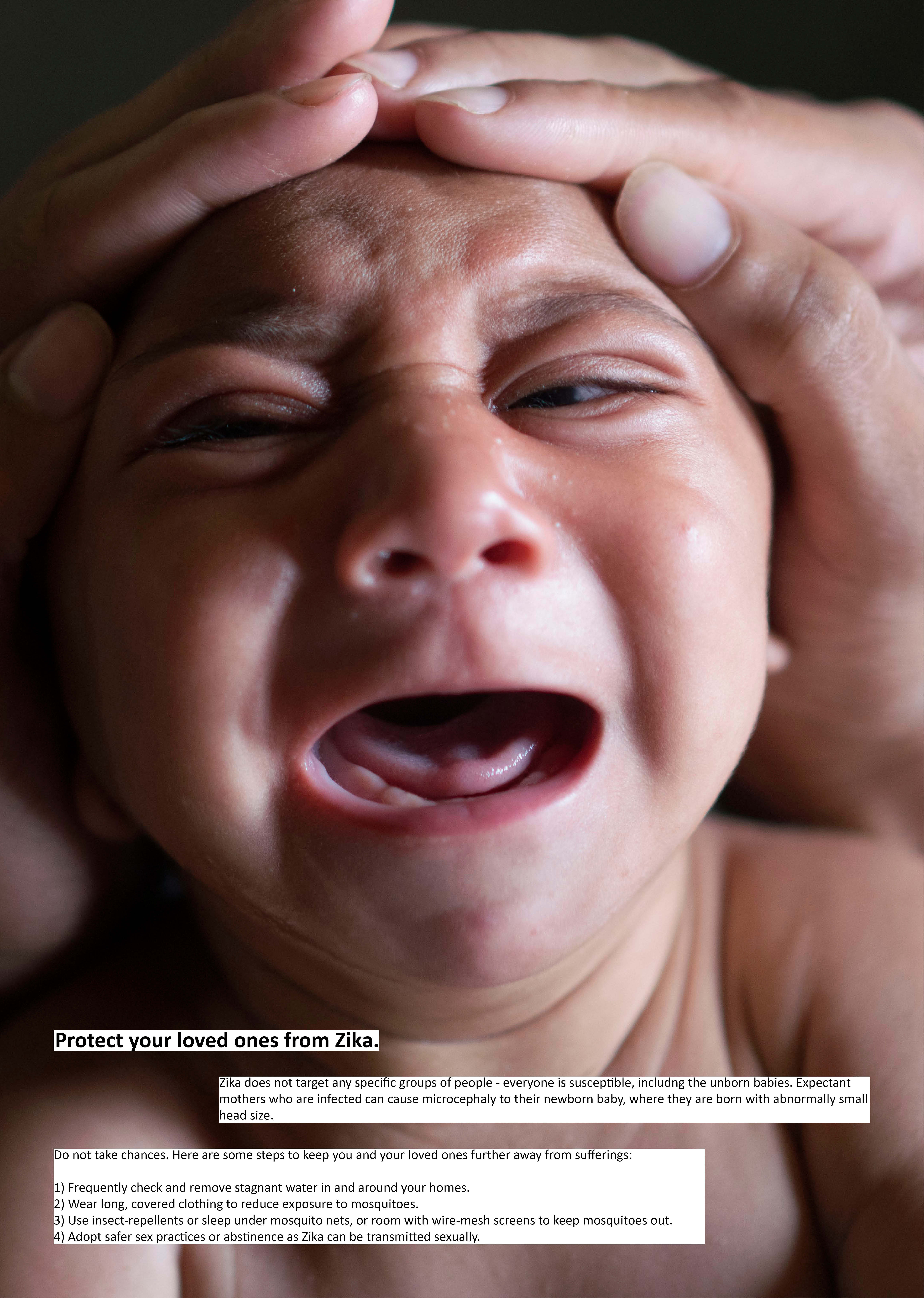
Concept 2 uses the photo of a baby with microcephaly as that is the main concern regarding Zika, since most victims actually recover with no other concerns, except that expectant mothers who are infected have a chance of their baby having microcephaly – a disorder with abnormally small head of the baby. Hence, I decided to address this issue more than anything else. The picture shows the baby crying (to tug on the heartstrings and conscience of viewers) and a pair of hands cupping the baby’s head to emphasize the small size. It is then coupled with smaller text that describes the danger and possibility of microcephaly, followed by preventive measures.
Some feedback I got from the sharing session included:
Concept 1 did not even look like any threat
Try having the mosquito facing the viewers to make them feel the threat
Reflecting the audience into the eyes of the mosquito?
Concept 2 what’s the point of cupping the head, why not the hands do something like overturning pails to prevent the danger?
Along the way of doing this project there were also random ideas that came to my head:
newspaper collage of Zika-related news as a background for the poster
warning strips / cordon
smashed mosquito
dented object to represent deformed head
price tag on hospital bed (ikea kind of signboard?)
Then, I moved on to coming up with other designs and compositions.
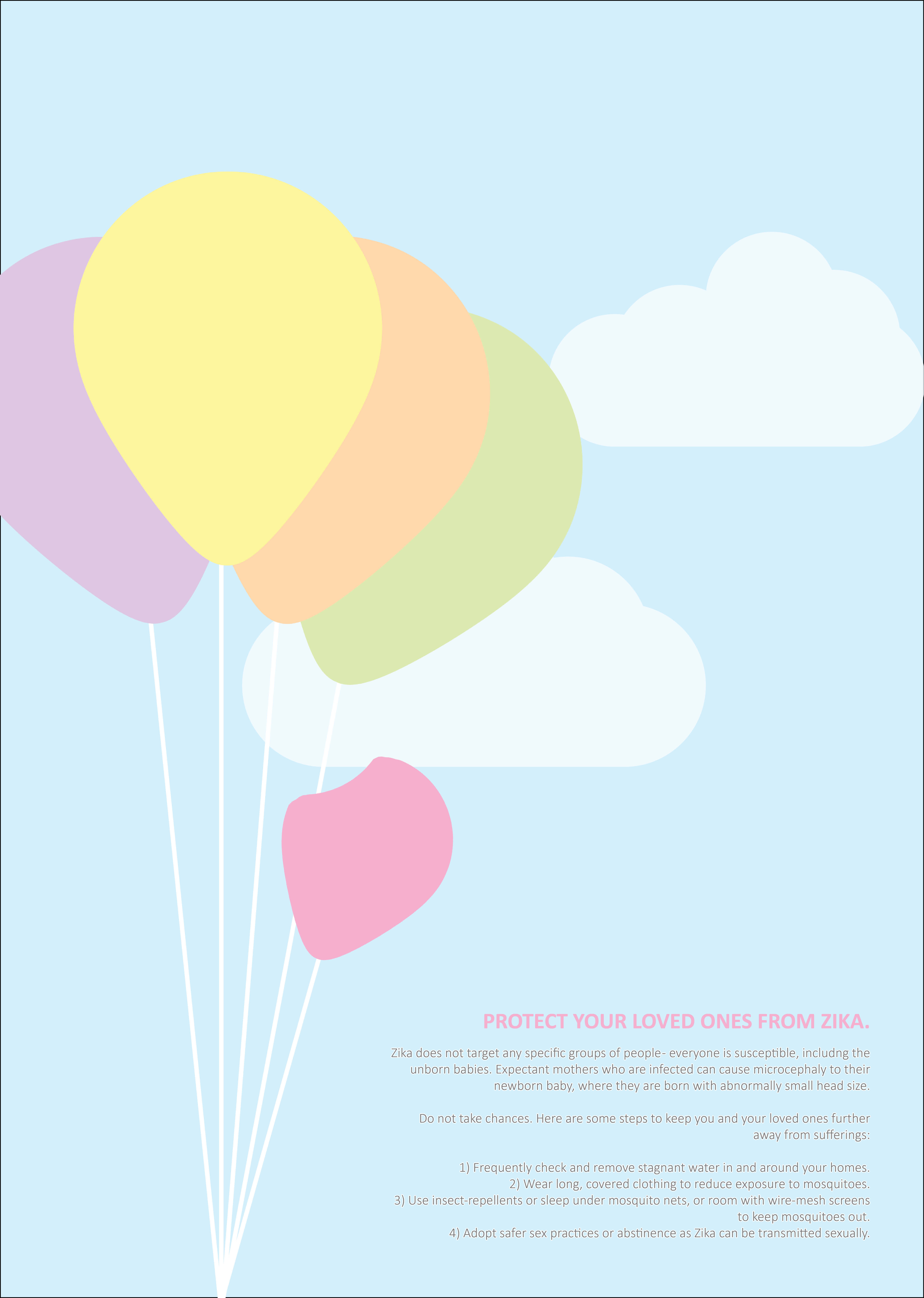
Concept 3
For this concept, I only came up with one design to find out the feedback of the idea before focusing on how it can be arranged. This is a very concept from everything else that I had. I wanted to come up with something different from everything that I have seen, to make a poster that looks cheerful on the first look and feels more contradicting to the original intended message. I decided to go abstract and using illustrations style, to use balloons to represent children, with a smaller, dented one to represent a child with microcephaly. The colors are all pastel to give a comfortable and cheerful tone to it, with the balloons all flying up high in the sky to show how kids have a bright future ahead of them, everything is very high spirited etc. The dented balloon is then lower, making it obvious that this “child” is less fortunate and might even have a shorter life than other children. I then use the came color for the slogan and the dented balloon to put in the context and also lead the eye.
Nonetheless, this was not well understood, and some feedback included that the color palette made everything hard to see, the overall mood feels too much like a party and not suitable for this case.
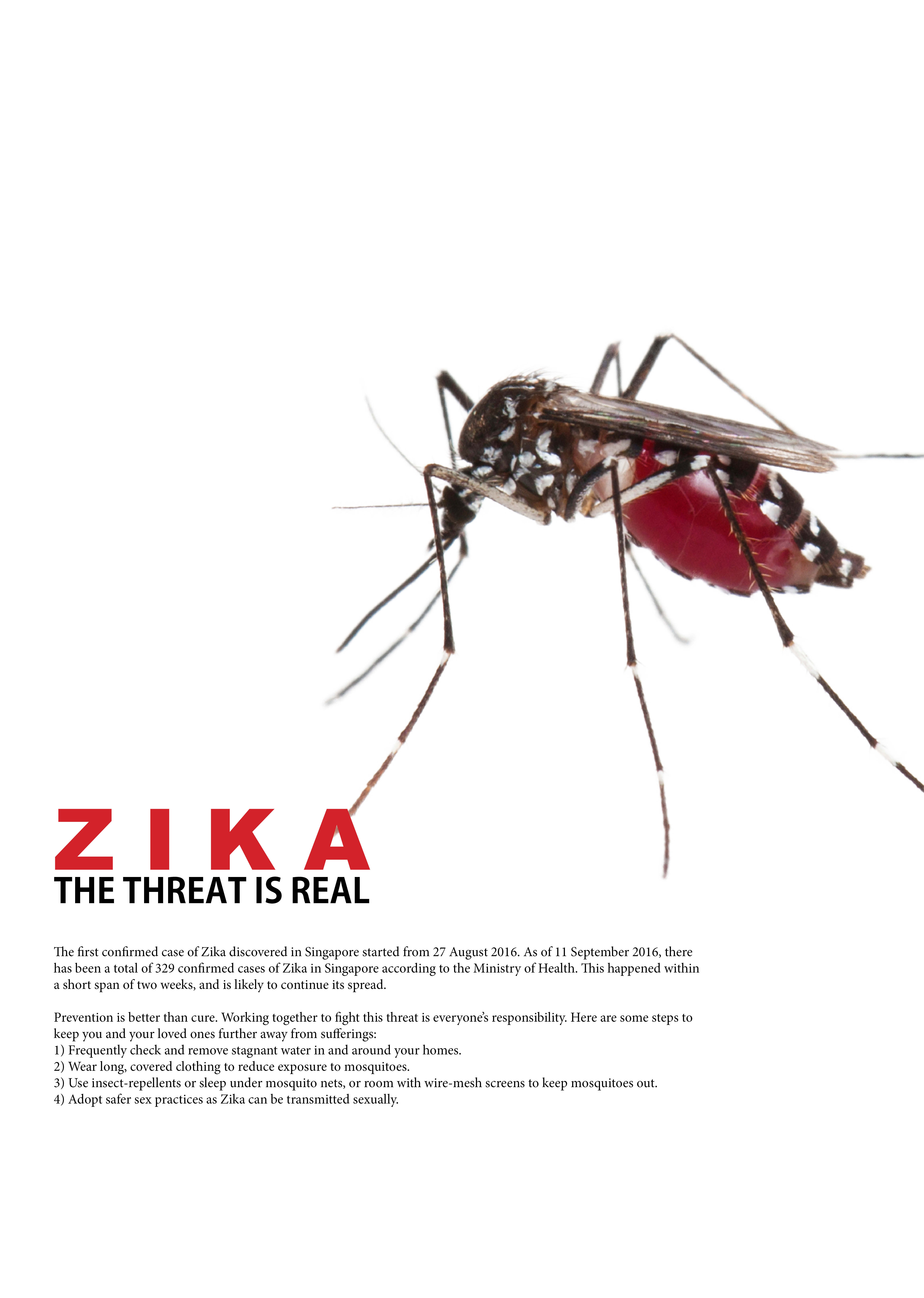
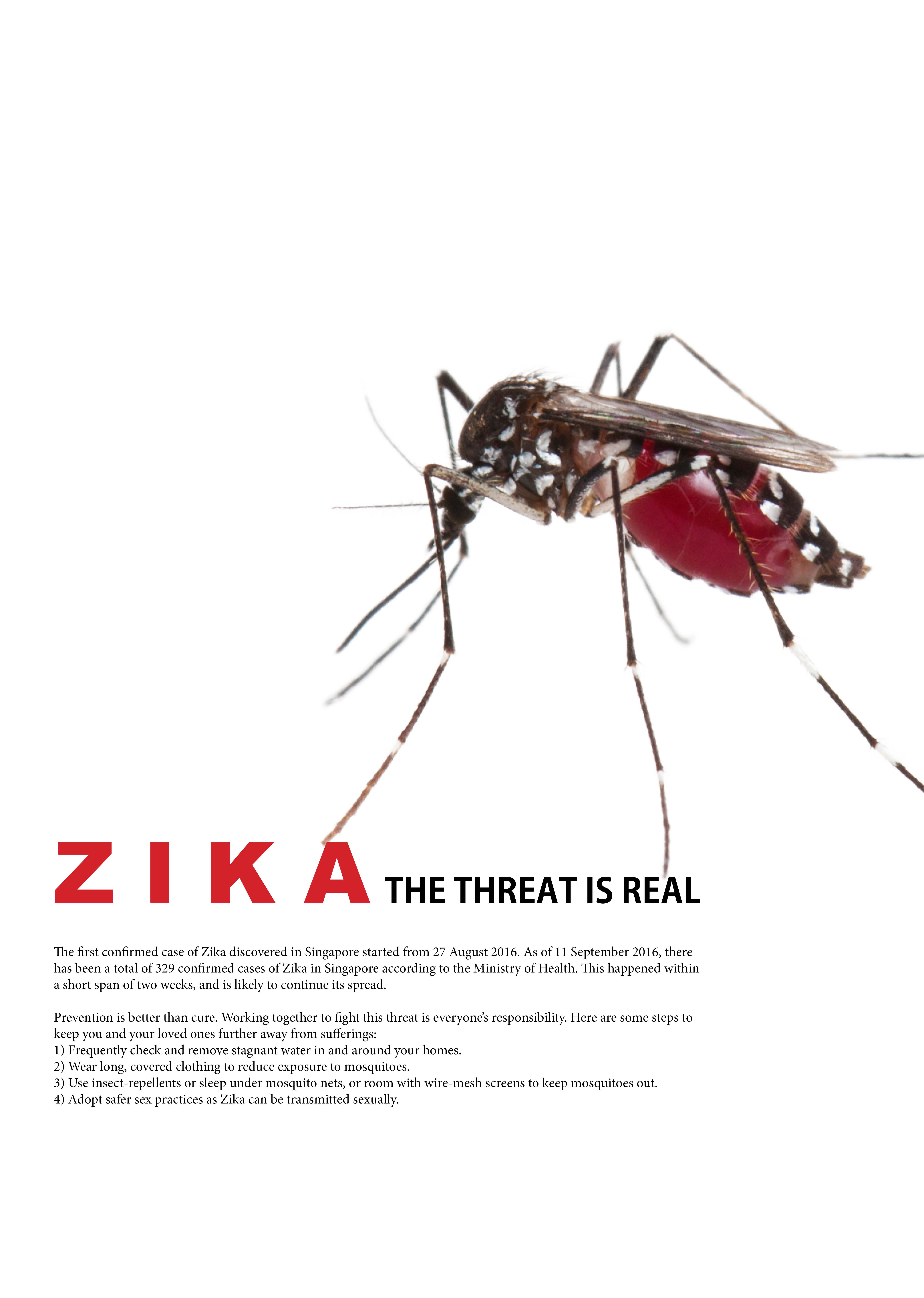
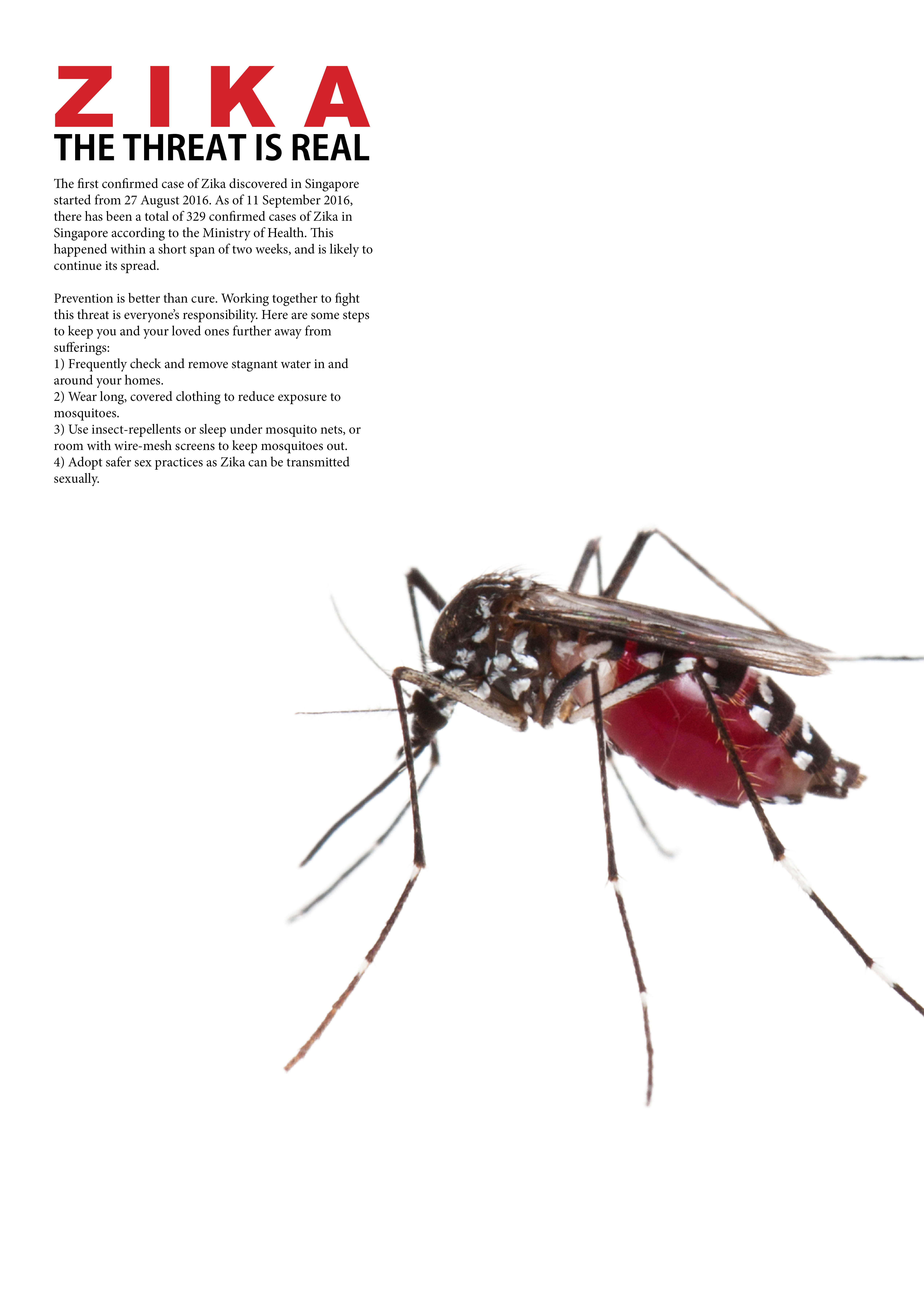
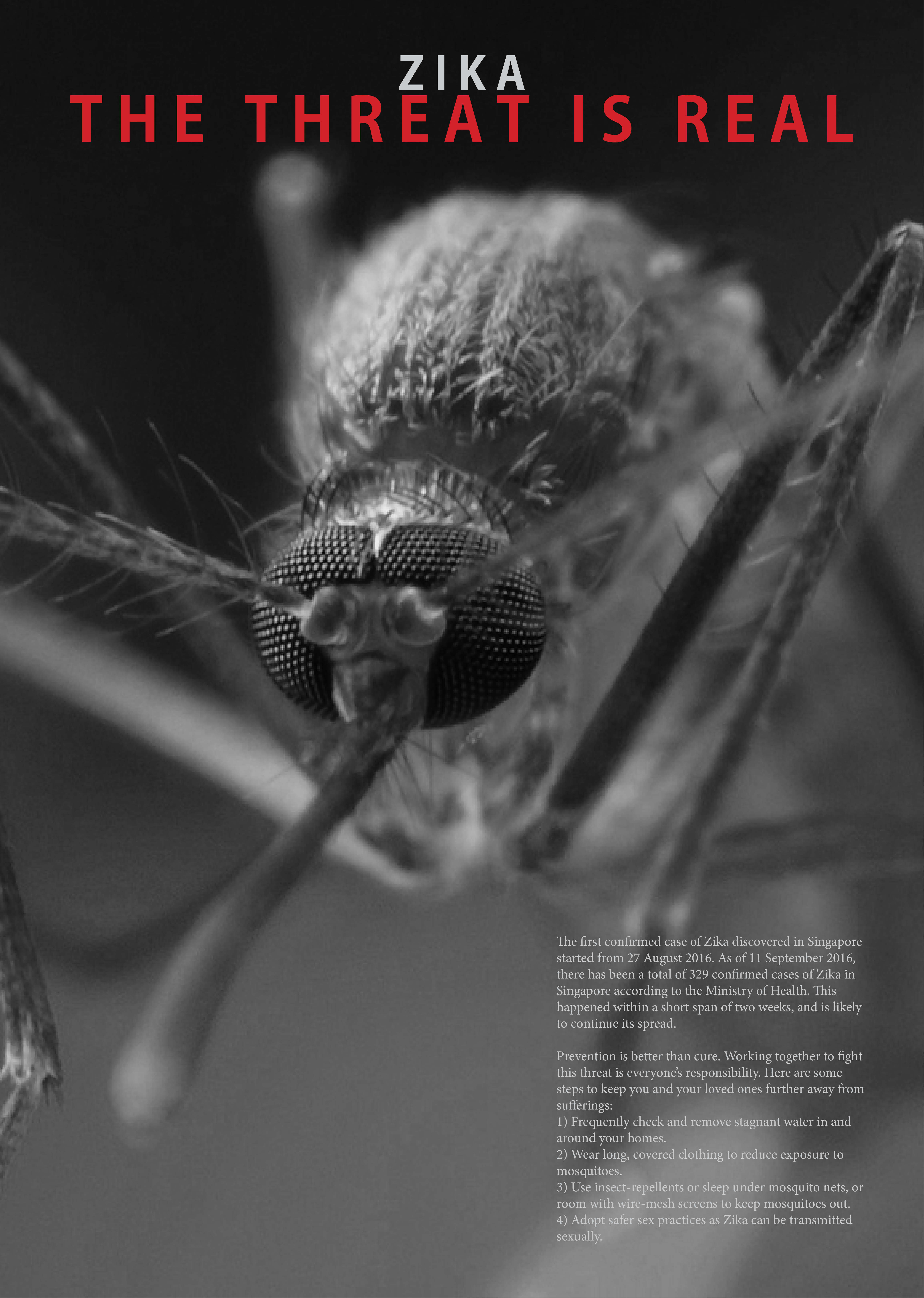
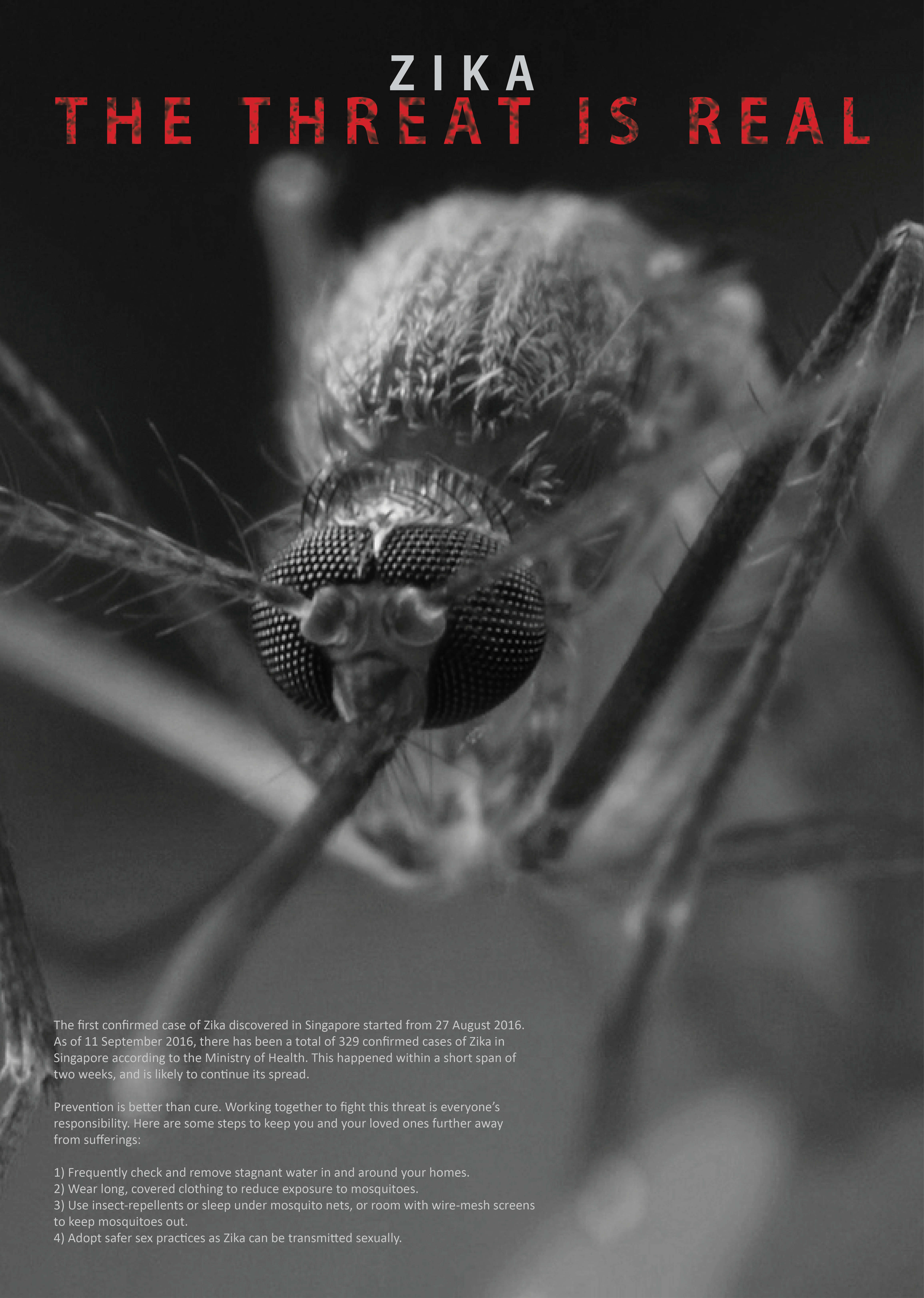
For concept 4, it is spun off concept 1, where I decided to follow the feedback by using the image of a mosquito facing the viewer to heighten the threat. It is also the concept that I am likely to stick to. 4-1 is the original one that was created, followed by the rest to experiment and play with various compositions. Initially, I couldn’t find a high res photo that was clear and scary enough to be appropriate for use, and thought of doing an illustration manually. Nonetheless, what makes a mosquito actually look scary is the amount of details on it. An illustration would make it look cartoon-like and the effect of threat would definitely not be there. After searching for a long time, I came across an image that seemed suitable. I decided to make it black and white to give the feeling that it is very solemn and serious, further enhancing the idea of threat. Although it is not an Aedes mosquito, it cannot be told as after close examining, an Aedes mosquito’s striped legs only has the stripes across the joints and lower parts of the legs, which cannot be seen in the poster. I decided to put the eyes near the middle of the poster to catch the attention of viewers, and also the slogan in red to make it pop. The content of the paragraph is the same as concept 1, just playing with the alignment and arrangement. I was also told that the text should be on the left, where the mouth of the mosquito acts as a line that directs the vision downwards. 4-3 to 4-5 are mainly playing around with the captions to see what kind of effects I can get from different effects and fonts, sizes, etc. Ultimately, I am still most pleased with 4-2. It is almost the same as 4-1, but paying more attention to the text and the alignment of the captions. It fits into what I wanted all along, something that is clean, simple, clear and concise and has an impact, rather than throwing in all kinds of ideas and experiments which to me makes it look very messy and unpolished, be it the visual outcome or the thoughts thrown into it. Somehow, I feel that having a simple and clean design emphasizes the clarity and effort of thoughts behind organising the entire layout, rather than the lack of it by choosing the easier way out. One other additional touch that I am considering to do is to make the eyes reflective to allow the viewers to see themselves as the next targets.
Lastly, there seems to be some unofficial changes to the assignment brief just for the record to remind myself, that there is no longer a need for the word “Zika”and preventive measures to be included in the poster. Nonetheless, I would most likely stick to the original requirements of the assignment as a challenge to myself, and also because I believe that is the “correct” way of working in this field, to try my best to adhere to the requirements and needs of my client! 😀
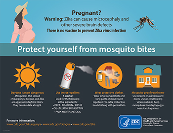
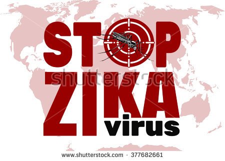
This is the second assignment on Visual Communications, and this time on Health Communication Posters, particularly targeting the issue of Zika.
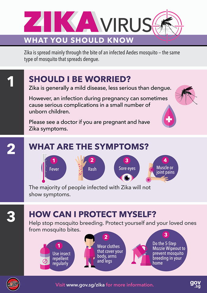
As a start, I started to look for various health communication posters which appealed to me more than the rest of them out there, and here they are:
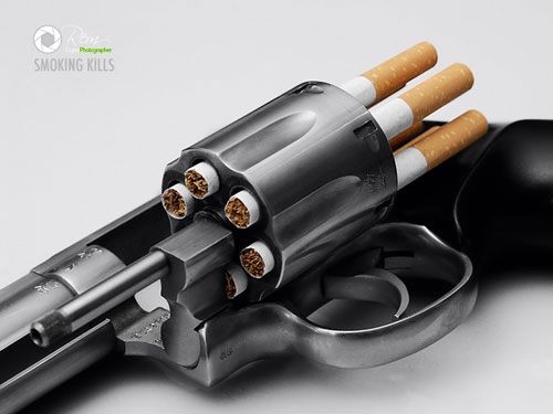
Something provocative to catch attention of viewersLiteral, graphic content to arouse interestA creative use of props to bring across a clear messageClean and eye-catching with a rough finishInformative, kept it here as a way to organise informationIn-your-face kind of messageAnother informative example
The next step would be come out with slogans, which I have come up with the following:
“Zika – Everyone’s at risk.”
“Zika – The threat is real.”
“Zika – To be safe than sorry.”
“Protect your loved ones from Zika.”
“Fighting Zika together.”
“Zika 101”
Nonetheless, these slogans seem a little cliche, and might not arouse enough interest or catch the attention of viewers. I will be looking out for more inspirations and maybe tweak them along the way.
Moving on from last week, I have decided to focus on the sapling design as I was more keen towards it as compared to the one with water droplets. Nonetheless, there were many feedback and considerations taken in, allowing me to tweak my design further before finalising it.
Based on the previous design, I have maintained the concept of transparent and opaque composition, but decided to change some of the elements shown inside.
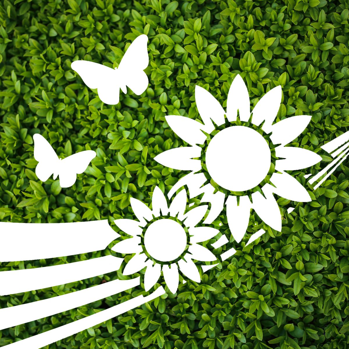
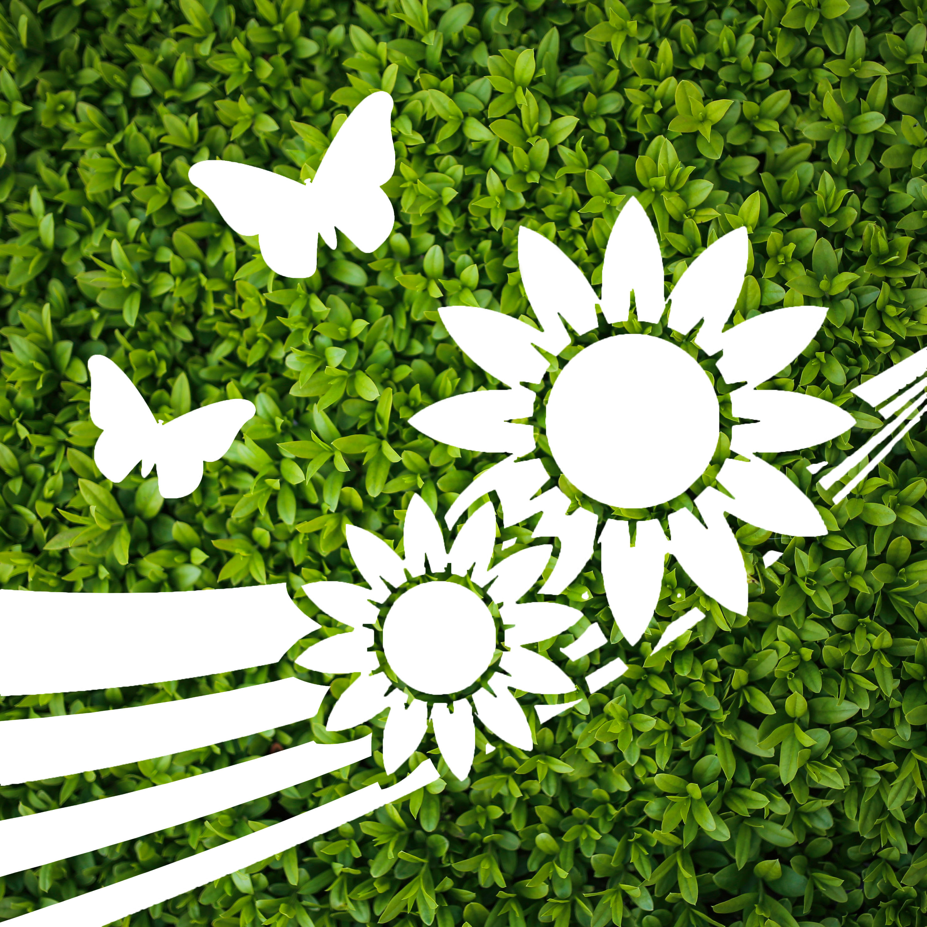
FInal Design – To be done on translucent decal.
The main subject, the sapling, has been changed to sunflowers. The sapling image was not as clear to audiences, and the roots did not seem to be well received. As such, I decided to replace it with sunflowers. Initially I used one sunflower, but it seemed kind of lonely and did not bring out the message of happiness and warmth as a sunflower should. Two sunflowers were then used to counter this issue, rotated and overlapped slightly to give more dimension despite being a silhouette.
The silhouette of the butterflies were also changed as the previous ones did not look like butterflies to most people. This brought up the issue of clarity, even though my initial idea was to make use of different profiles of butterflies to give movements. This time round, I have made use simple butterfly shapes in different sizes and orientation to help bring some movement into the design, and remain clear as well. This combination of flowers and butterflies would then give a positive vibe of nature.
After these two elements were settled, I felt that the design was still kind of flat and lacked interest and a focal point. I then added in the strips of curved lines which had different thickness, converging towards the right “behind” the sunflowers. This silhouette of the lines seemed to help guide the eyes towards the sunflowers and provided movement as they move from a broad layout to a converging point.
Last but not least, the background was chosen to be a lush green spread of small leaves. This is also inspired by how Innisfree typically has a wall of leaves behind their counter, which gives a relaxing feel of nature and soothing to the eyes. First of all, this background is in one general color, making it plain and simple enough to be contrasted against the transparent elements which will reflect the bustling city colors. Second, this wide background of greenery fitted the nature theme well, and provides a soothing and relaxing resting spot for the eyes, yet not steal the limelight from the main cutouts.
Overall, this finalised design aims to bring about a feeling of warmth, happiness, calm, yet along with a bit of energy brought about by the movement and bold lines. A blend between simplicity and details also aims to bring a clear image to the eyes, simple enough for fast understanding, detailed enough to make out the elements. If it was to be translated into a series, the bold lines could make the connection between different panels, providing a flow while keeping the background consistent. The overall effect would then have a very broad and lush greenery which could be seen as an entire wall of leaves or a garden. Keeping the simplicity and style of the cutouts constant, other panels could display more variations of flora and fauna.
After sharing the three concepts that I had come up with last week, I have received various feedback from the class and our tutor Michael. The feedback has helped me see pointers that I could not, and also help me focus on what can be done or should be done to improve my designs.
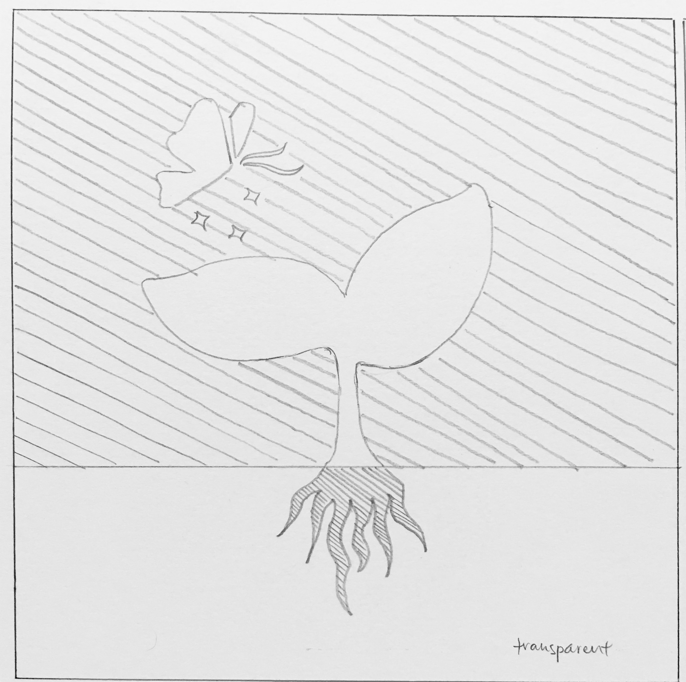
Among the three designs, I have decided to continue exploring the first two that I came up with, namely the one with a sapling, and the one with water droplets. I have decided to drop the idea of the farm as it did not seem as good an idea as the other two, thus deciding to focus more time on improving these two. The farm design seemed more suitable for kids, and might not work as well to other age groups, even though the concept of cuteness is applicable, audiences might not receive the same message as I have intended.
So, this is the next stage where I start to think more about the composition and color choices.
Design 1 – Sapling
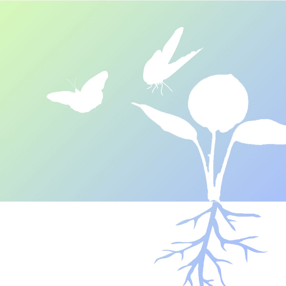
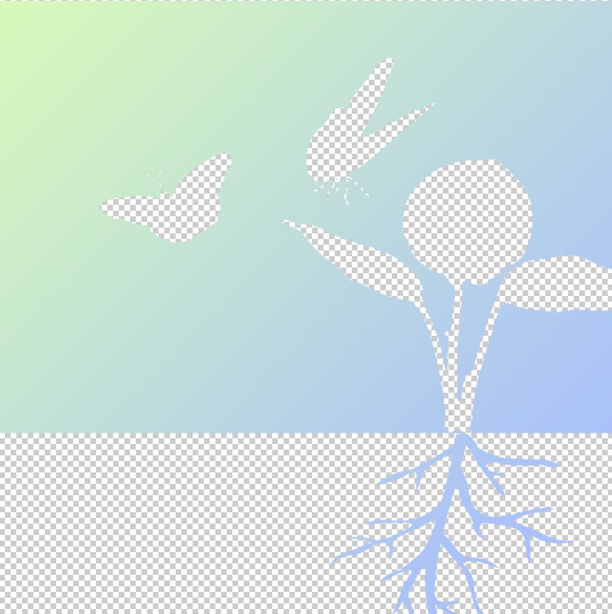
This is based on my first concept, the one with a sapling. As planned, I decided to go with the contrast of opacity, playing with transparent and opaque parts. I have shifted the sapling towards the right one third of the composition, following the rule of thirds which the eye focuses. Different postures of the two butterflies also serve to add more motion to the design, giving it more life despite the simple design and colors. I have chosen to use a gradient of green and blue as these colors largely symbolises nature, such as the sky and grass. The colors also come in a more pastel shade for it to feel more comfortable and soft. These plain background would also serve to work well against the background, which would be a myriad of colors as the bridge is surrounded by buildings, roads, trees and so on.
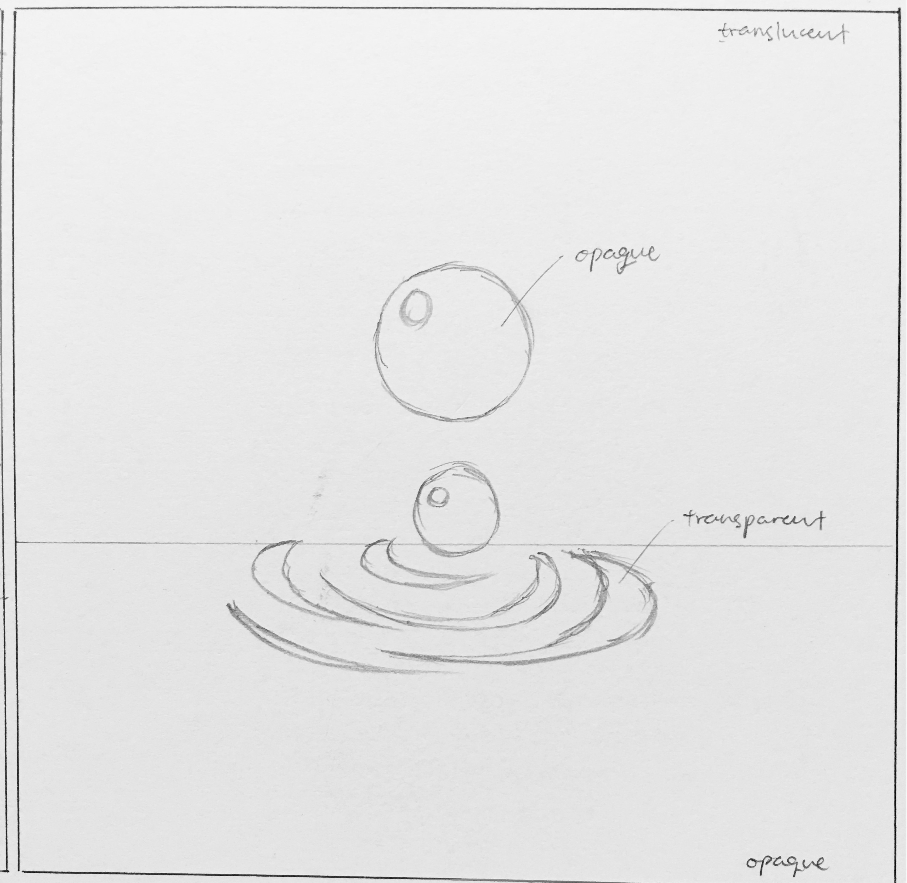
Design 2 – Water drops
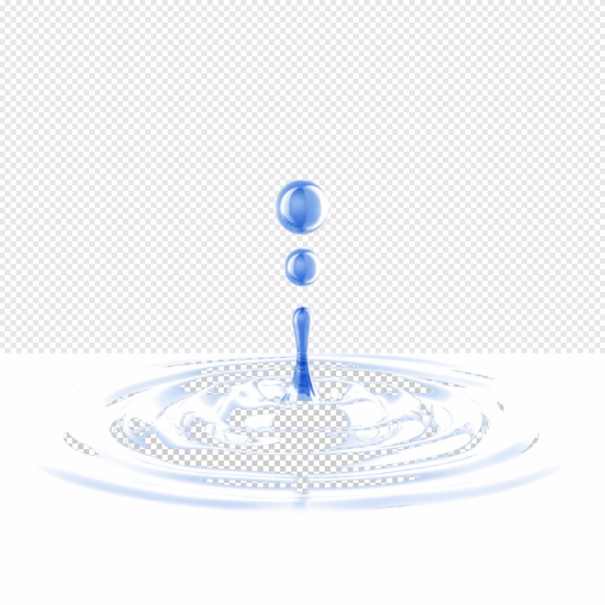
This design is based on my second composition, the water droplets and the ripples effect. This design more be more towards a calm and tranquil mood, thus the choice of white and blue, which are very clean and soothing colors. The main background is actually translucent, which allows the environment to fill up the background, yet the colors and images from the environment would be blurred. This allows the design to be visible, yet not just a plain flat image. The ripples are then made to be transparent, as this seems to be the “focus” of the design. As viewers walk along the bridge or move along the travellator, the background would then change accordingly, making it seem as though the ripples are moving, giving the design more dynamics and visual interest. I have decided to keep the entire composition centralised as opposed to the first design, as I felt the it seem more complete being right in the middle. The ripples would radiate from the middle of the composition, making the design well balanced and give an idea of “wholeness”, along with the spherical shapes of the droplets.
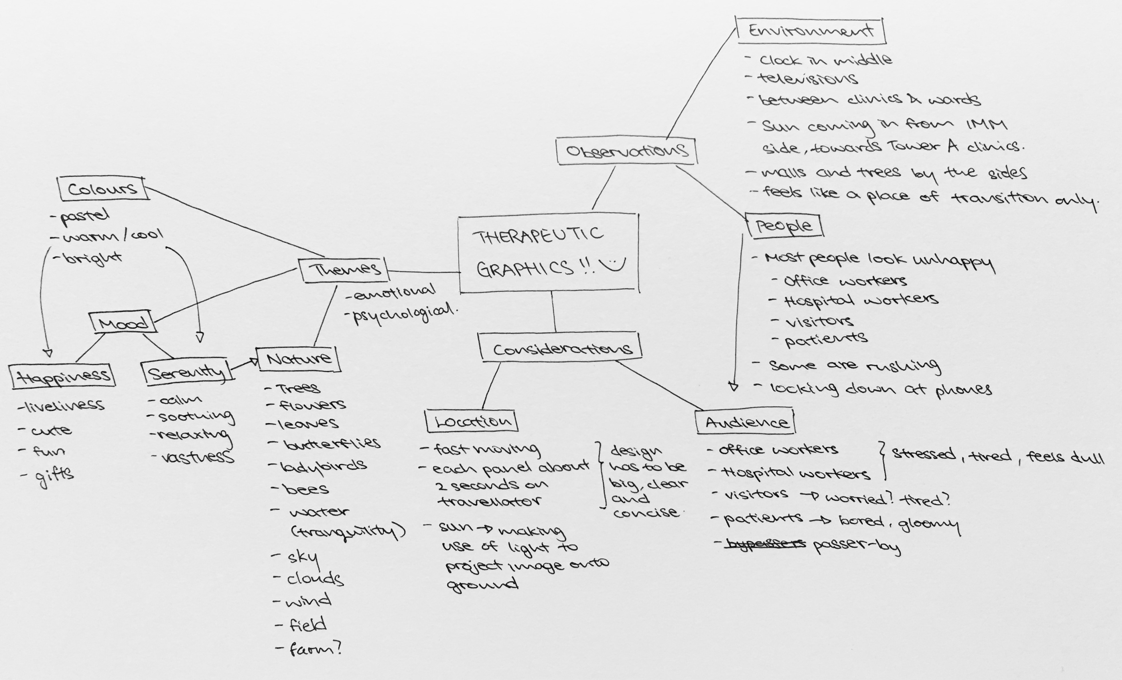
On the first day of school, 8th August, we went on a visit to Ng Teng Fong hospital, and were briefed to come out with a two dimensional therapeutic graphic to be placed along a bridge which connects Tower A clinics to Tower B wards.
With the luxury of staying in the west, I went back there for more observations on Saturday, 13th August. I wanted to see if there were any difference in the crowd as well as the environment there between a weekday and a weekend, and also between a morning and an afternoon. The crowd would determine the groups of audiences that my design has to cater to, while the environment would give me a clue of what would work and what might not.
With the observations, I then generated some considerations that I had in mind. This considerations would then bring me forward in coming out with concepts that I deem therapeutic and appropriate for use there.
One key consideration that changed my idea of the designs was the sunlight. Initially, I wanted to have a transparent design where the sunlight can project the image onto the ground. However, I noticed that the sunlight there was not very strong, and did not have a very low angle that can project the image large enough onto the ground, thus I decided to change the idea and work towards another direction. Another would be the viewing time, which is short of about two seconds on the travelator, which means my concepts have to be clear, concise, and visible.
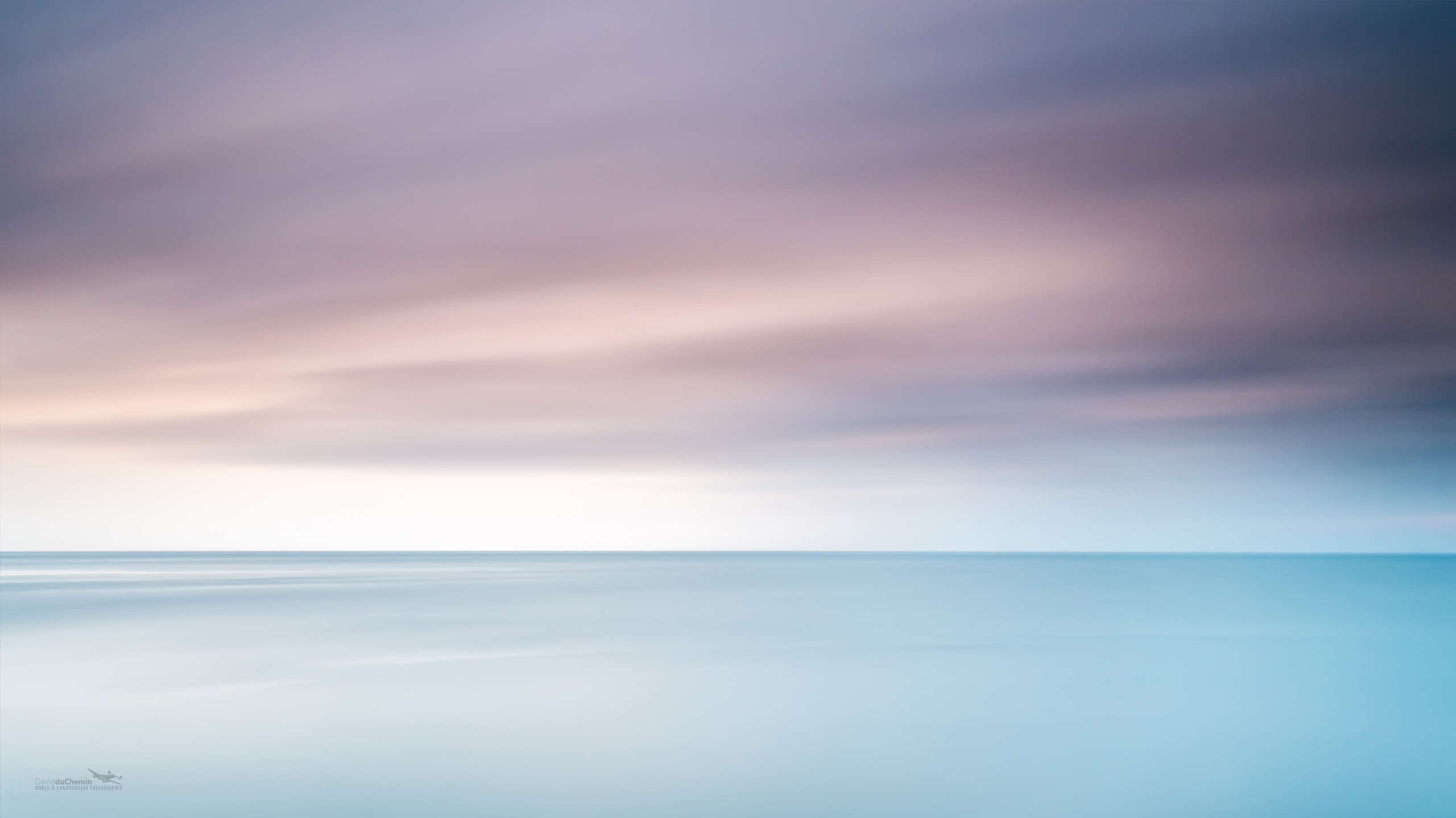
After coming up with the mindmap, it was simpler to understand what direction I would be heading towards. I went online to search for ideas of therapeutic graphics and pictures with a healing element, and most of them had the idea of “nature” in them.
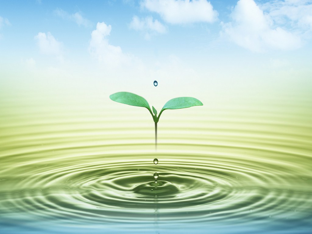
Vastness of the sea and horizonA sapling and ripples
The following are three main concepts that I came up with after the considerations and references.
Concept 1 – Sapling
The first one makes use of the light and surrounding elements to play with the contrast of opacity. The top portion would be an opaque background with transparent graphics of a sapling and a butterfly, whereas the bottom portion would be an opaque root against a transparent background. This concept uses the surroundings to fill up the image, giving the design more dynamics. The sapling would symbolise growth and recovery, with the butterfly serving to enhance the experience by sort of providing some movement and “smell”.
Concept 2 – Water droplets
The second is similar in that it uses the idea of opacity. The top portion would feature a translucent background, while the bottom is opaque. The water droplets are opaque as well, leaving ripples transparent only. This would allow the ripples to “move” as the audience move along the bridge as the background surroundings would change along the movement. I wanted to give a feeling of tranquility of a calm water surface, as well as the vibrancy of the ripples. The water droplets also symbolises “wholeness” as water droplets tend to the form of a sphere by itself.
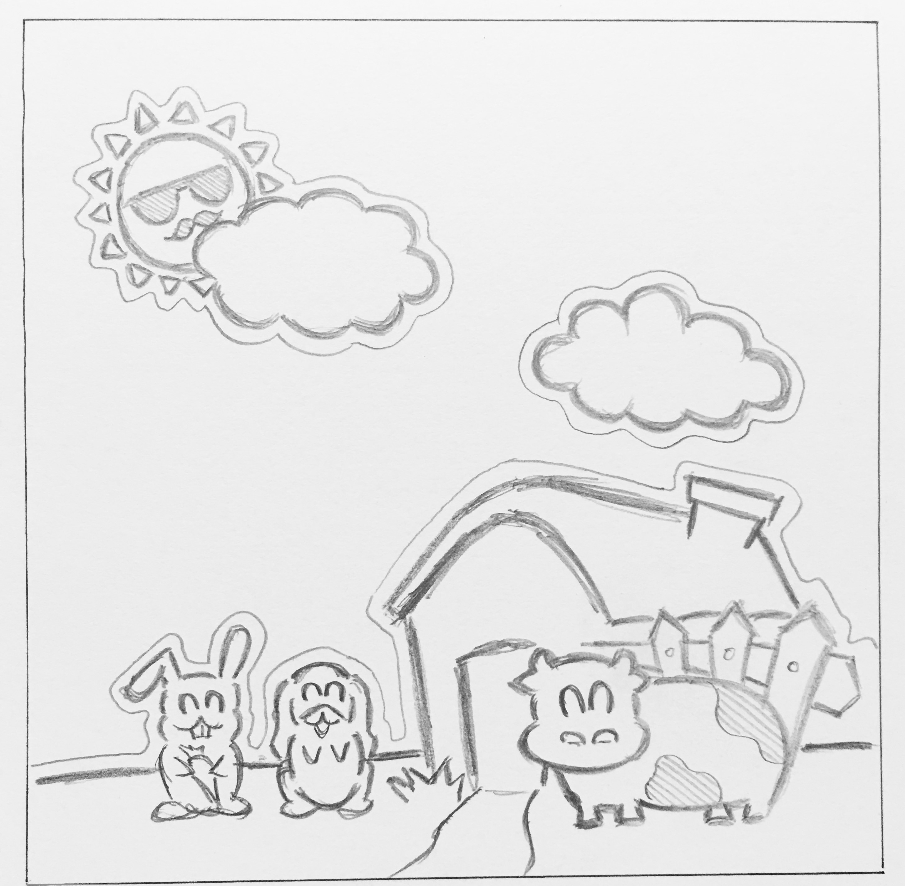
Concept 3 – Cute farm
Lastly, in my third concept, I decided to change a point of view and have a different idea altogether. While coming up with concepts for the first two, I had a random idea that struck me, which is that basically almost anything cute would help to liven up somebody’s mood. I wanted to use the idea of “cuteness” to make people more happy and relaxed, and not forgetting some sort of therapeutic elements in it. I decided to come up with a farm, where a farm is largely related to being a place for retirement, for relaxation. I did it as a sticker / decal style to have some sort of a child-like touch to it, where the lines are black and bold and have a ring of white space around it. Very simple shapes and objects make up this composition to make it simple to view despite having more objects in it.
Subsequent improvements on these concepts would include how to make these compositions interesting despite having a simple design as well as the choice of color use.