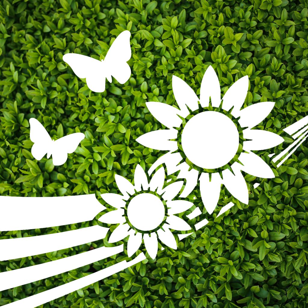
Moving on from last week, I have decided to focus on the sapling design as I was more keen towards it as compared to the one with water droplets. Nonetheless, there were many feedback and considerations taken in, allowing me to tweak my design further before finalising it.
Based on the previous design, I have maintained the concept of transparent and opaque composition, but decided to change some of the elements shown inside.

The main subject, the sapling, has been changed to sunflowers. The sapling image was not as clear to audiences, and the roots did not seem to be well received. As such, I decided to replace it with sunflowers. Initially I used one sunflower, but it seemed kind of lonely and did not bring out the message of happiness and warmth as a sunflower should. Two sunflowers were then used to counter this issue, rotated and overlapped slightly to give more dimension despite being a silhouette.
The silhouette of the butterflies were also changed as the previous ones did not look like butterflies to most people. This brought up the issue of clarity, even though my initial idea was to make use of different profiles of butterflies to give movements. This time round, I have made use simple butterfly shapes in different sizes and orientation to help bring some movement into the design, and remain clear as well. This combination of flowers and butterflies would then give a positive vibe of nature.
After these two elements were settled, I felt that the design was still kind of flat and lacked interest and a focal point. I then added in the strips of curved lines which had different thickness, converging towards the right “behind” the sunflowers. This silhouette of the lines seemed to help guide the eyes towards the sunflowers and provided movement as they move from a broad layout to a converging point.
Last but not least, the background was chosen to be a lush green spread of small leaves. This is also inspired by how Innisfree typically has a wall of leaves behind their counter, which gives a relaxing feel of nature and soothing to the eyes. First of all, this background is in one general color, making it plain and simple enough to be contrasted against the transparent elements which will reflect the bustling city colors. Second, this wide background of greenery fitted the nature theme well, and provides a soothing and relaxing resting spot for the eyes, yet not steal the limelight from the main cutouts.
Overall, this finalised design aims to bring about a feeling of warmth, happiness, calm, yet along with a bit of energy brought about by the movement and bold lines. A blend between simplicity and details also aims to bring a clear image to the eyes, simple enough for fast understanding, detailed enough to make out the elements. If it was to be translated into a series, the bold lines could make the connection between different panels, providing a flow while keeping the background consistent. The overall effect would then have a very broad and lush greenery which could be seen as an entire wall of leaves or a garden. Keeping the simplicity and style of the cutouts constant, other panels could display more variations of flora and fauna.
