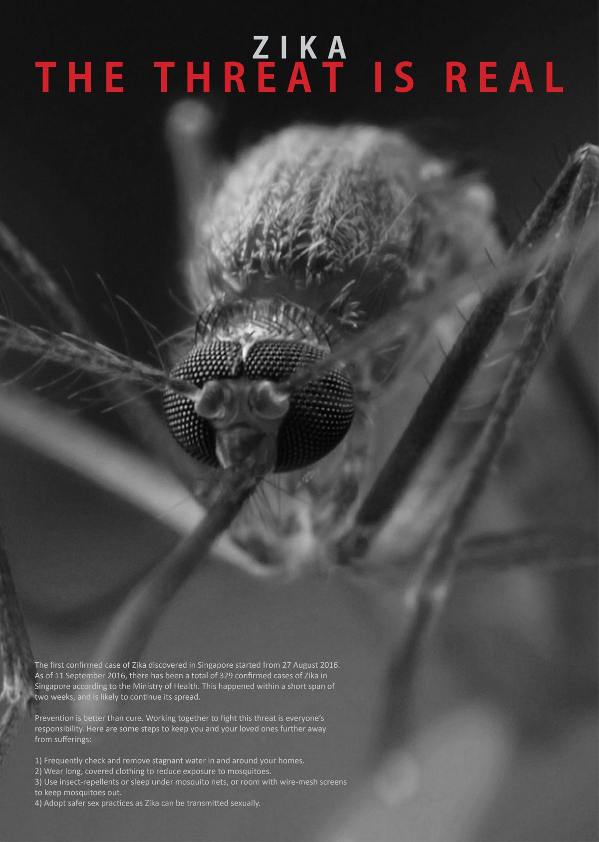
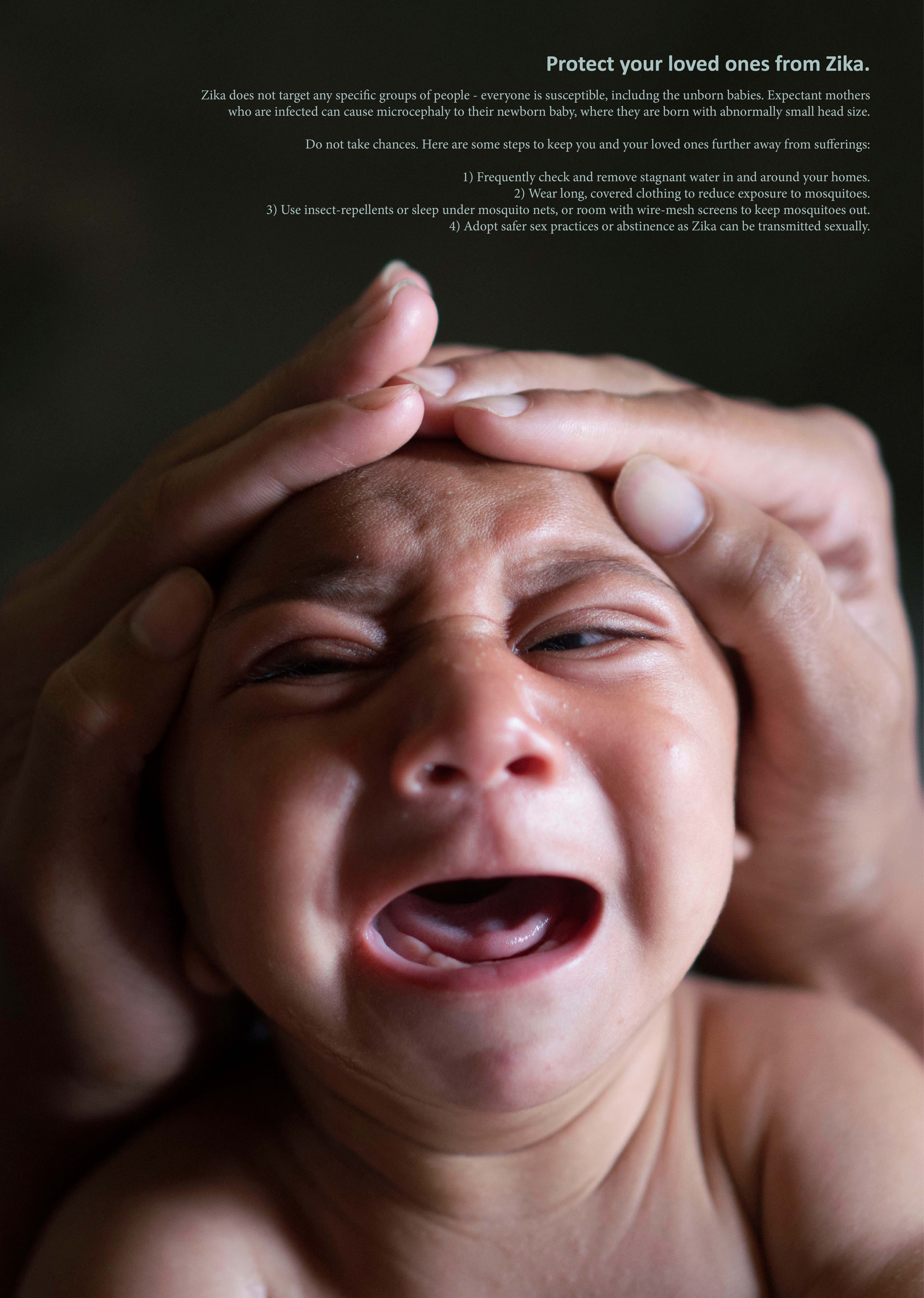
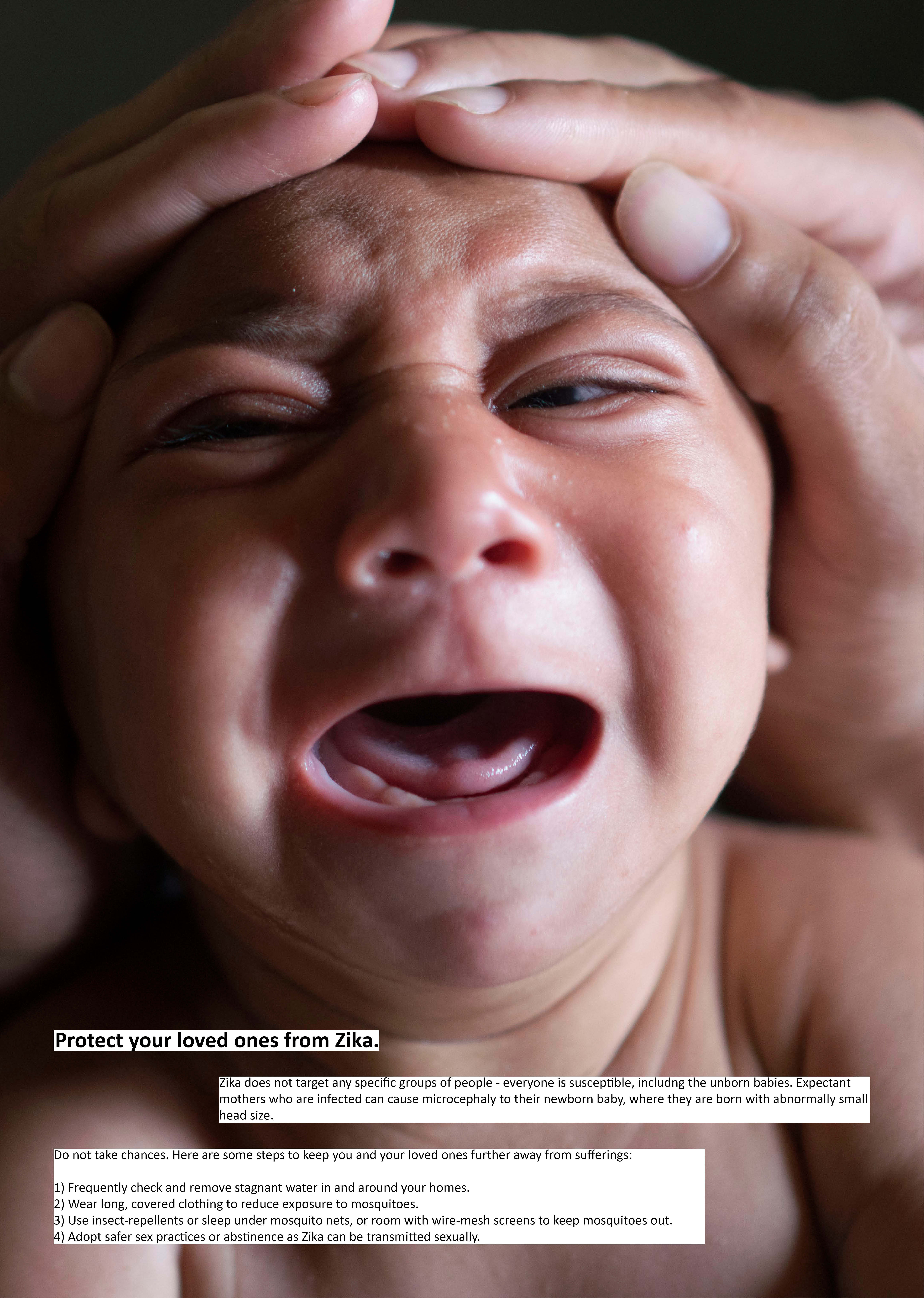
As a start to the project, I started off with coming up various different categories that were more relatable to me, so as to better bring across the emotions or intended meanings with more impact. These categories included Family, Food, Loneliness and Trust. Under each category, I also generated a list of possible metaphors that I could work with. However, the feedback was that there was a lack of element of surprise and connection that no one has thought of yet.
After that, our Prof Nanci showed us a FYP project based on metaphors, where the designer worked on a photo series showing objects found in an unidentified society to criticize the state of living and law in that country. With that, I shifted my focus towards something that might be more relatable to more people, and with that I started thinking about controversial issues in Singapore, since controversies always draw attention and debate or discussions. Controversy refers to issues likely to give rise to public disagreement or heated discussion. I was thinking maybe I could work on subtle feelings that people feel day to day, but did not bring up officially. This would make it relatable to many, and might be something that no one has brought up before. For example, feeling that local elderly are too self-entitled rather that understanding many privileges were offered to them rather than an entitlement, such as how some of them do not have the courtesy to properly ask for a seat on a public transport but rather just scold the person or go “ahem” to get the seat that is “reserved” for them. After getting offered the seat, they do not thank the person for his or her courtesy as well and deem it as an act that should be done anyway. However, I slowly start to find this might be a little hard as it might be difficult to find out what people actually feel inside but have never spoken out. I then moved on to try to target an organisation instead, which in this case would be the army, making it relatable to at least half the population which are the males who go through it personally, as well as the addition of their friends and spouses who hear stories from them.
The army consists of a mix of emotions, and I wanted to portray it by mocking or pocking fun at things happening in the army. This was based on personal experience as well as shared experience with male friends who has been through National Service (NS). Males will find it relatable and nostalgic or funny, while females will gain an insight to the little things that happen in the army apart from formal training, or also find relatable to what their friends or boyfriends might have told them before. It was also something that was tough when we were going through, but bittersweet memories when we look back on things that happened, so it will evoke more emotions in the audience. Nonetheless, the feedback gotten was that it might not be relatable to the general audience apart from the males who experienced it. At this part I was stuck for very long as I couldn’t quite understand the feedback. Metaphors are transport that help bring across ideas that otherwise seem unrelatable or not understood. Just like how my classmate Hui Zhong worked on homesickness, I believe her extent of homesickness as a foreign student is much larger than ours as locals who grow up here and get to return to our comfort zone with family this close. Drawing parallels, I felt that even though females do not go through NS, they don’t have to go through it to feel the emotions to that extent, and that is exactly why I choose to use metaphors to bring across these emotions for them to understand better rather than relating directly. From this I started to think about how do we relate? Is it by having been through the exact same thing, or by going through something similar, or by going through something similar and being able to imagine it to a larger extent? All these were with reference to my discussion with Prof Nanci, where the example she gave included a student’s work about the quarrel between her mother and her mother-in-law/mother, as well as how Syrian refugees are reported on the internet. To me, we didnt go through the exact same quarrels, the exact scenarios as the mother, neither did we go through any famine or living conditions similar to the refugees, but yet we could relate and feel for them. To me it was because we know the feeling of hunger, and that it is already bad, having a famine or lack of food for prolonged period was going to be much worse based on what we know and imagine. I was stuck for a long period of time brainstorming how to draw parallels to make it more understandable about my POV, and at the same time trying to take a step back to understand how to make it more relatable to more people.
During a group discussion with my classmates, we talked about whether a metaphor was cultural-dependant or transcends across all cultures. Something could be not relatable due to culture / knowledge differences, but yet a metaphor should help to carry the ideas across to make something not relatable more relatable. From this, we came up with the idea that maybe the army is a zoo, or maybe the army is a factory. Eventually, taking the idea of the zoo, I decided to show society, or an organisation as a zoo. And this started off with showing the idea of oppression in an organisation just like how animals in a zoo are oppressed. This was the initial parallels drawn before working on it more.
| ZOO | SOCIETY / ORGANISATION |
| 1) Many different types of animals, different species, genders, breeds etc. | – Many different types of people, genders, background, culture, race, and religion etc. |
| 2) Animals are oppressed by zookeepers. | – Workers are oppressed by superiors. |
| 3) Animals are treated the same based on generic classification, usually regardless of individual preferences and traits. | – People are treated the same based on generic classifications such as education level or departments. |
| 4) One-way communication, animals cannot feedback to zookeepers, can only do what they say. | – One-way communication, subordinates or citizens cannot feedback to superiors or government, have to follow their orders. |
| 5) Over time ill-treated animals might display aggressive behaviour to fight back, but there’s only so much they can do being under the control of the zoo. | – Over time unhappy subordinates or citizens will rebel / revolt against the superiors or government, but there’s only so much they can do working under the organisation or living in the country, even with the idea of freedom of speech. |
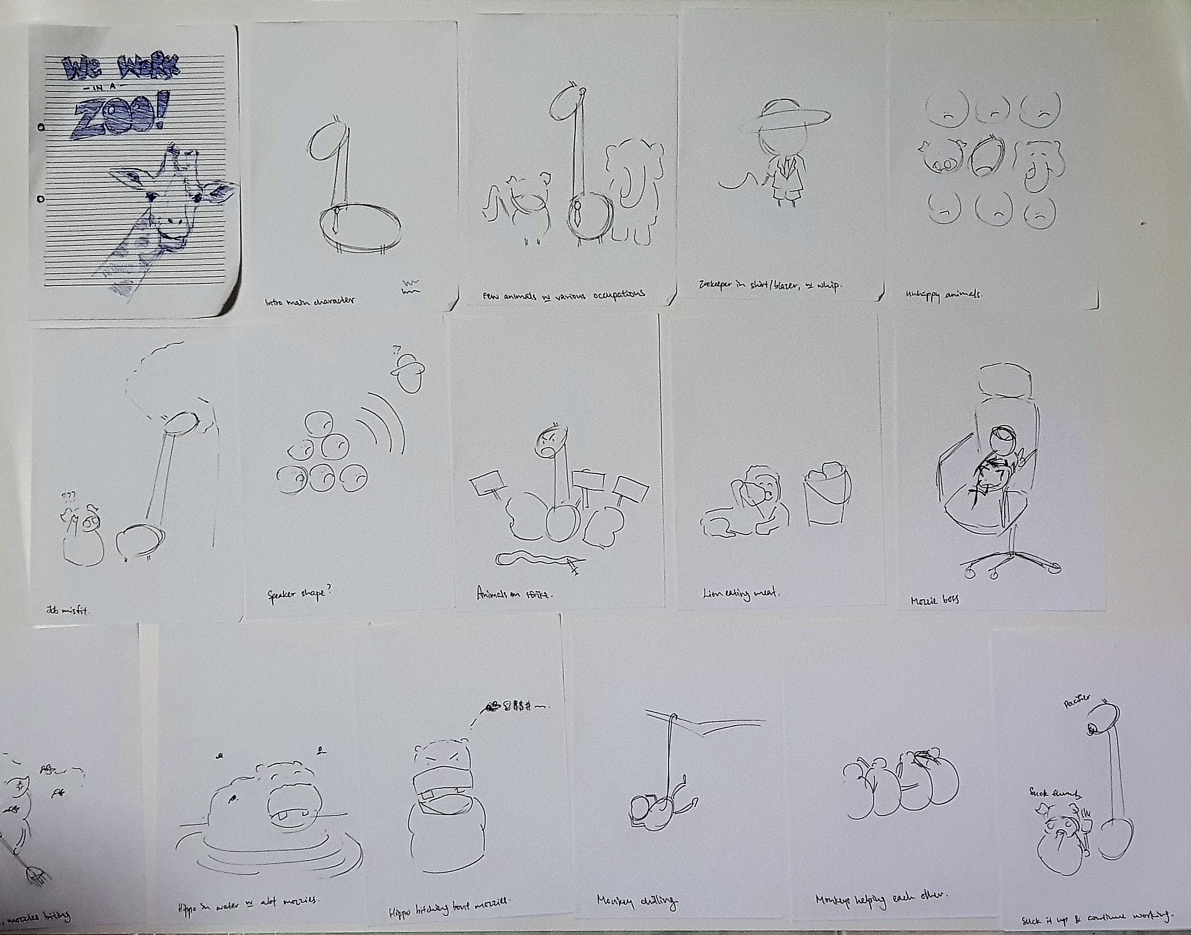
I wanted to do a photo series, showcasing objects that could be found from a zoo, to mock the conditions of an organisation that do the same to their employees. However, after showed an example of a book, I was swayed to try doing something similar. The book was showed during one of the sharing sessions by Prof Nanci, where the book talks about a screw / bolt / nut, its life, and eventually death when war came. The book was simple, with simple illustrations but yet was very impactful. I was impressed by it, and thus wanted to try to do something similar. My initial outline of the story only talked about oppression, and the story feels too short and empty and didn’t have the impact. With that feedback, I researched more on what employees feel or go through during work and what are most of their unhappiness or “office drama”. With that, my finalised outline included oppression by higher ranking workers, unfair wages earned by foreign talents, office politics, job misfit, favoured workers or departments, and pretending to be busy at work. This was the finalised outline.
| Storyline | Image | |
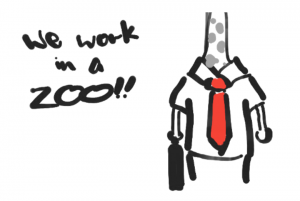
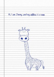
| 1 | Hi! I am Jimmy, and I work in a zoo. | Close up to eyes only. |
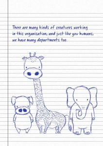
| 2 | There are many kinds of creatures working in this organisation, and just like you humans, we have many departments too. (bg) | Different animals in different jobs. |
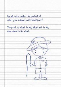
| 3 | We all work under the control of what you humans call zookeepers? They tell us what to do, what not to do, and when to do what. (hierarchy) | Zookeeper human holding a whip. |
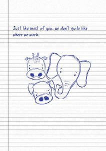
| 4 | Just like most of you, we don’t quite like where we work. (work unhappiness) | Unhappy animals. |
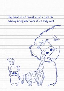
| 5 | They treat us as though all of us are the same, ignoring what each of us really need. (job misfit) | Few different variety of animals put together. |
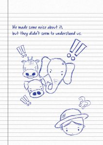
| 6 | We made some noise about it, but they didn’t seem to understand us. (complaints not heard) | Animals making noise. |
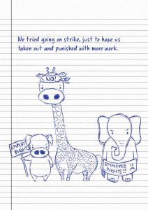
| 7 | We tried going on strike, just to have us taken out and punished with more work. (fighting for employee rights) | Animals on strike. |
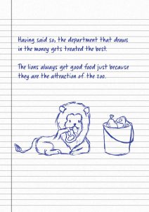
| 8 | Having said so, the department that draws in the money gets treated the best. The lions always get good food just because they are the attraction of the zoo. | Lion, chubby, munching on a bucket of meat. |
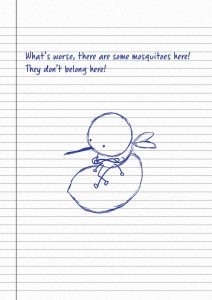
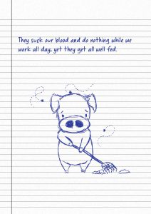
| 9 | What’s worse, there are some mosquitoes here! They don’t belong here! (foreign talents) | Mosquito boss with golden hair. |
| 10 | They suck our blood and do nothing while we work all day, yet they get all well fed. (highly paid foreign talents) | Fat mozzies sucking blood. |
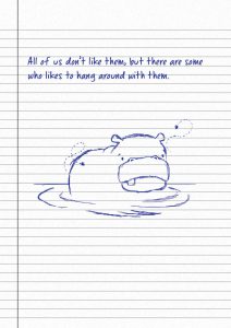
| 11 | All of us don’t like them, but there are some who likes to hang around with them. (office politics) | Hippo happy in swampy mozzie area. |
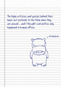
| 12 | The hippo criticises and gossips behind their back, but pretends to like them when they are around… and I thought such politics only happened in human offices. | Hippo ranting about mozzies. Hippo critter |
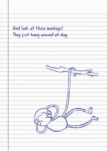
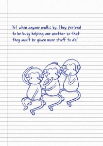
| 13 | And look at those monkeys! They just hang around all day. | Monkeys hanging from branches, relaxing. |
| 14 | Yet when anyone walks by, they pretend to be busy helping one another so that they won’t be given more stuff to do! (pretending to be busy) | Monkey helping monkey scratch / catch lice. |
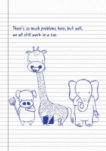
| 15 | There’s so much problems here, but well, we all still work in a zoo. (suck thumb continue working) | Unhappy animals still working. |
Before and alongside working on the outline, I was also trying out various styles of illustrations to bring across what I wanted to. Initially, I wanted to have clean and fully coloured illustrations (similar to happy tree friends) to make the book look like and suitable for children’s book, yet having a deeper meaning to adults.


I also considered another style done by local artist with the alias of “The Bitter Stickgirl”, where her illustrations are usually on puns or current affairs which are slightly satirical or mocking, making it relatable to locals. Her style of illustrations is very simple and clean and minimal. And this might be more appealing to adults who can just see everything at one glance rather than dive into details or enjoy fully coloured works.


After that, I also started to combine both illustrations and storyline to see how it flows and whether it was clear to bring across what I wanted to. This eventually led me to the style of pen doodling on a notepad to bring out the context of an office, like how workers might get bored during meetings and start scribbling in their notepad.

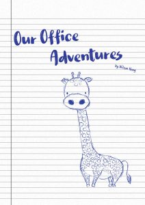
Having decided the style and mostly finalised the storyline, I decided to draw everything digitally. This allows me to think in a way that if the book needs to be reproduced, it can be done easily and also, mistakes and errors in the illustrations were more easily editted. This is also the first time I have done a digital drawing, and I got myself a Wacom for this. It was difficult getting used to it as the coordination was very different as compared to drawing directly on paper with a pen. I took a while to get used to it and continued to practice and try along the way, while changing settings and understanding how the Wacom works and what settings are suitable for this project so on and so forth. It did manage to replicate a style similar to pen drawings, and the first results are as follows.
This was for the final discussion before presentation, and I managed to receive some feedbacks. Personally I felt the typeface was too big, and there was too much empty spaces when everything is done on A4 to simulate a foolscap pad. That was also the general concensus from the class. I also received feedback to lighten the lines so that the images can stand out and be clearer, and to tighten up the storyline. I could try to think more from the state of mind of the supposed writer, and also keep the suspense by portraying only a zoo, and only revealing the office aspects at the very end, as my previous renditions all showed too much office elements and might be too “in the face” as a metaphor, and thus having to cut out some of these elements with every version. I then decided to resize everything to A5, to produce a notebook which can be used in an office setting to take meeting notes.