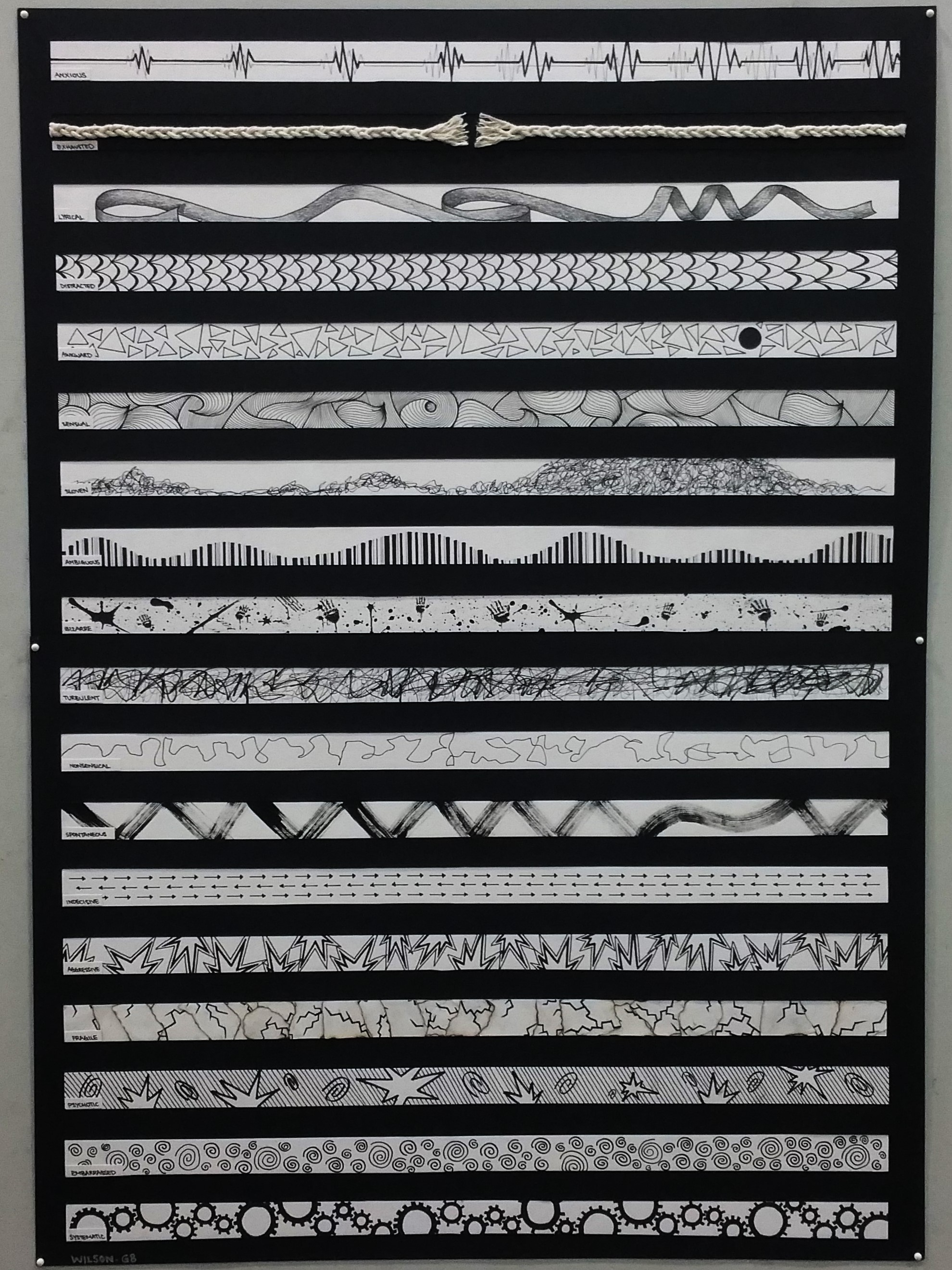
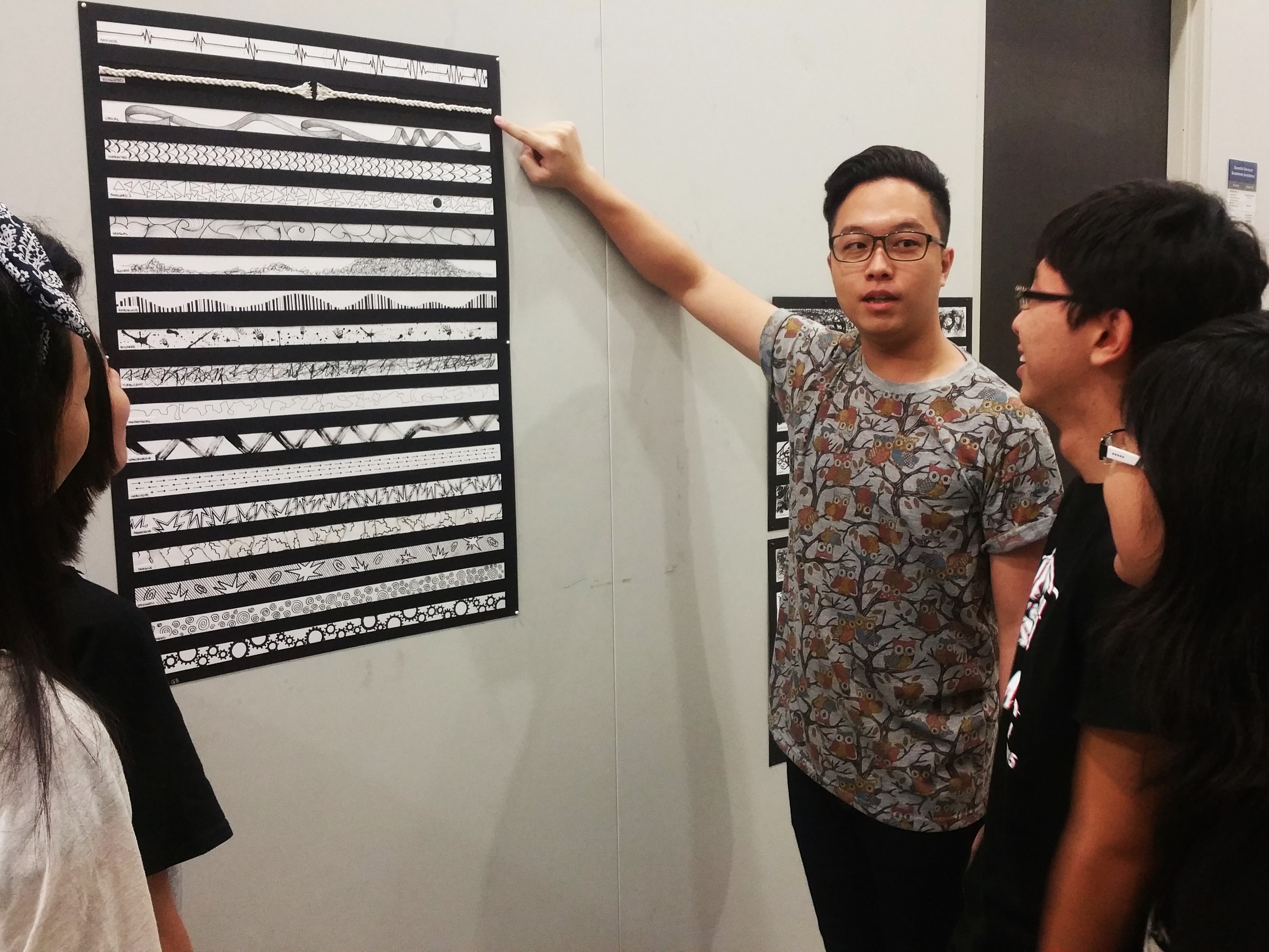
This is the final draft to be submitted for critique. Most of my strips were done using marker and pen, simply drawing what I want to convey in the most simplistic monochrome way. This is with the exception of “Bizarre” and “Spontaneous” which included the use of Chinese ink, “Exhausted” which uses cotton twines and “Fragile” which includes burning my paper.
The final product!
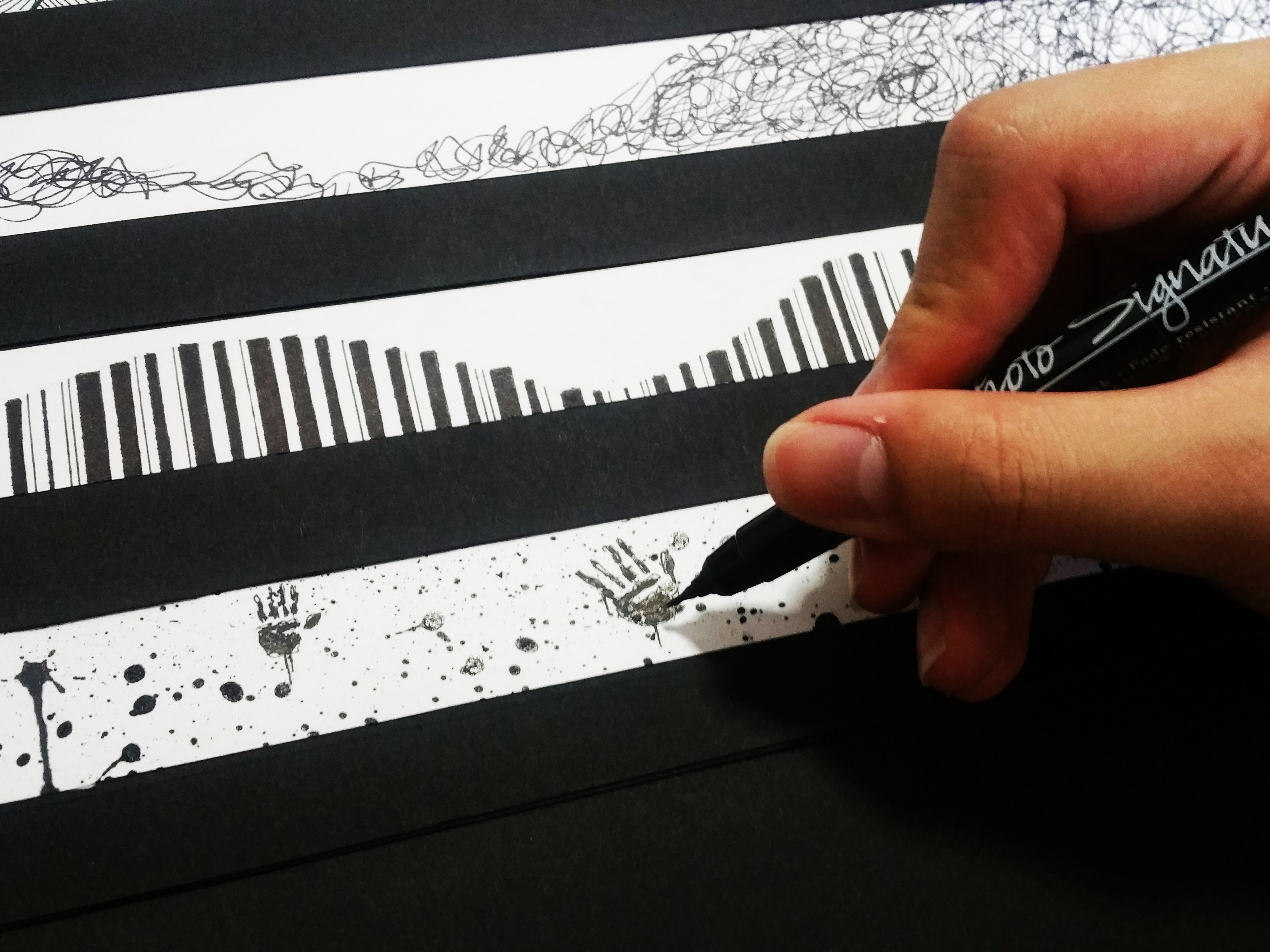
“Bizarre” was first done by drawing random hand prints of different sizes and orientations across the strip, followed by drawing the larger splatters to give it a more dramatic effect, then lastly completed by sprinkling Chinese ink across the entire strip using a hard bristle brush. It gives an overall effect of a crime scene, bloody and mysterious feel which goes in line with its grotesque characteristics.
“Bizarre”Touching up the hand prints with a marker
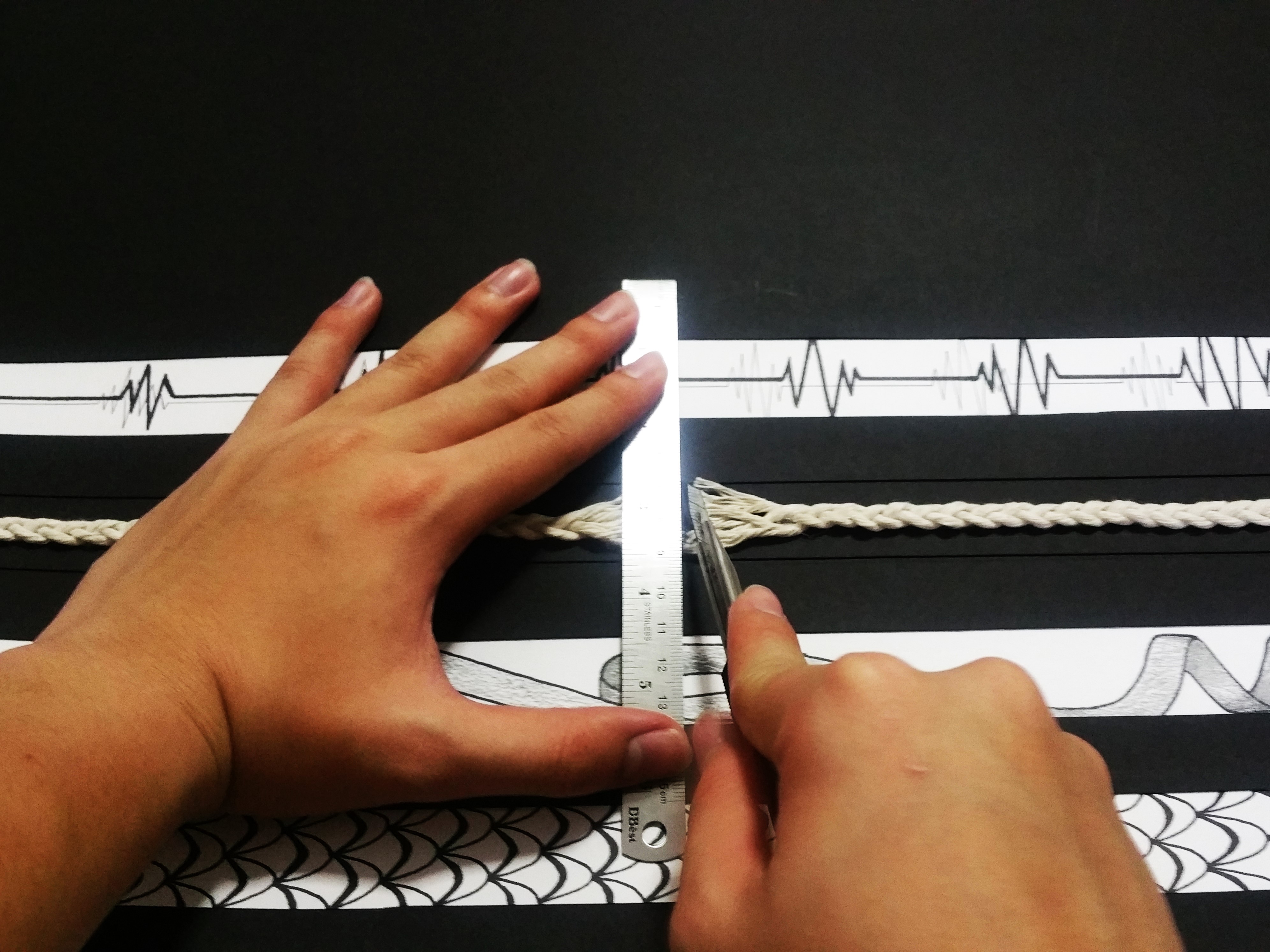
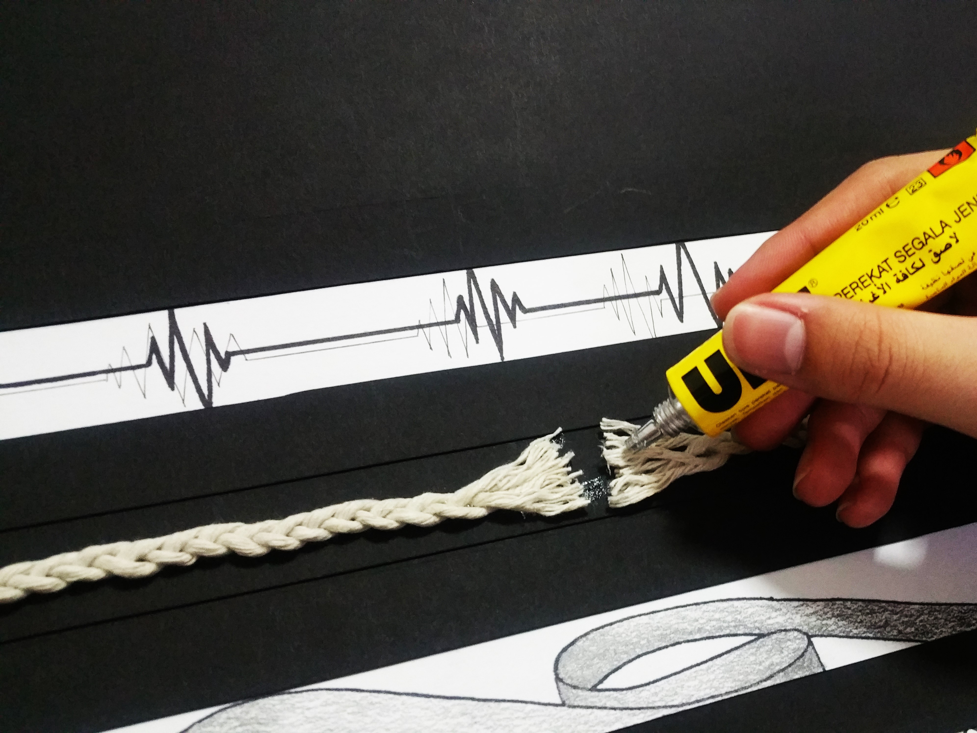
“Exhausted” was done by using cotton twines. As cotton twines were not thick enough to be prominent, I took three cotton twines and braided them, then stick the two ends onto a strip of black paper to make it stand out. after which, I cut the middle section and untwined the individual cotton strands, before sticking everything down onto the paper. This is to represent reaching a limit, a breaking point, which I feel is what exhausted really means.
“Exhausted”Cutting my “breaking point”Securing the twine with UHU glue!
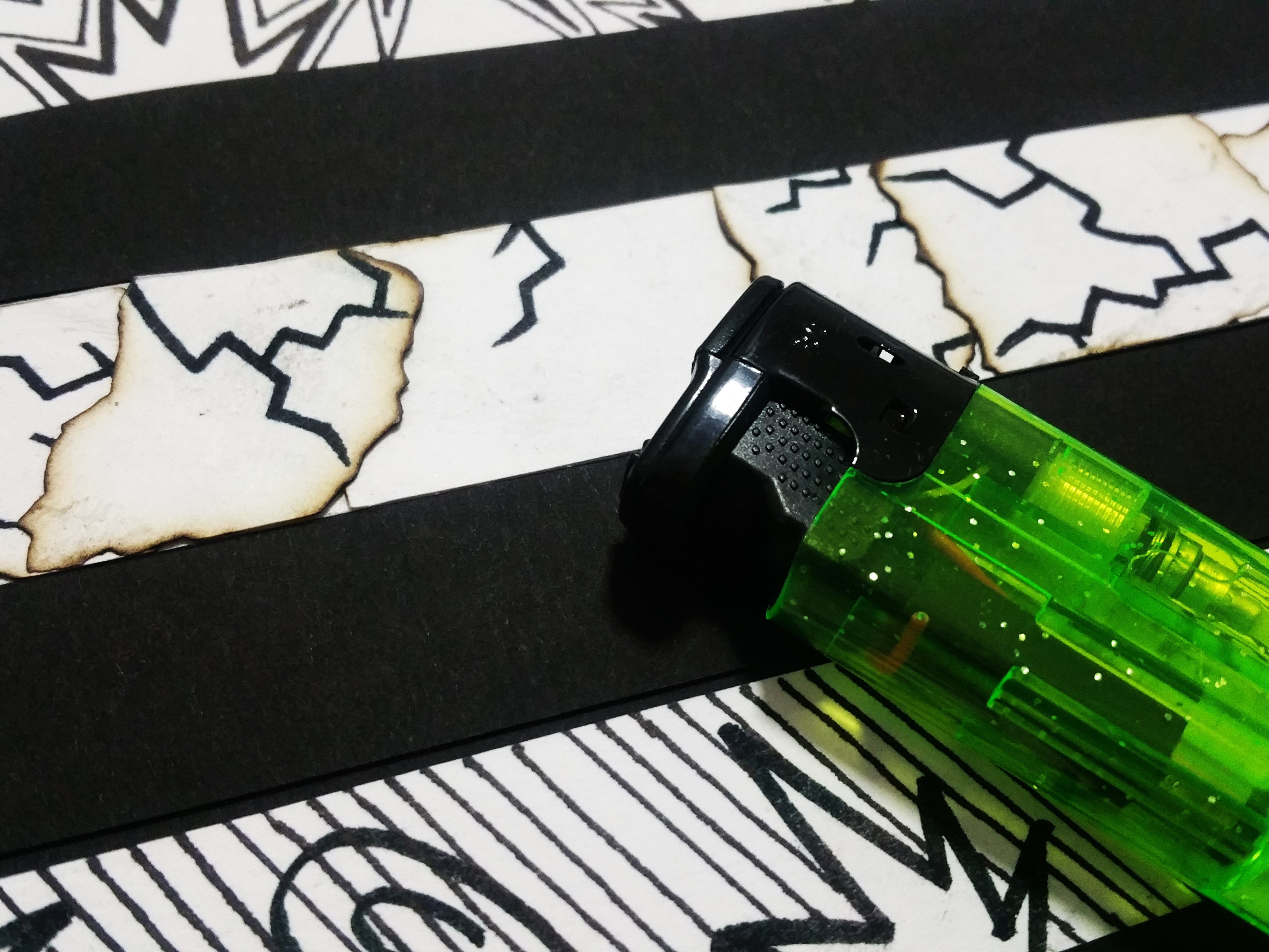
“Fragile” was done by first drawing crack lines across a piece of paper, then tearing it up into small pieces, then burning the edges to give a brownish edge and an outline when the pieces are stuck on top of one another. It gives me the impression of fragility as it shows like it is easily breakable or brittle using the crack lines and torn pieces, and how it is burnt gives a vintage and fragile feel like it will be destroyed at any time if not careful.
“Fragile”Burning with a windproof lighter makes it easier to control the flame burning only the edges.
Last but not least, the assignment was eventually completed, and ended off with a presentation to the class, showing the concept of doing the various strips and sharing the methods of doing it.
The assignment ended with a presentation to the class
When I first read this poem over and over for a few times, I could not relate what Robert Frost was trying to bring across in the poem, except for the very literal juxtaposition of fire and ice in relevance to the world of desire and hate. As such, the first step I took was to go online to research on the poem itself, to break it down before adding my understanding to it.
From my research, I found out that he was actually relating fire to desire and ice to hatred, and how these two would destroy the world. In addition to this that most people probably found, I found out that this poem was published during the period of time when people were actually really concerned over the destruction of Earth, either by an ice age, or by the Earth’s core heat. I found it quite interesting as this would be a bridge or link between the past and present, and how the poem would be interpreted differently when read in these different periods of time.
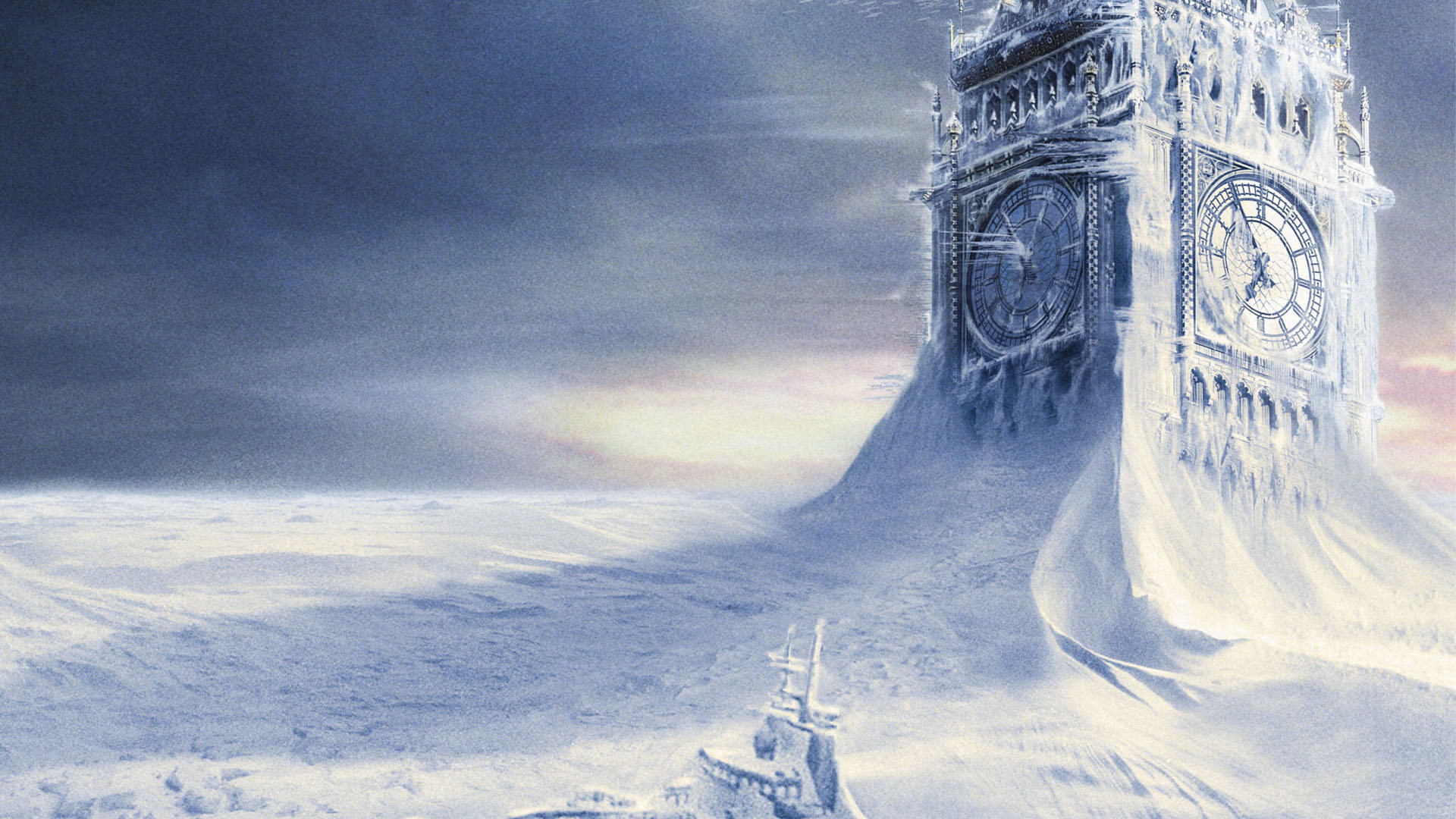
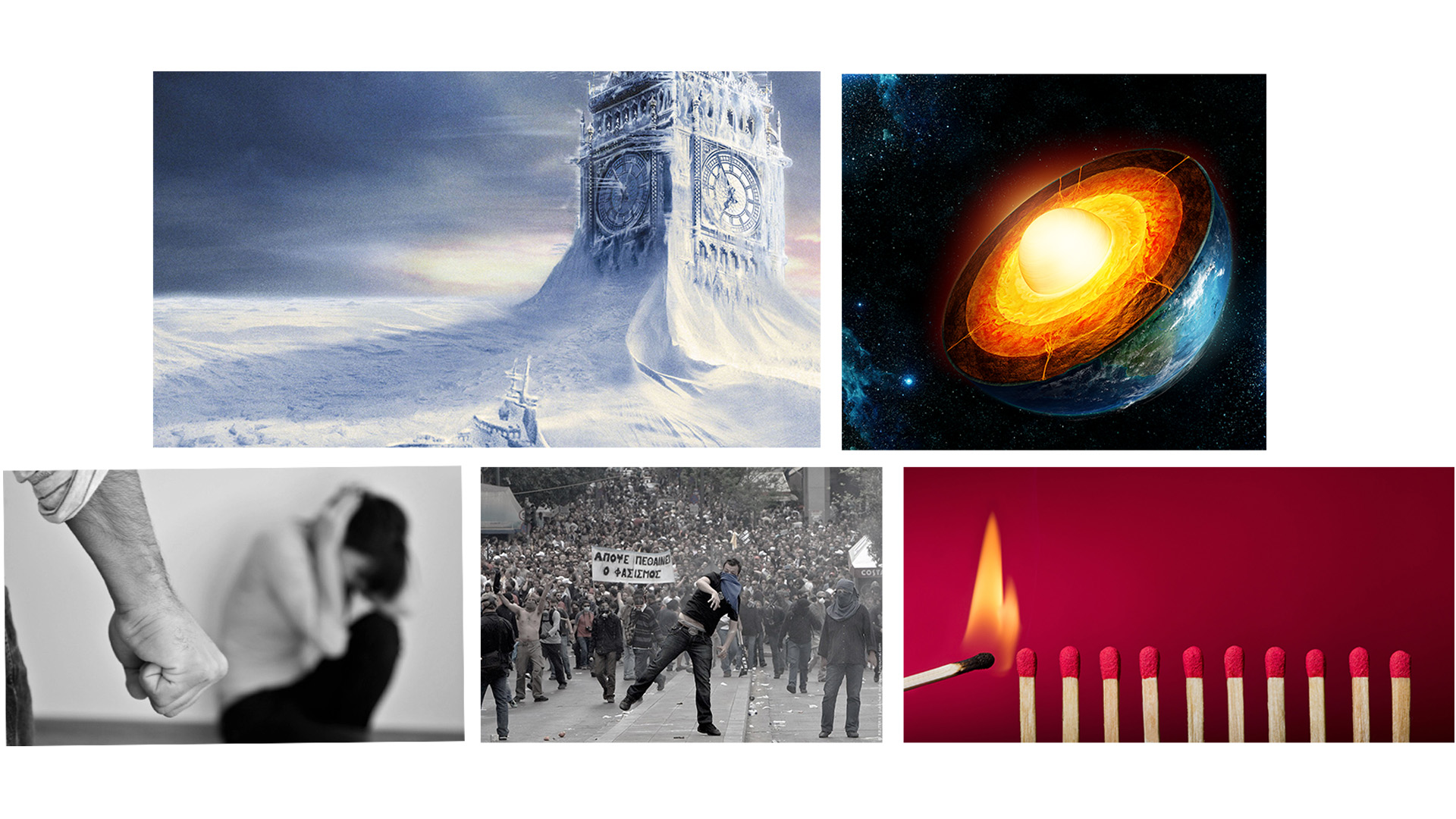
After that, I started sourcing for my images on the internet. However, as I was not proficient with editting, I could only do basic colour and lighting editing instead of composing my own images using various sources. My first idea was to search for a literal representation of the Earth’s ending in both methods of ice and fire, in relation to both the poem and the debate over the actual destruction of the Earth. I managed to find a picture adapted from the movie “The Day After Tomorrow”, which shows an area covered in ice and snow, including a frozen ship in front of the Big Ben clock tower. This shows the depth and scale of the frozen areas, and represents how Earth has been destroyed by an ice age. On the other hand, I tried looking for visual representations of the Earth’s core and its heat. However, most of the photos I found looked either more like a Sun, or just molten lava which I felt was not pinpointing the Earth’s core directly. Thus, I had to use a more scientific picture depicting the Earth’s core. Both of these pictures are full coloured, with the first being very blue, the second more red and yellow.
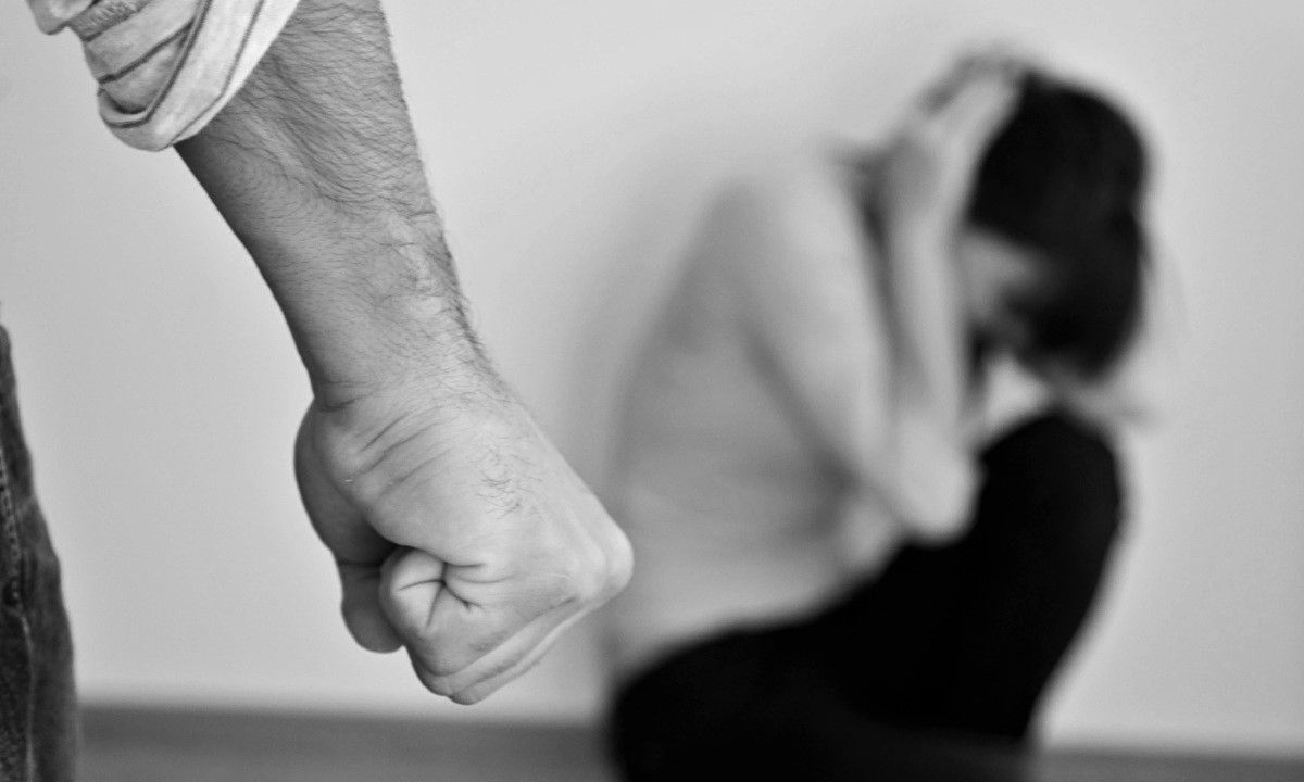
Then, I started sourcing for images to depict hate, and then desire, which represents the ice and fire respectively. I decided to depict hate and desire across a spectrum, instead of separating them into two completely different groups. I used a photo which shows a man’s clenched fist in the foreground, and a woman curling up in fear in the background. This shows violence and in turn hate from what I make out of it. The picture was in monochrome, which also shows that lack of warmth in hate. I also like the contrast between the sharp foreground and the blurred background which brings across the message of the violence.
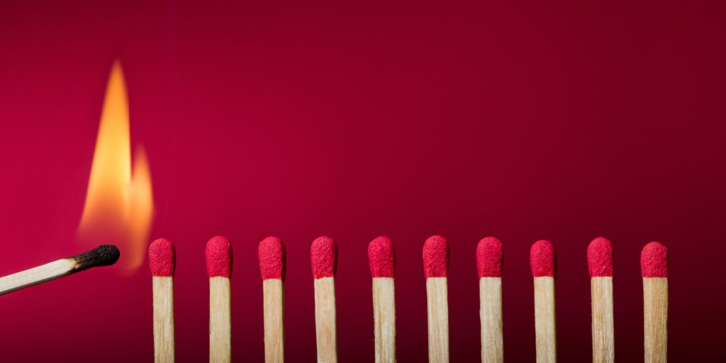
Then, I decided to move to the other end of the spectrum before finding a bridge for the two. I started looking for pictures to depict desire. I found a picture of a row of matches getting lit up by a lighted match. I like how the picture literally shows how desire will consume a person like how the fire consumes the matchstick and destroys it. It is also a literal representation of the Chinese saying “欲火焚身”, which literally translates into “the fire of desire cremates”, which shows the destruction by desire. The background is also red in colour, which is also associated with being very warm, passionate and full of desire. I feel like the matches give me a general direction of moving towards the left, in a such a way like they are actually queuing up to be ignited by the lighted matchstick, which brings in the notion that desire is something voluntary. It’s like a willing want instead of something forced upon. I kept the colours of this picture as it contributes a lot to the notion of desire and passion.
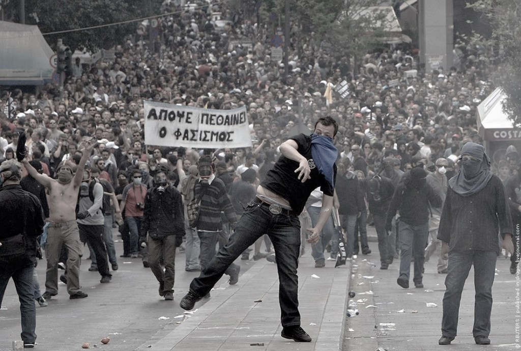
After settling both ends of the spectrum, I wanted to find a picture that could link up them up. So what could be consisting both of hate and of desire? I thought of riots. Riots are a combination of both as they are started to overthrow or show unhappiness about something at present, depicting the hate notion, the hate of the present situation. They are also started to bring into effect something new or what they believe in, which depicts the notion of desire, the desire to change to something. Thus, I found this image of a riot which I felt had a nice composition. The background shows a huge population going on a riot or strike, showing the massive scale in the background and some sort of symmetry. Yet, at the foreground is a man shown sharply, throwing something forward and breaking this symmetry despite standing in the middle of the picture. I decided edit the colours of this picture, most importantly the saturation of it such that it becomes a bridge between the monochrome hate and the red desire. Thus, showing a spectrum from hate to desire, from monochrome to full colour.
Then, I arranged them into 2 rows to show the contrast between the background of the poem, and my understanding of it.
The first row shows an ice age, then the Earth’s core, to show the contrast between the two just like the contrast between hate and desire.
The second row shows my understanding of hate and desire in a spectrum, in line with the first row with hate on the left, desire on the right.
Project 1a basically focus on a form of self introduction, namely 3 photos to describe me, 3 photos of a place that matters to me, and 3 photos of an object that matters to me.
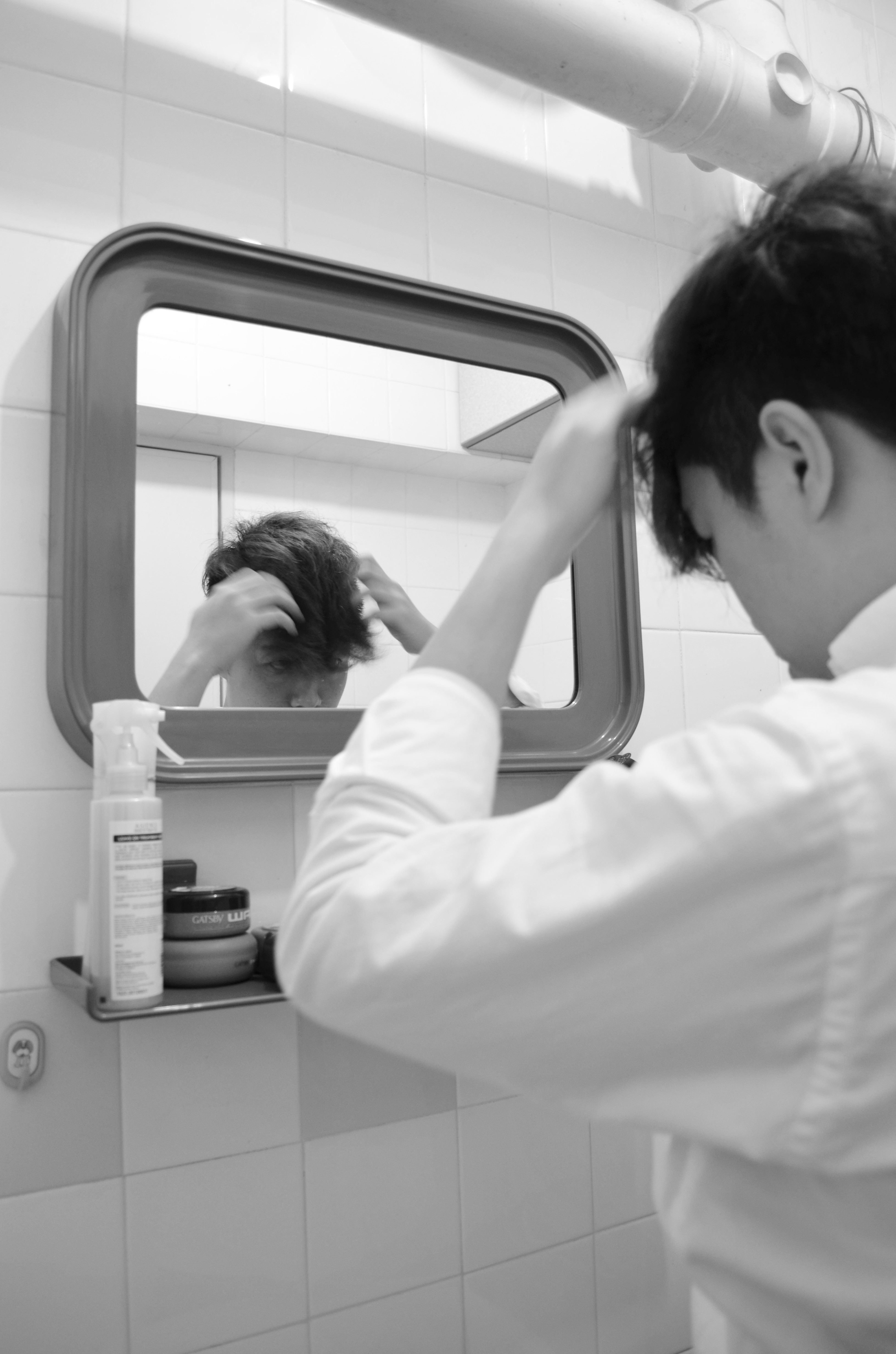
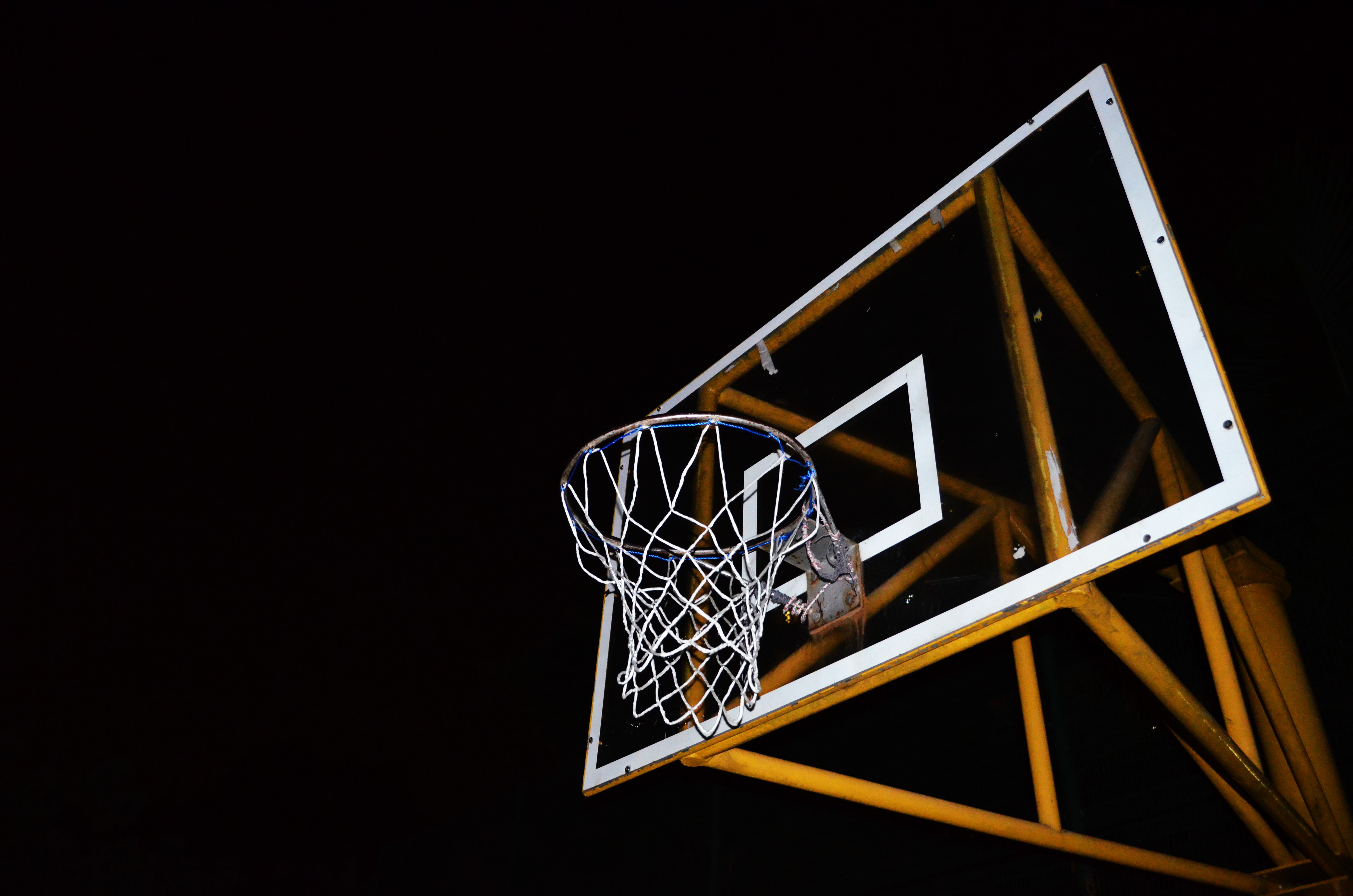
For the first part on 3 photos that describes me, I chose a photo of a collection of figurines taken at SimplyToys, a photo of myself styling my hair, and a photo of a basketball rim.
The photo of the figurines was taken as I like toys and figurines. I chose to take it in a shop as I do not have the collection yet, thus taking a bigger collection in a shop would better show how much I like these. The photo is basically aligned with all the lines formed by the boxes of the figurines as it adds more symmetry despite the wide spectrum of colours.
The photo of me styling my hair shows how I am a rather vain person who is concerned with how I look most of the time. It is taken from behind me, which shows a blurred me with a sharper image in the mirror as that is the focus, and also how I see myself when I am styling my hair. It is chosen to be in black and white to bring the focus to the actions and not be distracted by random colours in the original photo. The image of me in the mirror is also aligned to the rule of thirds, with my actual body along another third.
The photo of the basketball rim was taken with flash at night, making the basketball rim stand out a lot on the pitch black background. I chose to take it at night to show how I used to play basketball a lot more often a few years back, and that nowadays I do not. The night is to signify the end of the day, like how I ended playing basketball and the fact that I do not play it anymore resonates with the idea that late at night there is no one playing it anymore. It is composed in such a way that the rim is about the middle of the picture, with the rest of the backboard and metal structures to the right and sufficient empty space on the left to show the contrast.
All three pictures show “frames” within the pictures and is what ties them together as a set.
FigurinesStyling my hairBasketball rim
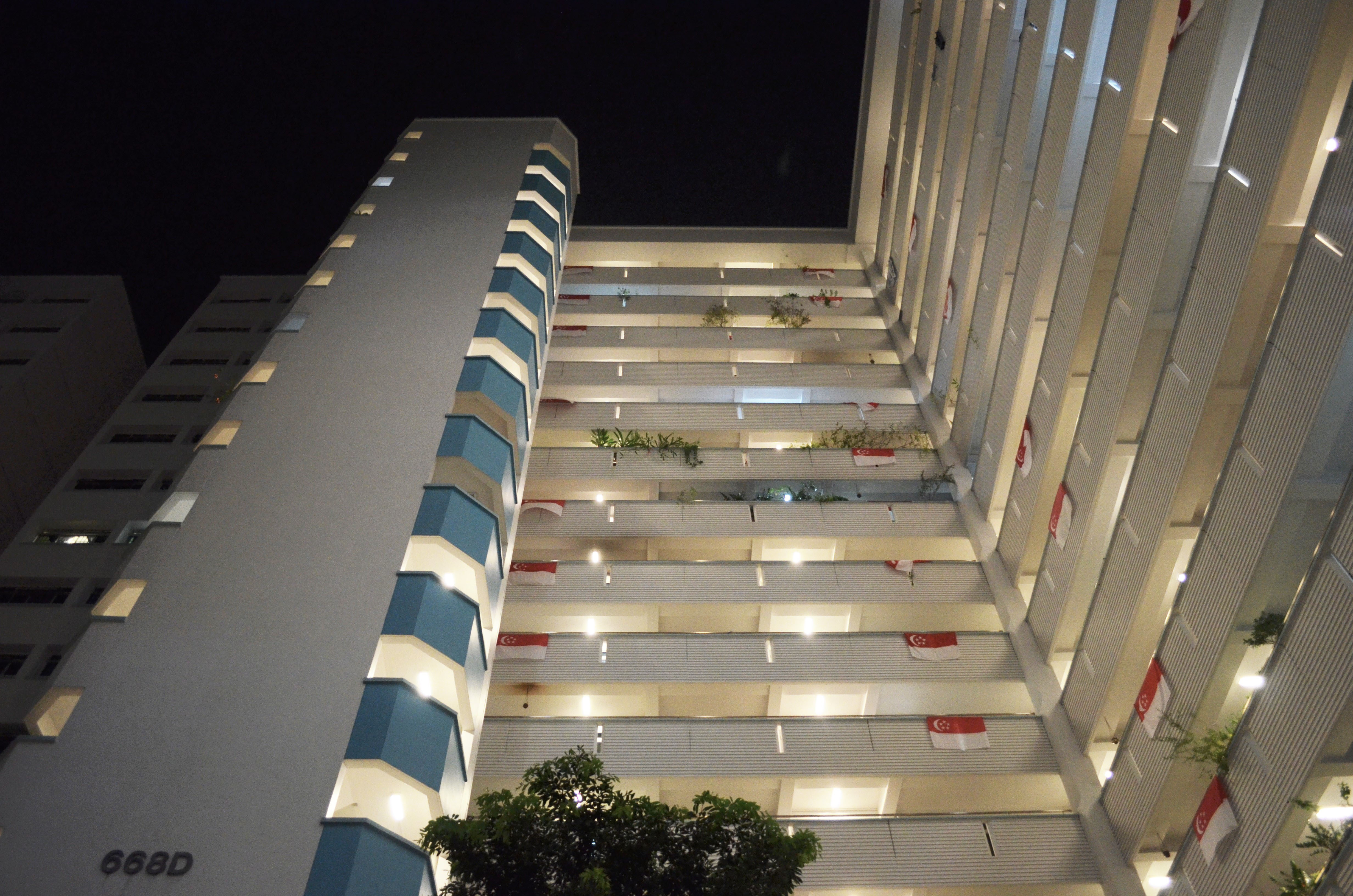
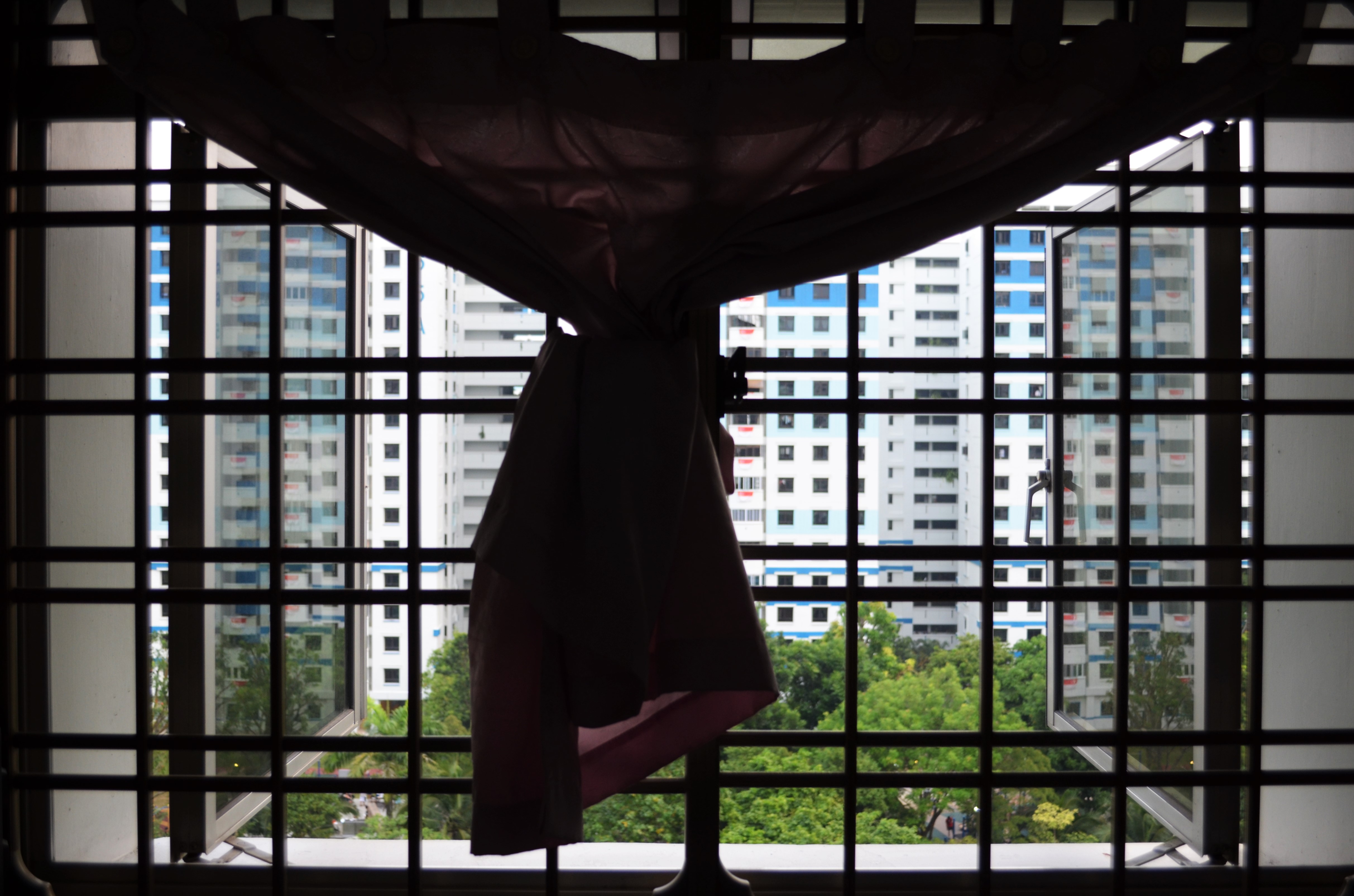
The second part on 3 photos that show a place that matters to me, I chose home. To me, home is where the heart is. Home is a place where everything is peaceful and beautiful, calming and relaxing. No matter what happens, home is there for me to be back there to rest and recuperate from the daily hustles. It is where family is and where everyone truly cares about me.
I chose to take a set of photos featuring my home. One was taken from a low angle, from the void deck up my block. It the vertical edges leaning inwards, making the building seem very tall, which represents how it is a very secure and strong place for me. I chose to take it from this angle and at night as this is the sight I got to see whenever I return home at night. Ever since I enlisted, weekends were for me to go out and spend time with family and friends instead of staying at home doing nothing. It has become such a habit that I see this view each time I go home at night, while walking towards my lift. There is also one outstanding “white” light among all the “yellow” corridoor lights as that particular one is my unit. My dad changed the light as he likes it to be brighter, thus this special light reminds me of my home and my dad.
One photo shows a view from my room out of the window. The window grilles act as a natural border and the curtain adds a sense of familiarity and coziness, to what I call home. This is the familiar view that I like to be greeted with, as it assures me that I am back at home, in my comfort zone, in my room where I spend most of my time, be it doing work or just lazing around. It also partially shows the greenery of the park across my house, which gives a very friendly and familiar neighbourhood feel. I chose to take the photo as it is as the lines add to the symmetry and tidiness of the photo, yet the curtain stands out and breaks this neatness so that the photo does not become too dull.
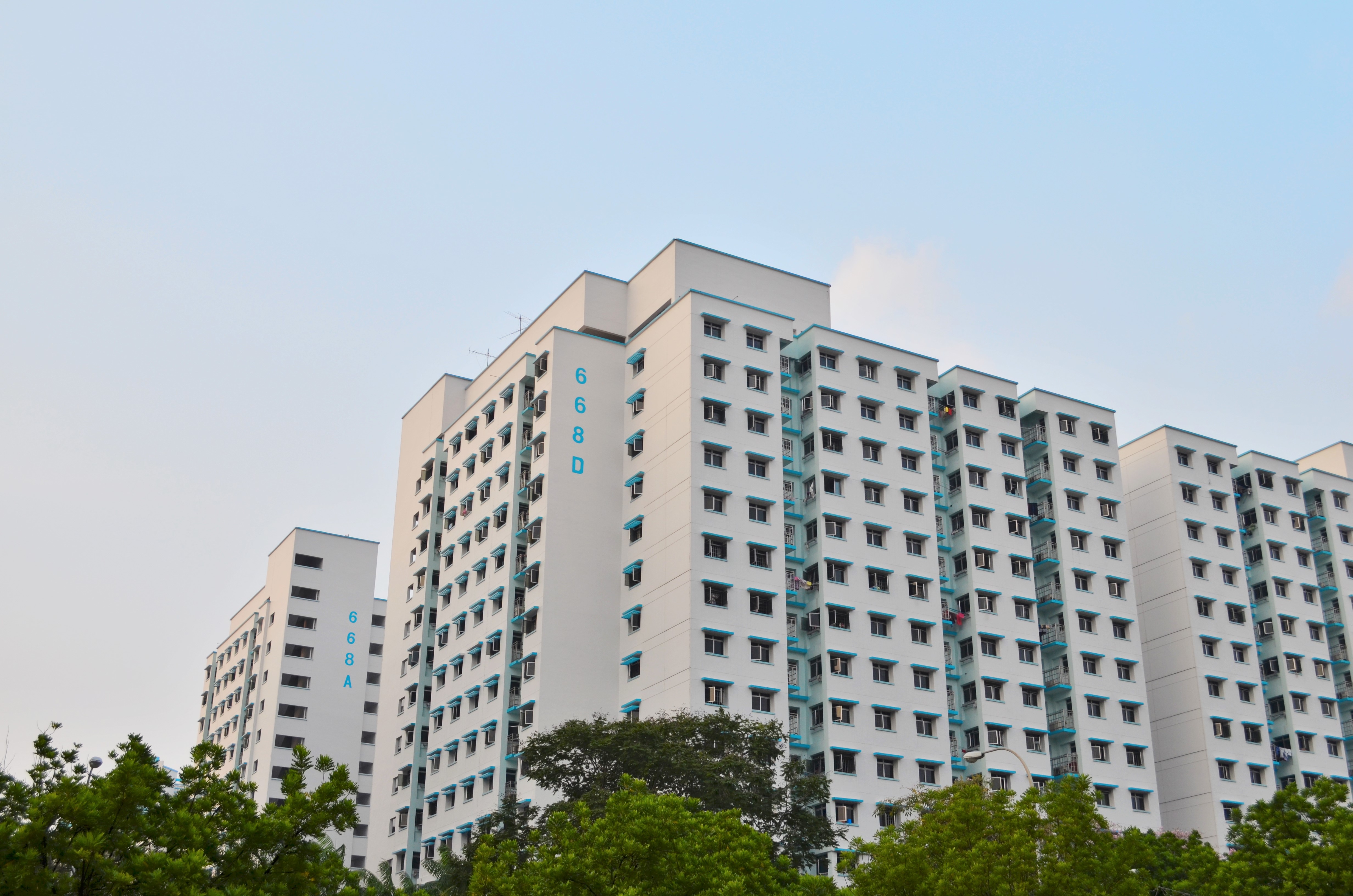
One photo is then taken from afar to show my entire block before sunset. I chose to take this as it gives a very clear view of my block against green trees and blue sky, giving a feel of tranquility of home where I mentioned was away from all the daily hustles.
Low angle shot at nightFamiliar view out from my roomA clear view of my home
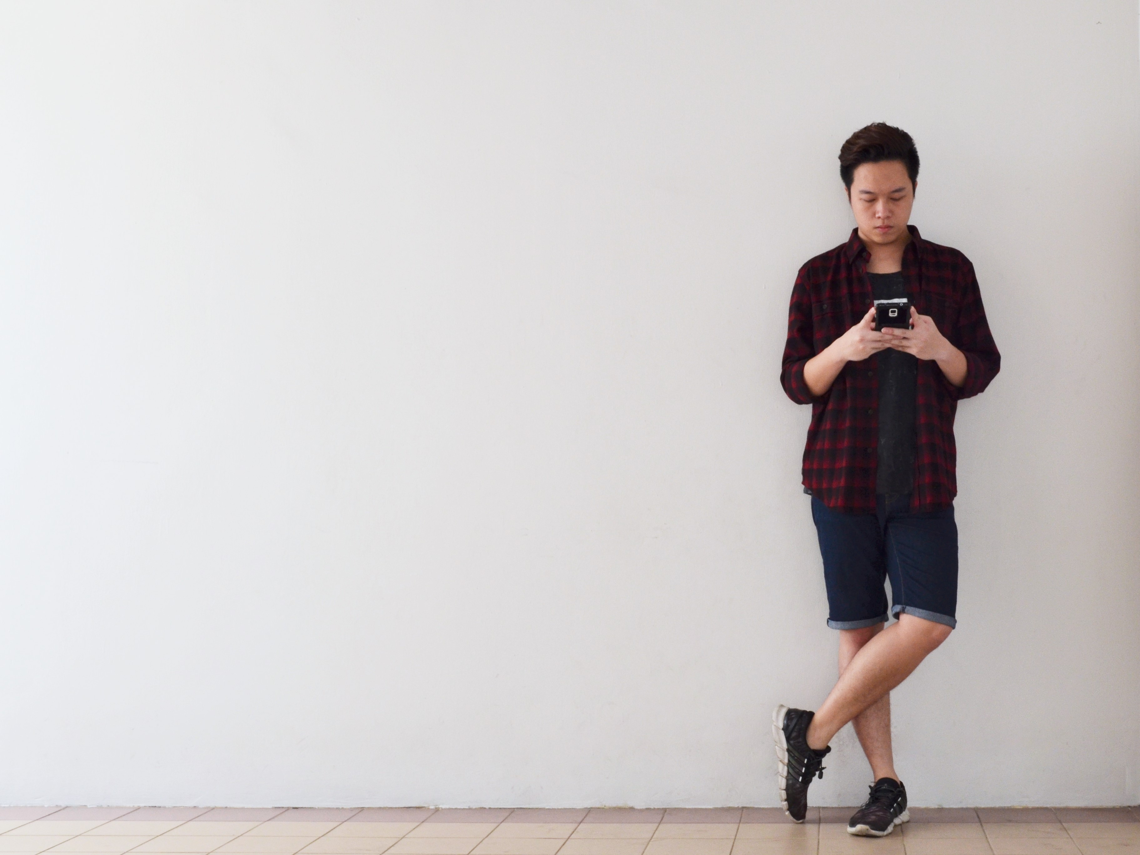
The last set is on an object that matters to me, and that is my handphone. I have never had a personal computer ever, until I started University education. As such, all along, my phone has acted not just as a means of communication to me, but also as a research platform, social media, gaming platform, music player, and a camera. It basically functions as all the electronic gadgets that I want to use. Thus, my phone really mean a lot to me.
The photos are arranged in a zooming in manner.
The first photo shows me standing along one third of the photo, leaning against the wall and using my phone in a very relaxed manner. This is to show how people, including me, rely heavily on the use of handphones all the time now, such as waiting for people to come or waiting for things to happen. I chose to leave a lot of empty space such that I was the main focus in the picture, using my phone.
The second photo shows me using my phone in a closer shot. It shows me typing on the screen of my phone, which further emphasizes how the phone is important to me and everyone else, like how we see people who are on their phones all the time, typing or watching videos on the go, in trains and such.
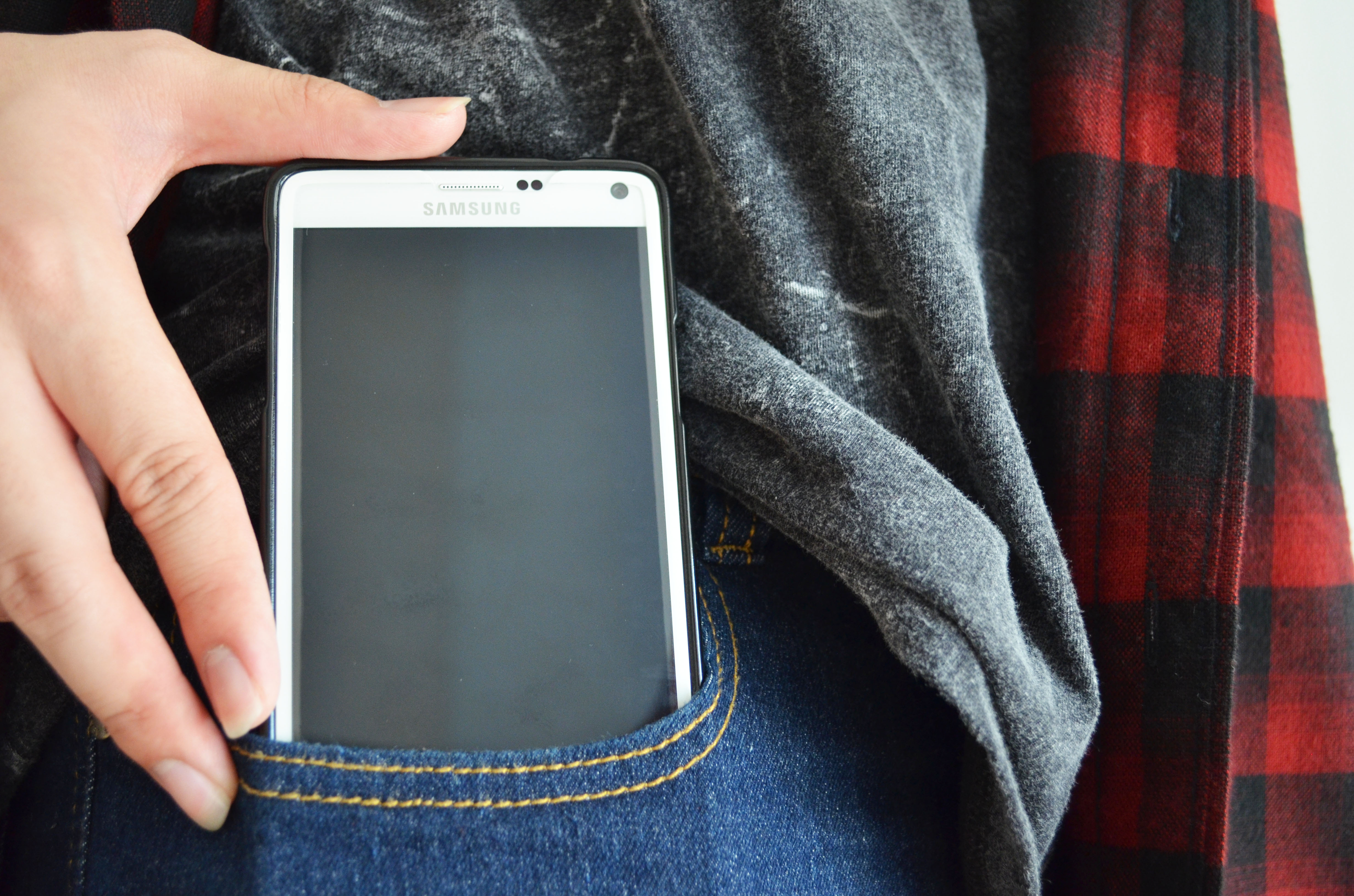
The last photo shows me putting my phone into my pocket, despite the big bulky size of a Samsung Galaxy Note 4. It signifies the importance of it that I hold it dear and close to me even though it is huge and uncomfortable to be put in the pocket. Nonetheless, it is so important that I have to keep it on me, instead of inside my bag or anywhere else. I closed up on the phone to show my hand pushing the phone into my pocket, adding a sense of movement to it.
While waitingTypingPutting it in my pocket at all times
Then it was the final presentation. I arranged the pictures in simplistic vertical and horizontal lines so as not to distract the viewers with fanciful arrangements.
Final presentation
Through this project, I understand the importance of the composition of photos. All these include the position of the objects in the photos, as well as colours, the framing and distance, and the kind of message they bring across. There is still a lot about photography to be learnt, and I believe experimenting and exposure to taking pictures would be effectively helpful.
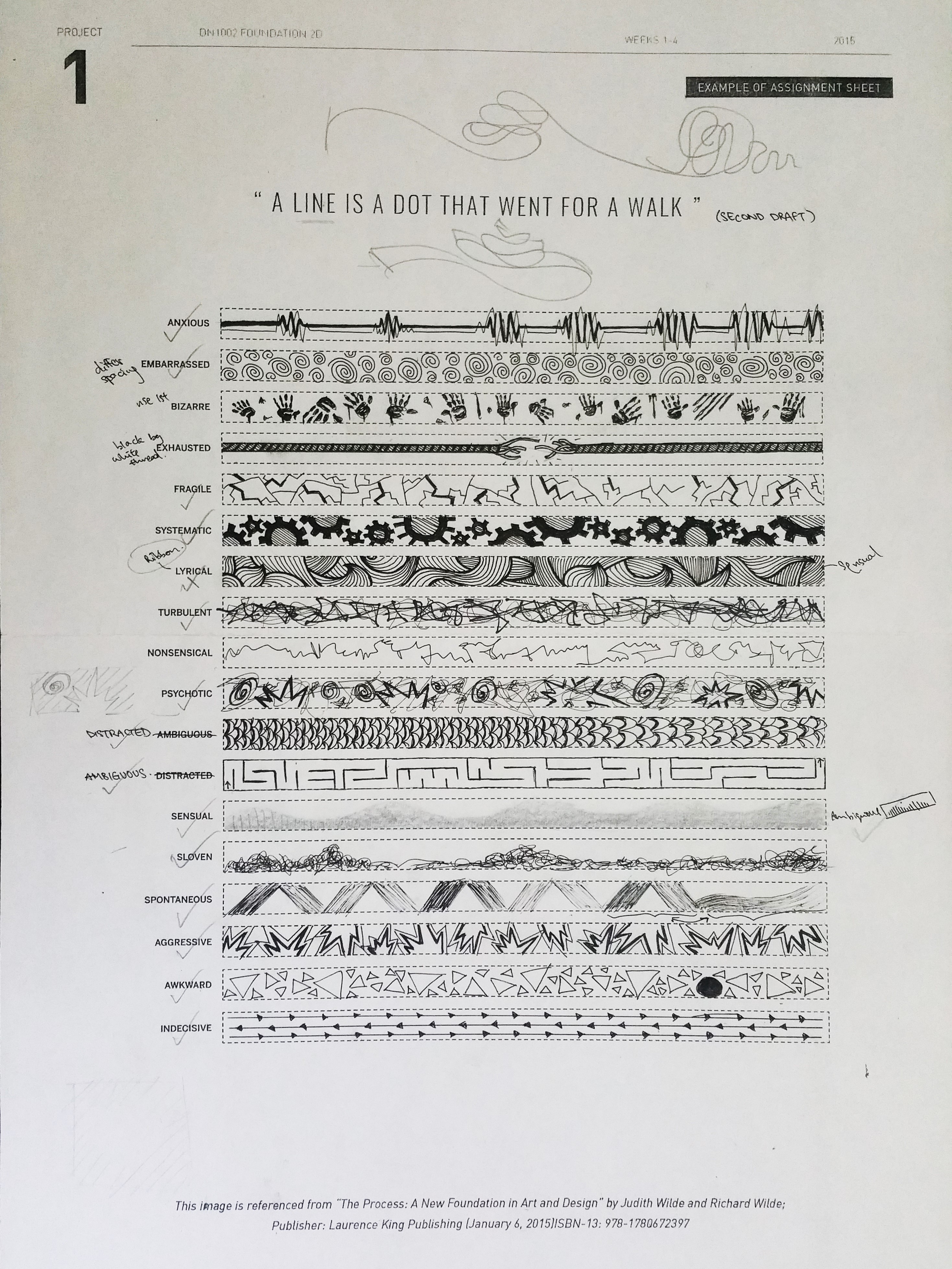
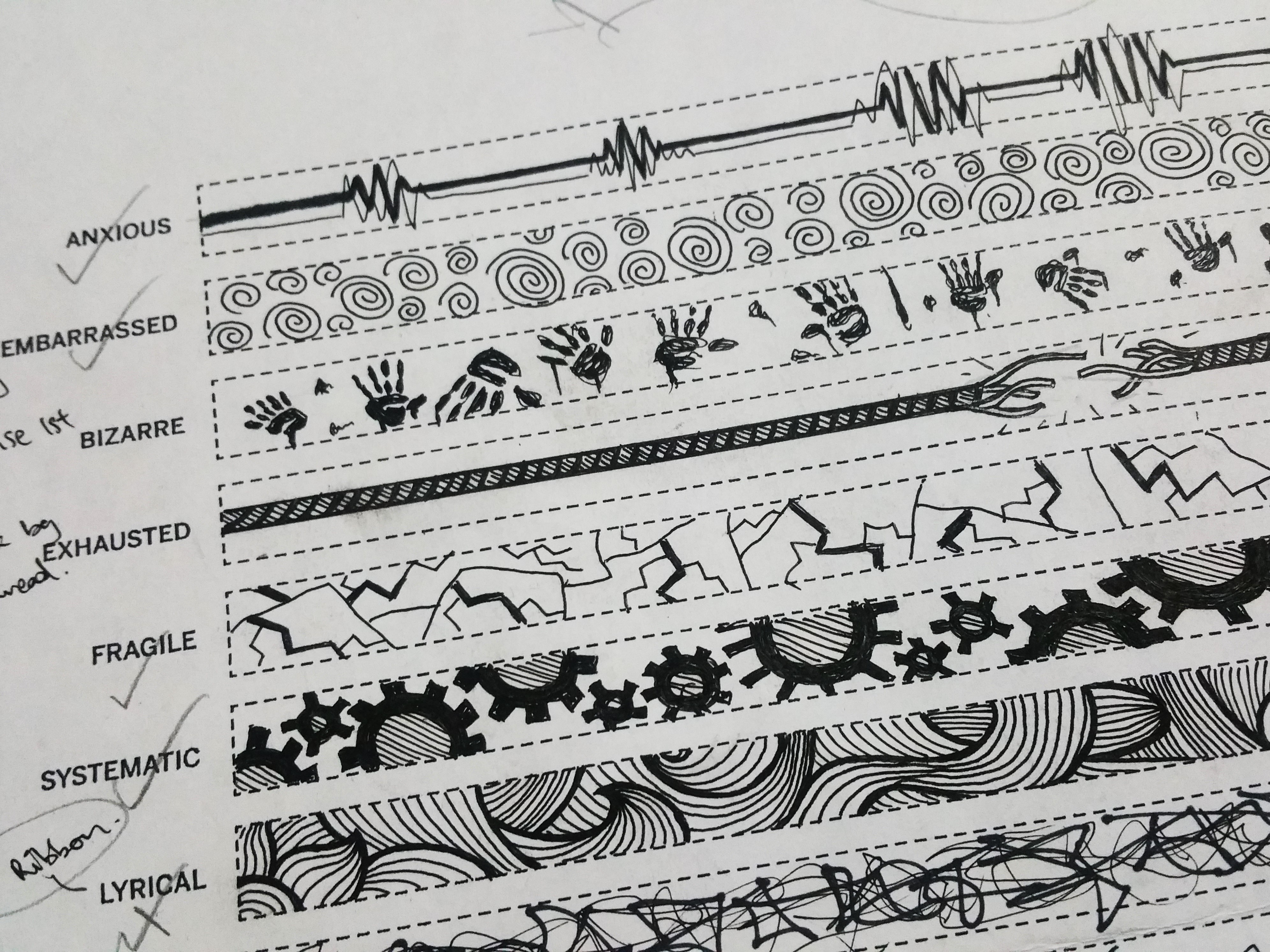
Basically this is the first assignment for Foundation 2D. When I first heard about representing the various words using lines, I was rather taken aback and have no idea how to do it at all. Slowly as time passed and looking at various examples, it slowly got slightly more comprehensible and made a bit of sense to me.
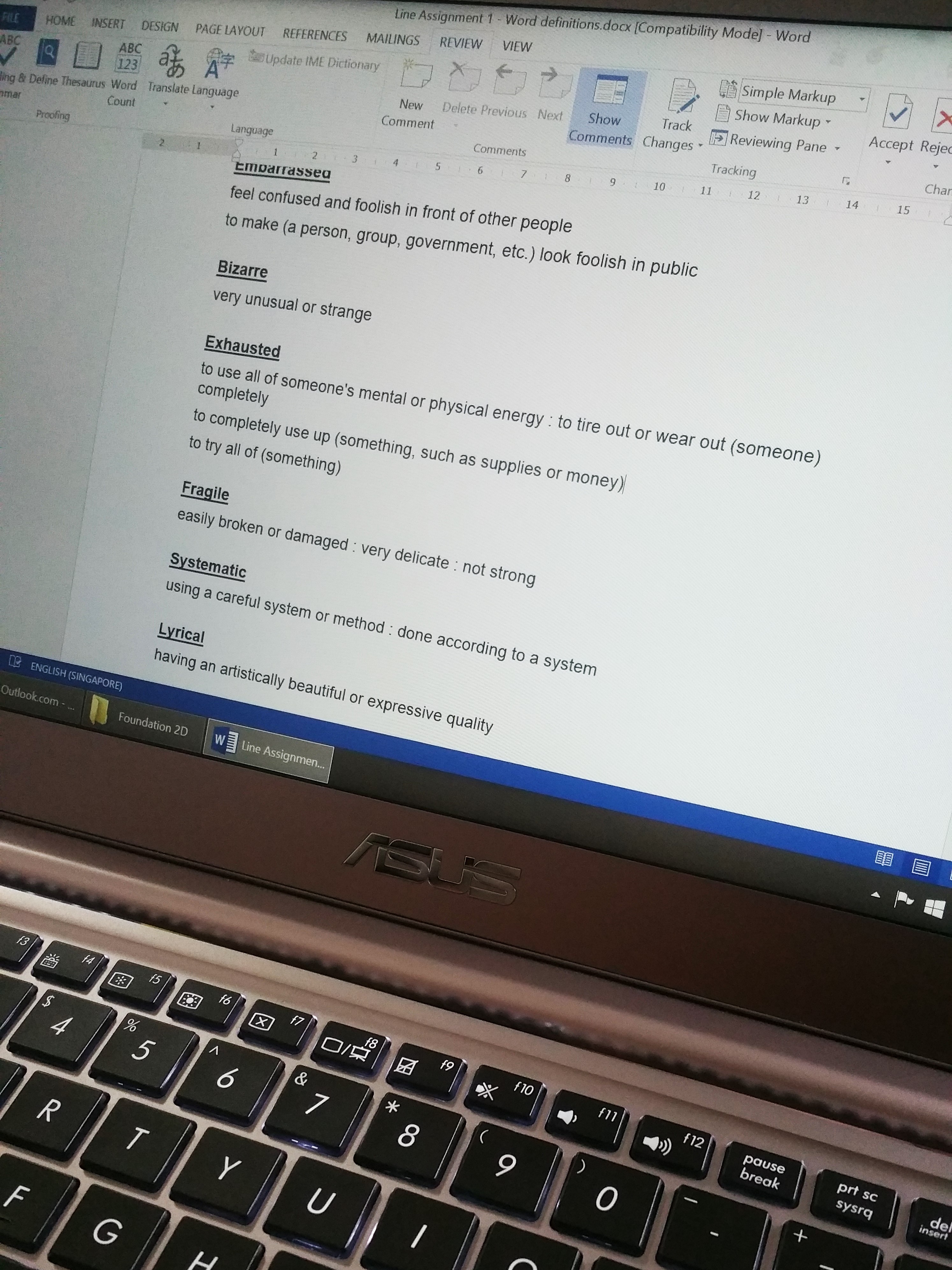
The first thing that came to my mind, was to find out what exactly each word means in general, and what it actually means to be, be it the same or not. So first of all, I went online to look for the definition and some synonyms of the given words to better understand them, and compiling them all into one document.
Compiling relevant definitions
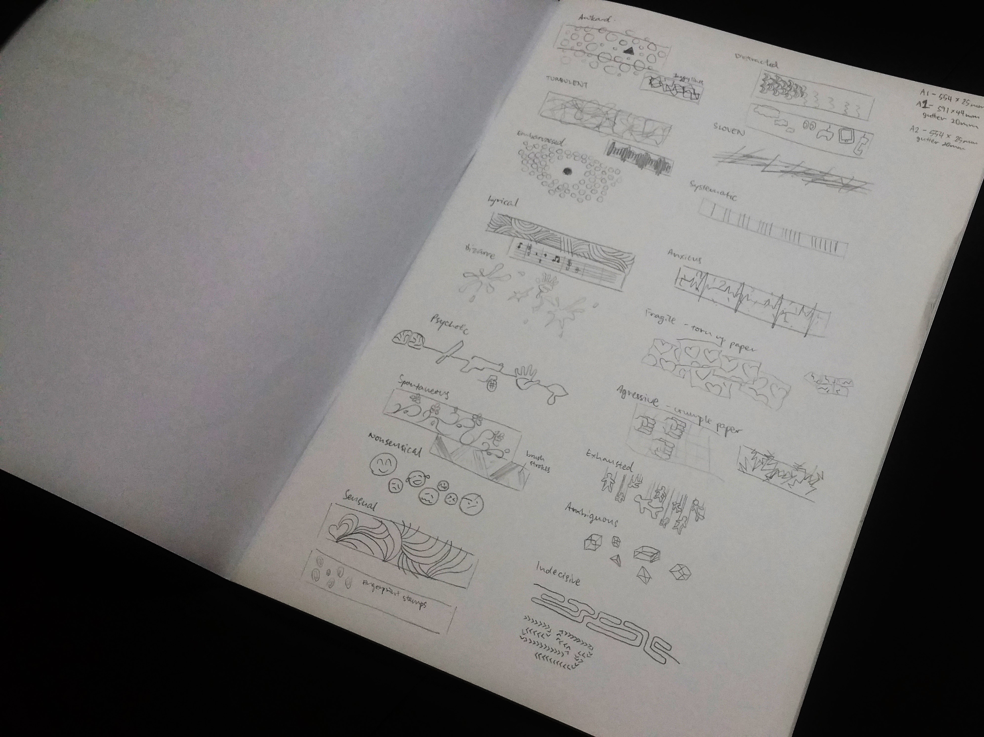
After which, I started doodling whatever came to mind into my sketchbook lightly, in order of whatever came to mind first.
Doodling whatever comes to mind
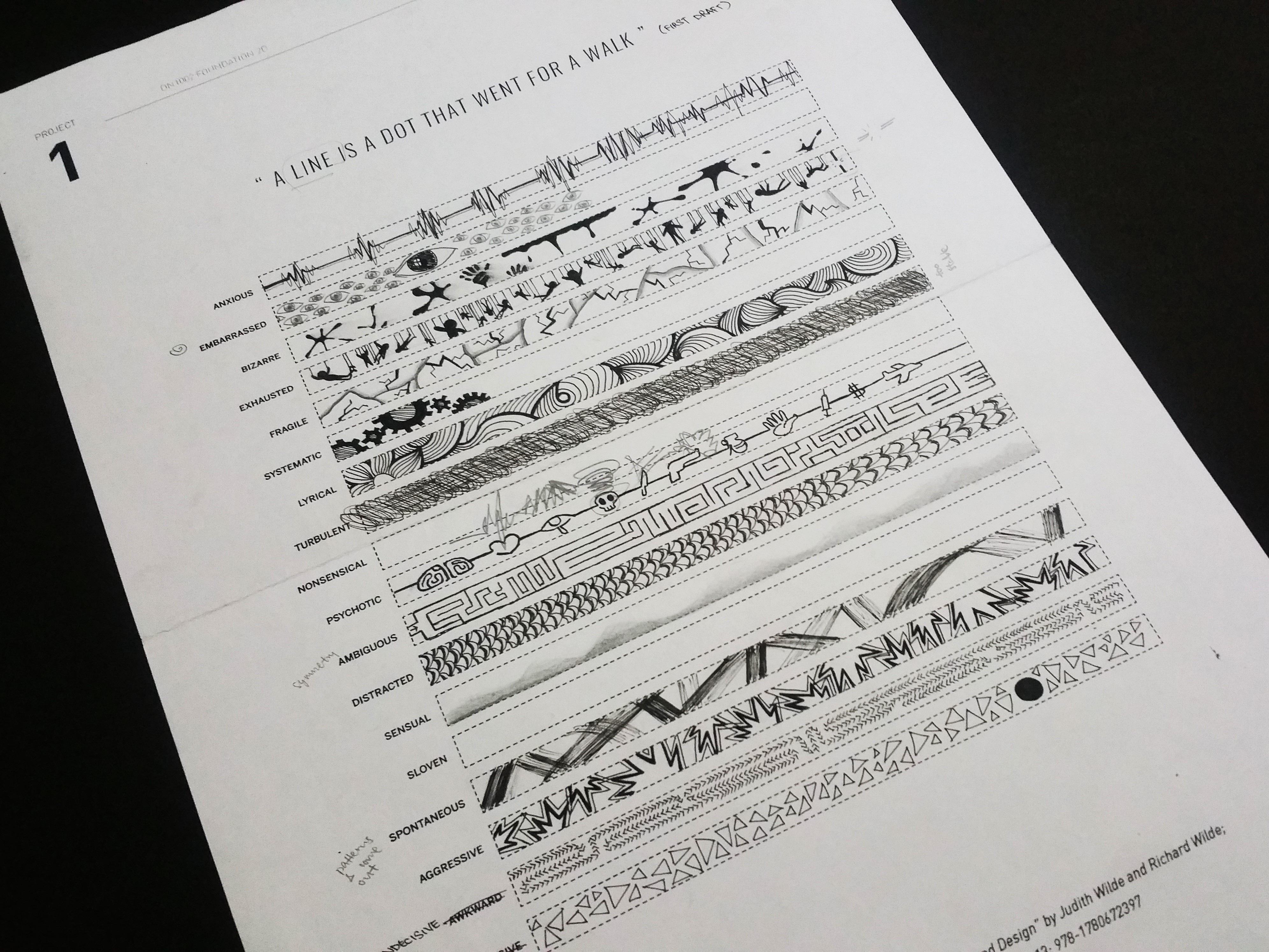
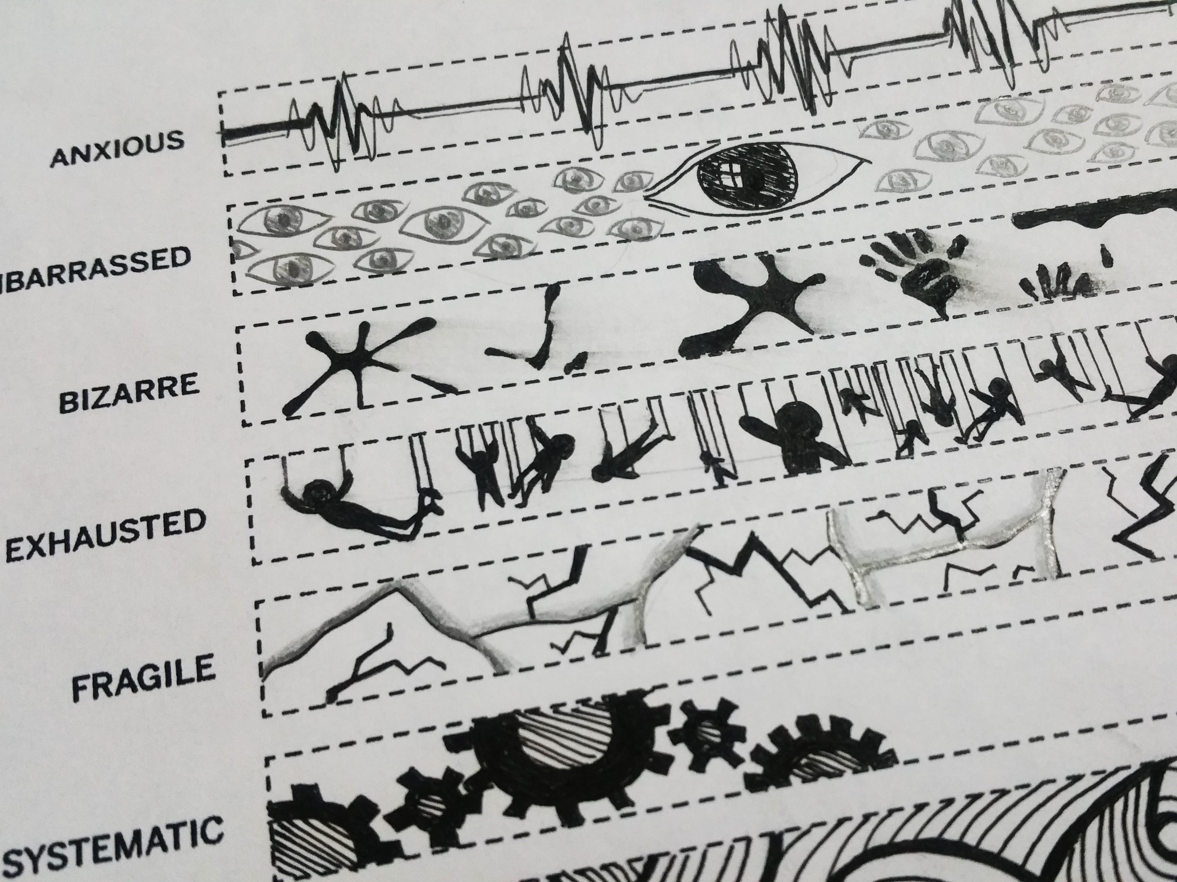
This was followed by the more formal first draft onto strips printed on a A3 paper given to us. Took quite a while to have everything done onto it, but felt that it was way better than the first doodling, although there was still a lot of room for improvement, especially after consulting Shirley about it.
First draft on A3 printed strips
Here is how my presented 3 initially looked like, where “Exhausted” and “Bizarre” looks different, while I kept the idea for “Fragile”.
First version of my presented three strips.
“Bizarre” shows a lot of splatters and a few hand prints, which symbolized blood to me which depicted the “grotesque” nature.
“Exhausted” shows human figures hanging lifelessly from ropes, depicting how society and survival requires us to do things that we might not want to, causing us to be worn out and tired.
“Fragile” would be done with torn up paper with burnt edges and showing crack lines drawn, showing all natures of fragility that comes to me.
After which, I made changes and adjustments to the first draft and came up with the second draft for Shirley to vet through, before completing my final project. Various strips that I felt was not bad or actually good for me were kept but repeated to make sure I got them right. Shirley advised how various strips could be switched around, which I agreed and took into consideration, and also suggestions for improvement.
Second draft on A3 printed strips.Second version of the presented three strips.
“Bizarre” now shows more hand prints and less splatters, which I felt was better at bringing out the grotesque feature. Nonetheless, Shirley advised me that the first draft of this was better as it is slightly more messy and makes everything have a bizarre “feel”.
“Exhausted” was not represented by a horizontal rope which snaps in the middle of the strip which was an improvement suggested by Shirley after seeing my human figures hanging around. She also reminded me that if I could replicate this using another medium, I had to make sure it is prominent enough, preferably covering at least a third of the space given.
Finally, it is the final draft to be submitted for critique. Most of my strips were done using marker and pen, simply drawing what I want to convey in the most simplistic monochrome way. This is with the exception of “Bizarre” and “Spontaneous” which included the use of Chinese ink, “Exhausted” which uses cotton twines and “Fragile” which includes burning my paper.
The final product!
“Bizarre” was first done by drawing random hand prints of different sizes and orientations across the strip, followed by drawing the larger splatters to give it a more dramatic effect, then lastly completed by sprinkling Chinese ink across the entire strip using a hard bristle brush. It gives an overall effect of a crime scene, bloody and mysterious feel which goes in line with its grotesque characteristics.
“Bizarre”Touching up the hand prints with a marker
“Exhausted” was done by using cotton twines. As cotton twines were not thick enough to be prominent, I took three cotton twines and braided them, then stick the two ends onto a strip of black paper to make it stand out. after which, I cut the middle section and untwined the individual cotton strands, before sticking everything down onto the paper. This is to represent reaching a limit, a breaking point, which I feel is what exhausted really means.
“Exhausted”Cutting my “breaking point”Securing the twine with UHU glue!
“Fragile” was done by first drawing crack lines across a piece of paper, then tearing it up into small pieces, then burning the edges to give a brownish edge and an outline when the pieces are stuck on top of one another. It gives me the impression of fragility as it shows like it is easily breakable or brittle using the crack lines and torn pieces, and how it is burnt gives a vintage and fragile feel like it will be destroyed at any time if not careful.
“Fragile”Burning with a windproof lighter makes it easier to control the flame burning only the edges.
Last but not least, the assignment was eventually completed, and ended off with a presentation to the class, showing the concept of doing the various strips and sharing the methods of doing it.
The assignment ended with a presentation to the class