Zine

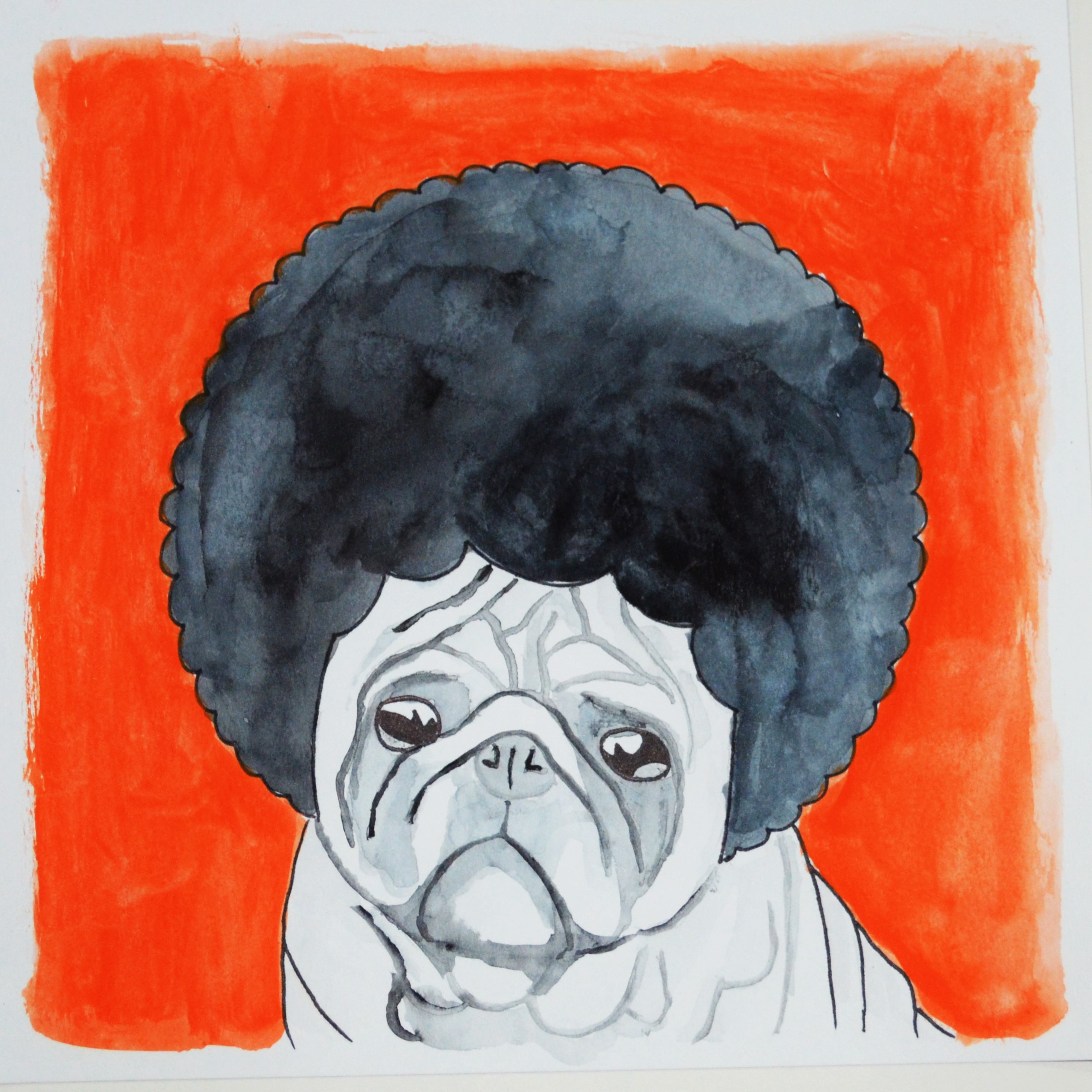
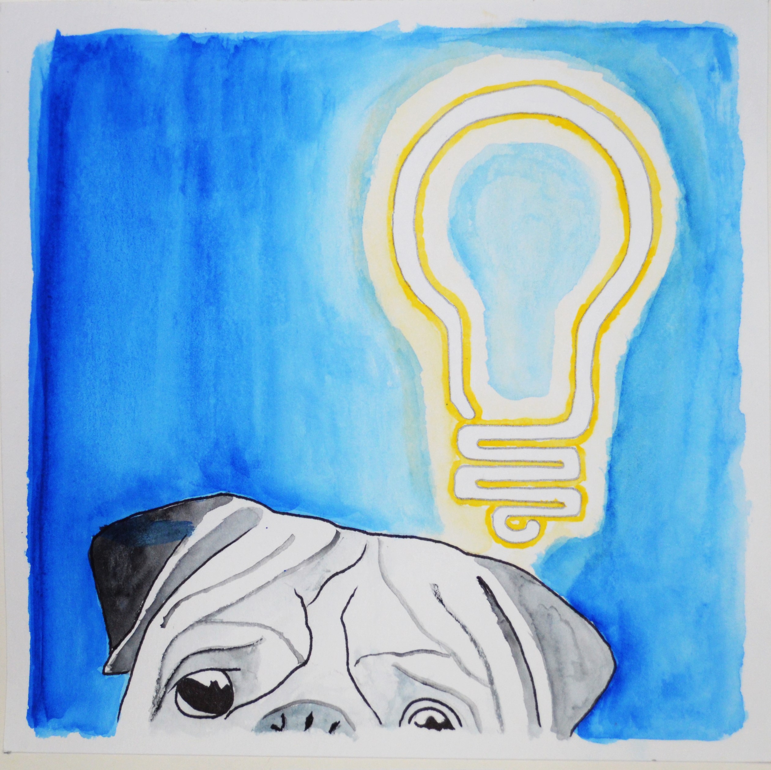
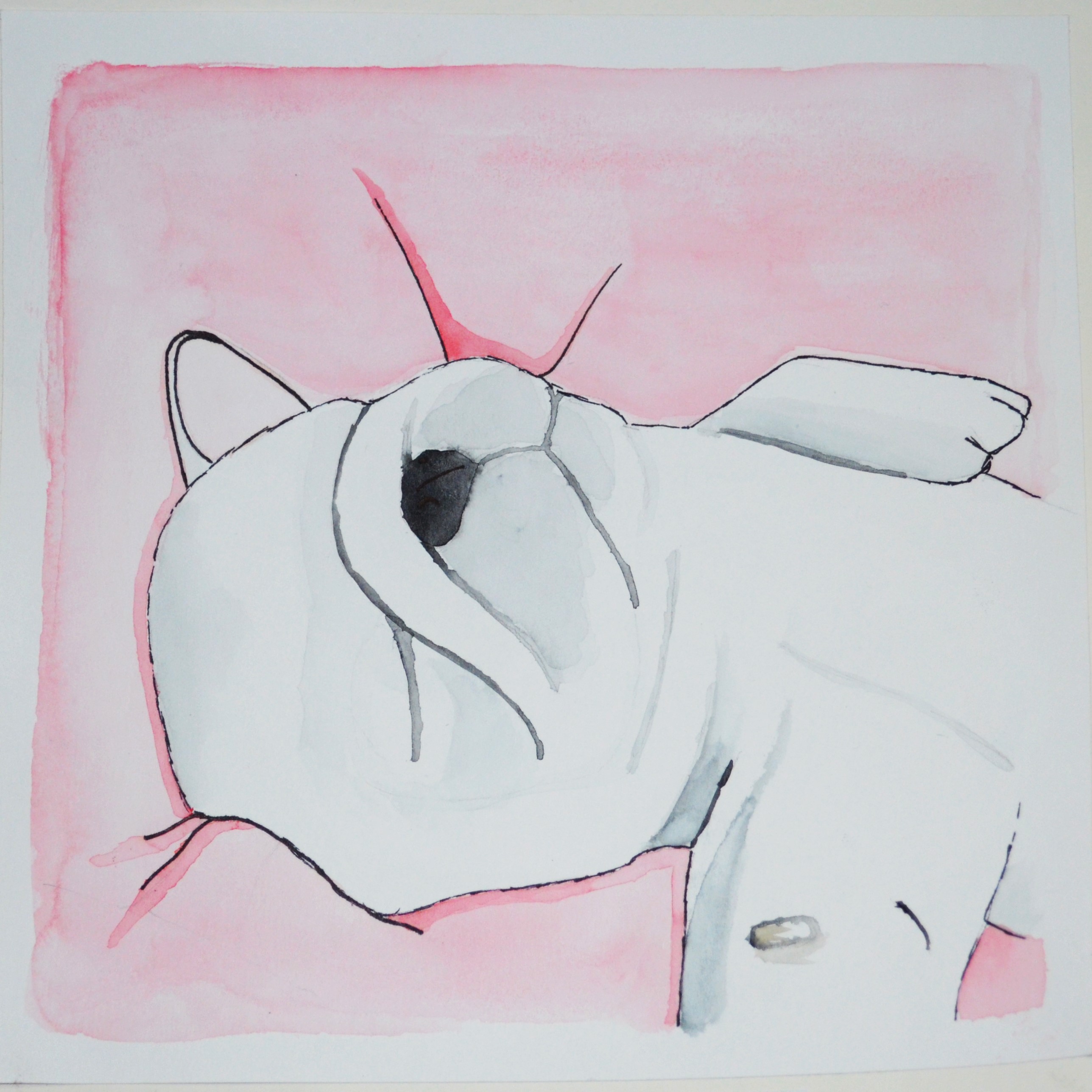
In this project, we design a printed document, a zine, that we can showcase almost anything we want to, from past works to photography. For me, I chose to display some of my preferred works, ranging from digital works done in 2D modules, to painting done for Foundation Drawing, and even works done before ADM life started.

Initially, my idea was to come up with something like a catalog for a gallery, something clean and classy and minimalist. I also considered to make the entire zine in monochrome, showcasing only my works done in black and white, to further enhance the idea of minimalist and classy. I went to check out several designs, in particular from Apple and Samsung, two big technological giants well known to have been producing classy and sleek gadgets like the Apple iPhone, iPad, or the Samsung Galaxy series.

The Apple website
The Apple website
The Samsung website
The Samsung website

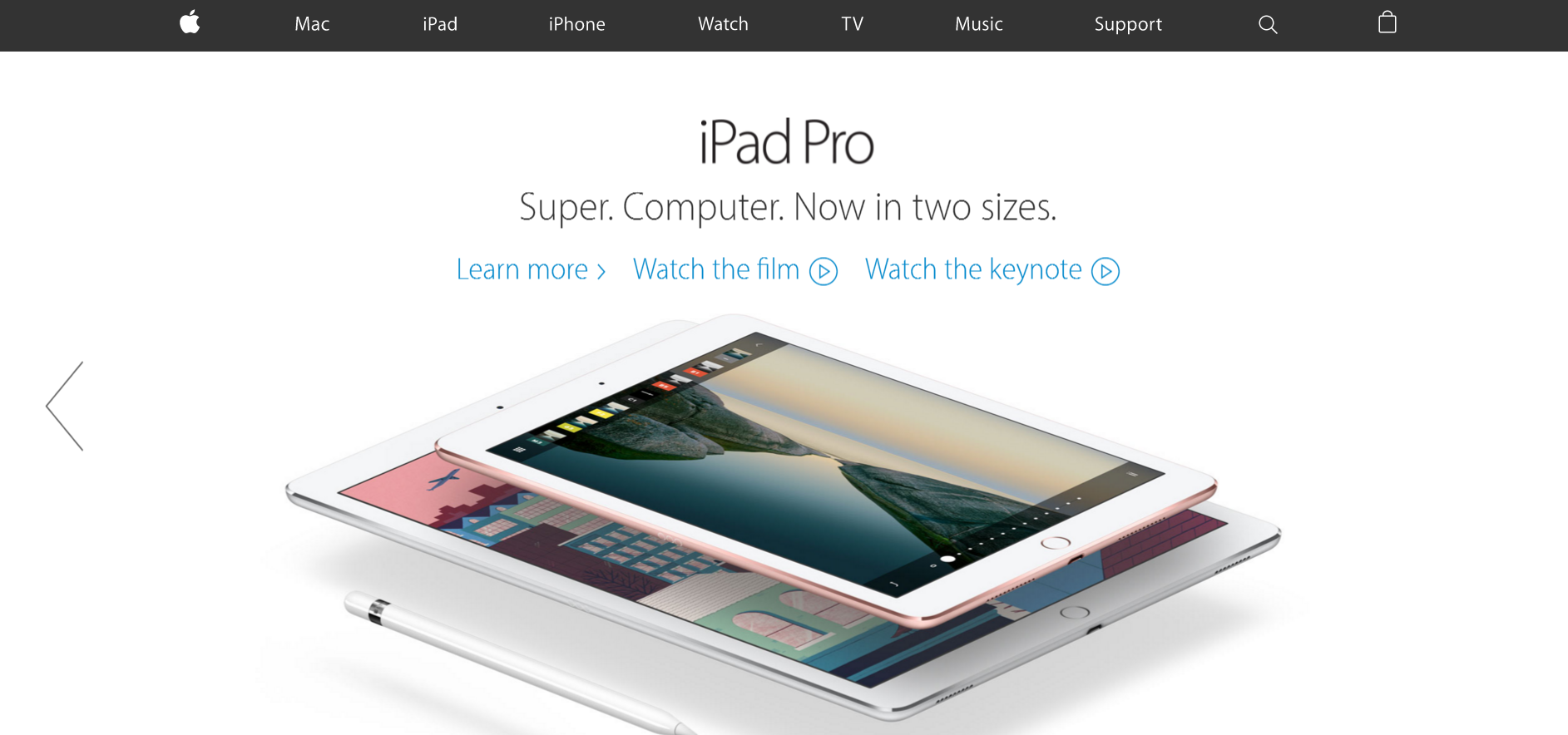
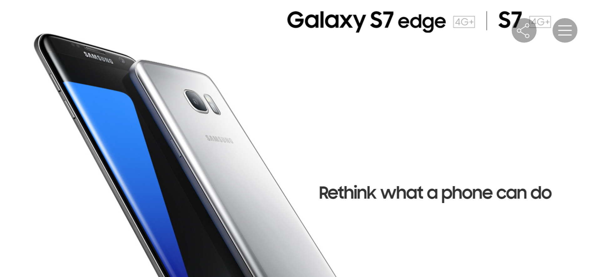
I found out that both Apple and Samsung made their website very classy in similar ways. First, it was the plain white background with very simplistic font, that makes the entire composition very clean and sharp. Next, the subjects – the gadgets and phones, were very precisely trimmed and placed in place with sufficient empty space, to make the subject stand out and have enough empty space to accentuate their elegance and class. However, this point might not be applicable to my design as my subjects were not 3D objects, and tend to have a background, making such cropping inapplicable. Nonetheless, this was a good start in understanding how to compose my “clean” and “classy” zine.

I also researched on the websites of the National Design Centre, and National Museum of Singapore, since I wanted my zine to look like a catalog for a gallery or exhibition, thus this two might be a good platform that is more relevant to my design.

The National Design Centre website
The National Museum of Singapore website

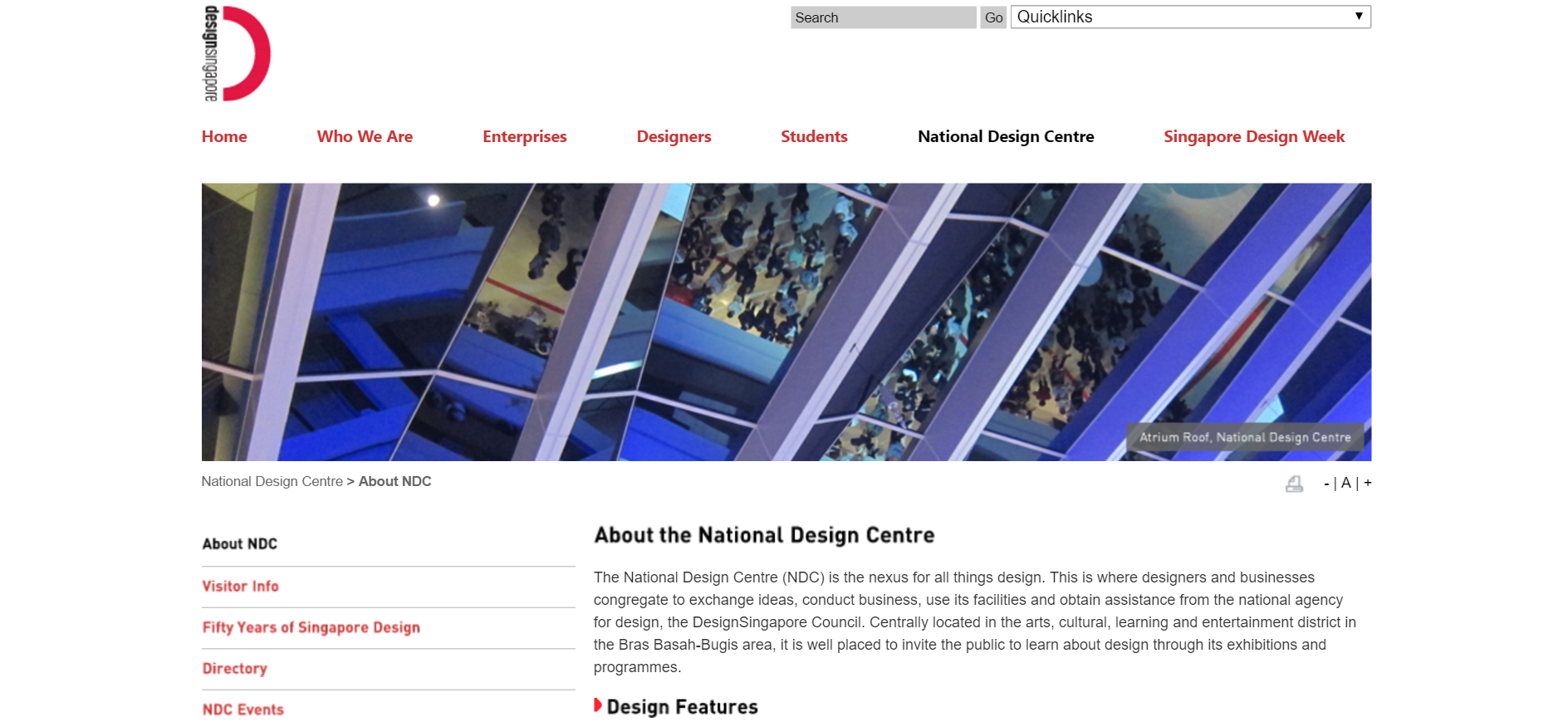
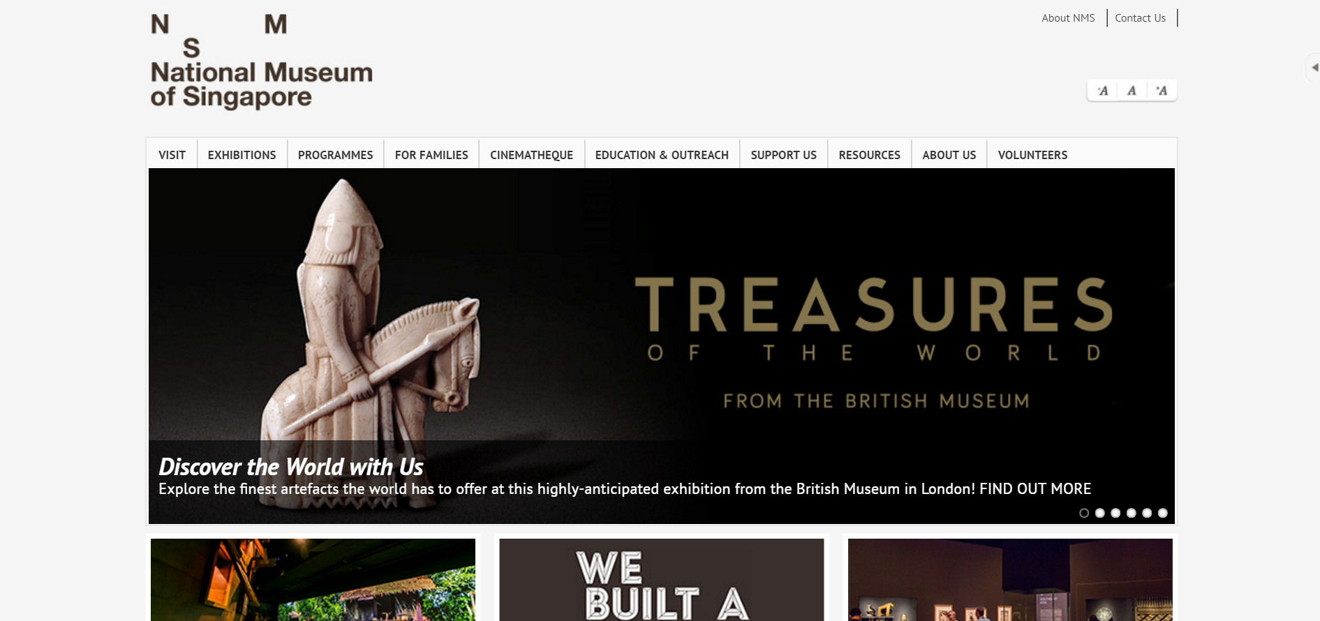
SImilar to Apple and Samsung, they had very plain and light coloured background, which looks clean and classy. Both website also uses very plain fonts, with very neat and orderly arrangement of their elements. I noticed that the logos of this two websites were slightly more unique, with the logo of the National Design Centre incorporating words into part of the logo, and the asymmetrical arrangement of NMS for the National Museum. I thought through how I could incorporate English into Chinese strokes for my cover page, but ultimately giving up the idea to keep things very minimalist. I also decided to use asymmetrical arrangement in some of my layout, similar to the National Museum logo and also in line with a design principle, which talks about repetition and something out of the norm to draw attention.

While shopping, I chanced upon another idea for my zine, after seeing how MUJI, a japanese shop actually has a very calm and “zen” feeling to it. This was another direction I could go for! With shopping physically there and going online to their website, I found out I like their design quite a lot.

The MUJI shop
The MUJI shop
The MUJI website
The MUJI website

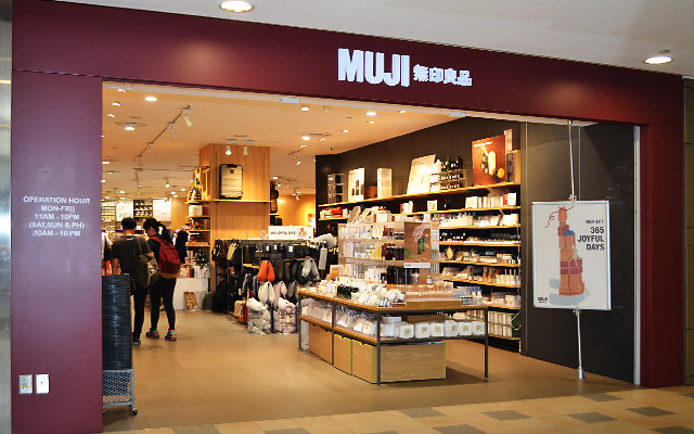
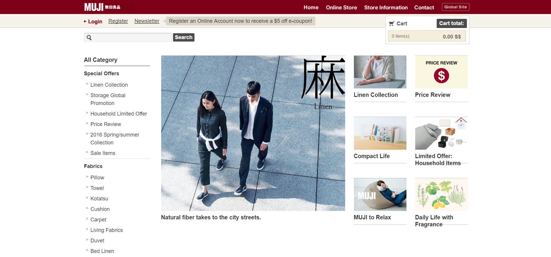
MUJI typically uses 2 colours in their entire theme – a dark red, and a light brown. These colours worked well together to give a warm, cosy and comfortable feeling, yet not compromising on its elegance and class. I also like how they use a single Chinese / Japanese word to classify and label their products. I felt that this could be a possible way to classify my works. Slowly, I decided to move my design towards a “MUJI” feel, a slightly more Japanese, cosy and comfortable design, tied in with the classy and spacious feeling of Apple and Samsung.

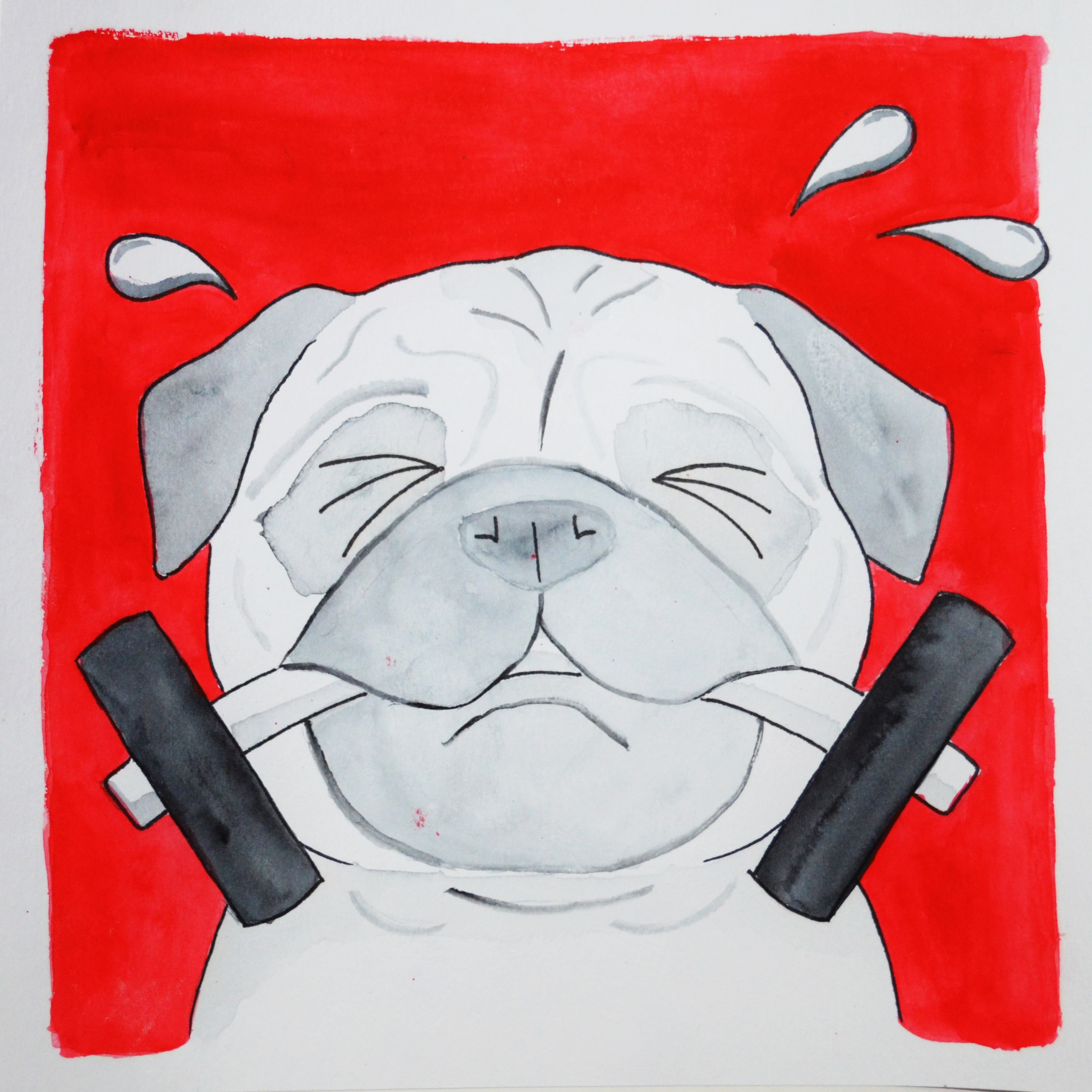
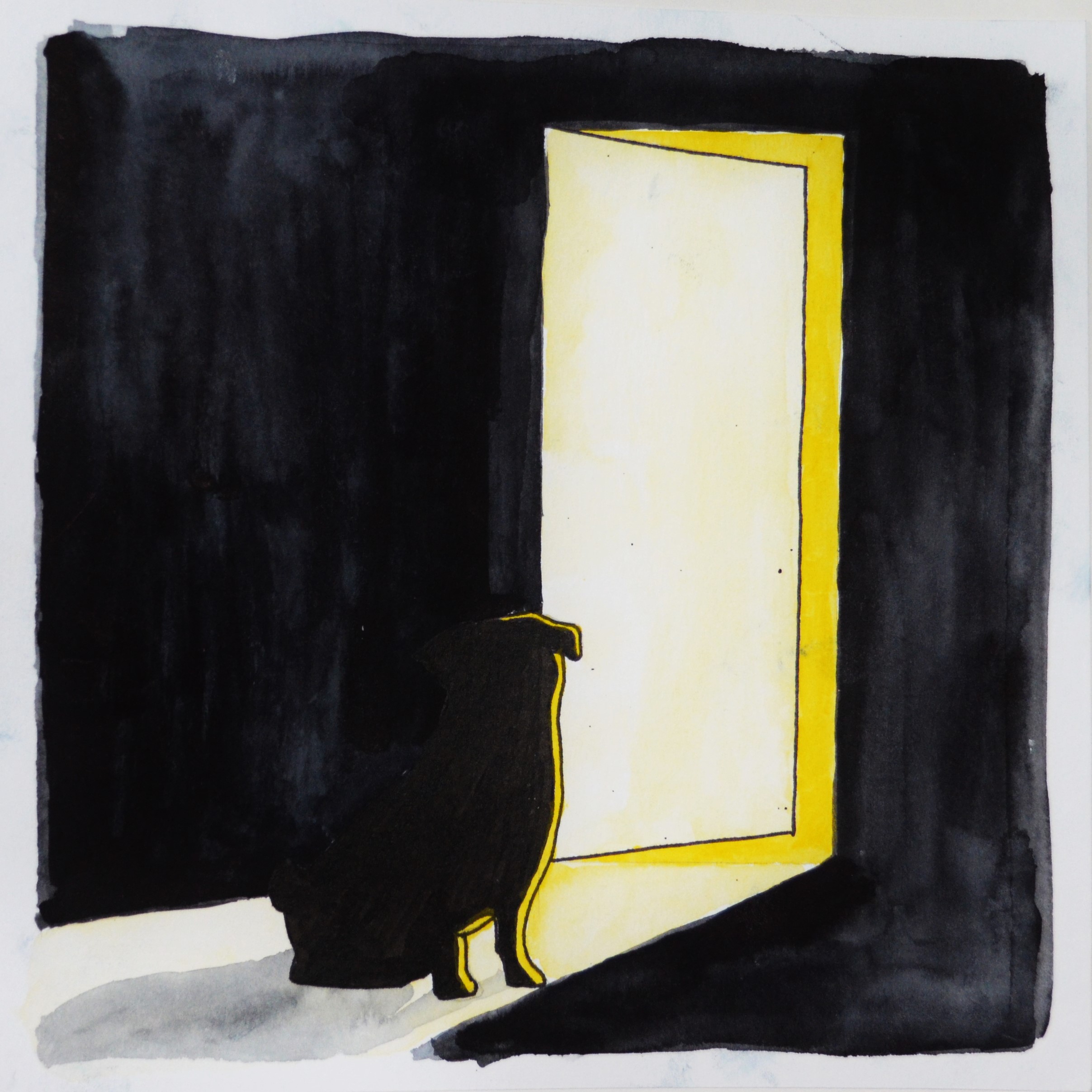
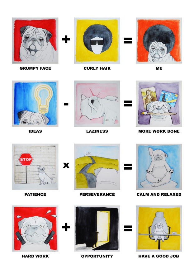
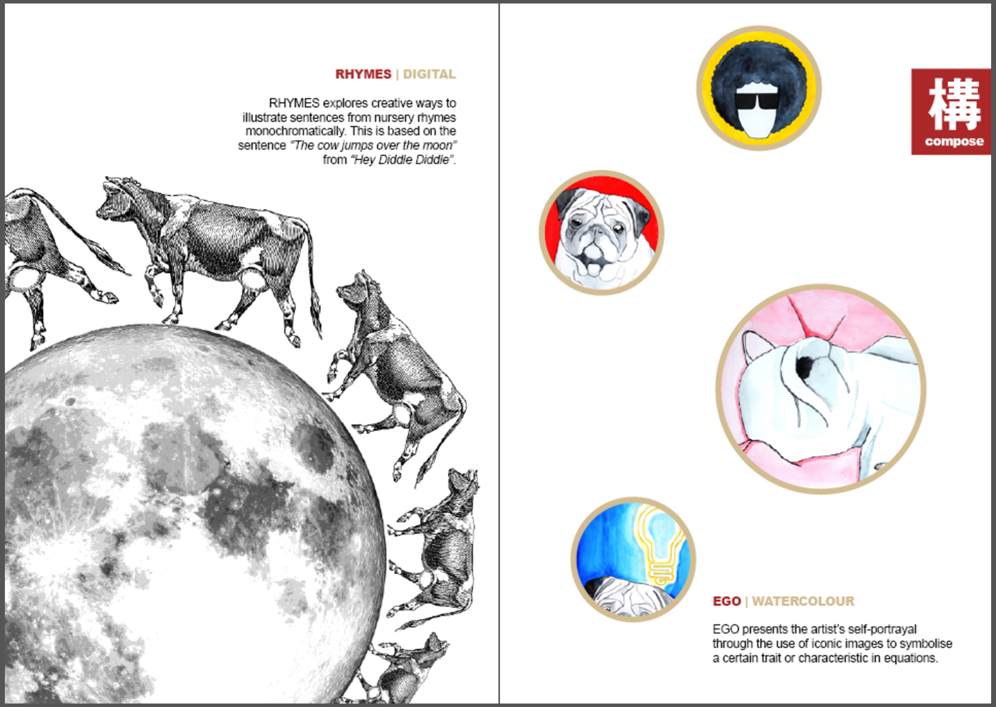
With these in mind, I started looking through my past works and sieved out some of the better ones that I would like to showcase in my zine. These included 2D projects since semester one like Lines, Rhymes, Ego, Point of View, and also drawings and paintings in both wet and dry mediums, from my portfolio and Foundation Drawing module.

Here is how my zine looks like, as a finalised printout, in page order (borders are only here to define the area printed due to white background):
Page 1Page 2-3Page 4-5Page 6-7Page 8
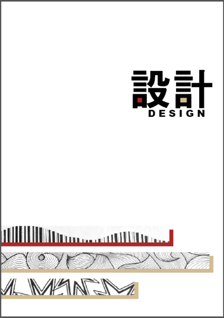
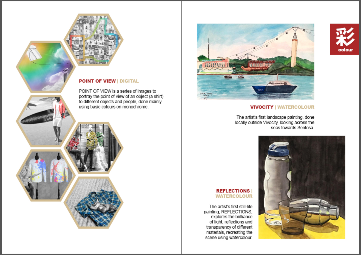
I made use of the dark red and light brown colour combination as a main theme for my zine, giving a warm and comfortable tone due to their warm nature. I then used the “one chinese word” element from MUJI, which in my case, i chose to find them in Japanese. I translated the words I wanted into Japanese on google translate, and tried to use those that could be in Chinese characters, particularly, traditional Chinese characters. The existence of these words in both Japanese and traditional Chinese seemed like a good match to me, as it ties in well with the Japanese style I wanted, and also understandable in Chinese to most locals. As such, I categorised my pages according to a defining type they belong to, namely “composition”, “sketch” and “colour”, which translates to 结() or ()造, ()画, and 色(). I then named the entire zine as 设计, or Sekkei in Japanese, meaning design.

On the cover page, the title was along one-third of the layout, while the “Lines” strips were started at the two-third in response to the rule of thirds. The word “design” and the strips were also slightly misplaced left / right to eliminate symmetry. I also added my two main colours into the Chinese words which had similar strokes on one side. The shadows of the strips were also in the same colour, and given that order to not have symmetry as well.

On the second page onwards, the dark red was used as the titles to the works, as it was more eye-catching, while the light brown subtly tells of what medium the work was done in. On the right hand side of every spread, there would be a dark red tab to tell of the category of the works, similar to the one-character design of MUJI. The second page shows the “Rhymes” composition being cropped out and taking a large portion of the page, similar to the design idea of Apple and Samsung.

On the third page, the “Ego” composition was arranged in a asymmetrical way similar to the logo of the National Museum, and the shapes were all round. This gives repetition and something out of the norm based on arrangement and size. The arrangement and size different also brings in something of interest to catch the audience’s attention, and provides more movement in the layout.

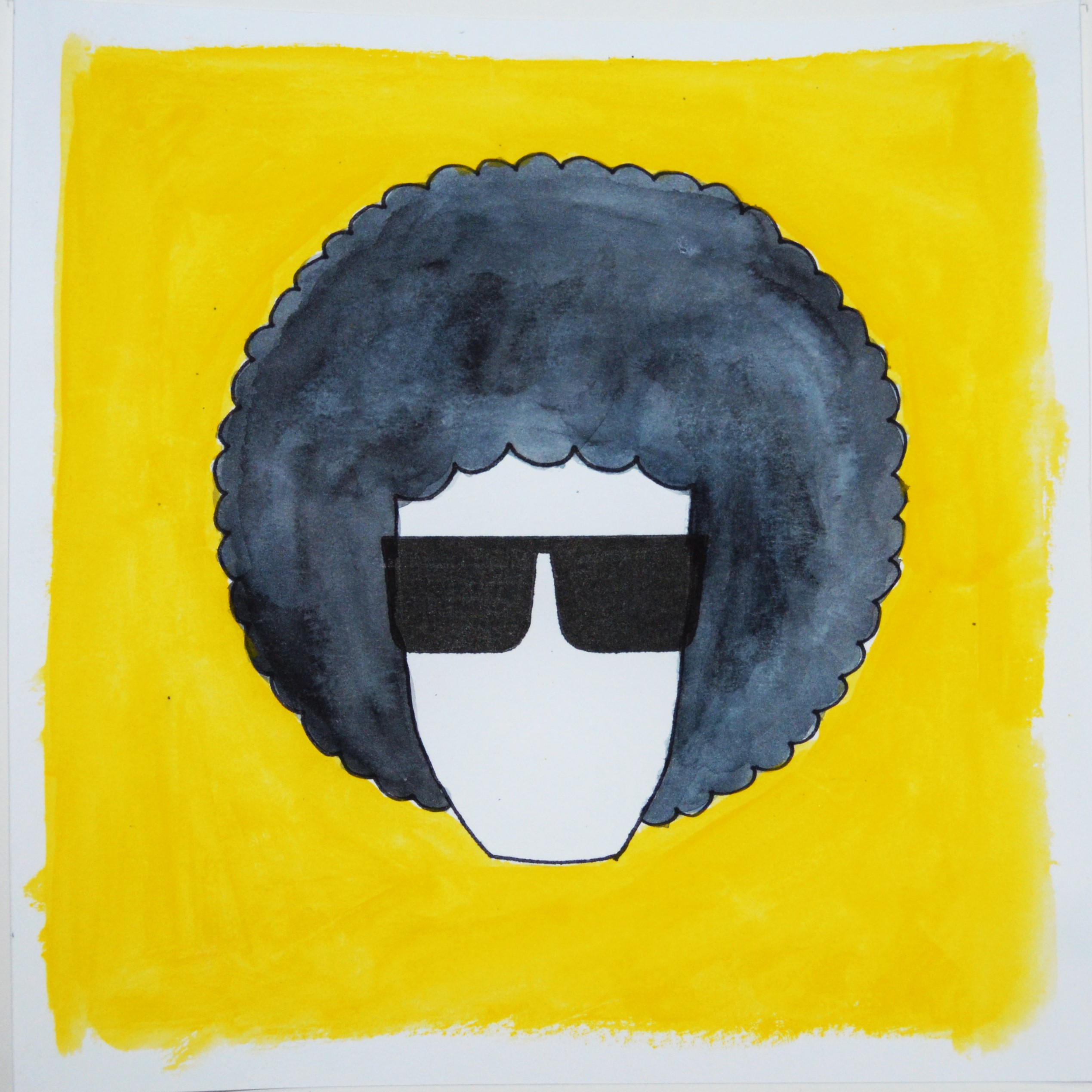
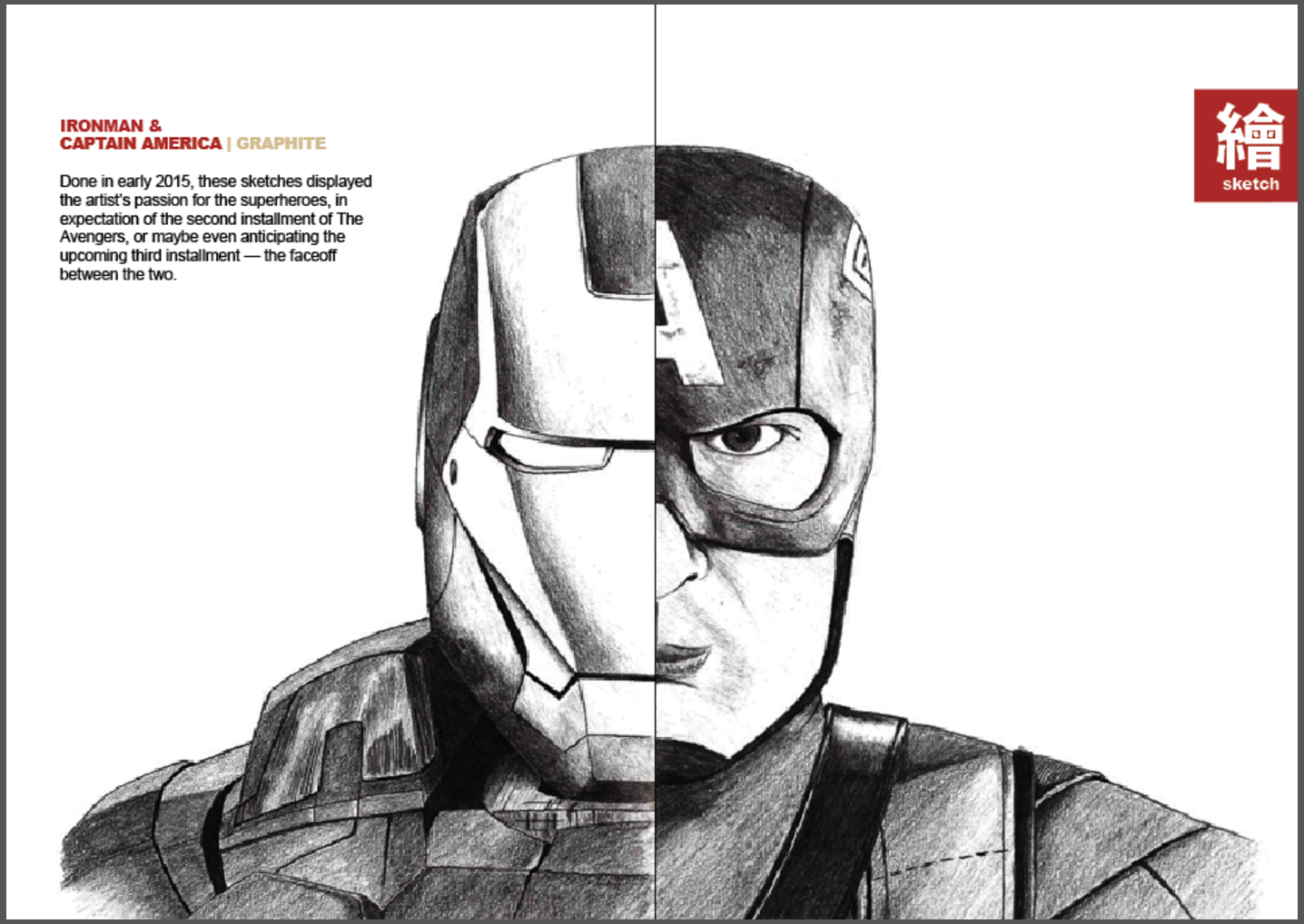
On page four and five, the two sketches merges to form “one” person, which I felt was an interesting way to display these two different but similarly styled sketches, especially when these two superheroes are going to face-off in an upcoming movie, Captain America – Civil War. There was also an emphasis on white spaces around them, with entirely nothing else apart from the caption, to bring full attention to the work done.

On page six, the hexagons work together with little gaps in between to show a coherent composition like a bee hive. then, one piece is removed from the composition to have an interesting point, and I felt that the area was just nice to insert the captions, giving the whole page a clean and neat arrangement without being too boring.

On page seven, the two paintings are misaligned such that the top painting seems to hang over the bottom one, having a cantilevered position gives it movement to make the composition interesting.

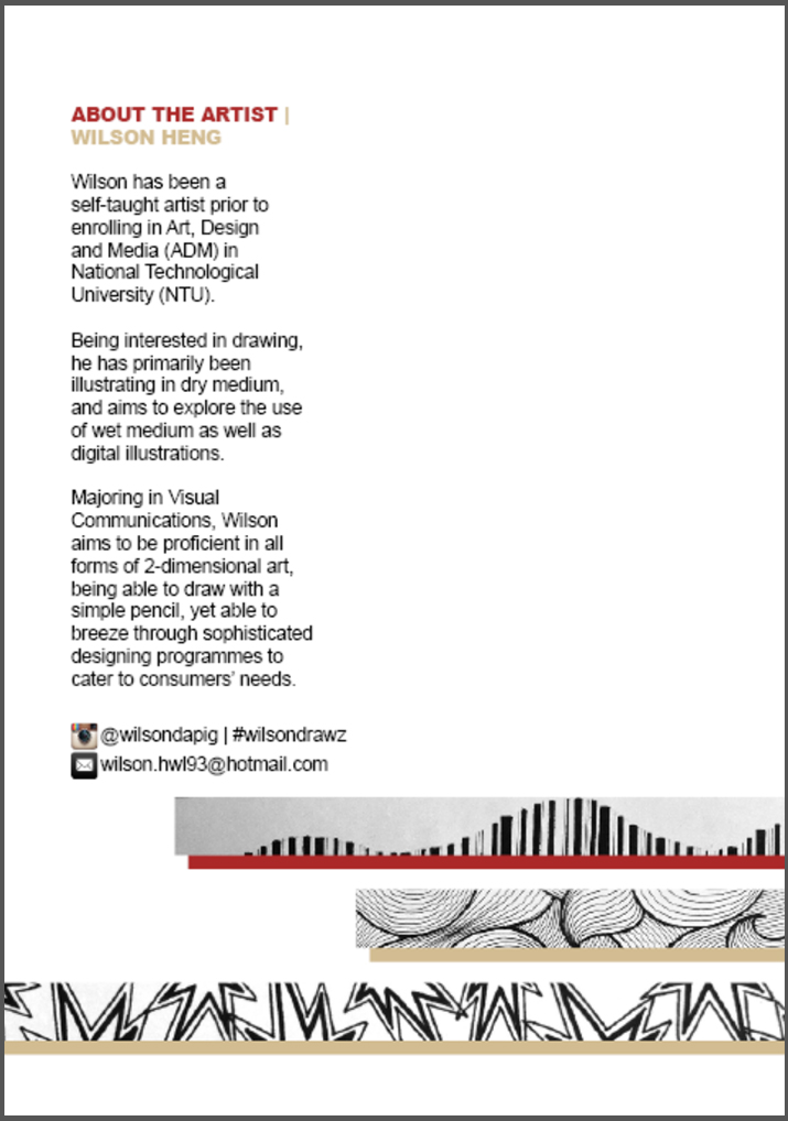
The back cover shows the extension of the strips from the front cover, as well as details about myself, to give more information and context of what the works are about and who the artist is. Social contacts are also provided so that interested audience could view more works and even contact the artist for queries or request for works.

With this, the zine is completed! I personally found it quite interesting to carry out this project, to look through all the works I have done, bringing back all the good (and bad) memories as well as reflecting back to see progress and improvements, and changes in style over time. It was also interesting to try to understand how to make the layout interesting and make everything aesthetically pleasing, to both the audience and myself.


Point of View

In this project, I explore how an item is portrayed or seen from the point of view of different objects. This is interesting as I start to think of random stuffs and how they view the same thing differently, which is something that not everyone will do normally.

I randomly picked an item, and came up with “shirt”. In this case, “shirt” refers to not just a formal buttoned shirt, but more of tops in general. After coming up with the main subject of focus, I started brainstorming for other objects that could view “shirt”, and what they felt a shirt might be to them. Here’s the list that I generated, and the six in blue made it to the finals, with a little bit of edits –

  1. A shirt from the point of view of a hanger is a warm embrace.
  2. A shirt from the point of view of a designer is a canvas.
  3. A shirt from the point of view of a fashion mall is money.
  4. A shirt from the point of view of an African kid is hope.
  5. A shirt from the point of view of a bamboo pole is burden.
  6. A shirt from the point of view of a pair of bottoms is frenemy.
  7. A shirt from the point of view of a chair is a jacket.
  8. A shirt from the point of view of the Hulk is a rag.
  9. A shirt from the point of view of a beach-goer is a redundant / wardrobe malfunction.
  10. A shirt from the point of view of a soldier is refreshment.
  11. A shirt from the point of view of a mum is a chore.
  12. A shirt from the point of view of a body is security.
  13. A shirt from the point of view of a model is reputation / fame. / popularity
  14. A shirt from the point of view of a cat is a bed.
  15. A shirt from the point of view of a wallet is depressing.
  16. A shirt from the point of view of a loose thread is farewell.
  17. A shirt from the point of view of a bird is a toilet.
  18. A shirt from the point of view of an interviewer is judgement.

Next, was to think of how to carry it out. Usually for 2D projects, I have been doing them hands-on, using paints, paper, or even exploring a variety of materials to play with texture and space, making the subjects 3D. This time round, we were advised to keep it 2D, and thus I decided to explore and improve on something I have been weak at – Photoshop. I am very bad at photoshop as I only started using it in university, and thus I tend to try to avoid using it for projects but to do something that I am more confident and comfortable with, doodling with pens and pencils, making things hands-on instead of digital. I decided to use mainly photography, but making the entire composition black and white in general, then add vibrant colors to enhance the subject, which is usually the shirt itself. This technique is only widely known as color splash, and here are some examples that I have came across –

3 1 2

This technique helps to bring attention to the colored subject immediately, with the black and white subtle background filling in the rest of the details to complete the picture. I find this technique very interesting, and thus decided to employ it in my project. So here’s my final 6 compositions –

A SHIRT FROM THE POINT OF VIEW OF A POOR AFRICAN KID IS HOPE.

A SHIRT FROM THE POINT OF VIEW OF A POOR AFRICAN KID IS HOPE.

In this composition, I placed a topless African kid at the bottom right corner, in black and white to show how he seems to be neglected, his life has a lack of colors, seems dull and sad, but not without realizing that hopeful look in his eyes. I then placed a shirt at the top right corner, disguised as a kite as suggested by the frame and string. A kite seems like a source of happiness for kids, and I wanted to portray the shirt as a form of hope and happiness for this shirtless African kid, thus putting it against a sky that is overlayed with vibrant colors of the rainbow, which slowly recedes to black and white towards the kid. This shows a contrast between black and white as compared to colors, as well as the contrast between the two moods.


A SHIRT FROM THE POINT OF VIEW OF A BEACH-GOER IS WARDROBE MALFUNCTION.

A SHIRT FROM THE POINT OF VIEW OF A BEACH-GOER IS WARDROBE MALFUNCTION.

In this composition, I portrayed a man well-dress in a blazer holding a surfboard. To him, the shirt is redundant and does not serve its function a the shirt will get wet if he surfboards in that outfit. As such, it is a wardrobe malfunction. His blazer is overlayed with a warm pink to suggest the warmth of the beach, yet not too red to prevent stealing all the attention towards the blazer alone. He is placed along one third of the picture, with a horizontally placed surfboard to balance out the composition. On the other vertical one third, 2 surfboarders are placed in the background to juxtapose the difference between being topless and wearing the blazer. This composition was fun to make as the initial portrait of the man in blazer at the beach was a narrower portrait, and I had to clone the background out to make it seem natural and show the vastness of the beach as well. His shadows were extended and the surfboard added in, in place of a pair of shoes he was holding initially. His belt was also removed and I made his tee longer, all to remove the initial portrayal where he looked like a model for a beach photoshoot as seen below.

Initial picture of the subject


A SHIRT FROM THE POINT OF VIEW OF A CAT IS A BED.

A SHIRT FROM THE POINT OF VIEW OF A CAT IS A BED.

Cats always like to snuggle in the shirts of its owner, often curling up on these small cosy areas instead of enjoying the large beds. Similarly to the previous composition, the cat and shirt is placed towards one third of the picture, with only the shirt in color. The shirt is blue to signify a sense of serenity and calmness associated with sleeping and resting, and the shirt is placed on another fabric which is typical of bedsheet and blankets. This shows the emphasis of how the cat sleeps on the shirt, instead of on the bed. In the composition, the sourcing of cats to be in a similar angle of shot as the shirt was key, to make the image look more real instead if incoherence because of different angles. Then, shadow was added to the cat, in a similar way to the shirt’s shadow to have consistency. I also experimented to control the feathering edge of masking the image, to preserve the soft and furry texture of the cat which does not make him look like he is superimposed onto the shirt.


A SHIRT FROM THE POINT OF VIEW OF A DESIGNER IS A CANVAS.

A SHIRT FROM THE POINT OF VIEW OF A DESIGNER IS A CANVAS.

This statement works in 2 ways! One, a designer would want to make his/her own shirt, and thus the shirt would be like a canvas to him/her. Two, even when a designer does not make his/her shirt a canvas, very often while painting and drawing, the paints get onto the shirt, making it seem like a canvas after all! In this composition, I put a series of plain white shirts on mannequins and the third shirt is slightly cropped out, suggesting a continuing row of shirts. Then, I put splashes of paint over these shirts, in the basic colors of red, yellow and blue, which overlapped to create areas of purple and orange. The background is a very raw concrete feel to give the “industrial” look which many studios nowadays take after.


A SHIRT FROM THE POINT OF VIEW OF A FASHION MALL IS MONEY.

A SHIRT FROM THE POINT OF VIEW OF A FASHION MALL IS MONEY.

Who doesn’t know shopping malls make a huge load of money out from your pockets, with the cost of shirts being really low overseas and the prices being ridiculously high here? Yes, to fashion malls, a shirt is money! As such, I used a photograph of a display window with several mannequins, then cropped out their shirts and underlayed with trademark american dollar bills. The dollar bills are then tinted with the 3 basic colors of red, yellow and blue, with green added in between. This is to show like how this shirts are made of money, OUR MONEY.


A SHIRT FROM THE POINT OF VIEW OF A MODEL IS FAME.

A SHIRT FROM THE POINT OF VIEW OF A MODEL IS FAME.

Last but not least, this is one of my favourite compositions, as it has a very trendy and local feel to it. It is also probably the most tedious composition in this project. To models, it seems like their #ootd, or “outfit of the day” is very important to them, as it in turns determines the number of “likes” they get, their reputation and fame. Sometimes these #ootd shots are also advertisements or sponsored apparels, making it even more important to ride on their reputation and fame. To begin, I took quite a number of #ootd shots of a local model, and then rearranged and repeated them in tiles in the background to create a messy yet homogeneous backdrop. I took screenshots of these #ootd shots from instagram, then had to crop them out, and arrange them neatly in squares before duplicating, flipping and rearranging them so that they look slightly different. Then, I put over a transparent layer of a facebook’s “like” button, before adding colors of the rainbow to this button to make it stand out from the black and white background. This composition is also tricky in that the size of the tiles mattered, as they had to be small to be subtle as a consistent background, yet big enough to tell the subject in the background, which is a focus of #ootd shots with a shirt. As such, it was fun experimenting with different sizes, overlaying with different colors and trying to see which is the nicest, to me at least.

With that, Point of View project is done, so what’s your point of view of a shirt?

EGO – The project about Oneself.

EGO – This project was to explore and portray ourselves using a series of equations, as well as the first and only project from 2D to be dealing with colors, unlike the previous monochromatic projects. Medium was also free for us to explore, making this project one of the most interesting and enjoyable one to do.

The equations were as follows:

__________ + __________ = ME

__________ – __________ = A BETTER ME

__________ x __________ = AN IDEAL ME

__________ +/- __________ = ME IN 5 YEARS

I decided to choose watercolor as my medium as i had recently bought some dry watercolor pellets, and wanted to have some fun with them. This is my second time trying to paint something with watercolor.

I started to brainstorm what was relevant and very significant of me, and the first things that came to mind was my face, which almost every single one said that i looked fierce and grumpy, and also my curly hair, which friends who are closer had realised. In secondary school and JC, I was sometimes called “Bulldog” or “Q-mo” (curly hair). As such, I decided to make use of these identities in this project. I chose to portray a pug instead of a bulldog as a pug seems cuter and funnier, which ties in well with my humorous personality.

Thus, my equations were made as follows:

GRUMPY FACE + CURLY HAIR = ME

IDEAS – LAZINESS = MORE WORK DONE

PATIENCE x PERSEVERANCE = CALM AND RELAXED

HARD WORK + OPPORTUNITY = HAVE A GOOD JOB


Grumpy Face + Curly Hair = ME

GRUMPY FACE
GRUMPY FACE

Most of the pictures had the main subject occupying a huge portion of the picture so that it stands out and the message I want to bring across is very clear and simple, unless the background has something important and relevant to the message. As such, I drew a very big pug, against the red background as red signifies anger.

CURLY HAIR
CURLY HAIR

Then, I chose to draw a guy with an afro hairstyle as I felt that an afro is the epitome of curly hair. I gave the guy a pair of shades and a yellow background to have a huge color contrast, and yellow gives a happy and groovy feeling to this picture.

ME
ME

Tada! Grumpy face + curly hair = ME! The background was orange due to the addition of red and yellow, and that it represents friendliness and also passion. I put the afro wig over the pug for a simple addition which tells the message very clearly. The first equation is then complete with a very warm color scheme.


Ideas – Laziness = More Work Done

IDEAS
IDEAS

I can usually come up with many ideas for anything, but my laziness becomes a burden and makes me find only the easiest way out which sometimes might not be the best option. As such, I drew half a pug, obvious enough to tell that it is a pug, and a glowing neon light bulb above him to suggest “ideas”. I chose a yellow bulb against a blue background as they are complementary colors, showing a comfortably high contrast.

LAZINESS
LAZINESS

Then, i pictured a dog sleeping to represent laziness, as well as through the very soundly asleep posture. I chose a very light shade of pink as the background that the dog is sleeping on as this shade of pink is very soft, comfortable and warm, tying in with the idea of being lazy and wanting to snooze.

MORE WORK DONE
MORE WORK DONE

Then, if my ideas were not burdened by my laziness, I would have more work done! I chose to portray a pug in the foreground biting a paintbrush, his artworks in the midground, then a purple background. The artworks is to symbolize the works done by him, which i chose “Mono Lisa” (with a pug’s face as if he was drawing his friend), and “Starry Night”, which were famous paintings to show how good he is. The purple background gives the idea of luxury or royalty, going in line with how he is able to come up with such good and expensive paintings. This entire equation shows a gradual color transition.


Patience x Perseverance = Calm and Relaxed

PATIENCE
PATIENCE

For the third equation with multiplication, I felt that it means an attribute that I already have, but have to multiply the quantity in order for it to be ideal. I felt that I have patience and perseverance, but would be even better if I had more of these. For patience, I drew a pug next to a stop sign against a brick wall. The wall was in a faded shade of brown to show that it is dull and boring, which requires even more patience to pull through these periods of dullness and boredom. The stop sign was then in a very vibrant red to stand out from the rest of the picture, with the word “STOP”, which symbolizes waiting and to have patience.

PERSEVERANCE
PERSEVERANCE

Then, I showed a back view of a pug looking towards a very very long road across mountains. This is to show that the road is long and he has to persevere to get to the end of it, where there is a bone to represent a reward. The green mountain was to represent peace and balance, like the statement “Keep Calm and Carry On!”. The blue sky goes well with the green mountains as an analogous color scheme.

CALM AND RELAXED
CALM AND RELAXED

The last picture of this equation shows a pug sitting in a zen or yoga position on a cushion, where everything is very white and light blue. This shows the calmness if I could have a lot of patience and perseverance, and I would be able to solve and do everything, slowly but surely. This would be the ideal situation where I wouldn’t have to worry about anything and just be very relaxed.


Hard Work + Opportunity = Have A Good Job

HARD WORK
HARD WORK

So what would I want to happen to me to me in 5 years? One of the biggest worries of ADM students is being unable to find a job. So, of course I want to have a good job in 5 years, after I have graduated from ADM! I believe that whatever we are doing now is all hard work towards building a name for ourselves to find a good job as artists and designers. As such, I showed a pug using a dumbbell to represent the effort put in and the hard work, against a red background which represents energy and passion.

OPPORTUNITY
OPPORTUNITY

But of course, hard work alone does not necessarily pay off. We all need to have that exposure and be given that opportunity to shine and carve a name for ourselves. Success is when preparation meets opportunity. Here, I chose a door to represent opportunity. It is slightly open to let the light in, like how people see light as hope and a chance. I chose yellow as the light, and everything else is black and just silhouettes, as yellow represents optimism and hope, and also gives a high color contrast against black.

HAVE A GOOD JOB
HAVE A GOOD JOB

So, when hard work meets opportunity, I might just be able to have a good job within 5 years! I showed a small pug on a high chair to represent how new I would be to the industry and being just a very small character, but the high chair suggests a rather good job. The yellow shows happiness of being “successful” in finding a job which is enjoyable and pays well!


When all put together, this completes my EGO project, with a simple concept of the pug tying through the entire project and every square having a simple color composition.

EGO
EGO

Color Harmonies

Colors are everywhere, present in everything. More often than not, colors are not alone, but in fact, a combination of a few colors! So, how do colors work with each other, and how do they match?


COMPLEMENTARY

Colors that are opposite each other on the color wheel are considered to be complementary colors. (e.g. Red and Green)

The high contrast of complementary colors creates a vibrant look especially when used at full saturation. This color scheme must be managed well so it is not jarring.

Complementary - Blue and Orange
Complementary – Blue and Orange

SPLIT-COMPLEMENTARY

The split-complementary color scheme is a variation of the complementary color scheme. In addition to the base color, it uses the two colors adjacent to its complement.

Split-complementary - Blue, Orange, and Yellow
Split-complementary – Blue, Orange, and Yellow

ANALOGOUS

Analogous color schemes use colors that are next to each other on the color wheel. They usually match well and create serene and comfortable designs.

Analogous color schemes are often found in nature and are harmonious and pleasing to the eye.

Analogous - Shades of Blue and Violet
Analogous – Shades of Blue and Violet

RECTANGLE / TETRADIC

Tetradic color scheme uses four colors arranged into two complementary pairs.

This rich color scheme offers plenty of possibilities for variation. It works best if you let one color be dominant.

You should also pay attention to the balance between warm and cool colors in your design.

Tetradic - Blue, Green, Red and Yellow
Tetradic – Blue, Green, Red and Yellow

SQUARE

The square color scheme is similar to the rectangle, but with all four colors spaced evenly around the color wheel.  Similarly, it works best if one color is the dominant.

You should also pay attention to the balance between warm and cool colors in your design.


TRIADIC

A triadic color scheme uses colors that are evenly spaced around the color wheel.

Triadic color schemes tend to be quite vibrant, even if you use pale or unsaturated versions of your hues.

Triadic - Red, Blue and Yellow
Triadic – Red, Blue and Yellow


Colors – What do they mean?

Colors make up an important part of everyday life. They are everywhere. They give things identity and let people feel a certain kind of emotions. So what do they tend to represent?


RED

Red represents anger.

It also represents love, energy, power, strength, passion, heat, danger, physical courage, warmth, stimulation, masculinity, excitement, defiance, aggression, visual impact, strain and warning.

RED_anger


ORANGE

Orange  represents physical comfort and sensuality.

It also represents courage, confidence, friendliness, success, ignorance, warmth, security, passion, abundance, fun, deprivation, frustration, frivolity, immaturity and sluggishness.

ORANGE_Sunset


YELLOW

Yellow represents happiness.

It also represents brightness, energy, the sun, creativity, intellect, irresponsibility, optimism, confidence, self-esteem, emotional strength, friendliness, creativity, irrationality, fear, emotional fragility, depression, anxiety, and unstable.

YELLOW_hapiness


GREEN

Green represents harmony.

It also represents money, growth, fertility, freshness, balance, refreshment, universal love, rest, restoration, reassurance, environmental awareness, equilibrium, peace, boredom, stagnation, blandness and healing.

GREEN_growth


BLUE

Blue represents serenity.

It also represents intelligence, communication, trust, efficiency, serenity, duty, logic, coolness, reflection, calm, coldness, aloofness, lack of emotion and unfriendliness.


PURPLE

Purple represents introvert.

It also represents spiritual awareness, containment, vision, luxury, authenticity, truth, quality, decadence, suppression and inferiority.

PURPLE_luxury


PINK

Pink represents love.

It also represents physical tranquility, nurture, warmth, femininity, love, sexuality, emotional claustrophobia, emasculation, physical weakness.


BROWN

Brown represents seriousness.

It also represents warmth, nature, earthiness, reliability, support, lack of humor, heaviness and lack of sophistication.

BROWN_earthiness


GREY

Grey represents depression.

It also represents psychological neutrality, lack of confidence, hibernation and lack of energy.

GREY_depressed


BLACK

Black represents oppression.

It also represents sophistication, glamour, security, emotional safety, efficiency, substance, coldness, menace and heaviness.

BLACK_glam


WHITE

White represents purity.

It also represents hygiene, sterility, clarity, purity, cleanness, simplicity, sophistication, efficiency, coldness, barriers, unfriendliness and elitism.

WHITE_purity