Zine

In this project, we design a printed document, a zine, that we can showcase almost anything we want to, from past works to photography. For me, I chose to display some of my preferred works, ranging from digital works done in 2D modules, to painting done for Foundation Drawing, and even works done before ADM life started.

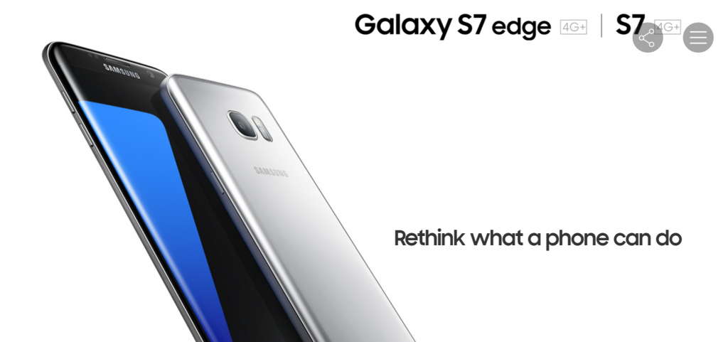
Initially, my idea was to come up with something like a catalog for a gallery, something clean and classy and minimalist. I also considered to make the entire zine in monochrome, showcasing only my works done in black and white, to further enhance the idea of minimalist and classy. I went to check out several designs, in particular from Apple and Samsung, two big technological giants well known to have been producing classy and sleek gadgets like the Apple iPhone, iPad, or the Samsung Galaxy series.
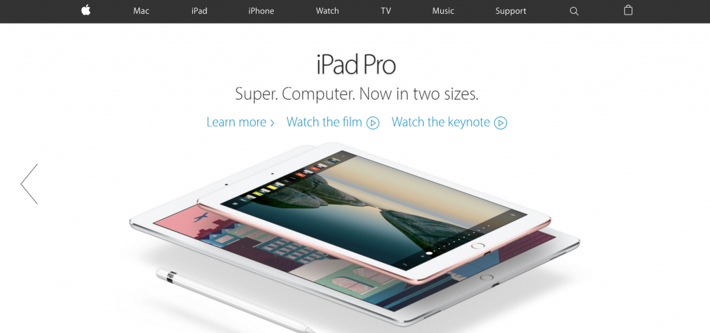
The Apple website
The Apple website
The Samsung website
The Samsung website

I found out that both Apple and Samsung made their website very classy in similar ways. First, it was the plain white background with very simplistic font, that makes the entire composition very clean and sharp. Next, the subjects – the gadgets and phones, were very precisely trimmed and placed in place with sufficient empty space, to make the subject stand out and have enough empty space to accentuate their elegance and class. However, this point might not be applicable to my design as my subjects were not 3D objects, and tend to have a background, making such cropping inapplicable. Nonetheless, this was a good start in understanding how to compose my “clean” and “classy” zine.

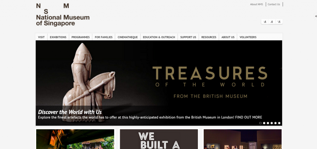
I also researched on the websites of the National Design Centre, and National Museum of Singapore, since I wanted my zine to look like a catalog for a gallery or exhibition, thus this two might be a good platform that is more relevant to my design.
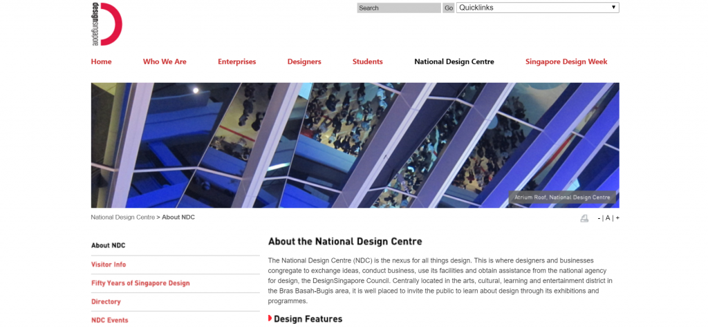
The National Design Centre website
The National Museum of Singapore website

SImilar to Apple and Samsung, they had very plain and light coloured background, which looks clean and classy. Both website also uses very plain fonts, with very neat and orderly arrangement of their elements. I noticed that the logos of this two websites were slightly more unique, with the logo of the National Design Centre incorporating words into part of the logo, and the asymmetrical arrangement of NMS for the National Museum. I thought through how I could incorporate English into Chinese strokes for my cover page, but ultimately giving up the idea to keep things very minimalist. I also decided to use asymmetrical arrangement in some of my layout, similar to the National Museum logo and also in line with a design principle, which talks about repetition and something out of the norm to draw attention.

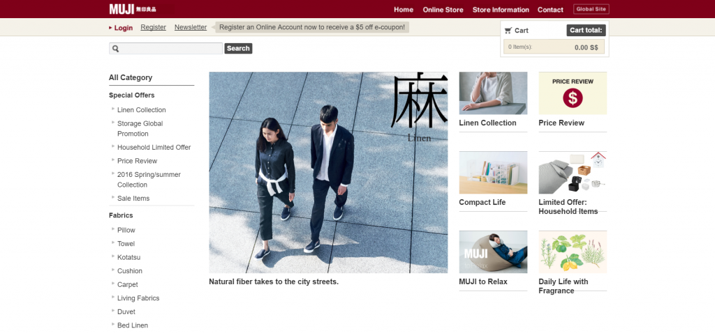
While shopping, I chanced upon another idea for my zine, after seeing how MUJI, a japanese shop actually has a very calm and “zen” feeling to it. This was another direction I could go for! With shopping physically there and going online to their website, I found out I like their design quite a lot.
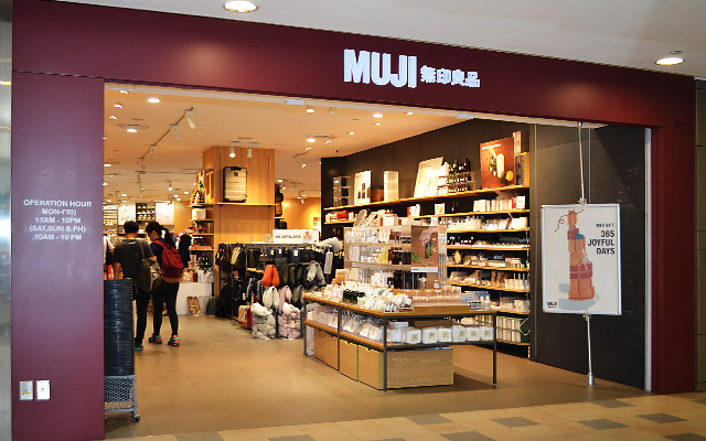
The MUJI shop
The MUJI shop
The MUJI website
The MUJI website

MUJI typically uses 2 colours in their entire theme – a dark red, and a light brown. These colours worked well together to give a warm, cosy and comfortable feeling, yet not compromising on its elegance and class. I also like how they use a single Chinese / Japanese word to classify and label their products. I felt that this could be a possible way to classify my works. Slowly, I decided to move my design towards a “MUJI” feel, a slightly more Japanese, cosy and comfortable design, tied in with the classy and spacious feeling of Apple and Samsung.

With these in mind, I started looking through my past works and sieved out some of the better ones that I would like to showcase in my zine. These included 2D projects since semester one like Lines, Rhymes, Ego, Point of View, and also drawings and paintings in both wet and dry mediums, from my portfolio and Foundation Drawing module.

Here is how my zine looks like, as a finalised printout, in page order (borders are only here to define the area printed due to white background):
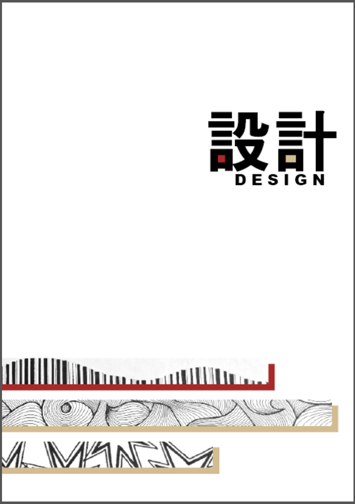
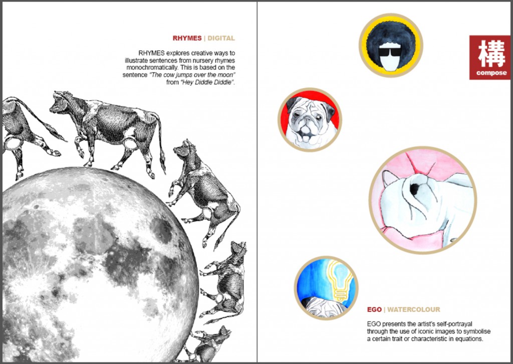
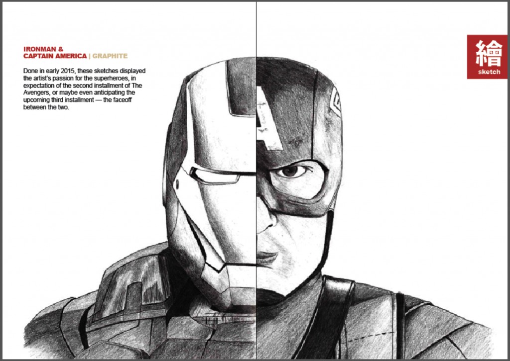
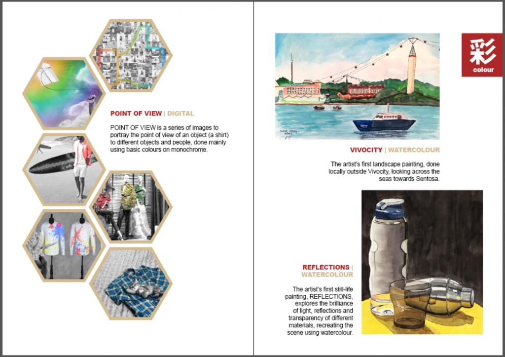
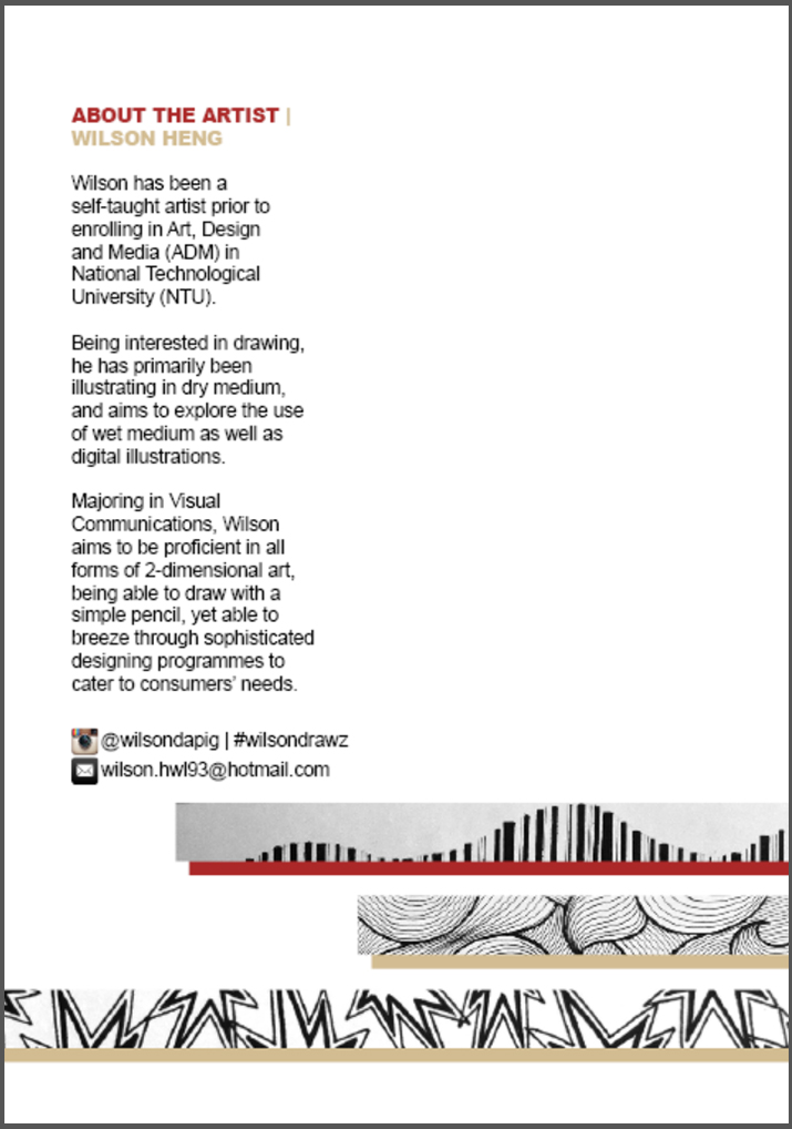
Page 1Page 2-3Page 4-5Page 6-7Page 8I made use of the dark red and light brown colour combination as a main theme for my zine, giving a warm and comfortable tone due to their warm nature. I then used the “one chinese word” element from MUJI, which in my case, i chose to find them in Japanese. I translated the words I wanted into Japanese on google translate, and tried to use those that could be in Chinese characters, particularly, traditional Chinese characters. The existence of these words in both Japanese and traditional Chinese seemed like a good match to me, as it ties in well with the Japanese style I wanted, and also understandable in Chinese to most locals. As such, I categorised my pages according to a defining type they belong to, namely “composition”, “sketch” and “colour”, which translates to 结() or ()造, ()画, and 色(). I then named the entire zine as 设计, or Sekkei in Japanese, meaning design.

On the cover page, the title was along one-third of the layout, while the “Lines” strips were started at the two-third in response to the rule of thirds. The word “design” and the strips were also slightly misplaced left / right to eliminate symmetry. I also added my two main colours into the Chinese words which had similar strokes on one side. The shadows of the strips were also in the same colour, and given that order to not have symmetry as well.

On the second page onwards, the dark red was used as the titles to the works, as it was more eye-catching, while the light brown subtly tells of what medium the work was done in. On the right hand side of every spread, there would be a dark red tab to tell of the category of the works, similar to the one-character design of MUJI. The second page shows the “Rhymes” composition being cropped out and taking a large portion of the page, similar to the design idea of Apple and Samsung.

On the third page, the “Ego” composition was arranged in a asymmetrical way similar to the logo of the National Museum, and the shapes were all round. This gives repetition and something out of the norm based on arrangement and size. The arrangement and size different also brings in something of interest to catch the audience’s attention, and provides more movement in the layout.

On page four and five, the two sketches merges to form “one” person, which I felt was an interesting way to display these two different but similarly styled sketches, especially when these two superheroes are going to face-off in an upcoming movie, Captain America – Civil War. There was also an emphasis on white spaces around them, with entirely nothing else apart from the caption, to bring full attention to the work done.

On page six, the hexagons work together with little gaps in between to show a coherent composition like a bee hive. then, one piece is removed from the composition to have an interesting point, and I felt that the area was just nice to insert the captions, giving the whole page a clean and neat arrangement without being too boring.

On page seven, the two paintings are misaligned such that the top painting seems to hang over the bottom one, having a cantilevered position gives it movement to make the composition interesting.

The back cover shows the extension of the strips from the front cover, as well as details about myself, to give more information and context of what the works are about and who the artist is. Social contacts are also provided so that interested audience could view more works and even contact the artist for queries or request for works.

With this, the zine is completed! I personally found it quite interesting to carry out this project, to look through all the works I have done, bringing back all the good (and bad) memories as well as reflecting back to see progress and improvements, and changes in style over time. It was also interesting to try to understand how to make the layout interesting and make everything aesthetically pleasing, to both the audience and myself.


Rhymes – Image Composition

This assignment was to research on rhymes and compose images using Photoshop, to represent lines given in the rhymes and explore the principles of design.

We were initially broken down into groups and each group was assigned a rhyme to research on and compile a photo bank after editing on Photoshop. After which, we were to compose multiple image compositions and then choose our final 4.

My group was assigned to do the rhyme “There Was An Old Woman Who Lived In A Shoe“. This was how the rhyme went:

“There was an old woman who lived in a shoe.
She had so many children, she didn’t know what to do.
She gave them some broth without any bread;
And whipped them all soundly and put them to bed.”
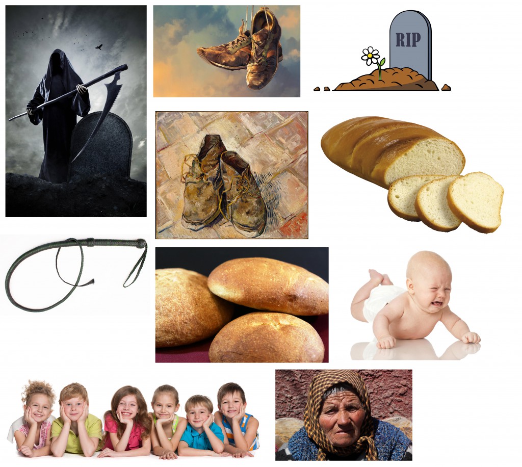
Thus I started to look for images that could represent what I understand from the rhyme. The images had to be rather high definition as it is used for printing, thus at least 300 pixels per inch. It was not easy to look for images that fully represent and suit what I need, yet has the requirement of 300 dpi. Thus, it took quite some time to look for a variety of images that fit all the requirements.
Compilation of images used for photo bank.


 Some of the images were more literal, such as the old woman, children, bread, whip and shoes, while the ones representing death was what I inferred from the last two lines of the rhymes.
After getting the photos, they were then all cropped out, changed to grayscale and either halftone, threshold or posterize. They were then uploaded into our class google drive so that everyone could access each other’s photo bank, making the photo bank more complete and have a greater variety to choose from.
We then broke down the photos into individual lines and tried to compose images based on them. We were advised to try out all 12 lines of the three rhymes – “There Was An Old Woman Who Lived In A Shoe”, “Humpty Dumpty”, and “Hey Diddle Diddle”). However, I chose to focus on doing drafts to explore some of the lines twice instead of doing everything. In total, I had 15 compositions as some of my compositions were too literal, I was advised to think of something that represented them and ways to improve them.
 –
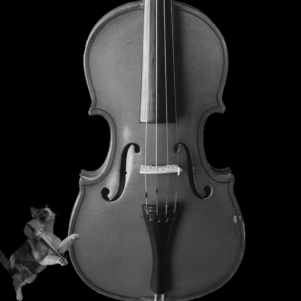
"Hey Diddle Diddle! The cat and the fiddle."
“Hey Diddle Diddle! The cat and the fiddle.”

Just the cat and the fiddle. Literally. The huge fiddle in the middle contrasts in size with the cat at the corner. The small cat at the corner also helps to balance out the big fiddle in the middle.


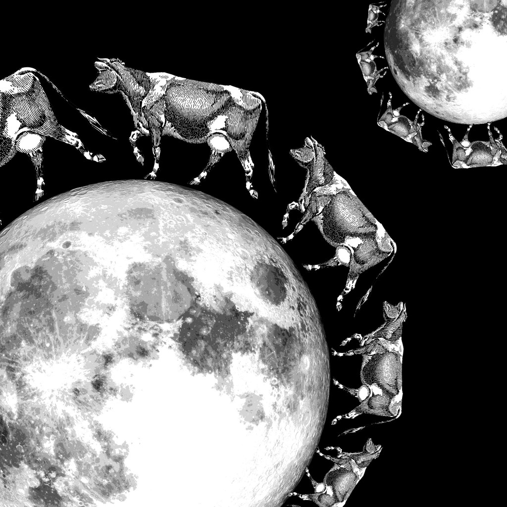
02_The cow jump over the moon
“The cow jumped over the moon.”

The cows have a gradual change in size to signify movement. The smaller group at the top contrasts in size with the bigger group at the bottom.


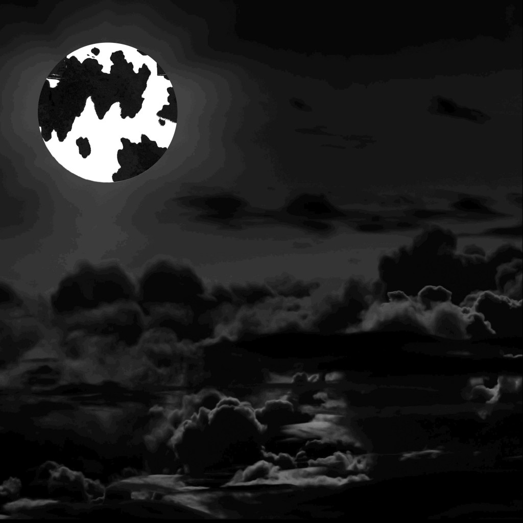
02_The cow jump over the moon_DRAFT 2
“The cow jumped over the moon.” DRAFT 2

The cow skin covers the moon, signifying the cow jumped OVER the moon. The moon is brighter than the entire picture being relatively black to bring attention to it.


03_The little dog laughed to see such sport
“The little dog laughed to see such sport.”

The sport refers to the cow jumping over moon. There is a laughing dog in the background, showing contrast between size and colour tone of background versus foreground. Shows symmetry.


03_The little dog laughed to see such sport_DRAFT 2
“The little dog laughed to see such sport.” DRAFT 2

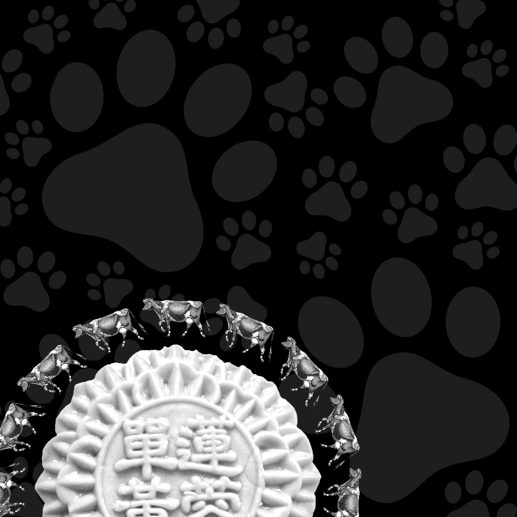
The paws are tilted and have a variety of sizes to show the dog dancing around happily or laughing, while the white mooncake in the foreground represents the moon. Shows contrast between fore and background.


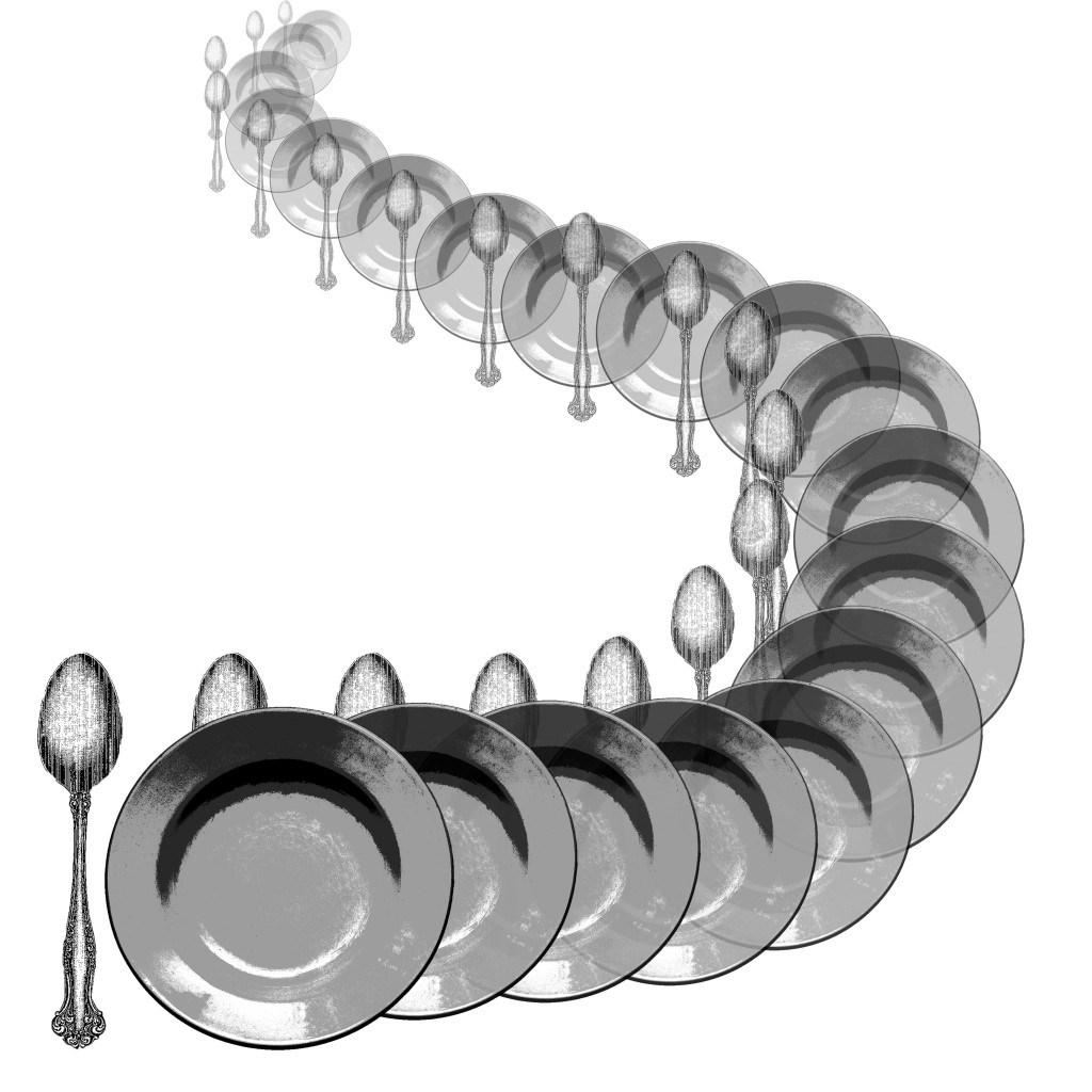
04_The dish ran away with the spoon
“And the dish ran away with the spoon.”

The gradual change in size and opacity to represent movement. Purposely twisted to have a dramatic path and show both the dish and the spoon.


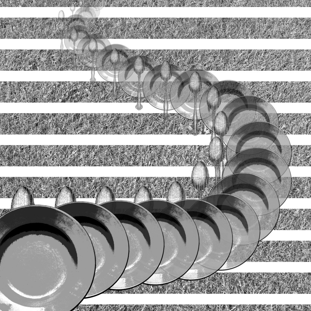
04_The dish ran away with the spoon_DRAFT 2
“And the dish ran away with the spoon.” DRAFT 2

Added a background of grass texture to give the context of running on grass or mountains. Stripes added to give texture and more contrast with foreground. One dish added to foreground out of frame to have a hint that they have not stopped running.


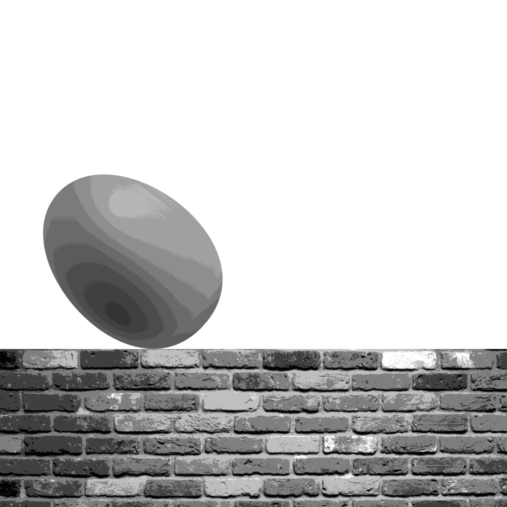
05_Humpty dumpty sat on a wall
“Humpty dumpty sat on a wall.”

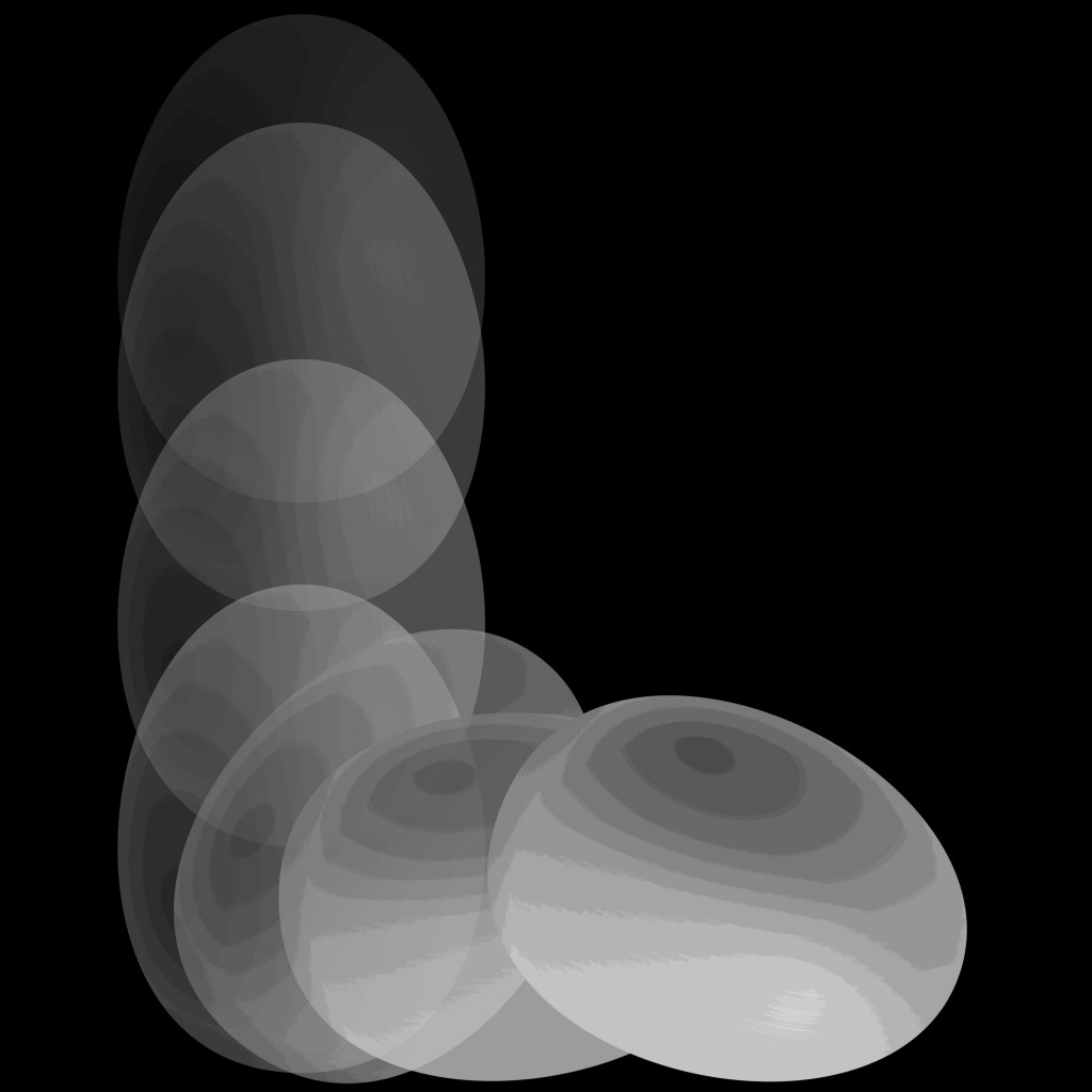
An egg on a wall. Egg is off-center to reduce symmetry, placed along one-third of the picture. It is also tilted to have more movement and life, imitating a relaxed and laid back sitting position.


06_humpty dumpty had a great fall
“Humpty dumpty had a great fall.”

The gradual change in opacity to show movement, and the different angles along the bottom further adds to the movement and life of the egg.


06_humpty dumpty had a great fall_DRAFT 2
“Humpty dumpty had a great fall.” DRAFT 2

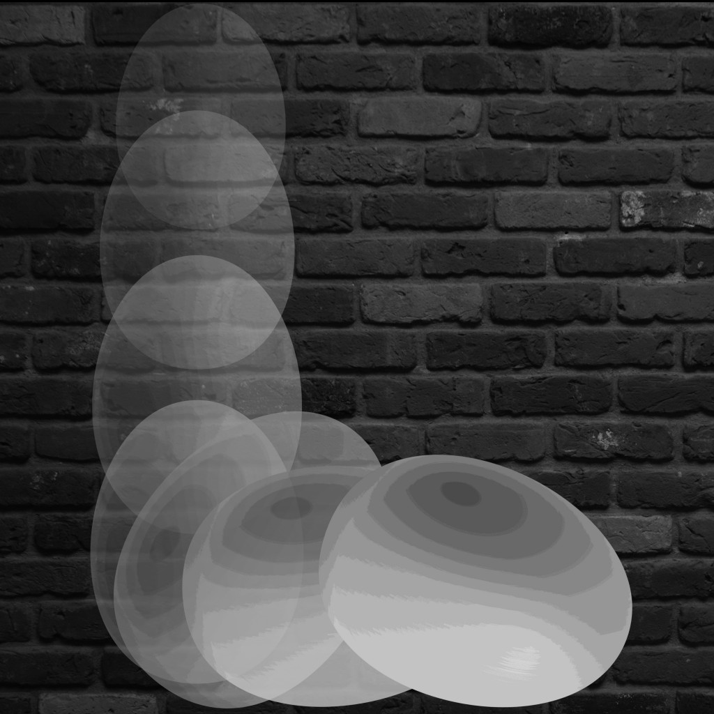
Background of brick wall added to give the context of falling from the wall. Size of the eggs have also changed to have a gradual change to signify the falling from a further place, i.e. top of the wall.


07_all the kings horses and men
“All the king’s horses and all the king’s men.”

Replaced decorations of the the king’s crown with imperial soldiers and soldiers on horses. Emphasizes on the symmetry of the image and the stark contrast between black and white.


08_Couldnt put humpty together again
“Couldn’t put Humpty together again.”

Stark contrast between shape of egg and background, with low contrast of soldiers in the background. Small little dots in the egg represents how the egg has shattered into tiny bits and cannot be put together, despite having so many people.


08_Couldnt put humpty together again_DRAFT 2
“Couldn’t put Humpty together again.” DRAFT 2

Shifted the egg to a corner to reduce symmetry and bring the center of focus to a point. Egg is purposely shifted out of frame as audience will complete it mentally, also making the composition more interesting.


10_She had so many children she didnt know what to do
“She had so many children she didn’t know what to do.”

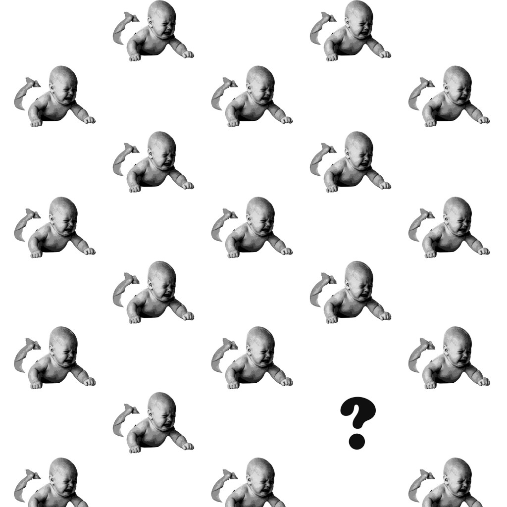
The symmetry and pattern of the babies to bring the center of focus to the only difference – the “?”. The babies are also crying to signify the lack of attention as there is too many of them.


10_She had so many children she didnt know what to do_DRAFT 2
“She had so many children she didn’t know what to do.” DRAFT 2

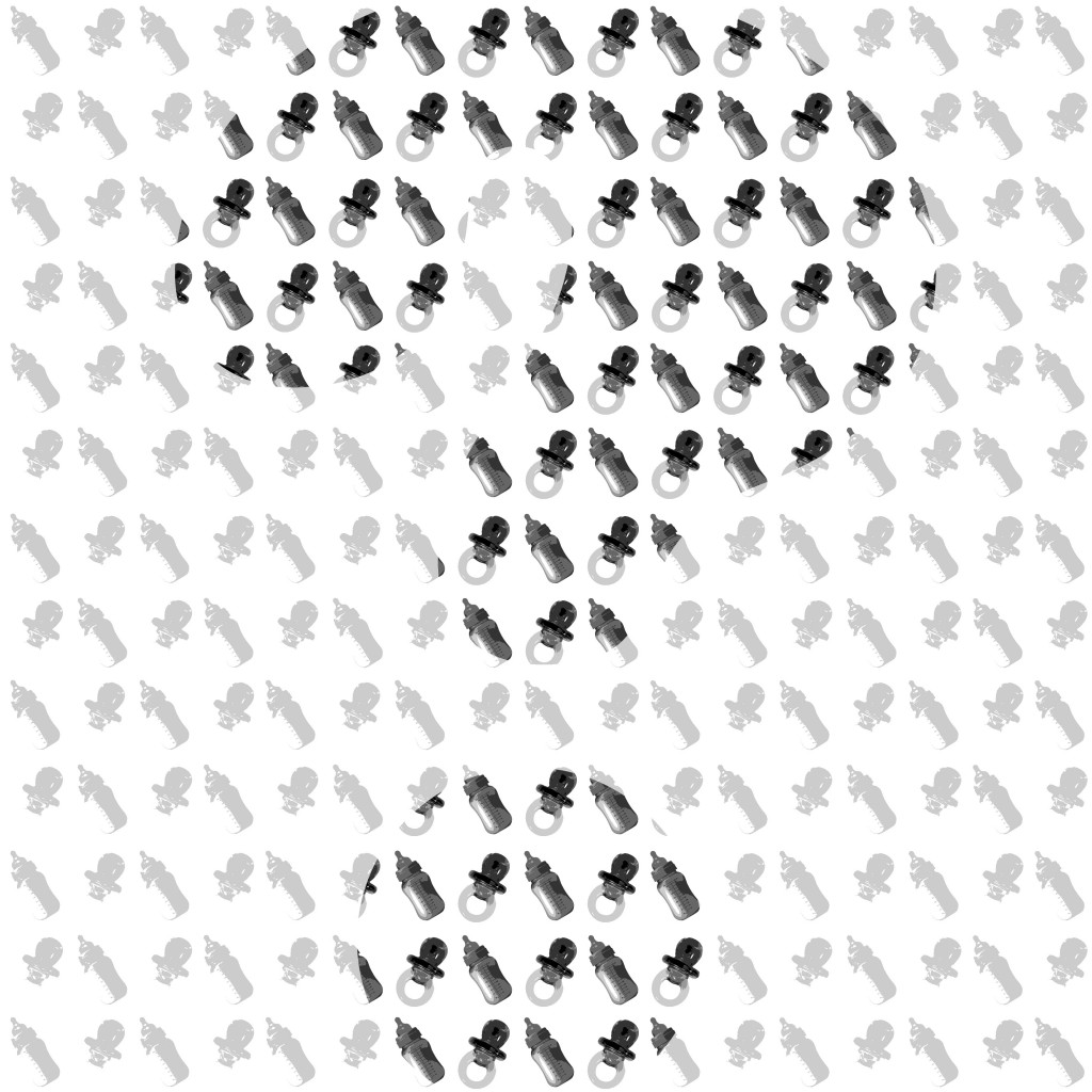
The idea was changed to using milk bottles and pacifiers to represent the vast amount of children, and then a subtle “?” is across the entire composition by having a darker tone and contrast. Parts of the “?” are out of the frame to make the composition more interesting.

Among all of the above, 4 final ones were chosen to be printed, 297mm x 297mm.
10_She had so many children she didnt know what to do_DRAFT 2
“She had so many children she didn’t know what to do.” DRAFT 2

The amount of milk bottles and pacifiers represents the huge number of children that the old woman has. There is then a subtle “?” formed in the middle by having a darker tone and more contrast to represent the idea of lost and not knowing what to do.

The above composition has rhythm and repetition in the milk bottles and pacifiers. It also has contrast to bring out the “?”.


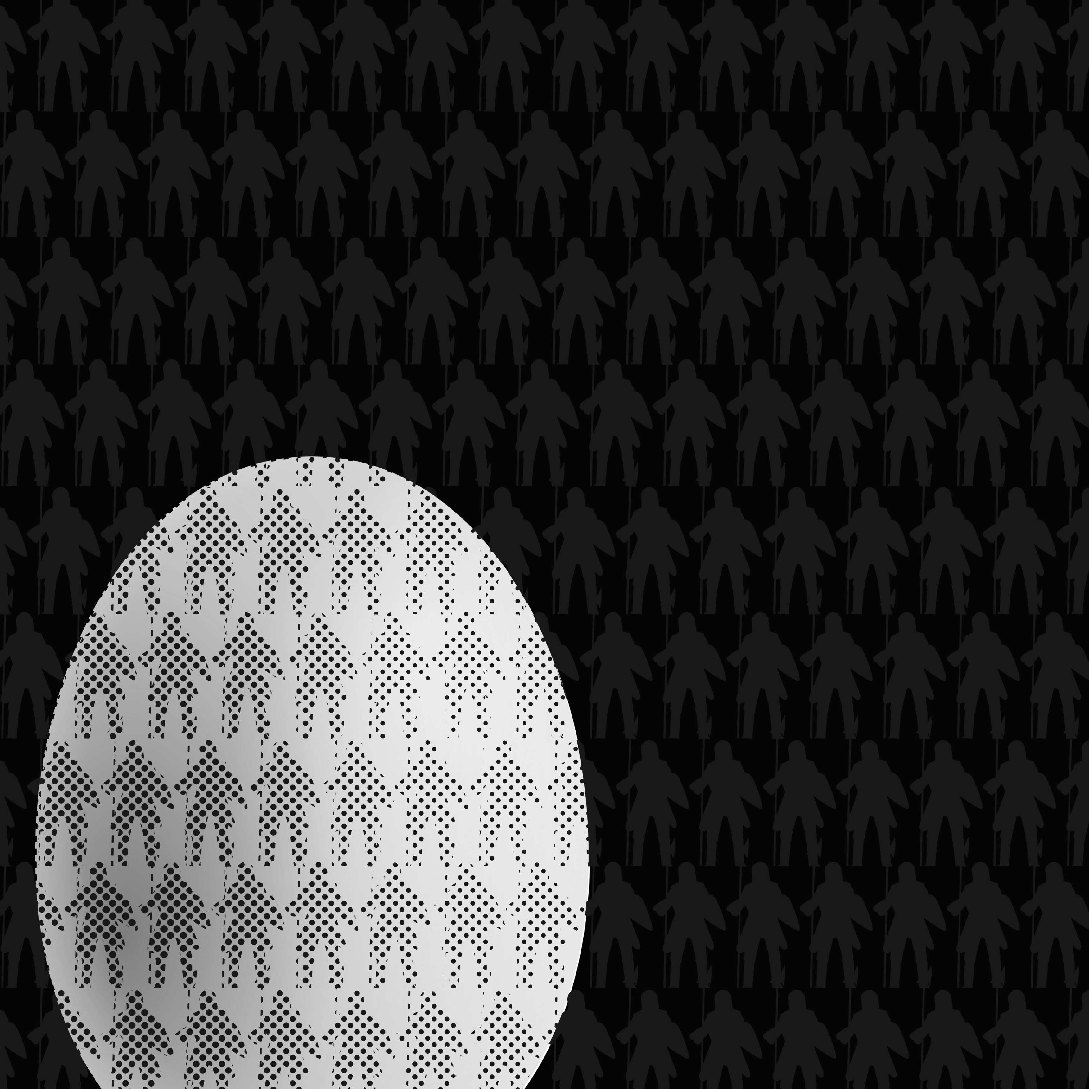
08_Couldnt put humpty together again_DRAFT 2
“Couldn’t put Humpty together again.” DRAFT 2

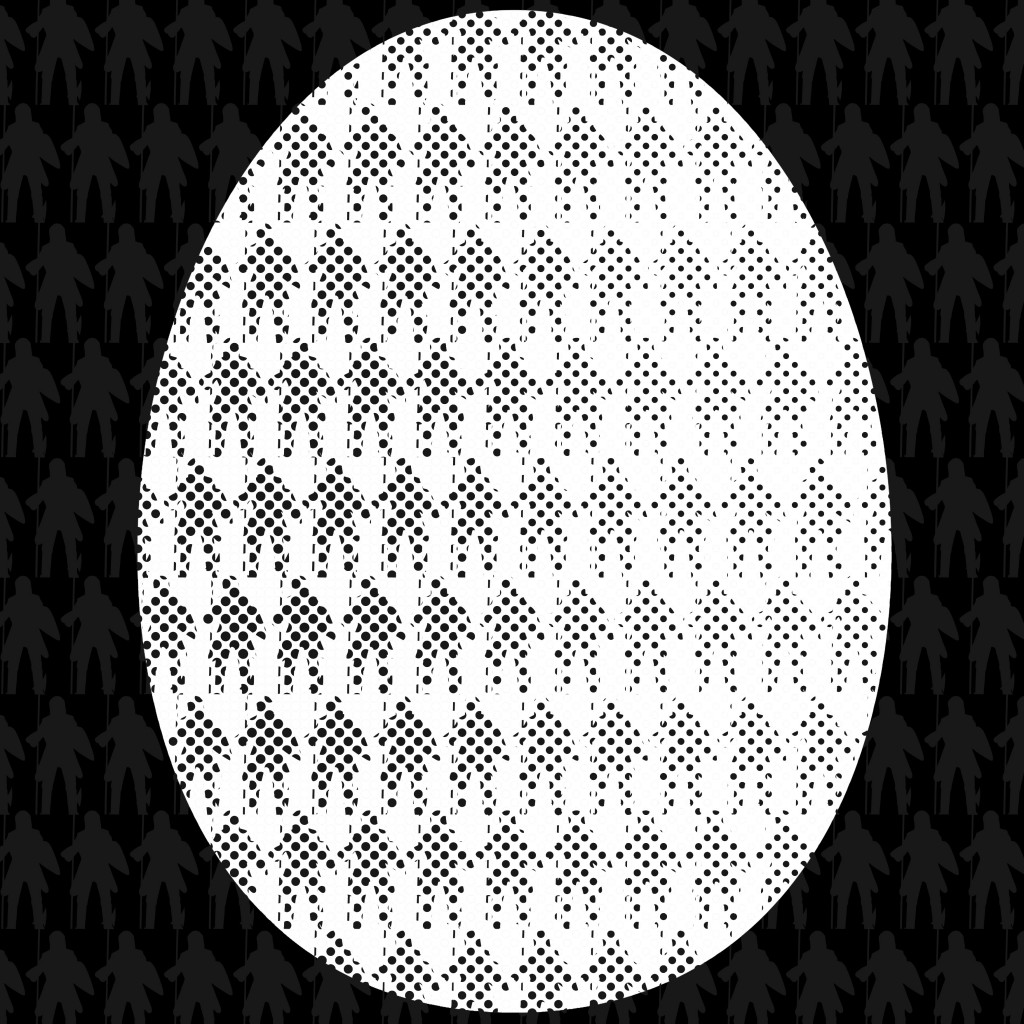
The entire image is filled with silhouettes of soldiers, then an egg at the bottom left corner. The silhouettes of the soldiers show the huge number of soldiers, and the egg represents Humpty Dumpty. The egg was edited with halftone to have the dots , in which the soldiers can be seen through the egg. These small little dots that form the soldiers represent that Humpty Dumpty has shattered into tiny pieces and cannot be put back together again.

The composition shows repetition and rhythm in the soldiers, and also contrast of the colour and size of the egg to let it become the center of interest. The egg itself actually also has a gradation of tone to give depth of the egg.


04_The dish ran away with the spoon_DRAFT 2
“And the dish ran away with the spoon.” DRAFT 2

This image shows a trail of a dish and a spoon, following a gradual transformation of size and opacity, small to big, transparent to opaque. This is to signify the movement of the dish and spoon. They are also composed to take a curved path to emphasize on the dramatic movement, and also to show both the dish and the spoon clearly. The background is laid with texture of grass to give a context of the dish and spoon running on grass or mountains. The stripes serve to increase the contrast of the background versus the dish and spoon.

This shows repetition of the dish and spoon, their directional movement through the change in size and opacity, and contrast between the background and foreground.


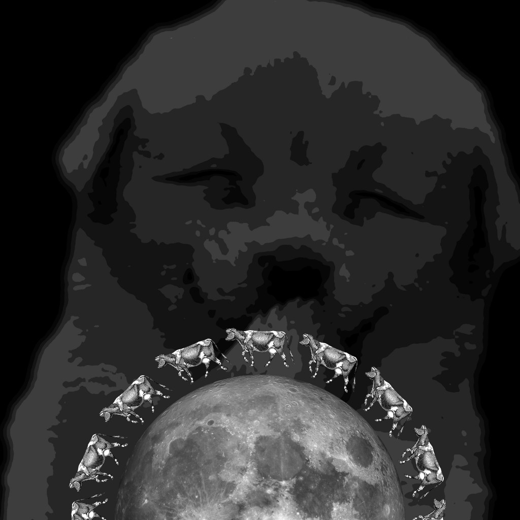
03_The little dog laughed to see such sport_DRAFT 2
“And the little dog laughed to see such sport.” DRAFT 2

The background is decorated with varying shapes and directions of dog paws, showing the happiness of the dog, seemingly running and dancing about, to signify the laughing of the dog. The low contrast of the paws and the black background is to bring out the high contrast of the foreground. The foreground shows a mooncake to represent a moon. It is made to be white to seem more like the moon, and also have a greater contrast from the background. It is slightly out of frame to let audience complete the circle. The cows are placed around to the moon in one direction to signify the movement of the cow over the moon, and made to have a same size to have a contrast with the varying sizes at the back as well.

This shows contrast between the foreground (white, consistent sizes) and the background (black, varying sizes). It also shows repetition of the cows and paws,  and the center of interest of the foreground through the stark contrast.

Project 1a – ME

Project 1a basically focus on a form of self introduction, namely 3 photos to describe me, 3 photos of a place that matters to me, and 3 photos of an object that matters to me.


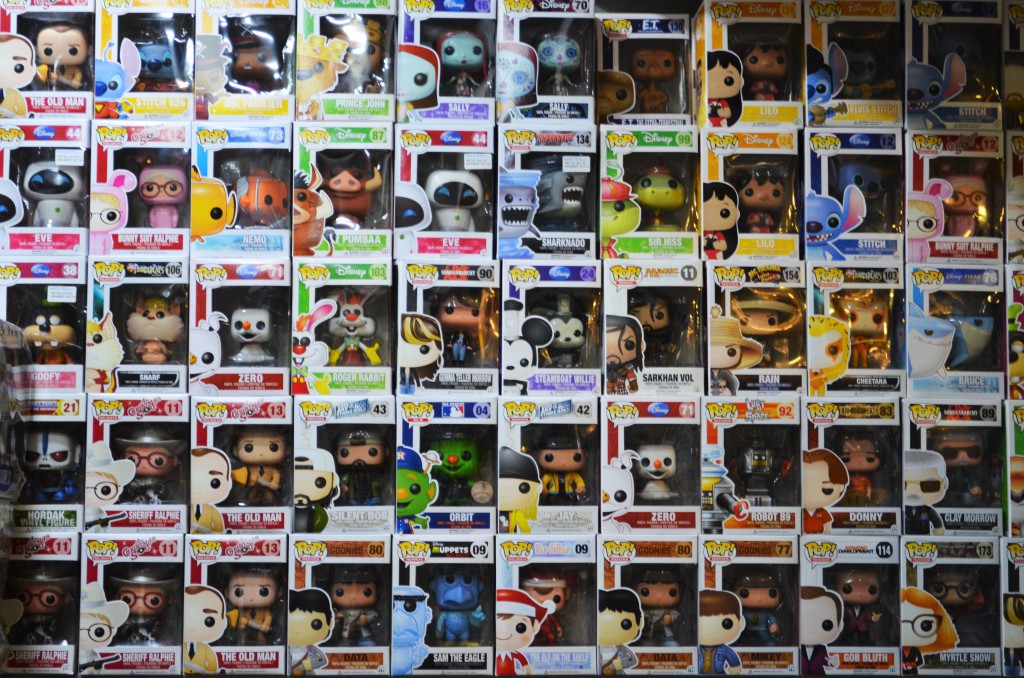
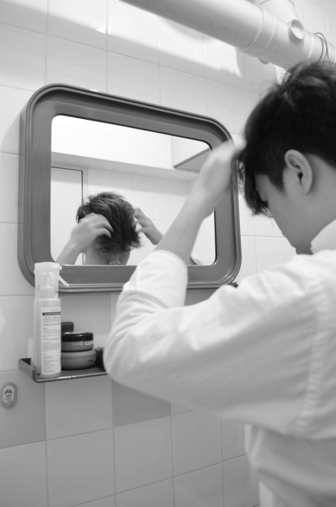
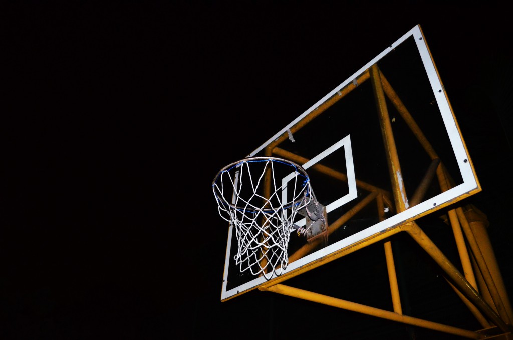
For the first part on 3 photos that describes me, I chose a photo of a collection of figurines taken at SimplyToys, a photo of myself styling my hair, and a photo of a basketball rim.

The photo of the figurines was taken as I like toys and figurines. I chose to take it in a shop as I do not have the collection yet, thus taking a bigger collection in a shop would better show how much I like these. The photo is basically aligned with all the lines formed by the boxes of the figurines as it adds more symmetry despite the wide spectrum of colours.

The photo of me styling my hair shows how I am a rather vain person who is concerned with how I look most of the time. It is taken from behind me, which shows a blurred me with a sharper image in the mirror as that is the focus, and also how I see myself when I am styling my hair. It is chosen to be in black and white to bring the focus to the actions and not be distracted by random colours in the original photo. The image of me in the mirror is also aligned to the rule of thirds, with my actual body along another third.

The photo of the basketball rim was taken with flash at night, making the basketball rim stand out a lot on the pitch black background. I chose to take it at night to show how I used to play basketball a lot more often a few years back, and that nowadays I do not. The night is to signify the end of the day, like how I ended playing basketball and the fact that I do not play it anymore resonates with the idea that late at night there is no one playing it anymore. It is composed in such a way that the rim is about the middle of the picture, with the rest of the backboard and metal structures to the right and sufficient empty space on the left to show the contrast.

All three pictures show “frames” within the pictures and is what ties them together as a set.

Figurines
Figurines
Styling my hair
Styling my hair
Basketball rim
Basketball rim

The second part on 3 photos that show a place that matters to me, I chose home. To me, home is where the heart is. Home is a place where everything is peaceful and beautiful, calming and relaxing. No matter what happens, home is there for me to be back there to rest and recuperate from the daily hustles. It is where family is and where everyone truly cares about me.

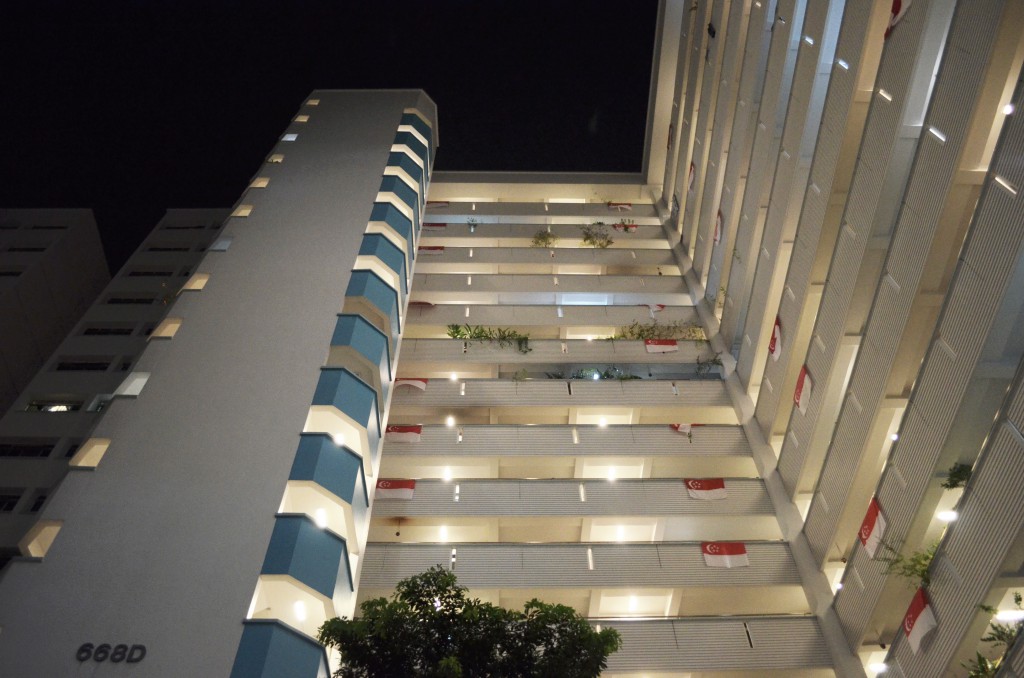
I chose to take a set of photos featuring my home. One was taken from a low angle, from the void deck up my block. It the vertical edges leaning inwards, making the building seem very tall, which represents how it is a very secure and strong place for me. I chose to take it from this angle and at night as this is the sight I got to see whenever I return home at night. Ever since I enlisted, weekends were for me to go out and spend time with family and friends instead of staying at home doing nothing. It has become such a habit that I see this view each time I go home at night, while walking towards my lift. There is also one outstanding “white” light among all the “yellow” corridoor lights as that particular one is my unit. My dad changed the light as he likes it to be brighter, thus this special light reminds me of my home and my dad.

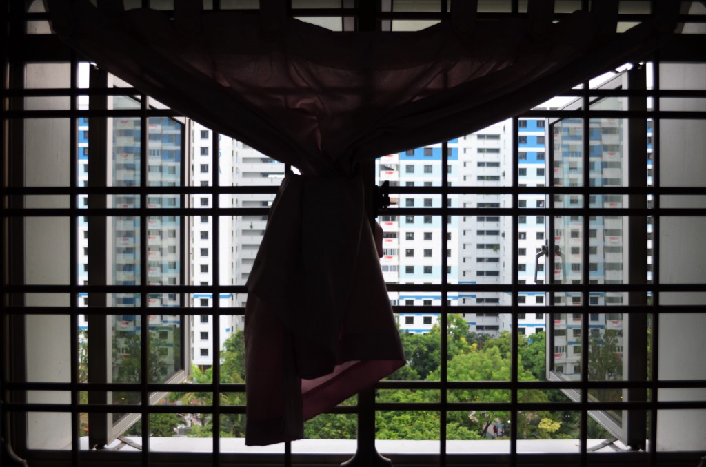
One photo shows a view from my room out of the window. The window grilles act as a natural border and the curtain adds a sense of familiarity and coziness, to what I call home. This is the familiar view that I like to be greeted with, as it assures me that I am back at home, in my comfort zone, in my room where I spend most of my time, be it doing work or just lazing around. It also partially shows the greenery of the park across my house, which gives a very friendly and familiar neighbourhood feel. I chose to take the photo as it is as the lines add to the symmetry and tidiness of the photo, yet the curtain stands out and breaks this neatness so that the photo does not become too dull.

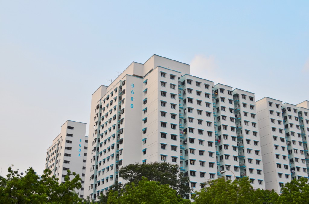
One photo is then taken from afar to show my entire block before sunset. I chose to take this as it gives a very clear view of my block against green trees and blue sky, giving a feel of tranquility of home where I mentioned was away from all the daily hustles.

Low angle shot at night
Familiar view out from my room
A clear view of my home

The last set is on an object that matters to me, and that is my handphone. I have never had a personal computer ever, until I started University education. As such, all along, my phone has acted not just as a means of communication to me, but also as a research platform, social media, gaming platform, music player, and a camera. It basically functions as all the electronic gadgets that I want to use. Thus, my phone really mean a lot to me.

The photos are arranged in a zooming in manner.

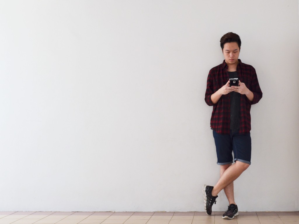
The first photo shows me standing along one third of the photo, leaning against the wall and using my phone in a very relaxed manner. This is to show how people, including me, rely heavily on the use of handphones all the time now, such as waiting for people to come or waiting for things to happen.  I chose to leave a lot of empty space such that I was the main focus in the picture, using my phone.

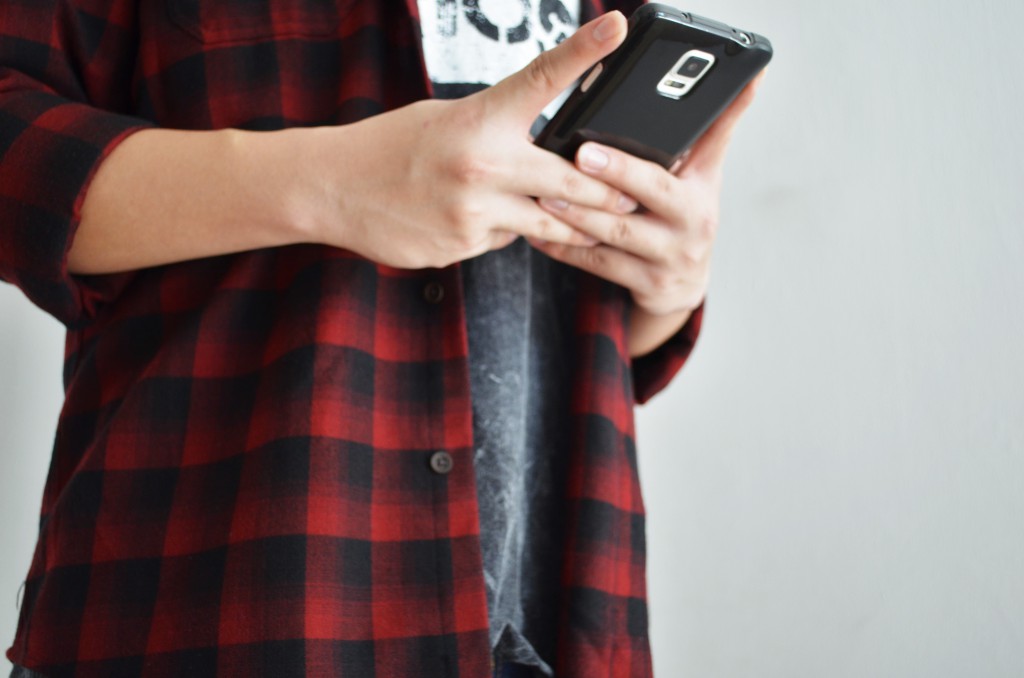
The second photo shows me using my phone in a closer shot. It shows me typing on the screen of my phone, which further emphasizes how the phone is important to me and everyone else, like how we see people who are on their phones all the time, typing or watching videos on the go, in trains and such.

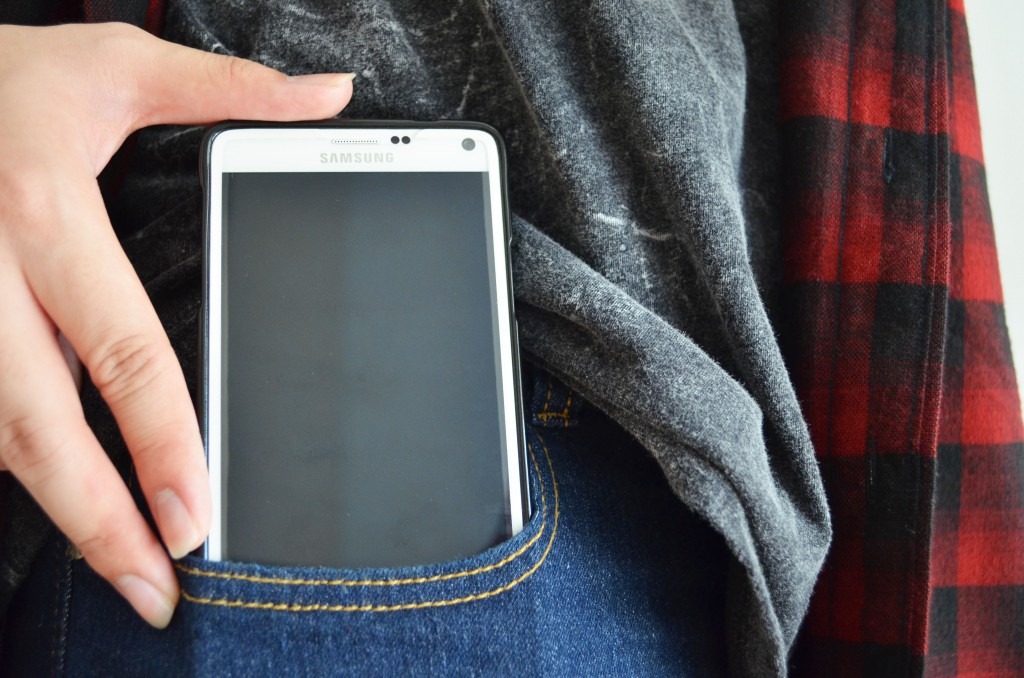
The last photo shows me putting my phone into my pocket, despite the big bulky size of a Samsung Galaxy Note 4. It signifies the importance of it that I hold it dear and close to me even though it is huge and uncomfortable to be put in the pocket. Nonetheless, it is so important that I have to keep it on me, instead of inside my bag or anywhere else. I closed up on the phone to show my hand pushing the phone into my pocket, adding a sense of movement to it.

While waiting
While waiting
Typing
Typing
Putting it in my pocket at all times

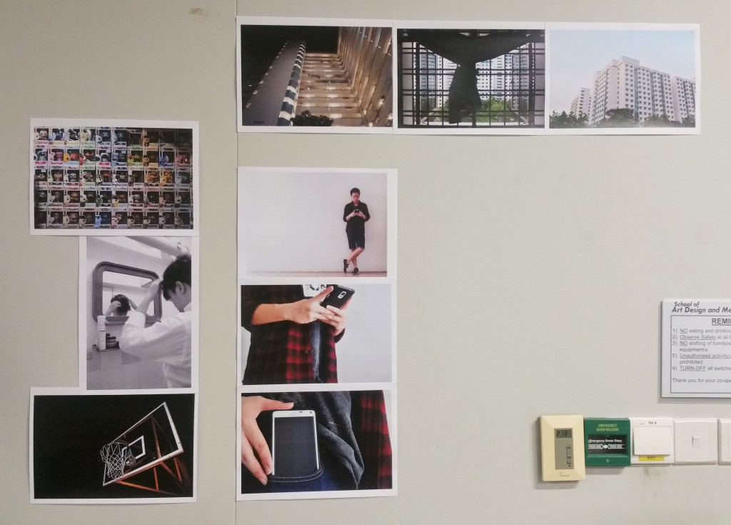
Then it was the final presentation. I arranged the pictures in simplistic vertical and horizontal lines so as not to distract the viewers with fanciful arrangements.

Final presentation
Final presentation

Through this project, I understand the importance of the composition of photos. All these include the position of the objects in the photos, as well as colours, the framing and distance, and the kind of message they bring across. There is still a lot about photography to be learnt, and I believe experimenting and exposure to taking pictures would be effectively helpful.