Color Harmonies

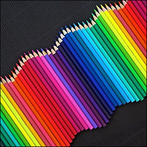
Colors are everywhere, present in everything. More often than not, colors are not alone, but in fact, a combination of a few colors! So, how do colors work with each other, and how do they match?
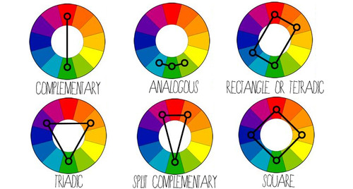
 

COMPLEMENTARY

Colors that are opposite each other on the color wheel are considered to be complementary colors. (e.g. Red and Green)

The high contrast of complementary colors creates a vibrant look especially when used at full saturation. This color scheme must be managed well so it is not jarring.

Complementary - Blue and Orange
Complementary – Blue and Orange

SPLIT-COMPLEMENTARY

The split-complementary color scheme is a variation of the complementary color scheme. In addition to the base color, it uses the two colors adjacent to its complement.

Split-complementary - Blue, Orange, and Yellow
Split-complementary – Blue, Orange, and Yellow

ANALOGOUS

Analogous color schemes use colors that are next to each other on the color wheel. They usually match well and create serene and comfortable designs.

Analogous color schemes are often found in nature and are harmonious and pleasing to the eye.

Analogous - Shades of Blue and Violet
Analogous – Shades of Blue and Violet

RECTANGLE / TETRADIC

Tetradic color scheme uses four colors arranged into two complementary pairs.

This rich color scheme offers plenty of possibilities for variation. It works best if you let one color be dominant.

You should also pay attention to the balance between warm and cool colors in your design.

Tetradic - Blue, Green, Red and Yellow
Tetradic – Blue, Green, Red and Yellow

SQUARE

The square color scheme is similar to the rectangle, but with all four colors spaced evenly around the color wheel.  Similarly, it works best if one color is the dominant.

You should also pay attention to the balance between warm and cool colors in your design.


TRIADIC

A triadic color scheme uses colors that are evenly spaced around the color wheel.

Triadic color schemes tend to be quite vibrant, even if you use pale or unsaturated versions of your hues.

Triadic - Red, Blue and Yellow
Triadic – Red, Blue and Yellow


Principles of Design

Balance

A large shape close to the center can be balanced by a small shape close to the edge.

A large light toned shape will be balanced by a small dark toned shape (the darker the shape the heavier it appears to be)

Large object in the middle, balanced by small object near the edge.

Gradation

Gradation of size and direction produce linear perspective.

Gradation of colour from warm to cool and tone from dark to light produce aerial perspective.

Gradation can add interest and movement to a shape.

A gradation from dark to light will cause the eye to move along a shape.

Gradation of tone.
Gradation of tone.

Repetition

Repetition with variation is interesting, without variation repetition can become monotonous.

If you wish to create interest, any repeating element should include a degree of variation.

repetition
Repetition with a slight variation.

Contrast

Contrast is the juxtaposition of opposing elements eg. opposite colour, contrast in tone or value, contrast in direction

The major contrast in a painting should be located at the center of interest. Too much contrast scattered throughout a painting can destroy unity and make a work difficult to look at. Unless a feeling of chaos and confusion are what you are seeking, it is a good idea to carefully consider where to place your areas of maximum contrast.

Contrast of colours.

Harmony

Harmony in painting is the visually satisfying effect of combining similar, related elements. eg.adjacent colours on the colour wheel, similar shapes etc.

Harmony of adjacent colours.

Dominance

Dominance gives a painting interest, counteracting confusion and monotony. Dominance can be applied to one or more of the elements to give emphasis

Dominance of size.
Dominance of size.

Unity

Relating the design elements to the the idea being expressed in a painting reinforces the principal of unity.eg. a painting with an active aggressive subject would work better with a dominant oblique direction, course, rough texture, angular lines etc. whereas a quiet passive subject would benefit from horizontal lines, soft texture and less tonal contrast.

Unity in a painting also refers to the visual linking of various elements of the work.

How unity works.
How unity works.

Center of interest

An area that first attracts attention in a composition. This area is more important when compared to the other objects or elements in a composition.  This can be by contrast of values, more colors, and placement in the format.

center of interest
Difference in colour and shape.

Directional Movement

A visual flow through the composition. It can be the suggestion of motion in a design as you move from object to object by way of placement and position.  Directional movement can be created with a value pattern. It is with the placement of dark and light areas that you can move your attention through the format.

directional movement
Gradual change in size causing movement.

Rhythm

A movement in which some elements recurs regularly. Like a dance it will have a flow of objects that will seem to be like the beat of music. The Principles of design are the results of your working with the elements of art. Use them in every piece of art you do and you will be happy with the results.

Repeated wavy movement of colour pencils forms a rhythm.