Therapeutic Graphics – Final

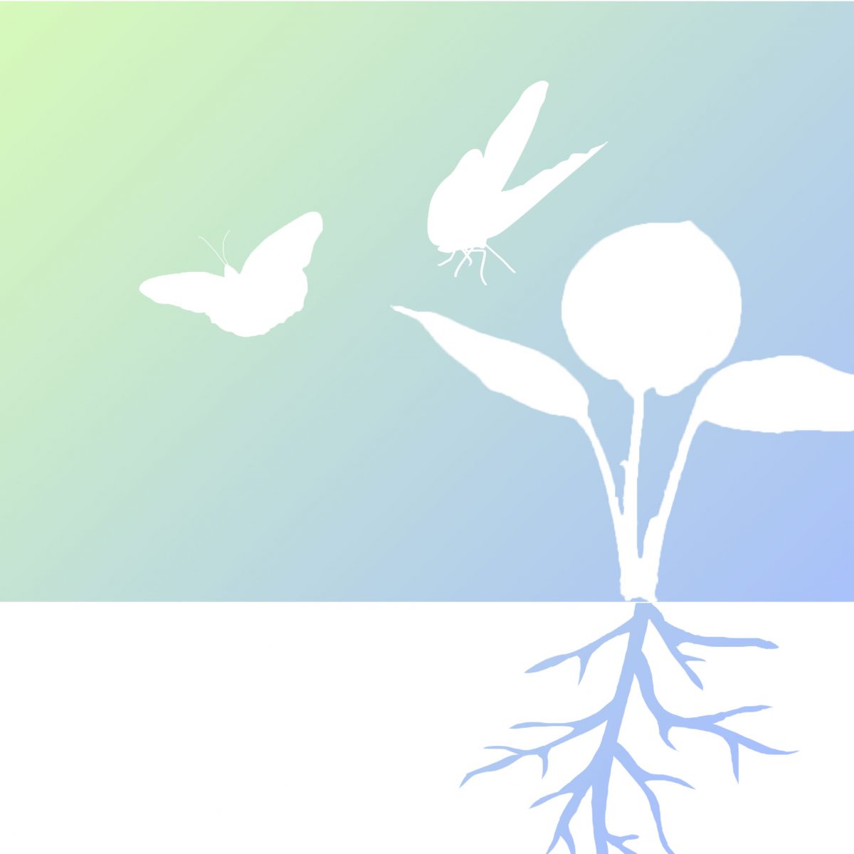
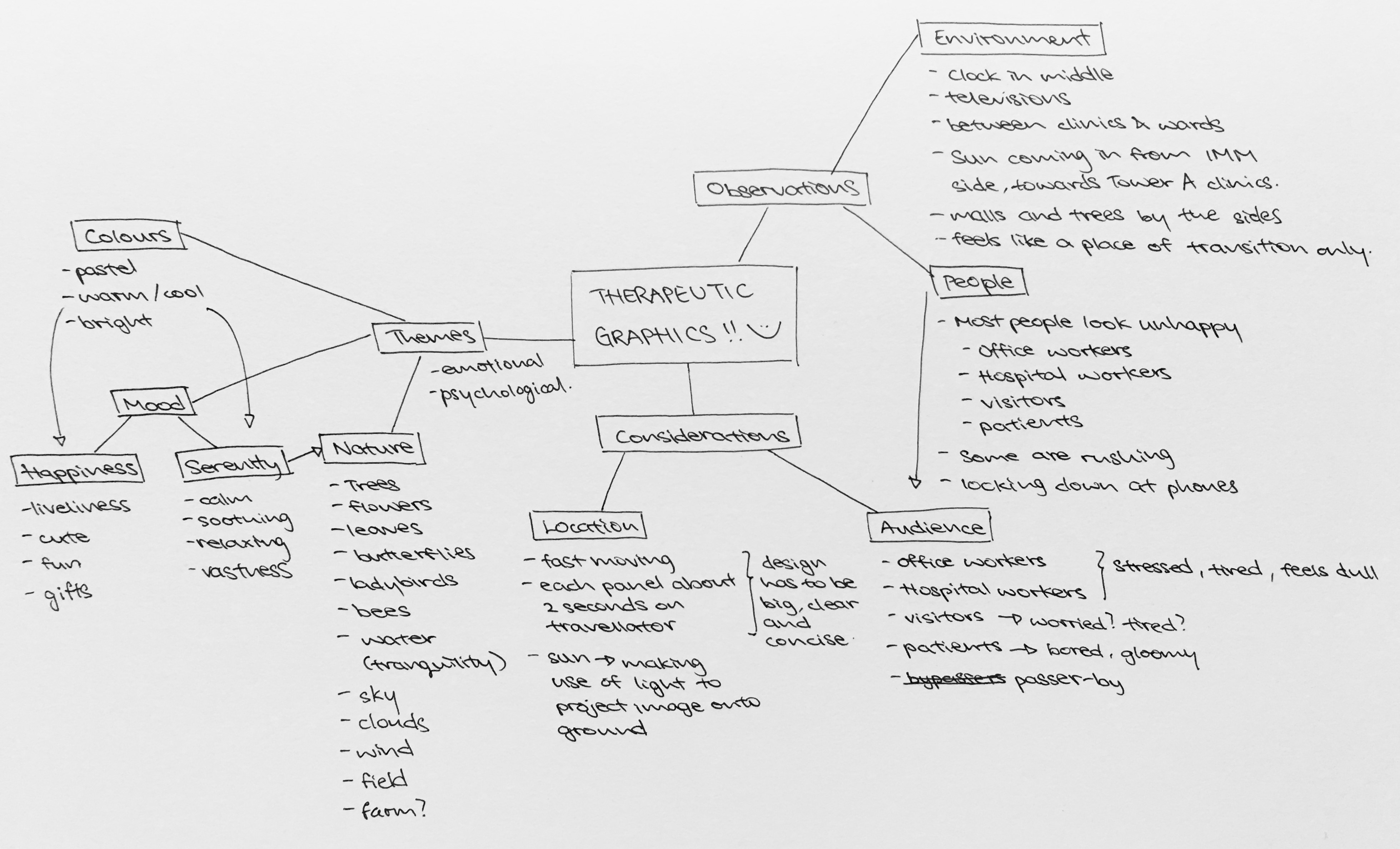
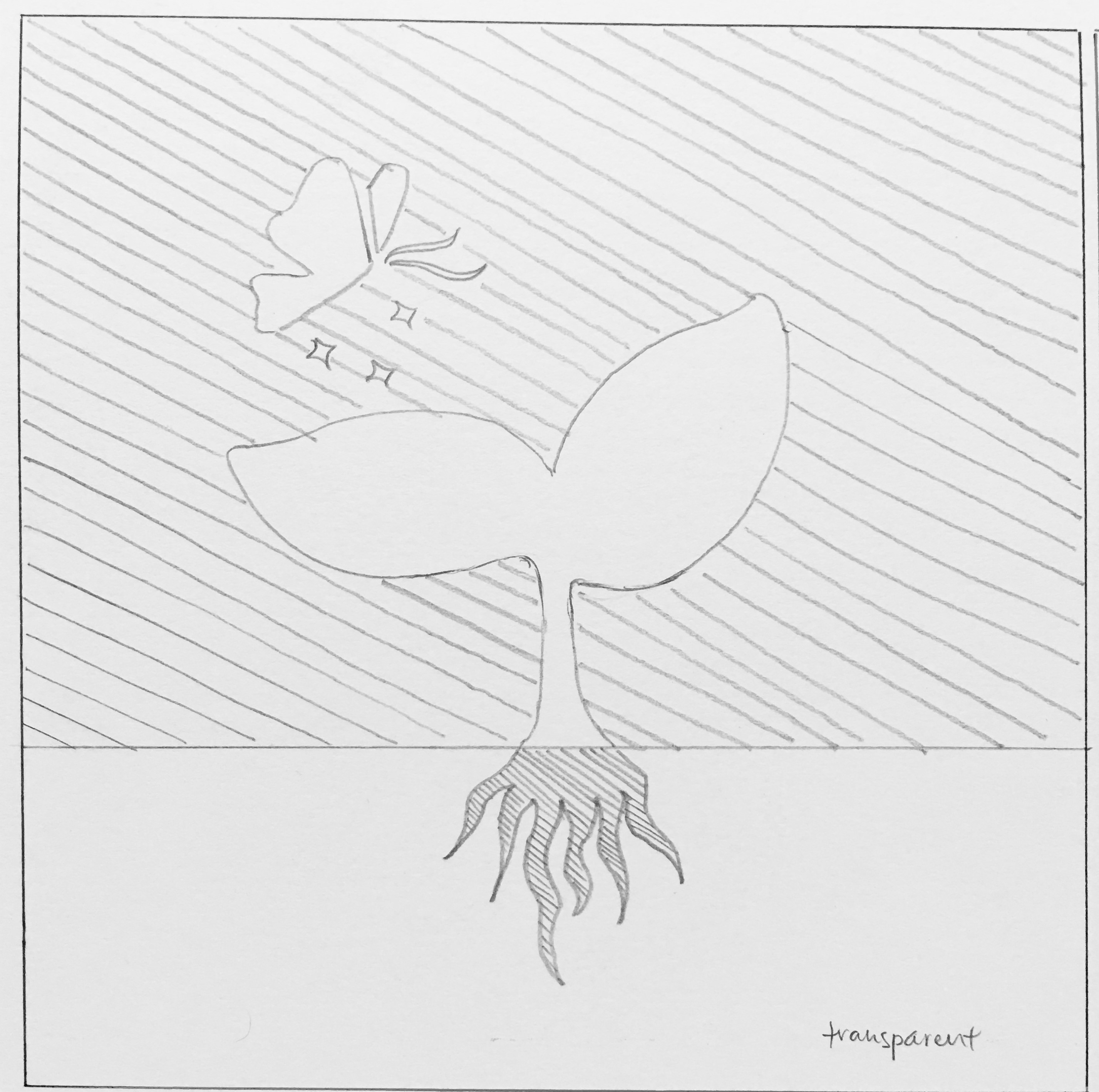
Moving on from last week, I have decided to focus on the sapling design as I was more keen towards it as compared to the one with water droplets. Nonetheless, there were many feedback and considerations taken in, allowing me to tweak my design further before finalising it.

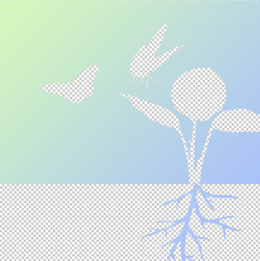
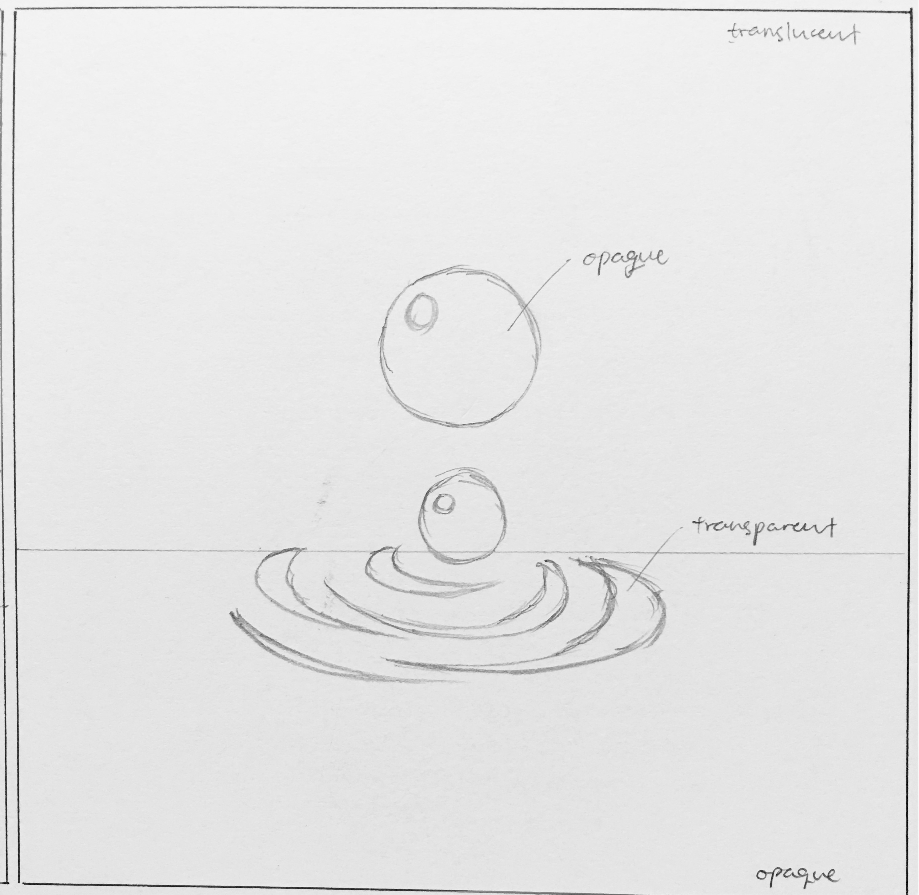
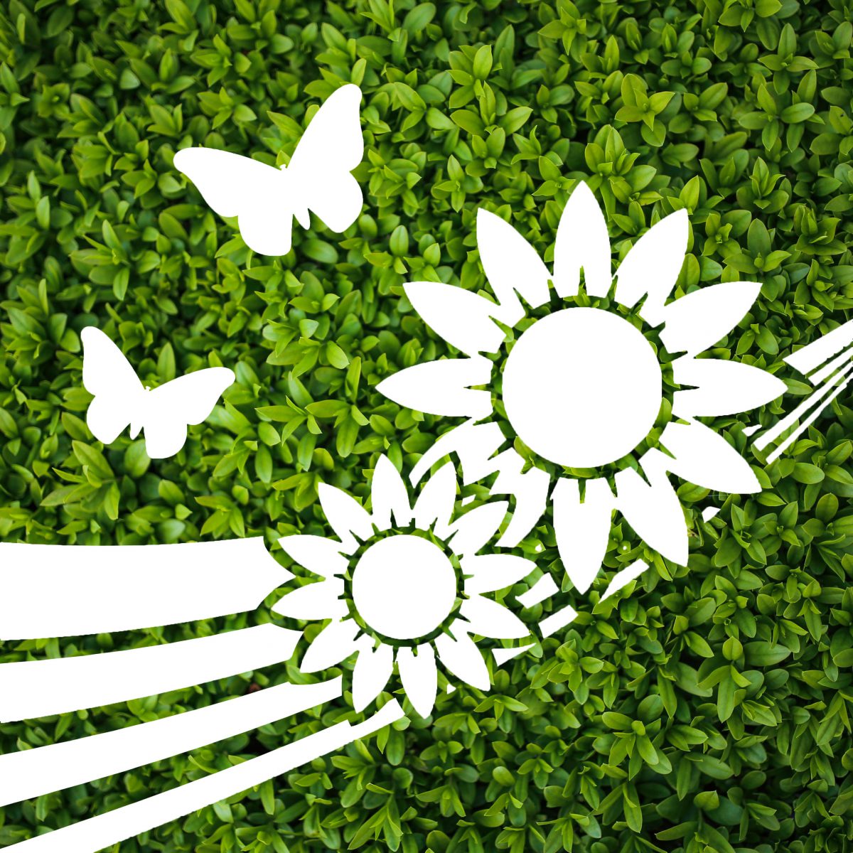
Based on the previous design, I have maintained the concept of transparent and opaque composition, but decided to change some of the elements shown inside.

FInal Design
FInal Design – To be done on translucent decal.

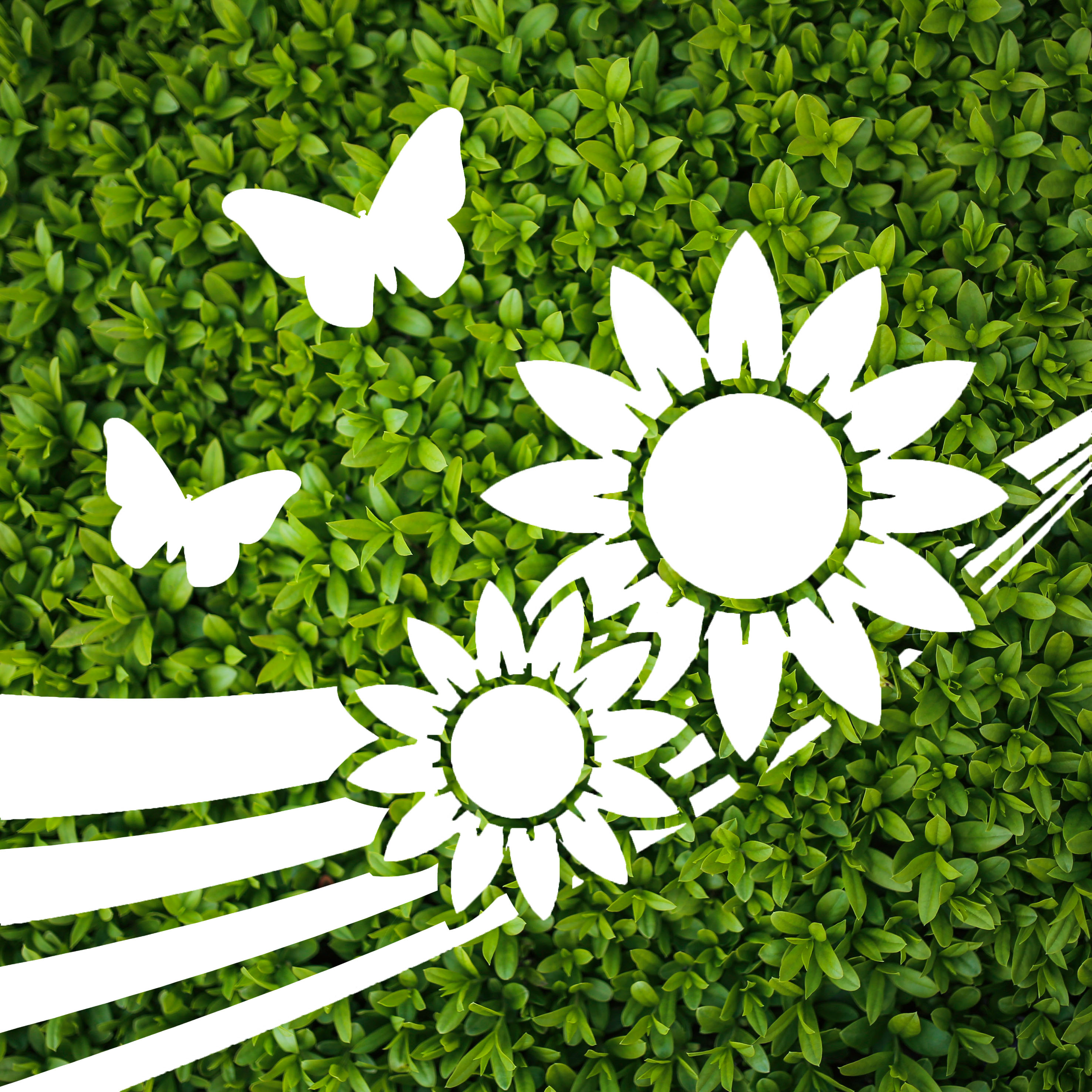
The main subject, the sapling, has been changed to sunflowers. The sapling image was not as clear to audiences, and the roots did not seem to be well received. As such, I decided to replace it with sunflowers. Initially I used one sunflower, but it seemed kind of lonely and did not bring out the message of happiness and warmth as a sunflower should. Two sunflowers were then used to counter this issue, rotated and overlapped slightly to give more dimension despite being a silhouette.

The silhouette of the butterflies were also changed as the previous ones did not look like butterflies to most people. This brought up the issue of clarity, even though my initial idea was to make use of different profiles of butterflies to give movements. This time round, I have made use simple butterfly shapes in different sizes and orientation to help bring some movement into the design, and remain clear as well. This combination of flowers and butterflies would then give a positive vibe of nature.

After these two elements were settled, I felt that the design was still kind of flat and lacked interest and a focal point. I then added in the strips of curved lines which had different thickness, converging towards the right “behind” the sunflowers. This silhouette of the lines seemed to help guide the eyes towards the sunflowers and provided movement as they move from a broad layout to a converging point.

Last but not least, the background was chosen to be a lush green spread of small leaves. This is also inspired by how Innisfree typically has a wall of leaves behind their counter, which gives a relaxing feel of nature and soothing to the eyes. First of all, this background is in one general color, making it plain and simple enough to be contrasted against the transparent elements which will reflect the bustling city colors. Second, this wide background of greenery fitted the nature theme well, and provides a soothing and relaxing resting spot for the eyes, yet not steal the limelight from the main cutouts.

Overall, this finalised design aims to bring about a feeling of warmth, happiness, calm, yet along with a bit of energy brought about by the movement and bold lines. A blend between simplicity and details also aims to bring a clear image to the eyes, simple enough for fast understanding, detailed enough to make out the elements. If it was to be translated into a series, the bold lines could make the connection between different panels, providing a flow while keeping the background consistent. The overall effect would then have a very broad and lush greenery which could be seen as an entire wall of leaves or a garden. Keeping the simplicity and style of the cutouts constant, other panels could display more variations of flora and fauna.


Therapeutic Graphics – Research 2

After sharing the three concepts that I had come up with last week, I have received various feedback from the class and our tutor Michael. The feedback has helped me see pointers that I could not, and also help me focus on what can be done or should be done to improve my designs.

Among the three designs, I have decided to continue exploring the first two that I came up with, namely the one with a sapling, and the one with water droplets. I have decided to drop the idea of the farm as it did not seem as good an idea as the other two, thus deciding to focus more time on improving these two. The farm design seemed more suitable for kids, and might not work as well to other age groups, even though the concept of cuteness is applicable, audiences might not receive the same message as I have intended.

So, this is the next stage where I start to think more about the composition and color choices.

Sap1
Design 1 – Sapling

This is based on my first concept, the one with a sapling. As planned, I decided to go with the contrast of opacity, playing with transparent and opaque parts. I have shifted the sapling towards the right one third of the composition, following the rule of thirds which the eye focuses. Different postures of the two butterflies also serve to add more motion to the design, giving it more life despite the simple design and colors. I have chosen to use a gradient of green and blue as these colors largely symbolises nature, such as the sky and grass. The colors also come in a more pastel shade for it to feel more comfortable and soft. These plain background would also serve to work well against the background, which would be a myriad of colors as the bridge is surrounded by buildings, roads, trees and so on.


WD1
Design 2 – Water drops

This design is based on my second composition, the water droplets and the ripples effect. This design more be more towards a calm and tranquil mood, thus the choice of white and blue, which are very clean and soothing colors. The main background is actually translucent, which allows the environment to fill up the background, yet the colors and images from the environment would be blurred. This allows the design to be visible, yet not just a plain flat image. The ripples are then made to be transparent, as this seems to be the “focus” of the design. As viewers walk along the bridge or move along the travellator, the background would then change accordingly, making it seem as though the ripples are moving, giving the design more dynamics and visual interest. I have decided to keep the entire composition centralised as opposed to the first design, as I felt the it seem more complete being right in the middle. The ripples would radiate from the middle of the composition, making the design well balanced and give an idea of “wholeness”, along with the spherical shapes of the droplets.

Therapeutic Graphics – Research

On the first day of school, 8th August, we went on a visit to Ng Teng Fong hospital, and were briefed to come out with a two dimensional therapeutic graphic to be placed along a bridge which connects Tower A clinics to Tower B wards.

With the luxury of staying in the west, I went back there for more observations on Saturday, 13th August. I wanted to see if there were any difference in the crowd as well as the environment there between a weekday and a weekend, and also between a morning and an afternoon. The crowd would determine the groups of audiences that my design has to cater to, while the environment would give me a clue of what would work and what might not.

With the observations, I then generated some considerations that I had in mind. This considerations would then bring me forward in coming out with concepts that I deem therapeutic and appropriate for use there.

One key consideration that changed my idea of the designs was the sunlight. Initially, I wanted to have a transparent design where the sunlight can project the image onto the ground. However, I noticed that the sunlight there was not very strong, and did not have a very low angle that can project the image large enough onto the ground, thus I decided to change the idea and work towards another direction. Another would be the viewing time, which is short of about two seconds on the travelator, which means my concepts have to be clear, concise, and visible.

[ Observations > Considerations > Concepts / Themes ]

Mindmap for Project 1


After coming up with the mindmap, it was simpler to understand what direction I would be heading towards. I went online to search for ideas of therapeutic graphics and pictures with a healing element, and most of them had the idea of “nature” in them.

Vastness
Vastness of the sea and horizon
Water ripple and leaves
A sapling and ripples


The following are three main concepts that I came up with after the considerations and references.

File 21-8-16, 10 44 17 AM
Concept 1 – Sapling

The first one makes use of the light and surrounding elements to play with the contrast of opacity. The top portion would be an opaque background with transparent graphics of a sapling and a butterfly, whereas the bottom portion would be an opaque root against a transparent background. This concept uses the surroundings to fill up the image, giving the design more dynamics. The sapling would symbolise growth and recovery, with the butterfly serving to enhance the experience by sort of providing some movement and “smell”.


File 21-8-16, 10 44 35 AM
Concept 2 – Water droplets

The second is similar in that it uses the idea of opacity. The top portion would feature a translucent background, while the bottom is opaque. The water droplets are opaque as well, leaving ripples transparent only. This would allow the ripples to “move” as the audience move along the bridge as the background surroundings would change along the movement. I wanted to give a feeling of tranquility of a calm water surface, as well as the vibrancy of the ripples. The water droplets also symbolises “wholeness” as water droplets tend to the form of a sphere by itself.


File 21-8-16, 10 44 47 AM
Concept 3 – Cute farm

Lastly, in my third concept, I decided to change a point of view and have a different idea altogether. While coming up with concepts for the first two, I had a random idea that struck me, which is that basically almost anything cute would help to liven up somebody’s mood. I wanted to use the idea of “cuteness” to make people more happy and relaxed, and not forgetting some sort of therapeutic elements in it. I decided to come up with a farm, where a farm is largely related to being a place for retirement, for relaxation. I did it as a sticker / decal style to have some sort of a child-like touch to it, where the lines are black and bold and have a ring of white space around it. Very simple shapes and objects make up this composition to make it simple to view despite having more objects in it.

Subsequent improvements on these concepts would include how to make these compositions interesting despite having a simple design as well as the choice of color use.