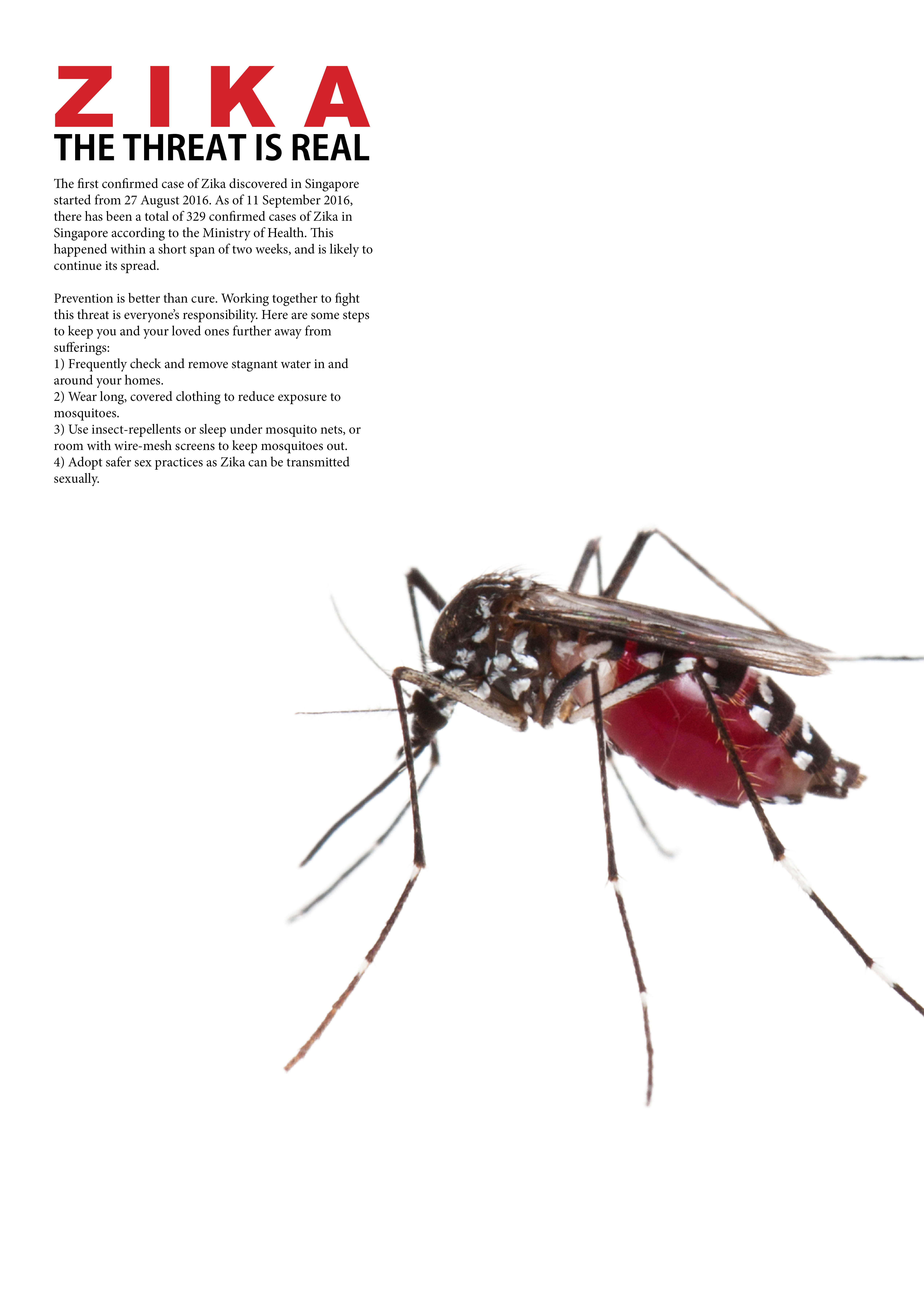
Moving onto the final artwork of this project, I have chosen to stick to the design with a mosquito looking forward at the viewer.
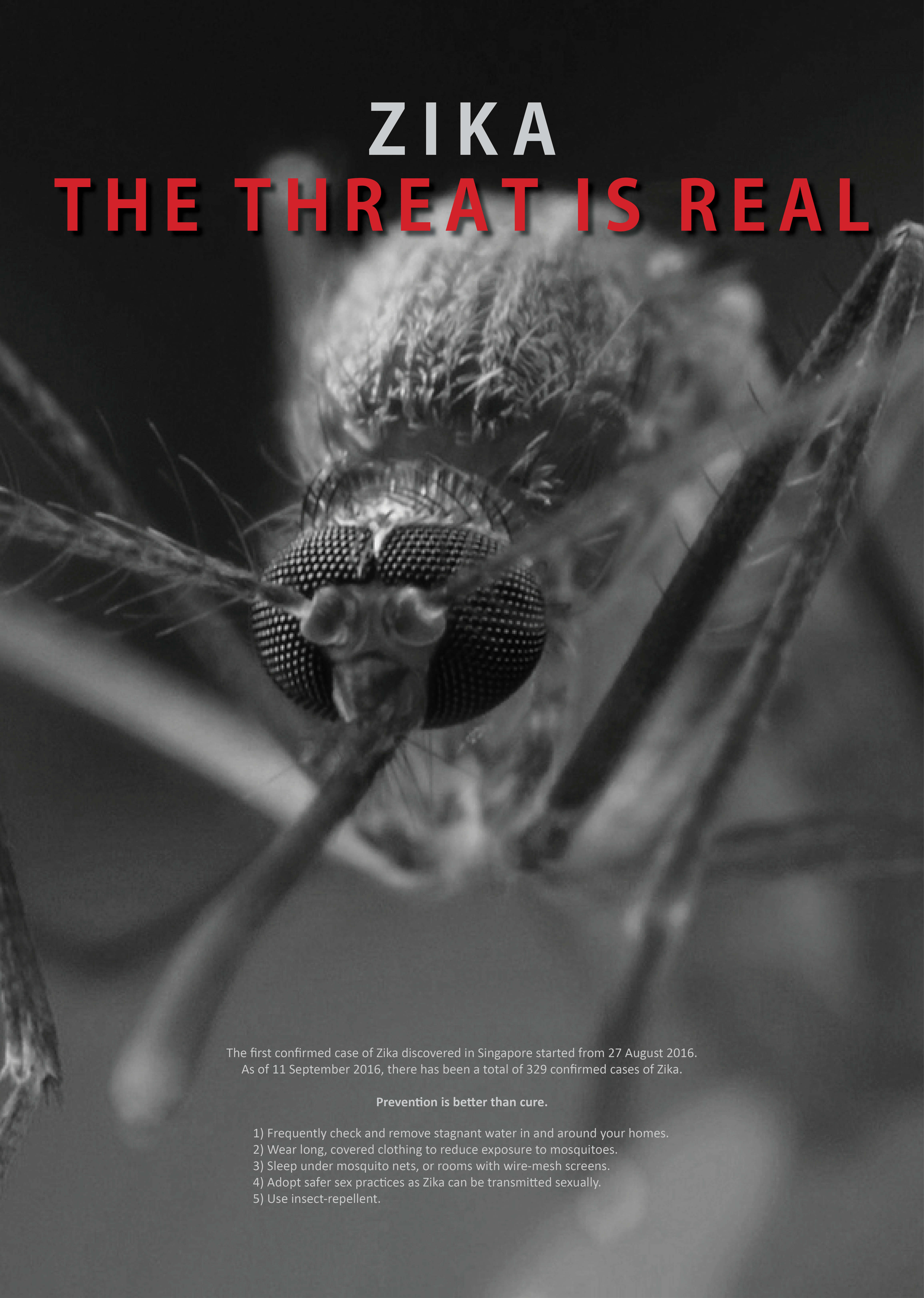
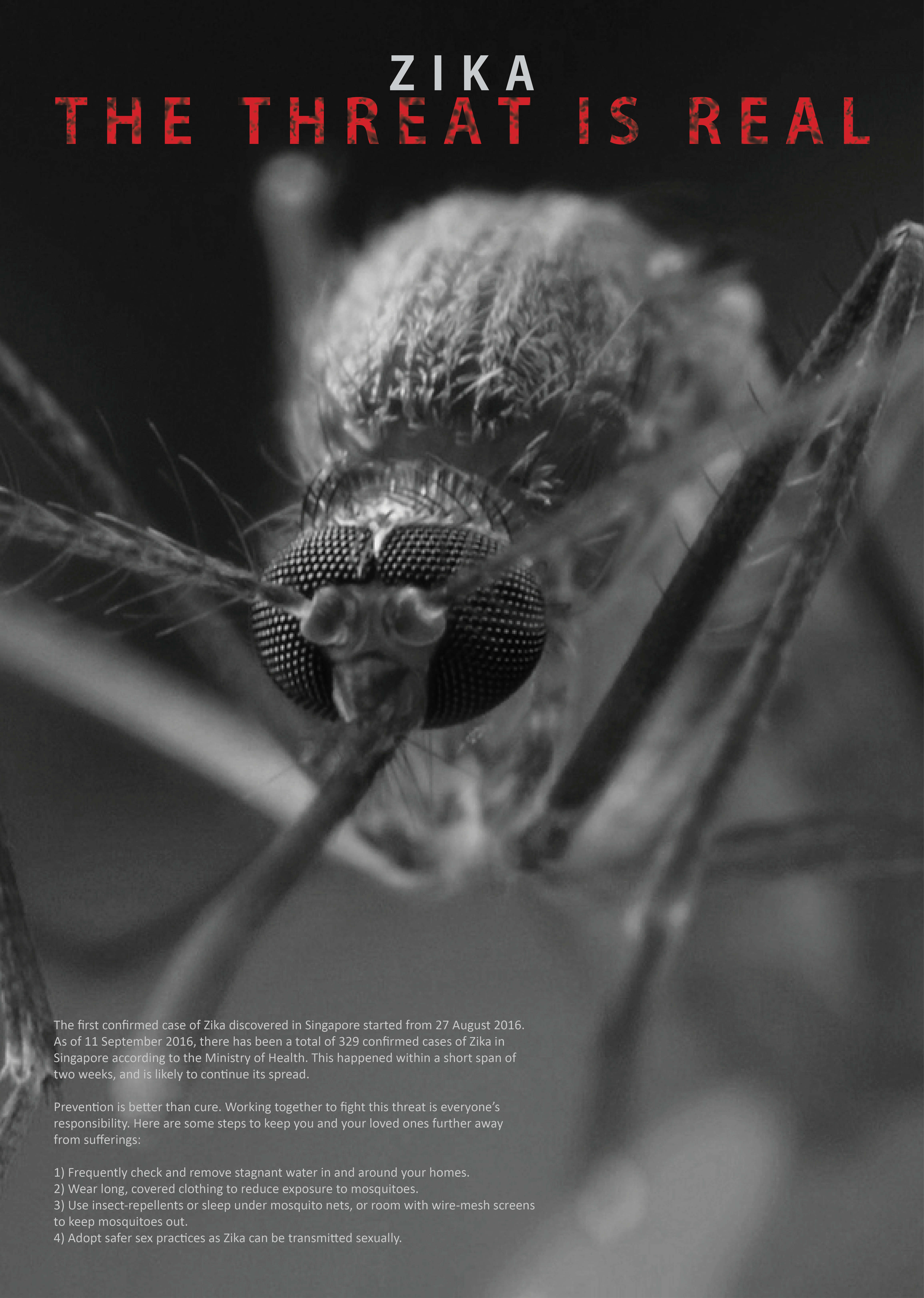
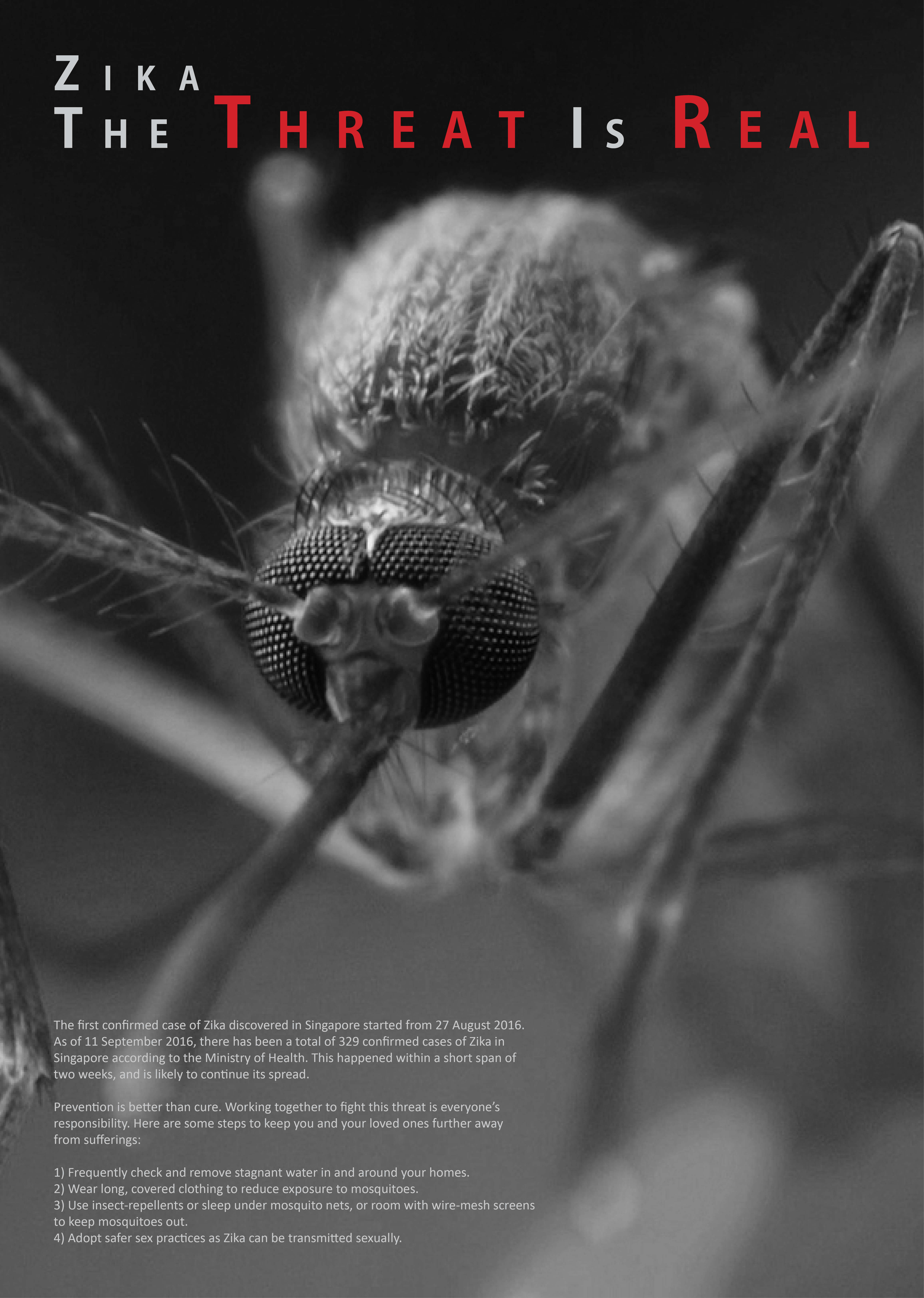
There are some minor tweaks introduced to reduce the amount of words in the body text as it seems kind of chunky which viewers might not want to read it, adjusting the position of the body text, changing the size and position of the title text at the top of the poster as well. Adding a drop shadow to the words in red at the top also helped to push the punchline forward, making it clearer and more impactful. This was because when we did a black and white mockup I realised that the red and the grey behind it were similar in tonal value, despite the difference in colors.
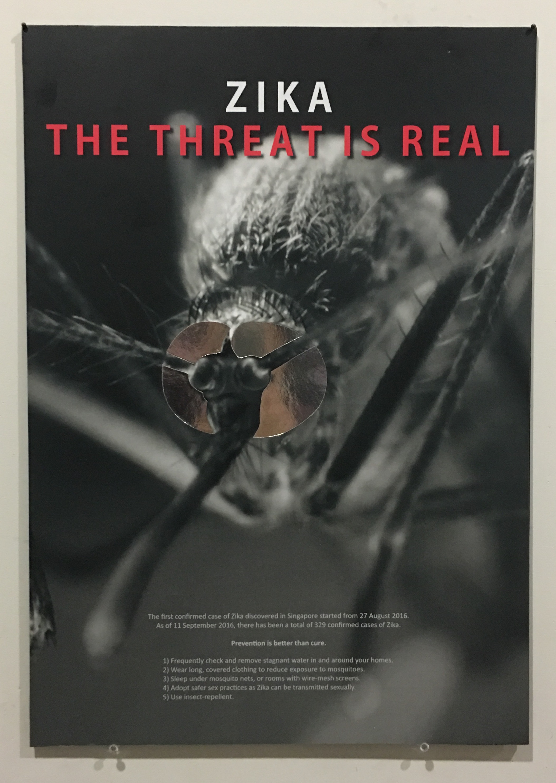
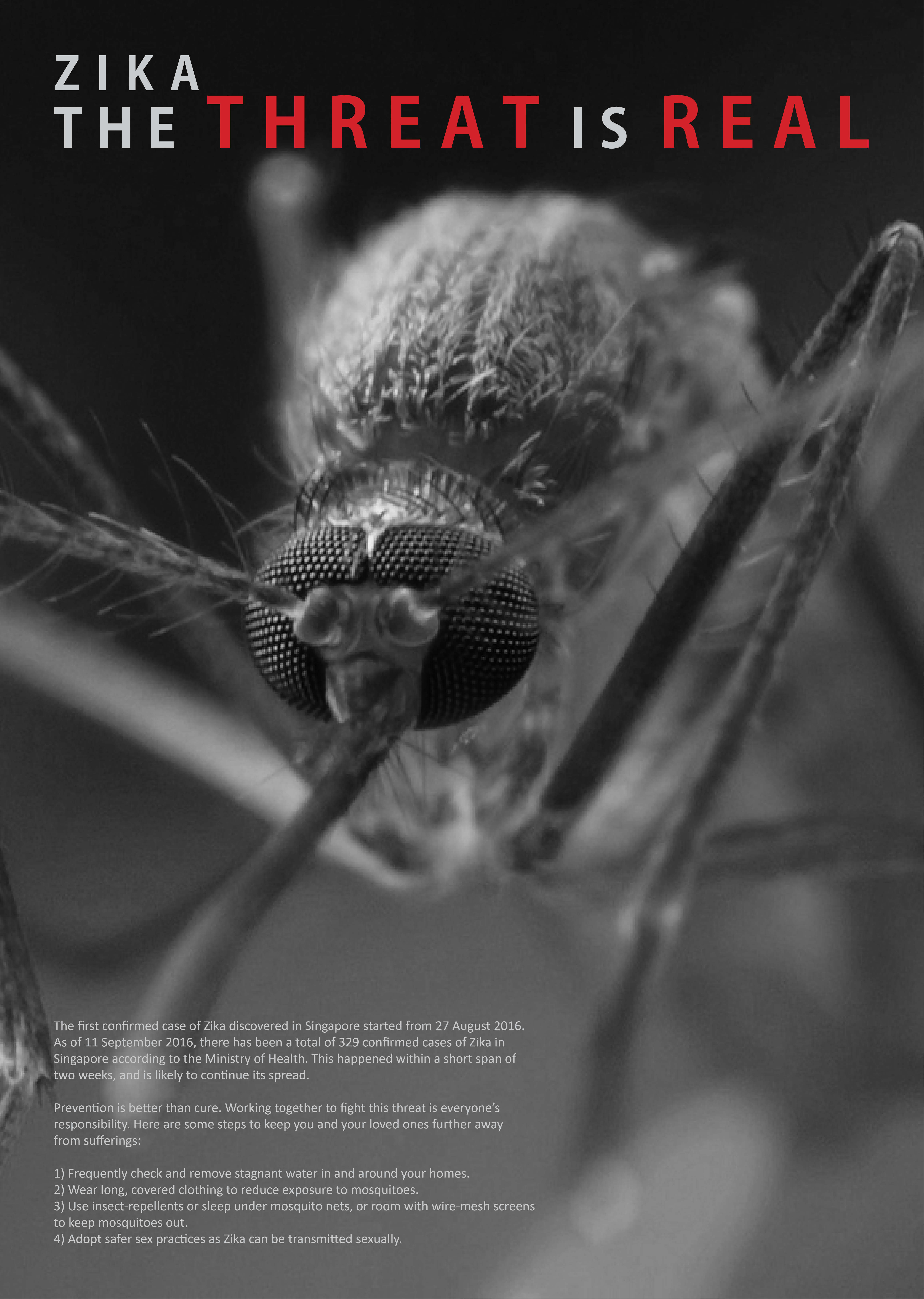
After printing, I traced and cut out silver reflective paper to stick over the eyes of the mosquito as suggested previously. This helps to enhance the context of the mosquito targeting the viewers and makes the poster more interesting as majority of it was in monochrome. Silver also gave it a touch of mystery and seductiveness, on top of the mirror effect intended.
I also decided to mount it on a black foamboard that I bought and mounted manually instead of mounting it on a white one done by the printing shop as my entire design is in black. Although looking from the front, it would not be obvious, it ultimately affects the overall harmony of the poster physically, thus I feel that a black foam board would be a lot more suitable for this poster. Below shows a recap of the previous design, followed by my final design and the physical poster itself!
Recap on previous designFinal ArtworkPhysical poster
After researching for health communication poster examples and coming up with some slogans, it’s time to start experimenting with some compositions and layouts of the poster, as well as deciding what content to put in. Some key points to note from the assignment brief include:
Graphic-driven
Slogan with the word “Zika”
Preventive measures
I decided to go for a clean and simple look for the poster, as I feel that it will look more professional that way, and is easy to understand, not complicated and also clear and concise. Here are some of the compositions that I played with.
Concept 1-1Concept 1-2Concept 1-3Concept 1-4
Among these for concept 1, my favourite will still be 1-1 with everything centralised. This has a symmetrical overall composition and goes well with what I want – very clean and simple. The mosquito is the biggest, catching the attention of viewers, followed by the word “ZIKA” in red and big which gives the context of the poster, followed by the rest of the caption “THE THREAT IS REAL”, then a small paragraph talking about the worsening situation of Zika as well as the preventive measures as required on the assignment brief.
Concept 2-1Concept 2-2Concept 2-3
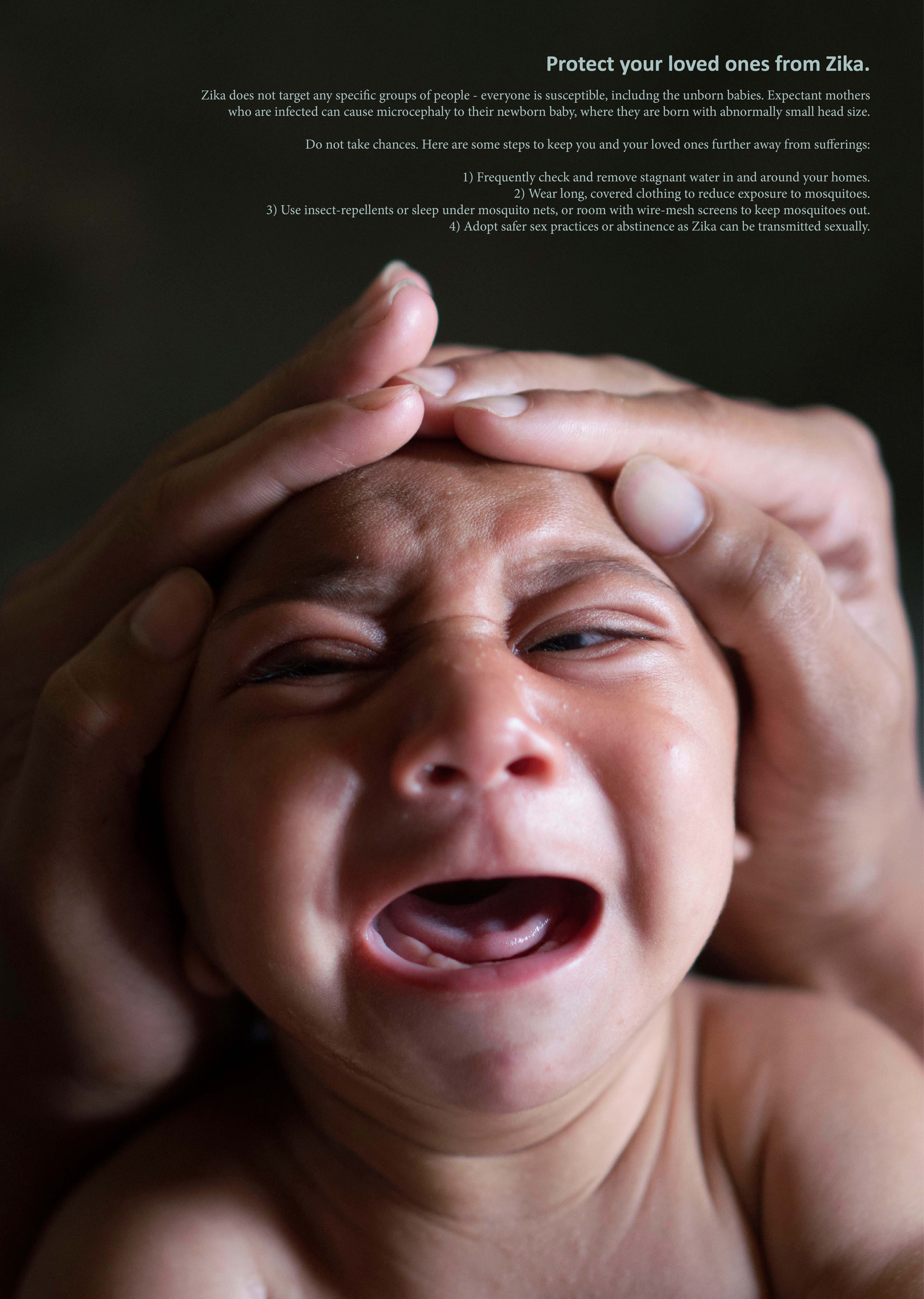
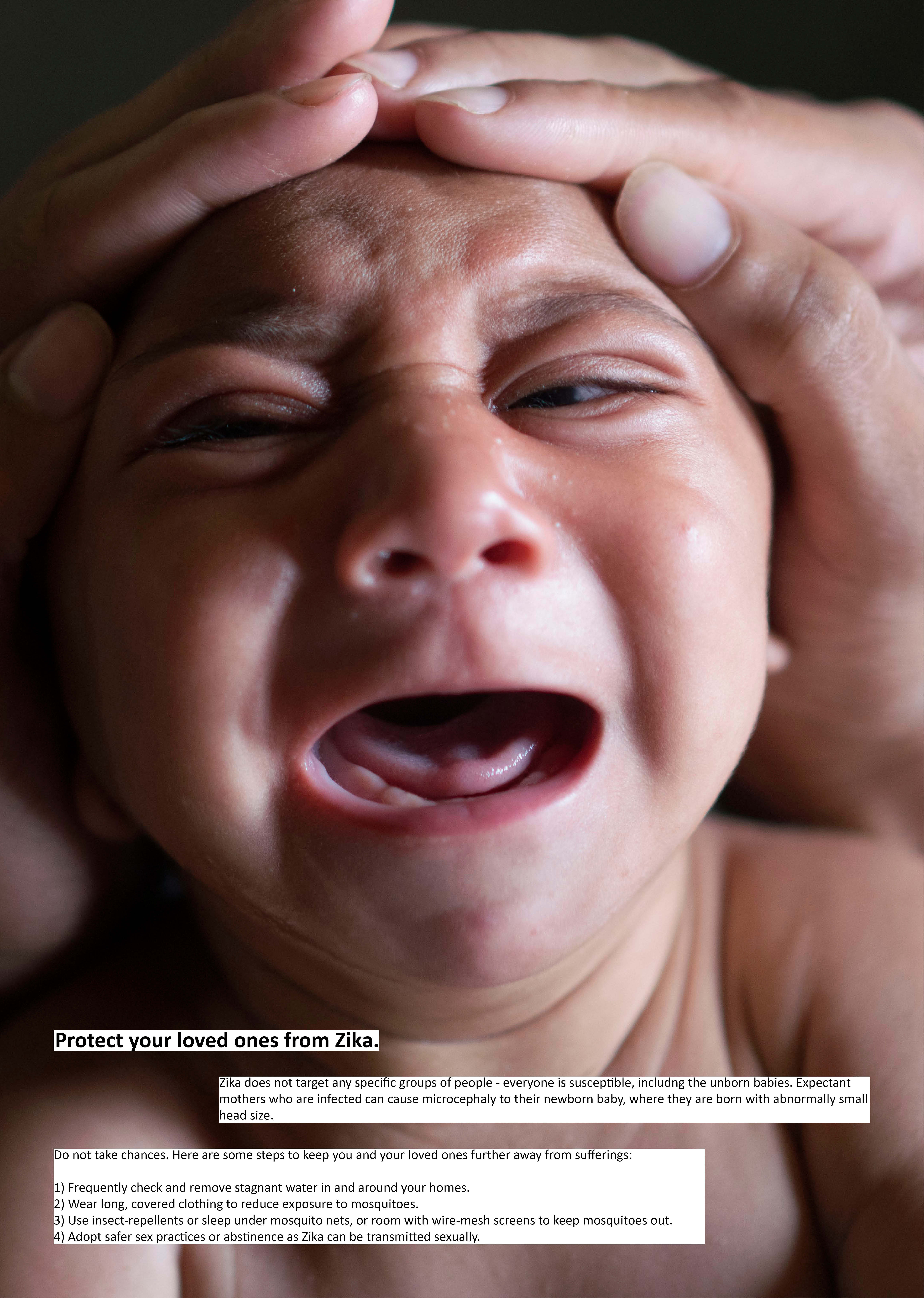
Concept 2 uses the photo of a baby with microcephaly as that is the main concern regarding Zika, since most victims actually recover with no other concerns, except that expectant mothers who are infected have a chance of their baby having microcephaly – a disorder with abnormally small head of the baby. Hence, I decided to address this issue more than anything else. The picture shows the baby crying (to tug on the heartstrings and conscience of viewers) and a pair of hands cupping the baby’s head to emphasize the small size. It is then coupled with smaller text that describes the danger and possibility of microcephaly, followed by preventive measures.
Some feedback I got from the sharing session included:
Concept 1 did not even look like any threat
Try having the mosquito facing the viewers to make them feel the threat
Reflecting the audience into the eyes of the mosquito?
Concept 2 what’s the point of cupping the head, why not the hands do something like overturning pails to prevent the danger?
Along the way of doing this project there were also random ideas that came to my head:
newspaper collage of Zika-related news as a background for the poster
warning strips / cordon
smashed mosquito
dented object to represent deformed head
price tag on hospital bed (ikea kind of signboard?)
Then, I moved on to coming up with other designs and compositions.
Concept 3
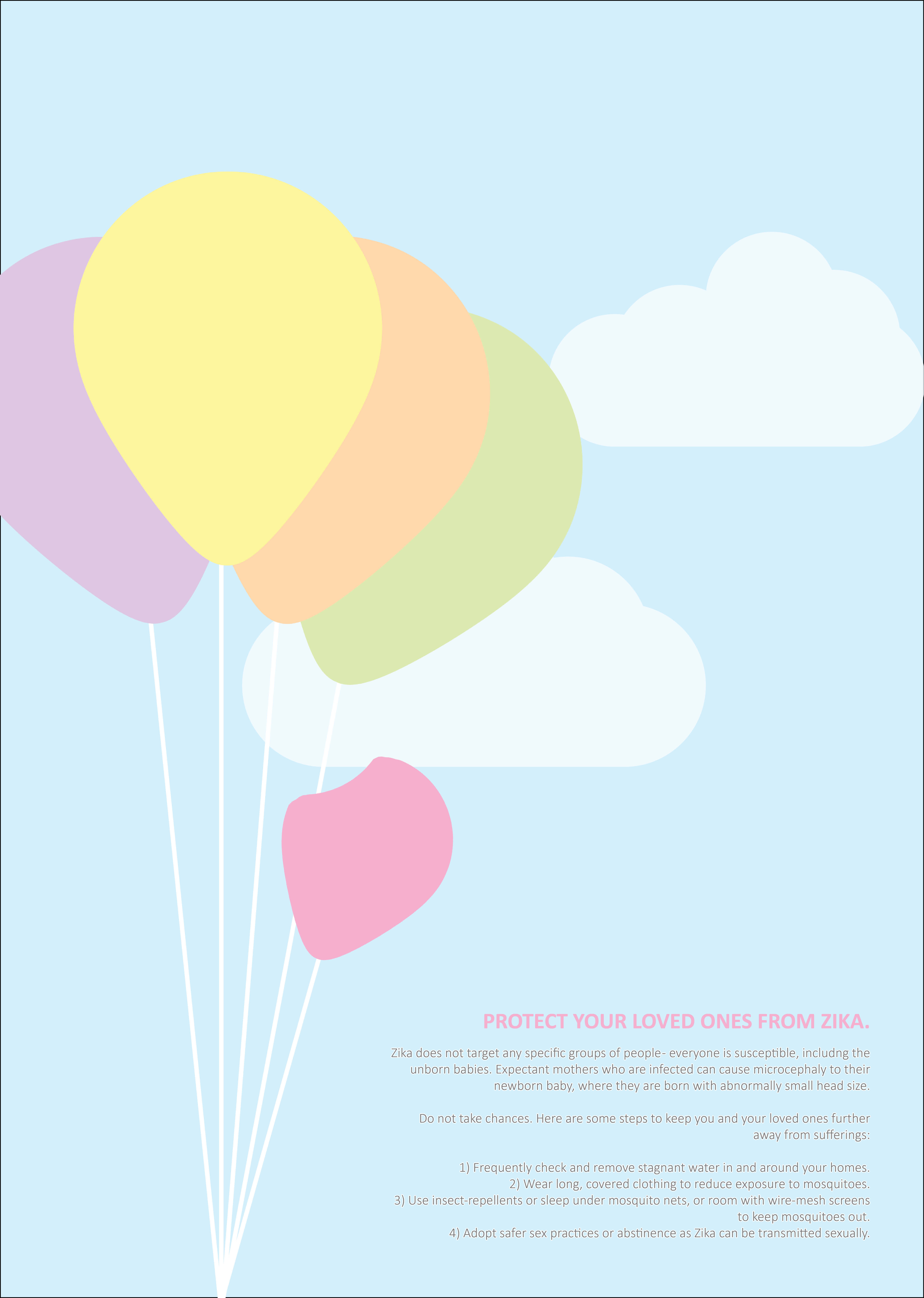
For this concept, I only came up with one design to find out the feedback of the idea before focusing on how it can be arranged. This is a very concept from everything else that I had. I wanted to come up with something different from everything that I have seen, to make a poster that looks cheerful on the first look and feels more contradicting to the original intended message. I decided to go abstract and using illustrations style, to use balloons to represent children, with a smaller, dented one to represent a child with microcephaly. The colors are all pastel to give a comfortable and cheerful tone to it, with the balloons all flying up high in the sky to show how kids have a bright future ahead of them, everything is very high spirited etc. The dented balloon is then lower, making it obvious that this “child” is less fortunate and might even have a shorter life than other children. I then use the came color for the slogan and the dented balloon to put in the context and also lead the eye.
Nonetheless, this was not well understood, and some feedback included that the color palette made everything hard to see, the overall mood feels too much like a party and not suitable for this case.
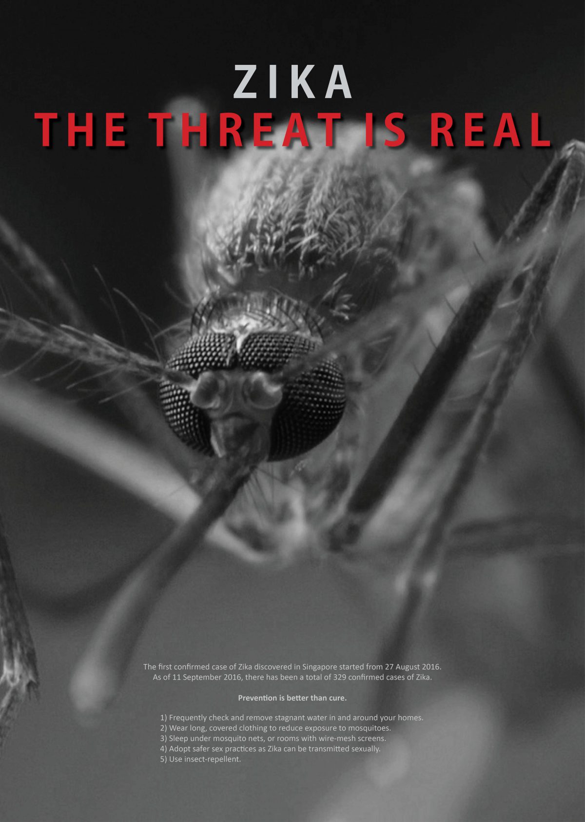
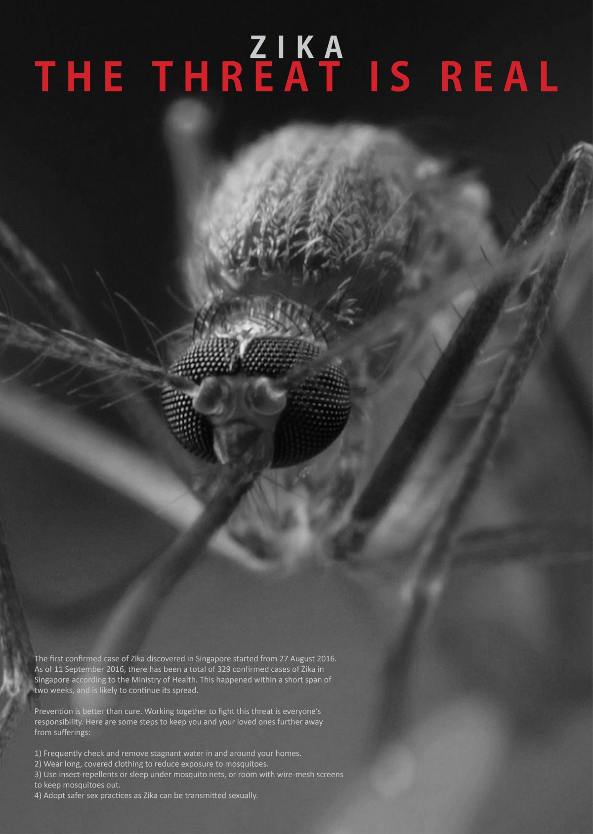
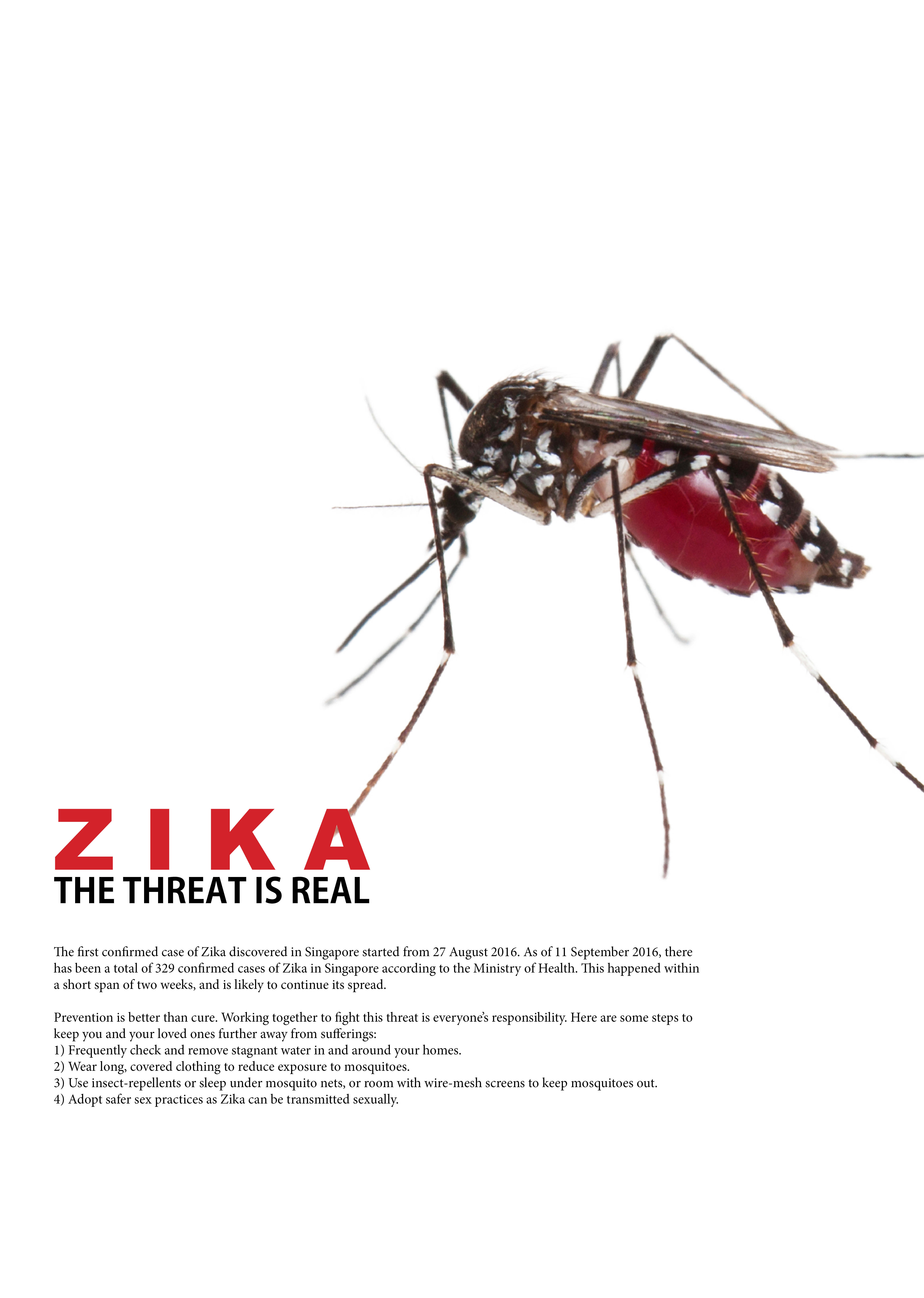
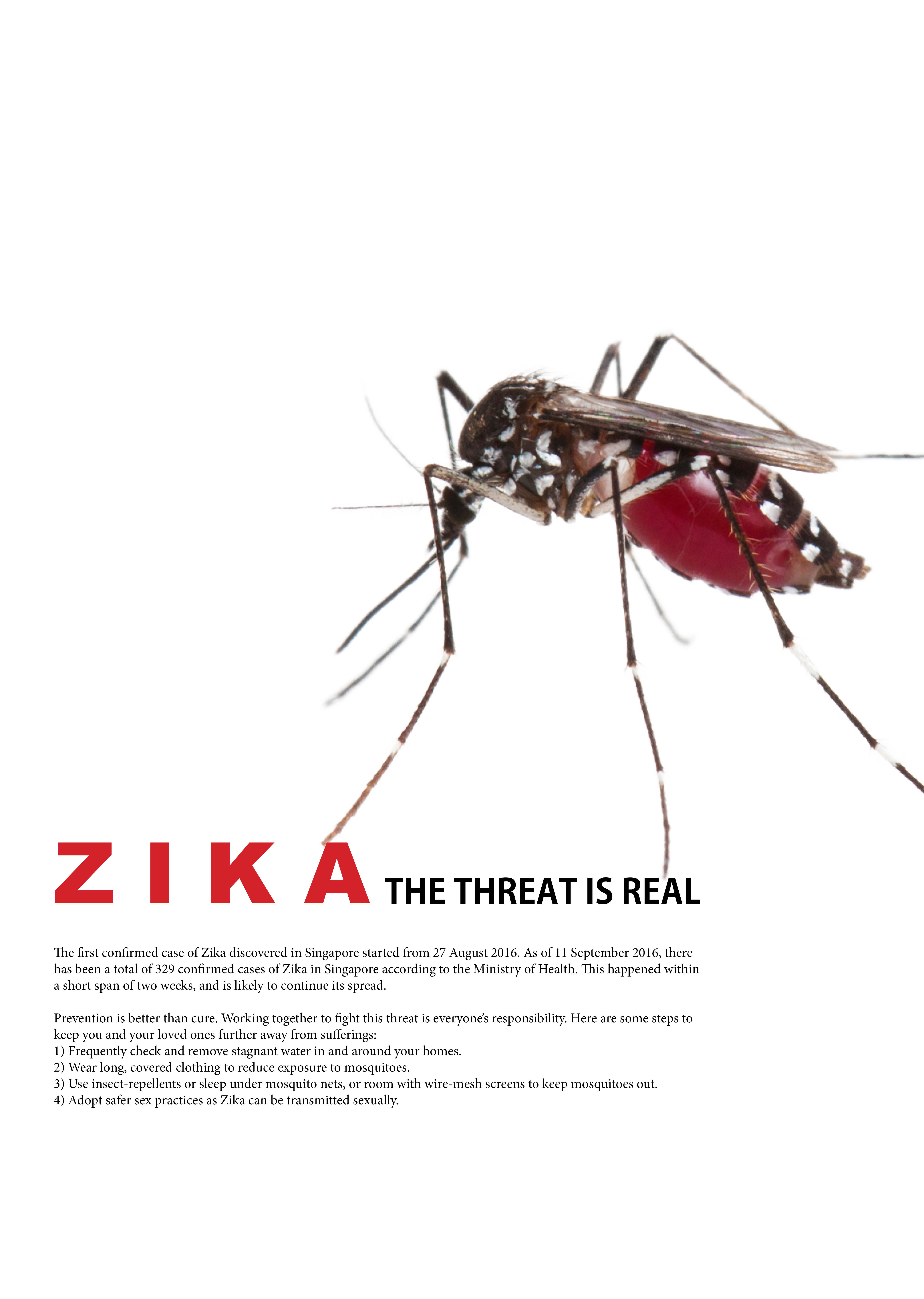
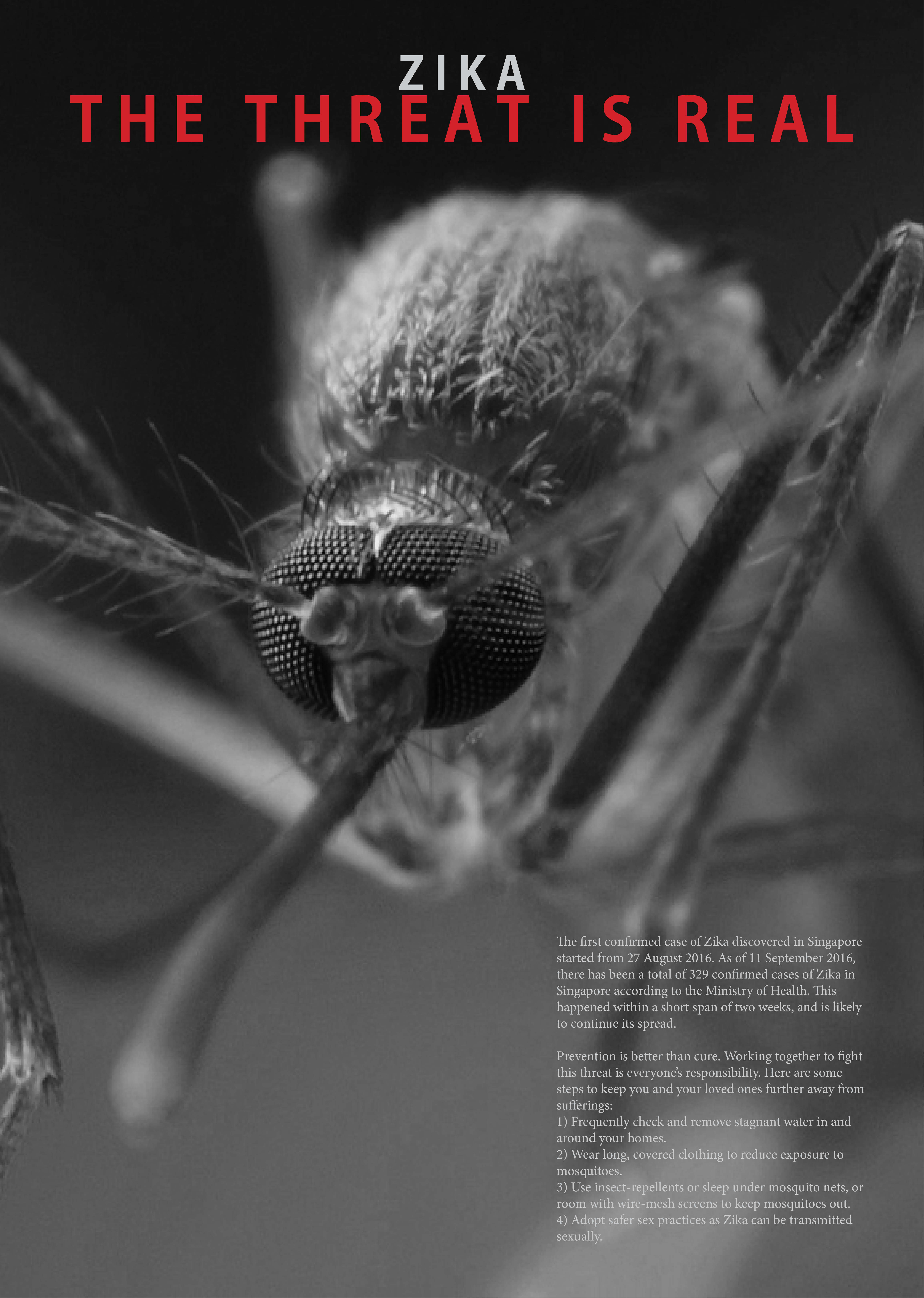
For concept 4, it is spun off concept 1, where I decided to follow the feedback by using the image of a mosquito facing the viewer to heighten the threat. It is also the concept that I am likely to stick to. 4-1 is the original one that was created, followed by the rest to experiment and play with various compositions. Initially, I couldn’t find a high res photo that was clear and scary enough to be appropriate for use, and thought of doing an illustration manually. Nonetheless, what makes a mosquito actually look scary is the amount of details on it. An illustration would make it look cartoon-like and the effect of threat would definitely not be there. After searching for a long time, I came across an image that seemed suitable. I decided to make it black and white to give the feeling that it is very solemn and serious, further enhancing the idea of threat. Although it is not an Aedes mosquito, it cannot be told as after close examining, an Aedes mosquito’s striped legs only has the stripes across the joints and lower parts of the legs, which cannot be seen in the poster. I decided to put the eyes near the middle of the poster to catch the attention of viewers, and also the slogan in red to make it pop. The content of the paragraph is the same as concept 1, just playing with the alignment and arrangement. I was also told that the text should be on the left, where the mouth of the mosquito acts as a line that directs the vision downwards. 4-3 to 4-5 are mainly playing around with the captions to see what kind of effects I can get from different effects and fonts, sizes, etc. Ultimately, I am still most pleased with 4-2. It is almost the same as 4-1, but paying more attention to the text and the alignment of the captions. It fits into what I wanted all along, something that is clean, simple, clear and concise and has an impact, rather than throwing in all kinds of ideas and experiments which to me makes it look very messy and unpolished, be it the visual outcome or the thoughts thrown into it. Somehow, I feel that having a simple and clean design emphasizes the clarity and effort of thoughts behind organising the entire layout, rather than the lack of it by choosing the easier way out. One other additional touch that I am considering to do is to make the eyes reflective to allow the viewers to see themselves as the next targets.
Lastly, there seems to be some unofficial changes to the assignment brief just for the record to remind myself, that there is no longer a need for the word “Zika”and preventive measures to be included in the poster. Nonetheless, I would most likely stick to the original requirements of the assignment as a challenge to myself, and also because I believe that is the “correct” way of working in this field, to try my best to adhere to the requirements and needs of my client! 😀
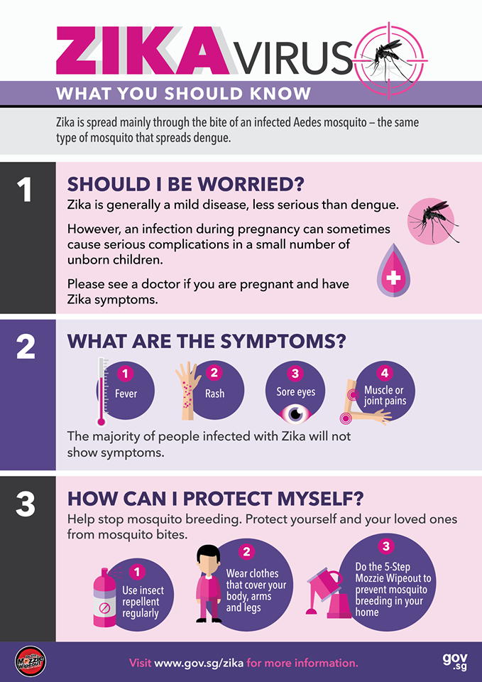
This is the second assignment on Visual Communications, and this time on Health Communication Posters, particularly targeting the issue of Zika.
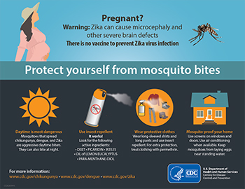
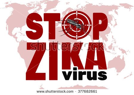
As a start, I started to look for various health communication posters which appealed to me more than the rest of them out there, and here they are:
Something provocative to catch attention of viewersLiteral, graphic content to arouse interestA creative use of props to bring across a clear messageClean and eye-catching with a rough finishInformative, kept it here as a way to organise informationIn-your-face kind of messageAnother informative example
The next step would be come out with slogans, which I have come up with the following:
“Zika – Everyone’s at risk.”
“Zika – The threat is real.”
“Zika – To be safe than sorry.”
“Protect your loved ones from Zika.”
“Fighting Zika together.”
“Zika 101”
Nonetheless, these slogans seem a little cliche, and might not arouse enough interest or catch the attention of viewers. I will be looking out for more inspirations and maybe tweak them along the way.
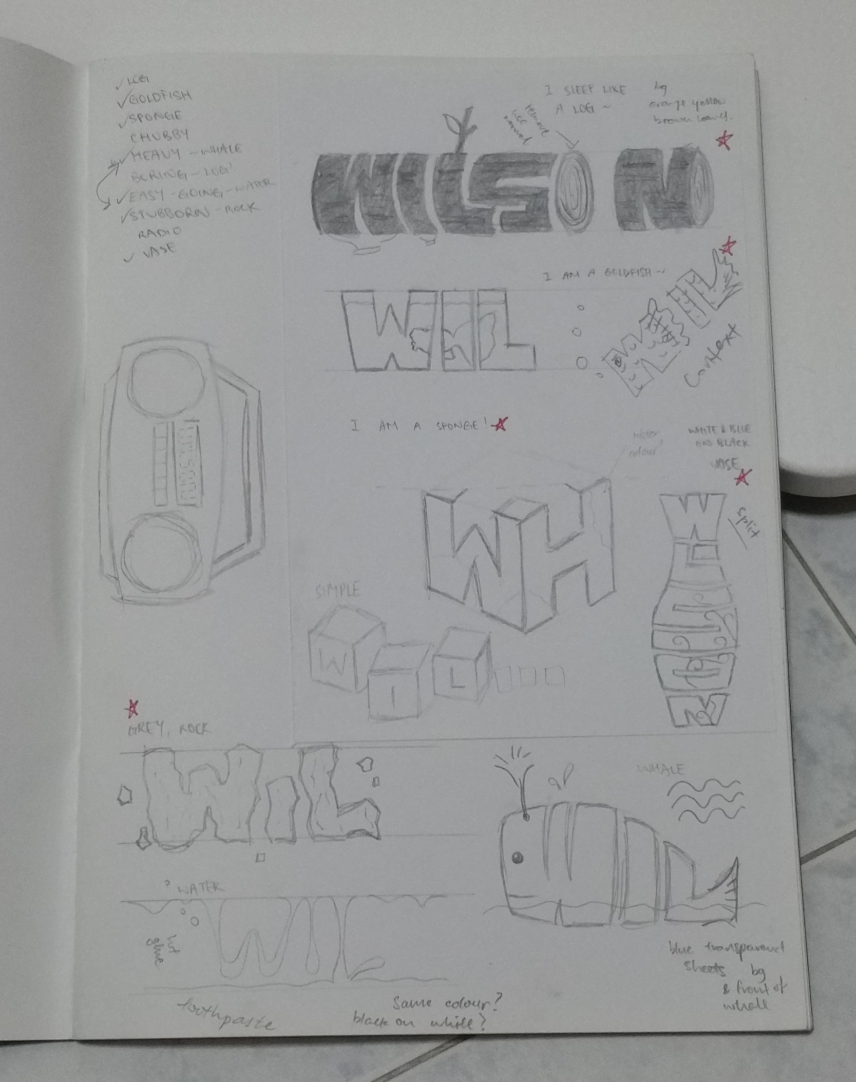
In this assignment, we were supposed to portray our names using an object or description.
First of all, I started by listing out a list of objects that I could be, things that were representative of me. This list included being a log, a goldfish, a sponge, being chubby, being heavy (whale? whale-son?), being boring (linking back to being a log?), being easy-going (water?), being stubborn (rock?), a radio, and also a vase.
After which I started coming out with random doodles that came to mind from this list of words.
Initial ideas
After that, I shortlisted 6 of them (log, goldfish, vase, rock, sponge, and water) which was the initial assignment deliverables. After the requirements drop to 4 pieces of deliverables, I decided to drop the idea of goldfish and water.
Here are the completed pieces, as well as some of the more interesting processes.
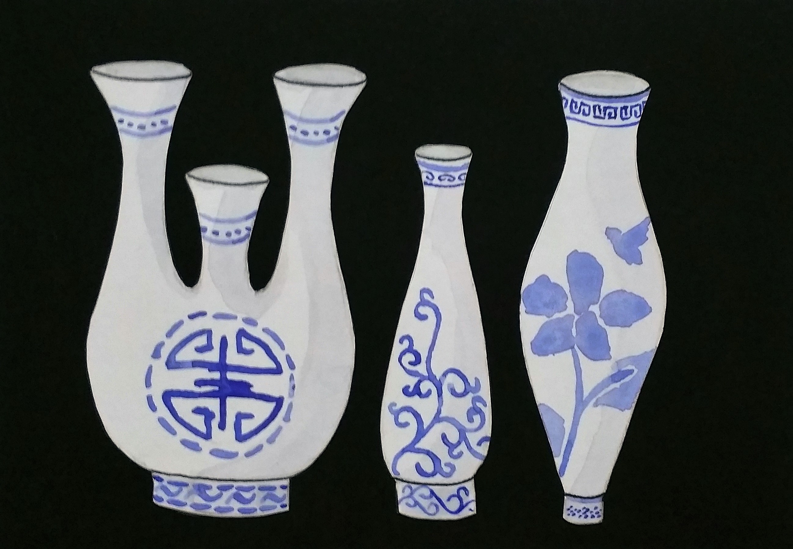
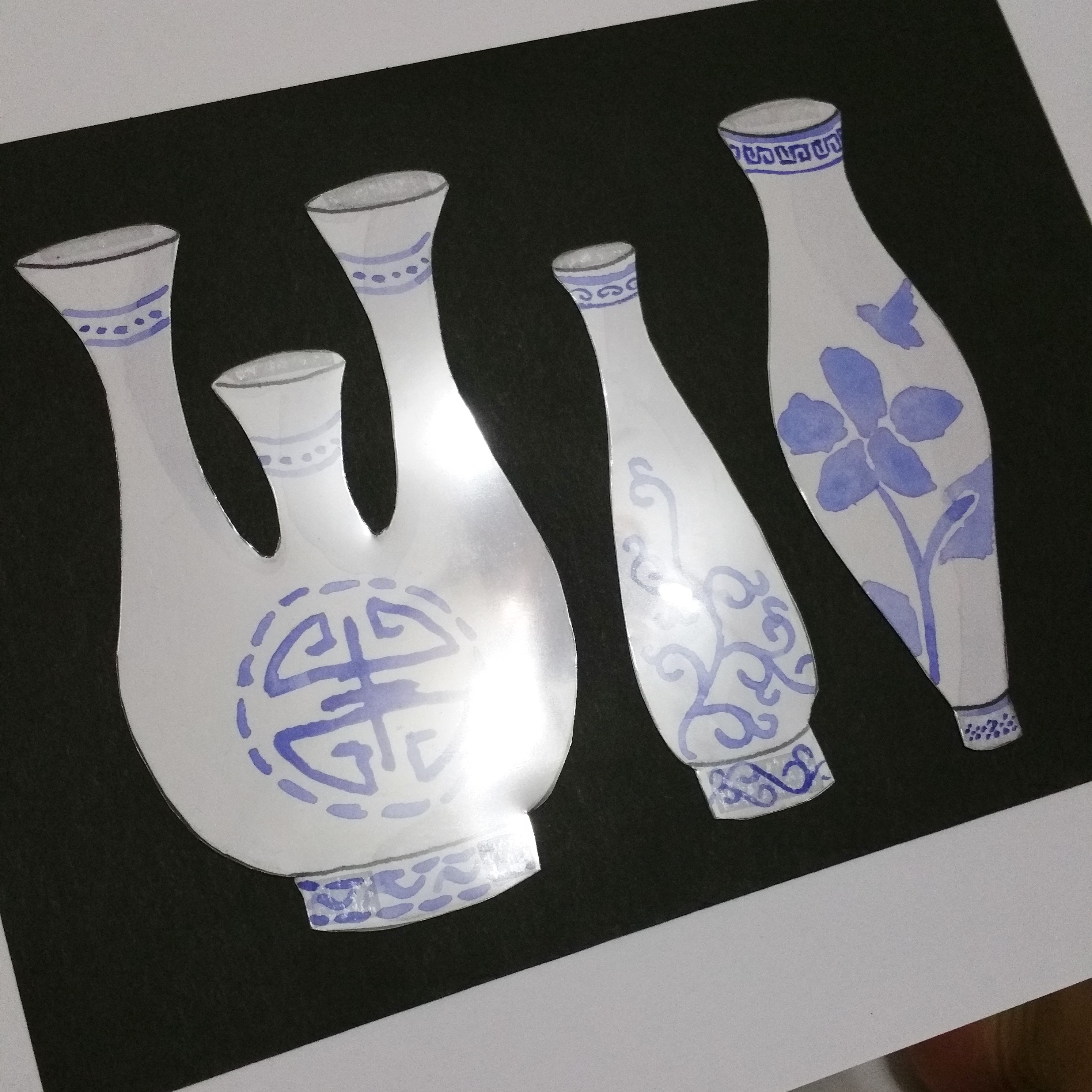
The first one would be the vase. I chose to portray myself as a vase because when people call you a vase, they mean that you are a bimbo and have no substance. On the contrary, I believe I have substance and would want to show it, thus making a vase to play with its meaning.
My name is Wil, and I am a Vase.
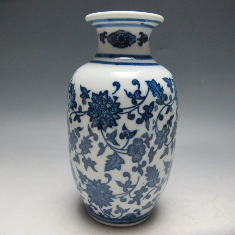
This was done by painting ultramarine blue watercolor onto white paper, before cutting them out and sticking them onto black paper. This idea of using chinese ceramic designs came to mind immediately upon thinking about vases, probably because of learning Asian art history in another module.
A Qing dynasty pottery.
After my painting was done, I added a layer of transparency sheet (those used on OHP in primary schools) over the vases to give a glossy effect, secured by tiny little pieces of double sided tape as it would be visible if attached using glue or bigger pieces of tape. This makes the vase closer to reality, also bringing out the contrast between the white vases and black background, the glossy vases and matte background.
Transparency sheet to add gloss to the vases.
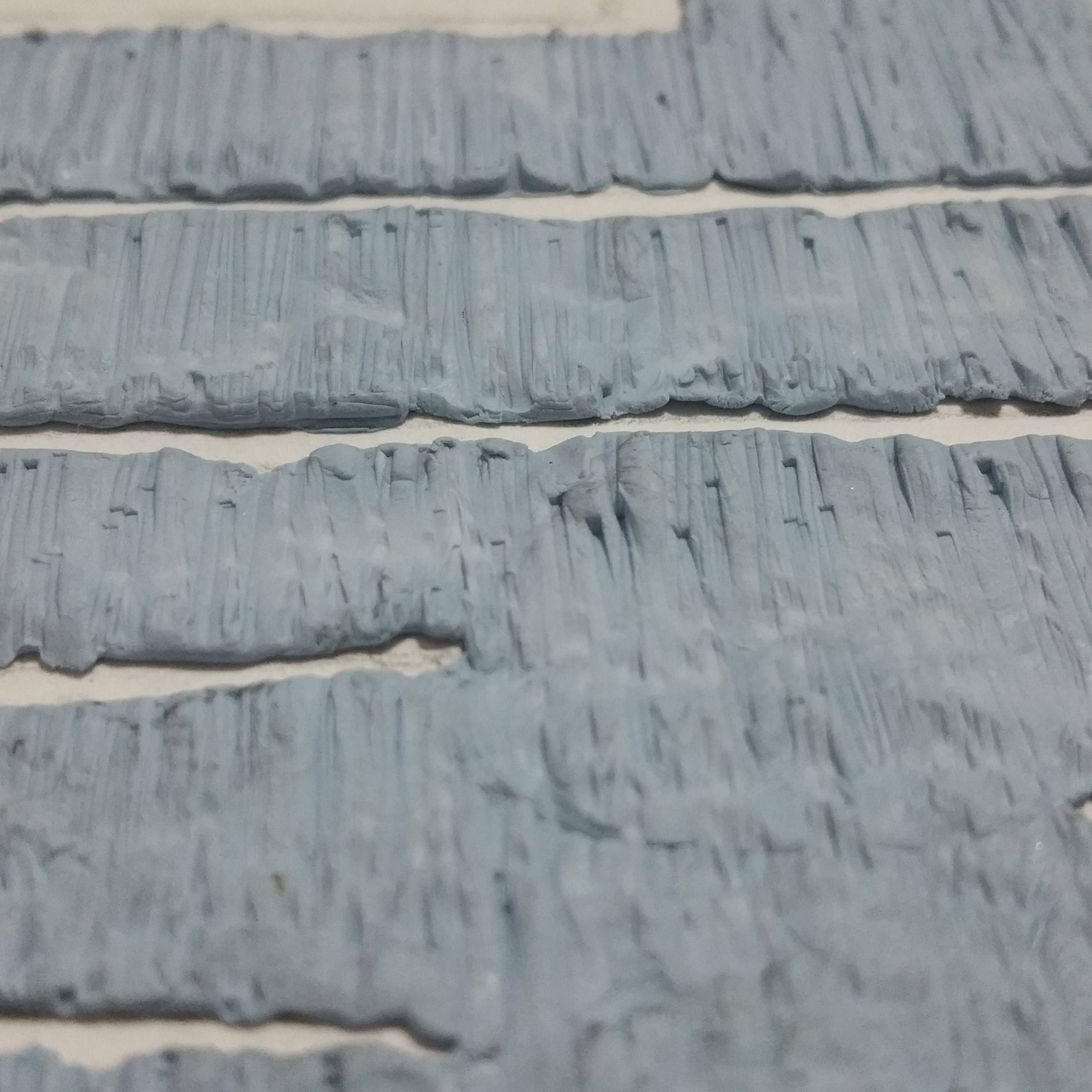
My second piece would be the log. I chose a log as for several reasons. First, I sleep like a log, I can easily sleep more than 12 hours a day without getting woken up by anything. Second, I’m a “block of wood” like a piece of log, I don’t get hints easily and am kind of oblivious to things sometimes.
My name is WILSON, and I am a Log.
This was made mainly by using blu-tac. First, I pressed blu-tac onto a piece of paper outlined with my name. The blu-tac is pressed hard to make it thin so that it will not be too heavy, and then after that pushed along the sides using a ruler to make sure the edges are clean.
Pressing blu-tac onto paper.
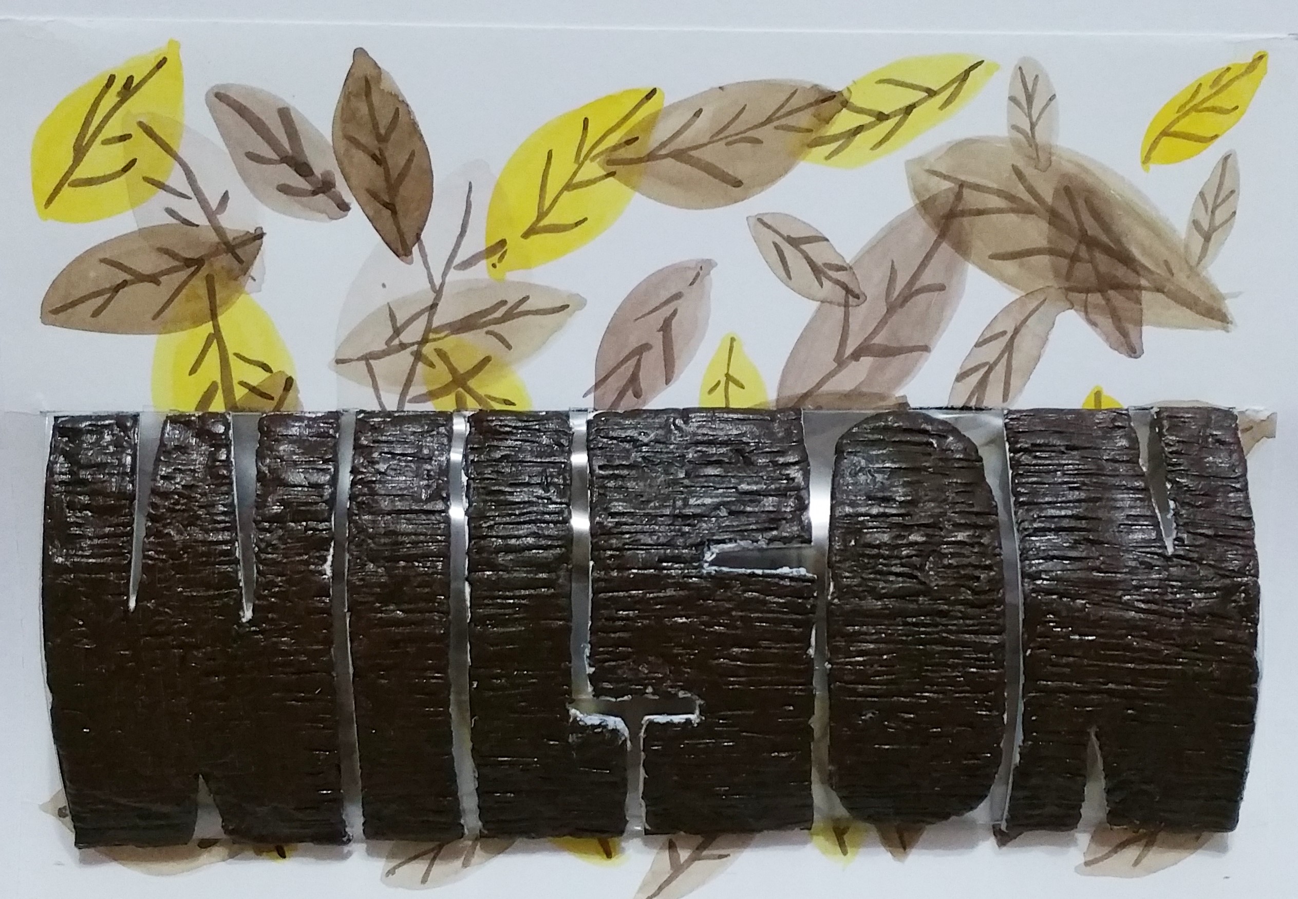
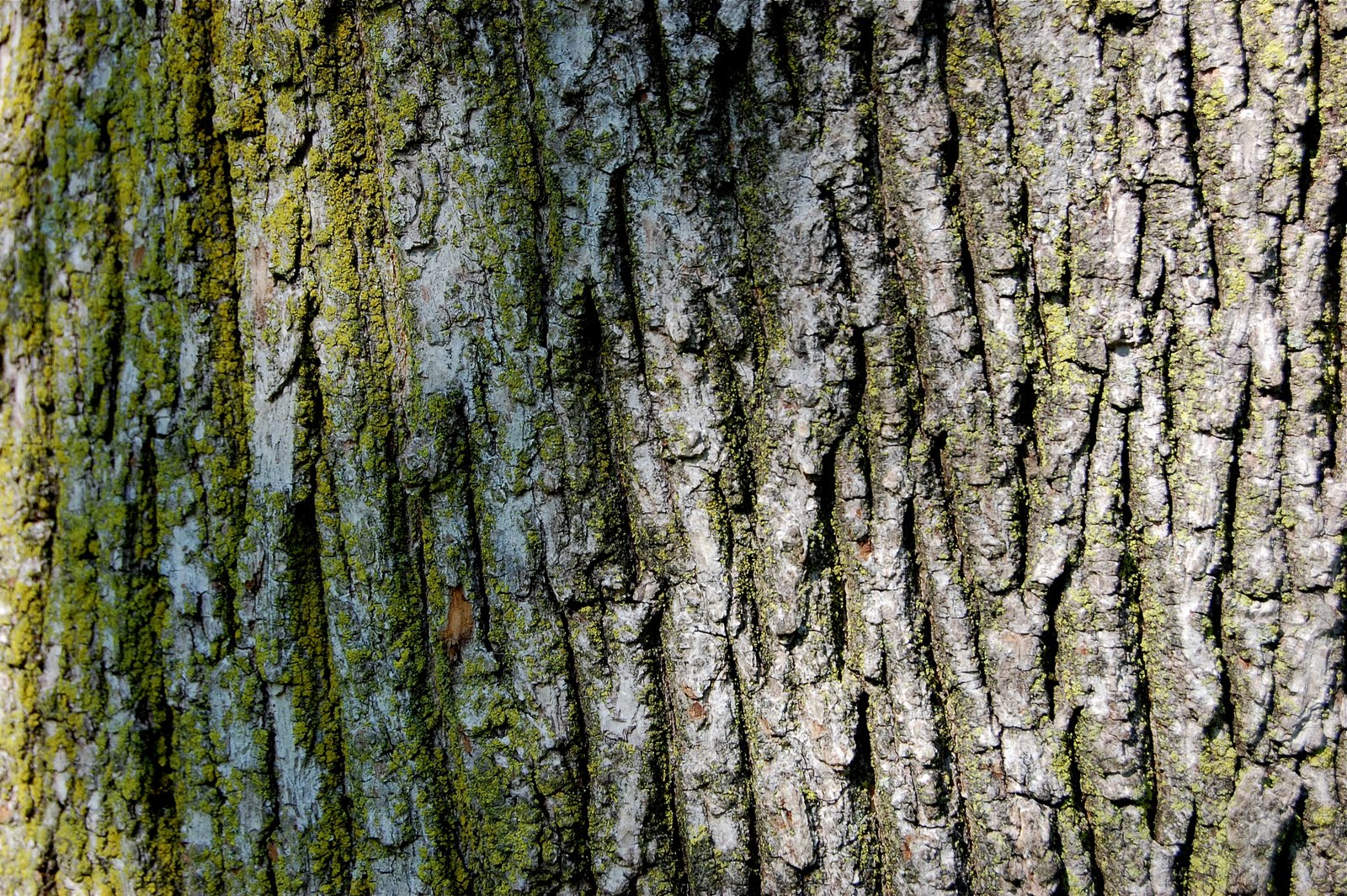
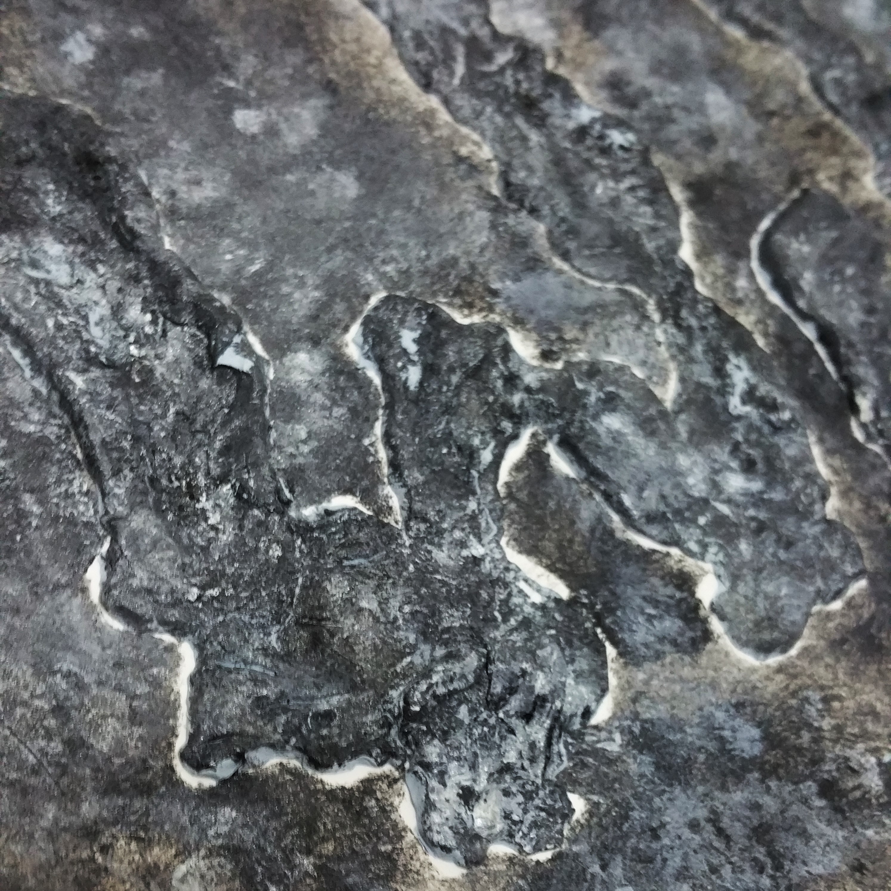
The bark of a tree have texture of long and short lines, deep and shallow. I decided to simplify these lines into straighter lines, which is carved onto the blu-tac by pressing the width of a metal ruler on it, and also scratching with the corner of the ruler. My research on recreating tree bark only showed how to do so using wall paint and clay, as well as epoxy, which were either difficult or heavy, thus my choice of blu-tac.
Tree bark textureRecreating the textureTexture on close-up, at an angleThe colored texture under light
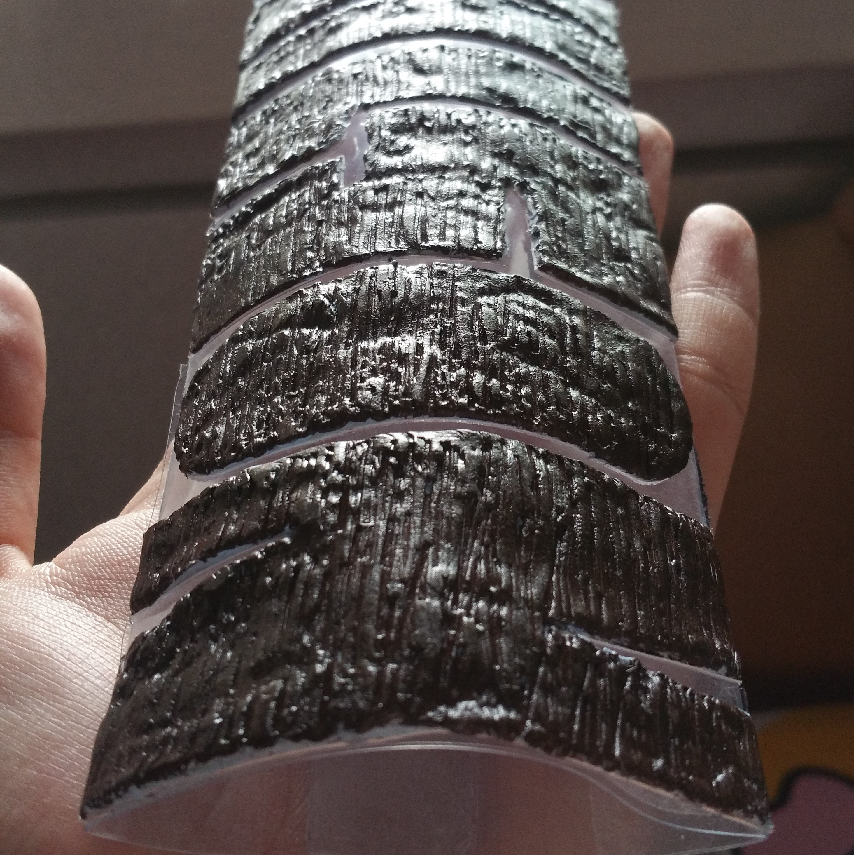
After the bulk of it was done, I painted acrylic over them, using a mixture of burnt sienna and black to make it a darker brown which is less red. I also brushed in patches of sap green over some areas to simulate algae, but is not obvious unless viewed very closely. I then cut them out, stick on a piece of transparency which is rolled into a semi-circular cylinder to allow it to stand out like half of a log. The background is painted randomly with watercolor to allow the transparent layers of leaves to overlap. The entire composition revolved around the use of yellow to brown colors to have a more harmonious color scheme.
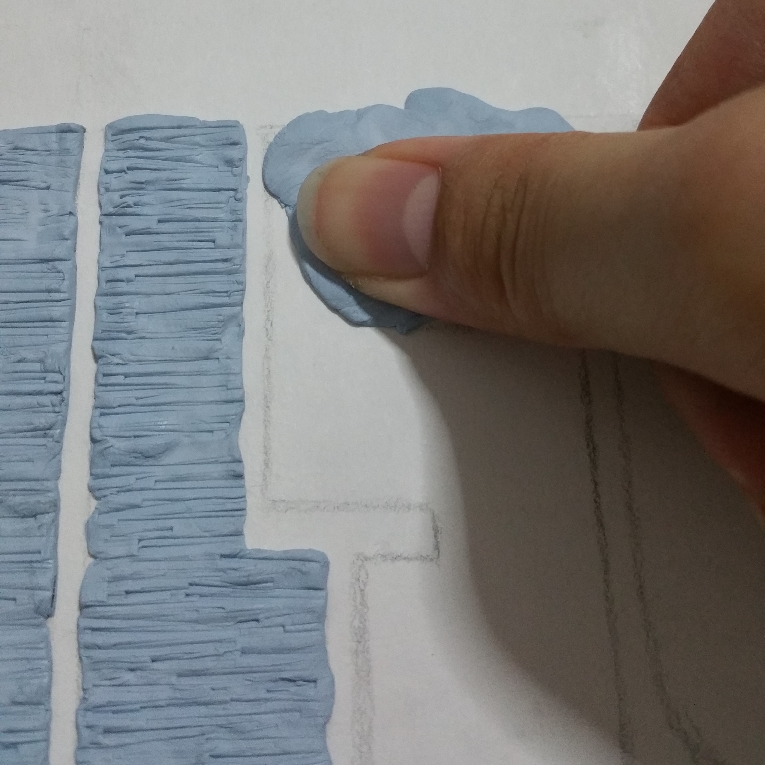
Next up is a rock. I chose to portray myself as a rock because at times I tend to be very stubborn, unwilling to budge just like a rock. Once I set my mind on a decision, it is unlikely for me to change my mind.
My name is Wil, and I am a Rock.
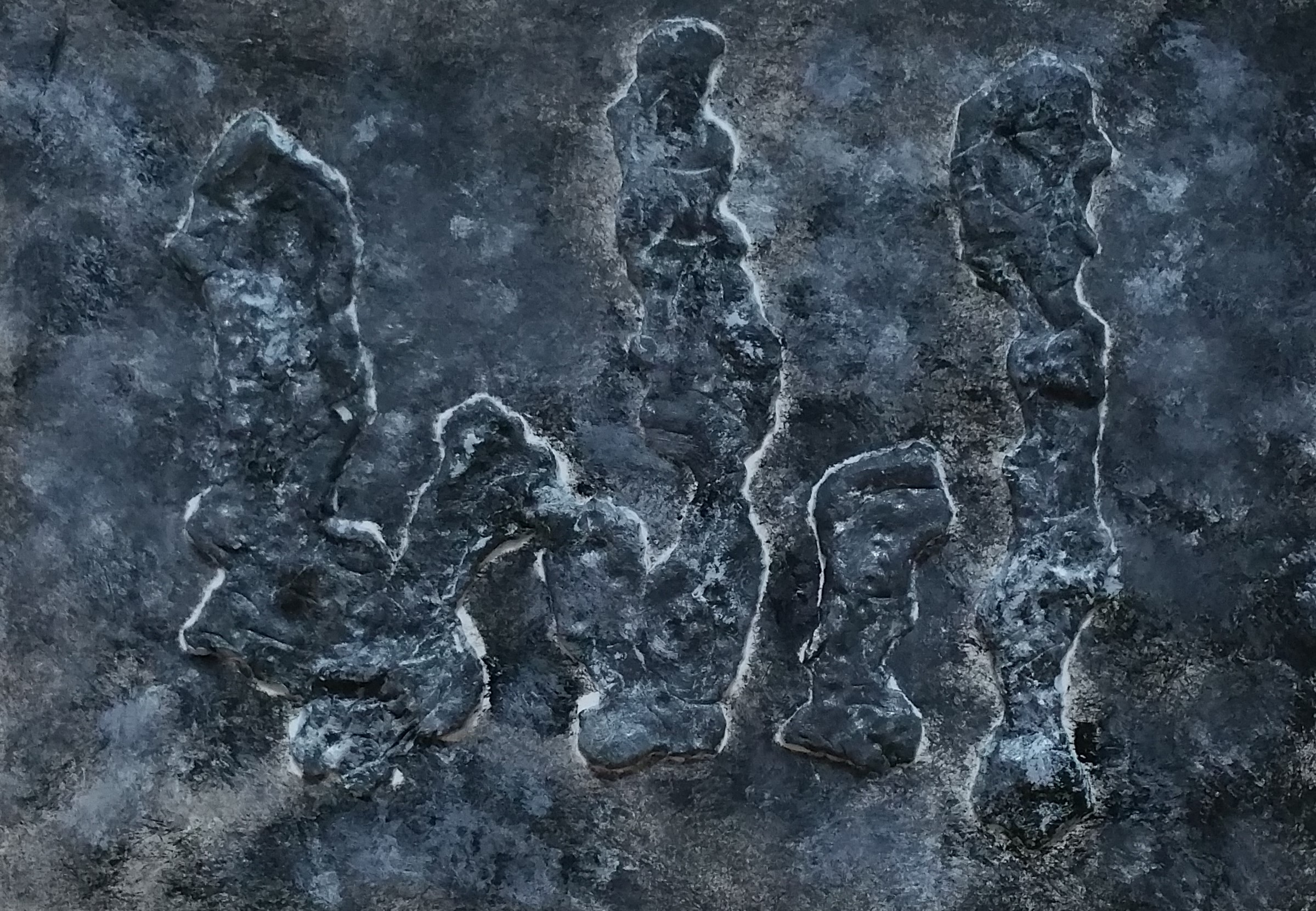
This too, is done mainly using blu-tac. This only required pressing the blu-tac only a piece of paper, but varying amounts of blu-tac were used across the words to give differing thickness and uneven surface, just like rocks. Some parts were pressed harder onto the paper, while some parts were pinched to give a sharper ridge.
Initial layout of blu-tac
After which, white and black acrylic were jabbed onto the product while the paint was wet, creating varying shades of grey and black. The border of the rocks were initially left out because the brush could not reach them, but turns out to be a good way of bringing out the words to make them clearer, thus left white. The jabbing of the brush with stiff bristles also created more texture on the rocks as the bristles made the blu-tac rough and also caused the paint to be in spots instead of strokes.
Texture of rocksClose-up on my rocks
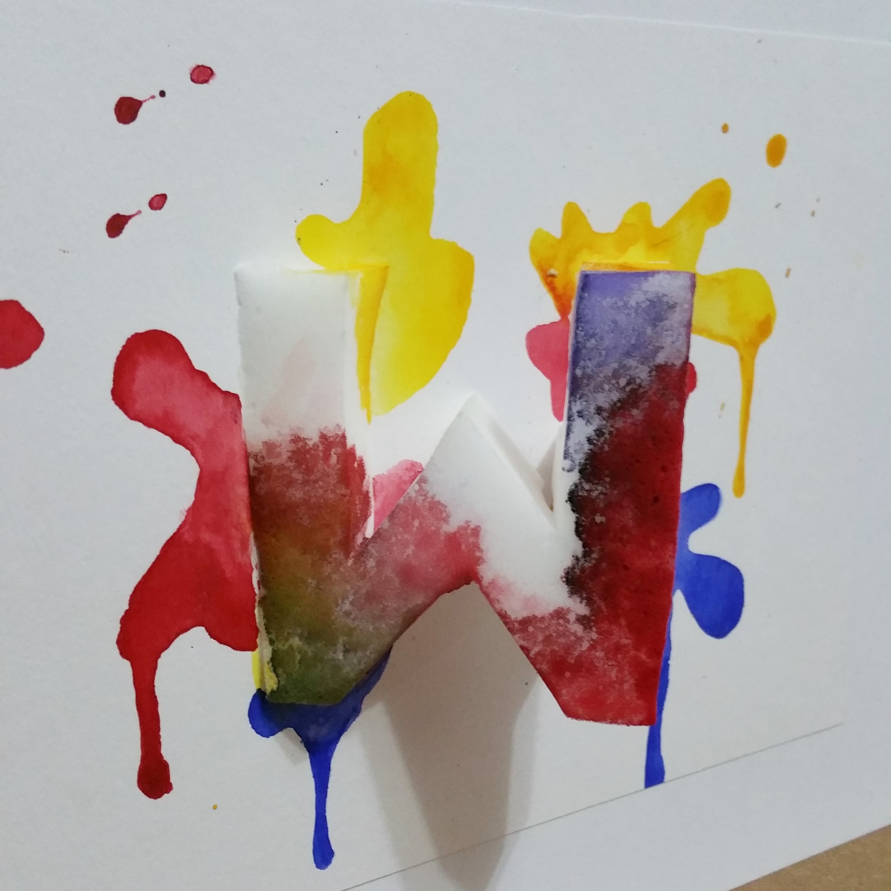
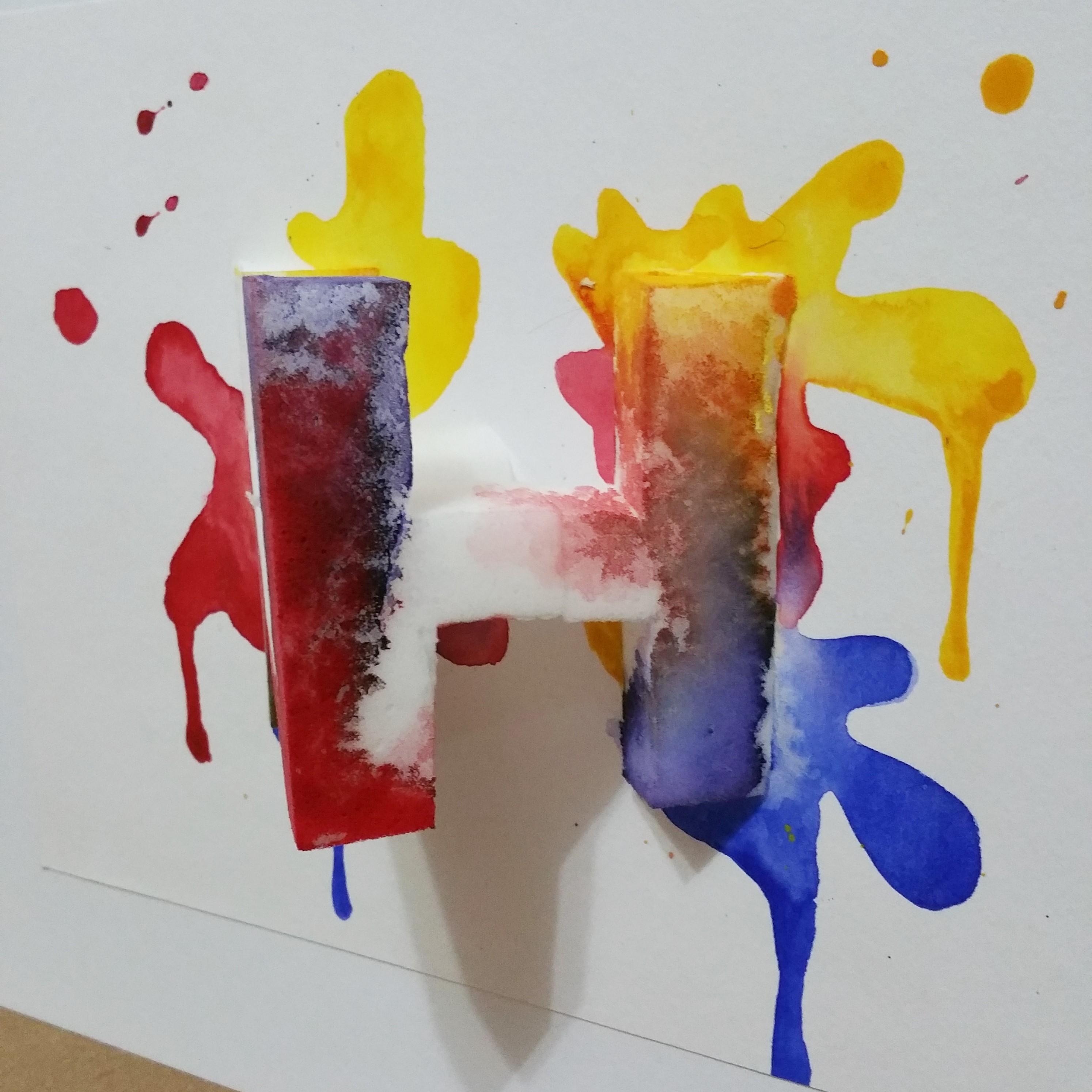
Last but not least, a sponge. I chose to be a sponge as I tend to learn things quite quickly and enjoy learning, like how a sponge can suck up water very quickly and efficiently. I also wanted the idea of adding blotches of colors to bring in the notion of being an artist and also learning more things, adding colors to my life, or also the notion of getting tainted by bad influences as I grow up.
My name is WH, and I am a Sponge.
I used my initials, W and H, to show 2 faces of a cube of sponge. I used white sponge on white paper to make it very plain and continuous, so that colors added on it will stand out. The sponge is made by attaching 2 layers of sponges together, then cut into a cube, then cut diagonally to half. Then, the W was carved in, before carving in the H, thus both sides could be seen.
The WThe H
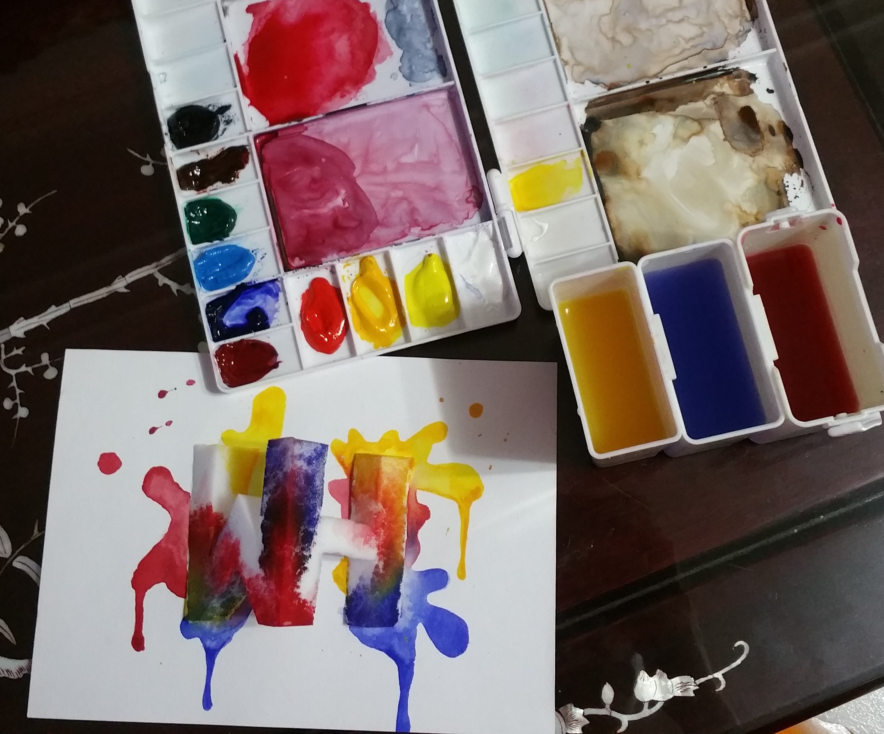
I wanted to drip watercolor onto the sponge and allow it to smudge and blossom by itself to have a soft texture. Unfortunately, the magic sponge was not very porous and did not allow the water to flow freely. The drop of color stayed where it landed and did not move. Thus, I had to manually paint on every part, and added water to blend some of the colors. I used primary colors of Red, Yellow and Blue, as they were the basics of colors. I wanted to show learning from basics and also felt that this 3 colors were very harmonious together, with the ability to form many other colors. I then painted parts of the background like colors splashes to allow the sponge to stand out, adding more dynamic movement to the composition as though the sponge is diving into the paper or emerging from it. The downward flowing “drips” were also painted in to make it look more natural and sort of give a more carefree and unintended feel to something which looks neat and well-planned.
Watercolor onto sponge and paper
With this, my 4 pieces of typographic portraits are complete!