DN1009 Graphic Form
Project 1 – Image Making Through Type
« Typography with Name »
Project Brief:
- Create typographic portraits using whole name, part of name, nickname or initials to describe your future job
- Consider choice of typeface, style, size, weight, use of upper and lower case characters as well as space in between the letters
Project Aim:
- Use typography as an end in itself, minimizing supporting imagery
- Conceptually driven solutions and letter forms are combined with abstract images to express your future job
- Outcomes address either materials, the process or a result of using specific media and technique
Initial general ideas and concepts:

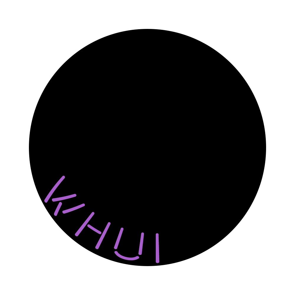
This picture above shows my first brainstorming process, where I just jotted down whatever that came to my mind and drew thumbnail sketches for certain jobs that I had concepts for. (yes it’s quite a mess)
Key information extracted from the picture above ⇓
Names/Nicknames to consider:
- Wan Hui
- Wan ✓
- WH ✓
- whui
- 婉僡
Ideas of illogical jobs:
- Nightmare Churner ✓
- Dream Catcher
- Sleep Programmer ✓
- Weather Controller
- Gundam Pilot
- Animal Whisperer
- Shape Shifter
- Chocolate Sniper ✓
- Card Magician
- Lego Parts Designer
- Gem Harvester
- 8-bit Warrior
- Fruit Ninja ✓
- Fruit Puncher
- Hole Puncher
Initially, based on examples of some seniors’ past works, it was still quite hard to grasp what was considered “bending the element to fit the letter”. But after my first consult with Shirley, I was able to understand the project better. The aim is to be able to “deconstruct, then reconstruct” a job to form a typeface. In other words, breaking down the elements of the jobs, and then applying it to the typeface. One thing that was important was consistency; It should be possible to integrate the elements seamlessly onto at least each of the 26 letters of the alphabet, and not just on the letters used for our own name. That means, the objective of the project is for others to be able to deduce my job just by looking at my typeface.
Final shortlisted names and jobs:
- WH, Chocolate Sniper
- WH, Nightmare Churner
- Wan, Fruit Ninja
- Wan, Sleep Programmer
First Job: Chocolate Sniper
Breaking down the job:

I think this job is relatively easy to understand, since it’s quite literal. I broke down the job word by word. Elements of “Chocolate” include its generic texture and brown colour. I decided to include the wrapper for the chocolate because with just the texture, I’ve gotten some feedback that it looks a bit like waffle. Elements of “Sniper” include the crosshair (for aiming) and gunshots/gunholes.
Initial thumbnail sketch:

Figure 1
I did my first ideation of Chocolate Sniper (Figure 1) before my first consult with Shirley. I made 2 mistakes here. First mistake was only applying the crosshair to my “W”, and the second mistake was the way I formed my “H”.
First mistake: As I mentioned before, the typeface should be consistent, which means that whatever element one letter has, the rest of the letters should also have the same, or at least similar elements. In my case, if I were to pick out just my “H”, I wouldn’t be able to deduce that my job is Chocolate Sniper, because the context of the foreground (sniper gun) and the crosshair on my “W” are not there. Only the “Chocolate” aspect of my job is present in the “H”.
Second mistake: I formed my “H” by combining 2 separate chocolate bars with the wrapper “conveniently” connecting in the centre. This is wrong because the letters shouldn’t be formed by just placing objects in convenient orientations so that they look like the letter. The point is to first break down the element into its essence, so for example, its texture, and then applying to the letter accordingly.

Figure 2
So after my consult with Shirley, I came up with a second concept sketch (Figure 2). I managed to fix both my mistakes from my first draft so I was quite happy with this.
Choosing colour scheme:
I then searched for images of the elements and possible colours to use for the background. I decided to use sand and sky for the background because “desert shooter” is the first thing that came to mind when I think of “sniper”. Blue and orange are complementary colours on the colour wheel, and since both beige (sand) and brown (chocolate) are tints of orange, the colours went well together.
“KitKat” was the first chocolate brand that came to mind, so I decided to use red for the chocolate wrapper on my font. I felt that warm fiery red was a good contrast to the cool blue colour of the sky.
Colour palette for Chocolate Sniper:

Execution:
For the font, I decided to use a bold and chunky font because chocolate bars are usually large blocks of rectangles. I decided to use Source Sans Variable (Stroke 40pt on Adobe Illustrator) as a general guide. I then used Adobe Illustrator (AI) to draw over the font. As I went along, I edited certain parts of the font so that it wasn’t exactly the same as the reference font.

Process:


I decided to draw in AI as opposed to Adobe Photoshop (PS) because I wanted to use the “Blob Brush” Tool in AI. Since I was drawing with a mouse, the blob brush tool is useful for me as it helps me smoothen out my, otherwise, shaky lines to a large extent.
I then used PS to add the 3D effect, crosshair, shadows and draw my own background.

Draft 1:

Draft 2:

Looking at my first draft, I felt that it was a little too plain. In my very first ideation sketch (Figure 1), there was a sniper gun, but I decided not to include it in my final work because I wanted the focus to be on the typeface and not rely on other elements to give away the idea of the job. I didn’t want to include too many extra elements outside of the typeface. I also wanted to show some form of action/indication of the gun shooting, so I thought adding the shattered chocolate pieces and gunshots would suggest that action quite well.
Final Draft:
After my 2nd consult with Shirley, she suggested reducing the size of the crosshairs and shifting the crosshair of the “H” to only one side of the H so that it doesn’t take up too much space and focus. I also thought that the differentiation of the browns were not very apparent, so I darkened the outlines of the chocolate to make it clearer.

Explanation:
To be honest, this job was quite an impromptu one, where it just popped into my head at 2am before I went to bed. I love chocolate, and I like to play shooter games, so put together, it became “Chocolate Sniper”. I chose “sniper” as opposed to “shooter” because snipers tend to be faster and more accurate in their shooting skills, so I preferred the more precise term rather than the generic term for shooting.
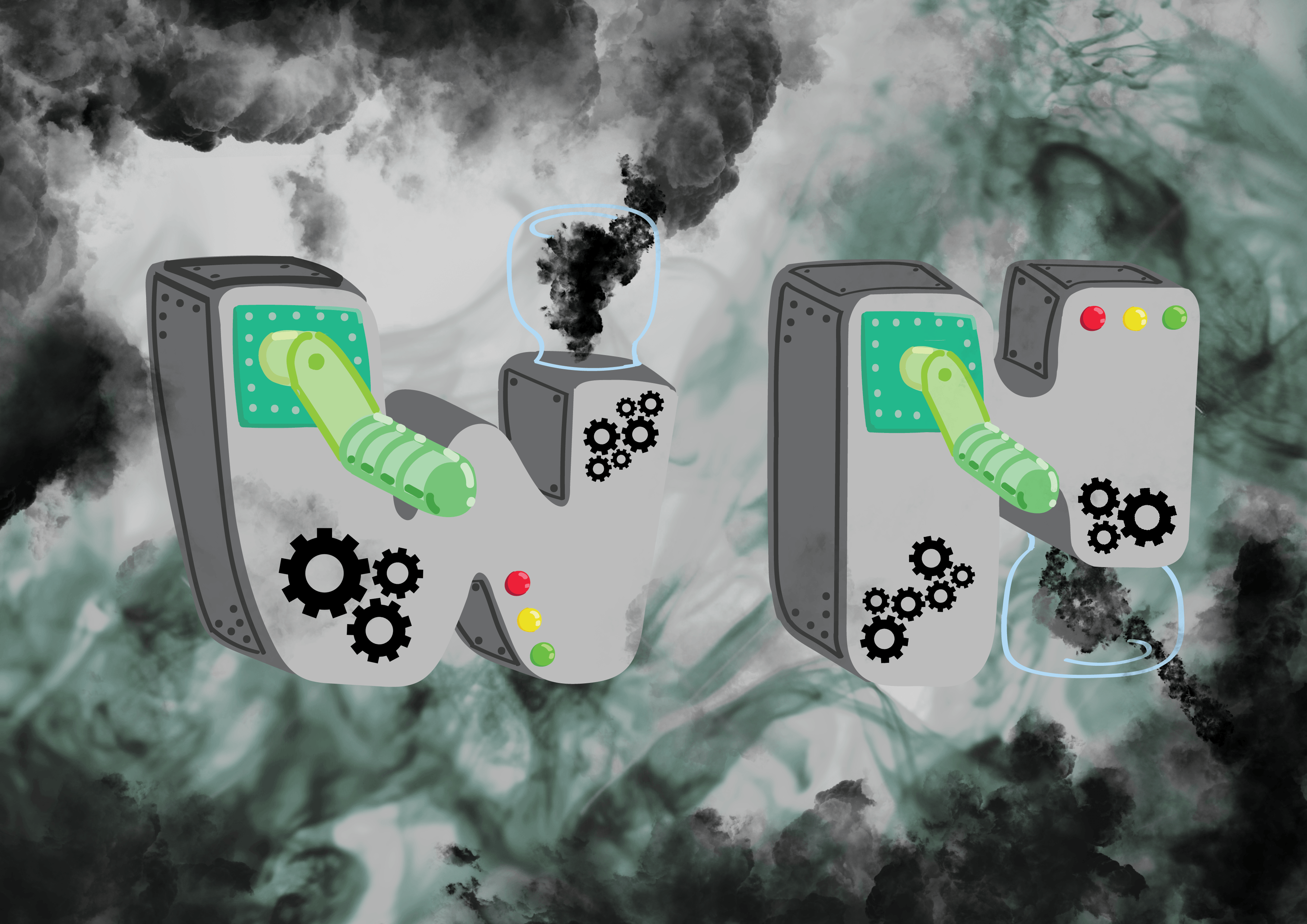
Second Job: Nightmare Churner
Breaking down the job:

“Nightmare” to me was dark and scary, and I thought of representing it with dark clouds, because when put together with “Churner”, which sounds like machinery, it seemed logical for the machine to produce smoke. Another reason why I used smoke to represent “nightmare” is because similar to smoke, I feel that nightmares tend to engulf people, in anxiety and fear. For “Churner”, some elements are the crank arm (to churn out the nightmare), light indicators on the machine (to indicate when the nightmare is ready to be produced), and glass jars (to store and emit the nightmarish smokes).
Initial thumbnail sketch:

Figure 3
This sketch (Figure 3) was also done before my first consult with Shirley so there are also a couple of mistakes here. Similar to my first ideation sketch for my first job Chocolate Sniper, the mistakes were inconsistency and simply combining objects together so that they form the letter. The element of “Nightmare” is also not apparent in the typeface itself, but rather, it’s shown in the background, which is wrong as well.

Figure 4
So again, I went back and refined the concept, and I ended up with the improved concept sketch (Figure 4).
Choosing colour scheme:
Similar to how I researched for Chocolate Sniper, I went online and searched for images to get inspiration for my colours. I decided on a slightly monochromatic colour scheme with a tinge of green. Green, to me, could represent a colour of disgust and fear, which in turn represents my feelings when I experience nightmares. I kept with a monochromatic theme of just black, grey, and white because I feel that factories or machines are usually devoid of colours, and are mostly made of metal. So I stayed true to that aspect of machines and kept with the grey scheme.

Colour palette for Nightmare Churner:

Execution:
For this work, I wanted a big and strong looking font, so I went online to search for fonts that looked like that. I ended up using a free online font called “TIGERYEN” as a reference.

I also decided that I wanted to use capital letters for both my “W” and “H” because I feel that will better convey my idea of BIG machines churning out smoke.

Process:

I used the font as a base, then drew over it by hand (or mouse). I shortened some parts of the letter so that I could incorporate the glass jar into the font, and not simply add it on as a protruding element.
I then proceeded to PS to add more elements (gears) to my font and also add the background.


I added the gears because gears are often used in machines, so I felt that it should be an element of “Churner” as well. It also gave the otherwise smooth face of my font some much needed texture so that it is visually more interesting. As I mentioned earlier, nightmares give me the impression of being engulfed in terror, so I wanted my font to be engulfed in the smoke. I went online to look for preset smoke brushes, which were really useful in helping to create the smoke effect. There was a variety of smoke brush textures to choose from. I really liked this part of the process because I could play around with the different sizes, shades and orientations of the smoke to create the effect on my own.
Final Draft:
Explanation:
For this job, I kind of had the idea in my head before I decided on the name for it. I thought of a machine churning out scary smokes, and what scares me are probably my own nightmares, so I thought that it fitted quite well with the concept in my head, so I went along with it. This job also kind of represents me in a way, because I think that humans are all inherently evil, including myself, so I would think that sometimes, I’m a nightmare to others, and that I’m haunting them hehe.
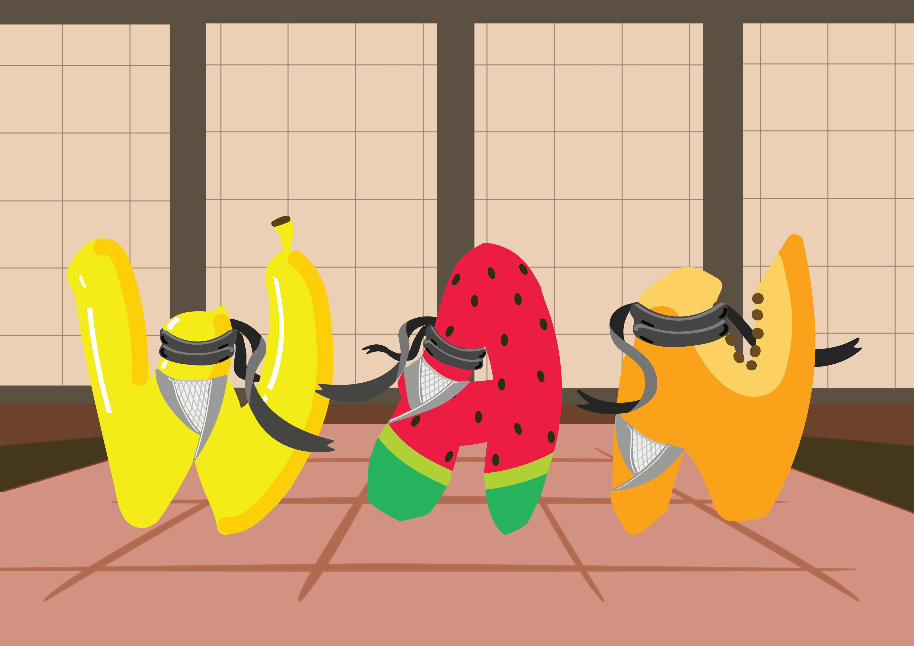
Third Job: Fruit Ninja
Breaking down the job:

Since “Fruit” is quite literal, I had to be careful to not just use the fruit itself as part of the font, but rather, pick out the iconic textures of each fruit and then apply the texture to each of the letters of my typeface respectively. At first, I thought of just using actual real life images of fruit textures and applying it to my font directly. But soon after, I decided against that, and settled on staying true to my style throughout all 4 jobs. There are many visual elements for “Ninja”, so I had to pick out just some key ones. I thought that the most unique thing about ninjas is the way they dress. I liked the traditional ninja outfit, and I feel that it is the most iconic feature of a ninja, so I used the headband and the vest to represent “Ninja”.
Initial thumbnail sketch:

Figure 5
The picture above (Figure 5) was drawn after my first consult with Shirley, so by this point I had already understood the project to a large extent, so there was less mistakes. However, the first sketch was still not the best. After my second consult with Shirley, she mentioned that having too many elements may make the typeface look crowded, so she told me to omit the “shuriken”, since the headband and the attire were already sufficient as visual clues to deduce half of my job (Ninja). I also decided to go online to look for other fonts that could replace this simple looking one, and also a font that could communicate my job visually, and thus, I ended up with the sketch below (Figure 6).

Figure 6
Choosing colour scheme:
(Same process) I looked online for images of fruits and ninjas, mainly for colour references.
For the typeface itself, I picked fruits with colours that would go well with each other. I ended up going with watermelon (red), papaya (orange) and banana (yellow), which forms the analogous colour scheme. I then decided on a dojo as the background because that’s where ninjas usually train, and that will set the context for my job. I kept the usual brown colour (earthly colours) for the dojo background because it’s the default colour for dojos, but more importantly, it blended in well with analogous colour scheme of the fruits on the font.
Colour palette for Fruit Ninja:


Execution:
When I think of “Ninja”, the anime “Naruto” comes to my head. And that’s where I got the idea of referencing the Naruto font so that not just the elements, but the font itself can also convey the idea of a “Ninja”. Thankfully, there was a free Naruto font that is available as a reference.
I didn’t want to just use “WH” throughout all 4 of my works because that’s just my initials. I wanted a bit of variety, and since “Wan” is actually a nickname that some of my close friends use to call me in real life, it is more intimate and true to myself. Hence, I wanted to represent it in at least one of my works. I decided to use capital letters throughout because I wanted the balance in this work, and show that each letter is of the same importance. Capital letters also gives the impression of boldness and strength, which is an important quality of a ninja.

For the fruit textures, I did reference some available fruit-based typeface.

Process:

What I realised is that by adding highlight and shadows, it can really make the object pop out. In this case, I’m referring to the banana “W”. The highlights and the shadows really displays the contour and the form of the banana better, as compared to the flat yellow colour.
I have quite a similar working sequence throughout this project. So after drawing my font on AI, I shifted over to PS to draw in the background.

For this background, I had a reference image of a dojo in one-point perspective. I used it as a base and redrew my own background based on it. I simplified the sliding paper doors (without the fancy designs) because I didn’t want the background to steal the focus away from the typeface itself. For the grids, I just used a grid brush preset (works like a charm). I also tweaked the colours of the dojo to be of a lighter shade and less saturated, so that there is a greater contrast between the saturated vibrant font and the duller background.
Final Draft:
Explanation:
This is probably my favourite one to work on. Initially, this idea came as “Fruit Puncher”, which I then changed to “Fruit Ninja” because I felt that a ninja has more iconic visual elements as opposed to a puncher. It was also partly inspired by the name of an existing game, “Fruit Ninja”, where the aim of the game is to slice fruits in the air to get points. It’s a game that I used to play a lot on my phone when I was younger. Being able to reinterpret this and recreate it in my own way is quite fun. Somehow, it’s like reliving my unattainable dream of being a Fruit Ninja, but through typography.
Fourth Job: Sleep Programmer
Breaking down the job:

The first thing that came to mind when I think of “Sleep” is Z (the z z z effect). However, I wasn’t sure if it was allowed to use letters to form letters (i.e. using the Z to form the typeface), so I did not explicitly include the Z into my typeface. For “Programmer”, it was very technological, so I thought of elements of programming, such as the language, the circuit board textures and binary codes. However, for this job, I think that the font itself is very useful in conveying the idea of my job, because there are specific fonts used for programming codes.
Initial thumbnail sketch:

When I first came up with this job, I didn’t really know how to represent it. I only knew that I wanted to use a Sans Serif font because most generic fonts for programming codes are Sans Serif fonts. But after breaking down the job, I found it easier to put the elements together to produce an image to this job.
Choosing colour scheme:
When one thinks of “Sleep”, the most common colour would be dark blue, because dark blue is generally associated with “night”, and people normally go to sleep at night. I adopted a monochromatic scheme because computer programs are usually typed on a black background, with white (usually), blue or green words. I then decided to use a bit of yellow so as to contrast with the blue, as inspired by a childhood show, Banana in Pyjamas.
Colour palette for Sleep Programmer:

Execution:

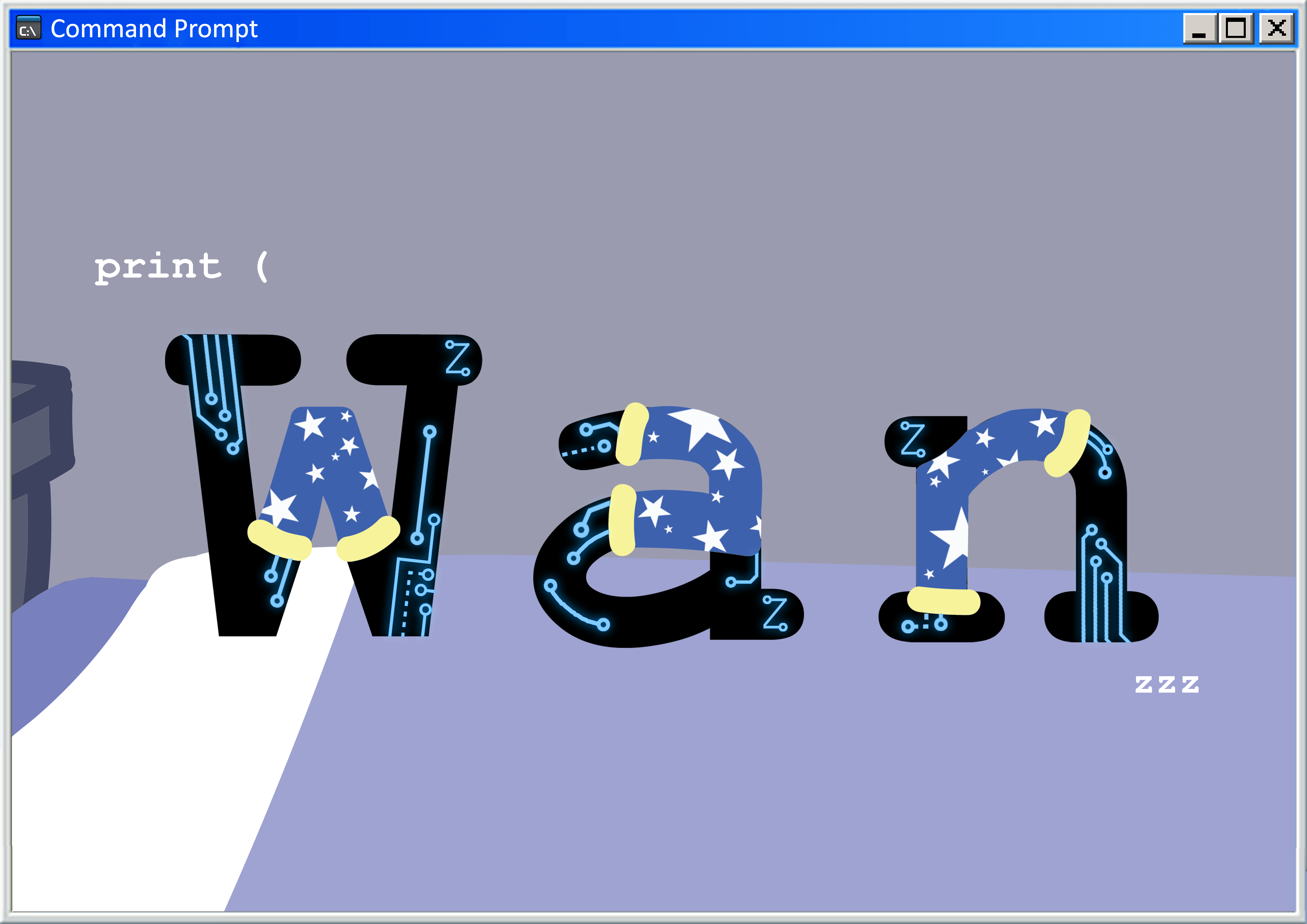
I chose Courier New as my base font because as mentioned earlier, it is the font used for most program codes, so with just the font, it will be able to convey the idea of “Programmer” to a large extent. However, I had to take into account that some people might not know that this is the font used for computer programs, so I had to include more elements of “Programmer” onto the font.
Process:


I then added pyjamas pants onto the font to convey the idea of “Sleep”. For this work, I did most of the editing on PS because I found it easier to work with images in PS, since I didn’t hand draw as much for this piece as compared to the rest.

I used a star-shaped brush preset for the pattern on the pyjamas pants, then I used a reference image for the circuit board texture. I also added a “Z” to each of the letter in the same style as the circuit board texture so that it blends in with the rest of the texture. This way, the “Z” element of “Sleep” can then be incorporated into the typeface without being too jarring or out of place.
The bed was drawn on AI, then transferred over to PS as the background. I added the “Command Prompt” border around the entire image to give the context of a running computer program (Command Prompt is a command line interpreter application available in most Windows operating systems. It is often used to perform advanced administrative functions on the computer.).
I also added the “print(” command, which is used in various programming softwares such as Python. The “print(” function displays the specified message on the screen. So by putting the “print(” there, followed by my name, it simulates the effect of me printing my name in a program. I made sure that the font size of “print(” and “zzz” isn’t too big, so as to keep the hierarchy (that my name is still the main focus here, which is why is the biggest.)
Final Draft:

Explanation:
This is my favourite concept out of all 4 of my works. I love sleep and I’m interested in programming. When put together, it forms quite a bizarre concept. I like the idea of being able to program my sleep. This means that I can make myself (or help others) sleep or keep myself (or others, based on their requests) awake when necessary. Being able to control sleep schedules technically would be quite useful, especially for us design students (where submissions are concerned), our sleep schedules usually get messed up. Even though this job is illogical right now, maybe in the future, it can evolve into an actual job.
Final thoughts about Project 1:
I think this project really helps us to think deeper about how to convey a context through the text itself, using minimal visual imagery/graphics. This really shows the importance of typography and how much impact a typeface can make. Like for example, using a bold font gives it the impression of having strength.