History of Design Essay
PDF version:
Groaning at another history module which my brain isn’t suited for memorizing modules agonizes me a little bit glad to discover that it wasn’t the case for all the history modules. From learning about Boustrophedon to the Art Nouveau and following by the Bauhaus, I think it was a good knowledge gain and sets the base for my graphic design studies. It was interesting to have Desmond as our first lecture for the history of design. Somehow or rather the topics covered in my Visual Communication I class and Typography I class are sort of sync, where it was interesting to have the same concept but seeing how it was different as it applied to all 3 modules in their own ways. The weekly reflection also helps me to dive in deeper to the topics that I am interested to find out more, takin gout time to work on the reflection helps to summarise the lecture topic went through.
Even though I’m bad at test, having the quiz spread out amongst 4 weeks and into 2 test it did really help me to cope with the amount of information I am taking it in. Quizzes basically help to dive in deeper to learn more and find a keyword to associate (for example, a particular key piece of typeface, an art movement that shaped the way people create their art).
It has been an enjoyable and happy to say that not really stressful history of design for the past 4 weeks. Thank you !
For week 4 of history of design lecture — To Bauhaus & Beyond. As I was more interested in the typeface – I decided to focus my reflection of the Bifur typeface by A.M Cassandre.

Commissioned as to design a brochure for the Paris Type House of Deberny et Peignot from 1929, AM Cassandra created this series of the typeface which impacts the small world of publishing and printing.
Strokes from each letter are taken away, replaced by a shaded grey area which gives an illusion of a silhouette which completes the character/letter again.
The 16 pages in the brochure are rather minimalistic as there are big areas of white space used, which works well as each character have its own voice which would not work well if they are layout in lines and lines of paragraphs text. Till this day, the art of the Bifur typeface echos the art of decoration styling in the world.

Continuing to google to on “Bauhaus” and found one of the more modern designs that were affected by the design movement. Firstly because it has this distinct color palette, playing around with 3 to 4 colors. It is also the restriction of the number of colors enables the design to be able to harmonize well with each element overlay over one another. Personally I really enjoyed what this design movement created and change the way people design.
— Redefining the meaning of art – the point where minimalism and mass production meets.

“BAU” – Definition (construction and the desire to provide methodologies for mass production)
Originated from the German art school — Staatliches Bauhaus. Founded by Walter Gropius, a German architect. The design philosophy of Bauhaus is essentially “forms follows function” This particular philosophy explains how the Bauhaus is based on a no gimmick advancement, rather they are often straight forward and not complicated. Having that they choose utility how it have to have some practicality over being just aesthetic looking to the eye.
Typography
Upon looking up the history of Bauhaus typography, I was kind of in awe because I didn’t realize many of the “descendants” of Bauhaus were my all-time favorite type family font that I often use for my design. A list of my favorite font that was Bauhaus’s descendants was as Futura, Pantra
Resembling a stencil, traced like style effect, the Bauhaus font made an appearance in 1969, where it has somewhat-thin & equal strokes throughout most of the characters.
Unique aspect of Bauhaus type family
It seems to definitely have a voice of its own, able to catch the audience’s attention despite the lack of decorative elements.
Moving on, it also affected the design in the world of architecture. Another interesting discovery was how the design of the Bauhaus font was used in designing certain parts of an architecture, building.
http://graphicnothing.blogspot.com/2011/04/adolphe-mouron-cassandre-bifur.html
-https://blog.pixlr.com/graphic-design-the-bauhaus-style-in-2019/
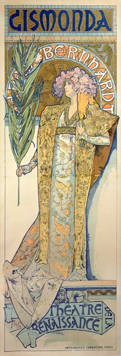
Alphonse Mucha
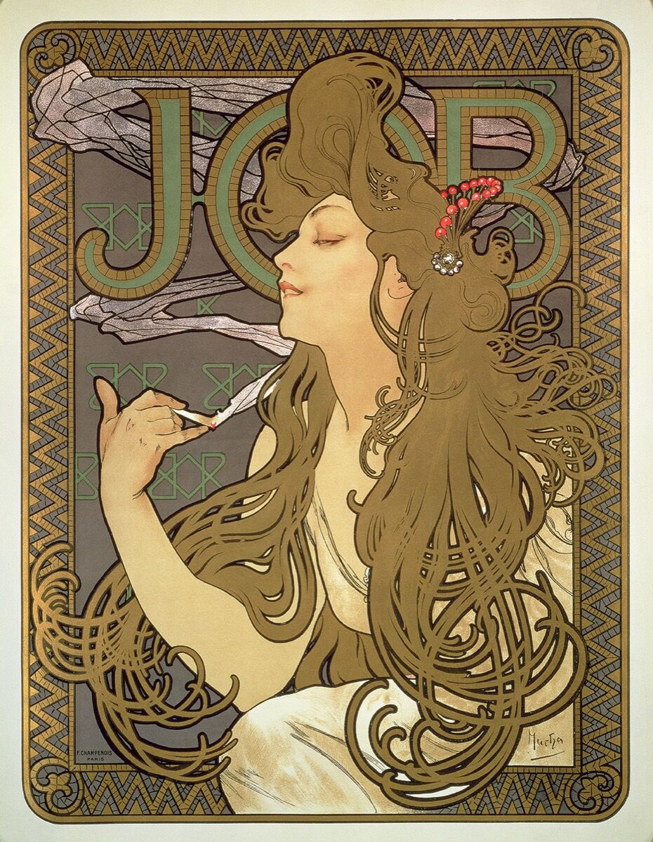
At first glance, I was really taken in by how elegant the style of the poster made me feel.
Firstly the depiction of the female figure accompanied with flowy hair that encompasses around the figure gave her the look. The intricate design by the edges and the usages of the curves
lined strokes contributed to the stylization of this poster.
The choice of colors was essential that bring out the elegance vibes in this poster. The artist used muted colours they have mostly warmed tones with splashes of saturated light green. The slight gradient alternating from orange and yellow creates depth.
Only after several looks, I realized it was a poster that was promoting cigarettes. The swirling smoke that fades into the background, It was interesting to see the artist using portray smoking cigarettes in such a feminine way. The curves of her hair were the distinct and unique features of this poster became known as the “Mucha style”.
As he continues to design for Sarah Bernhardt, his most recognisable work portray an elegant female surrounded by decorative motifs, often utilize the long locks of hair and clothing to create movement in his poster.
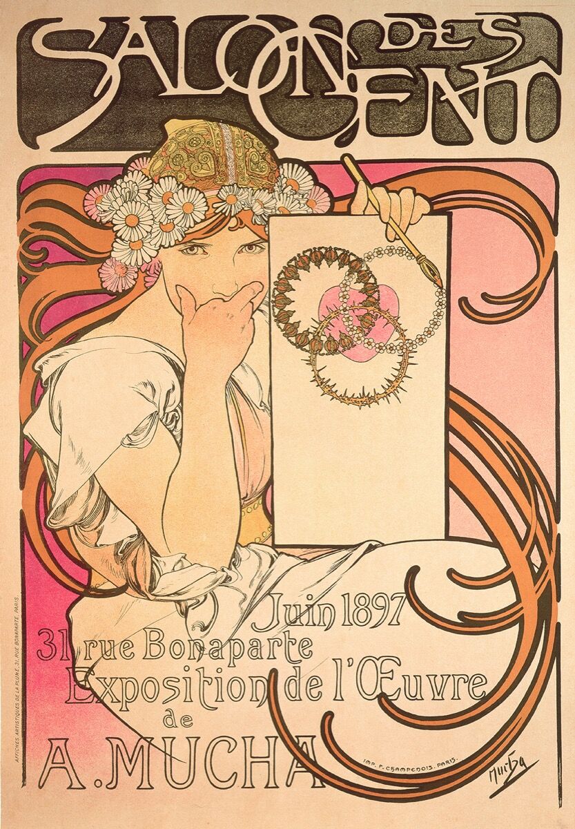 Alphonse Mucha, Salon des Cent: exposition de l’oeuvre de Mucha, 1897. © Mucha Trust 2018
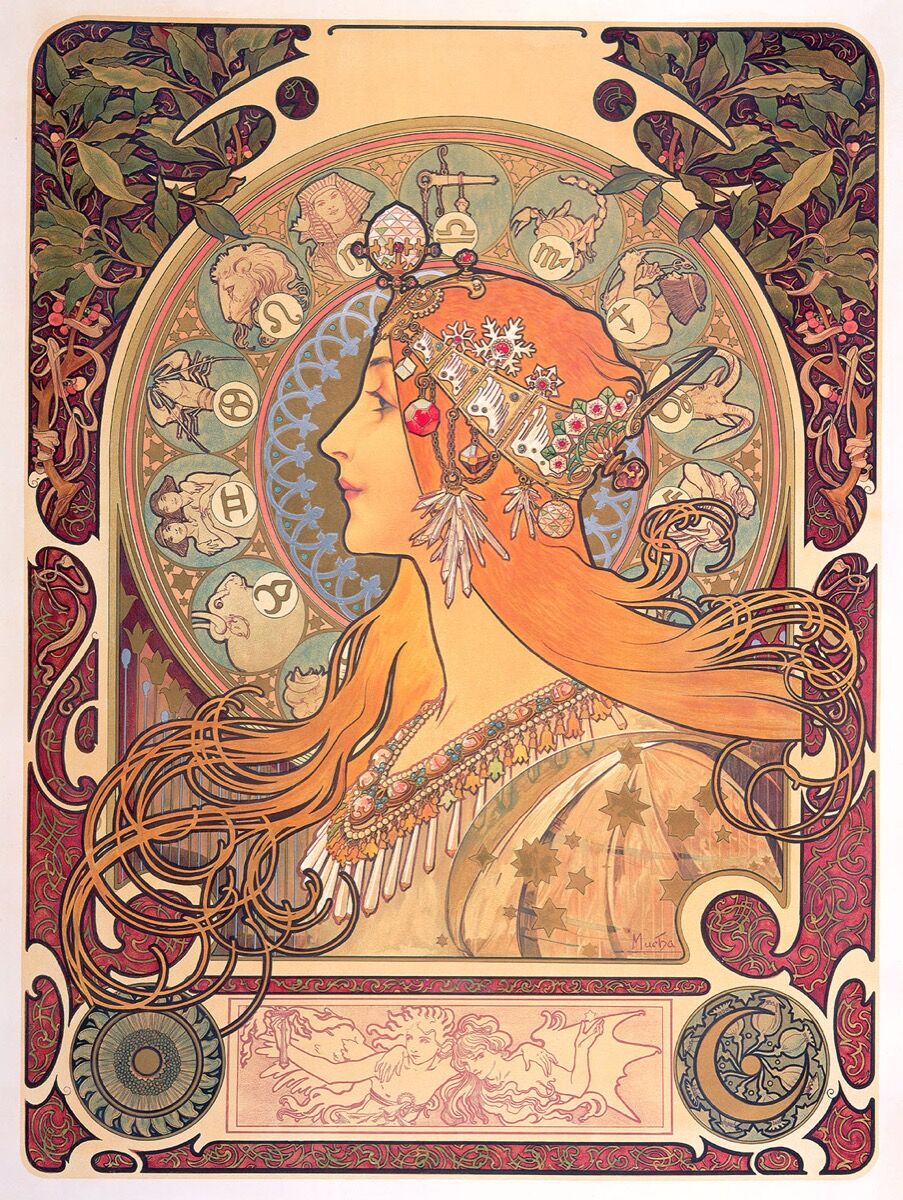 Alphonse Mucha, Le Zodiaque, 1896. © Mucha Trust 2018.
Mucha studied her performances and took note of her gesture while she performs her magic, in order to enhance her gesture in the performance. The flowing movements were then incorporated into his many later art works.
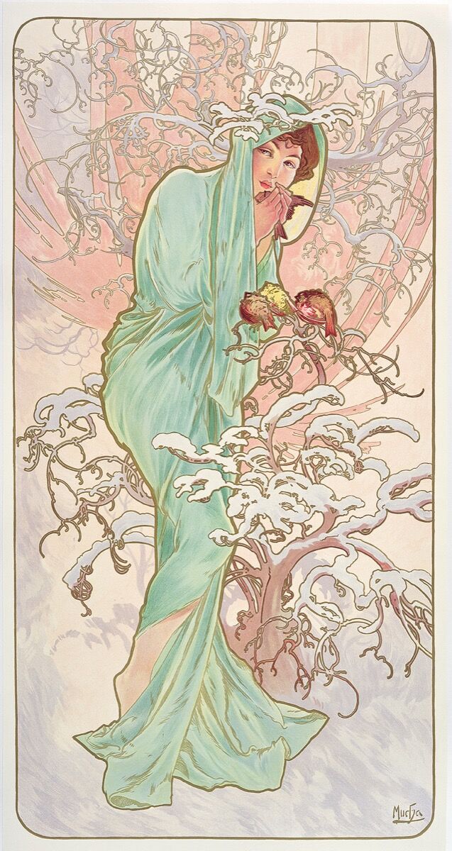 Alphonse Mucha, Les Saisons: l’hiver , 1896. © Mucha Trust 2018.
The focus of movement within the art and the decorative motifs. Mucha’ style became one of the most popular style that was associated with Art Nouveau.
References:
https://aphelis.net/alphonse-mucha-job-1898/
One of the differences in writing method that stood out to me the most was the Boustrophedon which was a method of writing from right to left and from left to right in alternate lines. During the lecture, this particular phrase “Imagine an ox plowing a field” that is the way that Boustrophedon works.
Every time when I am doing a quick briefly reading of a finished assignment or a reading, I found my eyes often skipping a few lines when I shifted from the 1st sentence extreme right jumping to the 2nd sentence extreme left and thought what if writing was invented this way, it seems to be creating a smoother flow for our visual and made sense like how if an ox was plowing the field.

Once popular with stone engravers in the 5th to 10th century
However, I realized it meant that we have to write backward. I tried it myself and it was very confusing when one has to spell backward.
Following closing, there is another older similar writing method named – Rongorongo script from Easter Island uses a reverse boustrophedon. Not only they wrote the letters backward they also have it up-side-down. Apparently it has been mastered by quite a few people back in the days. This was a shocking discovery of how they managed to learn and master this reversed method way of writing.
I guess I have my question answered as to why we end at the extreme right & starts at the extreme left.
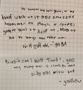
As I end of this last sentence, I will once again attempt to try the Boustrophedon writing method. (It’s hard~)