Assignment 3.1 : Applied Illustration – Poem Thoughts

Research

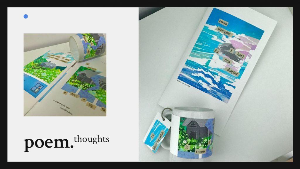
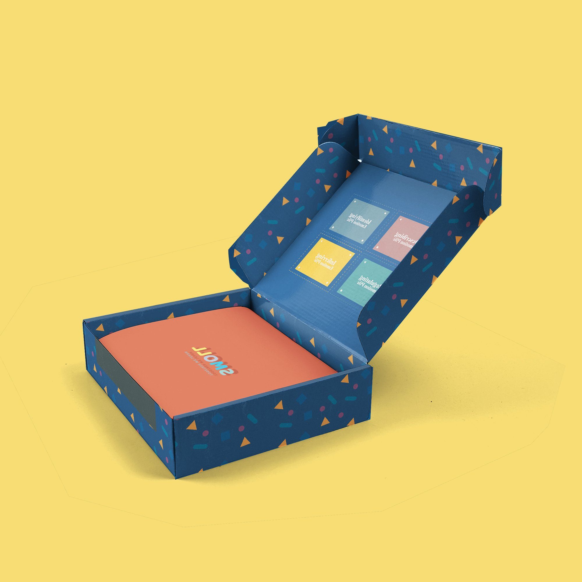
The event that I am creating is a small workshop that entails creating your own poem based on your topic of interest and following up with creating the illustrations visuals to go together with the poem

There are many different types of poem structures and techniques but I choose the one that has is gives the most freedom for beginners known as a “free verse”

I started with a poem generator and inputting keyword prompts, but I felt that it lacked the originality of creating my own poem as they are forming my sentences so I choose to use the key prompts to create a short sentence that I felt flows to the next line.

Purpose / target audience

An attempt for allowing space to express one’s inner thoughts/episode/chapter through the medium of poetry and illustrations

Kids from age 7-12
Teenagers from 13-23 (open to public

Workshop flow

  1. Gather your topic of interest
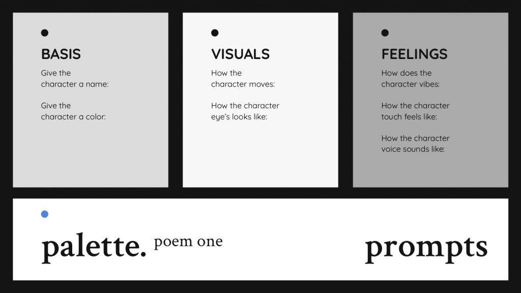
  2. Prompts will be given to help aid the ideation process
  3. Expand and rearrange the different sentences to flow the best
  4. Creating the visuals illustrations via a choice of medium (doodles / collaging / stitching)

Deliverables

  1. Creating Poem—(Interactive Session)
  2. Illustration of Poem
  3. Art & Craft Mixed Medium
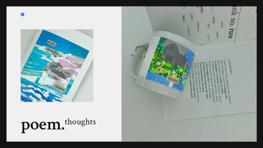
  4. DIY Mug

Aesthete in Chemistry (Assignment 2: Editorial Illustration)

Illustration Process

USER PERSONA:

Main Goal: engage the colorful and excitment side of chemistry

Name: Crescent Age Range: 19-26 years old

Status: Student, undergraduate

Challenges: Mainstream media stereotypes science as a boring mundane job prospect Not seeing the excitement of being a scientist

Preferred Channels: Looks for answers in research papers and library books Communicates on Twitter and forums

Preferred Content-Type: Eye-catching pictures to draw their attention

mood board / inspiration:

Main Idea: To create a fantasy-like scene that includes the instruments used in the chemistry label and also combine the two themes of the Woman in Chemistry and Corannulene. The lady in the middle of the composition will be holding up the corannulene with rays emitting out of it.

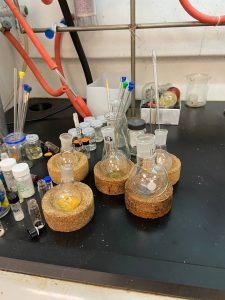
LAB VISIT: Photo taken in the lab for references


Sketches:

Final Illustration

Approaching with the combination theme of the Woman in Chemistry and Corannulene. Aesthete in Chemistry is presenting a person who is appreciative of and sensitive to art and beauty. Embracing the unseen beauty of chemistry in combination with the technical aspect of chemistry is represented by the instruments commonly used. This creates an opposition to the nature of art and nature, striking an interesting visual comprehension of the excitement after gathering findings through experiment and exploration.

Assignment 3.2 : Applied Illustration – Poem Thoughts

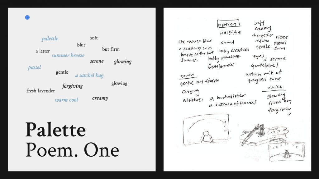
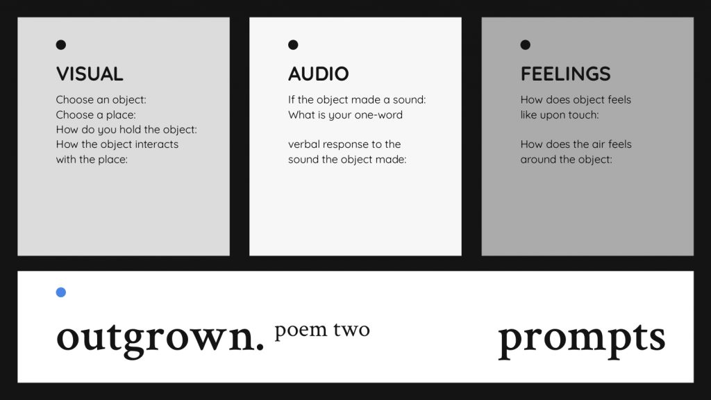
Creating Poem with Prompts Process

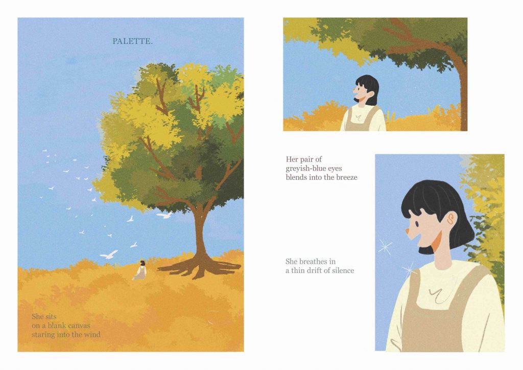
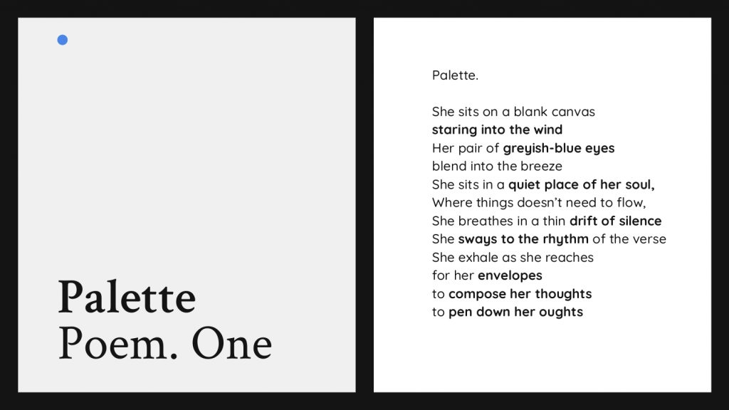
Poem One. Palette

Poem One

Palette

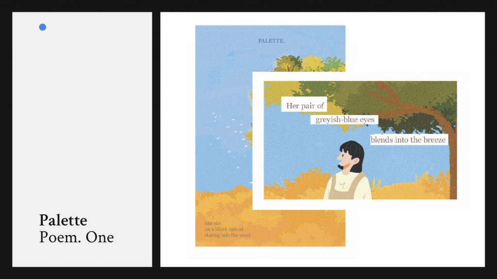
She sits on a blank canvas staring into the wind

Her pair of greyish-blue eyes blend into the breeze

She sits in a quiet place of her soul, 

Where things doesn’t need to flow,

She breathes in a thin drift of silence 

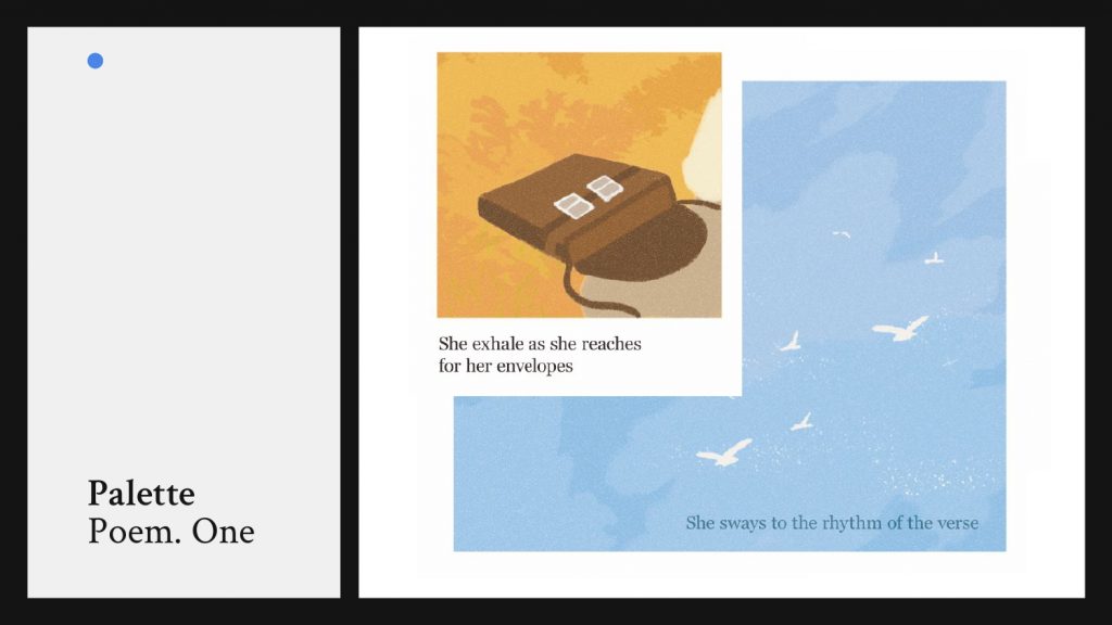
She sways to the rhythm of the verse

She exhale as she reaches for her envelopes

to compose her thoughts 

to pen down her oughts


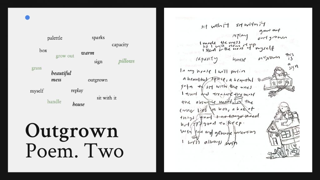
Poem Two 

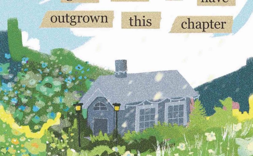
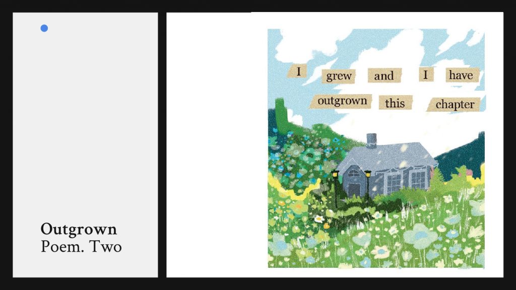
I grew and I have outgrown this chapter

The old house I am in no longer fits

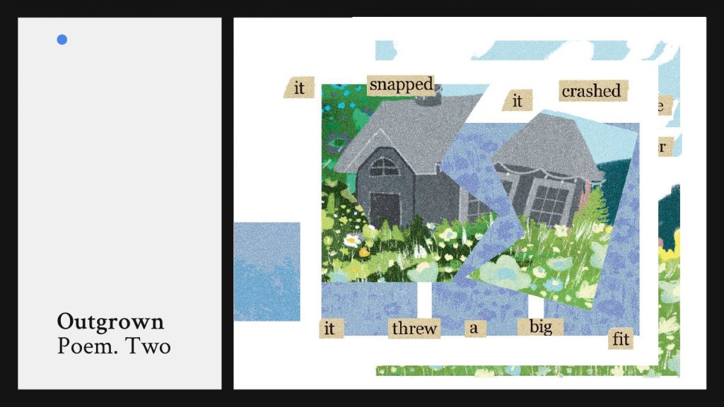
Thou I tried to mends the leaks

It snapped, it crashed, it threw a big fit

I picked up my roots and take a leave

In my house I will put a beautiful tree

A big snuggly sofa to sit and drink

All whom in the room are the ones

I trust and treasure the most

Here is where I thrive afloat

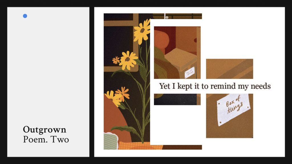
In the corner of the room lies a box

A box of things I no longer need

Yet I kept it to remind my needs


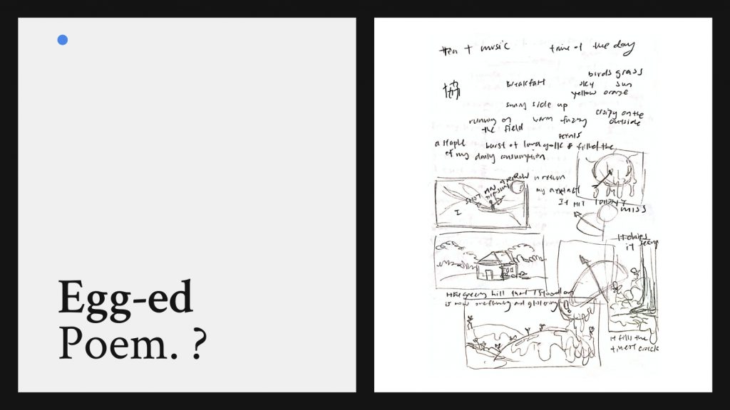
Poem Three. Egged

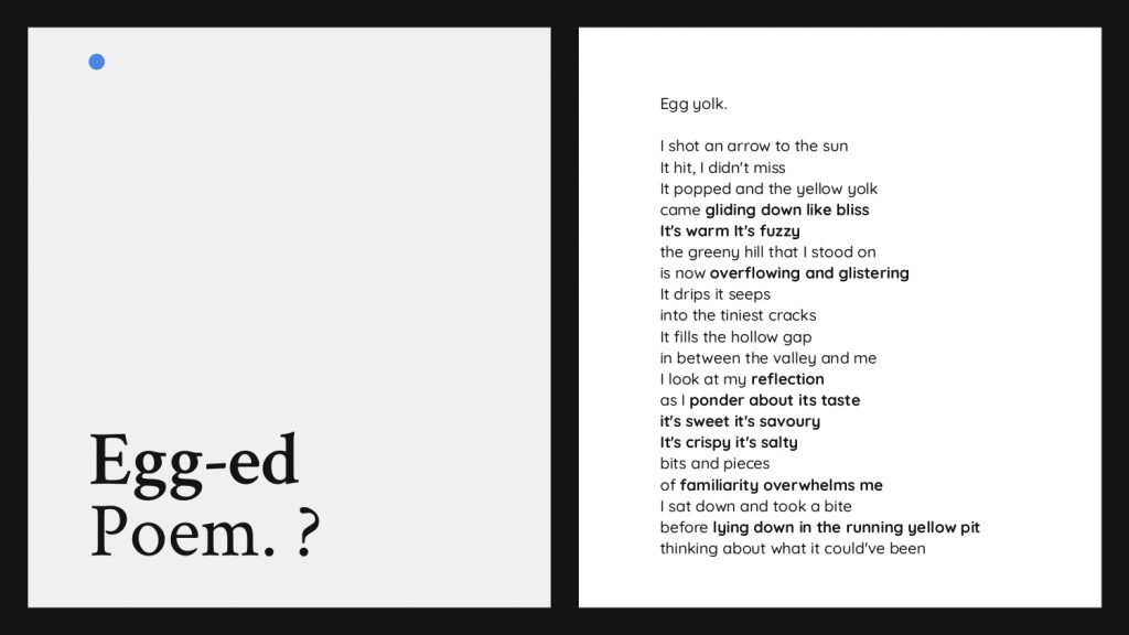
Poem Three—

I shot an arrow at the sun

It hit, I didn't miss

It popped and the yellow yolk came gliding down like bliss 

It's warm It's fuzzy

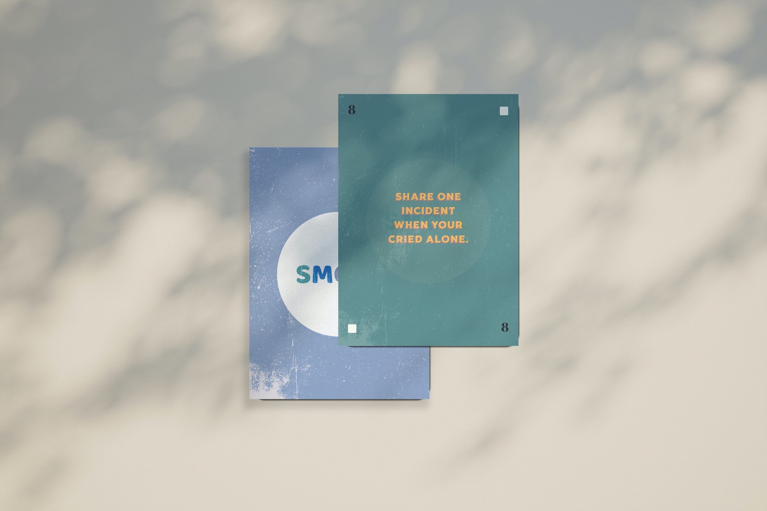
the greeny hill that I stood on is now overflowing and glistering 

It drips it seeps 
into the tiniest cracks 

It fills the hollow gap in between the valley and me

I look at my reflection as I ponder its taste

it's sweet it's savoury

It's crispy it's salty

bits and pieces of familiarity overwhelm me 

I sat down and took a bite 

before lying down in the running yellow pit 

thinking about what it could've been

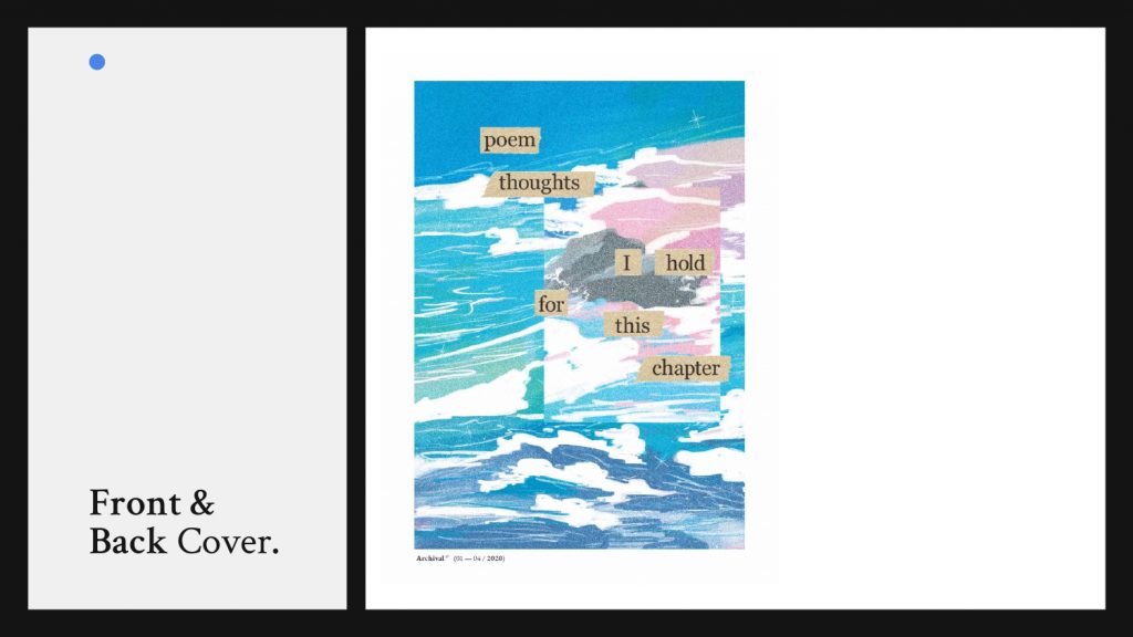
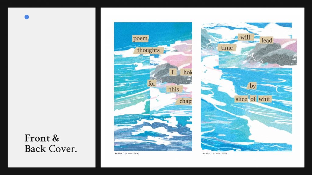
Front & Back Cover


Illustration Assignment 1: Spark AR Filter Design

Spark AR Project Description

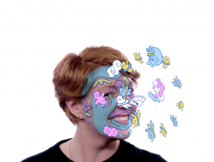
You are to create an illustrated portrait using the facemask technique in SPARK AR STUDIO. Exploring the concept of visual narrative, you will create a stylized self-portrait by illustrating an AR filter to represent your personality. Consider how you can best represent yourself in order to express personality and unique characteristics. The idea is to communicate who you are as an individual and as an illustrator; experimenting with stylization. Focus is encouraged towards a more stylized interpretation rather than a realistic drawing.


  1. Research & Inspiration

To begin with the project, I research other creative’s works on Spark AR. These are some of the imagery inspirations I have collected for my mood board. I wanted to go for a more comic hand drawn stylisation to reflect on my personality.


2. Artist Statement / Sketches

I asked myself a few questions to interview myself

What are the 3 emotions that I want to frequently experience this year?

1. Happiness, Carefree life without judgement 
2. Giggling, Making funny jokes and moments with friends 
3.Peace, Being comfortable to stretch out of my usual zone

What are 3 things I want to achieve this year?

1. Exploring a new style of illustration 
2. Take life at a slower pace
3. Spend more time with family and friends
Keywords that I conclude to:

Carefree, Ability to adapt to various situations, Onwards Positivity in life, full of motion and joy, interaction with friends, loving and caring.

I created a series of small character humans to represent the different sides of me. Each figure represents a different outlook on life— representing happy-go-lucky, hugging poses to cherish yourself, marching with a positive stance.

Tried various backgrounds but it was a little too distracting after adding multiple planes over the base face mesh. After playing with various colours, the mix of pastel blue, pink and yellow expressed the joyfulness and liveliness the best out of the rest of the pieces.

FaceMesh Design #1
FaceMesh Design #2
FaceMesh Design #3
FaceMesh Design #4


3. Exploration / Experiment 

Adding more plane layers to create a more interesting depth composition 

Creating a circular motion of the characters rotating around the face, using the spin function.


Final Illustration Artwork

This is how the illustration looks like when all the layers are stacked on top of one another. Each human plays a role in the composition, with the main core that is flowing to the centre of the face mesh.


Final Outcome


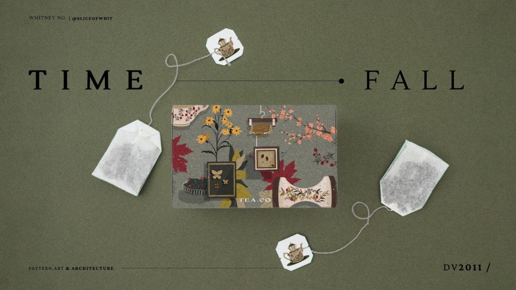
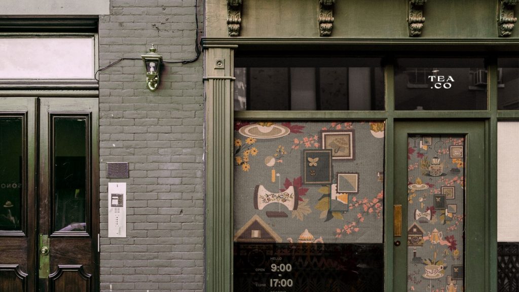
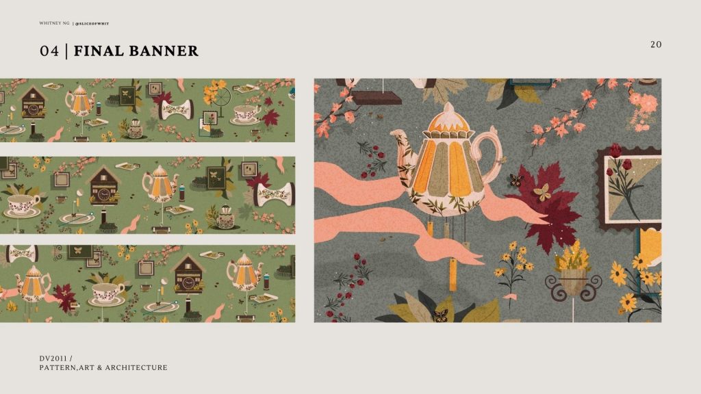
Pattern, Art & Architecture – Mood Boards

Links & References:

https://i.pinimg.com/736x/2d/84/bf/2d84bff3f371b13eda79bcbdc2a38648.jpg

https://i.pinimg.com/736x/2d/84/bf/2d84bff3f371b13eda79bcbdc2a38648.jpg

https://i.pinimg.com/736x/2d/84/bf/2d84bff3f371b13eda79bcbdc2a38648.jpg

https://i.pinimg.com/564x/64/fd/9a/64fd9a07ca30dc1784d37feee7db91ea.jpg

https://i.pinimg.com/564x/82/88/63/828863ae088b76378d39bc11db701fb4.jpg

https://www.behance.net/gallery/32263087/Staf-Magazine-Logo

https://www.behance.net/gallery/2445725/Various-work-09

HISTORY OF DESIGN: LECTURE 4 REFLECTIONS

Final Reflection.

Groaning at another history module which my brain isn’t suited for memorizing modules agonizes me a little bit glad to discover that it wasn’t the case for all the history modules.  From learning about Boustrophedon to the Art Nouveau and following by the Bauhaus, I think it was a good knowledge gain and sets the base for my graphic design studies. It was interesting to have Desmond as our first lecture for the history of design. Somehow or rather the topics covered in my Visual Communication I class and Typography I class are sort of sync, where it was interesting to have the same concept but seeing how it was different as it applied to all 3 modules in their own ways. The weekly reflection also helps me to dive in deeper to the topics that I am interested to find out more, takin gout time to work on the reflection helps to summarise the lecture topic went through.

Even though I’m bad at test, having the quiz spread out amongst 4 weeks and into 2 test it did really help me to cope with the amount of information I am taking it in. Quizzes basically help to dive in deeper to learn more and find a keyword to associate (for example, a particular key piece of typeface, an art movement that shaped the way people create their art).

It has been an enjoyable and happy to say that not really stressful history of design for the past 4 weeks. Thank you !

Week 4 — To Bauhaus & Beyond

For week 4 of history of design lecture To Bauhaus & Beyond. As I was more interested in the typeface – I decided to focus my reflection of the Bifur typeface by A.M Cassandre.

Commissioned as to design a brochure for the Paris Type House of Deberny et Peignot from 1929, AM Cassandra created this series of the typeface which impacts the small world of publishing and printing.

Strokes from each letter are taken away, replaced by a shaded grey area which gives an illusion of a silhouette which completes the character/letter again.Image result for Bifur typeface, A. M. Cassandre,

The 16 pages in the brochure are rather minimalistic as there are big areas of white space used, which works well as each character have its own voice which would not work well if they are layout in lines and lines of paragraphs text. Till this day, the art of the Bifur typeface echos the art of decoration styling in the world.

Bauhaus Design Movement

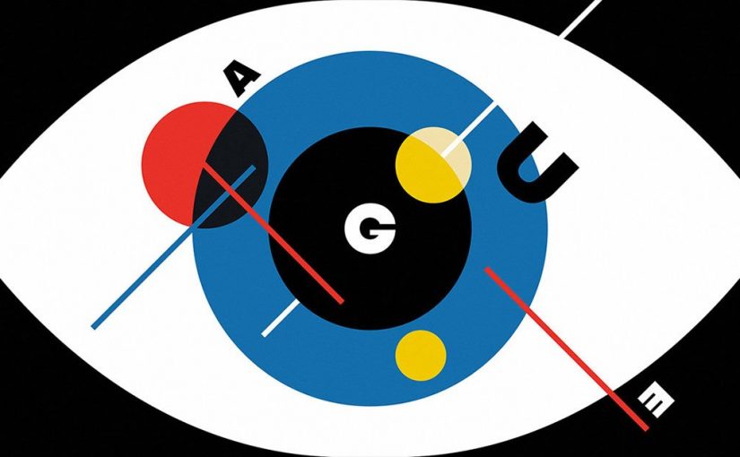
Continuing to google to on “Bauhaus” and found one of the more modern designs that were affected by the design movement. Firstly because it has this distinct color palette, playing around with 3 to 4 colors. It is also the restriction of the number of colors enables the design to be able to harmonize well with each element overlay over one another. Personally I really enjoyed what this design movement created and change the way people design.

— Redefining the meaning of art – the point where minimalism and mass production meets.

Graphic Design: The Bauhaus Style In 2019

“BAU” – Definition (construction and the desire to provide methodologies for mass production)

FUNCTIONAL TYPOGRAPHY VS STAGED TYPOGRAPHY

Originated from the German art school — Staatliches Bauhaus. Founded by Walter Gropius, a German architect. The design philosophy of Bauhaus is essentially “forms follows function” This particular philosophy explains how the Bauhaus is based on a no gimmick advancement, rather they are often straight forward and not complicated. Having that they choose utility how it have to have some practicality over being just aesthetic looking to the eye.

Typography

Upon looking up the history of Bauhaus typography, I was kind of in awe because I didn’t realize many of the “descendants” of Bauhaus were my all-time favorite type family font that I often use for my design. A list of my favorite font that was Bauhaus’s descendants was as Futura, Pantra

Resembling a stencil, traced like style effect, the Bauhaus font made an appearance in 1969, where it has somewhat-thin & equal strokes throughout most of the characters.

Unique aspect of Bauhaus type family

  • Bold
  • Strong identify
  • Structured and geometric
  • Balanced, equal

It seems to definitely have a voice of its own, able to catch the audience’s attention despite the lack of decorative elements.

 “ Less is More ” 

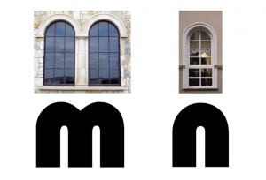
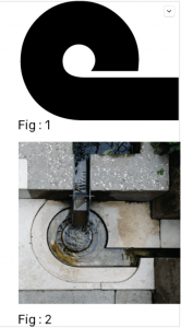
Moving on, it also affected the design in the world of architecture. Another interesting discovery was how the design of the Bauhaus font was used in designing certain parts of an architecture, building.
 

References:

http://graphicnothing.blogspot.com/2011/04/adolphe-mouron-cassandre-bifur.html

-https://blog.pixlr.com/graphic-design-the-bauhaus-style-in-2019/