Find 3 examples of a product/project that you think are good examples of thoughtfully designed user experience. Be prepared to support your choices.
The examples stated below are ones which are present in local context. They are products and services which I feel have contribute to a positive personal experience thus far:) I feel that how thoughtfully designed a product/ project is could be rather subjective as we all have our different needs and preferences.
Example 1:
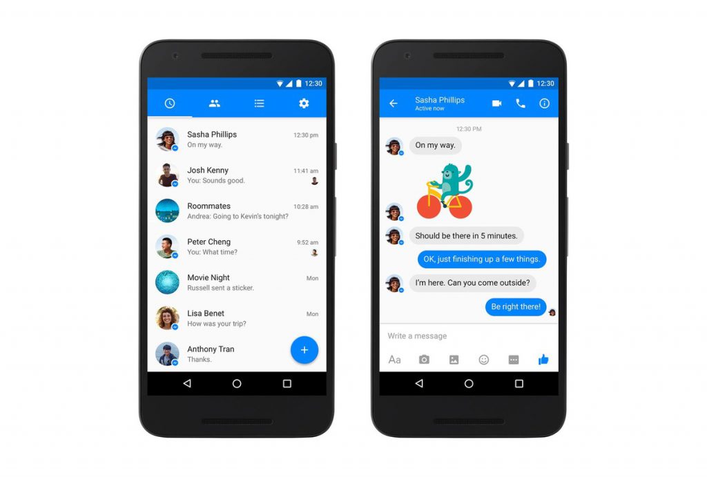
Facebook Messenger
Features of Facebook Messenger: https://www.messenger.com/features
Personal uses:
- keep in touch with close friends
- send documents


Reasons for why it is more thoughtfully designed:
- easily accessible (available on different operating systems, and laptop/ phone)
- more expressive than usual messaging services like Whatsapp and Telegram – through their “stickers”(which are also updated now and then)
- makes for a more interesting conversation
- more privacy (does not require the phone number)
- not affected by the change in number/ phone, easy to connect to friends overseas
- simple and clean colours, easy to learn functions
Example 2:
Ion mall toilets at Orchard Road
Location:https://goo.gl/maps/553frAp6YGw

Reasons for why it is more thoughtfully designed:
- consistently maintained. and also has many cubicles which lessens the wait
- many added features (such as seat sanitisers/ paper napkins/ automated soap dispenser/ tap which are fuss-free)
- combines all these functions with interior design (such as warm lighting and neutral colours)- to create a more peaceful environment, a momentary sense of calm amidst the shopping frenzy
- contributes to a better shopping/ working experience
-
“Of the three shopping malls, ION Orchard is rated best for its overall design and concept such as a dressing table for the ladies and well-groomed restroom cleaners who are service-orientated. Orchard Central is rated best for providing restroom facilities for the physically disabled while 313@somerset is rated best for baby-nursing facilities.” (http://www.toilet.org.sg/docs/apr2010/Updates/Update.htm)
Example 3:
Toastbox (bugis junction) pager for food collection
Location:https://goo.gl/maps/UicMjpSbmE82
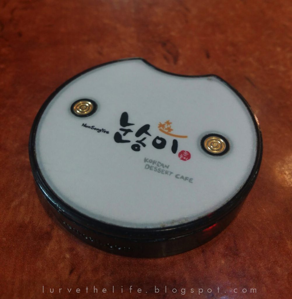
The image on the left is from a different restaurant but it is the exact shape used in Toastbox’s outlet at Bugis. The usual pager/ buzzer used to notify customers to collect their food is depicted on the right.


Reasons for why it is more thoughtfully designed:
- smaller and less intrusive
- lighter and easier to hold
- the red lights blink a longer while before the pager actually vibrates – less shock
- less intense buzzing, but enough to be noticeable
Image references:
Facebook Messenger:
http://www.androidcentral.com/sites/androidcentral.com/files/styles/larger/public/article_images/2016/03/facebook-messenger-material-press.jpg?itok=8tuOFzqE
Toastbox Pager:
https://4.bp.blogspot.com/-hfMsWRwdYq4/Vwu31iilCYI/AAAAAAAADbU/bYkUQwqVk9AAL_AIdF_4zJqVc69O1mn_A/s1600/227e9f65-3b6a-462a-b81d-88ad696aadd7.jpg
https://598d5fcf392acad97538-395e64798090ee0a3a571e8c148d44f2.ssl.cf1.rackcdn.com/10797727_food-review–toast-box-golden-lava-french_t2c96d1d7.jpg
Start to work on final project proposals – prepare three ideas for a screen-based experience that you’d like to create (it can be speculative). Prepare a slide show to illustrate your ideas. The ideas can be based on any of the field trips done so far or can be something completely new.
Idea 1: The Public Whiteboard
- inspired by the demonstration booths at stores, the pen testing areas in a stationary store
- instead of using phones while waiting, this board allows more interaction between strangers around, without the intimidating need to talk (since we are a relatively introverted lot)
- instinctively want to write/ draw/ see what others have written
- not permanent (“whitewashed”after it is full) and can also be translucent?
- public exchange of ideas, expression of thoughts, publicly
- also inspired by the message wall in a Taipei paper museum where people leave notes in exchange for another and also “thebandofdoodlers“group (but the ordinary public cannot participate, only as spectators)
- also referenced from the experience of drawing on condensation on glass walls
- can freely collaborate and continue a story or an artwork/doodle
- Limitations: fragility, abuse, vulgarity, hygiene:depends on location?

Idea 2: Virtual cage
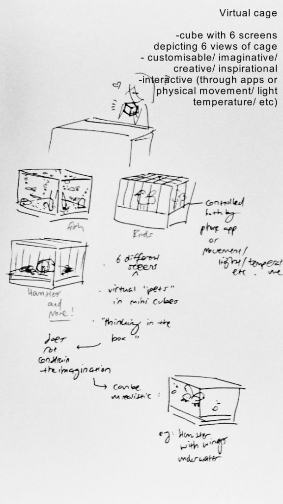
- a cube with six screens, with each depicting a part of the cage: like in reality
- can design your own cage/ tank for any small animal and observe their interactions. Mimics real life but encourages creativity
- allows the users to develop responsibility (taking care of the animals)
- incorporates a hint of fantasy: e.g. hamster can walk on all sides of the cage. Shaking a tank causes a tornado. Can install updates to further enhance the programme, to refresh the experiences. Can observe this little pet wherever you may be
- reminiscent of tamagotchi.
- “thinking inside the box”- size and shape does not constrain us.

Idea 3: Smart Fridge
- fully transparent doors allow users to write notes and to point out any item’s expiry date- less food wastage, perhaps a reminder once near expiry (fridge can detect: similar to Samsung’s smart fridge)
- or to label if an item belongs to a specific person
- leaving a message, writing a recipe or menu
- transparent (can see straight away what items are in the fridge: no need waste money and time opening the fridge)


Image reference:
http://www1.pcmag.com/media/images/490696-family-hub-refrigerator.jpg?thumb=y

