

I decided to redo the silkscreen process all over again because I was not satisfied with the size of my print, which I felt was too small for an A4 tote bag. It was a bit of a tedious process, having to redo everything, but I guess it was quite worth it for the outcome!

Step 01: Printing on transparency.
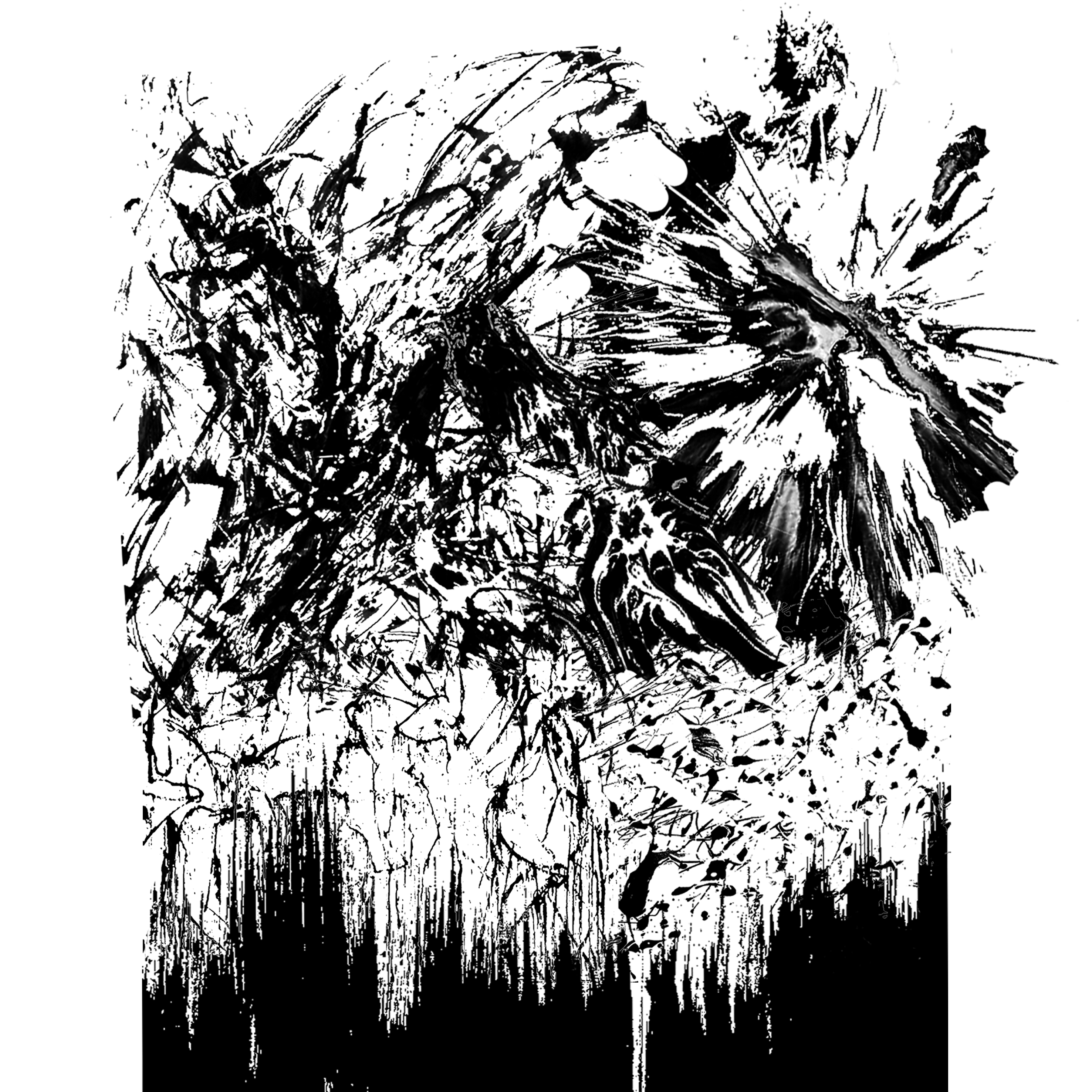
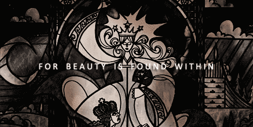
After a quick consultation with Shirley (because I couldn’t decide which design I wanted on my tote bag), we decided to go with this one from Beauty and the Beast. I also felt that this print was neater and more cohesive, as the previous design had tiny details that might not have been transferred properly during the photo emulsion process.

Unfortunately, I noticed that some parts of the printed ink came off. Minh suggested that I use something to cover it so that it would not appear when I expose the screen. We used ink to patch up the gaps.


Step 2: Photo emulsion.
In the dark room, we had to apply a blue ink substance onto our silkscreens to prepare for the exposure process. It was honestly quite difficult for me to apply the ink consistently, but I managed to do so with the help of Minh (life-saver). After covering both the front and back of the screen, we placed our screens in the huge dryer to wait for the ink to set.

Step 3: Dark room exposure.
One of the most fascinating parts of the dark room exposure (besides the colour of the room), was actually exposing the screens. We had to stick our transparencies on the screen before placing them in the machine.

I’m honestly not exactly sure how the process works but basically the machine compresses out all the air and the fabric-like material wraps itself snugly onto the screens.

The machine lights up, exposing the dark parts of the transparency onto the screen.


Step 4: Washing.
Using a pressurised water jet, we had to remove the blue ink at the parts where our prints were. The difficulty faced in this was not knowing if we had thoroughly removed all the parts that were meant to come off, but after many kiasu rounds of washing, the print became completely transparent. (looking at it does make me feel really proud :’) )

Step 5: Silkscreen.
First, we had to tape up the edges of our screens. According to Minh, this is a prevention measure, to ensure that the ink does not seep through any possible “gaps” that may have appeared during the dark room exposure process. I also taped coins at the edges of my screen because it wasn’t balanced, and might affect my final outcome.


Next, we applied ink at the top of our screens, because it is easier to pull the ink towards us consistently. One of the scariest parts is not knowing if I applied enough ink on the screen because:
too much = ink leaks,
too little = print fails.
O M G

The final step was to use the silkscreening squeegee to pull the ink over the print consistently, and the ink would be inked onto the surface.


Step 6: Test print.
THIS IS THE MOST EXCITING PART OF THE ENTIRE PROCESS – BEING ABLE TO LOOK AT THE FINAL PRINT. Unfortunately, it wasn’t as easy as I thought it would be. The following images show the different types of failure I experienced in my test printing process. Some prints were not fully printed because I didn’t pull the squeegee with consistent effort; some prints looked like a full black circle because the details were covered by the use of too much ink. Many many test prints later, I finally had one decent print :’)

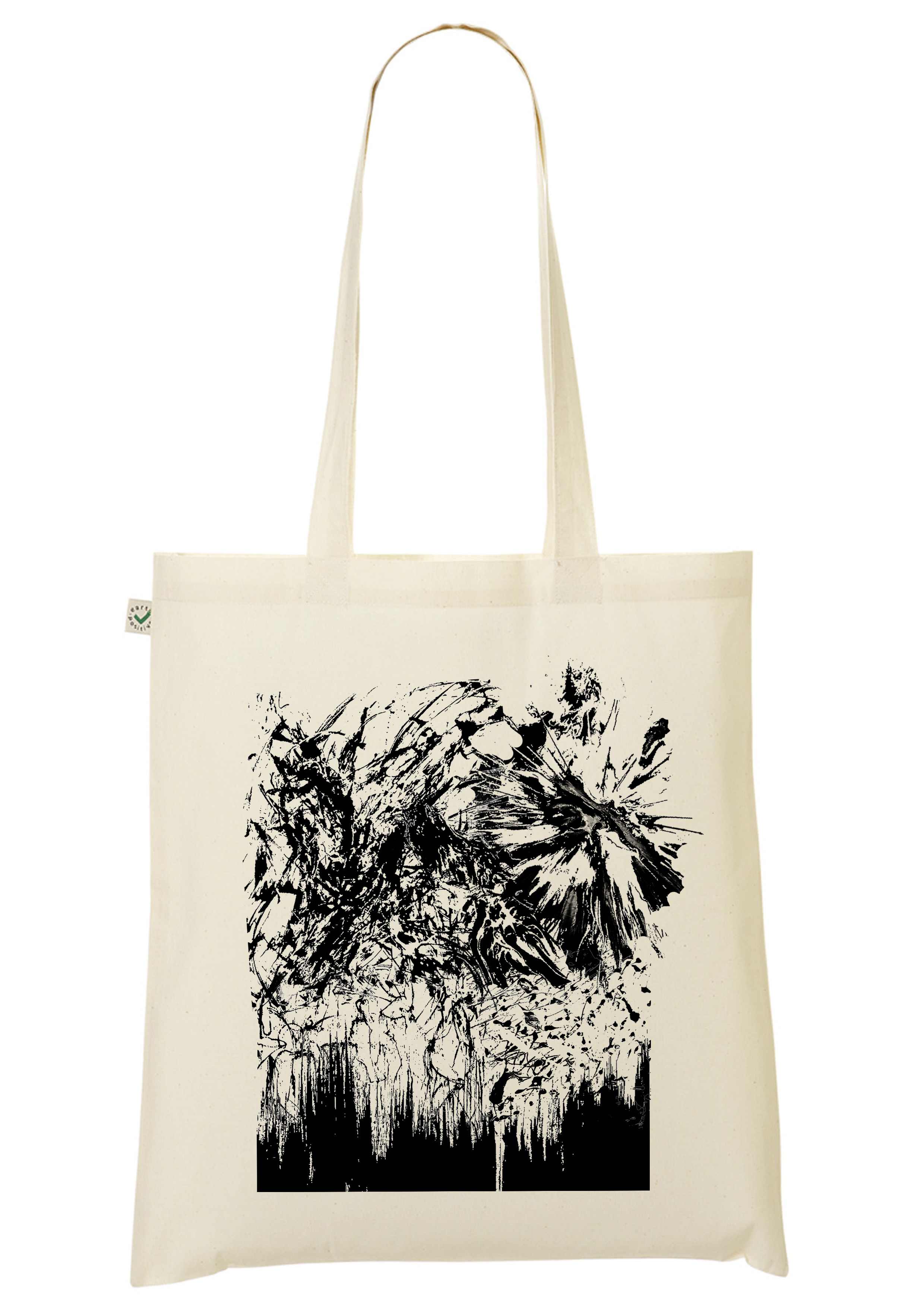
Step 7: Tote bag printing.
This is one of the scariest parts of the entire project, simply because there’s only ONE TRY and there’s no turning back. I was actually really afraid to print on the tote bag because I wasn’t confident enough that my print would appear as nicely as I would like it to, and kept doing test prints instead. After a burst of courage…

TADAAAAAAA!

And this is me showing off my tote bag, hipster enough?
Overall, the entire silkscreening process was very enriching. I had done silkscreen printing before back in my polytechnic days, but the processes are so vastly different (it is definitely more advanced here with all the machine and technology). I really enjoyed using the dark room exposure technique (and taking aesthetic selfies with the lighting) and watching how a print I created digitally could “come to life”. I’m glad to have had a hand in trying out a different method of silkscreen printing. It was definitely a fruitful learning experience, 10/10 would try printing again on other mediums!
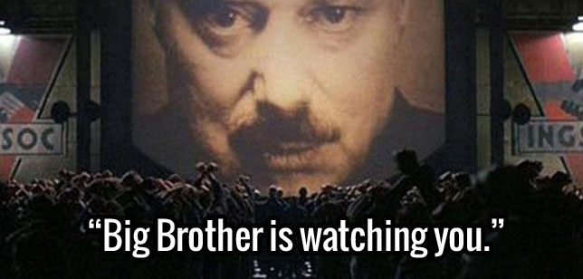
 “Big brother is watching you.” – 1984
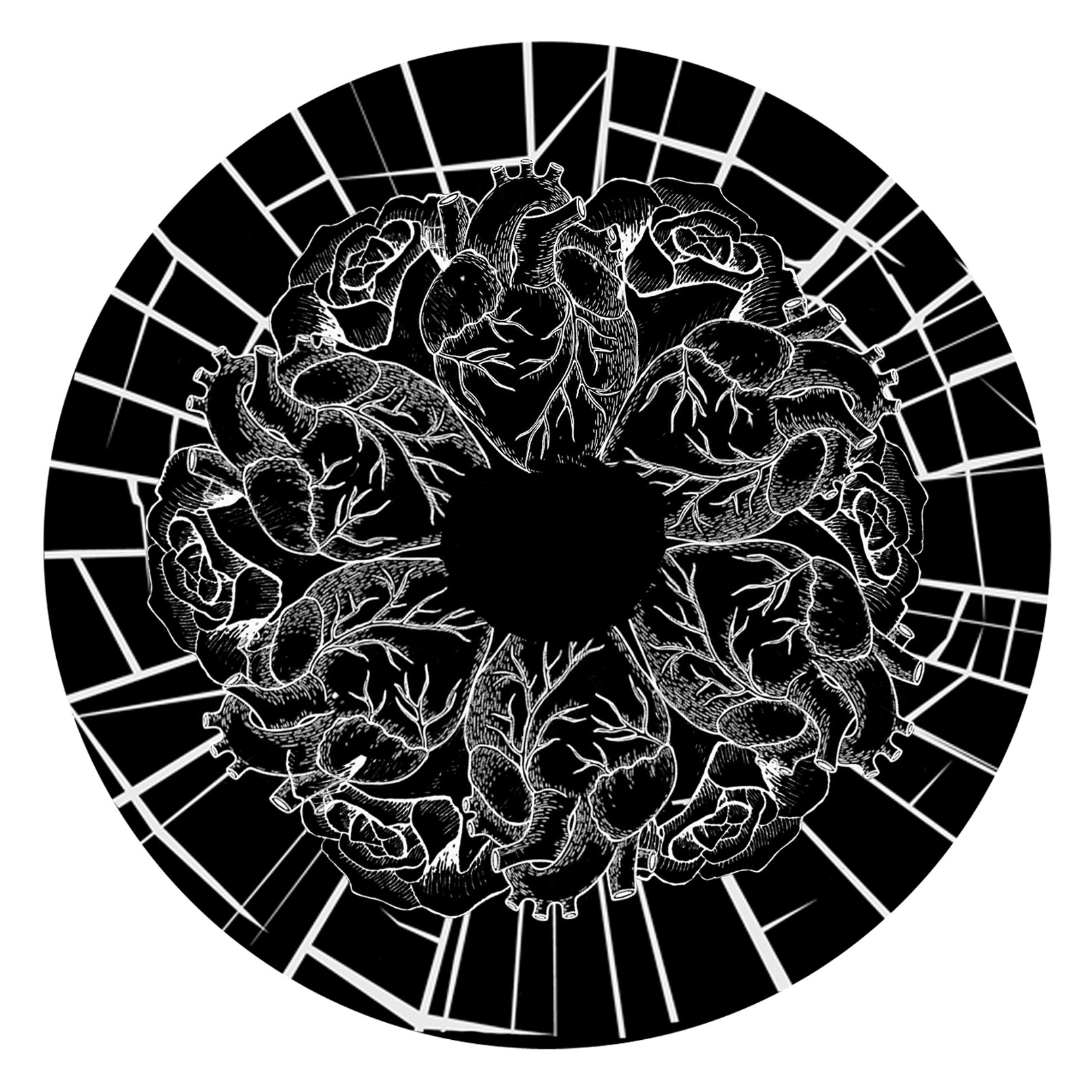


